The Beijing Automotive Group R & D Centre
When the Beijing Automotive group decided to establish their Research and Development Centre in the Wangjing district of Beijing, China, J.J. Pan and Partners saw this as an opportunity to make the Centre a symbolic expression for the area and won the design competition.
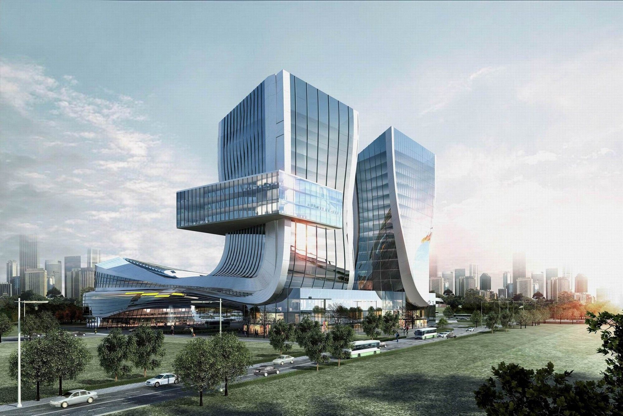
The meaning of ‘Wangjing’ is ‘Looking towards Beijing’. The architects decided that through the architecture of the building they would mark the identity of the place as the ‘Gateway of Beijing’. Naturally, with such an individualistic expression, the design is attractive and appealing, and the Centre will be hard to miss.
Perhaps the idea stems from the fact that Wangjing has primarily been a residential area. It has been a gateway for people moving to the city. However, growth is being undertaken to develop it so that people not only live there but can also engage in work and commercial activities. A symbolic building would not only establish its identity but also mark the transformation of the place.
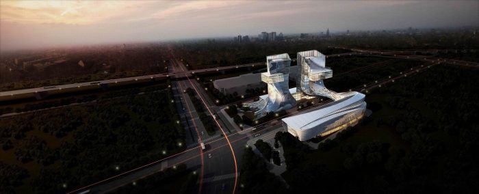
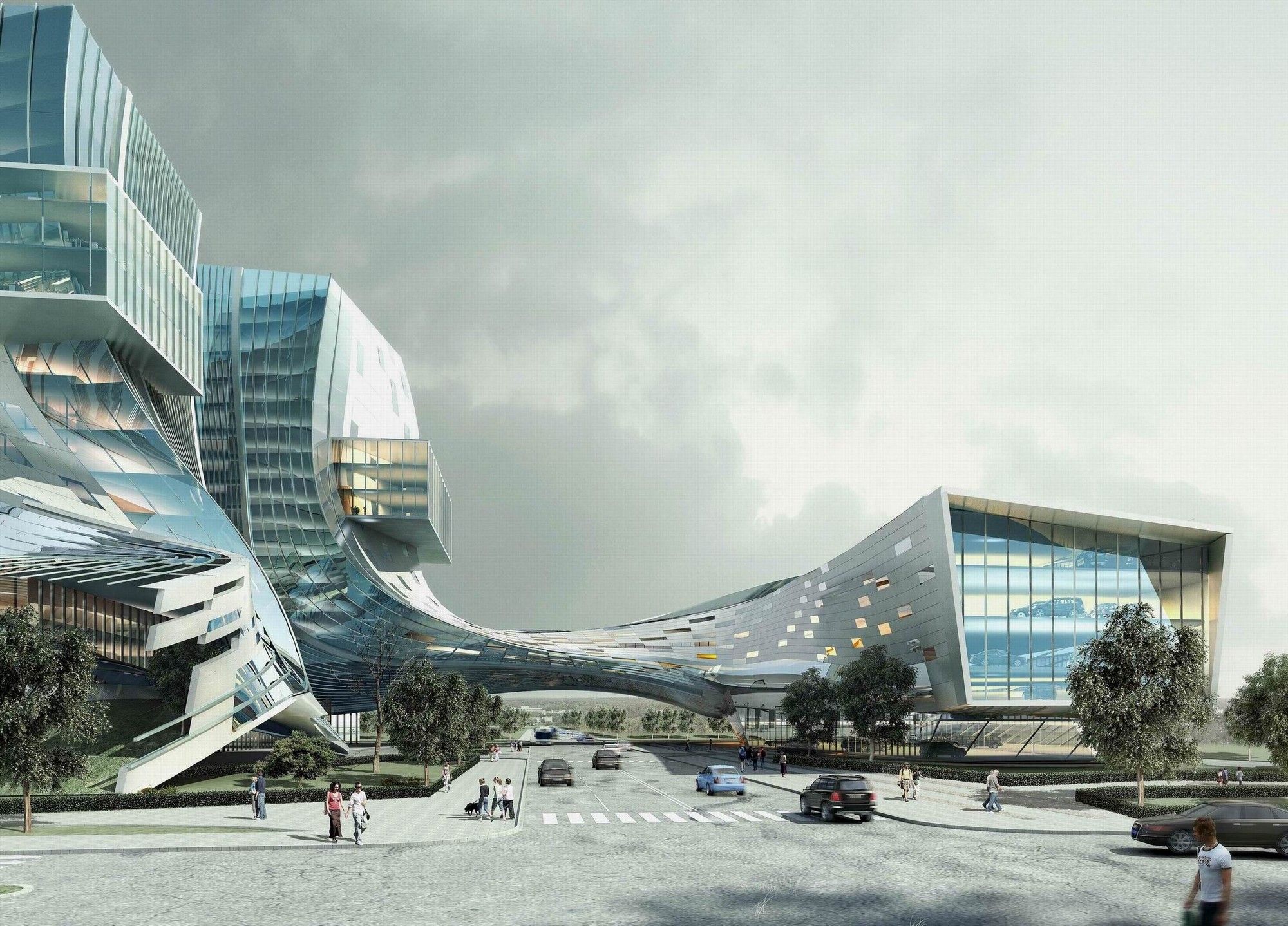
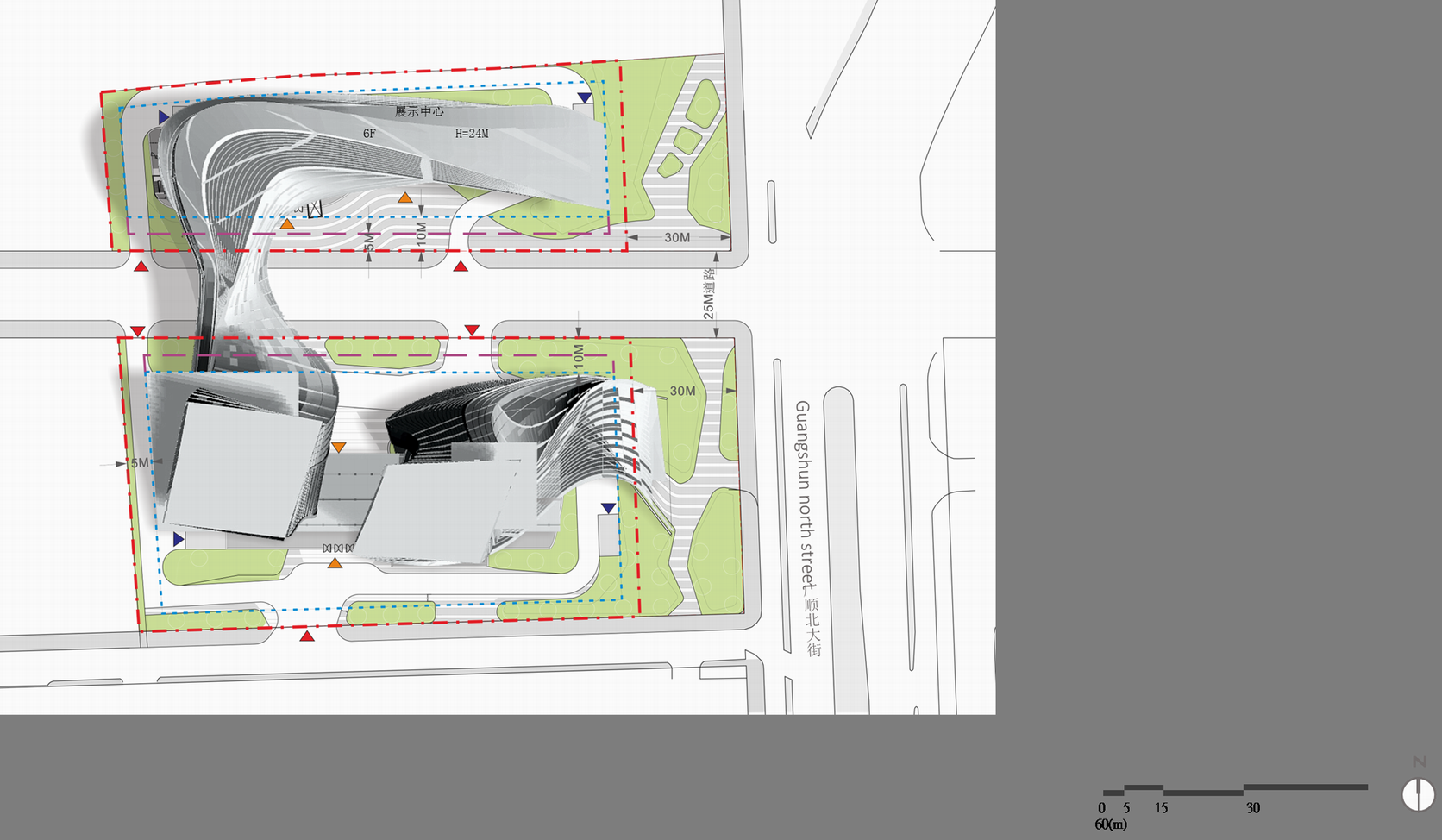
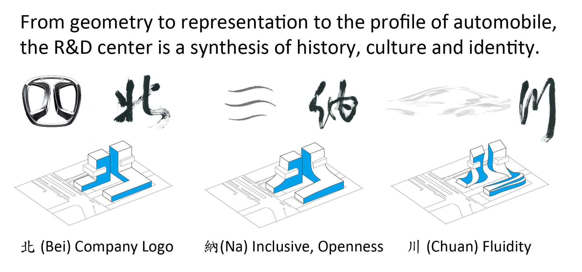
The plan literally emerges from the calligraphy of ‘bei’ 北, signifying the company logo as well as Beijing. Interestingly, the centre is broken into two plots of land by a road, and connected by a bridge- forming an emblematic as well as literal Gateway to the city. The Northern block is a five-storey structure that will house an exhibition space, an auditorium and shopping complex, while on the Southern plot sit two eighteen-storey office blocks.
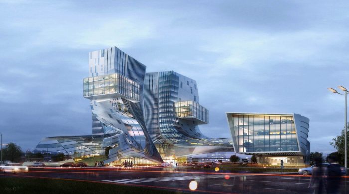
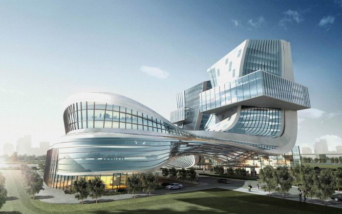
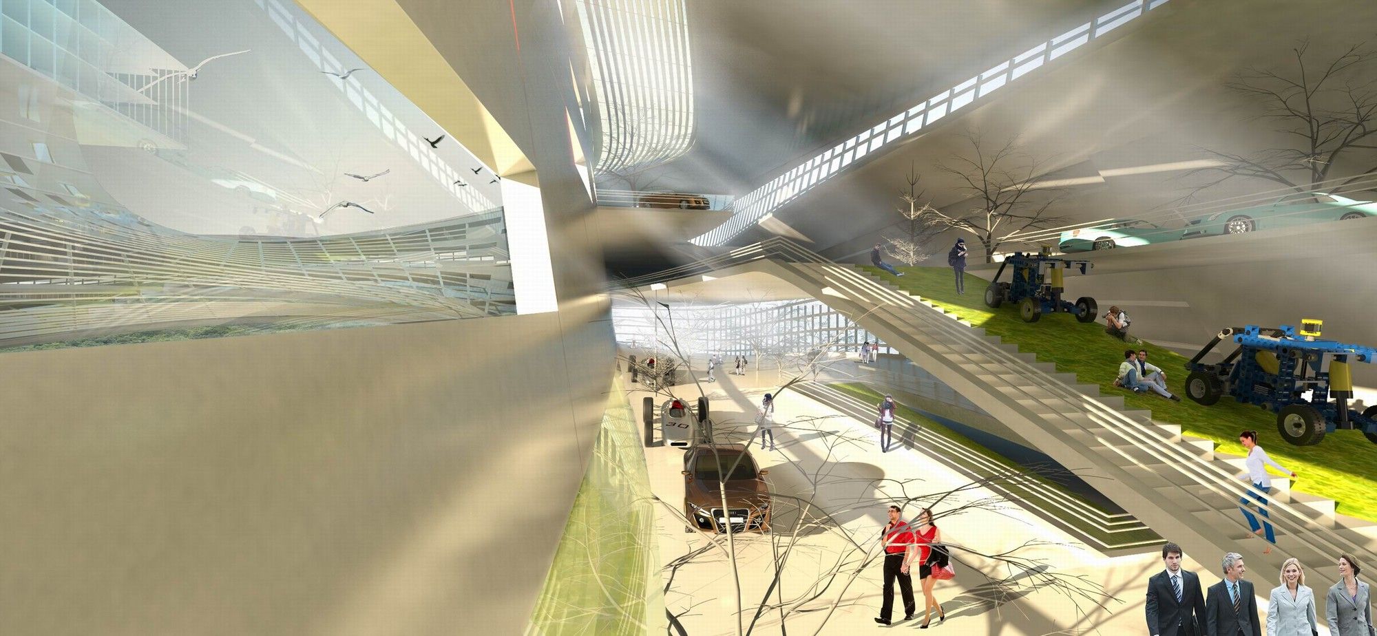
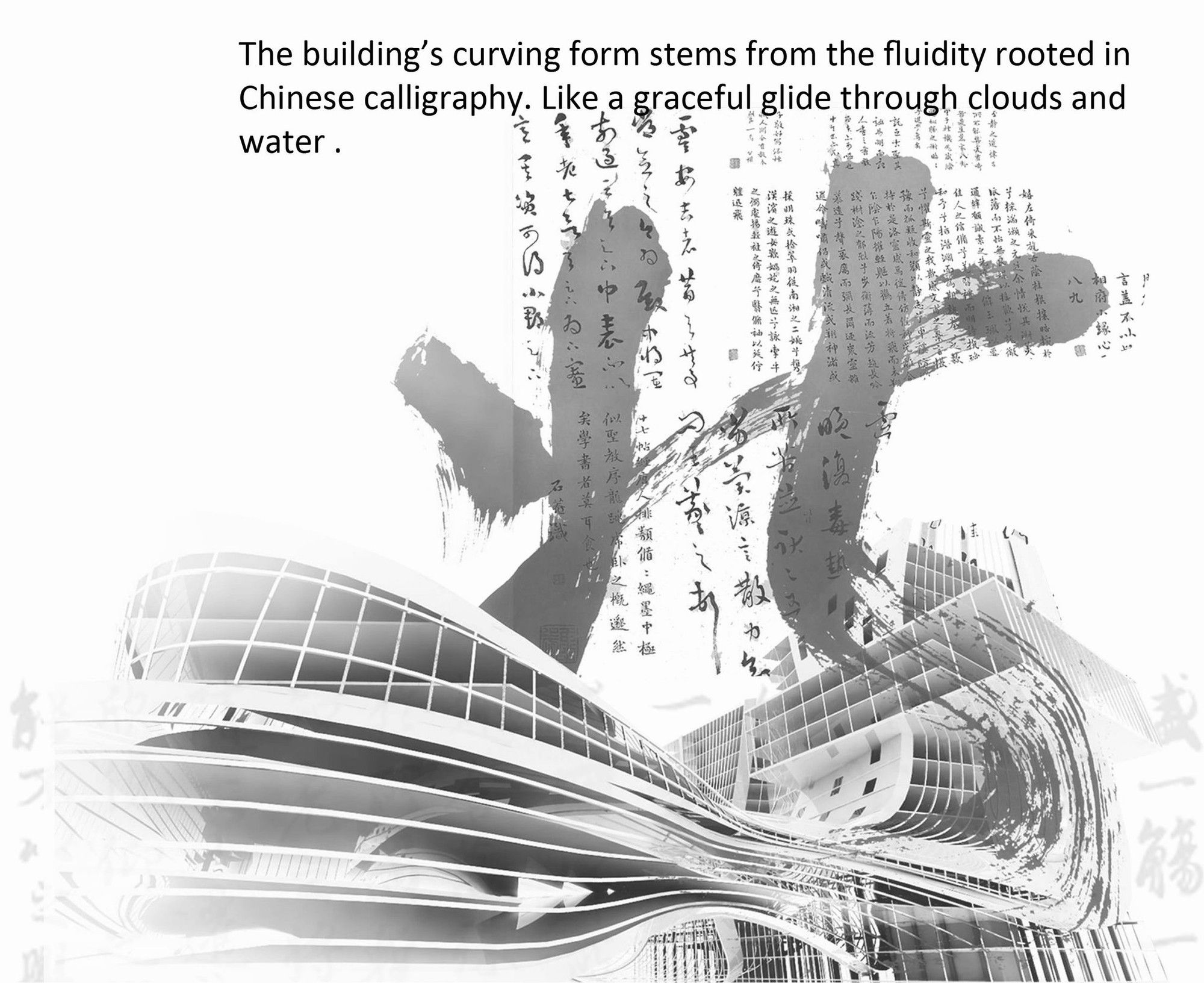
The curvature and fluidity of the form signify openness and have been derived from Chinese calligraphy. The fluidity is not just an expression but also caters for natural light and ventilation of the interior space.
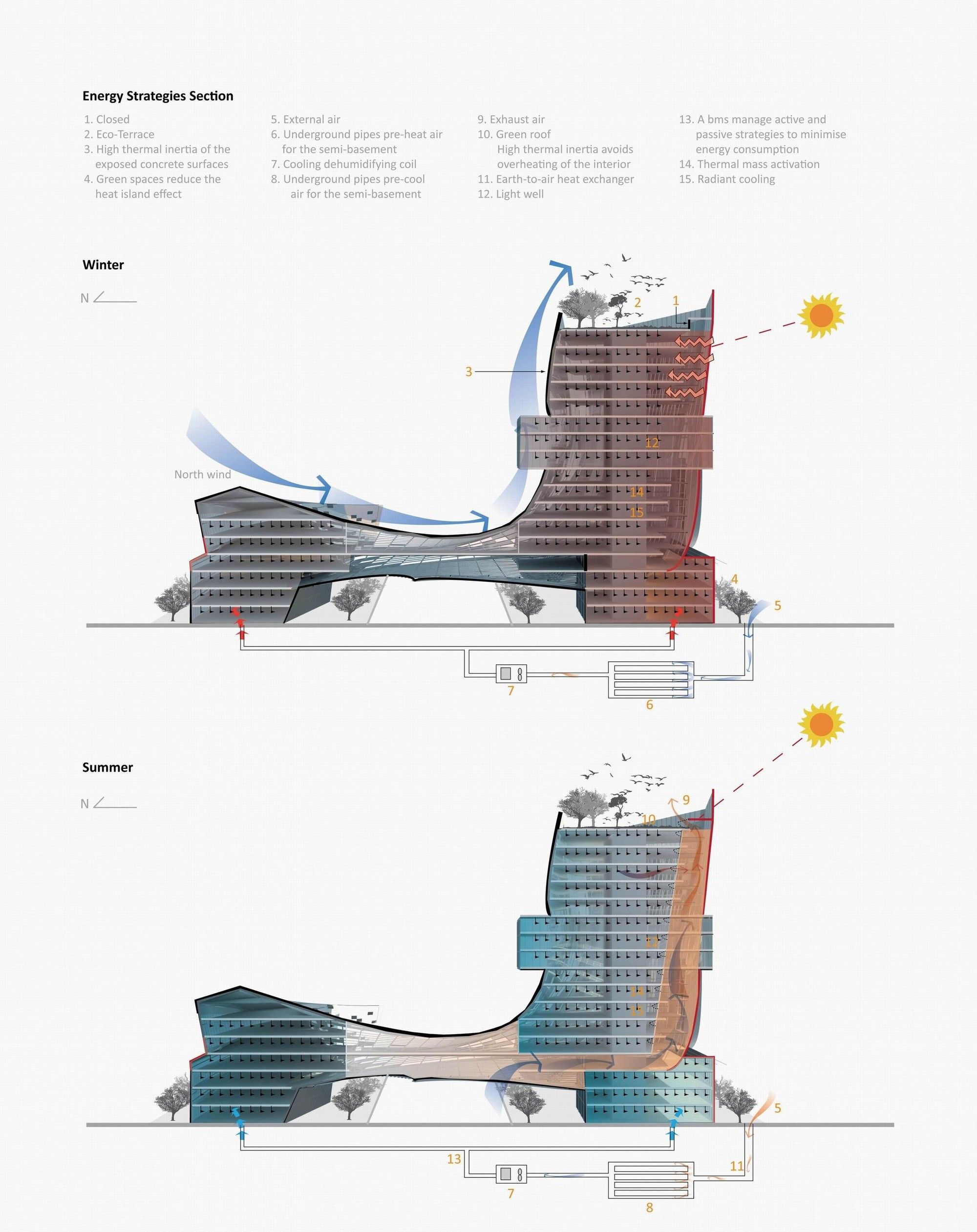
The placement of the blocks minimizes shading of neighbouring buildings. The building employs stack effect ventilation with the use of a light well which also brings in natural light. Geothermal, radiant cooling and green roof are other methods used to manage the temperature. The form has been designed to naturally ward off northern winter wind. The roof ventilation ports can be closed during winter to conserve heat.
With respect to its prime location, the building will have a major impact on how this area is viewed. The Northern as well as the South-West block form a beautiful composition together. However, when looking at the building from the east end of the street, the block right in front completely twists out of form, creating calligraphy in its expression. This brings certain questions to mind- does this make the building outright bizarre or an artistic sculpture; a senseless form or a landmark? ; Would the outlook of the building have been better if the curvature of the form was more subtle and less dramatic? ; Or will the Centre simply and without a doubt be an icon, a stunner?
Architects: J. J. Pan & Partners
Location: Wangjing, Chaoyang, Beijing, China
Architect In Charge: Joshua J. Pan, Chungwei Su
Design Team: Robin C.K. Tang, Yen-Chi Hsu, Chia-Yu Hong, Lee-Jen Lin, Yi-Chen Yuan, Hsin-Chieh Shen
Client: BAIC Group
Photographs: Courtesy of J. J. Pan & Partners
By: Sahiba Gulati
Courtesy of J. J. Pan & Partners
Courtesy of J. J. Pan & Partners
Courtesy of J. J. Pan & Partners
Courtesy of J. J. Pan & Partners
Courtesy of J. J. Pan & Partners
Courtesy of J. J. Pan & Partners
Site Plan
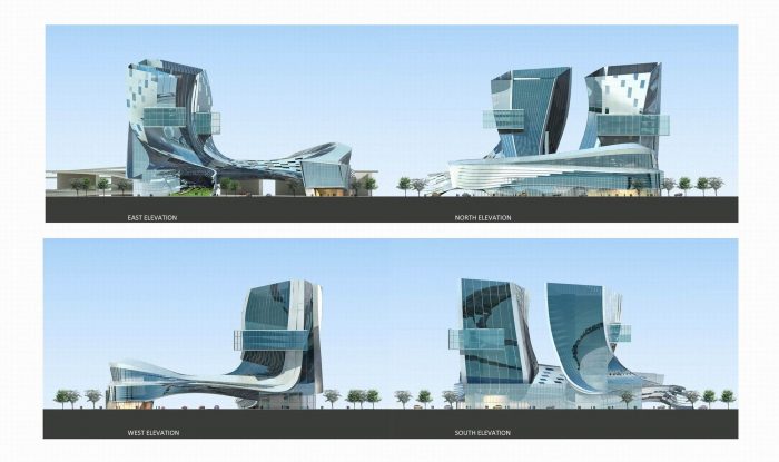
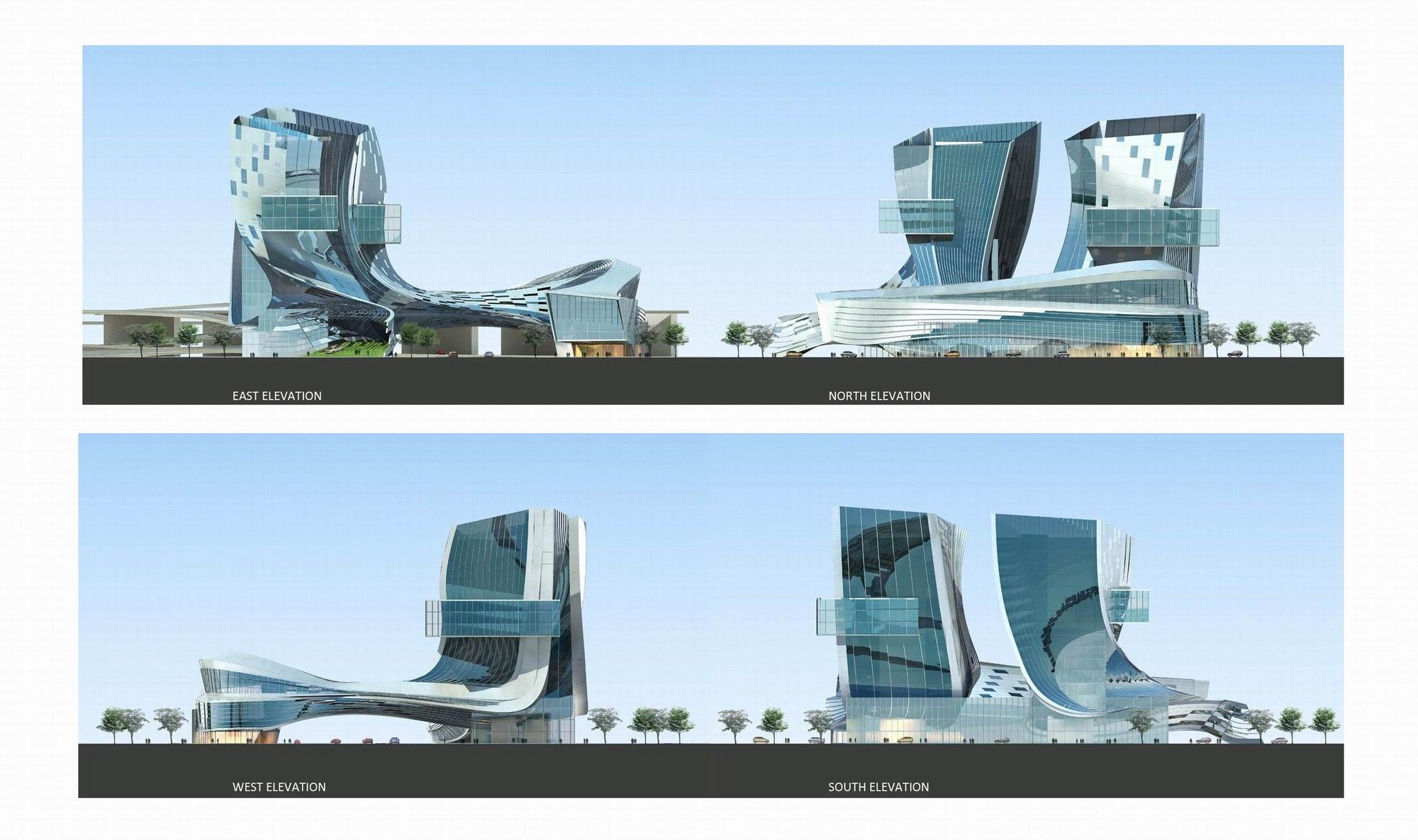
Elevations
Structural Diagram
Energy Section
The Building form as it relates to Chinese calligraphy
The Building and its Relation to Calligraphy


