BetterLife Group Headquarter
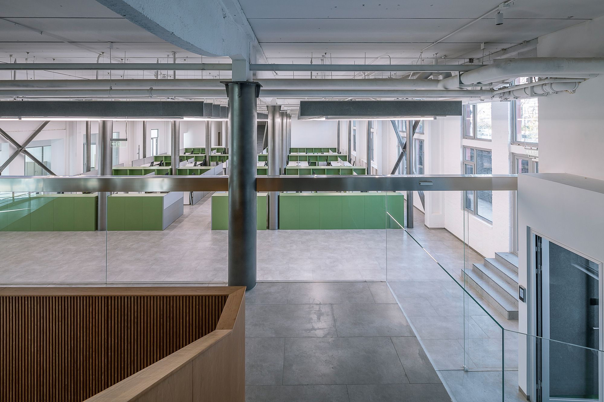
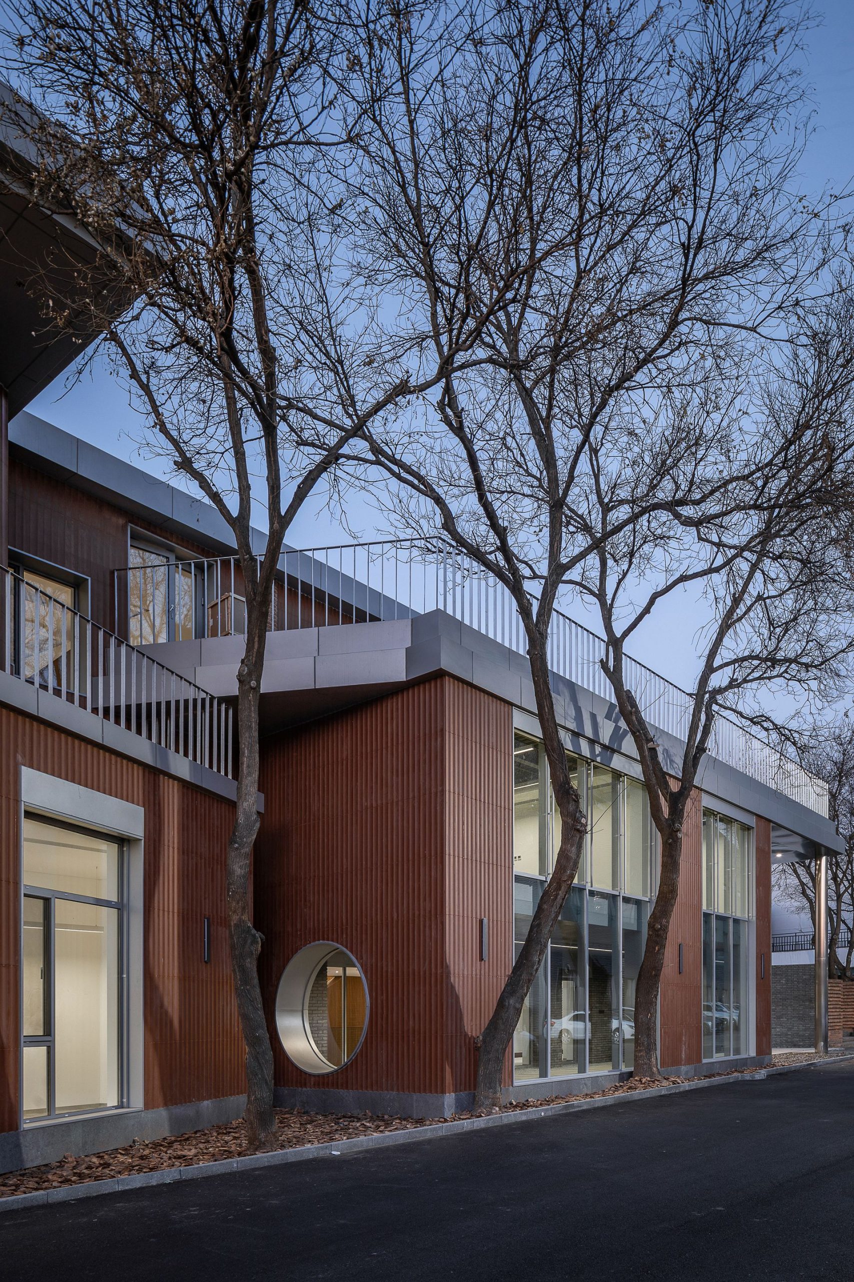
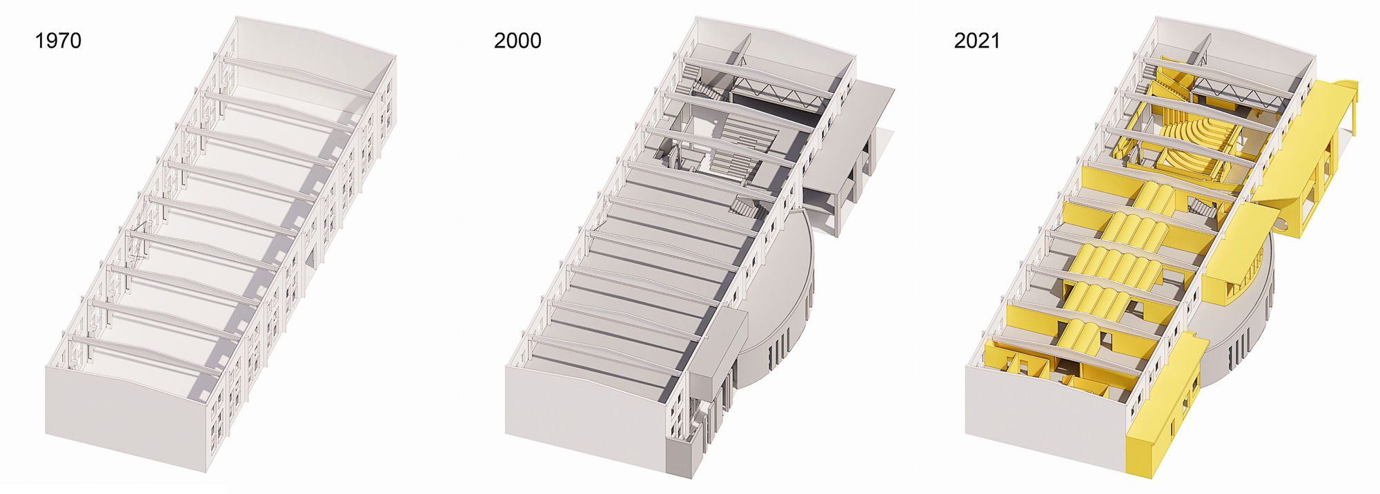
Erected in the early 1970s, before China opened its economy, the building was designed to house manufacturing activities for metallurgy spare parts. As with most factories of the time, the utilitarian rectilinear structure is laid with red bricks in a common bond, well-fenestrated with evenly spaced windows. Plenty of steel–concrete columns, truss, and beams throughout the interior remain to this day to support the building.

Photography © Weiqi Jin
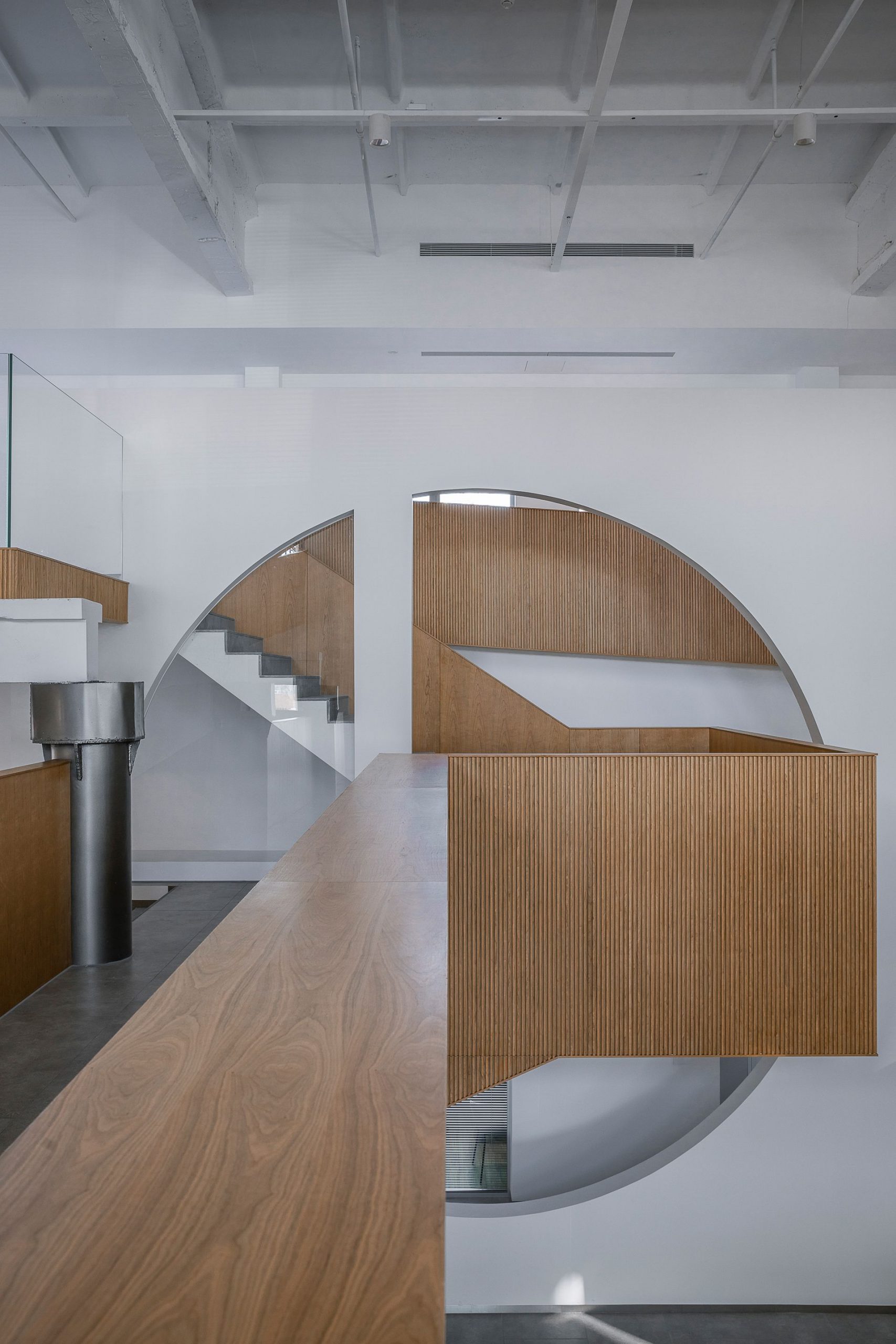
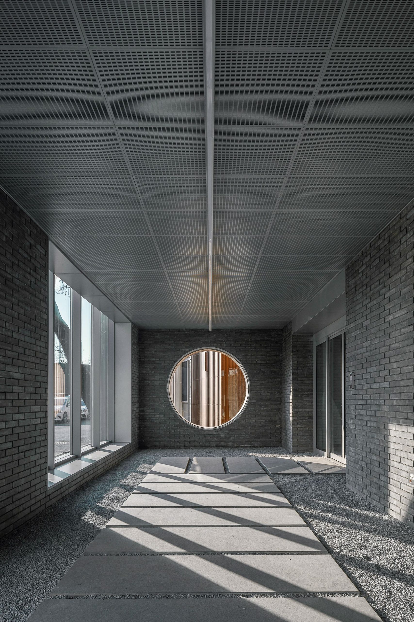
Its last occupant, a local architecture company, moved into the factory 20 years ago and added floor areas by extra mezzanine levels and a second story. Referencing historical architectural elements, the last designer blew up a circular frame traditionally seen in Chinese courtyards, asserting a cultural character right across the lobby.
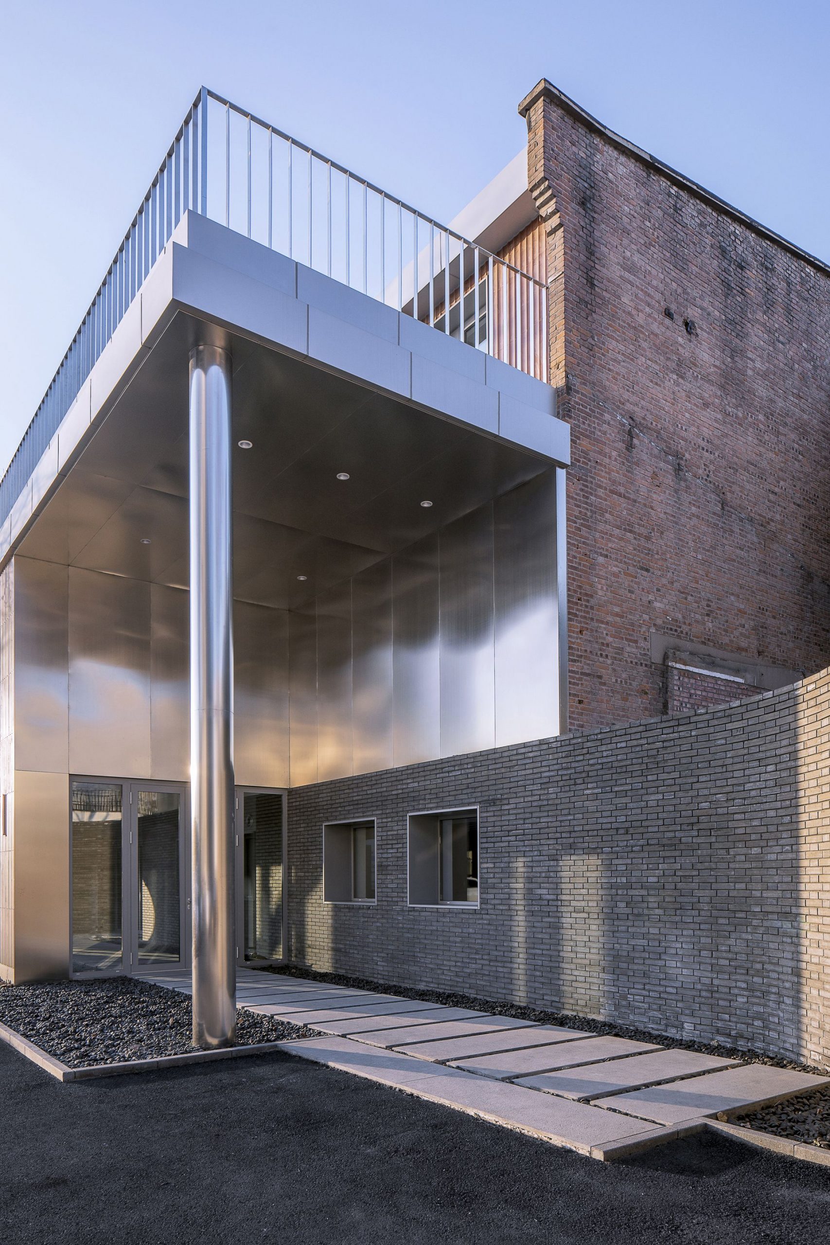
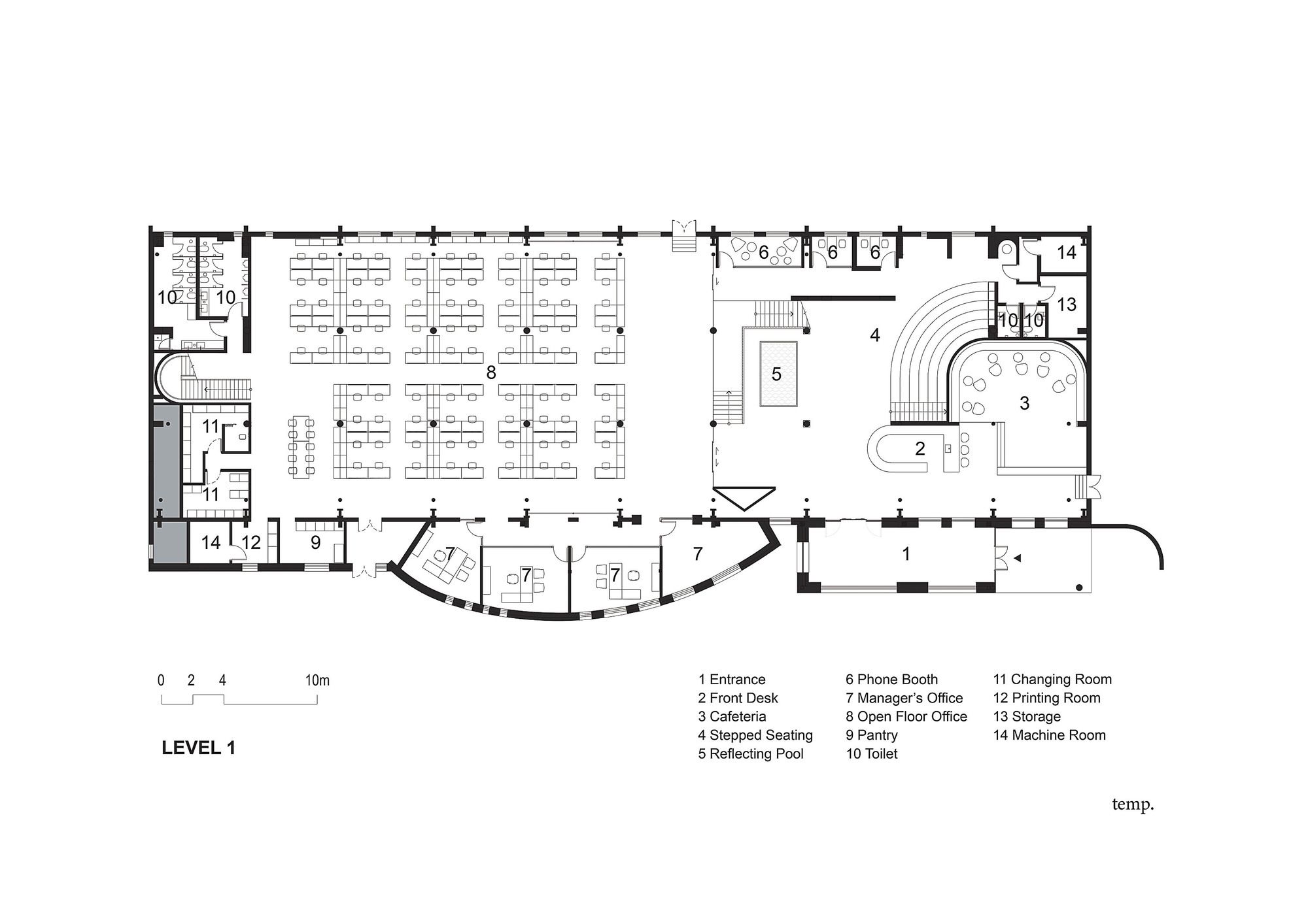
The new headquarter will not only be an office. Partners of BetterLife will visit to foster long-lasting business relationships, and employees will be here to explore the potentials of a dynamic business environment. To adapt, the entrance is refurbished with a reflective stainless-steel box and column hang, under which a curvilinear wall band of grey bricks and step stones roll out beyond the building’s original boundaries to draw attraction.
Photography © Weiqi Jin
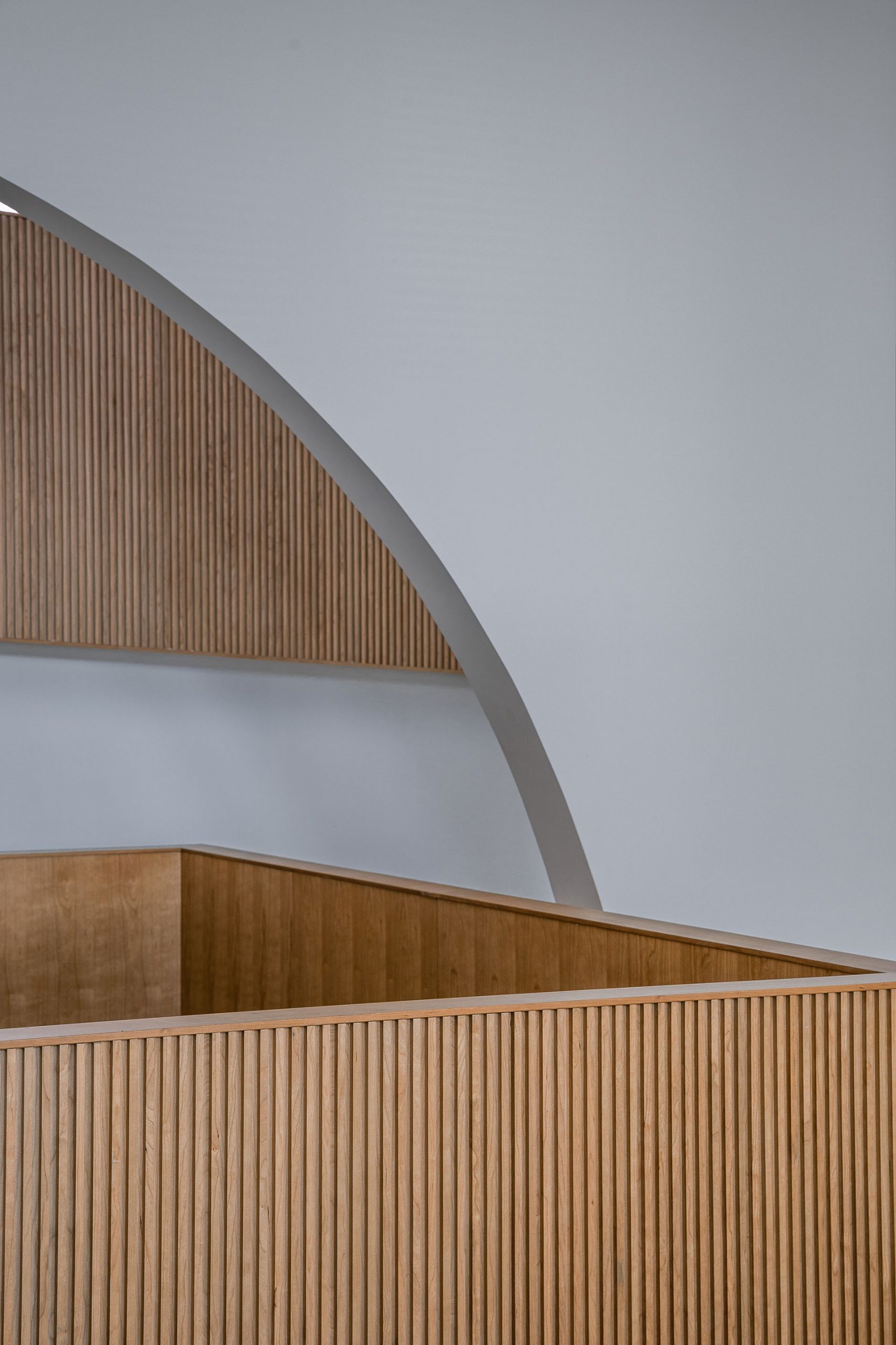
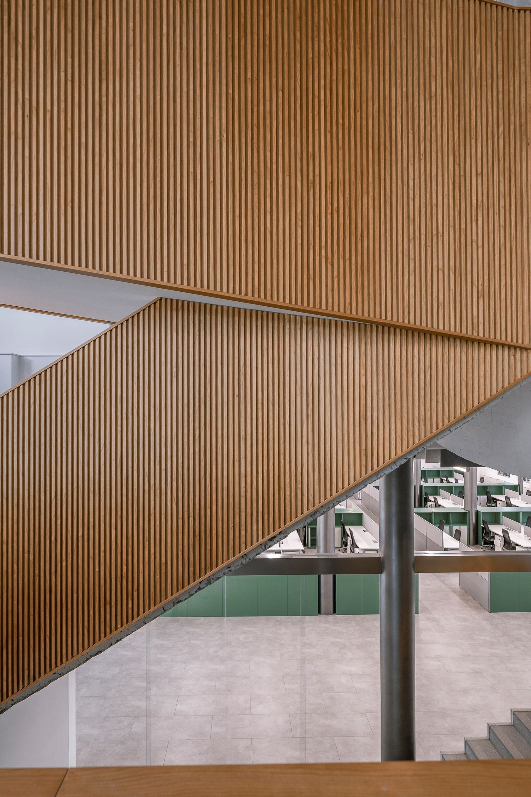
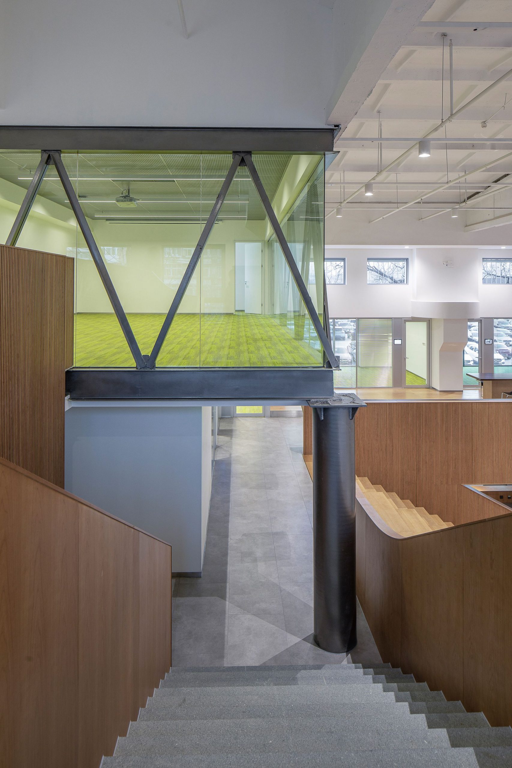
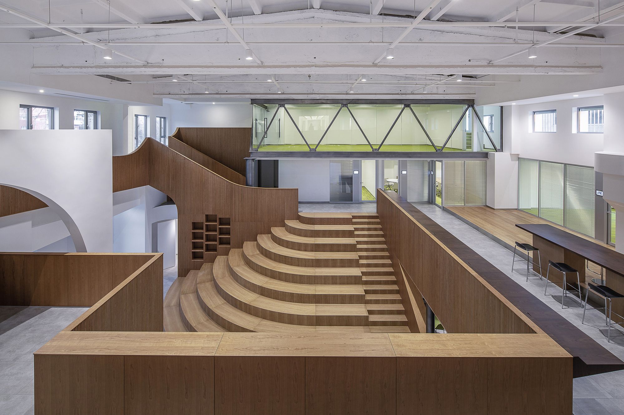
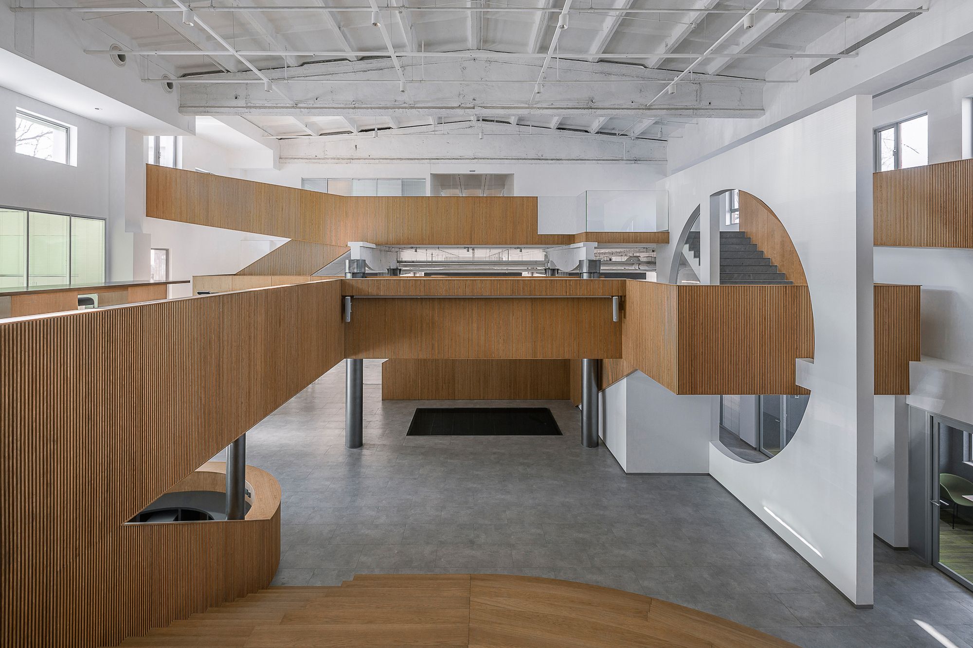
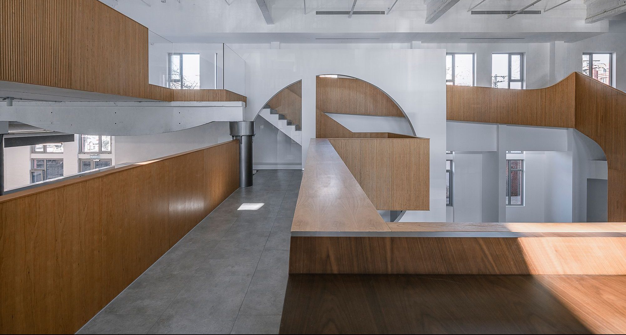
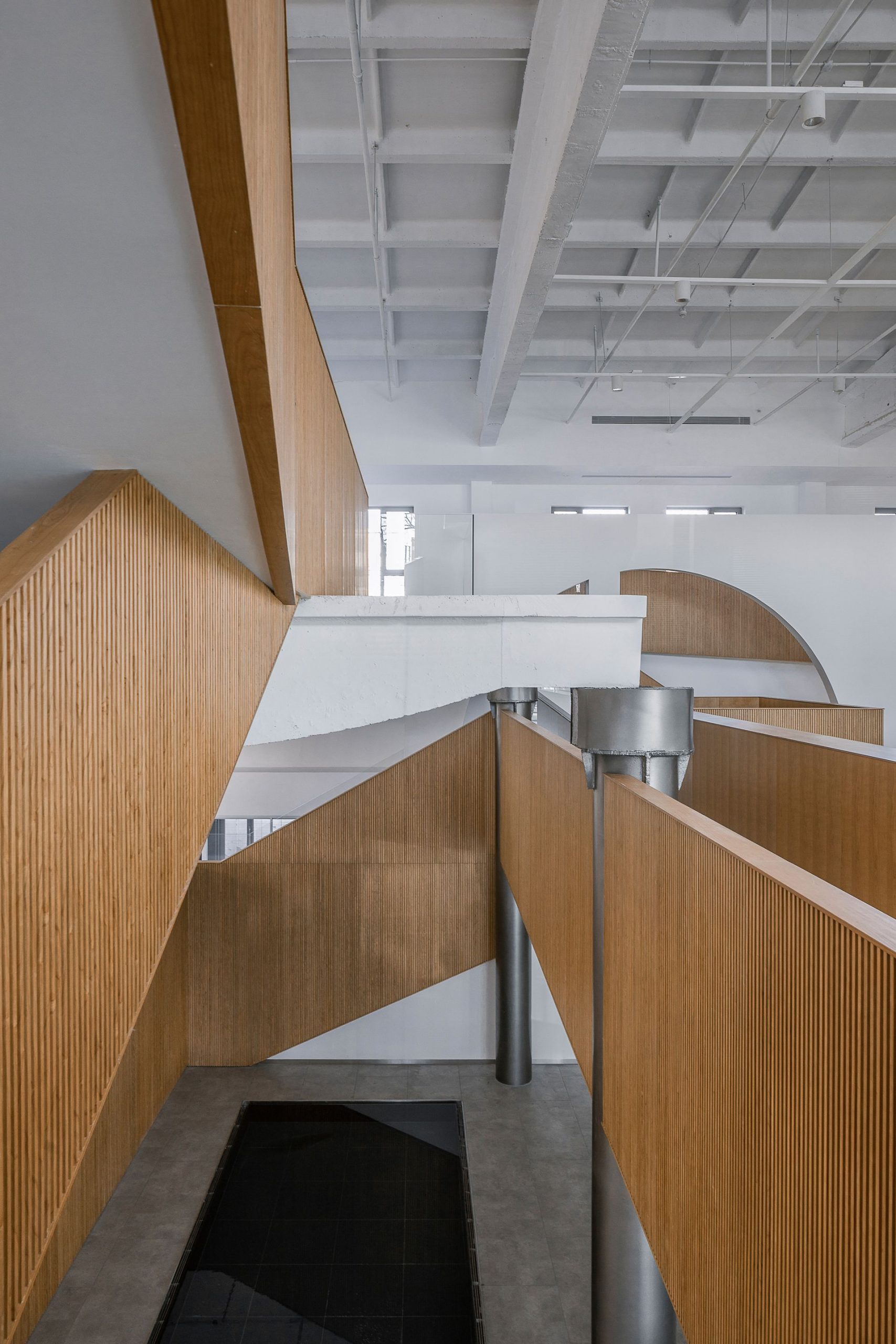
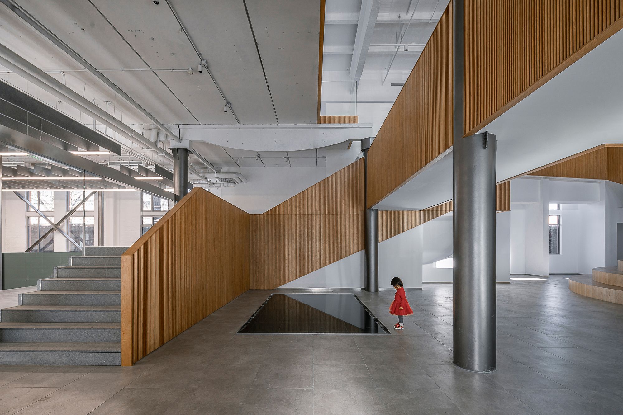
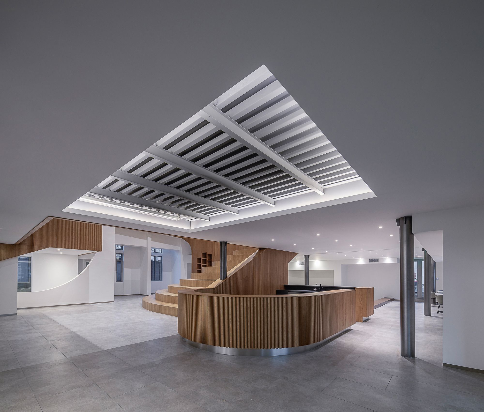
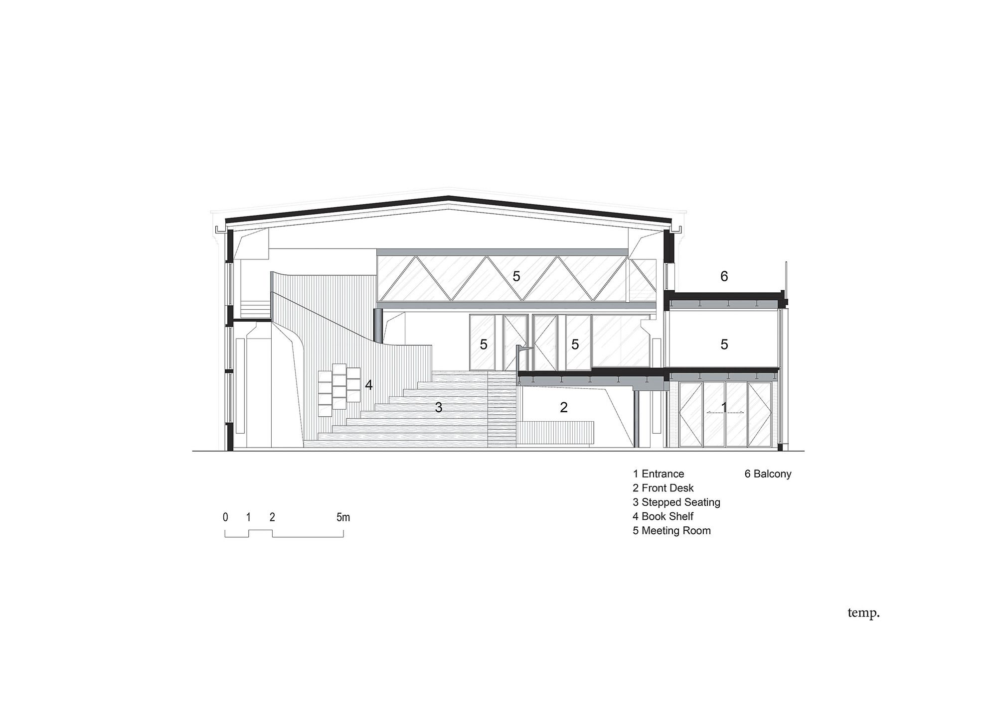
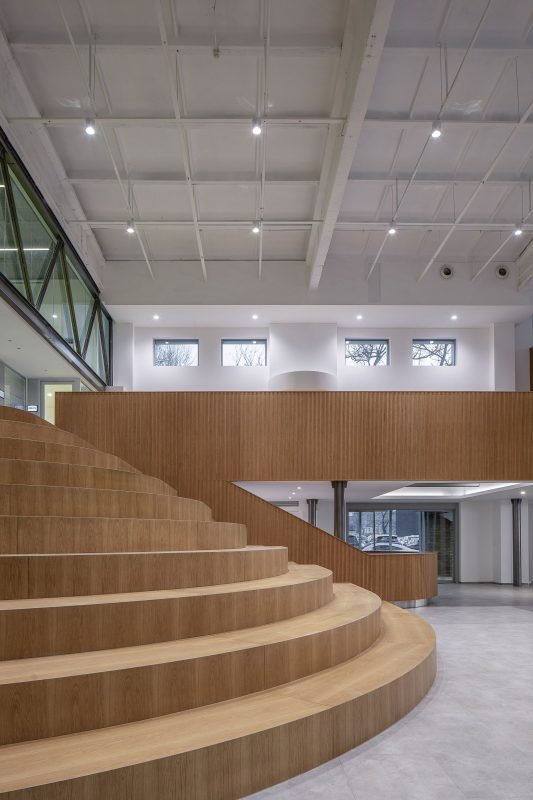
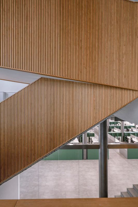
Unifying the space and adding solemnity, wooden railings are installed to connect and redefine the original structure‘s various levels of stairways and elevations. The same facing extends to its step seating and curves around the reception desk. The resultant dramatic wooden ribbon, against white walls and beams, flows through the hall and the extra-large circular frame.
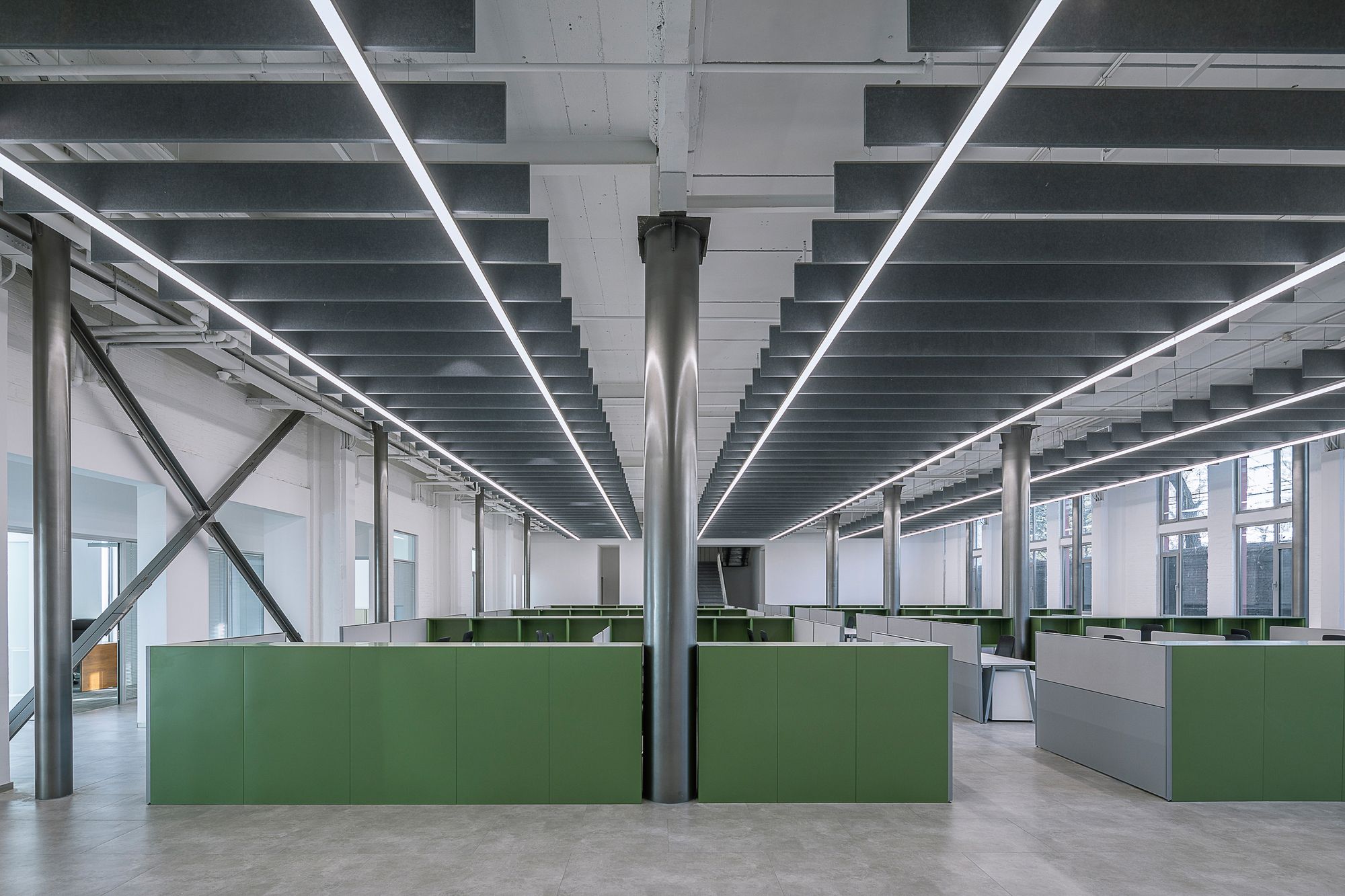
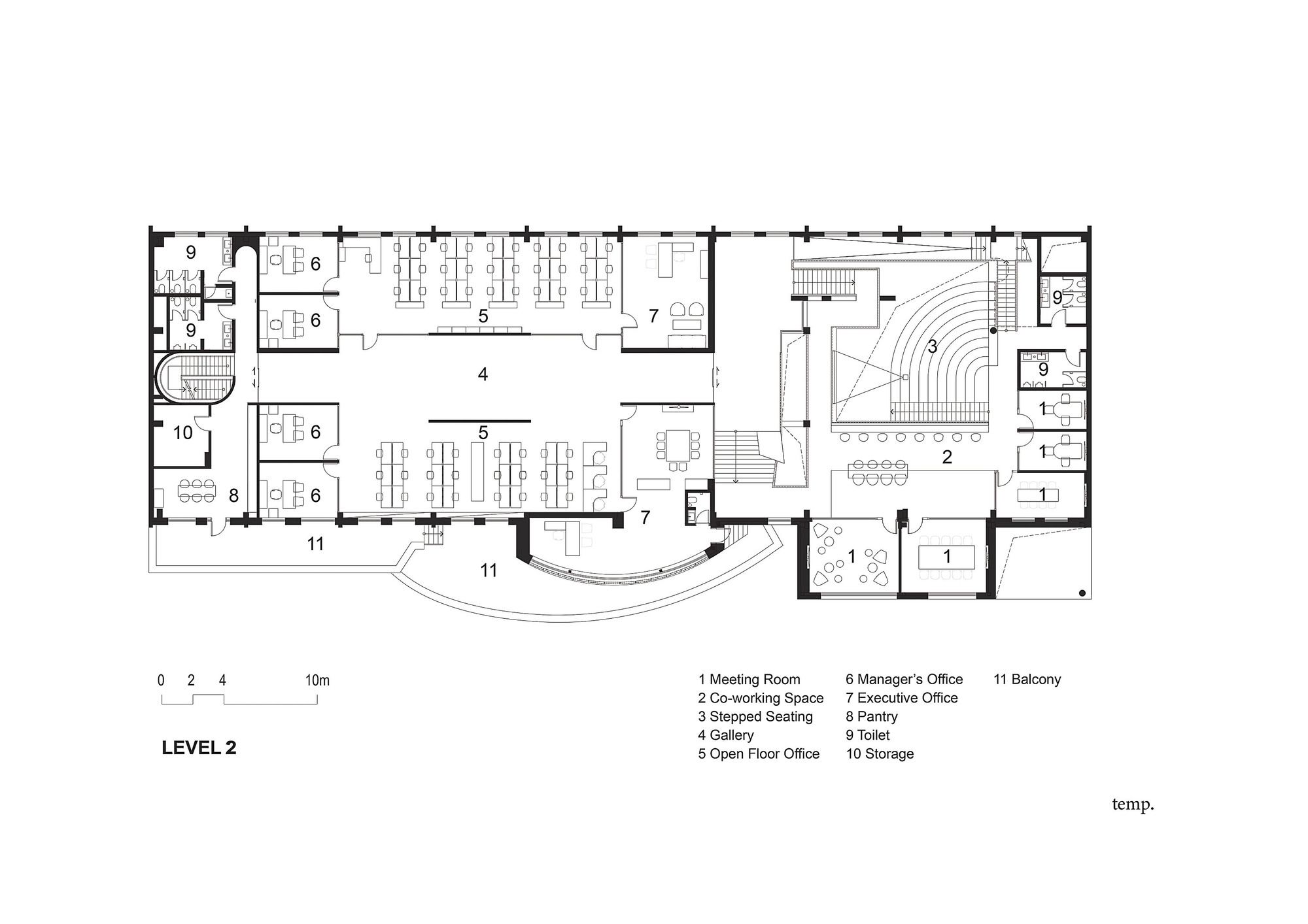
It elegantly acknowledges the contribution of its precedents, binding the remnants of time. Next to the atrium, behind a glass partition, a large hall will seat employees from various departments. Green cabinets and workstations are organized around existing steel columns to set a grid of an open plan layout. A railway-like system hangs sound-absorbing panels and suspended strip lighting, connecting the workforce visually and garnering spacious unity.
Photography © Weiqi Jin
Amenities such as conference halls, café, and social areas are implemented with interest, adapting to the building’s new occupants of managerial and strategic focus. Its new identity is not only one of innovation upon its ground but also an enrichment of the working experience with exploration, clarity, and perspectives.
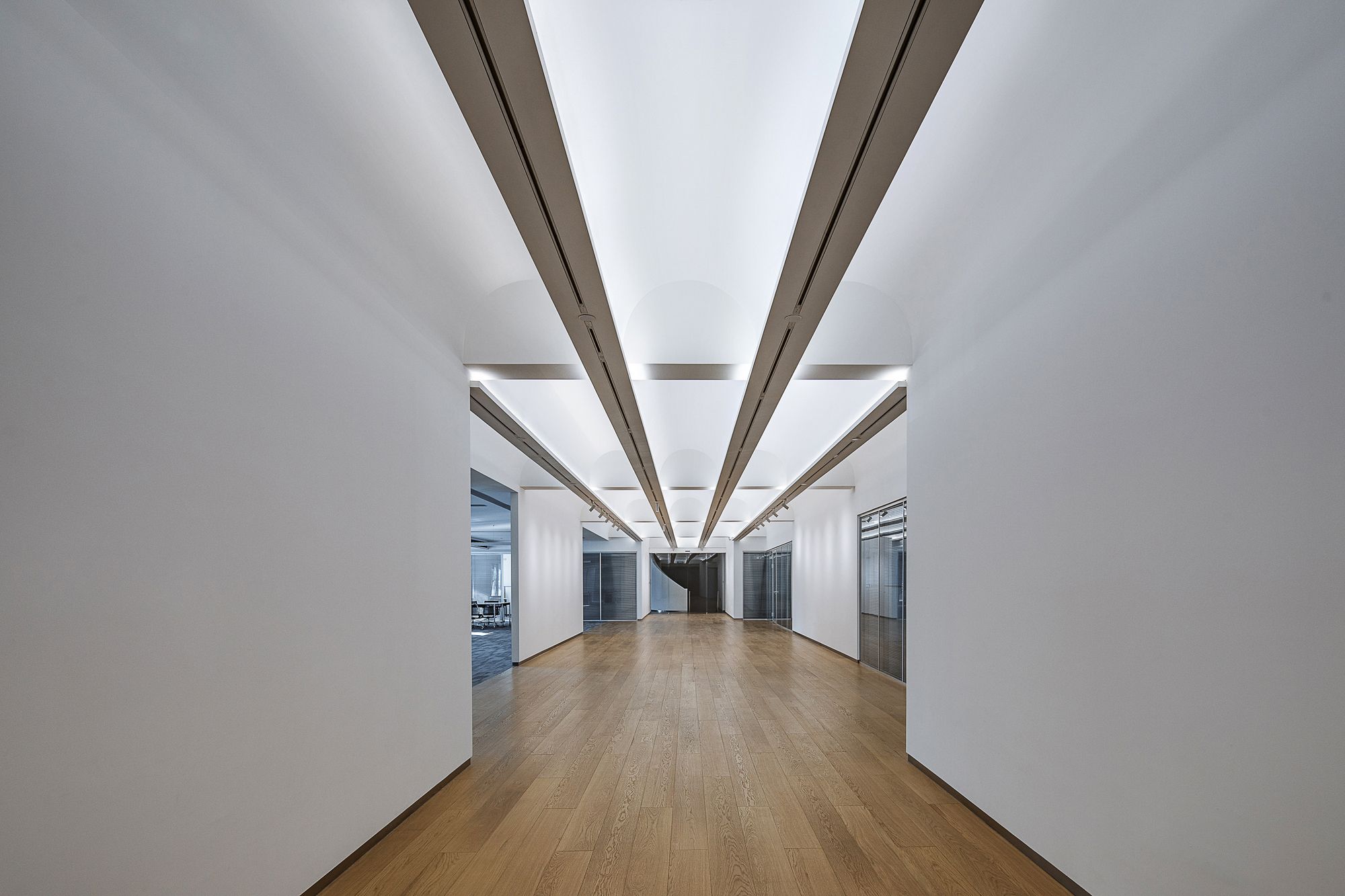
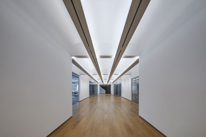
From double-height porches to an intimate pathway leading up to generous step seating and walkways, the journey through the headquarter captivates by its variation of scale. A central corridor on the second floor features a modulating number of arches with embedded track lighting, introducing visitors to various executive offices and meeting rooms. On the opposite side, a drastically different circulation sets off greatly in size with a narrow spiral staircase.
This curvilinearity, apparent in its arches, wooden ribbon, rounded step seating, and reception, softens the rigid industrial structure. Between the contrast of scale, lines, and past occupants, this renewed 50 years old edifice creates an office space that would be hard to attain on a contemporary high-rise, devoid of a ceremonial appreciation of time.
Photography © Weiqi Jin
Project Info:
Architects: TEMP
Location: Beijing, China
Area: 2600 m²
Project Year: 2020
Photographs: Weiqi Jin
Photography © Weiqi Jin
Photography © Weiqi Jin
Photography © Weiqi Jin
Photography © Weiqi Jin
Photography © Weiqi Jin
Photography © Weiqi Jin
Photography © Weiqi Jin
Photography © Weiqi Jin
Photography © Weiqi Jin
Photography © Weiqi Jin
Photography © Weiqi Jin
Photography © Weiqi Jin
Photography © Weiqi Jin
Photography © Weiqi Jin
Photography © Weiqi Jin
Photography © Weiqi Jin
Photography © Weiqi Jin
Diagram
Section
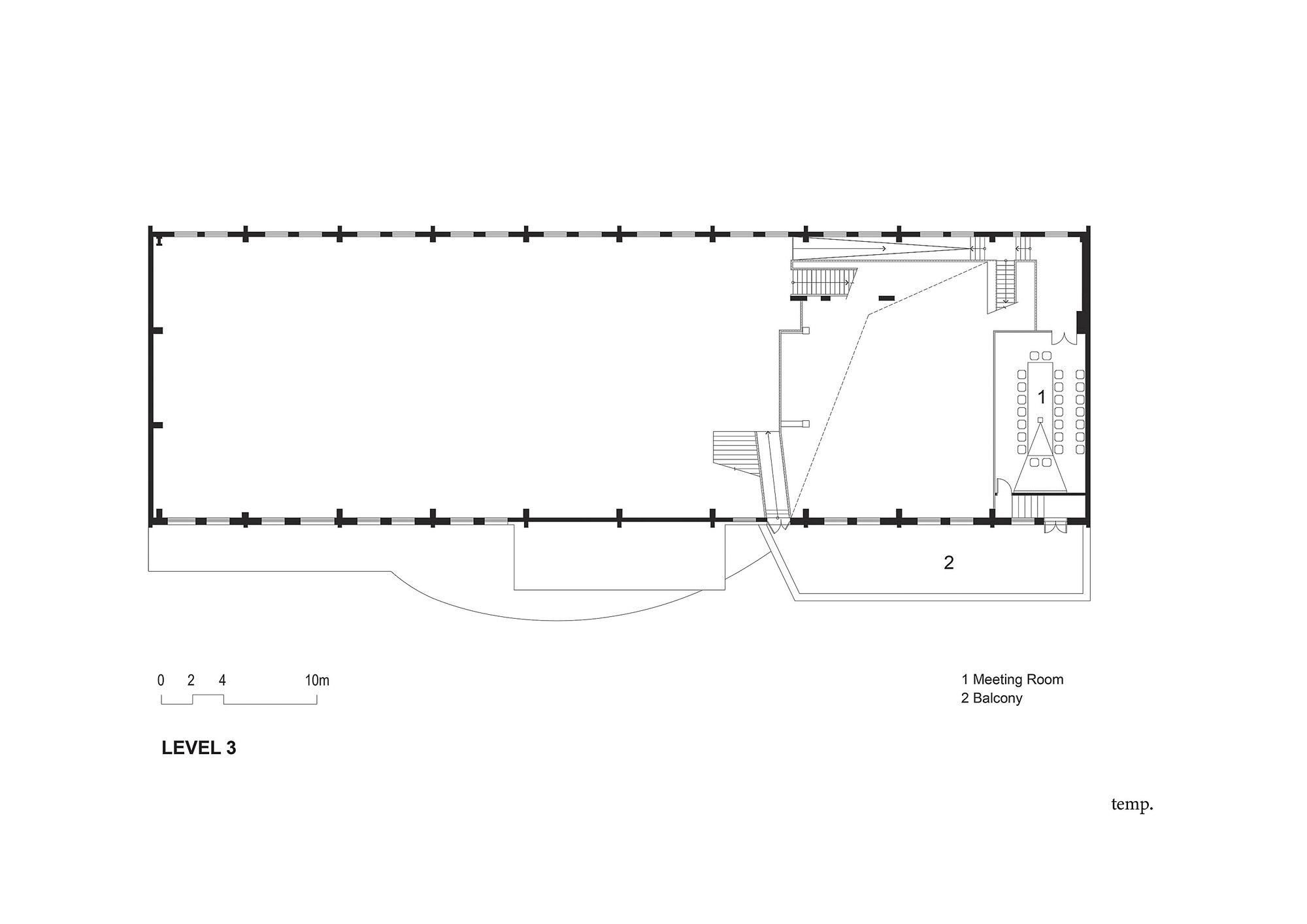
Plan
Plan
Plan


