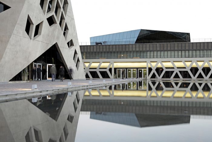
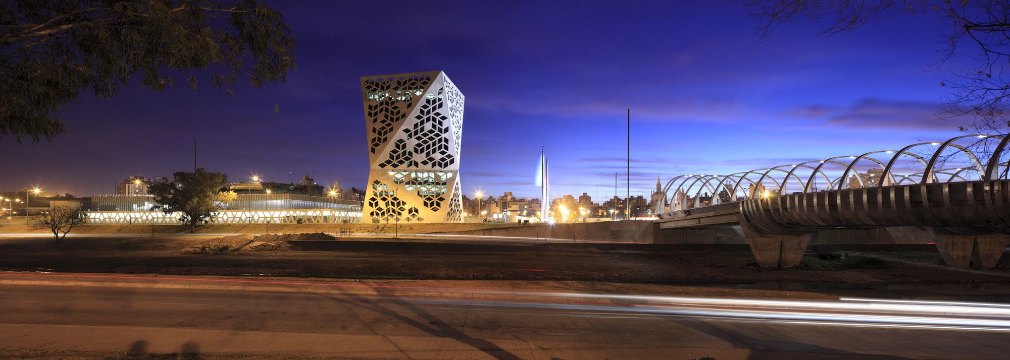
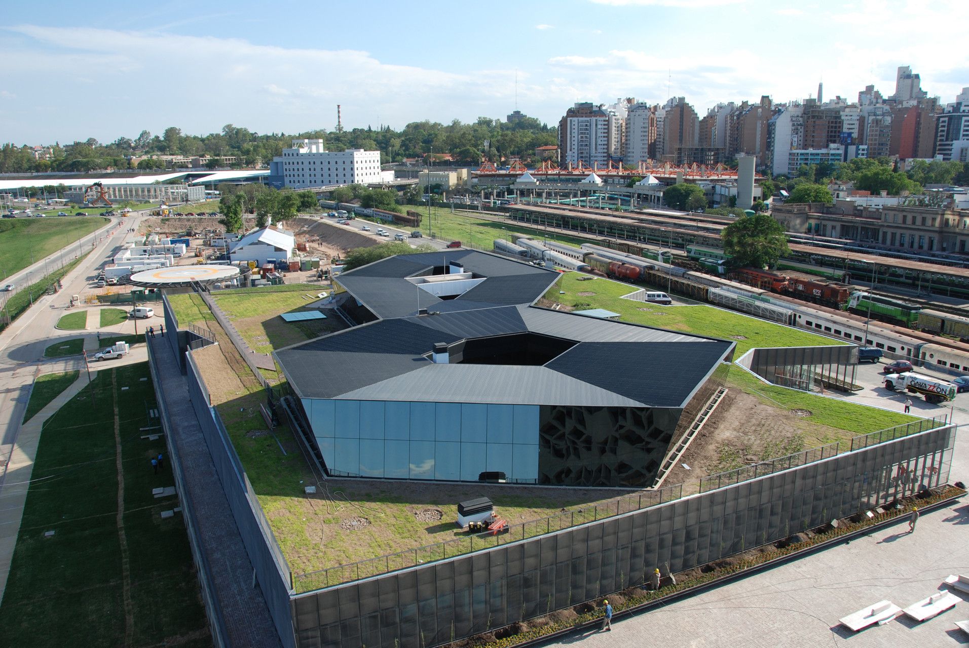
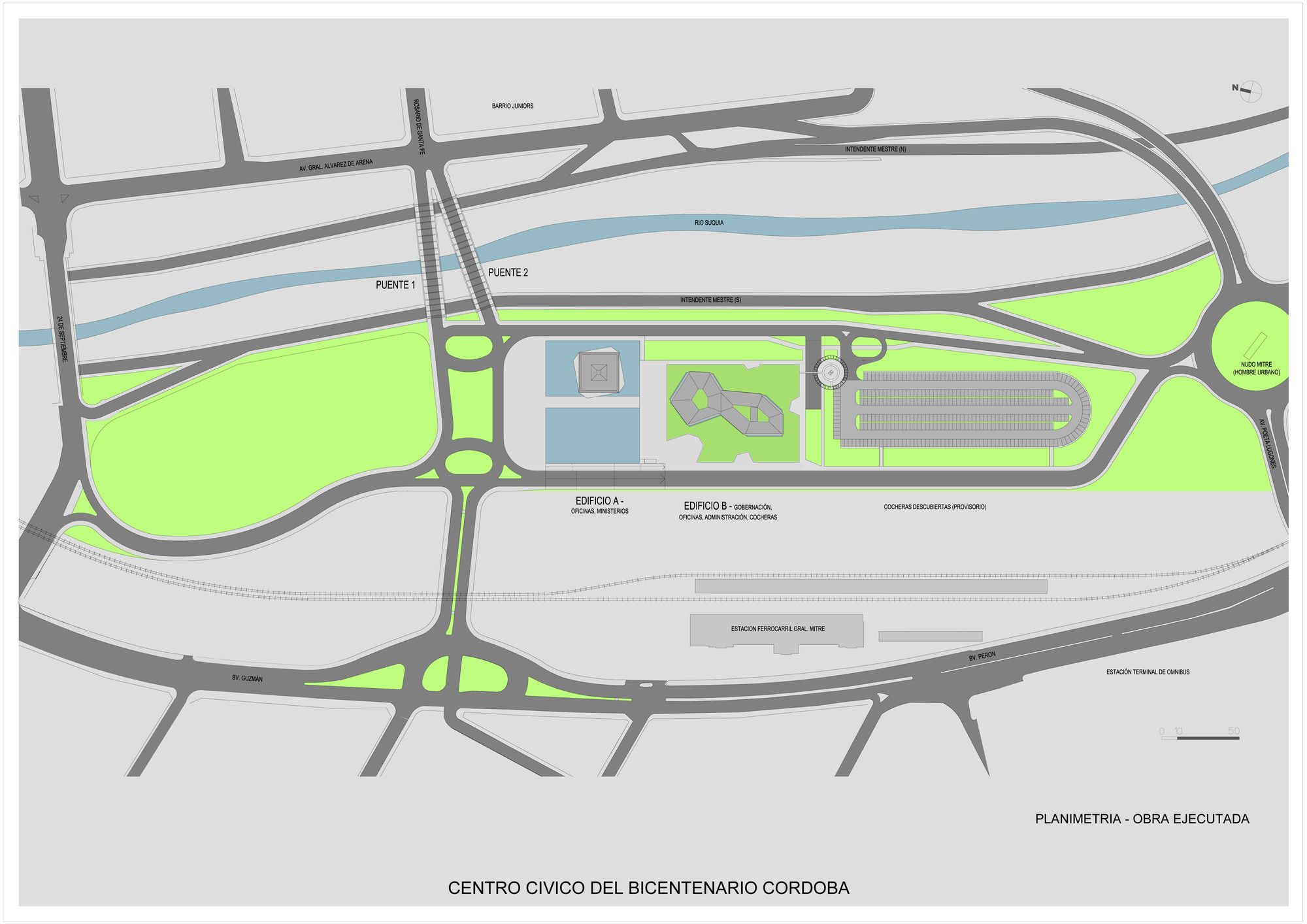
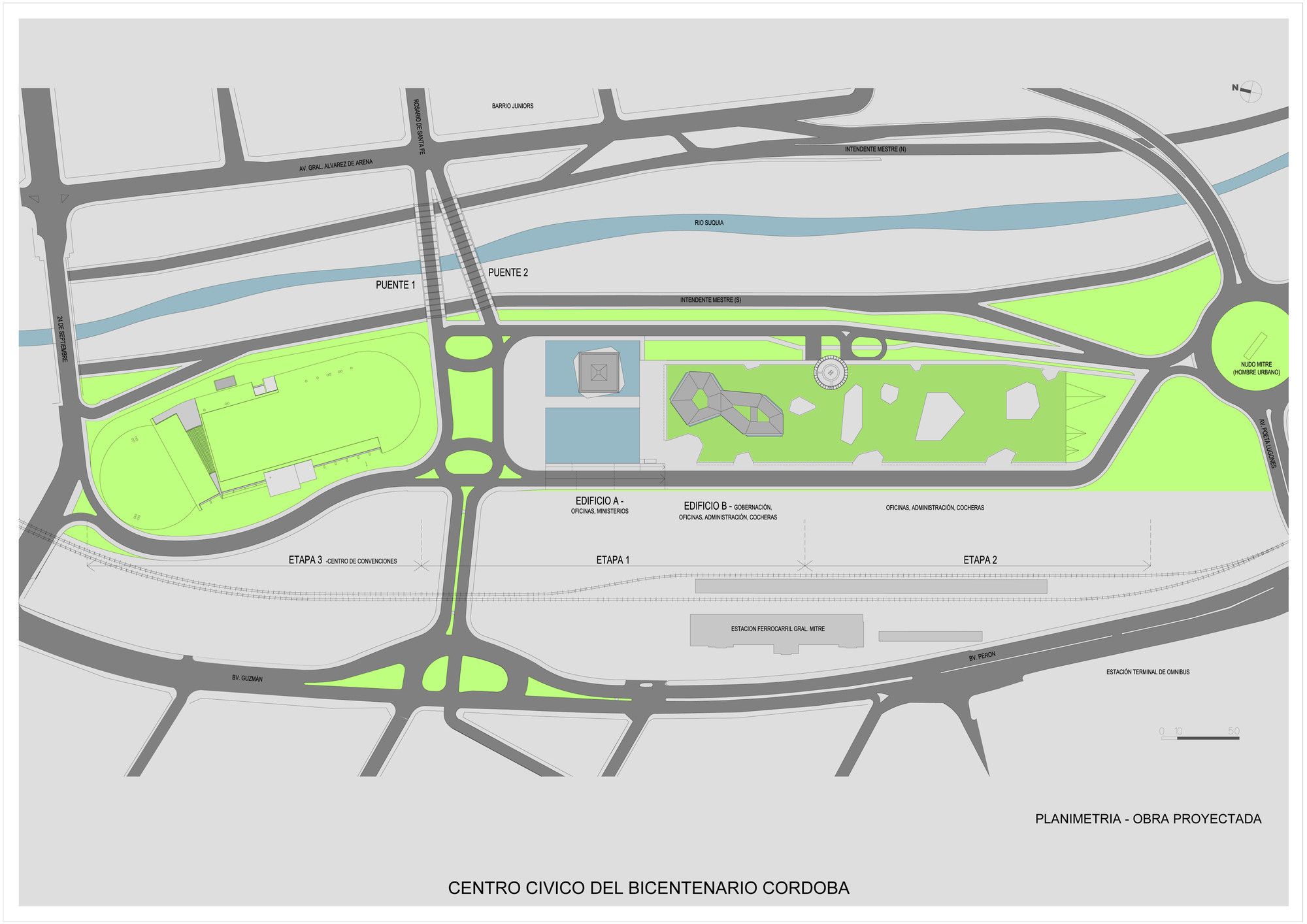
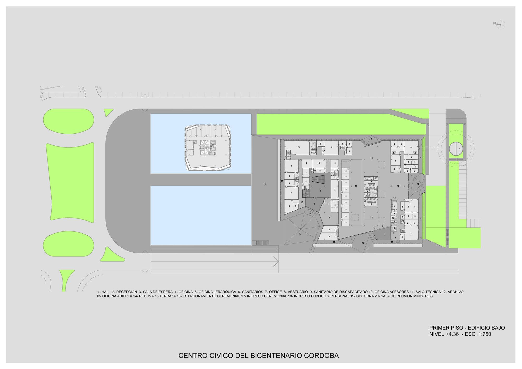
The Bicentennial Civic Center in Córdoba, Argentina designed by Lucio + GGMPU Arquitectos is a project planned to be built in three stages, with stage one consisting of two buildings that have already been completed in 2012. The site is located on the edge of the historic center of the city, on a lot that used to belong to the railway tracks, running adjacent to the River Suquia, which in the past has constituted a physical barrier separating the neighborhoods on both sides of the river. With the new civic center in place, the hope was to diminish the image of the river as a backyard to the city, thus transforming the whole sector into a new downtown front.
The two finished buildings of the completed stage one phase; take up an area of roughly 24,781 square meters. In the second stage the administrative area will be completed, and a Convention Center will be built as a third and final stage to the design. The Convention Center will be partially buried, and will take the shape of an artificial, grass-covered hill, in continuity with the adjacent landscaped areas.
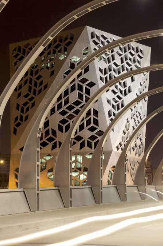
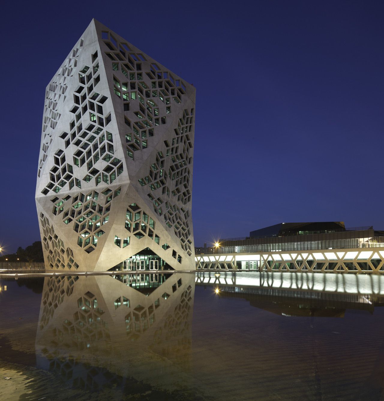
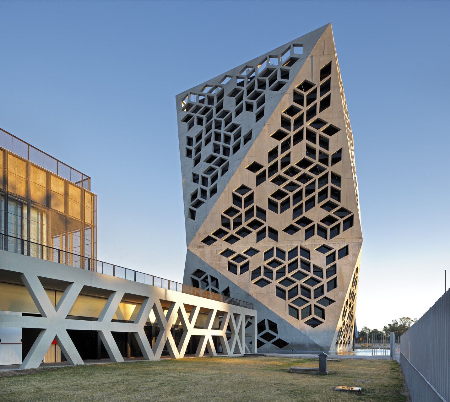
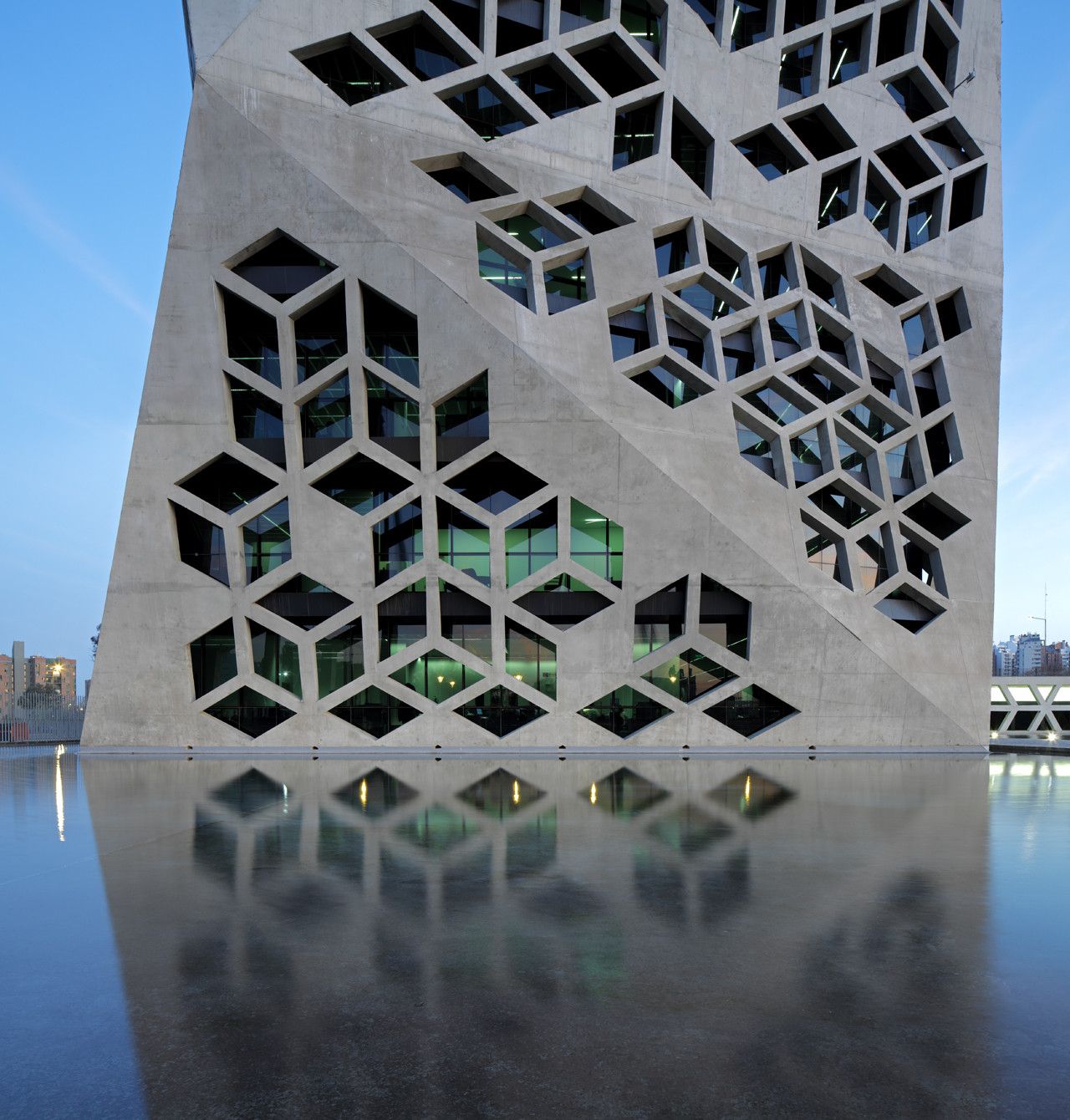
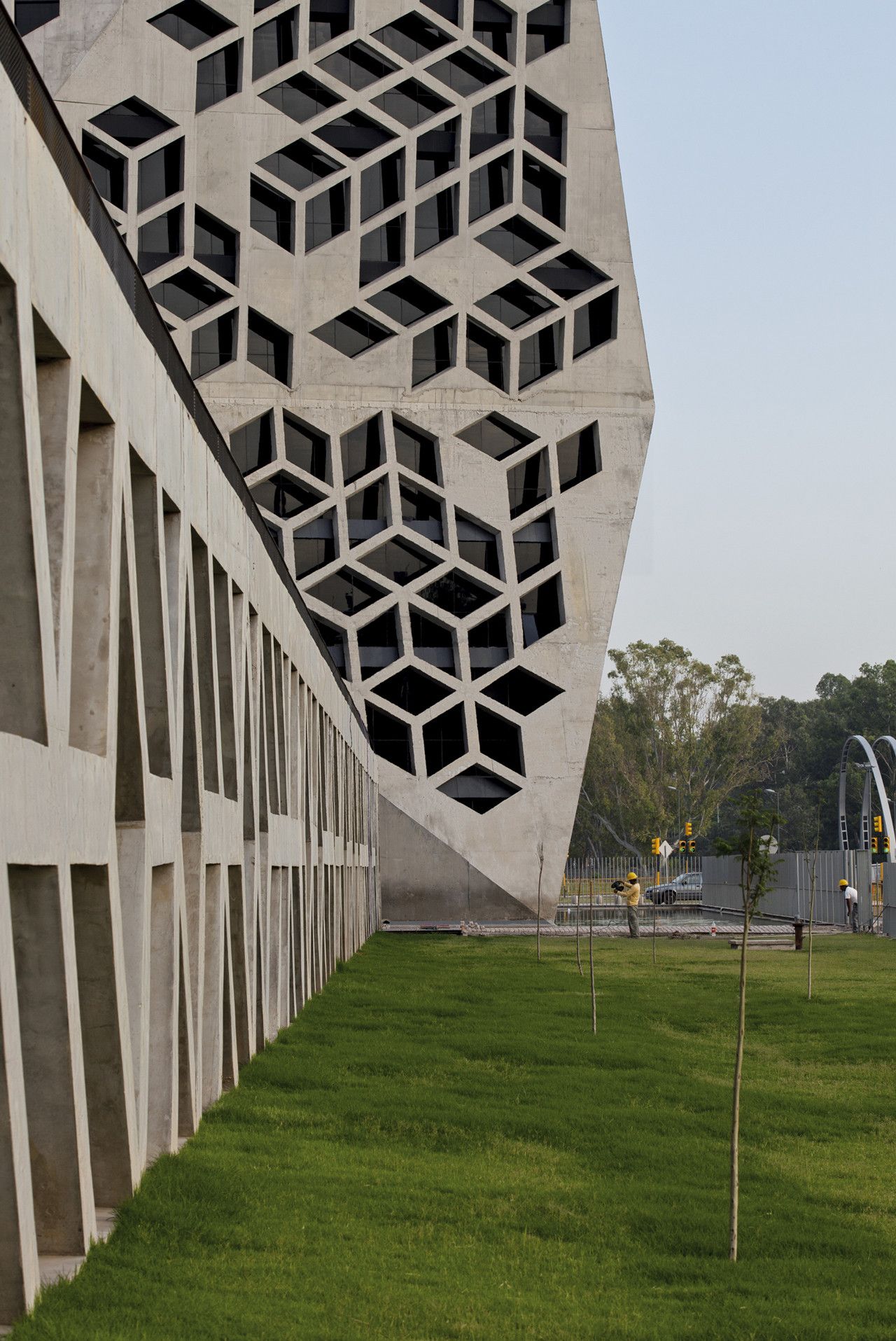
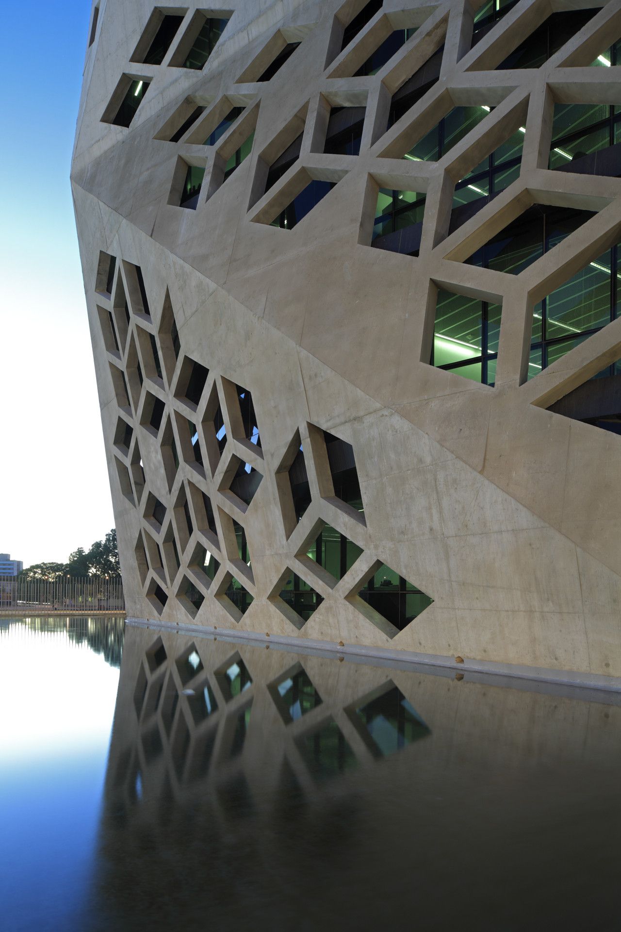
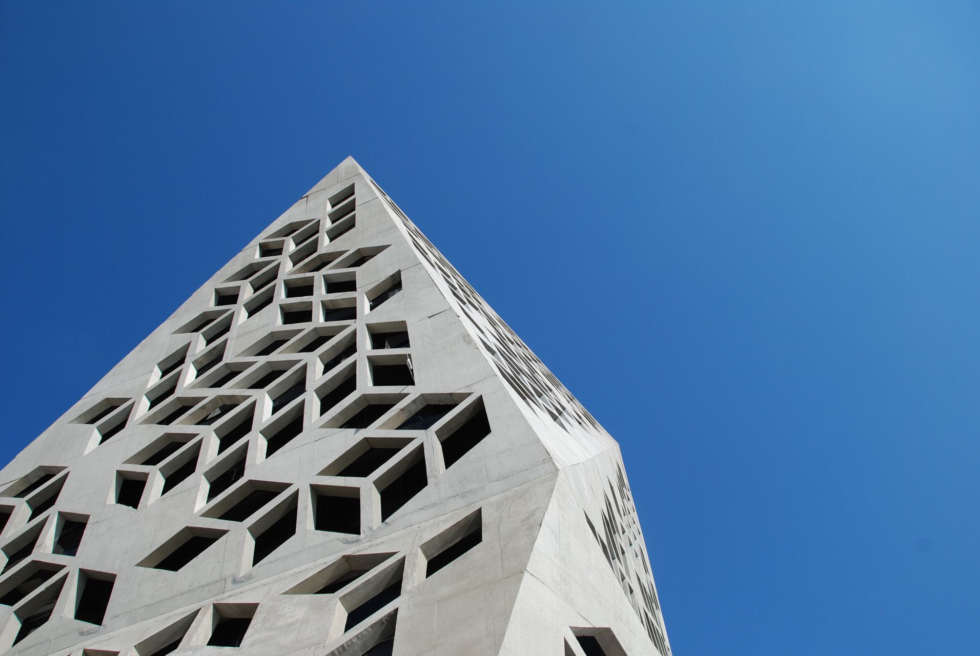
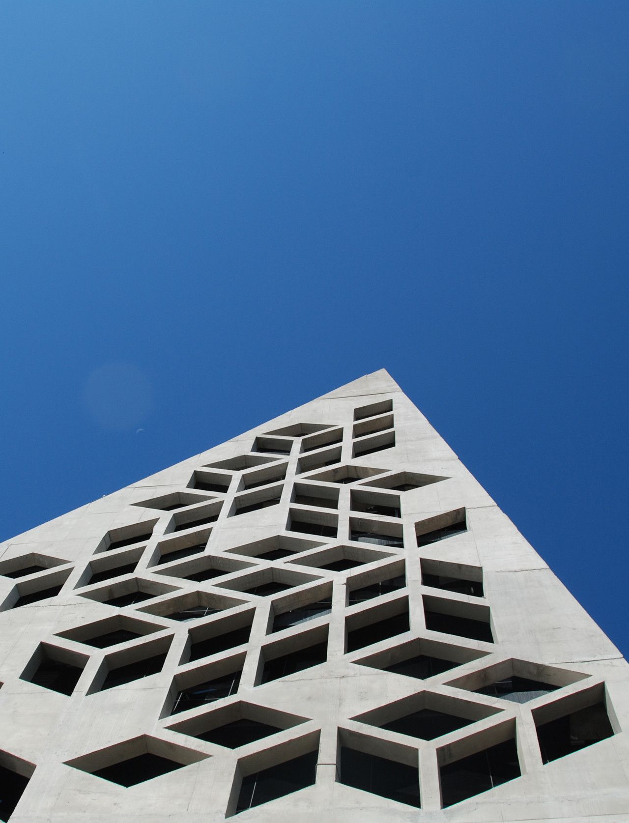
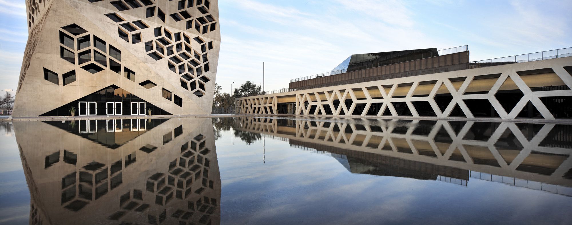
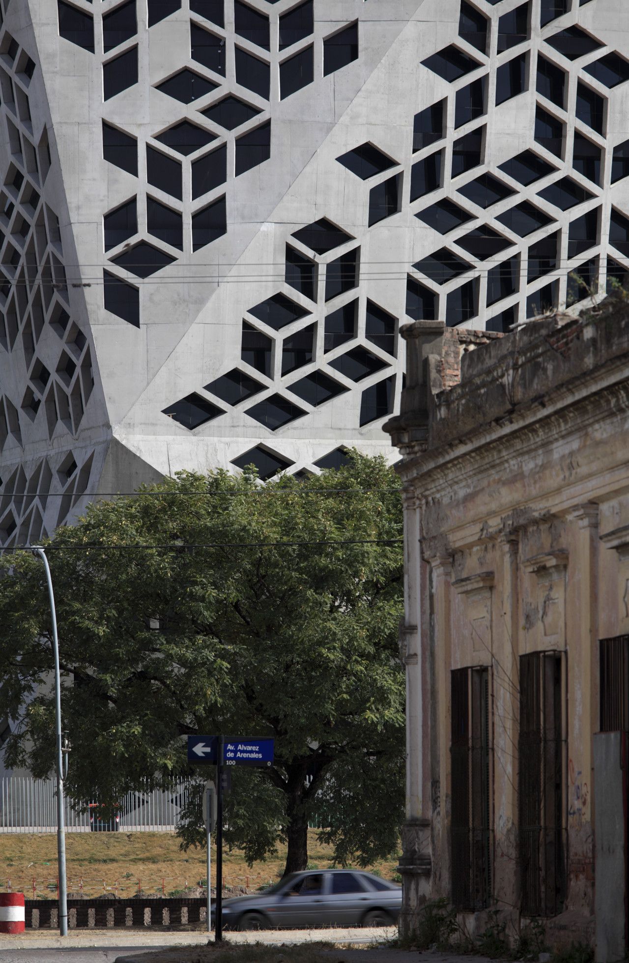
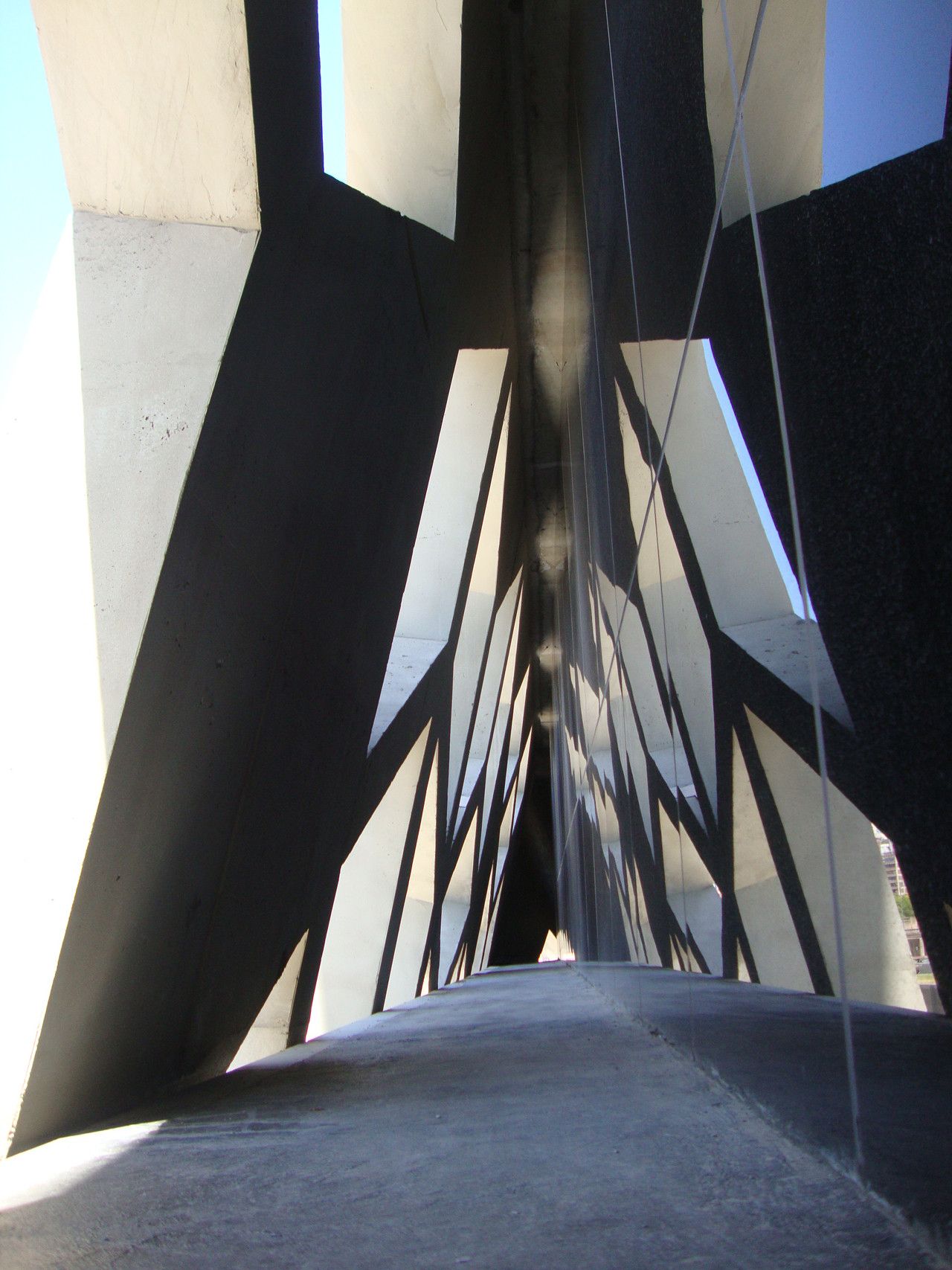
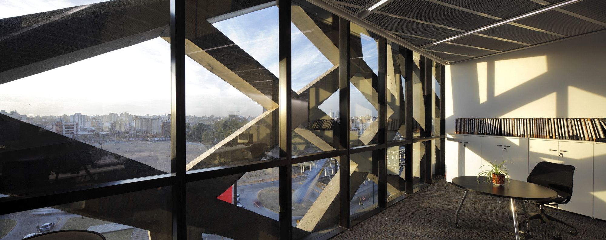
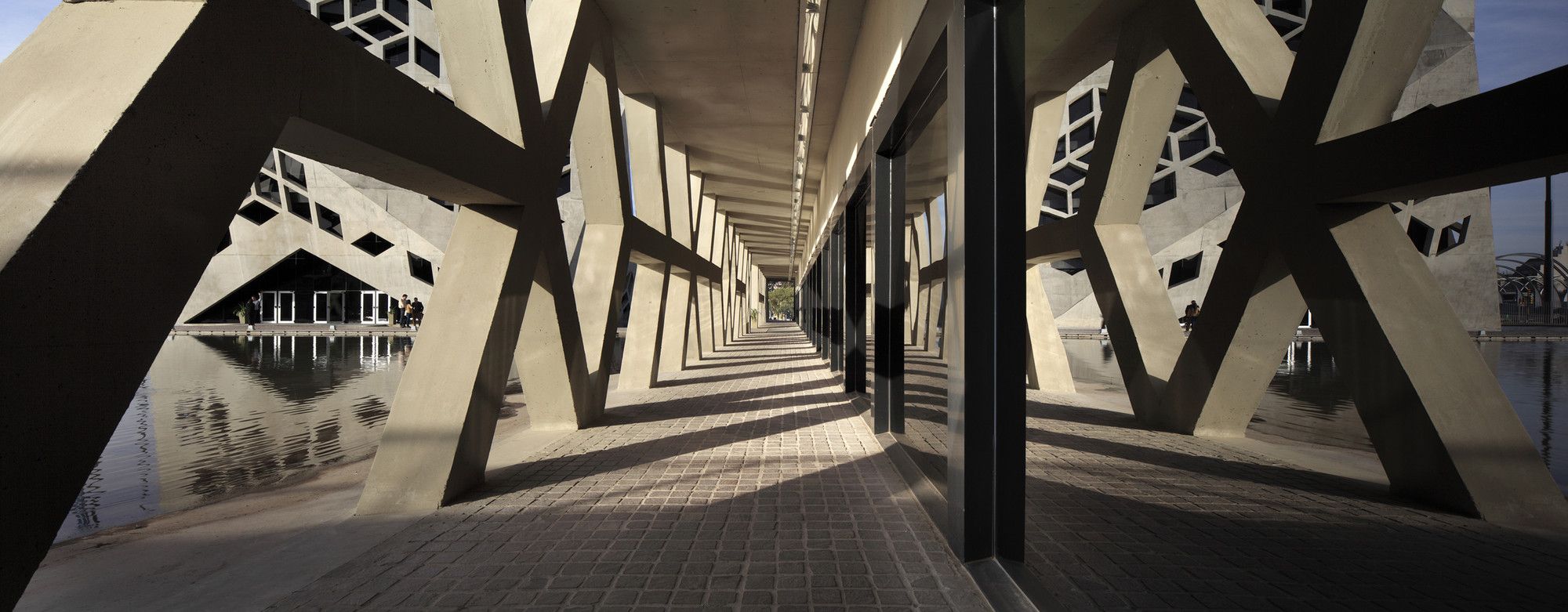
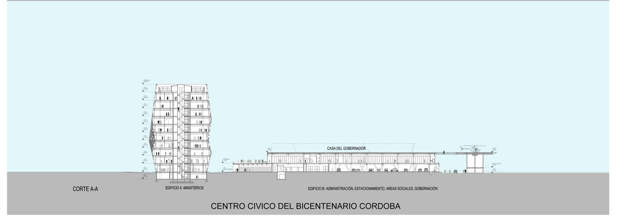
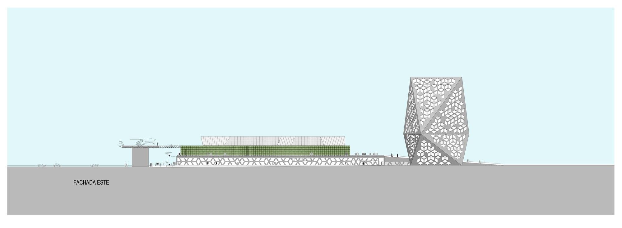
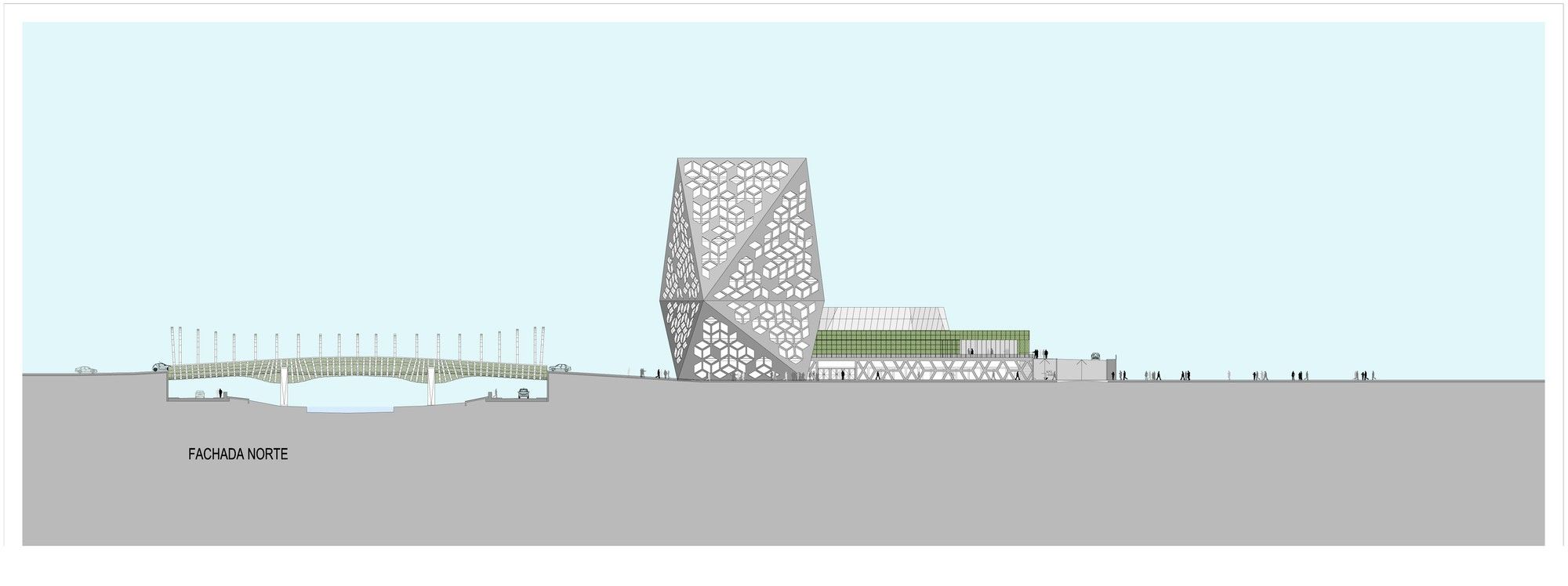
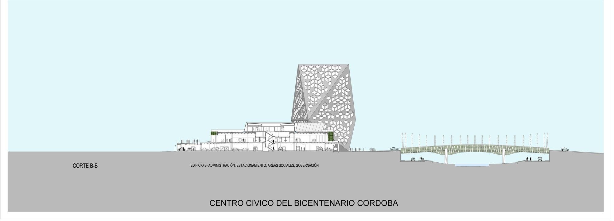
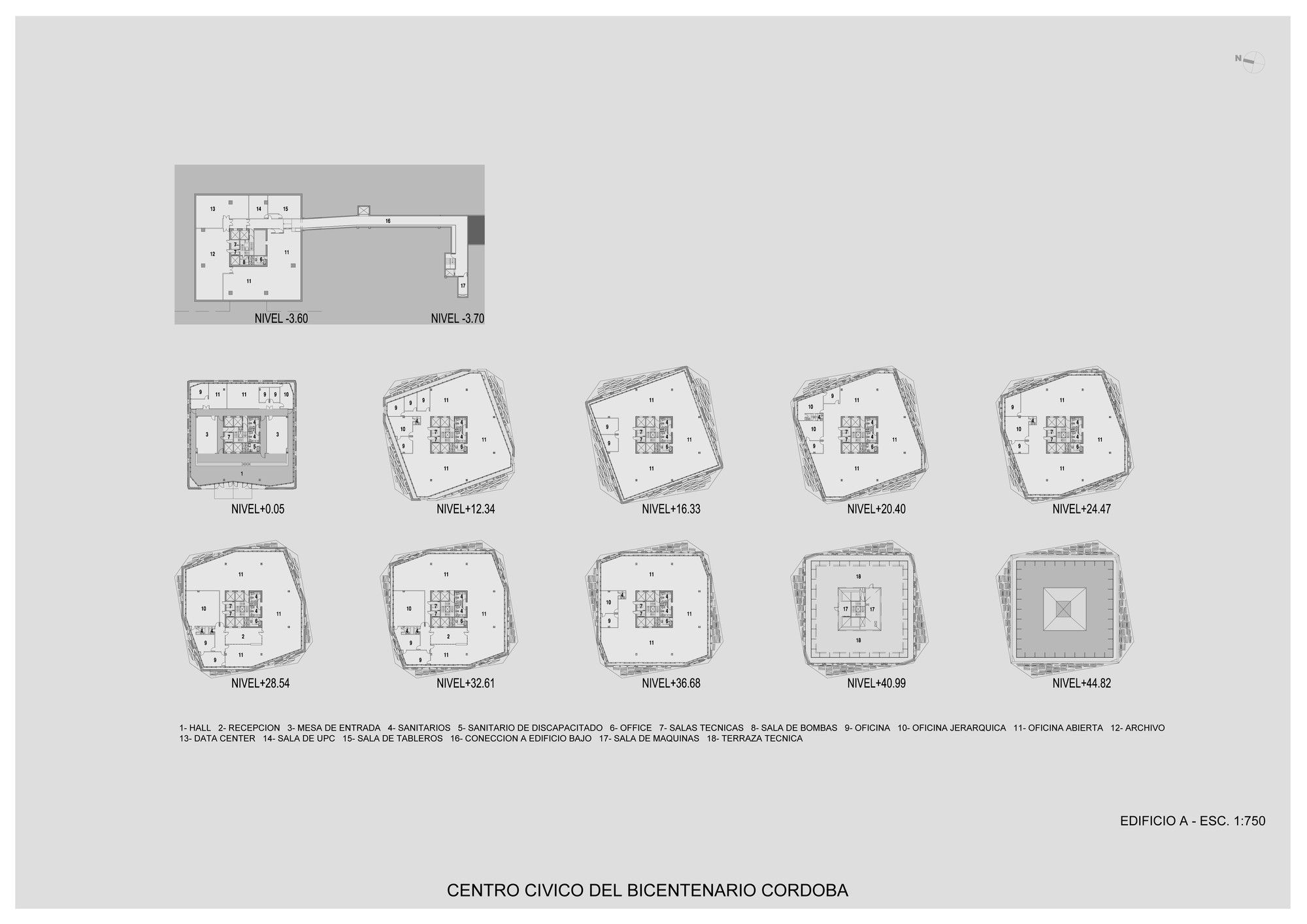
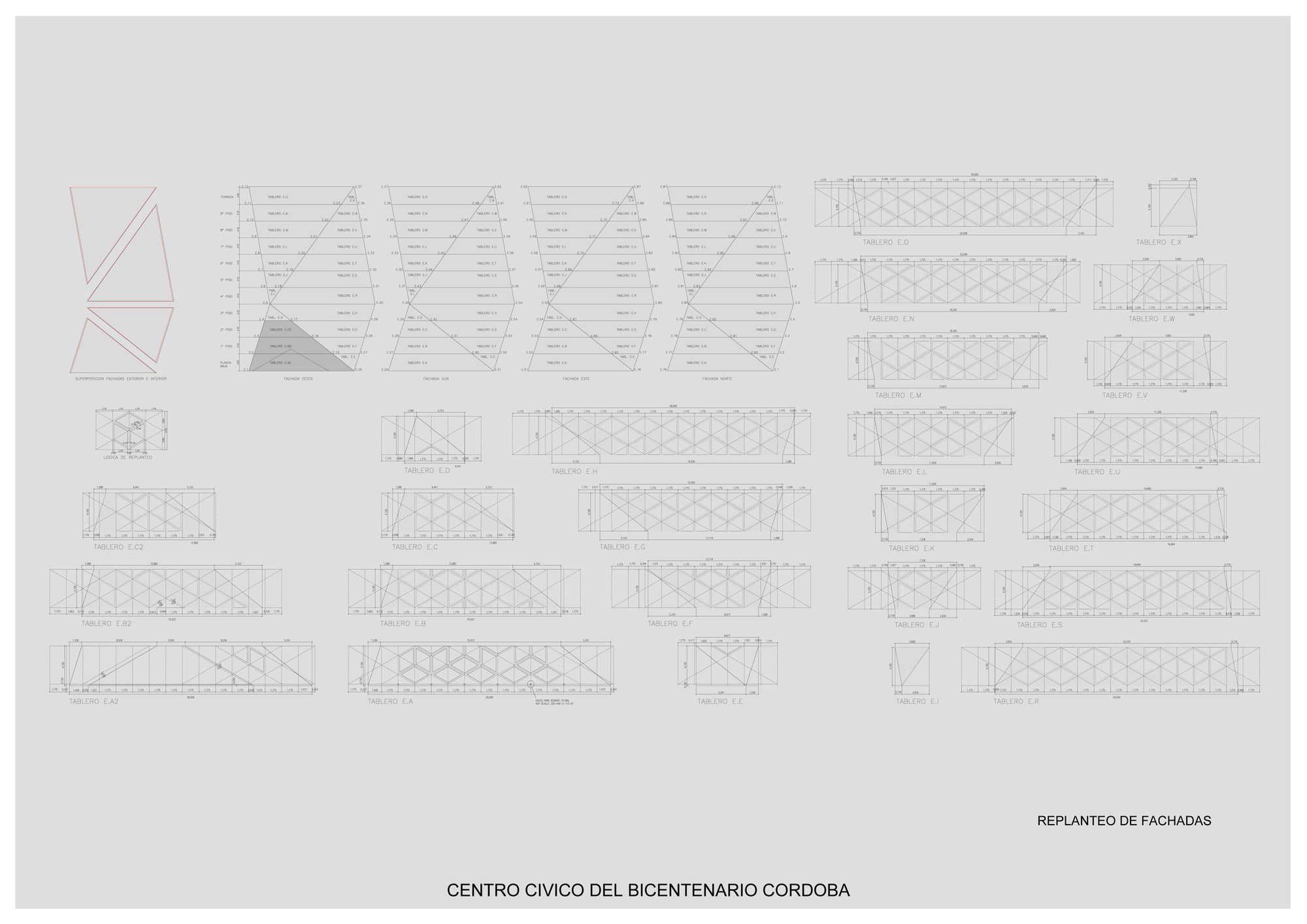
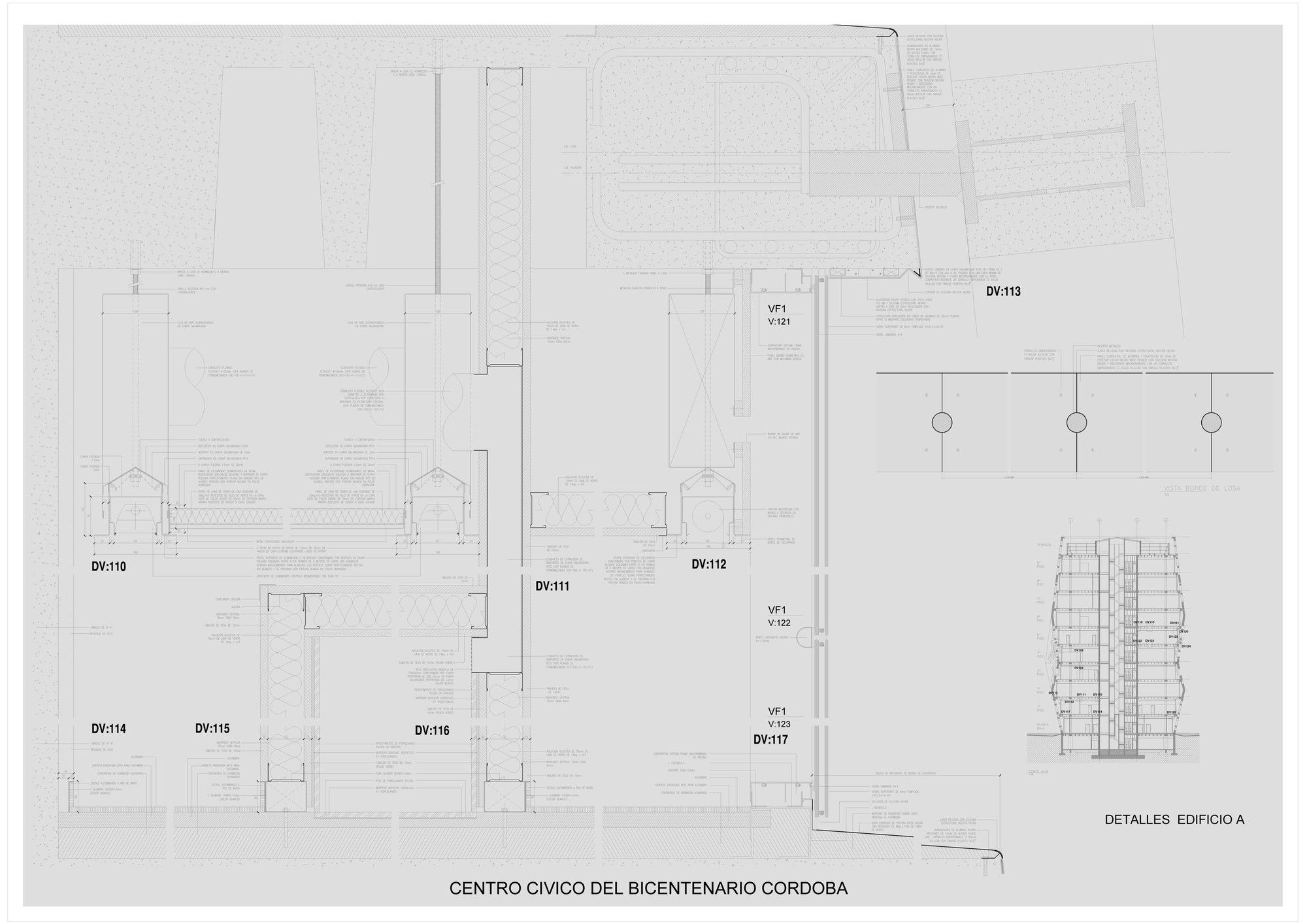
The medium-rise building made out of concrete houses the ministries and dominates the complex. It is based on a square cuboid 45 meters high and with a side measuring 26 meters, which at a height of 16 meters suffers a 20 degree rotation. The structure generates a complex morphology based on triangles creating a prism that plays with shadows and light. The openings were generated from a series of geometric rhomboid-based combinations designed to instill a tri-dimensionality to the flat character of the facades. The form is placed over a shallow reflecting pool that can easily be emptied to work as a civic plaza housing events.
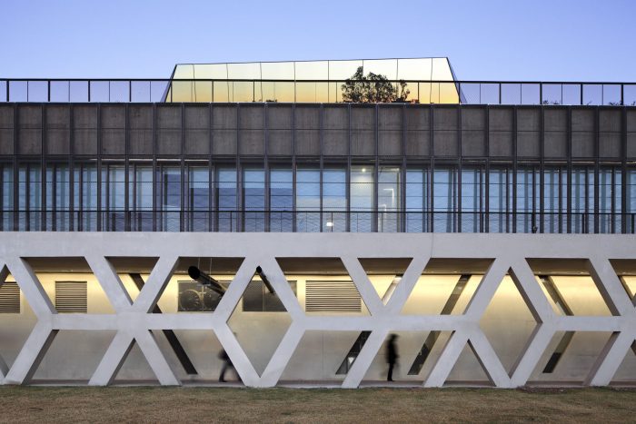
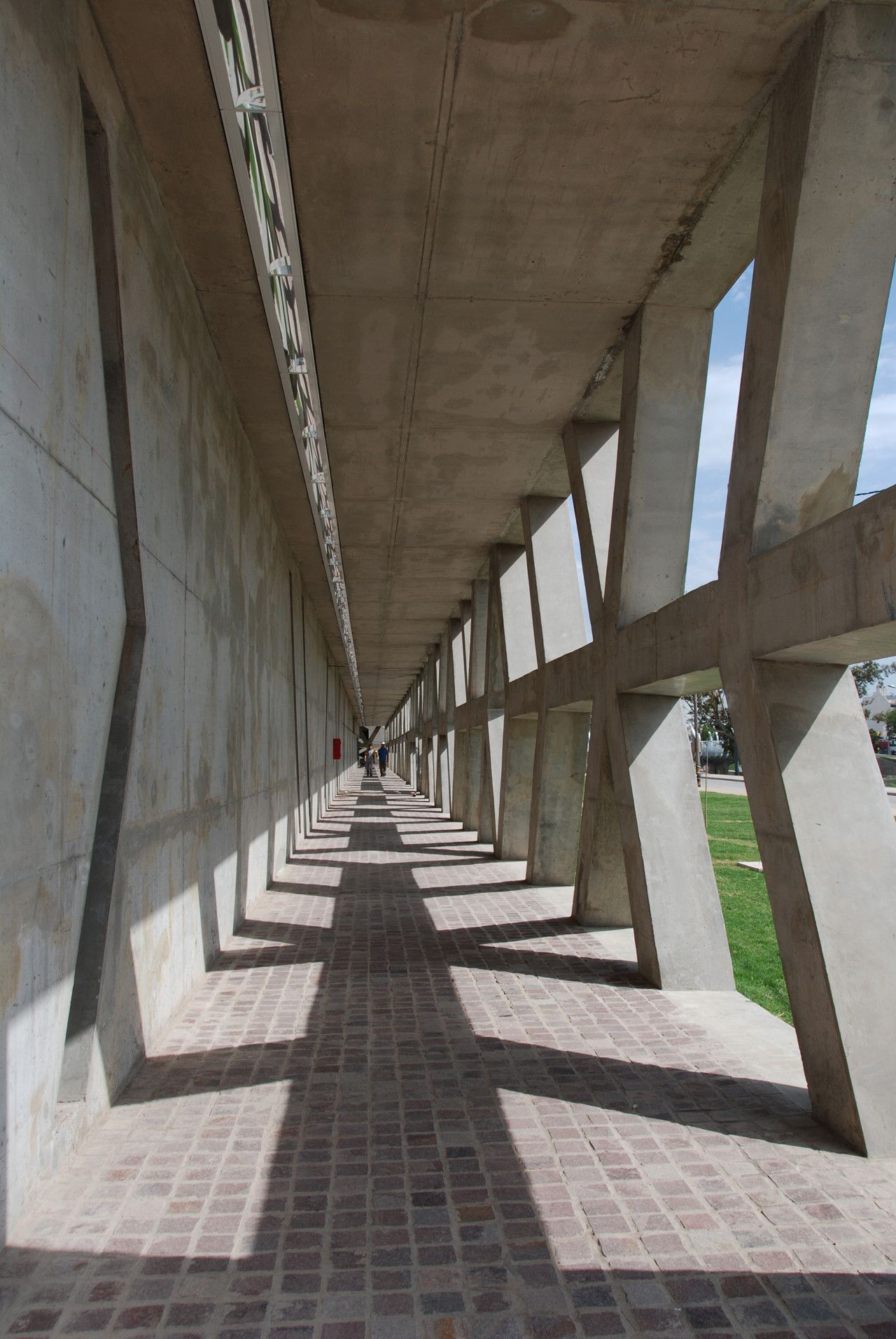
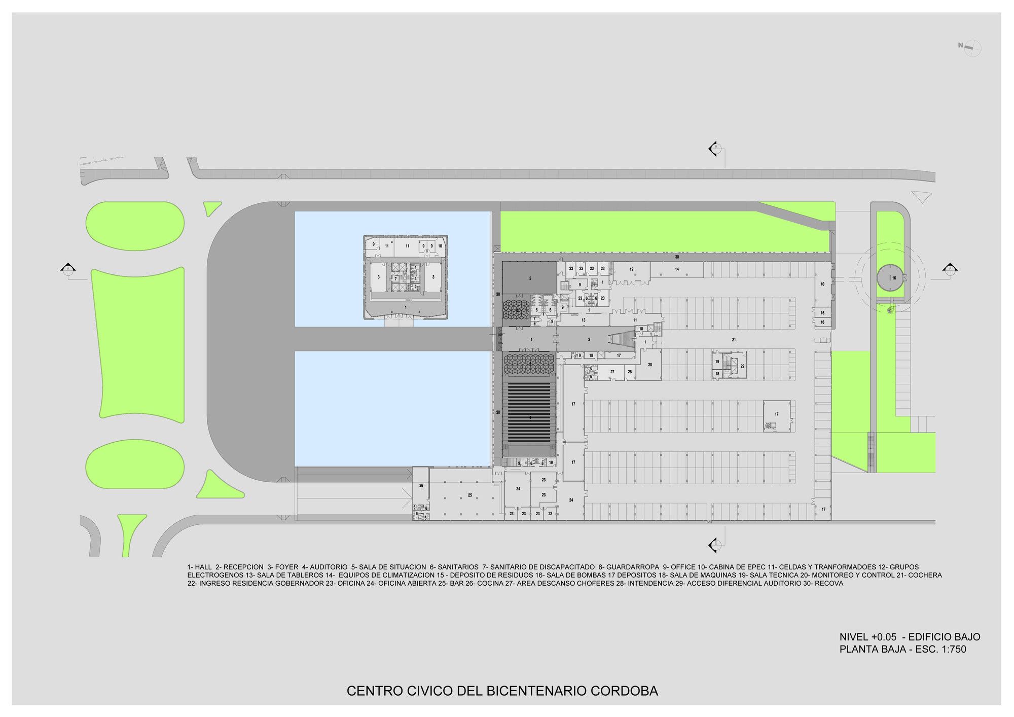
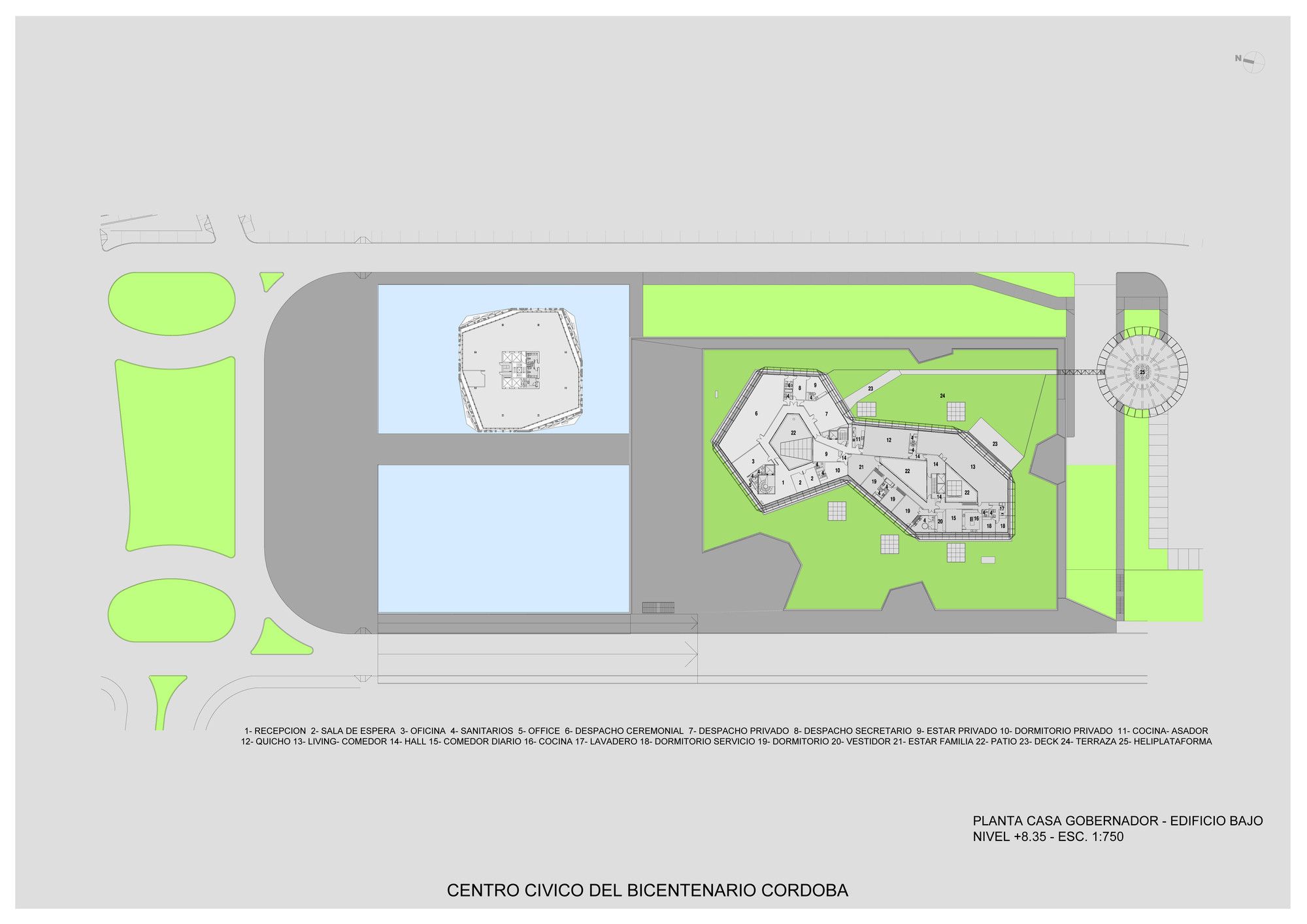
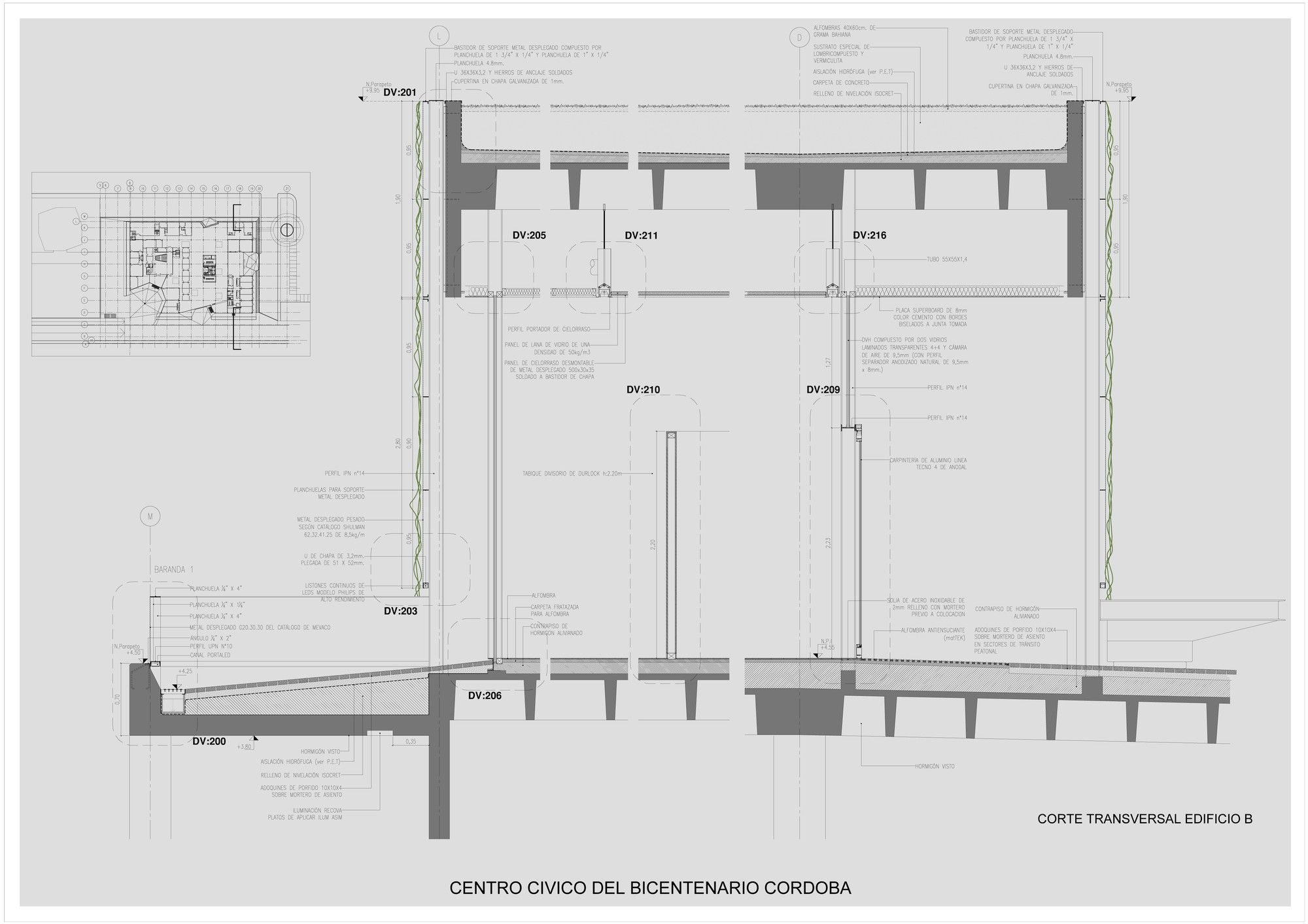
In contrast to the medium-rise prism building, the second building is a horizontal slab and houses administrative functions that a similar rhomboidal language used in the other building, though with a different scale. It is placed over a concrete base incorporating parking and areas that foster interrelationships and social events.
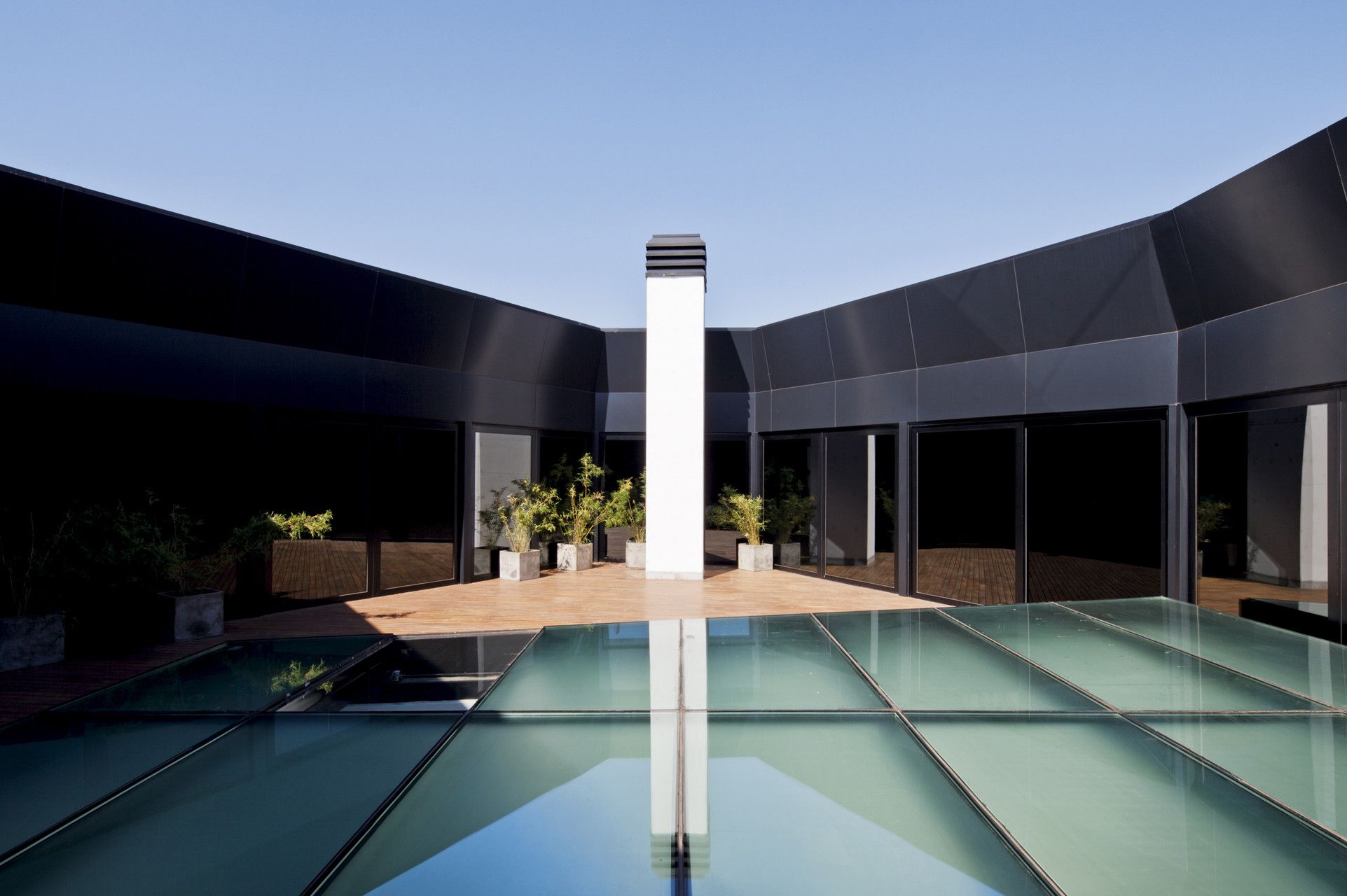
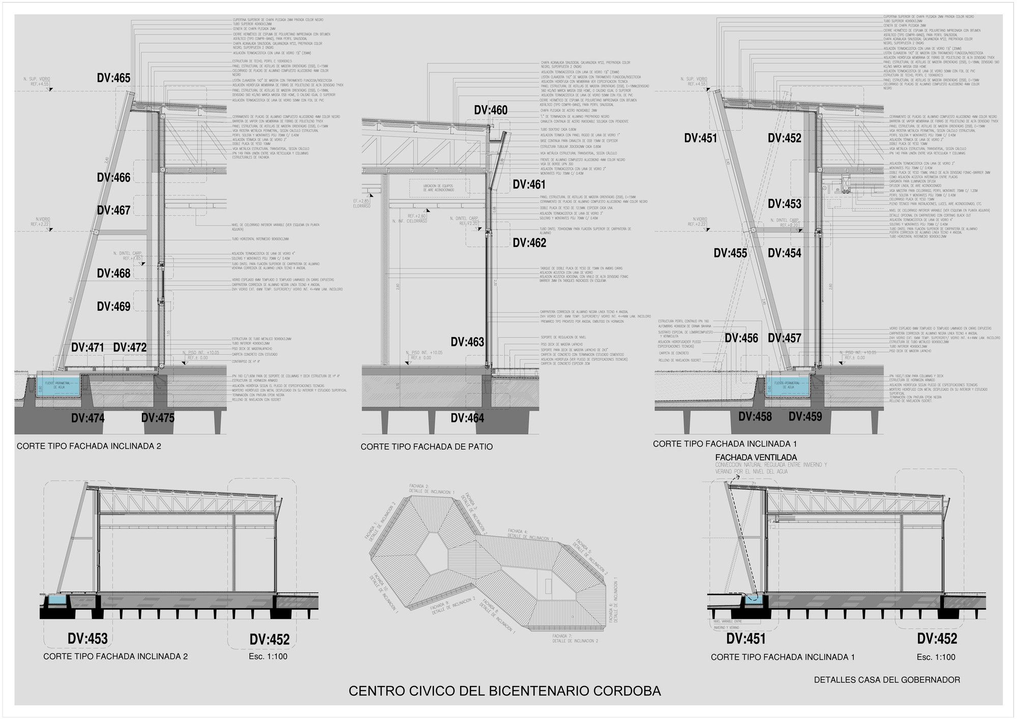
On top of the slab, rests a green volume enclosed by metal mesh enabling vines to climb freely, which helps to regulate the temperature inside the building by allowing sunshine to enter in the winter and blocking it in the summer. The roof is also green and is covered by grass and flowers. The extension of this building means there is a large area free of partitions so that offices can be arranged as desired. The Governor’s house consists of a single story freestanding object with mirror-clad faces, with alternating reflections of the sky and the green plane over which it rests.
The change in design the prism building went through from proposal to completion is interesting to note. Originally the concrete structure’s facades appeared lighter, existing entirely of the rhomboidal openings that created a web or lattice quality to the buildings appearance. Either for structural purposes, sustainability reasoning, money shortage, or any of the other variables that appear during construction and the completion of all architectural projects, the main prism building has developed a new character due to the change in façade appearance, whether for better or for worse. It will be interesting to see the entire project finished and how the completed administrative areas and Convention Center help to finish the thoughts and visions the architects had for this site.




Courtesy of Lucio Morini + GGMPU Arquitectos – Photography by Claudio Manzoni, Leonardo Finotti


