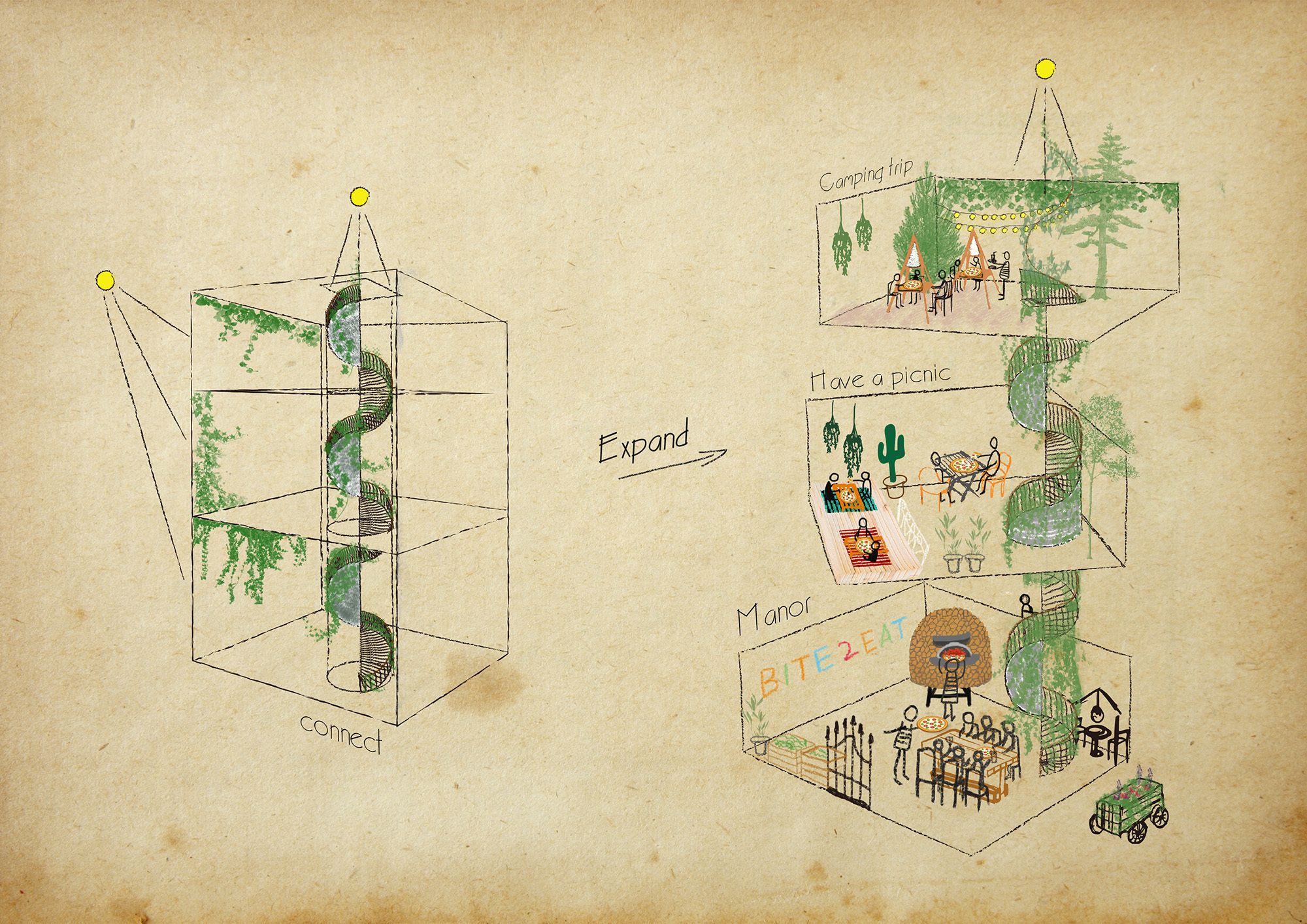
Bite to Eat is HAO Design, At a party in an Italian manor, some people dine around a table in the dining room, some set up tents around the house, while others leisurely bask in the sun on park benches. How to put all these relaxed, happy events into one room?
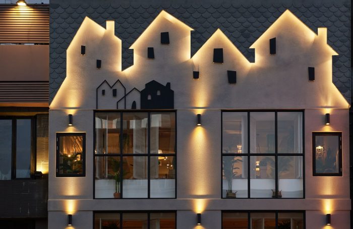
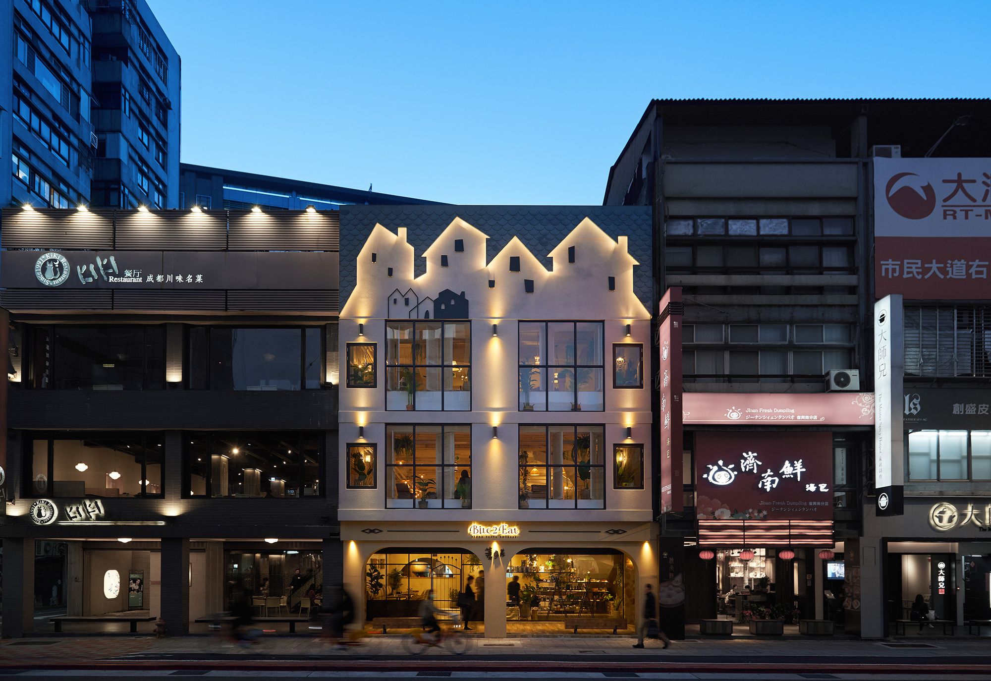
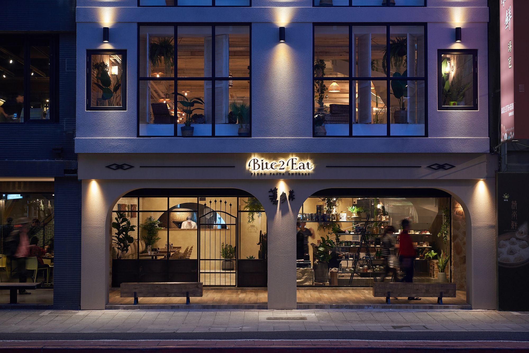
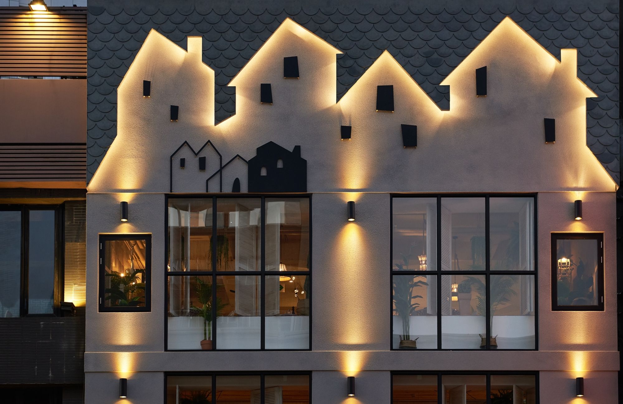
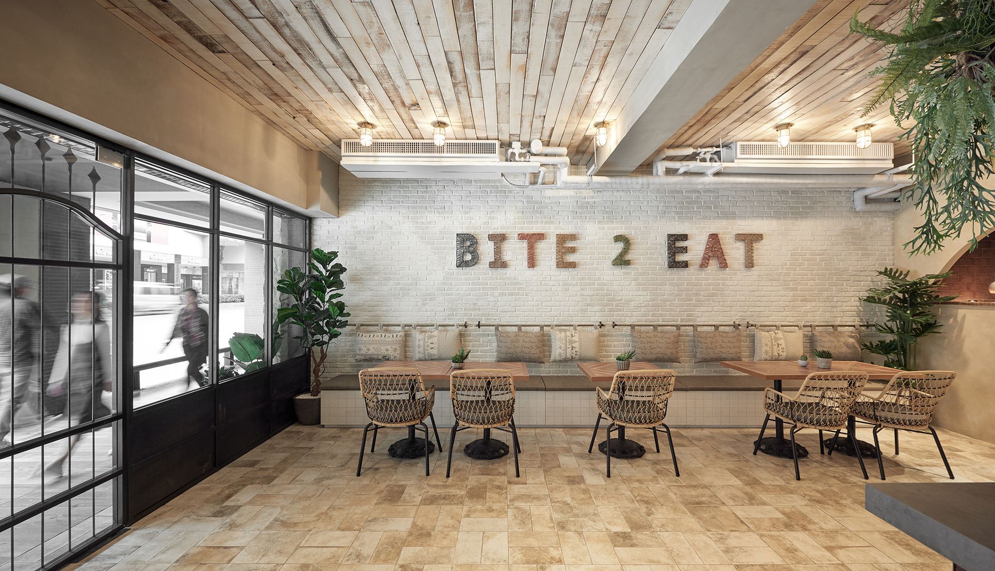
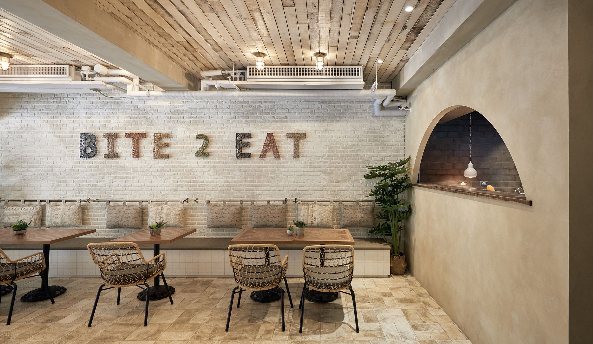
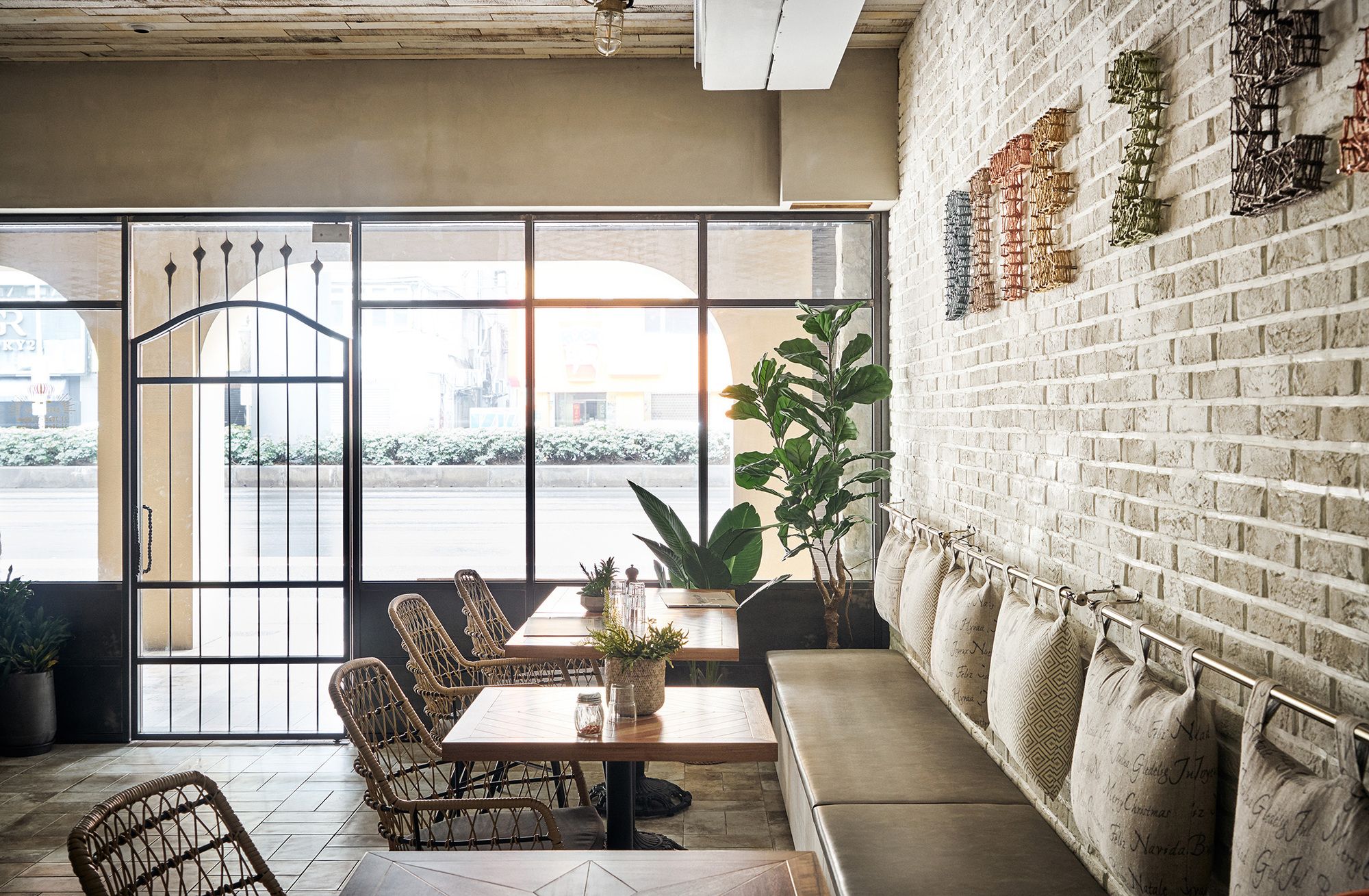
Inspired by simplistic yet gorgeous Italian houses, the facade of the restaurant features the silhouettes of many small houses, creating an inviting scene. The first-floor porch has an arched design and two benches, creating a simple and relaxing area for customers to meet, wait, and chat. At the entrance is a cast iron gate of intricate craftsmanship, accented by kiln-fired tiles on the ground to recreate a scene of a European street. Another arch is built to allow a view of the pizza oven within, so that people can peer into the goings on in the kitchen, turning the baking process into a mysterious ritual performed to summon delicious food. The subtle yellow lighting creates the slightly dimmed but warm atmosphere of a pub.
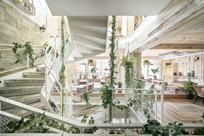
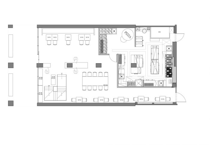
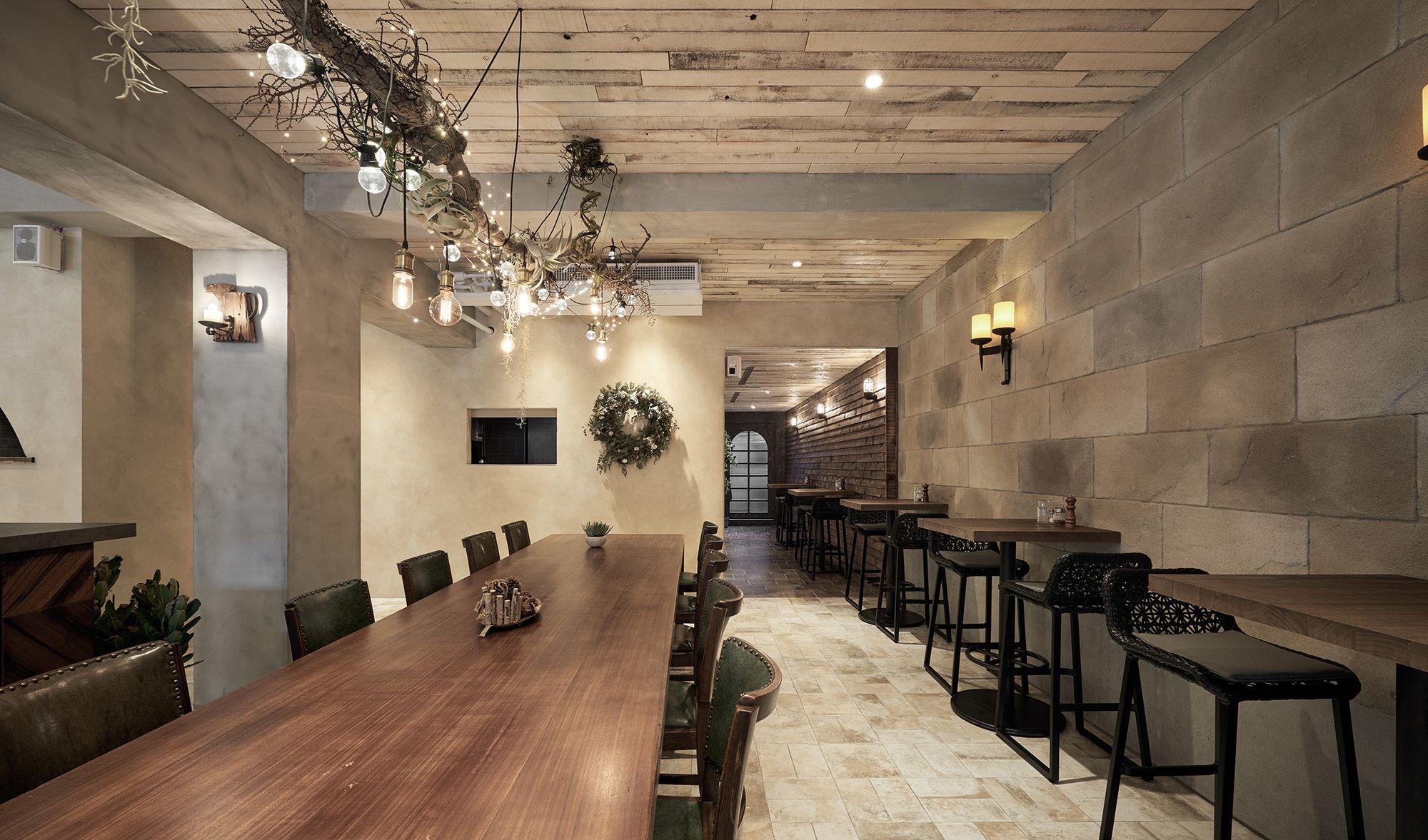
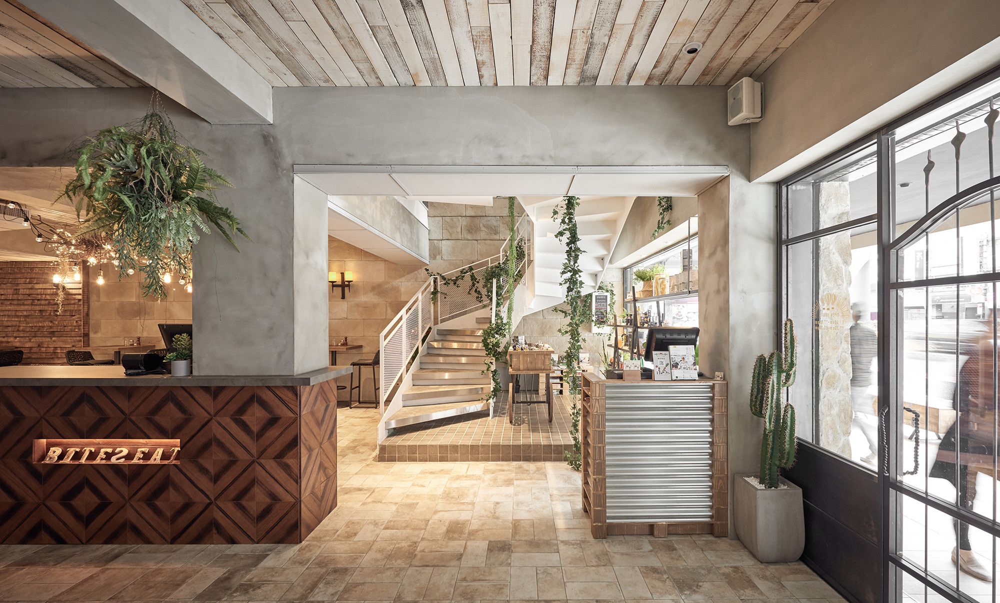
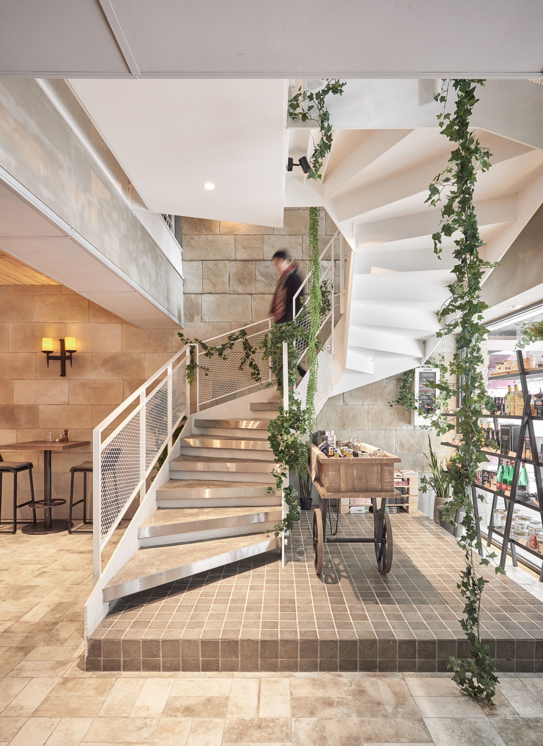
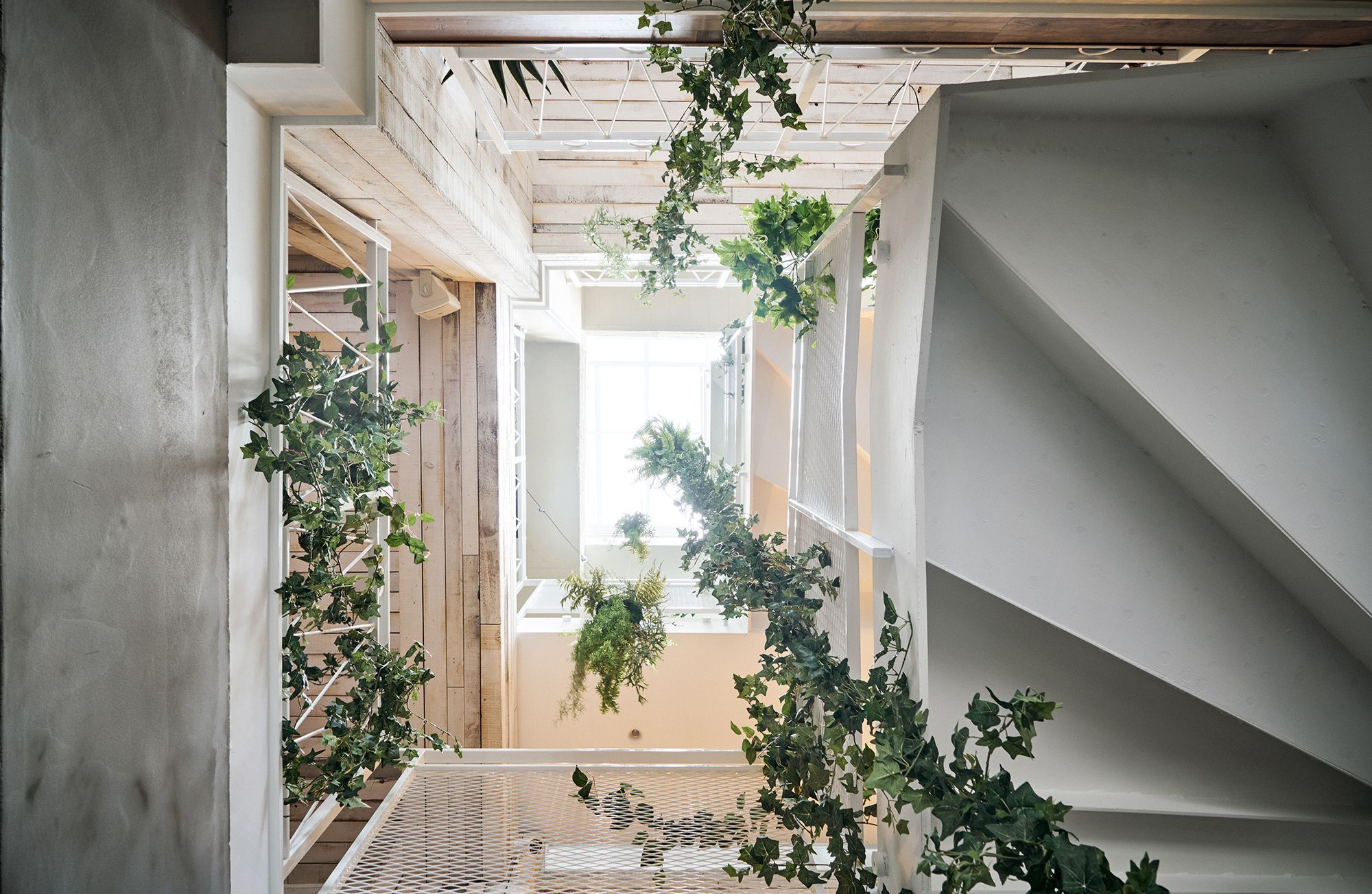
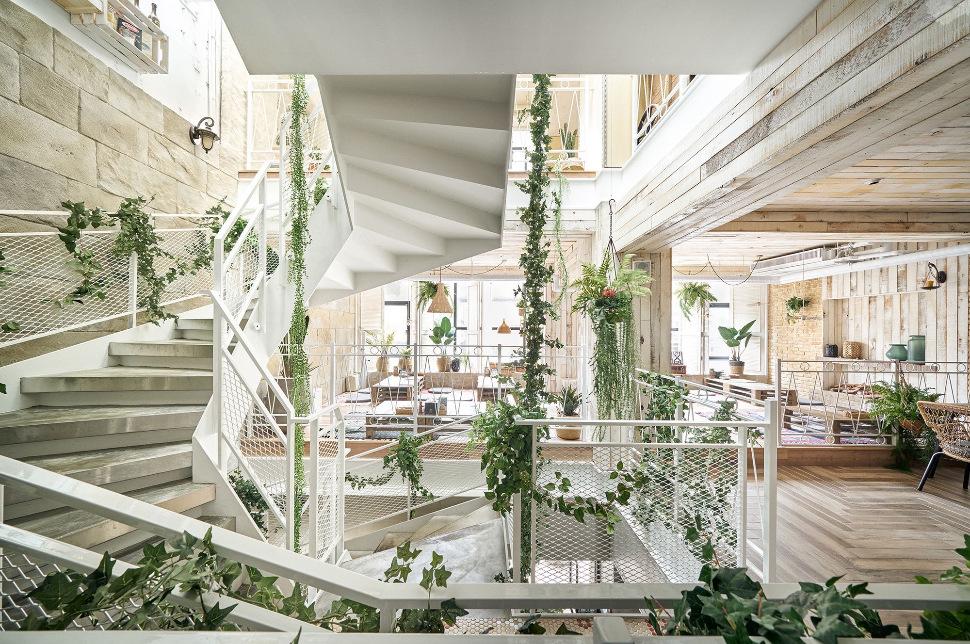
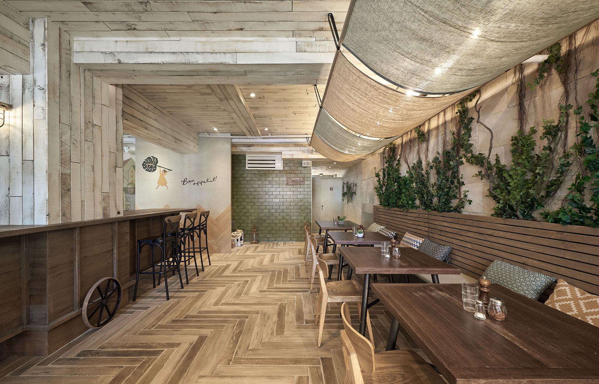
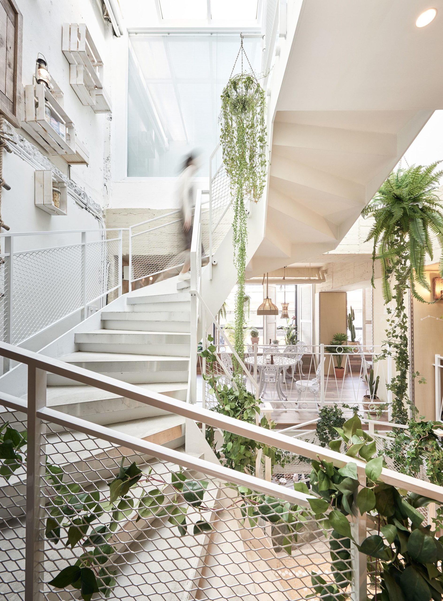
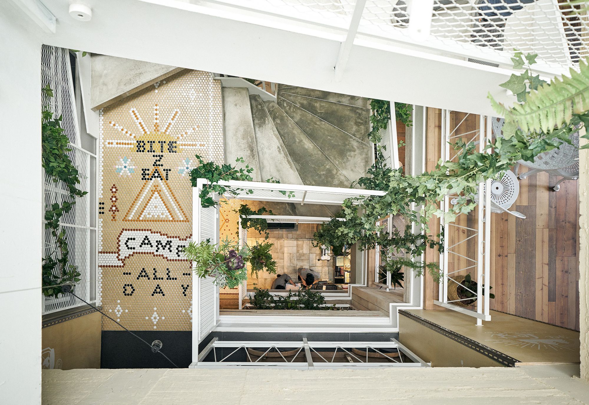
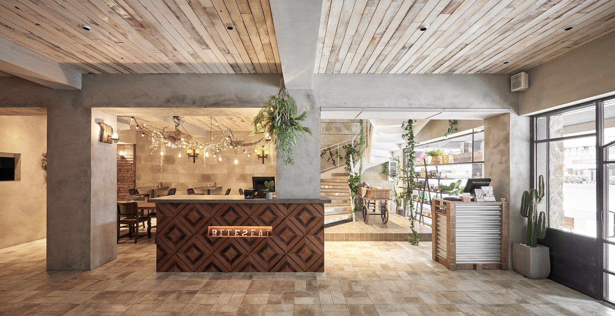
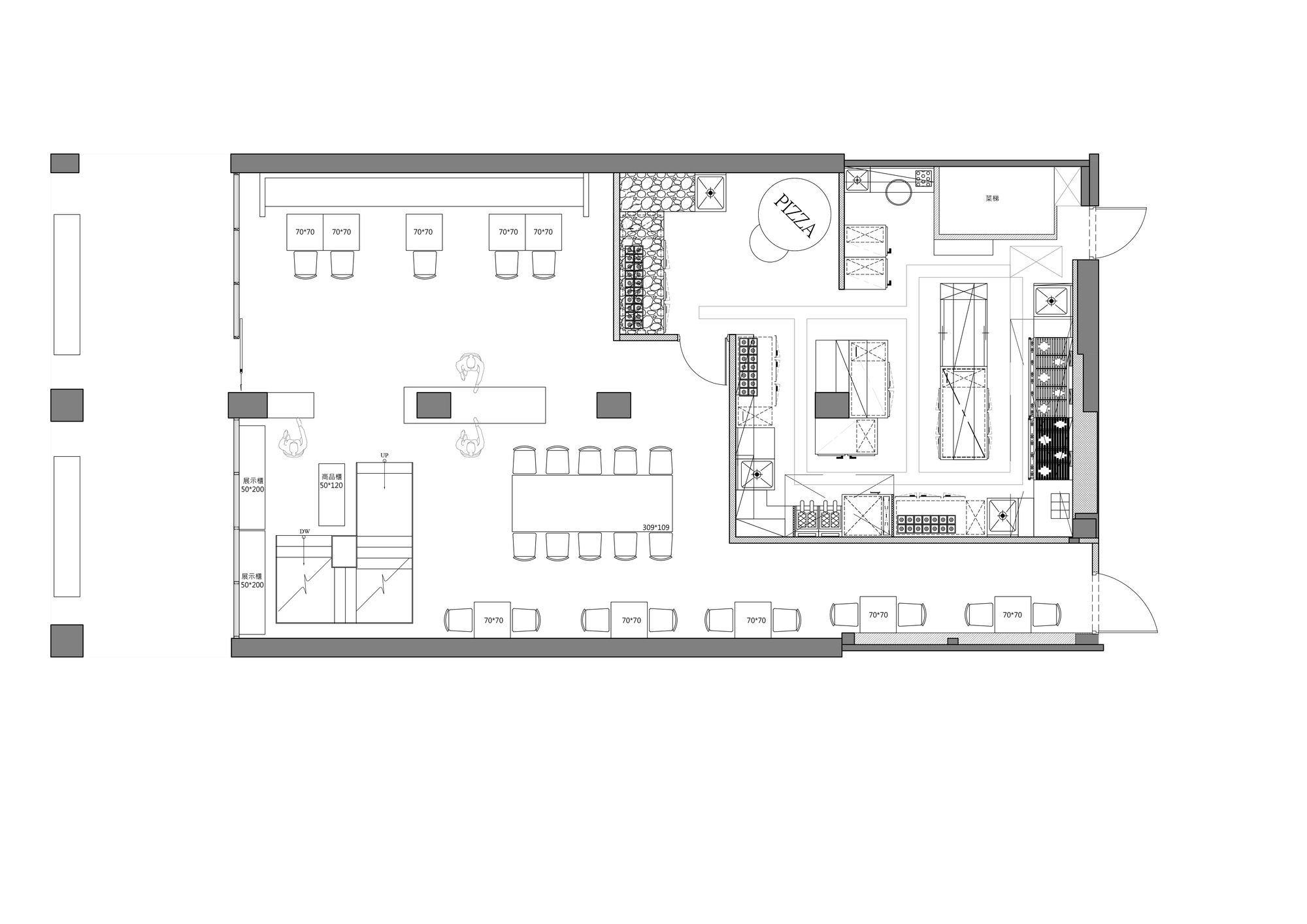
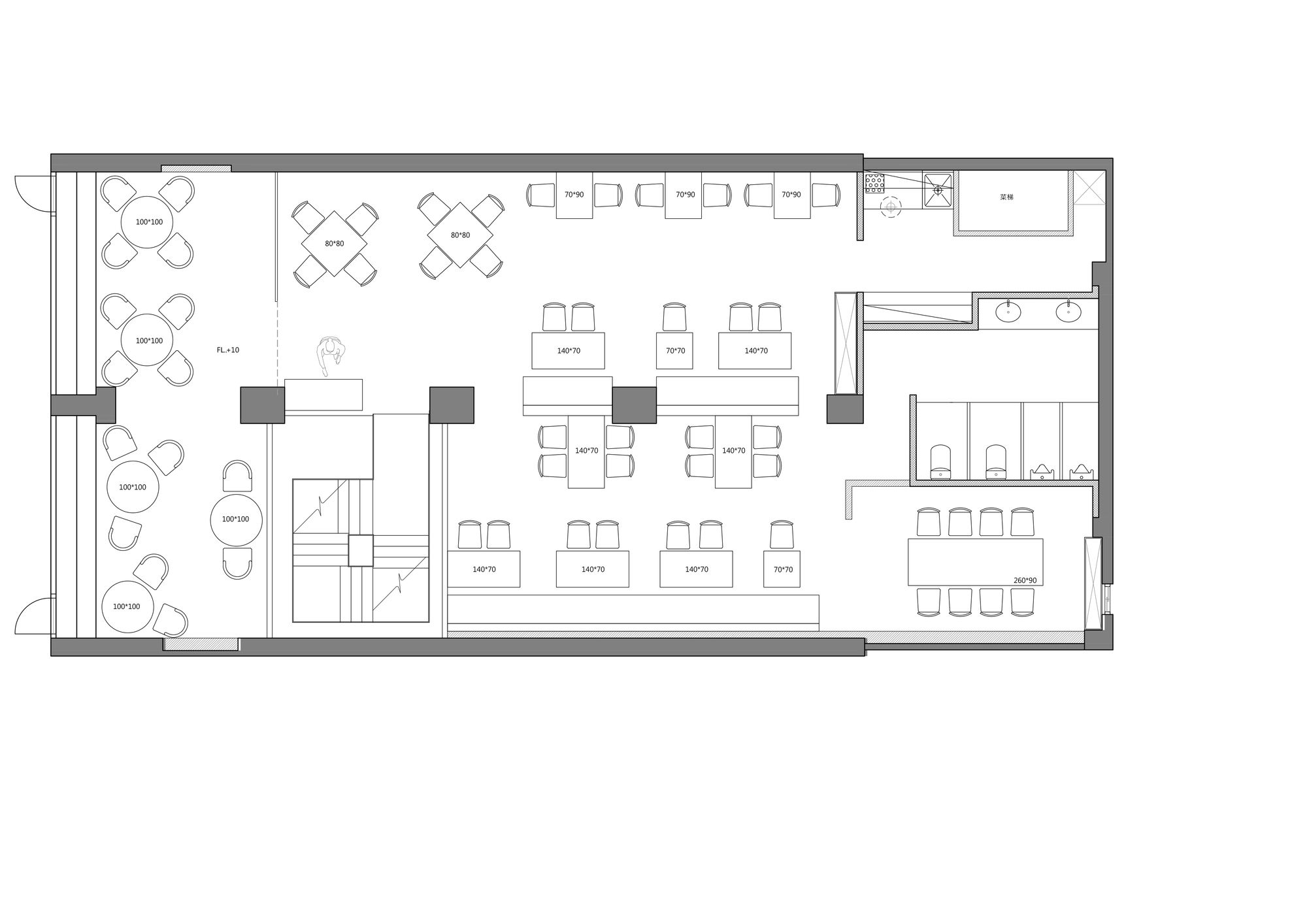
The first floor is a relaxed pub ambiance, with tables and chairs arranged in a way people are accustomed to, catering to the dining patterns of business guests and dating couples. Near the first floor window, a “Little Bazaar” sells a variety of Italian ingredients such as olive oil, noodles, and vinaigrette. The assortment of goods is displayed on a modern black iron stand, which is not only convenient for shoppers but also attracts passing guests to stop and take a look. Next to the “Little Bazaar”, a spiral staircase with ample lighting on top uses the green belt background it creates to lead people to different levels of spatial narratives.
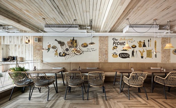
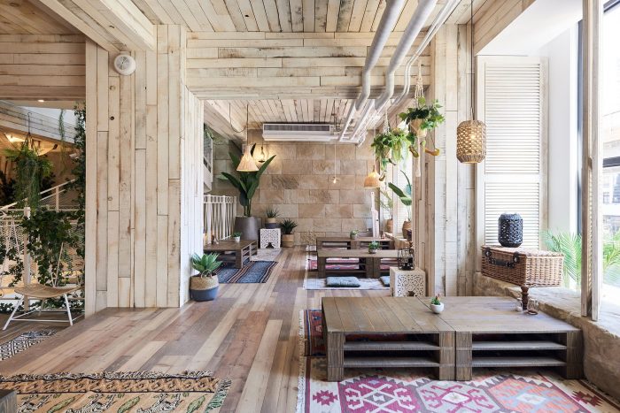
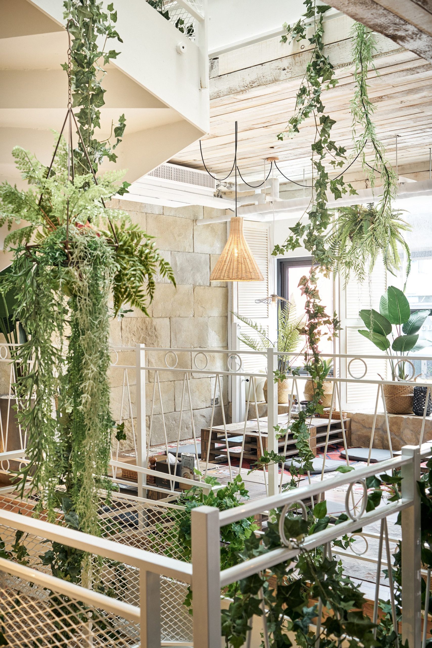
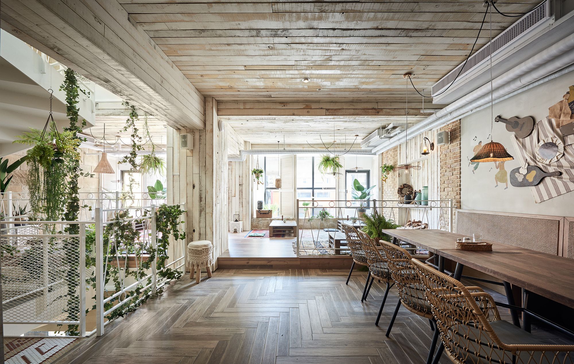
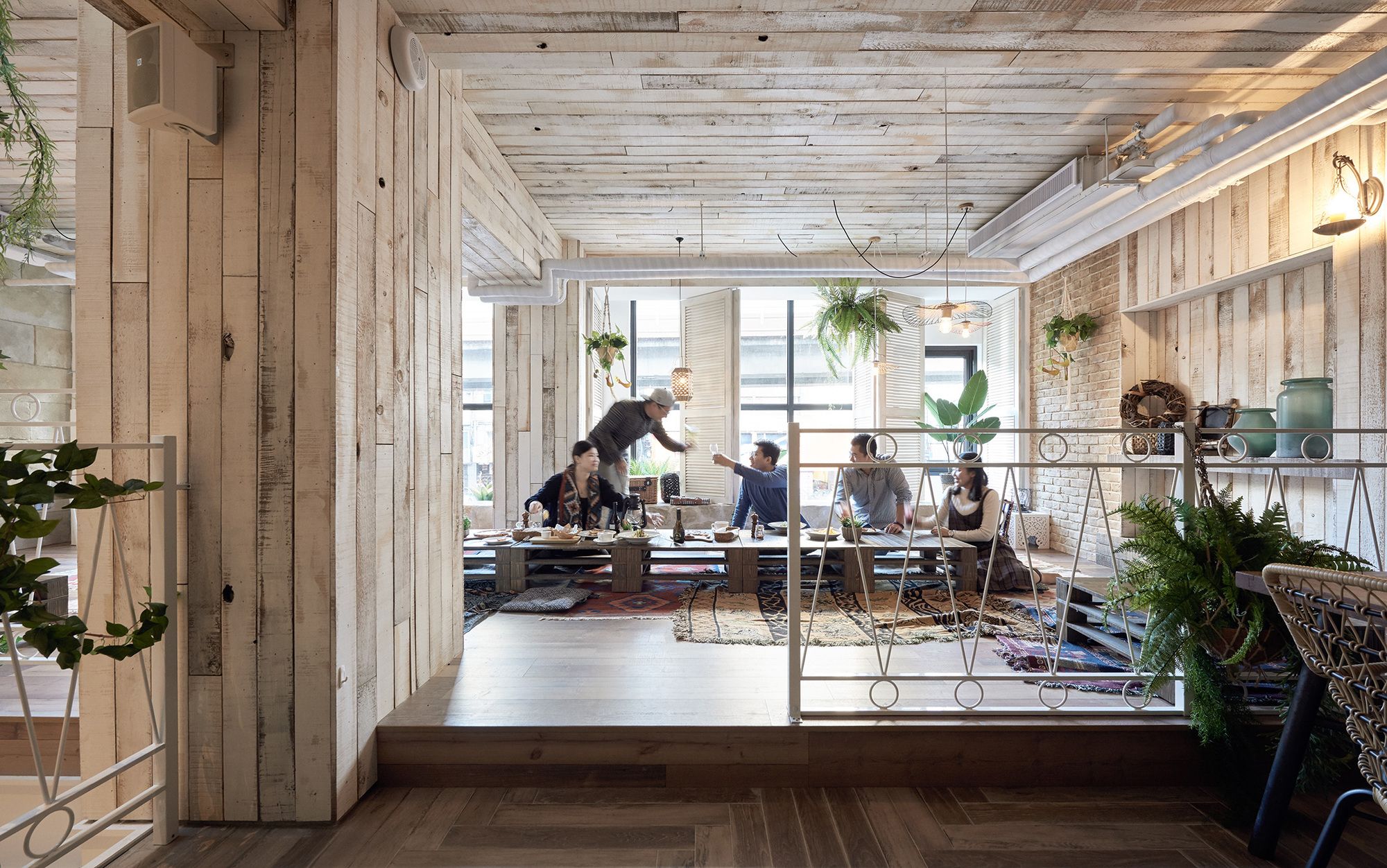
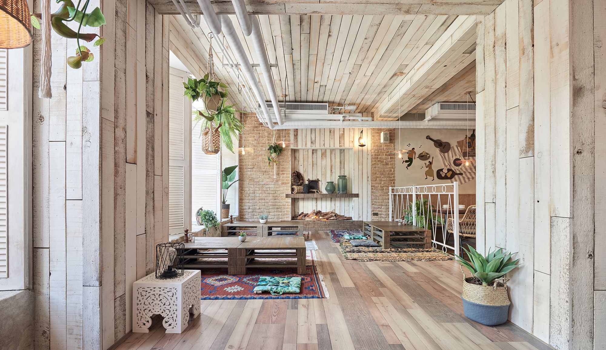
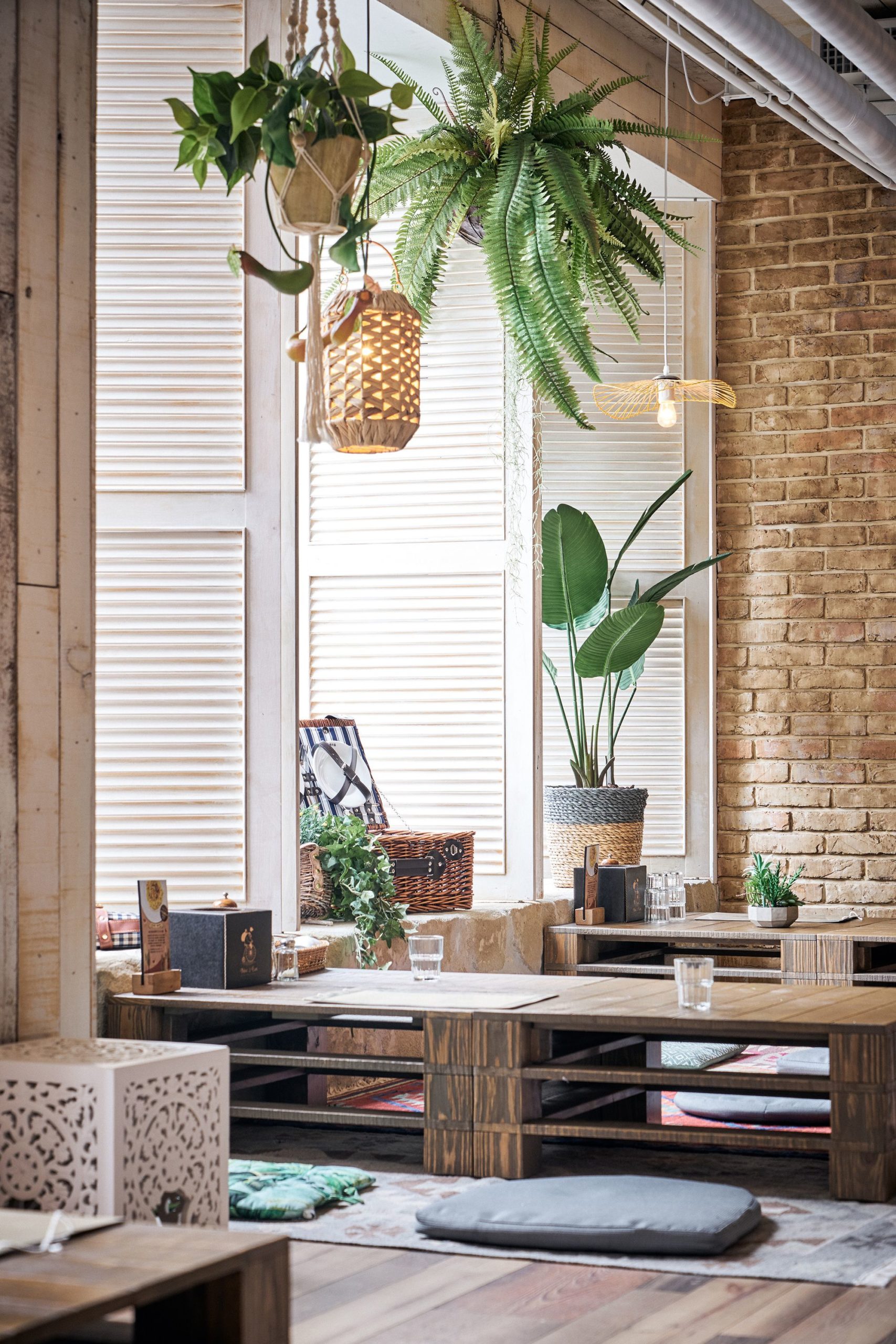
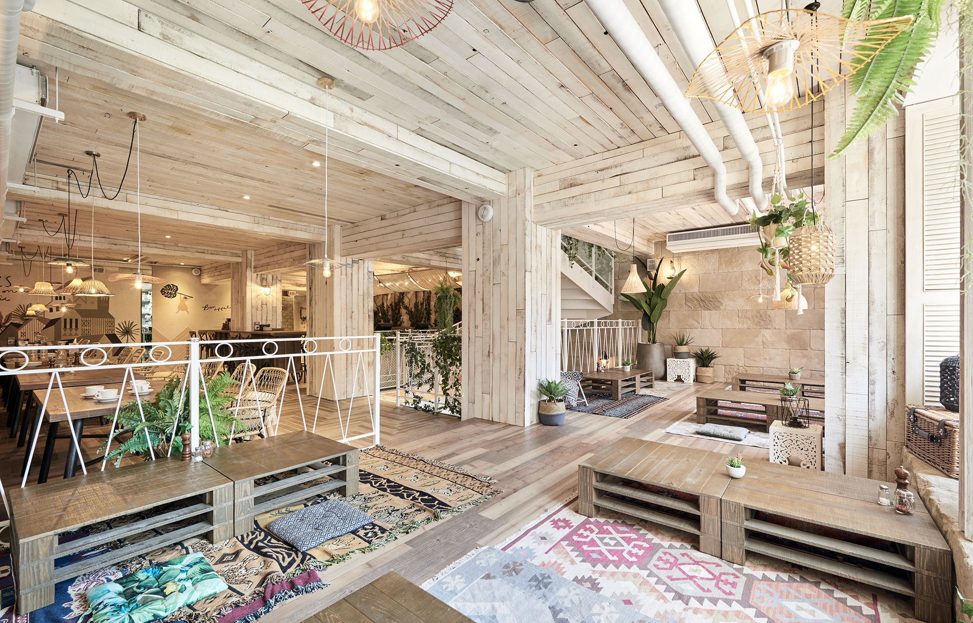
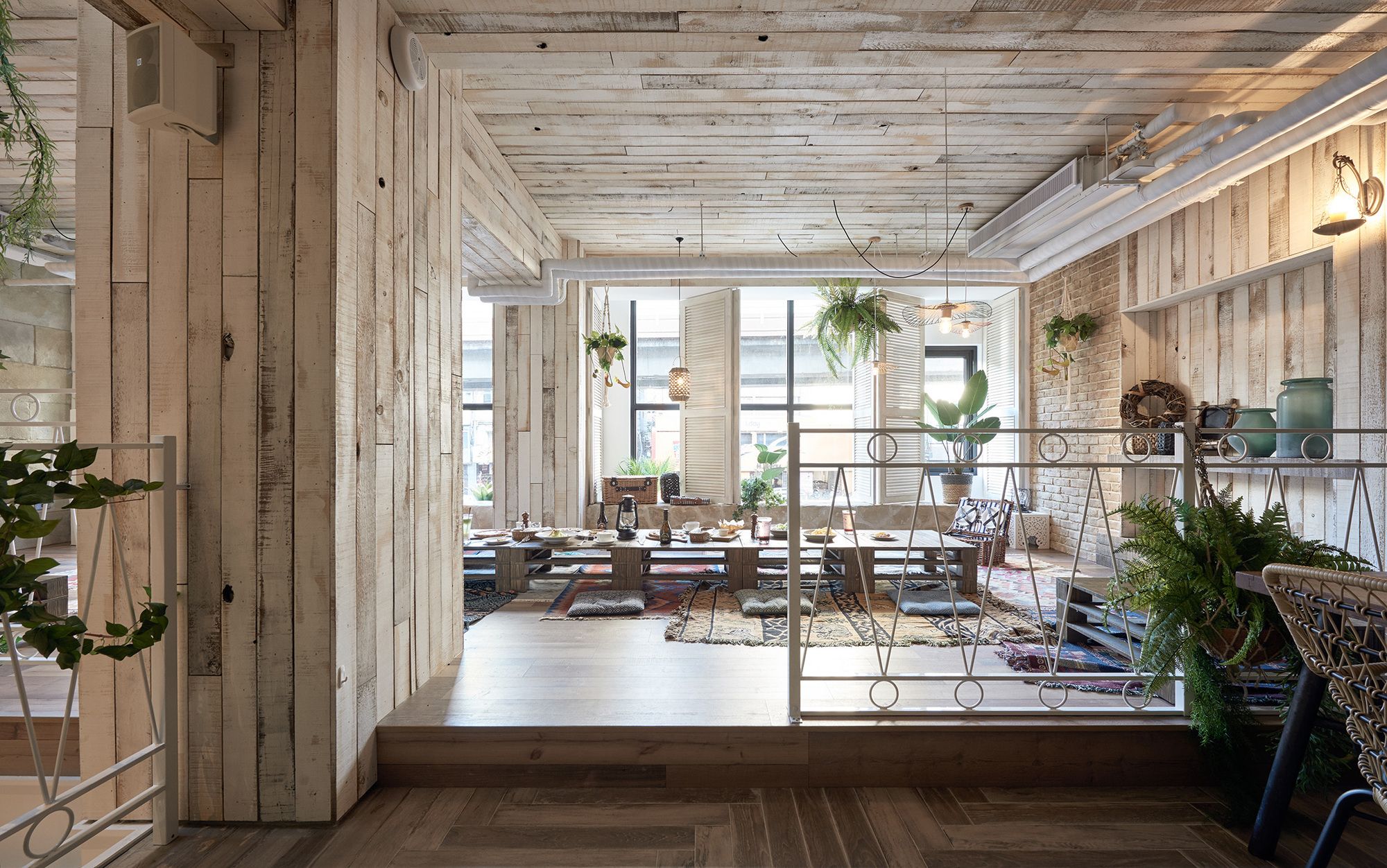
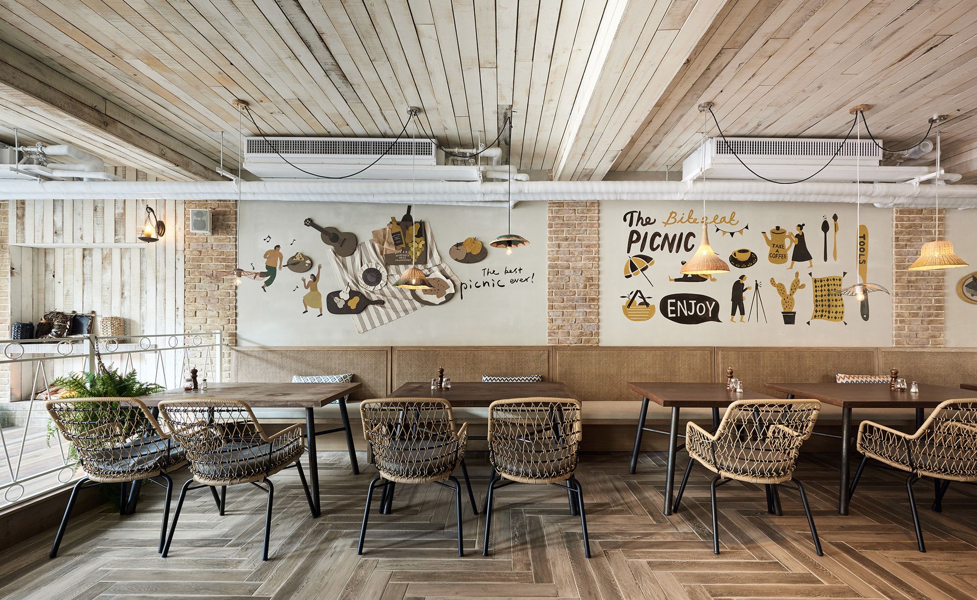
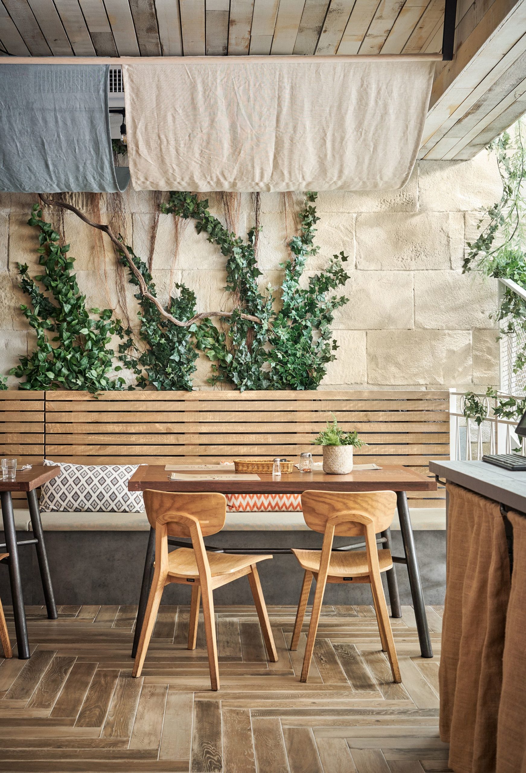
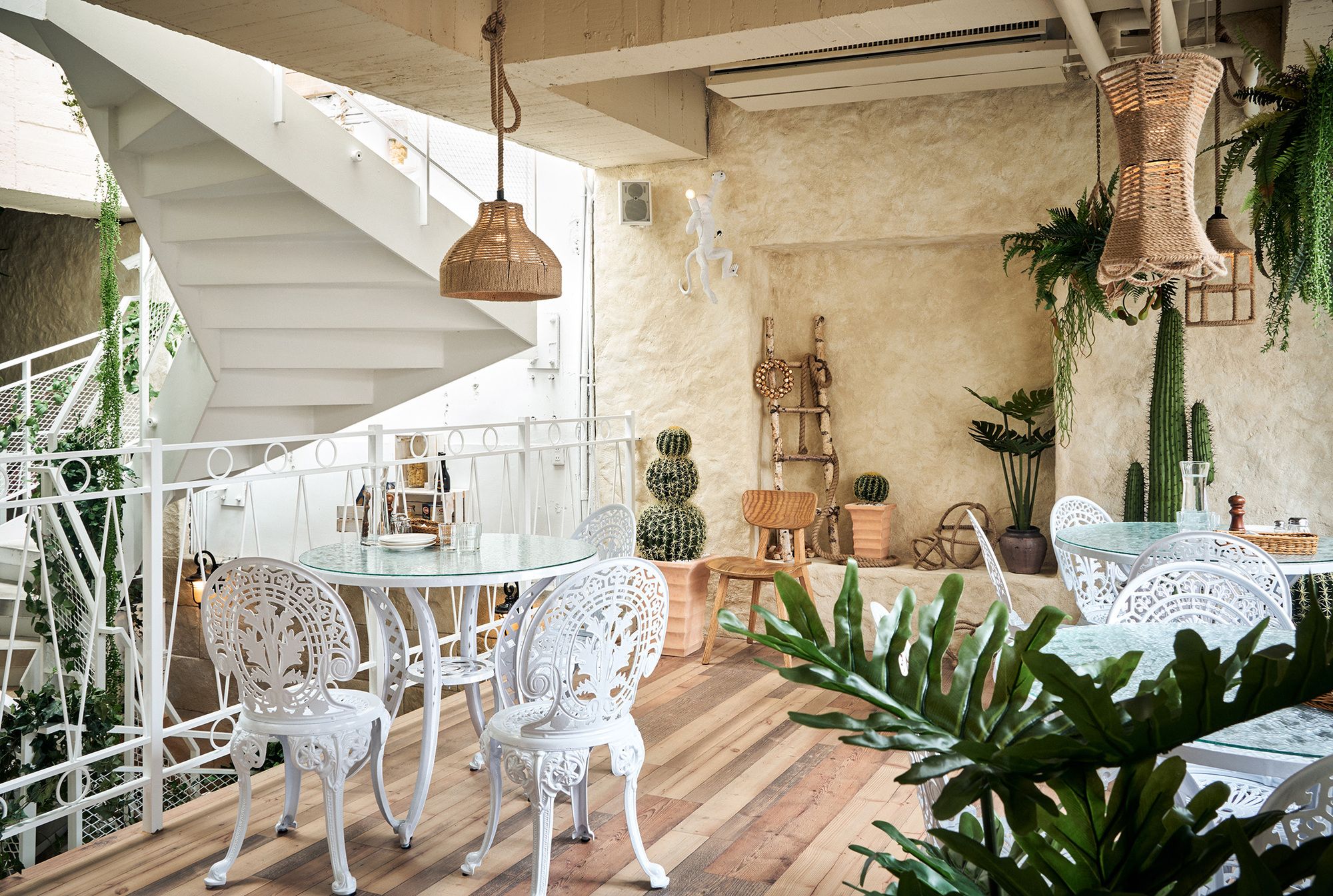
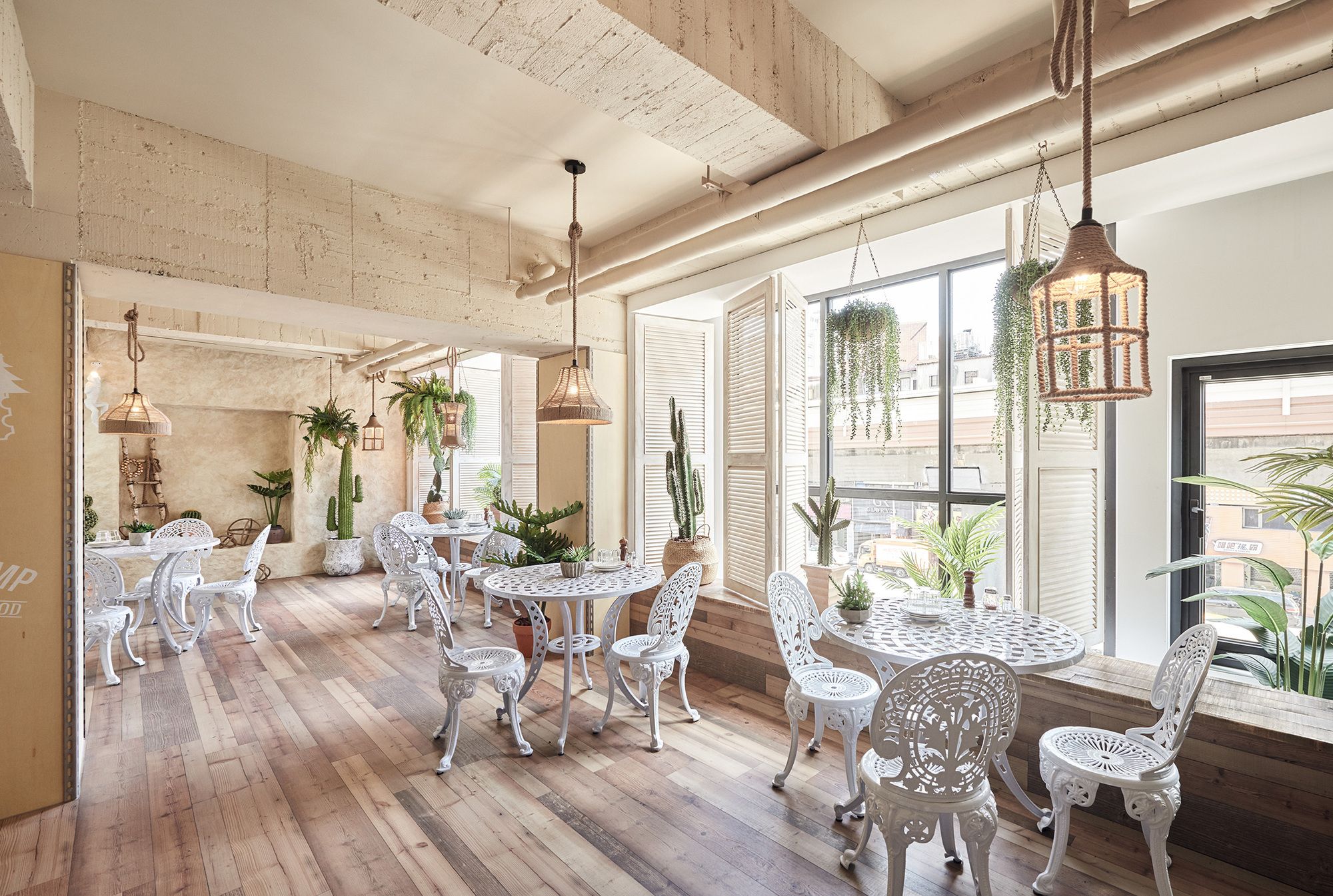
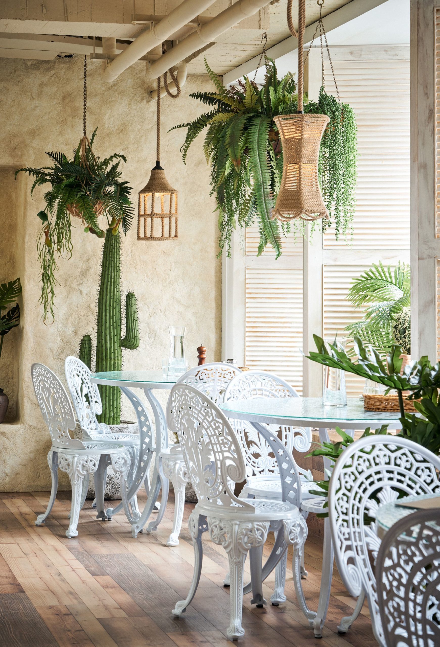
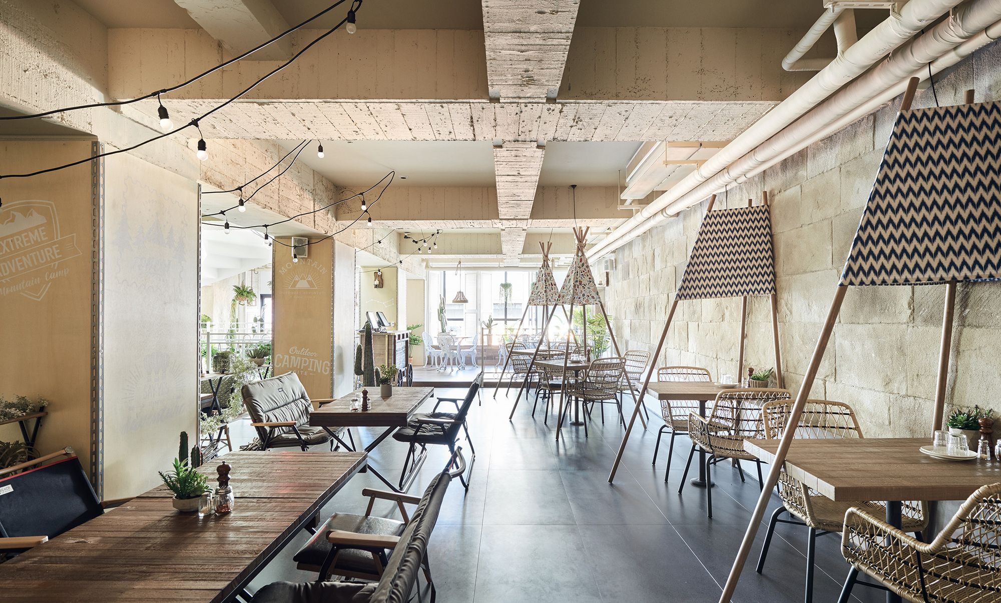
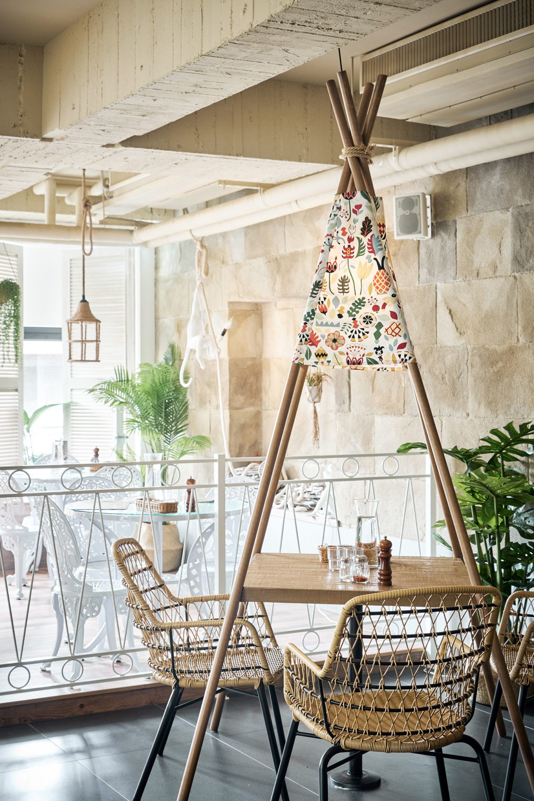
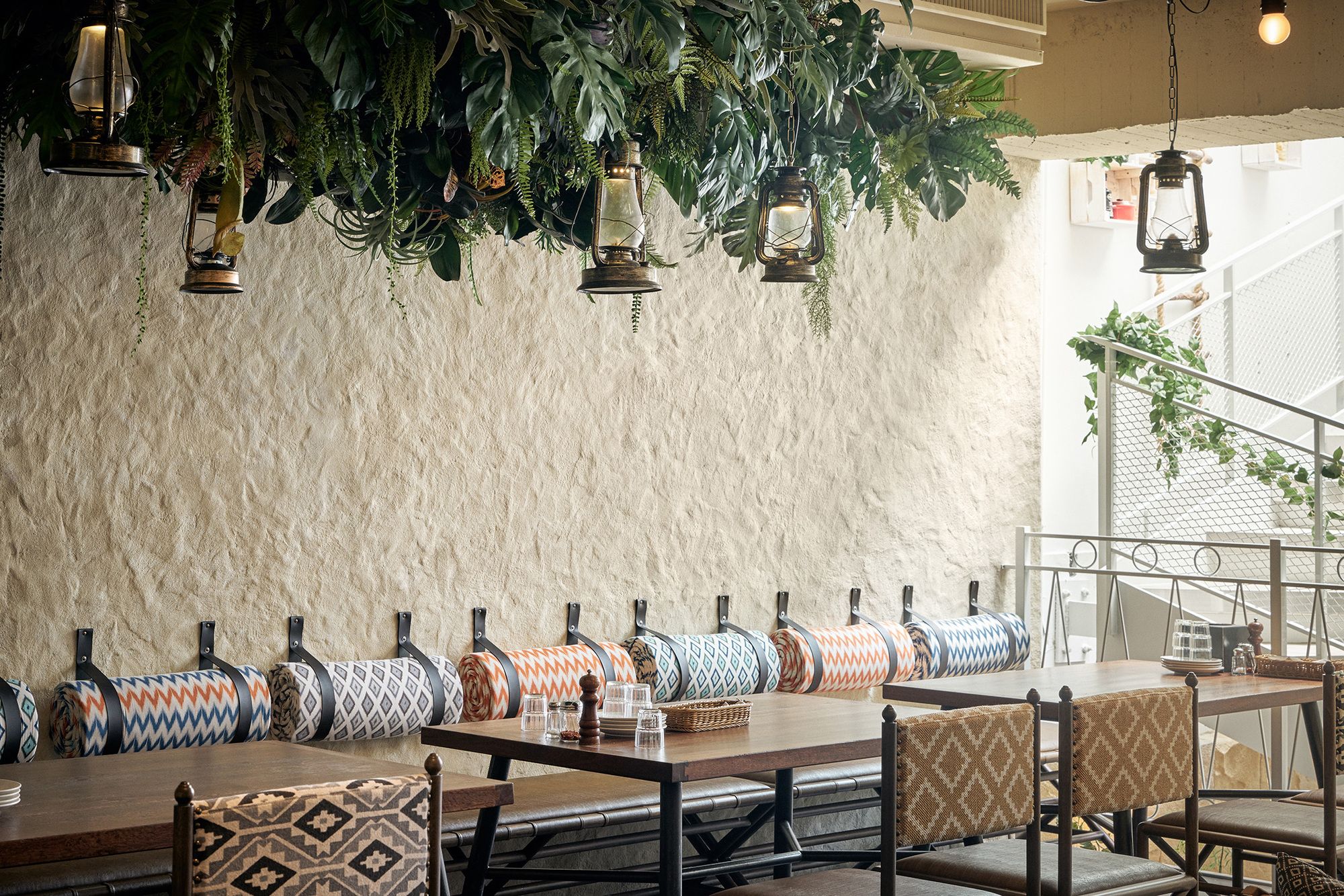
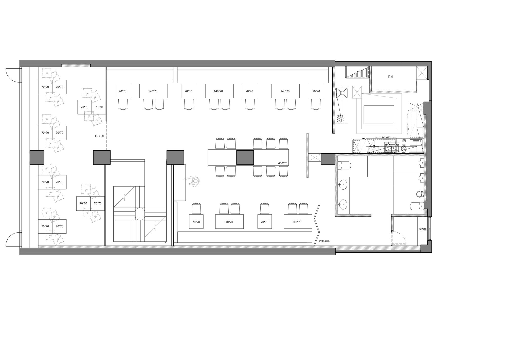
Walk up the second floor, and sunlight filters in as if you’ve stepped into an indoor patio. Walk further inward to find two main sections: One side of the wall features a lively picnic theme, while the other is decorated with linen fabric to create a canopy for a romantic, breezy feeling. The two sections have one important commonality: both allow people to feel a sense of enjoying a lovely picnic outdoors. Adjacent to the window facing Fuxing South Road is an area favored by families. The low desktop design mixes richly-colored Mexican fabrics and Japanese fabrics on wood grain bricks as cushions. It is also a place for children to walk and crawl around freely without restraint. As for the presentation of home decor, the plants hanging by the window, picnic equipment on the window sill, and wicker lamps create a relaxed feeling, allowing adults to sit joyfully and enjoy a relaxing “indoor picnic”. The walls and ceiling of this entire floor are composed of hand-distressed white fir panels that make the space brighter and richer.
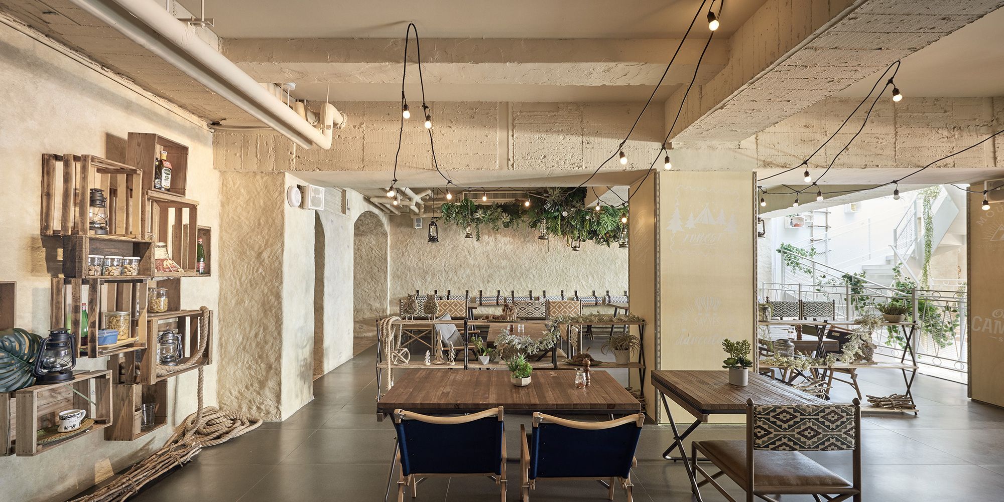
Compared to the warm and colorful style of the second floor, the third floor uses terrazzo flooring to create a spatial atmosphere more rugged than the second floor. Small round tables, the type typically found in parks, are placed near the window to create a relaxed atmosphere, and in the front is a small tent area with seats for 2~3 people. There is also a dining area with folded chairs and director’s chairs.
The height of the chair is purposely lowered to be closer to the ground for a camping experience. The variety of seating styles allows customers to easily select their favorite seats. Plants on the third floor comprise mostly ferns and succulents. Paints with wild textures are selected, paired with hemp hanging lights that have more defined shapes. An arched doorway designed like a cave is added, along with some “animal footprints” on the floor, ingeniously creating the primitive atmosphere of a cave, making this floor textured and dramatic, the first choice for customers wanting to throw private parties.
Urban life is tumultuous as always, but in this busy lifestyle, we hope to create a place that embraces natural life and comfortable encounters with every customer that walks into BiteToEat.
Project Info:
Interiors Designers: HAO Design
Location: Taipei City, Taiwan
Area: 556.0 m2
Project Year: 2017
Photographs: Hey!Cheese
Project Name: Bite to Eat
Photography by © Hey!Cheese
Photography by © Hey!Cheese
Photography by © Hey!Cheese
Photography by © Hey!Cheese
Photography by © Hey!Cheese
Photography by © Hey!Cheese
Photography by © Hey!Cheese
Photography by © Hey!Cheese
Photography by © Hey!Cheese
Photography by © Hey!Cheese
Photography by © Hey!Cheese
Photography by © Hey!Cheese
Photography by © Hey!Cheese
Photography by © Hey!Cheese
Photography by © Hey!Cheese
Photography by © Hey!Cheese
Photography by © Hey!Cheese
Photography by © Hey!Cheese
Photography by © Hey!Cheese
Photography by © Hey!Cheese
Photography by © Hey!Cheese
Photography by © Hey!Cheese
Photography by © Hey!Cheese
Photography by © Hey!Cheese
Photography by © Hey!Cheese
Photography by © Hey!Cheese
Photography by © Hey!Cheese
Photography by © Hey!Cheese
Photography by © Hey!Cheese
Photography by © Hey!Cheese
Photography by © Hey!Cheese
Photography by © Hey!Cheese
Photography by © Hey!Cheese
Photography by © Hey!Cheese
Photography by © Hey!Cheese
Photography by © Hey!Cheese
Photography by © Hey!Cheese
Photography by © Hey!Cheese
Photography by © Hey!Cheese
Diagram
1F plan
2F plan
3F plan


