Bitonic House
Site planning
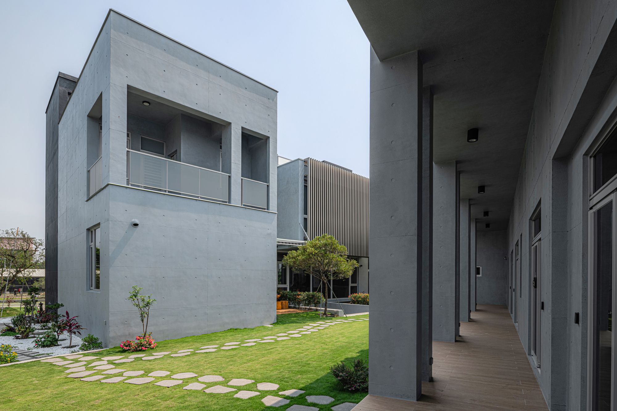
We divided the entire building into a front and rear building in a courtyard-like configuration similar to China. The front building is for the public domain and the main funded member families, and the rear building is for other family members and ancillary spaces. The semi-open air spa area serves as its transition space. The atrium between the two buildings provides sunlight and green plants and can be brought into the activities of family members.
Architectural design
Front building
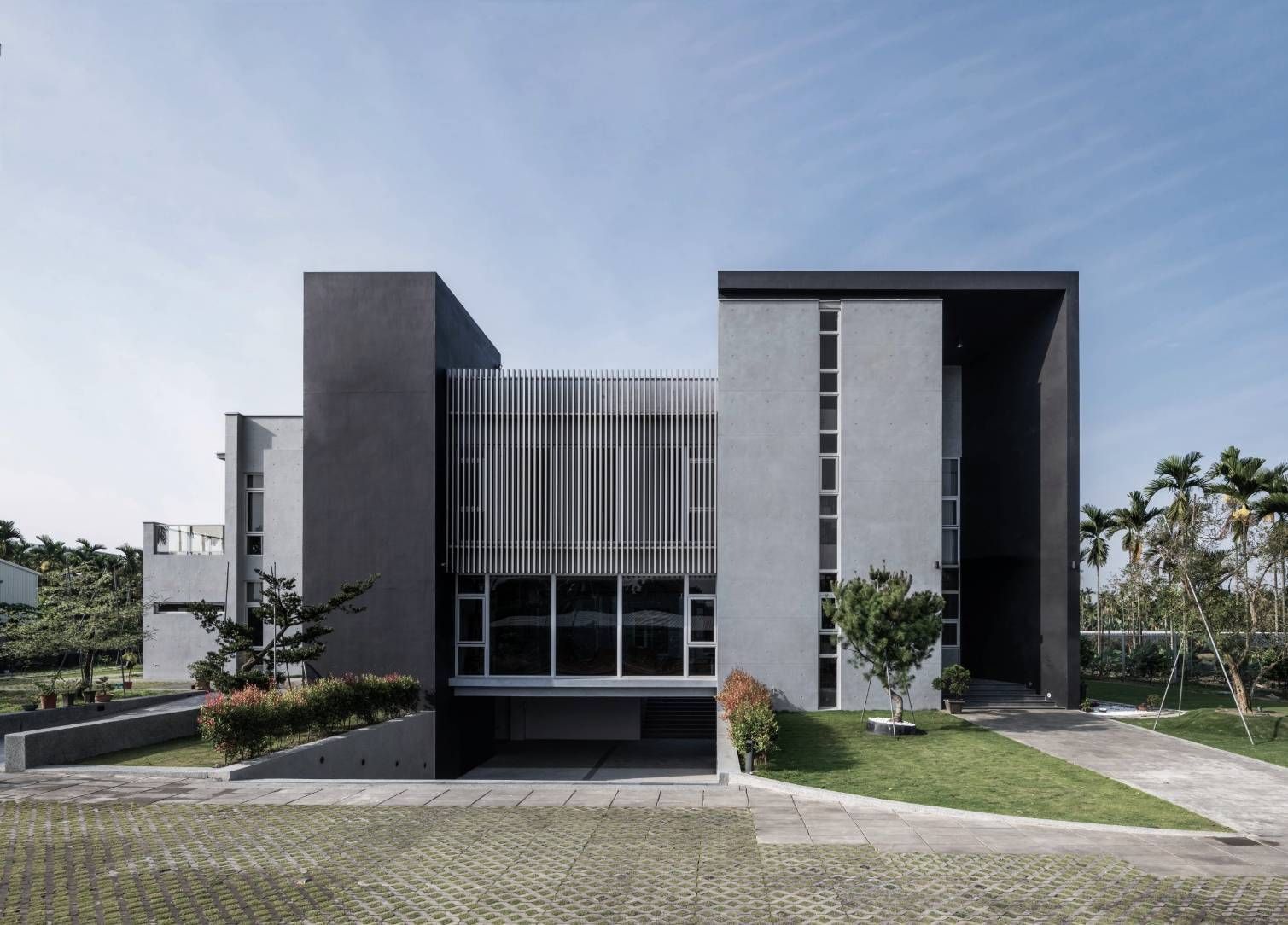
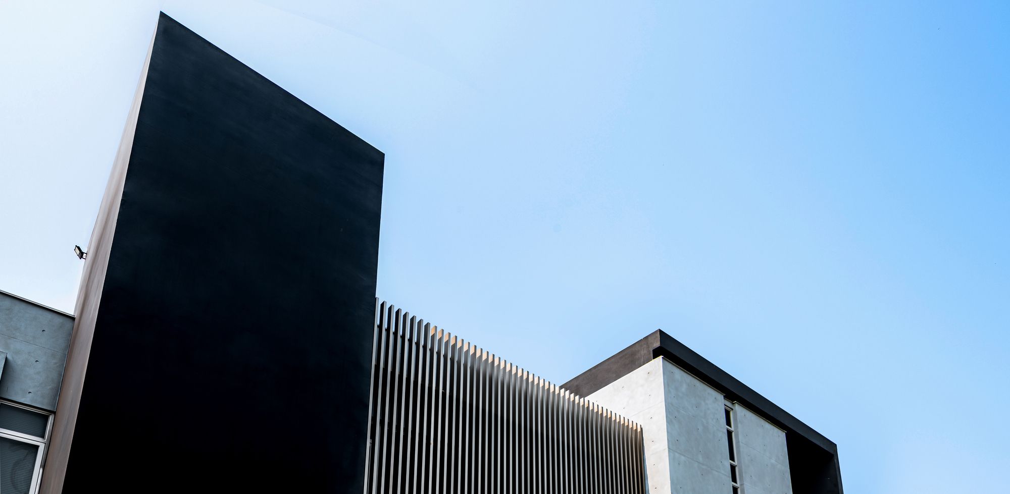
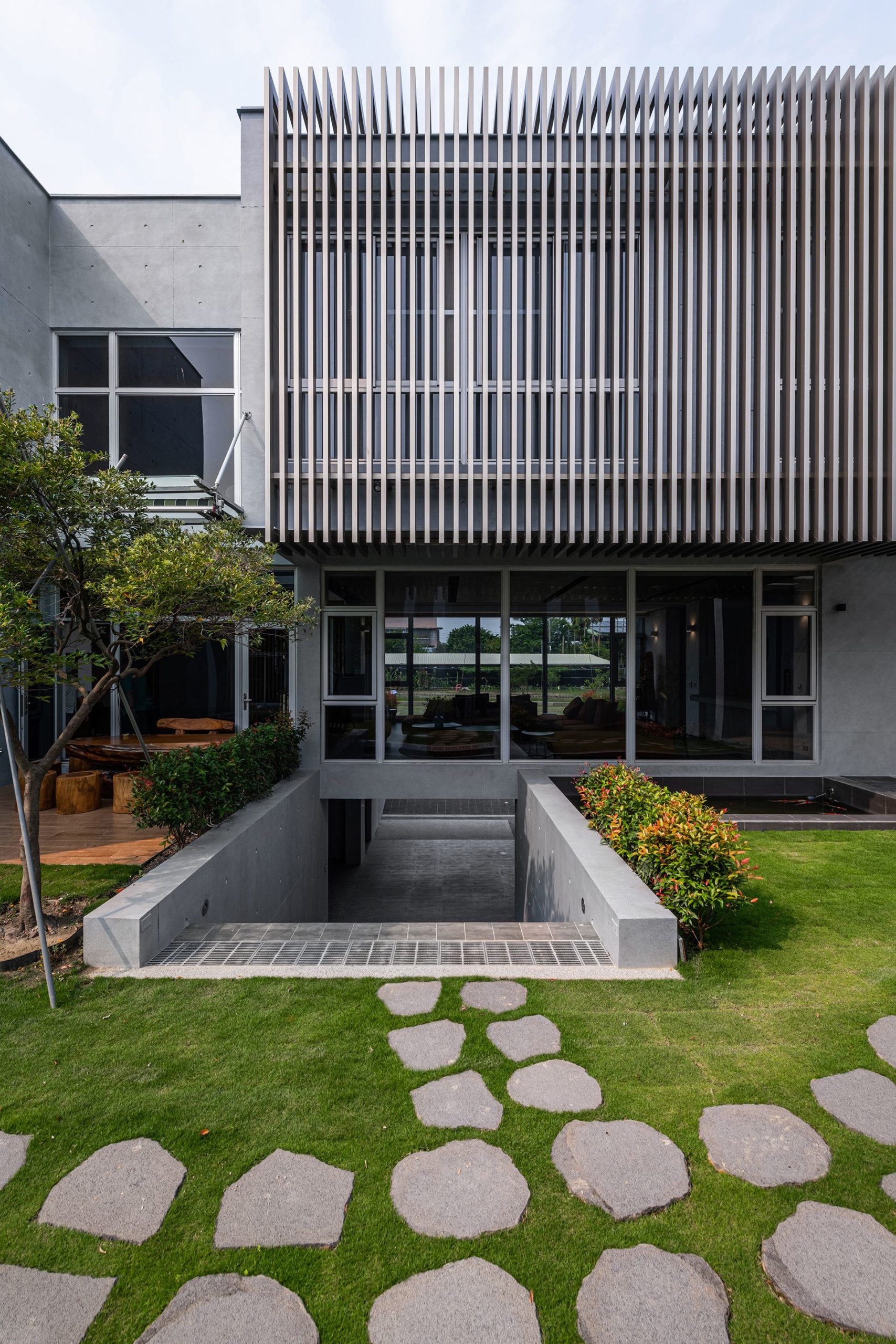
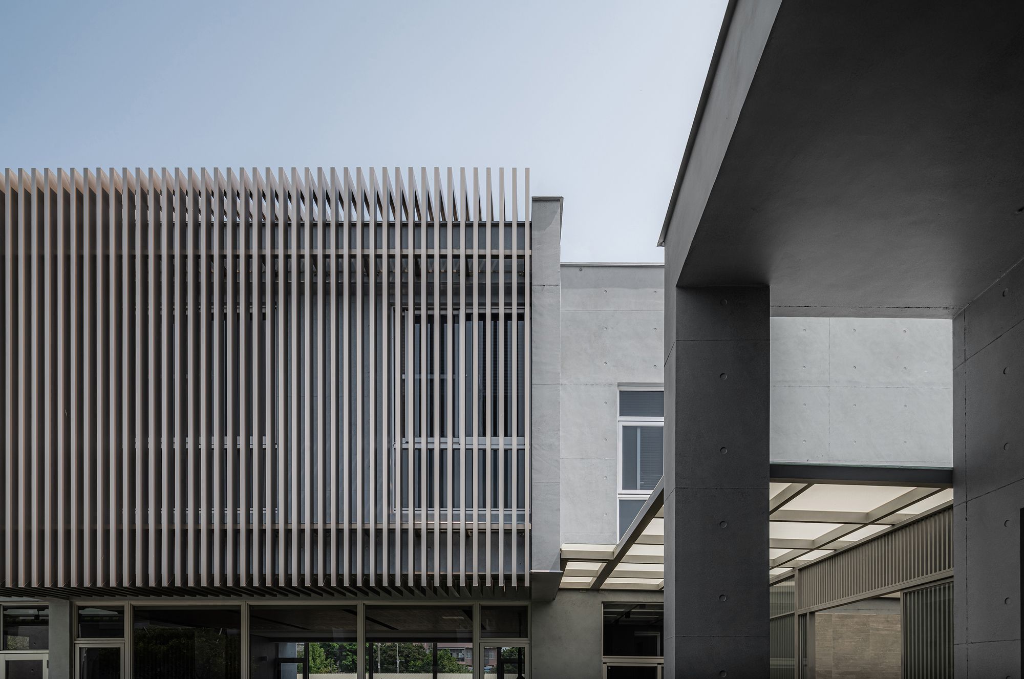
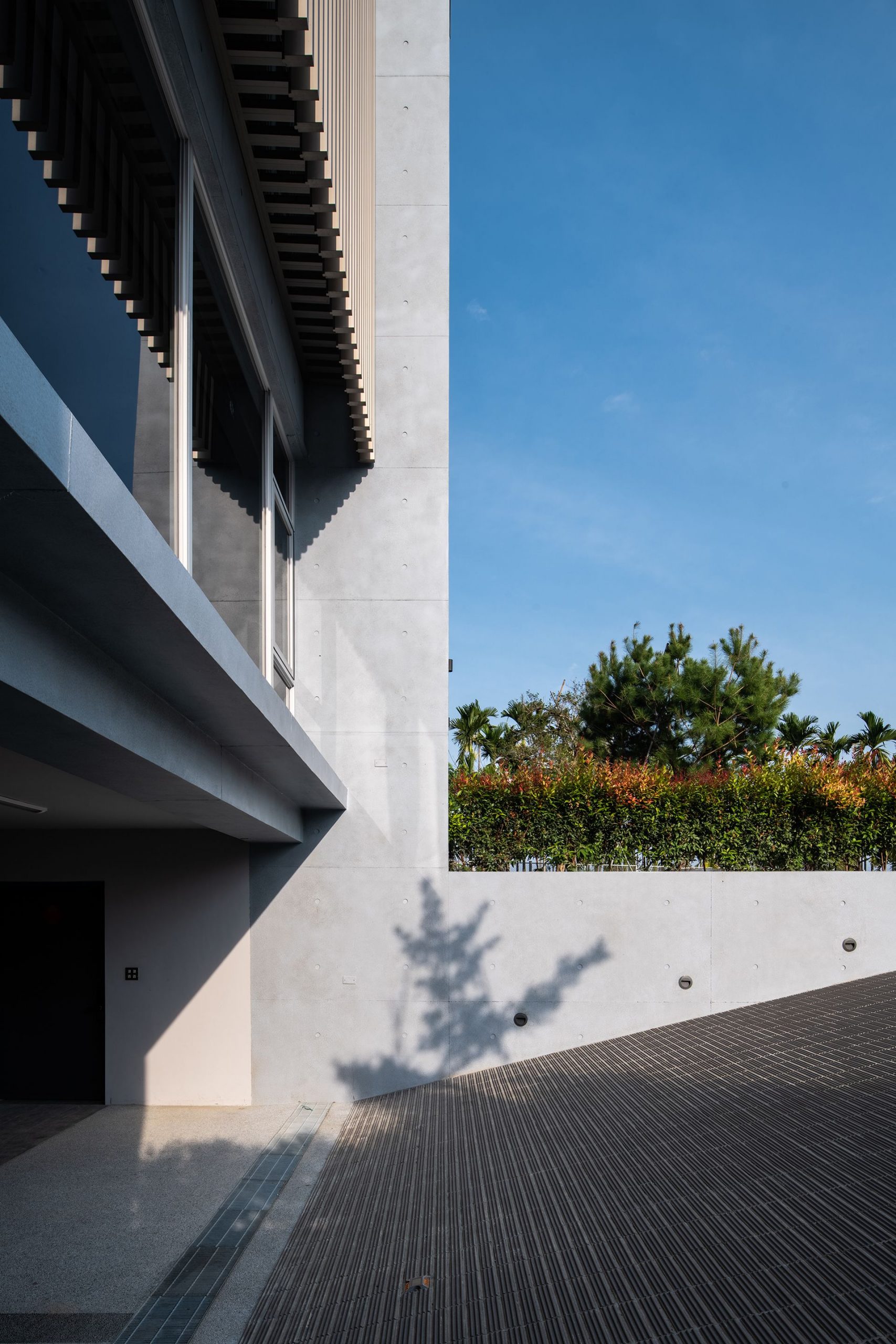
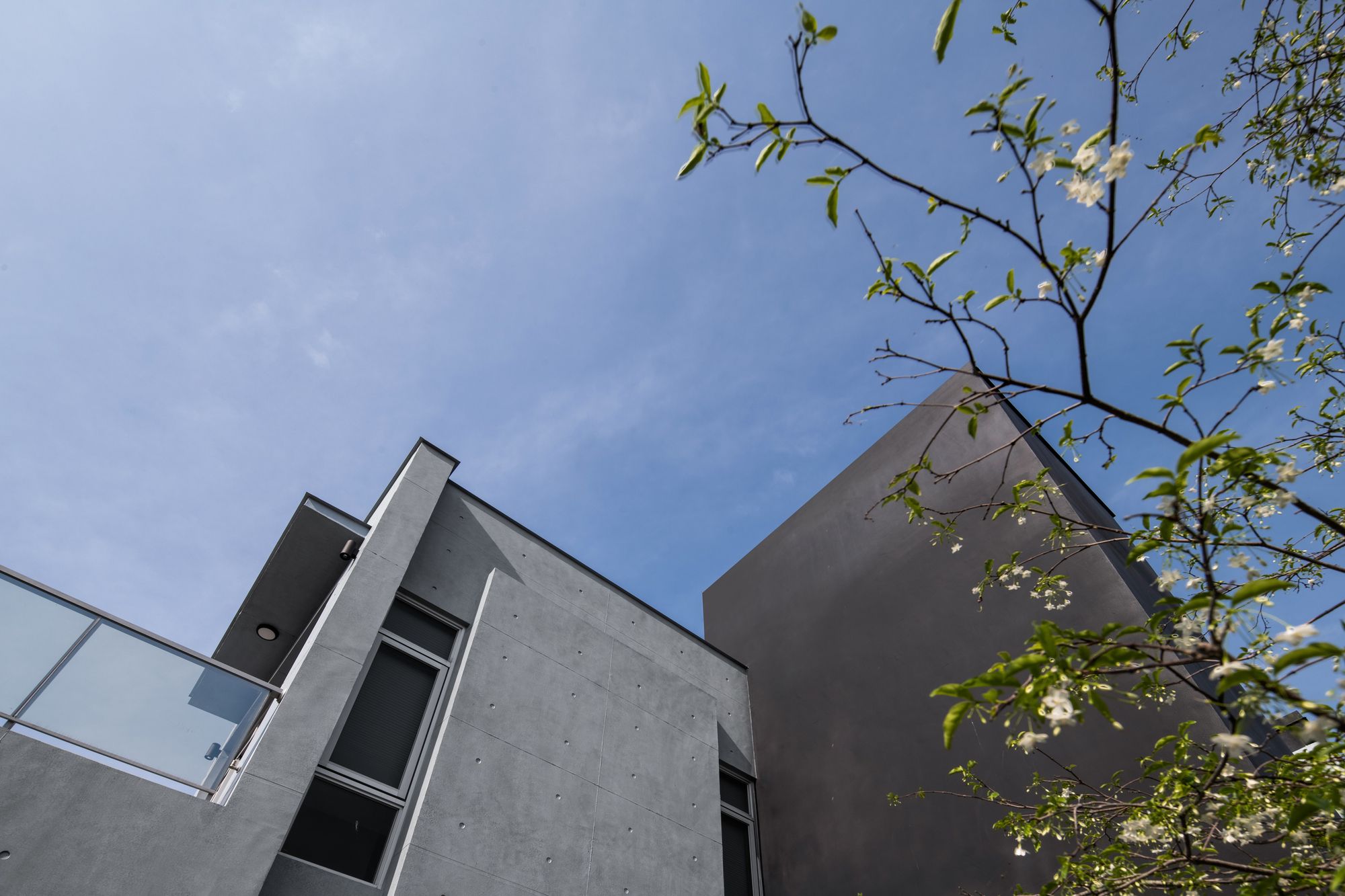
This base is lower than the main road, so we first set the elevation of the original base as a basement, and the first floor is raised and suspended; this type of tall house architecture similar to the South Island nation. We call it Singapore-style architecture at Taiwan. This type can effectively resolve the damp and hot ground gas, making the indoor space more dry and cool; in addition to the use of six cars and storage rooms in the basement, we have reserved a water collection box culvert in the foundation of the driveway to prevent the current Heavy rainfall in extreme climate. On both sides of the building, the suspended glass box is clamped by the amount of elevator and stairs, hoping to be light and stable at the same time. In 2F, because it is a private area, the facade is plated with aluminum grid to filter out too much sunlight and provide privacy Improve the overall refinement of the building.
Back building
We made a ceremonial corridor with a height of about 6M; because the end of the corridor is a zen room, I hope to present a solemn sense in the corridor.The corridor passes through the bedrooms and auxiliary spaces of other family members.
SPA SPACE
Between buildings, we arranged a semi-outdoor SPA space as a transition space and also as a public space in the center of the building for members to use.
Interior design
Front building basement
In addition to parking six cars, there are also a farm tool room and two staircase halls (elevator and staircase) .Because there are many family members, it provides more access lines for easy use.
The first floor of front building
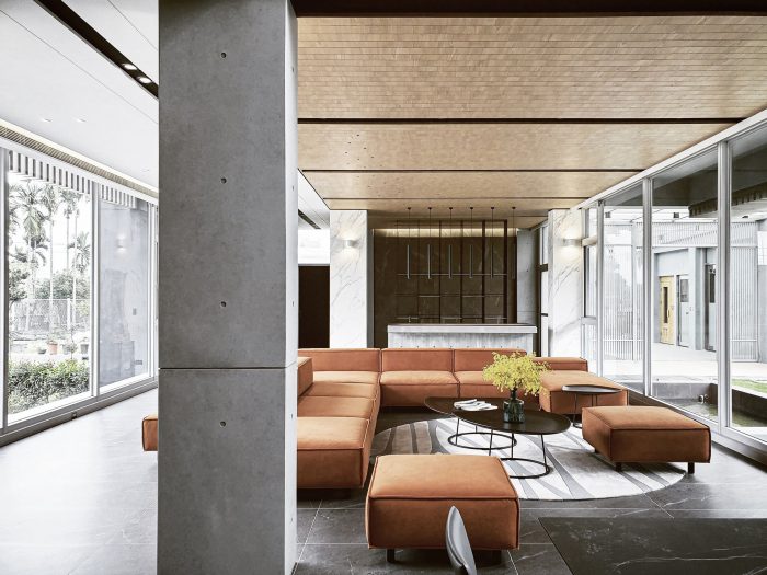
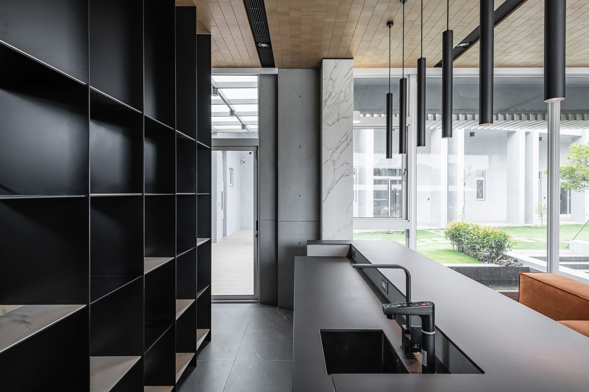
Because it is a public area of the whole building, in addition to the Chinese kitchen’s concerns about the needs of fume. The rest of the space hopes to see through all of the vision, but also hopes to have their own definitions. Therefore, the weak definition of the space in the material and space changes allows the vision to wear all Transparent, but with a sense of hierarchy.
Decoration
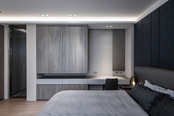
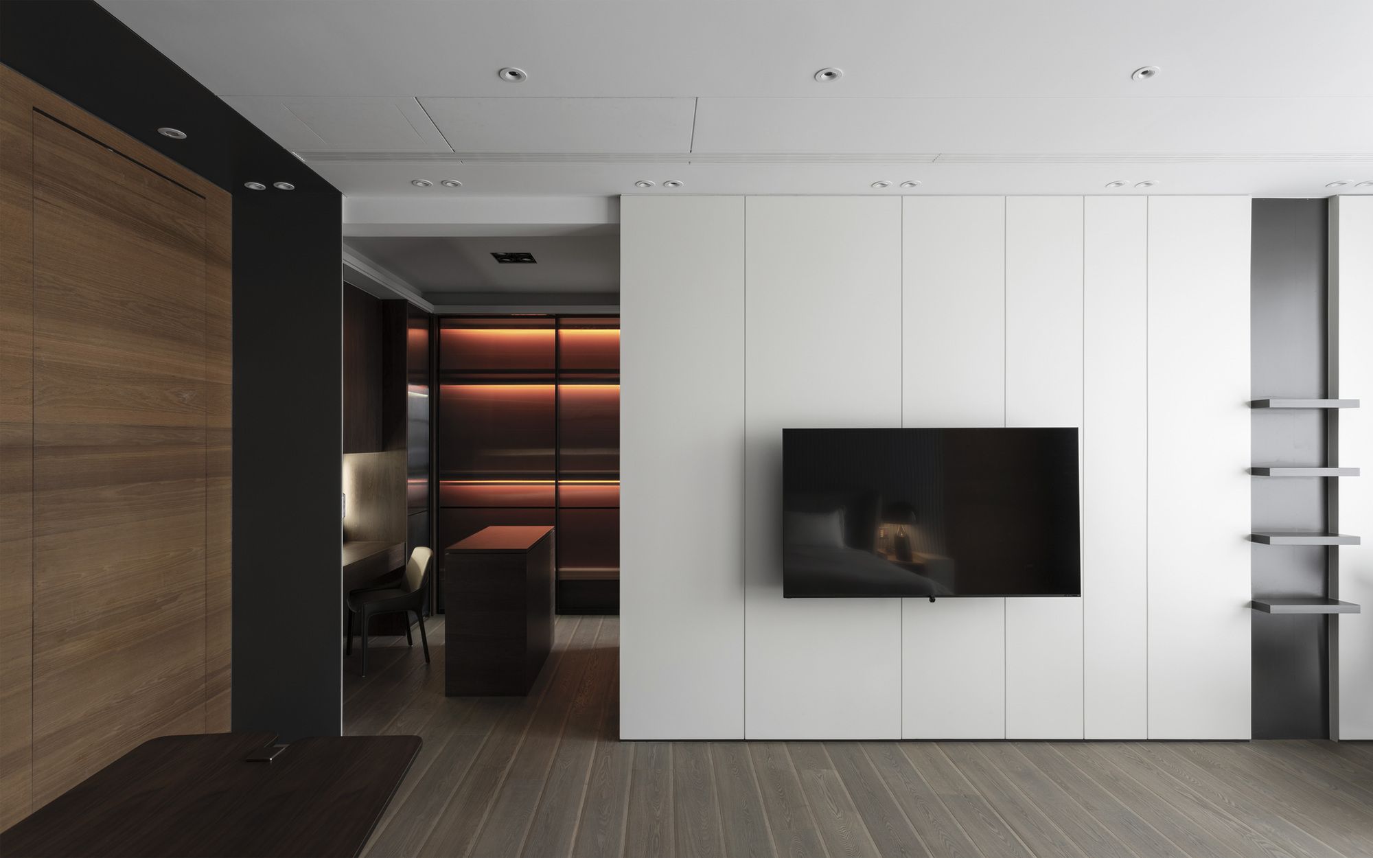
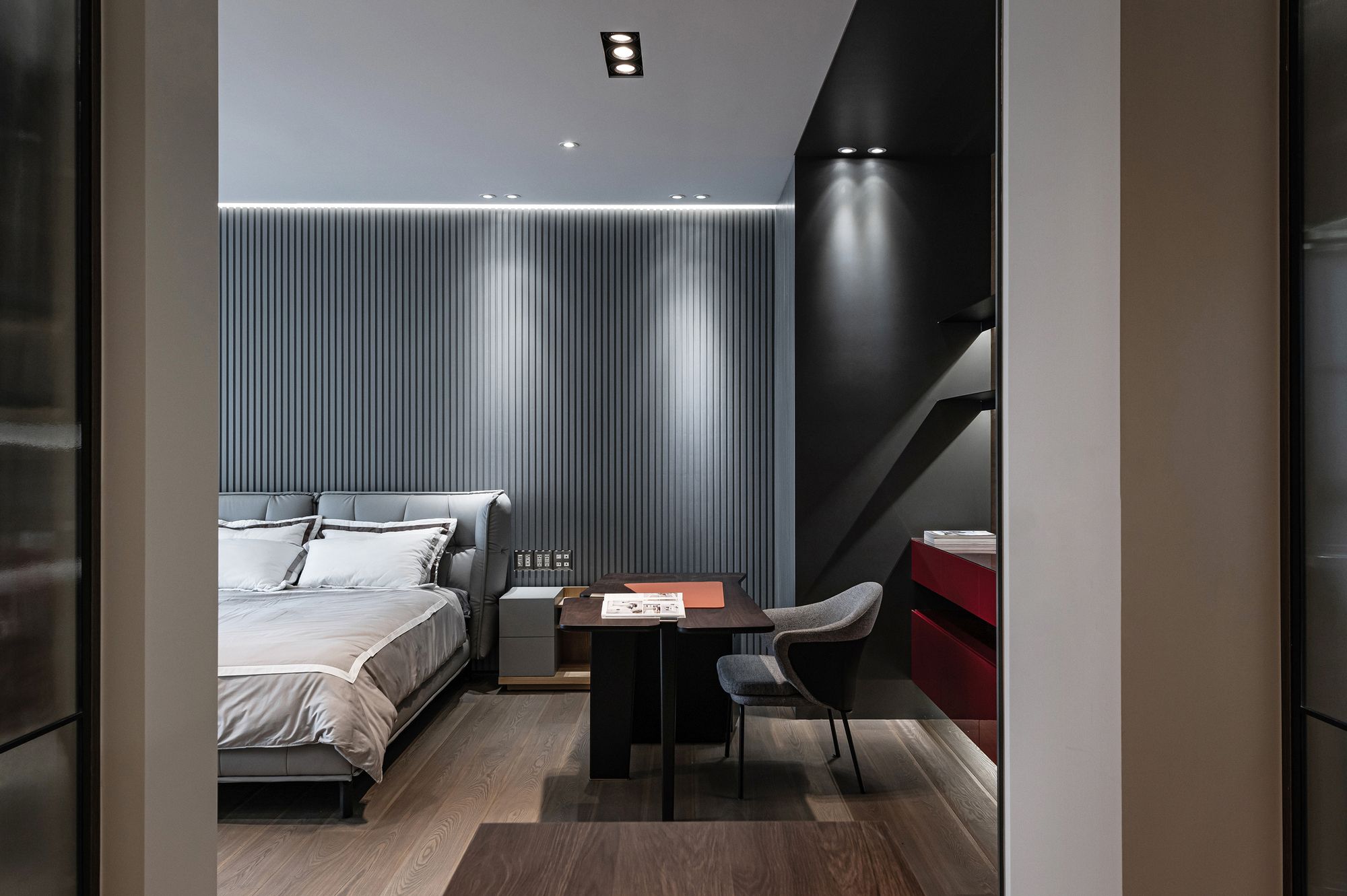
The public space is decorated with gray tones and light wood grain, and an orange multi-directional sofa is used as a highlight in the living room.
There is no TV main wall in the living room, because we hope that this space can be dominated by the view of the front yard and atrium, and supplemented by the needs of multi-party gatherings, so the directional multi-directional furniture configuration used in the living room is also specially selected to meet the above requirements.
Project Info:
Architects: Zhucun Design
Location: Pintung, Taiwan (ROC)
Area: 350 m²
Project Year: 2020
Photographs: AR HER KUO & Trig photography
Interior. Image © AR HER KUO & Trig photography
Interior. Image © AR HER KUO & Trig photography
Interior. Image © AR HER KUO & Trig photography
Interior. Image © AR HER KUO & Trig photography

Interior. Image © AR HER KUO & Trig photography
Interior. Image © AR HER KUO & Trig photography
Interior. Image © AR HER KUO & Trig photography
Interior. Image © AR HER KUO & Trig photography
Interior. Image © AR HER KUO & Trig photography

Interior. Image © AR HER KUO & Trig photography

Interior. Image © AR HER KUO & Trig photography
Interior. Image © AR HER KUO & Trig photography
Interior. Image © AR HER KUO & Trig photography
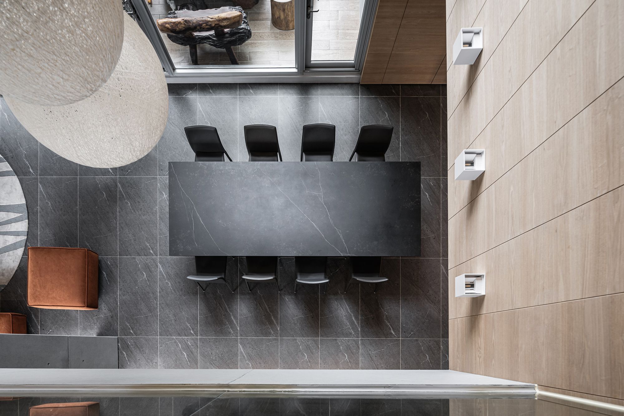
Interior. Image © AR HER KUO & Trig photography
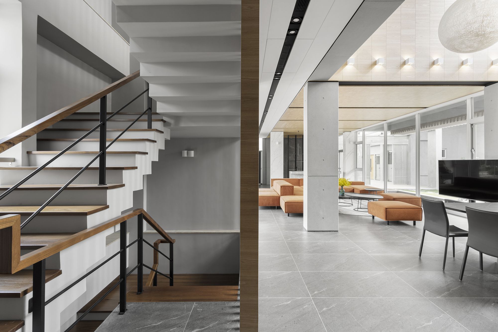
Interior. Image © AR HER KUO & Trig photography
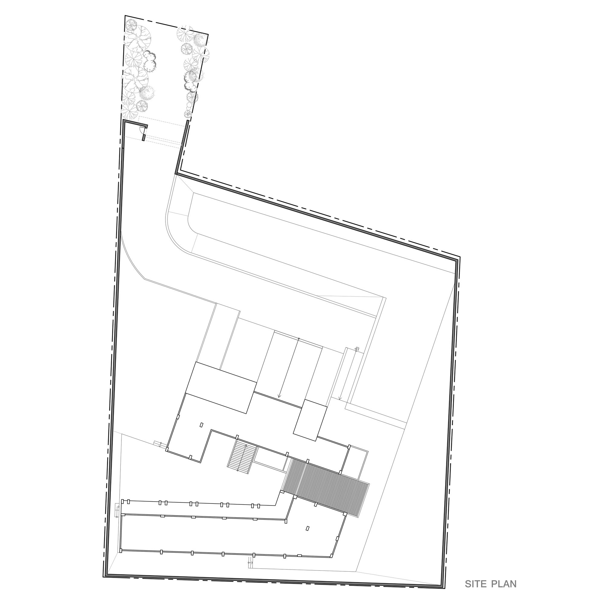
Site plan
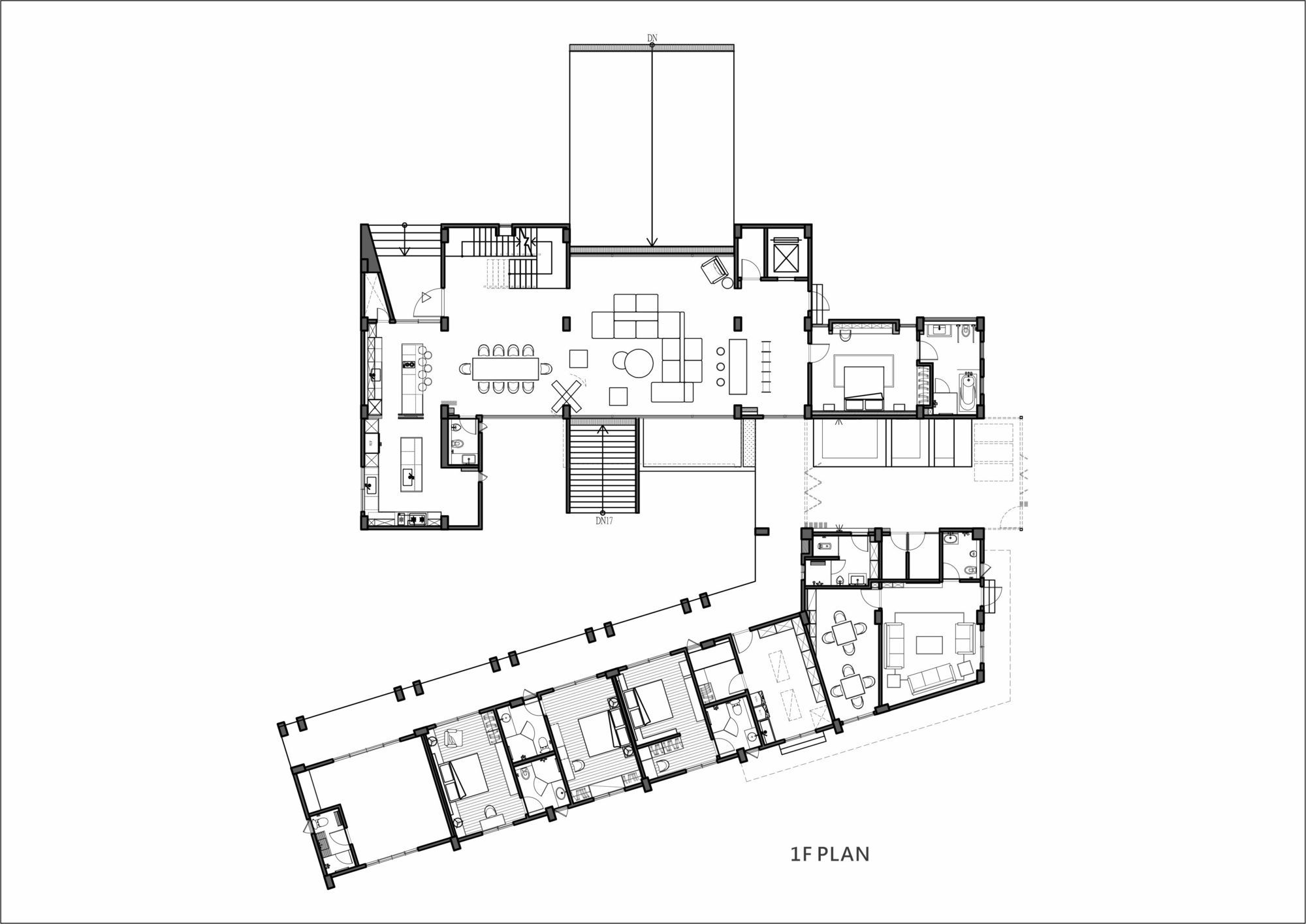
1F plan
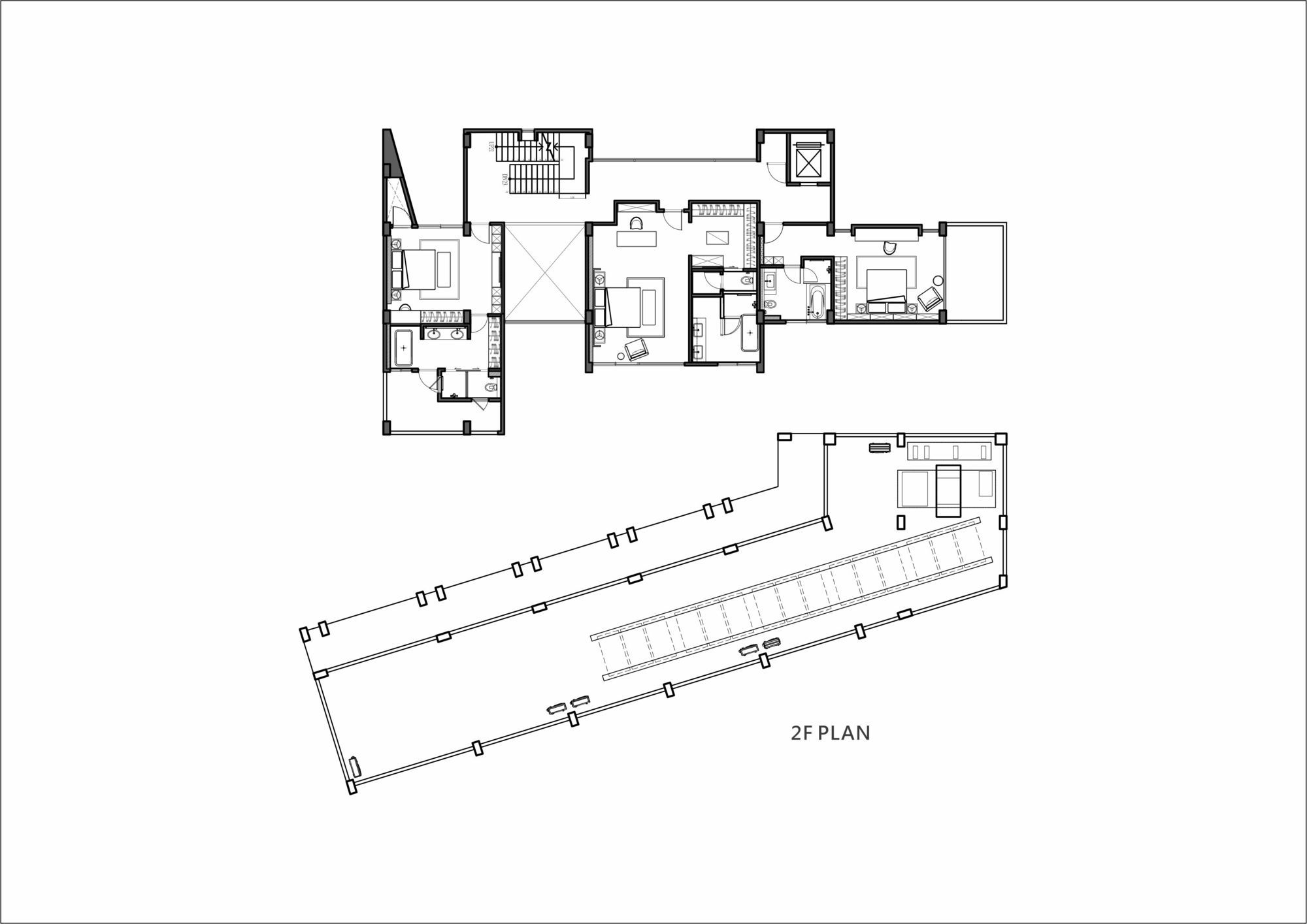
2F plan
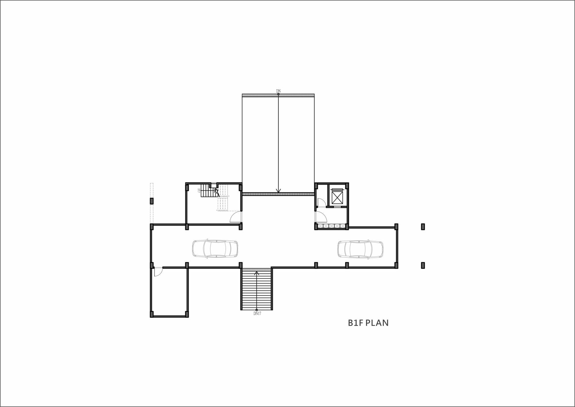
B1F plan
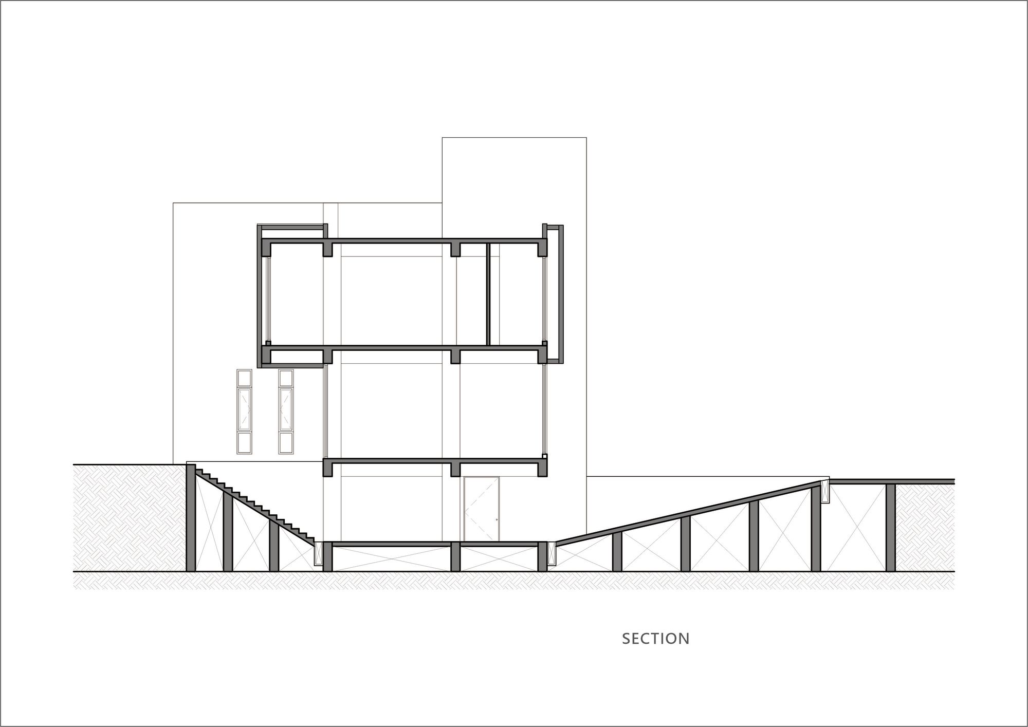
Section


