Bogen Restaurant’s concept:
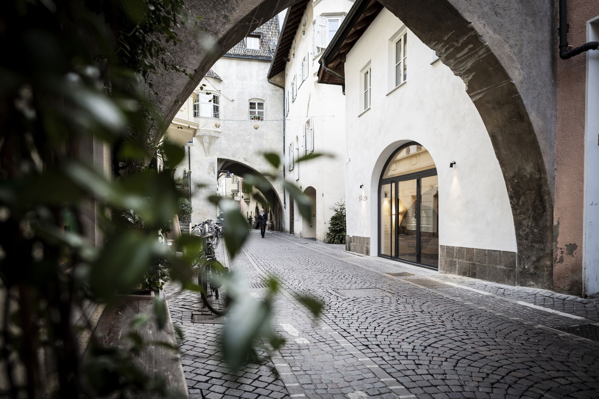
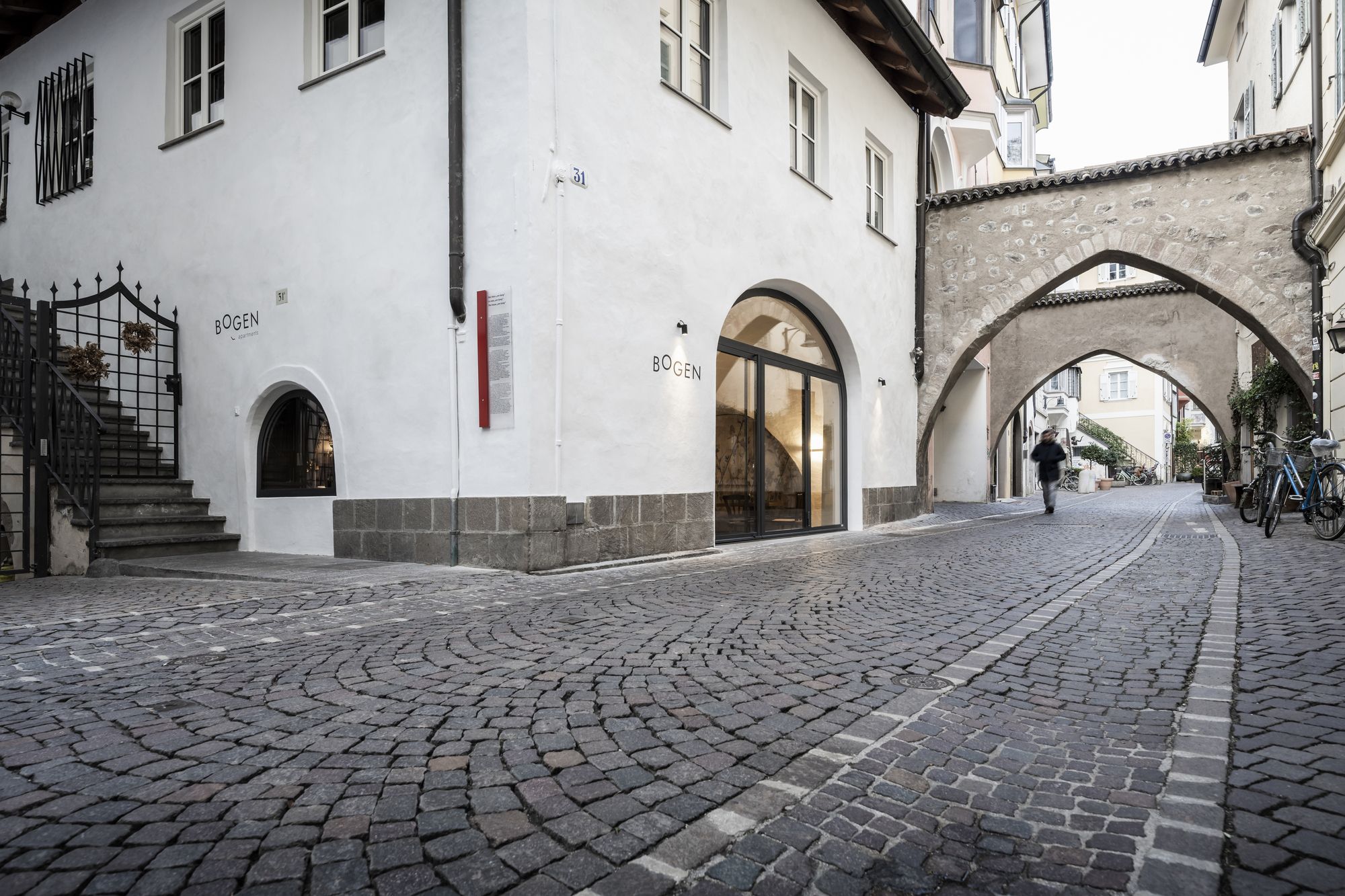
An ancient barrel-vaulted workshop hides under the dust of history along one of the oldest trade streets of BOLZANO. noa* breathes new life into this space, transforming it into a welcoming bistro poised between historical heritage and contemporary finesse.
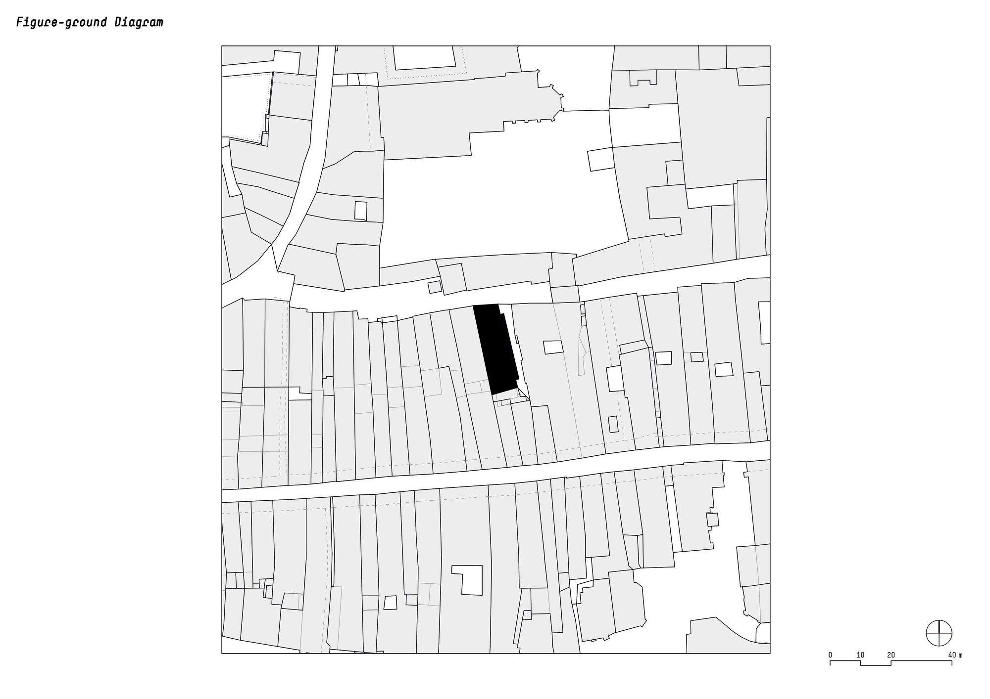
Bolzano’s mercantile past echoes through the arcades of Via Portici, the city’s main axis, which has been a trading hub for Italian- and German-speaking merchants since the 13th century. The goods that would later reach the whole of Europe were stored in its warehouses. Like Via Portici, also the northern parallel street, Via Dr.
Streiter has preserved much of its original appearance: today, it still passes through three medieval stone arches. It was mentioned for the first time in a document from 1498 and overlaps the old northern moat of the first town center. About halfway down the street is a house that is hard to miss: with only two storeys, it is one of the lowest in the neighbourhood.
An external staircase with an open corridor and round-arched portals provide access to the east side of the building, breaking up the compact street front. This house has been the backdrop for noa*’s latest interior design project.
The project involved the space on the ground floor where shoemakers, carpenters, carters, and wood and fruit merchants worked in the 19th century, and where later the first restaurant on the street was established. Although the building preserved its charming original architecture, it had deteriorated over time.
The Mayr family, current owners of the building, entrusted noa* with the restoration and interior planning for a new destination: the Bogen bistro.
Historical Heritage. The strong relationship with history was crucial in the definition of the project: both because the house is under monumental protection and because the design team wanted to emphasise to the fullest the original architecture of the arches, to which the bistro itself pays homage with the name “Bogen”, German for “arch”.
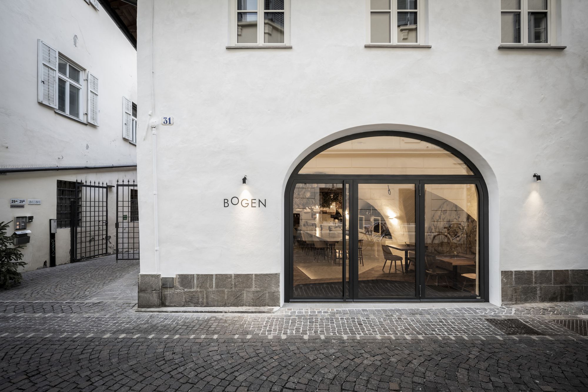
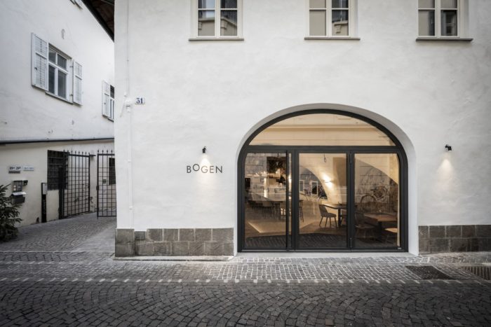
On the exterior façade, the intervention consisted of careful replastering in smoky white and an enlargement of the entrance arch. Here, a new tripartite black metal window follows the segmental arch and allows good natural lighting while providing an essential and timeless design.
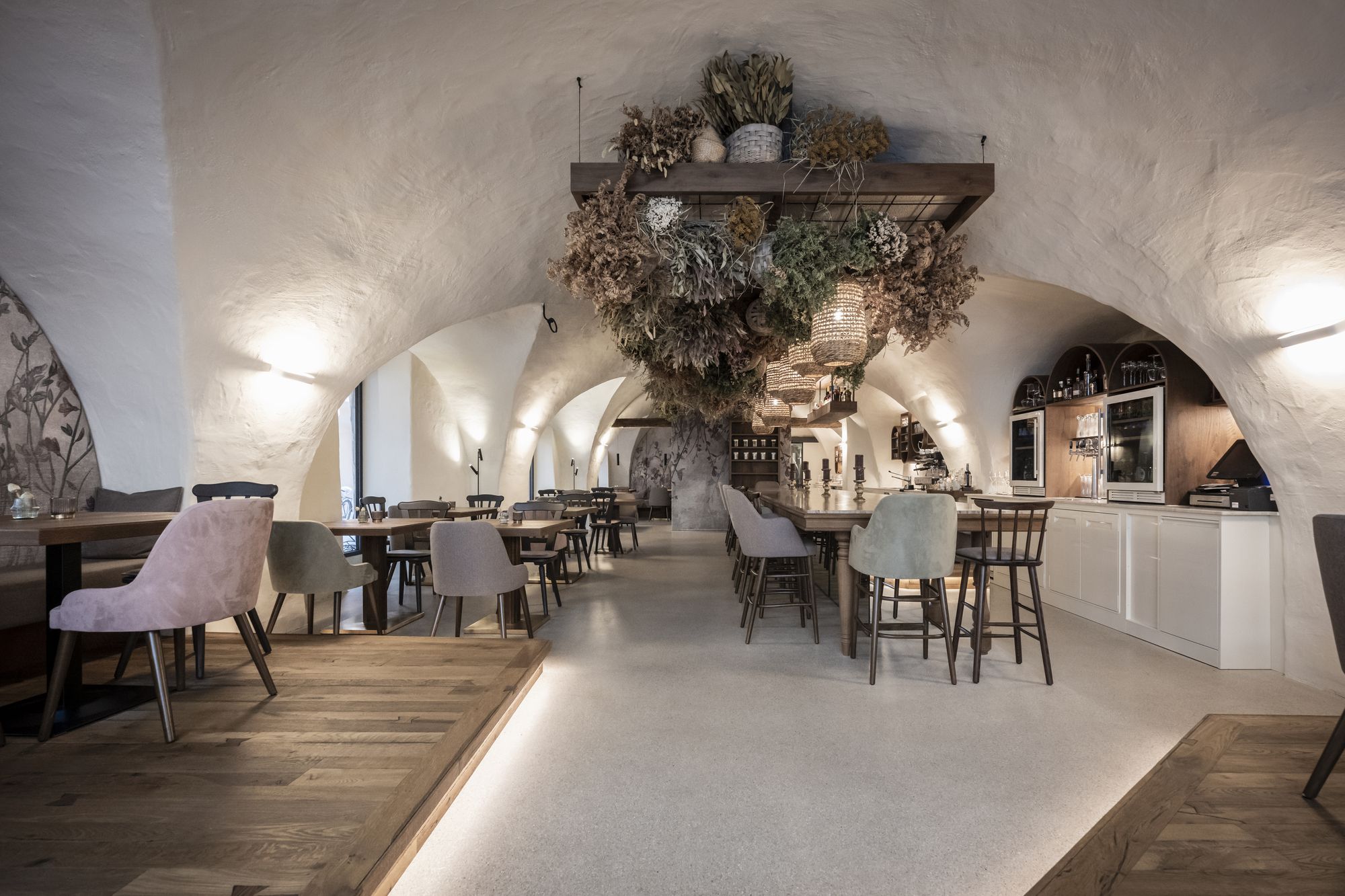
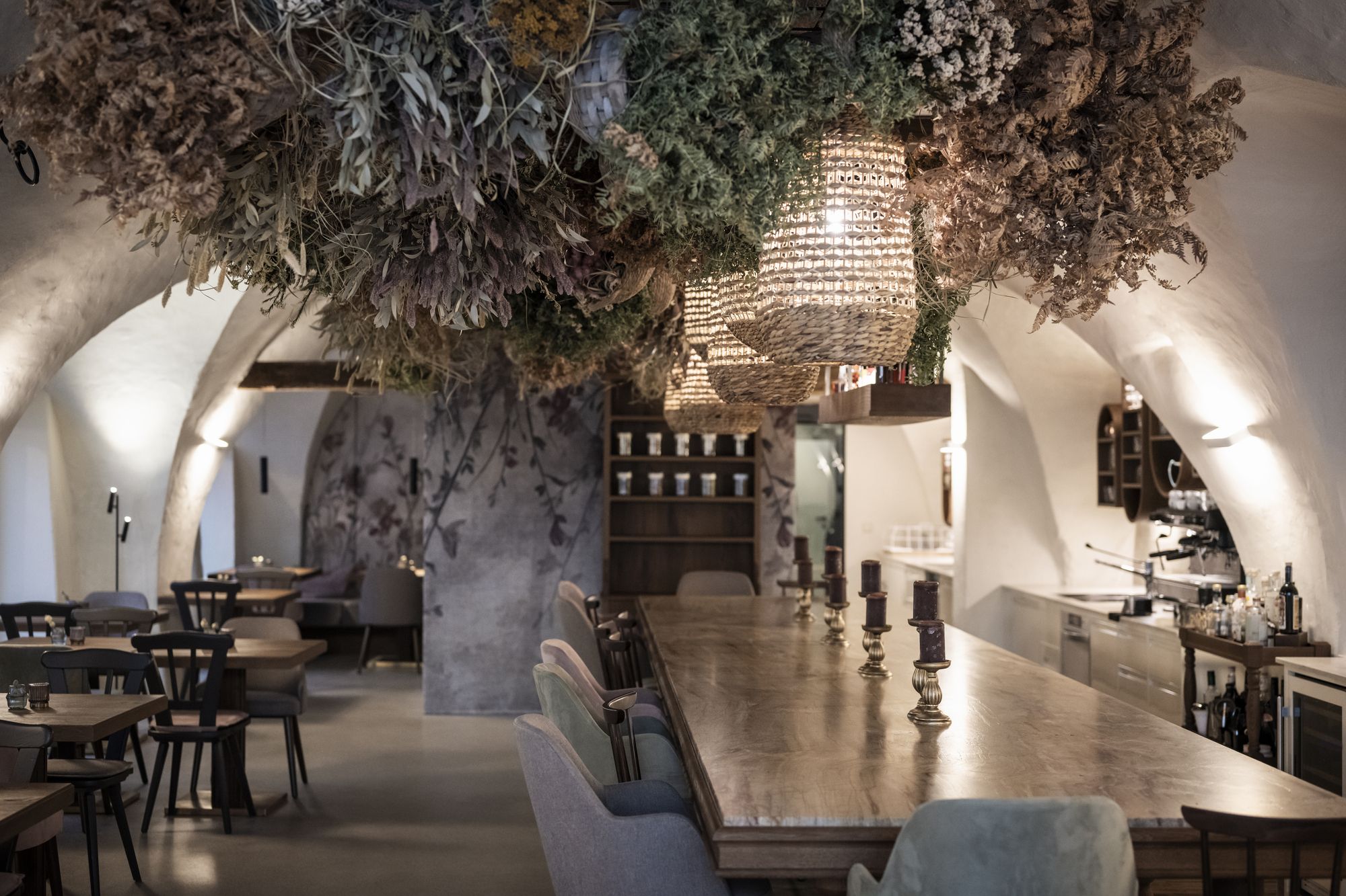
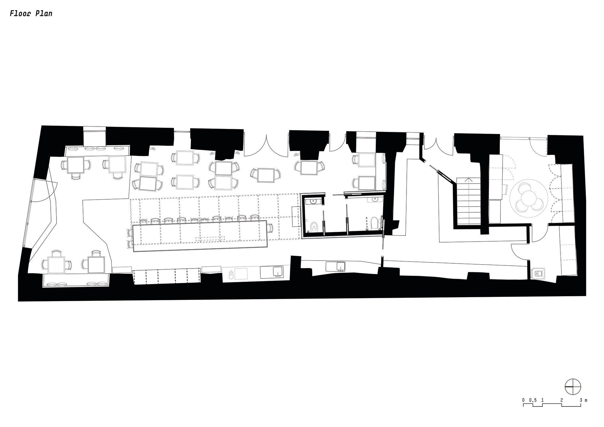
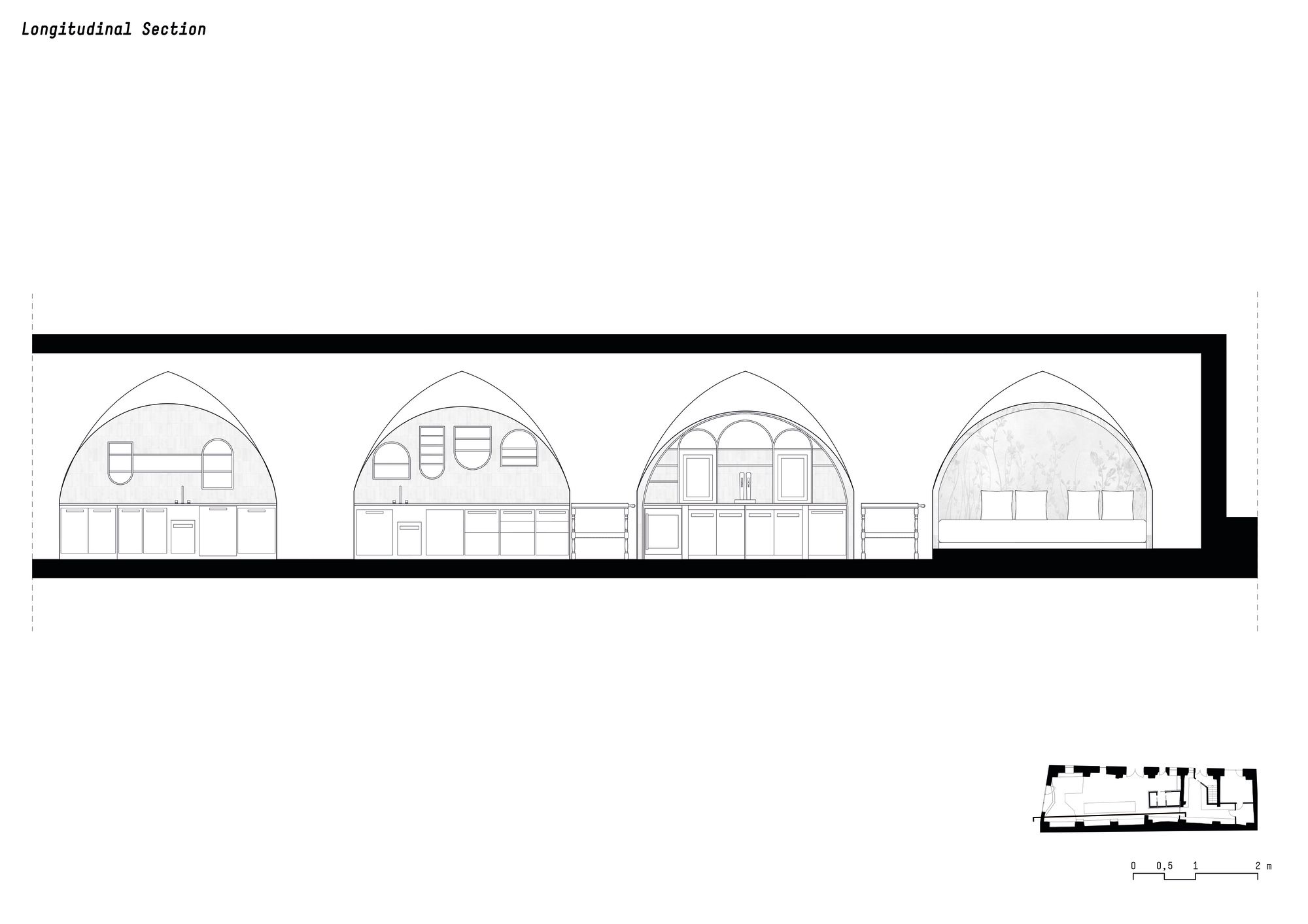
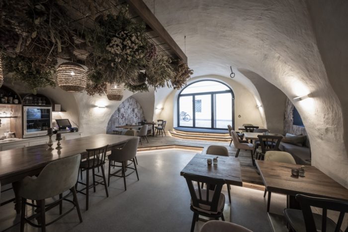
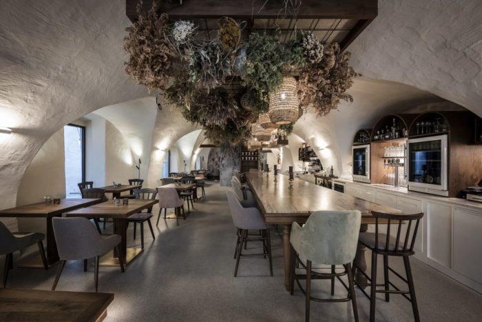
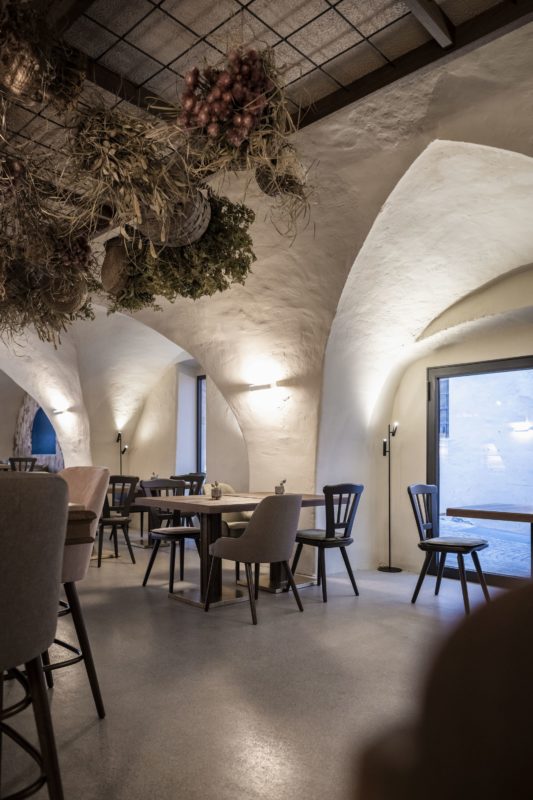
For the interior, the underlying idea was to emphasise the four arches, which on both sides rhythmically mark the almost 19-metre depth of the room. To do so, noa* worked on both the horizontal and vertical dimensions. In the first case, the existing internal height difference was resolved with an oak platform at the entrance, while a grey-beige polished screed was chosen for the floor.
In this way, there is no strong colour contrast with the walls, and the harmony of the shades enhances the whole space. On the other hand, noa* has designed the lighting so that the spotlights gently emphasise the curves of the arches. Except for the two tables at the end of the room, there are no pendant lights; floor lamps provide additional lighting.
Bohemian Atmosphere. During the first meetings between the clients and the interior designers, which focused on the ambience of the bistro, the client’s desire to have a romantic, bohemian-style atmosphere emerged.
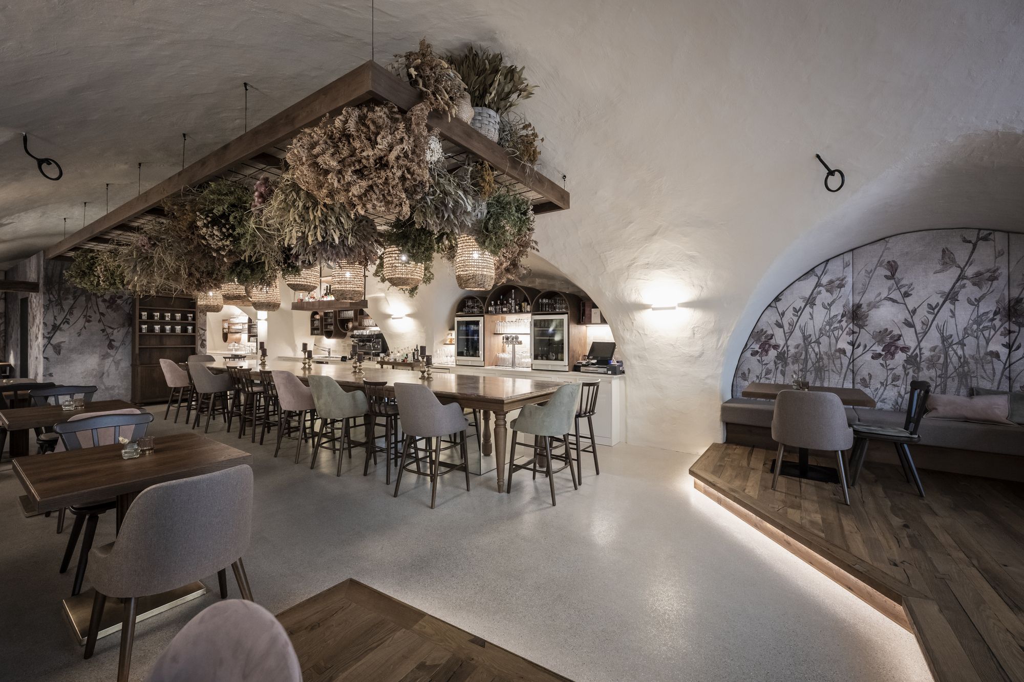
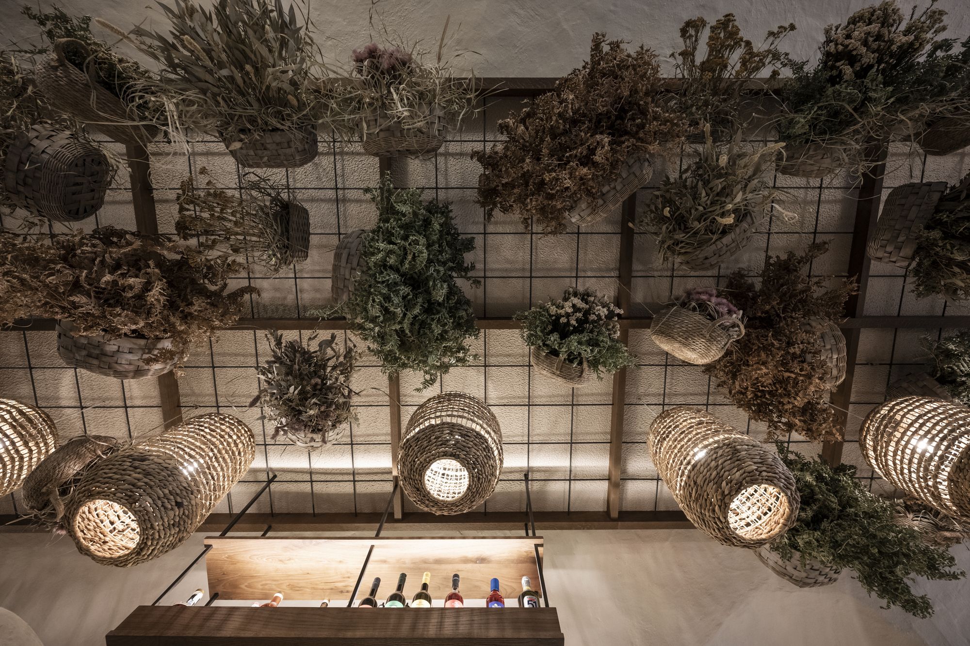
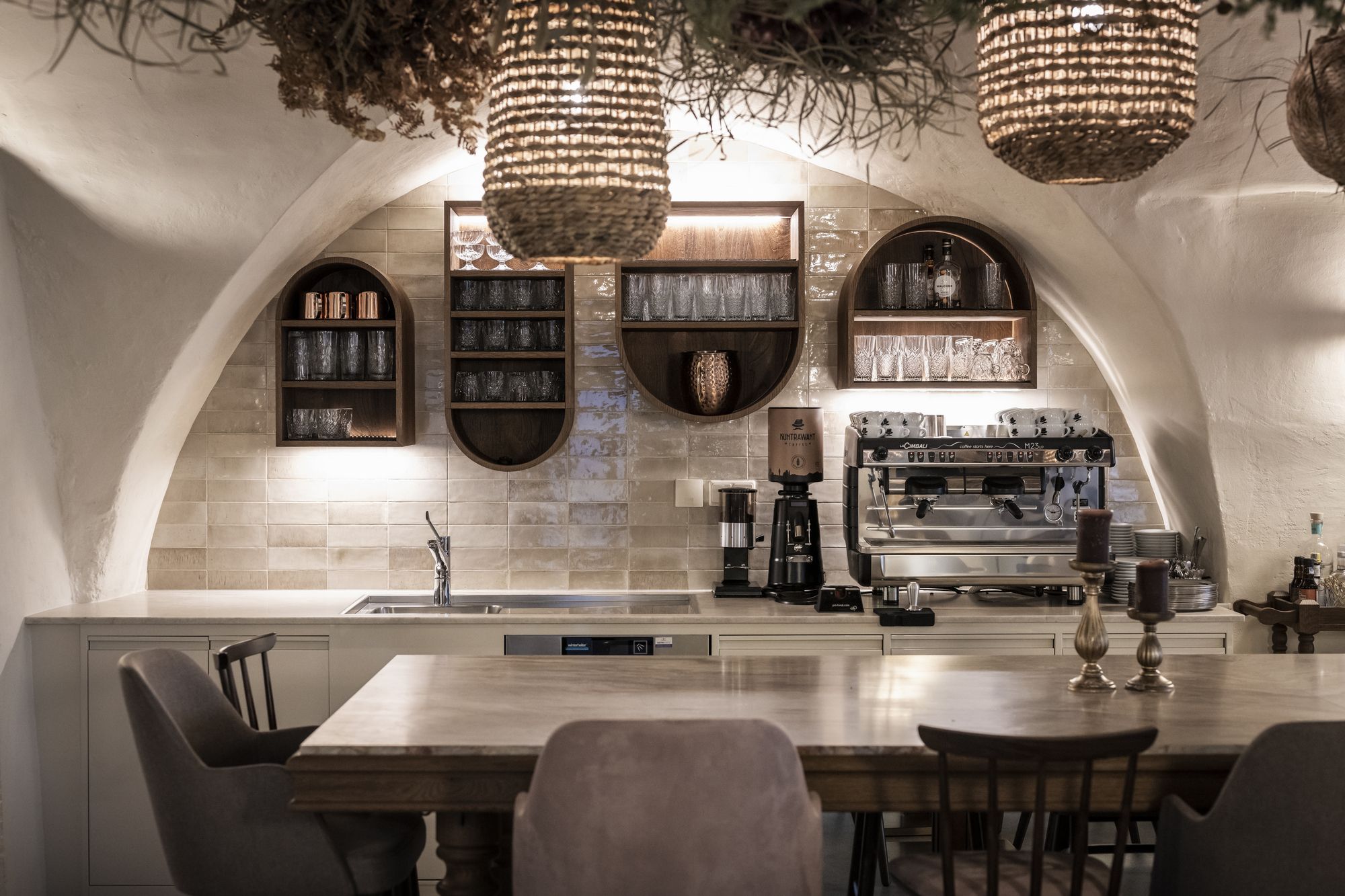
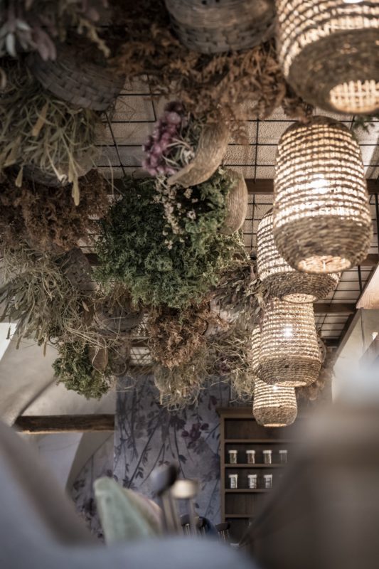
In addition, the owner of the house, Roswitha Mayr, wanted to give the space a personal touch with her handcraft and artistic talents in the form of floral compositions. noa * took up these ideas and structured the design around a pivotal element: a welcoming 7-metre-long counter placed under a ceiling of flower baskets.
The long table as a convivial and informal solution in gastronomic ambience is a recurrent motif for noa*; in this case, the counter is also a worktop on the right side, without any stools and housing technical compartments. Other interesting details make this piece of furniture unique: the six legs are one different from the other and suggest an improvised table that a family might have made for itself.
A mirror covers the central base and makes it disappear into the room. The top is a slab of Nacarado stone, chosen for its distinct veining and warm colour. Above the table, Roswitha’s personal creation is a large floral composition that seems to pour from the ceiling. The hanging rattan lamps, which also recall the basket motif, find their place among the flowers.
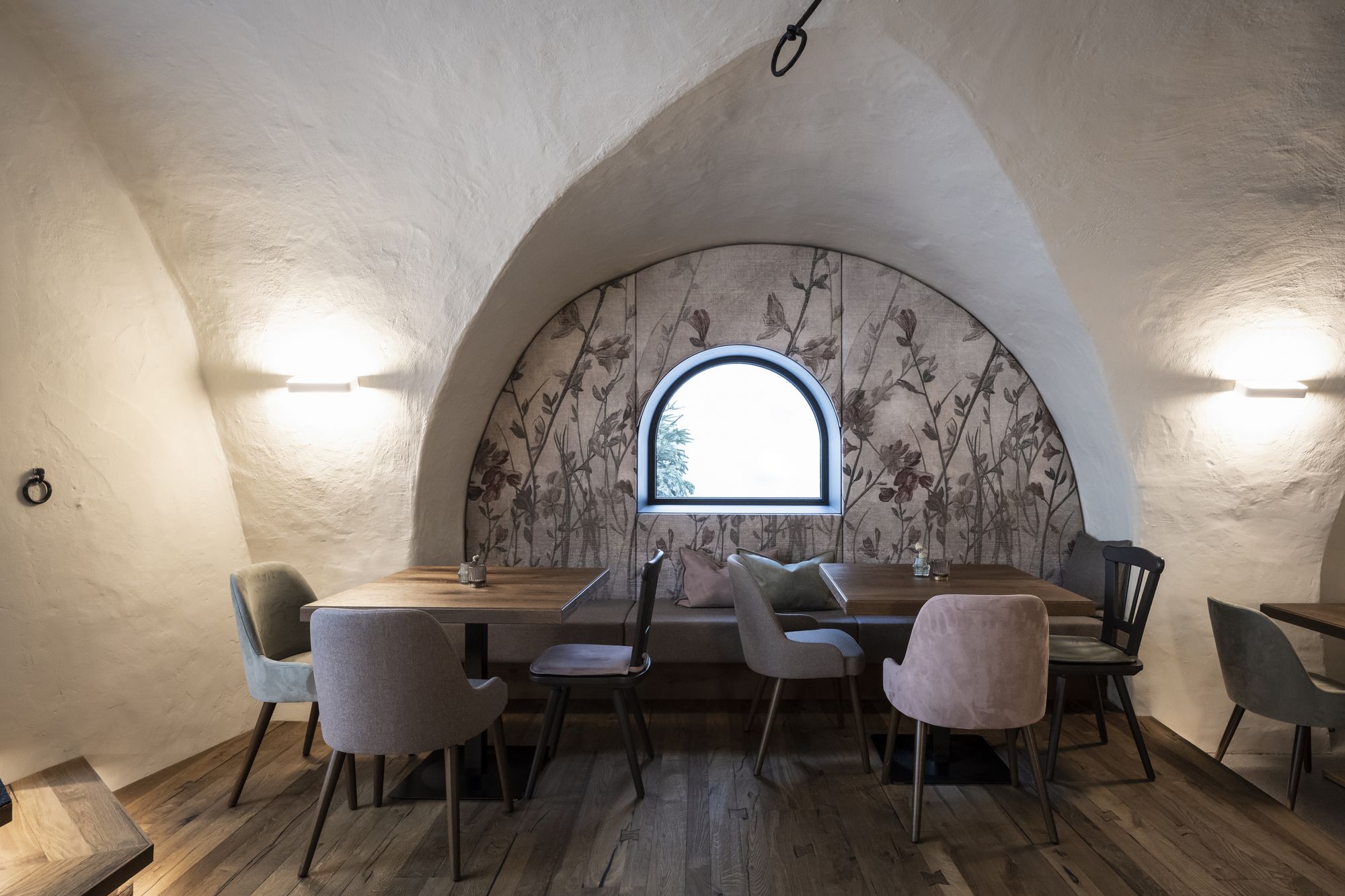
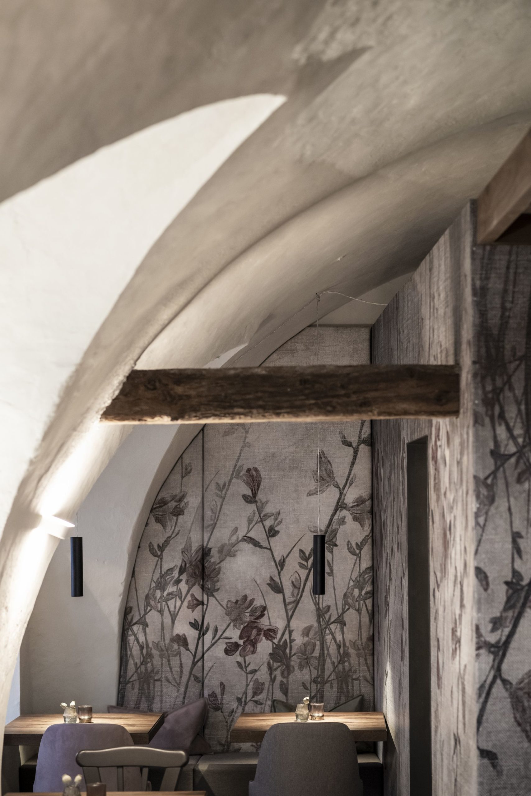
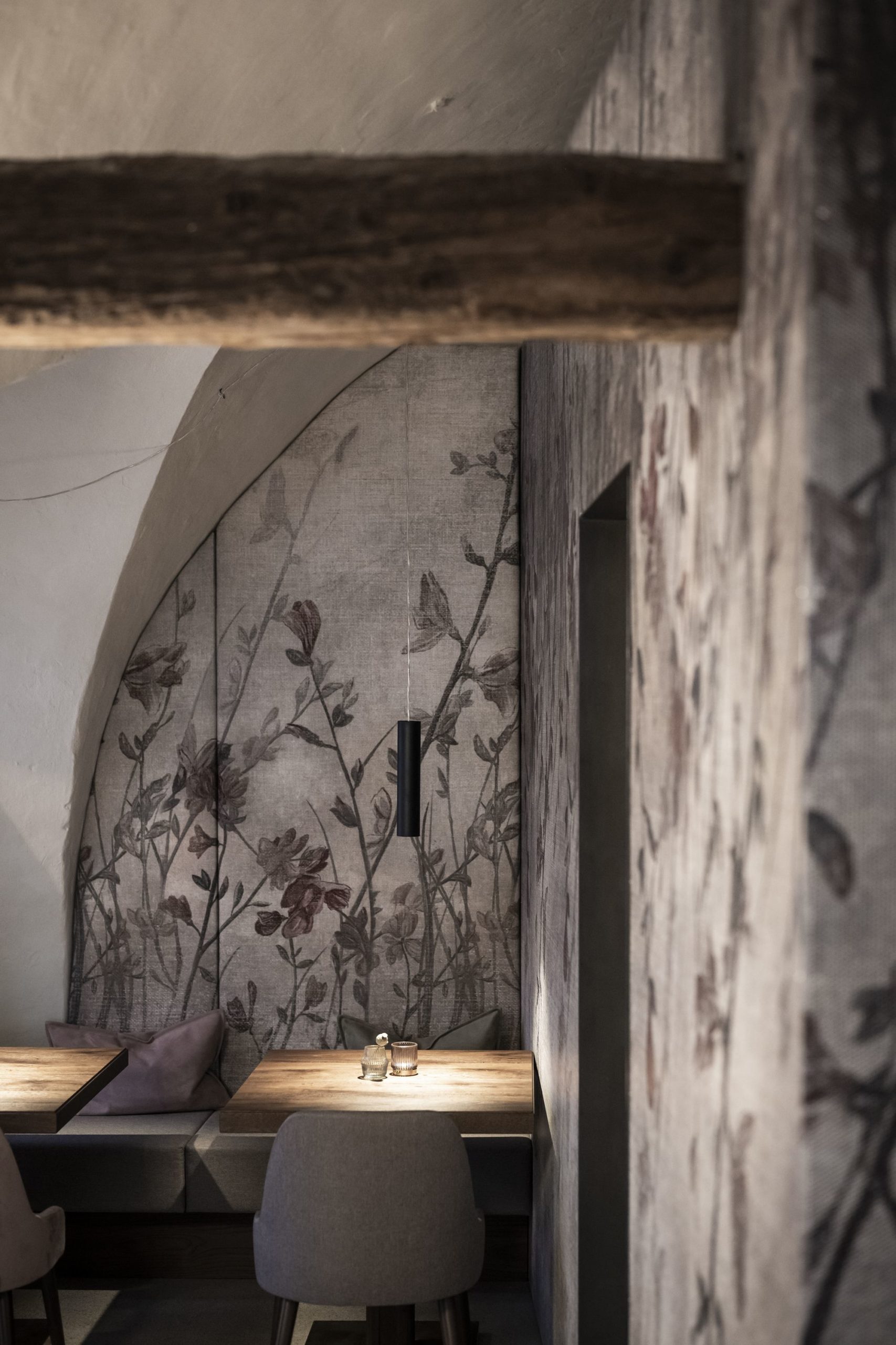
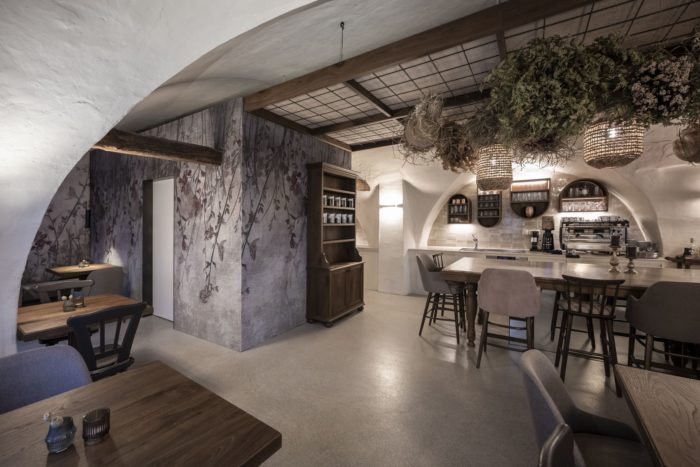
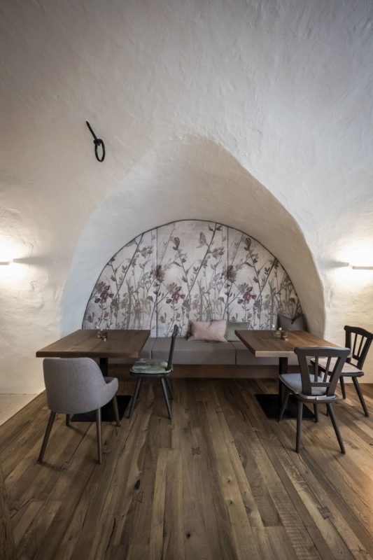
Cozy Alcoves. The shared space of the large counter contrasts with the intimacy of the small tables on the left side of the bistro, sheltered by the arches and overlooking the alley. The feeling of privacy is further accentuated in the first pair of arches, with seating built into the recesses and walls covered in fabric with an elegant floral print.
The niche closing off the room is also designed in the same way. In a constant dialogue between past and present, noa* chooses to alternate new seats in wood and fabric with newly lacquered vintage chairs.
There are two service areas: the kitchen, which has been completely renovated and is located at the end of the room, and the toilets. These have been accommodated in a box, clad with perforated metal panels, on which the same floral motif of the arches has been printed. In this way, noa* combines the technical requirements of acoustics with the venue’s aesthetics: the insulation panels are not visible under the perforated metal surface.
Architects: NOA* NETWORK OF ARCHITECTURE
Area :188 m²
Year :2021
Photographs: ALEX FILZ
