Four Bay of Plenty designers have been awarded top honours at the 2022 Regional ADNZ Resene Architectural Design Awards.
Held in Hamilton on Friday, the awards celebrate the greatest architectural designs New Zealand has to offer.
Awarding outstanding projects from across New Zealand in commercial and residential categories.
The award-winning Bay of Plenty designs came from Adam Taylor of ata, Jon McAlpine of TGA Ltd, Werner Naude of DCA Architects of Transformation and Andrew Ward of mod Architecture.
Jon McAlpine of TGA Ltd won four awards for two projects.
He received a Highly Commended Award in the Residential New Home Between 150m2 and 300m2 category for his work on a project titled ‘Rainscreen’ and three awards for a project titled ‘Palm Springs’ including the Regional Residential New Home Between 150m2 and 300m2 Award, the Regional Residential Interiors Award and the Regional Resene Color in Design Award.
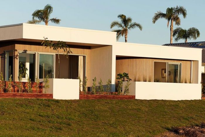
‘Palm Springs’ located in Papamoa, Tauranga, is a unique show home that sits comfortably with the Palm Springs aesthetic. It is practical, liveable and environmentally conscious.
McAlpine approached the design with a Mid Century modern intent.
ADNZ judges said there was a relaxed elegance to the design, a strong connection to the landscape and a sense of containment within the orthogonal forms.
“The curved cedar clad exterior provides a gentle transition to the cedar lined foyer, creating a seamless connection between exterior and interior spaces. The plan is organised around a planted atrium, wrapped on four sides with glass. Space is layered around this central element with the glass sliders opening from the outdoor space into the heart of the home. Designed to a 6 Homestar rating, sustainability has been prioritised in the design decision-making and integrated using carefully selected materials, finishes and fixtures,” says the judging panel.
Adam Taylor of ata won a Commended Award in the Residential New Home Between 150m2 and 300m2 category for his project ‘Mana Ridge’.
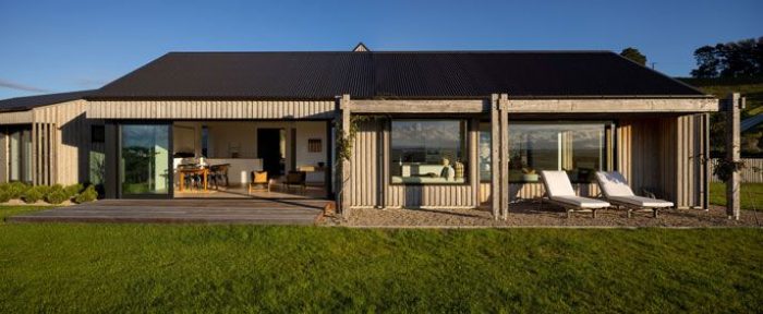
Walking the tightrope between rural and contemporary, ‘Mana Ridge’ has three modest gabled forms, sympathetic to its prominent position, that will gently patina as time passes.
Taylor gathered common use spaces and arrayed each cluster across the valley head. Living and sleeping wings orient North to passive design principles with utility spaces nestled behind. Deliberately simple, the material palette perfectly complements the arrangement. T
Timeless and telling the story of practical life on the land, a singular cladding was chosen to wrap all pods and capture the unique variations. Locally sourced, natural, and untreated Lawson Cypress Board and Batten is the aesthetic core. It was chosen to add texture, depth, and rhythm.
Judges said the design was a beautiful, fit-for-purpose, piece of architecture and that the contemporary home rests comfortably in its rural surroundings.
Werner Naude of DCA Architects of Transformation won two awards for a project titled ‘St. John’s Church’. The project won the Regional Commercial/Industrial Award and the Regional Commercial Interior Award.
Judges say the brief for this new church was for it to be a place of God that is connected to the community with flexible, welcoming spaces, while also honoring the past. It needed to be functional for the present, while also future-focused and multi-cultural/generational.
“The designer needed to be mindful of declining Christianity in New Zealand. The design response is a modest building that is visually open and engaging with flexibility to serve the church’s community ministries. The use of red brick veneer creates a strong link to the past while also being residential in scale and nature. It also responds to the site’s context, with openings in the brick allowing control of light, privacy and mood of the interior spaces through the creation of perforated apertures, with light bleeding softly through,” says the judging panel.
The overall result is a beautifully crafted interior and exterior that provides both a spiritual and practical environment for the community.
Andrew Ward of mod Architecture received a Commended Award in the Commercial/Industrial category for his work on ‘Te Puna Kindergarten’.
Located in Te Puna, the Kindergarten required a new purpose-built building that could also serve the broader community outside operational hours.
The design response consisted of two pavilions separated by a central spine as the main entry. Northern light could enter a southern pavilion while also providing a clear delineation between the areas where the children should be and where they should not.
After hours, community-based groups can use the southern pavilion without accessing the main building. Judges said Ward had carefully responded to the brief.
Architectural Designers New Zealand CEO, Keryn Davis says the Bay of Plenty region was well represented at the awards.
“The Bay of Plenty region was showcased by these outstanding designs. It was wonderful to see a mix of projects from the region, including residential and commercial. Well done to all the winners,” says Davis.
Architectural Designers New Zealand is a leading professional body for architectural designers and architects in New Zealand. Entries are received from members throughout the country.
The winners are announced through a series of regional award events in July through to August.
The National Awards will be held on Friday, October 28, at Te Pae in Christchurch.
Bay of Plenty Winners
Designer: Adam Taylor, ata
Design title: Mana Ridge
Location of property: Welcome Bay, Tauranga
Award: Regional – Commended for Residential New Home Between 150m2 and 300m2
Description: Walking the tightrope between rural and contemporary, the design has three modest gabled forms, sympathetic to its prominent position, that will gently patina as time passes. Taylor gathered common use spaces and arrayed each cluster across the Valley head. Living and sleeping wings orient North to passive design principles, with utility spaces nestled behind. Deliberately simple, the material palette perfectly complements the arrangement. Timeless and telling the story of a practical life on the land, a singular cladding was chosen to wrap all pods and capture the unique variations. Locally sourced, natural, and untreated Lawson Cypress Board and Batten is the aesthetic core. It was chosen to add texture, depth, and rhythm.
Judges Citation: A beautiful, fit for purpose, piece of architecture, this contemporary home rests comfortably in its rural surroundings. Three modest gabled forms, sympathetic to its prominent position, will gently patina as time passes.
Designer: Jon McAlpine, TGA Ltd
Design title: Rainscreen
Location of property: Mount Maunganui
Award: Regional – Highly Commended for Residential New Home Between 150m2 and 300m2
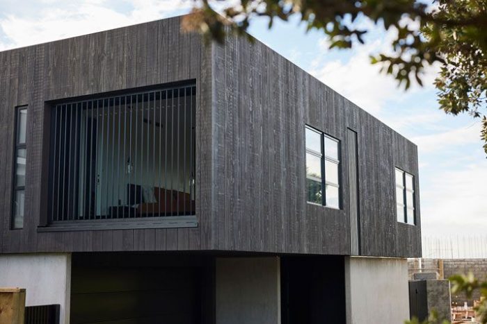
Description: This home nestles comfortably into its natural beach dune environment. Adjoining the site is a reserve providing direct beach access. The brief was to deliver a family home with a minimalist architectural response using natural materials that also offer permanence and a solid foundation to the ever-changing costal environment
Judges Citation: Situated on a small 325 sqm site, this home nestles comfortably into its natural beach environment. The design maintains efficiency and simple forms with its organic and low maintenance vertical Accoya rainscreen cladding. This is a very strong, robust and elegant addition to the Mount Maunganui coastline.
Designer: Jon McAlpine, TGA Ltd
Design title: Palm Springs
Location of property: Papamoa, Tauranga
Award(s):
- Regional Award Recipient for Residential New Home Between 150m2 and 300m2
- Regional Award Recipient for Residential Interiors
- Regional Award Recipient Resene Colour in Design
Description: A unique show home that sits comfortably with the Palm Springs aesthetic. It is practical, liveable and environmentally conscious. The design has been approached with a Mid Century modern philosophy. This home boasts a range of eco features and has been designed to gain accreditation as 6 Star Homestar rated. The design is optimised for solar electricity generation and storage, energy efficiency, and to suit local climate and site condition.
Judges Citation: There is a relaxed elegance to this design and a strong connection to the landscape and a sense of containment within the orthogonal forms. The curved cedar clad exterior provides a gentle transition to the cedar lined foyer, creating a seamless connection between exterior and interior spaces. The plan is organised around a planted atrium, wrapped on four sides with glass. Space is layered around this central element with the glass sliders opening from the outdoor space into the heart of the home. Designed to a 6 Homestar rating, sustainability has been prioritised in the design decision-making and integrated using carefully selected materials, finishes and fixtures.
Designer: Werner Naude, DCA Architects of Transformation
Design title: St. John’s Church
Location of property: Rotorua, Bay of Plenty
Award(s):
- Regional Award Recipient for Commercial/Industrial
Regional Award Recipient for Commercial Interior
Description: In 2017, fire destroyed Rotorua’s St John’s Church. The challenge was to design a ‘church for the future’ which was no small task, in the face of declining Christianity in NZ. Located on a busy intersection of Rotorua, the building has been rebuilt over the footprint of the previous structure. DCA’s design response took the opportunity to re-think what a church building could be and how it could enable more non-Christians to feel comfortable in approaching and using the building. The design response of a modest building is visually open and engaging-with flexibility to serve the church’s community ministries. The design eschews barriers to access which are present in many traditional Church buildings. The building scale is humble, lowered at the main areas of public engagement to a residential scale. The community hub is book-ended by glazing and connected with ‘nothing to hide’.
Judges Citation: The brief for this new church was for it to be a place of God that is connected to the community with flexible, welcoming spaces, while also honoring the past. It needed to be functional for the present, while also future focused and multi-cultural/generational. The designer needed to be mindful of declining Christianity in New Zealand. The design response is a modest building that is visually open and engaging with flexibility to serve the church’s community ministries. The use of red brick veneer creates a strong link to the past while also being residential in scale and nature. It also responds to the site’s context, with openings in the brick allowing control of light, privacy and mood of the interior spaces through the creation of perforated apertures, with light bleeding softly through.
The overall result is a beautifully crafted interior and exterior that provides both a spiritual and practical environment for the community.
Designer: Andrew Ward, mod Architecture
Design title: Te Puna Kindergarten
Location of property: Te Puna, Bay of Plenty
Award: Regional – Commended for Commercial/Industrial
Description: Te Puna Kindergarten was under pressure to find new premises after the NZTA had an agreement to purchase the land to make way for a roading development. A relatively flat site, with great northern aspect, and ideal western car park access, it was perfect for the kindergarten’s brief. The kindergarten required a new purpose-built building that could also serve the broader community outside operational hours. The design response consisted of two pavilions separated by a central spine that is the main entry. Northern light could enter a southern pavilion while also providing a clear delineation between the areas where the children should be and where they should not. After hours, community-based groups can use the southern pavilion without accessing the main building.
Judges Citation: The designer has carefully responded to the brief for a purpose-built building that also serves the broader community. This is evident through the design of two pavilions taking on the architectural language of two barns, separated by a central spine that incorporates the main entry.


