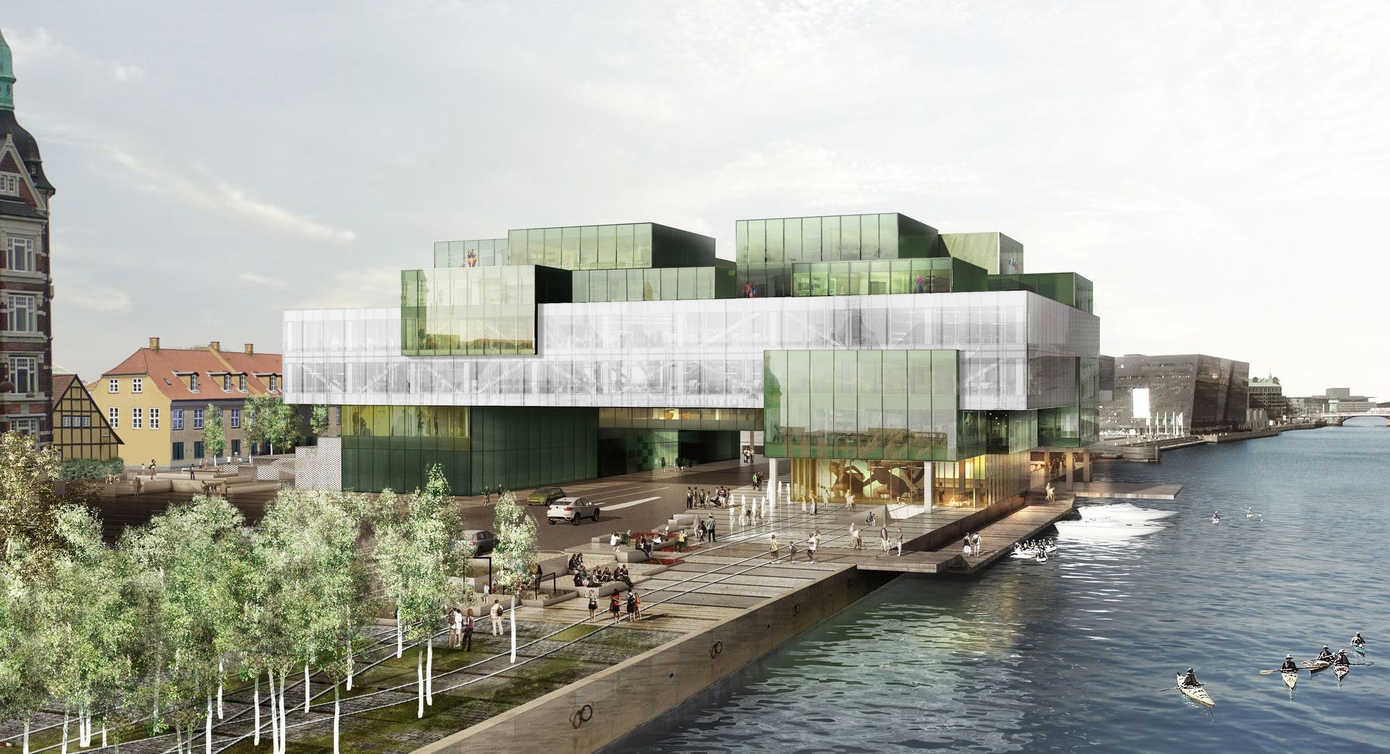
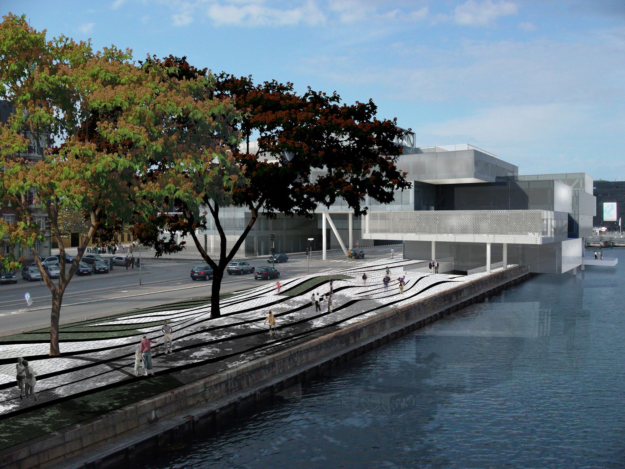
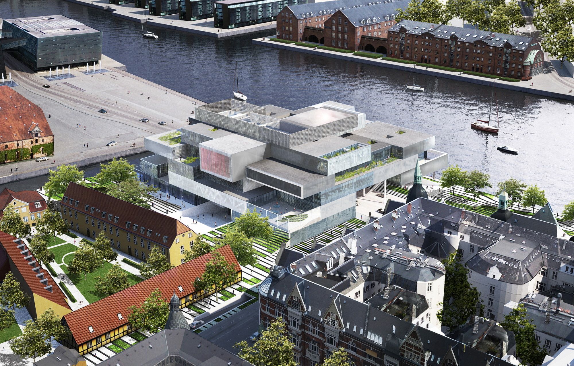
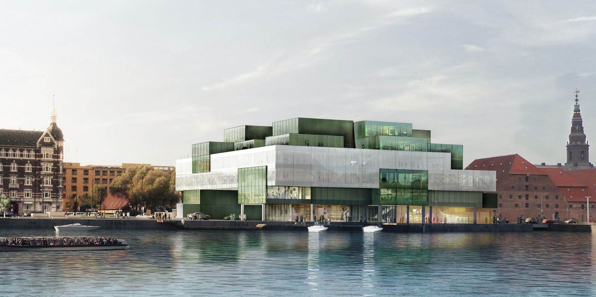
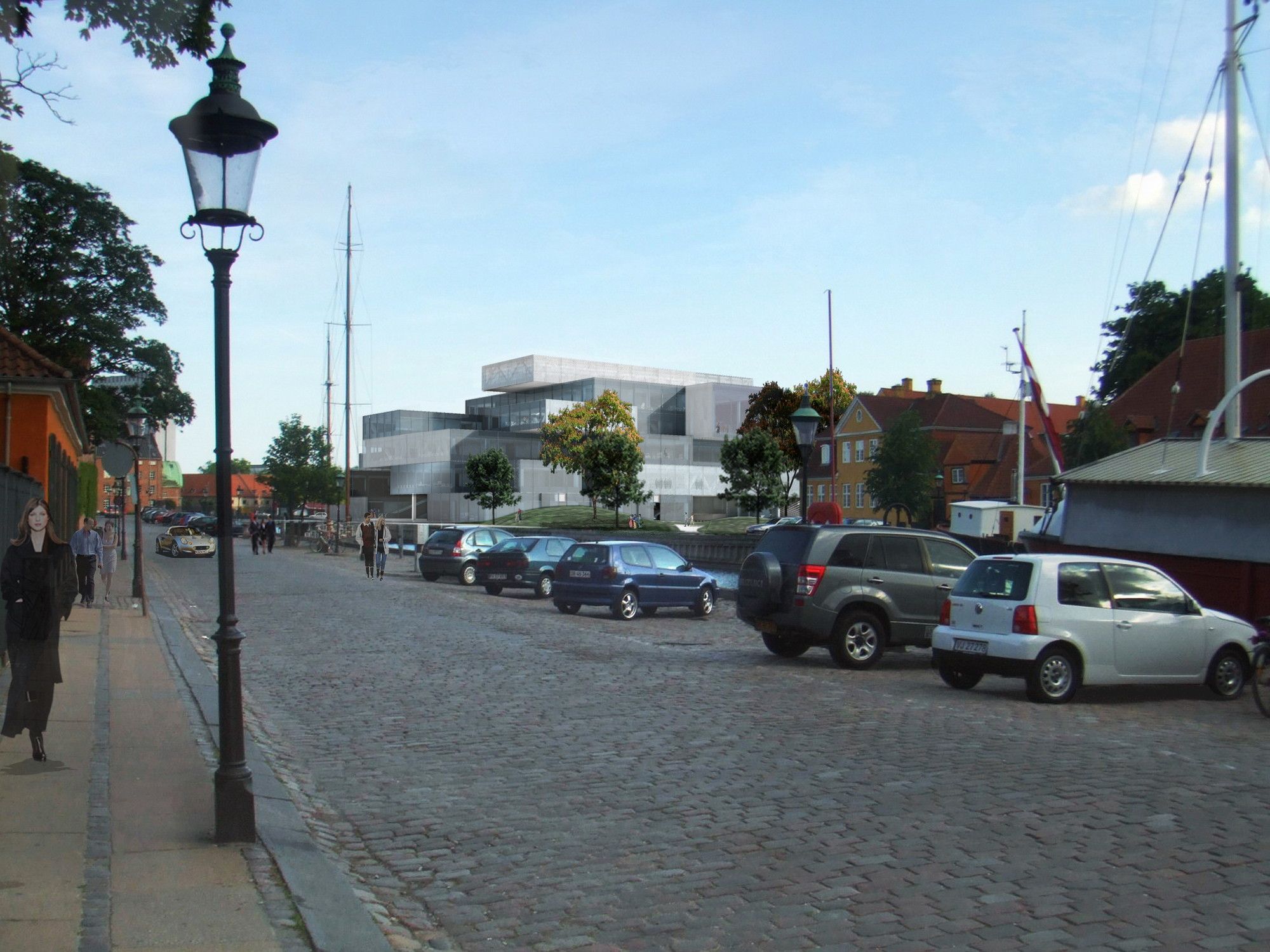
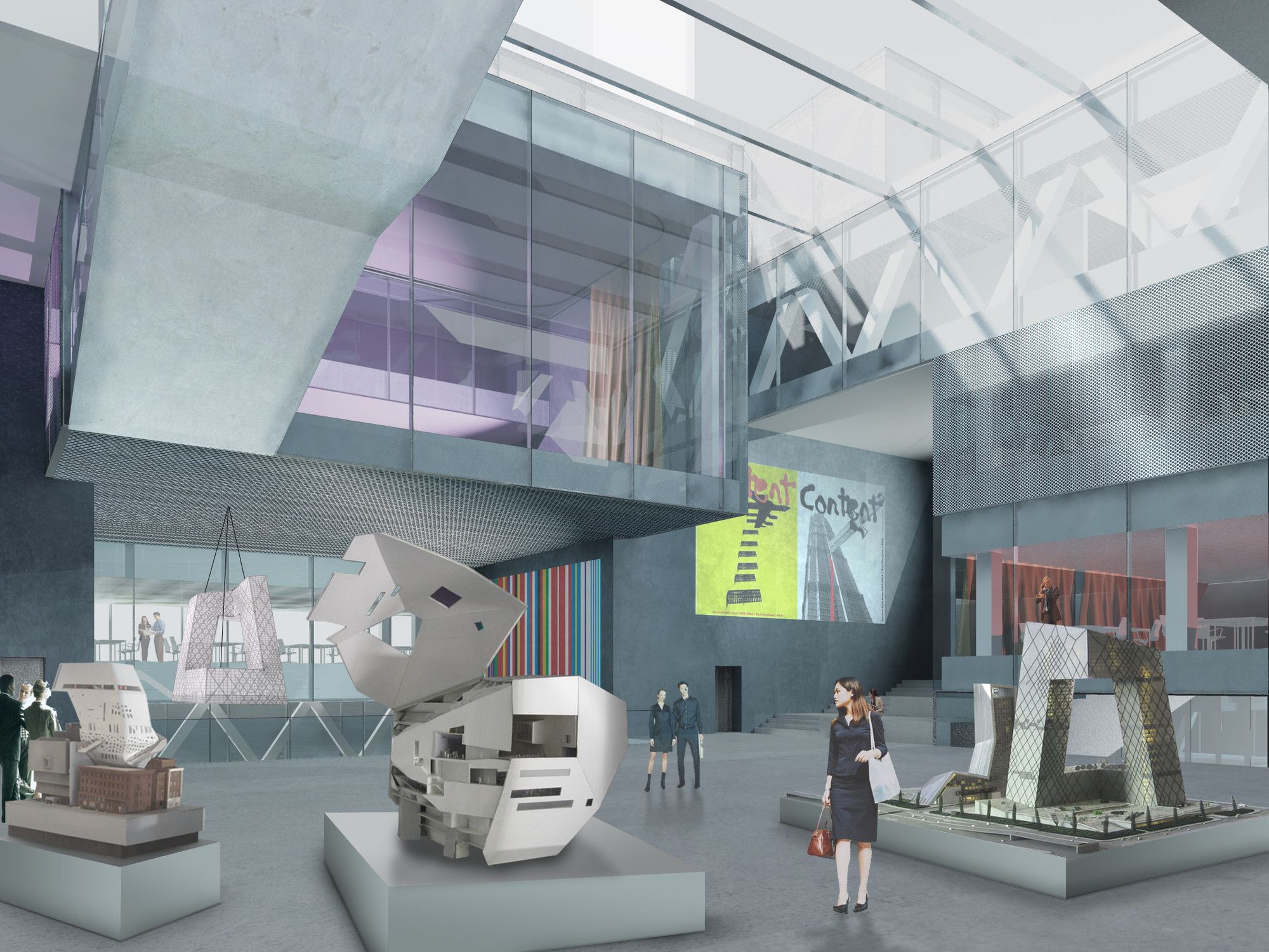
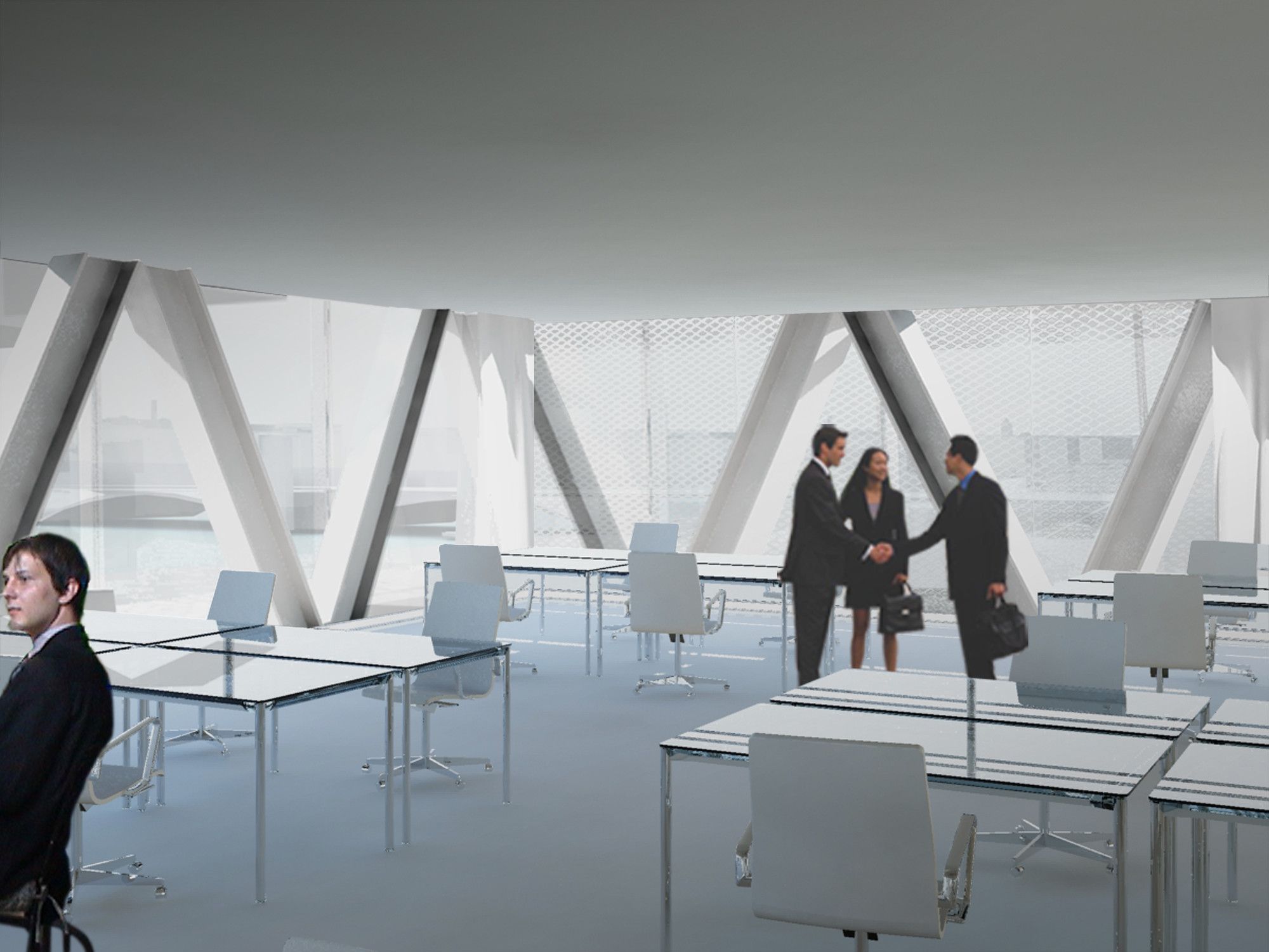
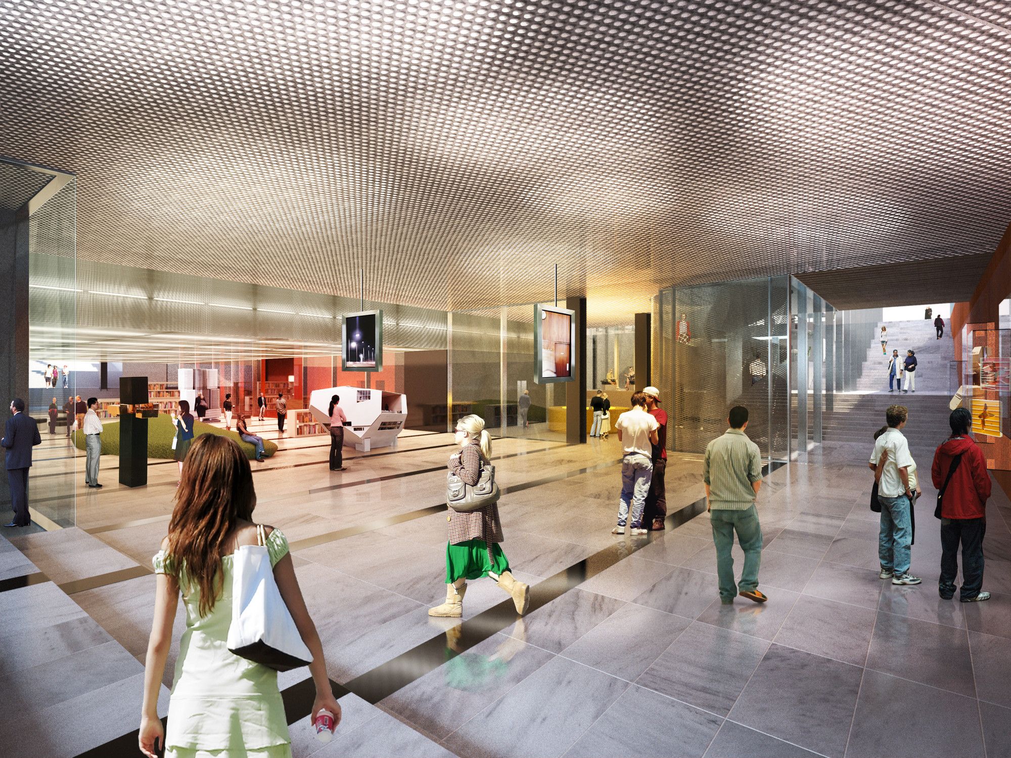
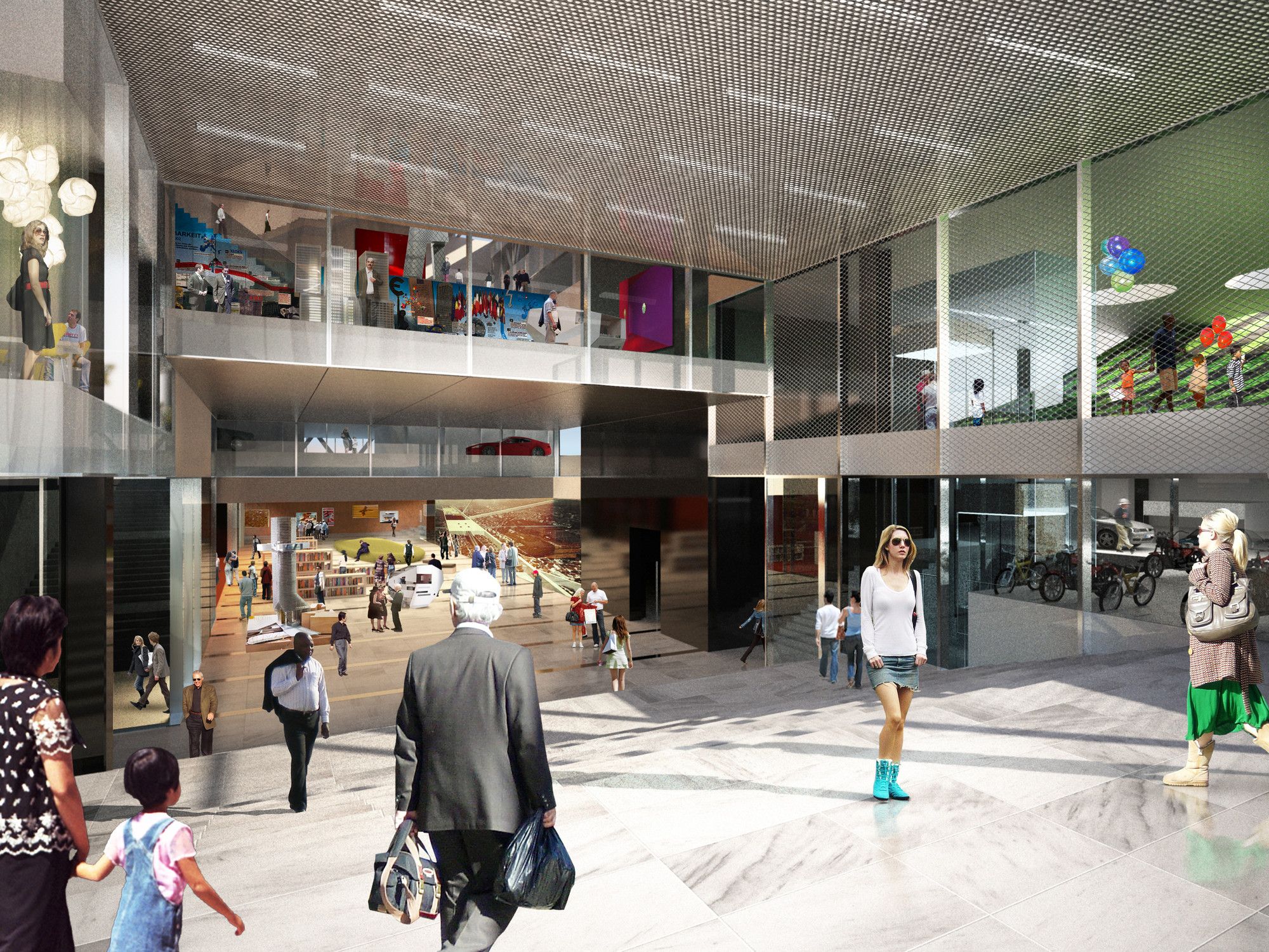
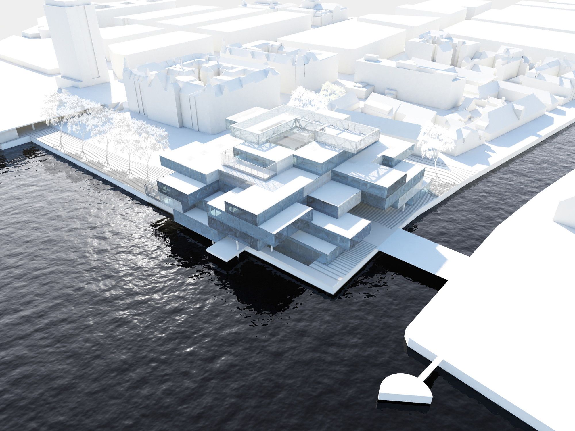
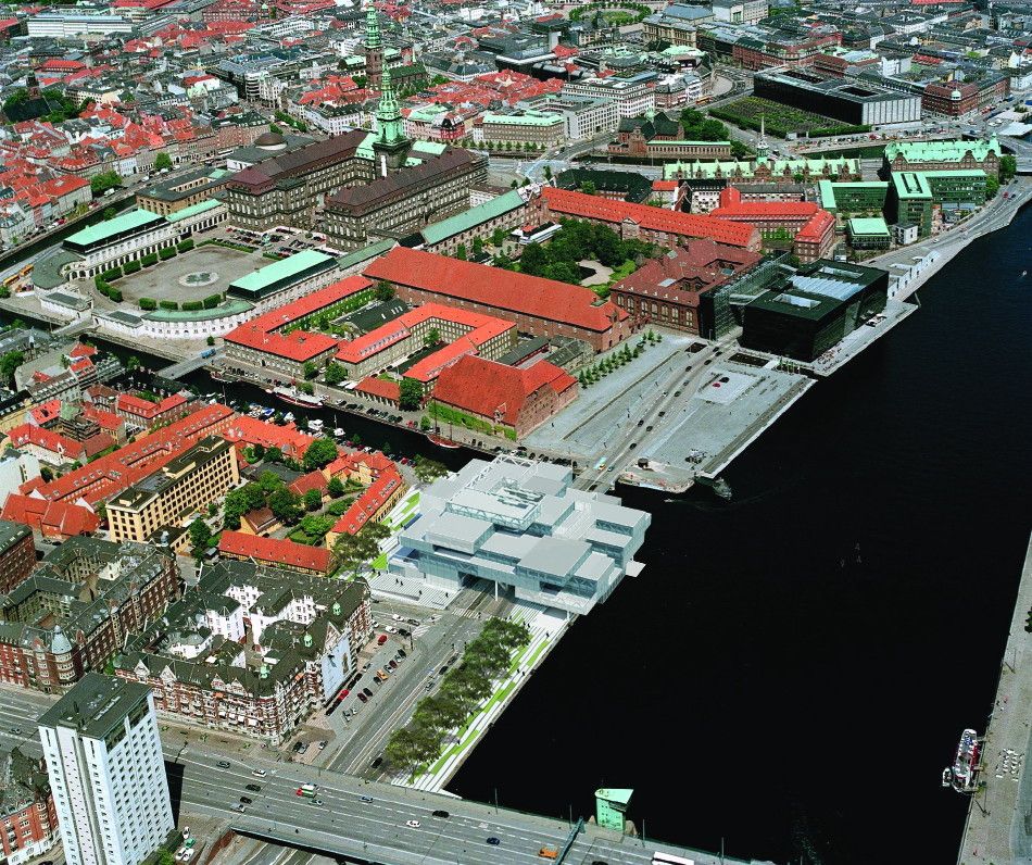
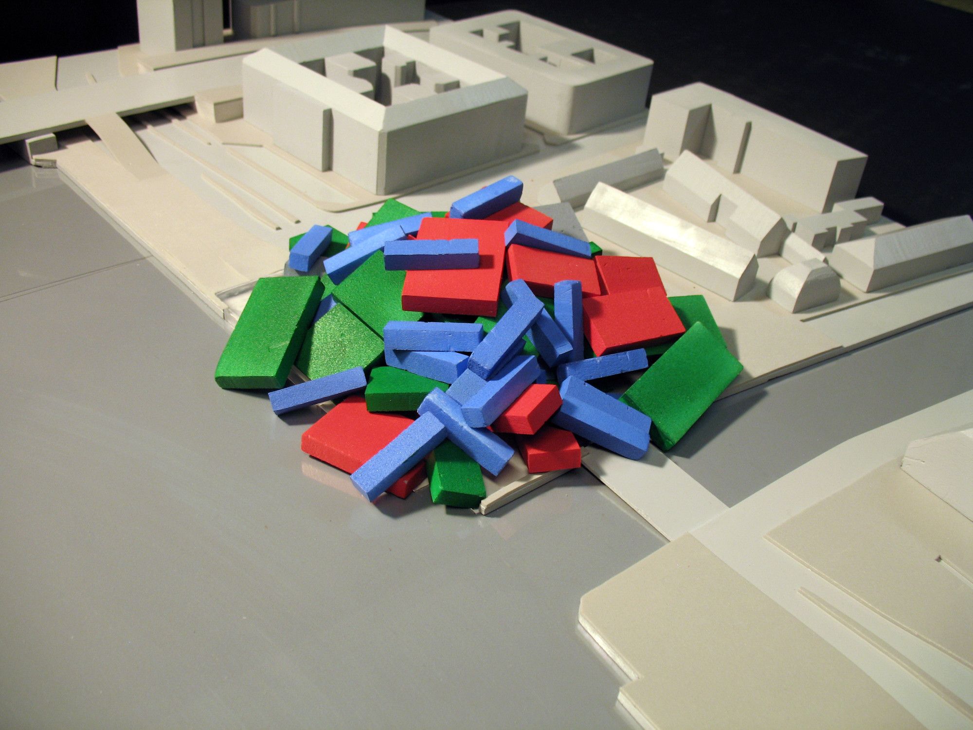
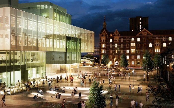
OMA’s design for Bryghusprojektet, which is being funded by the philanthropic Realdania Foundation, was first revealed in 2006 and scheduled for completion in early 2017. OMA is currently going head to head with Danish firm BIG in a competition to transform a convention center in Miami, USA, while work is nearly complete on the OMA’s Shenzhen Stock Exchange in China – see all architecture by OMA. The center will be surrounded by its own subjects of study and research, explains Ellen van Loon, who is OMA’s partner-in-charge on the project along with the firm’s co-founder Rem Koolhaas. The center will include exhibition areas, research facilities, conference rooms, an auditorium, a bookshop, and a cafe. More details come after the jump. The design for the Bryghusprojektet is a linear display of the tenets of Danish Modernism: monumentality, simplicity, and politeness. The Copenhagen harbor is experiencing a surge in development, transforming a previously underused natural asset into a new city-wide destination. The Bryghusgrunden site lies in the center of this transformation. To capitalize on the site’s potential we propose to use the building as an ‘urban motor’ to actively link the city and the waterfront. Providing a connection under the busy Christians Brygge, where entrances to the different program elements are strategically located, the site becomes both a destination and a connector at the hinge of the waterfront and the ‘entrance’ to the city. As opposed to the typical stacked section, where building programs remain autonomous, the program ‘heap’ can create unexpected and unpredictable situations where each program is made aware of its coexistence with the others.

Courtesy of OMA
Zoning
The Bryghusgrunden site, situated on a fault line between two zones – a stagnant heritage zone of government offices and historic buildings, and a mutating Metropol zone – can be considered as a newly born urban district. The polarity between the two, along with the waterfront location, give the site a unique position within Copenhagen.
While occupying an ideal location along the harbor waterfront, the site lacks any identity. Public spaces, cities, and water merge into one continuous field of asphalt and concrete.
No Spatial Definition
The public domain on and around the site also currently lacks any spatial definition. No distinction is made between road, car park, and urban plaza. The open area is too large and very unspectacular. There is no sense of being in the epicenter of Copenhagen, a place where city and waterfront are coming together.
No Connectivity
Currently, the public circulation throughout the site enforces the separation between city and water With no connection between the two, movement from the city remains distinct from pathways along the waterfront. The typical remedy to this situation is to setback buildings from the water to create a public passage. However, looking at the existing situation along the harbour front, the size, quality and atmosphere of these spaces render them empty and unusable.
“Meeting Point”
To give the waterfront definition and a sense of destination, a strong building footprint, touching all four sides of the site, would break the monotony. Each side of the site would retain its own identity. The building would become a meeting point of the waterfront, the harbour, Kierkegaard’s Square, and the city.

Courtesy of OMA
Urban Definition
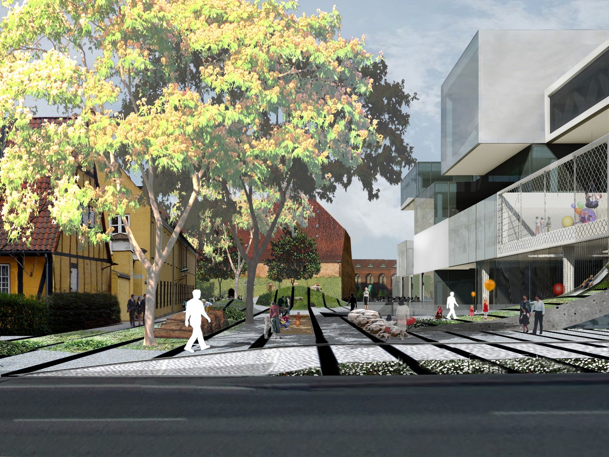
With the square footprint, the surrounding areas are reformed. Kierkegaard’s Square is given a strong border and a sense of enclosure. The northern area of the site is reformed into an intimate urban plaza, while the waterfront is reactivated with public activity.
Building
Can we create a building that not just responds to the contextual issues, but that is capable of introducing a new impulse in this area? Can we turn the constraints into exciting conditions and create a new language for Copenhagen?
Harbour Modernism
A linear display of the tenets of Danish Modernism: monumentality, simplicity, and politeness. The harbor holds some of Denmark’s most notable architectural icons, both past, and present
Concept
Responding to the Bryghusgrunden’s harbor neighbors formed the motivation of the project. Hyper-clean, modern, and polite became characteristics to investigate.
Volume
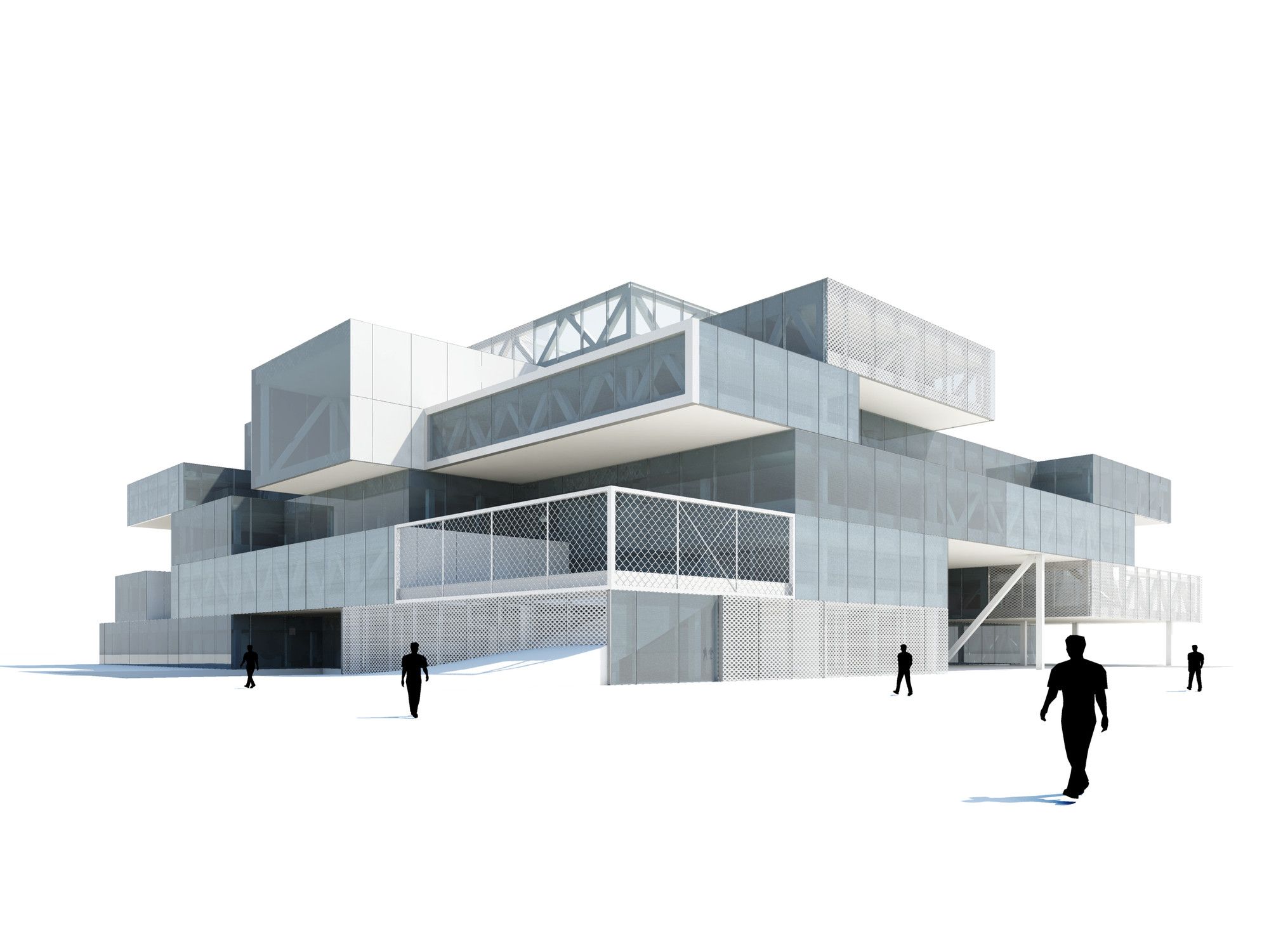
The urban context made us interested in a large footprint for the building. In order to fit in the requested program a solid volume, similar to the adjacent modern buildings, could be the base for the design.
Heights
Surrounded by historically significant and protected buildings on three sides of the site, the surrounding context is highly sensitive to the building’s volume. The highest point of the building relates to the Lille Christianborg to the west and the Old Brewery to the northeast forming an enclave of low-rise historical buildings directly to the north.

Courtesy of OMA
Mixed-Use Building
The various program elements are stacked in seemingly random order. The public program, the urban routes, and the DAC reach into the heart of the building and create a broad range of interaction between the different users.
Urban Passage
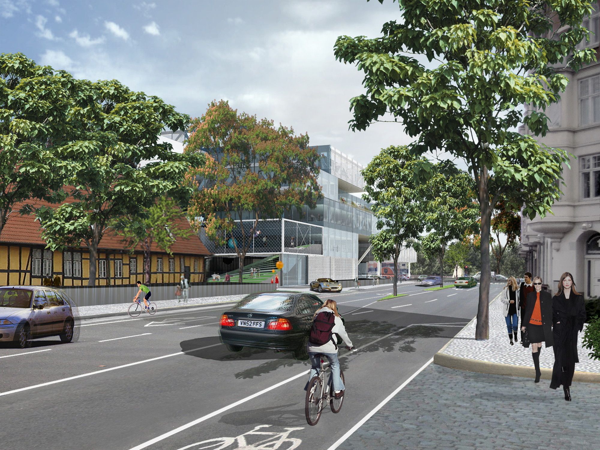
Situated between the city center and the waterfront, the site possesses one of Copenhagen’s few remaining opportunities to connect the two. To capitalize on the site’s potential the building introduces the concept of the ‘urban motor’ to Copenhagen and actively reunites the city to its harbor.
Program
Opposed to the typical stacked section, where building programs remain autonomous, the program ‘heap’ can create unexpected and unpredictable situations where each program is made aware of its coexistence with the others.
DAC
The Danish Architecture Centre is the only architecture research and display venue to be embedded within its own subjects of housing, offices, and parking.
Program Sequence
The DAC program is organized as a vertical sequence through the building. Starting below ground and moving upwards to the cafe with its view over all of Copenhagen, each program is given a unique position and quality making a varied progression through the building.
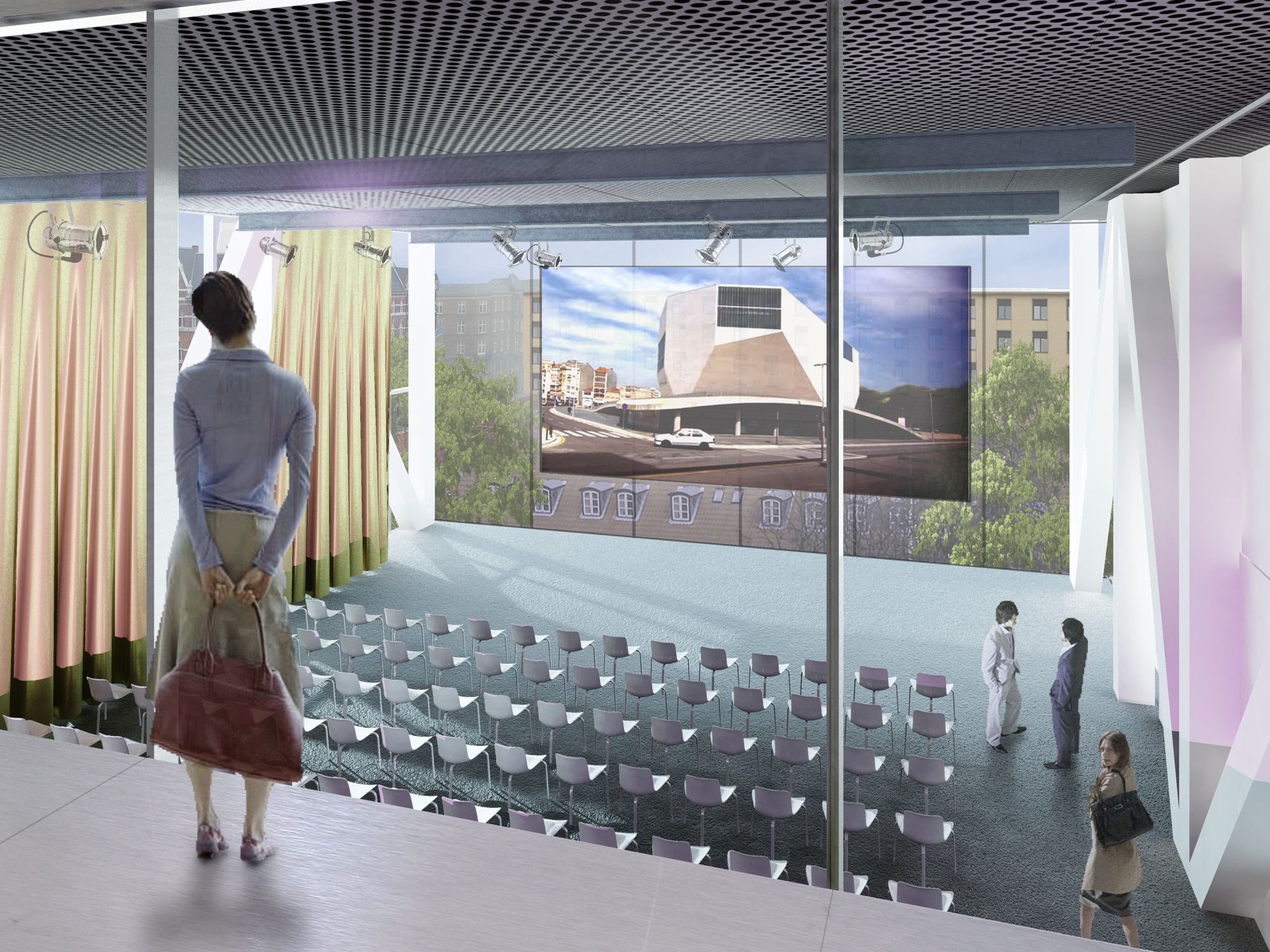
DAC Auditorium
Looking out over the city of Copenhagen, the DAC Auditorium reconnects the visitor to the city; from the outside, it becomes an attracting beacon for DAC.

Courtesy of OMA
Laboratory
DAC could take advantage of its varying position throughout the building by treating the surrounding program as a testing ground for architectural experiments in housing, offices, and parking.
RealDania
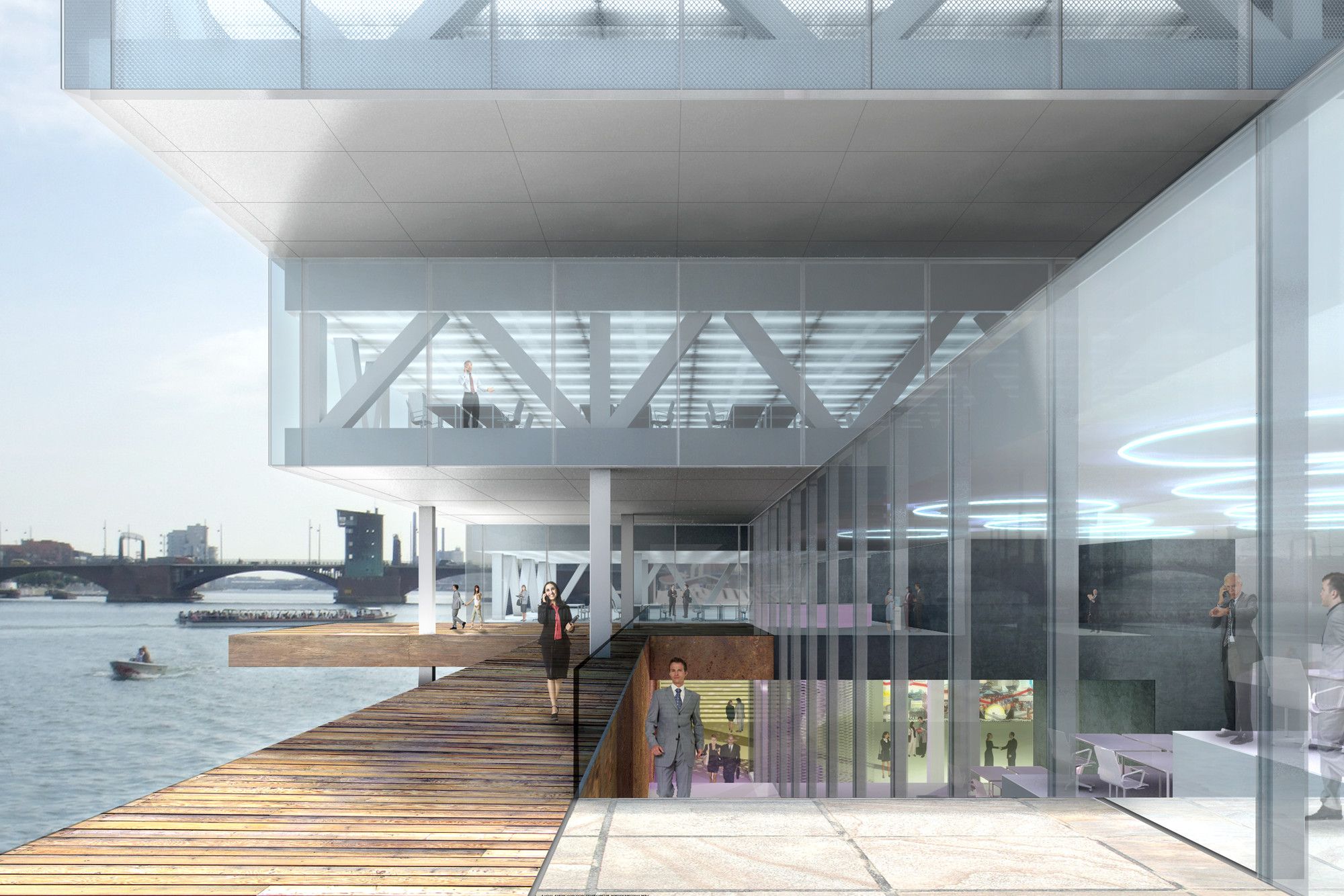
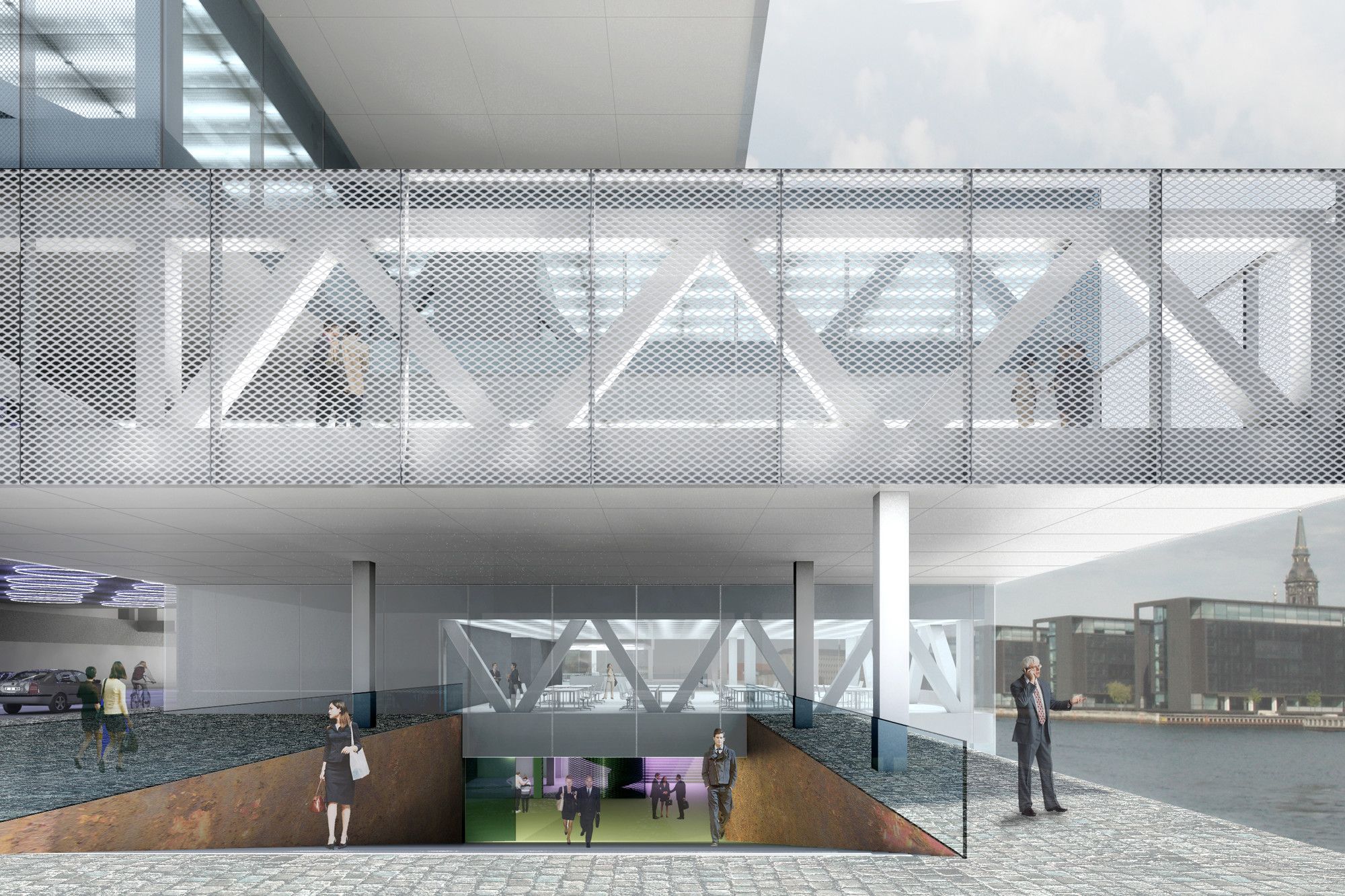
The offices for Realdania are located on the lowest three levels and can be accessed from the Urban Passage. Via voids and double height spaces, the various levels are spatially connected and offer interesting views and relations between the offices and the urban spaces along the water.
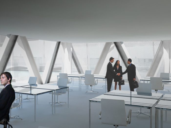
Offices The rentable office spaces offer generous views into the city through the large glass facade. The facade to the DAC atrium provides internal relations to other building users and the public. All offices are provided with natural ventilation which will enhance the comfort in the office space.
Landscape
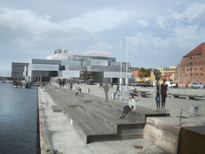
As an extension of the urban passage, the surrounding site is reformed into a series of public spaces. The north, adjacent to the Materialgård, is small in scale and designed as an intimate public plaza. Along the water, the long and narrow strip is populated with urban activities further intensifying the population of the site.
Playground
In the design of the building and the landscape, a playground concept is integrated. Different than the current playground the new proposal has different typologies of playgrounds distributed over the entire site. The most secured playground area is an exterior terrace located within the building volume, the landscape at the waterfront is attractive for the older kids. The playground will have a mix of an urban character and natural topographic elements and will challenge the children.

Courtesy of OMA
