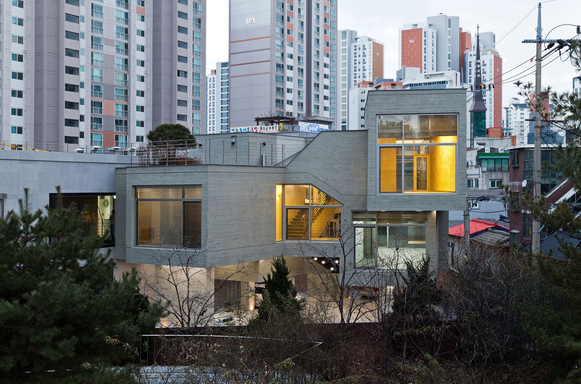
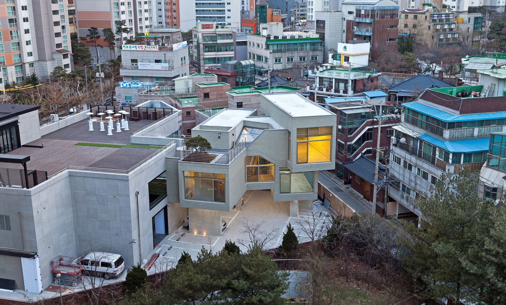
Mapo is a district undergoing considerable transformation in Seoul through a recent redevelopment craze. Large enterprises, hotels and apartment complexes unable to bear the cost of rent in existing urban centers are entering Mapo’s competitive market. Therefore, the image of Mapo is changing with the development of large apartments complexes behind a single layer of high-rise buildings positioned along the edge of the main streets. In contrast, a part of Mapo district remains undeveloped and intact as it was built from the 1960’s with small scale buildings.
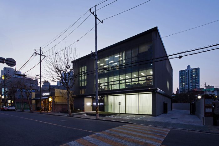
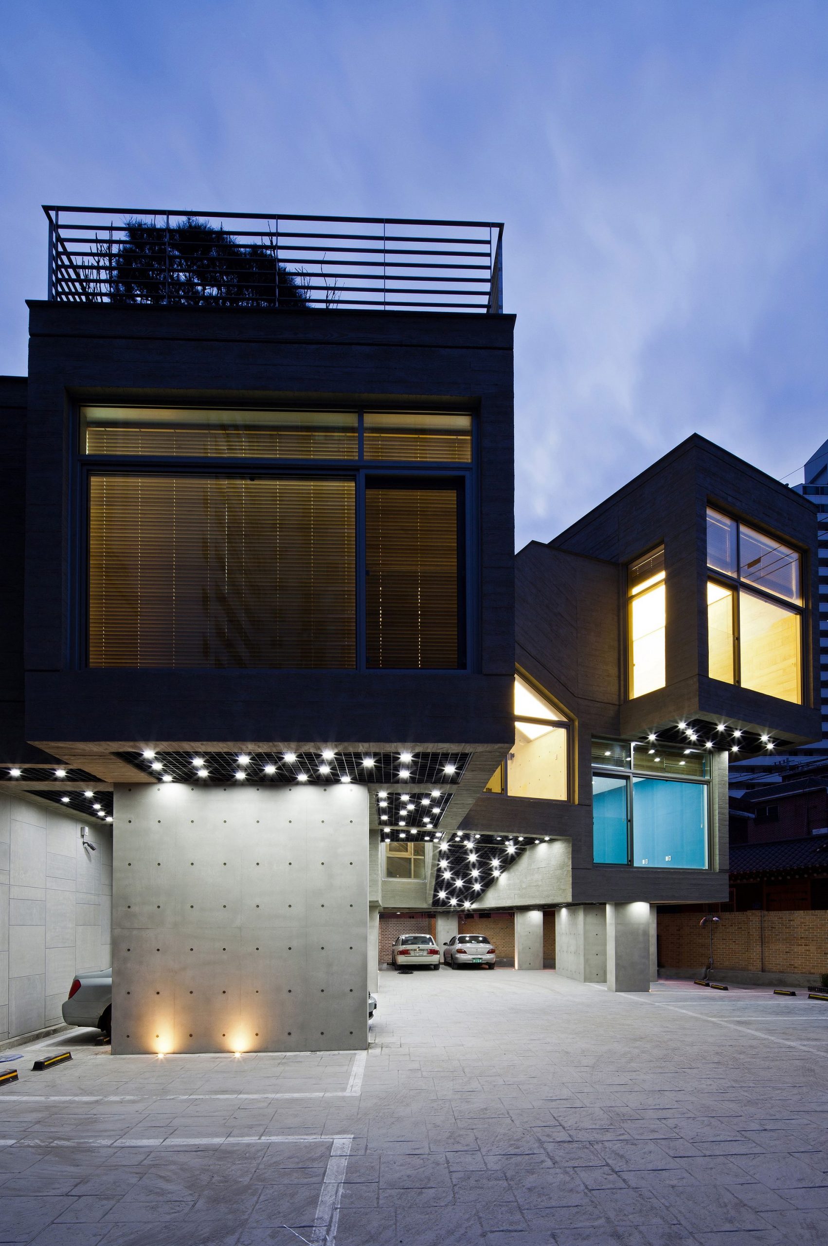
In terms of architecture, ‘Carver Global’ sought to achieve harmony with the urban structure of different scales, occupying an important position between apartment complexes and small scale buildings. The project’s intention was to suggest the possibility of ‘incremental development’ in this district which is a mixture of newly constructed apartment complexes and an historic urban structure.
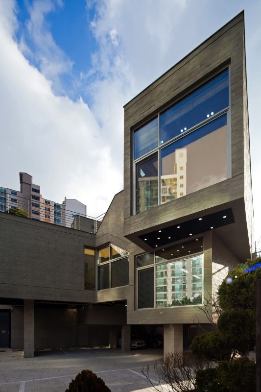
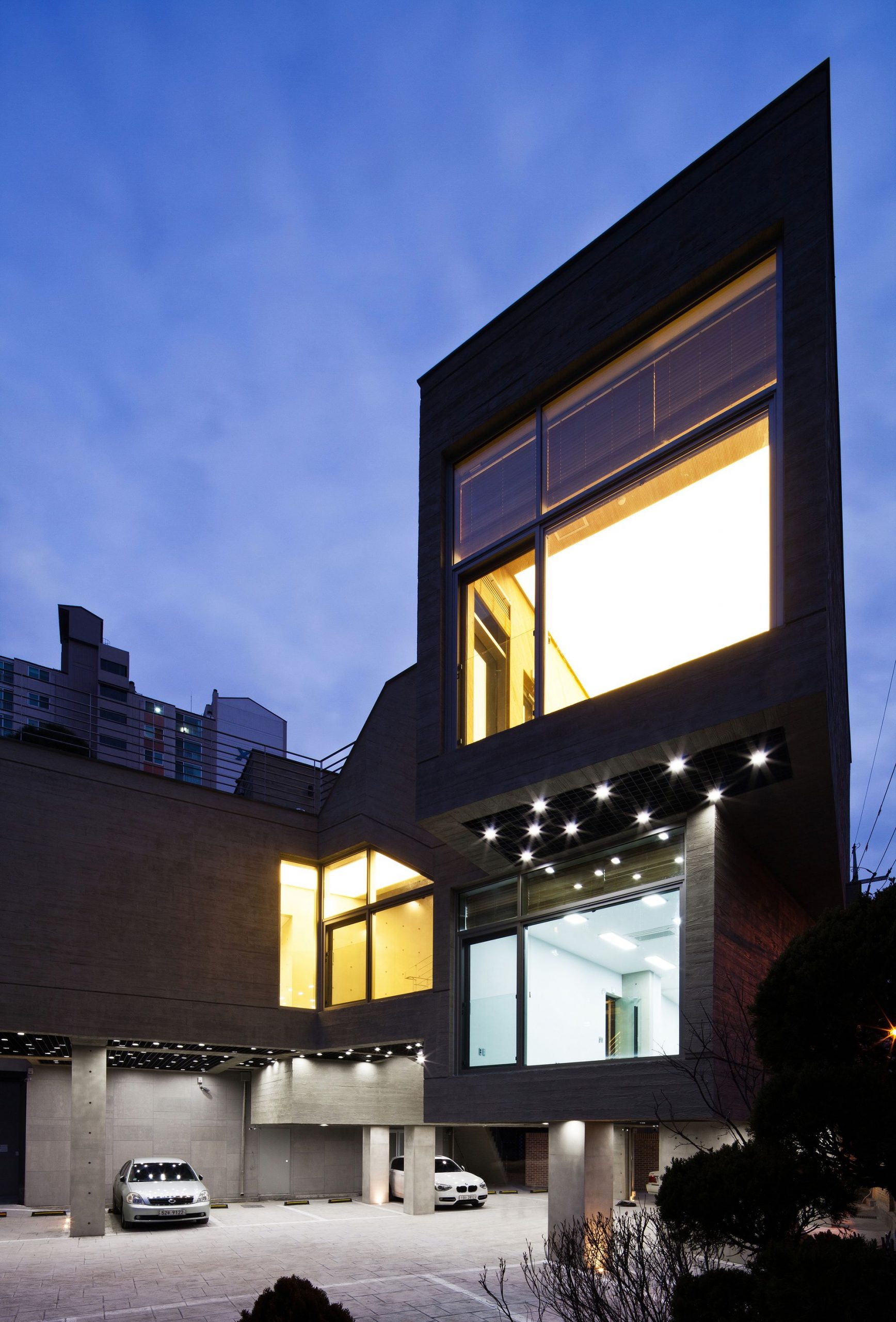
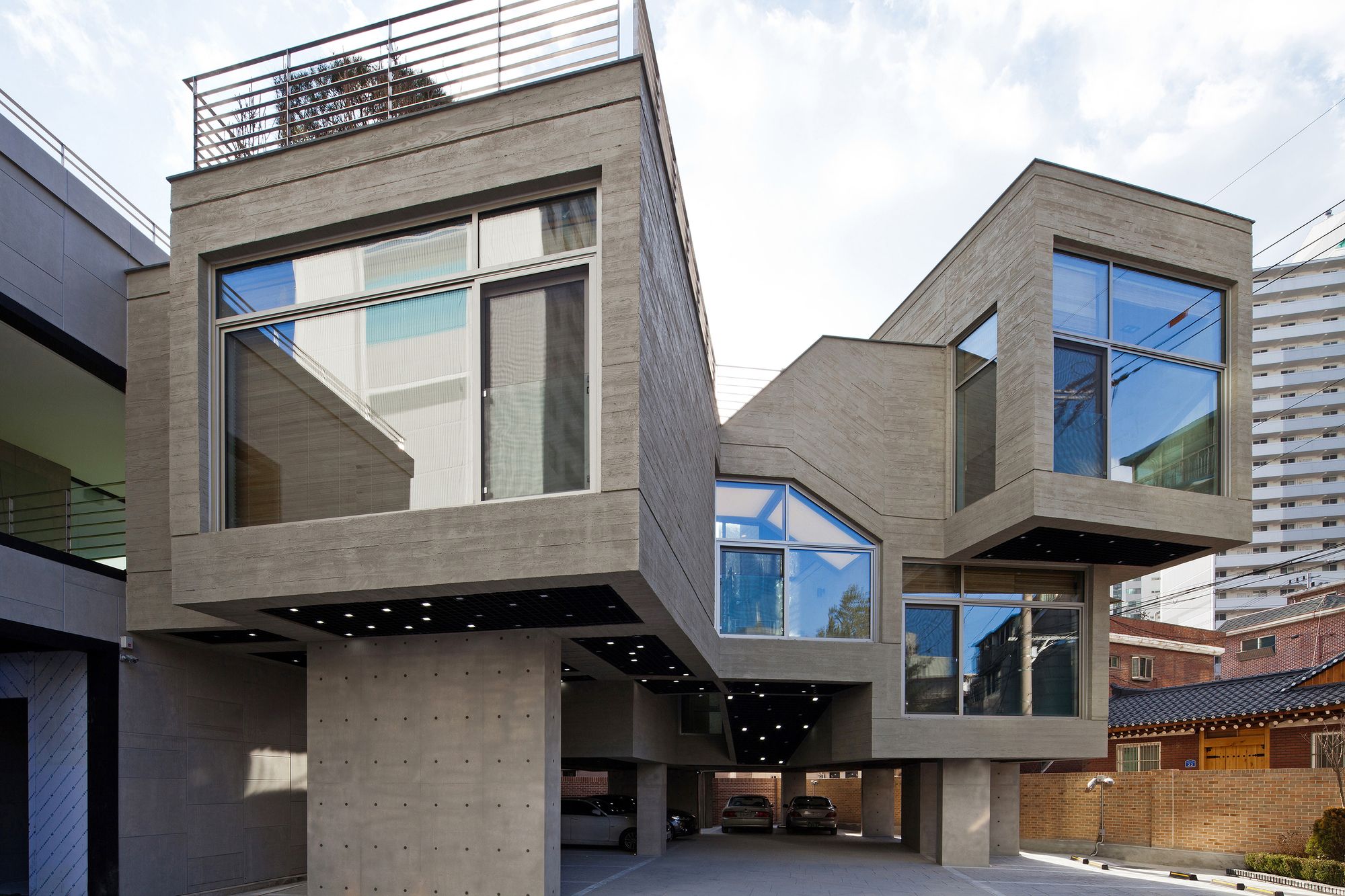
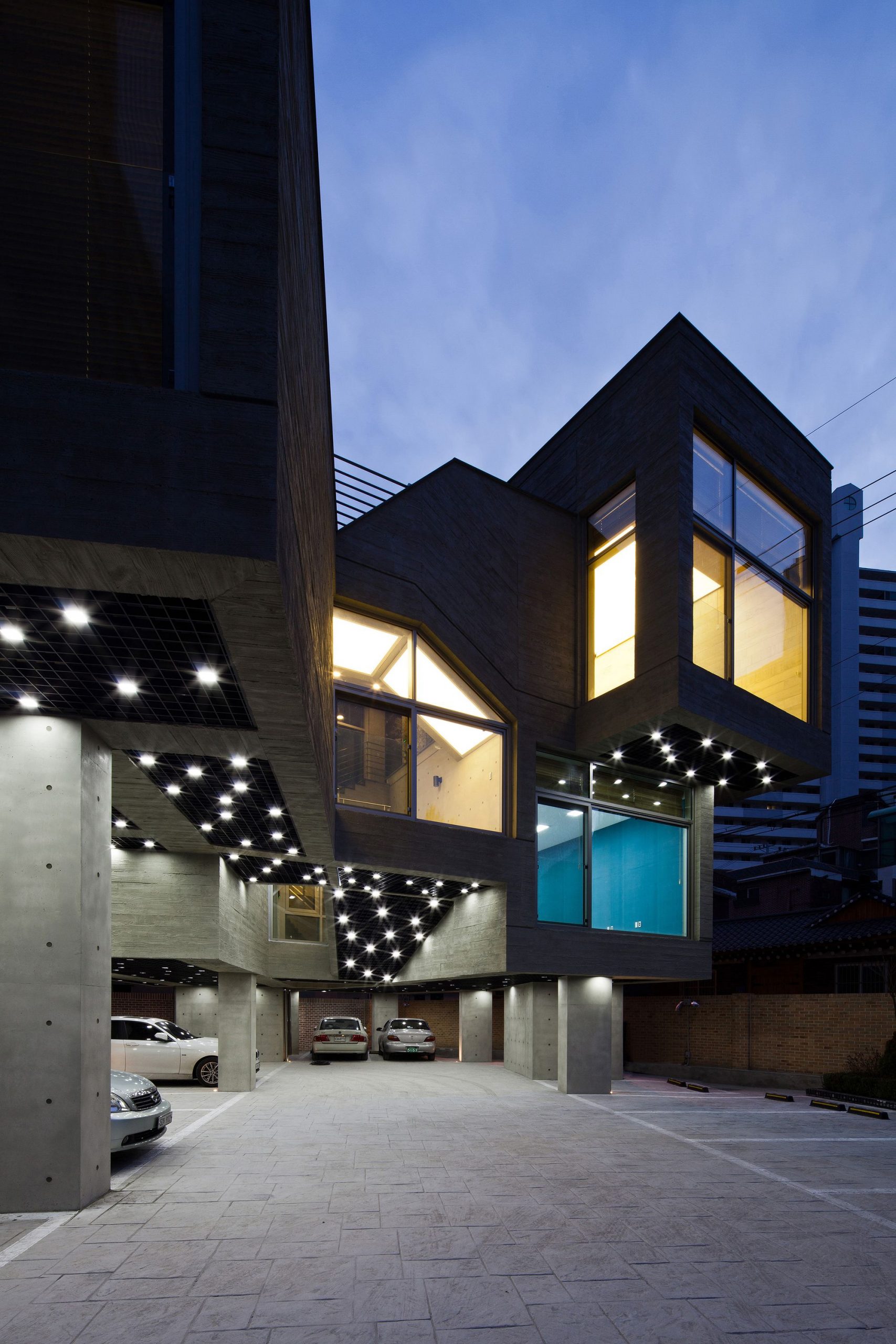
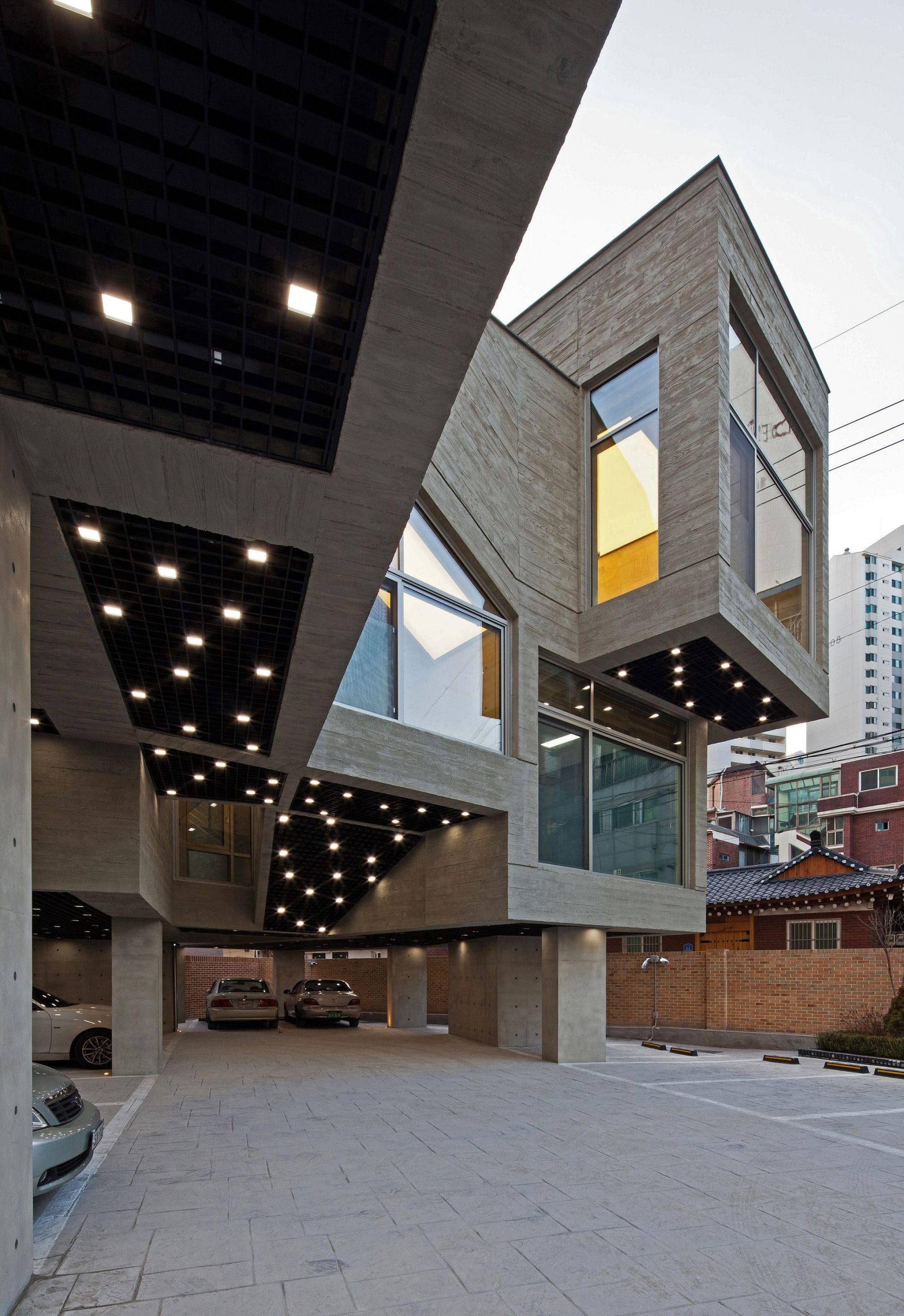
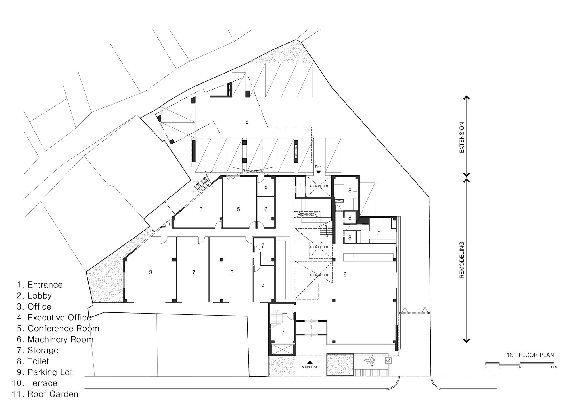
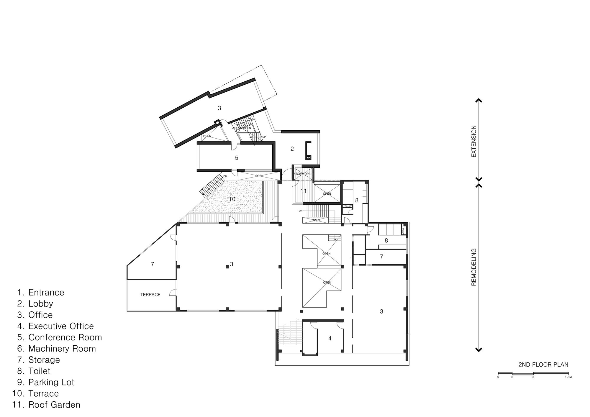
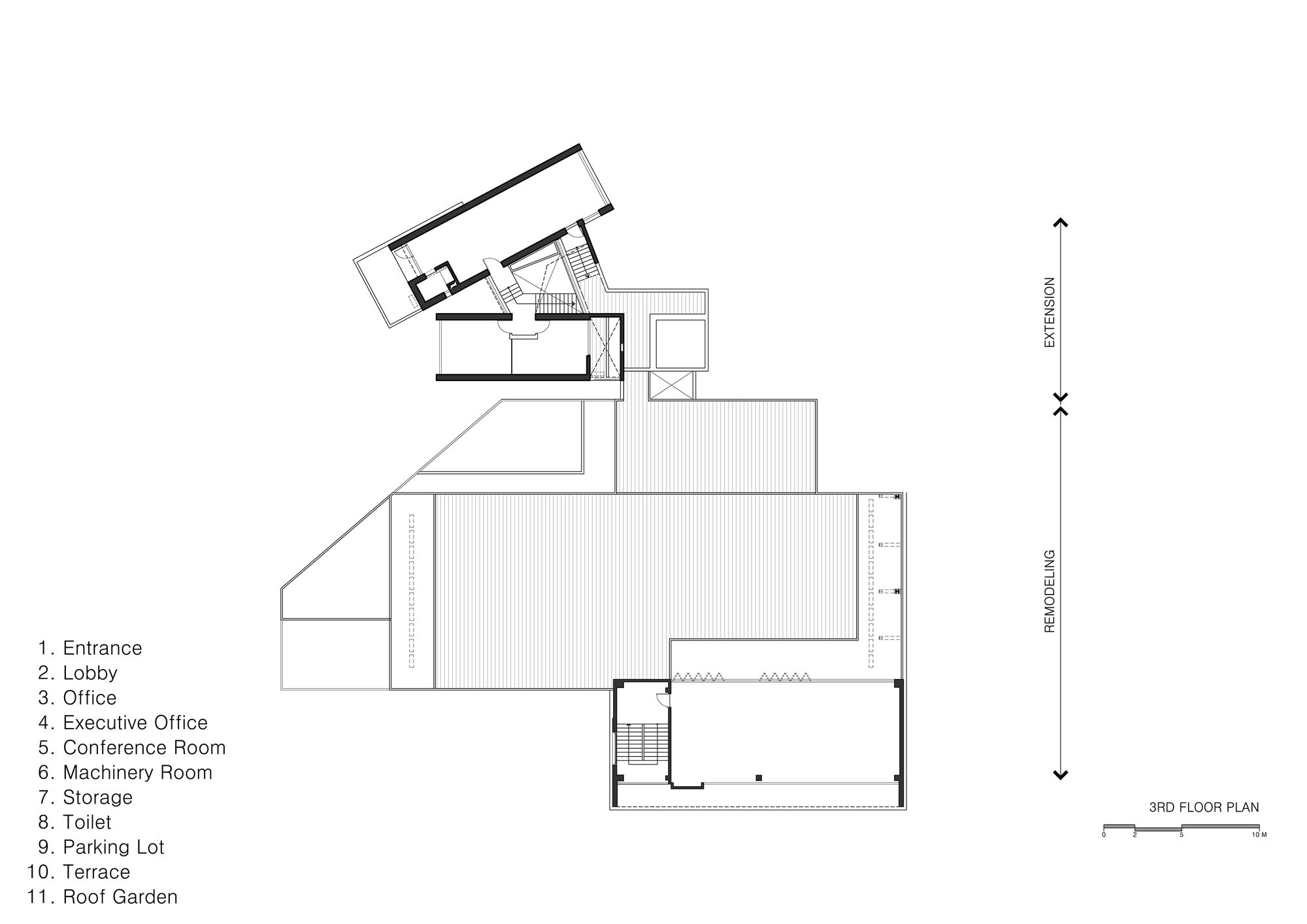
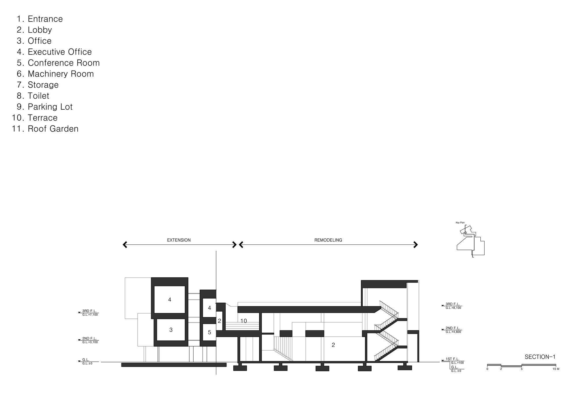
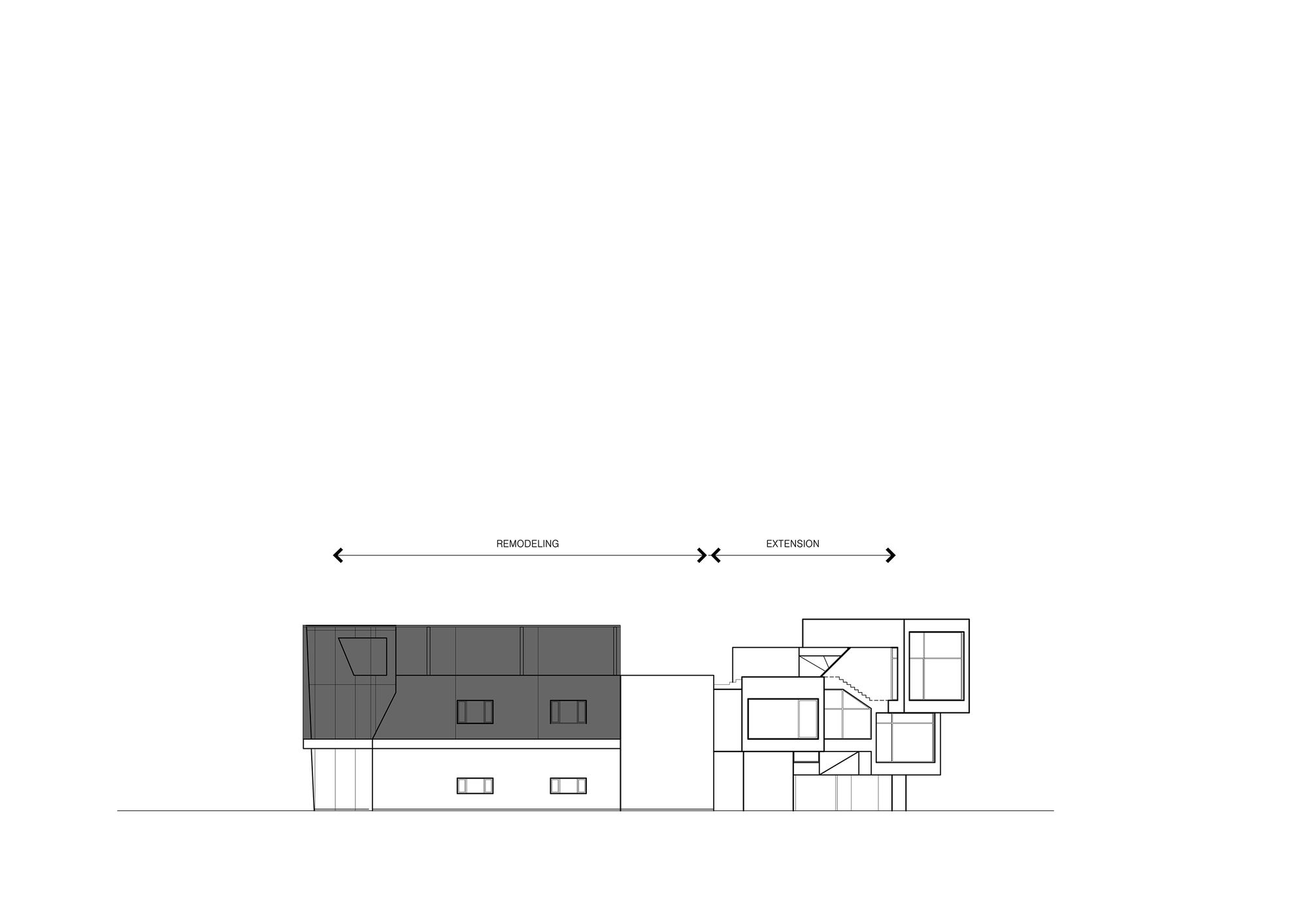
Rather than vertically extending the existing building which was relatively large-scale compared its surroundings, a strategy of horizontally extending the mass by segmentation was selected. The new program was inserted over the parking space behind the existing building and connected to the existing building. Through this maneuver, ‘Carver Global’ acts as ‘a neutral medium’ connecting the dual urban landscape of the street-facing large scale buildings with the small scale architecture located behind the site.
The method of horizontal extension was not just an architectural strategy considering urban surroundings but a means for resolving the client’s requirement that the building would be ready for use in two months. By horizontally extending the building, the client could utilize the existing building before the completion of the whole project.
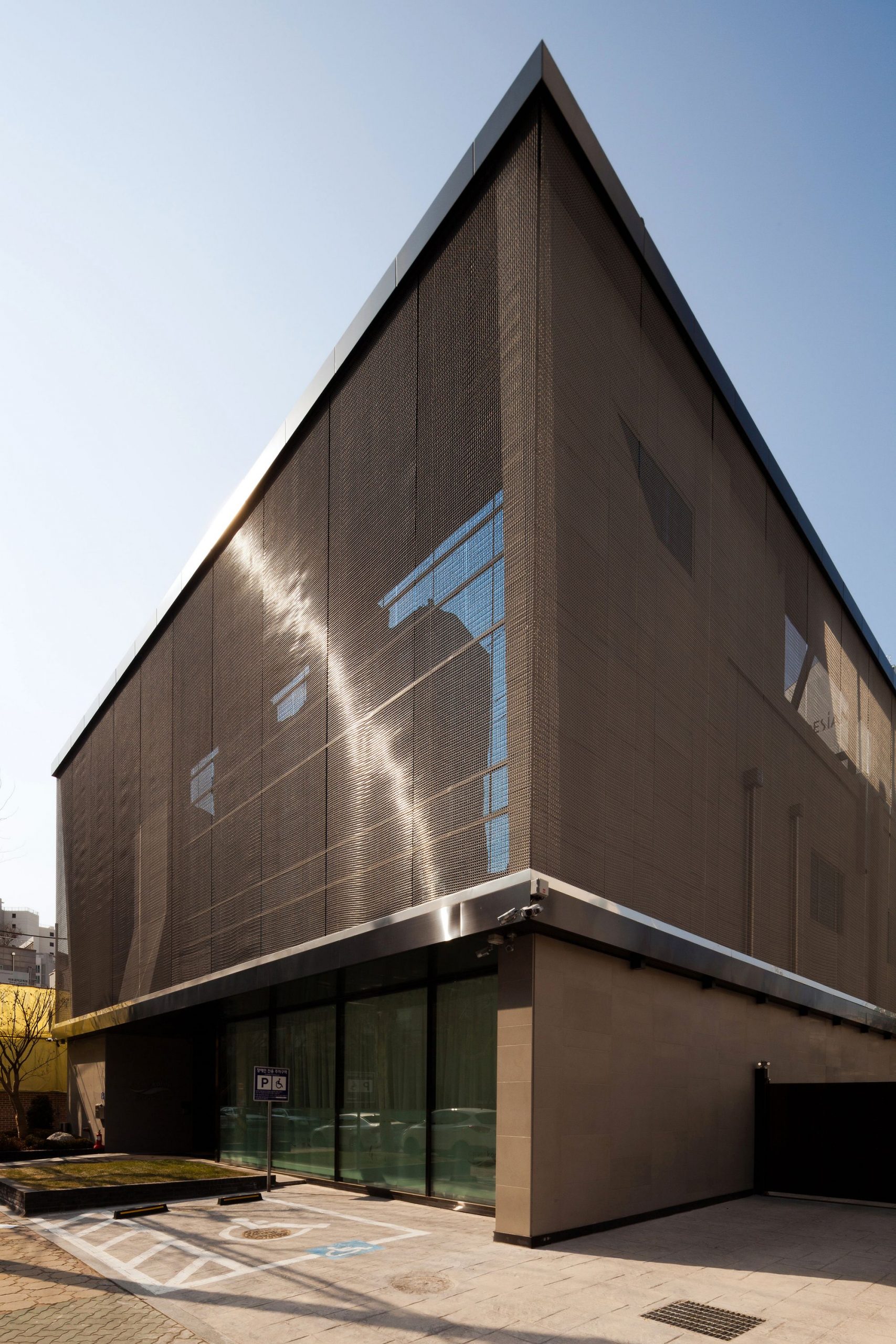
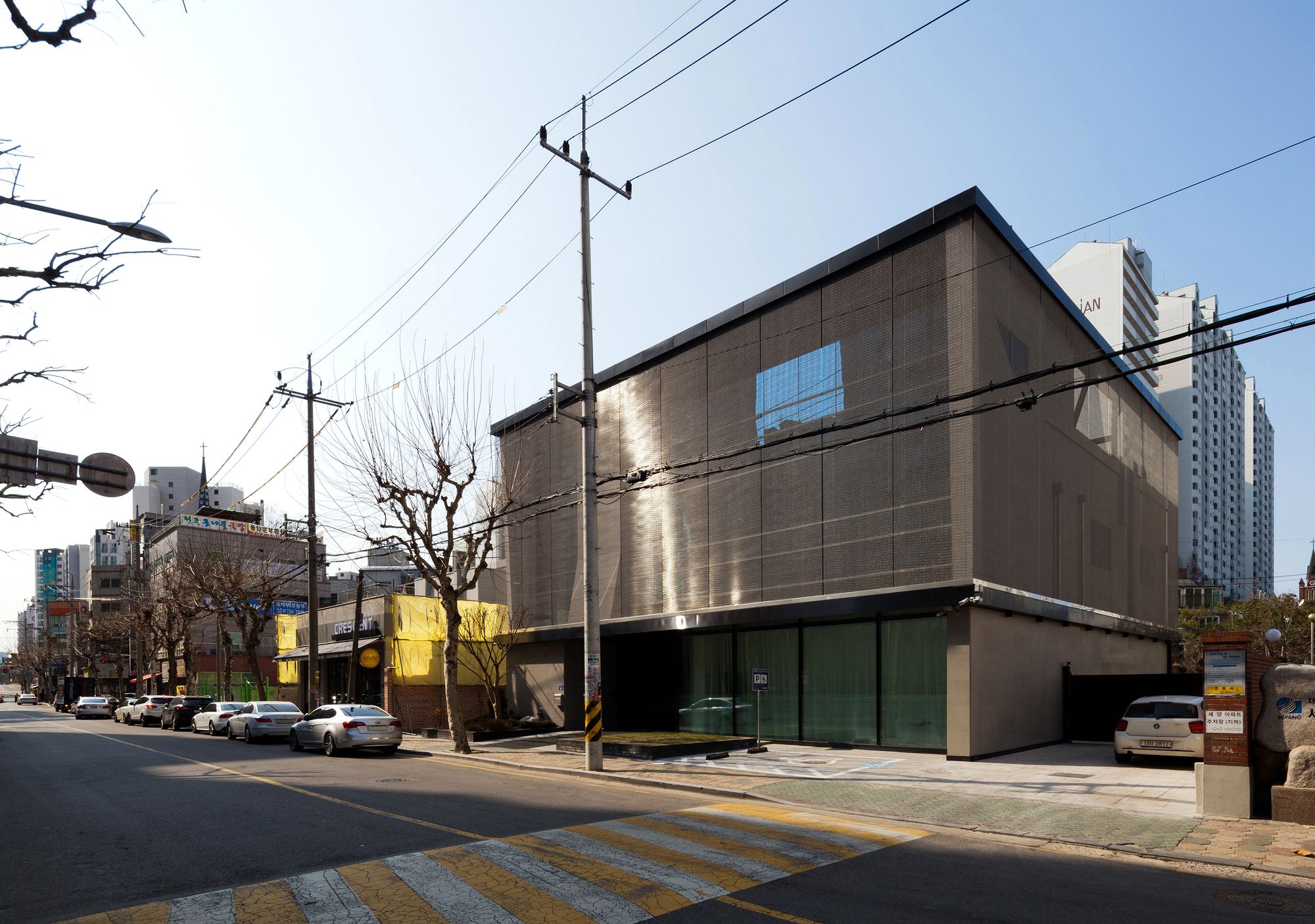
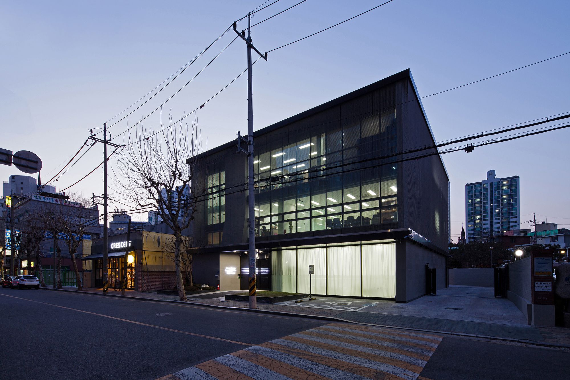
The project’s time constraint not only influenced the extension method, but also the remodeling method of the existing building. Within a short amount of time the sandwich panel construction of the existing building (formerly used by a package delivery company) needed to be transformed to correspond to the image of a cosmetic company. Metal fabric was selected as a suitable material which could be applied over the existing finishing without having to remove it, effectively improving the façade. This process of hiding and supplementing the existing look also acts like a metaphor for the transforming role of cosmetic products.
The metal fabric exterior not only coincides with the image of a newly emerging cosmetic brand, but simultaneously transforms the urban landscape of the neighborhood. Furthermore, as a material which does not exert a negative influence on the neighboring residential environment it creates a positive effect in the building’s relationships with its neighbors.
From the standpoint of an office building of a recently established small to mid-sized company in a society, it was important to conceive a space which could instill pride in the employees in addition to creating a positive image for the company’s customers and investors. In particular, the planning required that the space for this professional cosmetic company should be differentiated from the office spaces of other types of businesses.
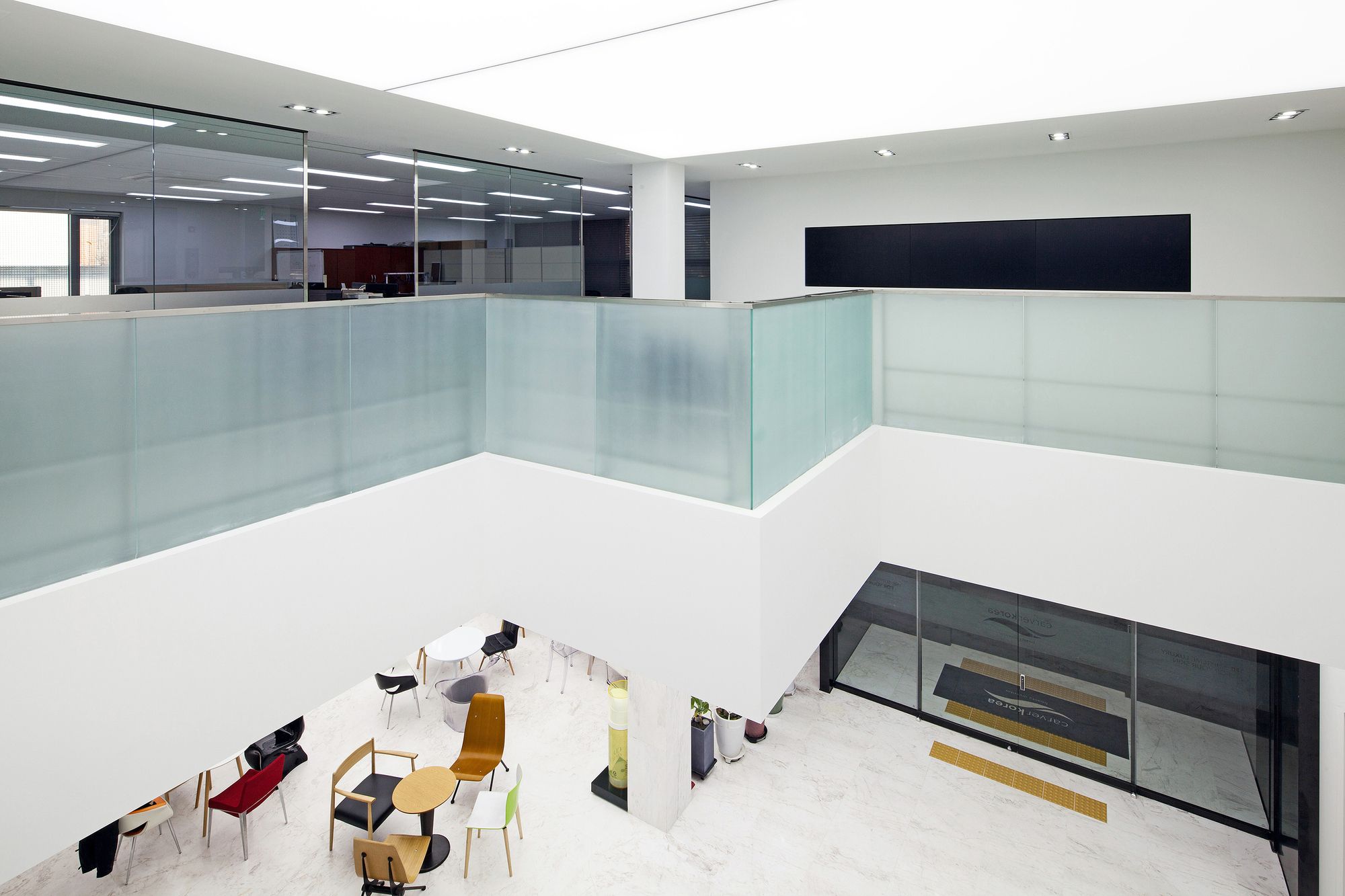
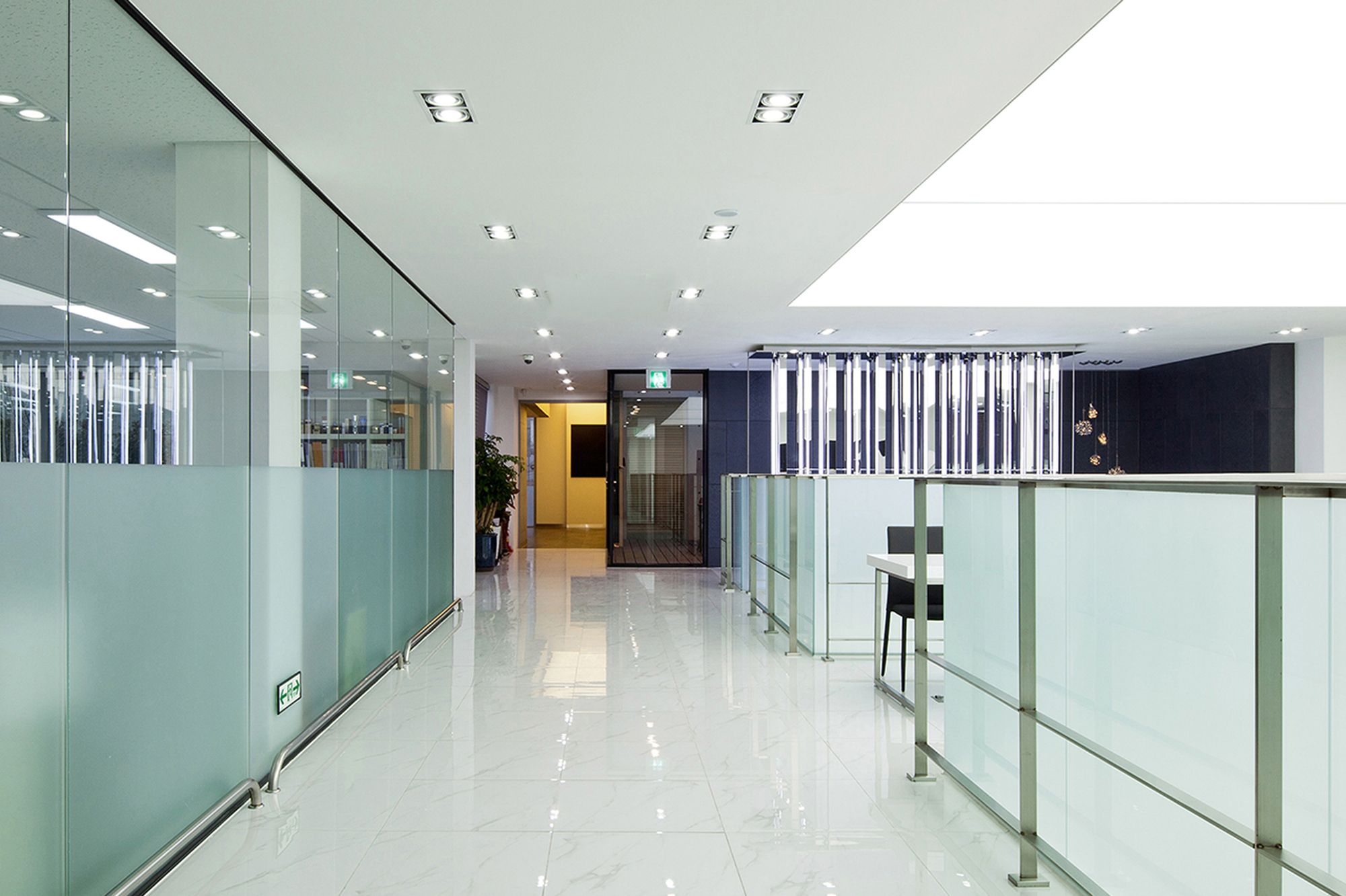
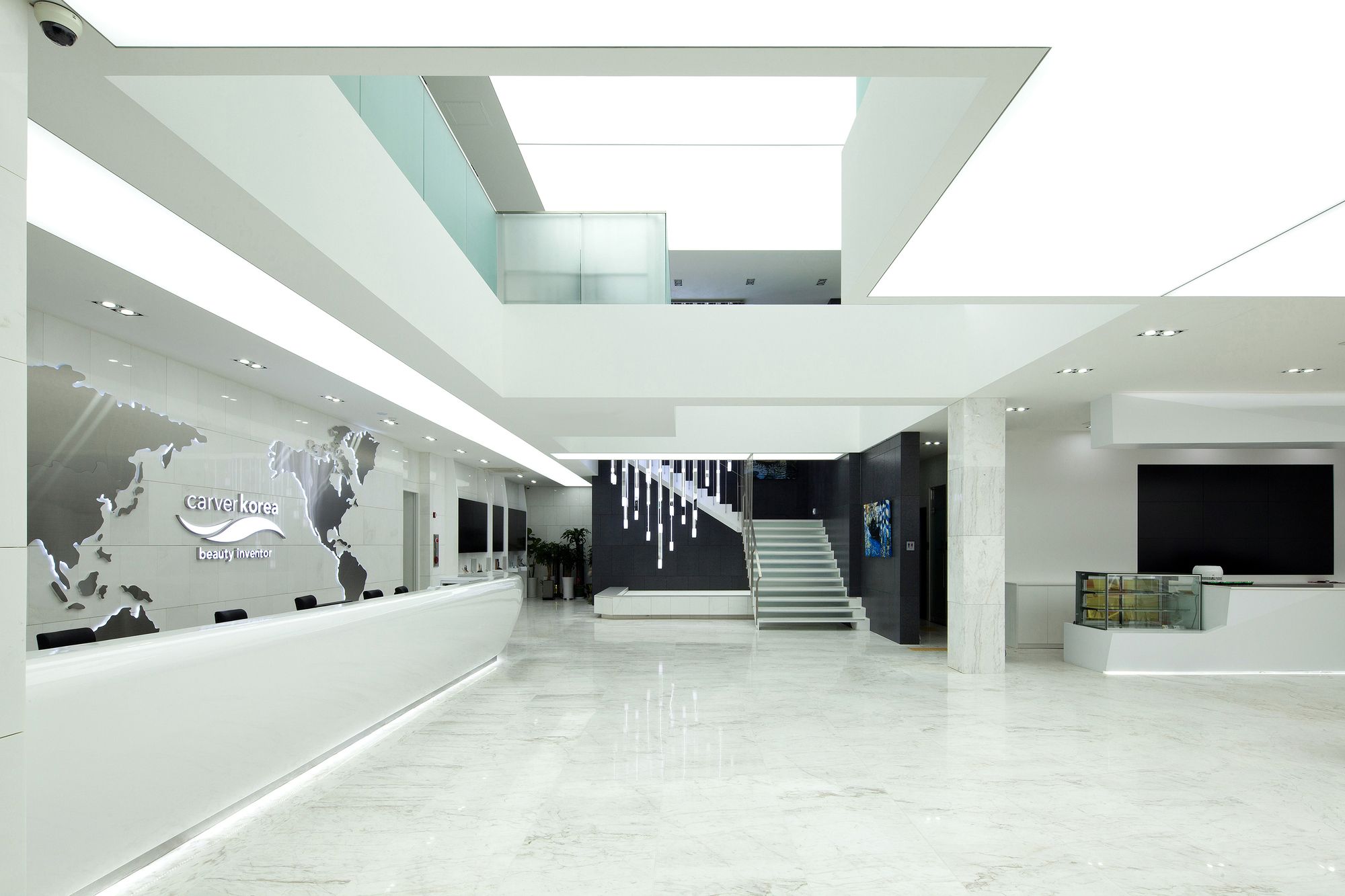
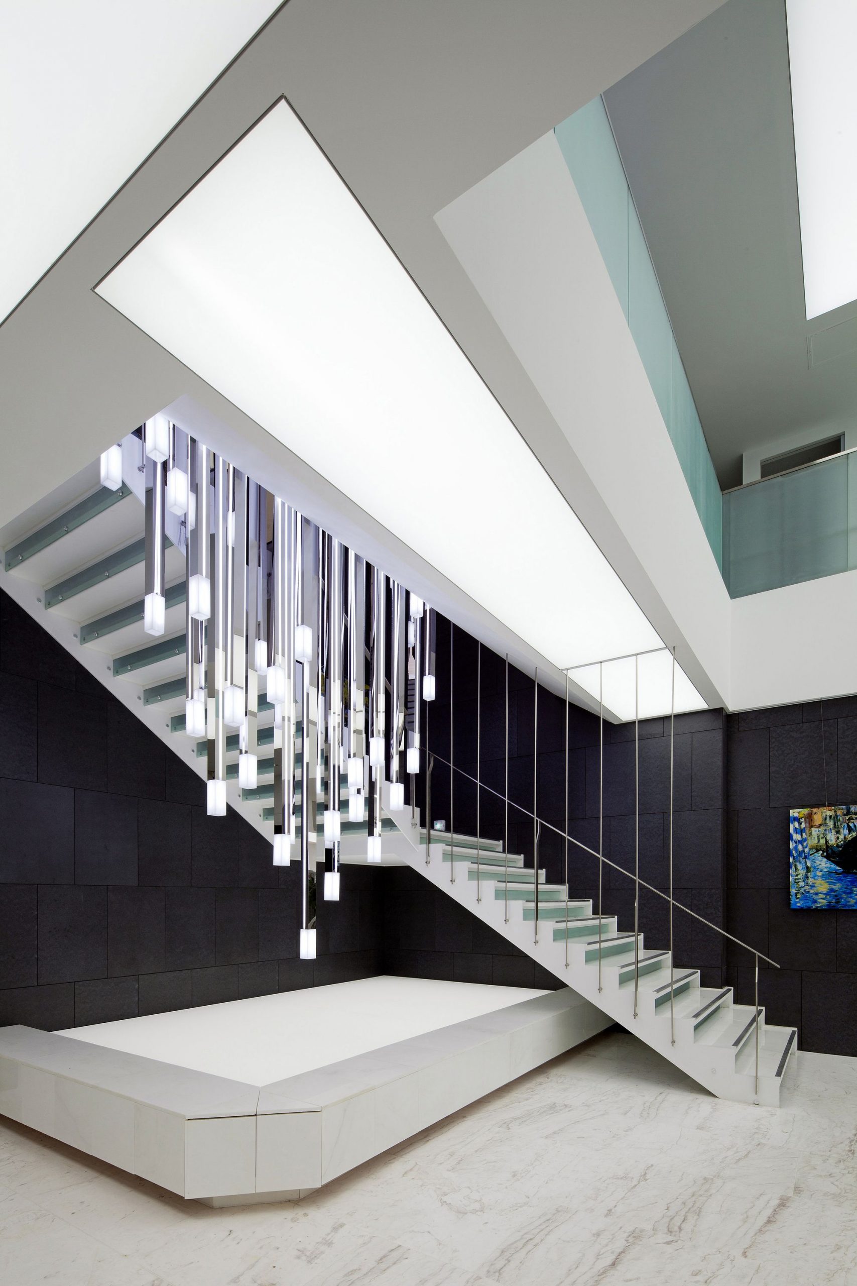
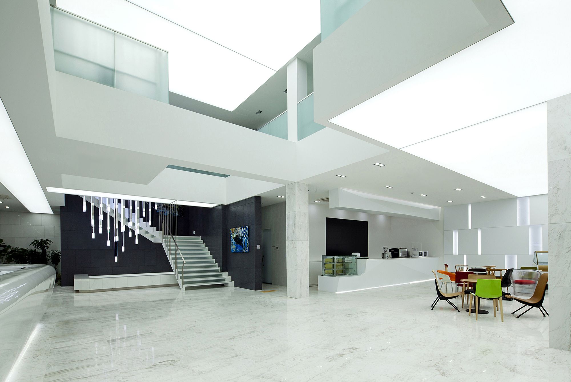
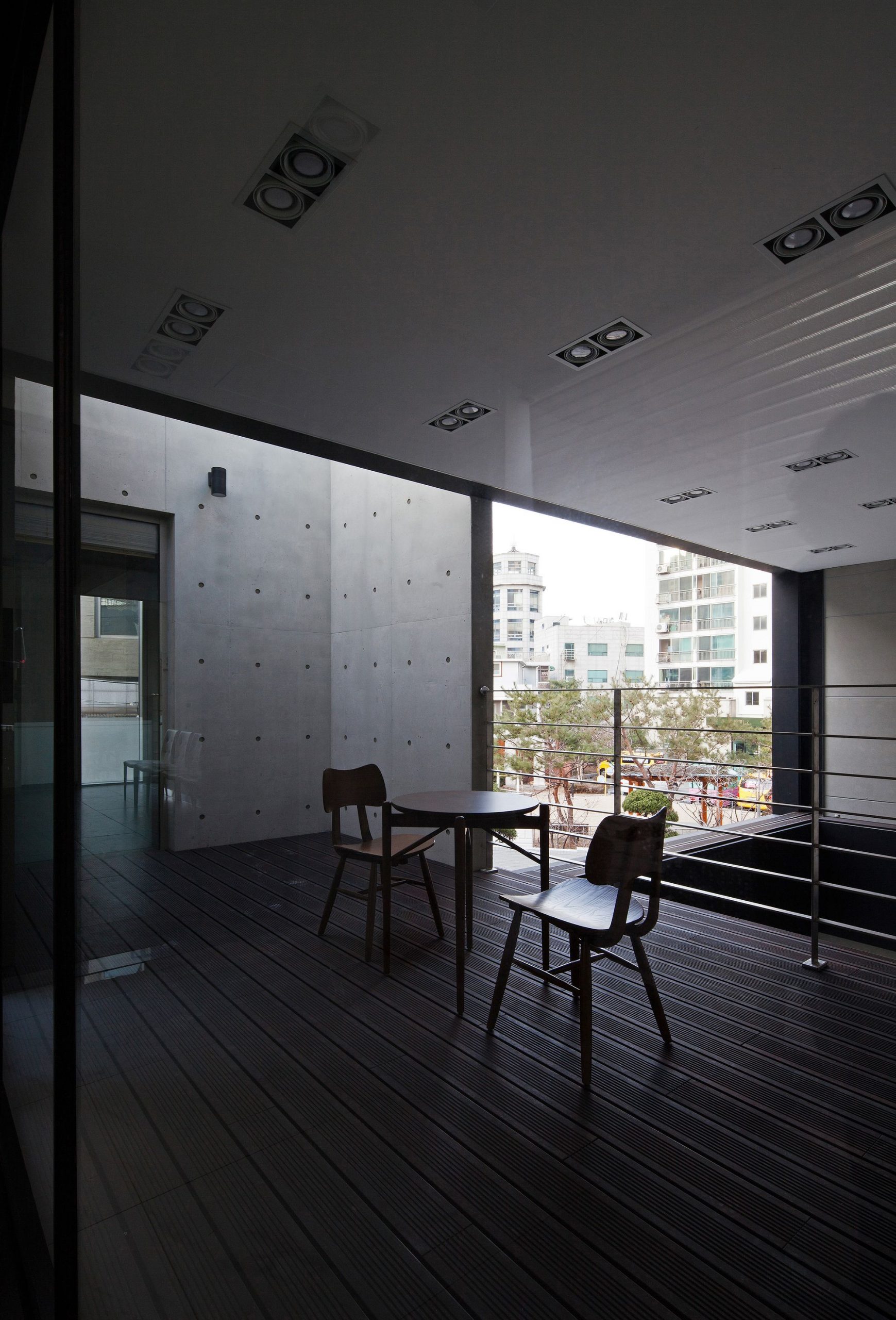
In comparison to the scale of the building, the size of entrance and lobby were over-emphasized. When the large, heavy, metal door which harmonizes with the building’s colorless exterior is opened, the visitor is greeted by a magnificent bright white space completely different than the exterior. In this large double height space sits a long information desk, while the lights of the ‘stretched ceiling system’ shine like sunlight as people gather together bringing life to this space. The building is connected to the extension wing by a terrace and rooftop garden which not only plays a circulation role by linking the two buildings, but was designed as a space where employees and visitors could encounter a diverse array of experiences in everyday life.
Normally, spaces for executives are strategically placed on the upper levels in high-rise office buildings. This represents the organization’s hierarchy and an order which reflects the desire to amplify the company’s greatness. However, this “height strategy” could not be applied in this three-storey building project.
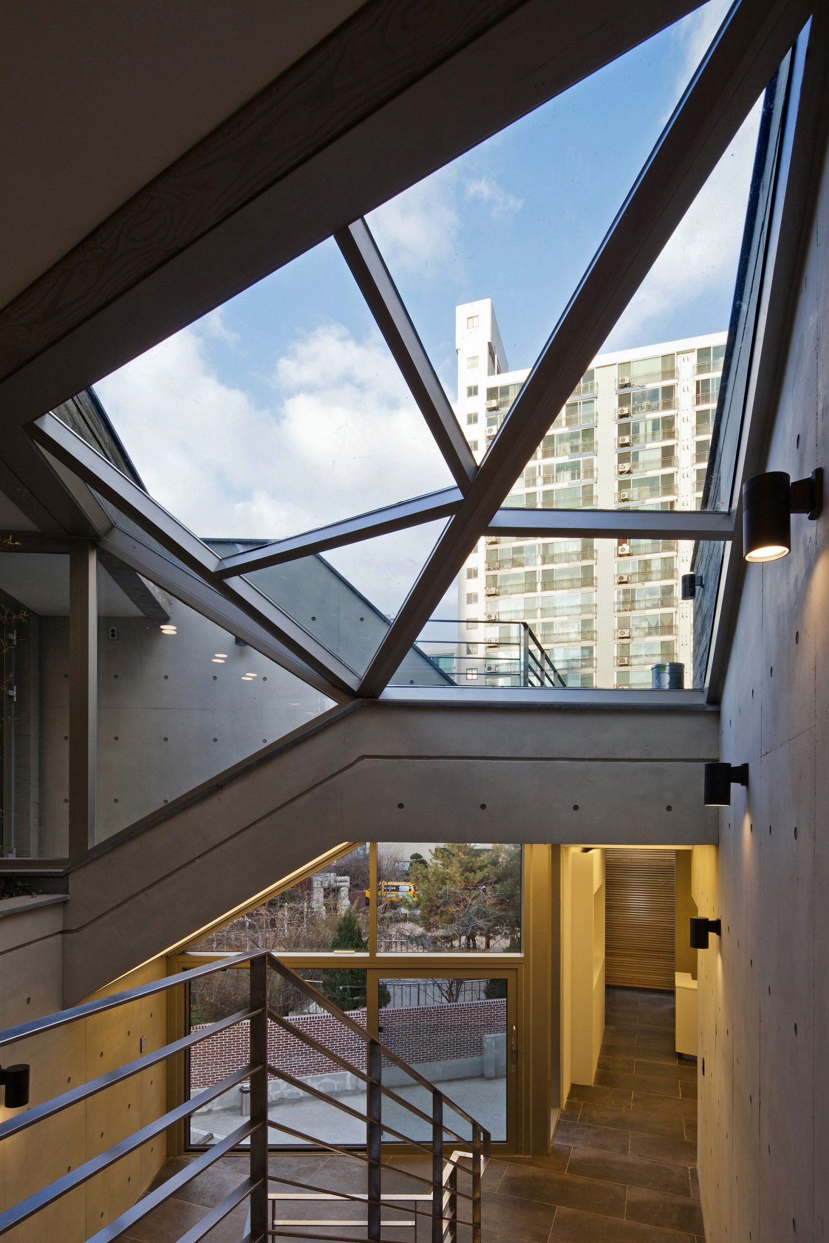
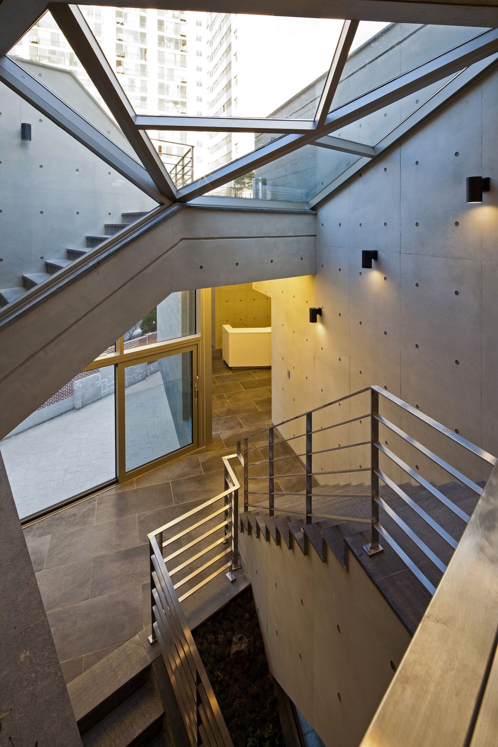
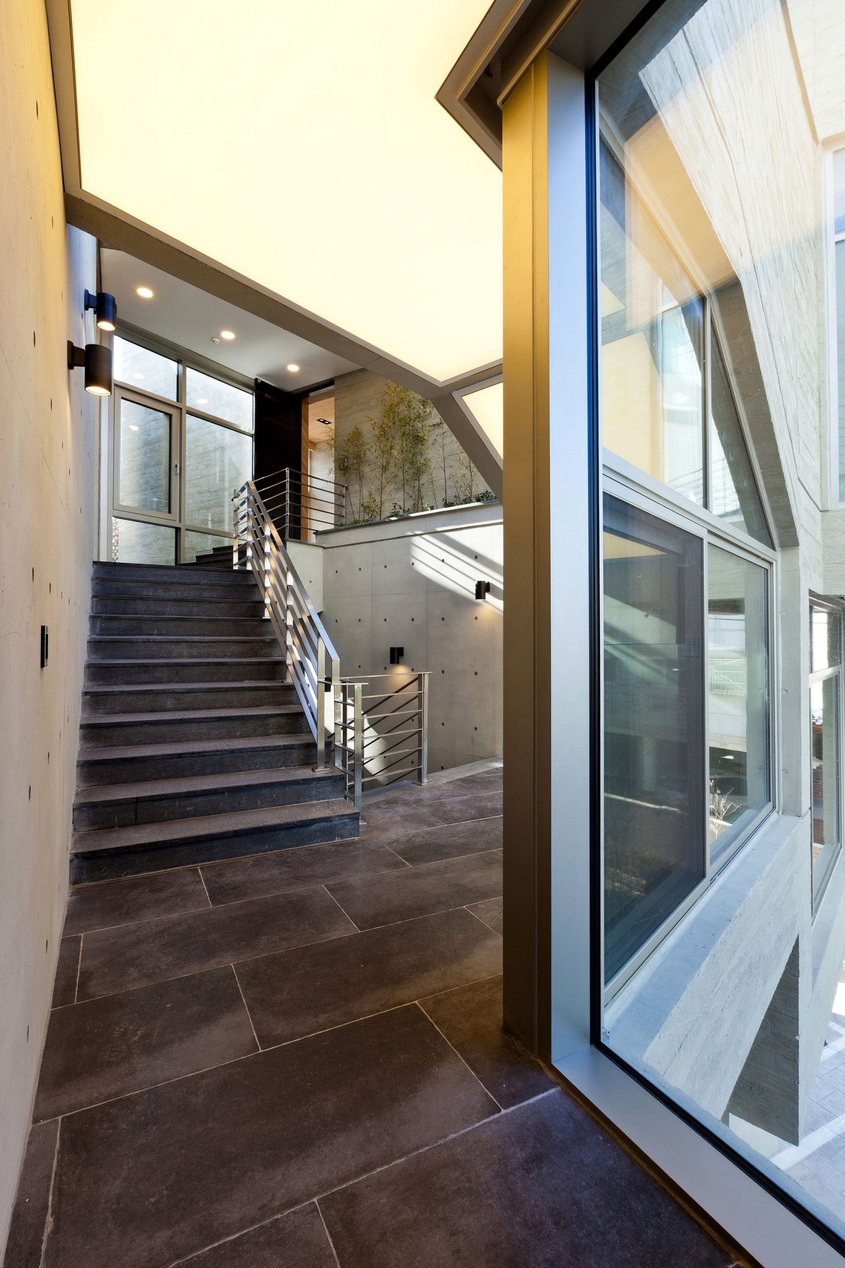
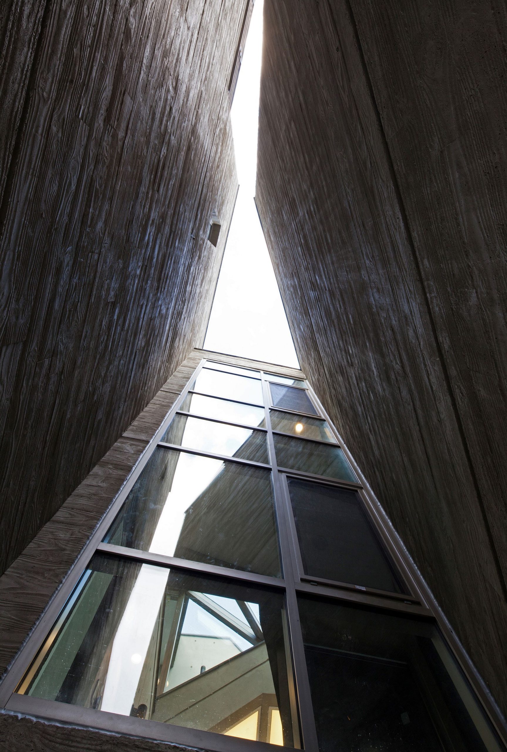
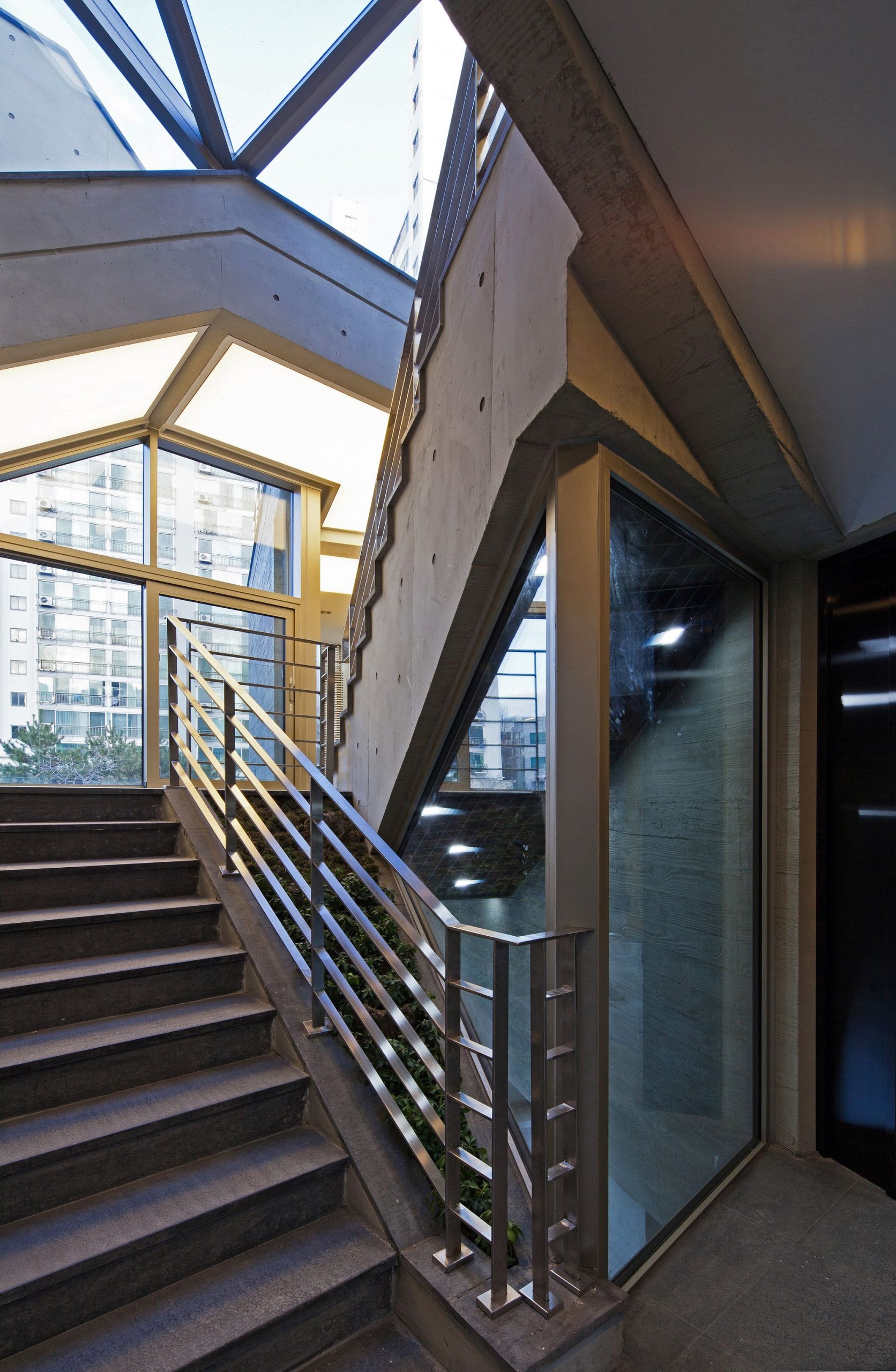
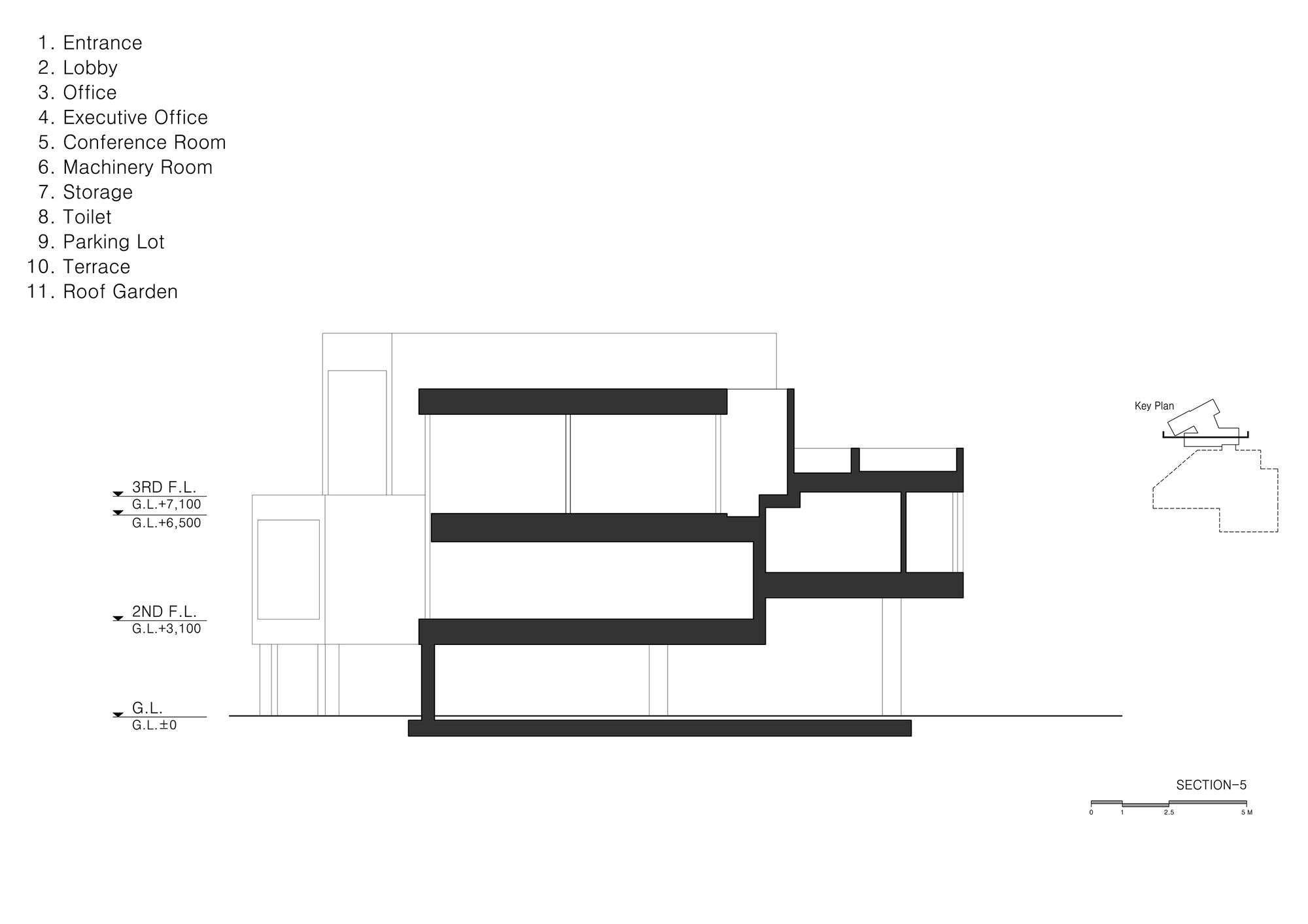
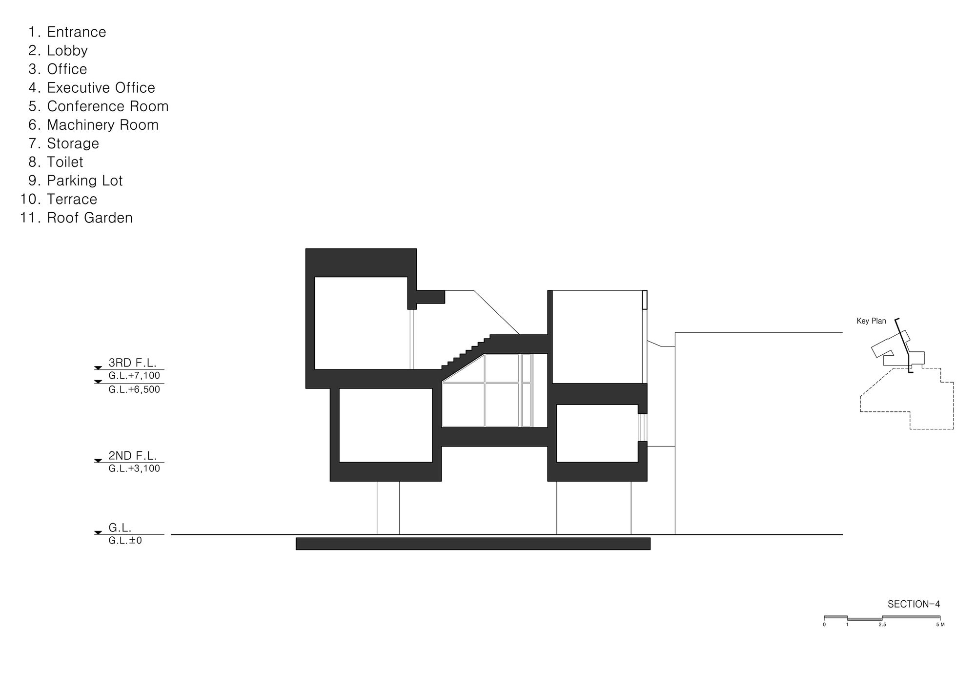
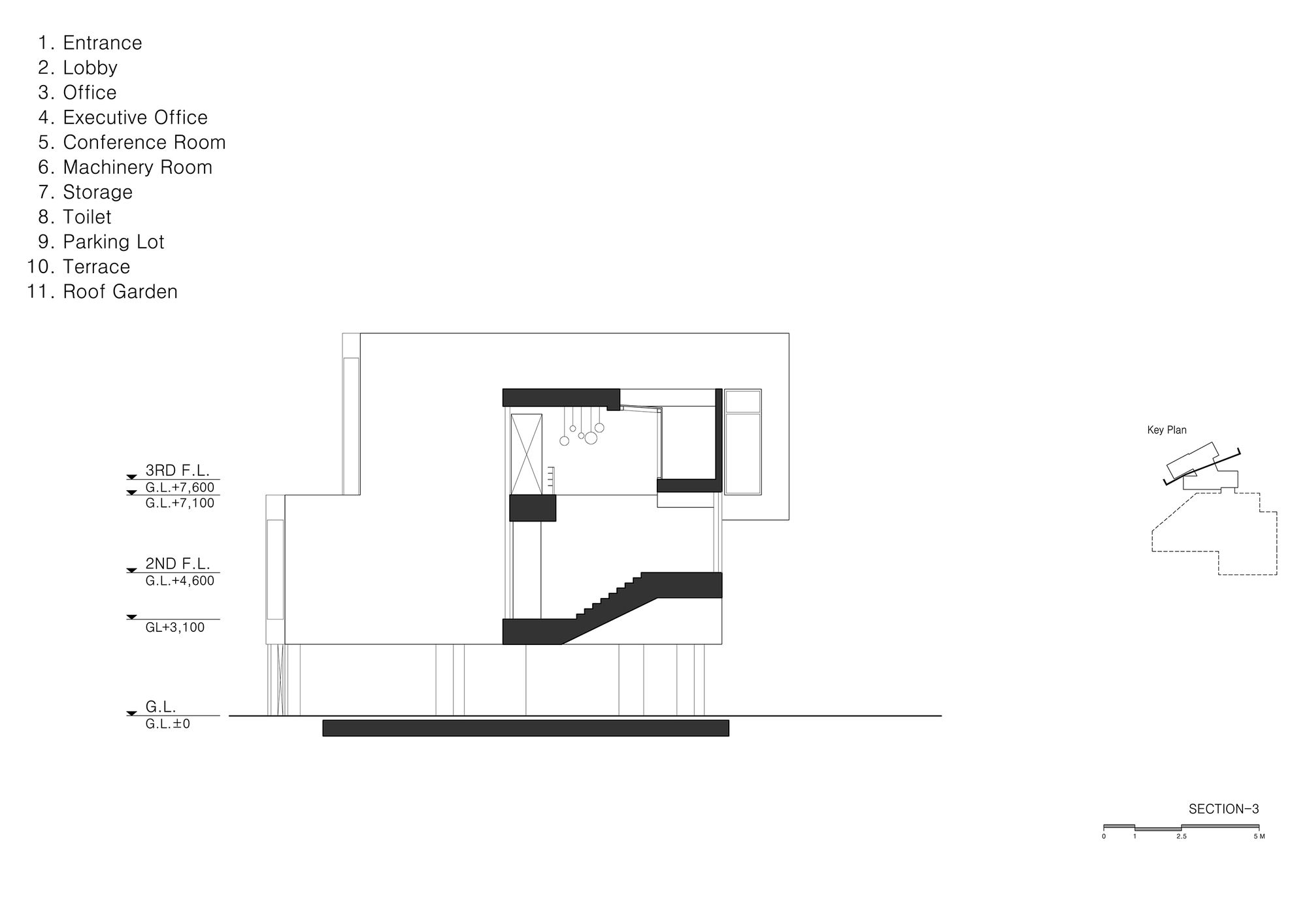
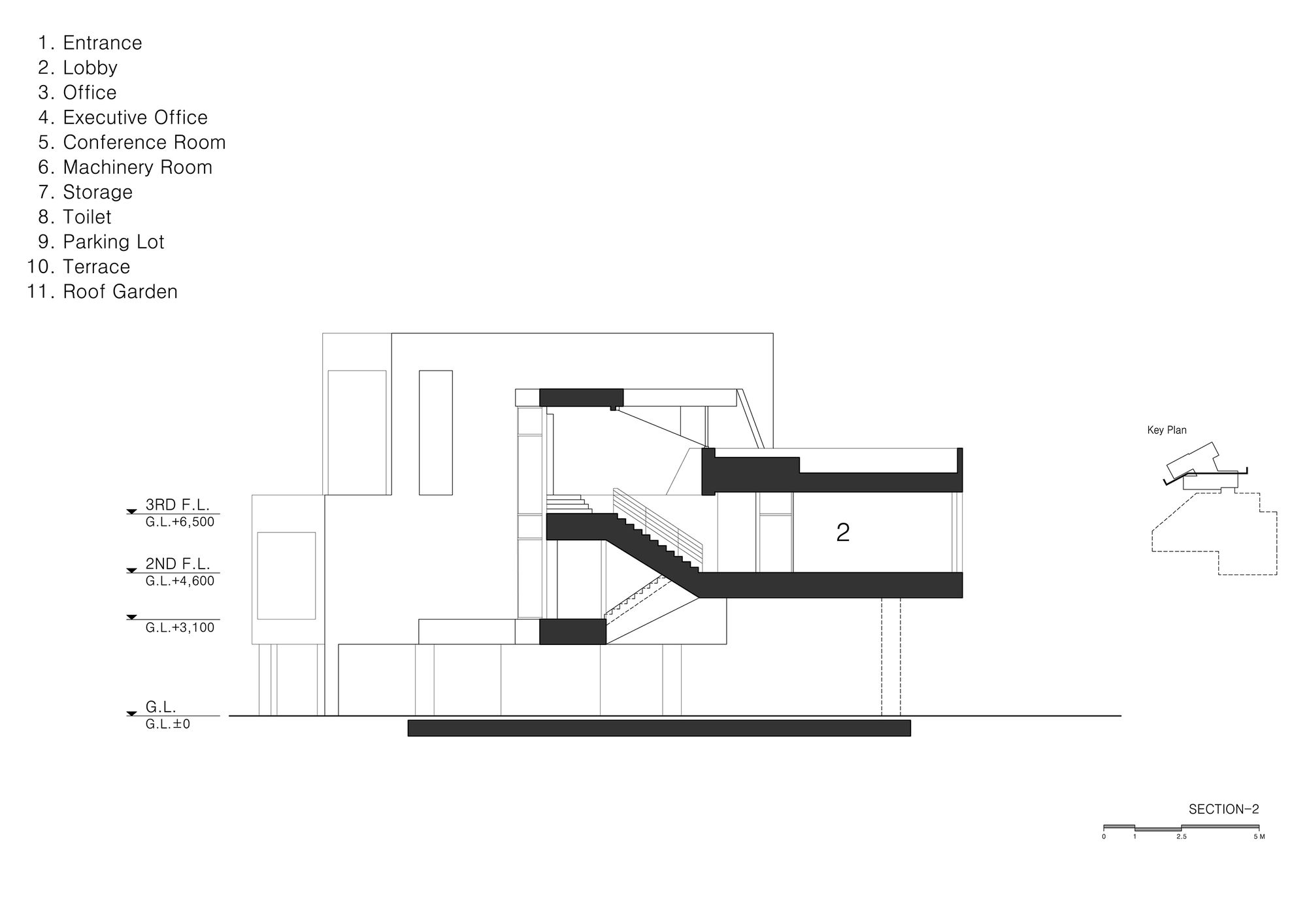
Instead, the president’s room was strategically placed on the farthest from the main entrance. In addition, each mass was separated using a ‘skip floor’ system with a small hall and skylight placed in between each mass, intentionally creating a long and interesting ‘journey’ to the president’s room.
In this way, the core of a high-rise building was transformed into a horizontal form, creating a ‘spatial strategy’ traversed not through machinery but through an architectural device.
Project Info :
Architect : D-Werker Architects
Project Location : Daeheung-dong, Mapo-gu, Seoul, South Korea
Project Year : 2016
Project Area : 1743.27 sqm
Photographs : Inwoo Yeo
Manufacturers : Eagon
Construction : Gaudikorea Co.
Client : Sang Rok Lee
Architect in Charge : Jieun Lee, Hwon Yoon
Photography by © Inwoo Yeo
Photography by © Inwoo Yeo
Photography by © Inwoo Yeo
Photography by © Inwoo Yeo
Photography by © Inwoo Yeo
Photography by © Inwoo Yeo
Photography by © Inwoo Yeo
Photography by © Inwoo Yeo
Photography by © Inwoo Yeo
Photography by © Inwoo Yeo
Photography by © Inwoo Yeo
Photography by © Inwoo Yeo
Photography by © Inwoo Yeo
Photography by © Inwoo Yeo
Photography by © Inwoo Yeo
Photography by © Inwoo Yeo
Photography by © Inwoo Yeo
Photography by © Inwoo Yeo
Photography by © Inwoo Yeo
Photography by © Inwoo Yeo
Photography by © Inwoo Yeo
Photography by © Inwoo Yeo
1st Floor Plan
2nd Floor Plan
3rd Floor Plan
Section
Section
Section
Section
Section
Elevation


