C+C House
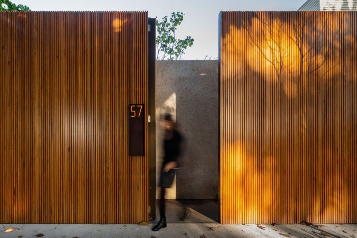
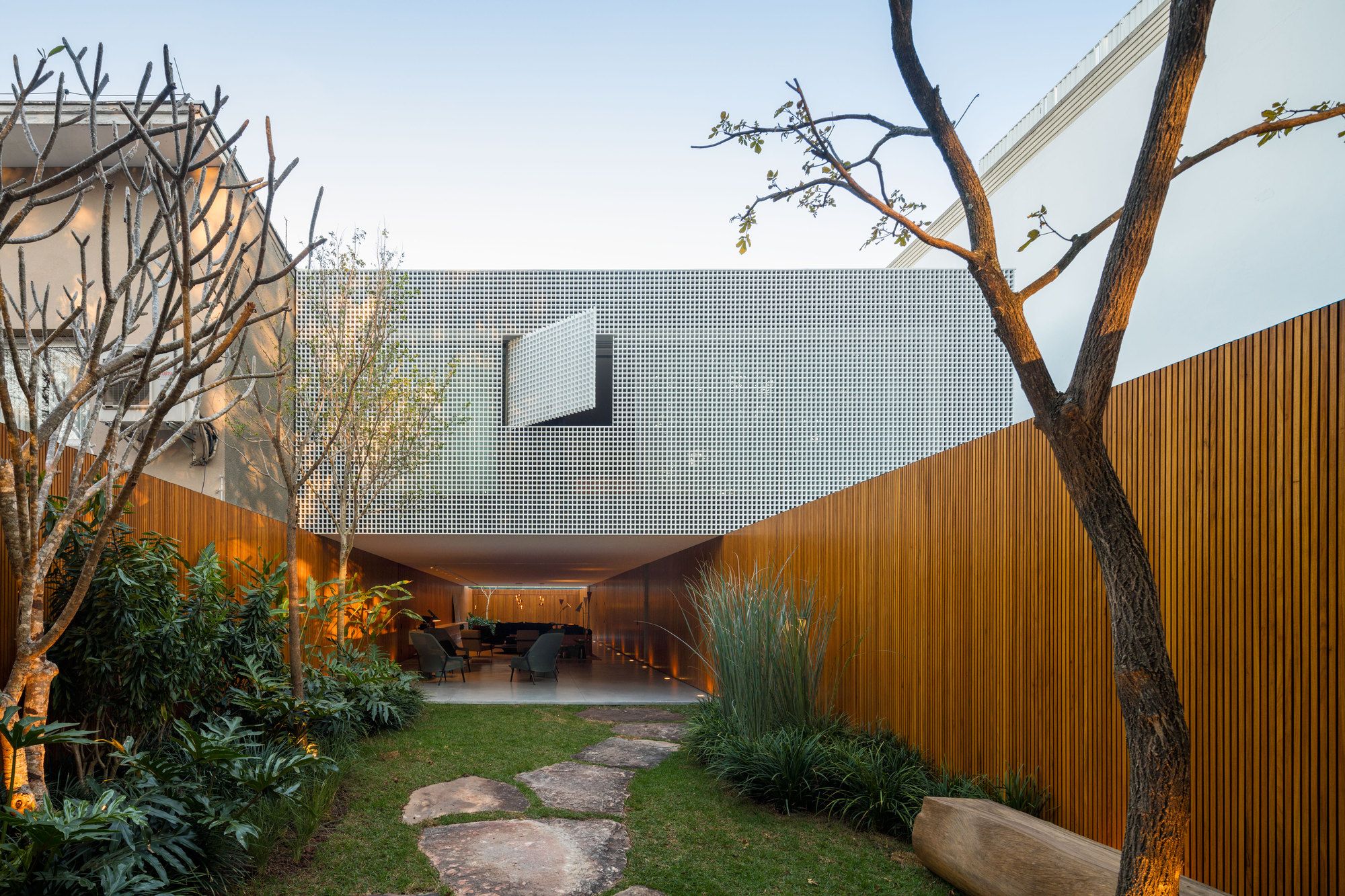
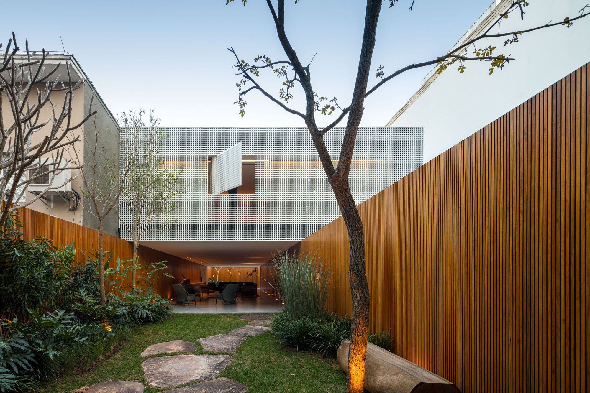
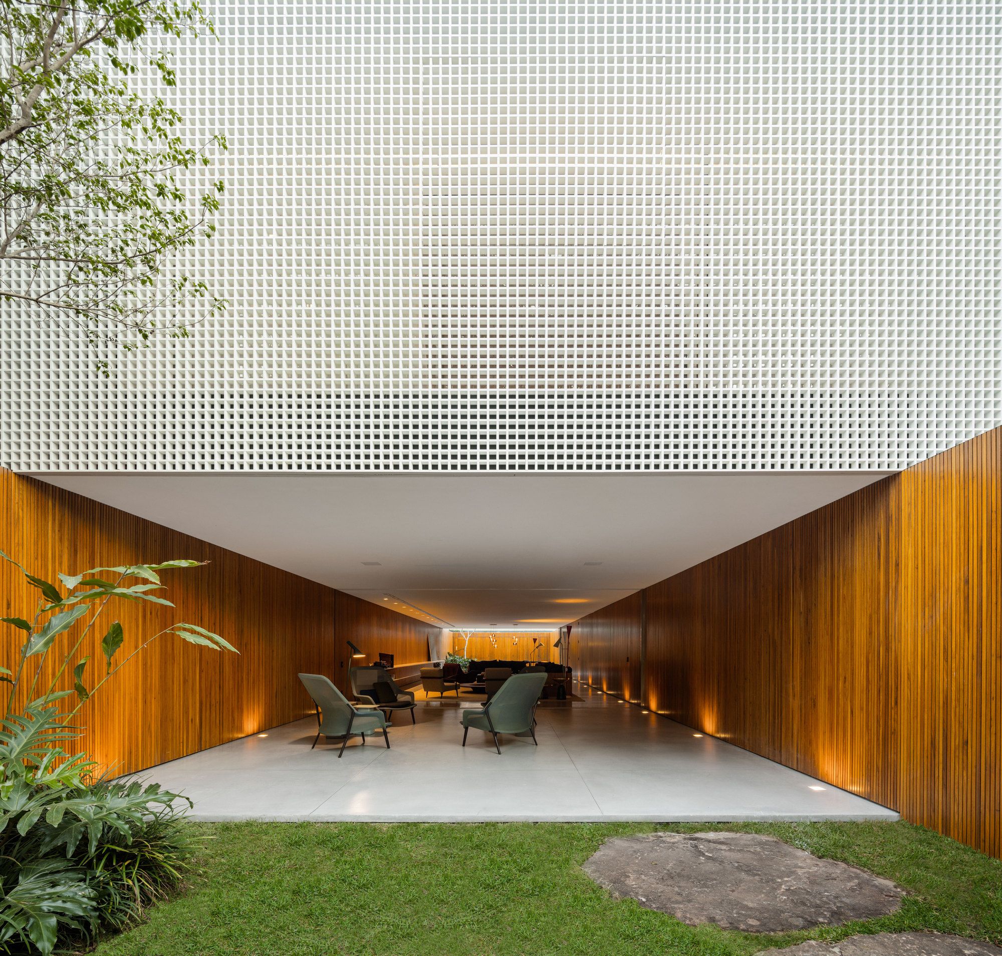
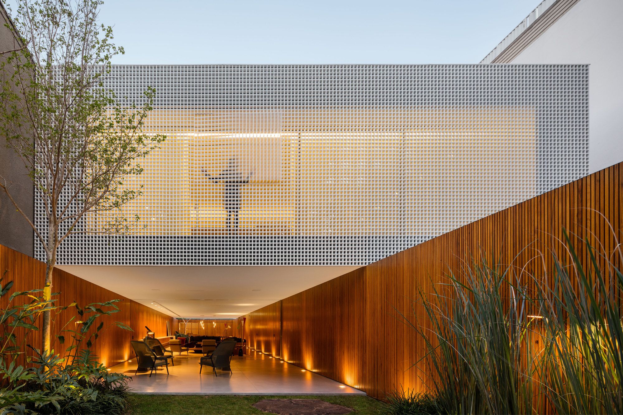
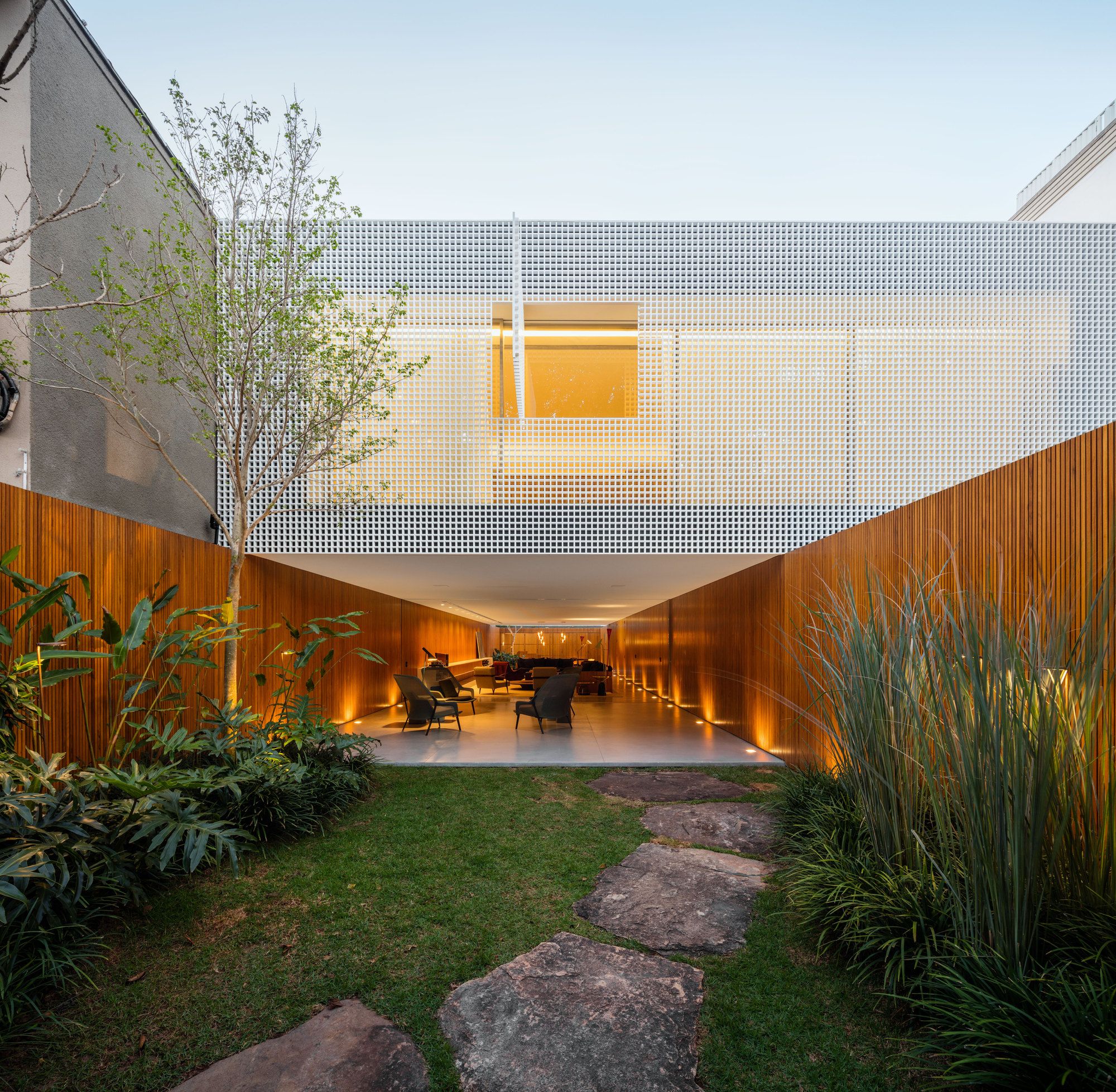
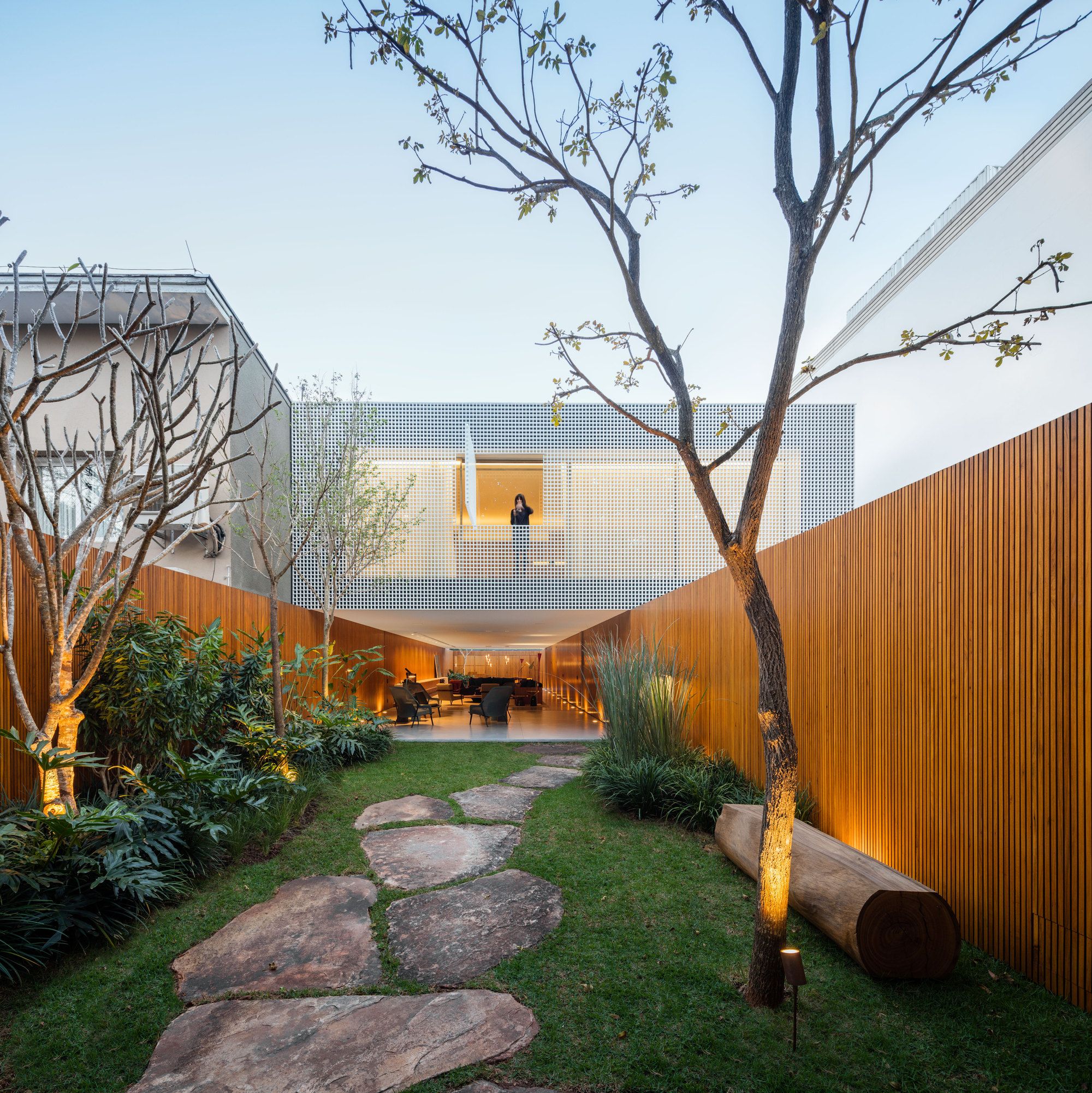
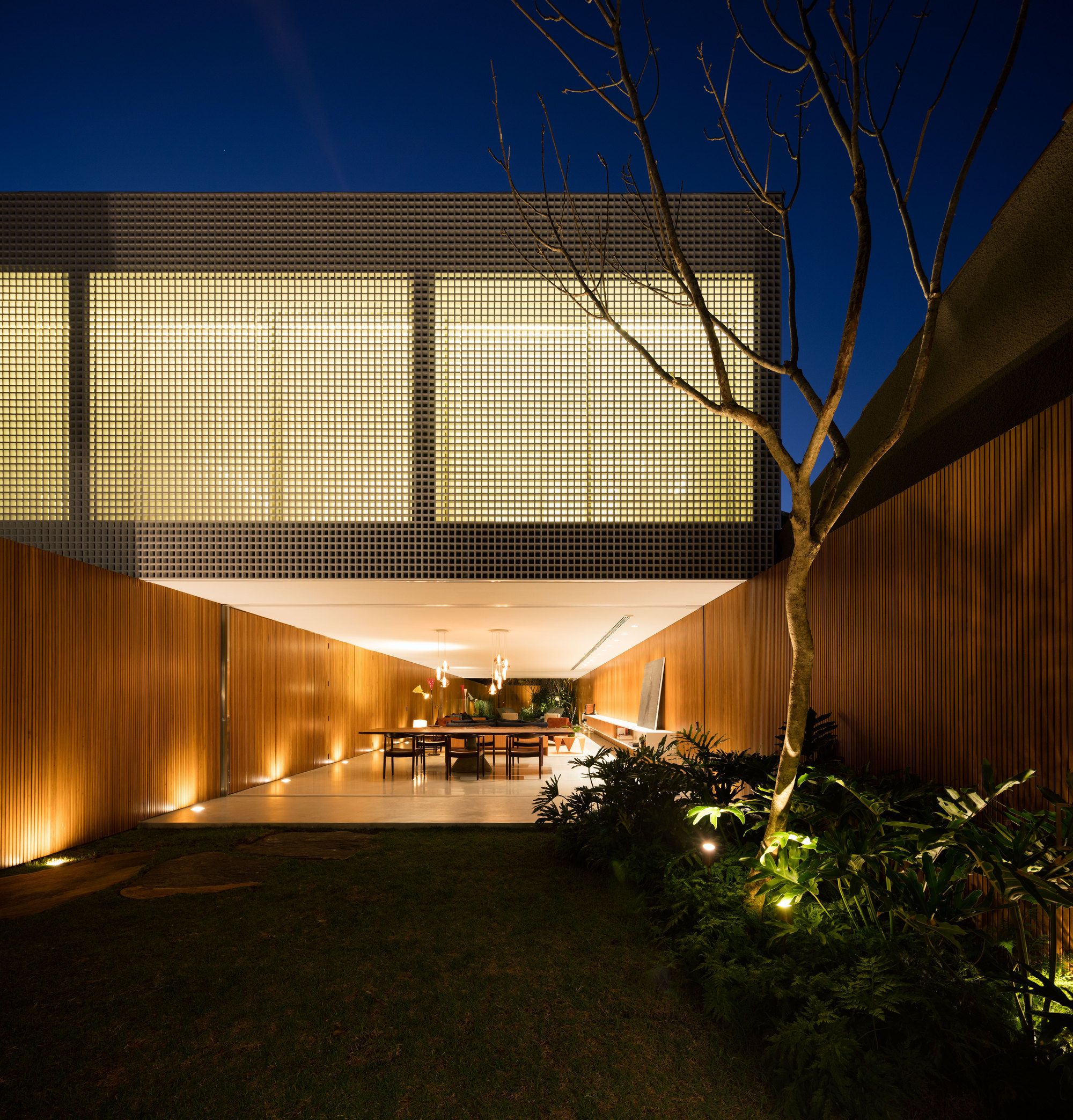
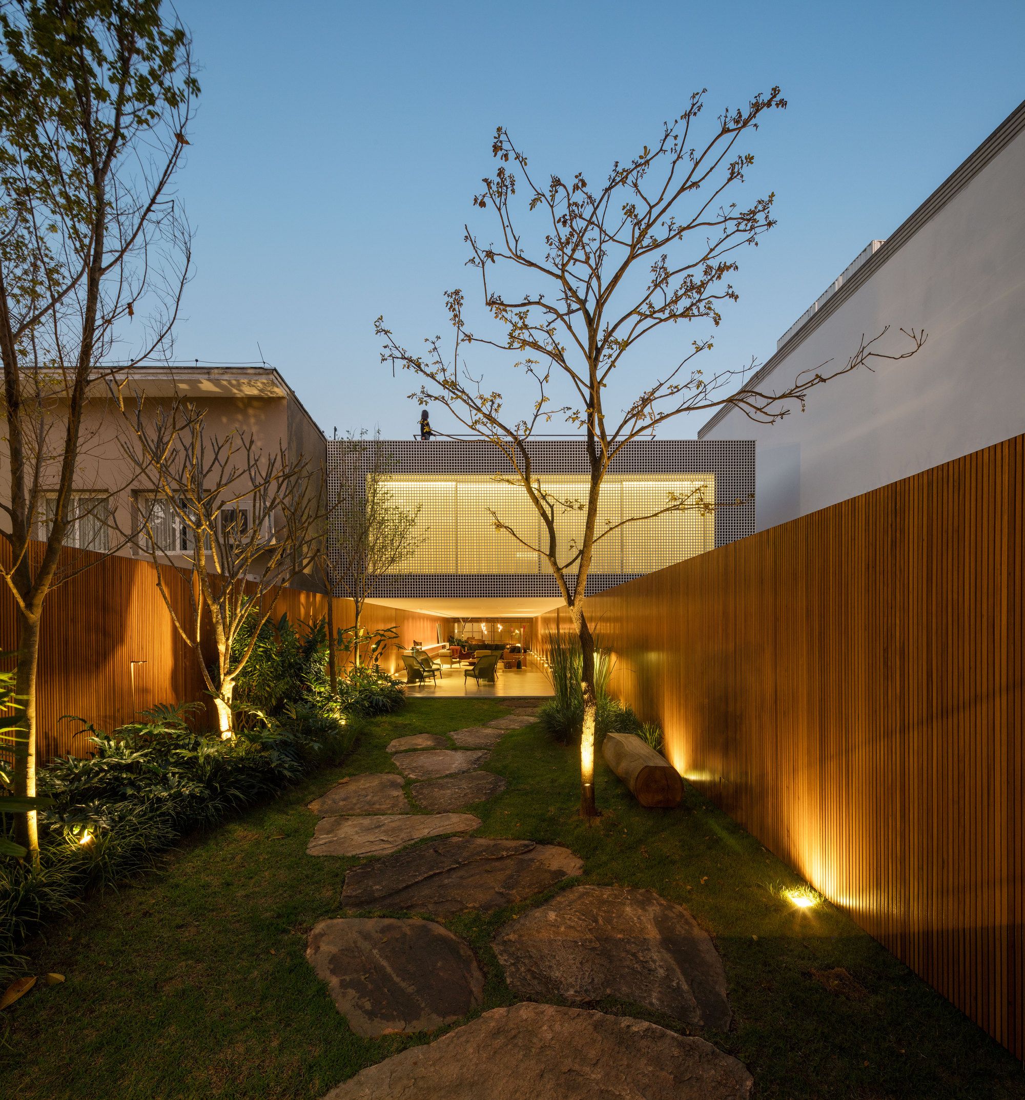
With camouflaged openings, C + C House is a balanced game between full and empty. Its land, located in a very leafy neighborhood in the city of São Paulo, has a narrow and long way with buildings on the sides, and guided the project openings forwards and back. This solution was chosen not only to guarantee the best use of the terrain, but also to guarantee the views, ventilation and insolation in the interiors.
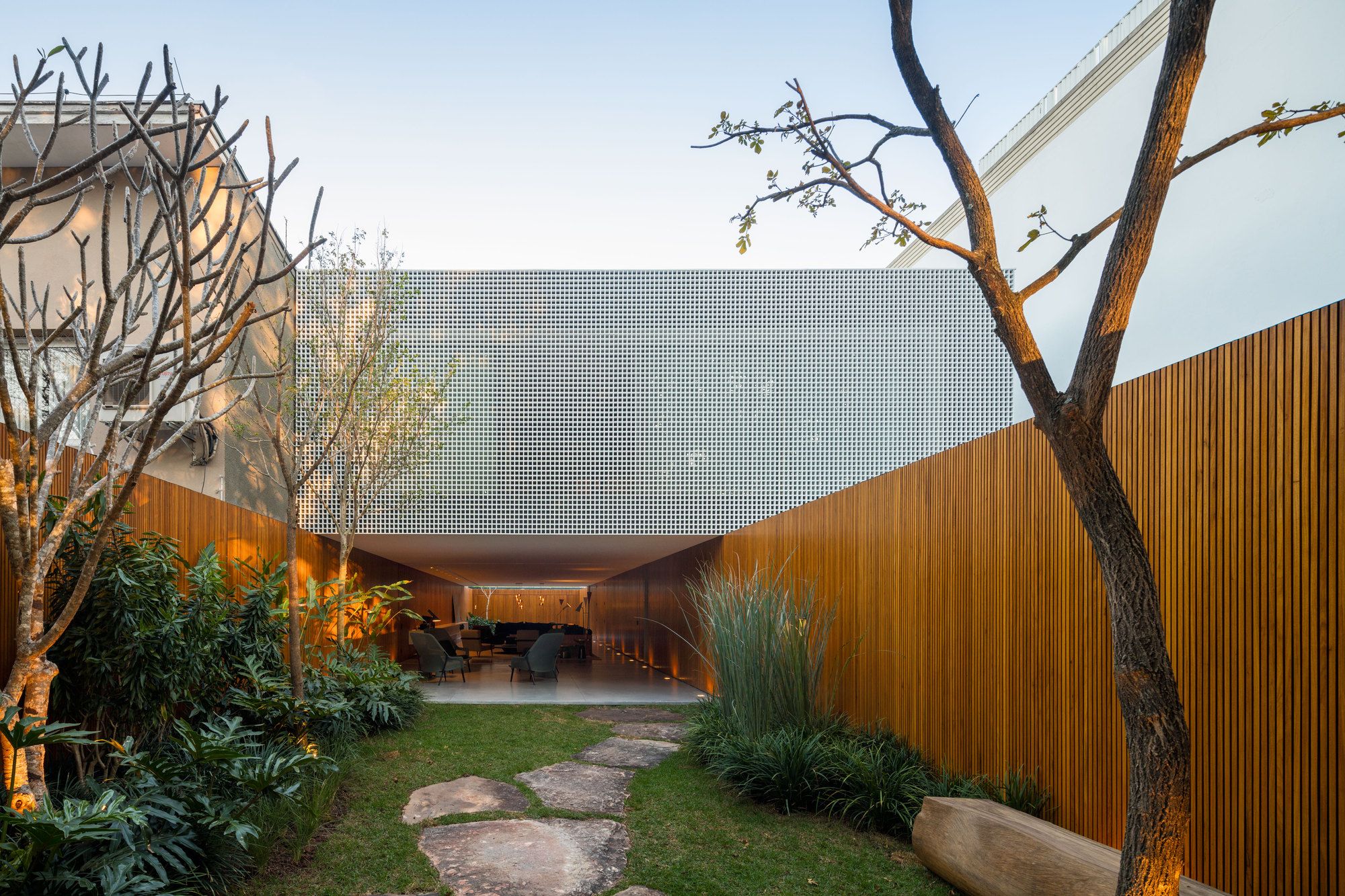
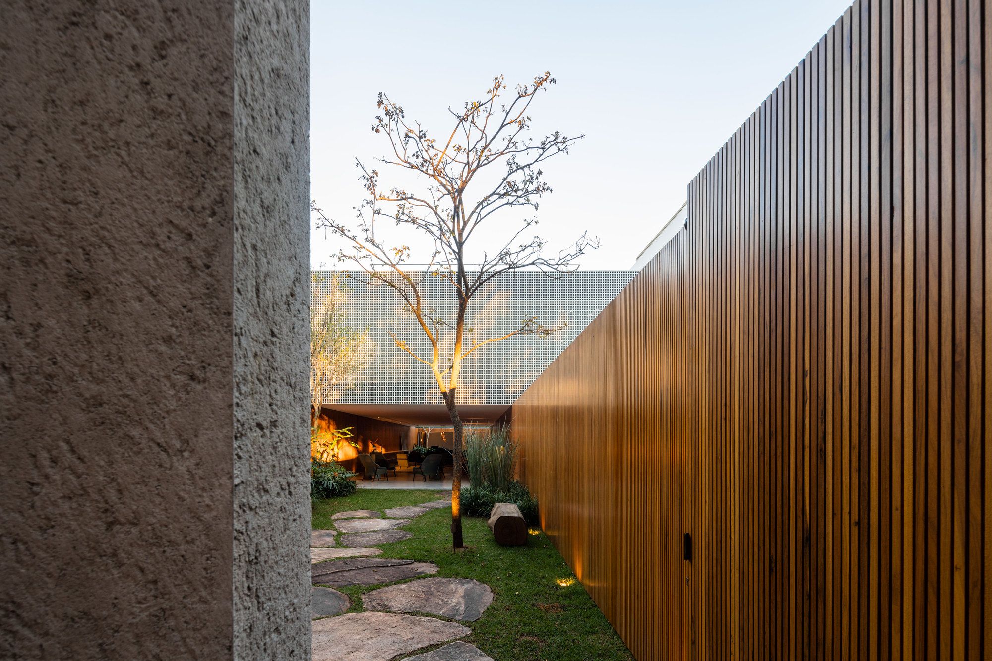
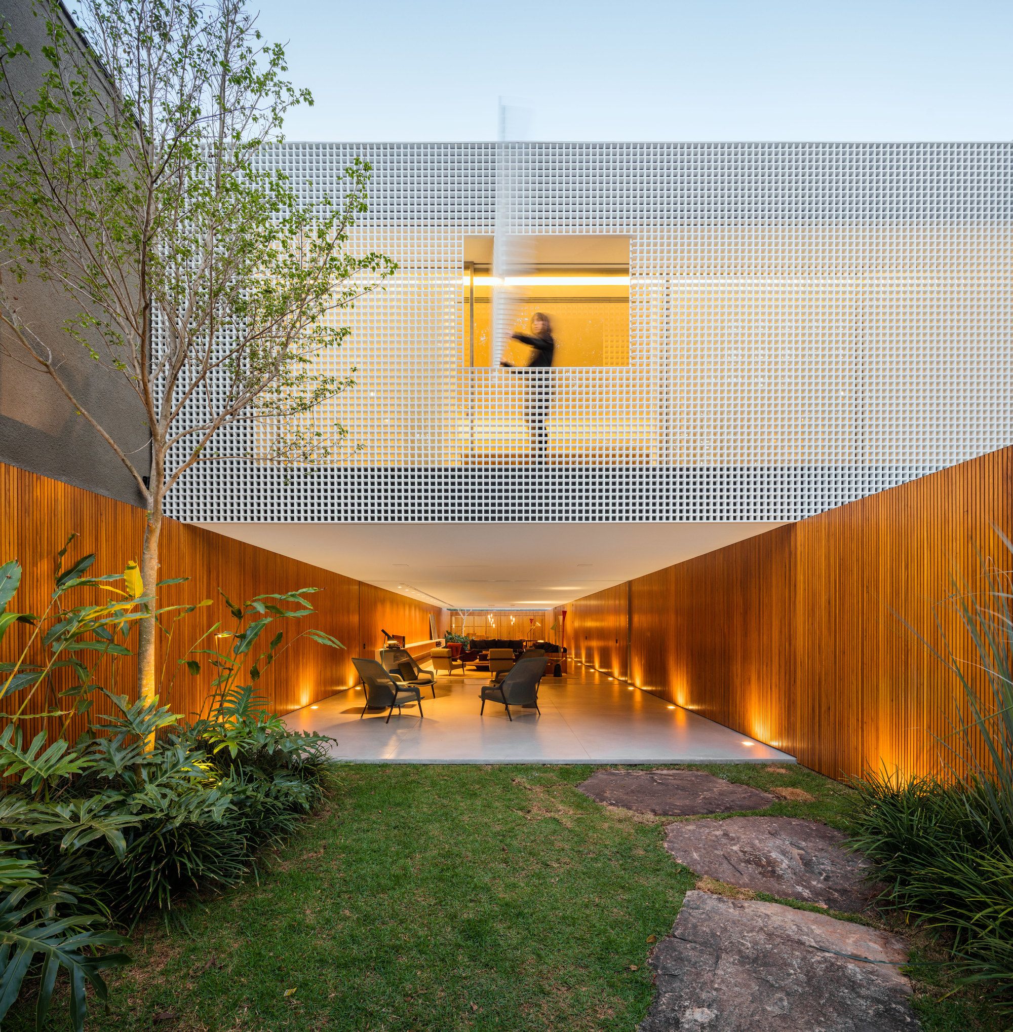
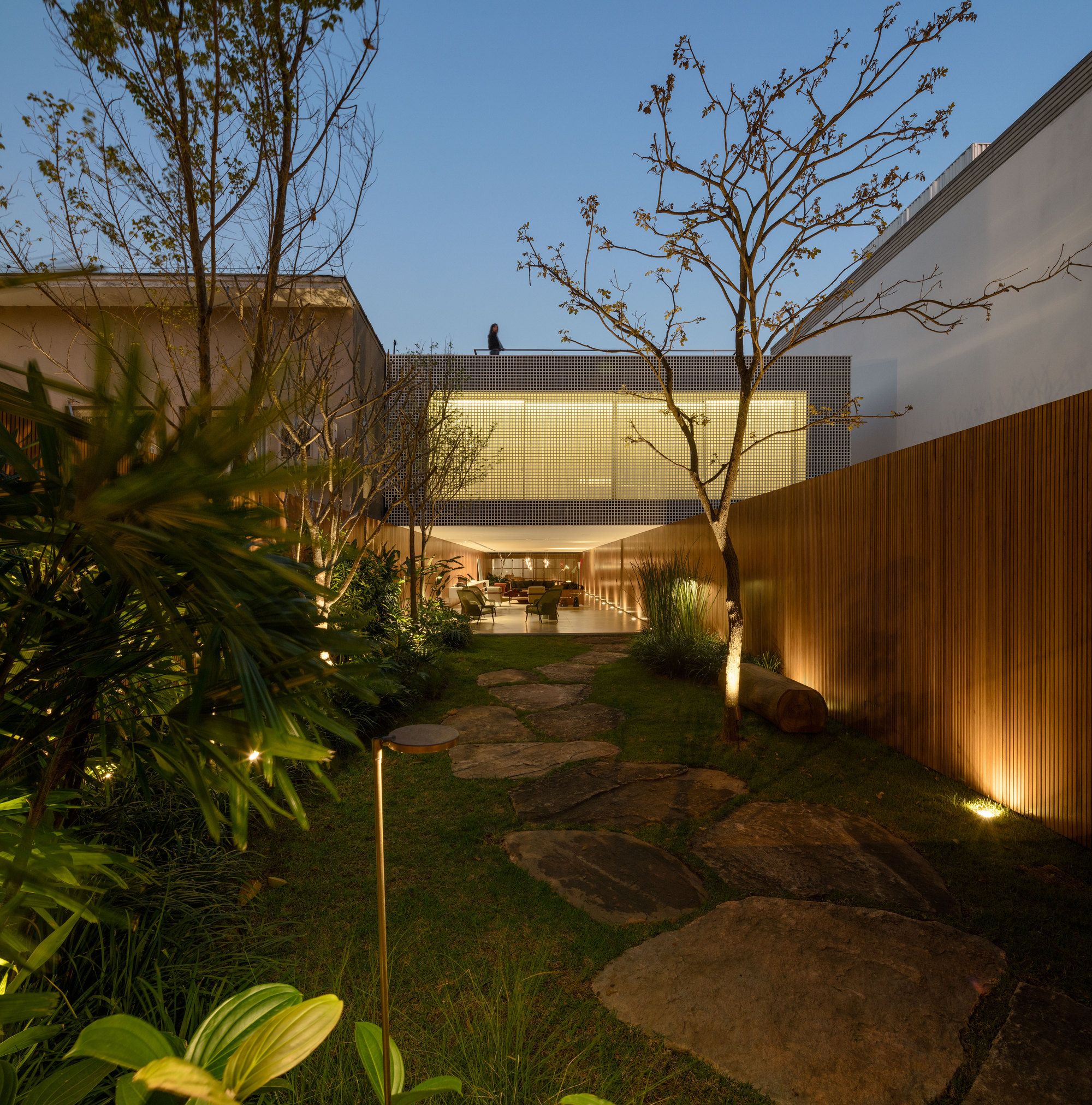
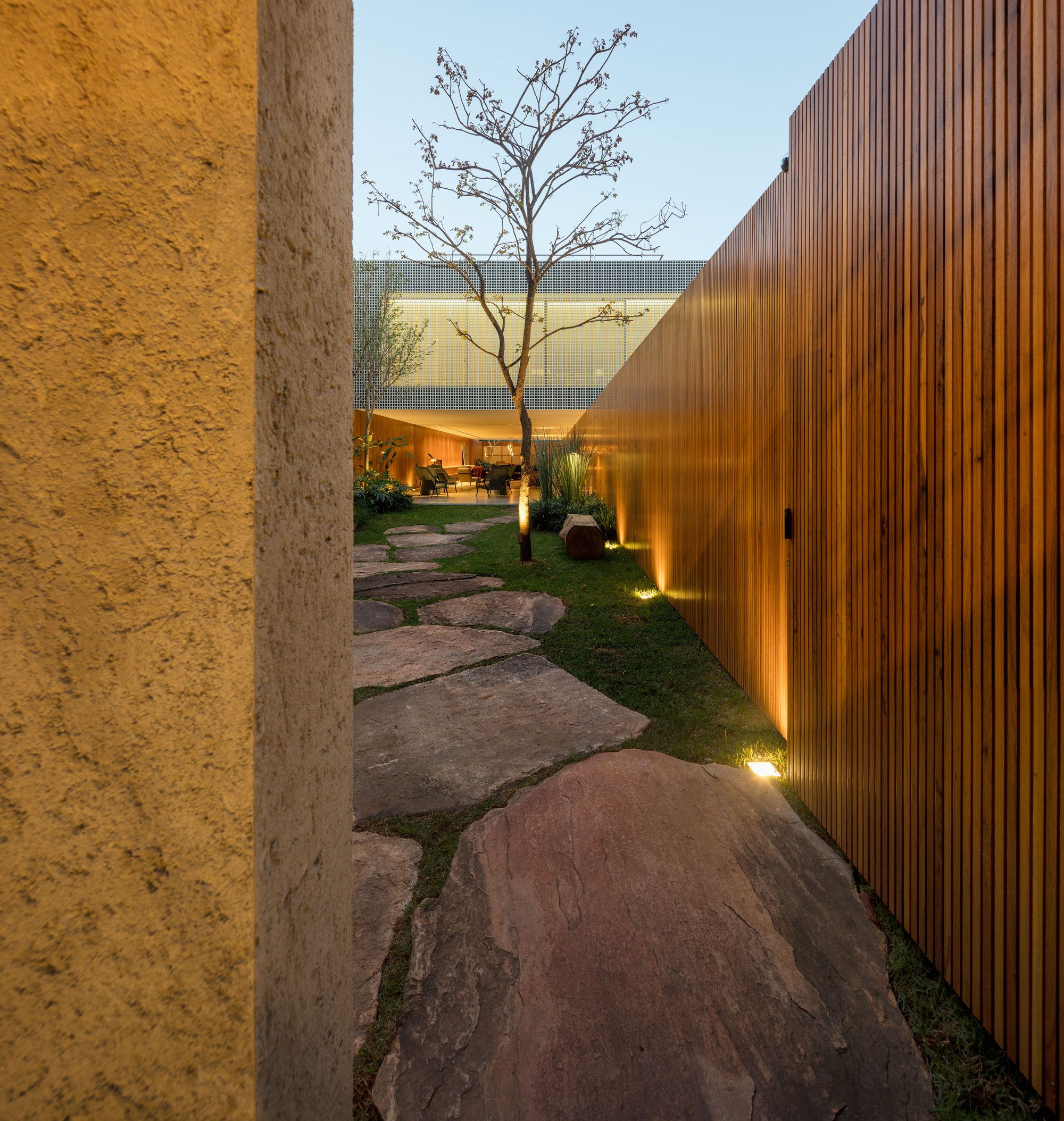
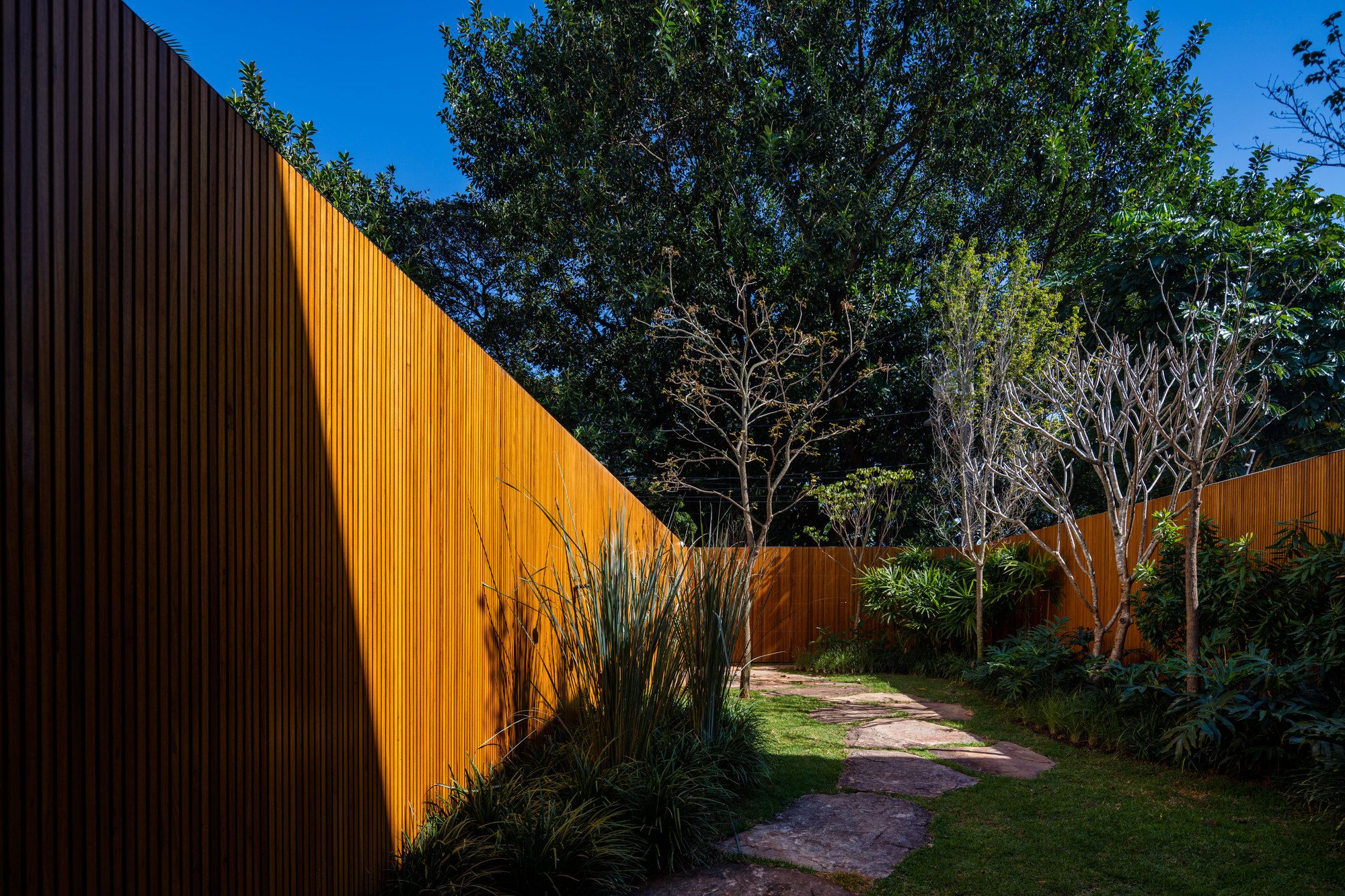
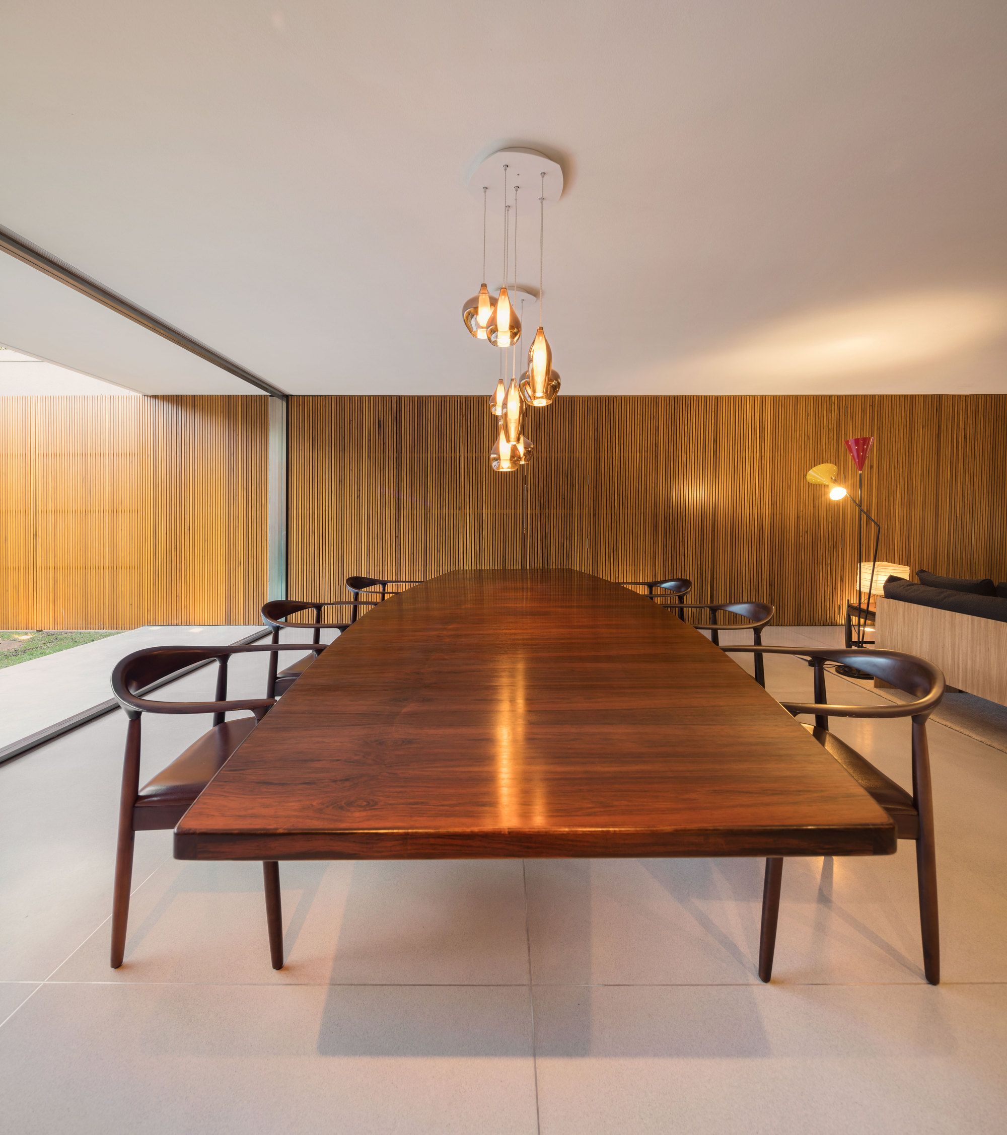
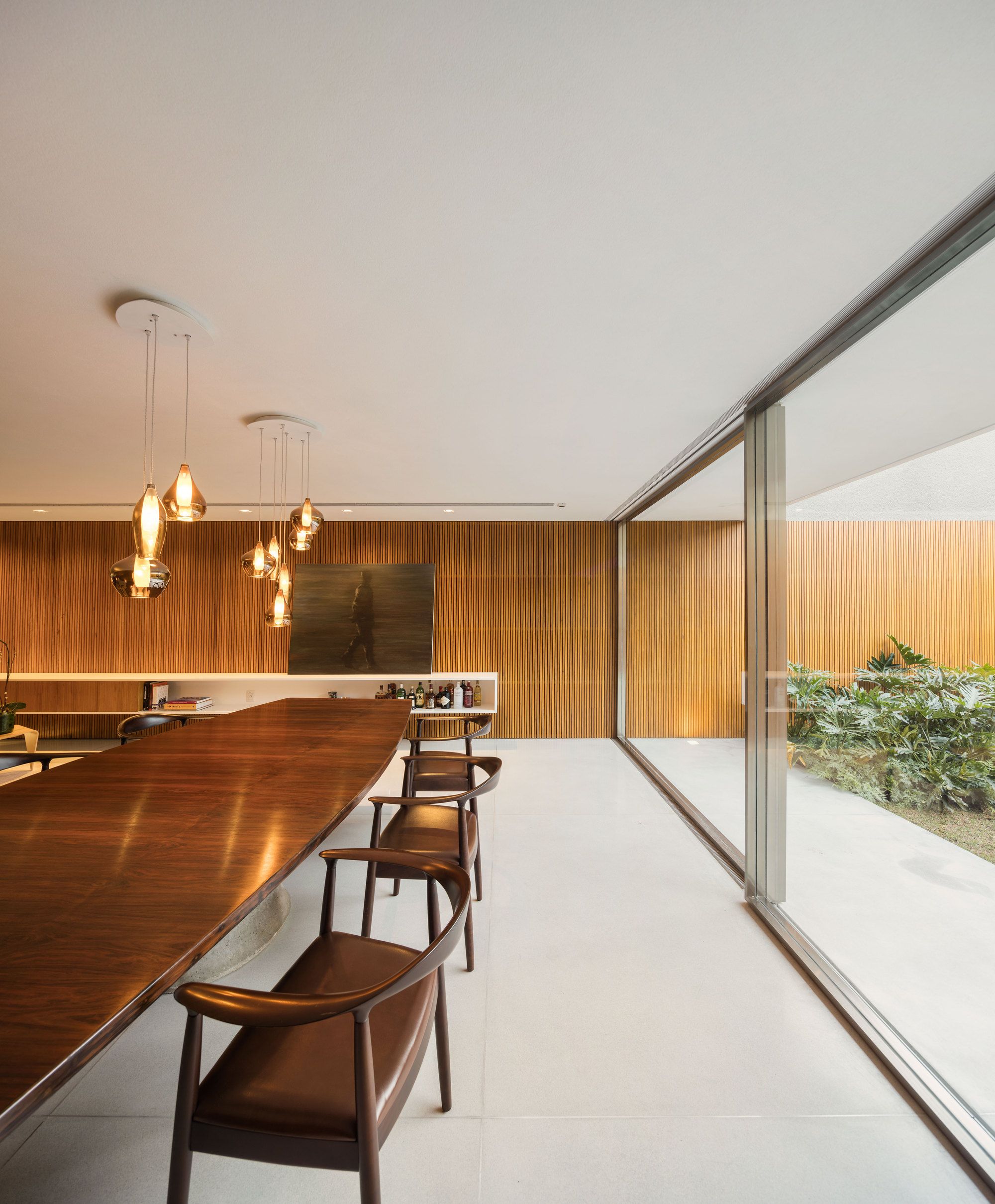
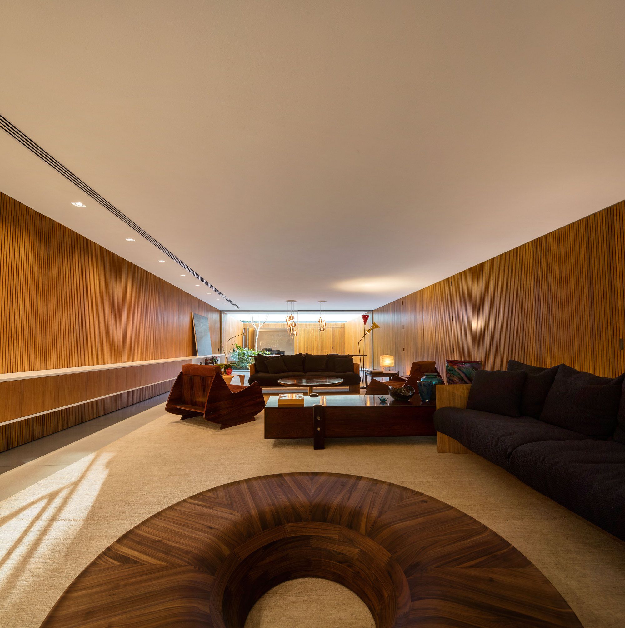
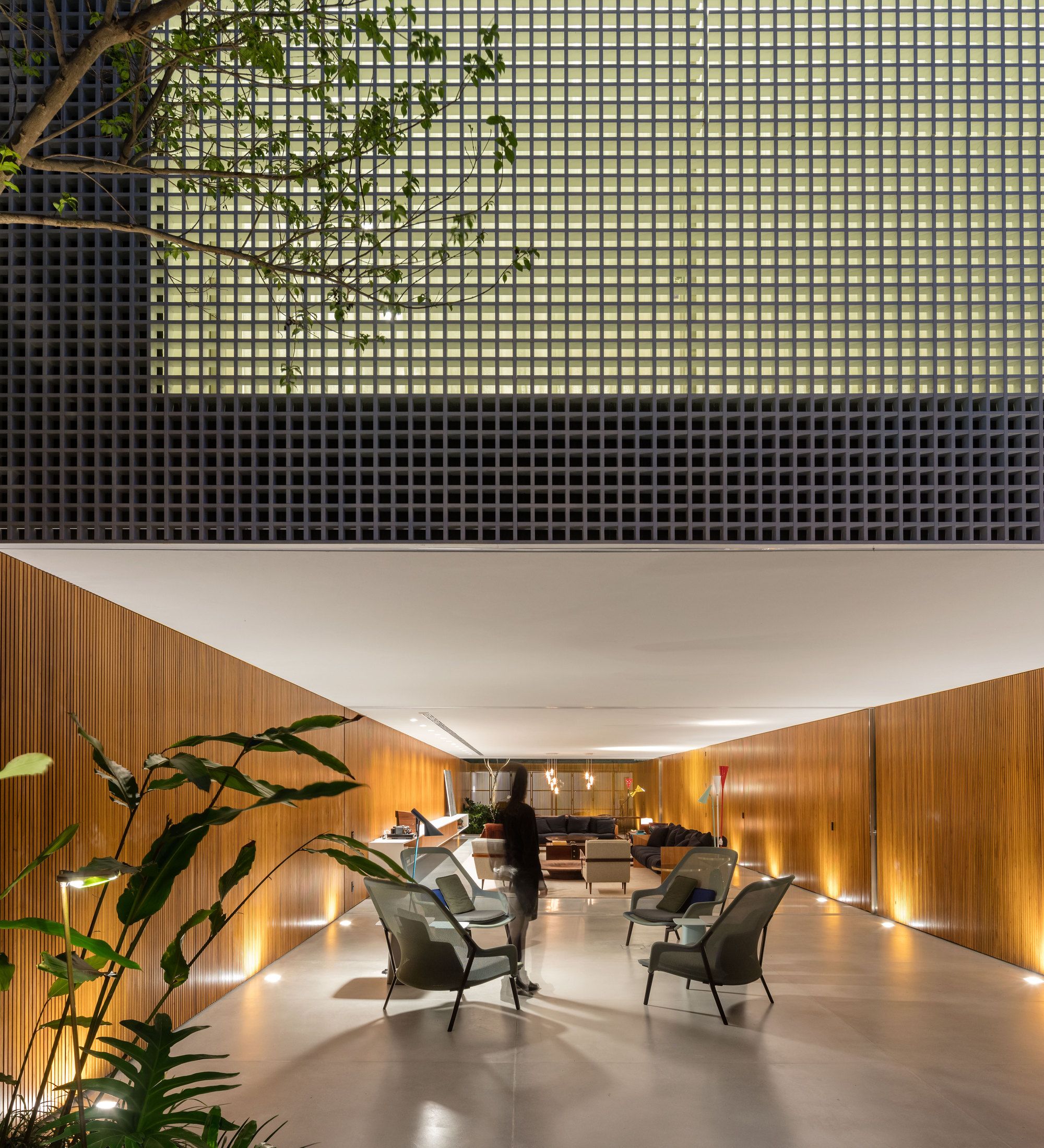
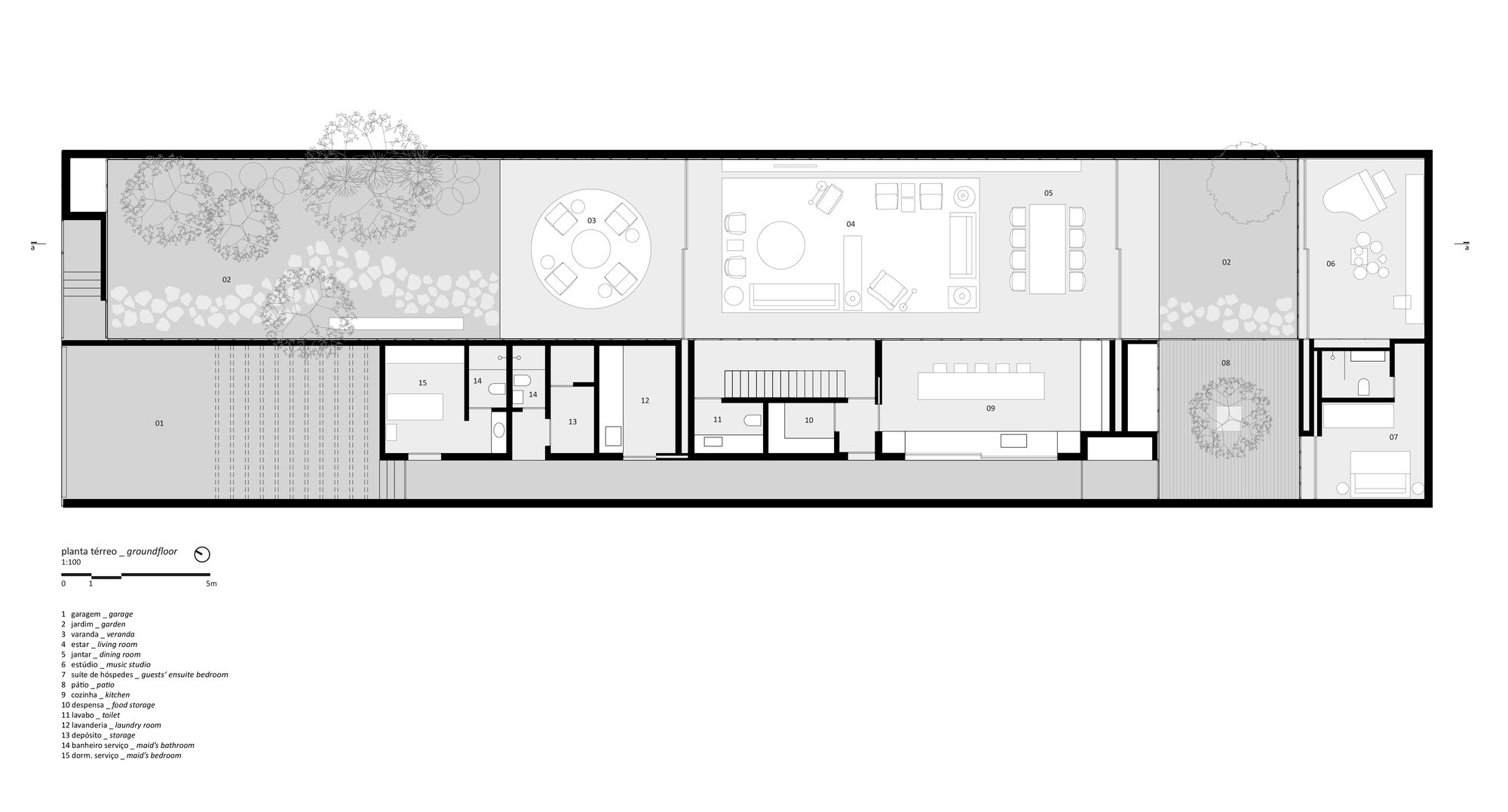
A path of stones in the front garden invites the visitor to the entrance. On the ground floor, the program was distributed in two sectors. The left-hand extension of the plot houses the entrance garden, the balcony, the living room, the dining room, a new garden and the music studio. The right side accommodates the service areas and, at the back, a patio that gives access to the guest suite. Garden patios are important because every room in the house opens to them.
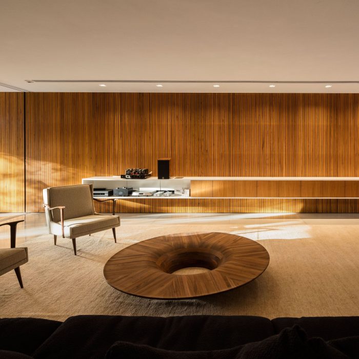
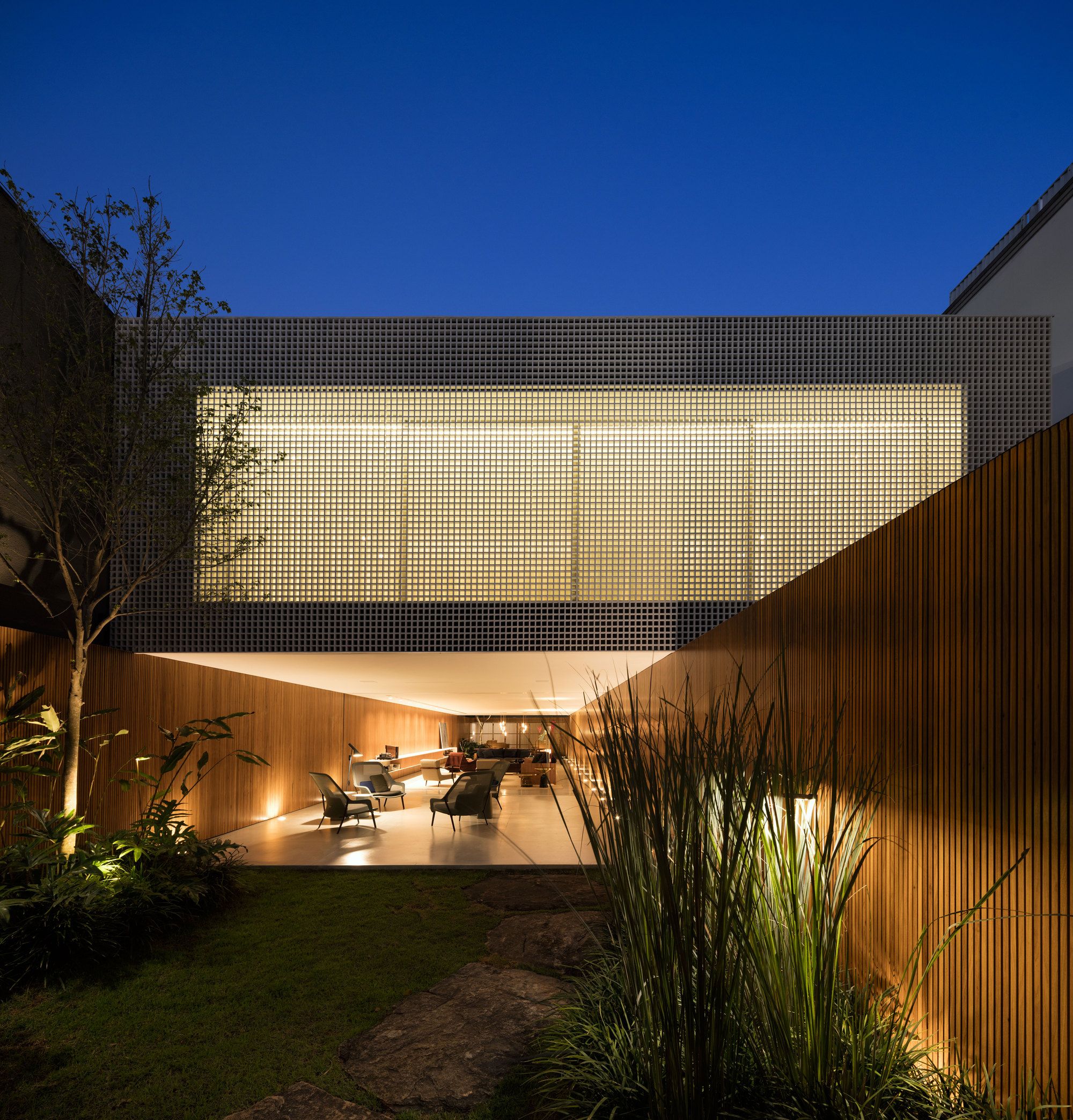
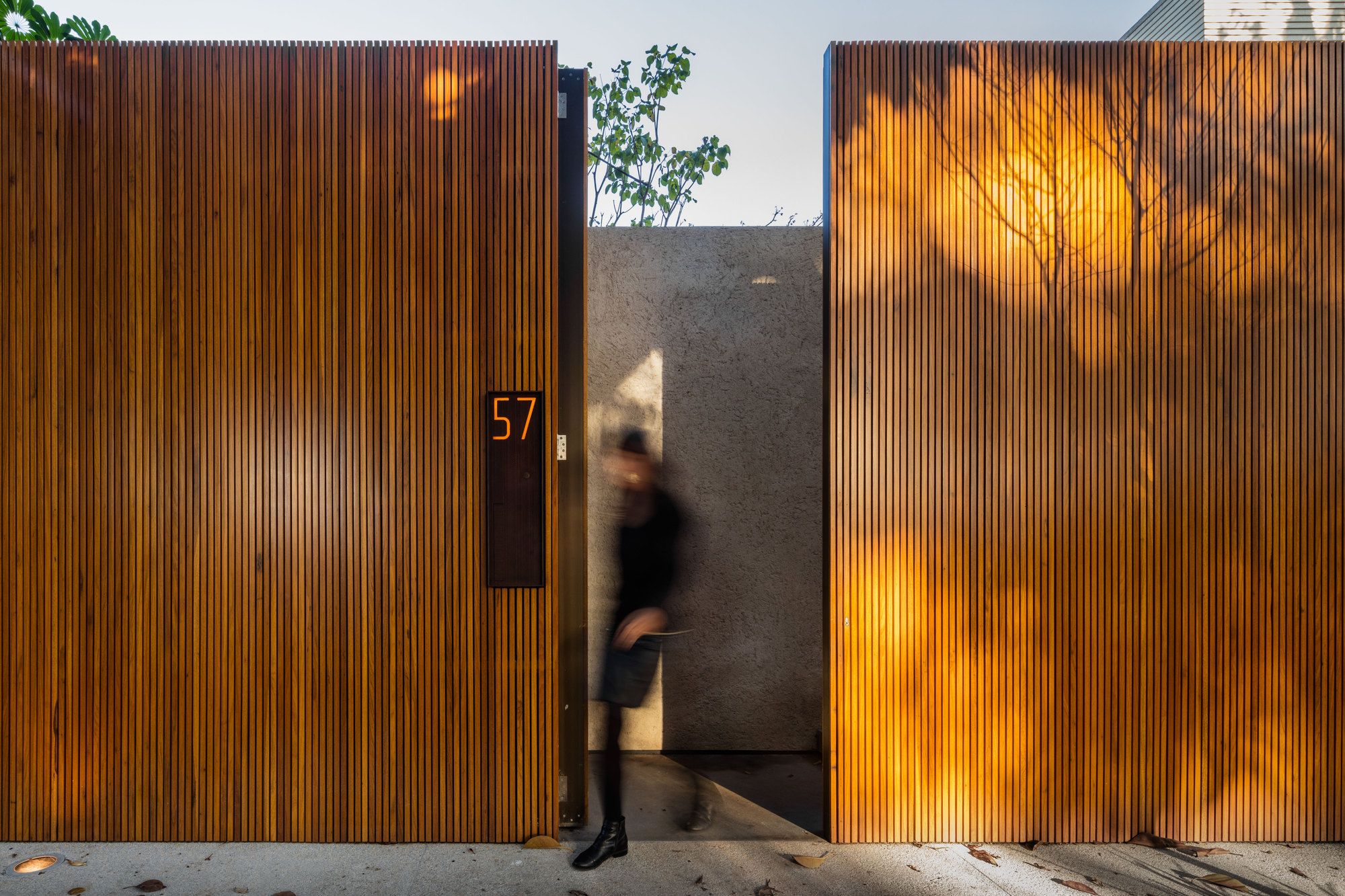
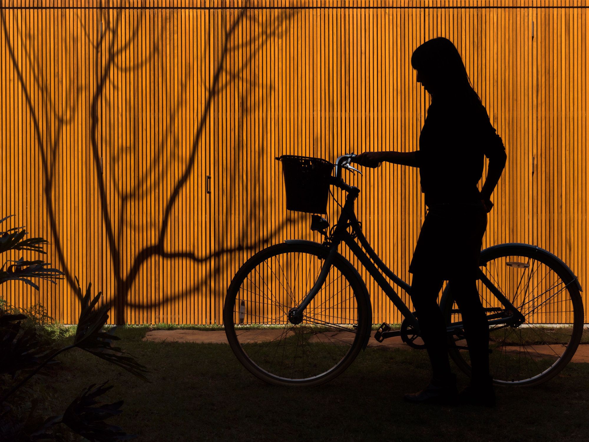
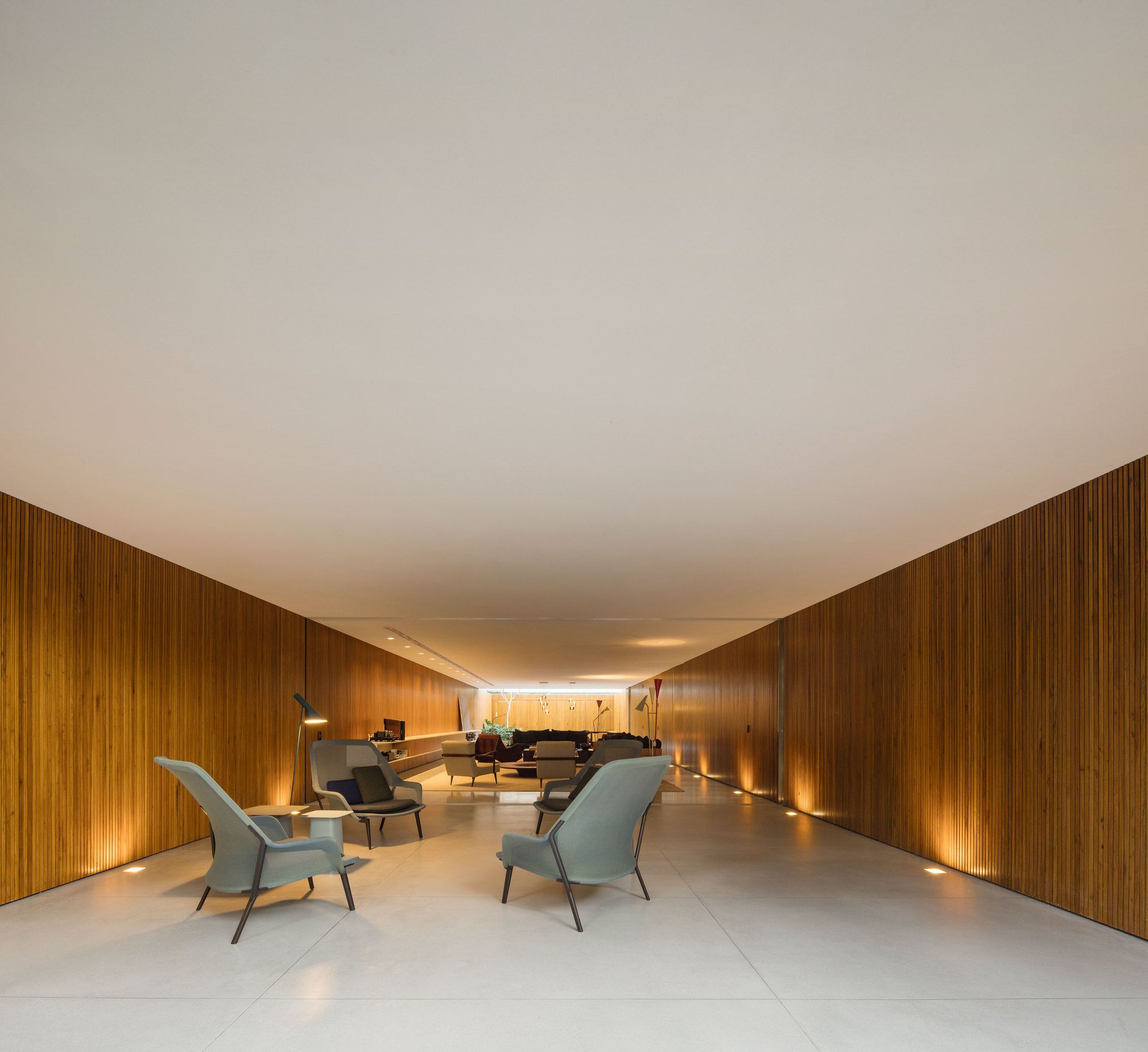
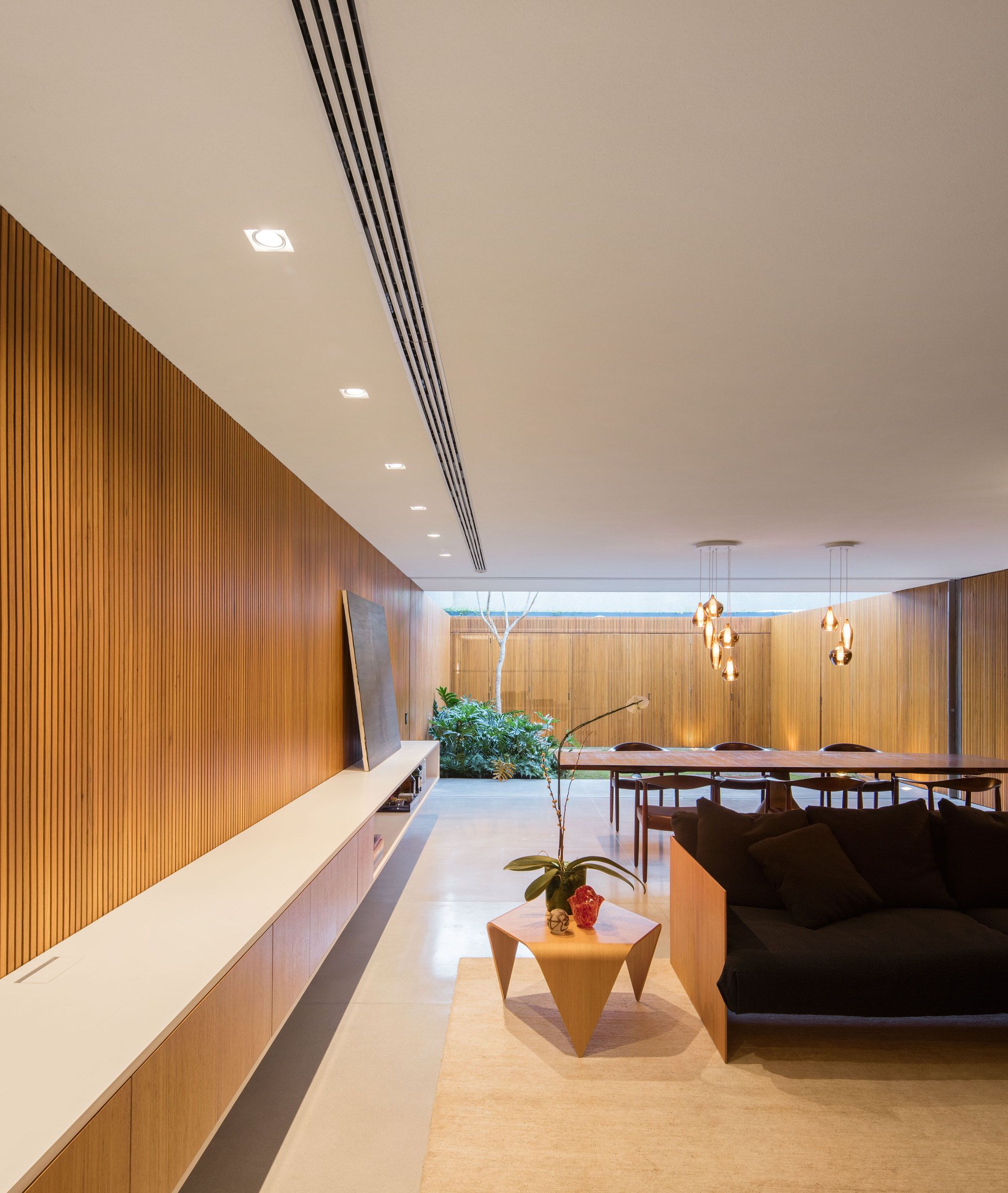
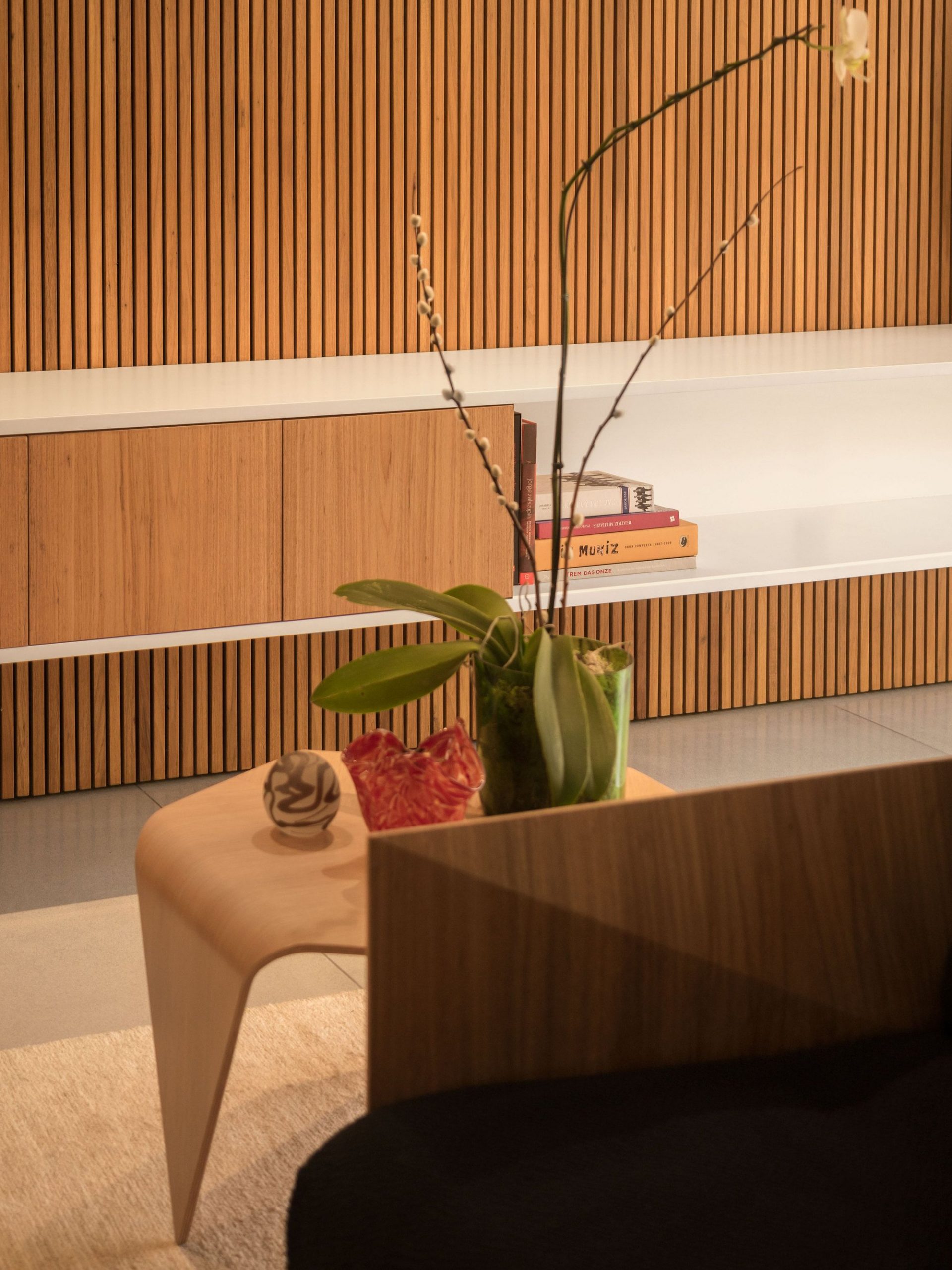
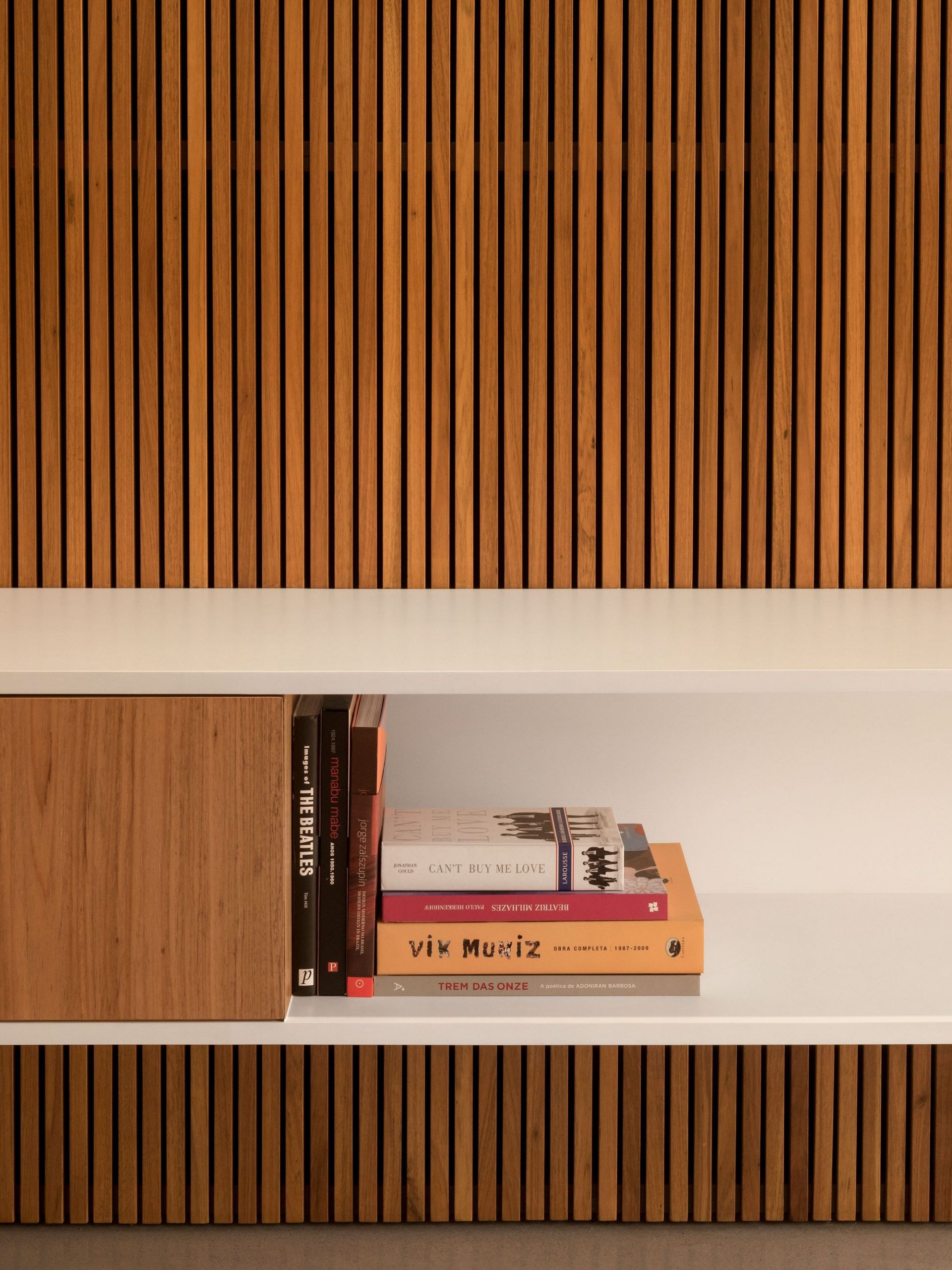
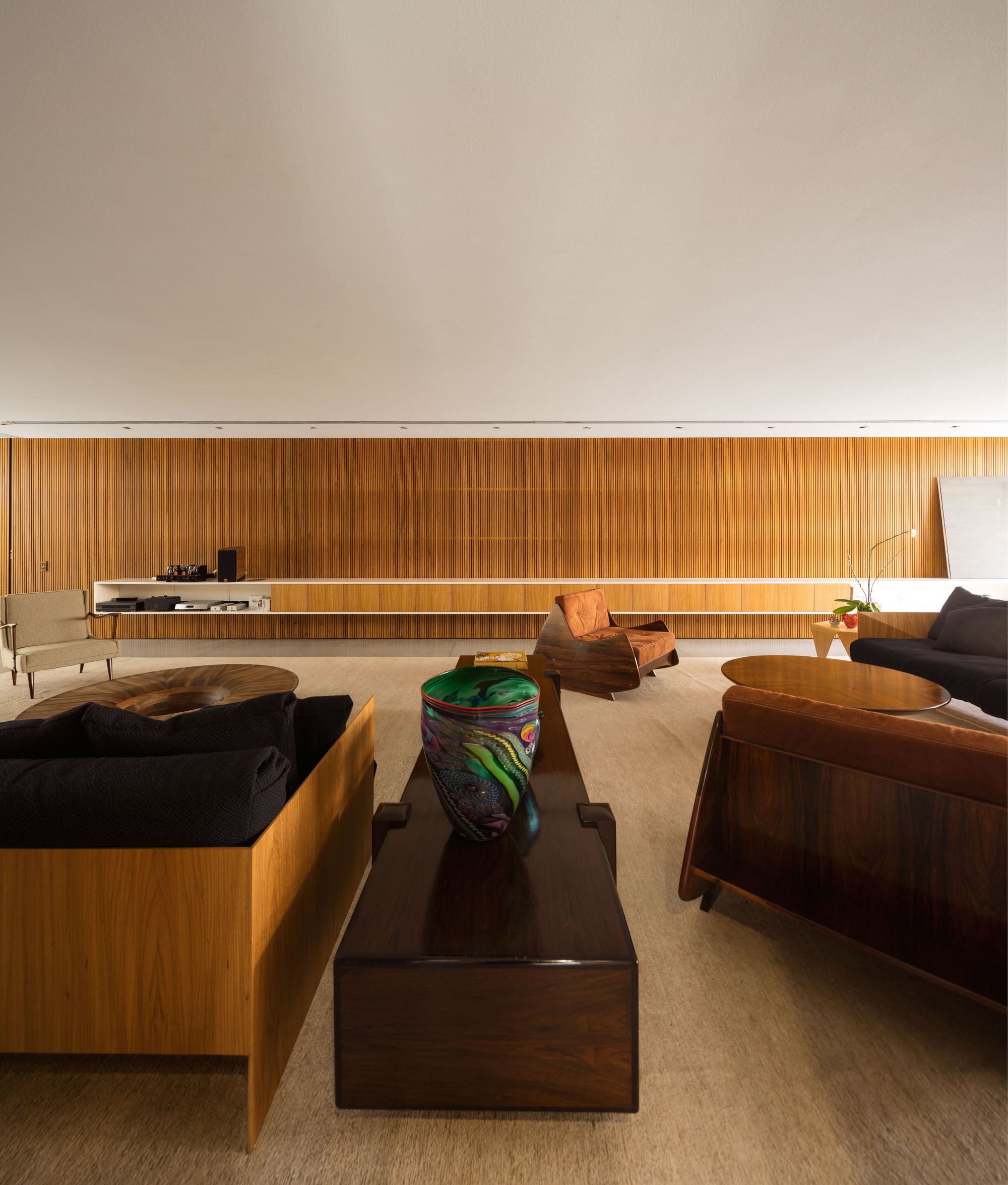
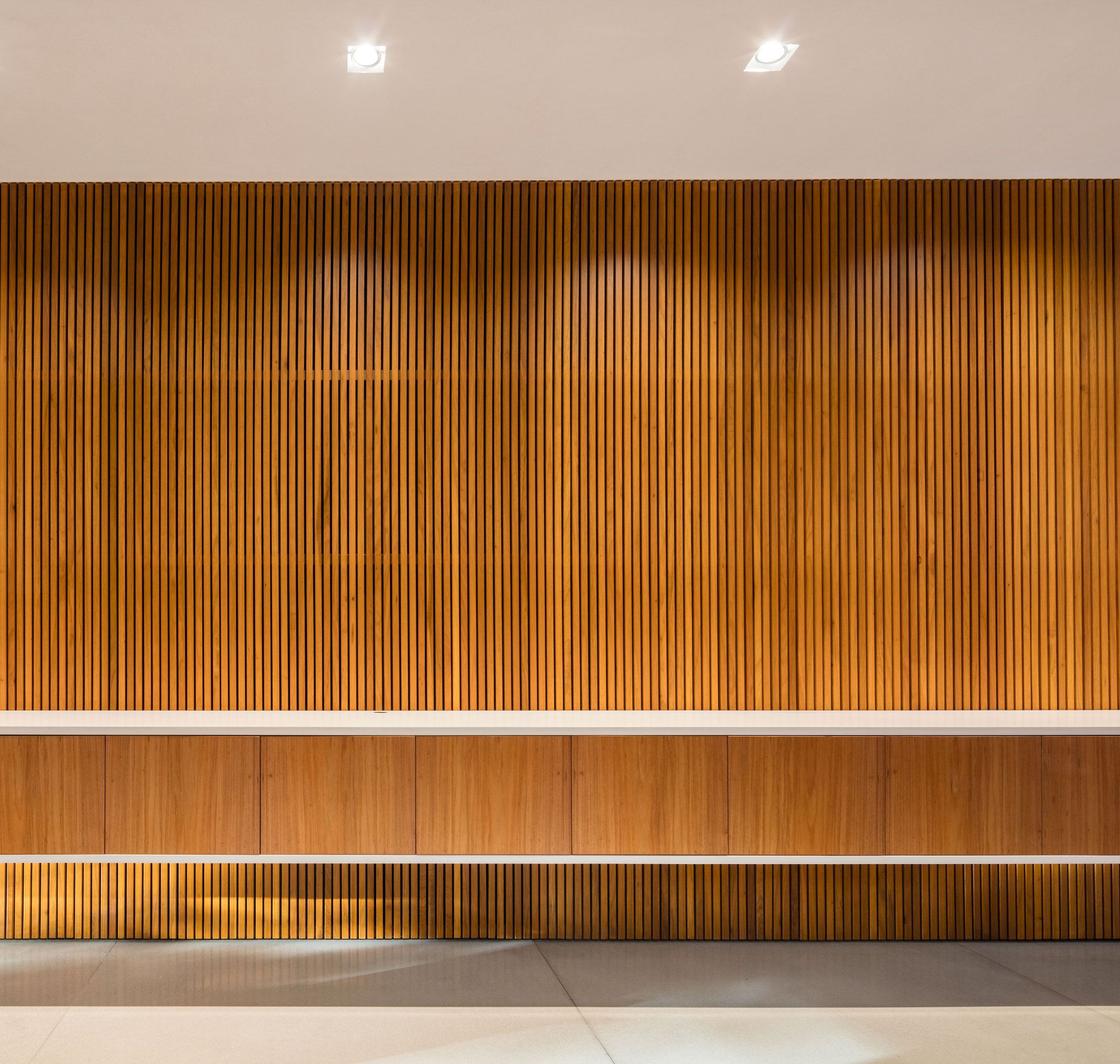
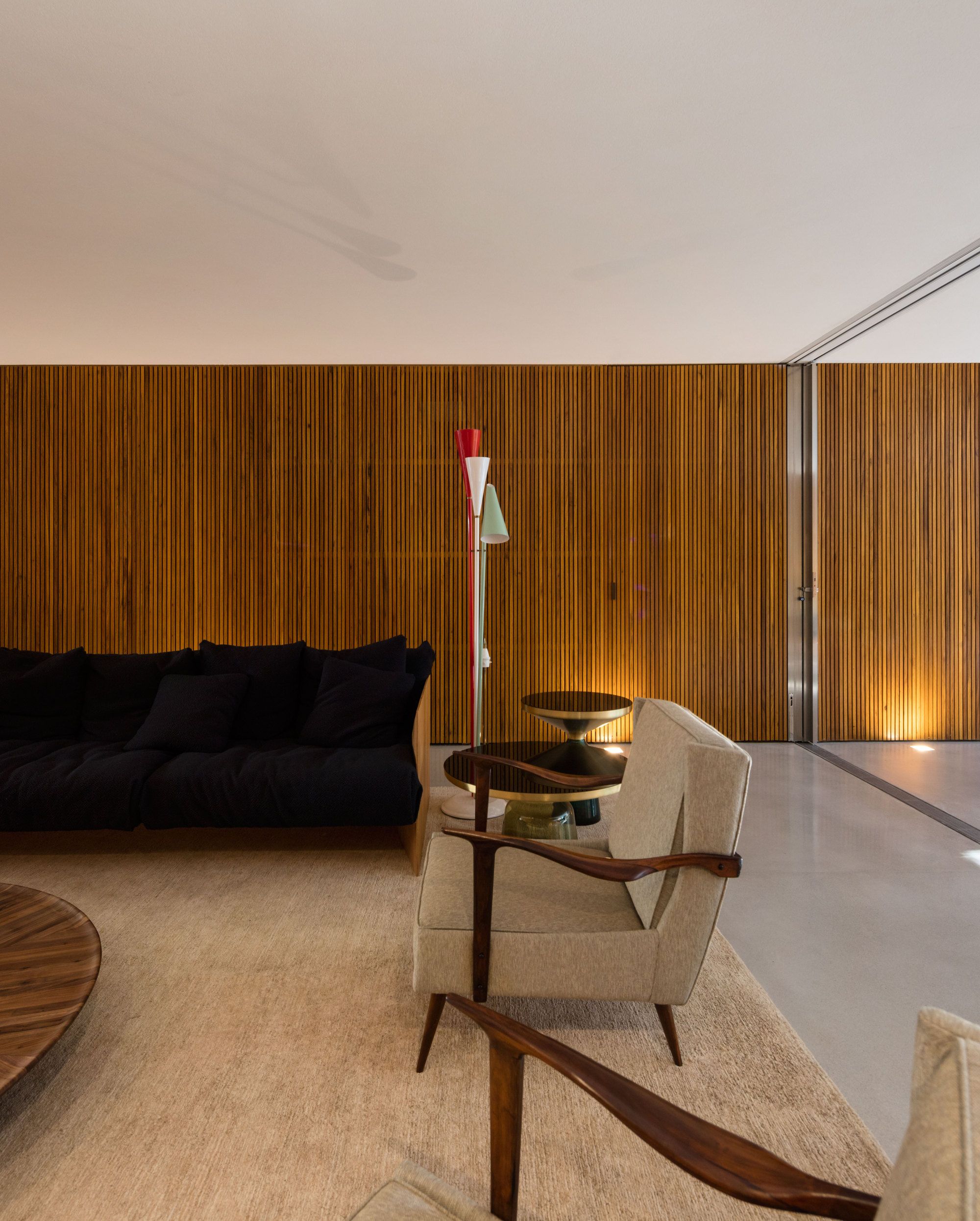
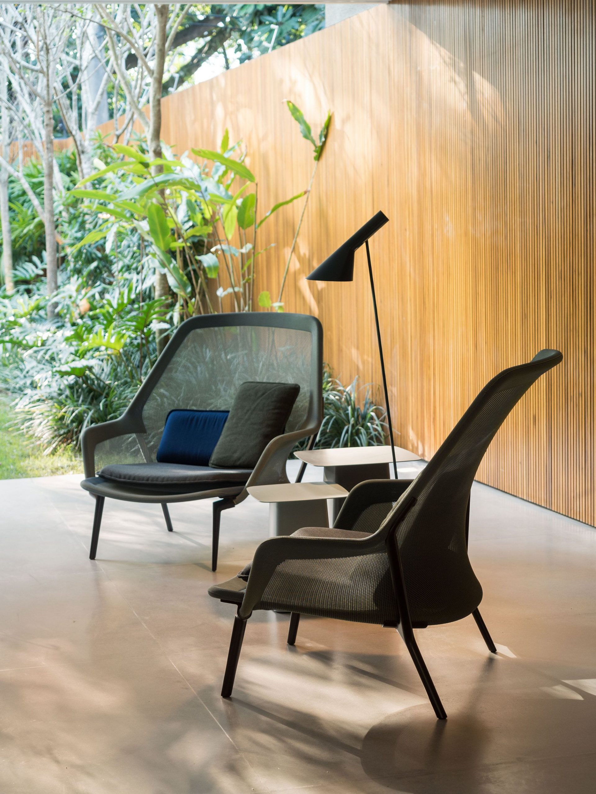
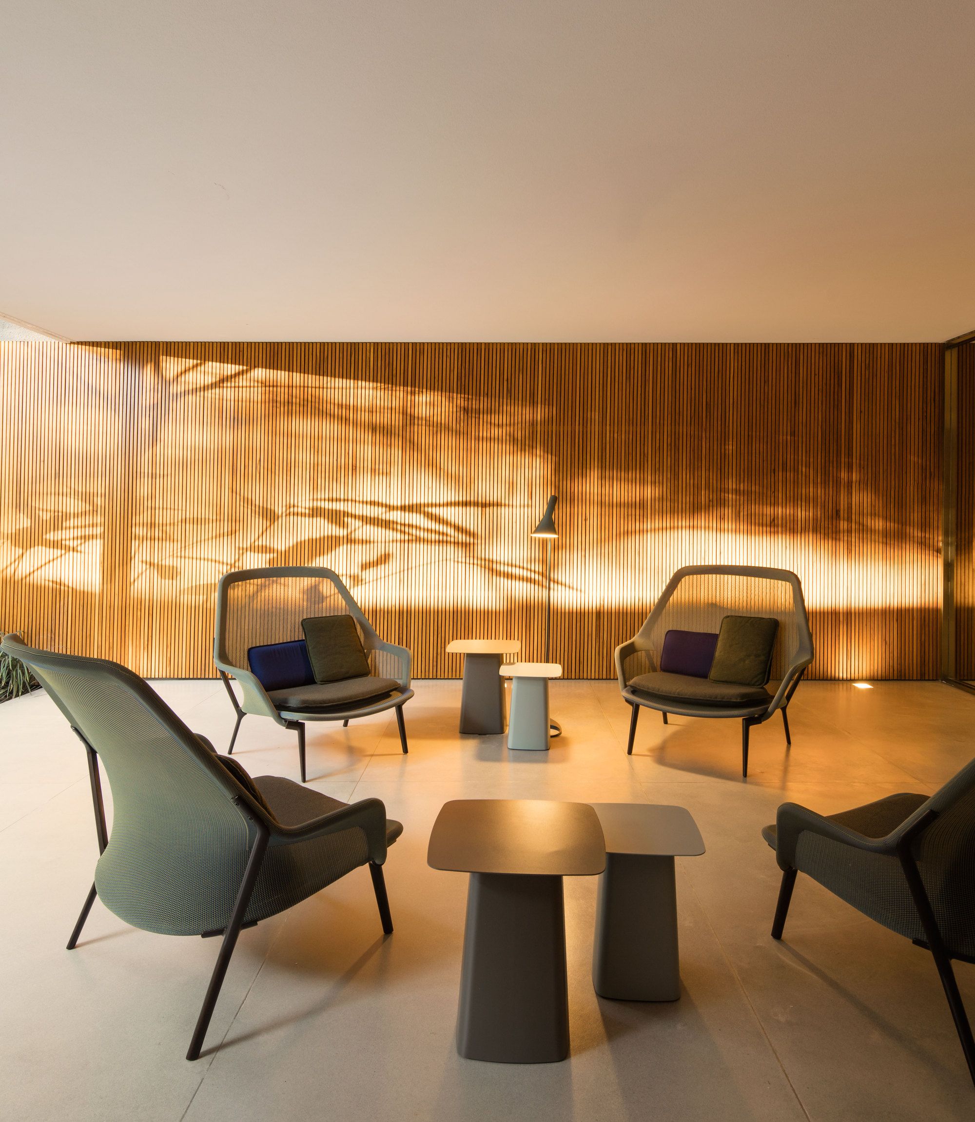
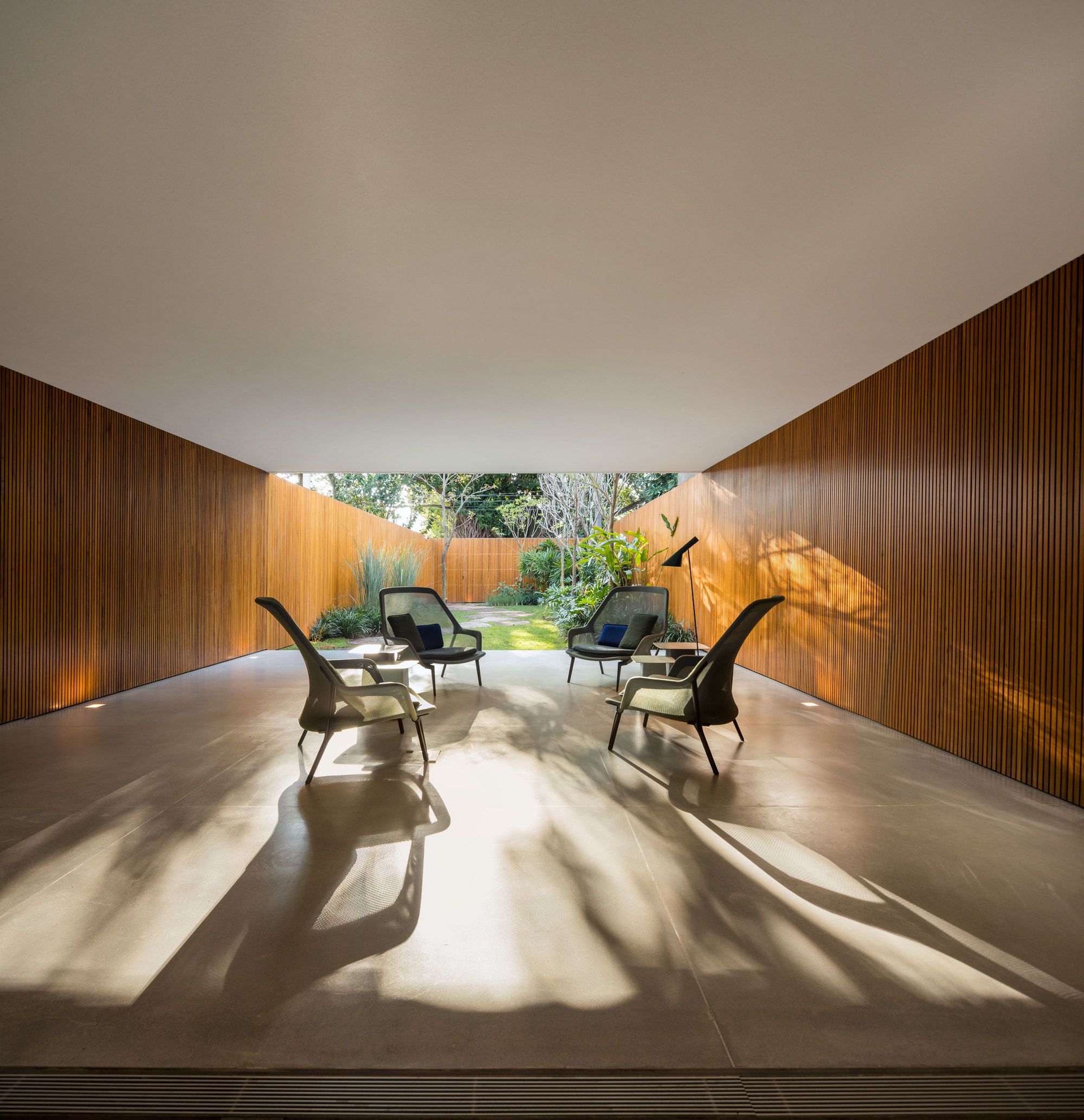
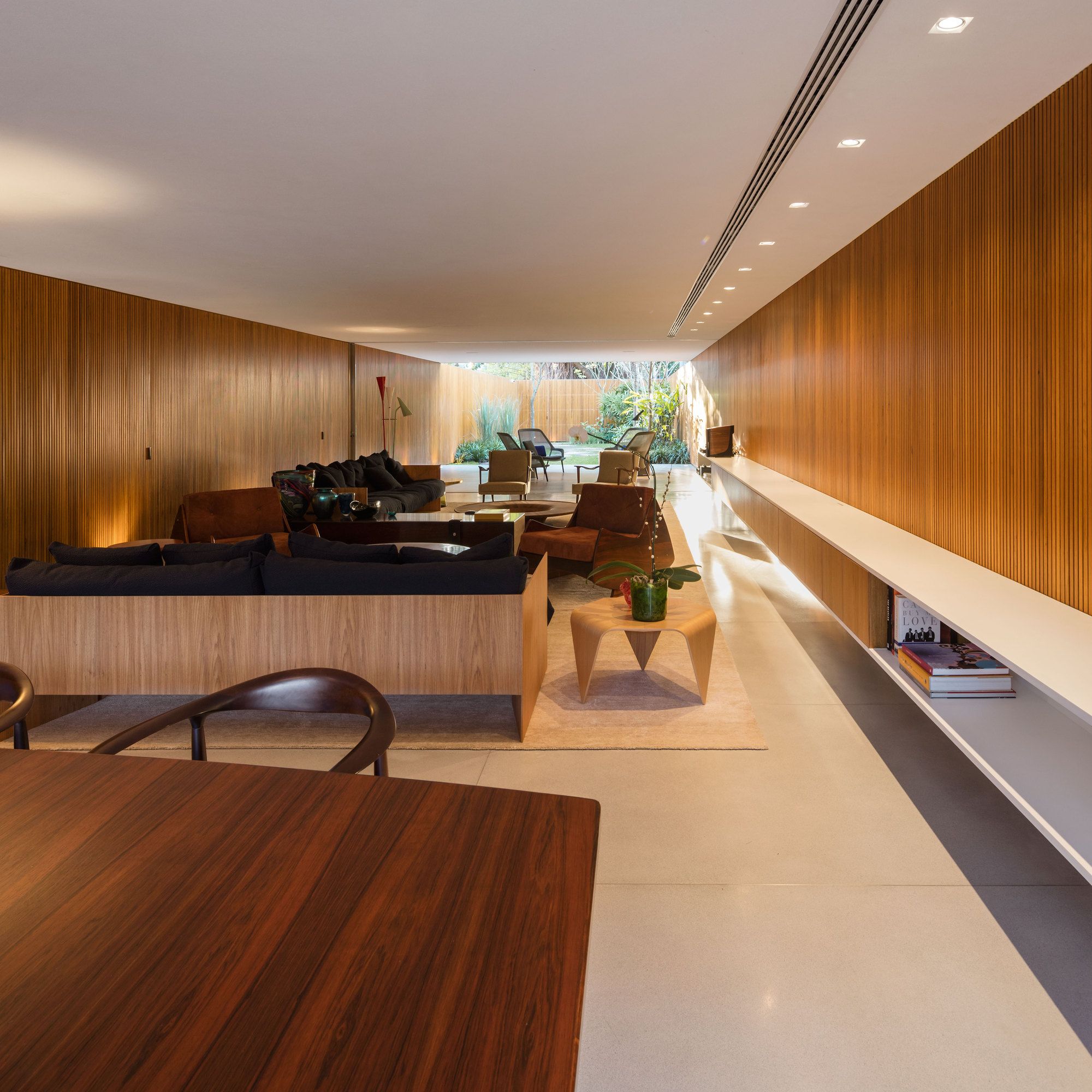
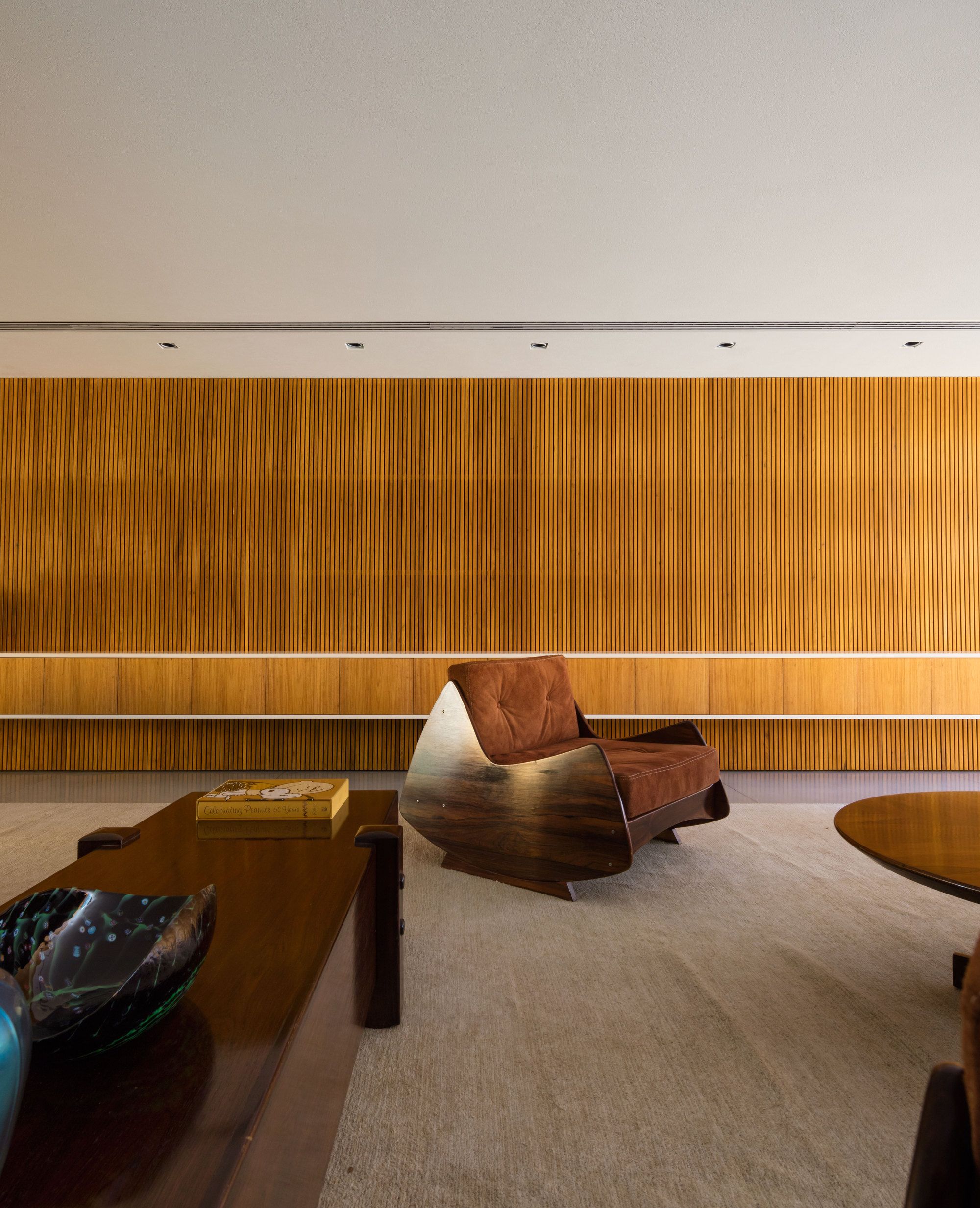
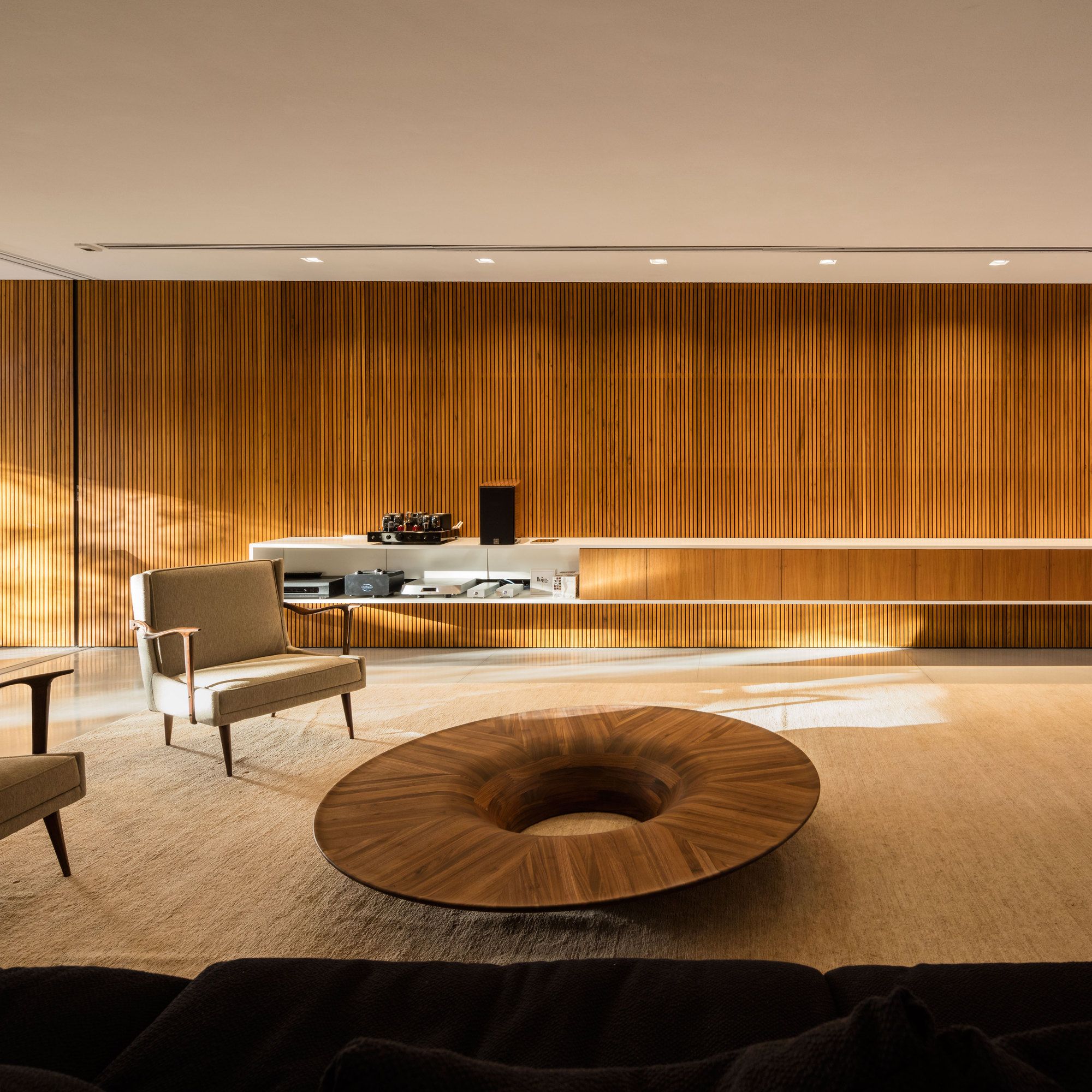
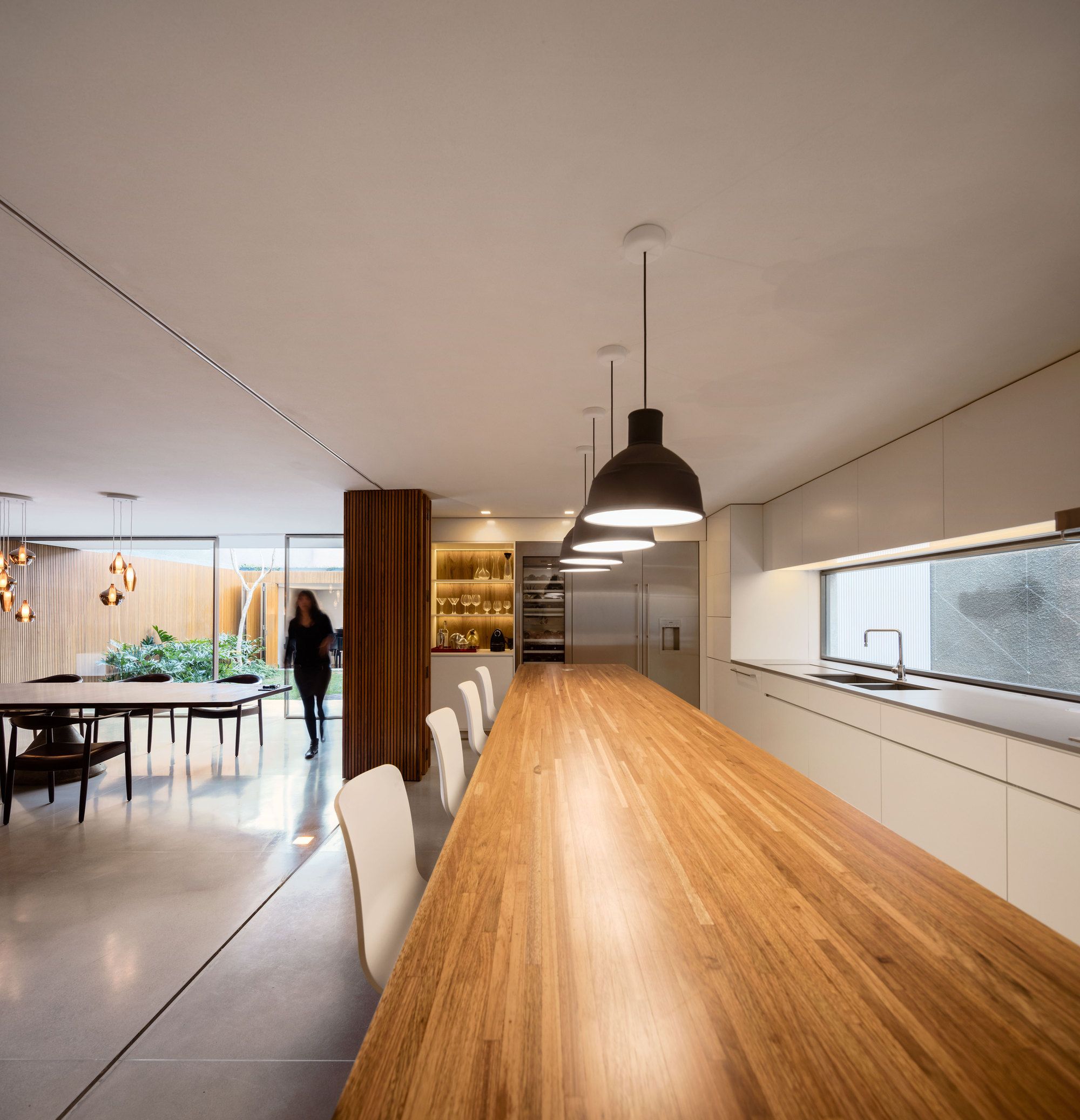
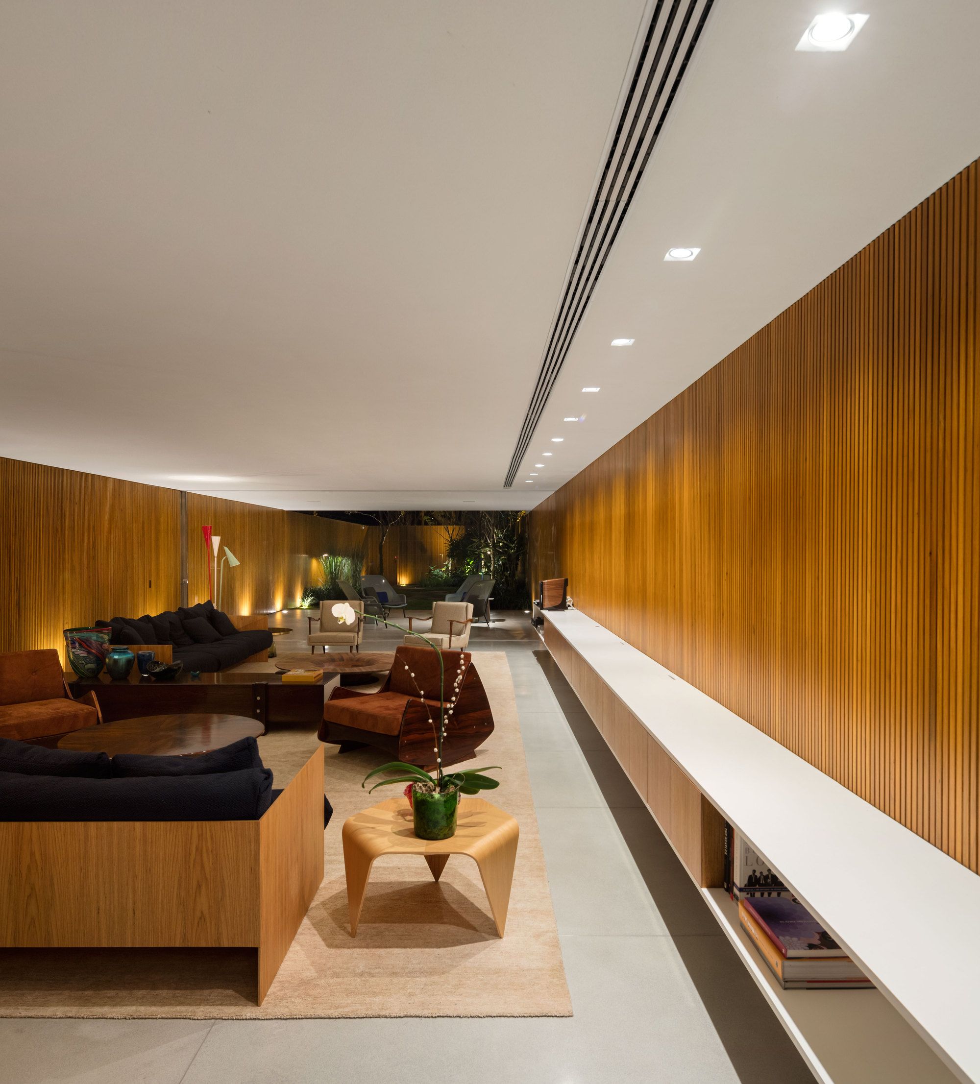
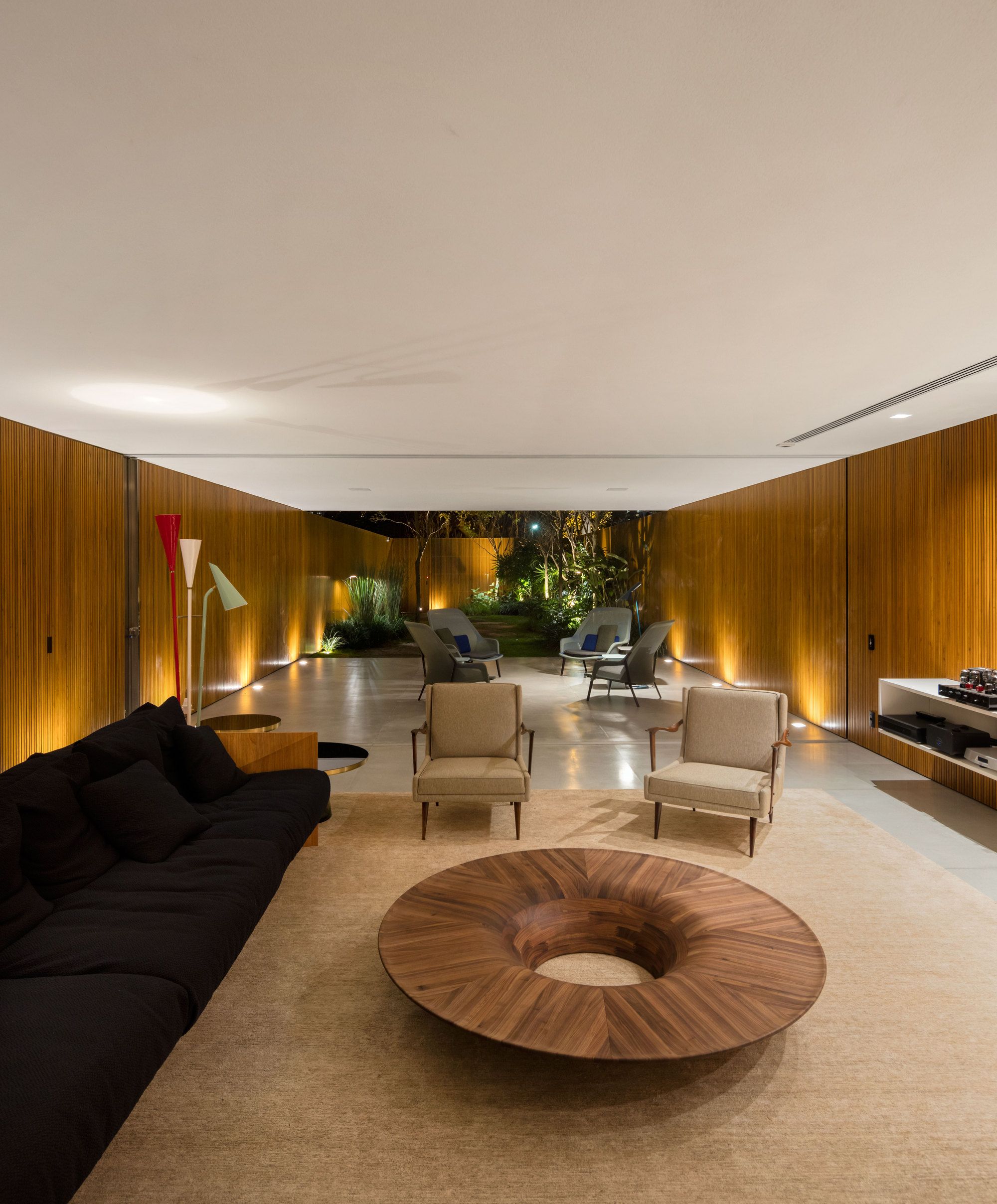
The use of the wooden slatted in all the walls of the social and leisure spaces, as well as the system of total recollection of the glass frames of the rooms, generate continuity and transform the covered area into a large balcony. This feature also allowed to camouflage the accesses of the kitchen and music studio, which, when necessary, open and configure a unique space. One of the locals is a music lover and uses the studio for classes or private party performances in the house.
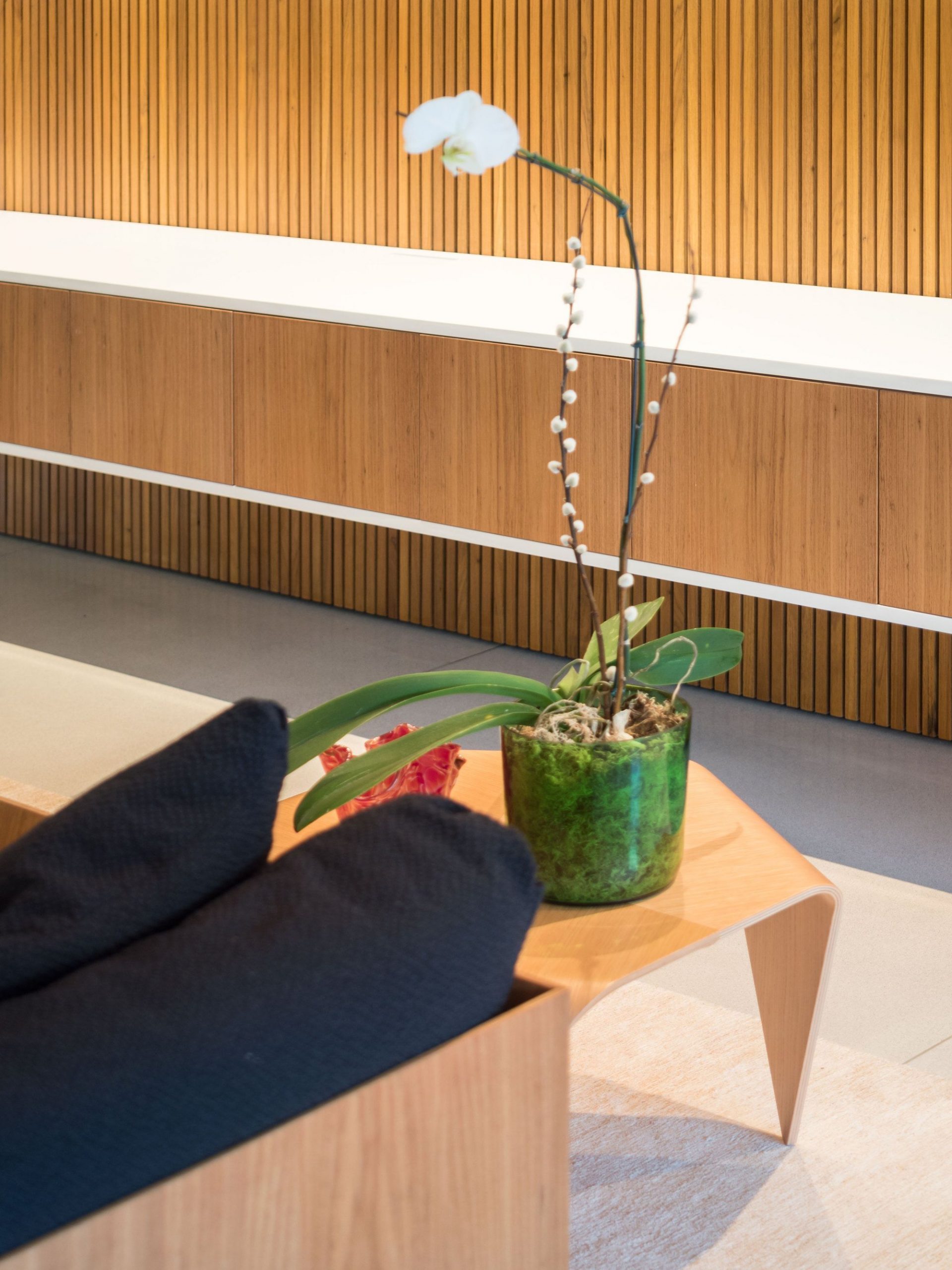
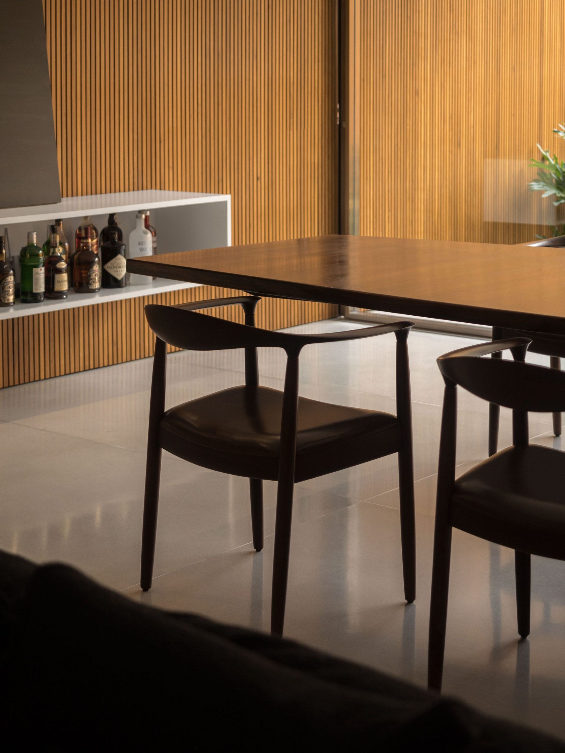
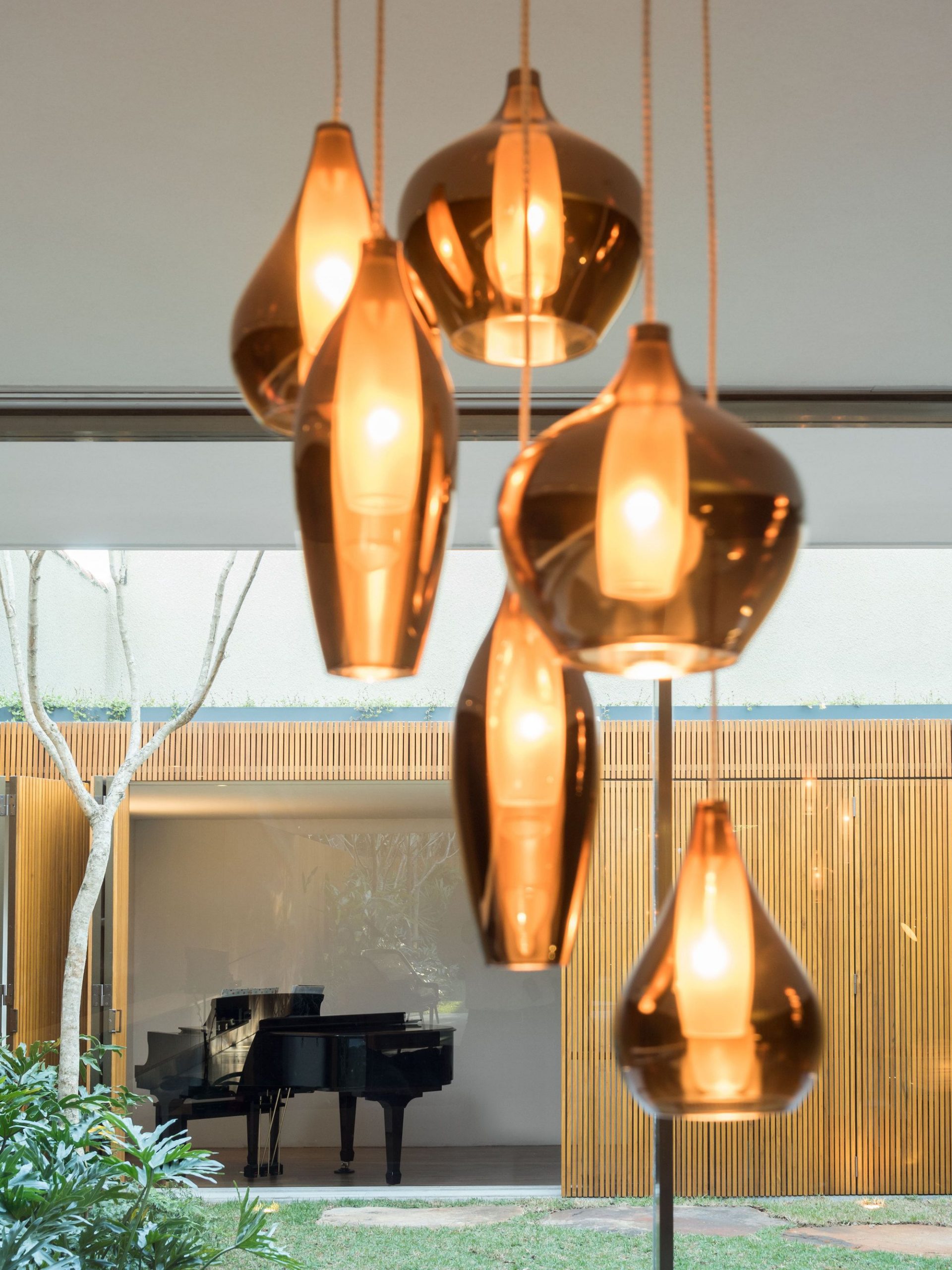
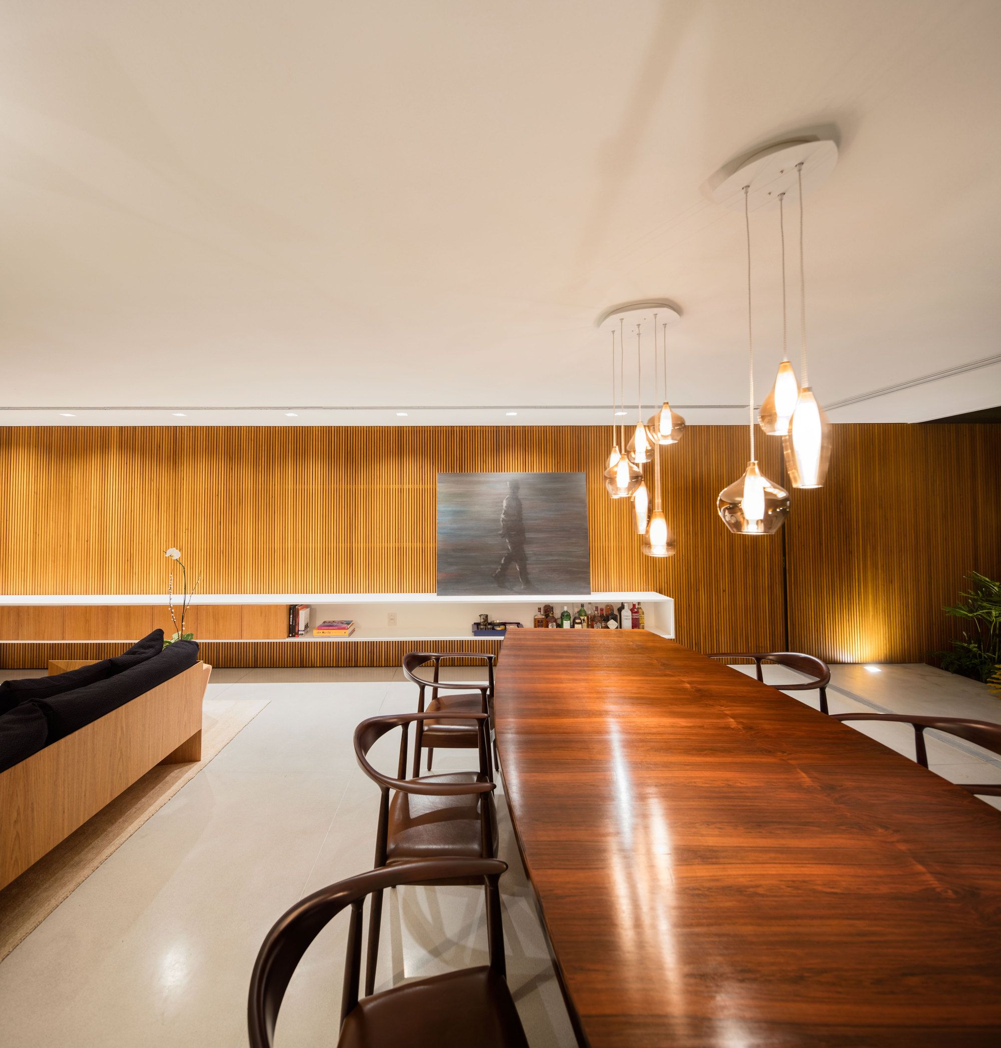
The 12-meter long sideboard, which has been thought since the initial design of the architecture project, is another element that connects the living and dining environments and receives various uses, from special music equipment to personal items and the bar. The furniture is a mix of antique pieces, reprints of modern international and Brazilian furniture, which creates a classic and cozy atmosphere.
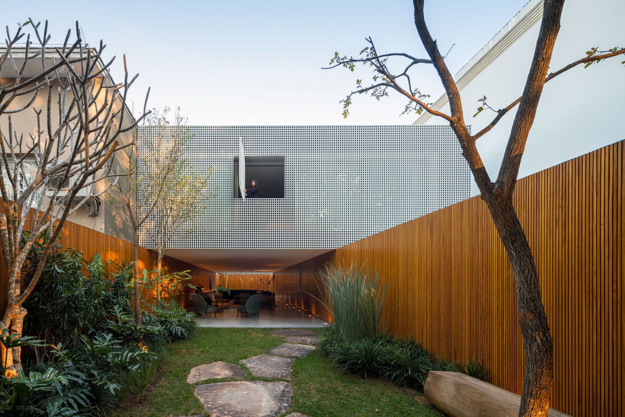
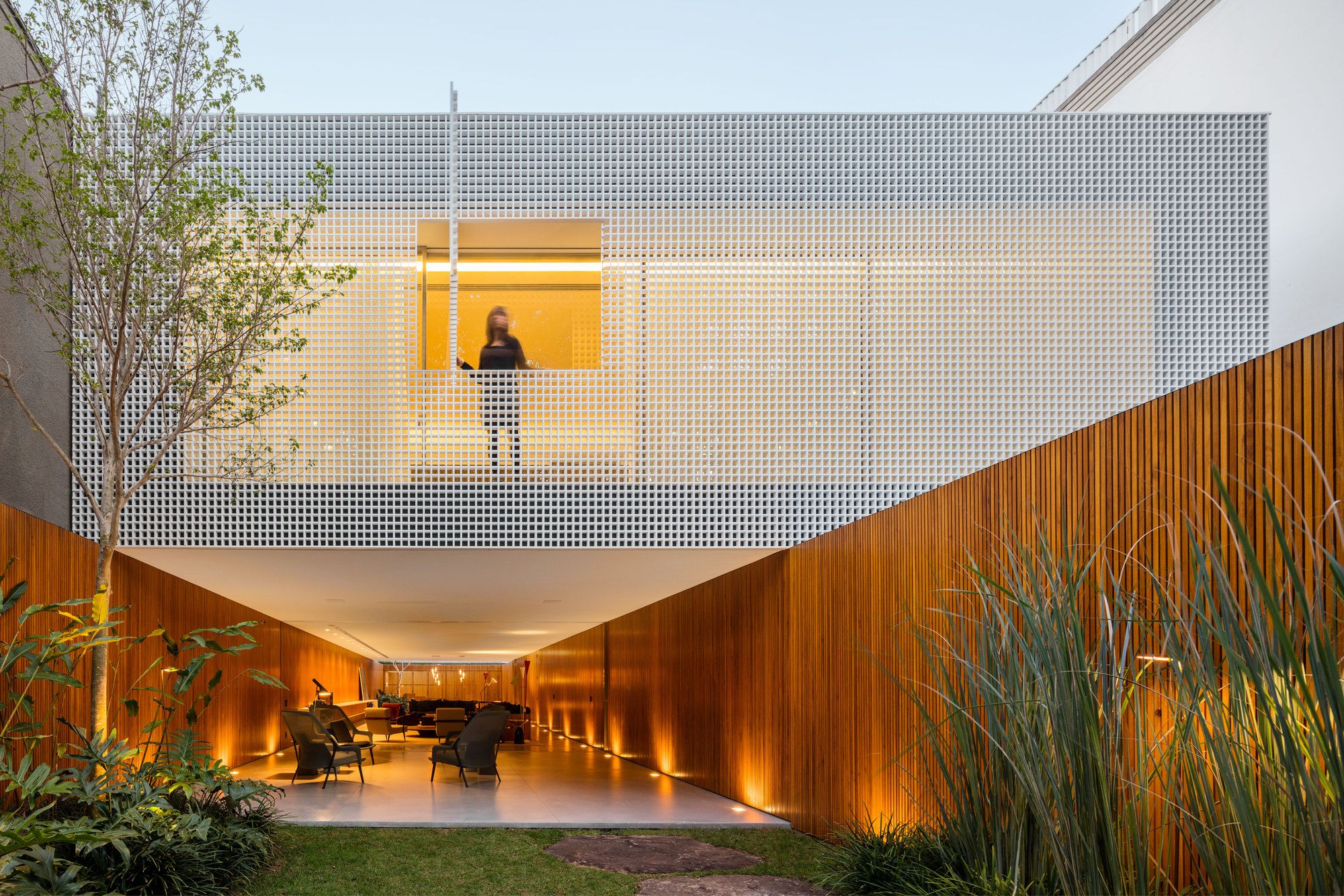
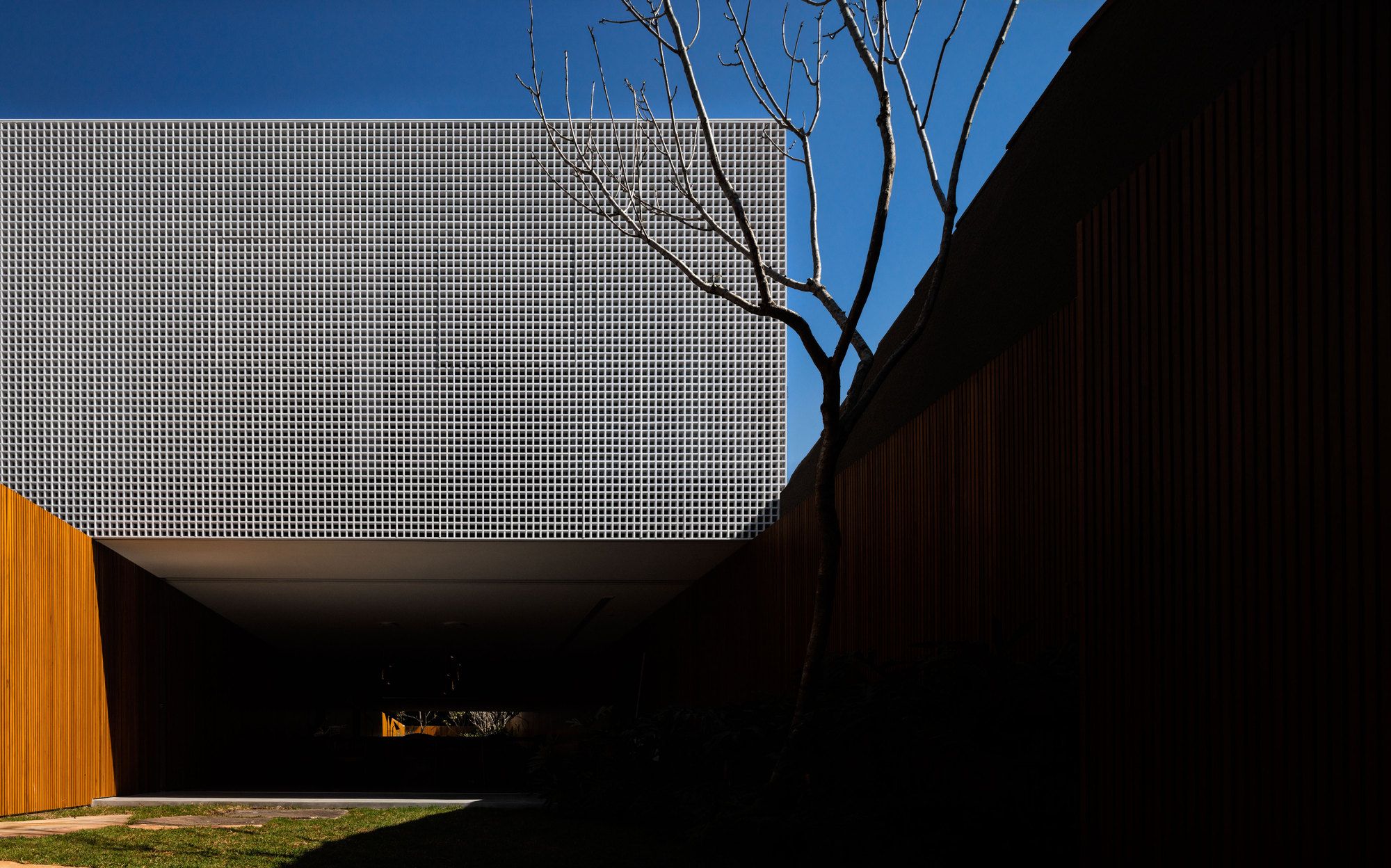
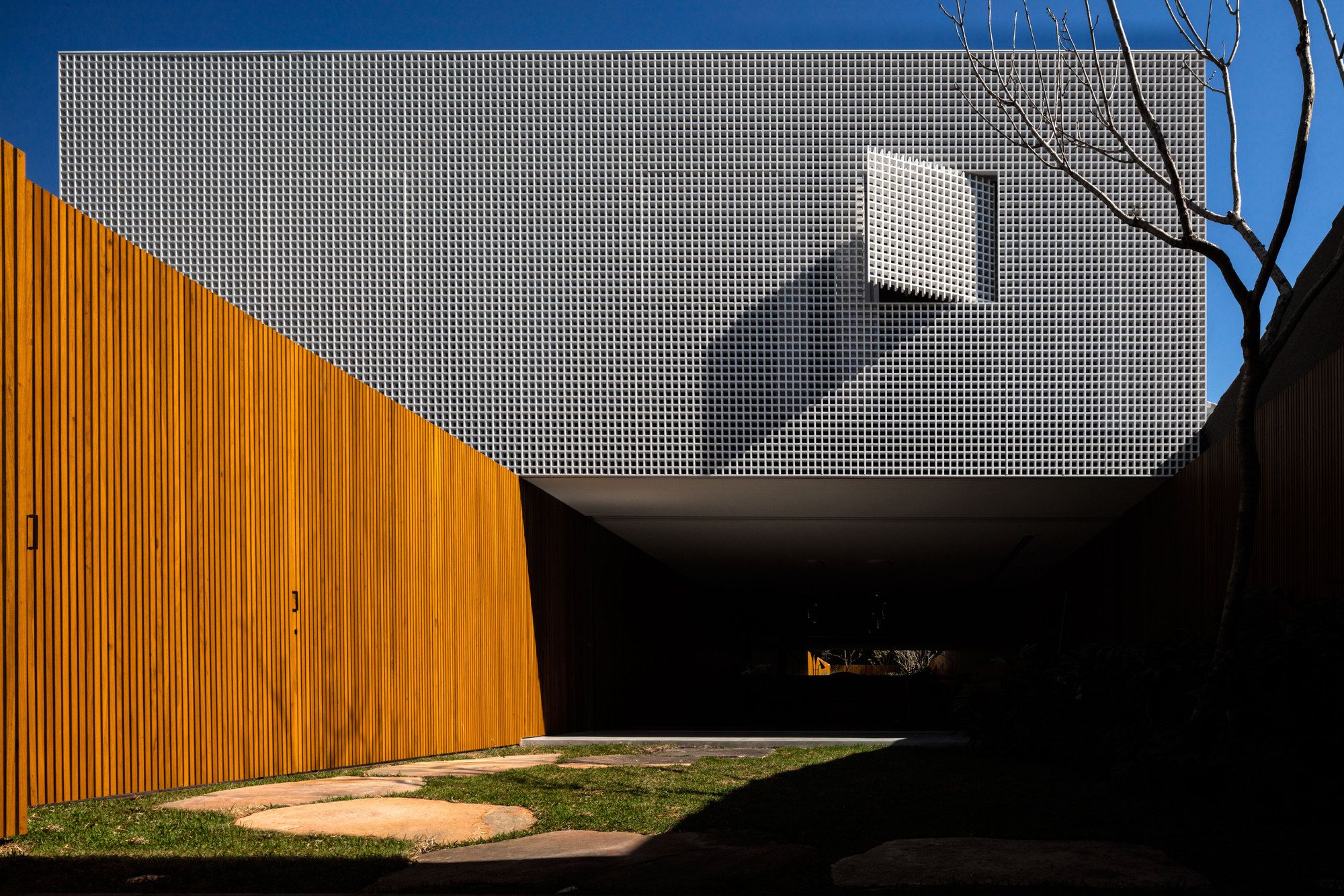
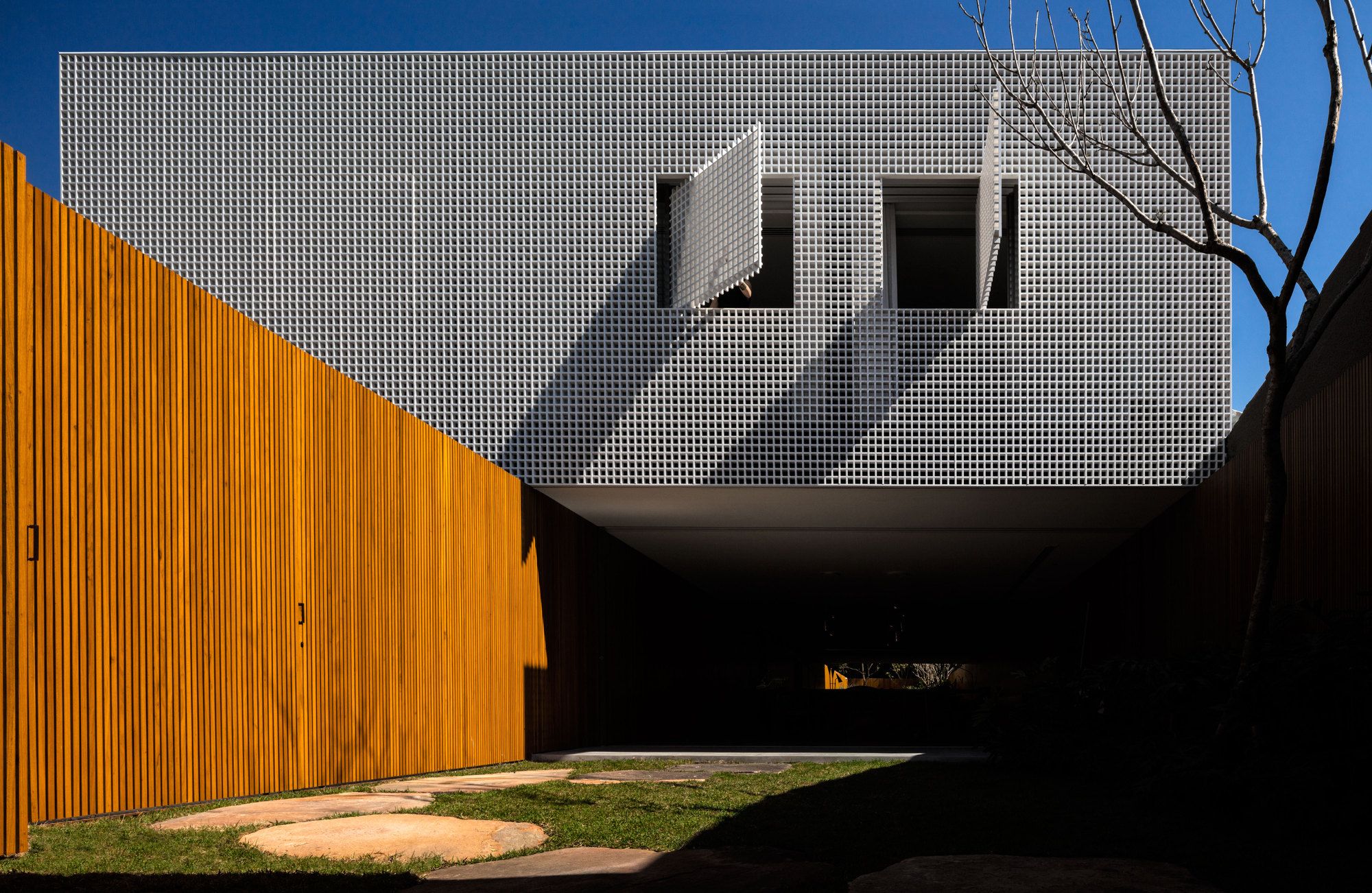
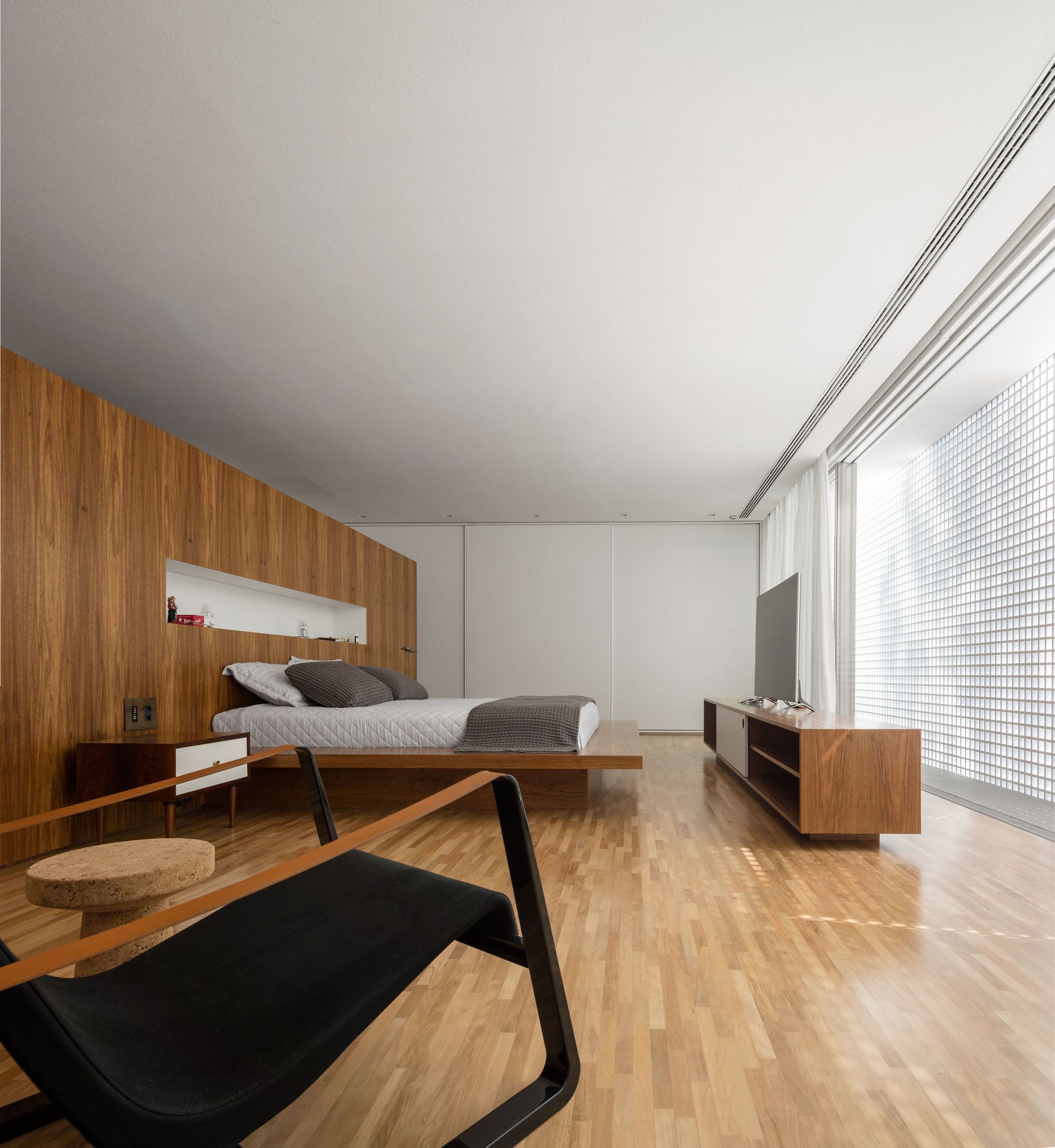
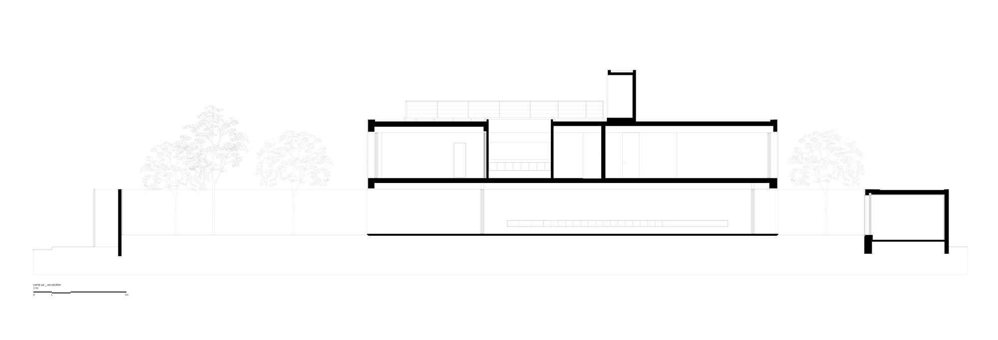
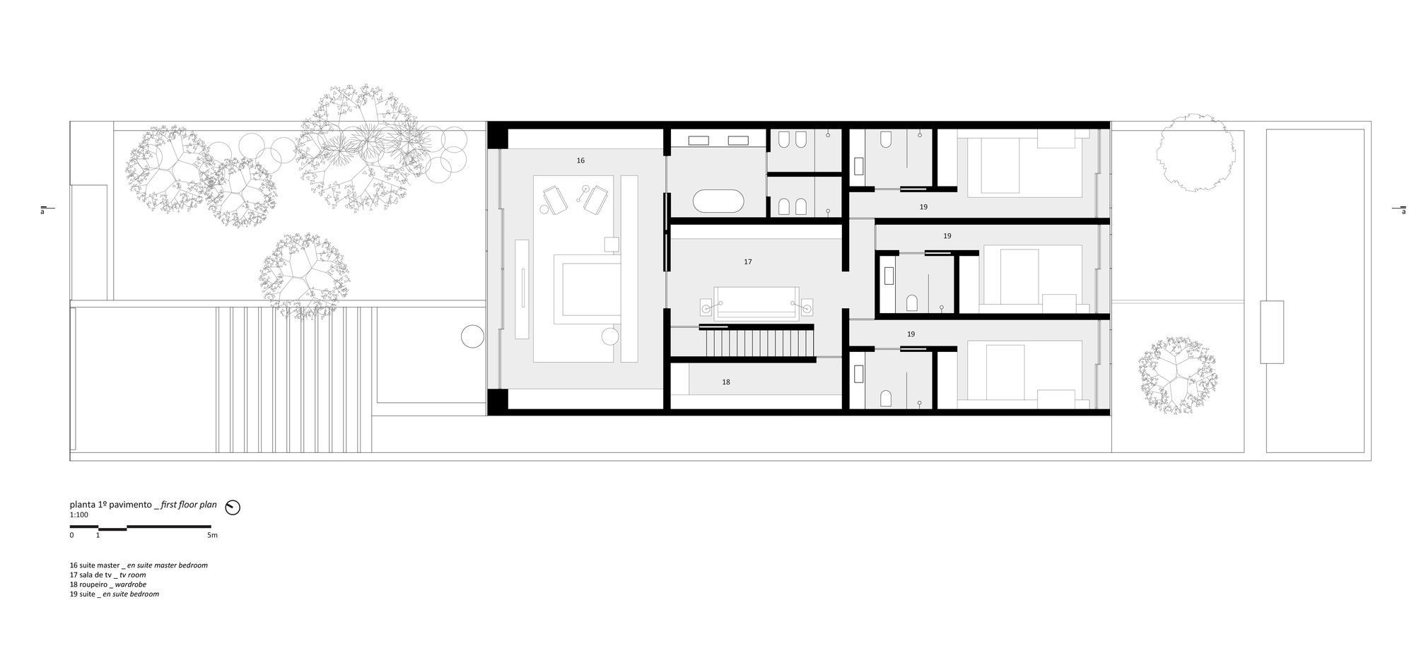
The balance between built spaces and open spaces provides natural lighting and ventilation for the whole house. The volume of the upper floor, where the suites are and the TV room, is set back from the street and leaning against one of the currencies to obey legislative issues, but also to guarantee sunshine to the rooms and provide visuals for the wooded surroundings.
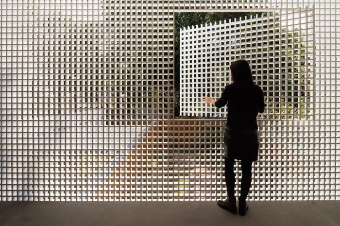
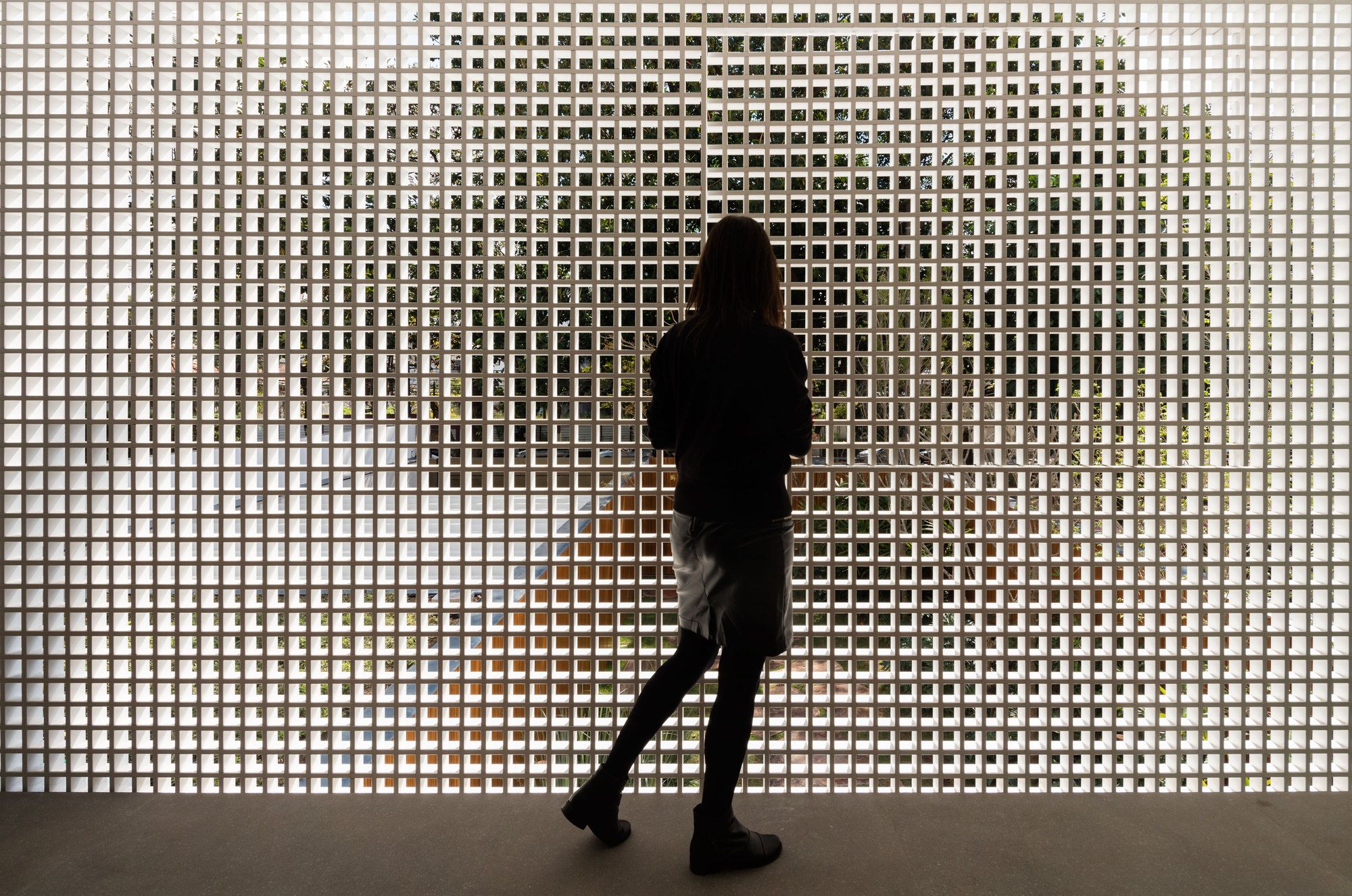
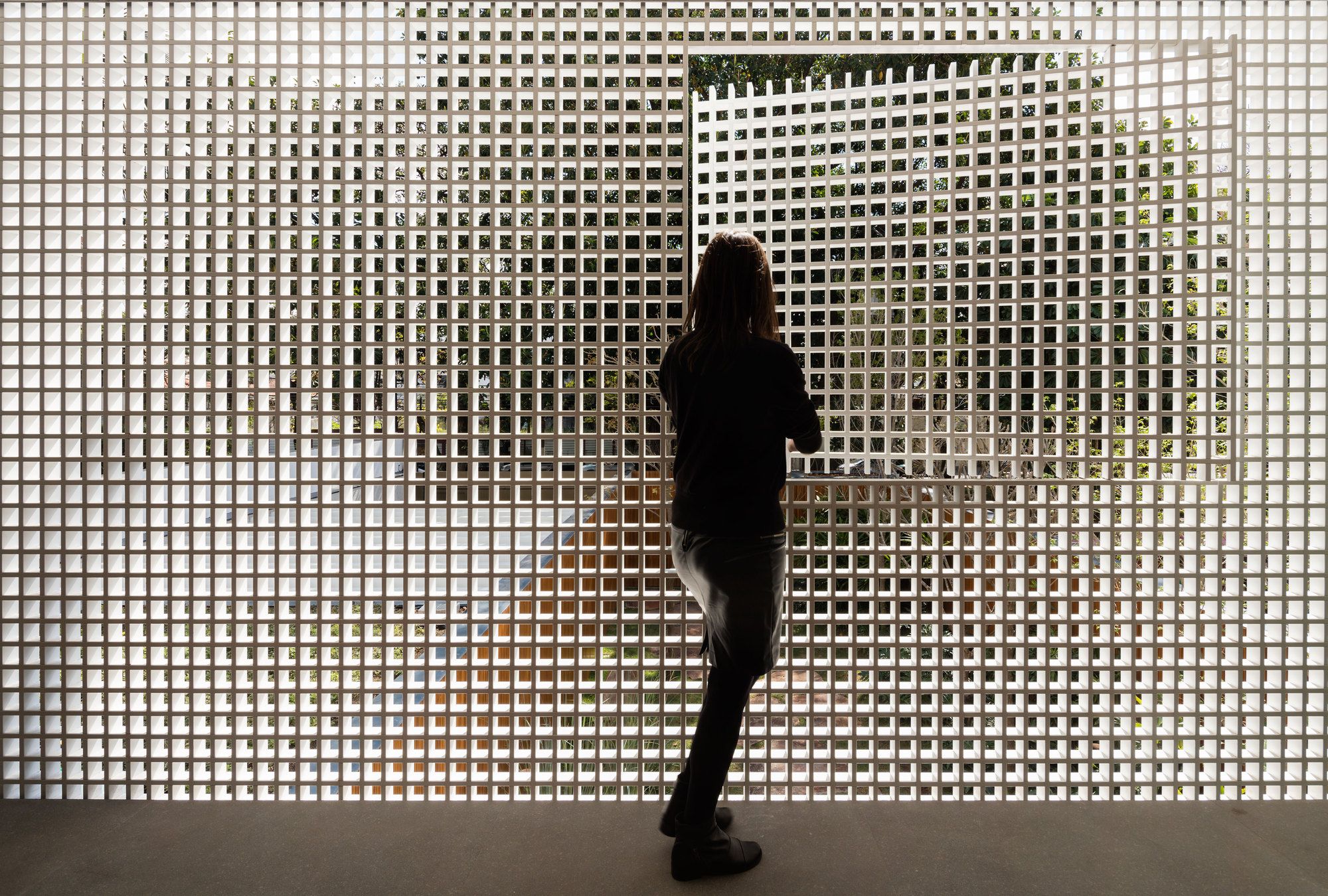
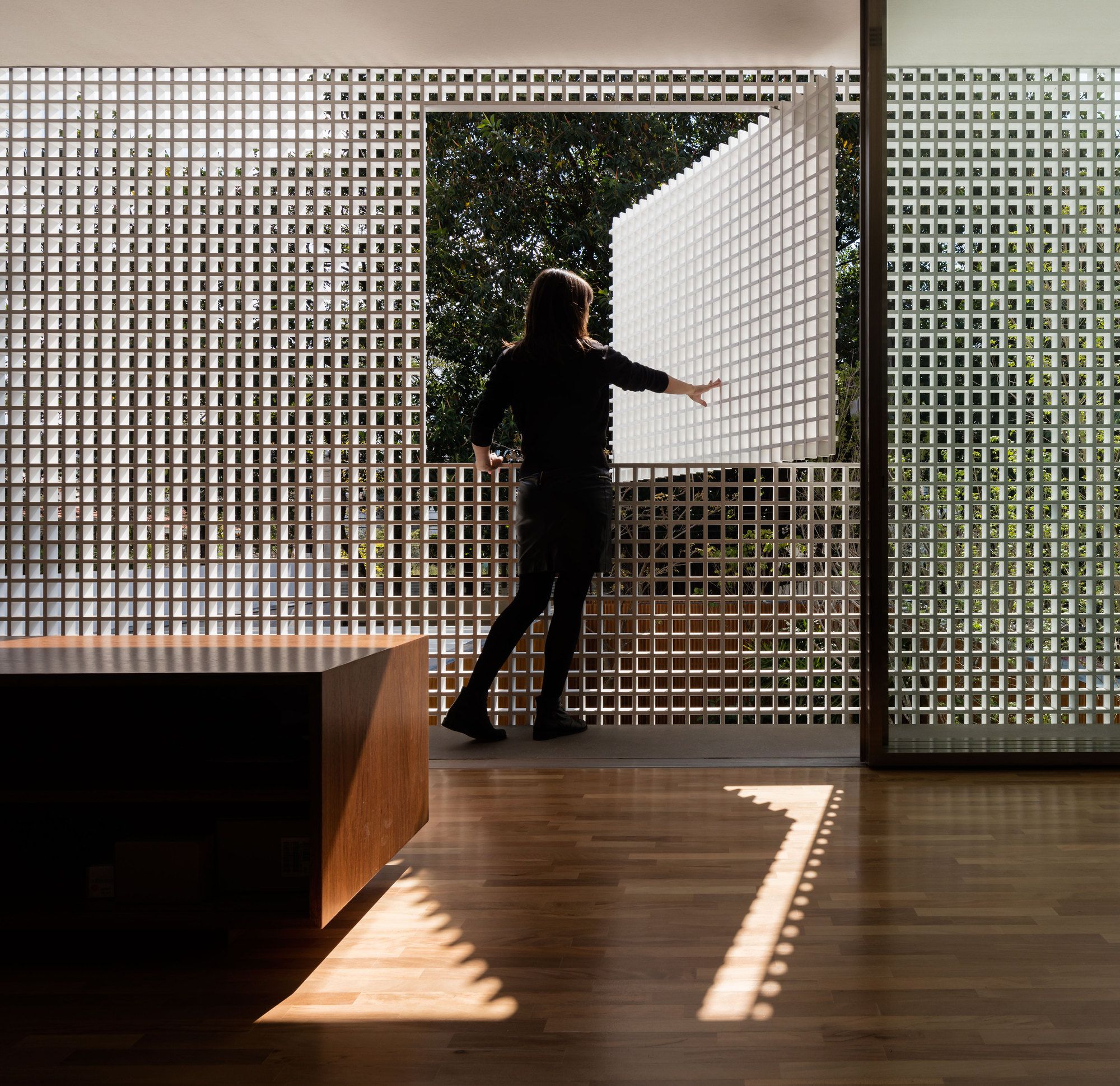
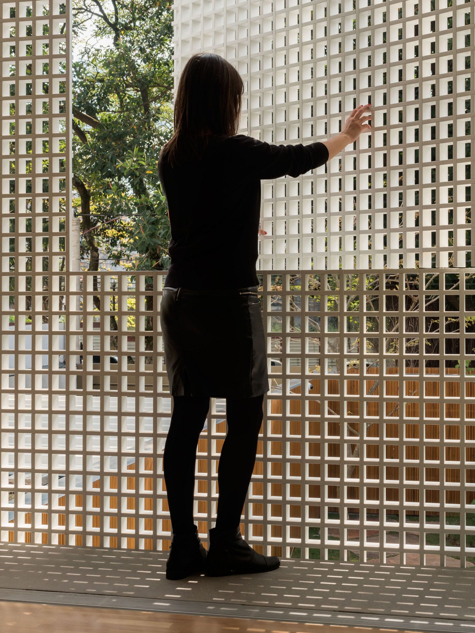
The volume of the intimate areas is also covered by wood, but with another treatment. The system of this facade is self-supporting with pivoting windows that are imperceptible when closed and function as a filter, allowing a controlled transparency. The whole project revolves around this dilution of the boundaries between interior and exterior, creating an intense spatial dynamics.
Project Info:
Architects: Studio MK27
Location: São Paulo, Brazil
Project Year: 2015
Photographs: Fernando Guerra | FG+SG
Manufacturers: Vitra, Antiquário Artemobilia, Dpot, Micasa, Punto, Vitrine, puntoluce
Photography by © Fernando Guerra | FG+SG
Photography by © Fernando Guerra | FG+SG
Photography by © Fernando Guerra | FG+SG
Photography by © Fernando Guerra | FG+SG
Photography by © Fernando Guerra | FG+SG
Photography by © Fernando Guerra | FG+SG
Photography by © Fernando Guerra | FG+SG
Photography by © Fernando Guerra | FG+SG
Photography by © Fernando Guerra | FG+SG
Photography by © Fernando Guerra | FG+SG
Photography by © Fernando Guerra | FG+SG
Photography by © Fernando Guerra | FG+SG
Photography by © Fernando Guerra | FG+SG
Photography by © Fernando Guerra | FG+SG
Photography by © Fernando Guerra | FG+SG
Photography by © Fernando Guerra | FG+SG
Photography by © Fernando Guerra | FG+SG
Photography by © Fernando Guerra | FG+SG
Photography by © Fernando Guerra | FG+SG
Photography by © Fernando Guerra | FG+SG
Photography by © Fernando Guerra | FG+SG
Photography by © Fernando Guerra | FG+SG
Photography by © Fernando Guerra | FG+SG
Photography by © Fernando Guerra | FG+SG
Photography by © Fernando Guerra | FG+SG
Photography by © Fernando Guerra | FG+SG
Photography by © Fernando Guerra | FG+SG
Photography by © Fernando Guerra | FG+SG
Photography by © Fernando Guerra | FG+SG
Photography by © Fernando Guerra | FG+SG
Photography by © Fernando Guerra | FG+SG
Photography by © Fernando Guerra | FG+SG
Photography by © Fernando Guerra | FG+SG
Photography by © Fernando Guerra | FG+SG
Photography by © Fernando Guerra | FG+SG
Photography by © Fernando Guerra | FG+SG
Photography by © Fernando Guerra | FG+SG
Photography by © Fernando Guerra | FG+SG
Photography by © Fernando Guerra | FG+SG
Photography by © Fernando Guerra | FG+SG
Photography by © Fernando Guerra | FG+SG
Photography by © Fernando Guerra | FG+SG
Photography by © Fernando Guerra | FG+SG
Photography by © Fernando Guerra | FG+SG
Photography by © Fernando Guerra | FG+SG
Photography by © Fernando Guerra | FG+SG
Photography by © Fernando Guerra | FG+SG
Photography by © Fernando Guerra | FG+SG
Photography by © Fernando Guerra | FG+SG
Photography by © Fernando Guerra | FG+SG
Photography by © Fernando Guerra | FG+SG
Photography by © Fernando Guerra | FG+SG
Photography by © Fernando Guerra | FG+SG
Photography by © Fernando Guerra | FG+SG
Photography by © Fernando Guerra | FG+SG
Photography by © Fernando Guerra | FG+SG
Section
Section
Floor Plan
Site Plan


