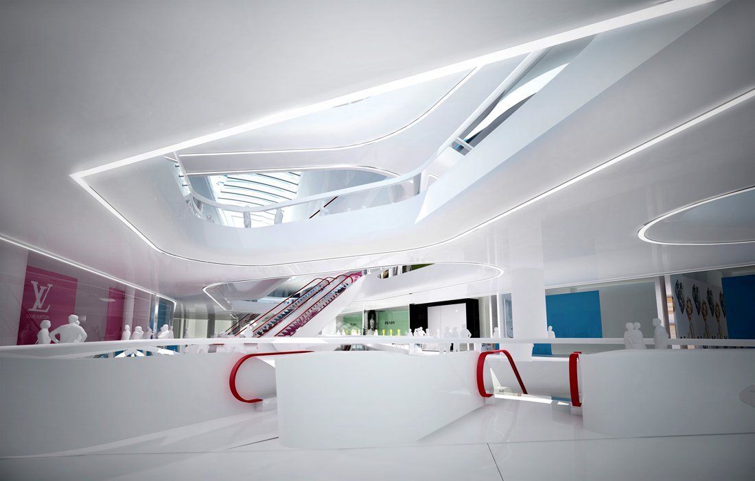
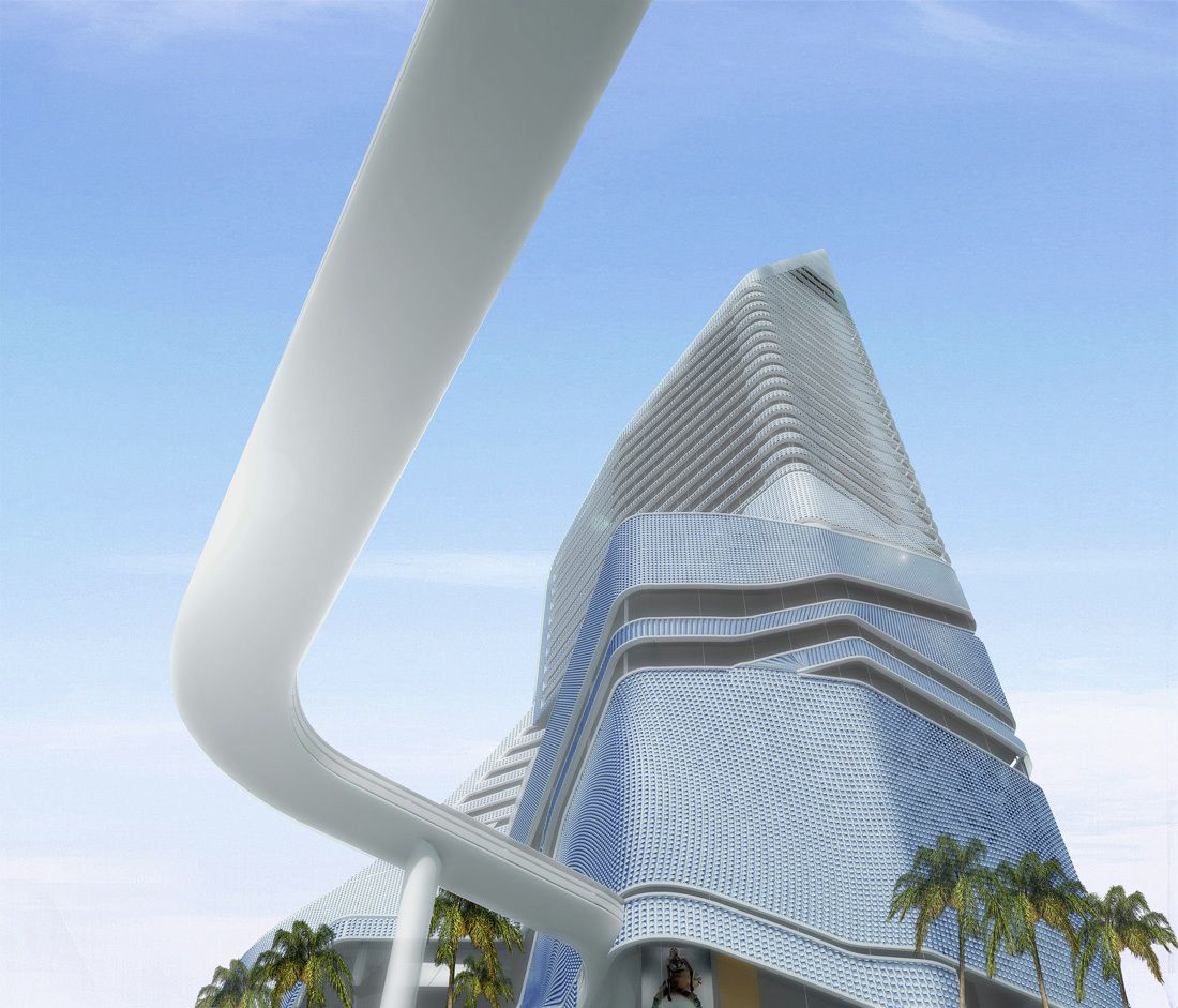
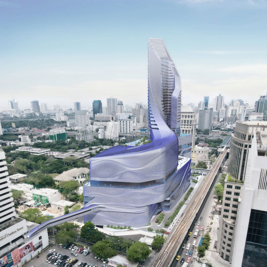
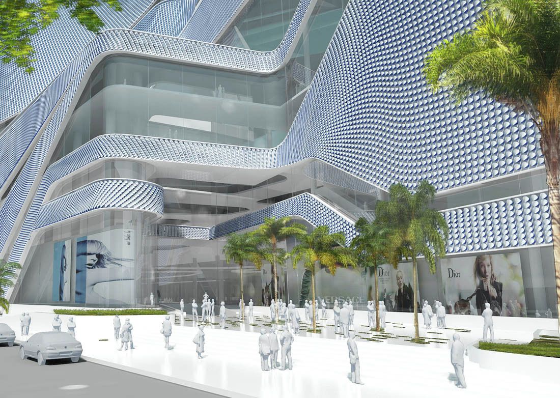
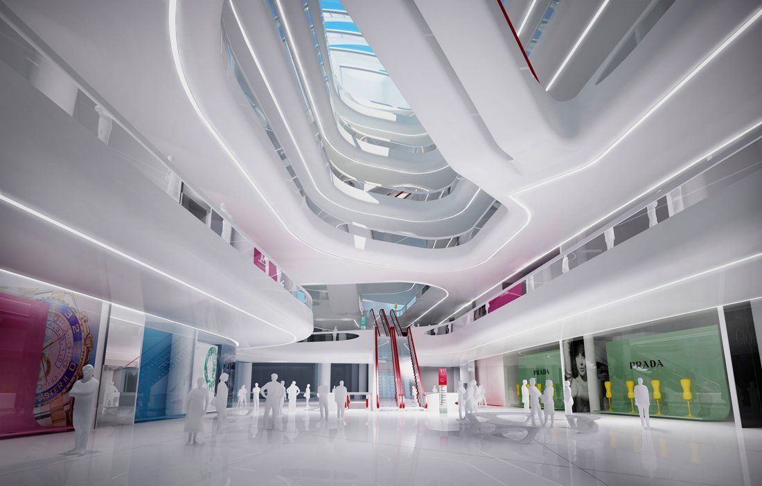
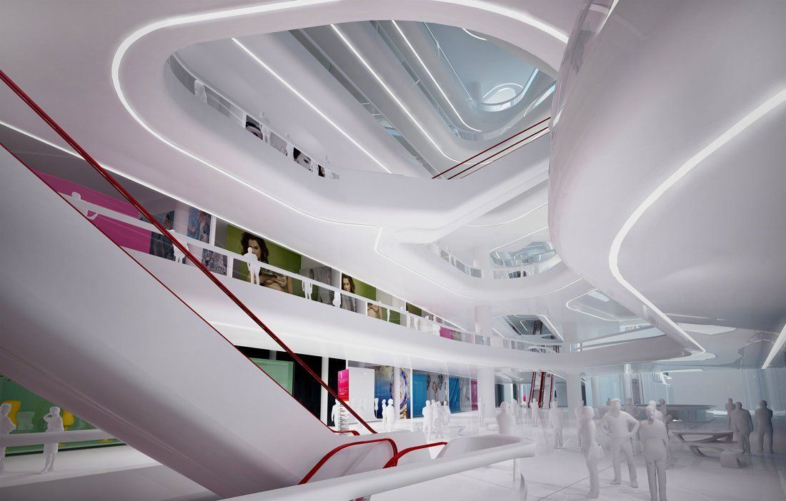
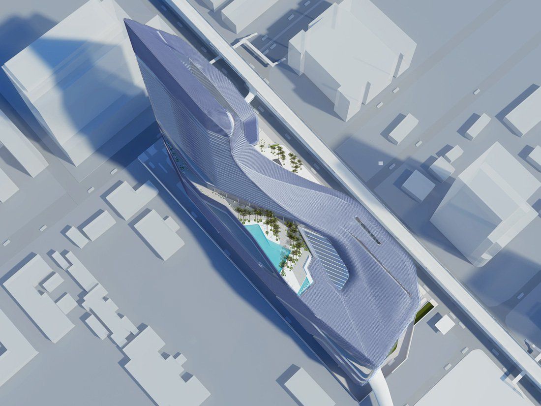
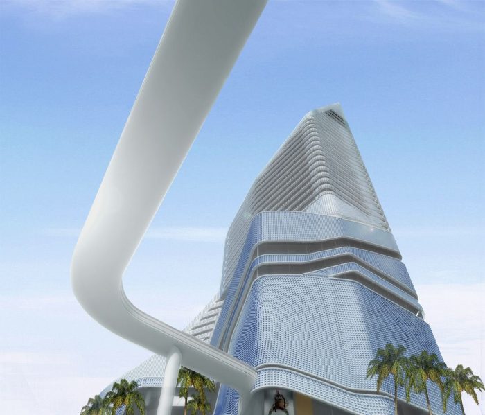
All architects have their own way of developing an idea and drawing inspiration for a project. In this case Amanda Levete Architects uses the design of furniture to explore architectural ideas and test material possibilities at a smaller, more intimate scale. This technique has once again proved successful for the firm in the design of the Central Embassy, a 30-storey retail and hotel project in Bangkok, Thailand, which will be built on the former gardens of the British Embassy.
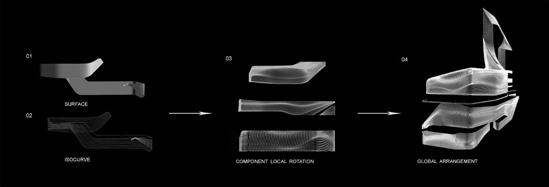
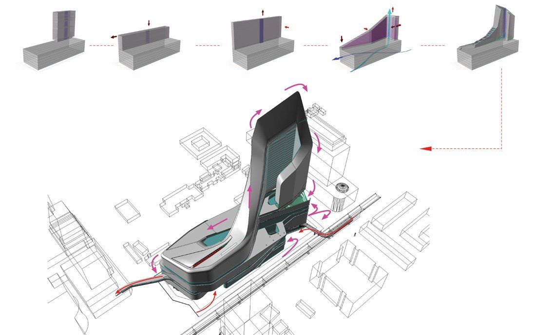
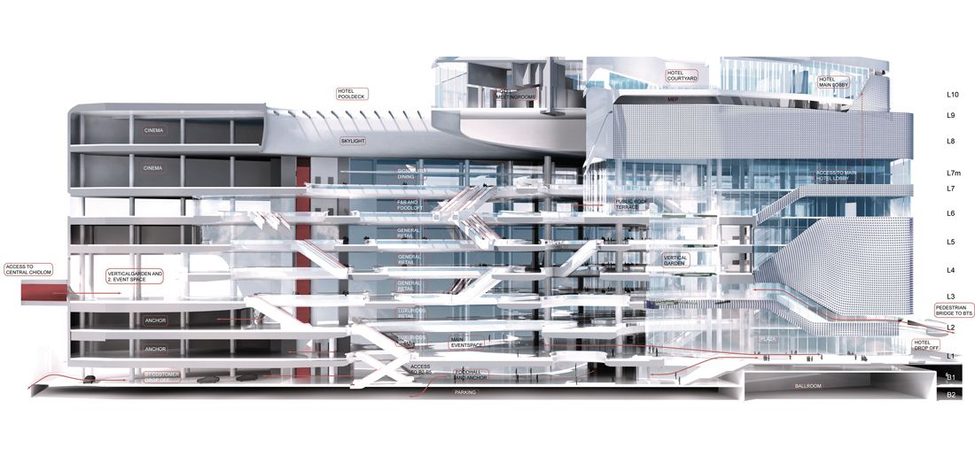
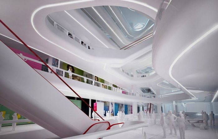
Once again we see the exploration of integrating a podium structure with a tower, merging them together into a sinuous and continuously twisting coil. This movement was determined by creating a form that wraps around two vertical light wells in the retail podium and at the same time encloses and exposes a series of exterior courtyards and roof gardens for the hotel. The internal spaces then break apart to reveal stepped terraces and vertical gardens.
As with most of Amanda Levete Architects designs, this one is rooted in design research focused on extensive studies in Thailand culture and experimentation with the application of advanced digital design techniques. It was important to create an innovative synthesis of technology and heritage in this project, to embrace new modern thinking with that of traditional patterns, materials, and fabrication methods in Thailand. This allowed the opportunity to create the first contemporary landmark building in Bangkok, demonstrably of its time, but also considerate of the history, heritage, and culture.
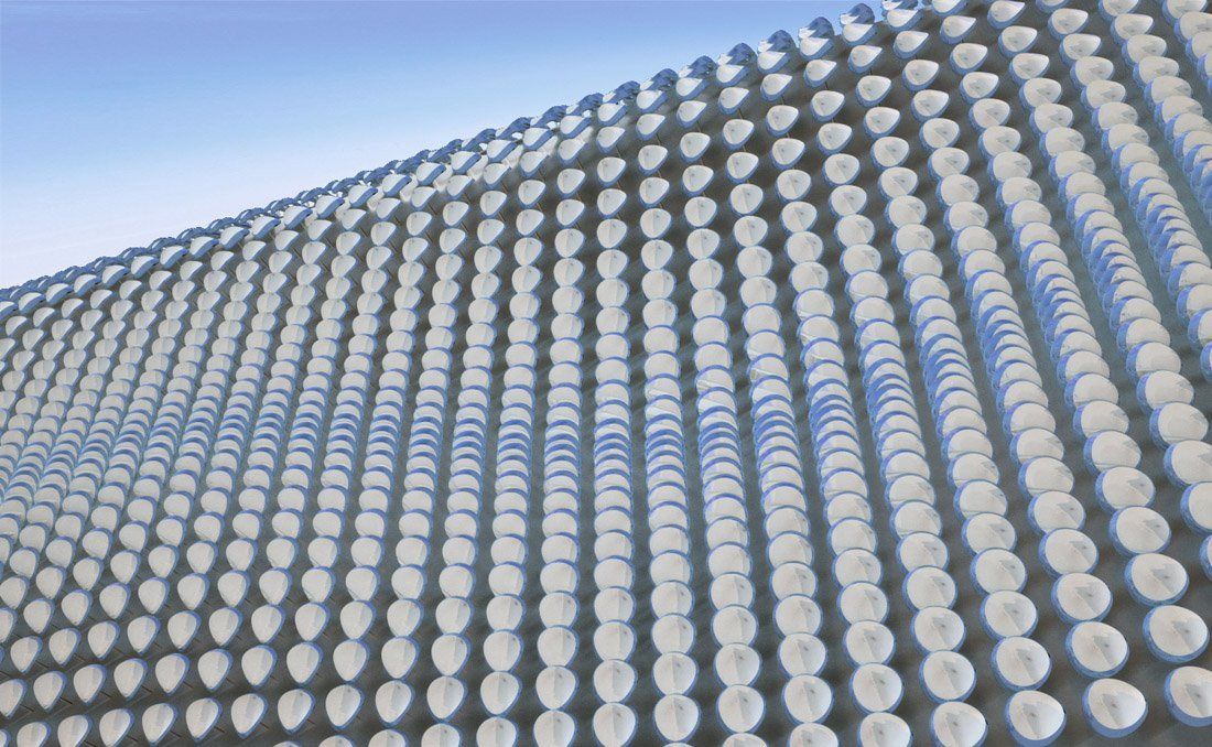
The attention to detail with the façade of the structure is also quite mesmerizing. The façade is composed of a dynamic and fluid three-dimensional array of ceramic tiles that breaks the long spans of continuous frontage into a rich pattern with changes of gradient, rotation, and spacing. This design element draws attention to the coiled mass of the structure while giving it varied impressions of depth, shape, and color. The viewer’s impression of the building changes with every step taken, where the ceramic tiles blur together when seen from far away, making the texture of the façade appear fluid, while up close the tiles add a sense of whimsy and abstraction.
