Founded in 1941, Coach began as a leather goods retailer, displaying their products in a single row of librarylike, wooden shelving that categorized their handbags and wallets. The brand’s repertoire has since expanded to include a full range of lifestyle merchandise including outerwear, footwear, jewelry, watches, and Sunwear, which are now sold in a variety of retail environments from specialty boutique to a department store.
Inspired by the clarity of Coach’s original, systematic filing retail strategy, OMA designed a modular display unit that is flexible enough to accommodate the specific needs of each product and retail environment. The spatial possibilities of this highly functional system reinforce Coach’s mission to represent ‘logic and magic.’ For the first iteration at a kiosk within Macy’s department store at Herald Square, acrylic display units were assembled into a floor-to-ceiling high, “V” shaped wall. Products appear to float amidst maintained views to the accessories floor beyond.
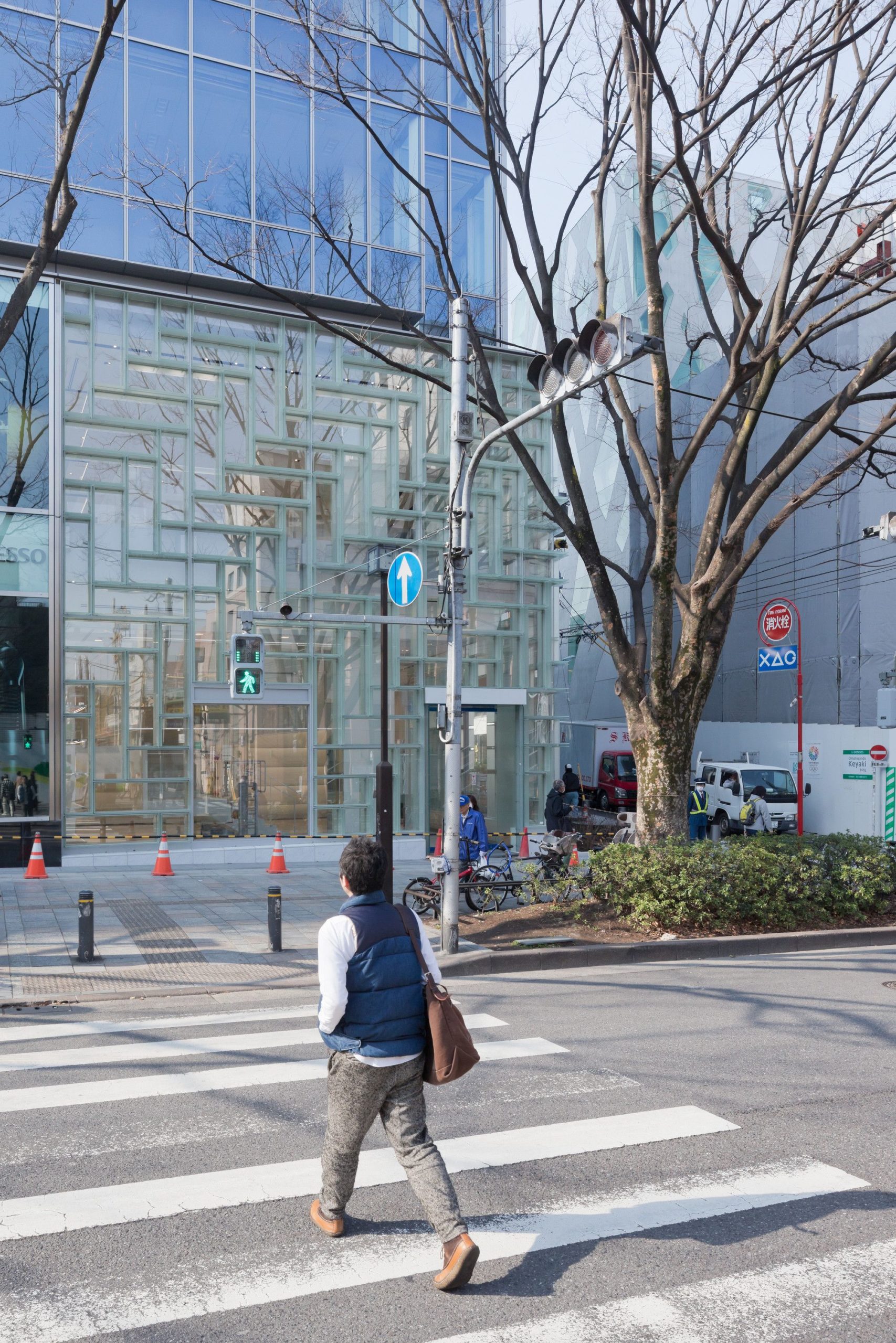
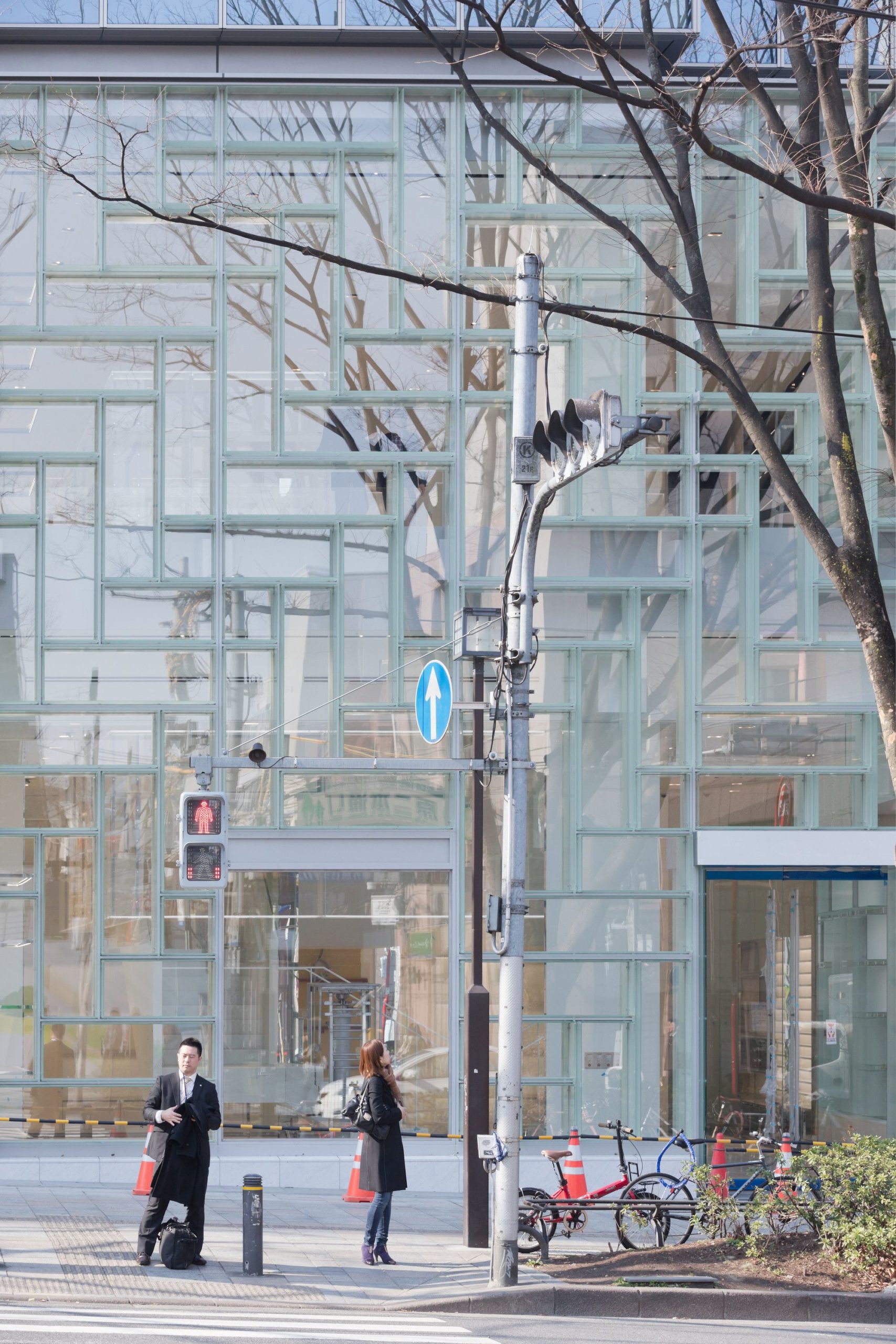
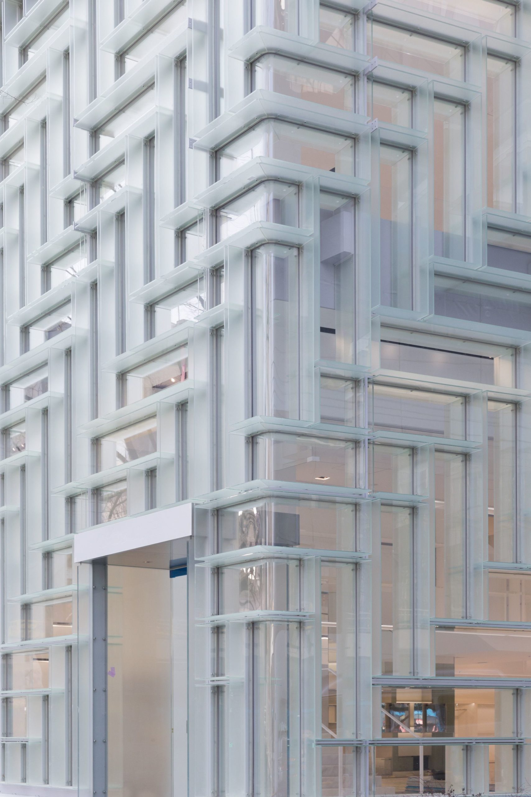
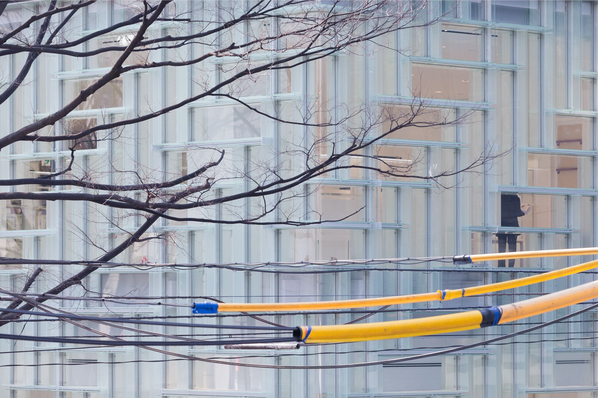
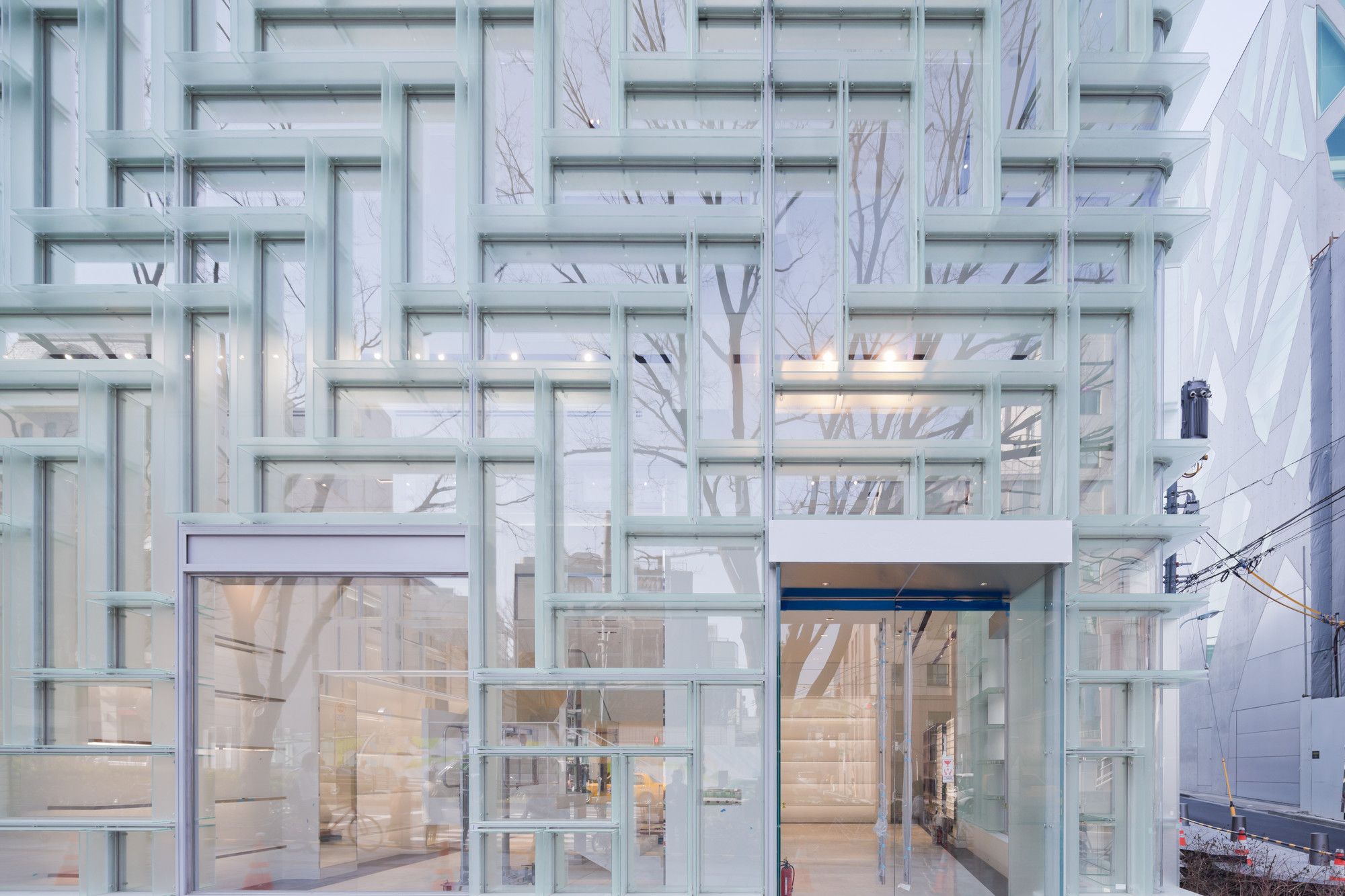
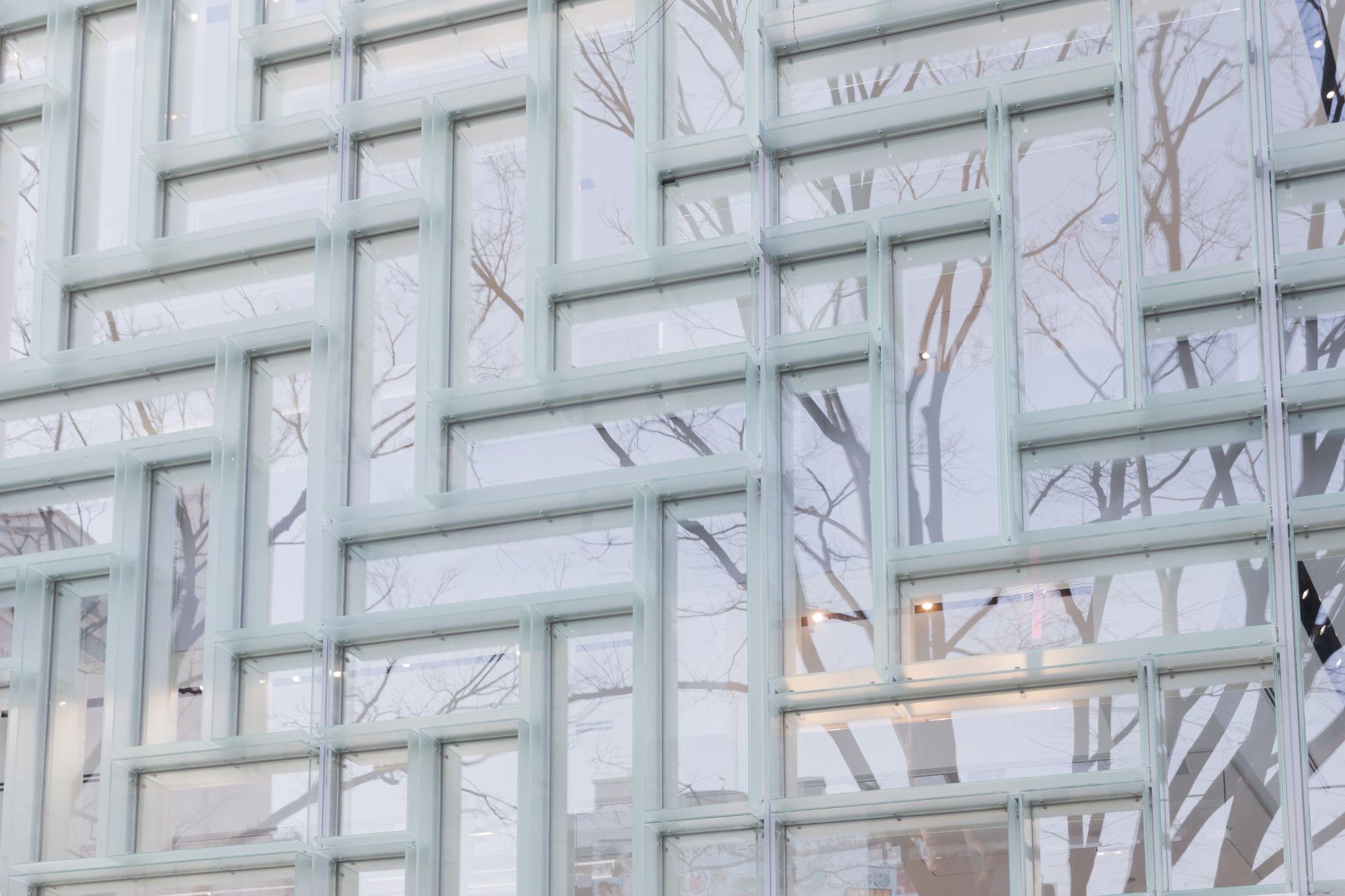
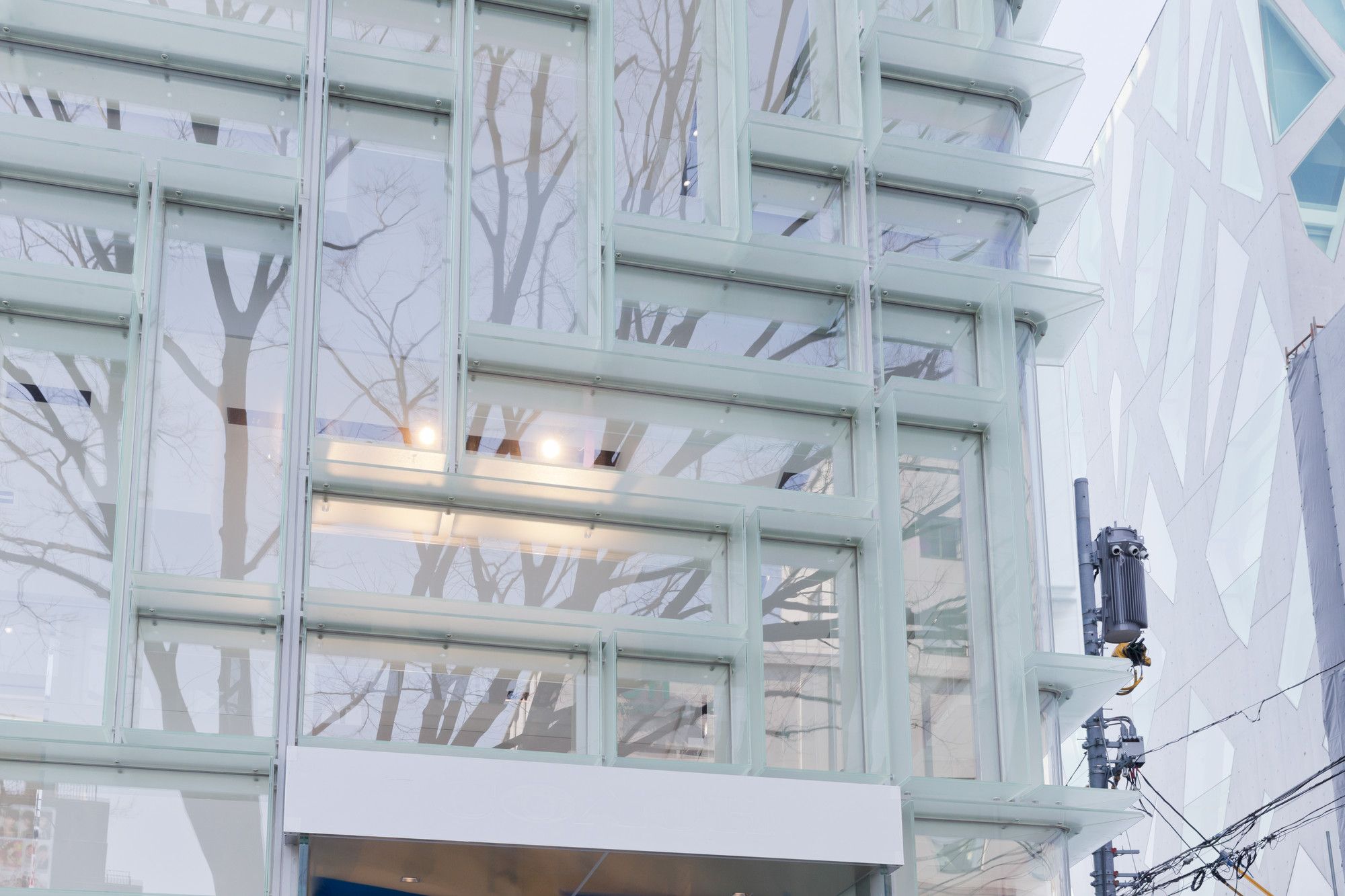
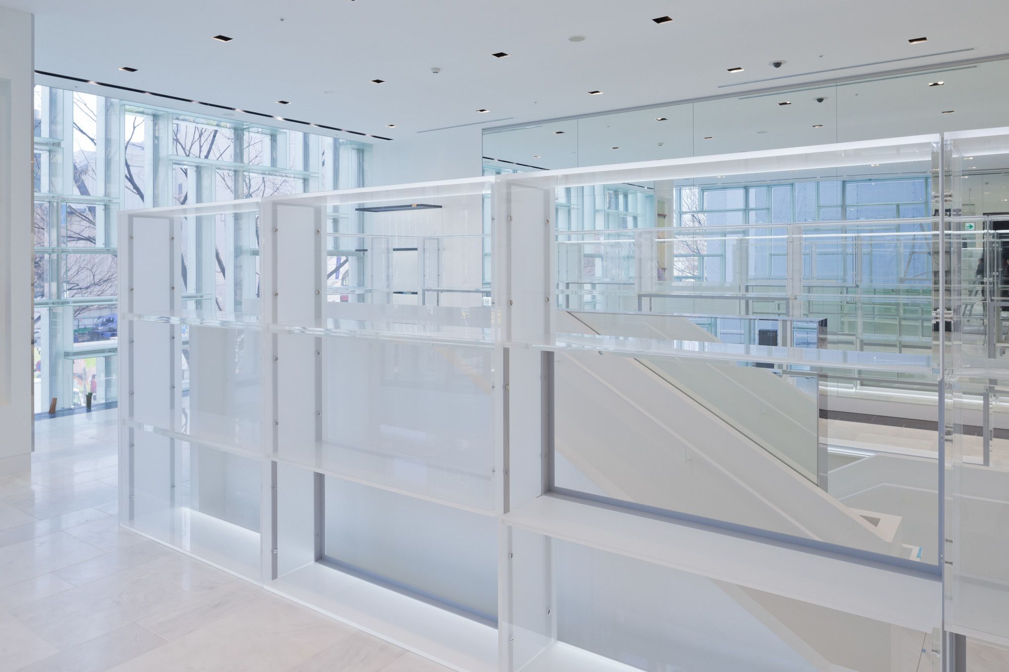
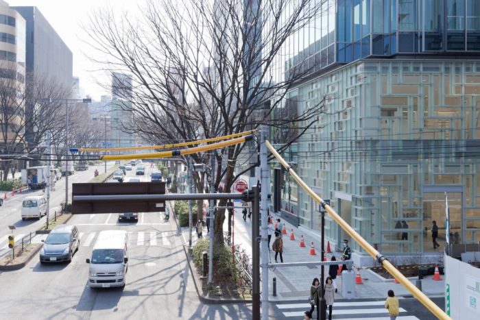
Coach’s ninth Japan flagship is a two-story, corner site on Omotesando, a prominent retail corridor in Tokyo. In comparison to the increasingly decorative elevations that characterize Omotesando, OMA’s design integrates the display into the façade, seamlessly communicating the brand’s presence from the inside out. The display units are stacked in a herringbone pattern of vertical and horizontal orientation to facilitate a range of curation scenarios. Dimensioned to accommodate Coach’s standard merchandising elements (ex. mannequins, busts, bags), the unit measures1800 mm x 520 mm. A frosted glass that provides shelving within the store is further articulated to the façade as louvers.
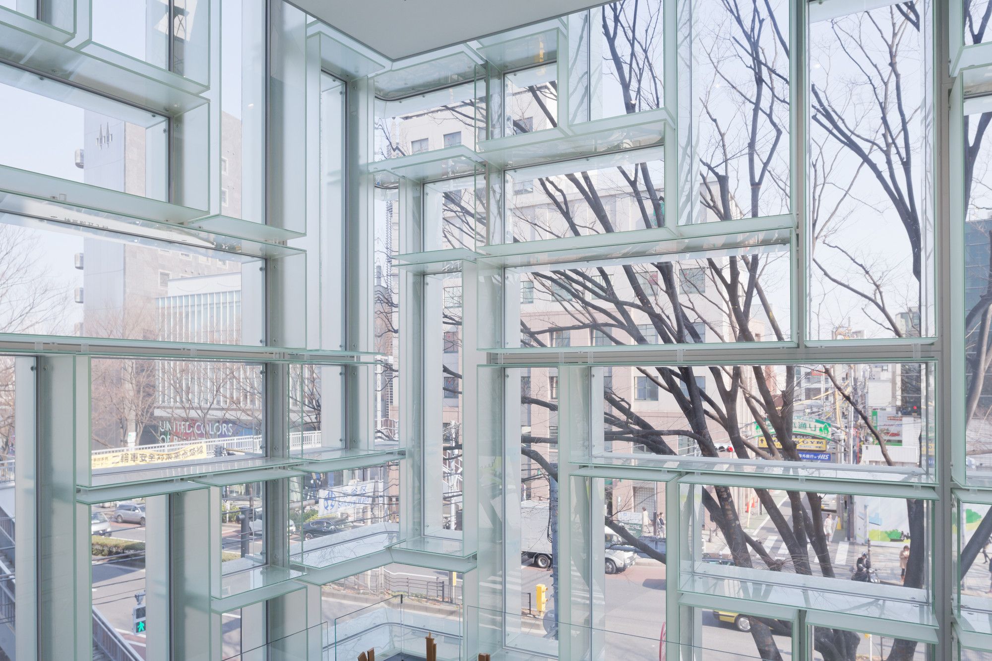
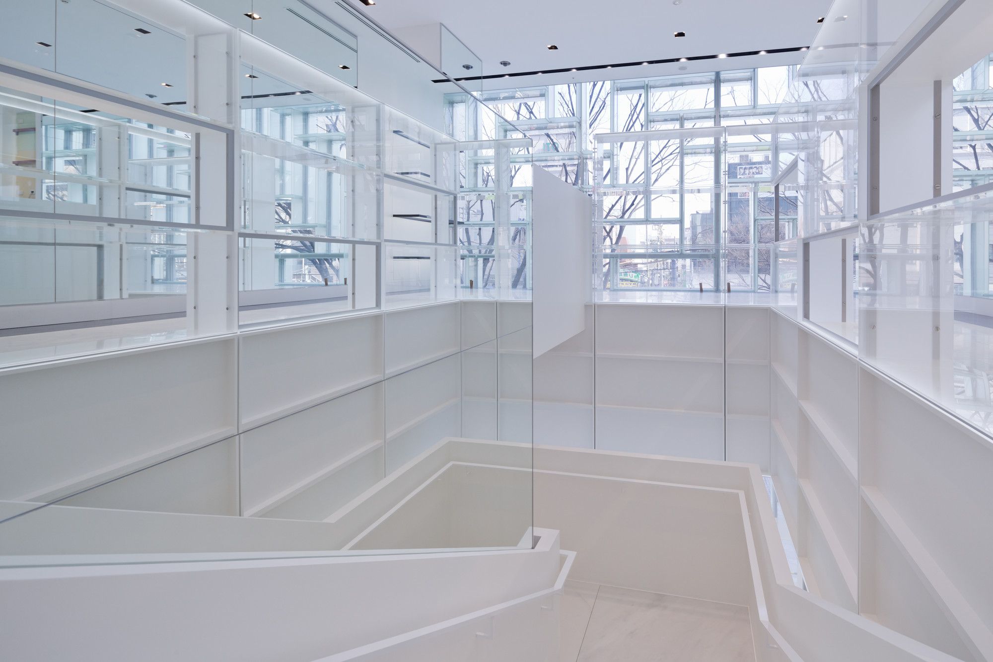
Viewed from the exterior, the double-height storefront presents an uninterrupted survey of Coach’s full collection in a single view, with a dedicated frame for each product. Viewed from the interior, the display unit’s translucency creates an active backdrop for merchandise, filtering Omotesando’s streetscape into the shopping experience.
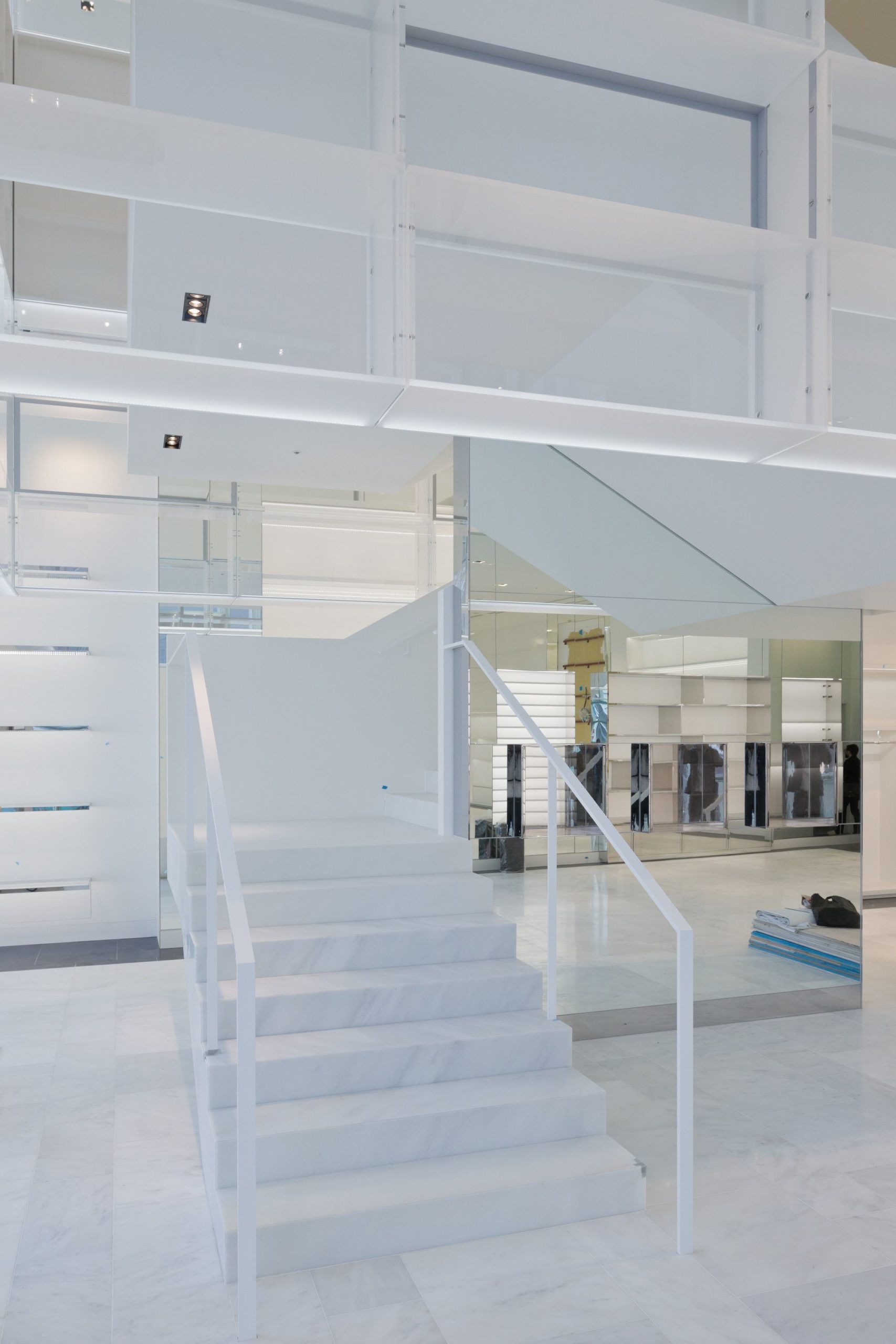
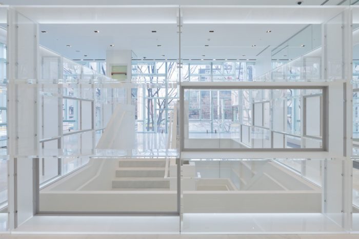
In addition to the façade, OMA designed a floating tower of illuminated units that encase the store’s central stair, seamlessly connecting the women’s first floor and men’s second level. Consolidating the display on the facade and circulation creates a condition in which the shopper is continuously surrounded by product, while simultaneously liberating floorspace. In the evenings, the circulation tower illuminates the façade as a dynamic, 24-hour window display from within.
Project Info:
Architects: OMA
Location: Tokyo, Japan
Partner-in-Charge: Shohei Shigematsu
Project Architect: Rami Abou Khalil
Team: Yolanda do Campo, Benedict Clouette with Jackie Woon Bae, Cass Nakashima, Phillip Poon, David Theisz
Area: 444.75 sqm
Project Year: 2012
Photographs: Iwan Baan
Project Name: Coach Omotesando Flagship

