Commune Apartment
The inspiration for this project was 1930s interior designs. Vladilen, the client, shares with Room Design Buro the appreciation of Bauhaus art school, modernism, and Russian constructivism movements in architecture. Before we began working on the project, we carefully investigated photographs from Vladilen’s trip to German, where the design and architecture of Schminke House owed him the most. That helped us to translate and apply some of the principles to the interior environment and spirit of this era. 27m² is not an easy task, but it is a common issue to solve for our Buro. The challenge was to create a comfortable space for one person to live in without compromises. The design includes a full-size shower and fully functional kitchen. Additionally, there was no compromise to the size of the bed, which is 200cm X 140cm, along with a hidden workspace/desk.
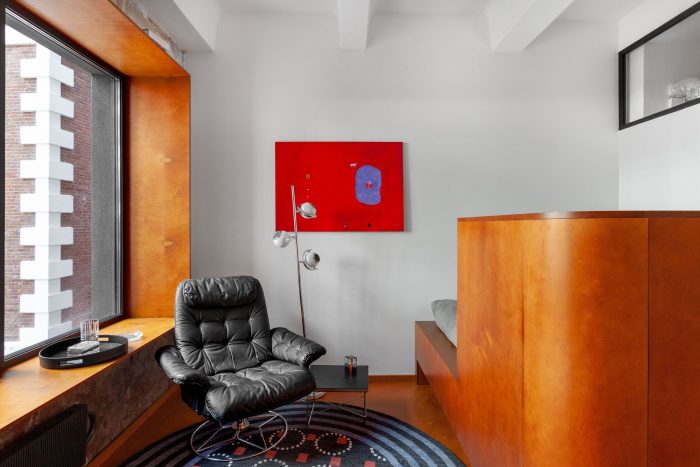
Furthermore, the layout has the leisure area for movie watching, reading, or simply indulge in thought with a nice glass of wine. The difference in floor height was introduced to create some plasticity and zoned the space. This idea initially was suggested by Vladilen. He really likes the look of low windowsills, that why we supported this idea and developed it to our design. The focus point in the interior is the furniture and material choices, especially the colour palette. The colour choice can be associated with the furniture and style of Soviet time, which might resonate negatively with some people.
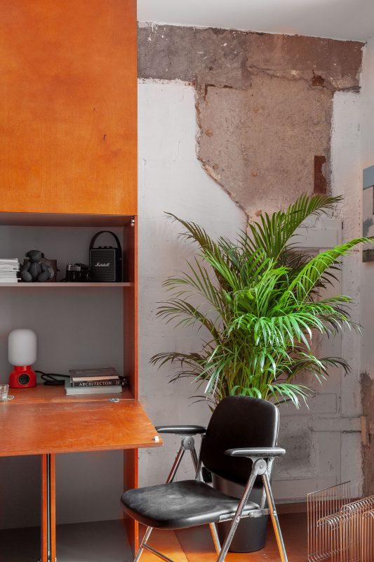
However, our goal was to prove that design exists independently from time and problems of this period. Once you abstract away from negative aspects of the household of the period than it is possible to purely enjoy the architecture, design, and unique parts of the household of this time. It would be reckless if we didn’t introduce aspects of modern constructivism to this apartment. There are a couple of design decisions that were made: the wall on a window-side stayed untouched along with the structural column that has been left exposed.
Some of these decisions created controversy and raise some questions in our social media accounts among our followers. We don’t have straight answers to their concerns, as we simply see the beauty in these design elements. Some of the decor elements came from our client’s personal collection, such as Philippe Starck’s lemon squeezer. A few pieces of furniture were found on online marketplace websites and Instagram pages. The black leather armchair was a coincidental discovery in a vintage store, an amazing piece from an unknown manufacturer. We all liked it, and it is fantastic how well it got integrated into our design space. “After it arrived and we placed into space we felt like crystal ashtray and the smell of tobacco is something that is missing. It appears that we created an interior 18+.”
Project Info:
Architects: roomdesignburo
Location: Moscow, Russia
Area: 27 m²
Project Year: 2020
Photographs: Polina Poludkina
Manufacturers: AYTM, Philippe Starck, Markpatlisstudio Carpet


