Designed by Moody Nolan, The impetus behind the concept for a new corporate headquarters in suburban Dayton, Ohio, was the owner’s love of adventure, aviation and the spirit of collaboration. Operating nationally, the locally-run company has re-located 70 employees into this new 39,000 square foot facility from its previous location in Centerville, a few miles to the north. Drawing upon the Owner’s desire for collaboration, the design team involved students from the AIA-founded Charter High School for Architecture and Design (CHAD) of Center City Philadelphia in charrettes. This involvement of bright, young minds provided the design team with unique feedback during the early formative stages of the process.
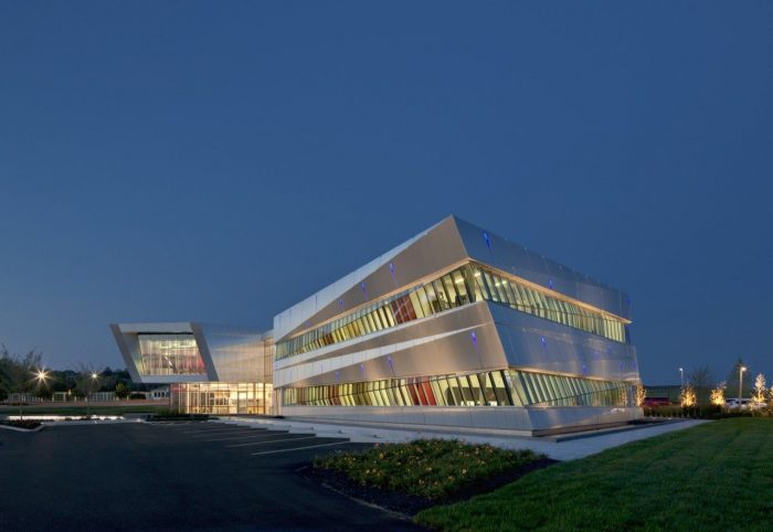
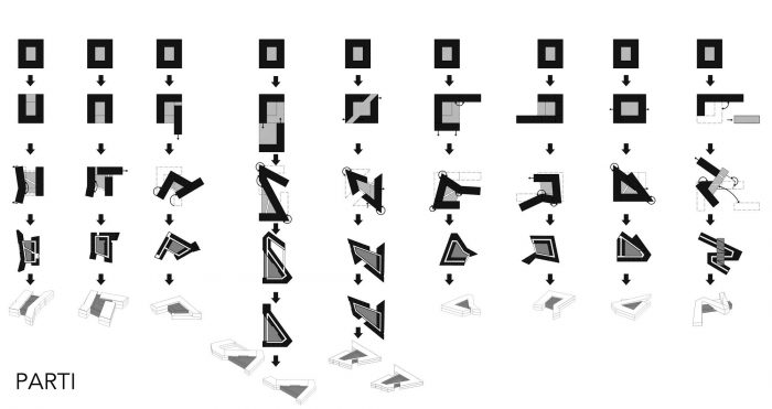
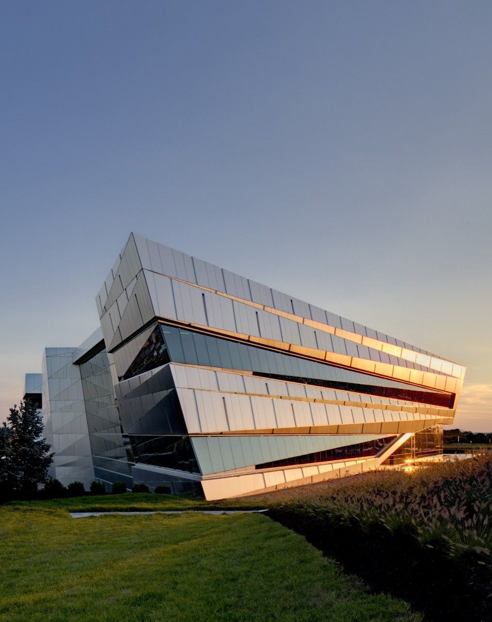
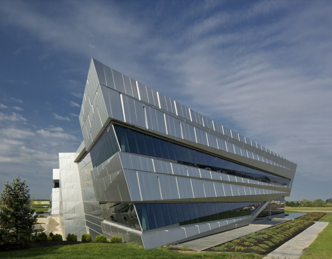
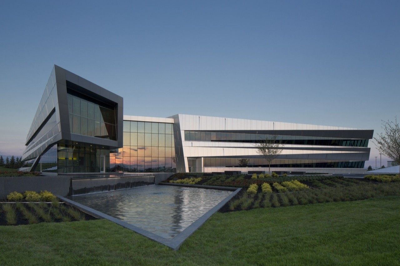
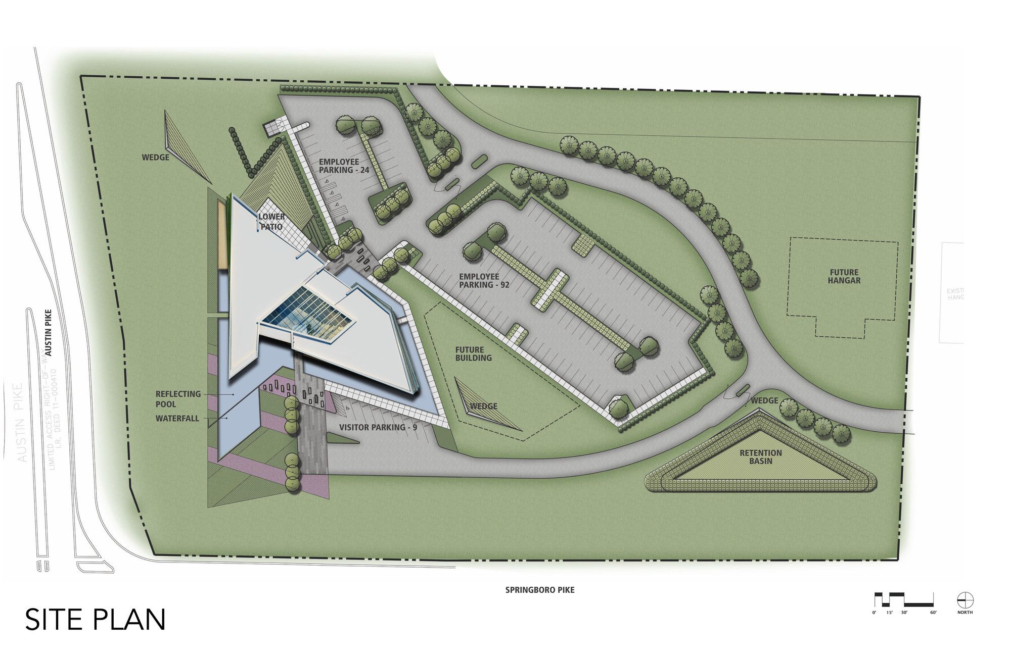
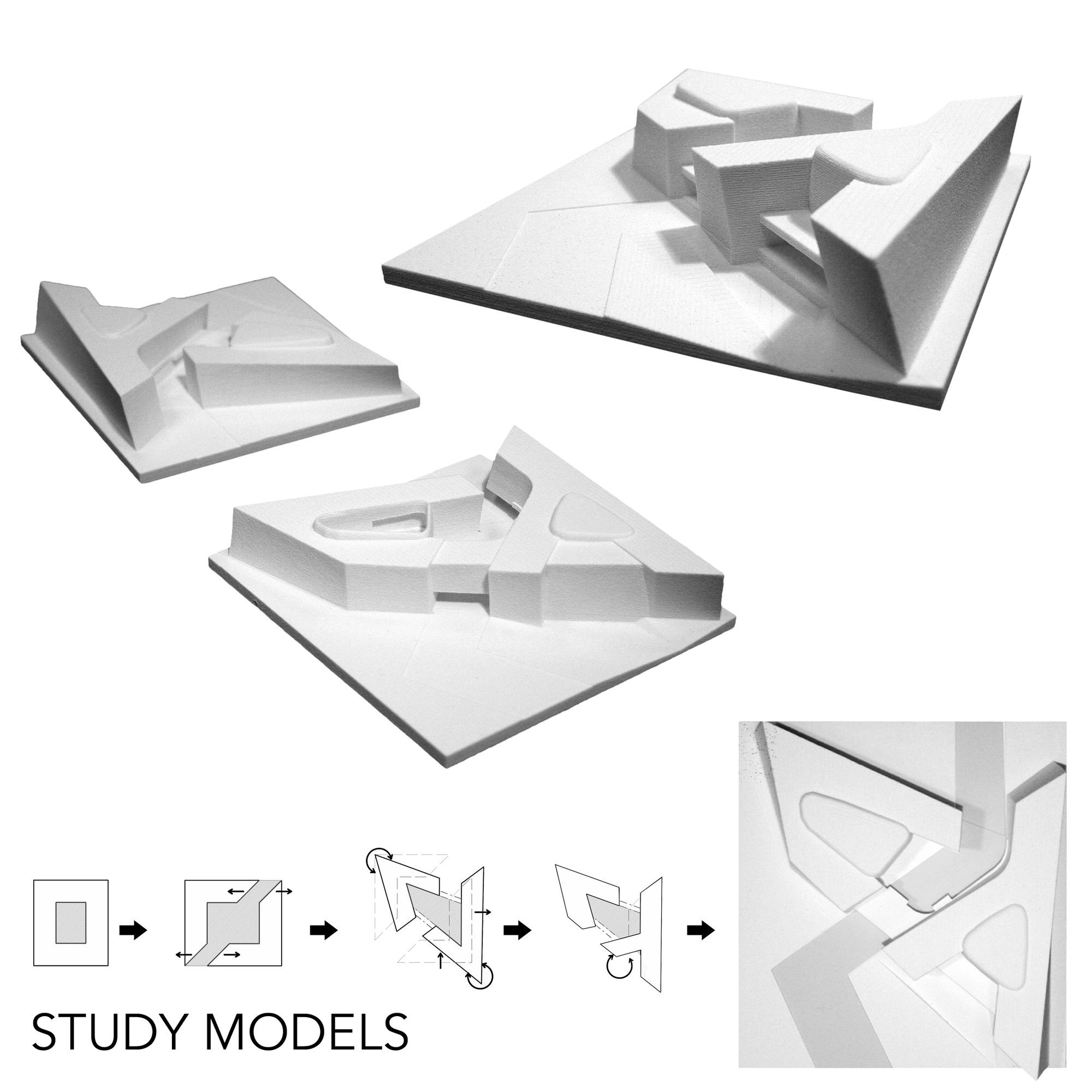
Located on the grounds of the Dayton-Wright Brothers Airport and at the busy intersection of Austin Boulevard and Springboro Pike, the building is ideally situated in a high-growth area of Dayton. The form of Corporate Headquarters is created via a double-loaded office bar wrapping around itself and uncoiling toward the public street intersection, forming a point of entry and an interior glass-enclosed atrium. Inspiration is gleaned from the notion of motion and lift, trajectory and momentum.
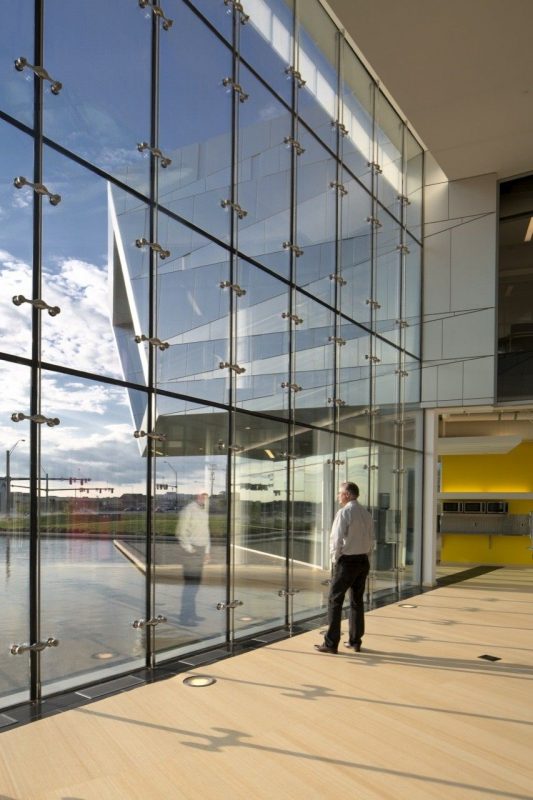
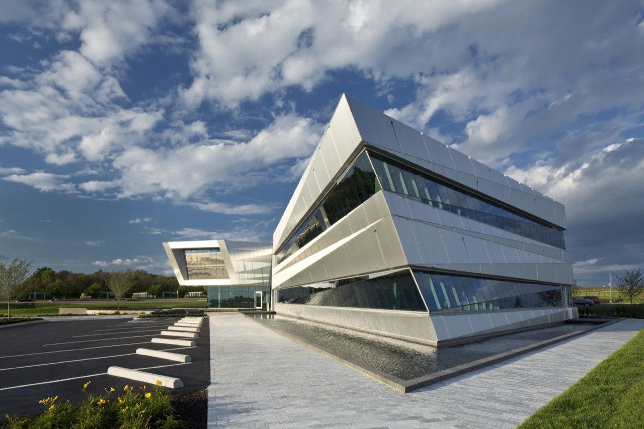
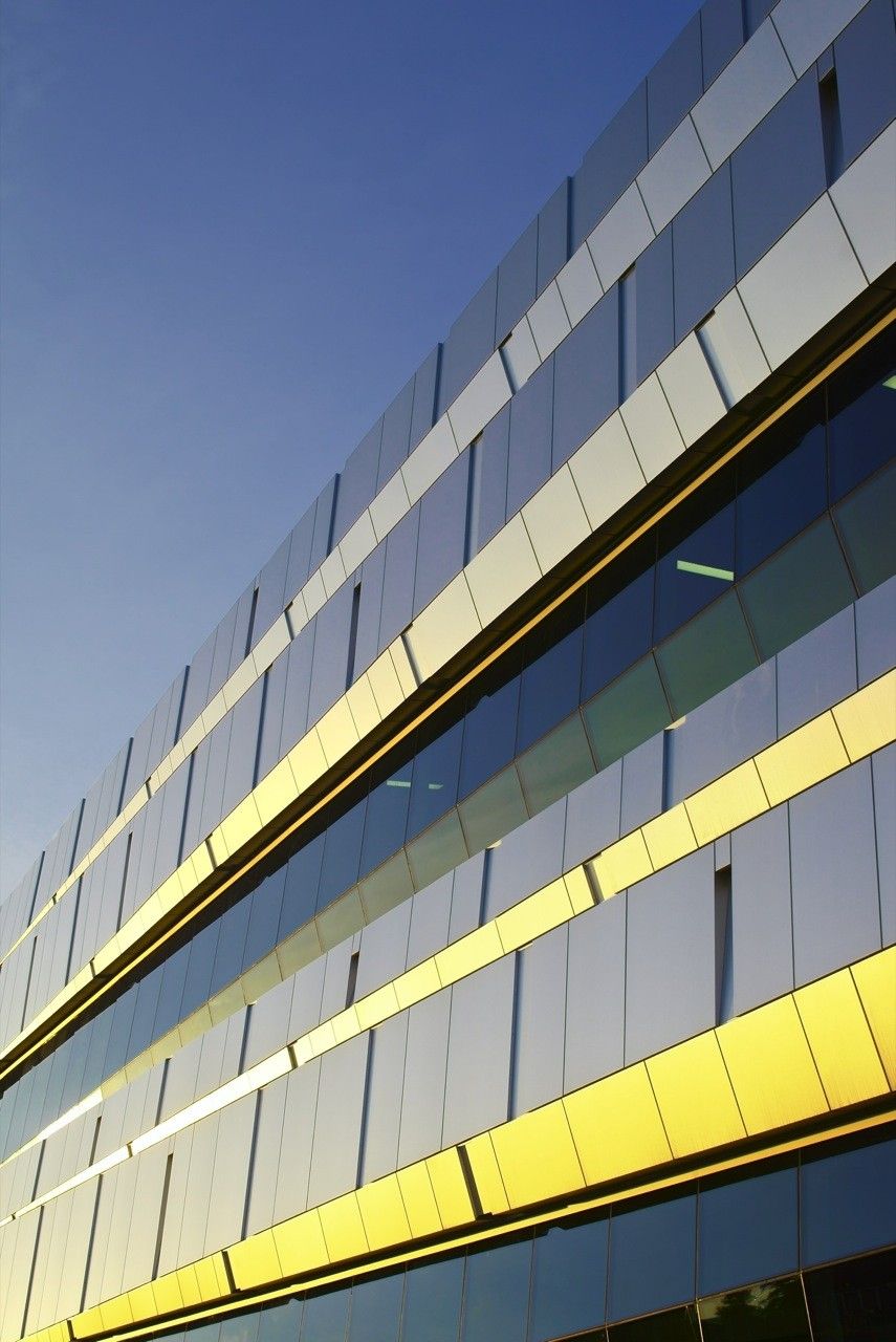
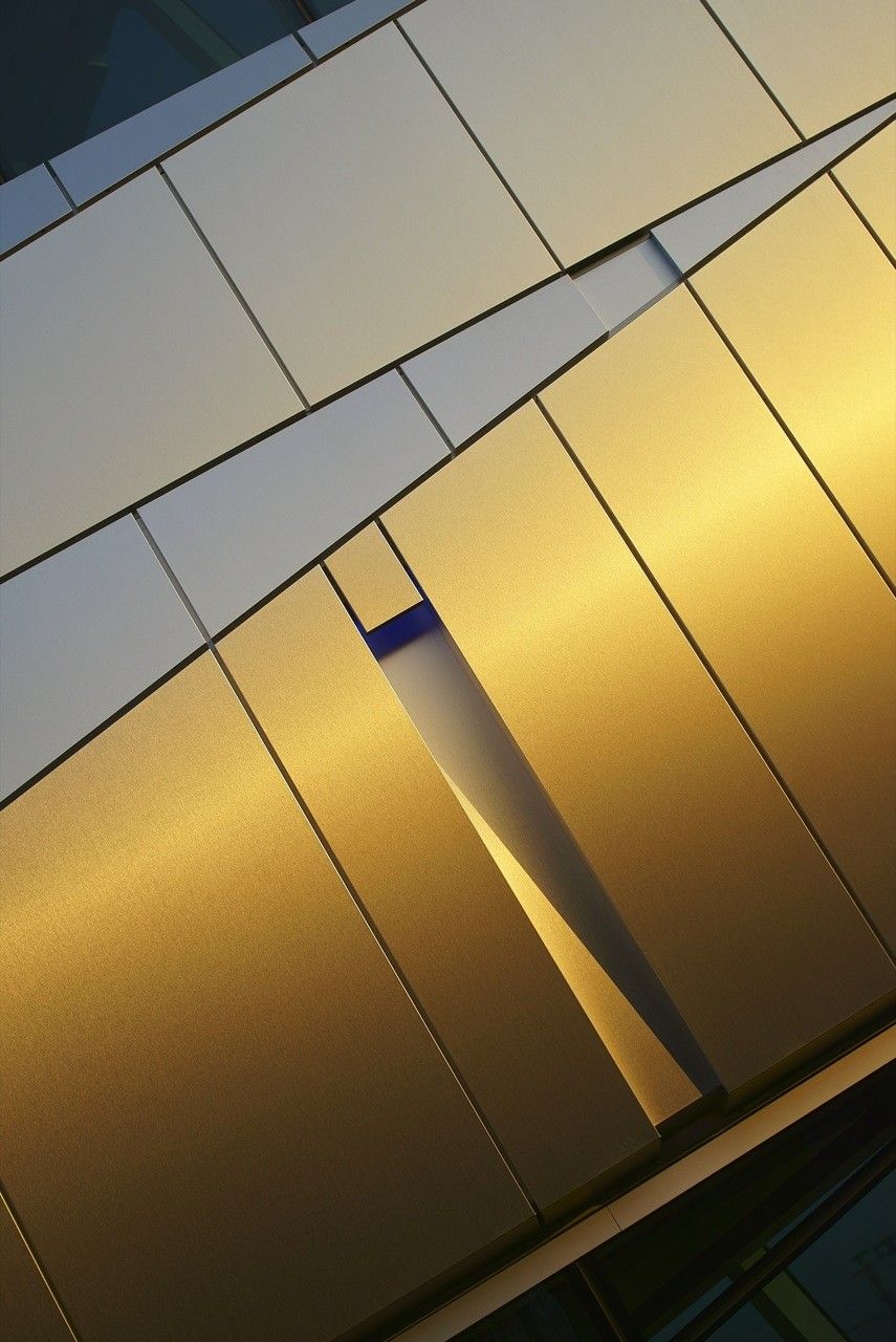
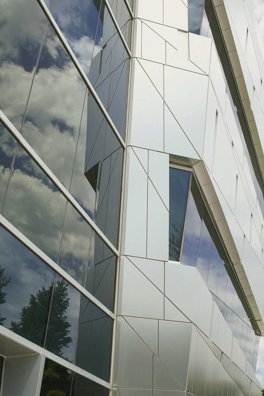
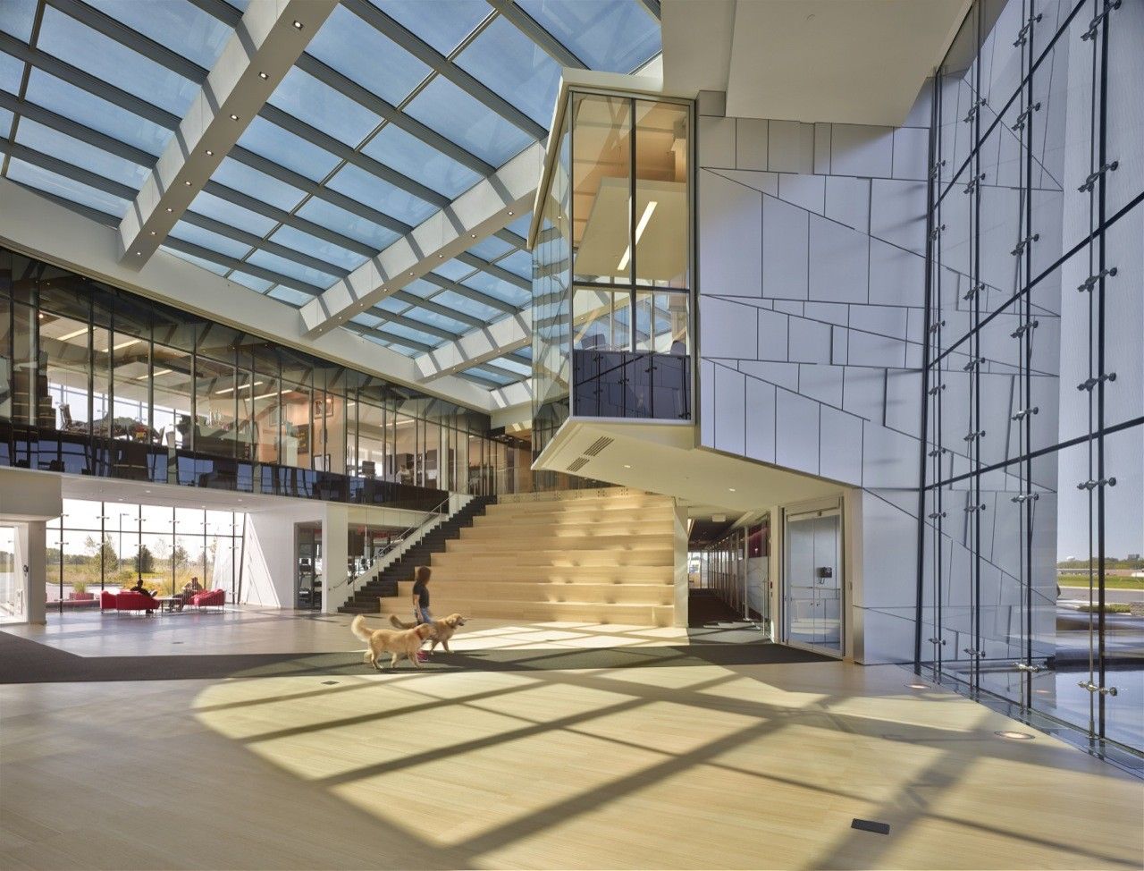
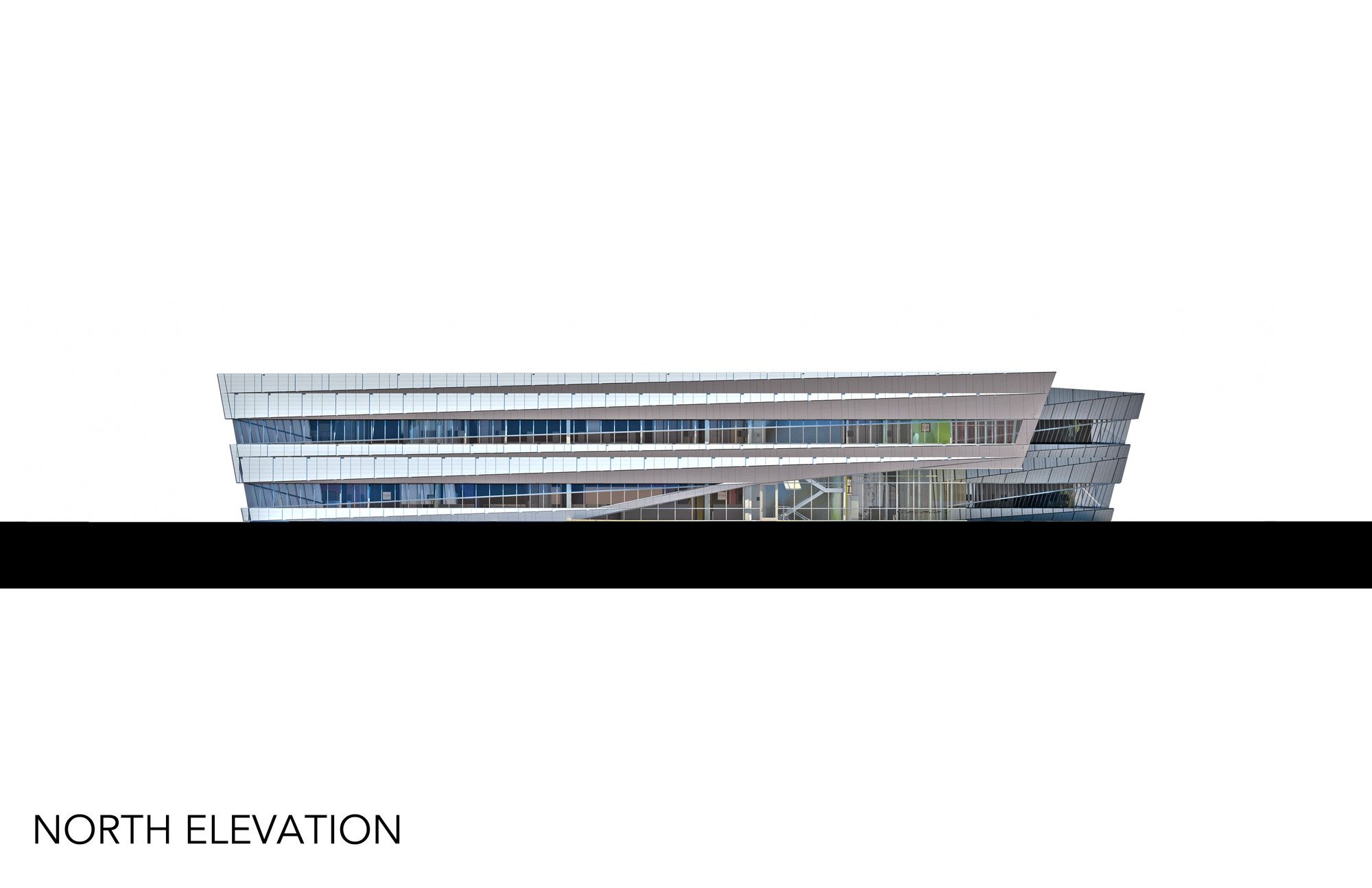
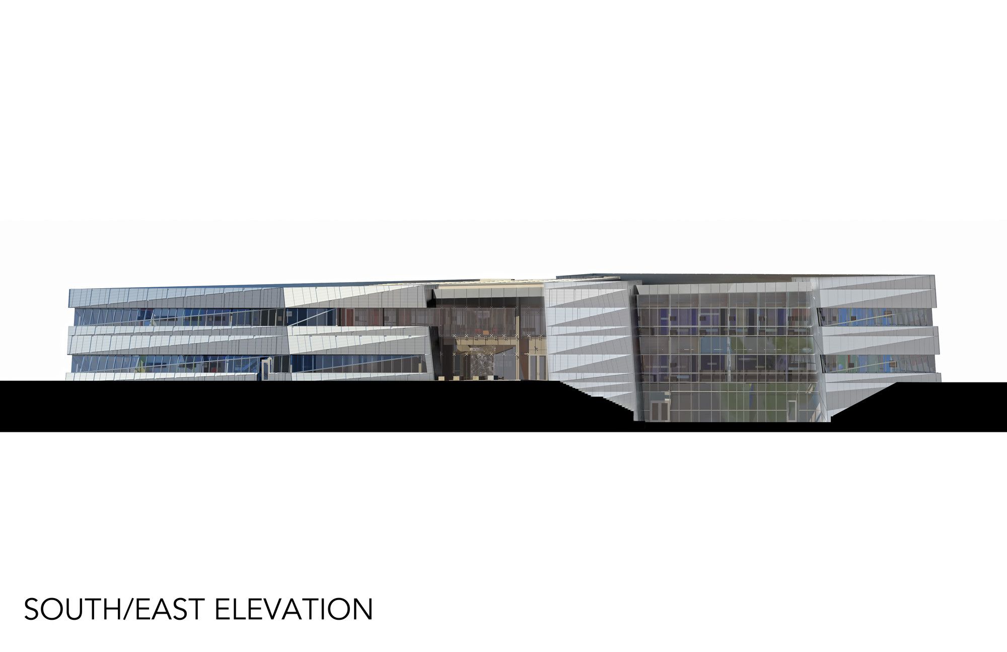
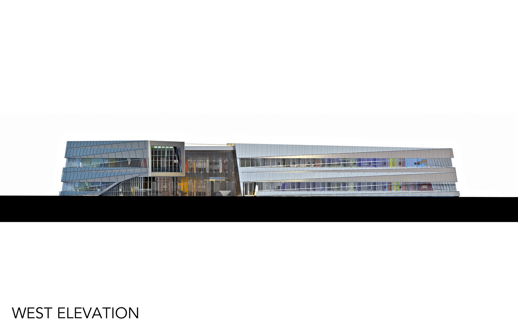
The outer “public” skin of the building form is sheathed in folded and triangulated sections of aluminum composite metal panels and strip windows. The triangulations allow the building to twist and lean as momentum and movement build and pull around the perimeter to the high point. Intersecting the middle of this area east to west is a slice of point-supported curtain wall that allows views and transparency through the atrium. Black reflecting pools surrounding the building give the form a greater sense of depth and provide a sense of crossing and arrival.
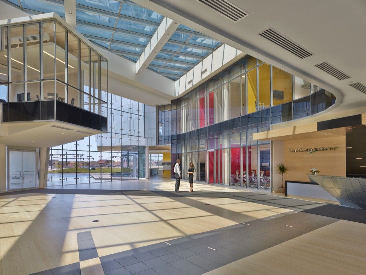
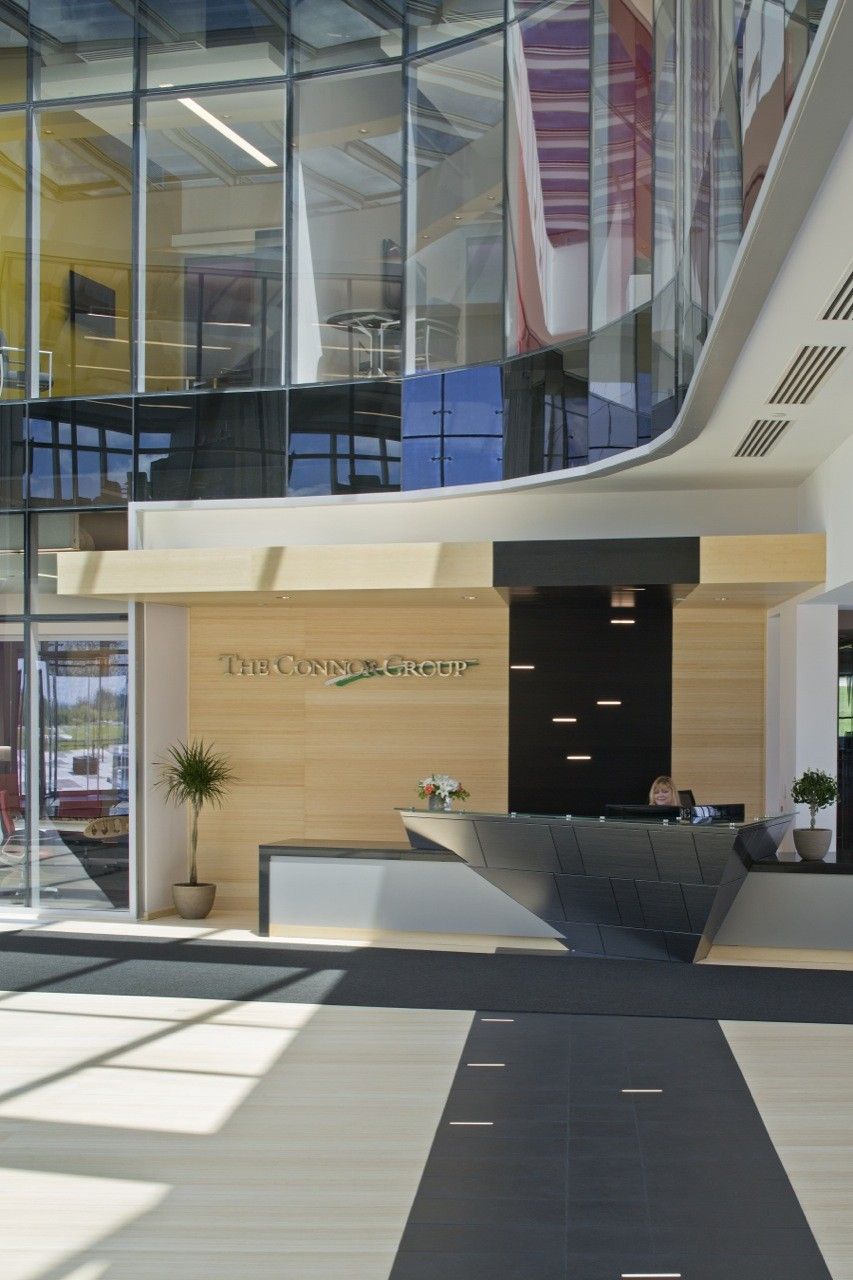
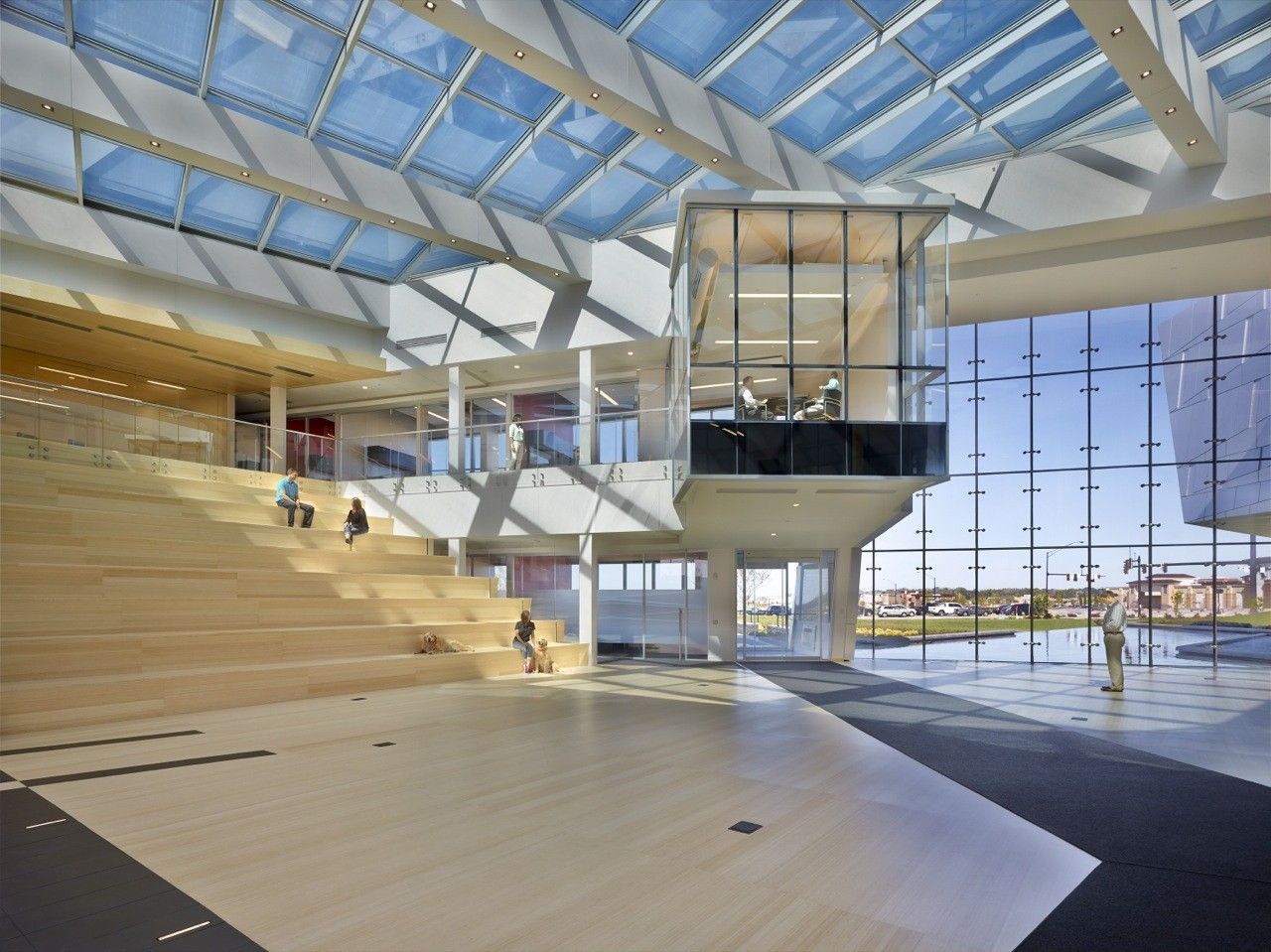
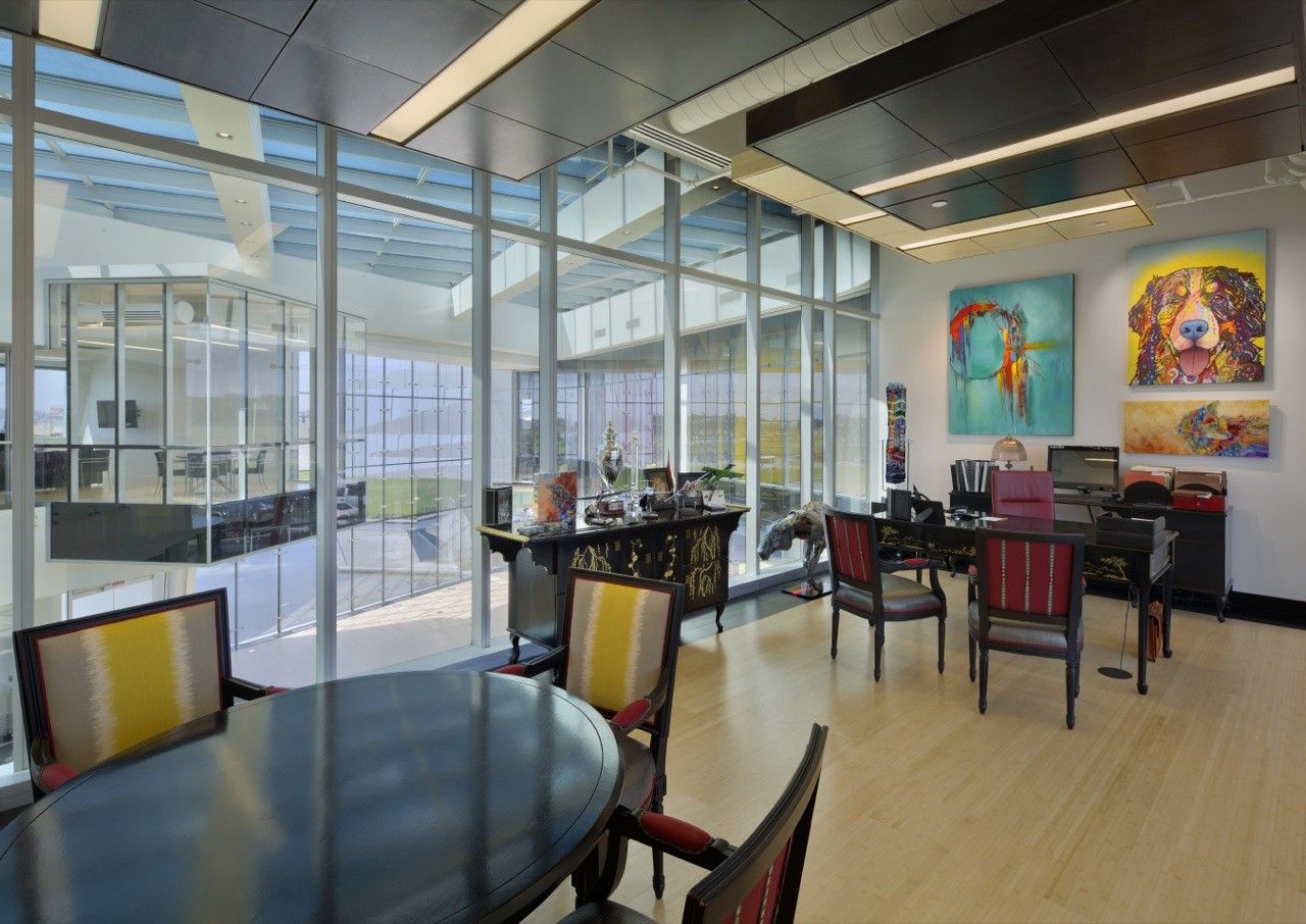
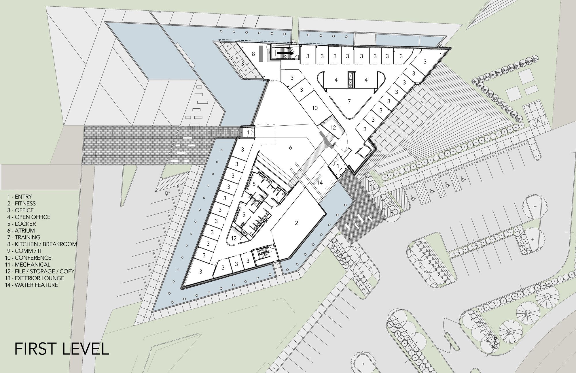
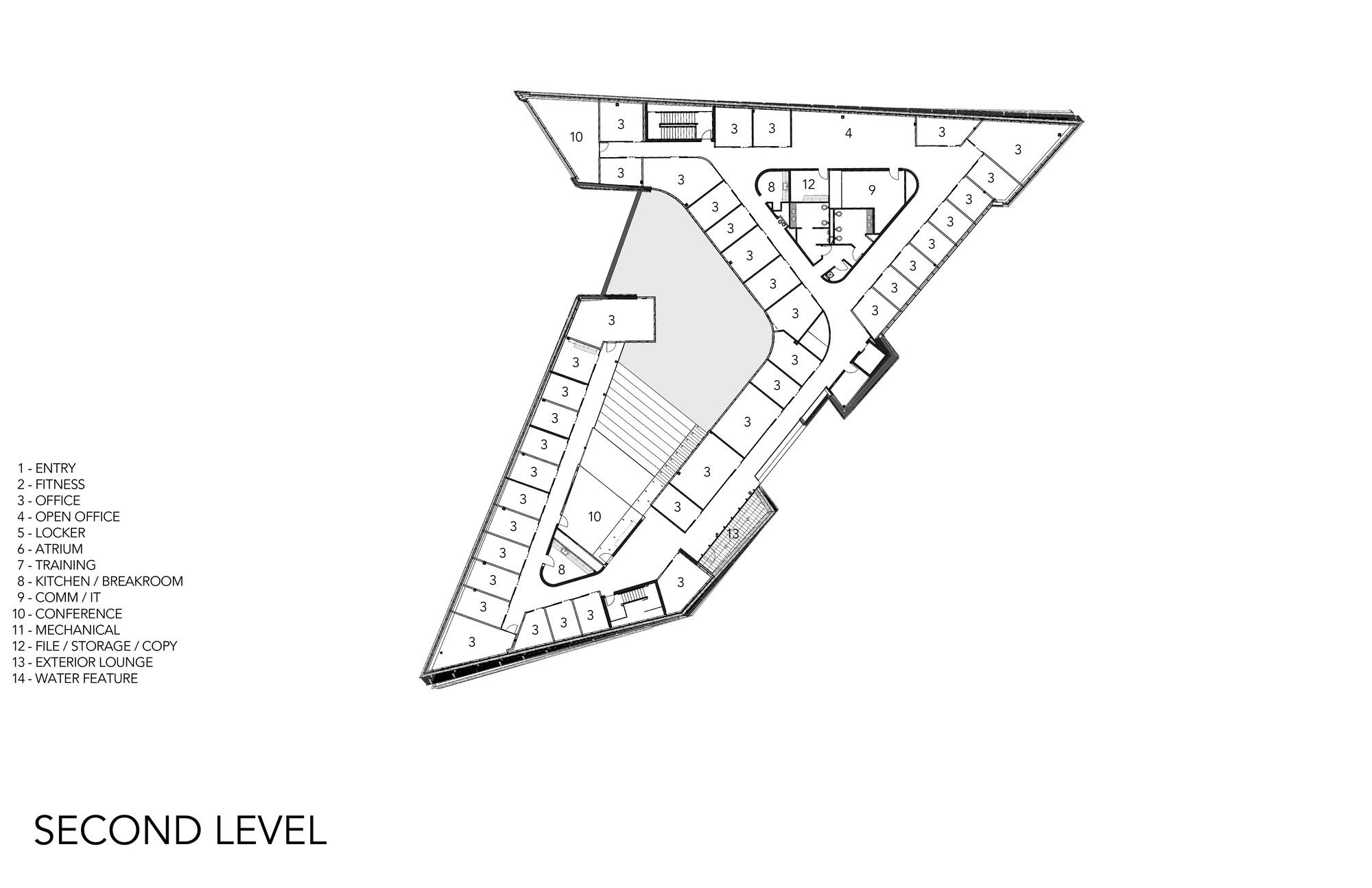
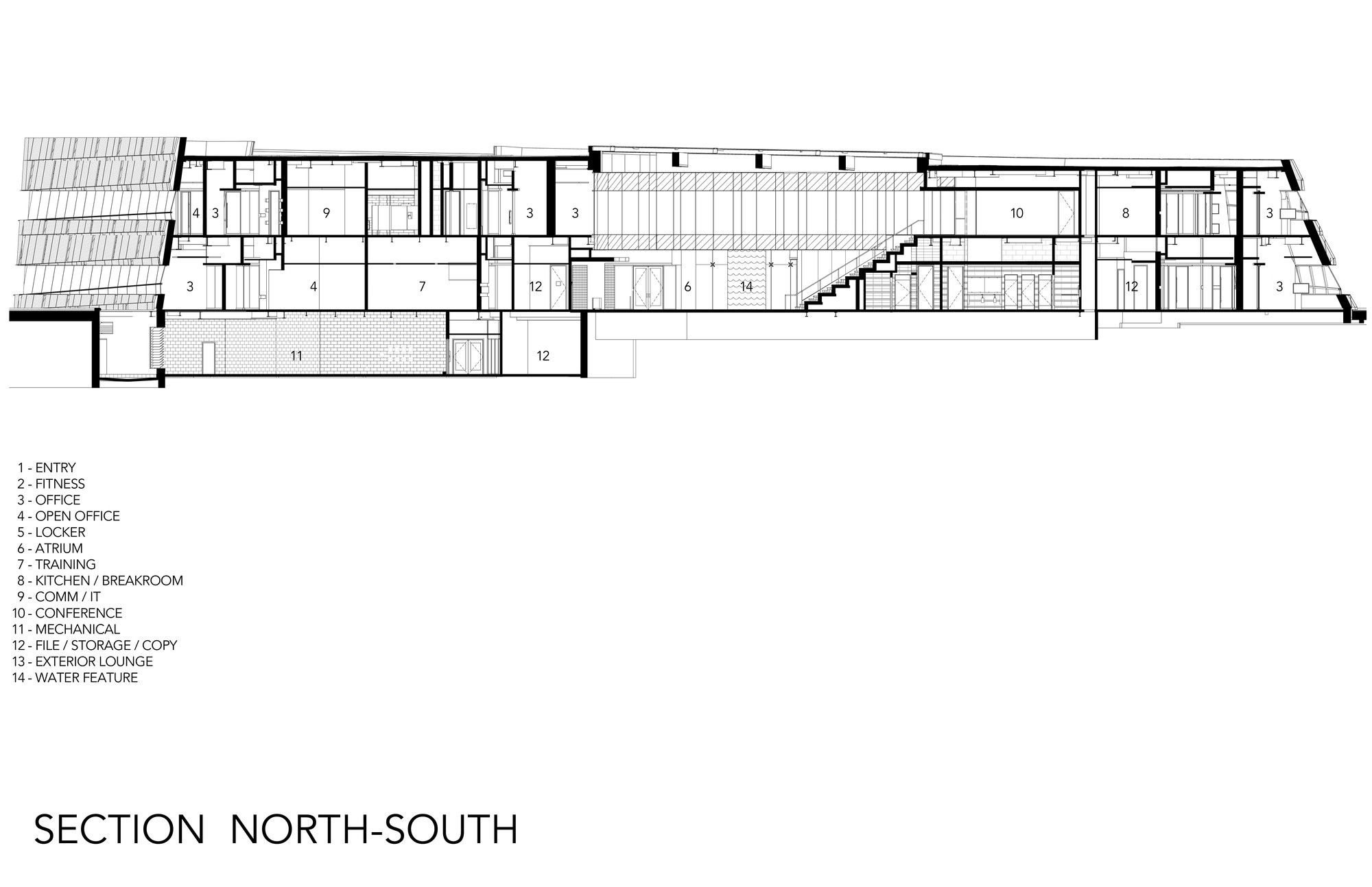
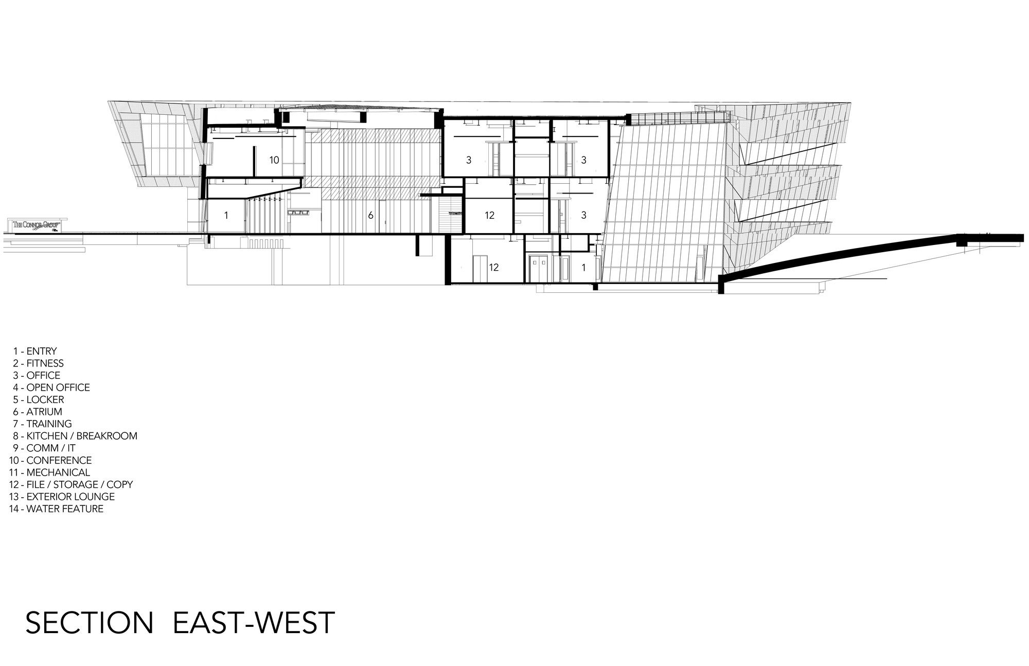
The atrium itself is the heart of the building. A circulation space around the perimeter allows offices, workspaces and conference rooms to be double loaded around this space. The notion of collaboration and visibility is reinforced heavily by the floor-to-ceiling glass that these spaces utilize to create an inner “collaborative” skin around the interior voided space. Visual communication across and throughput is maximized. A large skylight over the atrium uses new electrochromic glass technology to control heat gain while bathing the entire center with abundant sunshine. Optimal day-lighting and views are everywhere. Bamboo floors are used throughout, and the use of this material in the centerfolds up into a large, collaborative amphitheater-style seating stair that connects to a glass conference room on the second floor. There is also a water feature flowing near the reception desk that draws the theme of reflection and movement toward the inside of the building.
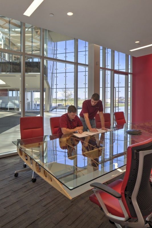
The furniture in the building also reinforces the aviation theme. Three conference tables have been fashioned from salvaged wings of airplanes. New and modern technology abounds; some for functional operation and some for sustainability initiatives. Liquid crystal privacy glass is used in several spaces. Taken as a whole, the dynamic complex showcases the forward-thinking culture of the company; one that is dynamic, rising and on the move, much like the building itself.
Sustainable Design Intent and Innovation:
The Managing Partner stated early in the design process that; “We want it to be a place that makes people excited to come to work.” This vision for a higher level of collaboration to increase innovation focused sustainable design strategies on indoor environmental quality issues. Even energy and water use reduction strategies inherently supported the creation of high-quality interior spaces.
As the focus of the interior space, the atrium skylight allows daylight to penetrate deep into the building but was also a concern for solar heat gain and glare. Static solutions were studied to mitigate these issues but the desire for a clean, simple skylight structure along with unobstructed views out led to the use of electrochromic technology in the skylight. The glass system switches from clear to several tint levels based on the amount of sunlight, allowing the interior ambient light levels to adjust with the exterior conditions. This provides a comfortable space regardless of the time or activity, while also reducing the heating load. The electrochromic technology is also used on the two-story, south-facing, curtain wall, and on the west-facing conference room on the second floor. This eliminates the need for interior or exterior shading, thus keeping the clean lines desired on the facade while reducing solar heat gain loads and glare on the interior.
The triangulated “public” skin provides integral sun shading “shelves” that are most effective on the longer south façade of the building, especially during the summer. The vertical metal “wrap” on the west-facing bar provides shading for the lower angle west sun. This strategy keeps the building visually clean of any perceived “added” shading devices; the architecture and the sustainable design response become truly integrated.
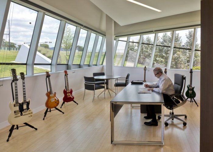
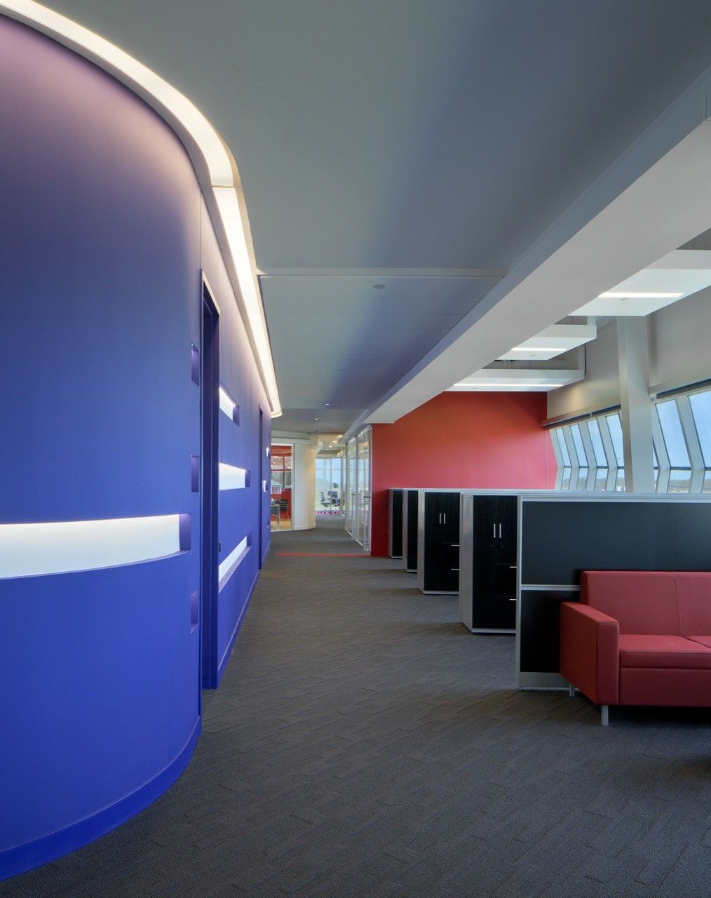
The double-loaded, shallow office bars ensure all employees are within easy access to daylight, views and the enhanced collaborative atrium environment. The interior space and program organization encourages movement and communication thru this simple layout. Coupled with bright interior finishes the intertwined, light-filled spaces provide the optimum work environment.
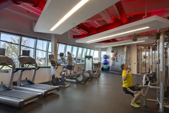
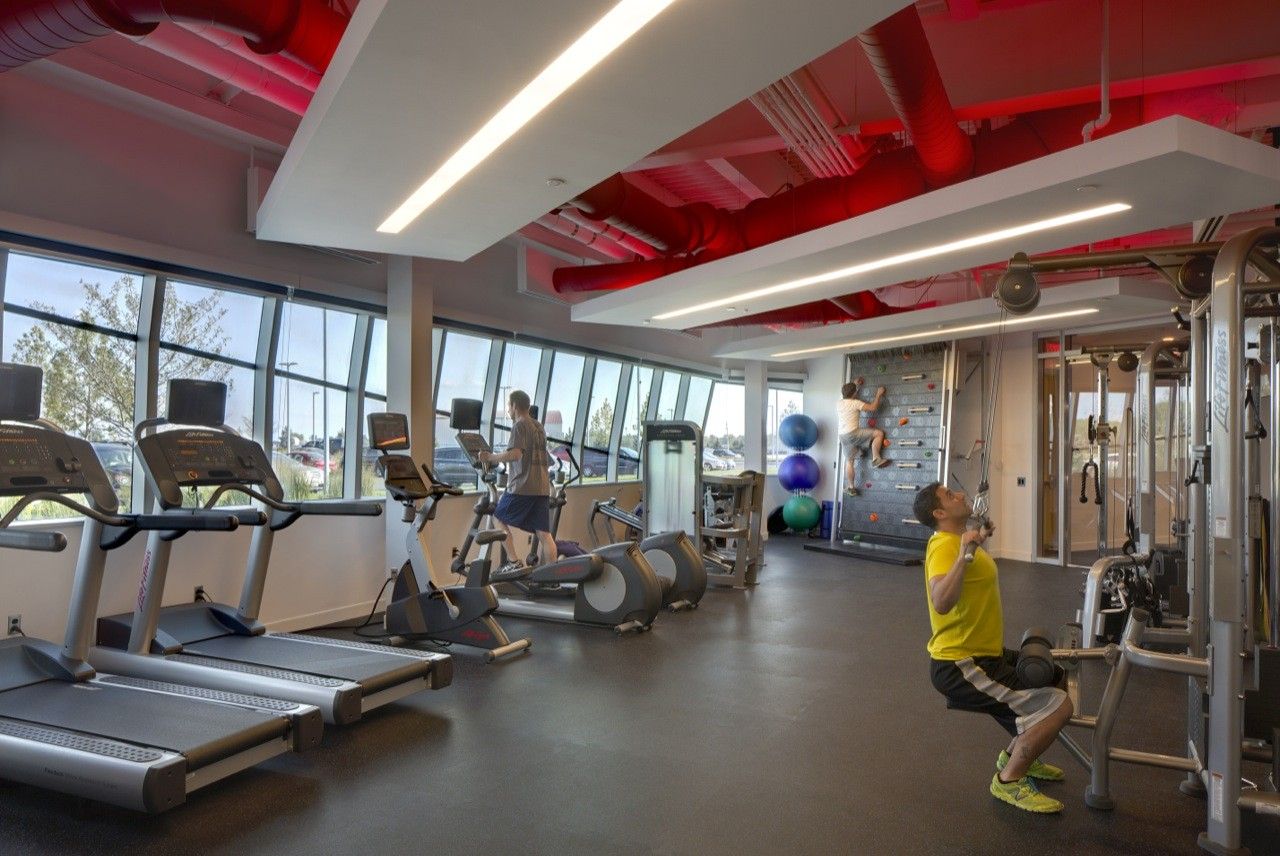
A fitness center is provided which is one piece of the live-work lifestyle envisioned for this project. The fitness space is located on the main level just off the atrium which allows views to the exterior while emphasizing the importance of health and wellness. This is a welcome change from the traditional fitness space located in an out of the way area of a building. Showers are available inside the facility, providing workers the ability to use the fitness room, ride a bike to work or get a jog in on the 10-acre site and be able to be fresh and rejuvenated for work.
Project Info:
Architects: Moody Nolan
Location: Centerville, OH, USA
Area: 39000.0 ft2
Project Year: 2014
Photographs: Brad Feinknopf
Manufacturers: Alucobond
Project Name: Corporate Headquarters
photography by © Brad Feinknopf
photography by © Brad Feinknopf
photography by © Brad Feinknopf
photography by © Brad Feinknopf
photography by © Brad Feinknopf
photography by © Brad Feinknopf
photography by © Brad Feinknopf
photography by © Brad Feinknopf
photography by © Brad Feinknopf
photography by © Brad Feinknopf
photography by © Brad Feinknopf
photography by © Brad Feinknopf
photography by © Brad Feinknopf
photography by © Brad Feinknopf
photography by © Brad Feinknopf
photography by © Brad Feinknopf
photography by © Brad Feinknopf
photography by © Brad Feinknopf
Site Plan
Floor Plan
Floor Plan
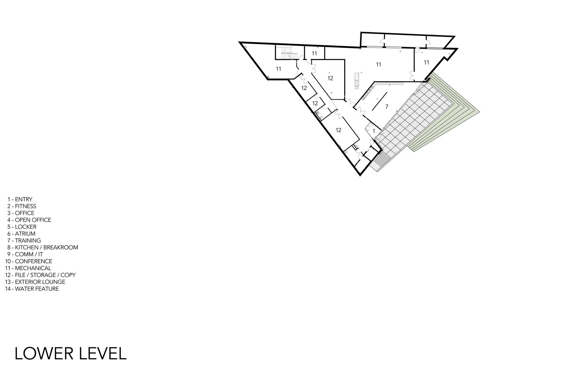
Floor Plan
Section
Section North South
Section East West
North Elevation
South East Elevation
West Elevation
Diagram
Detail
Model


