The Cultural and University Centre designed by Eva Jiricna Architects and A.I Design s.r.o. and located in the town of Zlin in the Czech Republic, is an example of well designed, well implemented architecture in spite of a strict budget. Located on a site previously occupied by adult ‘schools’ set up by the town’s founder Tomas Bata, the buildings seek to offer a contemporary re-imagining of the since collapsed buildings’ iconic ‘y-orientation’. This layout is important because of what it creates. Located just a few steps away from the town’s main factories, the Y shape created a public gathering space for people to meet and converse before and after events.
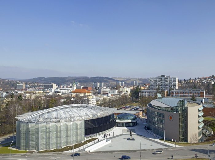
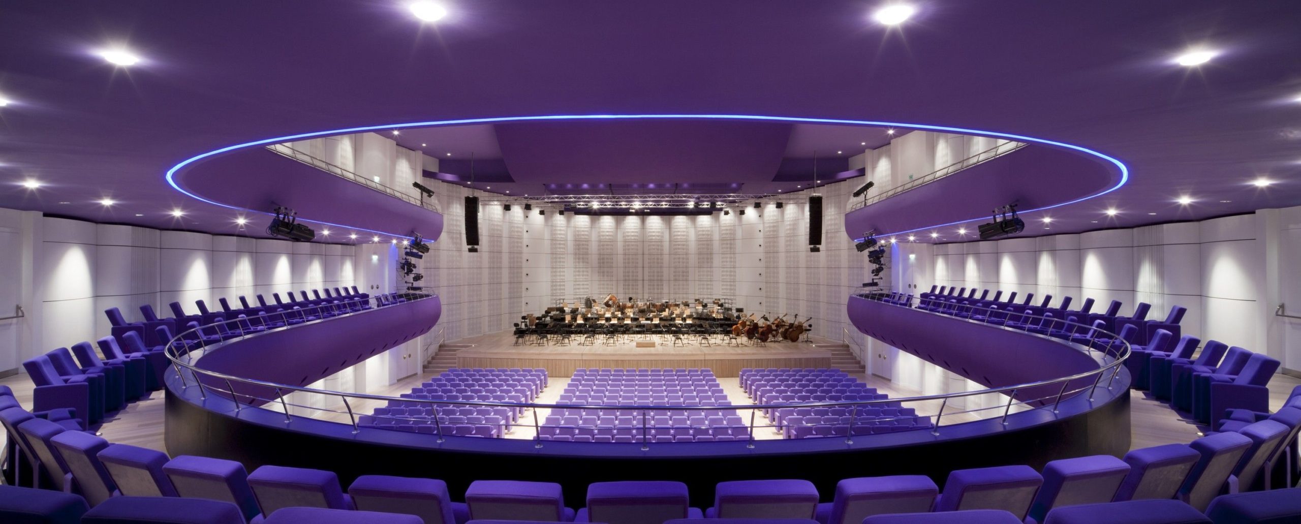
This move has been maintained, yet altered slightly to the form of a ‘V’ in the new complex, with the auditorium ‘meeting’ the library at a well sized public plaza featuring a statue of the first Czechoslovakian President. The Centre features a diverse program with a concert hall & theatre, conference centre, home for the administration of the Philharmonic Orchestra, the Centre’s own offices, rehearsal and recording studios, exhibition spaces, and bars. The Main Hall and conference centre each accommodate roughly 900 people with the capability of accommodating nearly 1100 for balls and other functions by sliding all the central seats under the stage.

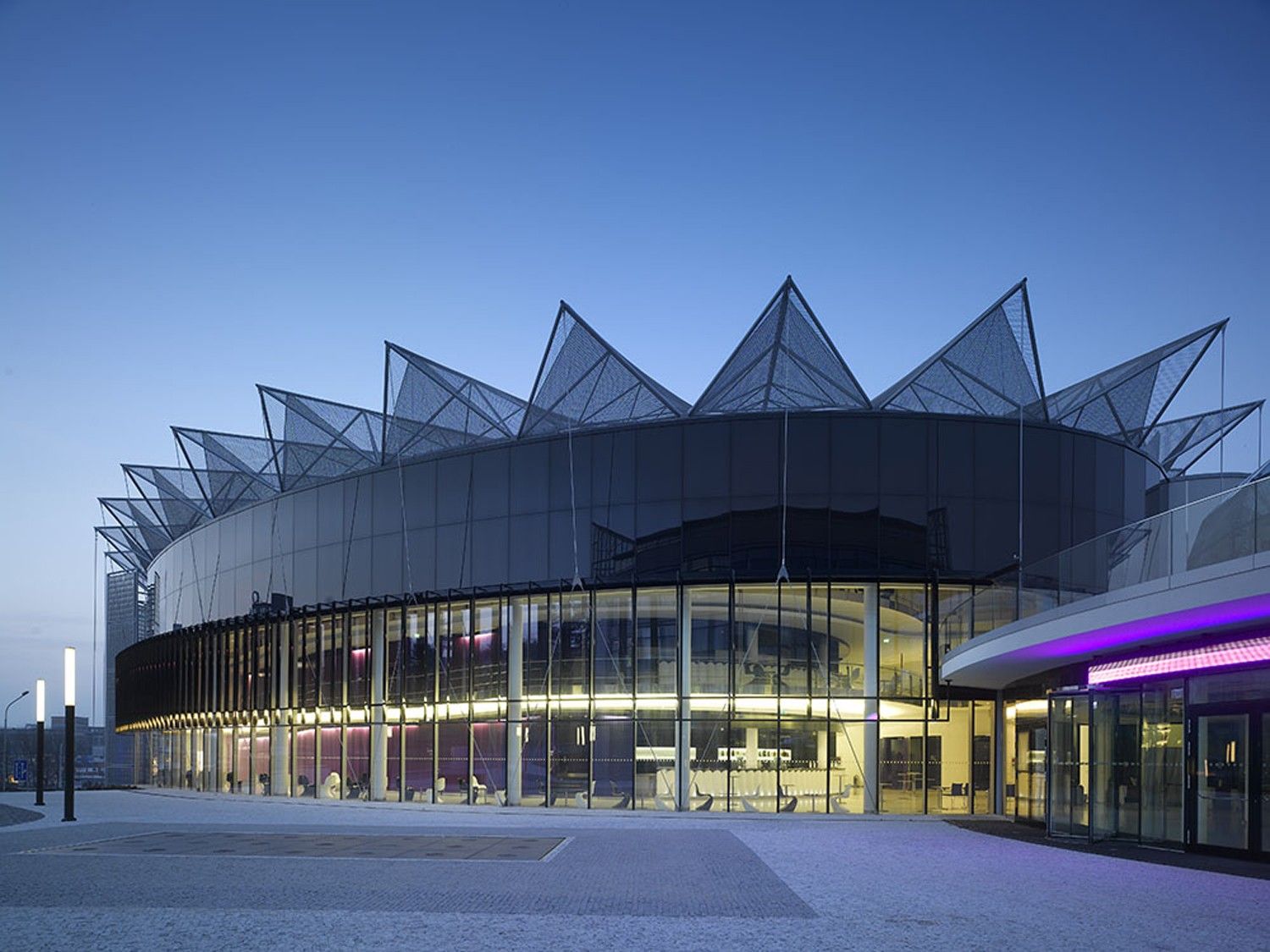
The auditorium required special attention due to the site’s proximity to a major intersection. Sound and visual isolation were musts. Thus, several protective rings encircle the Main Hall, including a circulation ring. Offices and rehearsal studios add to the isolation, with a final round being laid on by the building’s facade. The acoustics of this elliptical spaces are improved by the use of convex, louvered cast concrete panels, which have proved an effective solution.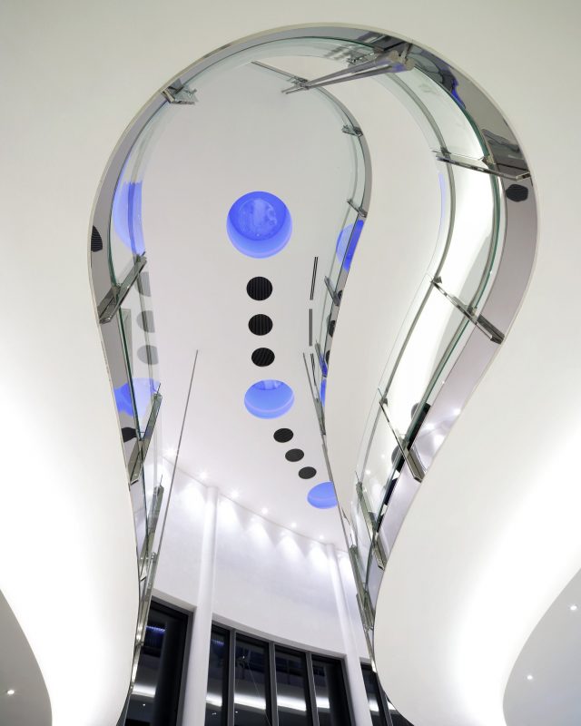
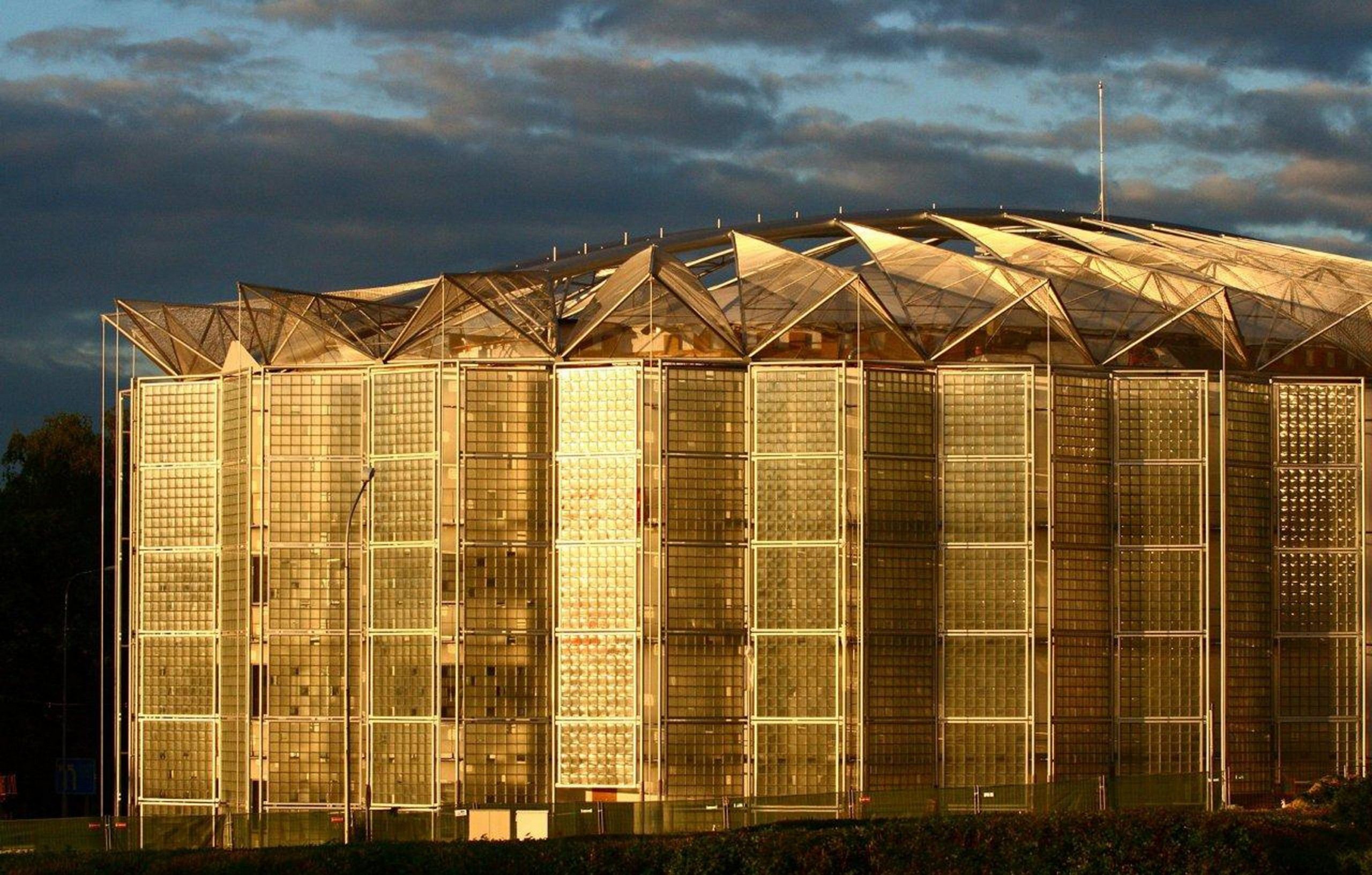
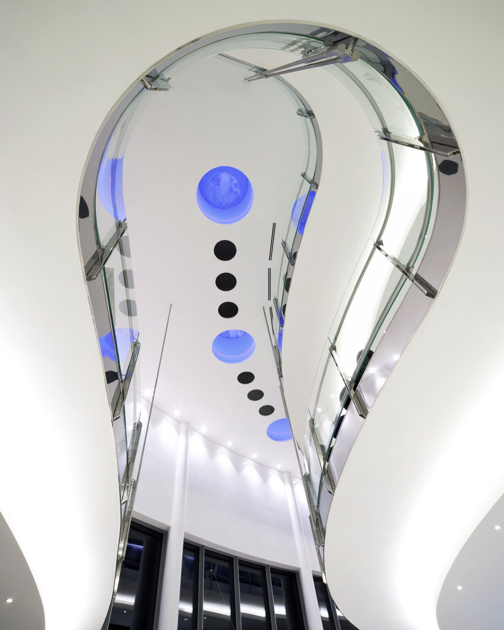
Where the two buildings come together, a connecting ‘bubble’ housing a public restaurant shared by both, acts as a unifier. The two are also visually unified by the formal similarities they share. Rectilinearity has been shirked in exchange for subtly curved elliptical forms. Their roofs are actually major players in the design due to the buildings’ location. Set at the very central bottom of a valley, they are visible to surrounding structures and therefore impact how the complex as a whole reads. Rather than leaving necessary rooftop services such as HVAC facilities, smoke outlets, etc… visible, a perforated metal skin unifies the external envelope with the roof, following a subtle, bulbous curve similar to the facades.

Courtesy of Eva Jiricna Architects + A.I Design s.r.o.

