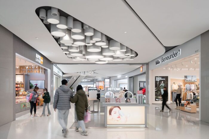
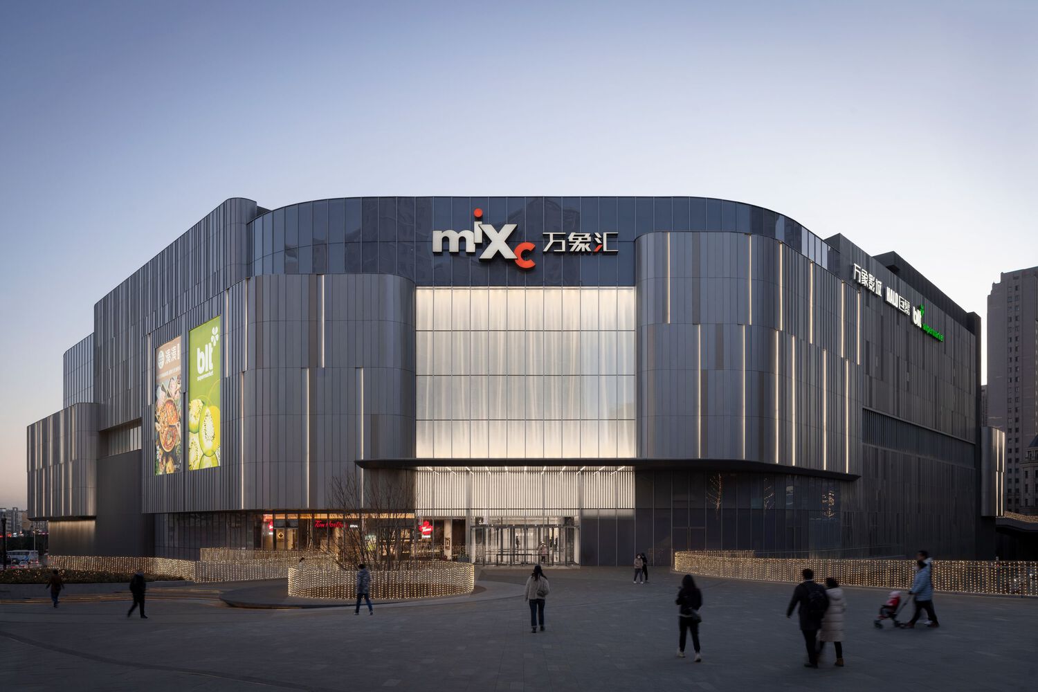
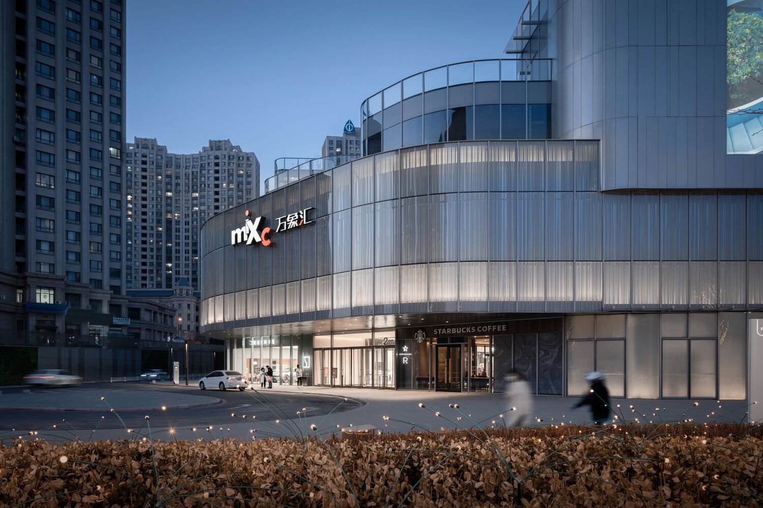
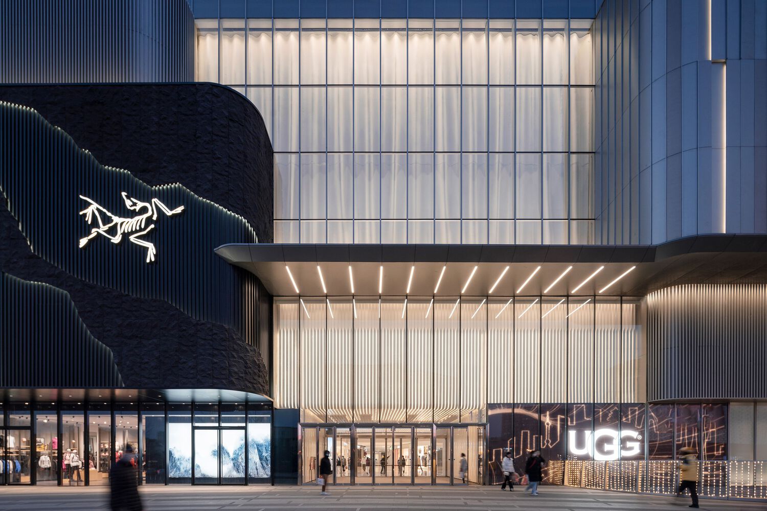
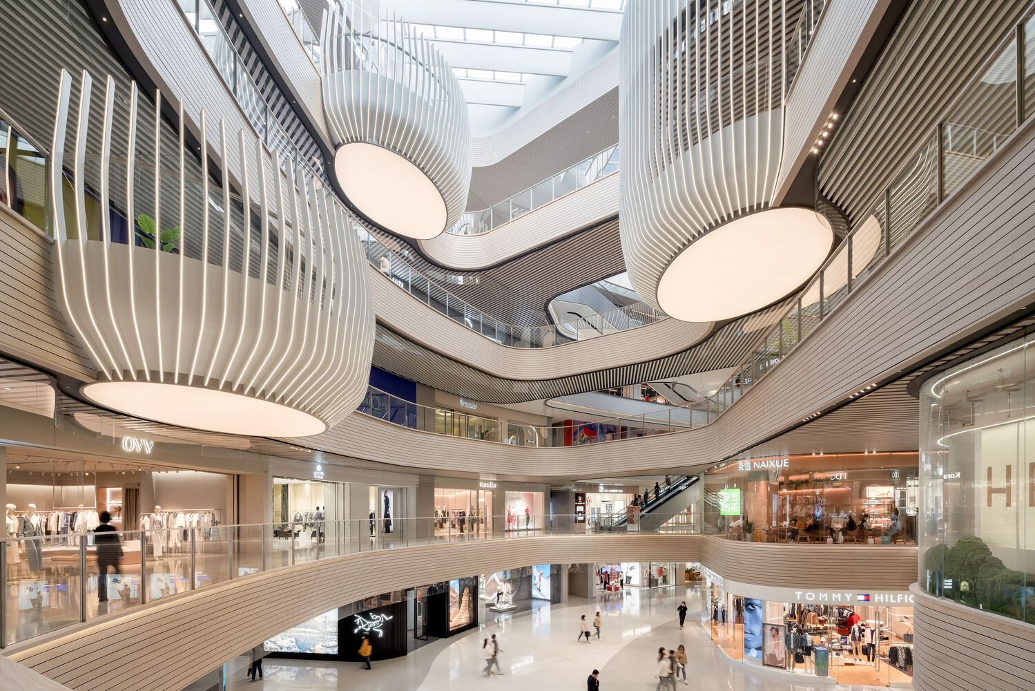
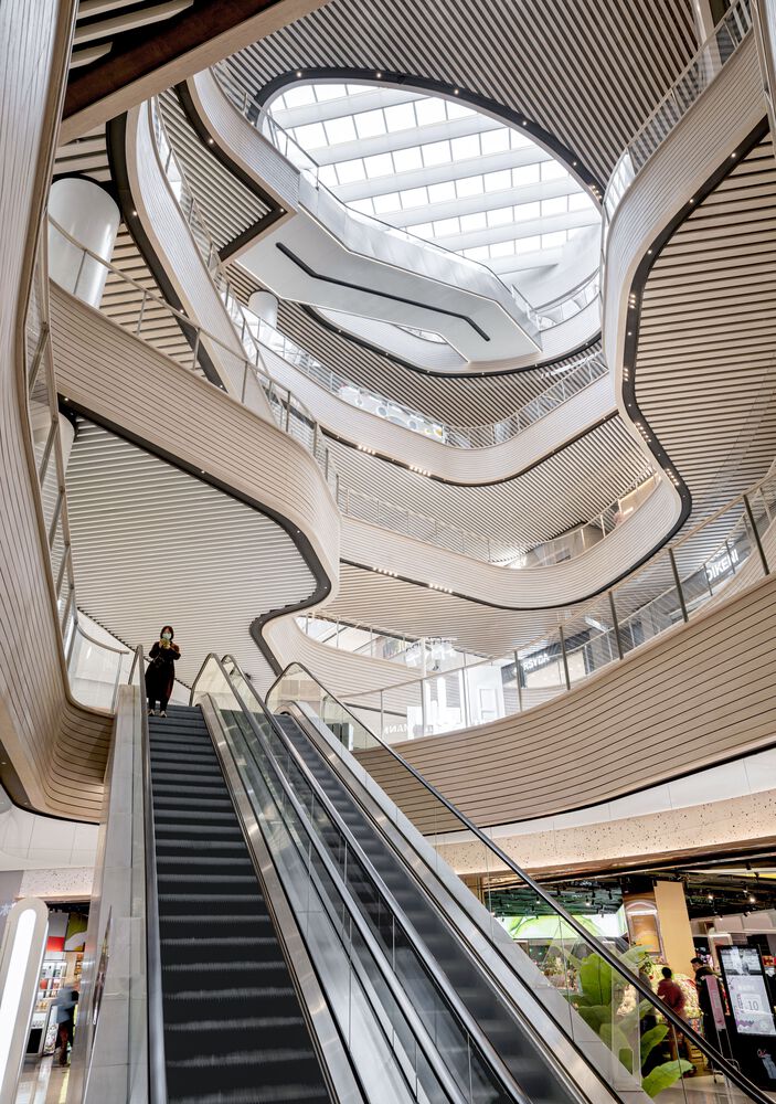
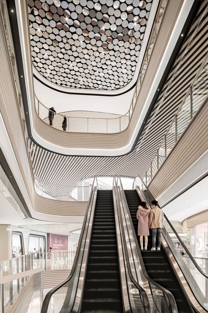
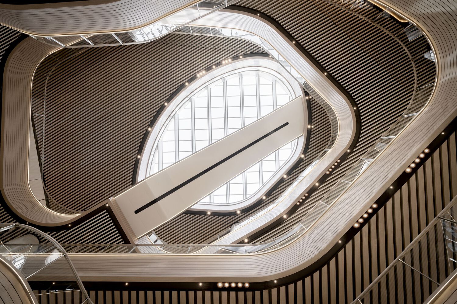
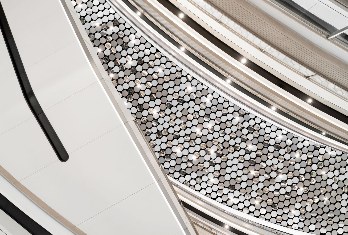
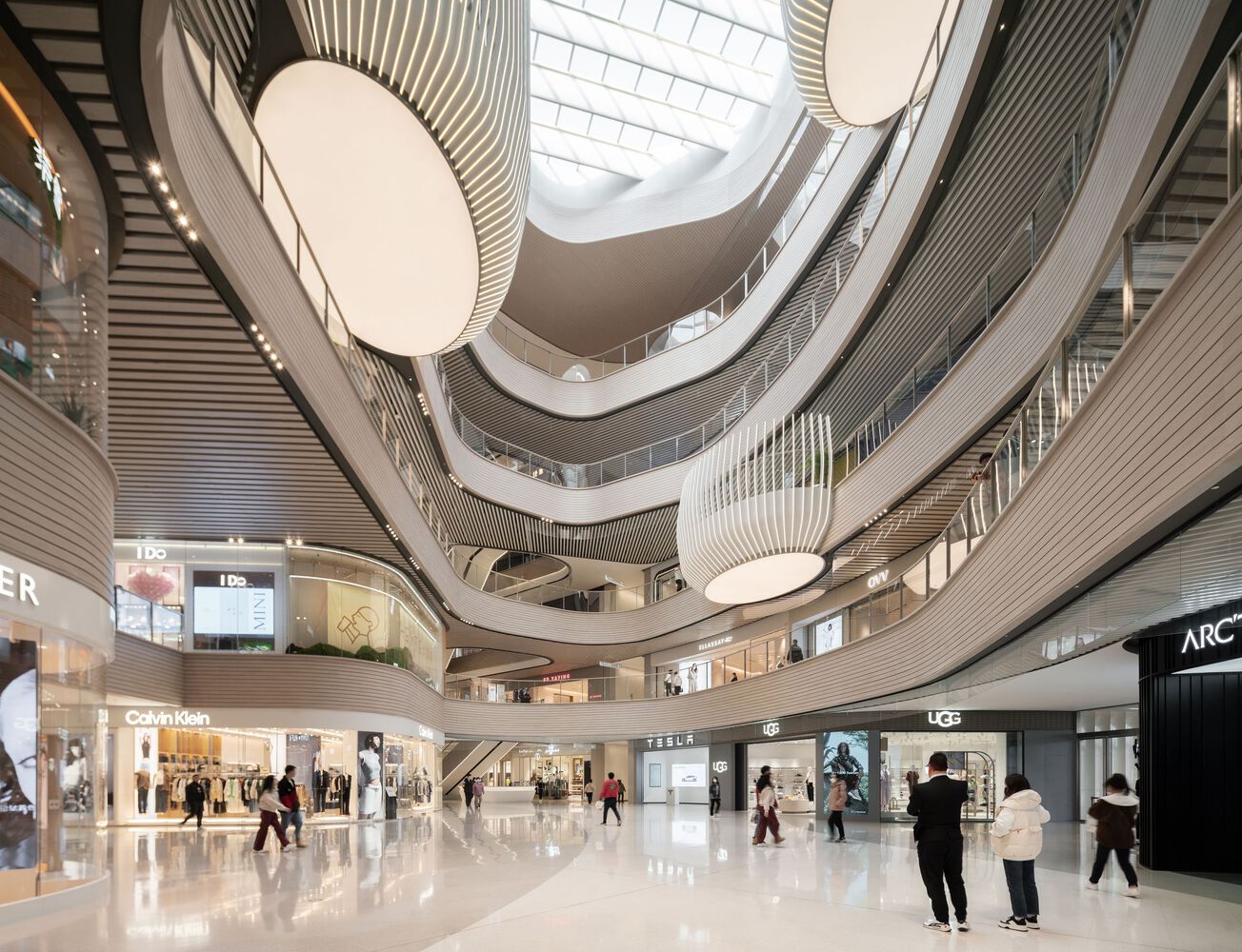
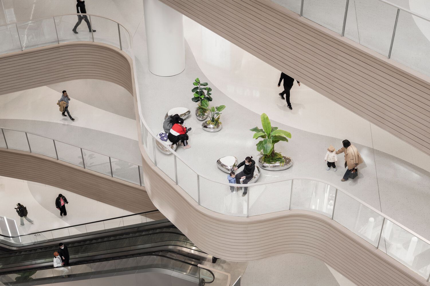
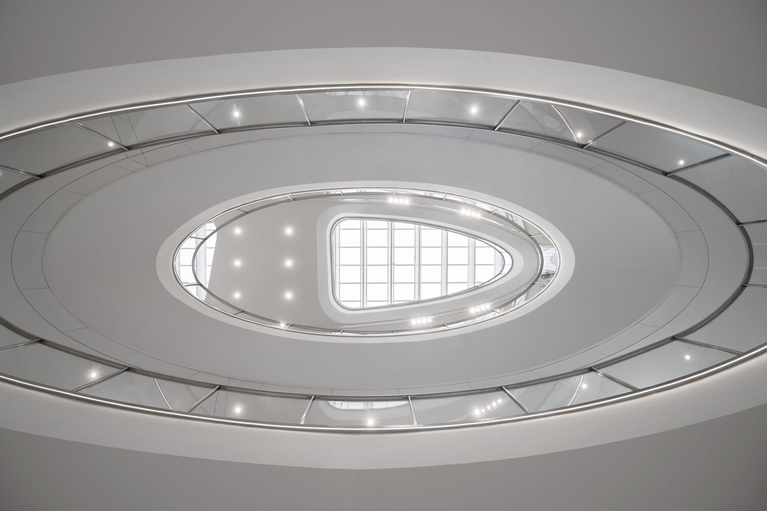
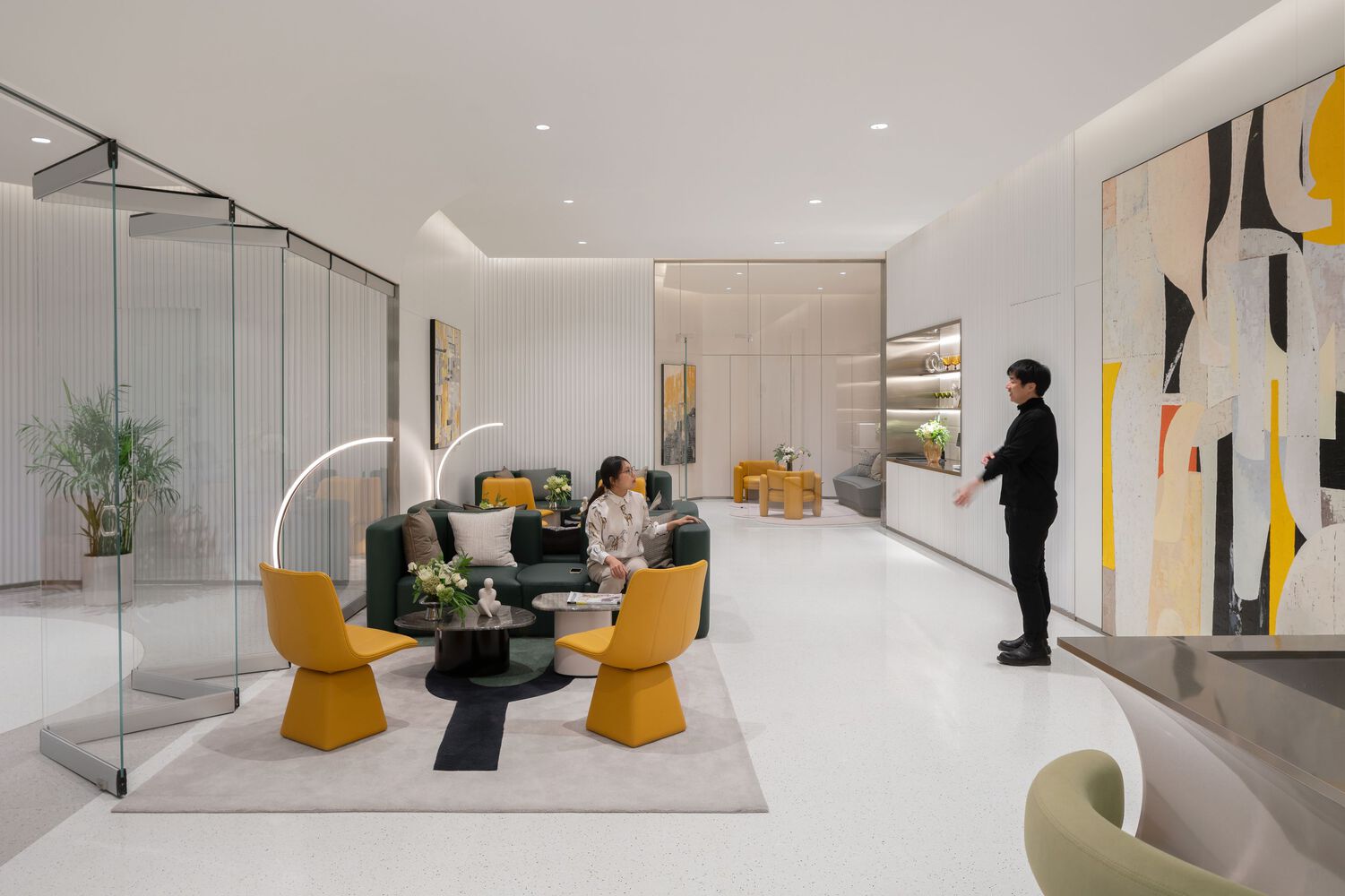
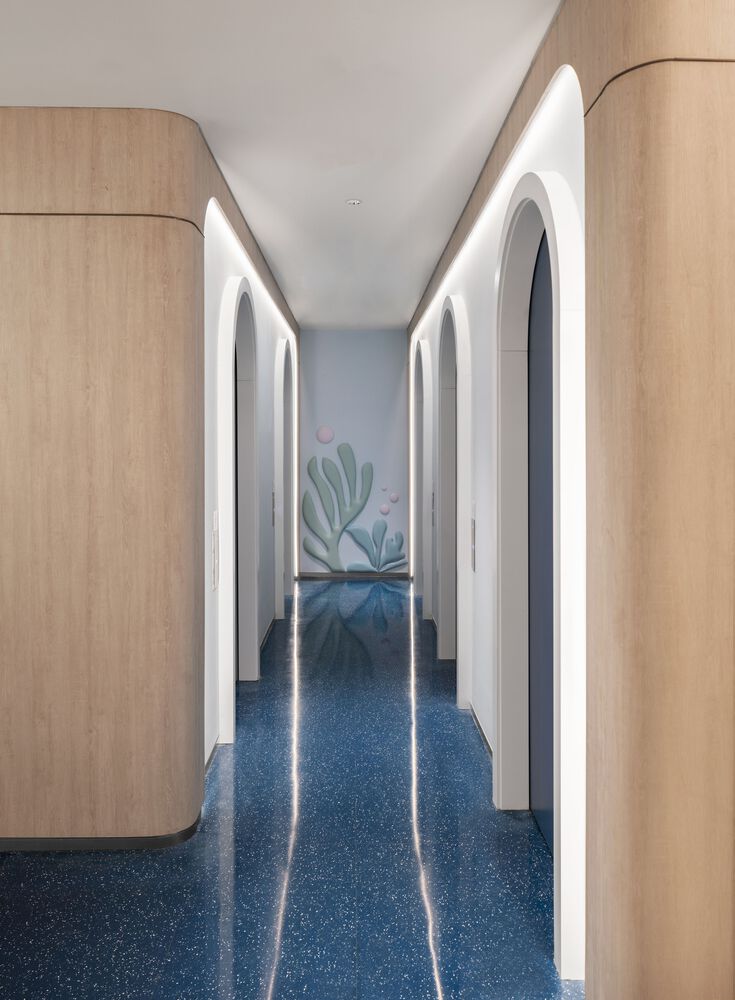
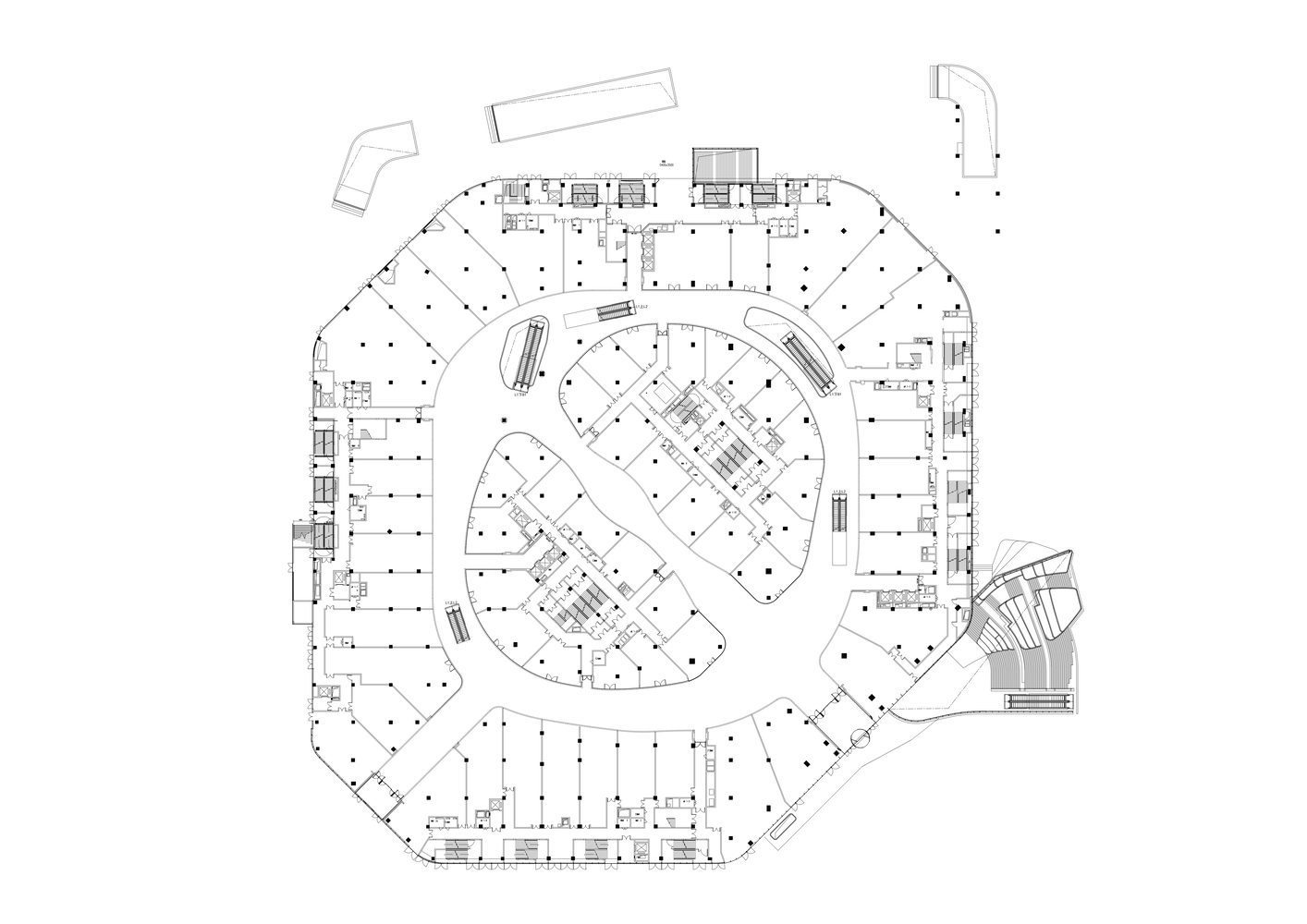
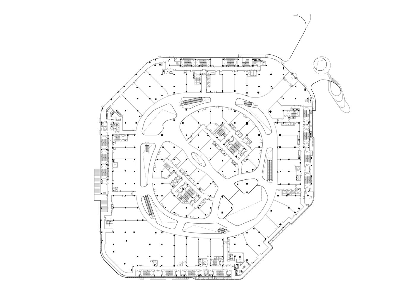
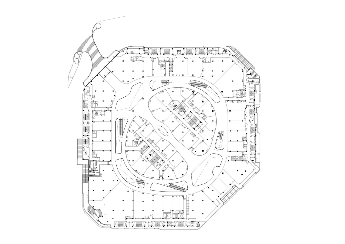
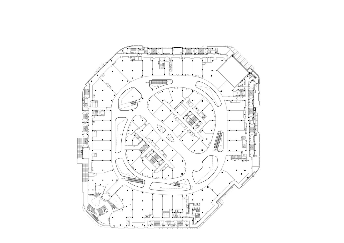
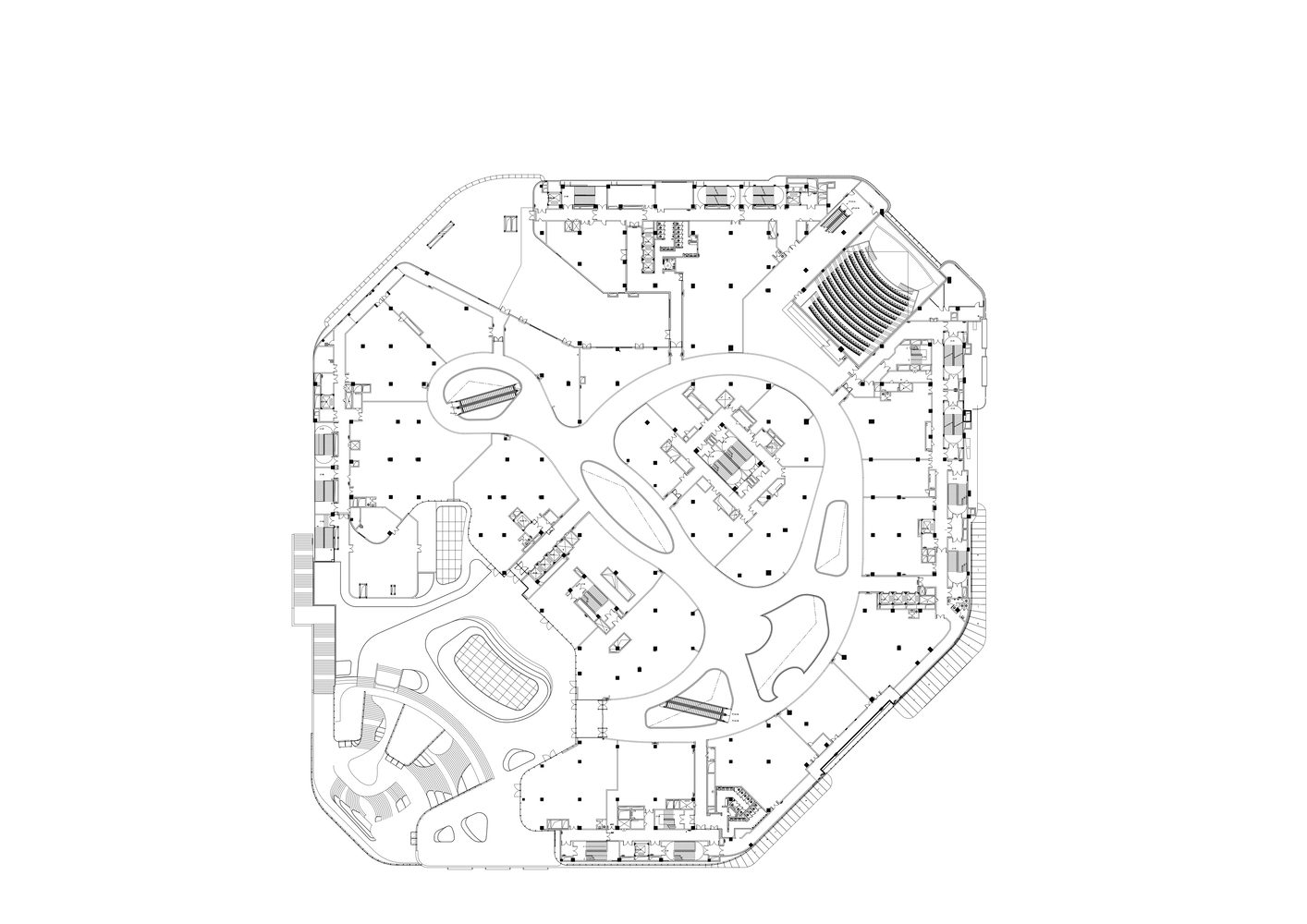
The MixC One Mall, created for project developer CR Land, is in Dalian, a port city on the Bohai Gulf widely considered the romantic city of north-east China. The characteristic coastal landscape of the region, an identifying feature for the local population, became the leitmotif of the design. The 84,000 m² mall contains more than 260 stores and combines a superlative shopping experience with the concept of a social hub consistently developed around the user’s perspective. Among the mall’s visual highlights are its impressively large atrium voids that are flooded with natural light thanks to generous skylights. The individual levels are modeled in a variety of organic shapes around a central air space. The atriums are thus stacked and staggered upon each other, resembling the irregular projections of a rocky island. At the same time, visual relationships are created between the galleries on the different vertical levels, arousing curiosity and encouraging visitors to explore the space. Overall, the mall appears as a large-scale sculptural space that is clear and uncluttered, yet full of surprises.
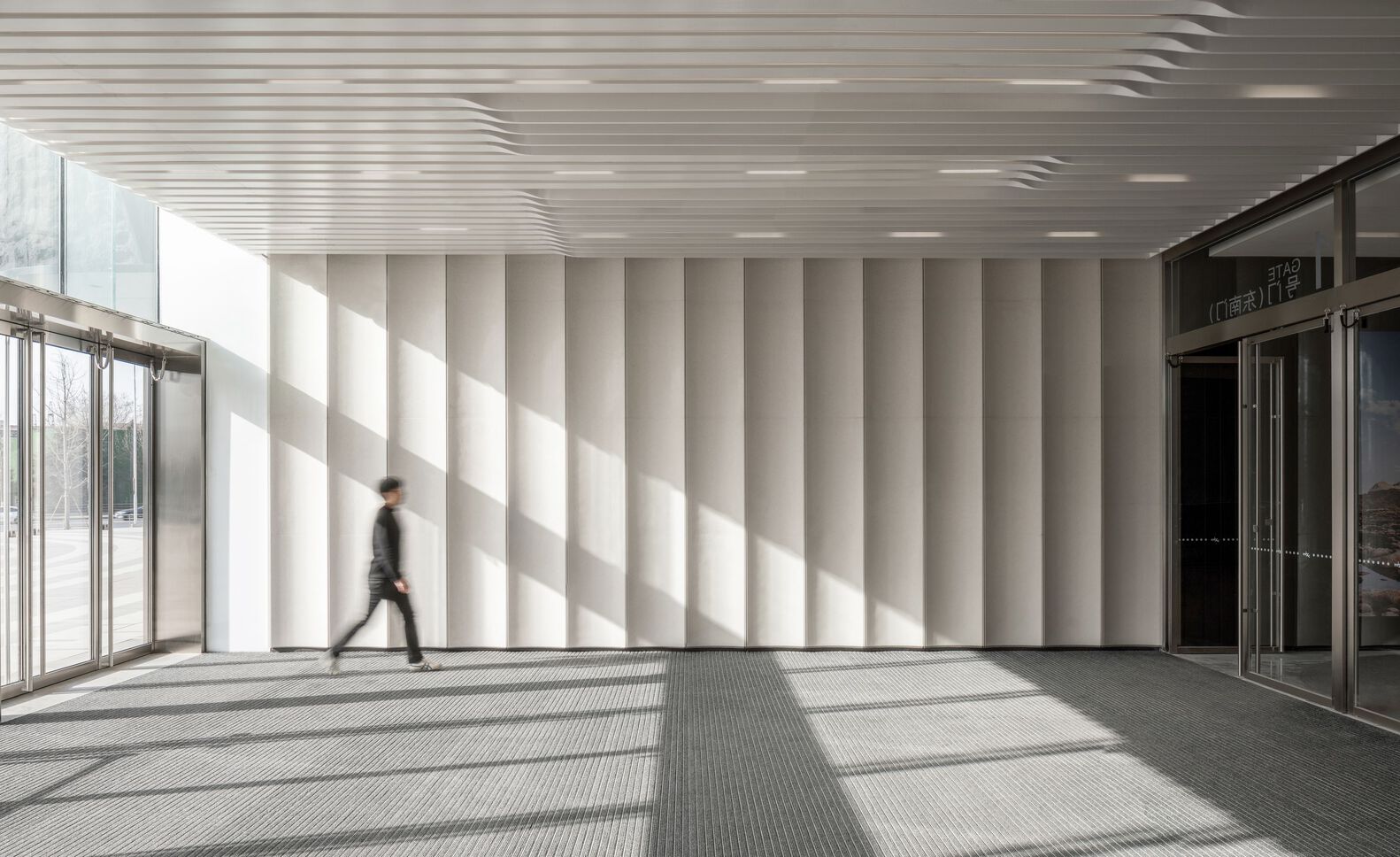
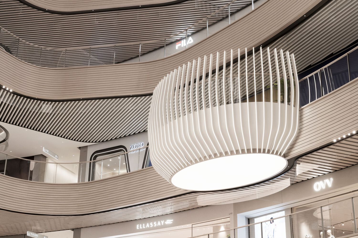
The atmosphere inside the mall is as relaxed as taking a gentle meander along the beach. The material concept evokes maritime associations with pale-colored slats dominating the walls and ceilings. They are reminiscent of driftwood weathered by the sun, pontoons leading out into the water, or perhaps the hull of a fishing boat. The ceiling lamellae vary in width and are aligned at different angles: They differentiate the levels and create dynamic shifts of direction that alternate with the viewer’s shifting perspective. The wooden structures wrap around the jutting balconies like skin: powerful, delicate, organic, and controlled at the same time.
Despite the size and expanse of the spaces, this execution engenders a feeling of security. Visual focal points, stringent spatial differentiation, and clear, intuitive user guidance make it easy for visitors to find their way around and render the mall highly recognizable. Large atriums as impressive and complex stages alternate with passage-like galleries, creating an exciting and memorable sequence. This rhythm is further supported by the choice of materials and lighting. As a result, the size of the space is broken down to a human scale that visitors can assimilate. Together with the graphic wayfinding system, the shopping mall becomes an easily navigable space that invites visitors to return again and again.
Project Info:
-
Architects: Ippolito Fleitz Group
- Country: Dalian, China
- Area: 84000 m²
- Year: 2023


