De Walvis Offices Concept:
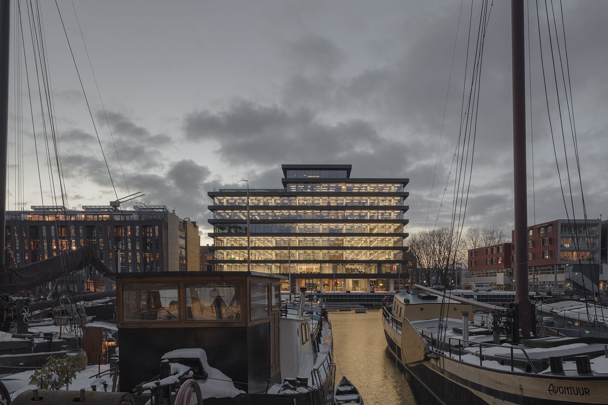
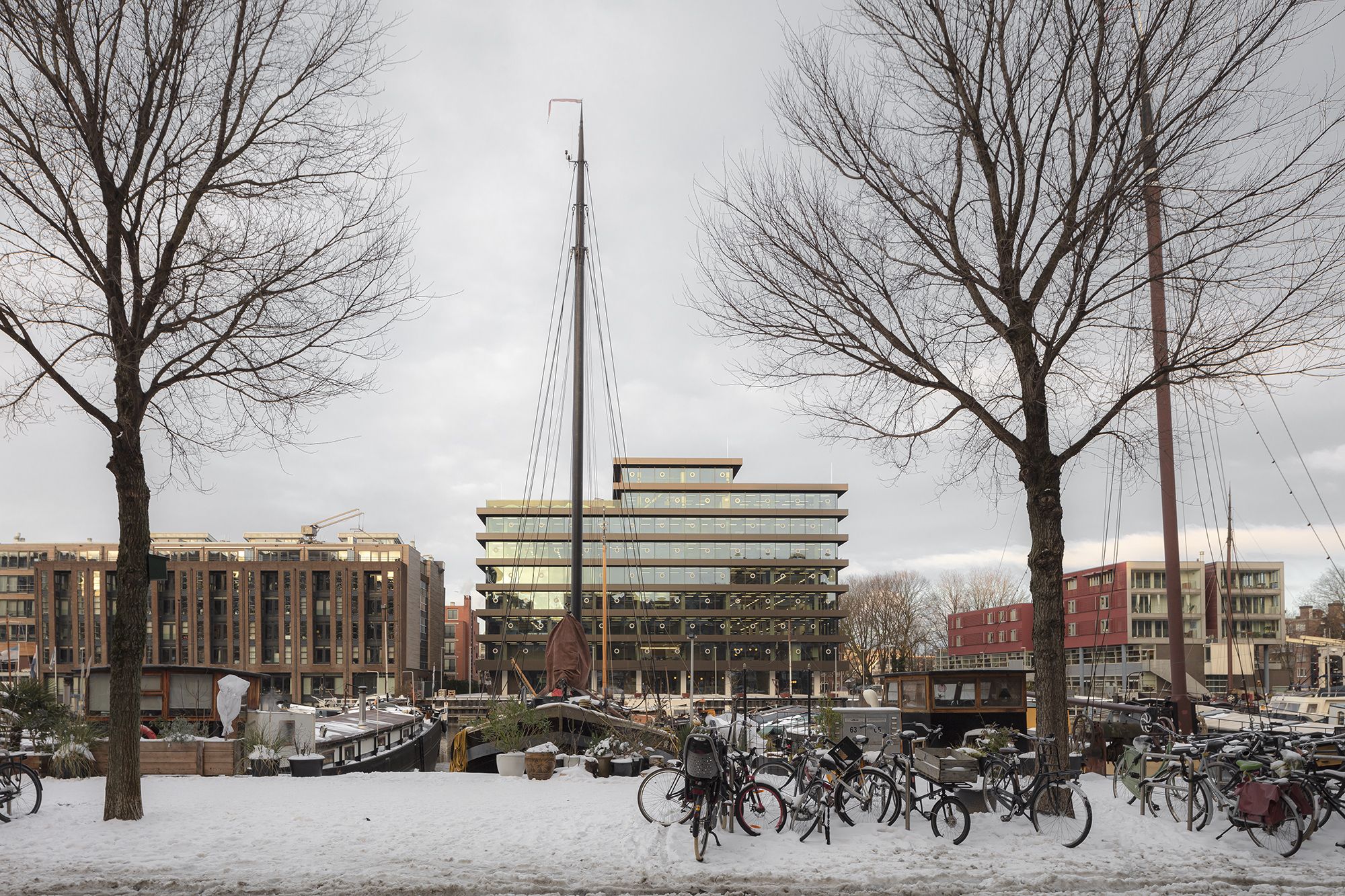
The office building De Walvis on Bickerseiland has been stripped down to its bones and completely revitalised by KAAN Architecten. The client Maarsen Groep requested a “hip and industrial feel” that would leave everyone in awe and fit with their envisaged future tenants from the advertising, media, and tech sector. Confident interventions in the structure have resulted in a sleek and elegant sculptural form.
De Walvis is a building with a history. It was part of Amsterdam’s urbanisation project of the early 1960s, forced upon local residents despite their protests. Property developer F.H.
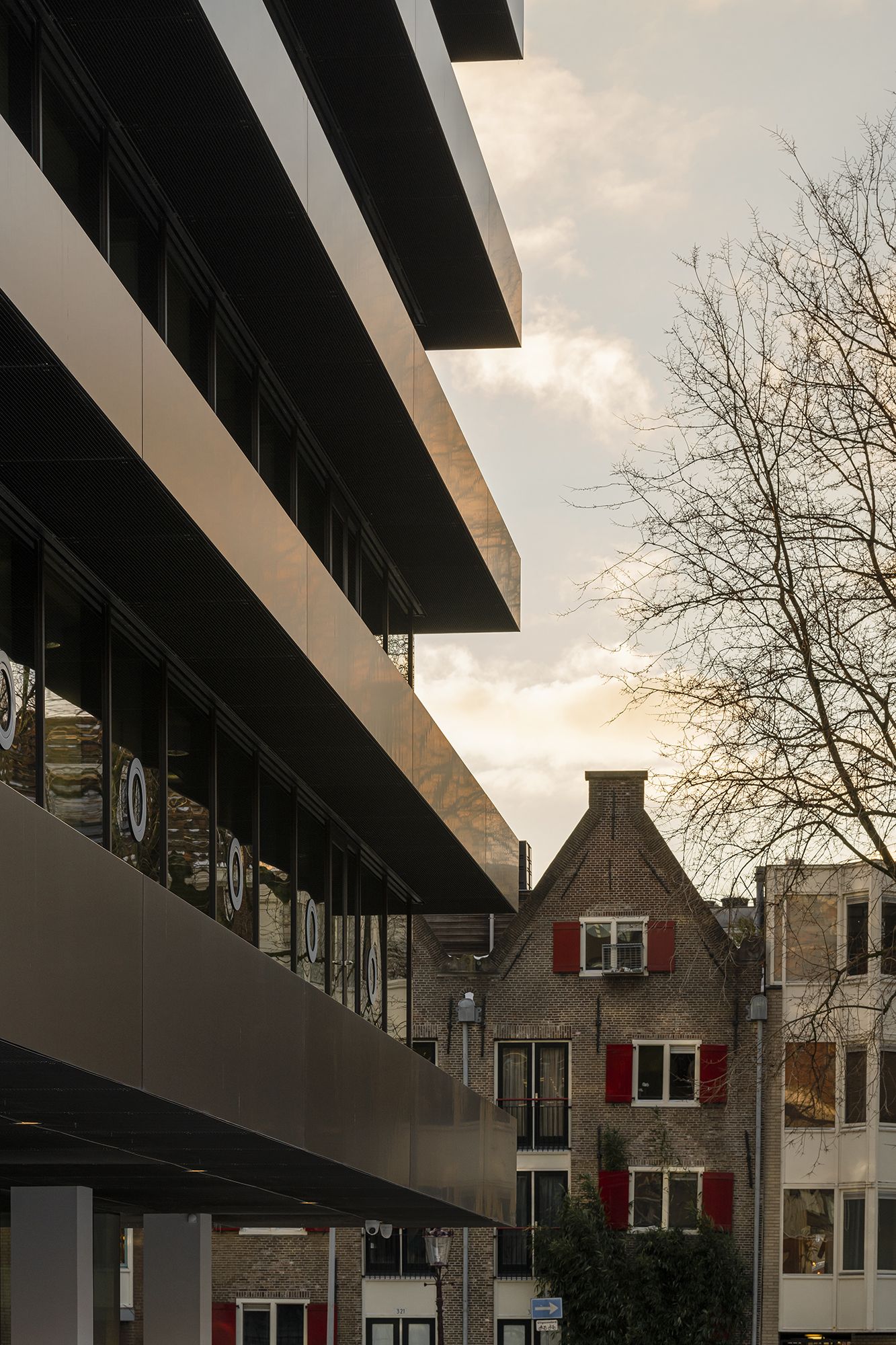
Gaus announced that Bickerseiland would become a Little Manhattan. Ultimately, this became a turning point in municipal planning policies, shifting from upscaling to a community-based building. The current architectural manifestation has turned the building from an intruder into a pleasant neighbour.
With circa 10,000 m2 gross floor area, De Walvis is a typical office building of the rationalist style that emerged in the 1950s-60s. It was designed by architect W.F. Lugthart (1921-1999), known mostly for his Diaconessenziekenhuis in Eindhoven, the first Dutch hospital built by ‘stacking floors’. The neighbourhood did not consider De Walvis – ‘The Whale’ in Dutch, named after the old shipyard nearby – an improvement architecturally and sooner saw it as a threat to their community.
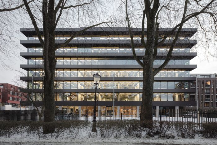
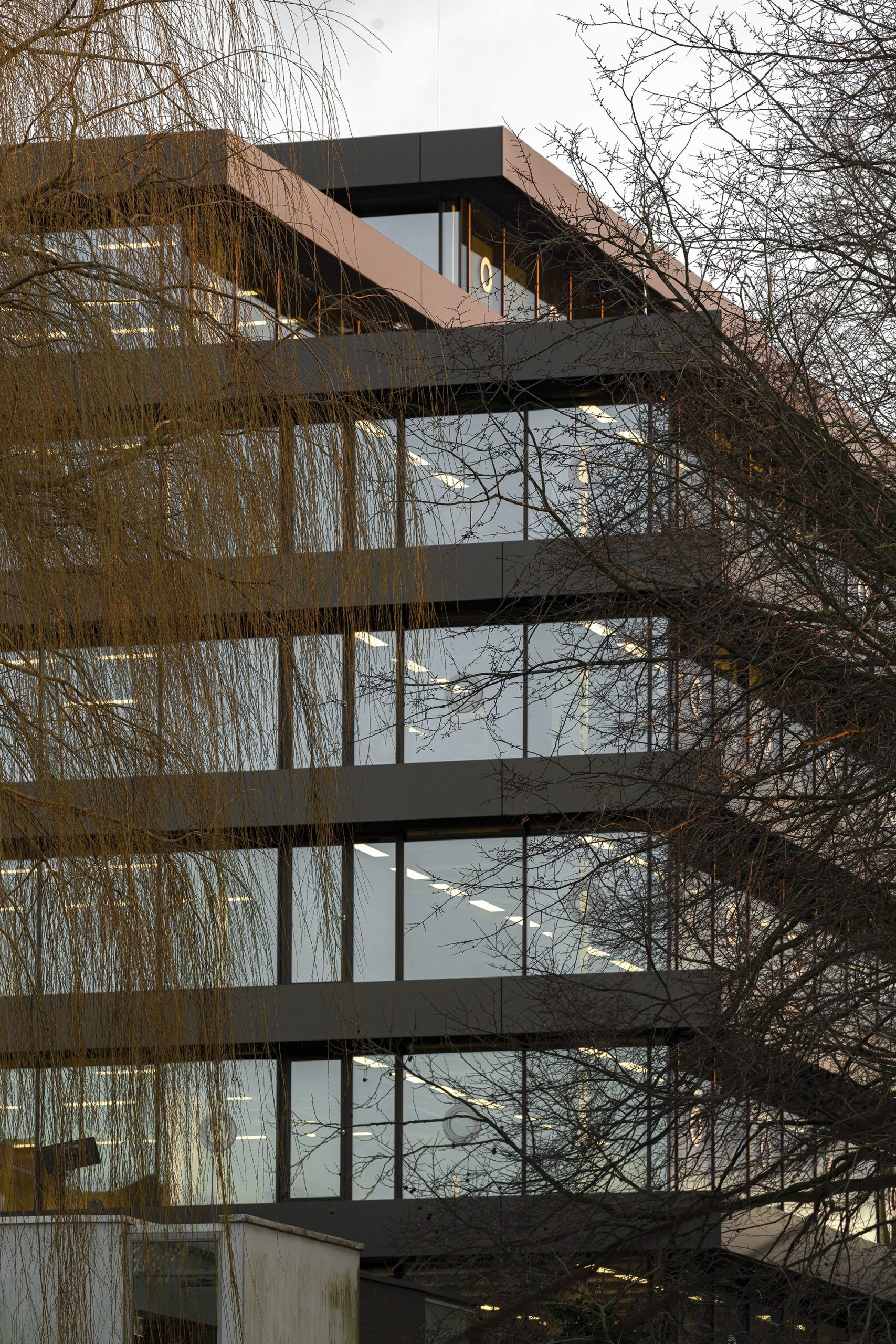
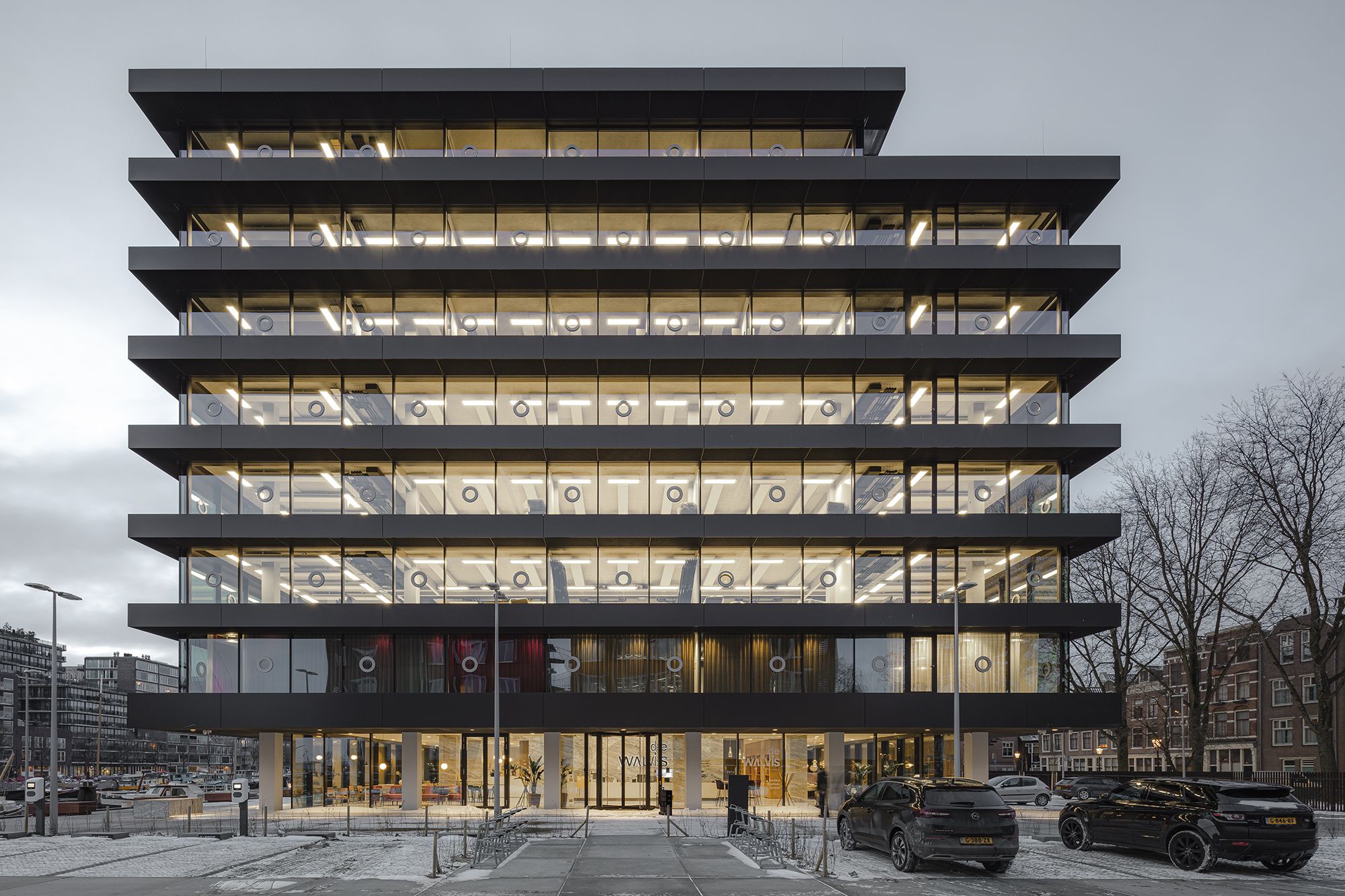
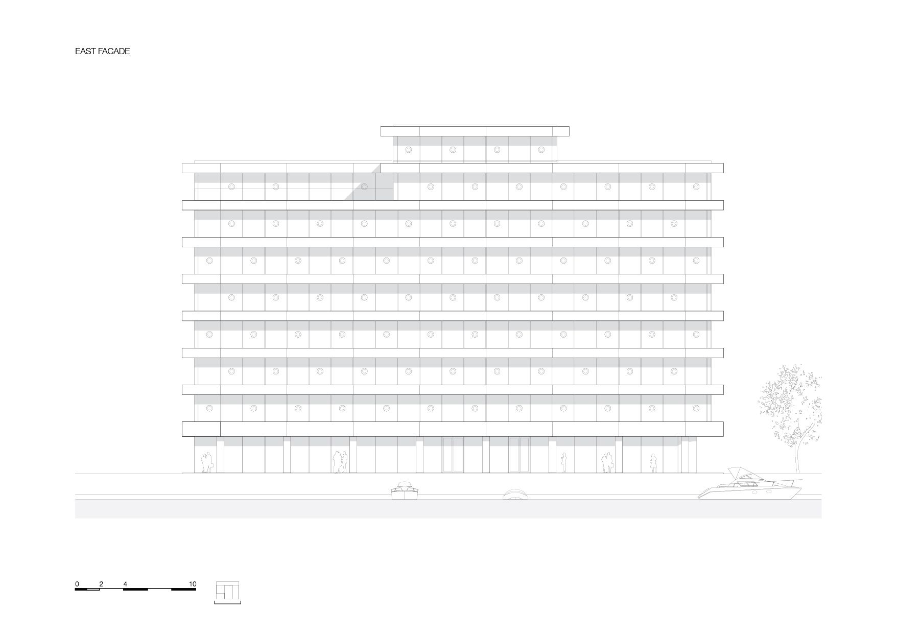
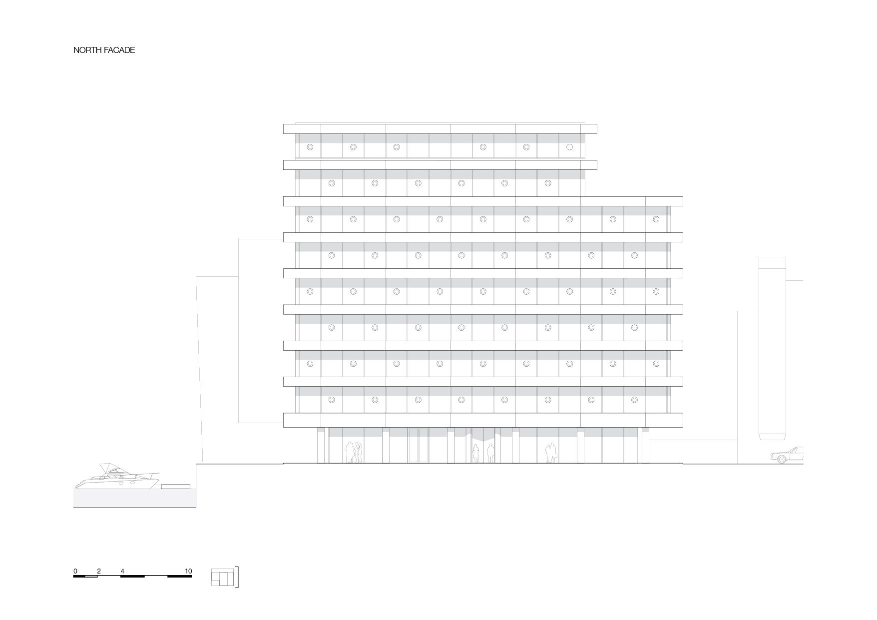
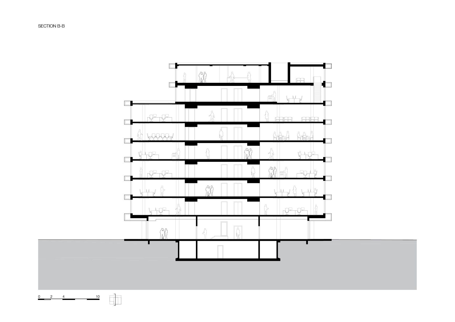
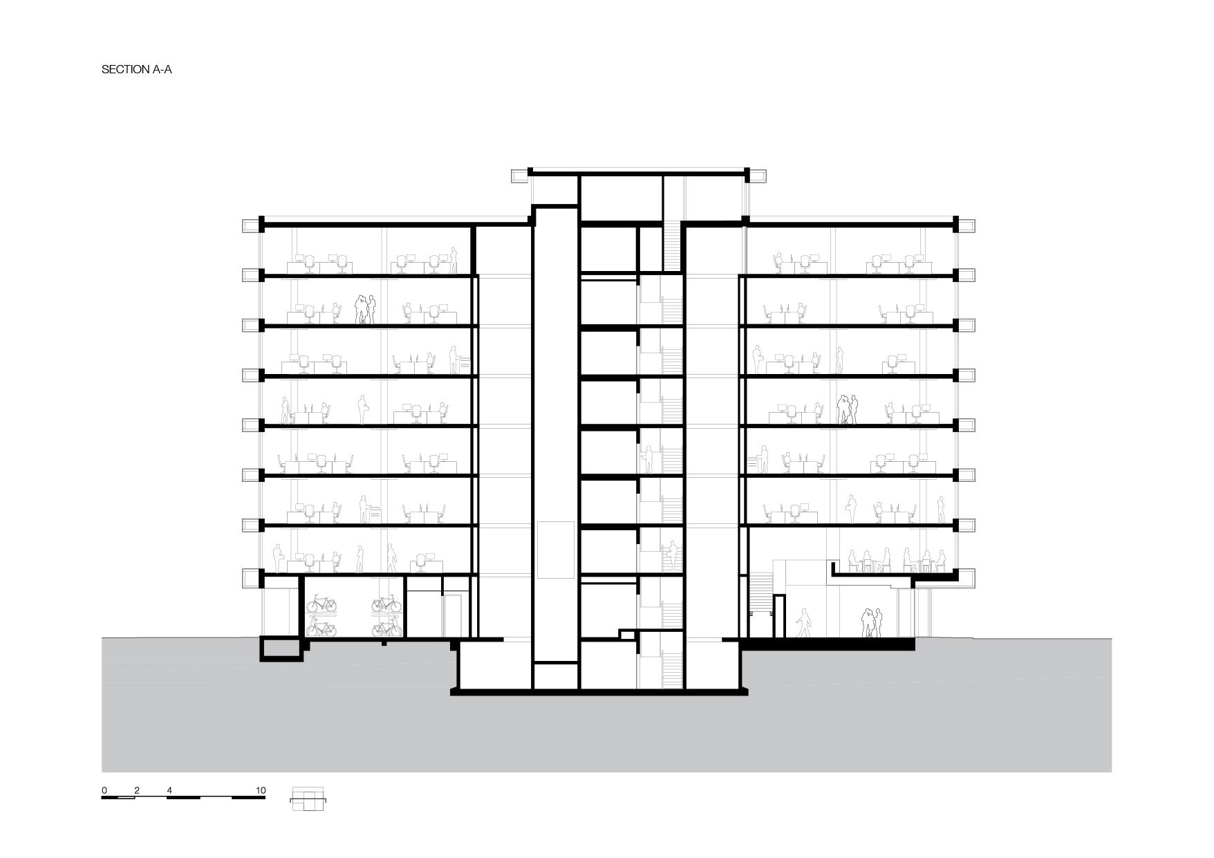
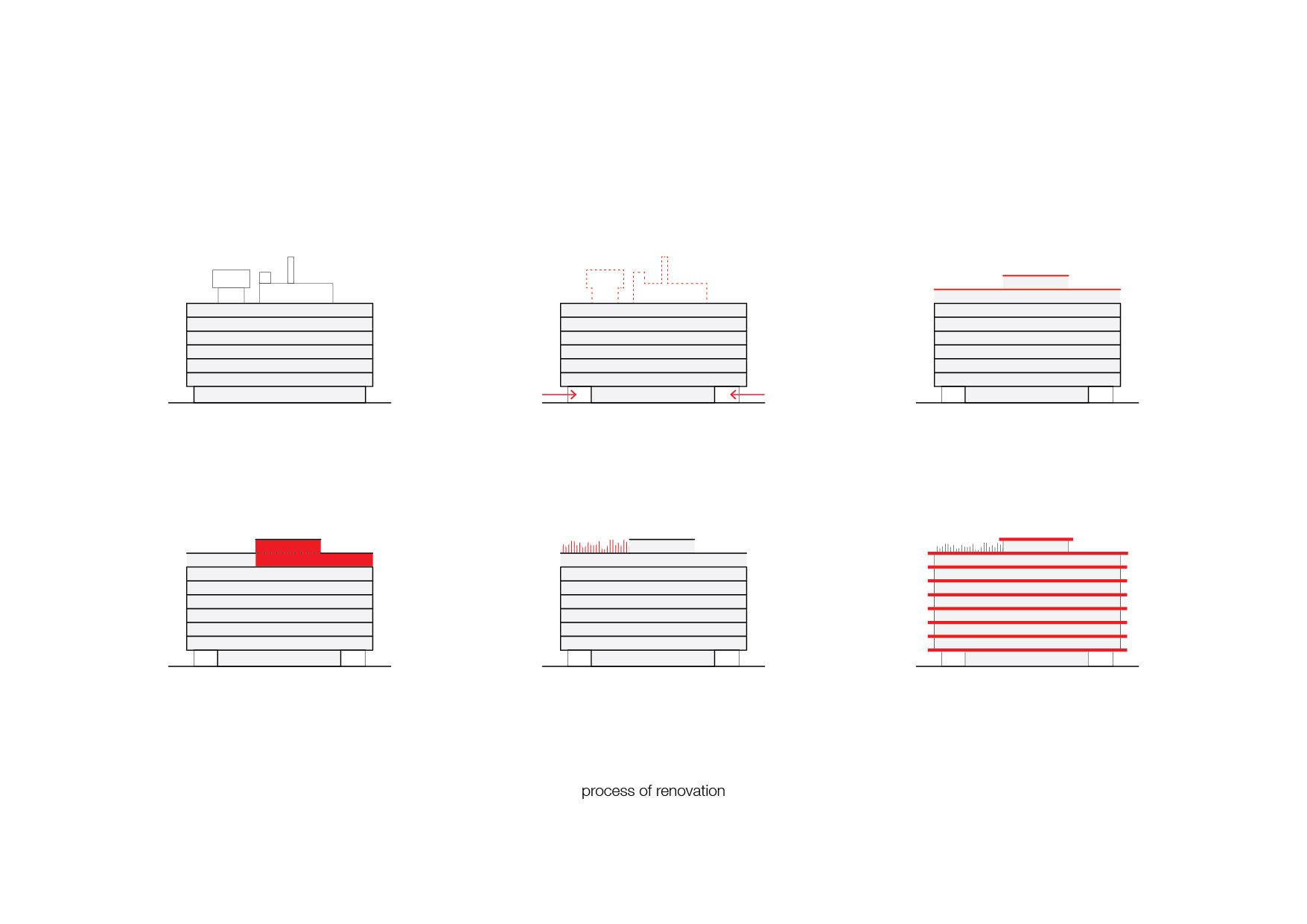
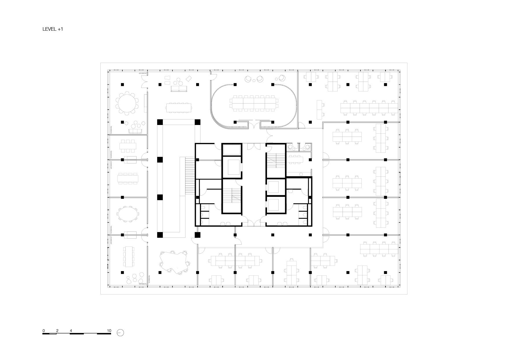
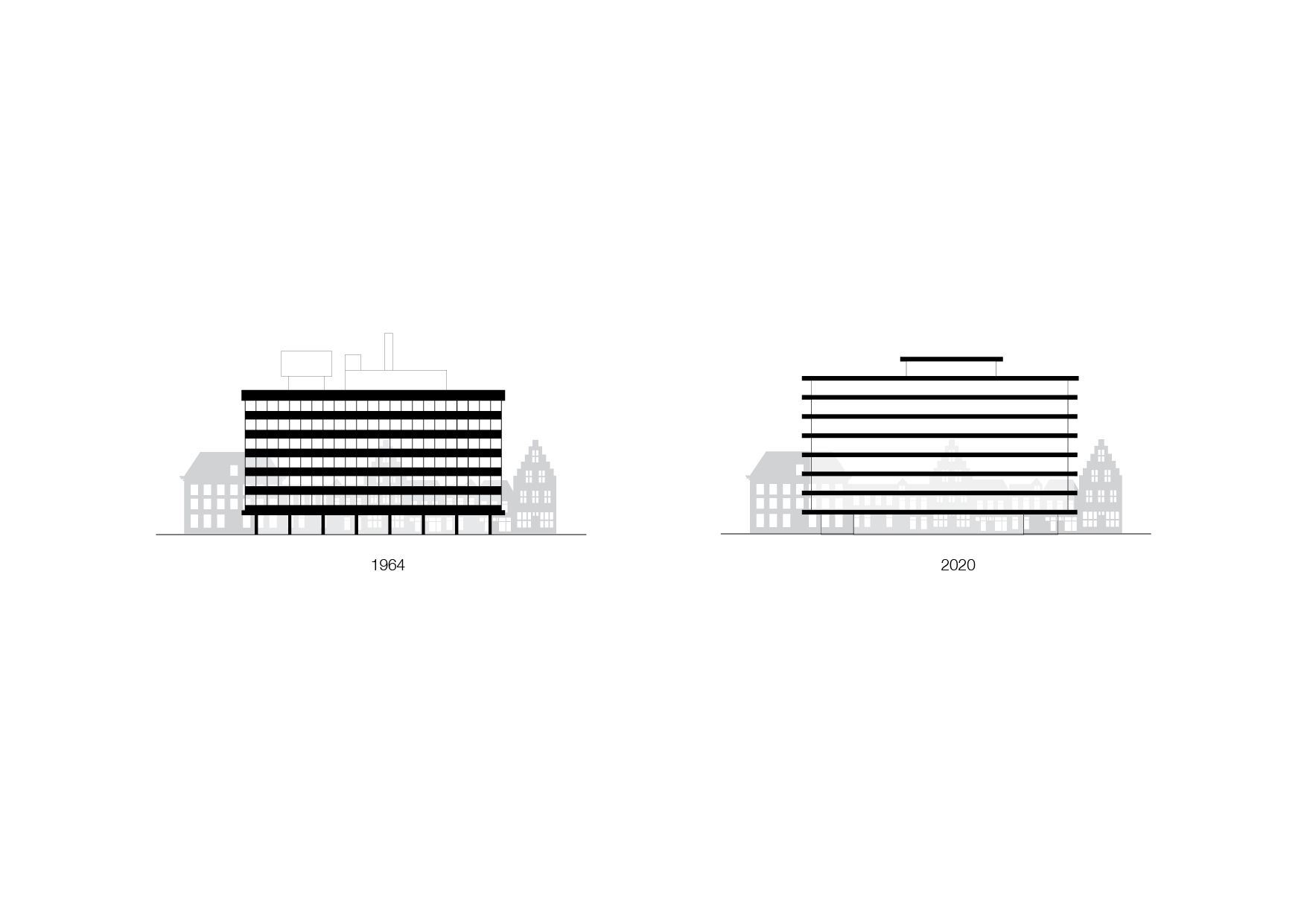
Inspired by the work of artist Donald Judd and drawing on their earlier work, KAAN Architecten has optically separated the floors of De Walvis. However, this strong horizontal emphasis is flexible on the interior since some openings have been left on the floors to potentially link them in the future.
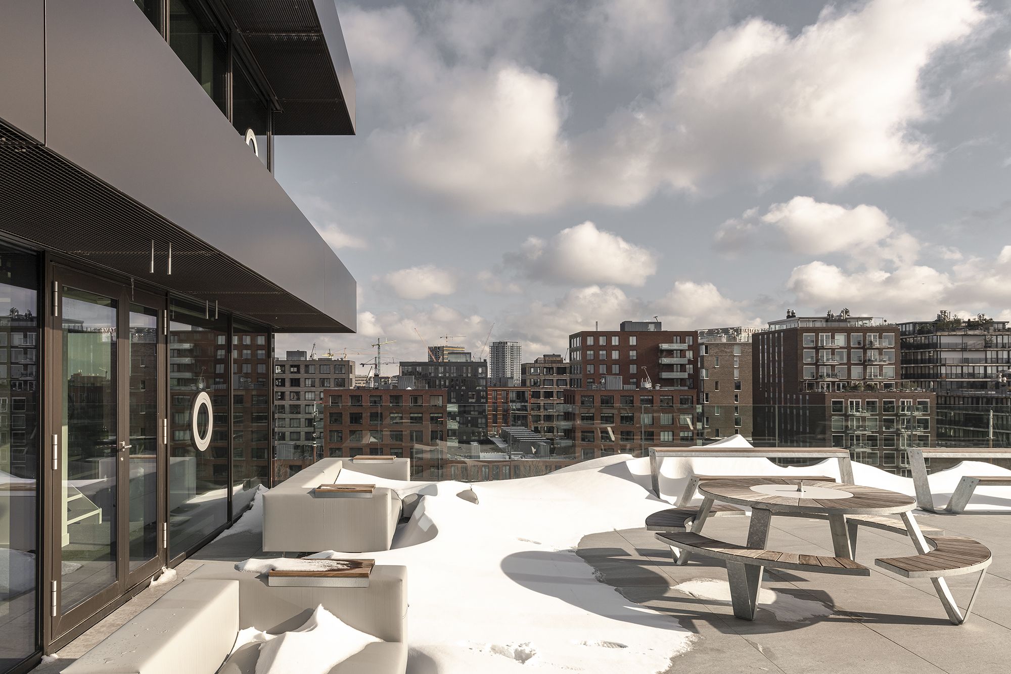
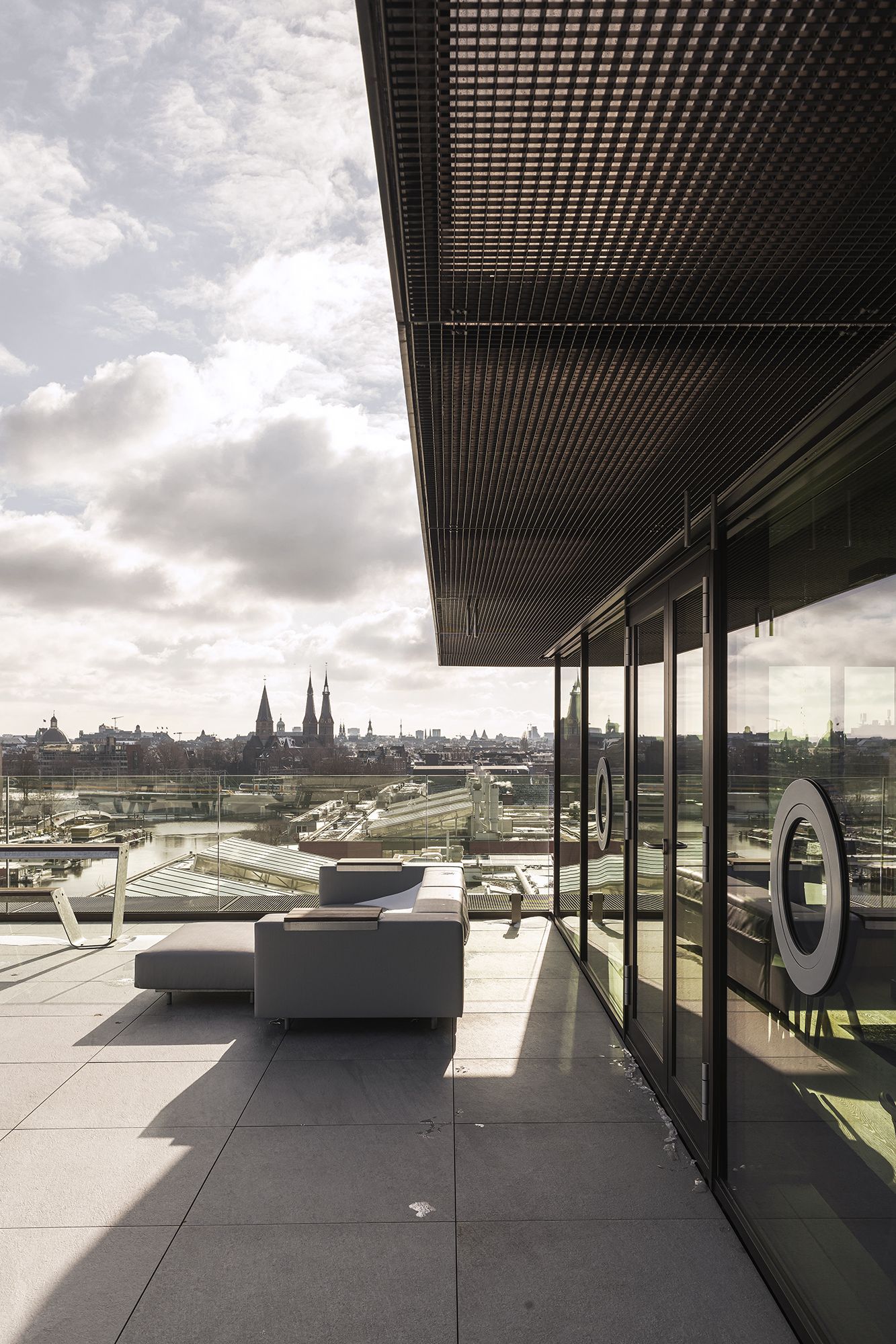
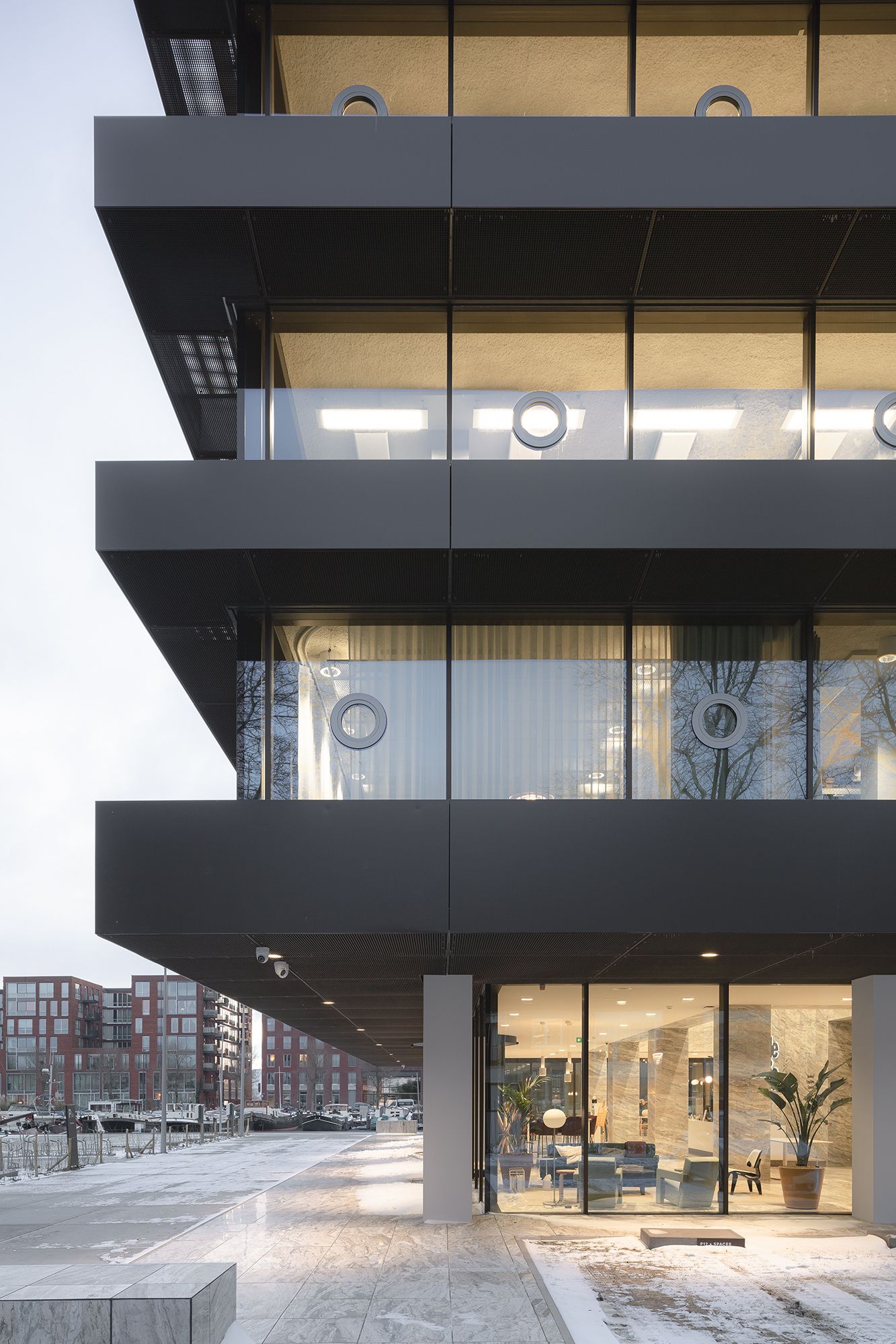
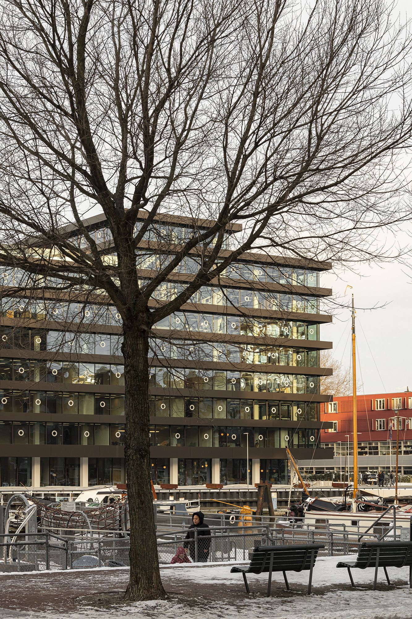
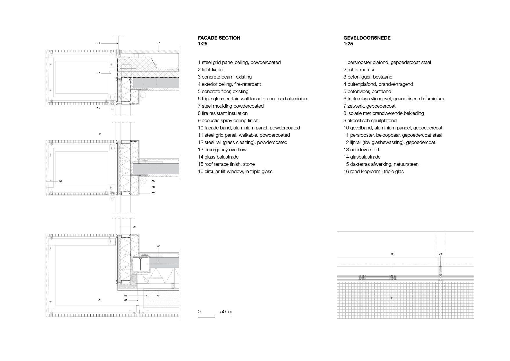
The floors now extend about a metre beyond the original building and consist of solid-looking dark bands that are actually light, hollow metal constructions.
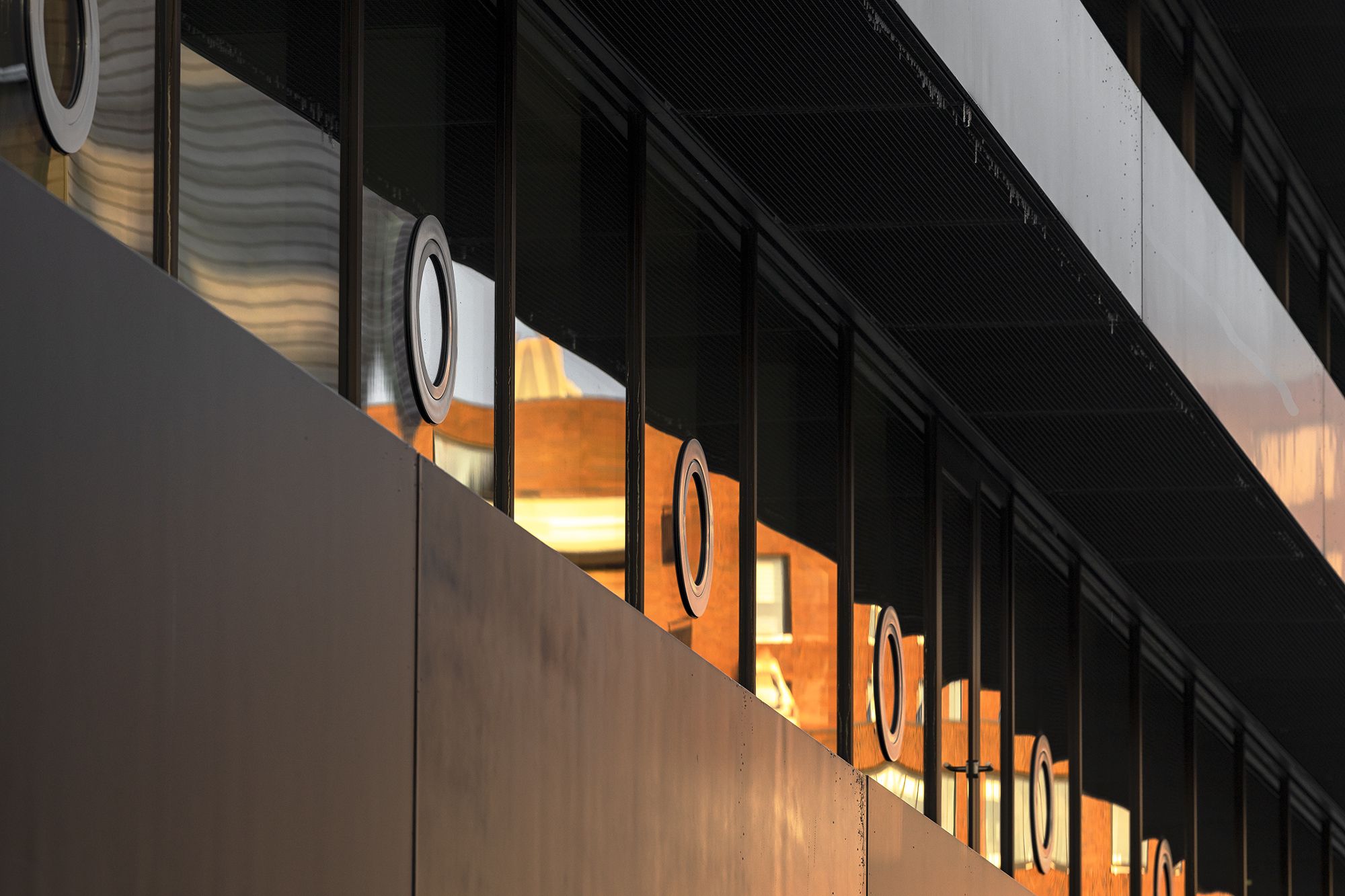
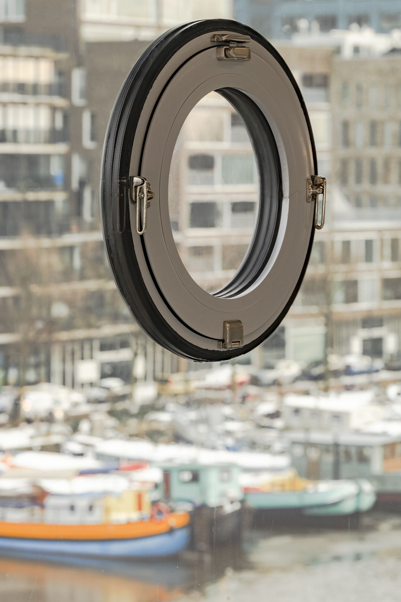
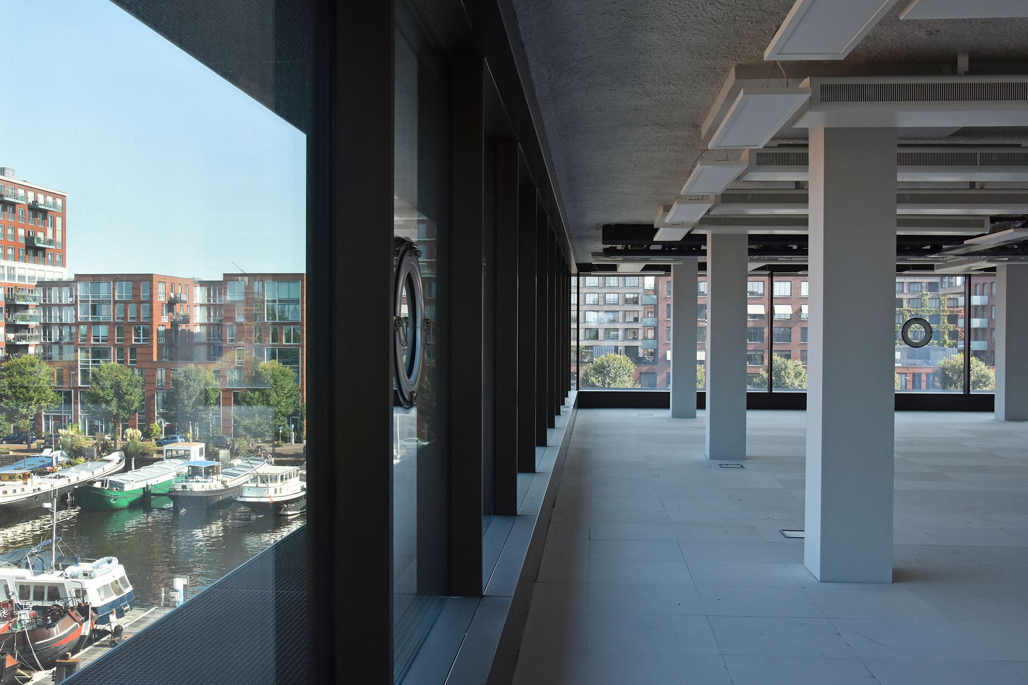
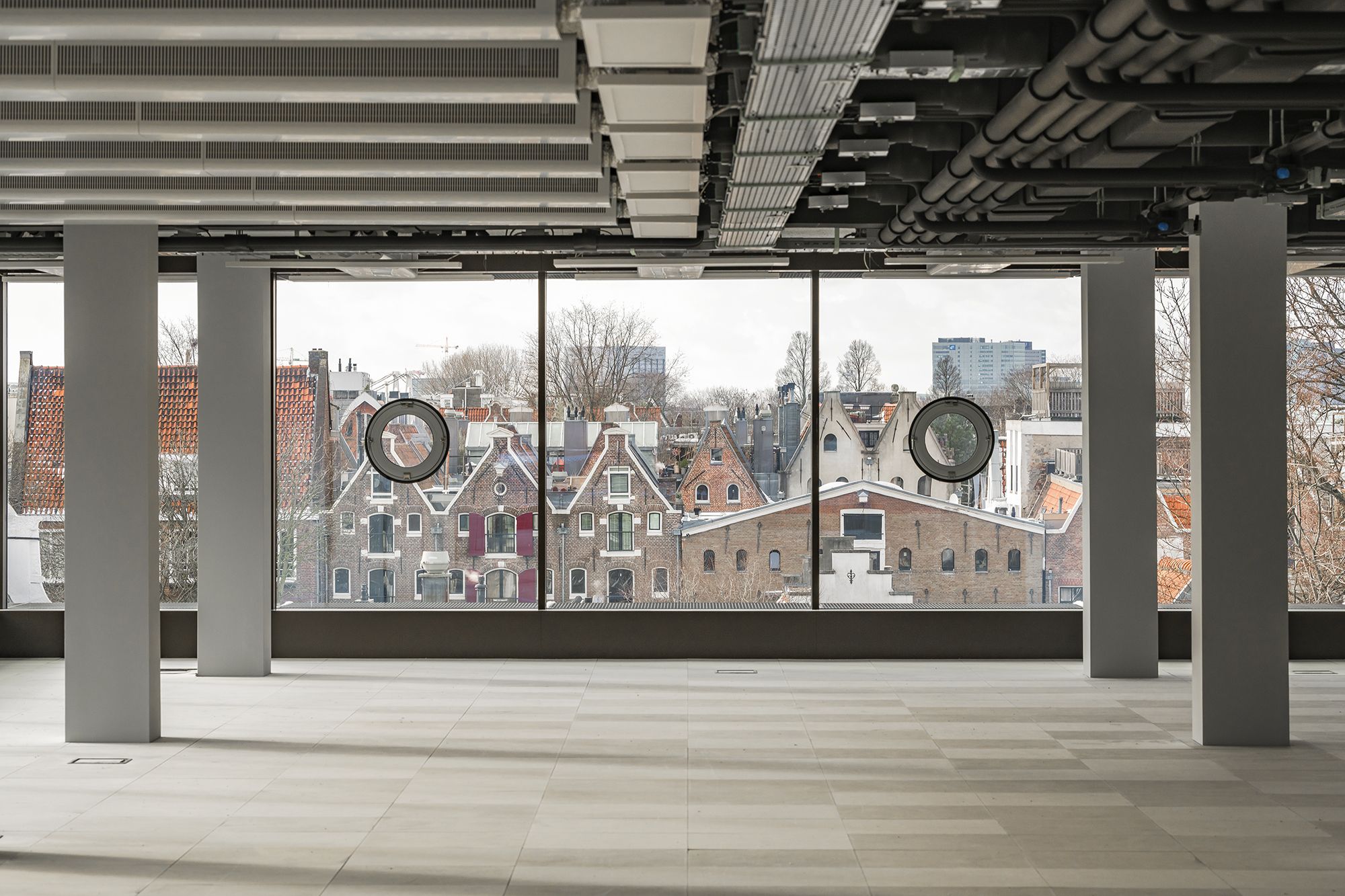
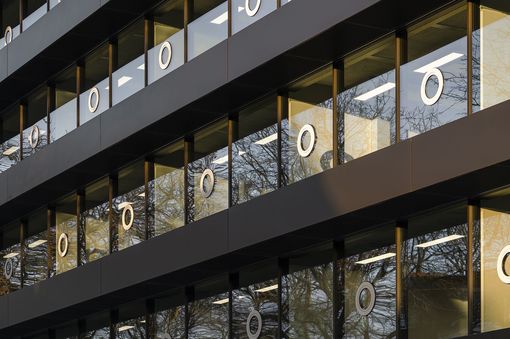
Recessed bands of triple glazing further optimise the effect of ‘floating‘ floors on each storey – the windows seem to go from floor to ceiling and have almost invisible vertical rebates. To avoid a sense of fragility, portholes have been incorporated into the glazing in a tight rhythm, at eye level per floor, and all easily opened.
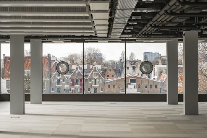
These round pivot windows could be seen as a reference to the area’s maritime history, though they also recall the pivot windows of the old building.
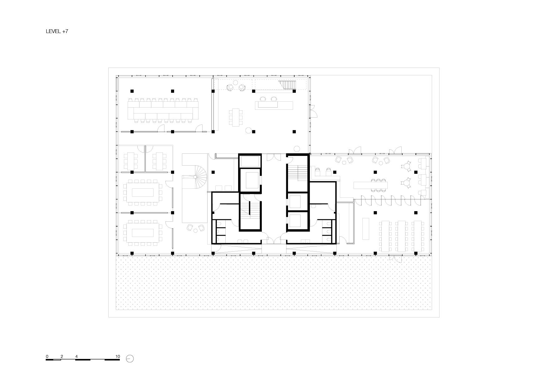
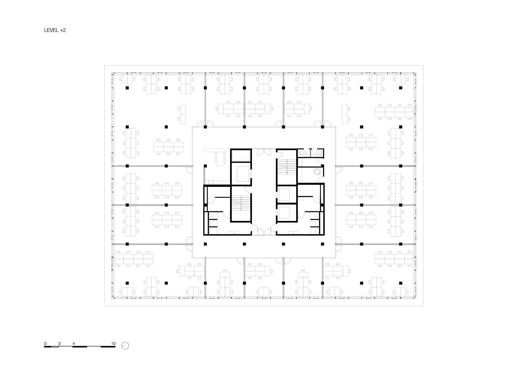
The load-bearing structure of De Walvis dictated a rather meagre 3 metres per storey, which meant that the necessary technical facilities could not be hidden away in the floors and ceilings.
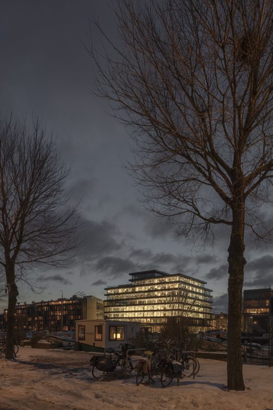
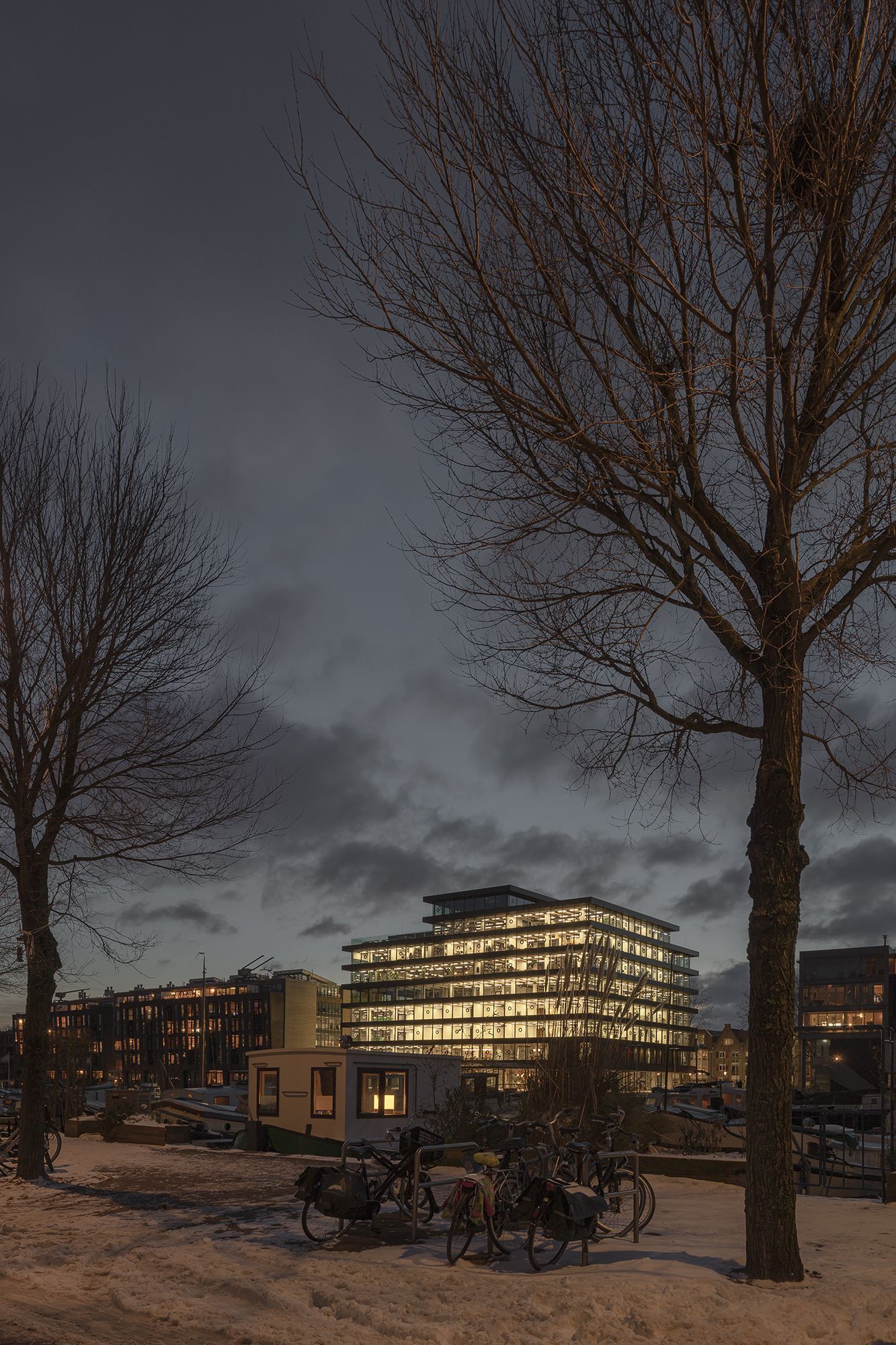
By keeping each storey as open as possible, the building appears much lighter than before – and the big windows, the views over the neighbourhood, and the daylight pouring in help to achieve this lightness.
This effect is heightened at night when the interior lights are on. Light, space, and sightlines – these were the seeds of the early design, alongside functional clarity and elegant facades.
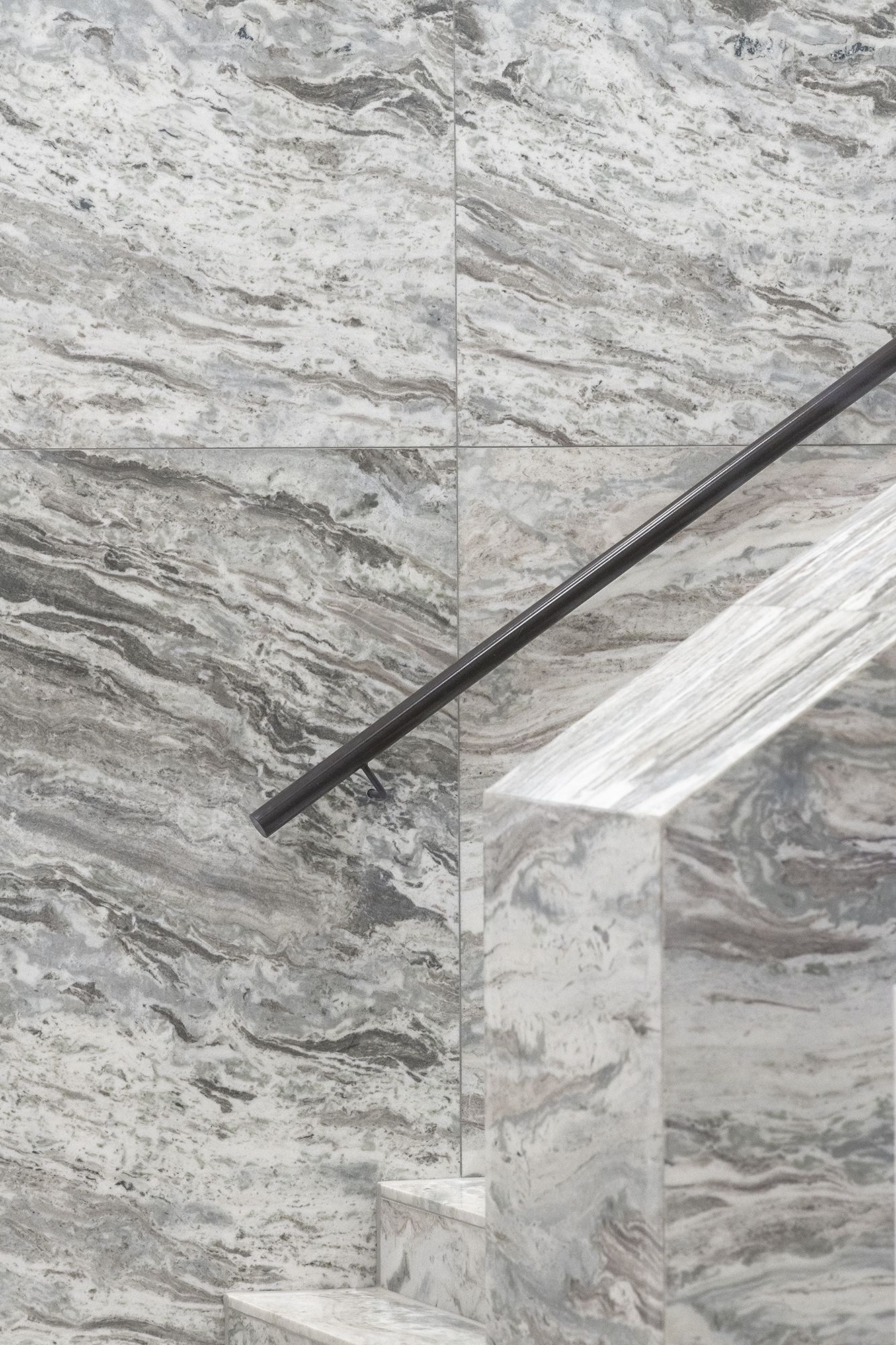
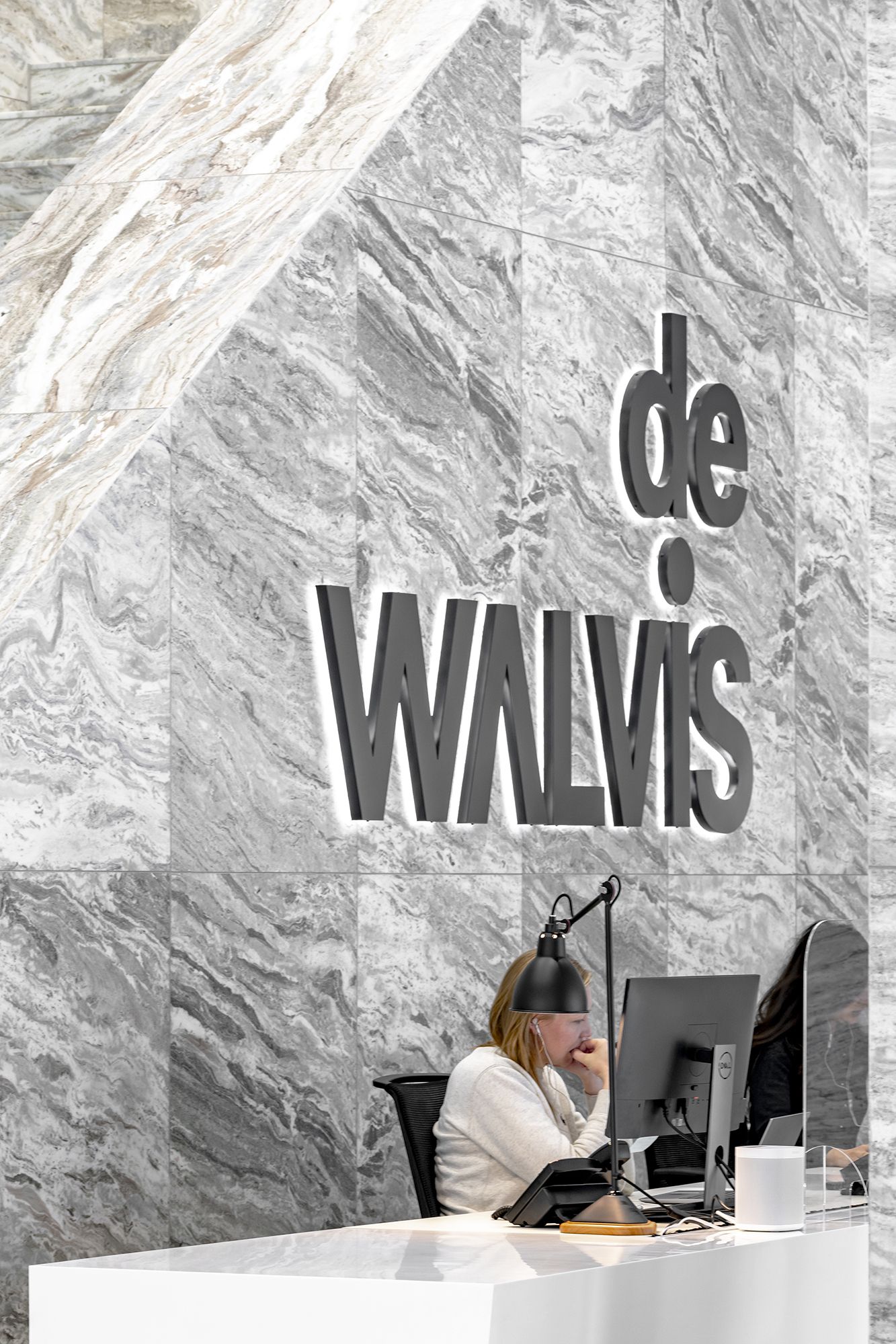
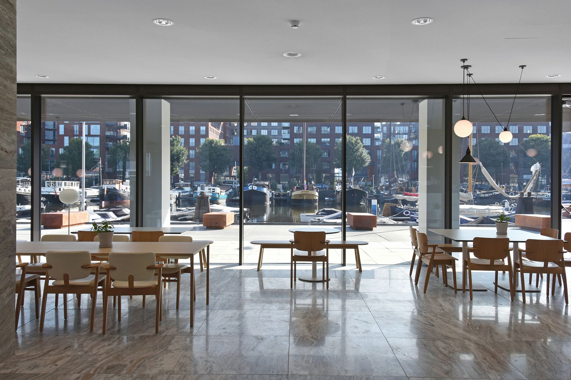
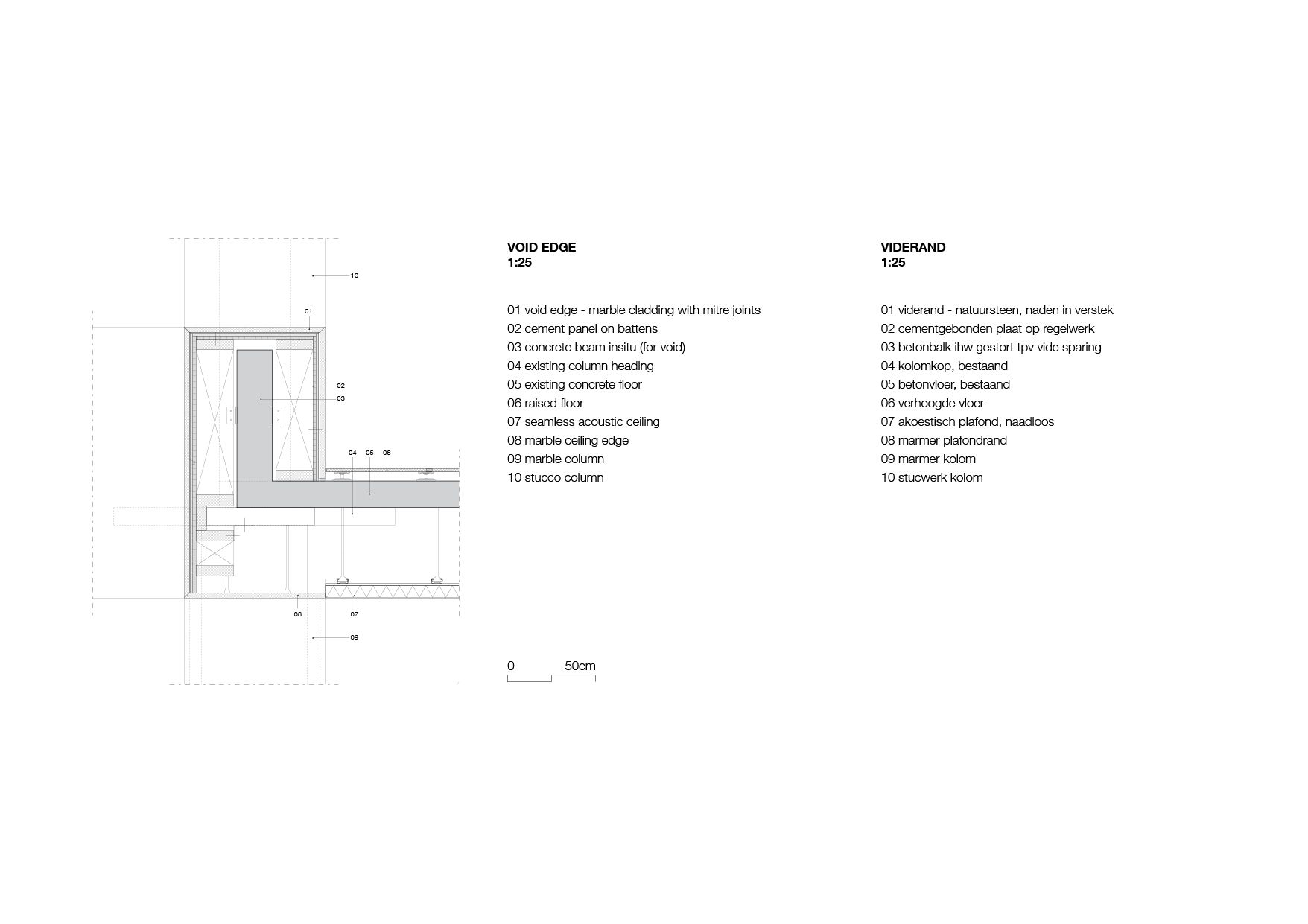
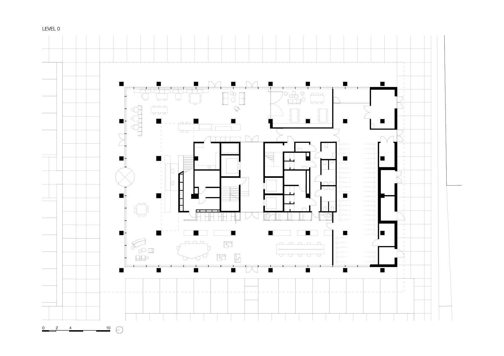
Additional design decisions that radically impact the sense of spatiality include setting back the ground floor lobby, richly clad in marble and appearing to detach the building from its footing, and removing entirely the heavy entablature that previously pressed down on De Walvis, giving the building plumpness.
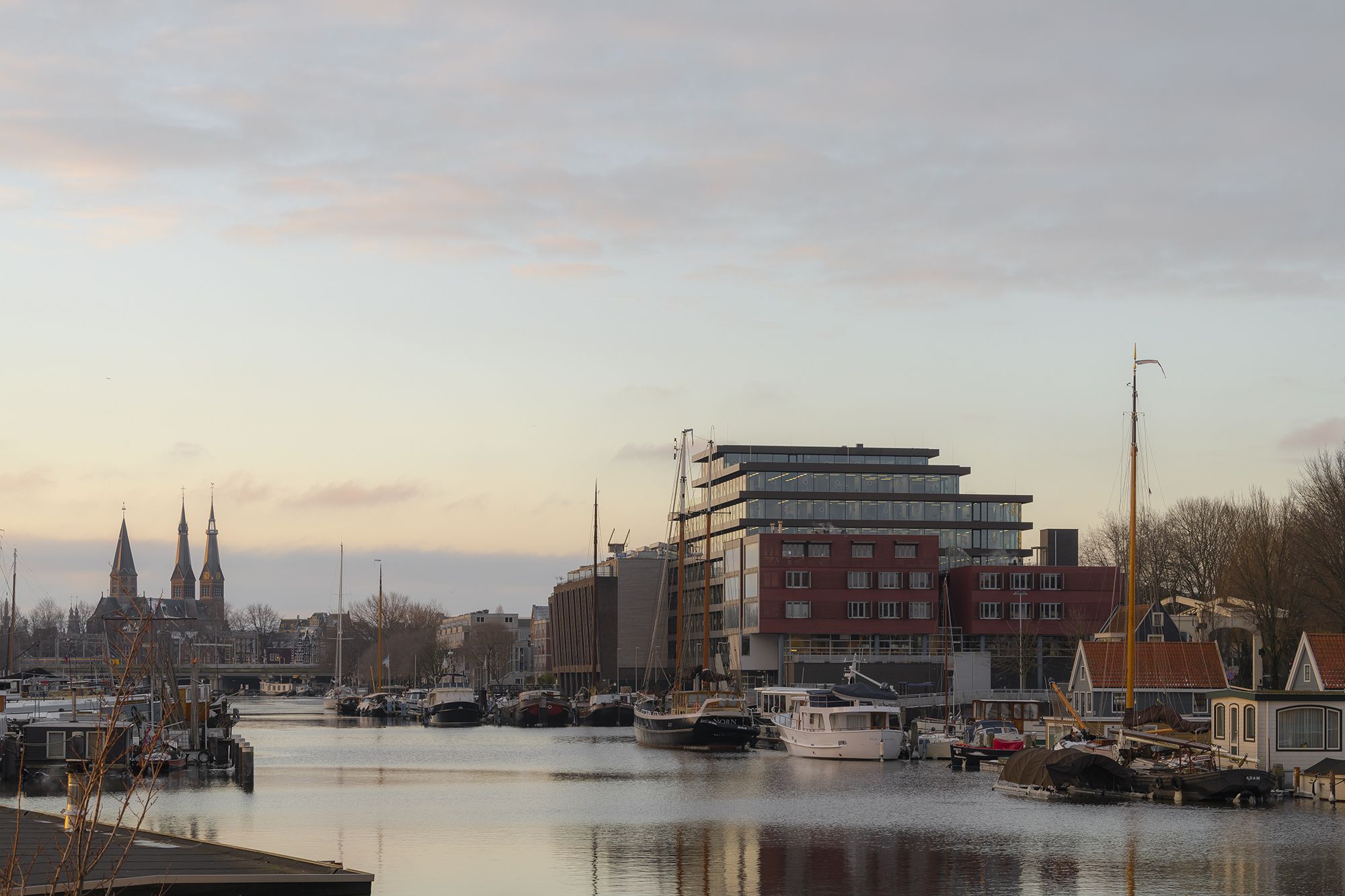
De Walvis is still a prominent building in its surroundings, though the high-density housing on the other side of Westerdok puts this into perspective. KAAN Architecten has introduced clear lines into the building: with the load-bearing columns mostly hidden within the envelope, the protruding floors are its most expressive facet. This horizontality is the soul of the structure.
The building’s regeneration has been awarded the BREEAM Excellent certificate, an internationally recognised points-based rating system that scores the sustainability and minimal environmental impact of a building.
Project Info:
Architects: KAAN Architecten
Area: 10400 m²
Project Year: 2020
Photographs: Sebastian van Damme, Dominique Panhuysen
Project Name: De Walvis Offices
photography by : Sebastian van Damme, Dominique Panhuysen
photography by : Sebastian van Damme, Dominique Panhuysen
photography by : Sebastian van Damme, Dominique Panhuysen
photography by : Sebastian van Damme, Dominique Panhuysen
photography by : Sebastian van Damme, Dominique Panhuysen
photography by : Sebastian van Damme, Dominique Panhuysen
photography by : Sebastian van Damme, Dominique Panhuysen
photography by : Sebastian van Damme, Dominique Panhuysen
photography by : Sebastian van Damme, Dominique Panhuysen
photography by : Sebastian van Damme, Dominique Panhuysen
photography by : Sebastian van Damme, Dominique Panhuysen
photography by : Sebastian van Damme, Dominique Panhuysen
photography by : Sebastian van Damme, Dominique Panhuysen
photography by : Sebastian van Damme, Dominique Panhuysen
photography by : Sebastian van Damme, Dominique Panhuysen
photography by : Sebastian van Damme, Dominique Panhuysen
photography by : Sebastian van Damme, Dominique Panhuysen
photography by : Sebastian van Damme, Dominique Panhuysen
photography by : Sebastian van Damme, Dominique Panhuysen
photography by : Sebastian van Damme, Dominique Panhuysen
elevation
elevation
section
section
floor plan
floor plan
floor plan
floor plan
floor plan
details
floor plan
elevation
floor plan
details
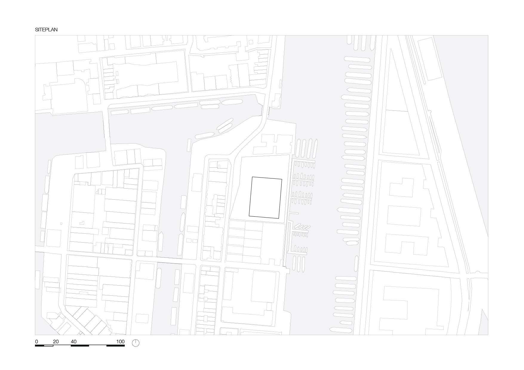
site


