Dear Ginza Amano Design Office
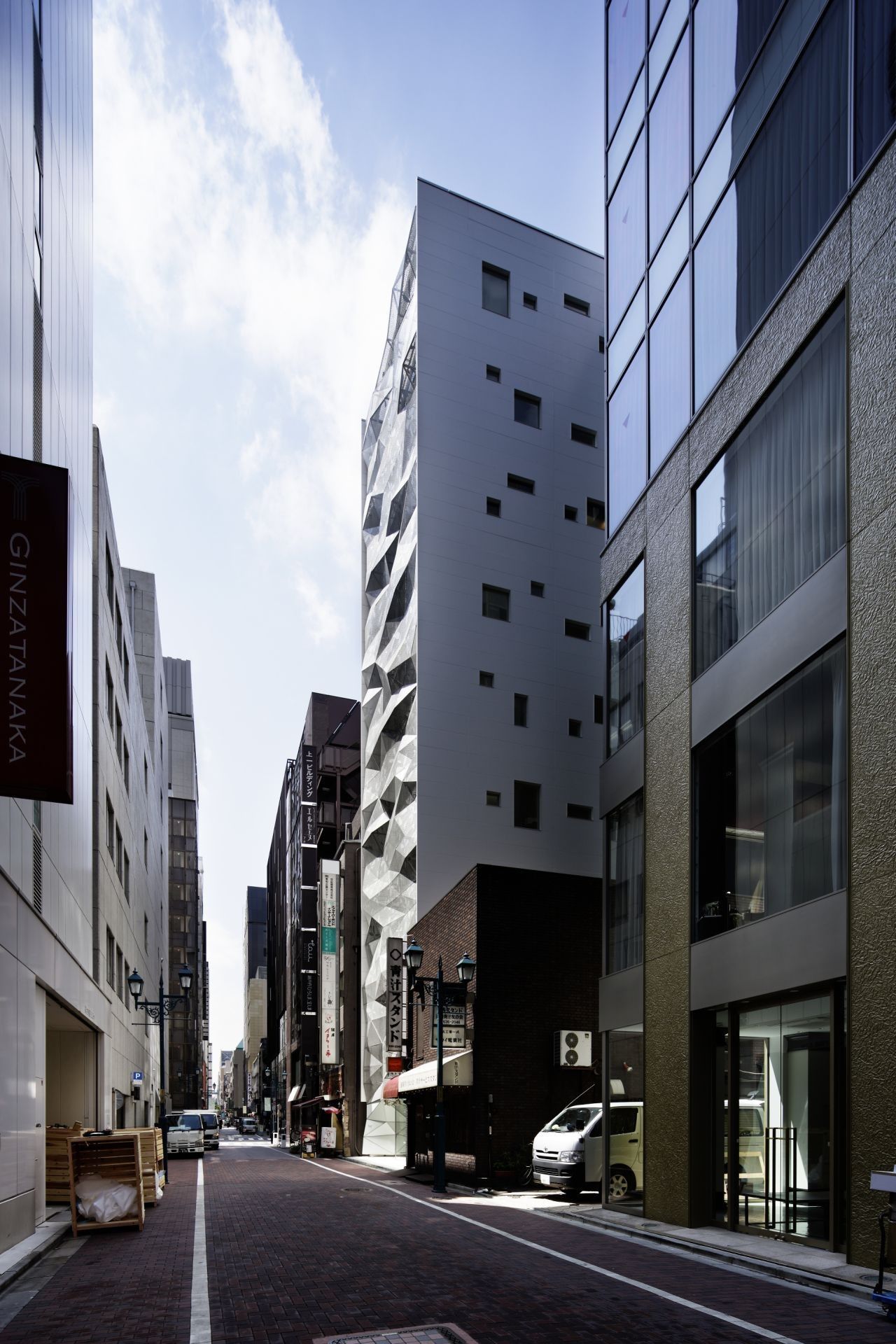
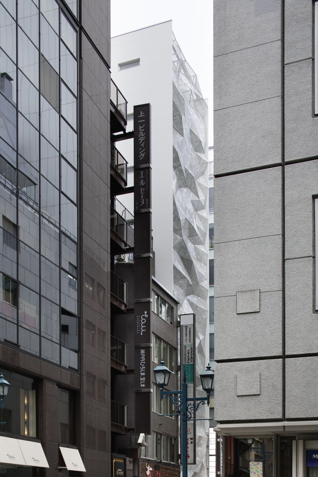
Situated rather on an empty street than on the beautiful and full of atmosphere Ginza Central Street, a new building designed by Amano Design office there rises to attract towards the not so visited backside of Mizuho Bank and Pola Ginza, Tokyo.
The history of Ginza’s establishment derives from the silver coin mint from 1612 and after the area burns down, the government decides to rejuvenate it in a new way – hence today Ginza stands for the showpiece of safety and modernization, turning the district into a glamorous shopping place.
So despite the fact that Ginza’s central radius offers shopping experiences by brands such as Louis Vuitton, Armani, Prada, Swarovski & Mikimoto [and many, many more], the newly built commercial/office space for a developer company reflects the glamour of Ginza onto the rear-positioned streets. It is designed to be as unique as the rest of the district.
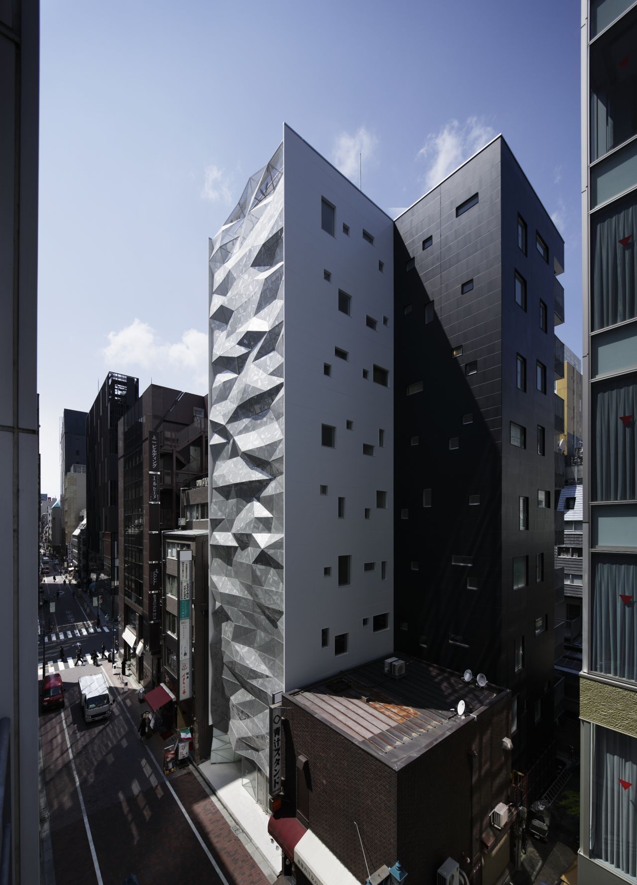
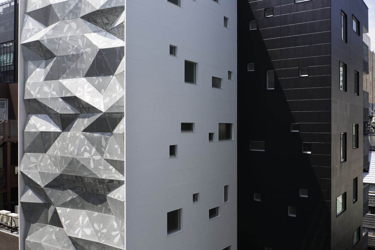
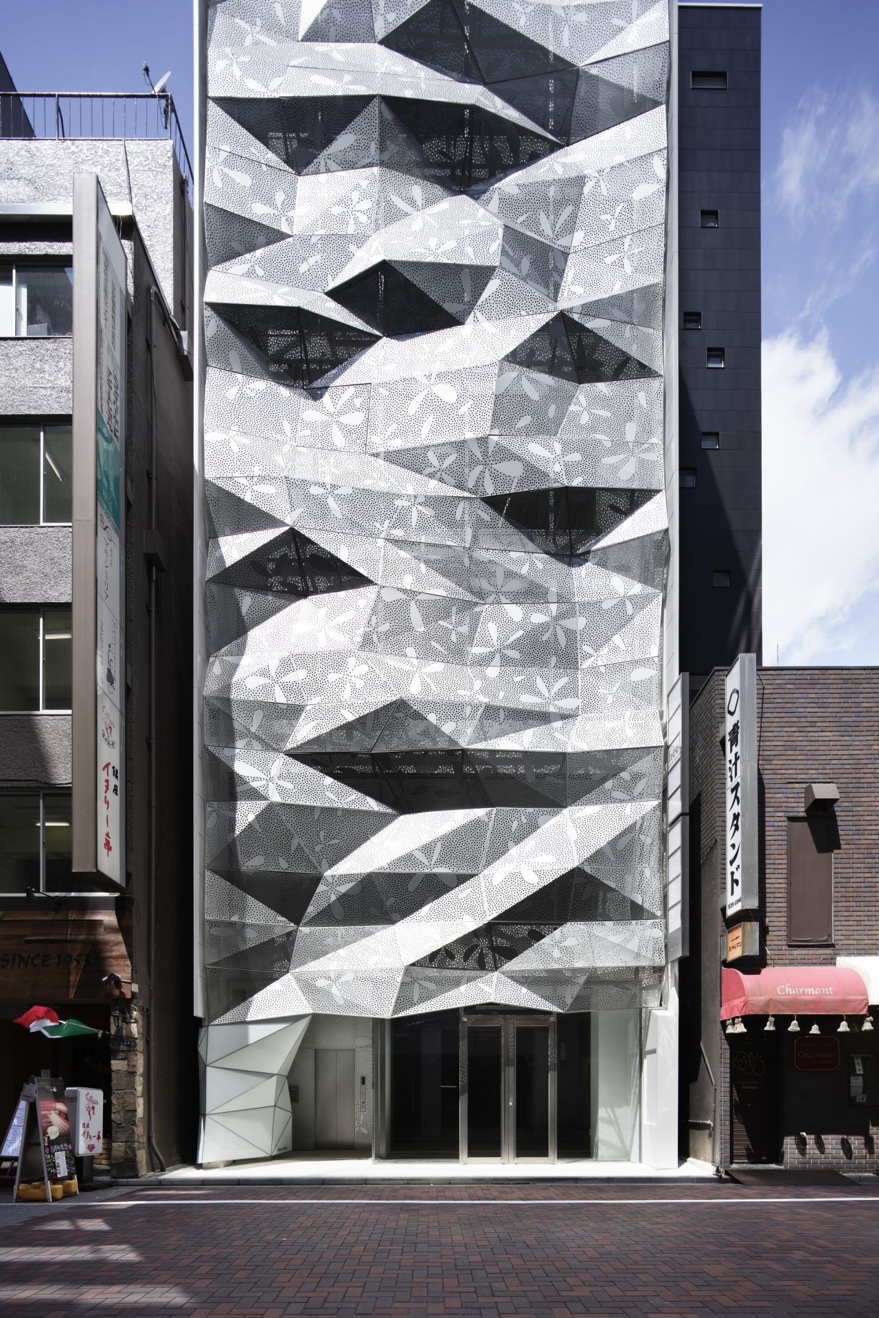
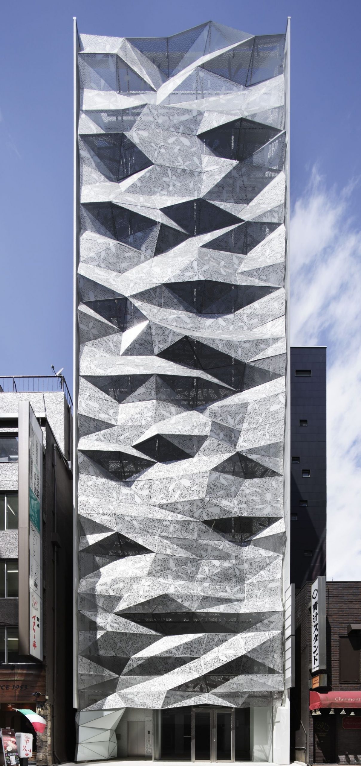
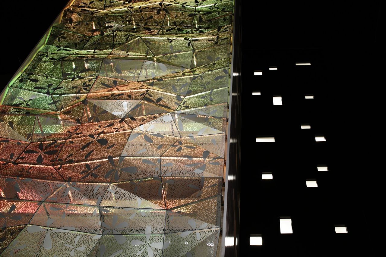
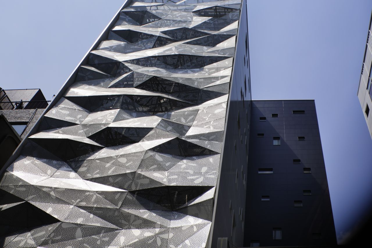
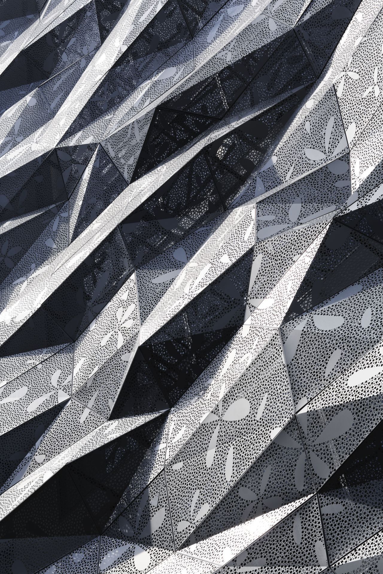
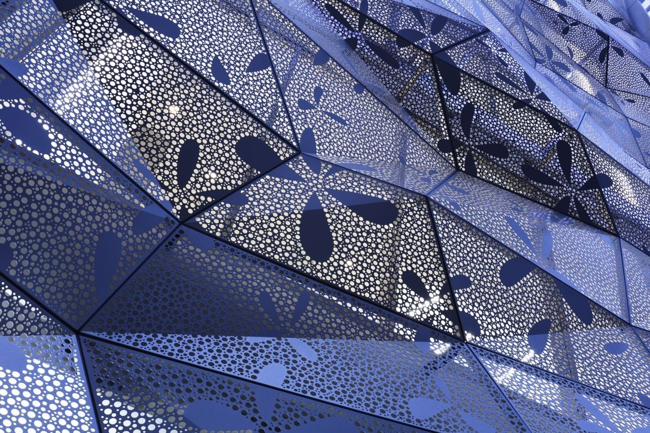
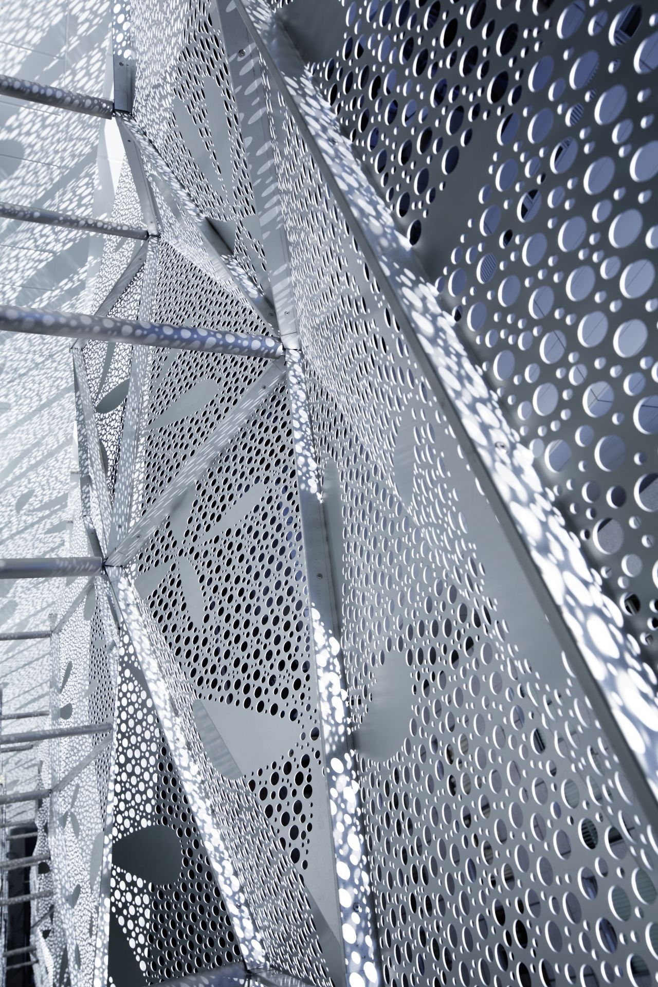
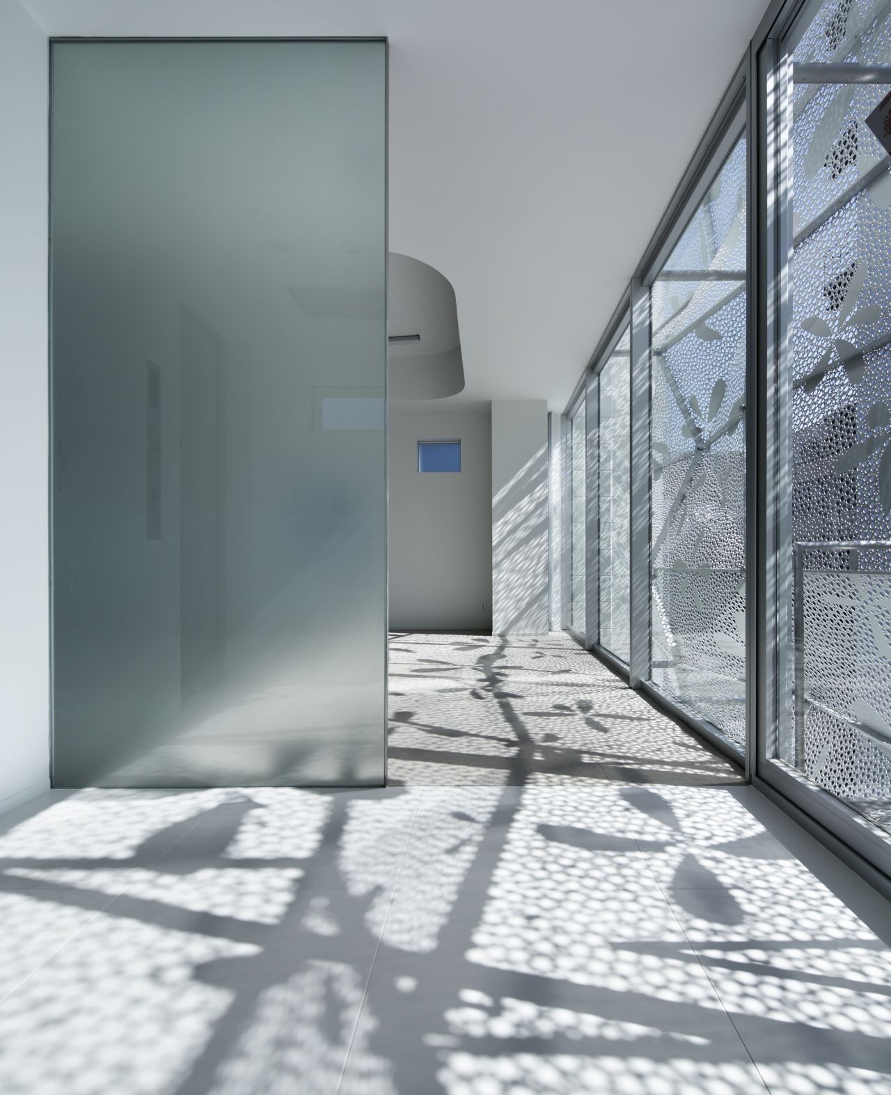
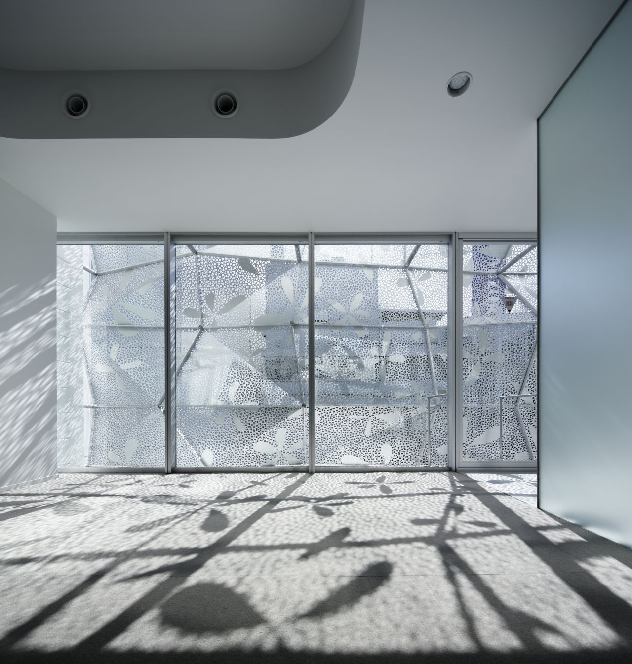
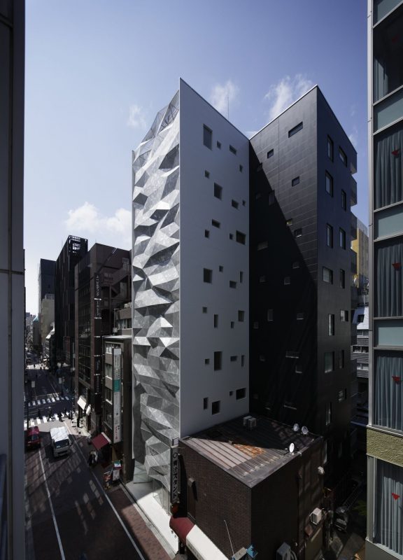
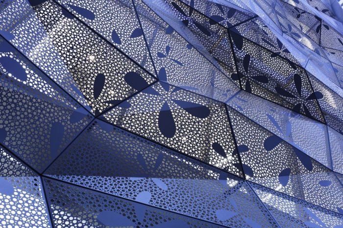
The most distinctive feature of the tower is its glazed façade, composed of irregularly shaped facets. They form peaks and crests, which allows for different lighting conditions to be created. Where the facets come out, they become well lit and reflect light and where there are inward going facets – they create the dramatic effect of the shades. In this way both the light and shadow reflections depict an overall playful, dynamic and outstanding façade composition.
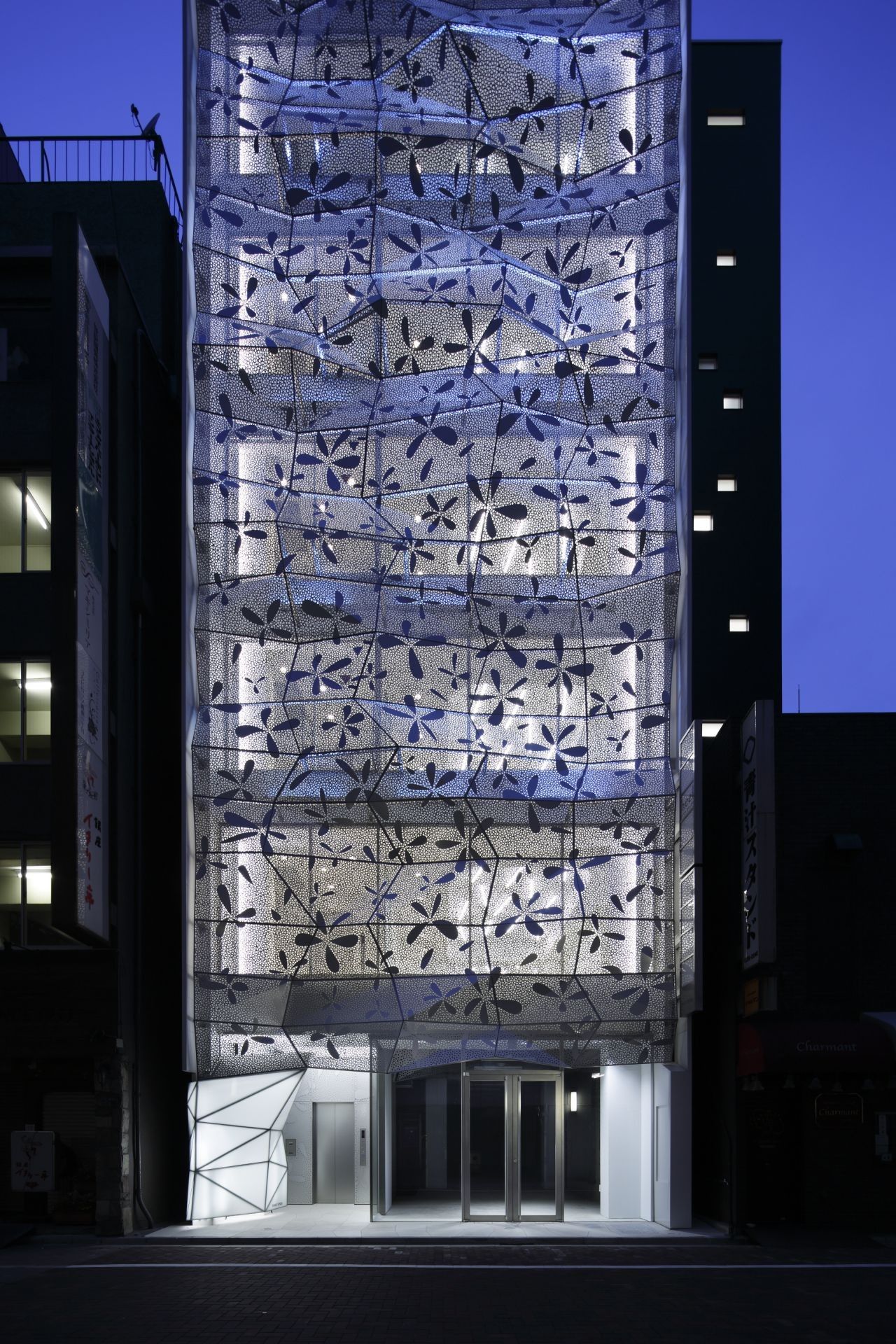
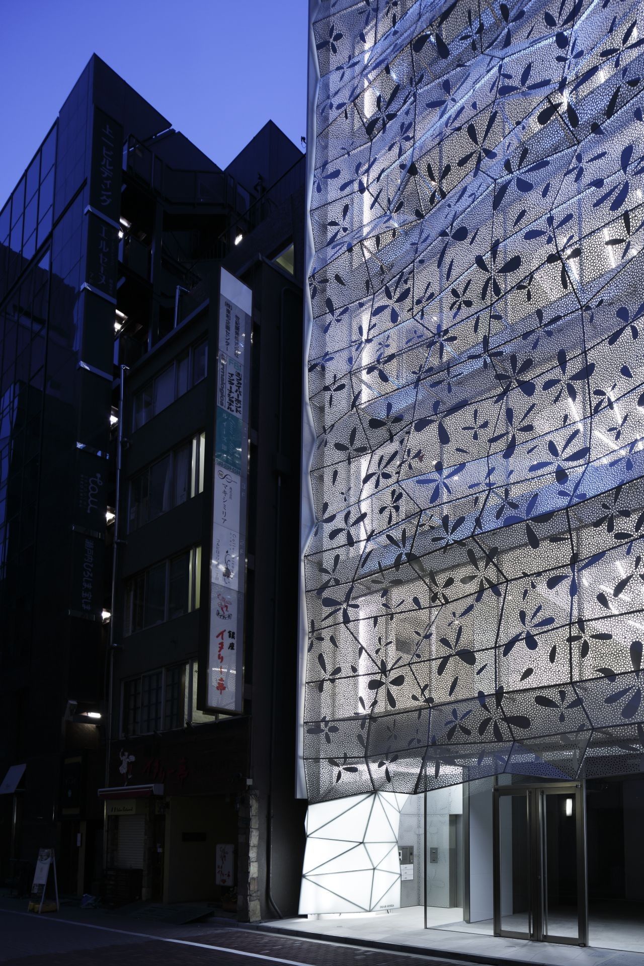
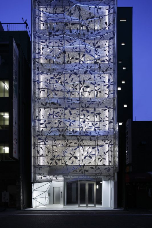
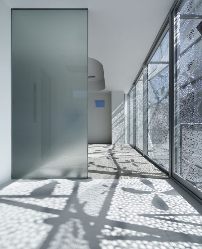
What’s important to note: the irregularity symbolizes the company’s wish to be distinctive and never dull, and also it represents the façade’s overall analogy with nature and the organics. This effect is achieved through computational methods – each facet is derived through the parametric modeling of angles and shapes to make the whole structure stand out from the modernist cityscape. This also acts upon the perception of the building’s function more as a commercial/luxurious rather than anything else and therefore its appearance merges with the Ginza’s central radius of bespoke-designed retail buildings. Also, during night-time, the façade glows with an abstract floral pattern the aesthetics of which are meant to soften the sharp edges of the facets’ peaks and crests.
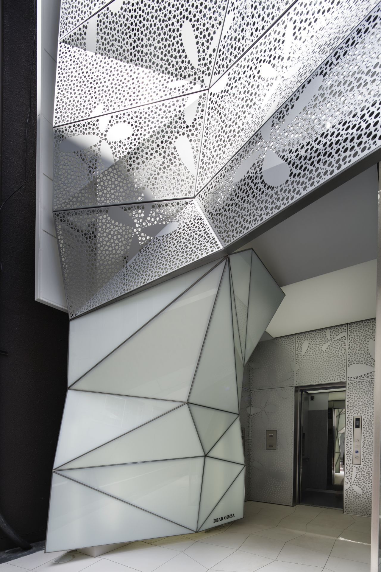
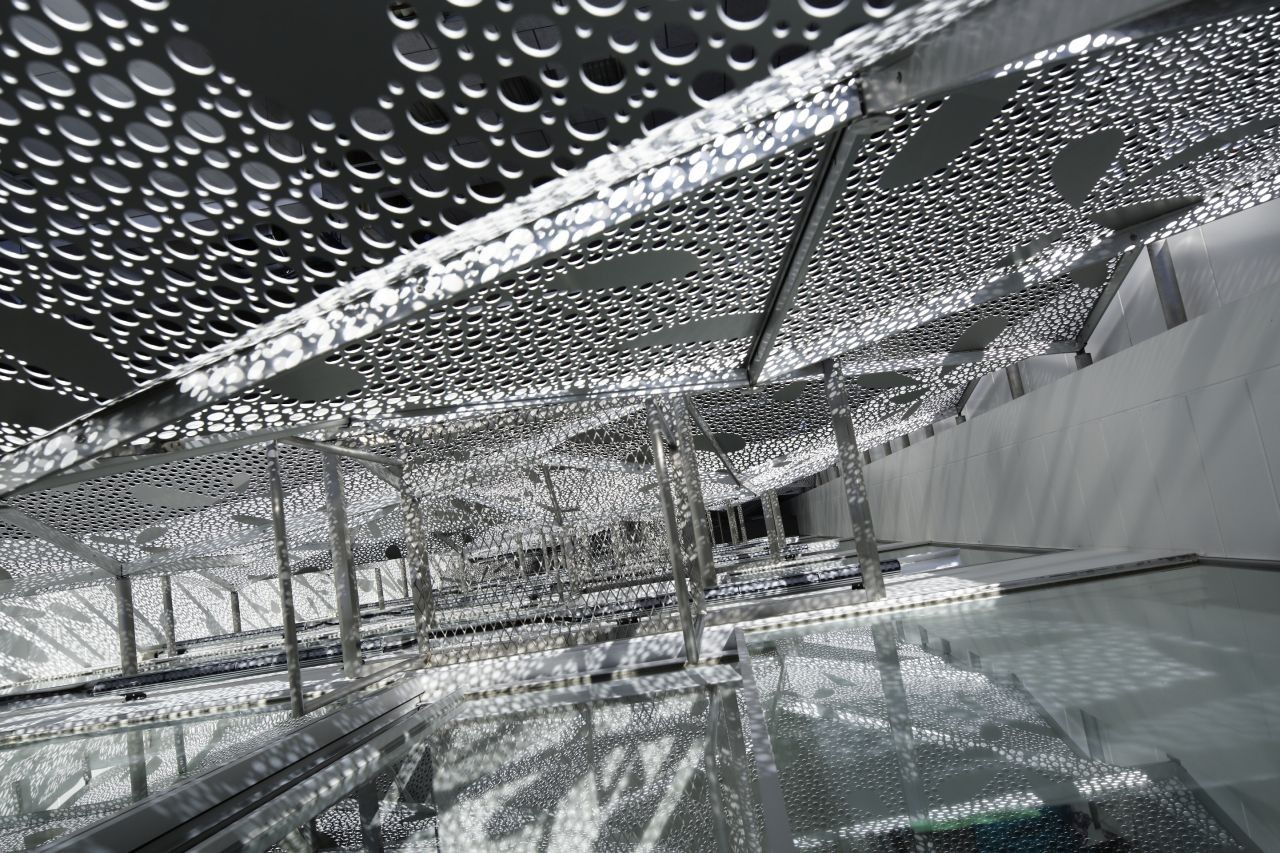
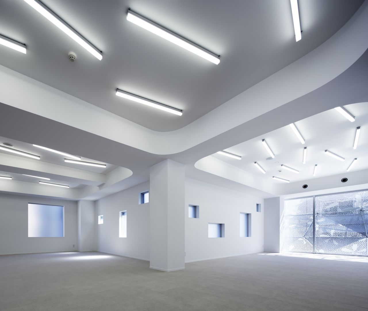
A double skin steel structure was employed, as views from the interior offer limited visual daylight. The structure consists of a lightweight system to prevent the design from appearing too heavy. To add more engaging elements to the street facing façade an impression of abstract flower graphics are detailed on the panels and LED lighting is installed that constantly changes depending on the season. So, aluminum punched panels, a lightweight structure, coloured LED and double skin – all that, indeed. The building’s conception is derived from the notion that it is in fact strangeness that attracts attention and ultimately seduces the viewer’s perception.
Project Info:
Architects: amano design office
Location: Chuo, Tokyo, Japan
Collaborators: Atorie Oica , Azzurro Architects
Photographs: nacasa & partners In
