As students at architecture school, we tend to give all our attention and most of our time to the architectural plan, but what happens “inside” the minds of architecture students? We try to solve zoning problems and circulation issues, which might never end, and then when we are hitting the deadline, comes the realization: “I haven’t worked on the elevation!”While some projects simply get the elevation design from their overall form, especially the ones that are meant to be ‘iconic’, other projects, where the function is the key player, may not have equally dynamic plans, regulated by essential requirements and codes.
Such projects are quite dependent on their elevation designs for aesthetic appeal and catchiness. Knowing how designing an architectural elevation can be a handful of tasks, mostly for students who are taking their first steps, we will give you here some tips on how to design an interesting elevation and present it in a way that communicates it properly. Also, Check other things they don’t teach you in architecture school.
[irp posts=’182827′]
First of all, you have to be aware that architectural elevation design is like any other design in general, meaning that the basic rules and principles of design apply. While we may disagree on the word “rules” in design, but they’re a set of characteristics that are always found in a successful design, whether they were respected consciously or subconsciously.
How Do You Get Elevation? Architectural Elevation Tips:
1. Your architectural elevation should be harmonious with a degree of unity. Unity makes the different elements and components of the elevation seem to be one, a whole instead of parts. There are different ways to achieve unity.
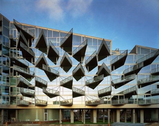
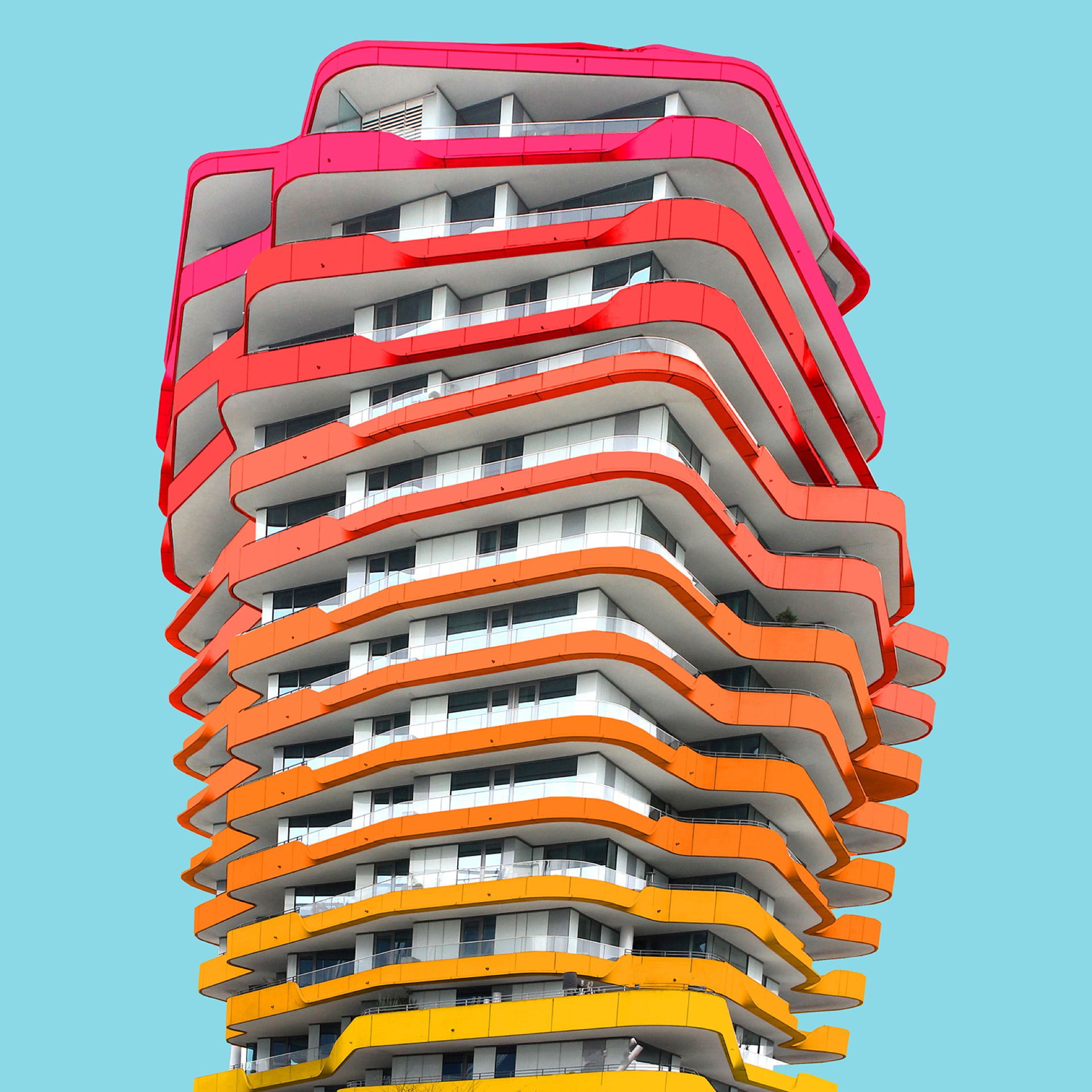
- One way is by Repetition of an element throughout the elevation to form a sort of a pattern.
- Another is by Continuity of a line literally or visually, or maybe the continuity of a pattern, forming a sort of a grid; something that leads the eye along the elevation. It can be achieved by alignment.
2. While your architectural elevation needs to have unity, it also needs variety or boring. At first glance, both concepts might seem to be opposing, but in design, this is what we call “variety within unity”. So, how does that work?
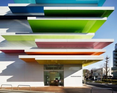
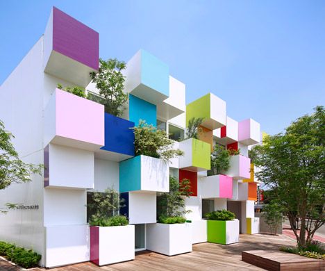
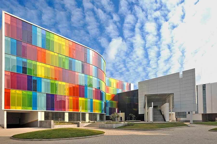
- You can maintain unity in geometry by using, for example, rectangular or circular units throughout the elevation, but vary them in color or size.
- You can unify the color but vary the shapes or the size of the elements.
- You can even use the same base unit or element with the same size and apply modifications per each unit, like tilting, twisting, stretching, or folding it.
3. Emphasis is important in the elevation design to lead the eye of the viewer to the entrance, for example, or other important parts, and there are many ways to achieve emphasis.
- The emphasis, by contrast, is one way. This contrast can be created by color or shape and texture.
- There is also an emphasis on isolation. Isolating one element from the successive pattern of the rest make it a focal point in a way.
- Also, placing something at the center by default makes it a focal point. That is why since ancient times, entrances have been most of the time placed at the center.
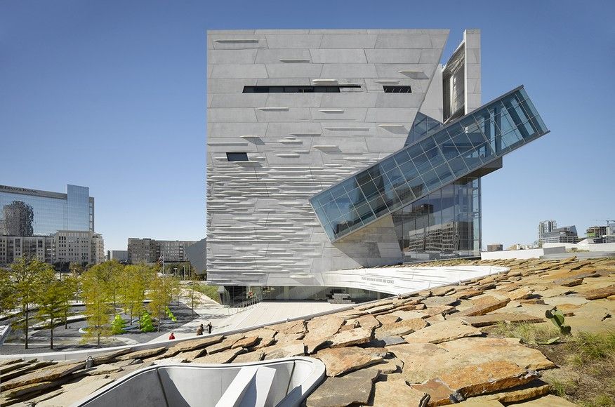
- Massive elements and parts also attract the eye and are regarded as a focal point. Moreover, a distinctive element on a plain undistinctive background would do the same job.
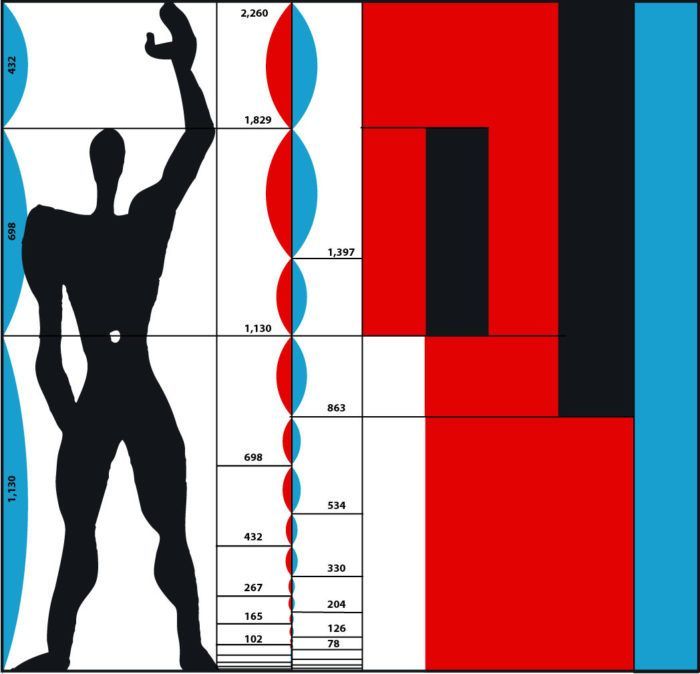
4. Proportions are vital in architecture, and naturally in elevation design. They can make or break a design. Rules were being devised since the time of ancient Greece to obtain perfect proportions, and here are some of the most commonly used proportions in design.
- Golden Ratio 1:1.618
- Fibonacci Sequence (0, 1, 1, 2, 3, 5, 8, 13, …)
- Alberti Proportions, from The Ten Books on Architecture by Vitruvius
- The Modulor, from Le Corbusier’s book of the same name
- The ratios and proportions which are thought to compose the most visually pleasing composition can be applied to the dimensions of various elements, their distribution, and the spacing between them.
5. Balance is another essential factor that should be present in the design of an architectural elevation. The most obvious way to achieve balance is by symmetry. This how it has been done since ancient times. However, symmetry is not the “thing” now. Contemporary architects believe in more indirect methods.
- Asymmetrical balance can be achieved by playing with size and color saturation or texture. For example, a large object with light color saturation may balance with a relatively small object with heavier color saturation.
- Also, a small complicated shape may balance with a larger but much less complicated shape.
- One more thing, you can balance a large object with a similar but smaller object by placing the large one closer to the centerline while keeping the smaller one more distant, like how it works with a seesaw.
- There is also what is known as “crystallographic balance” that distributes the load all over the surface of a composition. All units are of the same weight, but not necessarily identical.
6. A visually pleasing architectural elevation has rhythm. Like with unity, but with a different perspective, rhythm can be achieved by repetition and pattern. You may be more familiar with rhythm by the beat in music, but this sort of how it works in architecture; rhythm by the elements. The rhythm can be induced in many ways
- Repetition ( IIIIIIII ) ( II I II I II I II )
- Alternating Repetition ( IXIXIXI )
- Progressive Rhythm ( I I I I I I )
- Flowing Rhythm
7. Contrast is one way to relieve boredom in elevation design, however, you need to be careful not to mess with the balance when you are introducing it to your elevation. Contrast can be between:
- Solid and Void
- Opaque and Transparent
- Smooth texture and Rough Texture
- Light and dark
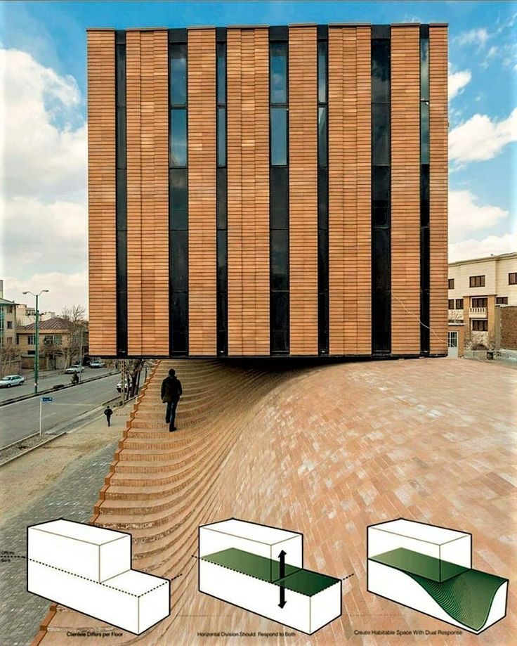
- Recesses and Protrusions
8. Choice of colors translated into architectural elevation materials is one of the most challenging tasks. You have to mind all the previous points and draft a vision for the elevation, where the solid and void be? Will the solid be rough? The transparent be transparent or just translucent. Do you need shine or muted surfaces? Then, translate all of this into material options.
9. You can start by creating a mood board for your architectural elevation. That will be very helpful with the choice of materials, colors, and architectural style. It will assist the design process in general as it will give you a visual sense of what you would like to achieve.
10. Bear in mind that there are no definite rules for aesthetics. We might have summarized some of the essential points for visually pleasing architectural elevations, but you can sum all of that up and get nothing pleasant. Aesthetic pleasure is much more than that. It has to do with context, history, and culture. Besides the physical factor, there is the spiritual factor and you will get that with practice, time, and, perhaps, wonder.


