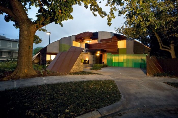
Dome House
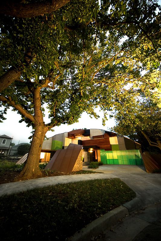
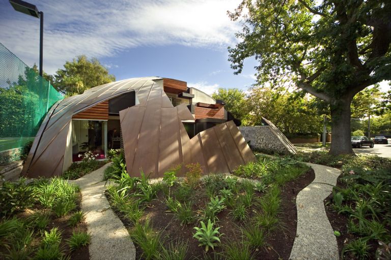
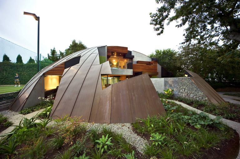
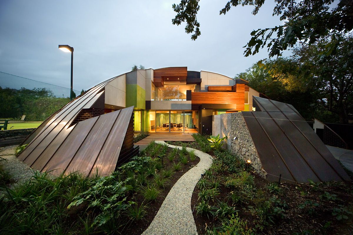
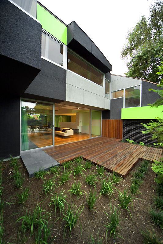
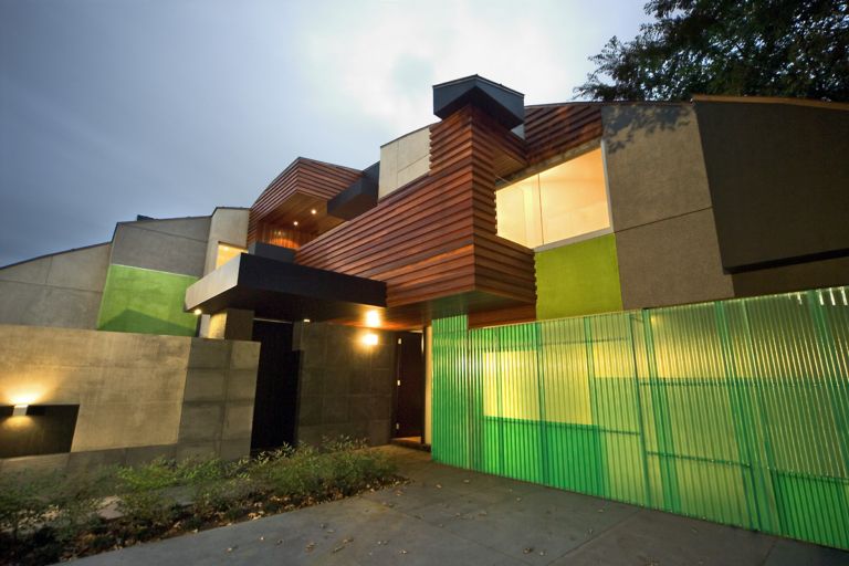
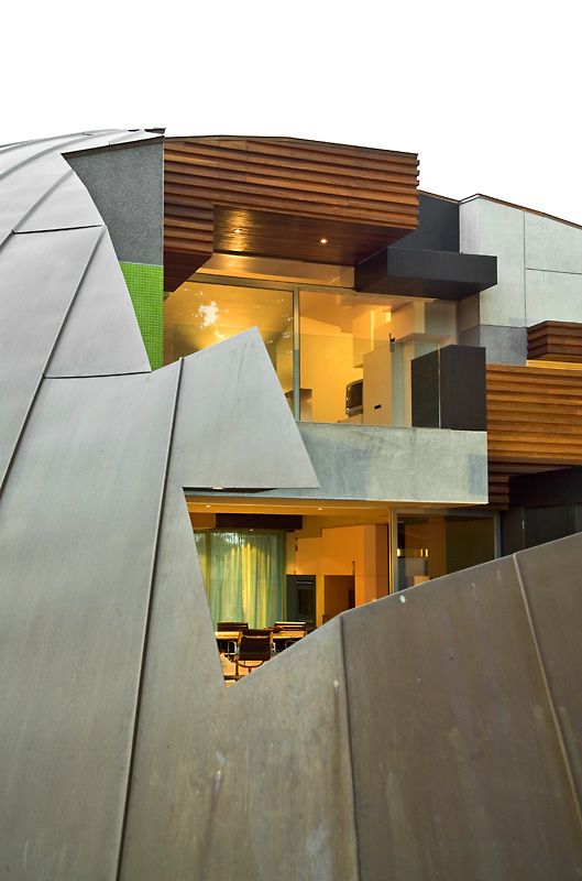
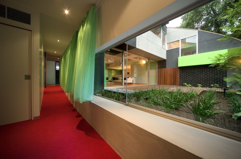
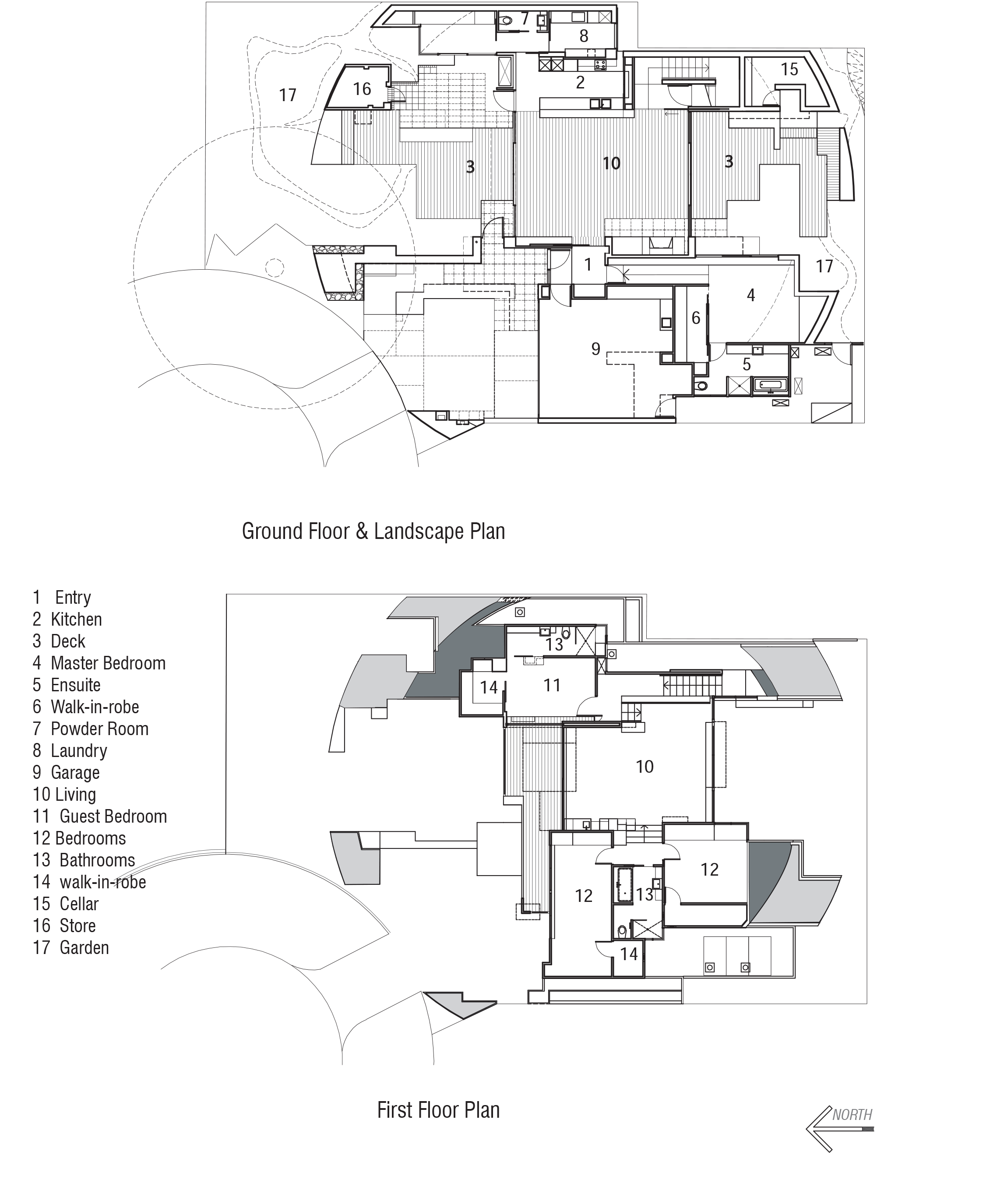
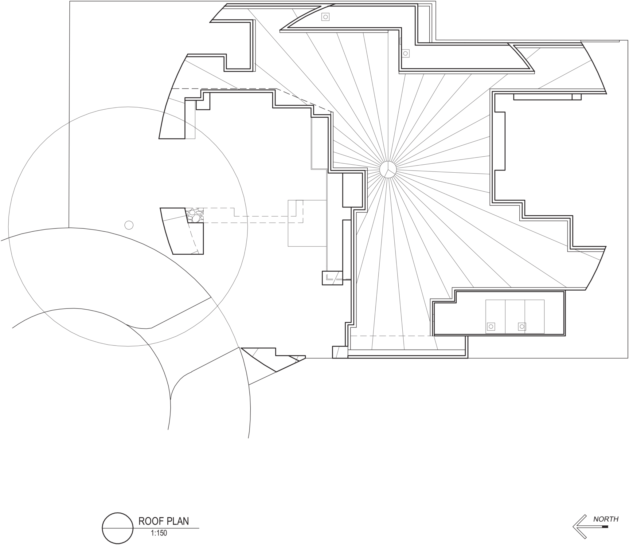
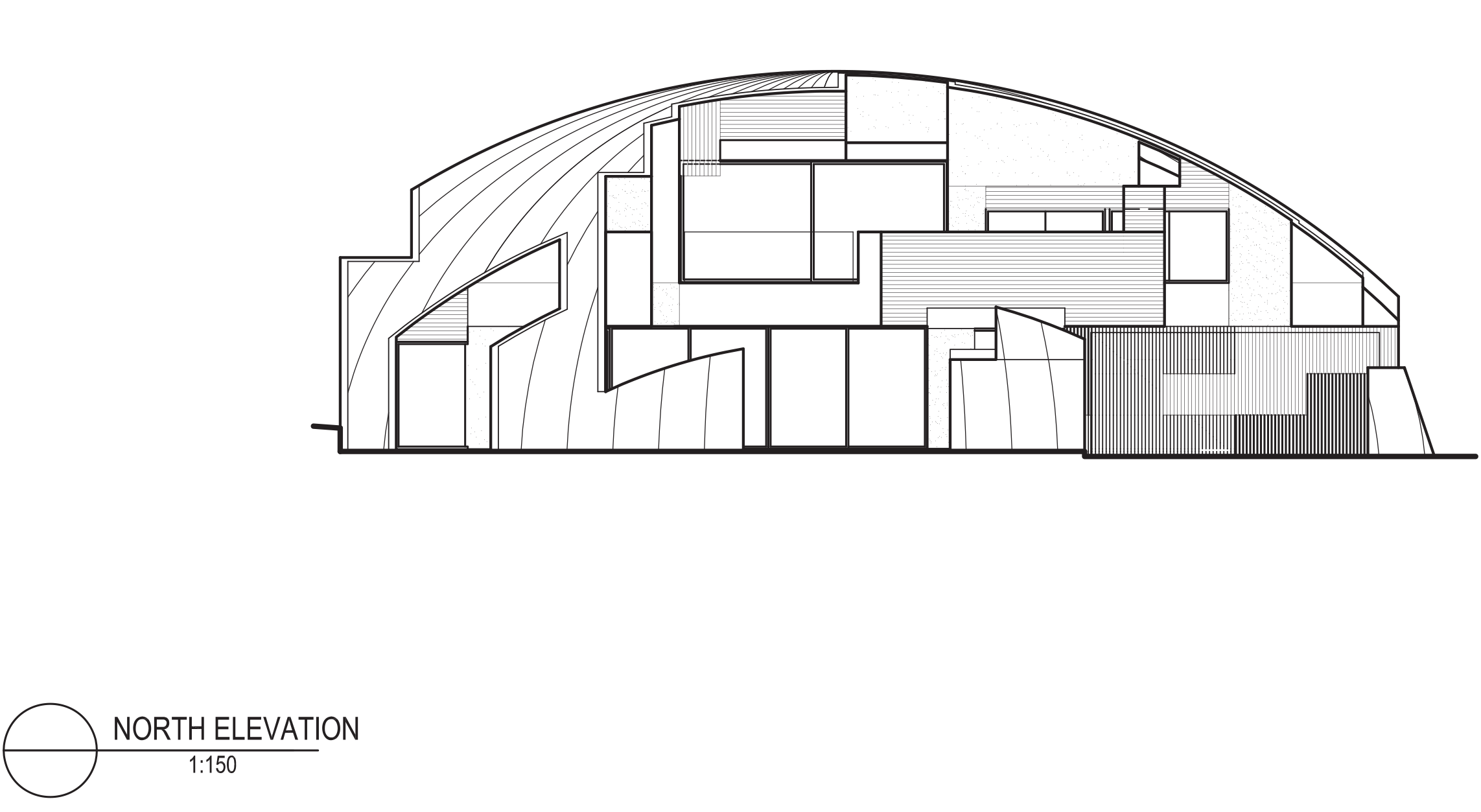
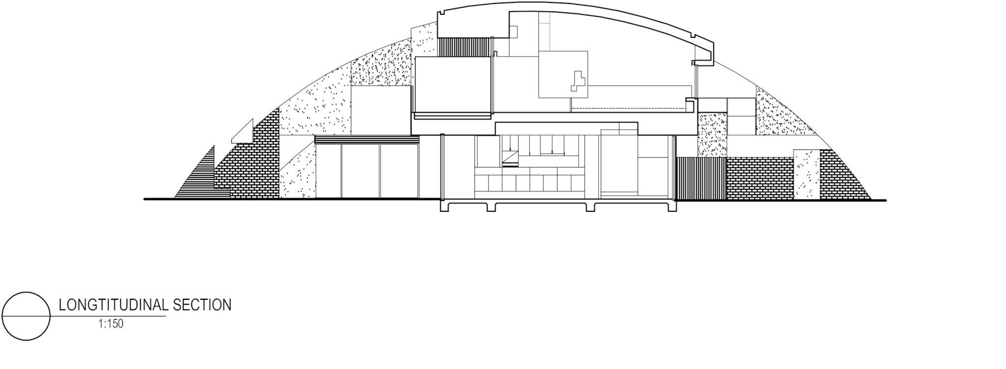
This project is a home in Hawthorn designed to accommodate at the various stages of its life, a family, a single person, and a single person with large visiting family. The design concept of this home was to take a perfect shape, the copper sphere, and to remove parts. By selectively removing parts of the sphere, there is the sense internally of being in and surrounded by garden. The spherical shell also provides beautiful internal spaces on the first floor.
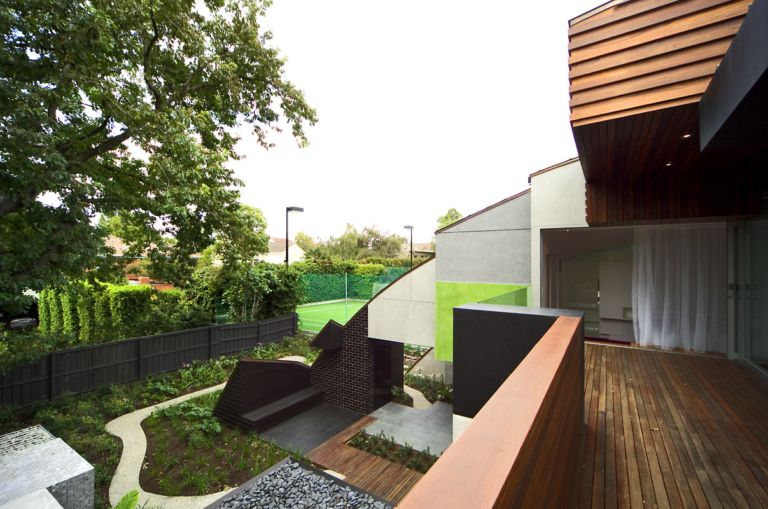
The person is a middle-aged single woman, an artist with a large family and circle of friends who often stay over. The place is Hawthorn a middle-class suburb, leafy and picturesque. Our first site visit gave us a strong sense of what this building might become – the large oak tree, the adjacent Victorian Mansion and the site’s location, a hill-top which terminated an easement of tennis courts that swept into the valley below. We sensed an object that could respond to these specific and unusual spatial conditions.
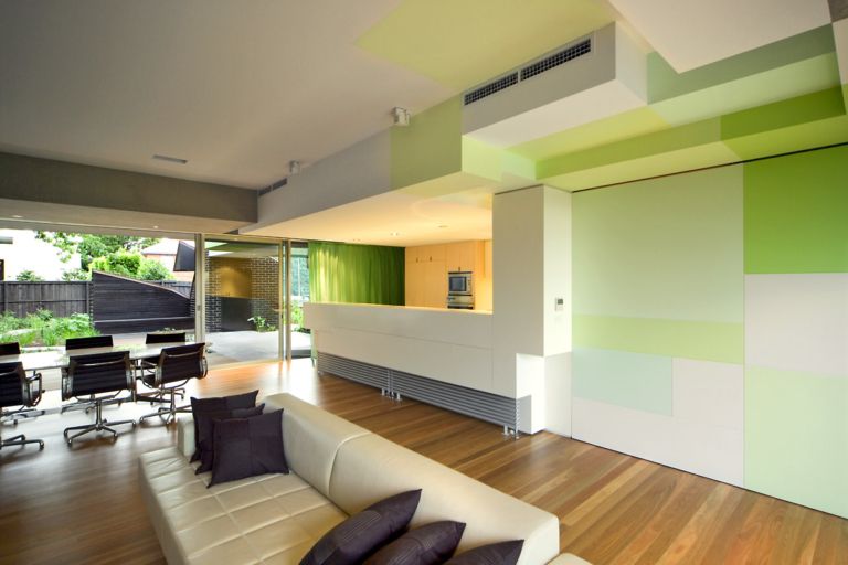
We became obsessed with the idea of a garden through the centre of the house. The plan evolved into one with a central living area, ancillary rooms were carefully slung either side providing a graceful union between private and communal in family-life. These ideas were not profound nor without precedent, and could have on their own resulted in a thousand different houses. The dome was an office favourite. And a good rough fit of the setback and programmatic displacement.
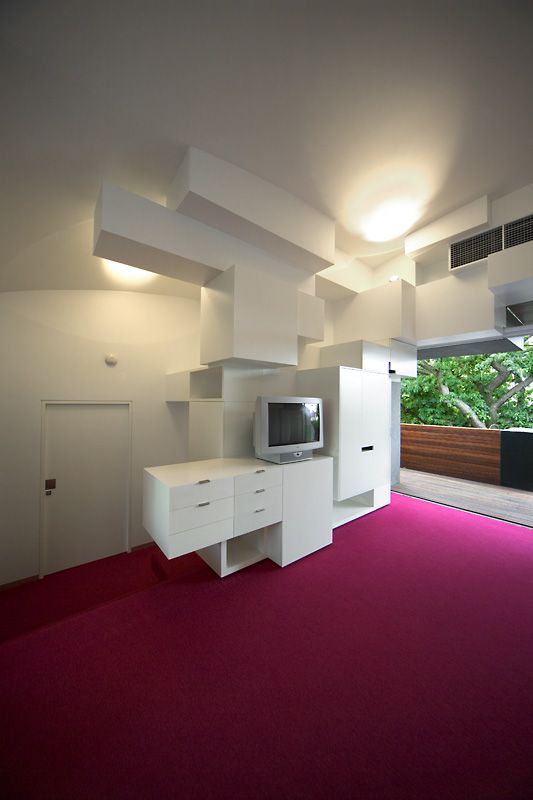
But the idea of the dome as an incomplete puzzle came about after experiments with hollowing and cutting the object. The accidental superimposition of dome and rectilinear plan resulted in a great variety of new domestic interior spaces. Externally we wanted to subtract just enough to hold the original form. We had hope that the revelation of the object after subtraction would be greater and more intriguing than if it were whole. We thought of the puzzle components as 3D pixels. We could scale up and down, bringing some areas into sharper focus. We questioned each compositional moment by negotiating accident & design, abstraction & representation.
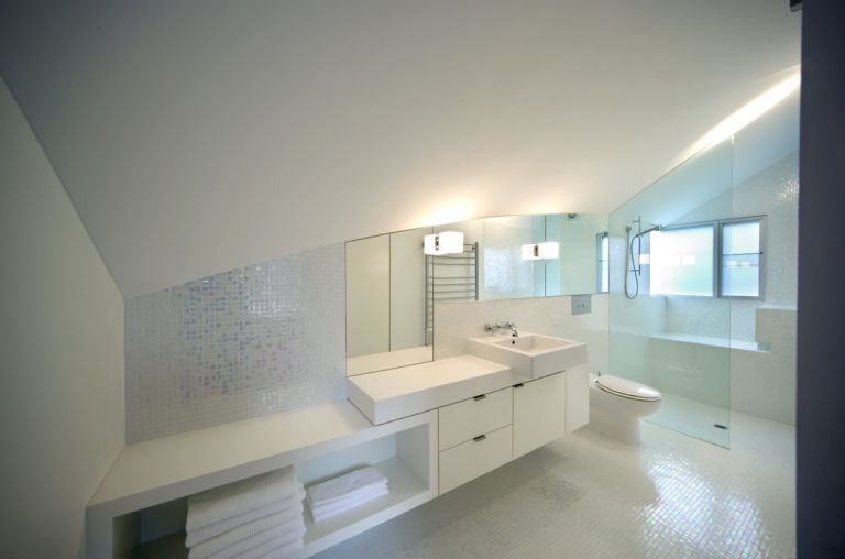
The building which evolved had the extreme heroicism of the revolutionary modernist dome house and yet it could also be read as a ruin of the same. Those little things that surround houses, the letterbox, seats, sheds, fence, and lights were subsumed as fragments in the system. They become markers and semi-enclosures of outdoor spaces, both courtyards and forecourt. Internal spaces were divided and colour-coded between two categories – ‘the exterior’ (main living area) and ‘within the dome’ (bleached white).
We hoped the consistency of the aesthetic order we were imposing would free us from the onerous task of designing each element from first principles. It however soon became its own form of imprisonment; everything called for our attention and screamed opportunity – we saw new little buildings everywhere. We then understood the blindingly obvious – that the Cartesian grid is one of endless opportunity.
Rainwater is collected from the copper clad roof by concealed gutters and is stored in rainwater tanks installed under the south desk. The dome house also utilizes solar hot water, a drip garden watering system and double glazing to maximize energy efficiency. These simple sustainable elements have been integrated into the home so as to have minimal aesthetic impact.
Project Info
Architects: McBride Charles Ryan
Location: Victoria, Australia
Principal Architects: Rob McBride, Debbie-Lyn Ryan Project team: Jamie McCutcheon, Lisa Cummings, Fang Cheah, Adam Pustola, Drew Williamson, Matt Borg
Year: 2005
Type: Residential
Photography: John Gollings
