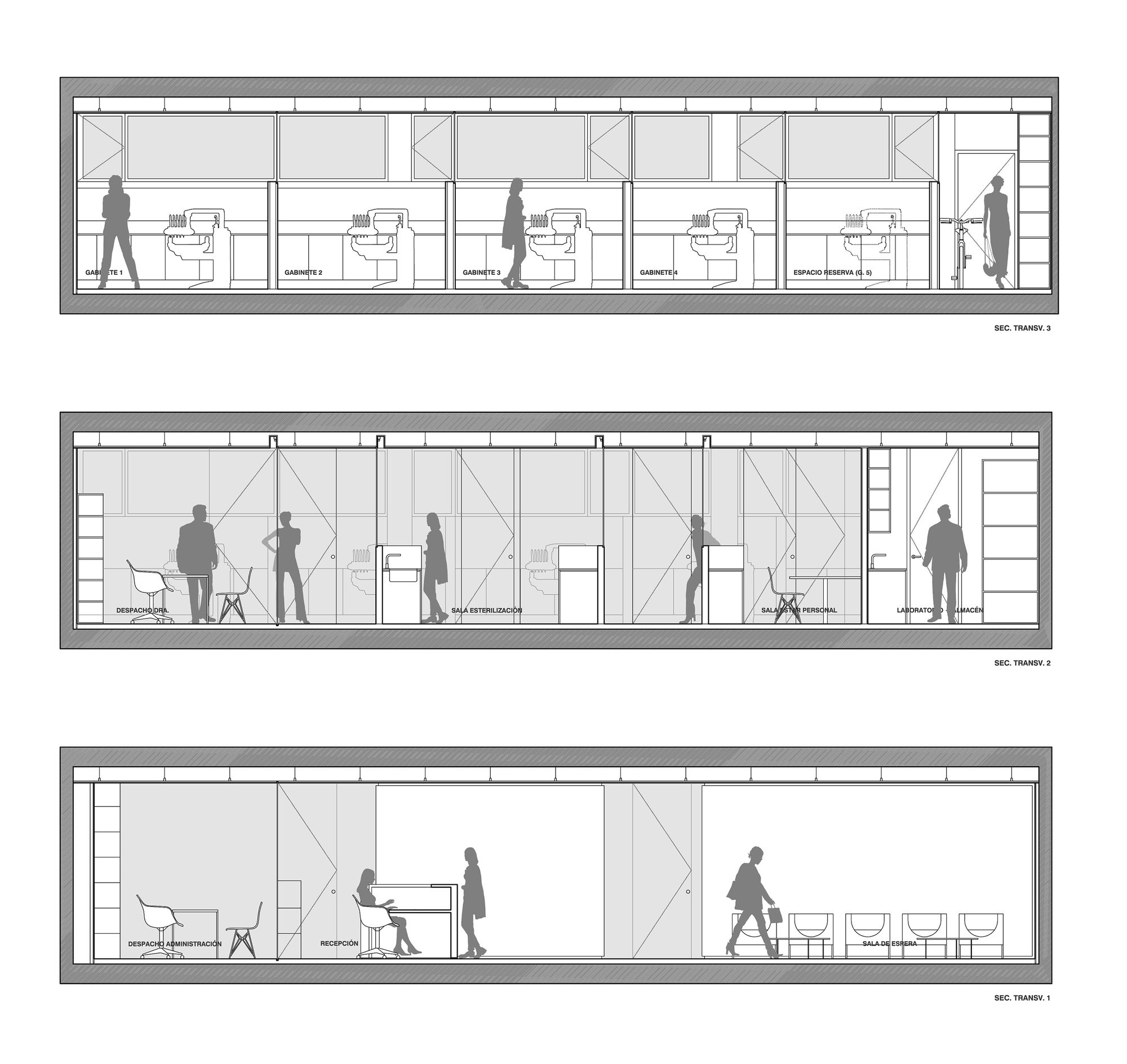
Designed by Jaime Sepulcre Bernad, On a perfectly square diaphanous room -15 x 15 m- with four central pillars, the project proposes the structuring of the future clinic in three programmatic bands of very similar proportions:
Waiting Area:
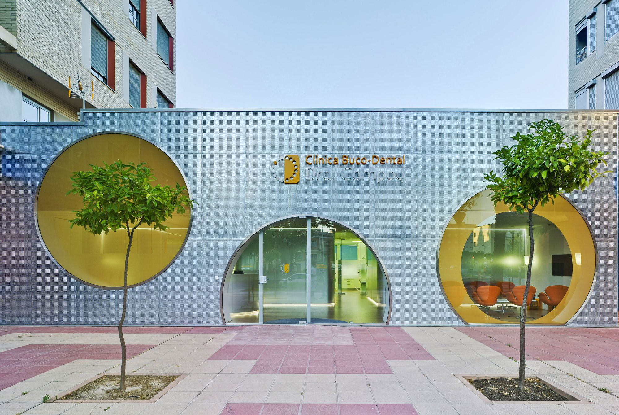
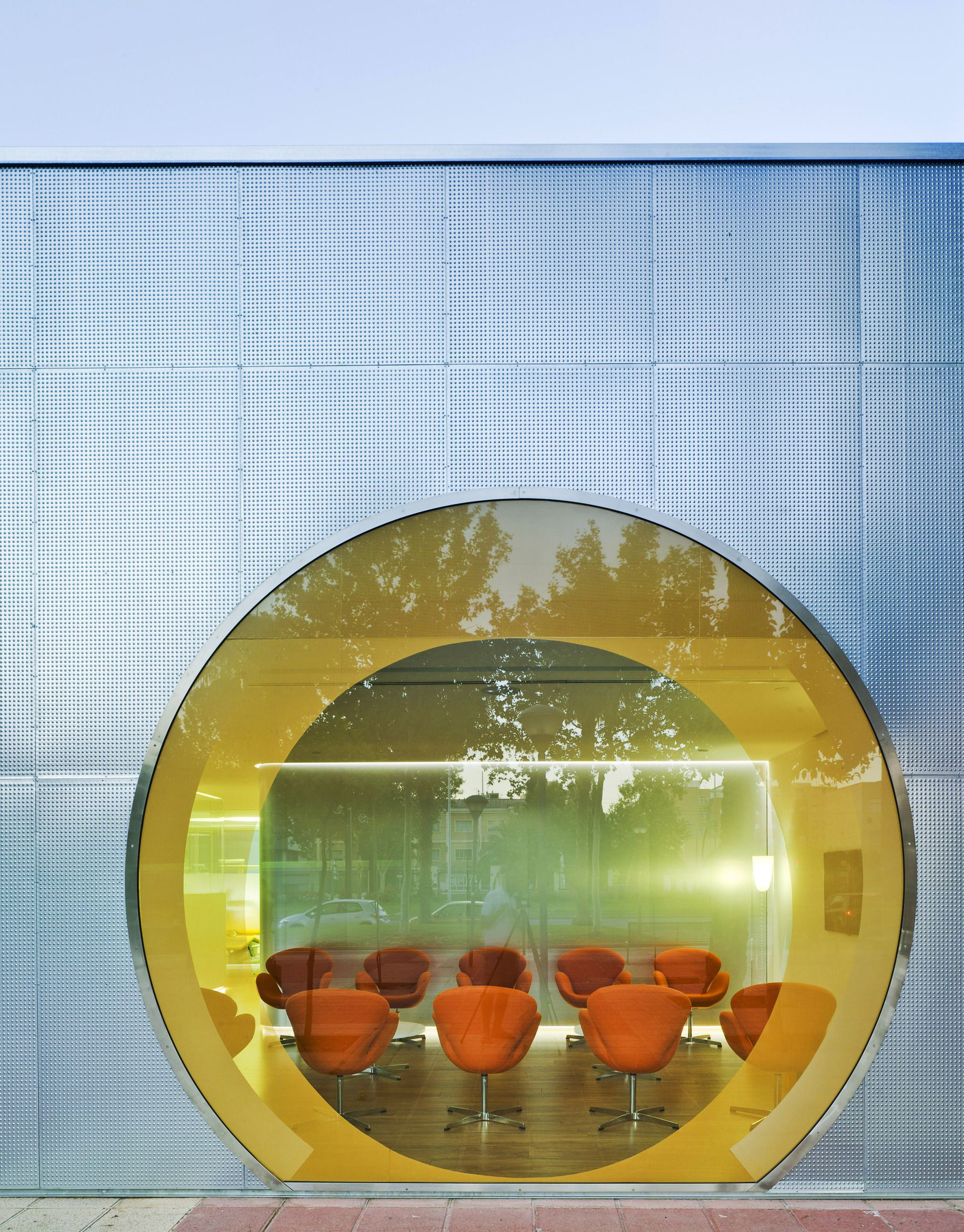
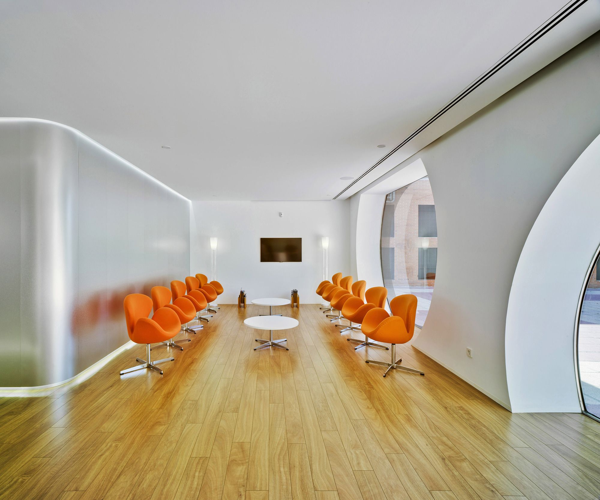
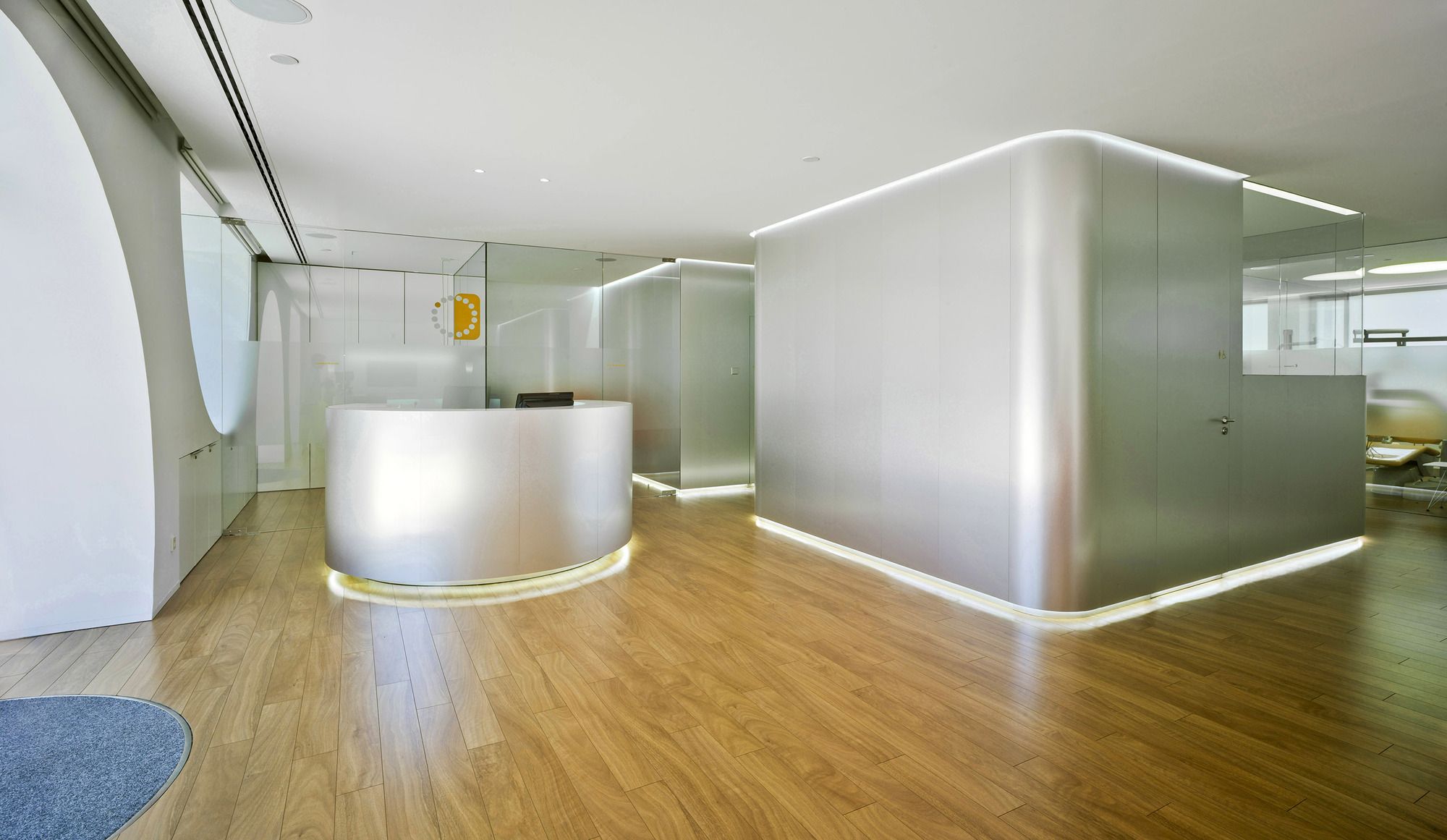
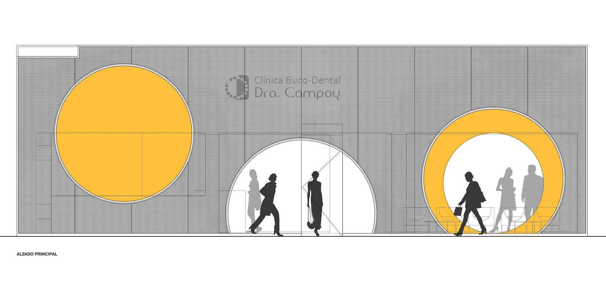
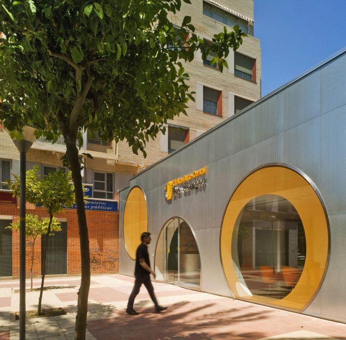
The first band is the most public, which is accessed and basically contains the reception and a large waiting room. All this generous space of reception and waiting opens its views towards an outer square through the great circles that make up the facade. The reception, organized in a circular piece of furniture, becomes the centerpiece of this first space and from it is controlled its operation. After the reception, there is a small administration office and a small relaxation room.
Dental Space:
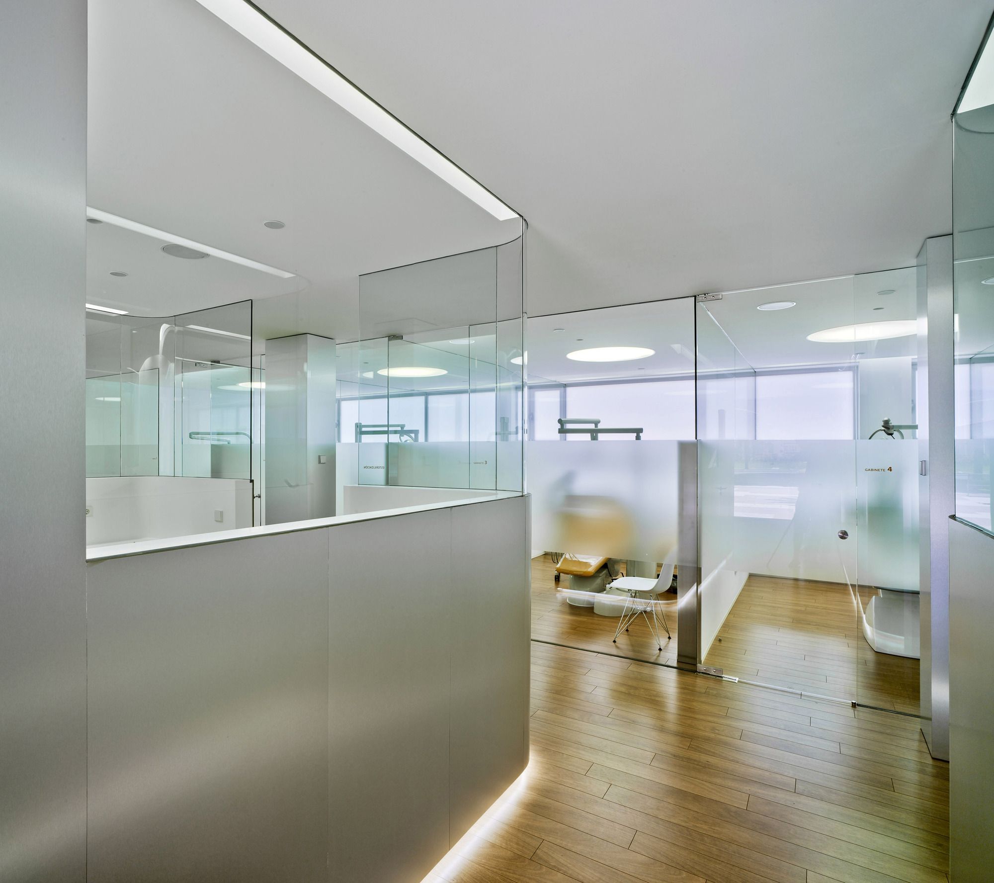
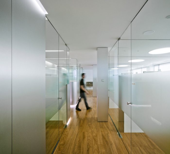
The most intimate and protected part of the clinic is the properly clinical band that appears alongside the back facade facing a boulevard. This dental care space is composed of a battery of five cabinets connected to each other visually. In this band also appears a secondary access for exclusive use of the personnel.
Server Area:
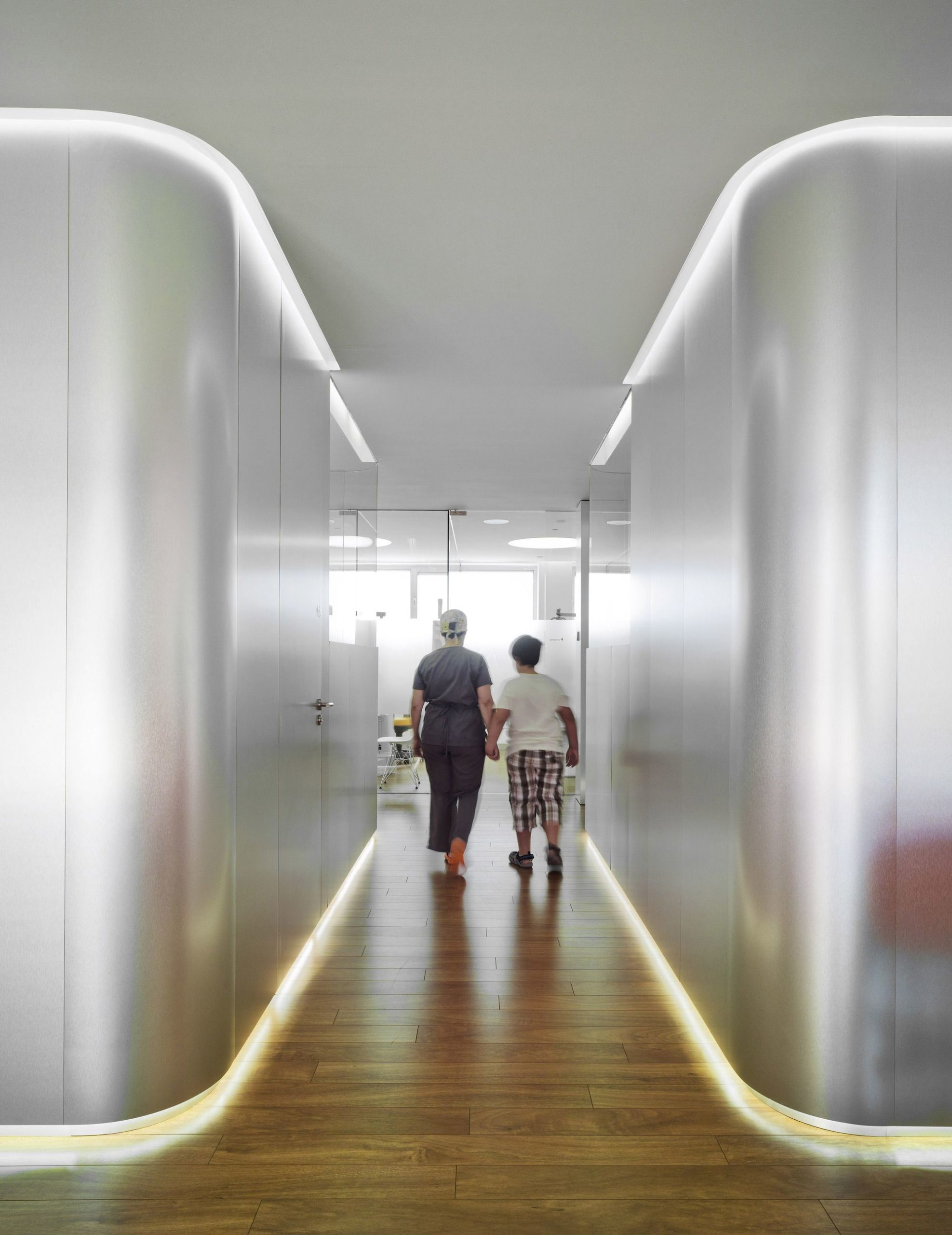
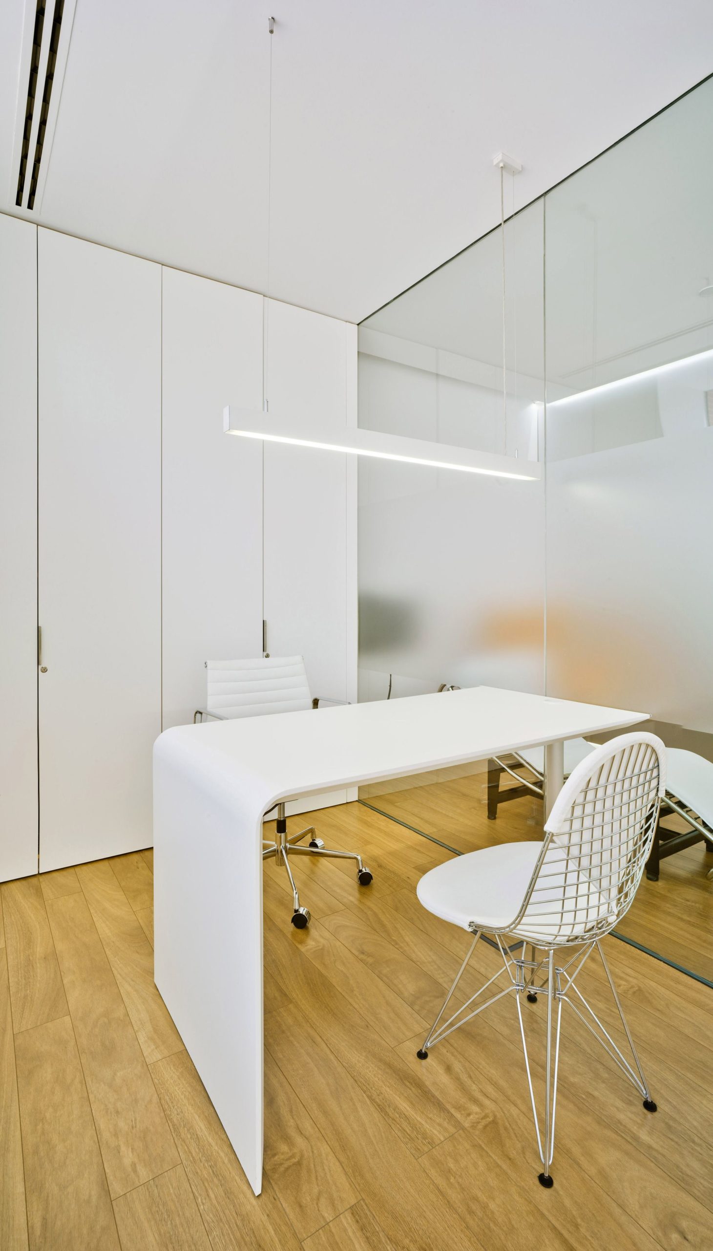
Finally, between the most extrovert and the more introverted space appears an intermediate band that makes of filter and that contains all the uses properly servants. This servant band is carried out by the sterilization room around which the functioning of the dental offices gravitates. In this band are also the ray room, the laboratory, the engine room, the staff room, the wardrobe, the office of the doctor and the toilets for patients.
Three materials:
Three material ideas formalize this space with vocation of continuous space – constant height 2.70 m-:
1 / The idea of achieving maximum transparency through the use of “glass”; 2 / The idea that the only pieces that appear loose are the three boxes that make up the intermediate band and that materialize like metal boxes, of “aluminum”; And 3 / the idea that the whole plane of the ground is a single material, continuous, and warm, human, “wood” – which is finally a good laminate-. And the rest, white.
Urban Logo:
The idea for the facade was to take a fragment of the logo of the clinic and expand it to scale city. The new facade therefore relies on a corporate image that was already consolidated and now acquires an urban scene size.
Project Info:
Architects: Jaime Sepulcre Bernad
Location: Spain
Area: 225.0 m²
Year: 2012
Photographs: David Frutos
Manufacturers: Finsa, Saint Gobain, POLYREY
Project Name: Dra. Campoy Dental Clinic
