Eagleton Weekend Home
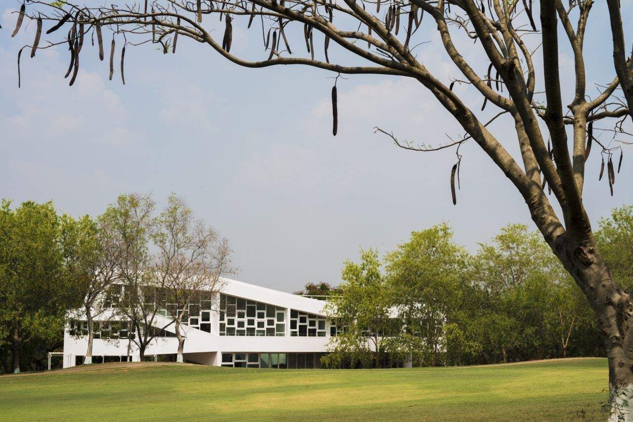
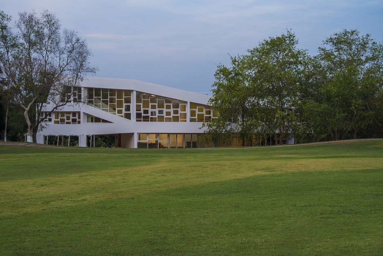
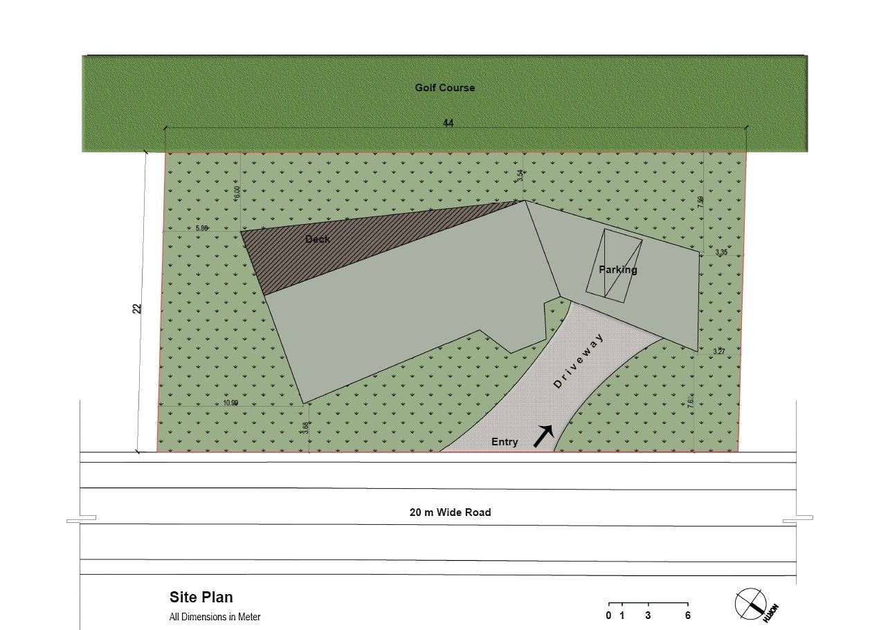
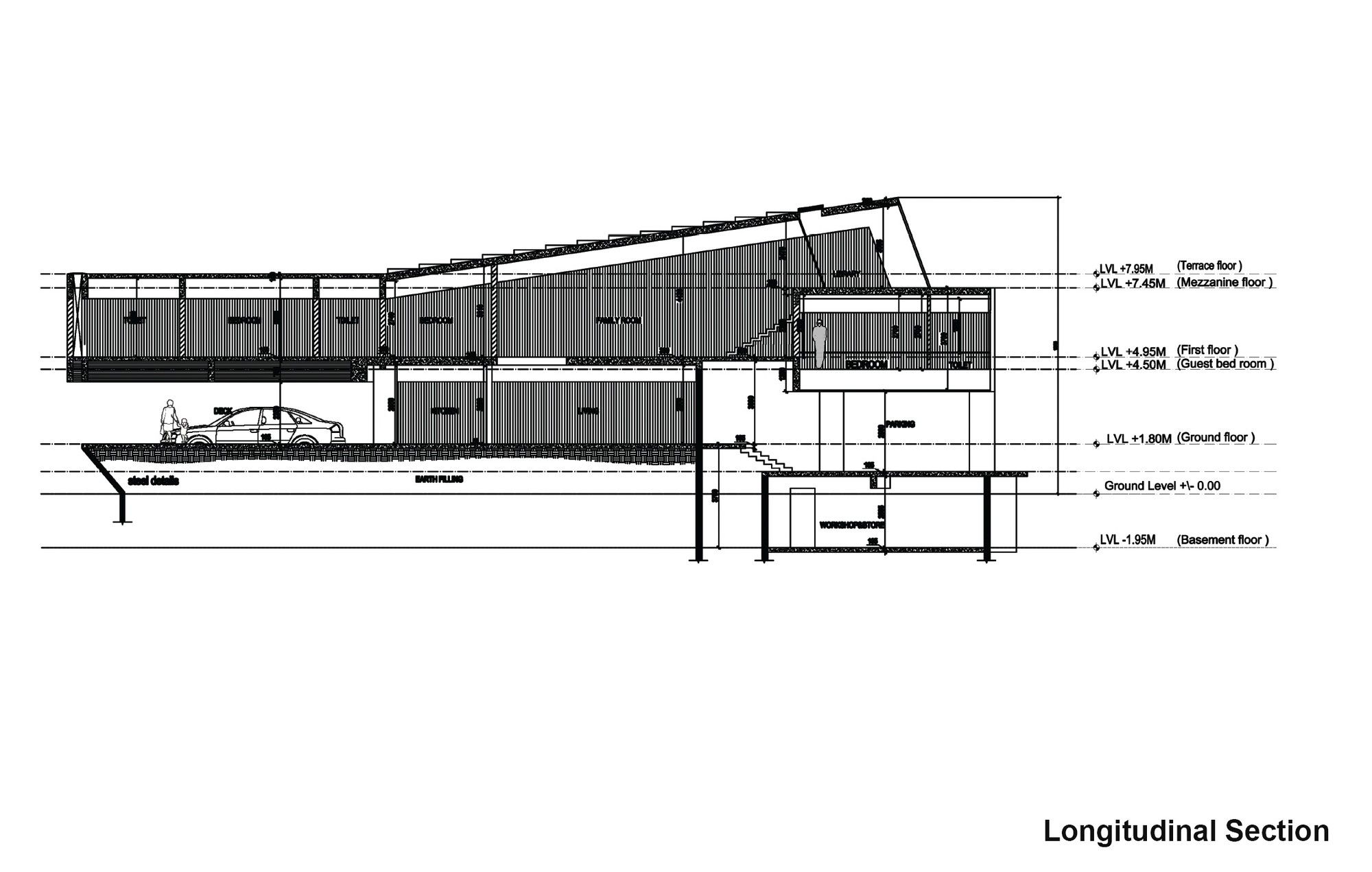
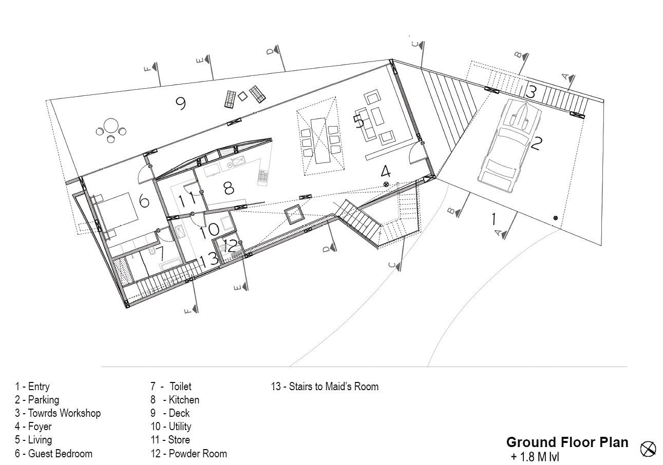
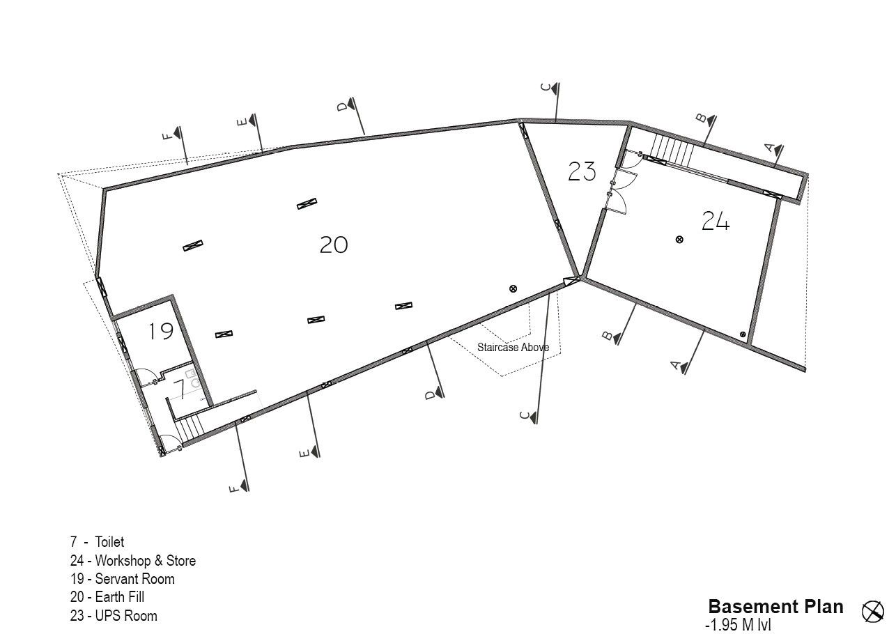
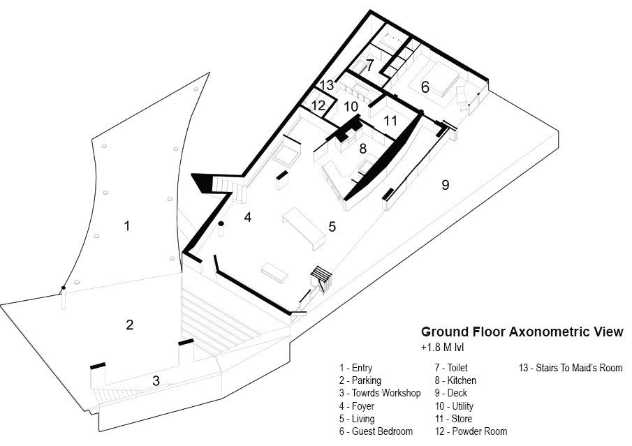
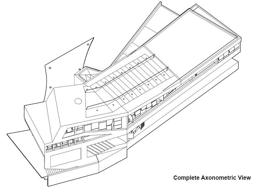
One of the site characteristics which we wanted to alter was the ground plane of the site with respect to the elevation of the fairway abutting it since there was a difference of almost 2m in height between the respective ground levels. Hence, we decided to elevate the site by 2 m in order to be confronted with the infinite expanse of green when one enters the plot from the street. The 2m height would be partially utilised by some service areas connected to the house. The design concept was derived after imagining a set of scenarios that would take place in the house at different times along with the potential the site offered wherein the 30 m side flanked by the fairway would be tested by the geometric intent.The scenarios allowed us to approach the notion of program differently just as much as the objective of spending a weekend at the house.
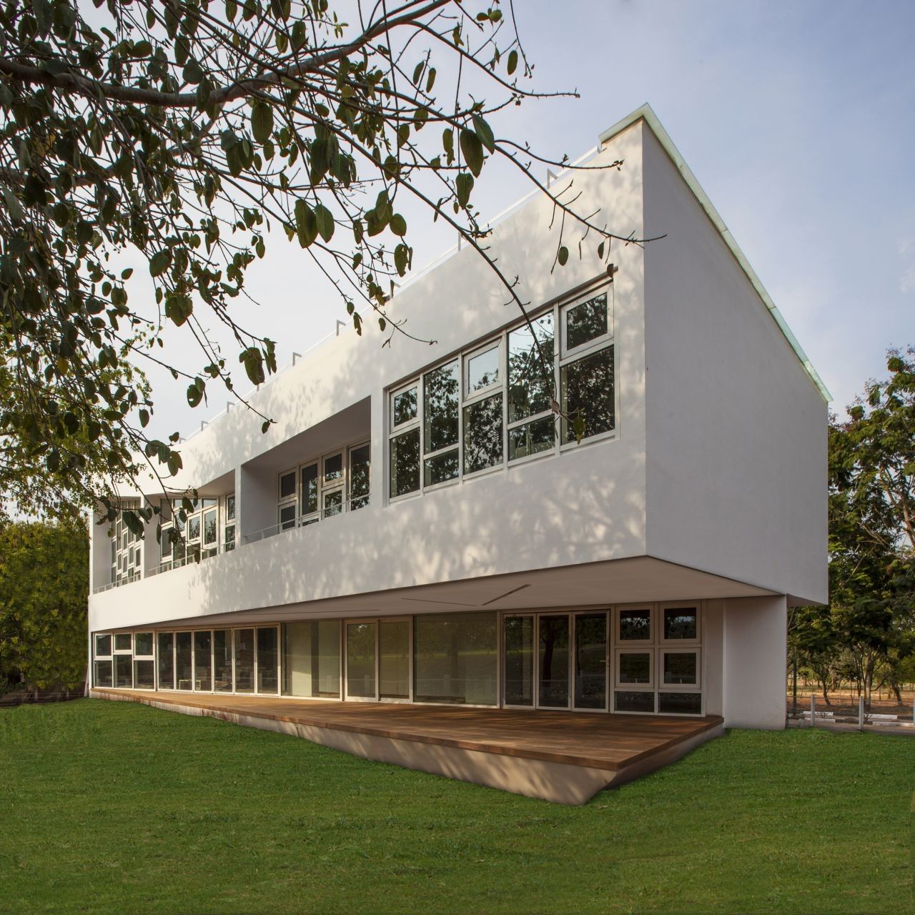
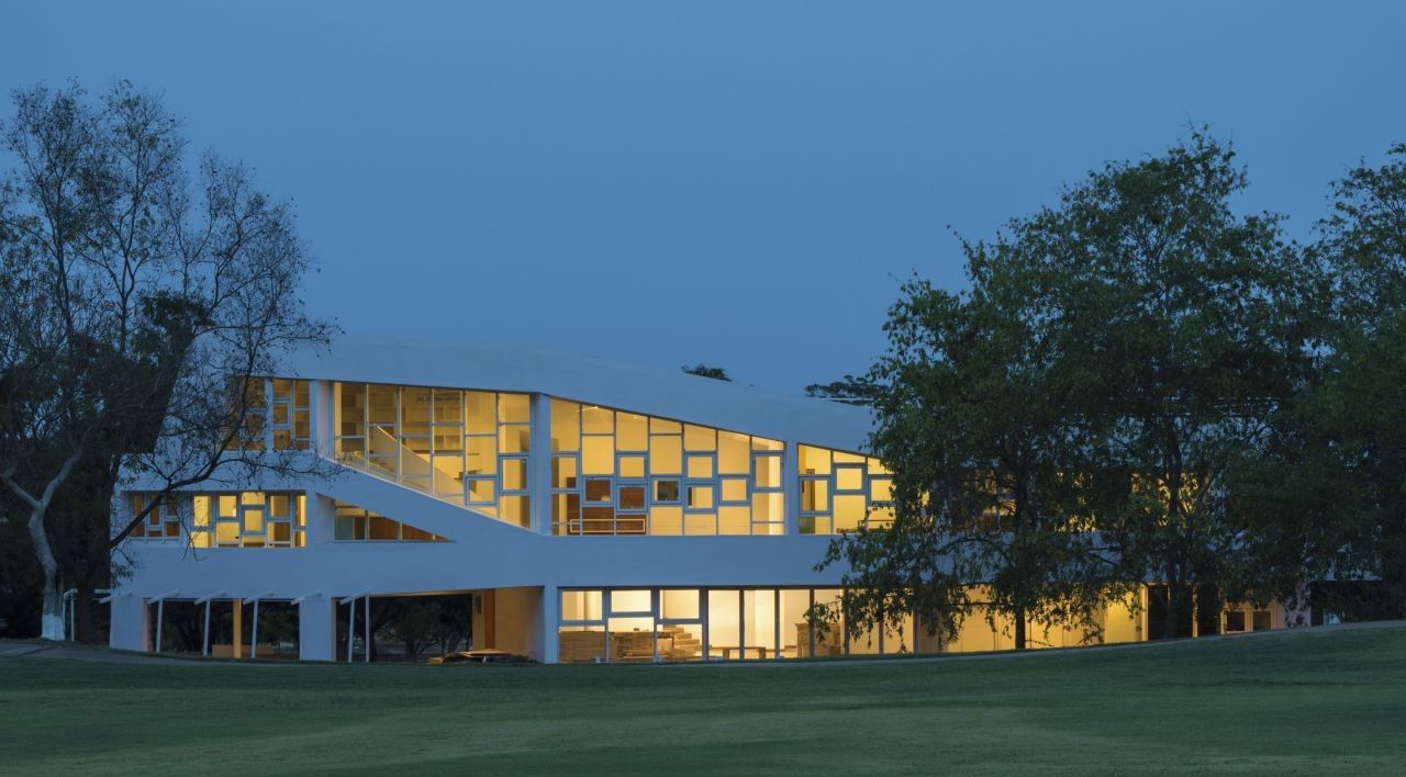
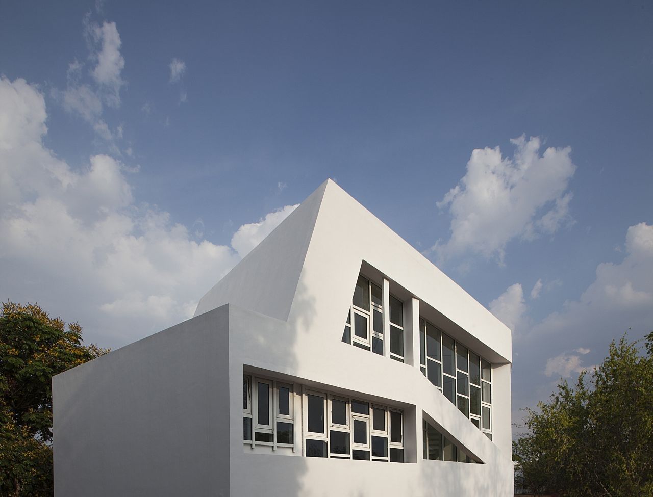
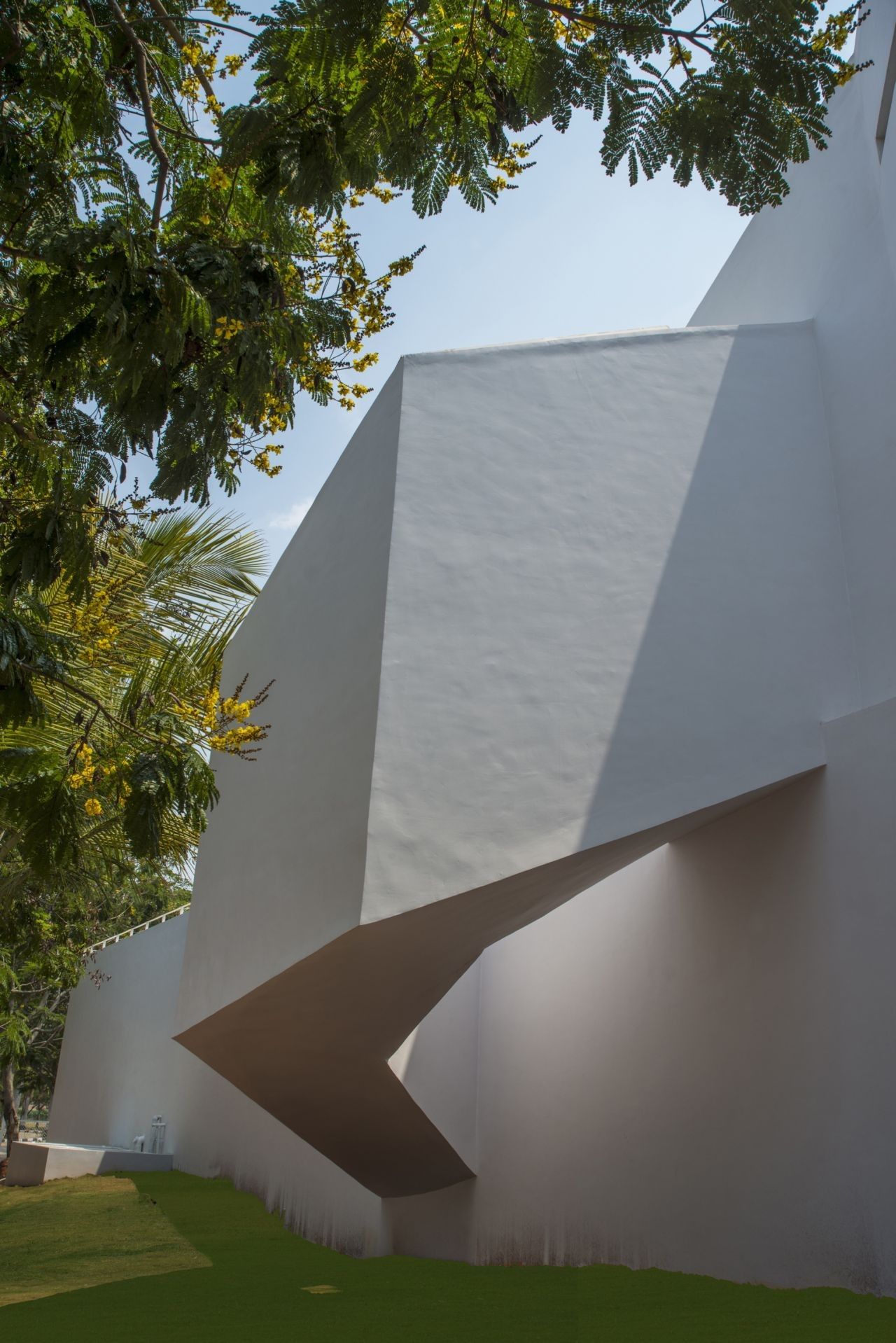
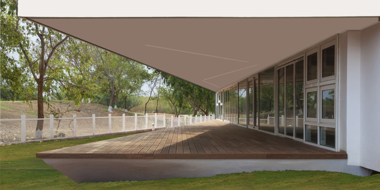
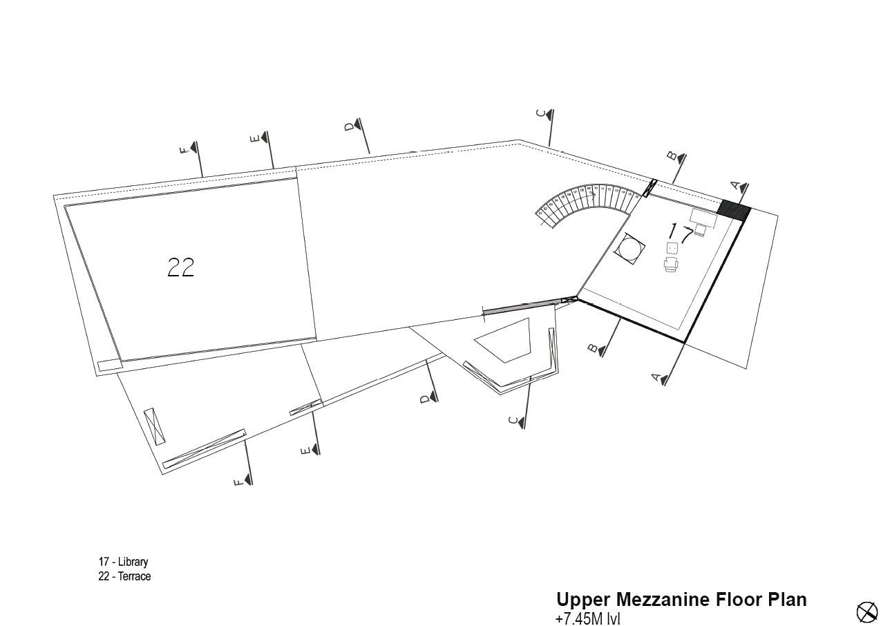
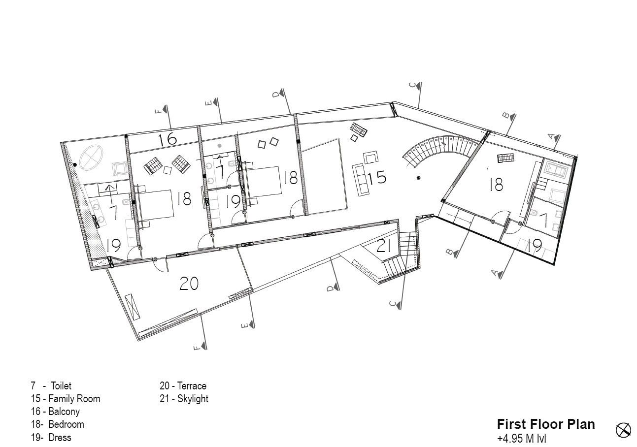
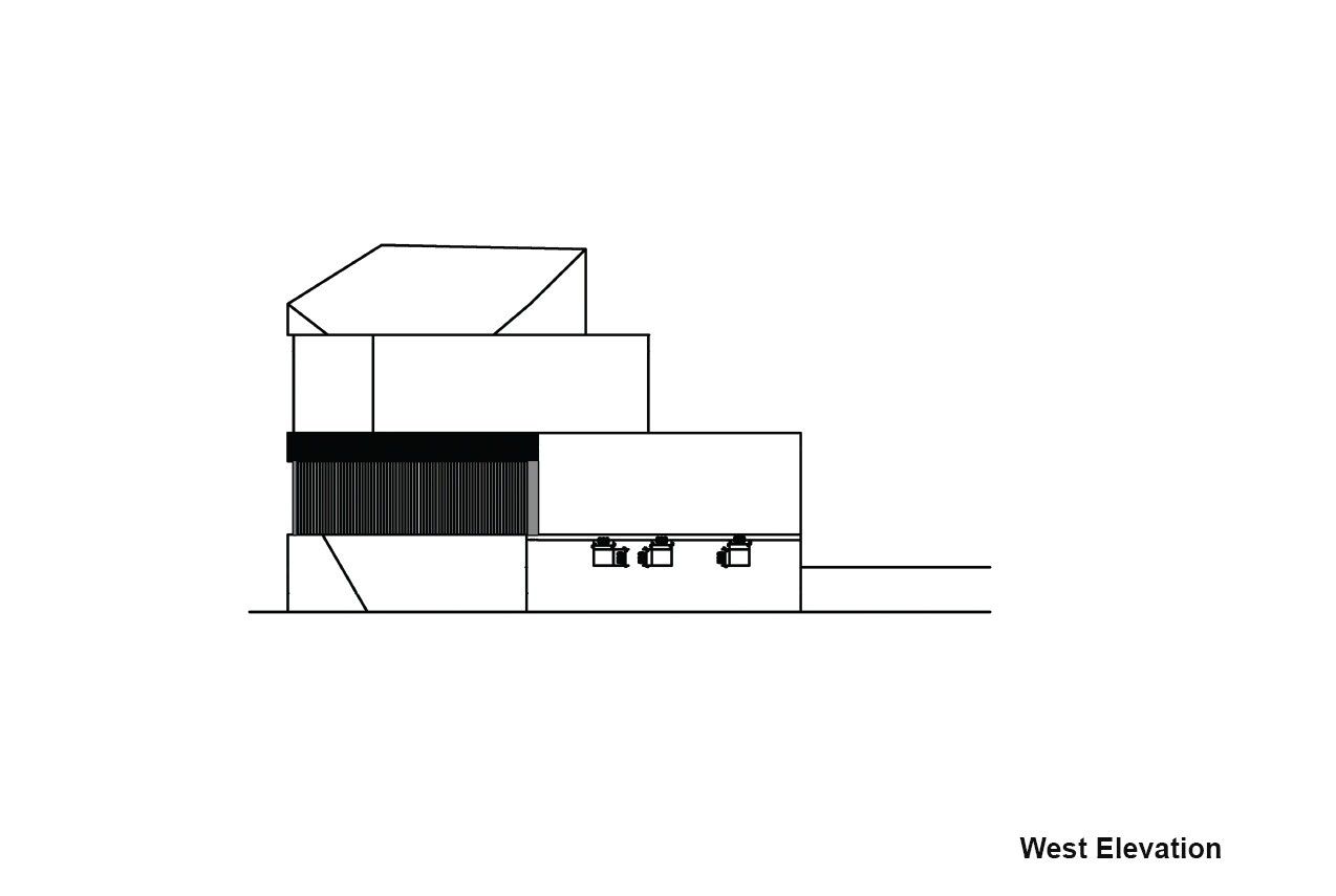
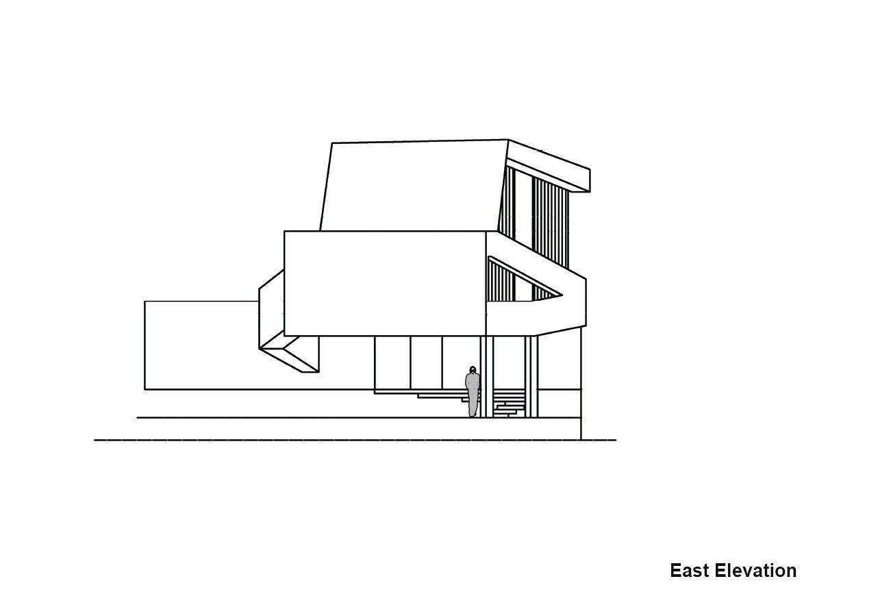
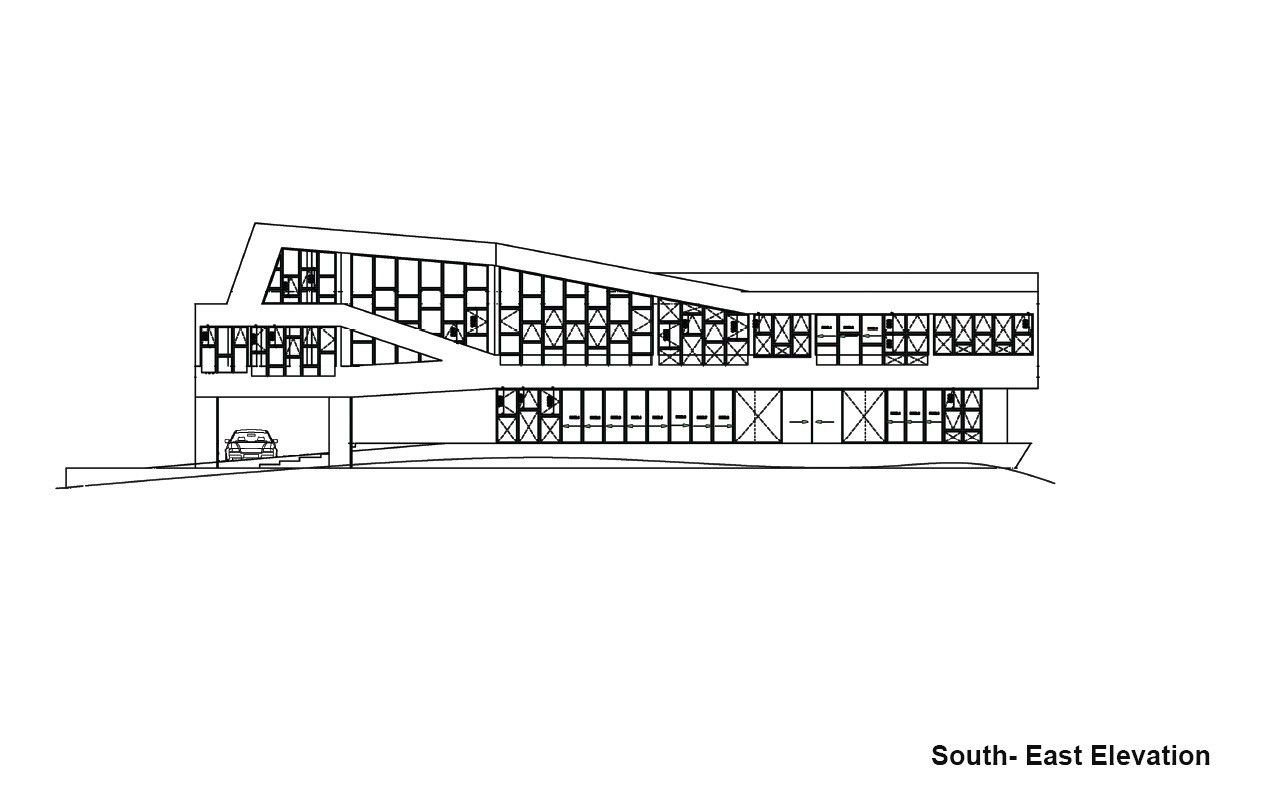
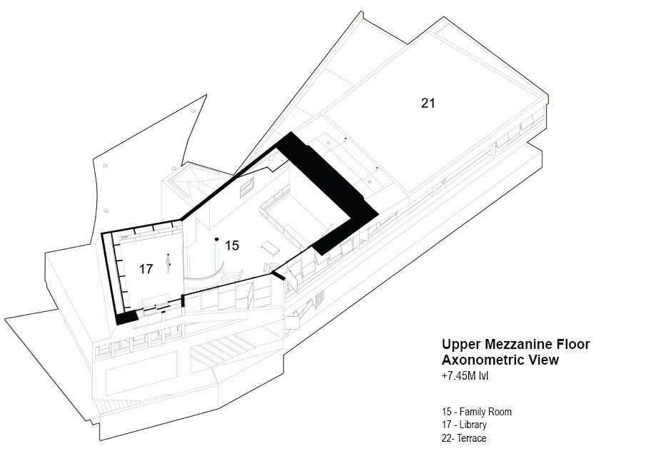
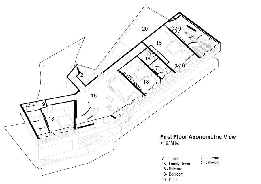
A radical decision was taken at the concept stage to not have any openings towards the street and do exactly the opposite towards the fairway. This decision hinted at the emergence of a form that was ‘sculptural’ and ‘unified’. The objective of taking this decision was to reduce the noise from the street and offer privacy whilst allowing a varied use of the spaces facing the fairway. The 2m elevated plot would be approached by a vehicular ramp from the street in such a manner that when the car is parked in front of the main entry to the house, the fairway becomes a canvas in front. The concept now urged for the structural principle to be integrated which would further allow the emergence of the form and its’ envelope.The sectional property of the design was such that the first floor was partly offset from the footprint of the ground floor so as to create a roof for the deck which stretched across the entire length of the floor and allowed access from the living room, dining and a bedroom as a single space.The first floor then branched to two levels where a bedroom and library were respectively located. The library was placed 1.5 m higher than the first floor.
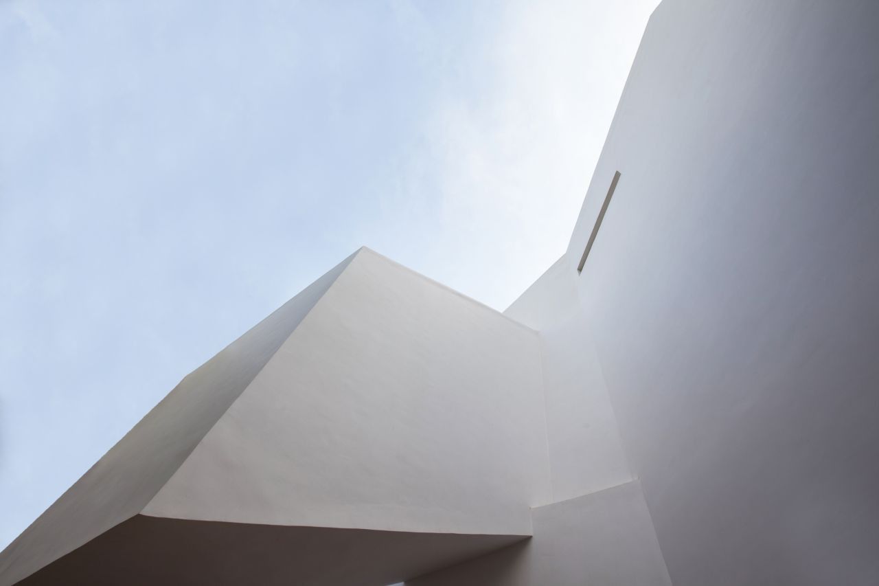
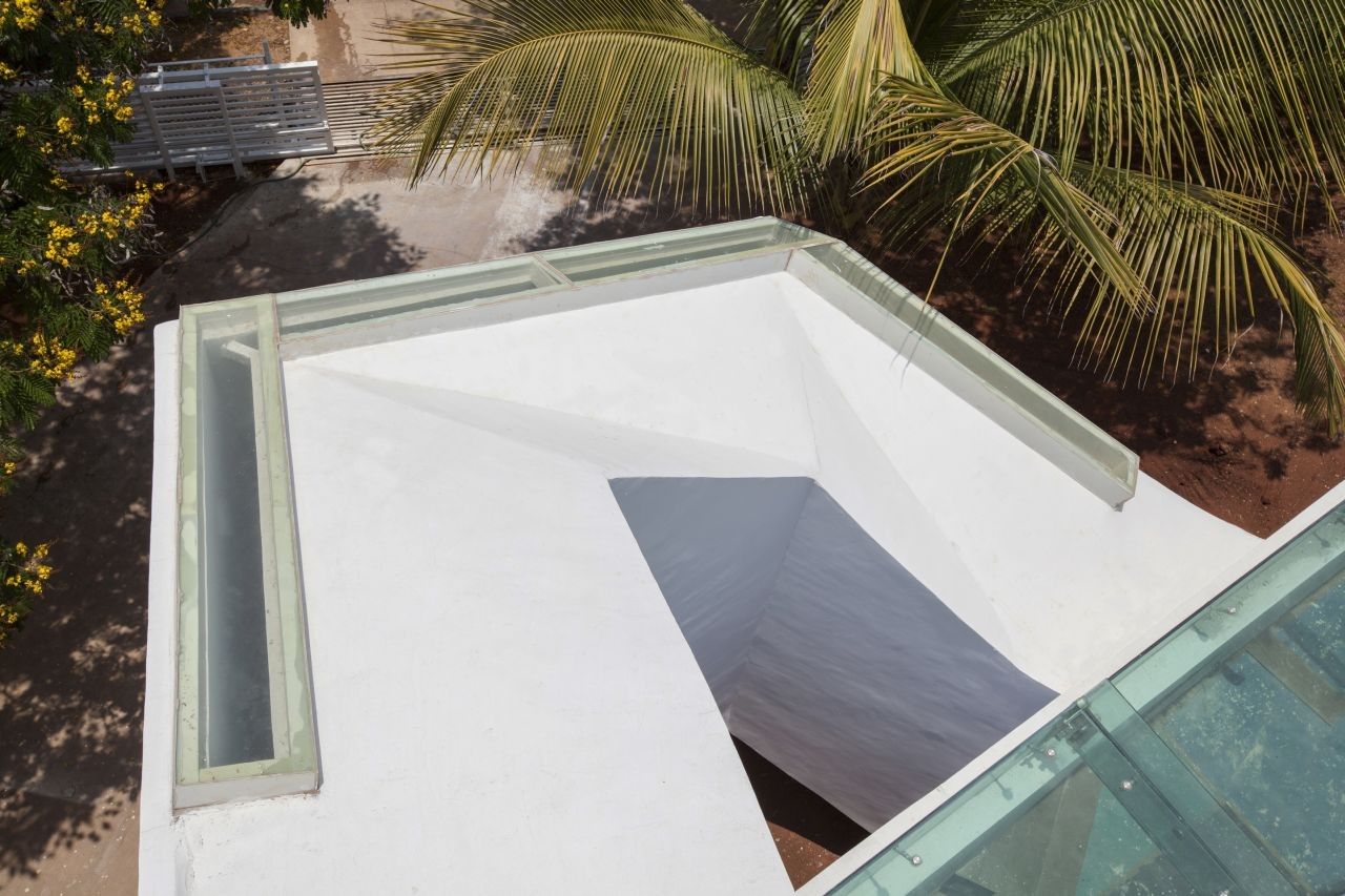
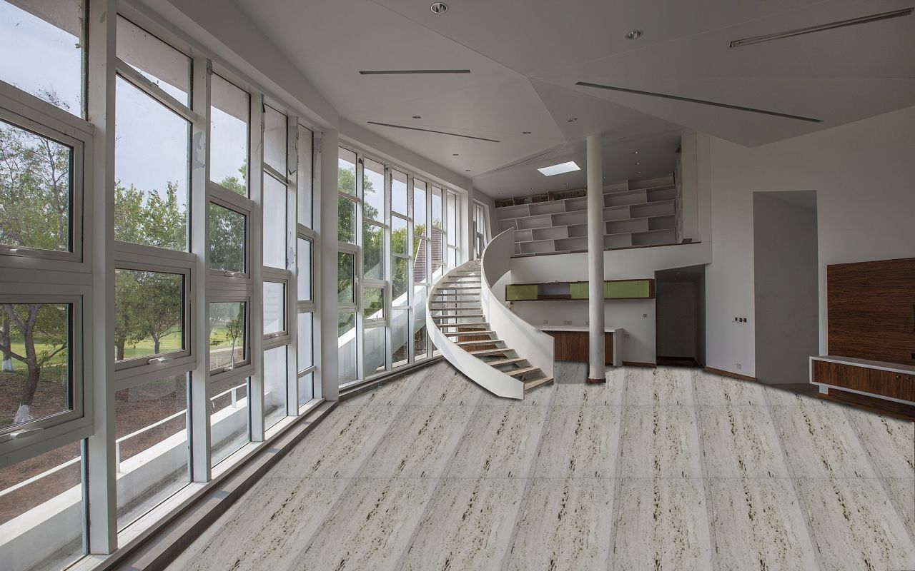
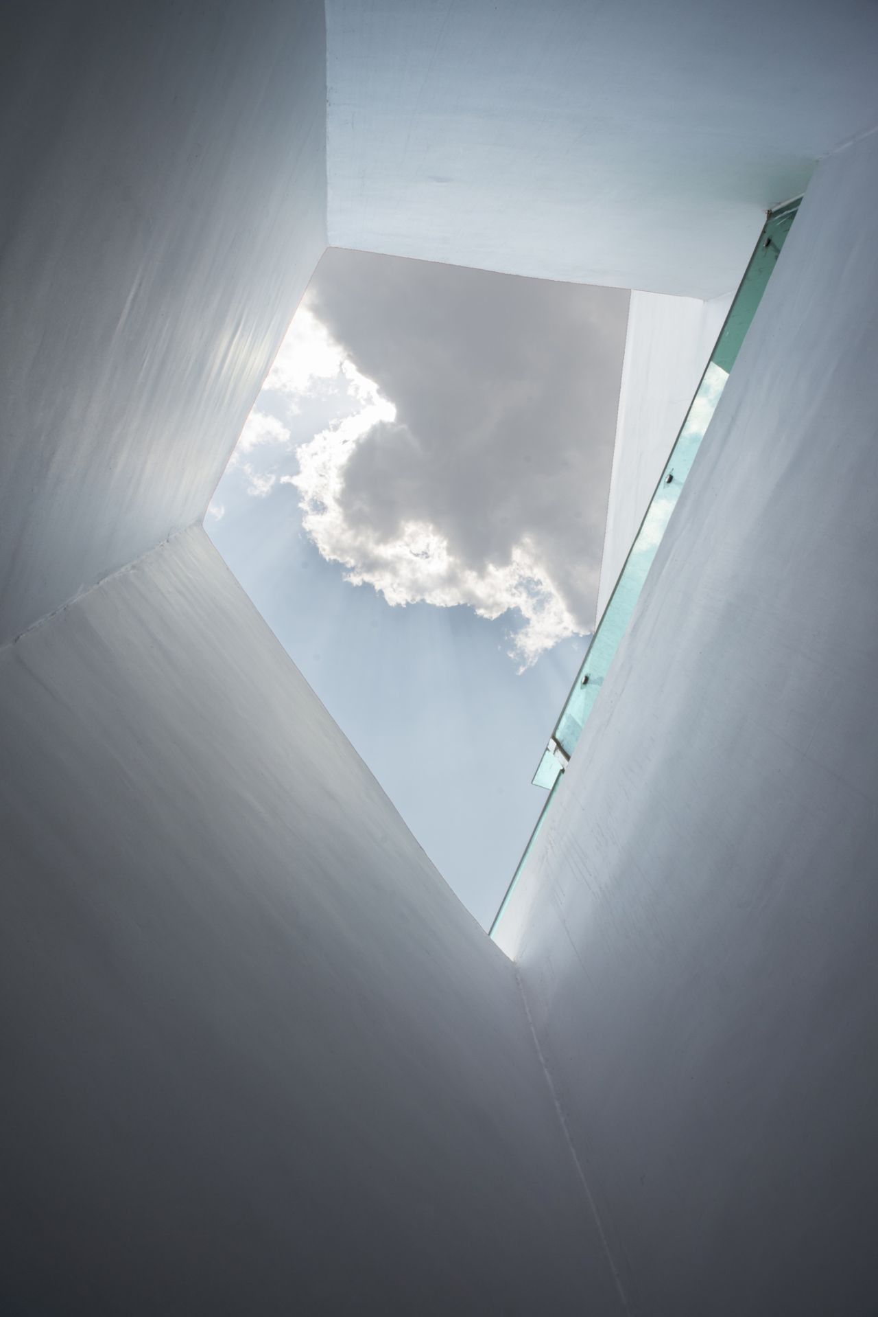
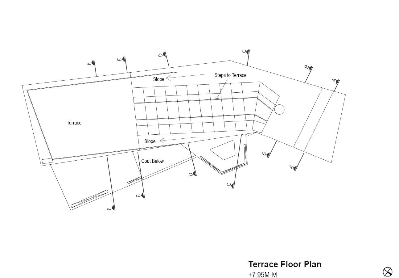
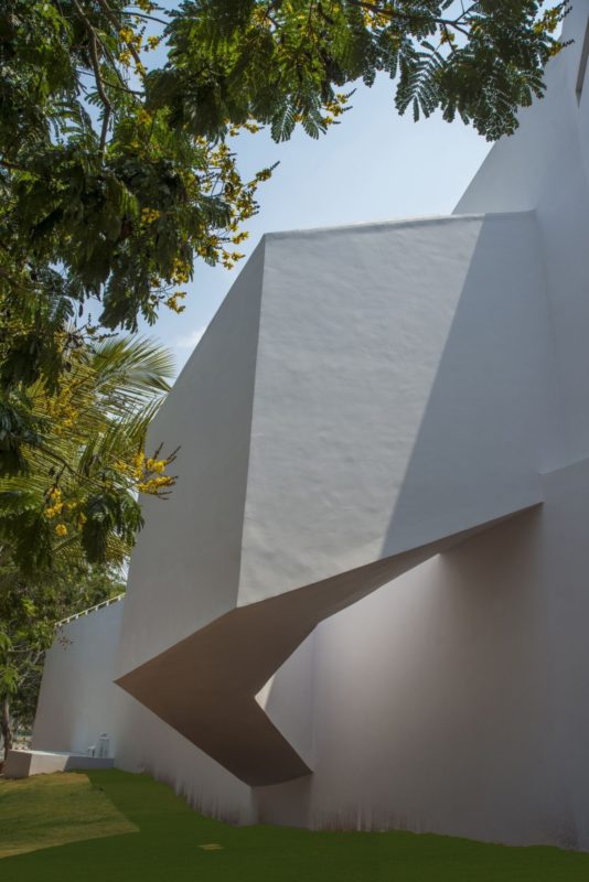
he main extent of the first floor had two bedrooms and a family area,all offering unhindered views of the fairway. The roof profile of the first floor sloped along the length of the house and it introduced some very interesting variations of spatial volumes to intensify the stillness of the fairway and the notion of movement in the geometry. The aspect of minimalism is spelt across the entire house as a result of the combination of the colour, geometry and materials.The blank wall and the projection of the staircase entity constitute the facade towards the road and underlines the qualities of minimalism and exemplifying the characteristics of a sculptural mass that hovers over the parking area i.e. main entry. The interior unfolds the various spaces in a cinematic manner where the structure, envelope and material all seem as one without attempting to supersede one another. The cinematic sequence is homogenous in its’ structure and heterogeneous in perspective. The walls are finished with white paint and the flooring is silver travertine finished dull. The ceiling is again finished with white paint and the light fixtures are recessed and specifically minimal in their design. The grains of the travertine further accentuate the linear arrangement of the inside.The minimal aspect of the house is so consistent that it is difficult to differentiate the exterior from the interior since they seamlessly unify. The interior design concept revolves around the concept of celebrating the scenario of relaxation in almost every part of the house without being conscious of the surroundings which are not layered to introduce complexity but rather to enjoy the geometrical mystery and outright functional furniture.
There veneers used on the doors and the furniture are rich in their colour so as to introduce an element of contrast with the rest of the colour palette. The lines of the furniture complement the geometric strategy adopted for the Architecture. The project aims to redefine the purpose of having a second home that which should alter the experience of engaging with activities those which are prompted primarily by the qualities of the space one is within.
Project Info
Architects : Vivek Shankar Design Partnership
Location : Bangalore, India
Year : Anand Jaju
Type : Residential/ house
Photographs : Anand Jaju
