Edmunds.com Headquarters
Our client’s brief was straightforward … the CEO of this “Silicon Beach” automotive information and car buying online site – Edmunds.com – wanted an inventive space, focusing on his 600+ person team, a space where they could collaborate, team, create, define, recruit, discuss, focus and work however they felt best to fit their current assignments.
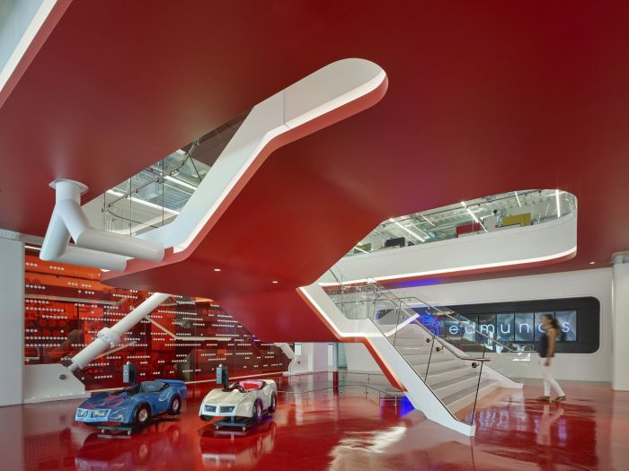
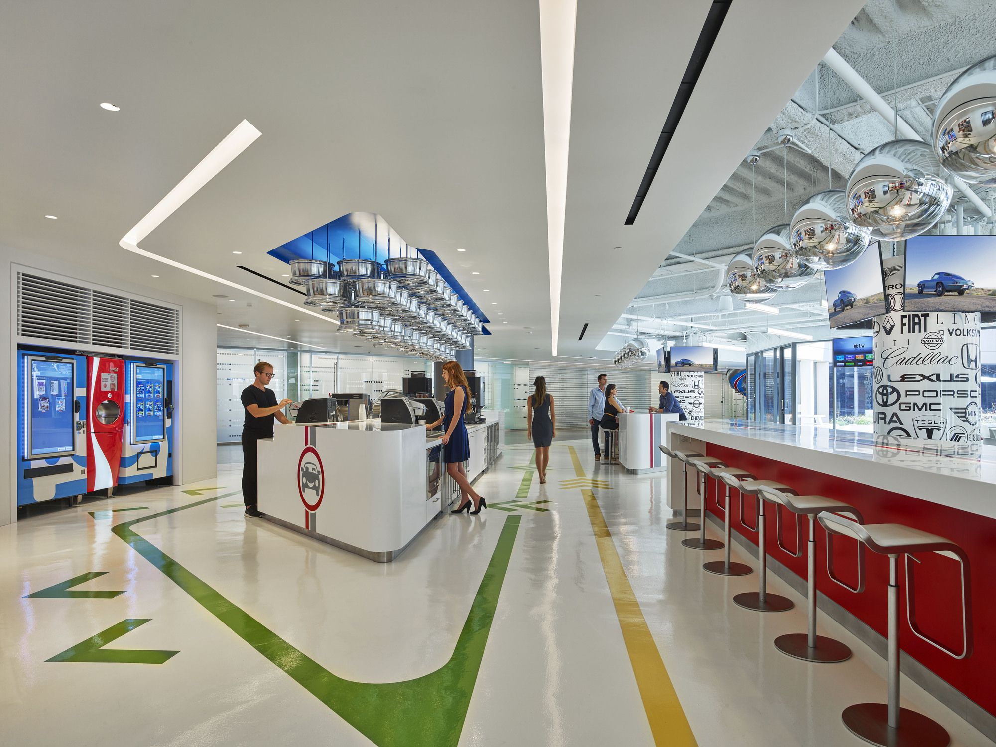
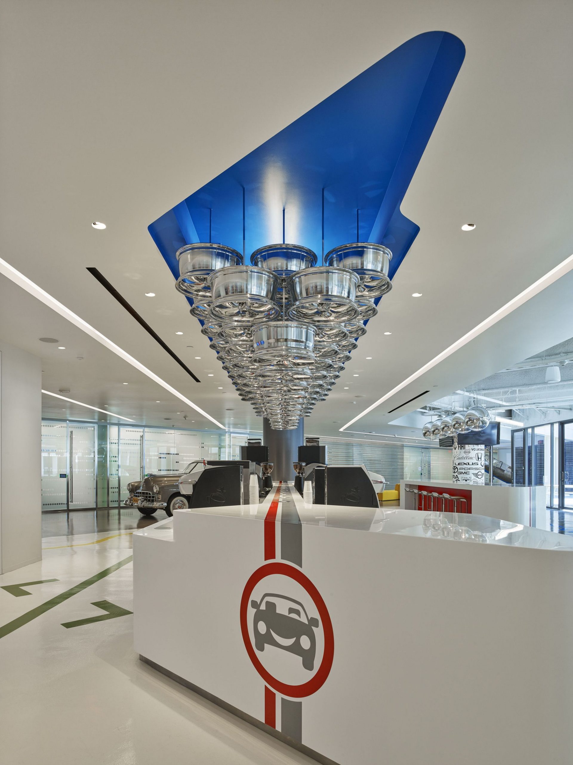
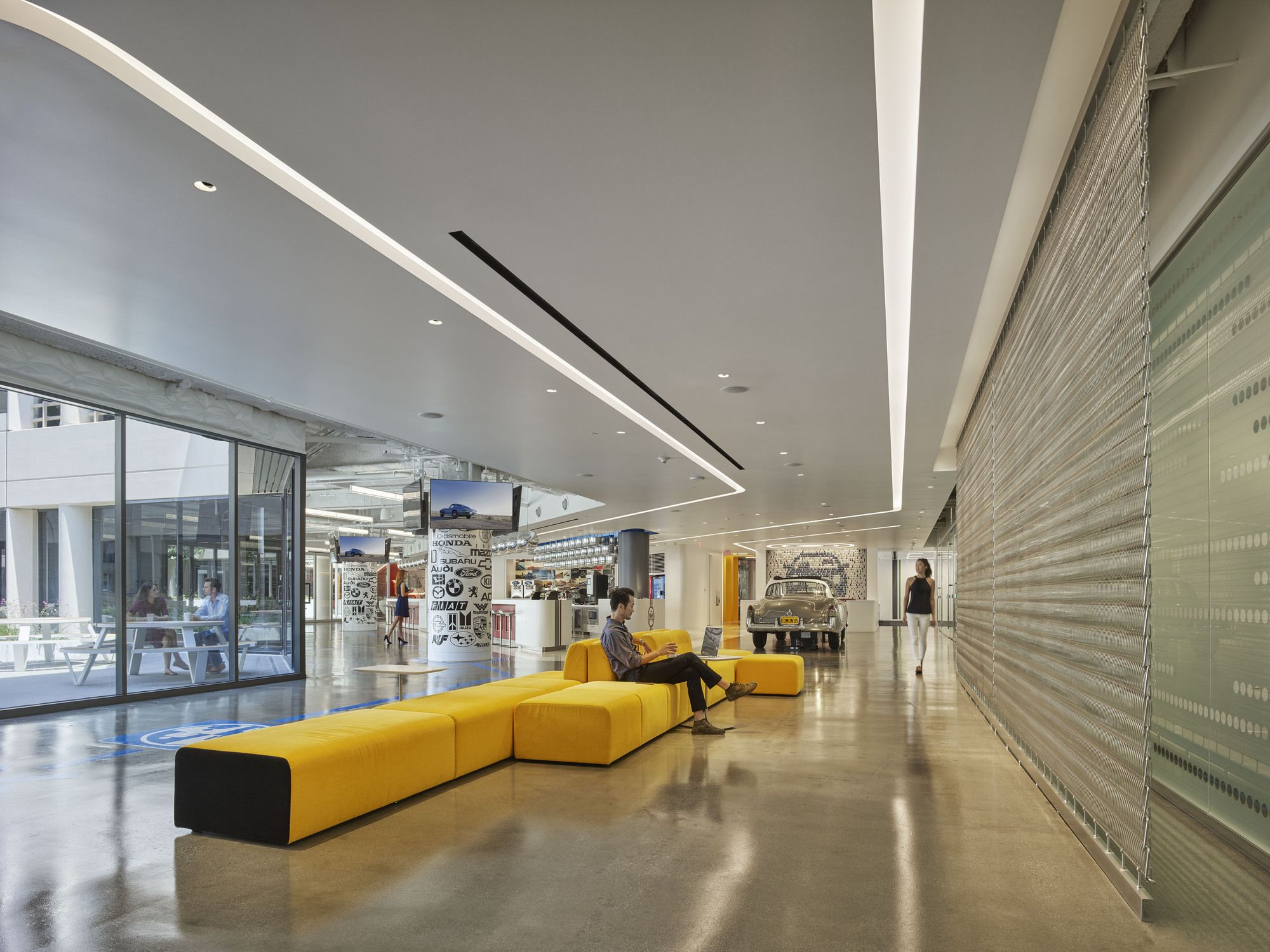
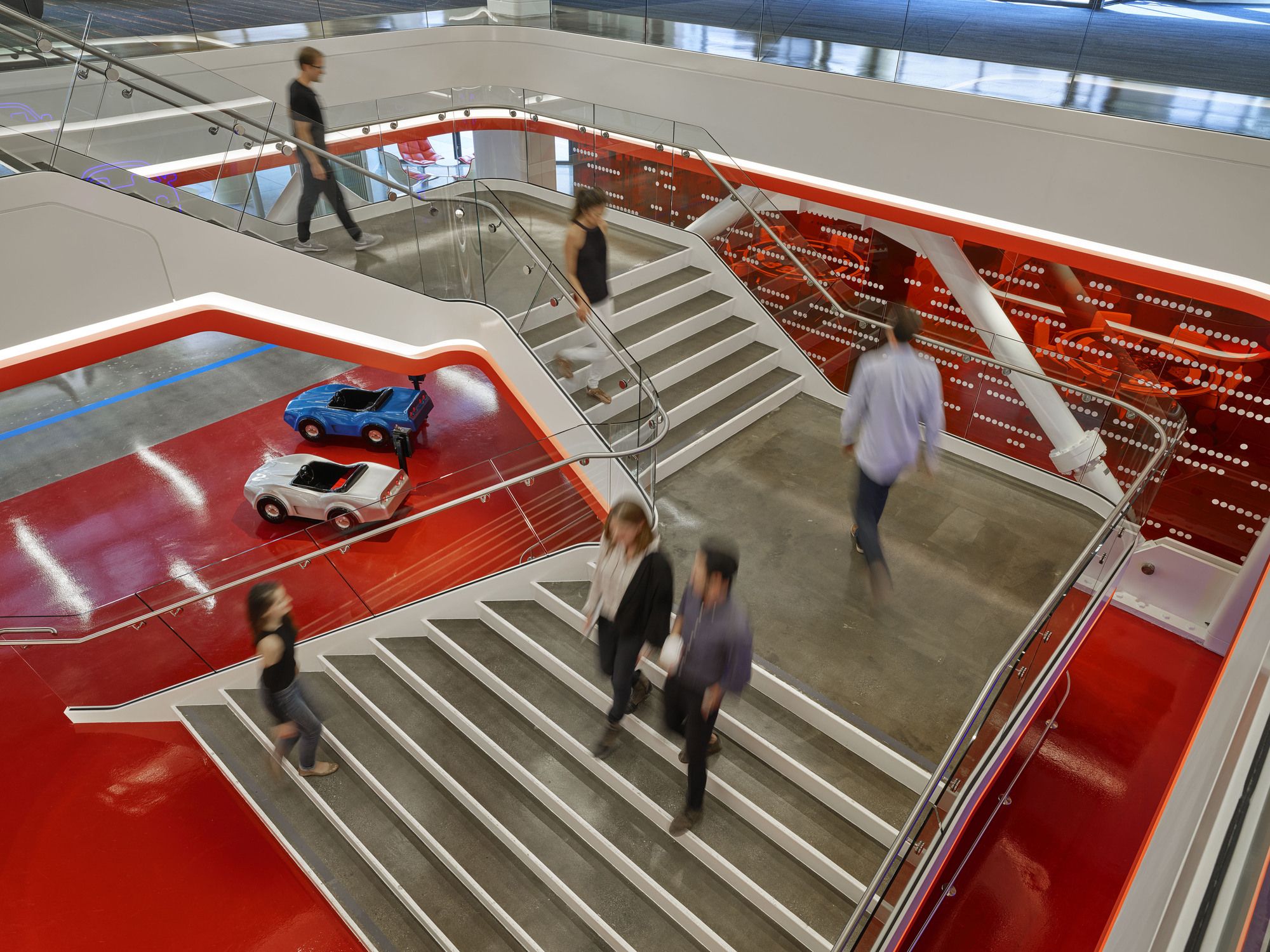
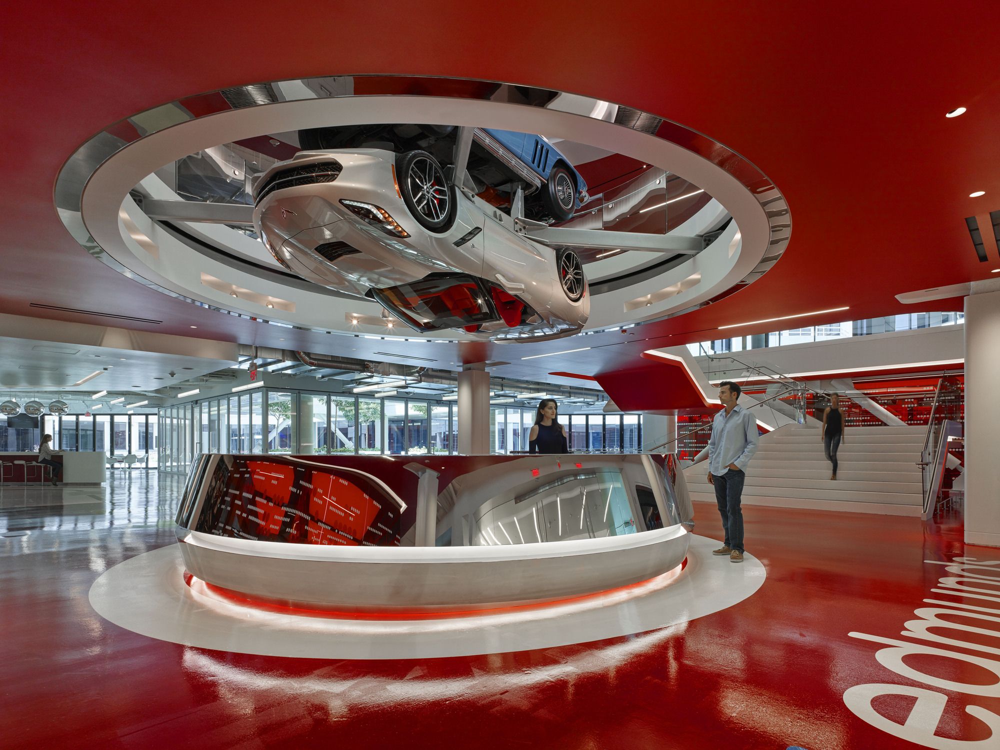
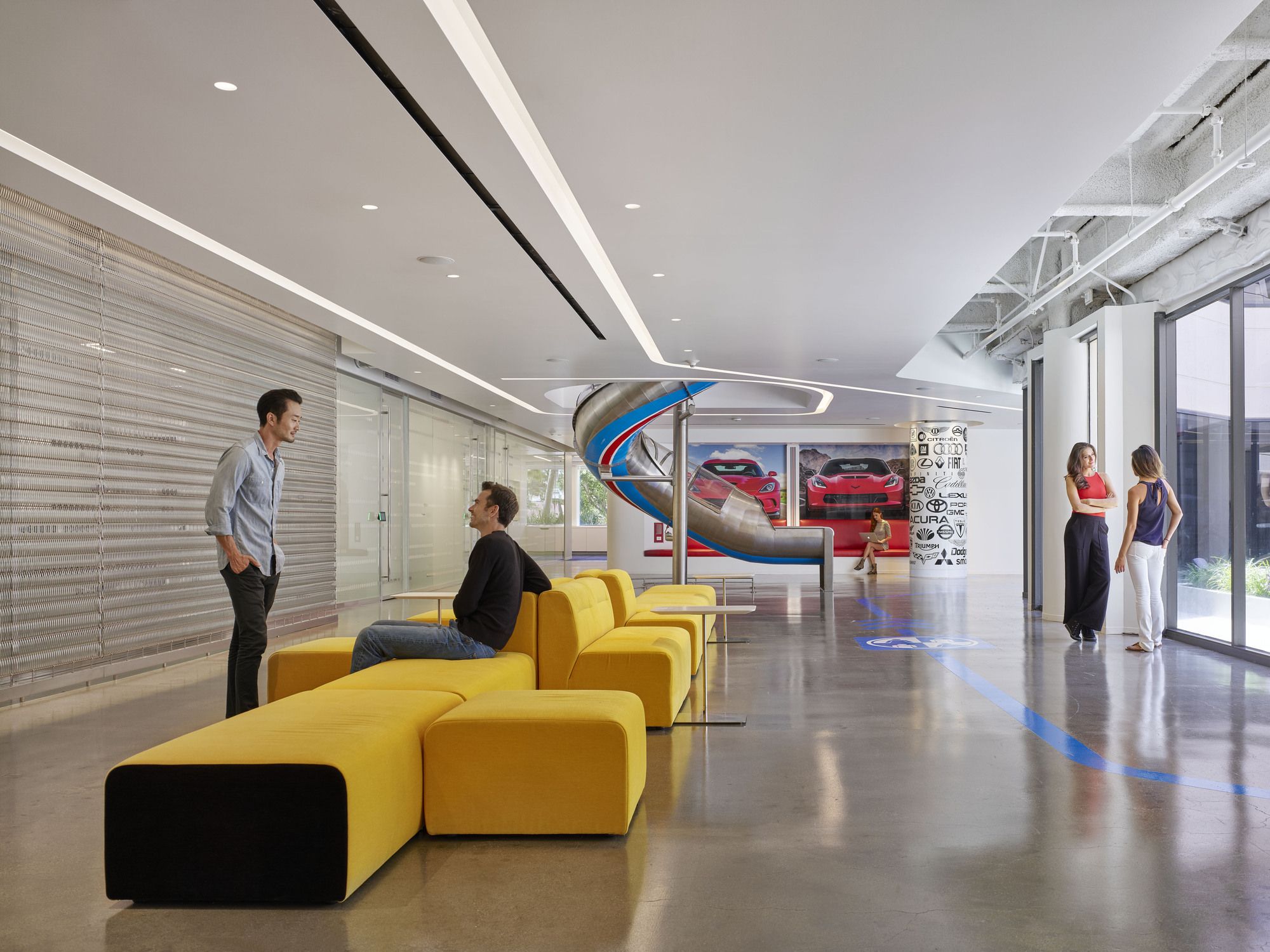
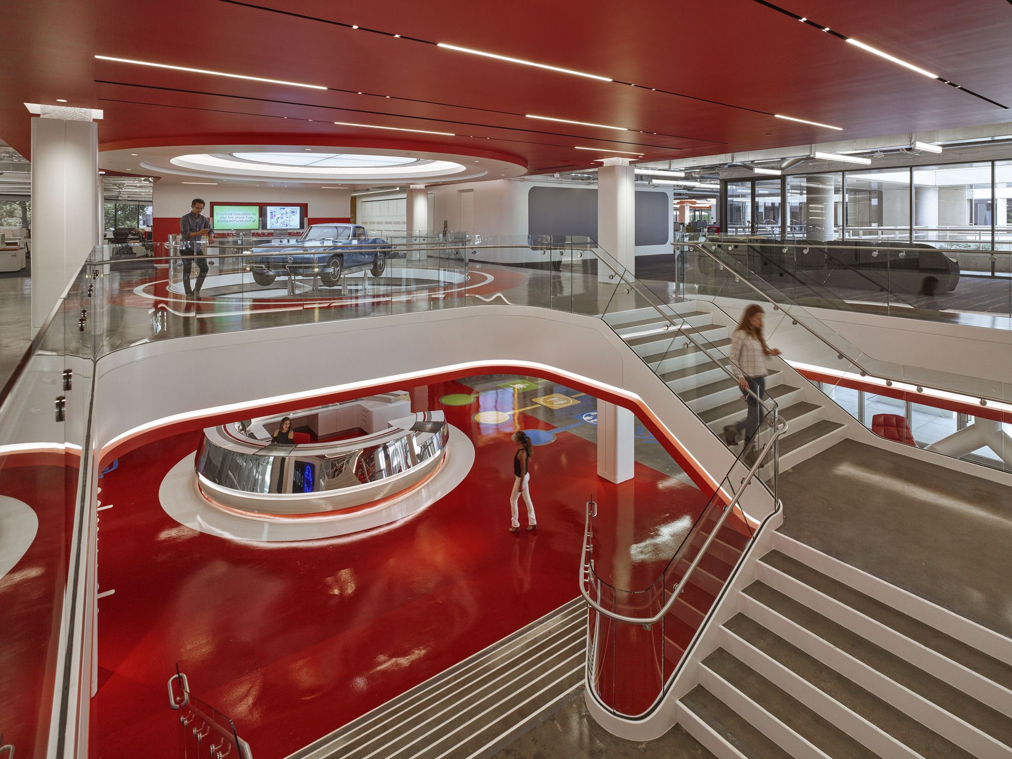
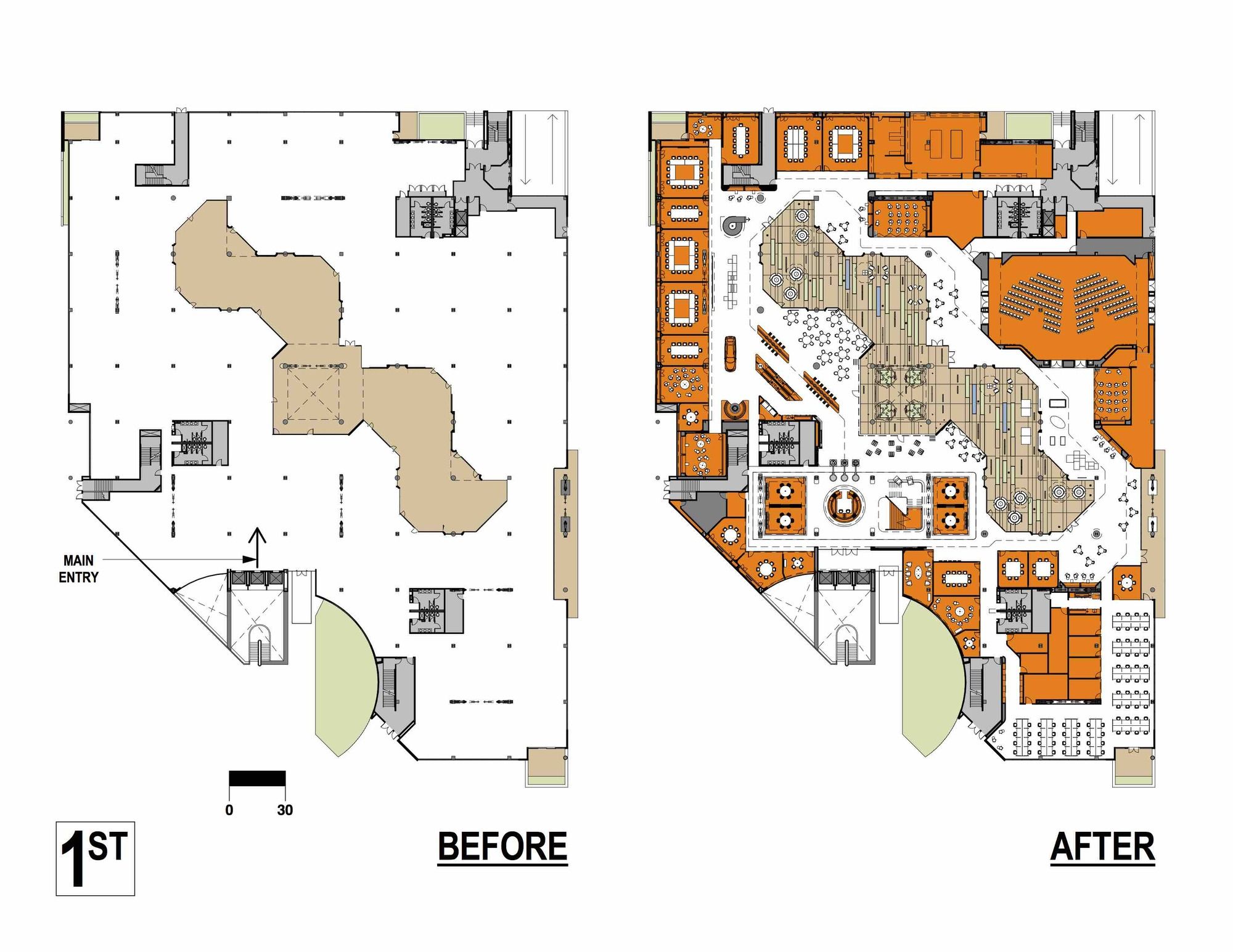
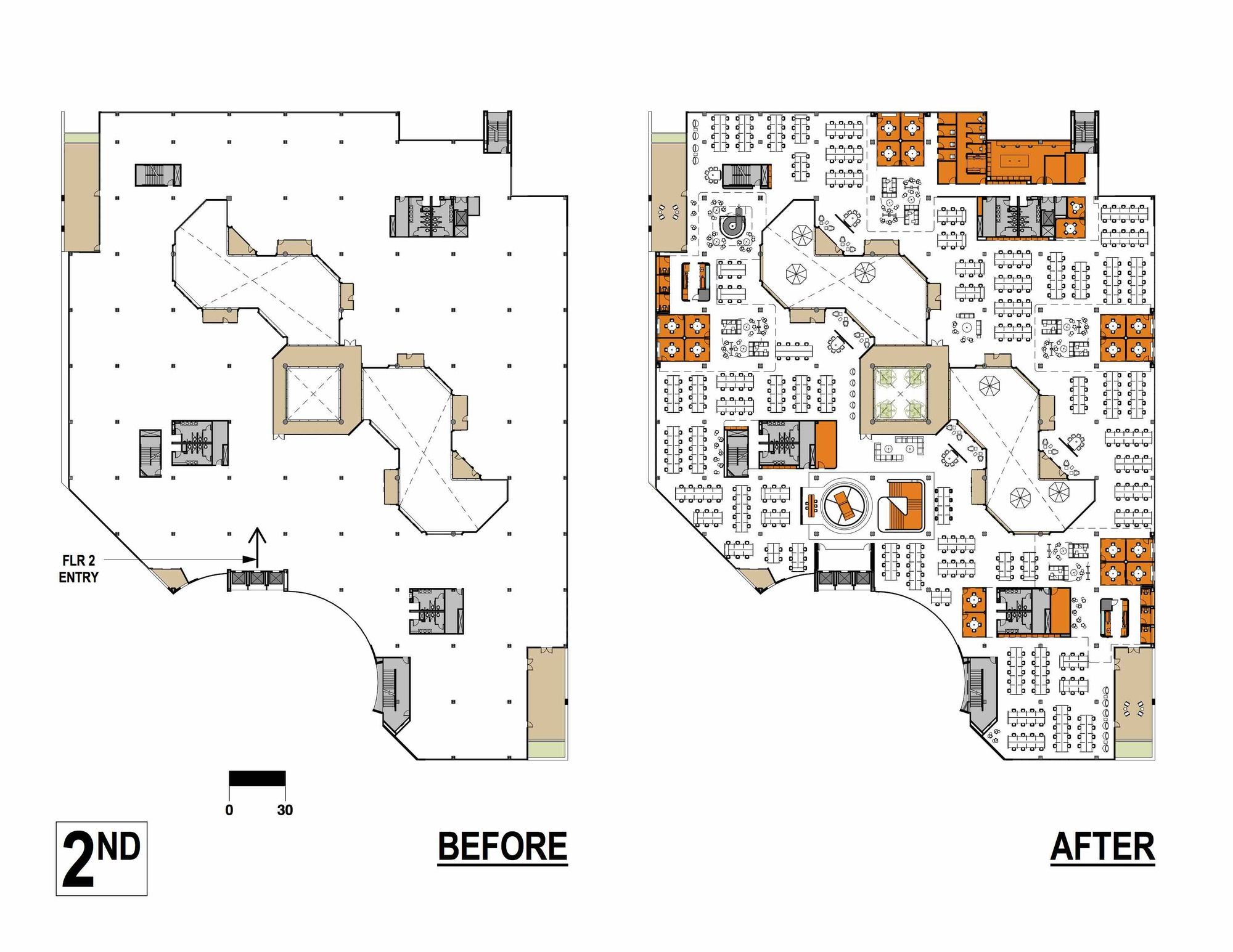
Working with two floors totaling 145,000 SF, we started with the larger moves; first, we harnessed the perimeter of the existing rambling internal atrium as the circulation ‘expressway’ for both floors, second, we concentrated the larger meeting spaces throughout the 1st floor – anchored by a ‘main street’ of program/design elements – main entry, reception and ‘the hub’ (i.e. ‘hubcap’), their one and only coffee bar for their entire company) and third, because it was critical to the CEO for each team member to have their own individual desk (i.e. ‘parking spot’), the bulk of the 2nd floor is comprised of a plank-desking system that allows flex in linear feet per person where required, with additional smaller meeting rooms dispersed throughout and miscellaneous programmatic requirements such as quiet rooms (‘rest stops’) and the IT service desk (the ‘pit stop’).
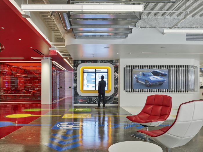
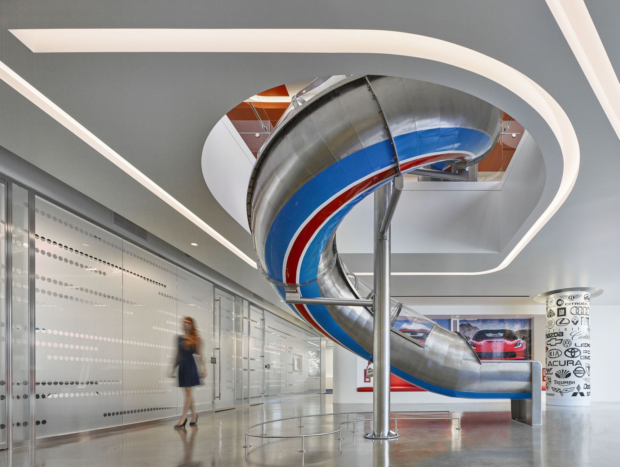
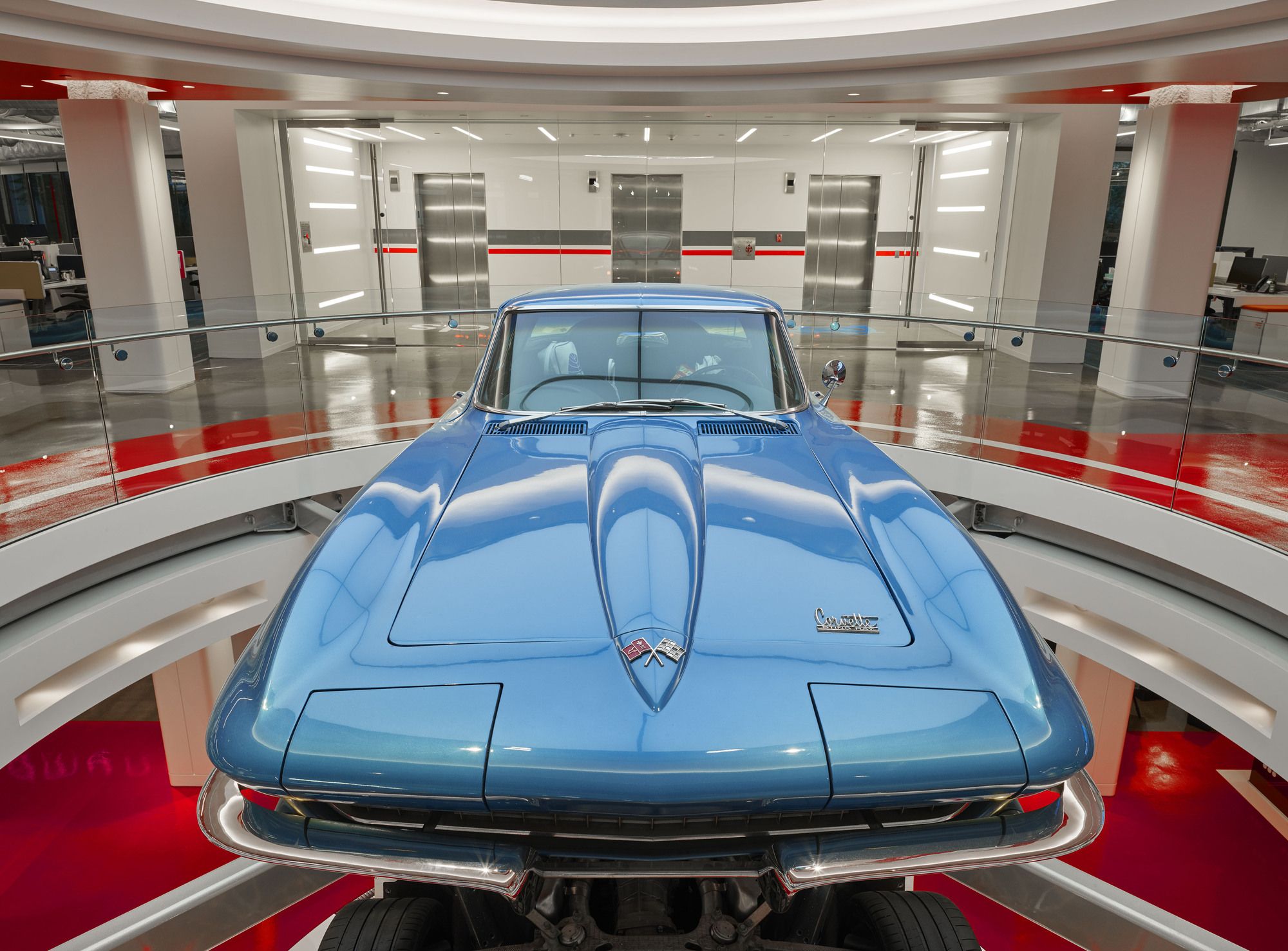
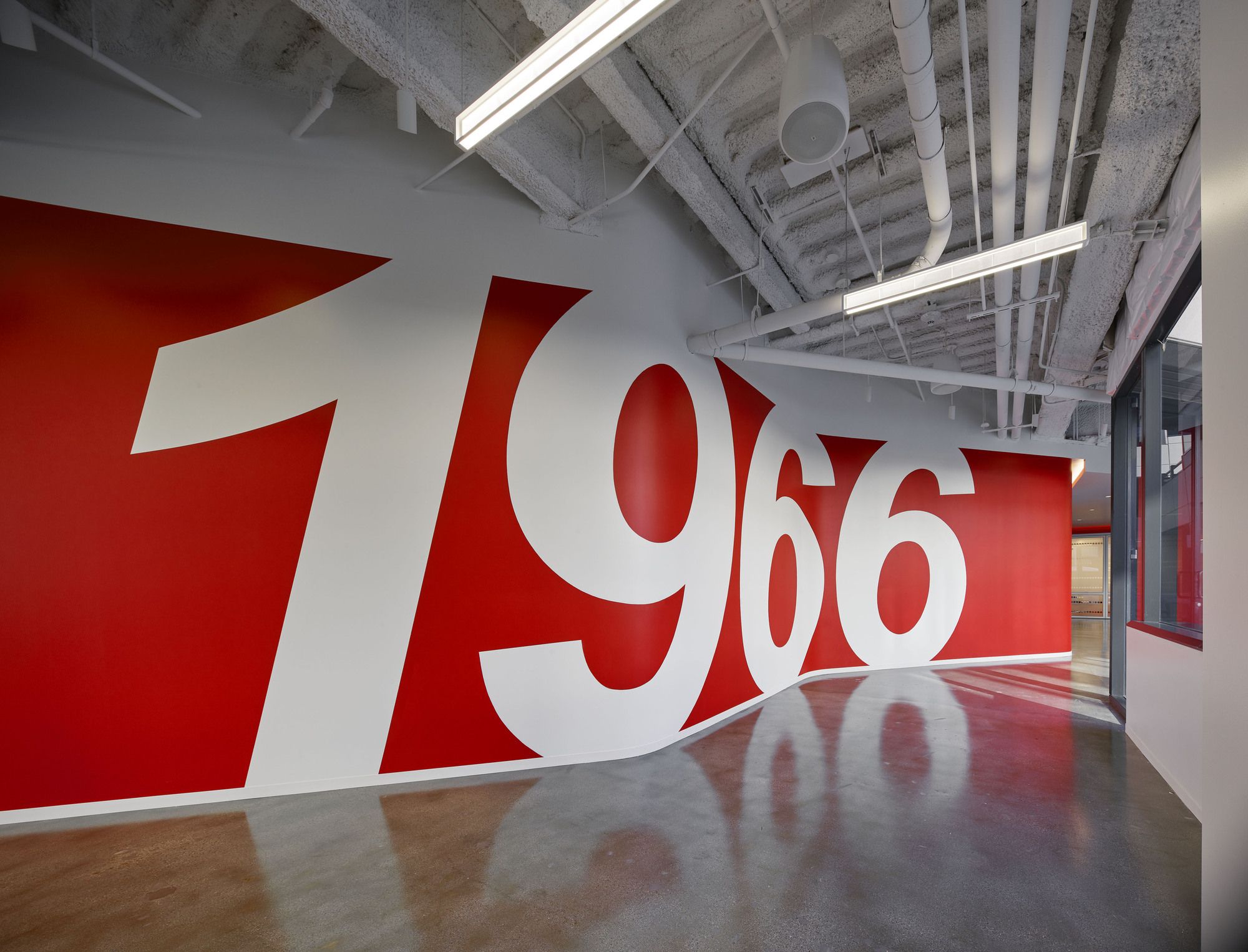
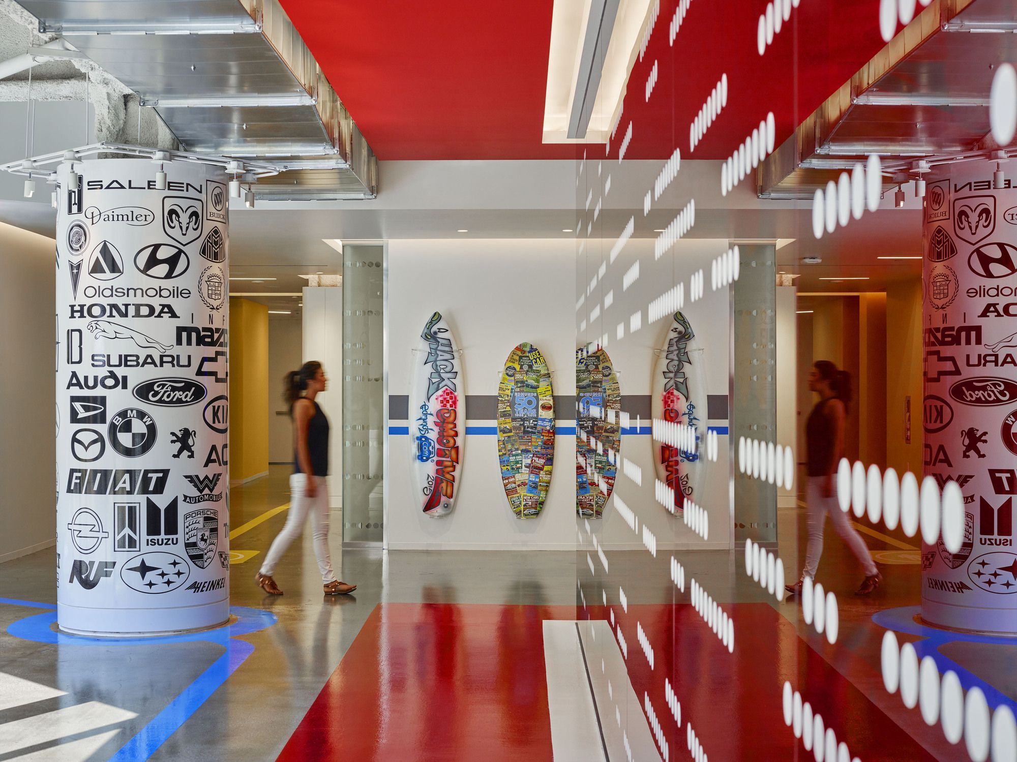
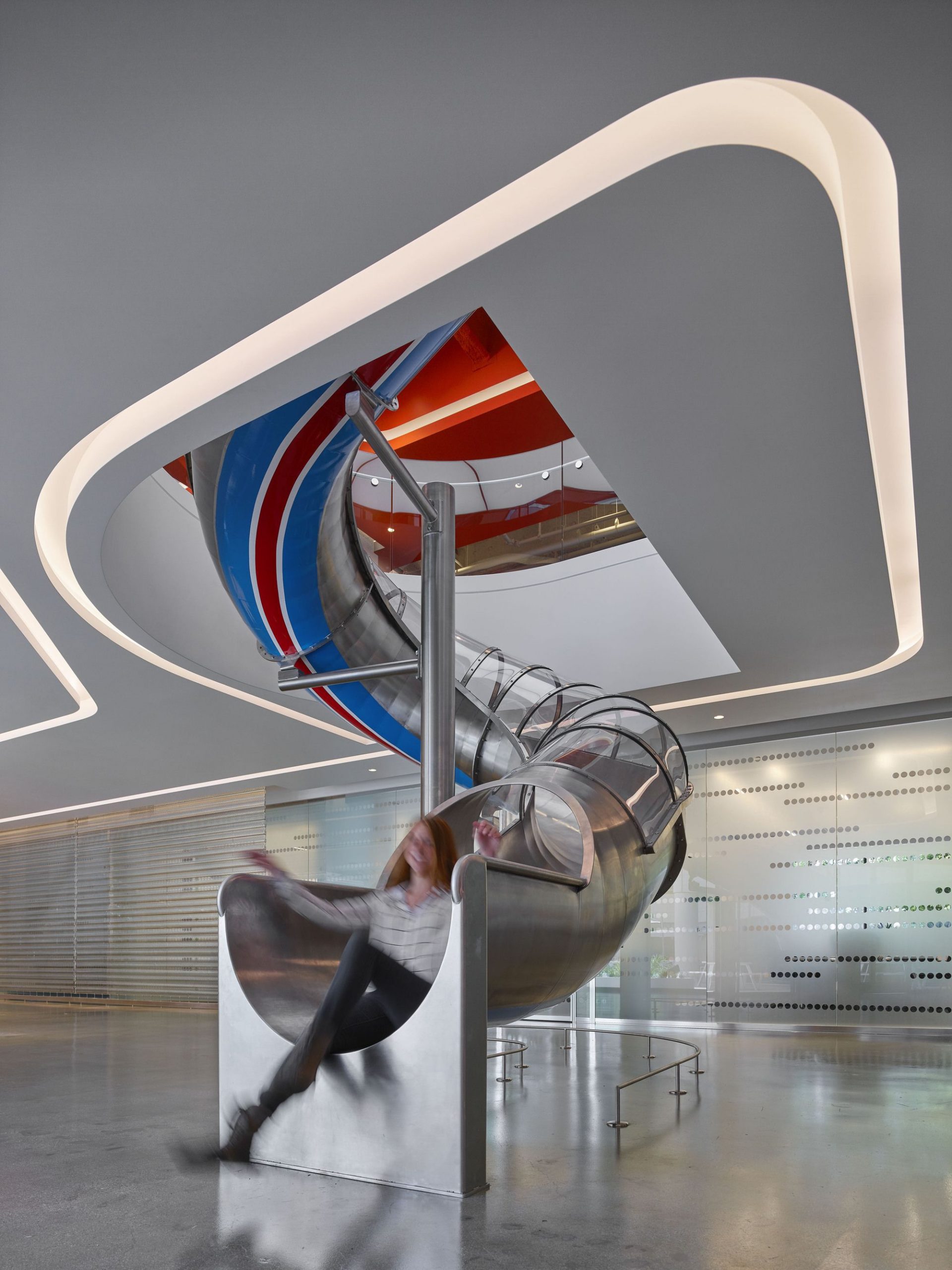
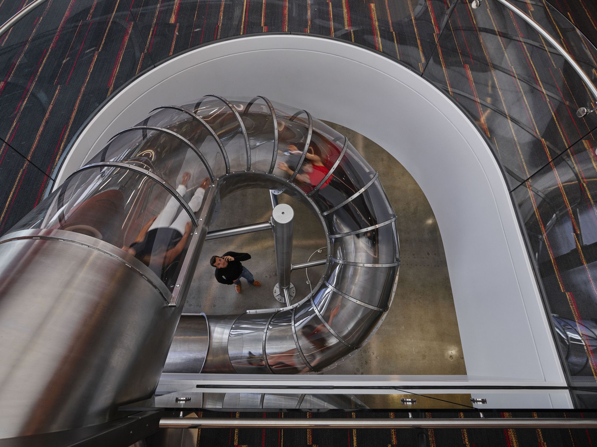
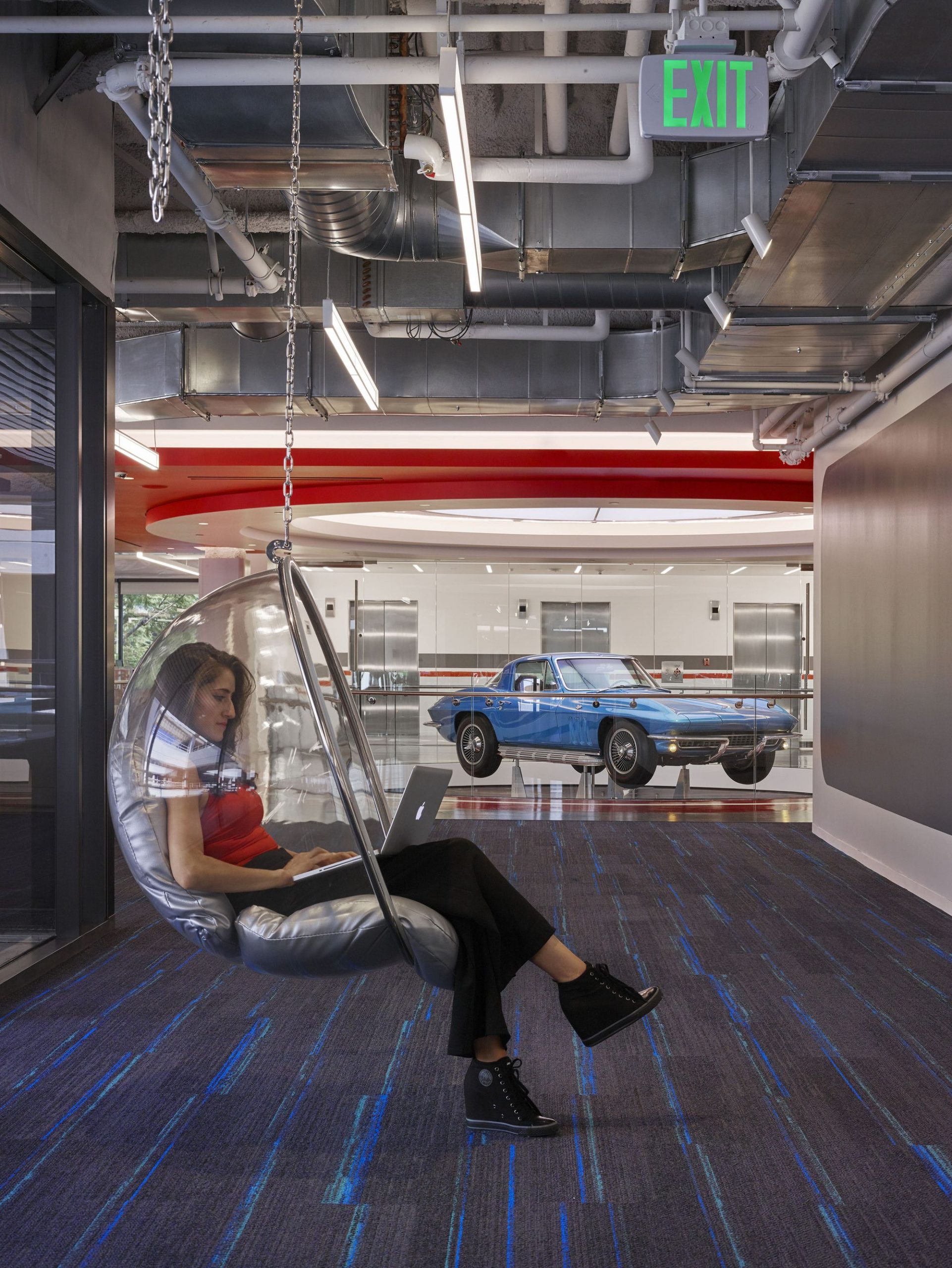
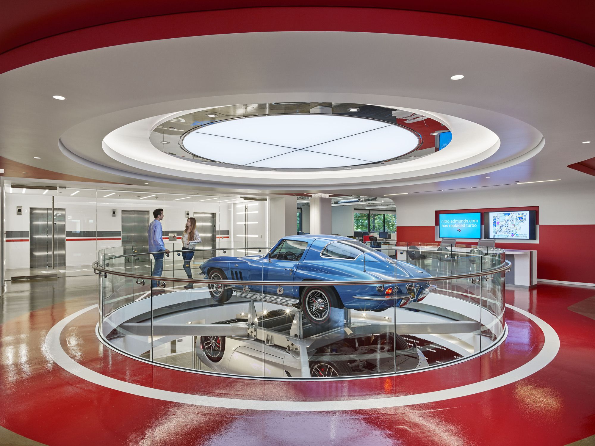
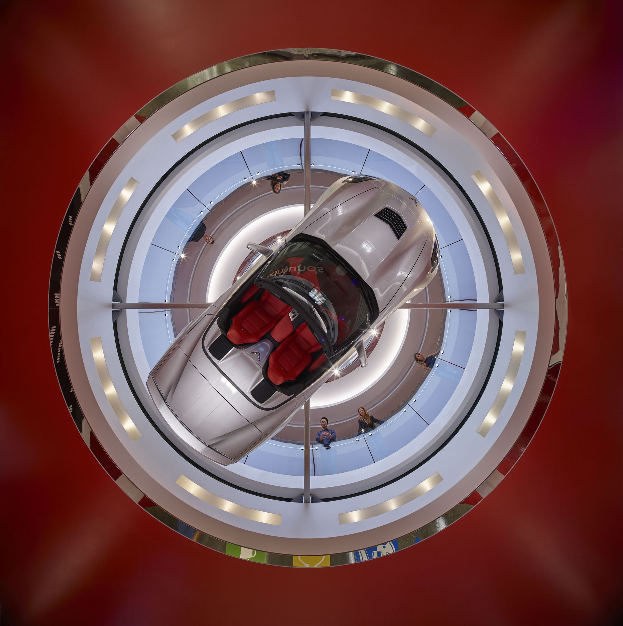
Necessity and pragmatism are the basis of design for any car (getting from point ‘A’ to point ‘B’), it is in the details that the designers strive to set each apart from the next – this is the very thinking that fueled and drove our entire team. Beyond the programmatic ease of use and neighborhood groupings, the design is meant to immerse all in the client’s newly branded world, eliciting motion through fluid shapes and shimmering materials, complete with ‘roadway graphics’ to assist in way-finding. Details include mounting two Corvettes (they turn in unison clockwise above the reception desk – because cars are meant to be in motion) above the mirror-polished stainless steel reception desk (a ‘1966’ [the year the company started] and a ‘2016’ [the year this project opened]) – a meaningful recognition of their past and future.
Additional automotive design elements include a chrome hubcap chandelier, chrome exhaust pipes creating the backdrop texture for the welcoming/on ramp’ monitor (playing loops of test track footage), a 1948 Cadillac (the coffee station from their very first office) re-imagined to be the happy hour bar and 2,472 individual ‘matchbox’ cars creating their ‘car’ logo.
In addition, the 10,000 SF exterior central atrium was completely re-envisioned – a newly dynamic outdoor space with both larger social and more intimate spaces – connected to the adjacent interior spaces with over 130 LF of retractable glass doors. Inside the atrium itself, the multiple 15’ long raised linear planters (planted with lavender, jasmine and kangaroo paws) and gurgling water features – all run in parallel lanes (like cars seen from above on a super-sized highway), weaving among the embedded LED strip lighting that, like a highway at night, race and change color with a varying choreography.
Project Info
Architects: M+M Creative Studio
Location: California, United States
Architects in Charge: Chris Mitchell, Sandra Mitchell
Executive Architect: Lewis/Schoeplein architects
Area: 145000.0 ft2
Manufacturers: Pulp Studio
Year: 2016
Type: Office Building, Headquarter
Photographs: Benny Chan
Photography by © Benny Chan
HyperFoPhotography by © Benny Chancal: 0
Photography by © Benny Chan
Photography by © Benny Chan
Photography by © Benny Chan
Photography by © Benny Chan
Photography by © Benny Chan
Photography by © Benny Chan
Photography by © Benny Chan
Photography by © Benny Chan
Photography by © Benny Chan
Photography by © Benny Chan
Photography by © Benny Chan
Photography by © Benny Chan
Photography by © Benny Chan
Photography by © Benny Chan
Photography by © Benny Chan
Photography by © Benny Chan
Photography by © Benny Chan
Before - After
Before - After


