Fly to Shop
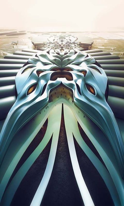
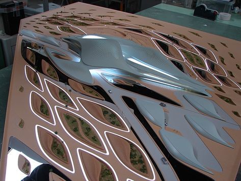
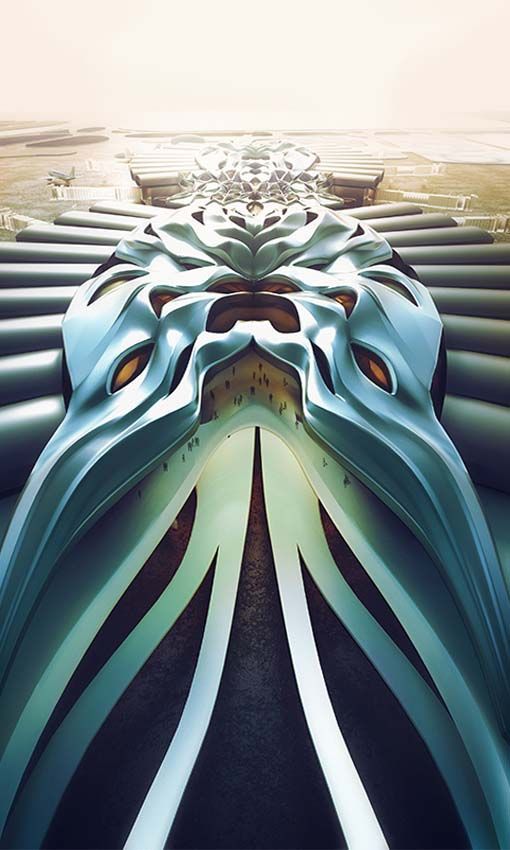
Yun Zhang, a student in the University of Applied Art, in Vienna, has designed, in Studio Zaha Hadid Architects, a shopping mall for a terminal in the Charles de Gaulle airport, in Paris.
Yun’s reasoning is perfectly sound; he wants to highlight the dichotomy of speeds that exists in airports. His shopping mall is meant to make passengers slow down and stroll through the corridors and aisles populated by shops and consumer opportunities, contrasting with the efficiency and speed required of an airport as a “passenger delivery system”.
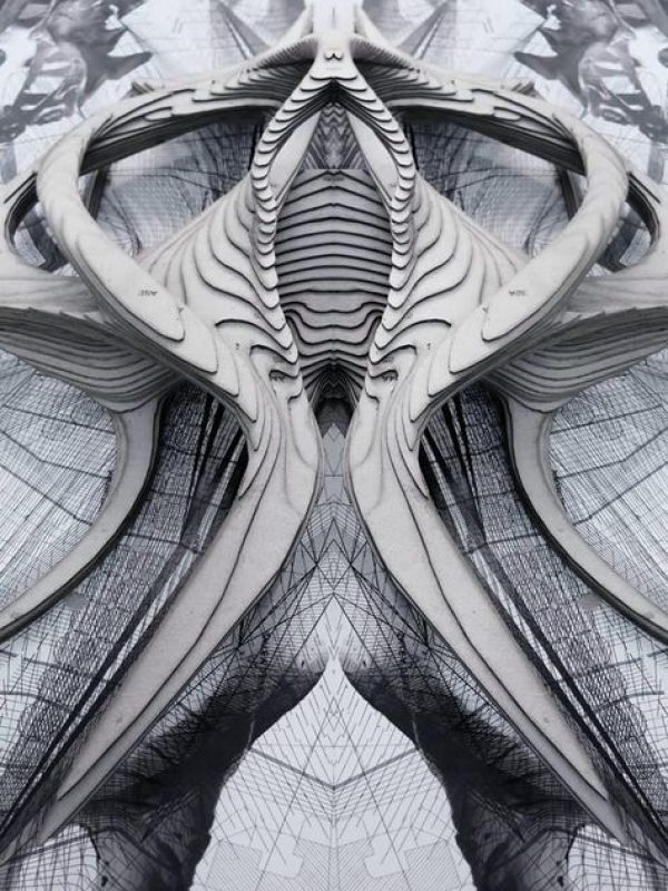
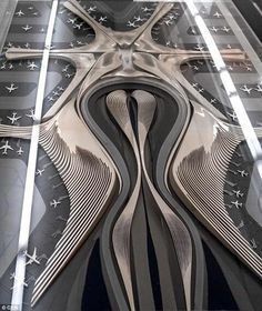
And, in a sense, it wouldn’t be fair to judge architecture based solely on its language and external appearance – this is a matter that quickly slides into subjective tastes and opinions, which are beyond the scope of this article. In fact, this proposal has several good points: the symmetrical organization creates a central void, around which shops, paths and passengers alike are organized. It is clear in the organization it proposes for the two types of passenger movement – slow strolling and fast, purposed walking.
Zaha Hadid Architects’s influence is extremely apparent. The plasticity of the forms is dramatic and most evidently showcased. In fact, the geometric patterns chosen are what give way to the spatial organization of paths, closed spaces and semi-open spaces – the symmetrical character of the plans is mirrored by the overhanging ceiling (or is it the other way around?).
But one question I would like to make is the following: is the architectural language of Zaha Hadid Architects not too apparent in this project? Shopping malls tend to be places where architects can give way to their most plastic, sculptural and “artistic” fantasies. Yet, sometimes, they are also the place where good taste and standards go to die – they tend to be pastiches of great ideas, movements and authors. Rem Koolhas once said that for every masterpiece there are one hundred lousy imitations.
And let it be clear that this is not a merely formal and vapid exercise; this mall clearly and efficiently accomplishes what it sets out to do – and that is something not all projects can boast about. It’s reasoning is sound and clear, and the space is organized accordingly, while at the same time providing a variety of spatial configurations that is also noteworthy.
But at the same time, it seems to me as a populist cry for attention. If Zaha Hadid Architects has carved for herself a niche in the starchitect constellation through her sculptural and plastic approach to building, she has also paved the way for myriad second-rate imitations. I wouldn’t hesitate one moment to define this project as a kind of imitation, despite its apparent and clear good points. It’s good spatial organization and reasoning dressed in a second-hand, counterfeit, out of fashion garments. It’s an outdated fashion statement, fascinated with its own plasticity in a frivolous way. A lost opportunity for substantial, original “artistic” – or architectural – expression.
By: Daniel Anthony Fraga


