Gallery of Furniture
On the outskirts of the Vinohrady housing estate in the city of Brno, Czech, there used to lie an outdated car showroom which has been there since the 90s. However, the building was destined for a got purpose when it was purchased by MY DVA Group for furniture and interiors in 2015. The re-purposed one-storey building needed remodeling on the inside and outside. The interior remodeling was for functional purposes, like including show space, office space, warehouse, and services in the 550-square-meter space.
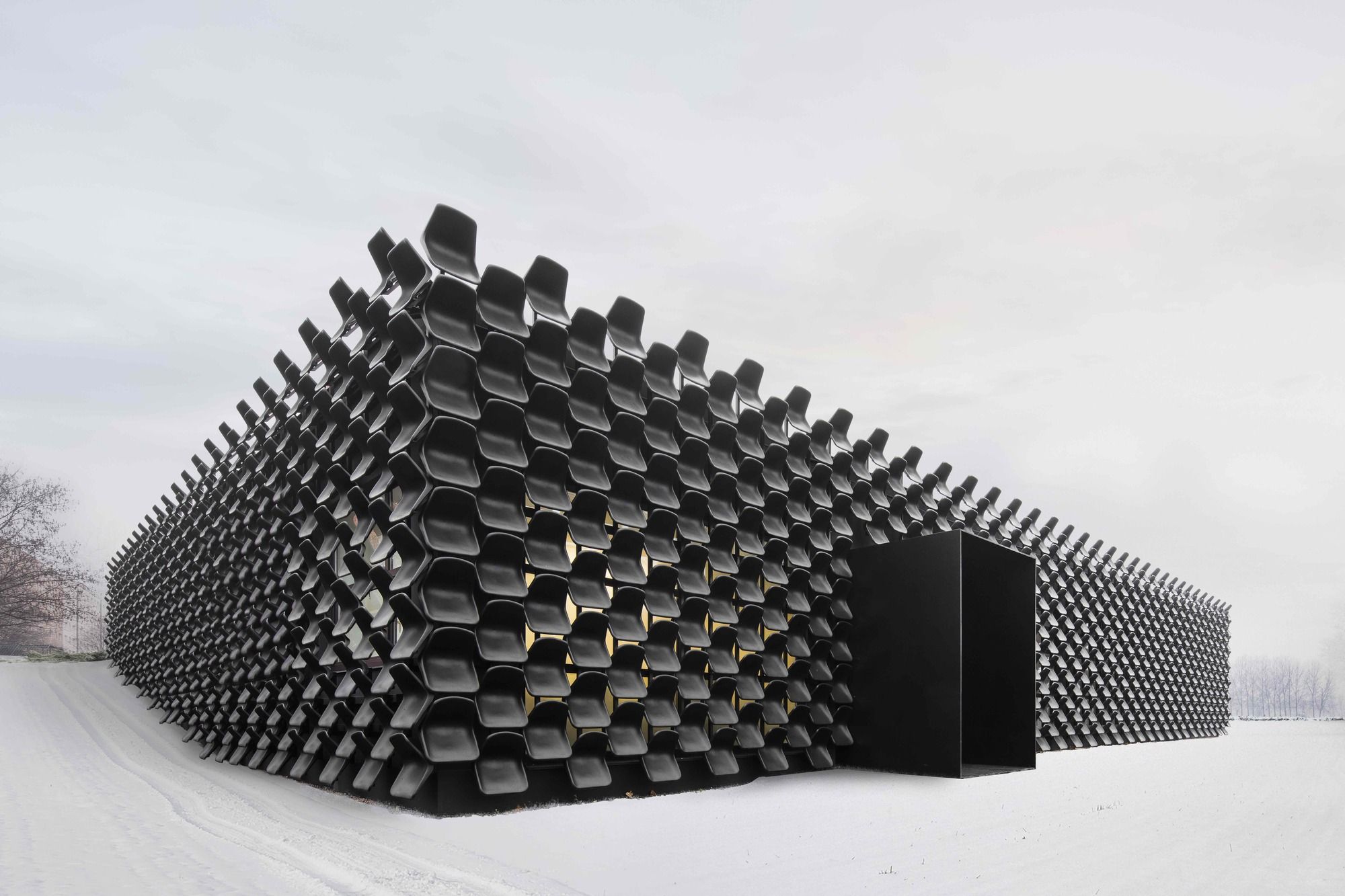
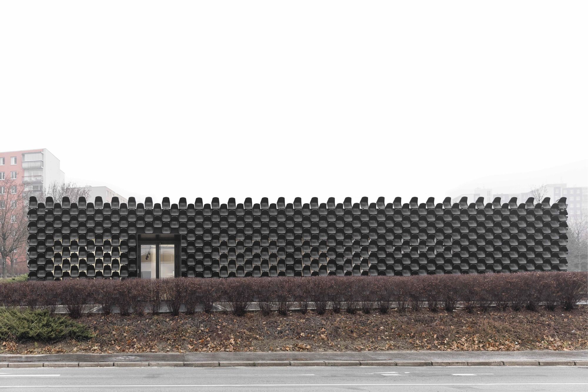
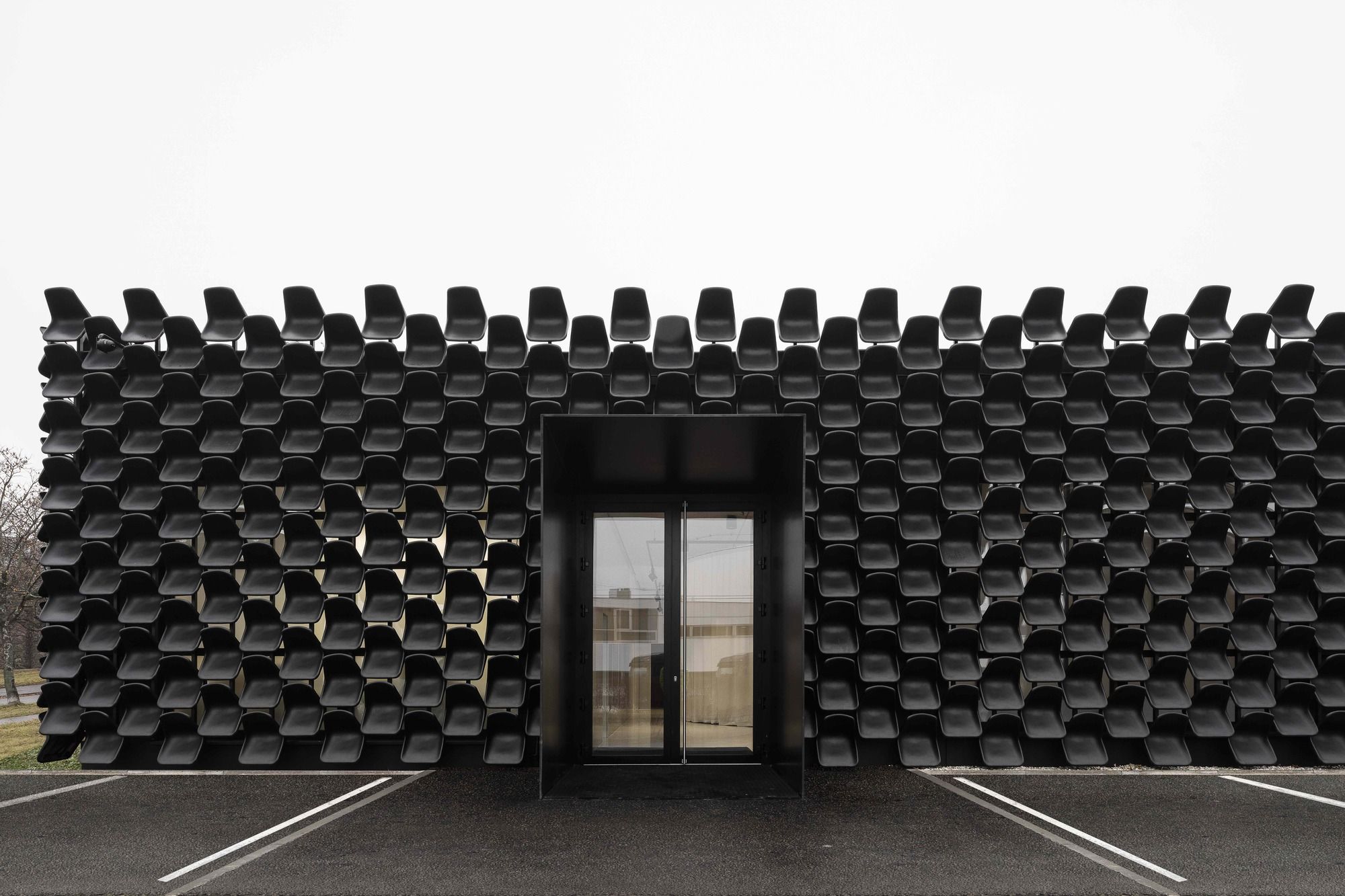
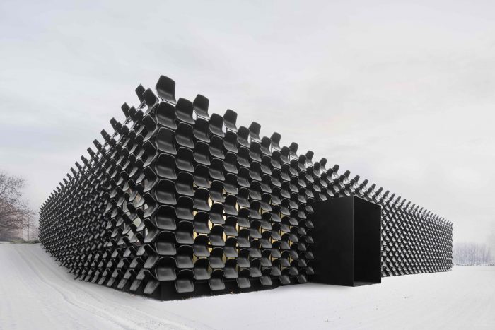
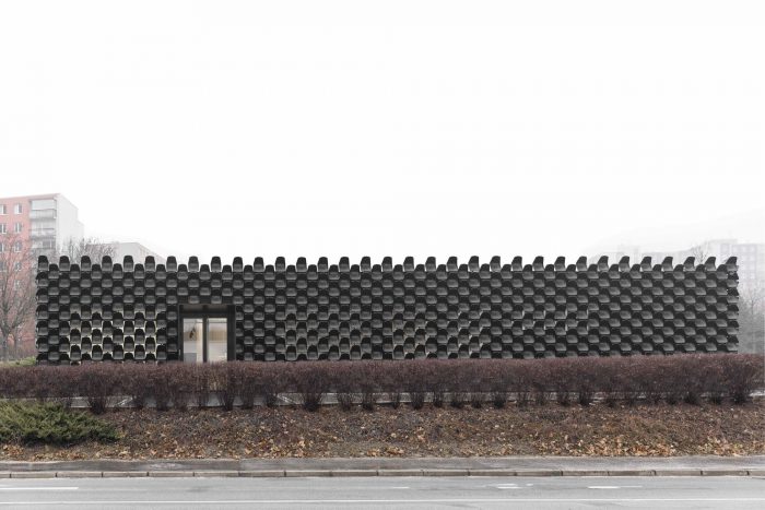
When it came to the façade though, MY DVA had a specific demand: “Do it cheap, ideally for free.” The designing architects had to do a fast job from outside the premises which was already operating on the inside. That is how the Brno-based CHYBIK+KRISTOF Studio came up with the concept: “façade as a functional banner.” They decided to envelop the furniture gallery with 900 black plastic chairs which, together, form a neat abstract pattern, expressive of the on-going functions inside the building.
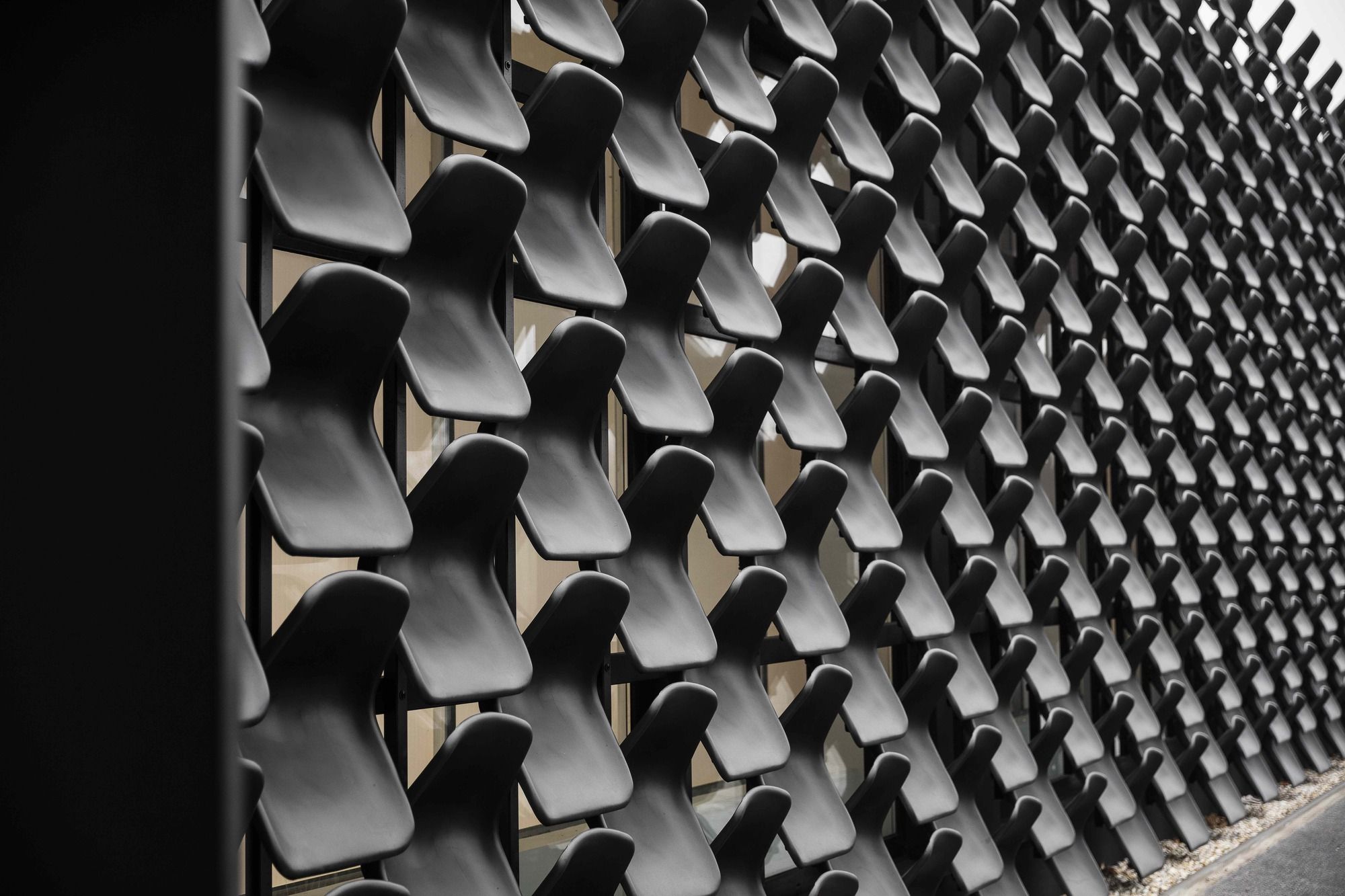
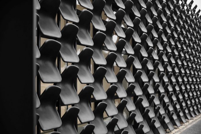
Architects Ondrej Chybik and Michal Kristof revealed that they used regularly supplied interior chair model called Vicenza. They, specifically, used “black granulate” in the outdoor, because it is resistant to UV rays and other weather conditions. The seats were installed on a steel structure fixed to the façade, and they can be easily replaced in case of damage. Each one of those chairs cost 80CZK which is equivalent to 3.25$. So, finally, the designers could successfully manage to create a unique and cheap façade, truly indicative of its building’s purpose as a modern furniture gallery, from simple chairs.
The Architect Description
The transformation of a former car showroom on the outskirts of a housing estate into a site of the MY DVA group, focusing on the production of office, school, and metal furniture, represents another finished structure of the young architecture firm CHYBIK + KRISTOF Architects & Urban Designers from Brno. The single-storey building of a poor aesthetic quality turned into a building with a new, easily remembered façade composed of more than 900 black plastic seats. The façade is conceived abstractly, functioning also as a banner advert for the firm itself. After finishing a simple refurbishment of its interior, a new flexible showroom was created presenting the individual segments of the firm´s production in specific, thematically arranged settings.
Vinohrady is the name of one of the oldest housing estates built in Brno in the first half of the 1980s. The car show room itself was set up in the 1990s and is a part of a line of nearby commercial buildings, bordering with the four-lane Zarosicka road, which, however, do not enhance the area anyhow. The former state of the building was technically and morally outdated and from the formal point of view, it did not correspond with the needs of the society. Given the fact that it was a temporary investment in the form of a rent and the firm had already been using those premises, the proposed solution had to be cheap and fast. The task was: ˮDo it cheap, ideally, for free,ˮ architects Ondrej Chybik and Michal Kristof are reminiscing.
The MY DVA group belongs to the front domestic suppliers of office, school, and metal furniture, focusing also on the concepts and realizations of commercial and educational interiors, including some atypical elements. The choice of material, which should have been based on the usage of a minimum amount of money, but with a maximum effect to enhance the former building, therefore, had to be connected with the firm´s production. Thus, the building is uncladded by a homogenous product, a plastic black seat for about 80 CZK/1 pieces, without any greater adjustments of the exterior. It creates an abstract texture which reflects what is going on inside without another banner advertising. ˮWhat we used is a basic form of an interior chair called Vicenza which the supplier delivers on a regular basis. In this case, however, we used black granulate for the outdoors because it is resistant to different weather conditions, especially UV light.ˮ the architects are describing. The individual seats are fixed on a structure made from steel sections fixed on the façade. In a case of a mechanical damage, it is possible to change each piece for a new one, even the façade cleaning can be done easily once or twice a year by a high-pressure cleaner.
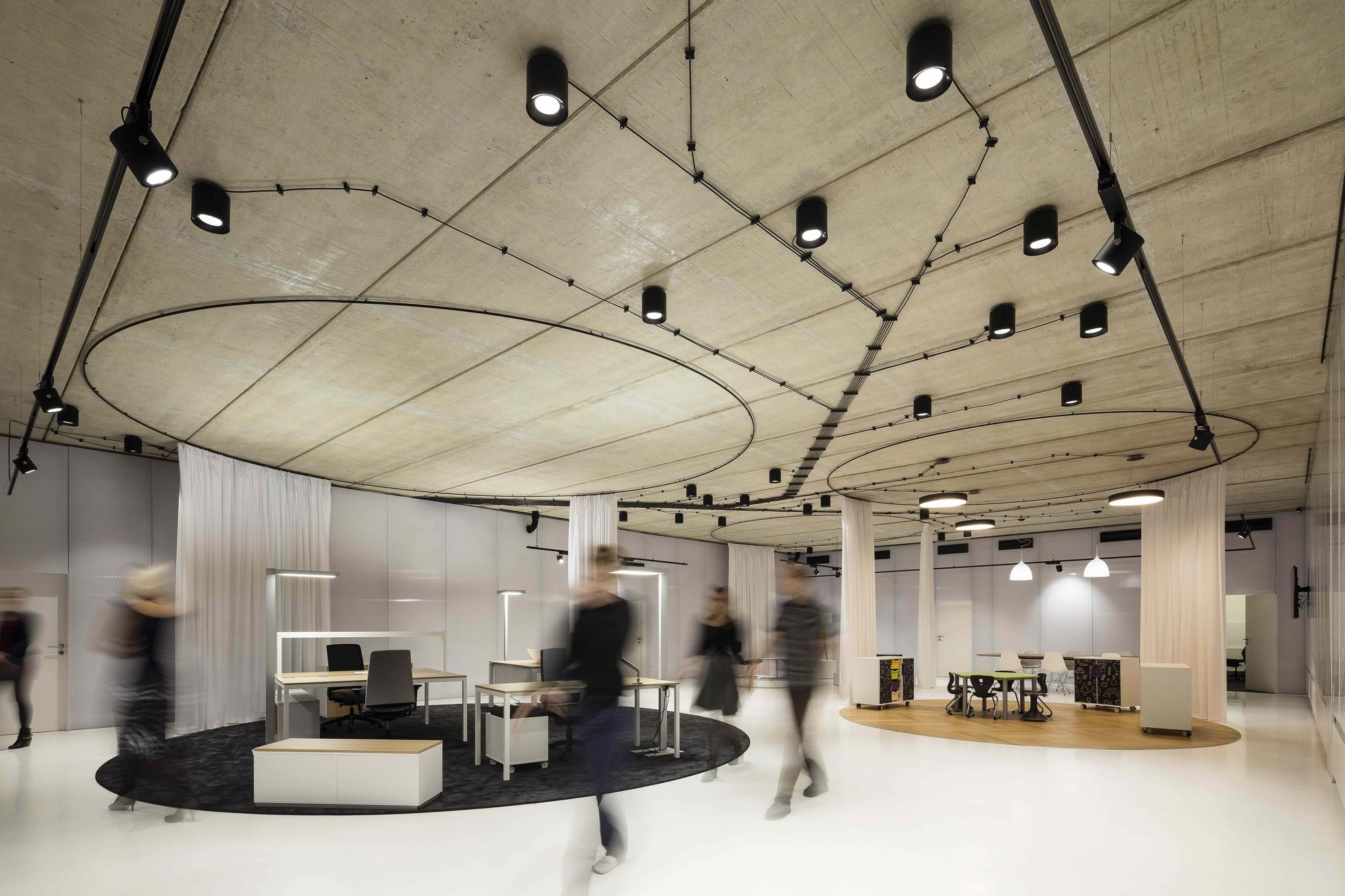
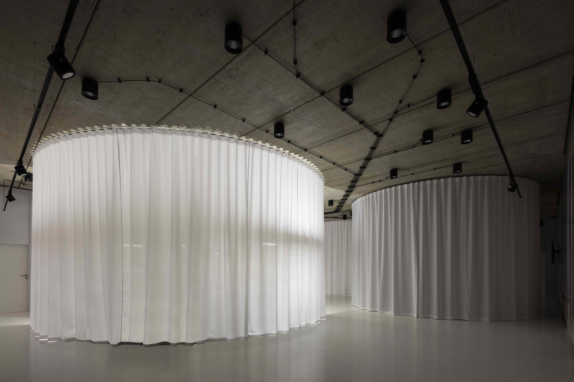
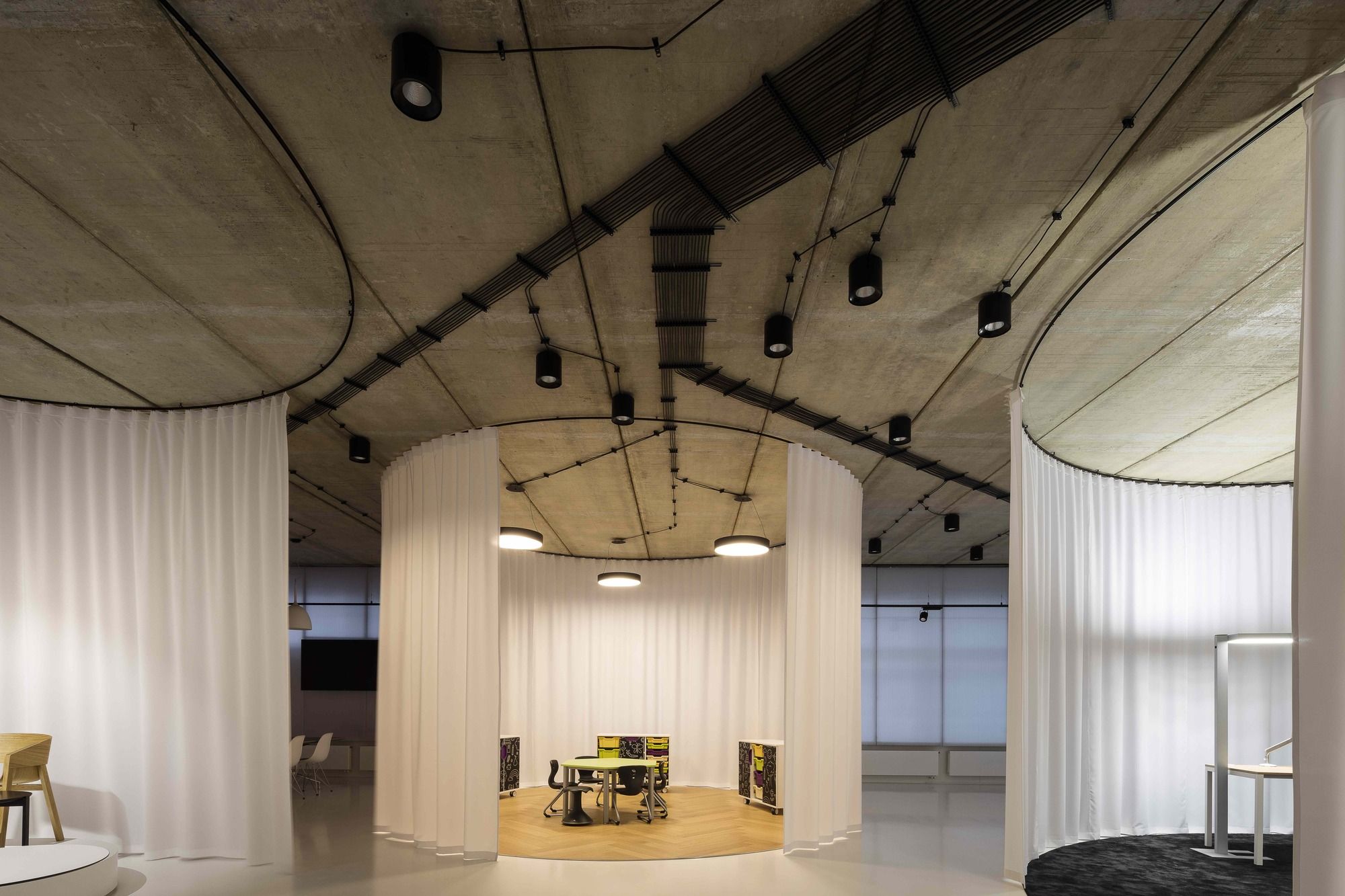
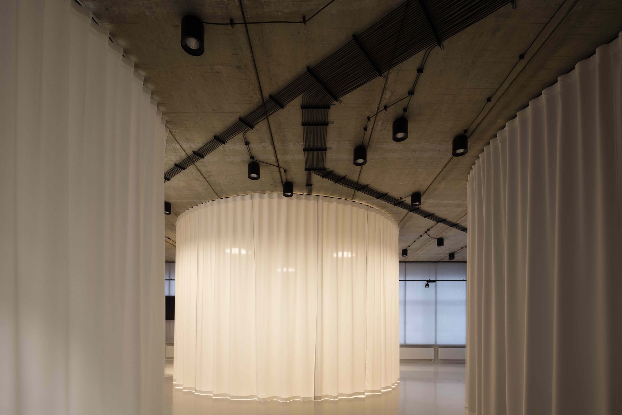
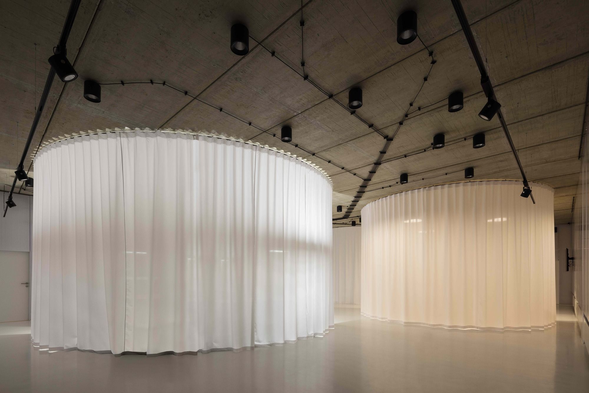
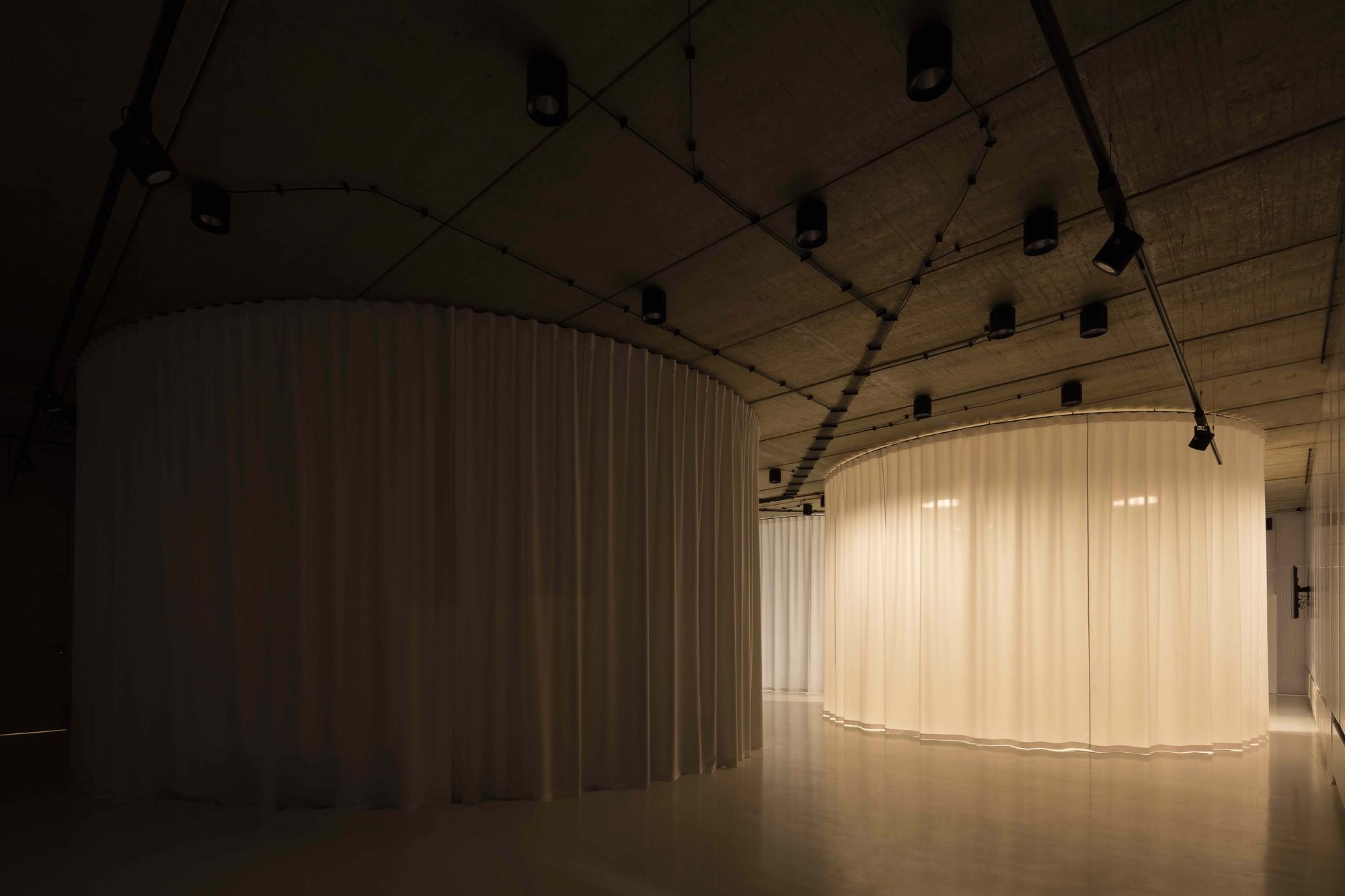
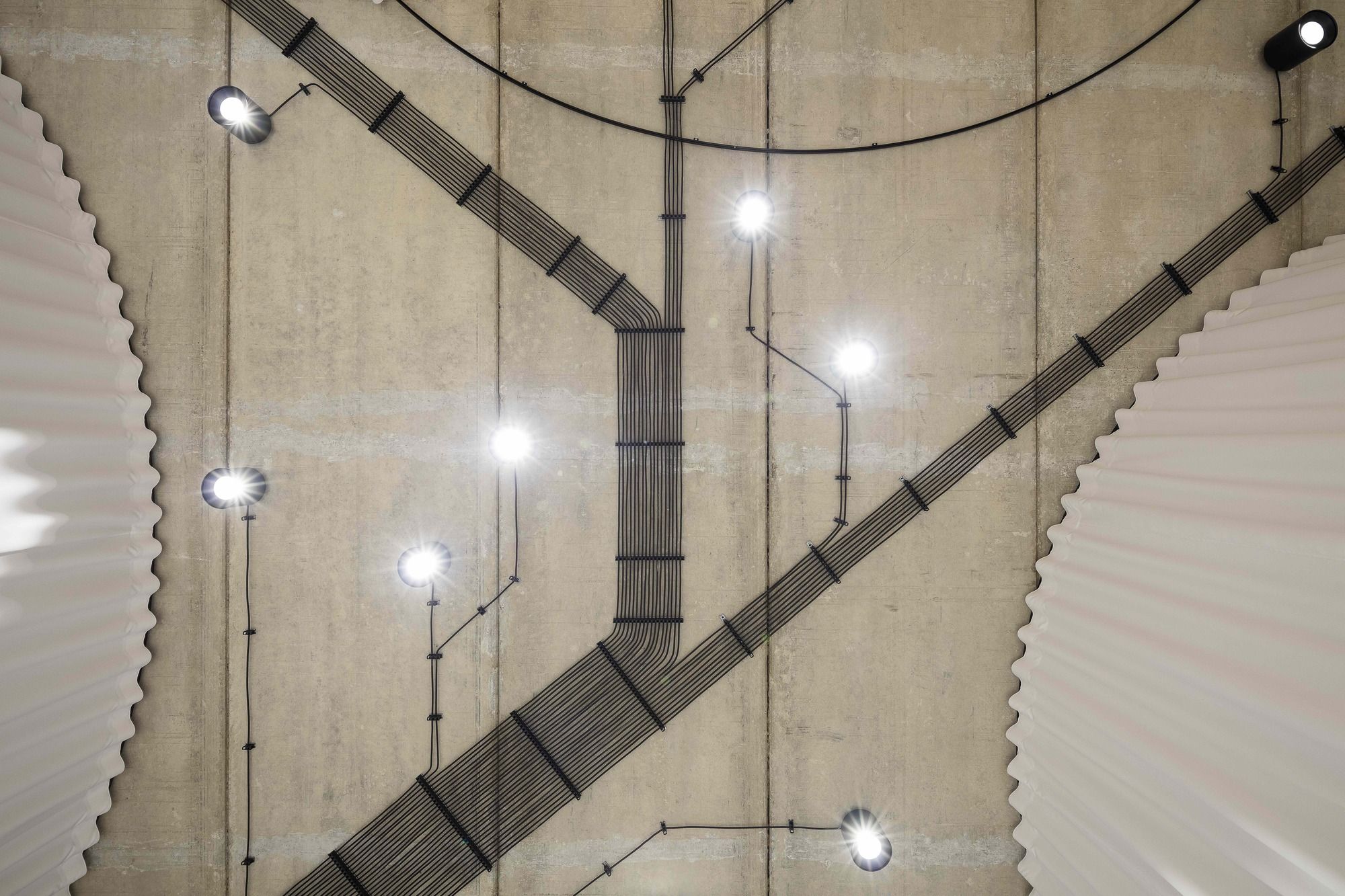
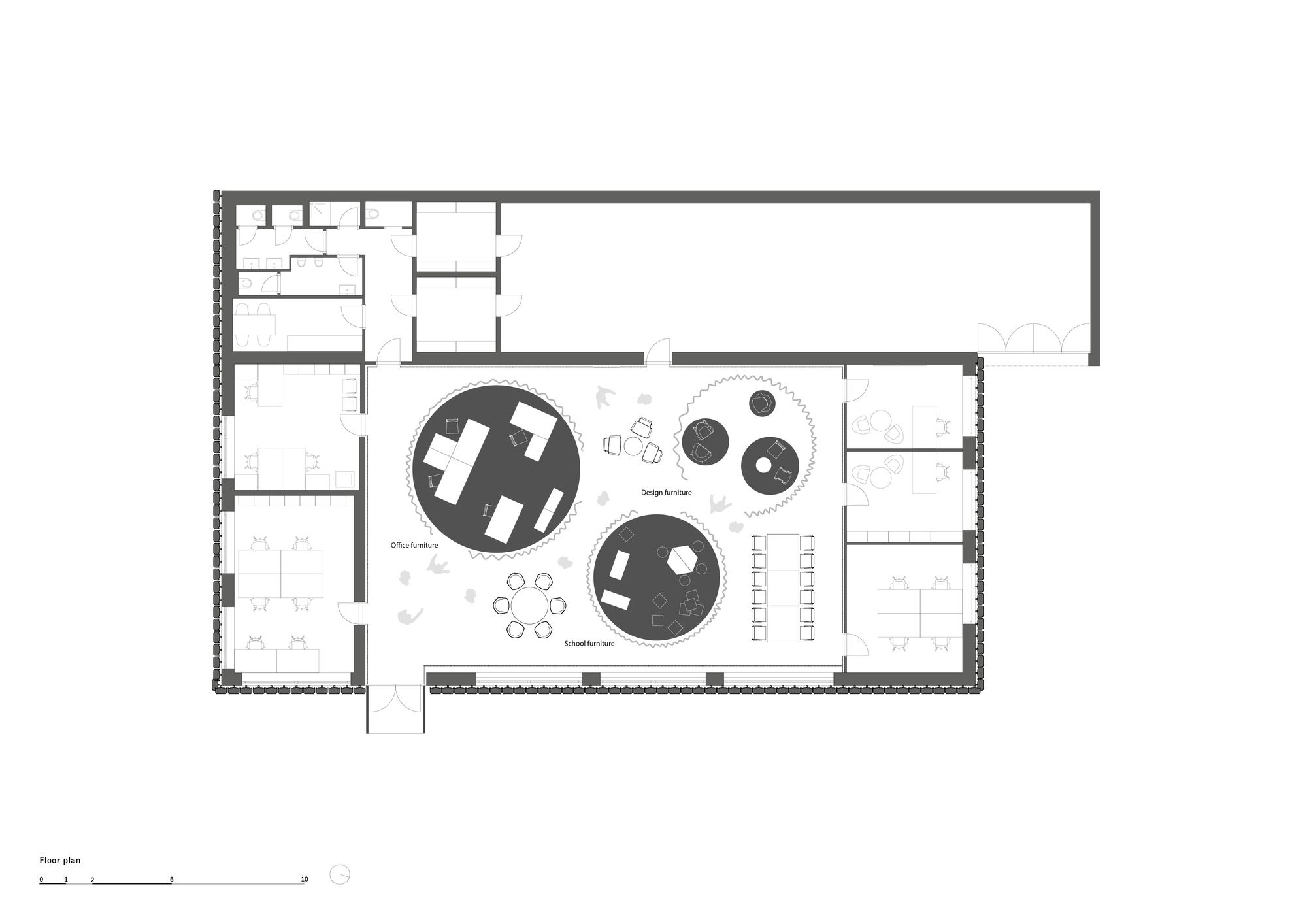
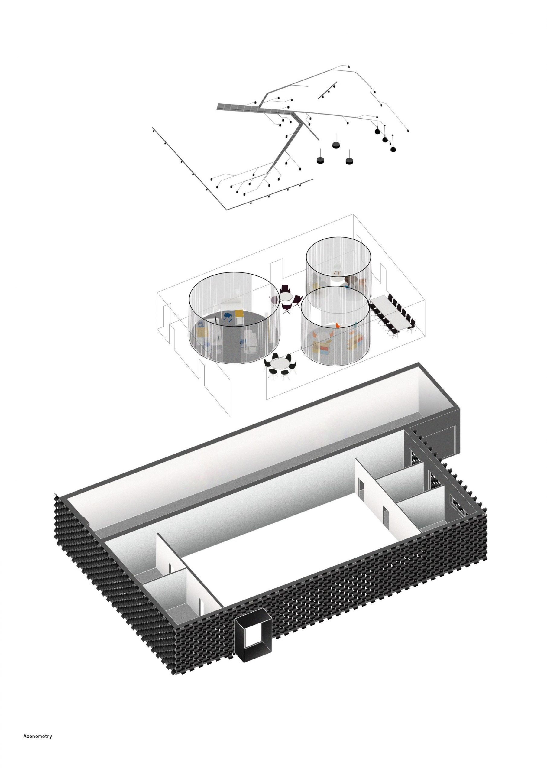
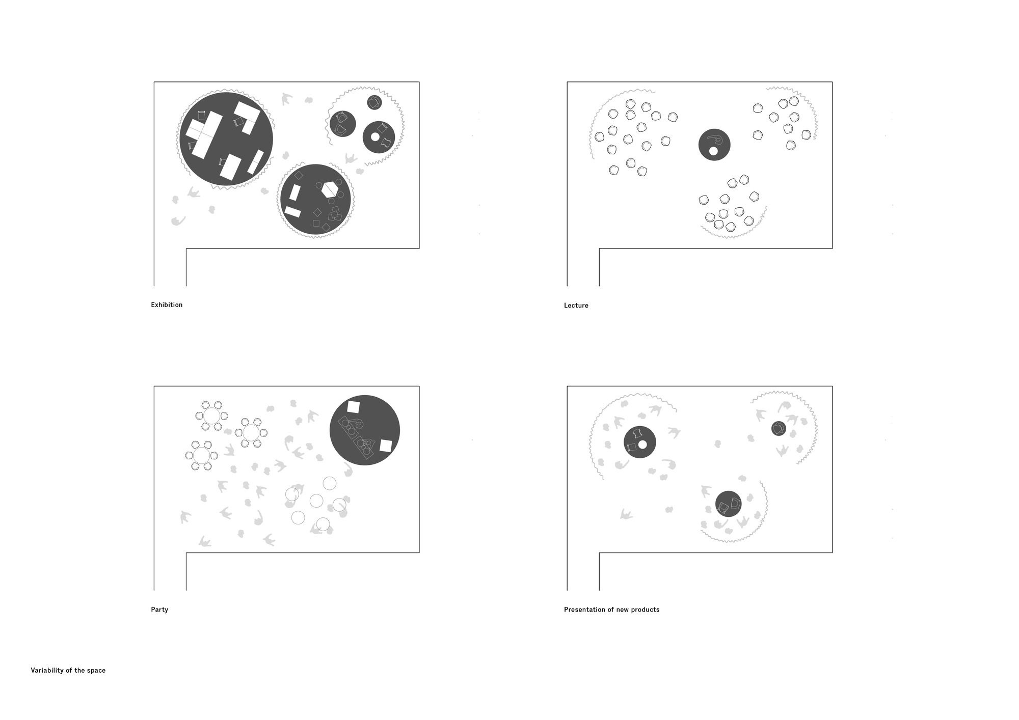
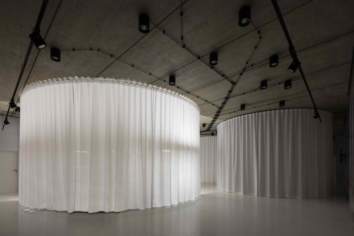
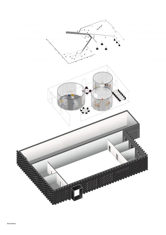
The concept of the interior represents the second level of the project and consists of two parts: a showroom and offices with a background for the employers. The inside of the building was demolished. A presentation space of the showroom was created by enlarging the former entrance hall at the center of the layout and is demarcated by polycarbonate partitions. The floor is unified by means of a white screed, on the ceiling remain former fair faced concrete panels and all the new wirings are exposed. Three circular galleries are embedded into this newly created space, representing three different segments of production – school furniture, office furniture and design pieces. The circular cutouts are demarcated by white textile curtains for the full height of the space, they can be closed or let open. Interiors of the cutouts represent three different settings where the flooring material, means of lighting and the color of the light itself are aimed to correspond with a natural setting that the furniture is intended for. The interstices can be filled with various products or pieces of art, they can be used as a common room for the employees or for get-togethers with clients. The whole space works on the principle of a gallery which can be easily adjusted according to the actual needs.
Offices for the employees are preserved along the perimeter of the structure, they are illuminated by daylight, have a ventilation and are unified by a grey carpet and white paint.
Project Info
Architects: CHYBIK+KRISTOF
Location: Brno-Vinohrady, Czech
Design Team: Ondrej Chybik, Michal Kristof, Victor Cojocaru, Martin Holy, Vojtech Kouril, Sarka Kubinova, Ondrej Mundl, Matej Strba
Area: 550.0 m2
Year: 2016
Type: Exhibition Hall
Photographs: Lukas Pelech
