Hybrid buildings are becoming more popular, not only in an attempt to maximize space, but because of the identifiable overlaps in function and program. Apartments have evolved to the point that not only do they need to provide adequate living conditions, they also have to supply social space that promotes residential interaction. So what constitutes as a residence? Is it defined by certain functions, does it correspond with a set of standards and characteristics? Or is it merely a label used to describe a specific building type?
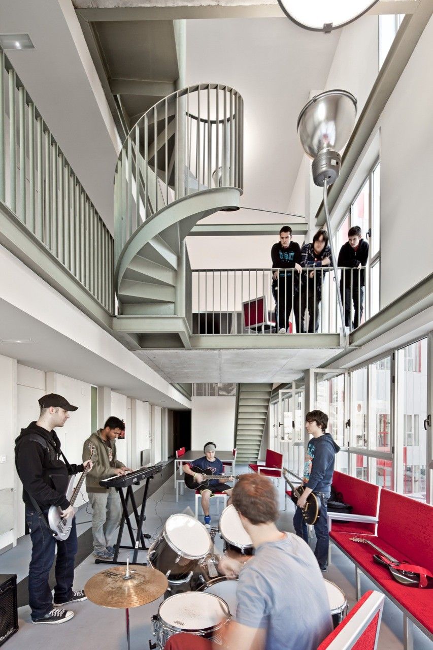
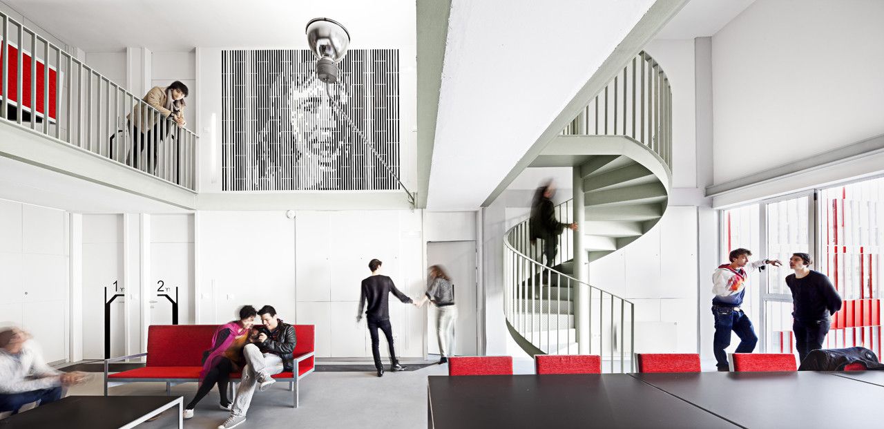
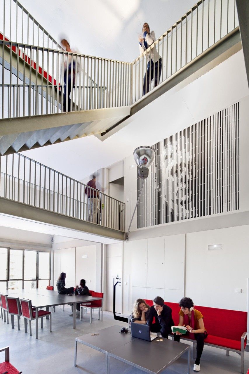
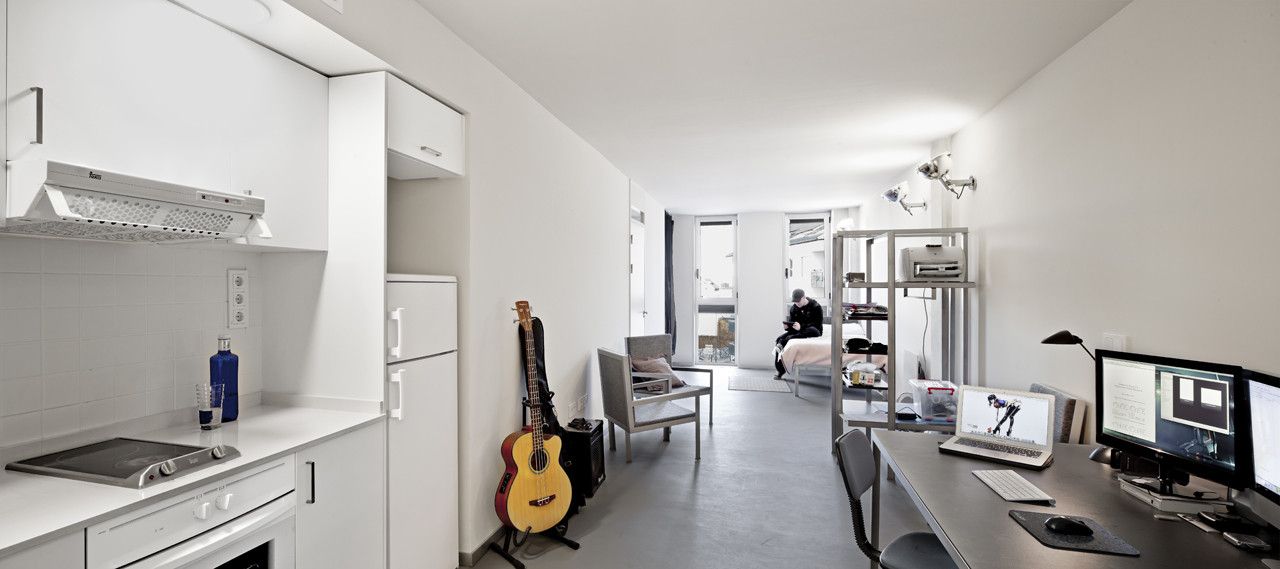
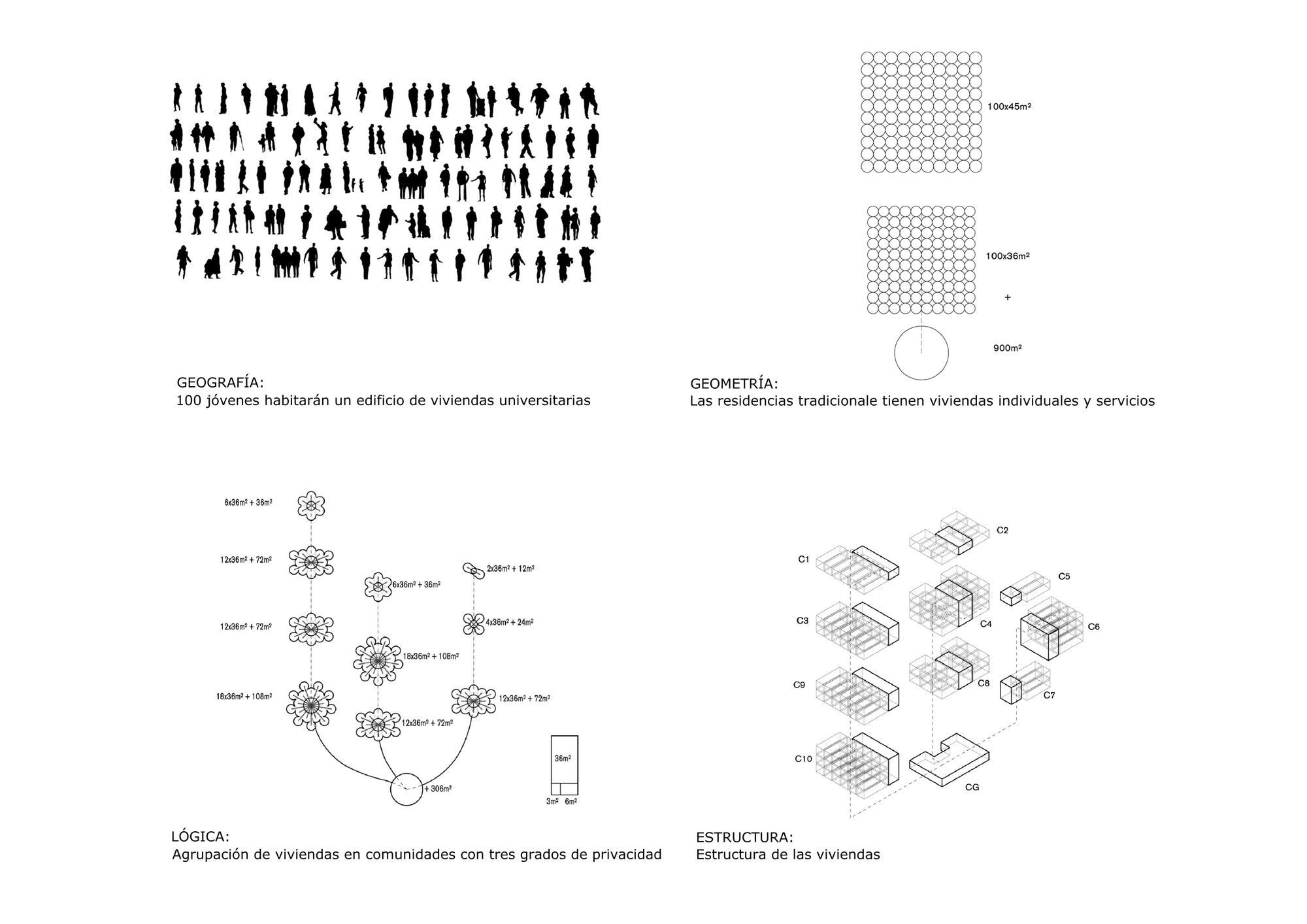
 In Spain the national Housing Plan states that an adequate apartment size should be built between the area of 30 to 45 square meters, with up to 20 percent shared space. Using these parameters, Guallart designed a space that attempts to break the mold of traditional housing, while experimenting the best way to use “shared space” within a building. “Shared space” in this instance was broadened to include such things as eating, relaxing, digital working, washing clothes, and other things of the like, where a semi-public environment is recommended due to the shared nature of the occupants using the area.
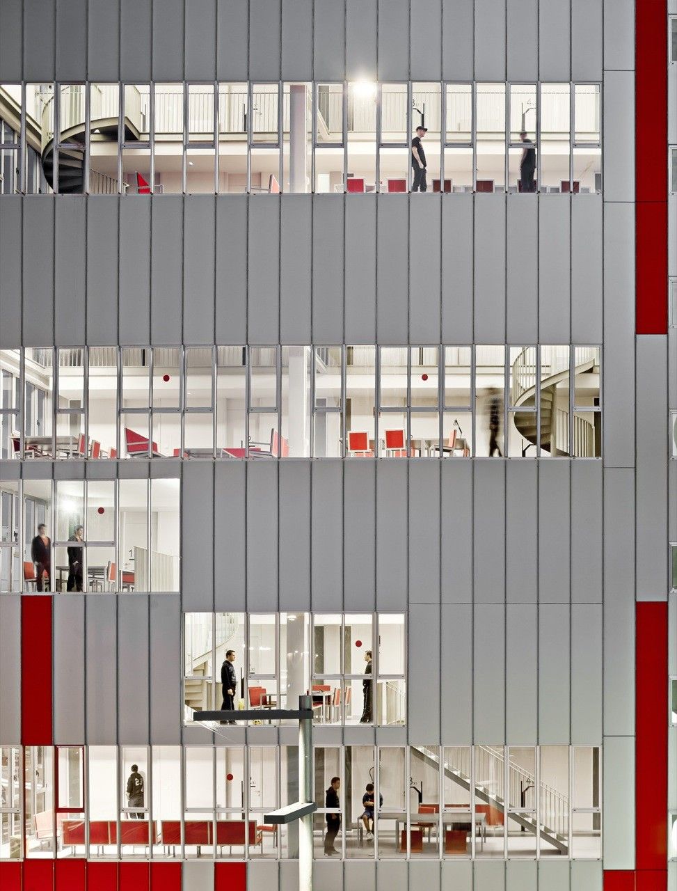
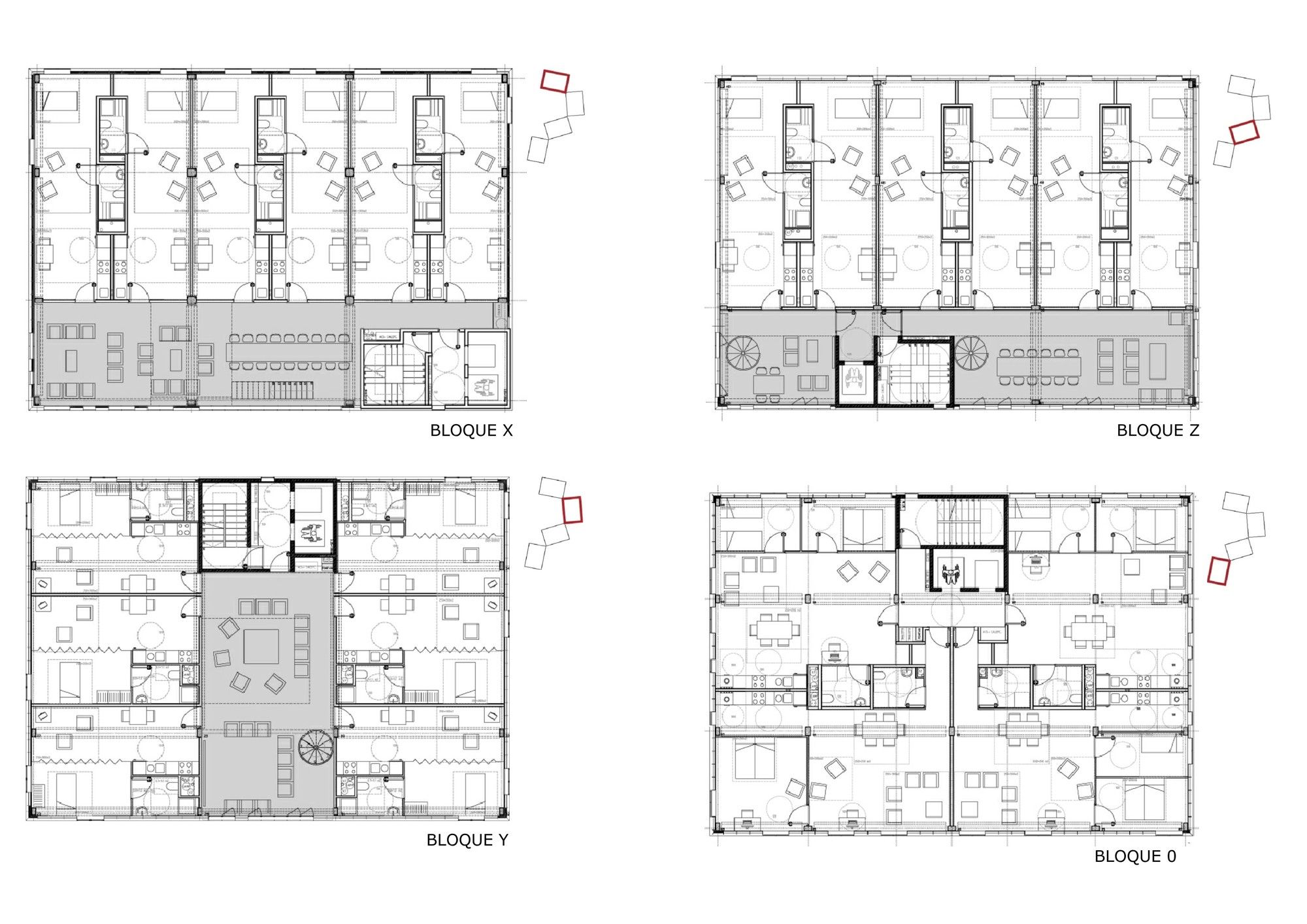
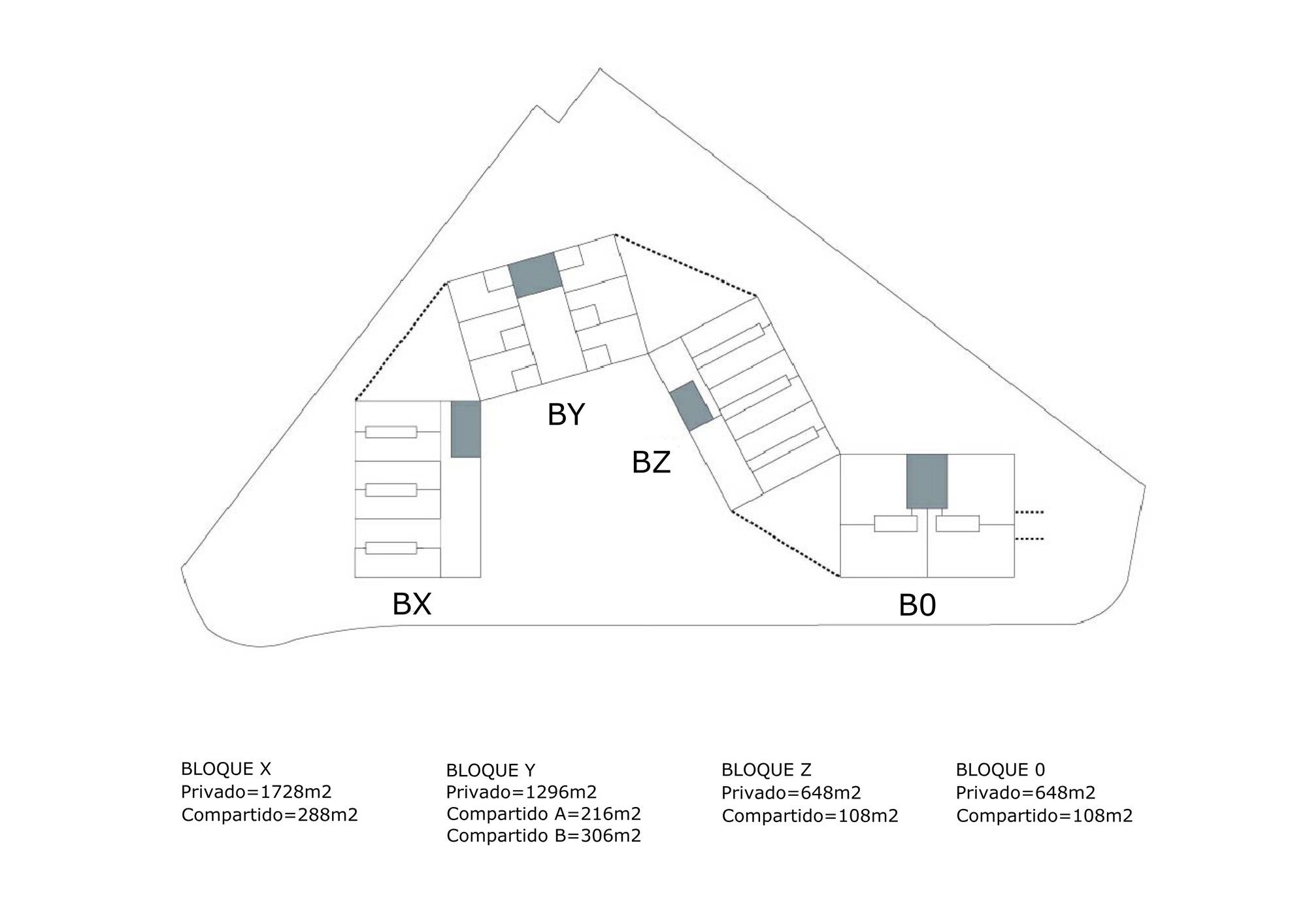
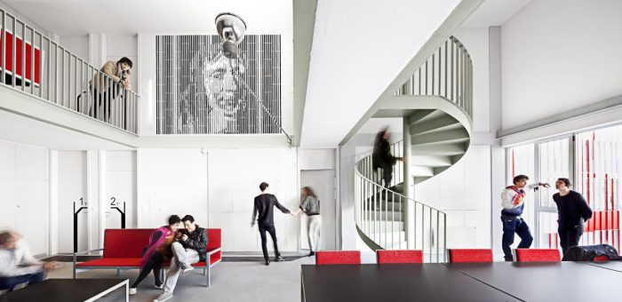
 The problem faced in this situation is at what scale should the shared resources within the building be introduced and finding that balance between private and public space. There were several different possibilities that were examined when trying to answer this question such as providing shared space within a single dwelling, between two or more dwellings, between adjoining floor, and even on the scale of the whole building or the surrounding neighborhood. In the end the proposal defined three scales of habitability. The first was a loft style apartment that included a kitchen, bathroom, and rest area, which provided a more intimate and personal space. The next was a spacious living area and contact and work areas stationed on every second floor that would be shared between 2 to 18 people. Finally the largest scaled area of the building shared by all the residences would contain a lounge, a laundry, internet access and a library, all of which would be located on the ground floor of the structure.
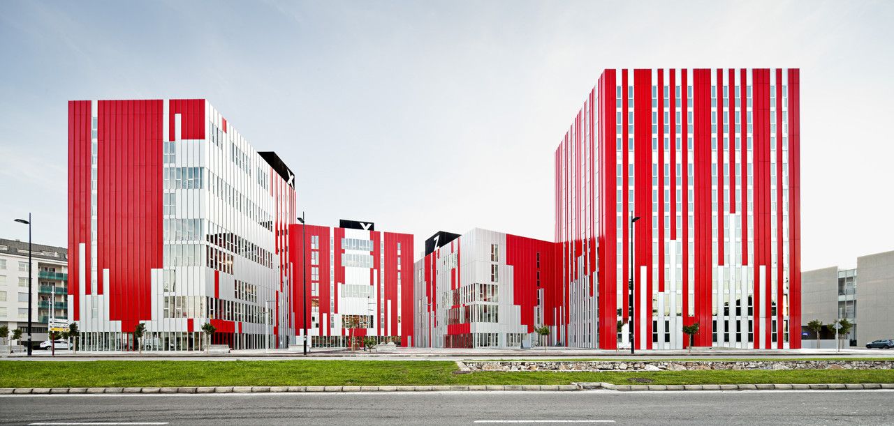
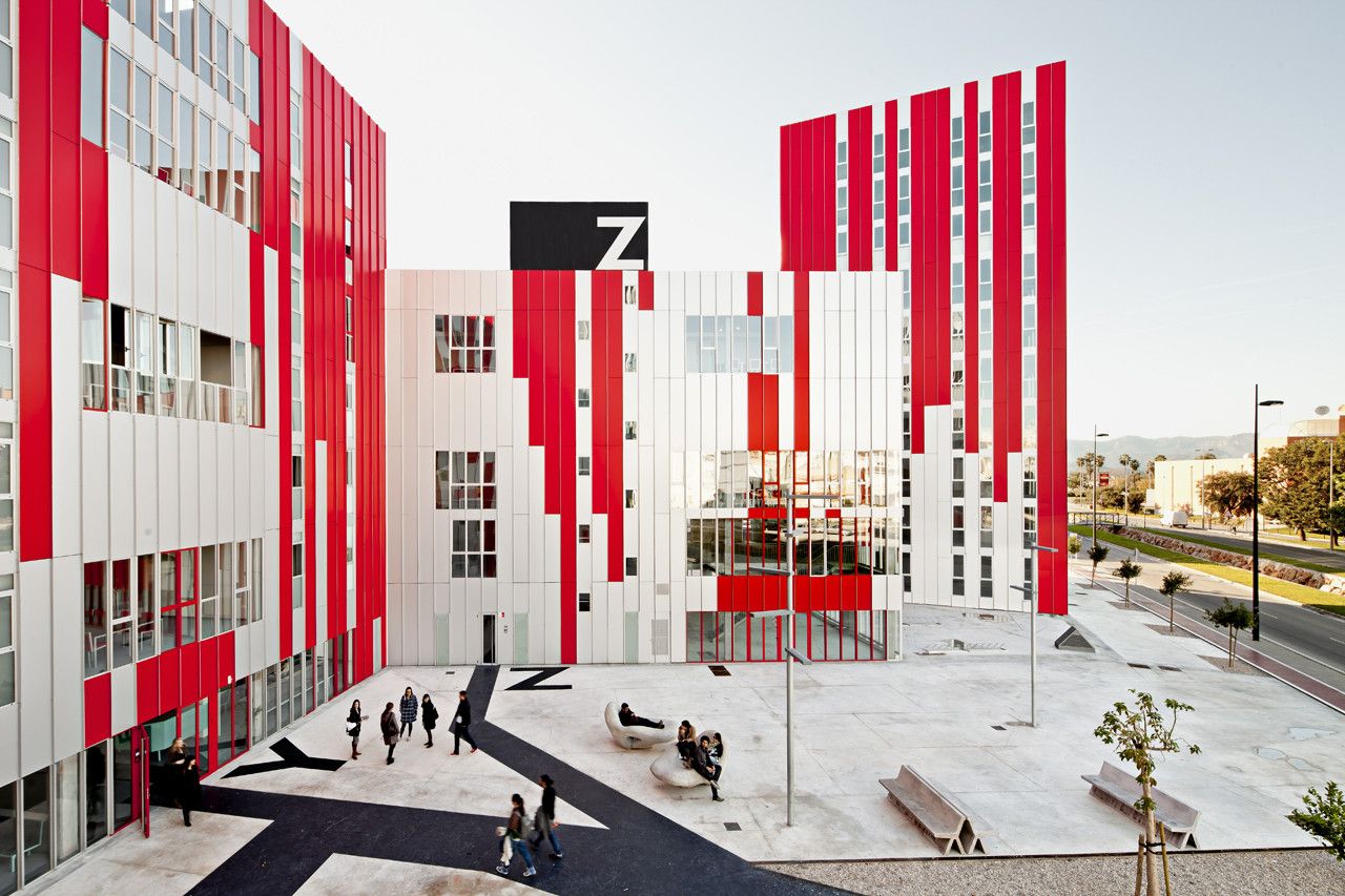
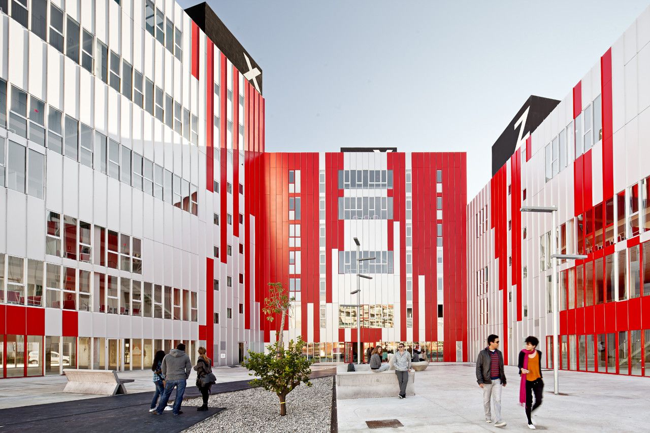
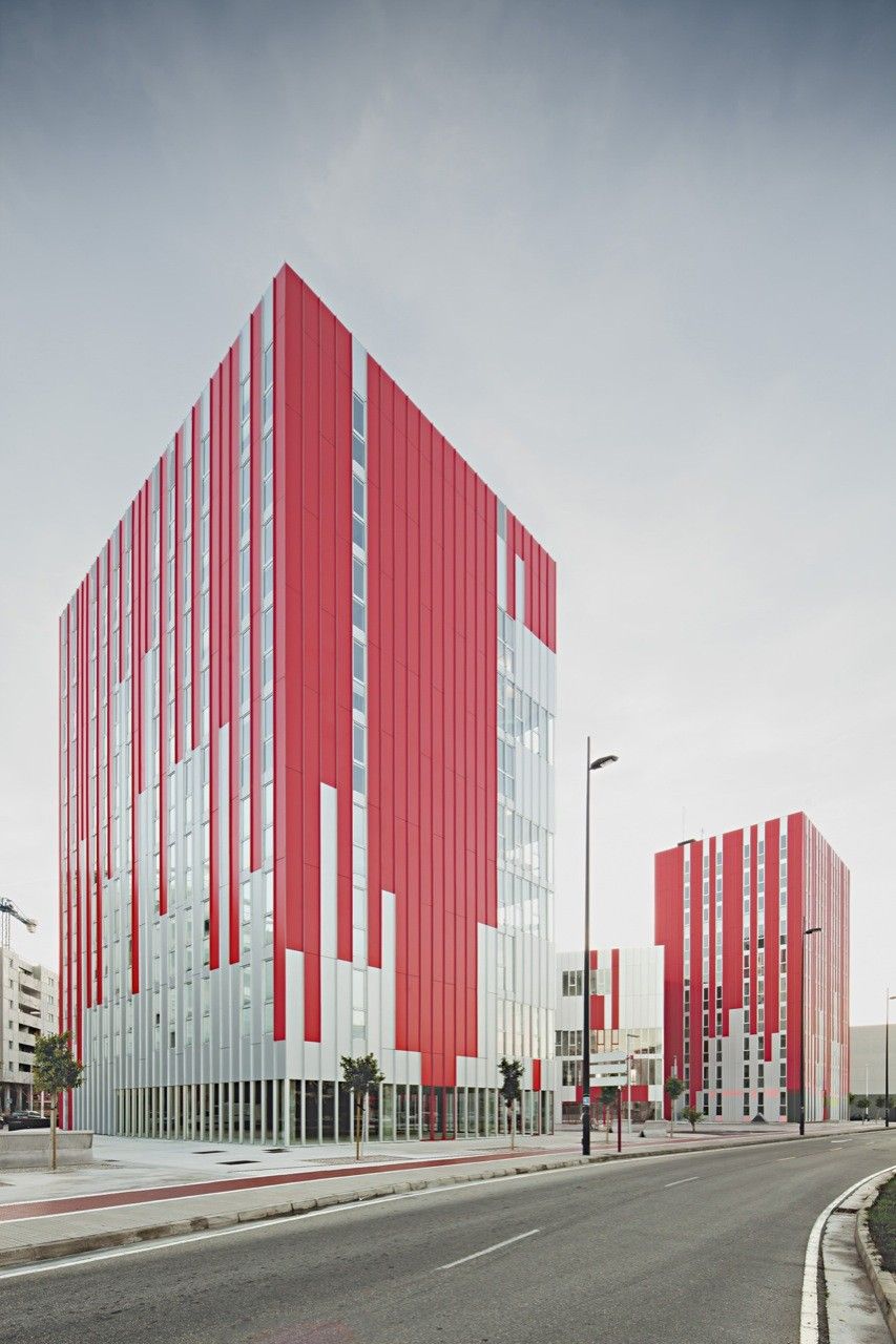
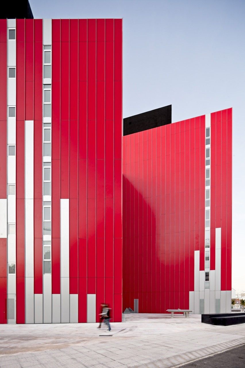
 Beyond the general layout of the University Housing, what’s the most captivating about this project is the dramatic façade, which I avoided talking about until now due to the fact that it is quite overwhelming. On the architects website the significance of the red a white cladding is not explained, but from my perspective it’s an attempt to capture the youth of the student residents within the buildings. With so much thought and consideration placed upon the spaces inside the buildings, the exterior seems random and chaotic, dominating the design and can make it difficult to look beyond the surface to appreciate the use of space and architecture inside.
