Ginza Place
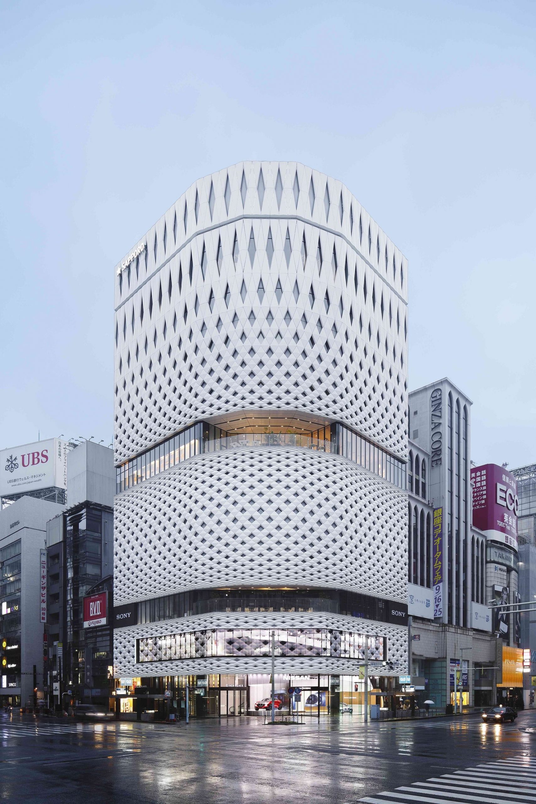
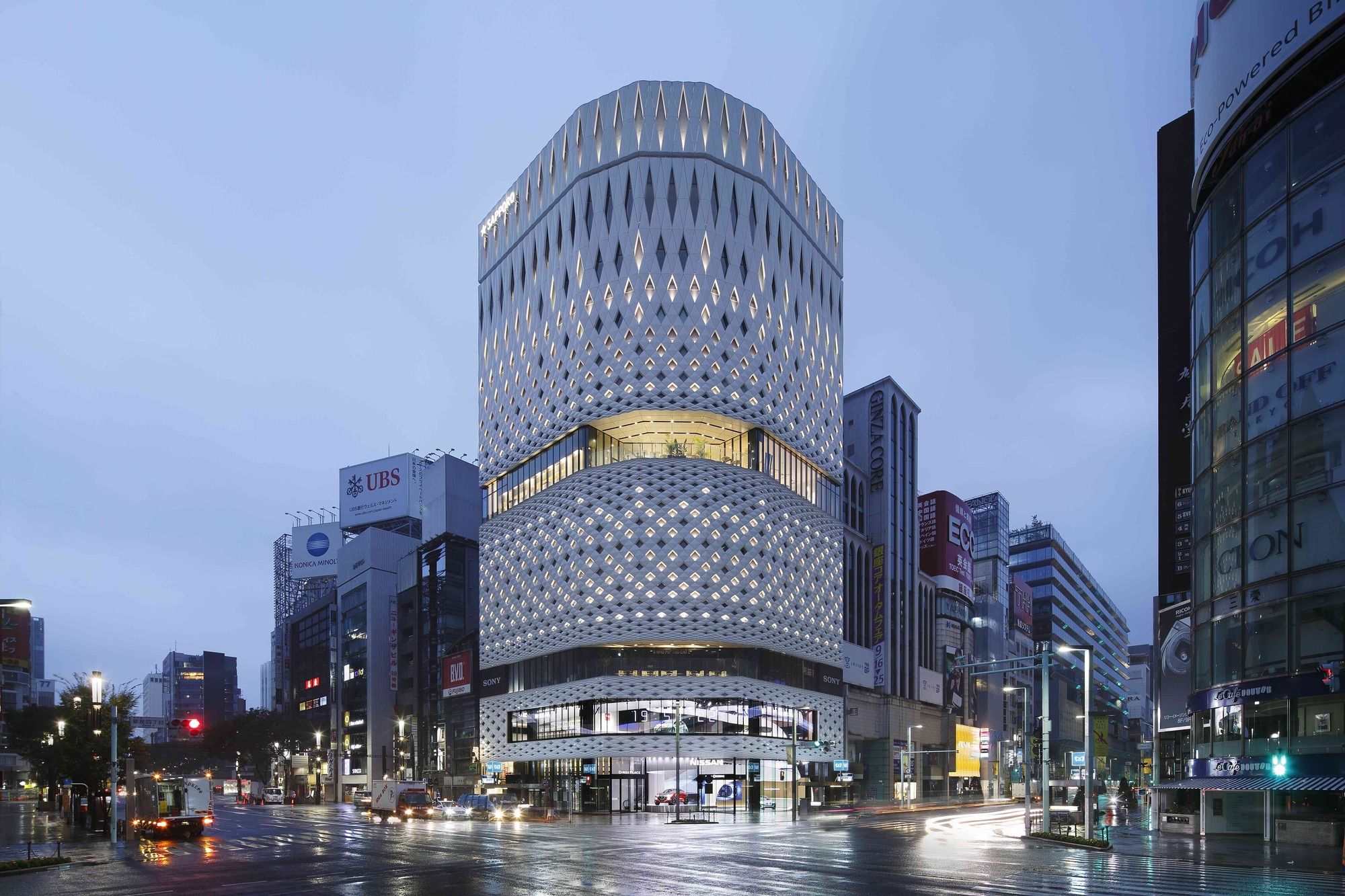
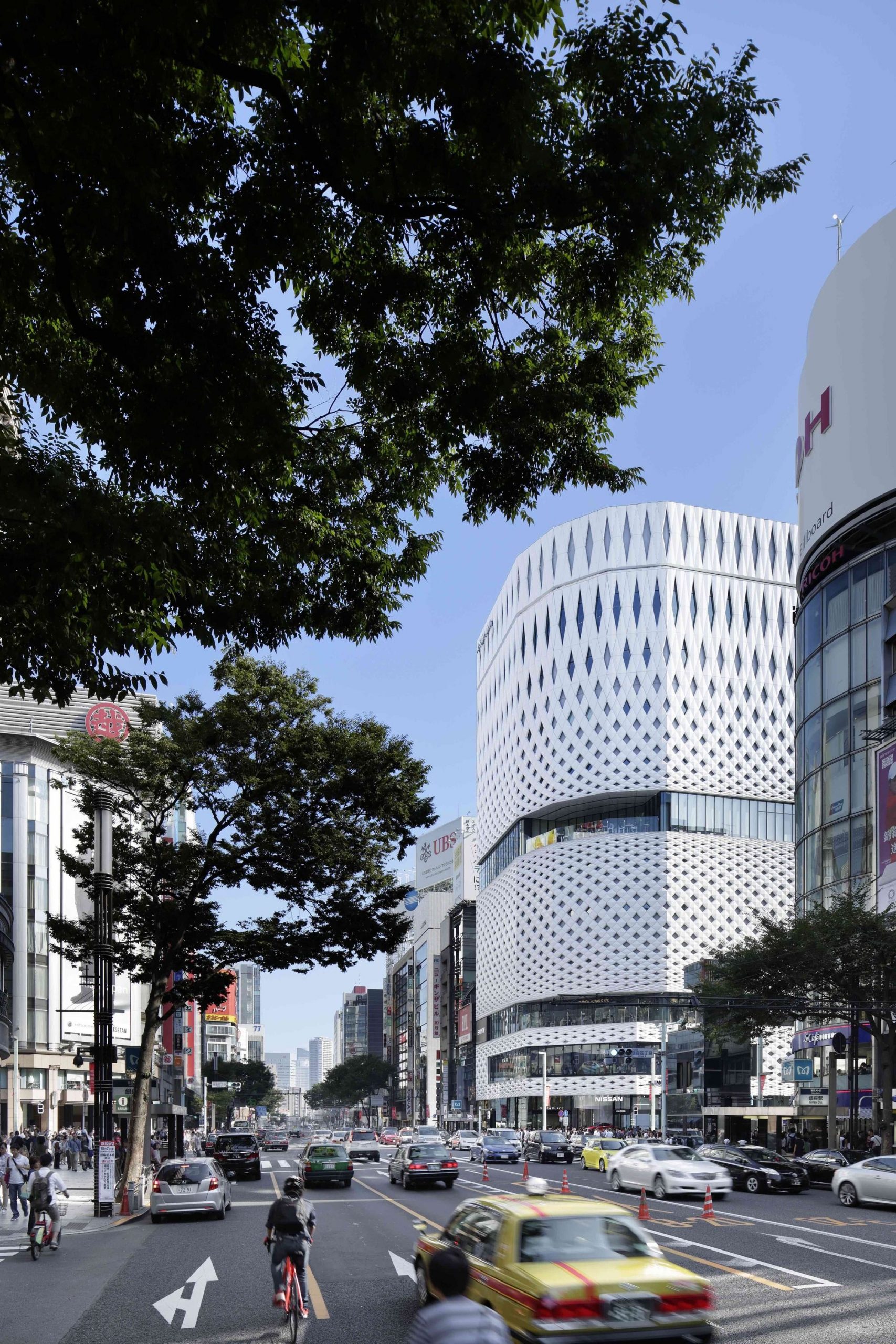
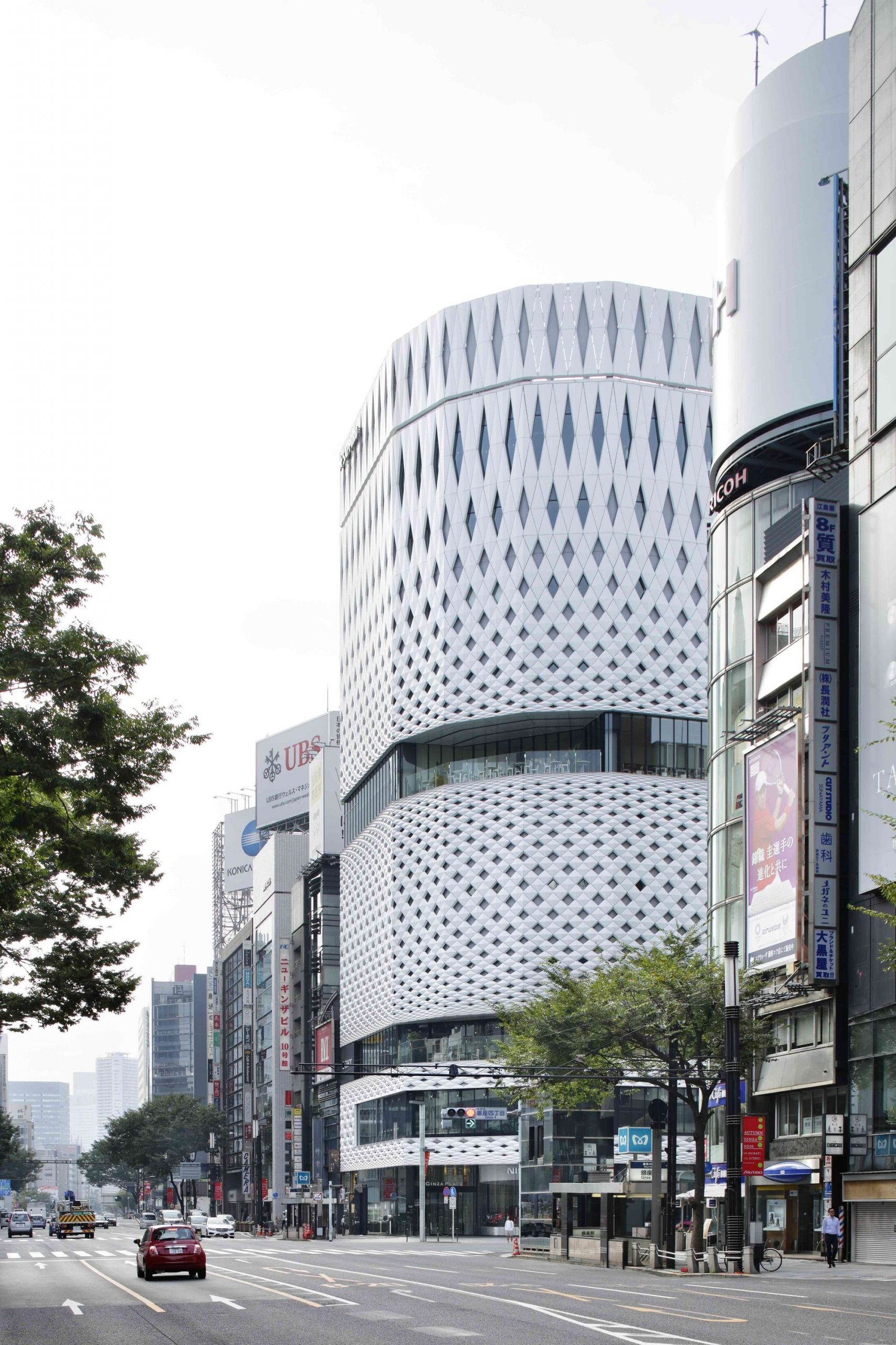
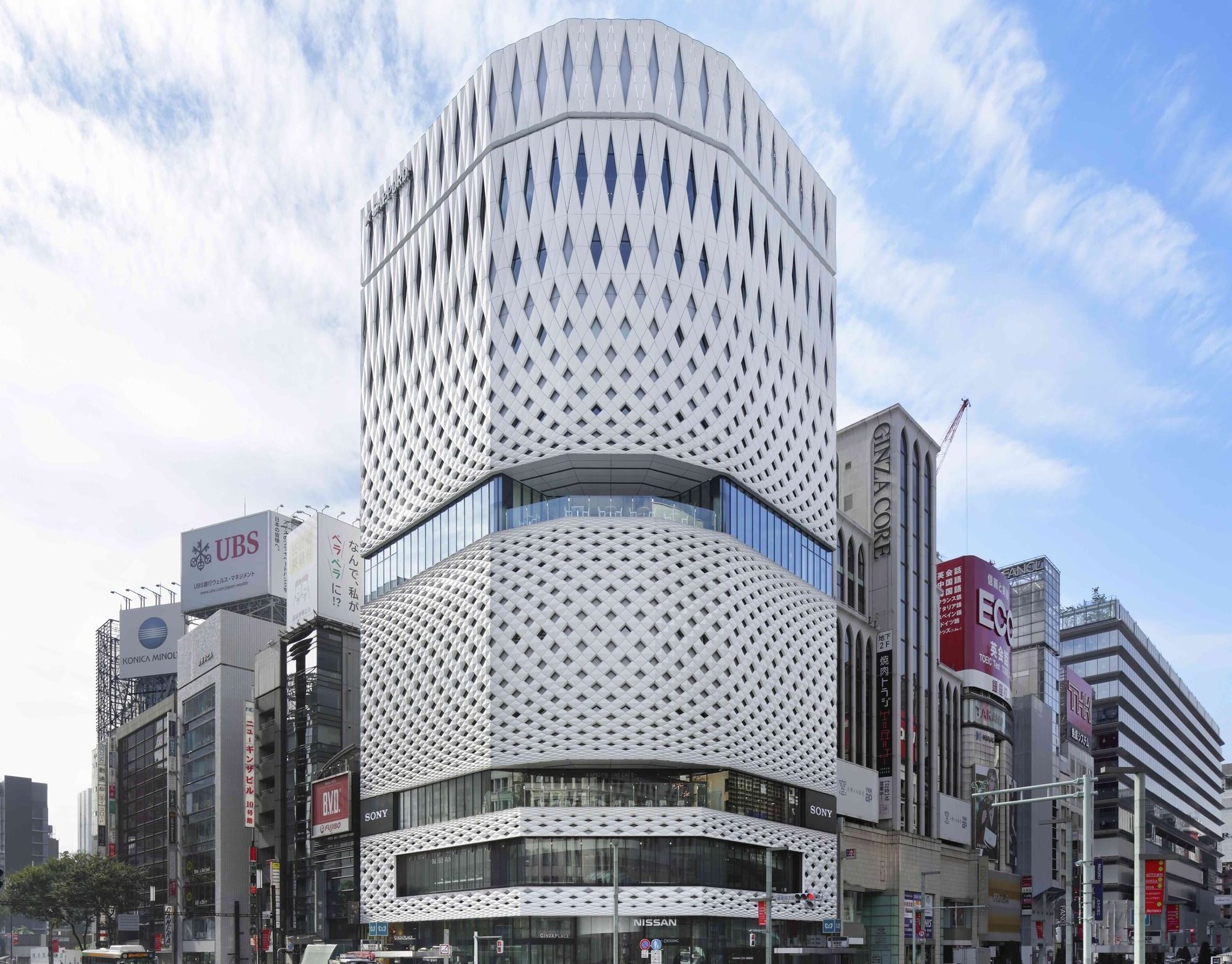
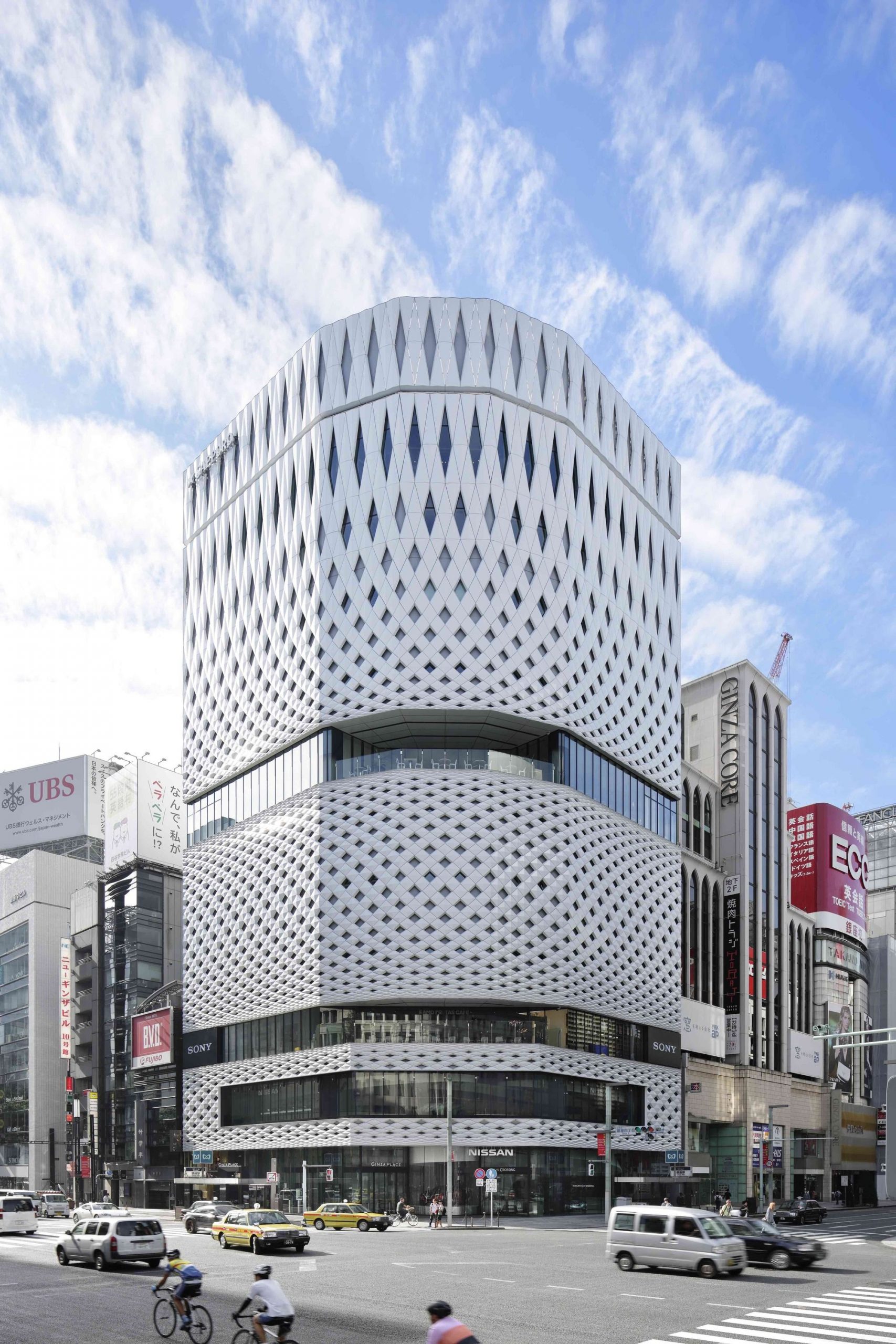
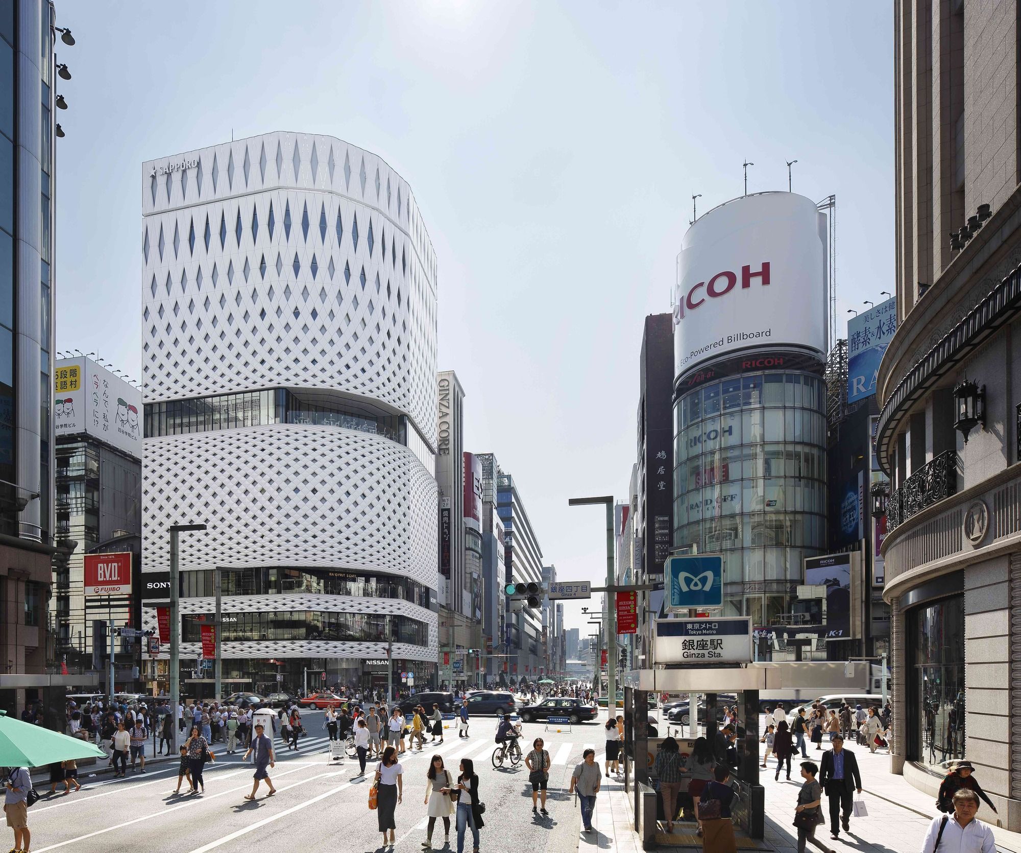
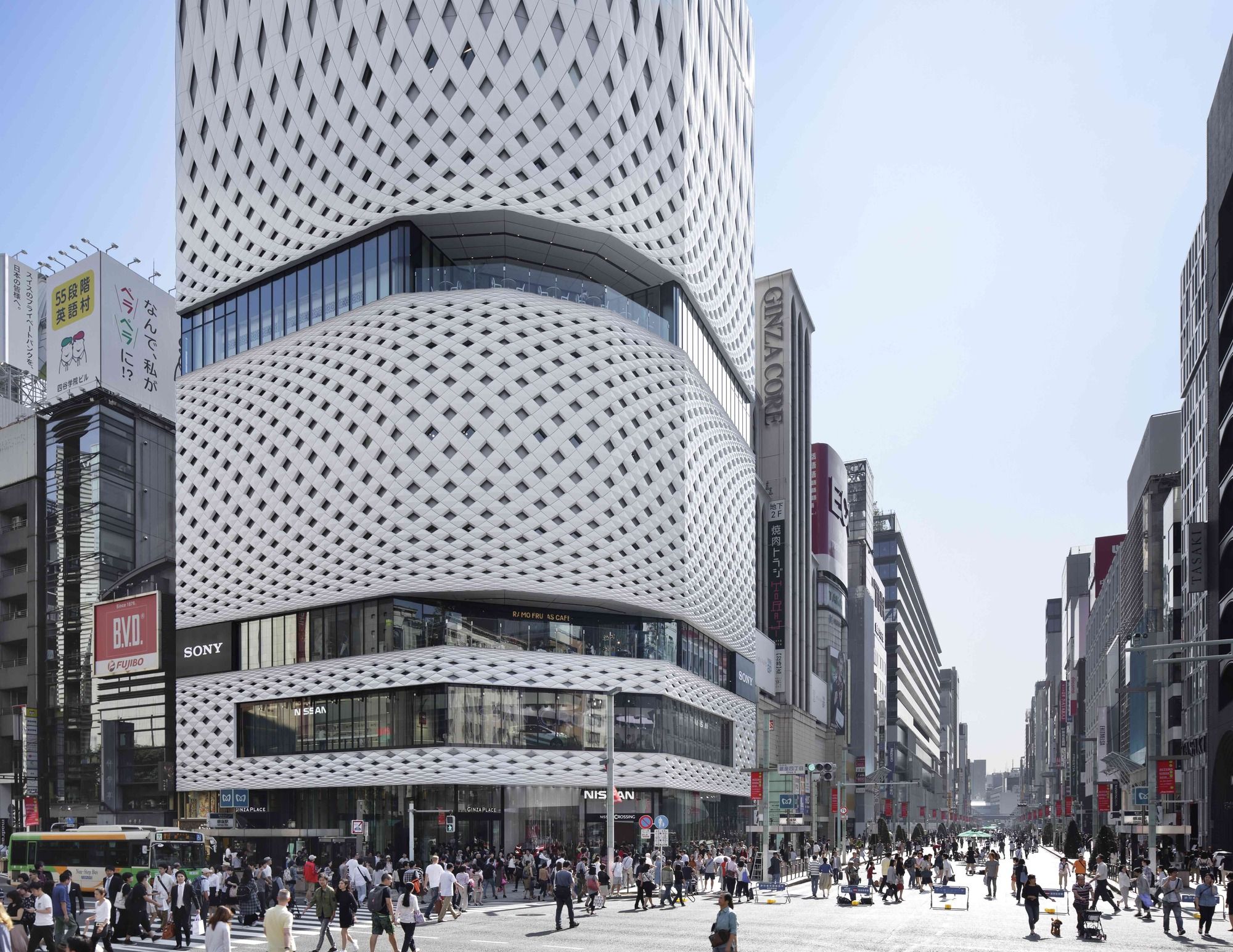
Ginza Place, a major commercial development in Tokyo’s famous Ginza shopping district, occupies arguably the most prominent recent development site in Japan. Ginza’s reputation for elegance and sophistication has made it a center of Japanese culture and commerce for more than a century. Ginza Place completes the neighborhood’s central intersection by introducing a bold and well calculated façade to the streetscape.

Photography by © Nacasa & Partners
Tokyo based Klein Dytham architecture handled the façade and building massing, and was tasked with creating a public face that synthesized the surrounding architecture and captured the energy of the intersection. At the same time, the design had to reflect the sophisticated character of the district. Ginza is known not only for its elite fashion houses and art galleries, but for its renowned collection of contemporary structures. Many of the biggest names in Japanese and international architecture have built in Ginza.

Photography by © Nacasa & Partners
The realty arm of Sapporo, a company better known for beer, has owned the site for over 100 years. Seeking to create a building befitting a site of this importance, they decided to demolish the existing structure and hold a competition for the replacement. Klein Dytham architecture worked with leading Japanese construction company Taisei Corporation to realize their winning massing and façade proposal.

Photography by © Nacasa & Partners
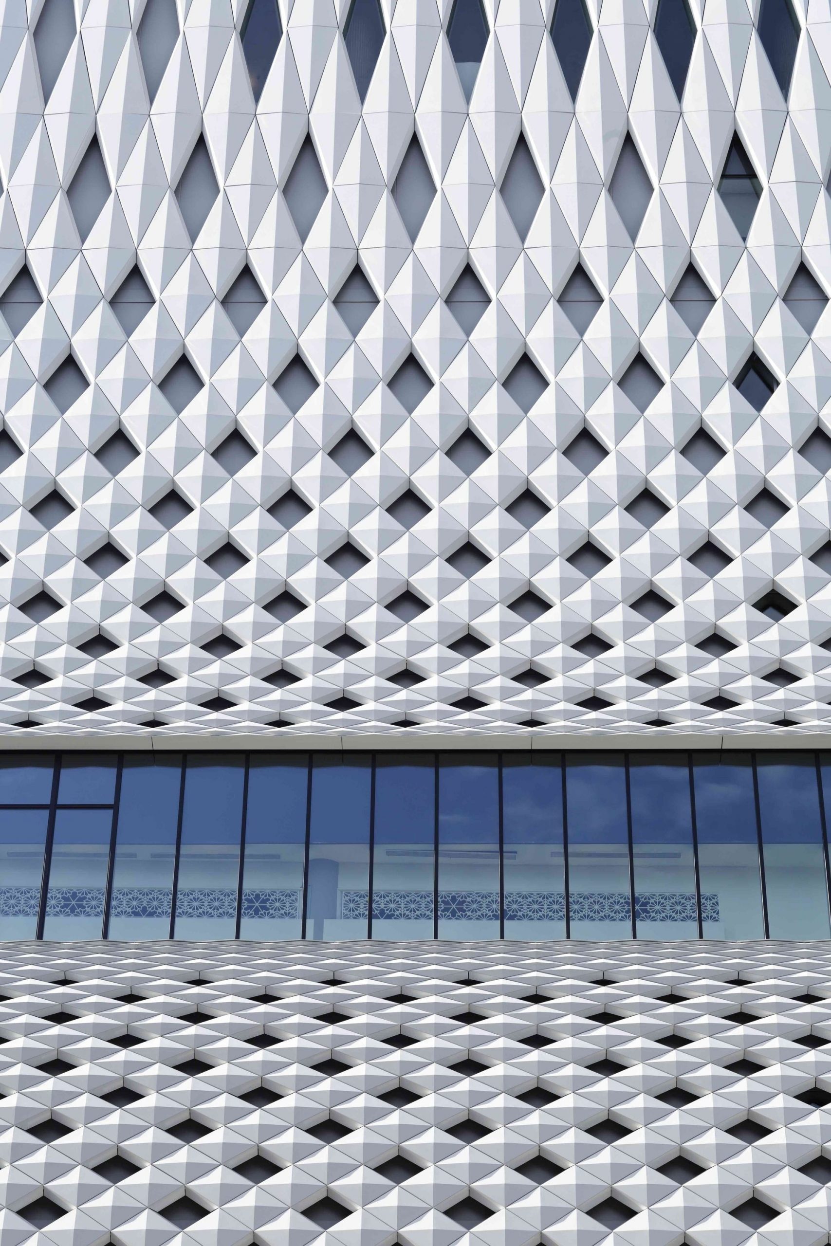
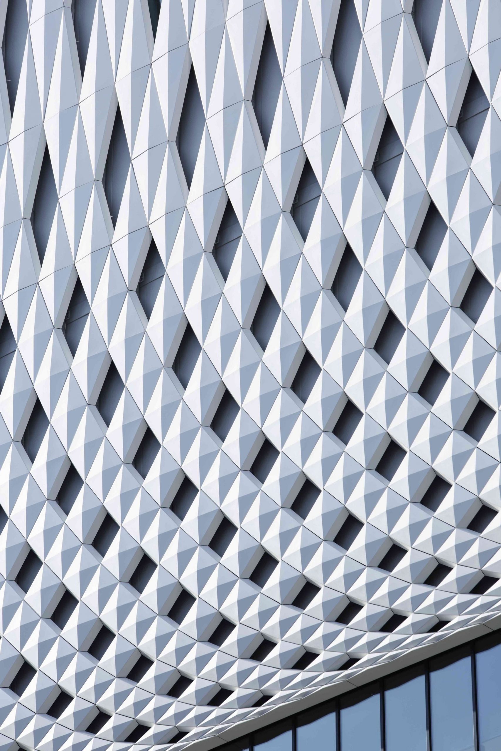
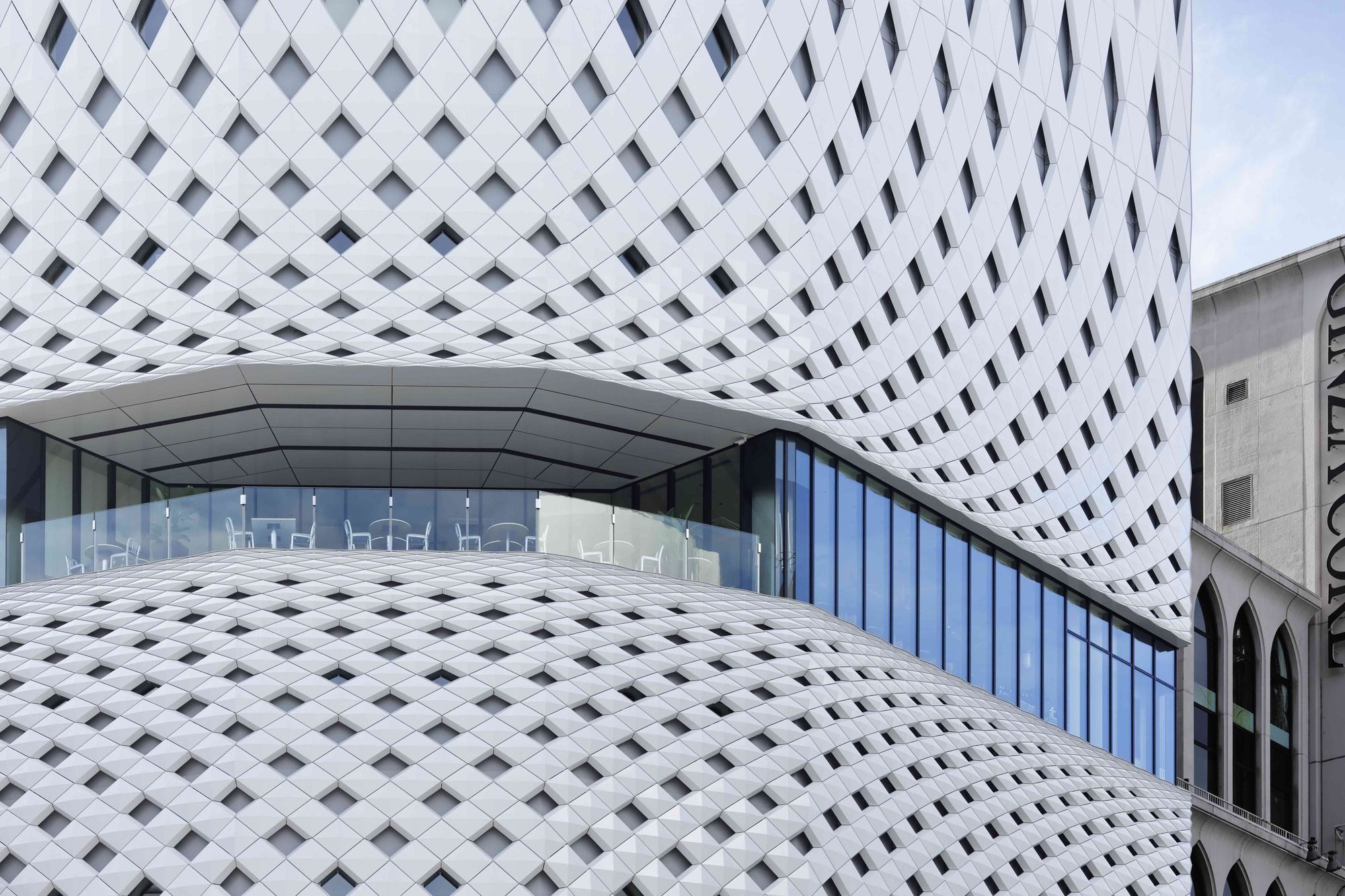
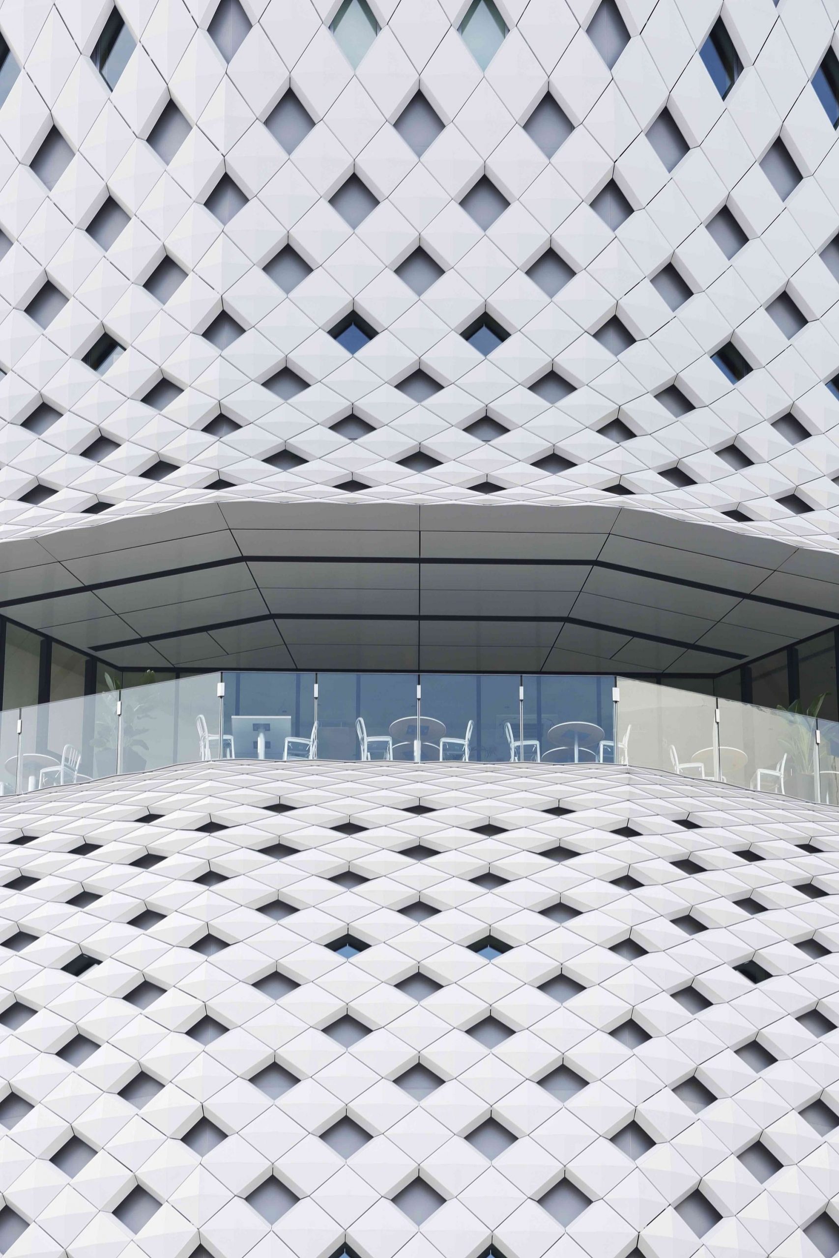
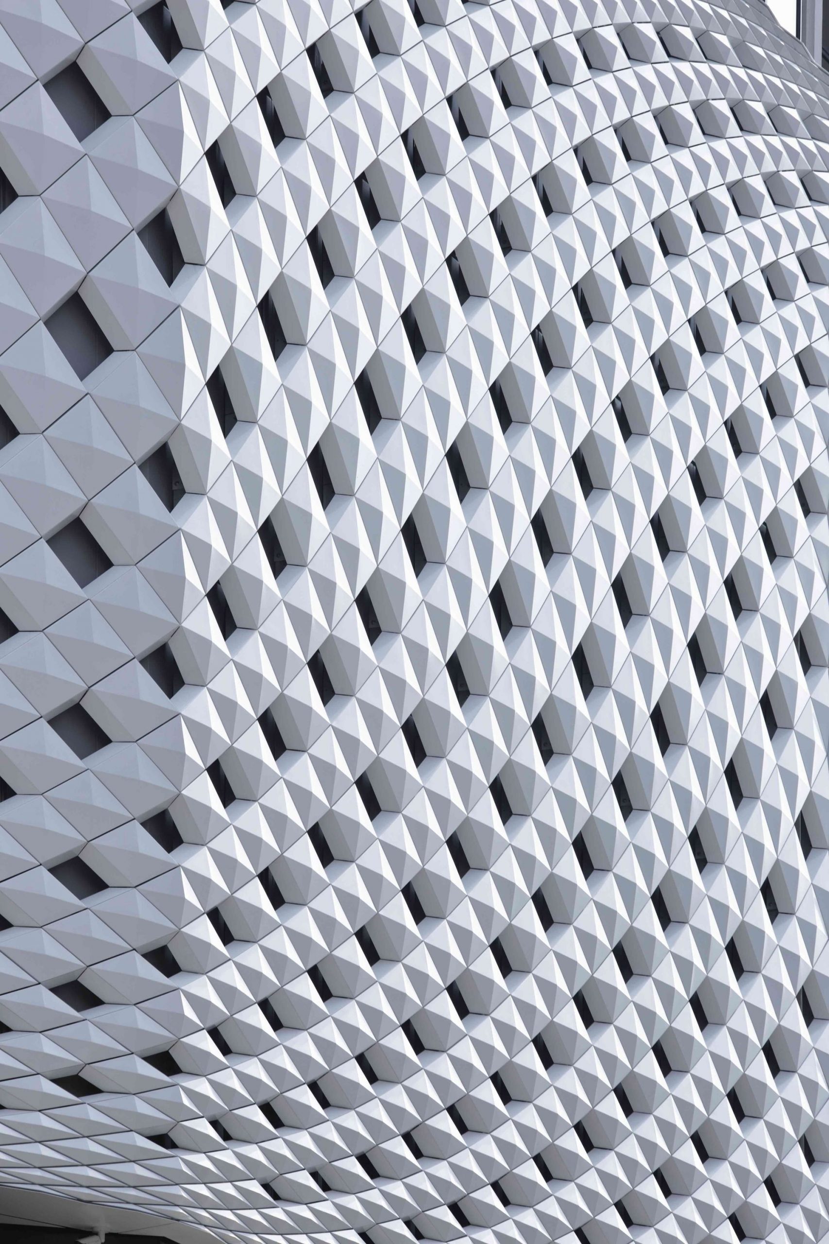
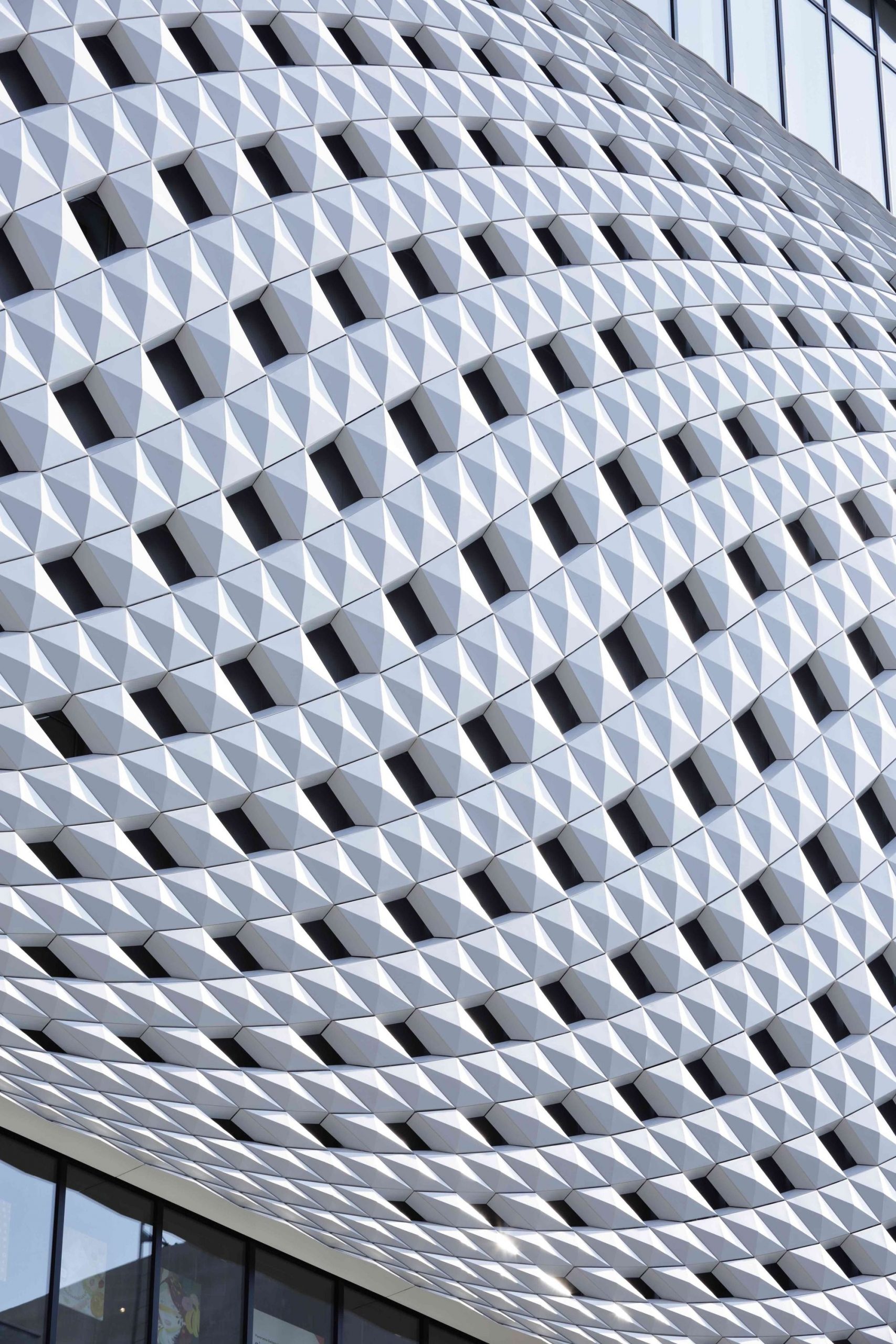
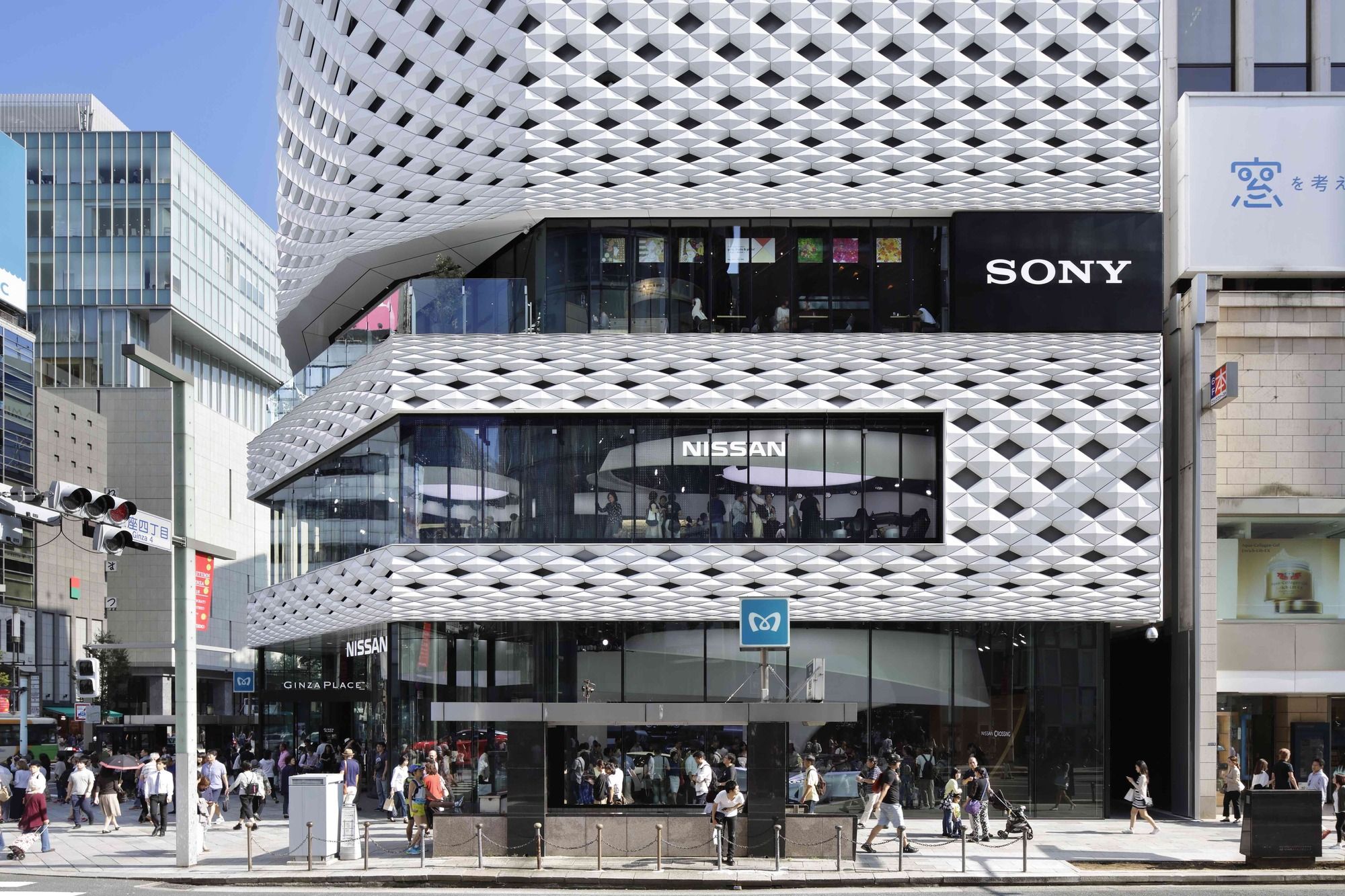
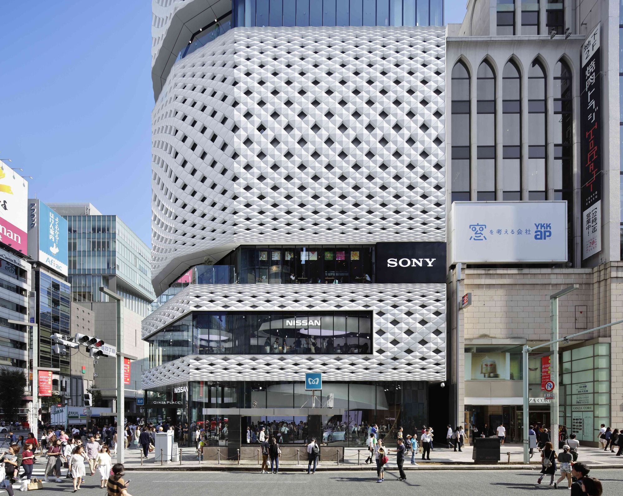
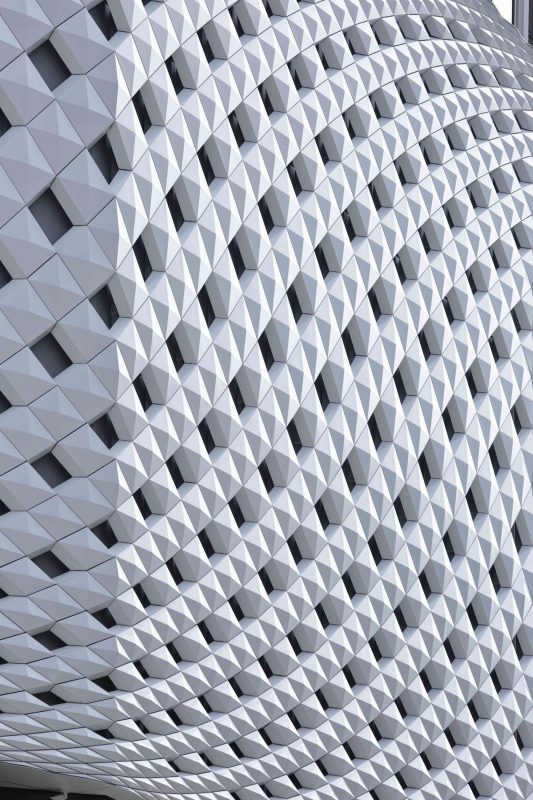
The façade takes its inspirit ion from sukashibori, a type of open latticework found in traditional Japanese crafts. Typically used in small items like baskets or tableware, the panel system used here was blown up to match the scale of the architecture. The permeability of the system allowed the façade design to be opened and closed strategically. The flexible architectural skin is applied unevenly over the building mass, breaking the large façade into smaller sections.
Photography by © Nacasa & Partners
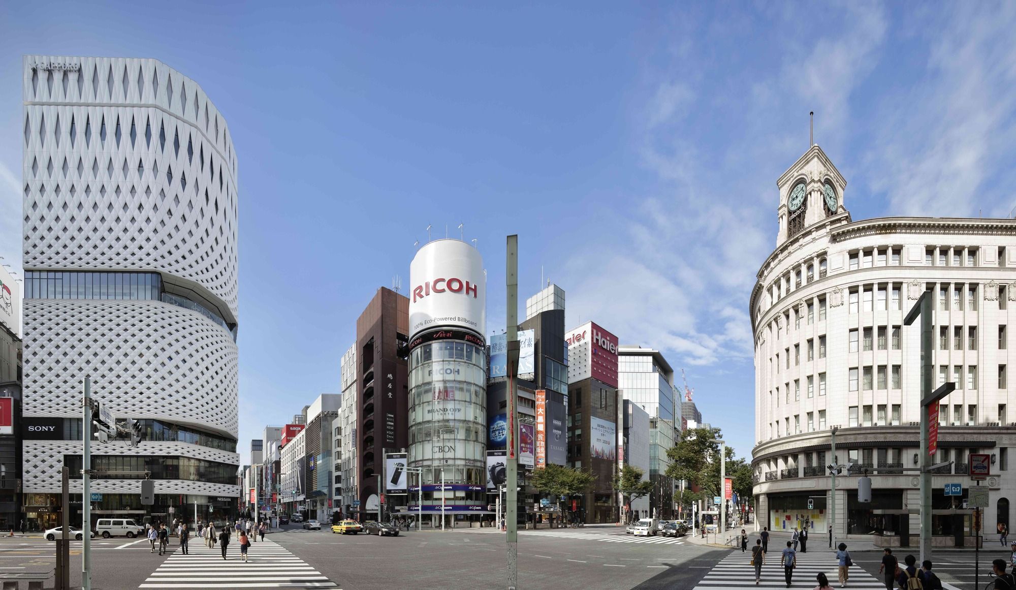
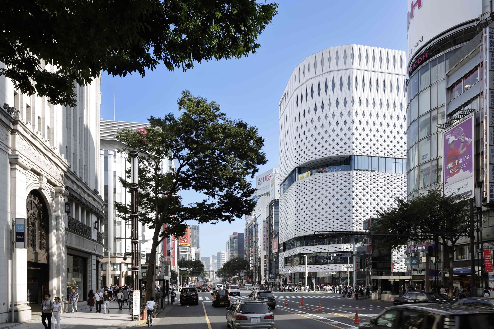
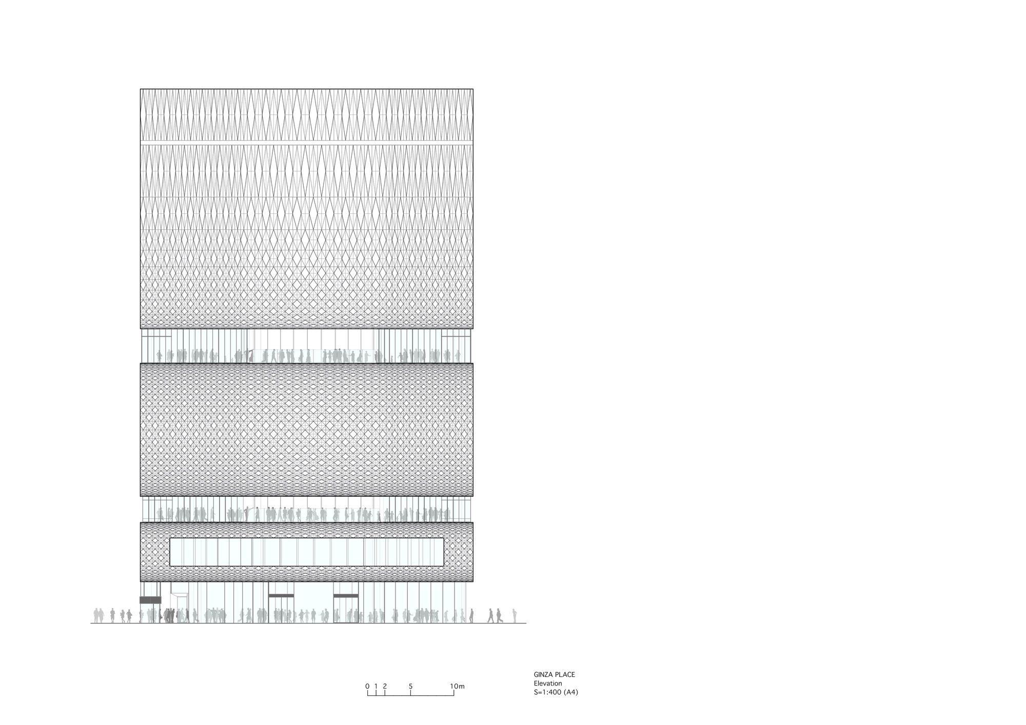
The larger composition of the façade takes cues from the surroundings, especially the Seiko Building (Wako Building) on the opposite corner of Ginza’s main crossing. The Seiko Building became a symbol of Ginza upon its completion in 1932, and its clock tower remains t he icon of the area. Klein Dytham analyzed the façade, breaking it up into a short podium, a taller mid section, and a vertical extension at the top suggested by the upward thrust of the clock tower.
Photography by © Nacasa & Partners
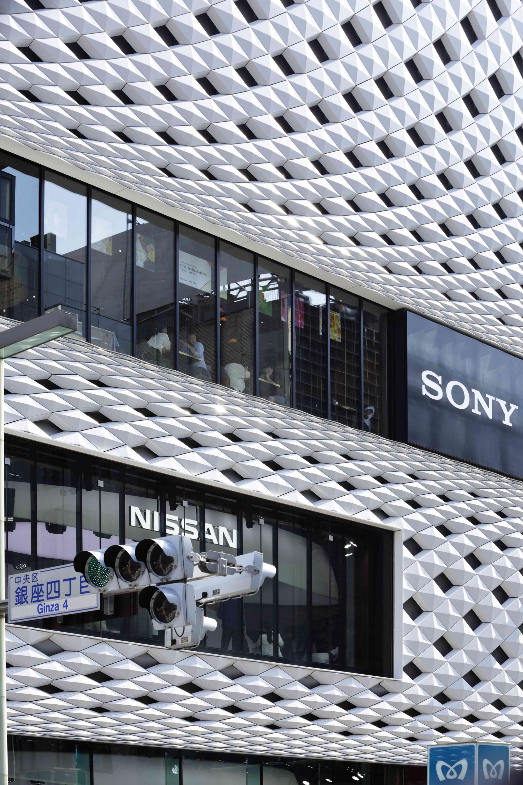
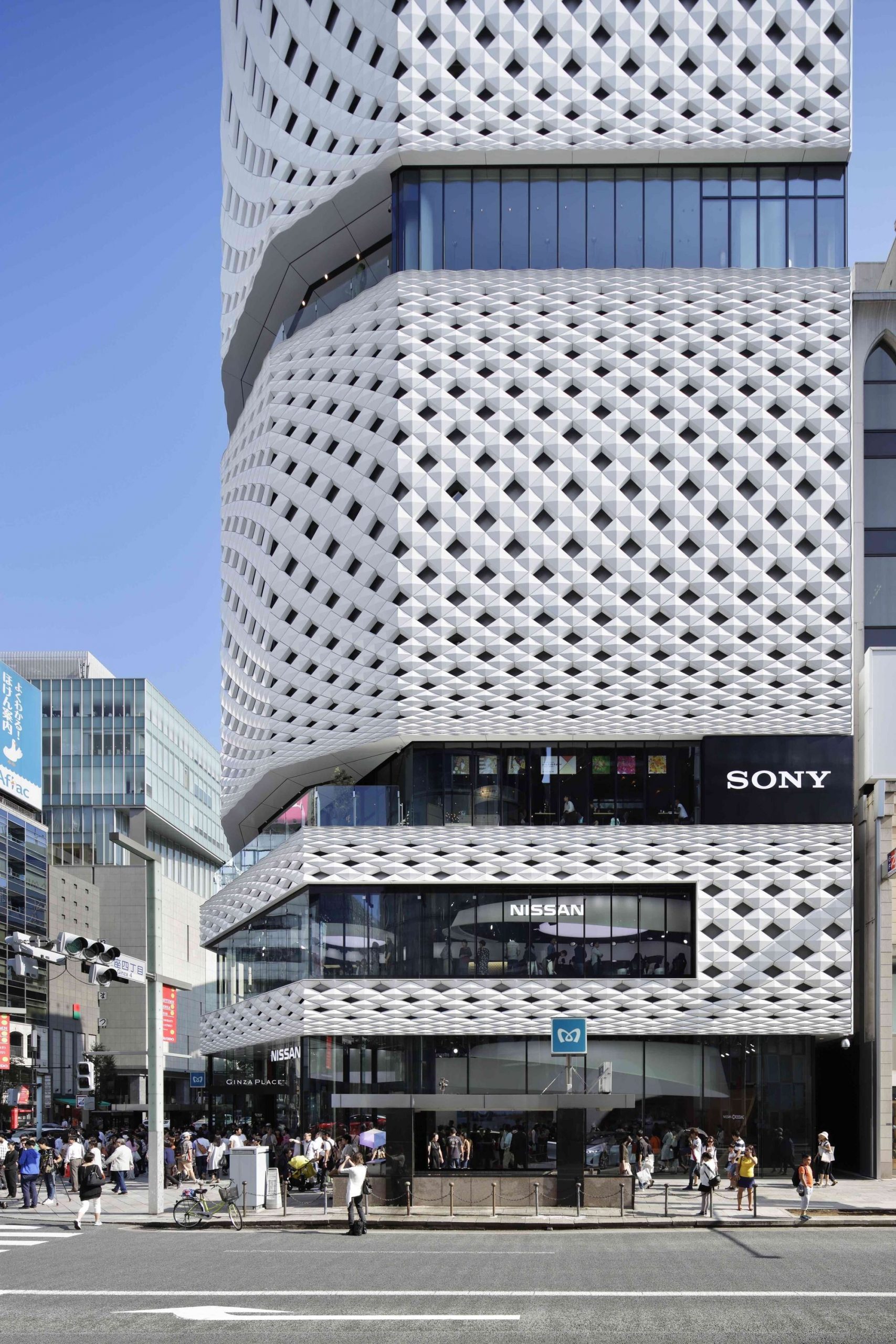
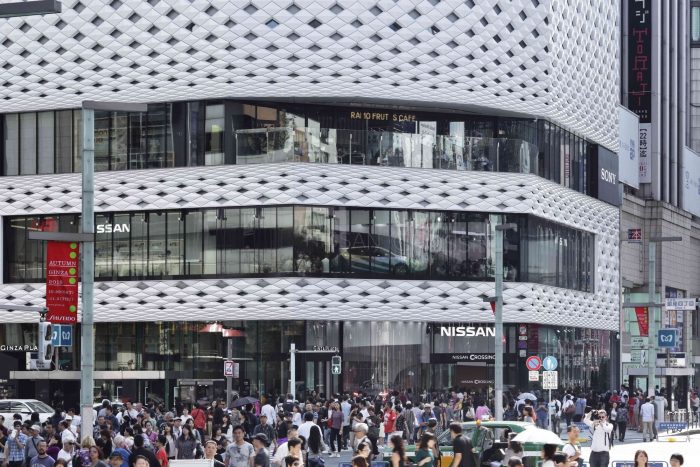
This increase in scale as the building rises from small to medium to large was repurposed in Ginza Place. The paneled façade is clearly divided into three sections, which reference the height of surrounding structures. The pattern is smallest at the base to establish a more intimate scale at pedestrian level. The panel façade begins on the second floor, where a wide aperture was made to reveal a Nissan show room behind.
The size of the panels increase in the middle and upper sections. The lower two sections of the panel system are both self contained; they swell and shrink parabolically to form an enclosed pattern. But the higher section continues to grow upwards, culminating in full floor-height panels at the building’s crown. This dramatic expression of vertical movement puts Ginza Place in direct conversation with the famous Seiko clock tower across the intersection.

Photography by © Nacasa & Partners
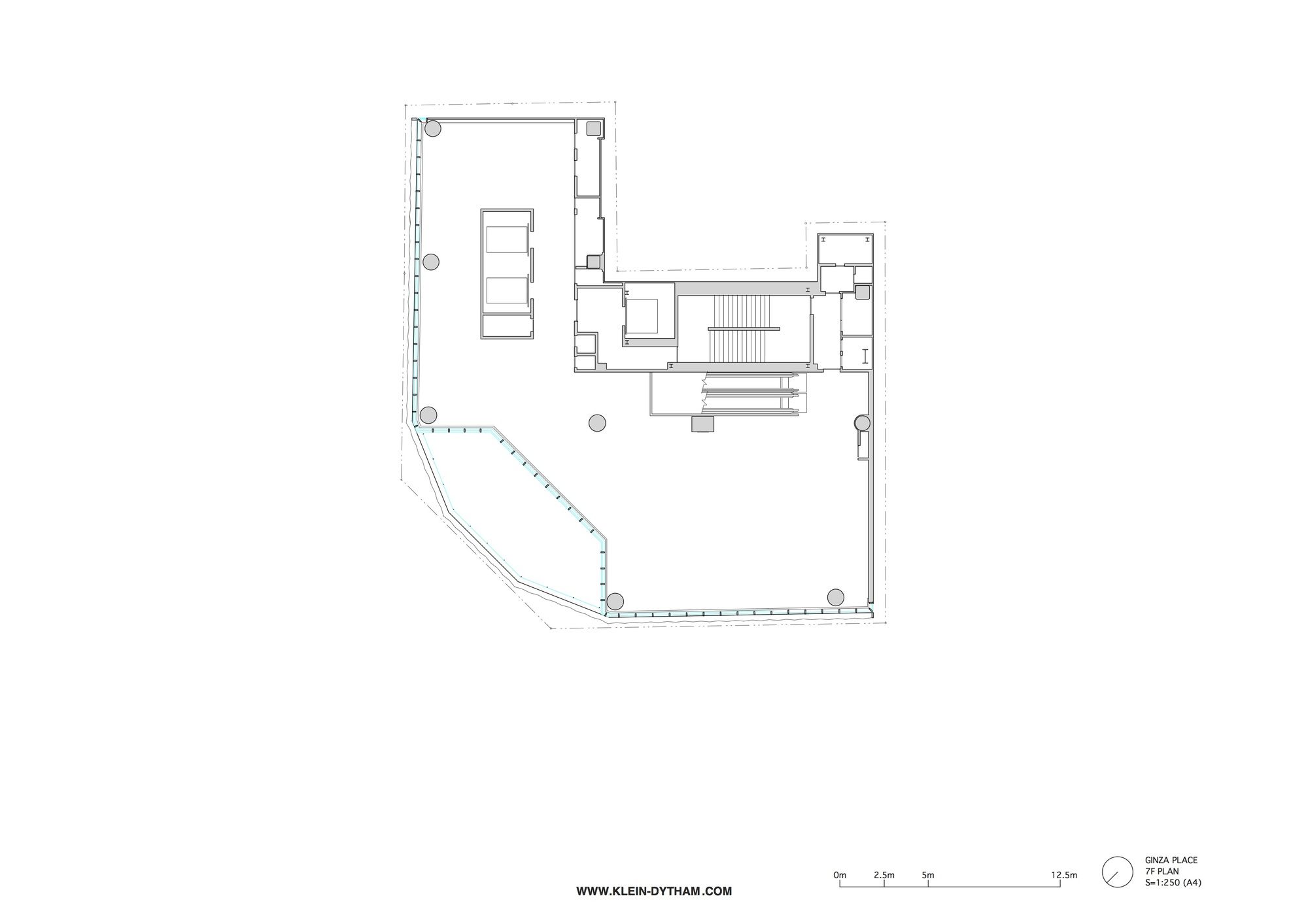
Each of the three sections are separated by horizontal breaks of floor-to-ceiling glass. The glazed sections on the third and seventh floor peel back to create broad balconies at the corner. Both balconies are occupied by restaurants that overlook Ginza crossing. Exposing public functions at the corner connects the activity in the building to the vibrant streets below. It also creates an opportunity for patrons to see and be seen in a way that is rare in Ginza, a district where most facades are formal and closed.
Creating a panel system of this complexity required close collaboration between Klein Dytham architecture and Taisei. The front face of each panel is made of a single piece of aluminum plate. Incisions were made in the plates which were then folded, welded at the seams, and powder coated. Each panel was prefabricated and given an individual address to record its position on the façade.

Elevation
Taisei oversaw the fabrication and installation of the panels. Flanges on the back of each piece were carefully attached to a bespoke metal substructure developed for Ginza Place and now patented by Taisei. This framing system responds to the seismic concerns in Tokyo by allowing panels to shift and resettle freely. Gaps between panels were minimized to a clearance of 8 millimeters. The level of care and craftsmanship visible in the façade does justice to the sukashibori latticework that inspired its form.
The façade interprets and reflects the lineage of craft that is the mainstay of Ginza. The panel system acknowledges traditional Japanese forms but repurposes them to create a permeable skin that welcomes the community in and contributes to the social atmosphere of the neighborhood.
The design of Ginza Place engages its surroundings both socially and architecturally. It pays special attention to the historic Seiko Building and the other structures on Ginza Crossing, effectively tying together the central intersection of Japan’s foremost commercial area. In doing so, it manages to be both a striking contemporary architectural statement and a responsible steward of the sophisticated culture that has always defined Ginza.

Photography by © Nacasa & Partners
Project Info
Architects: Klein Dytham architecture, Taisei Design Planners Architects
Location: Ginza, Tokyo, Japan
Area: 7350 m²
Project Year: 2017
Photographs: Nacasa & Partners
Manufacturers: FUJITEC, Colour Kinetics Japan, Fuji Sash, Nissan
Photography by © Nacasa & Partners
Photography by © Nacasa & Partners
Photography by © Nacasa & Partners
Photography by © Nacasa & Partners
Photography by © Nacasa & Partners
Photography by © Nacasa & Partners
Photography by © Nacasa & Partners
Photography by © Nacasa & Partners
Photography by © Nacasa & Partners
Photography by © Nacasa & Partners
Photography by © Nacasa & Partners
Photography by © Nacasa & Partners
Photography by © Nacasa & Partners
Photography by © Nacasa & Partners
Photography by © Nacasa & Partners
Photography by © Nacasa & Partners
Photography by © Nacasa & Partners
Photography by © Nacasa & Partners
Photography by © Nacasa & Partners
Photography by © Nacasa & Partners
Photography by © Nacasa & Partners
Elevation
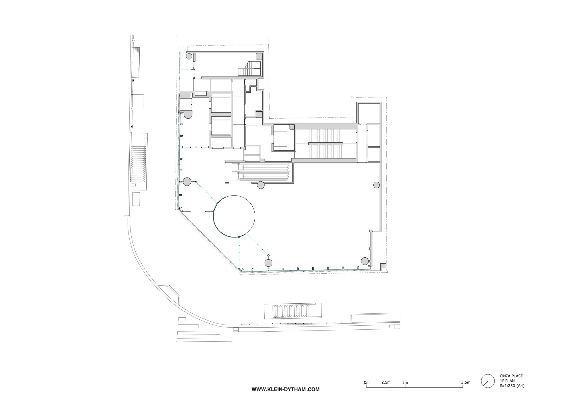
1st Floor Plan
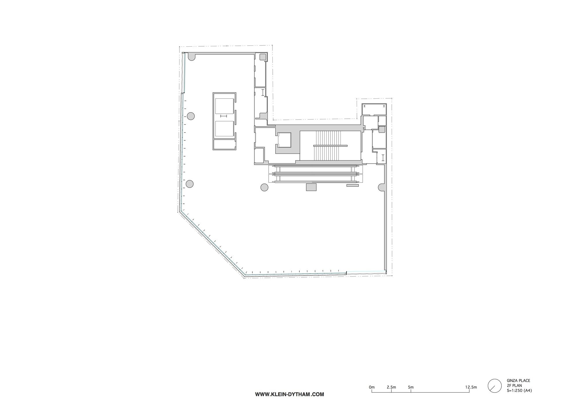
2nd Floor Plan
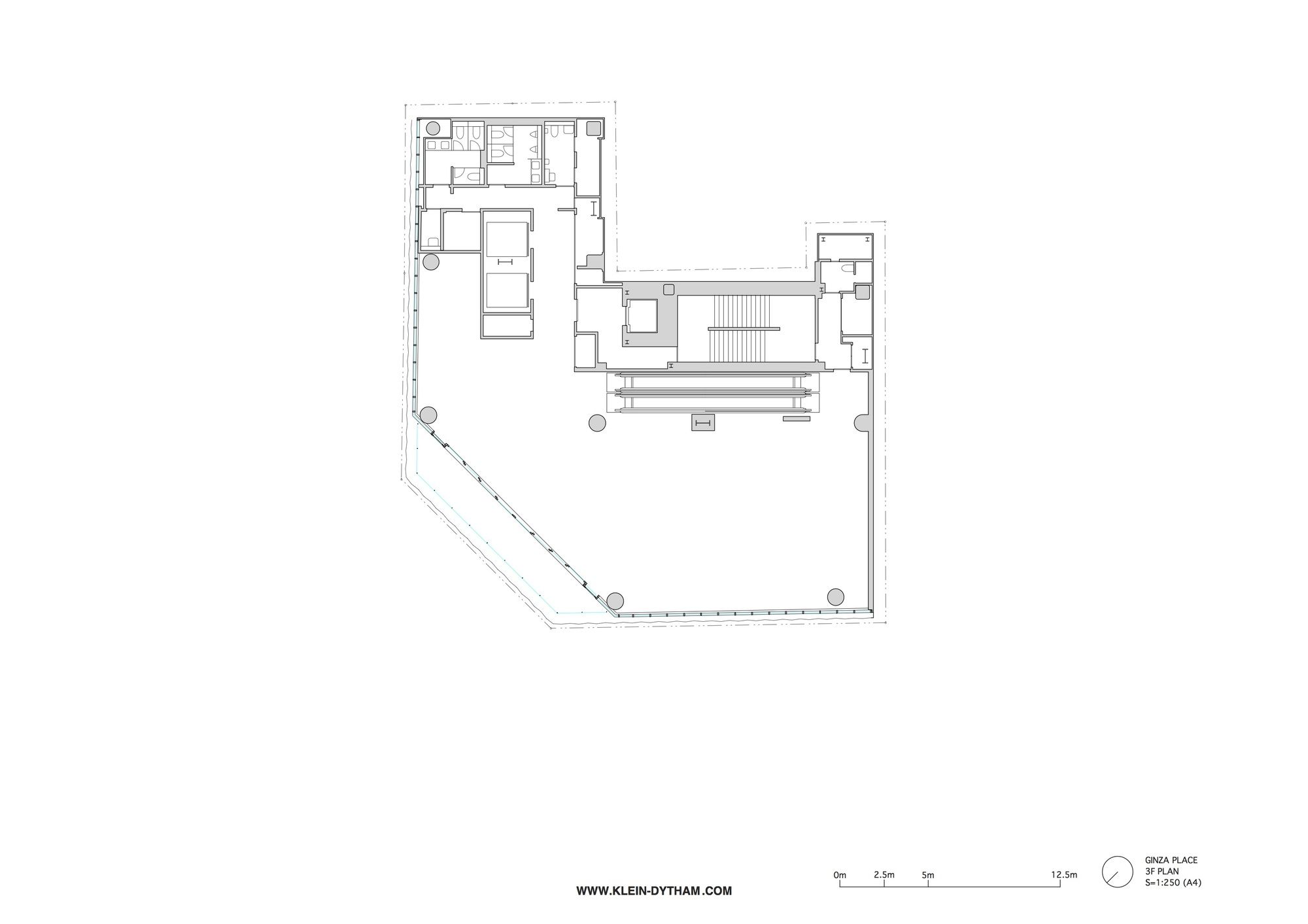
3rd Floor Plan
7th Floor Plan


