A current trend toward reusing existing structures, most likely due to a shift in economic tides, has left many architects designing renovations versus ground up construction. This is increasingly common practice with older commercial office buildings, often left desolate, which are in desperate need of upgrades. This situation inevitably presents the architect with the problem of re-skinning an existing structure. The most ubiquitous response to the needs of a typical commercial office building is to clad it with a curtain wall glazing system. This project is an interrogation of the pervasive use of standard storefront or curtain wall glazing for this application and its subsequent effect on the surrounding urban environment.
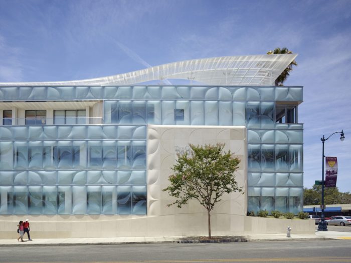
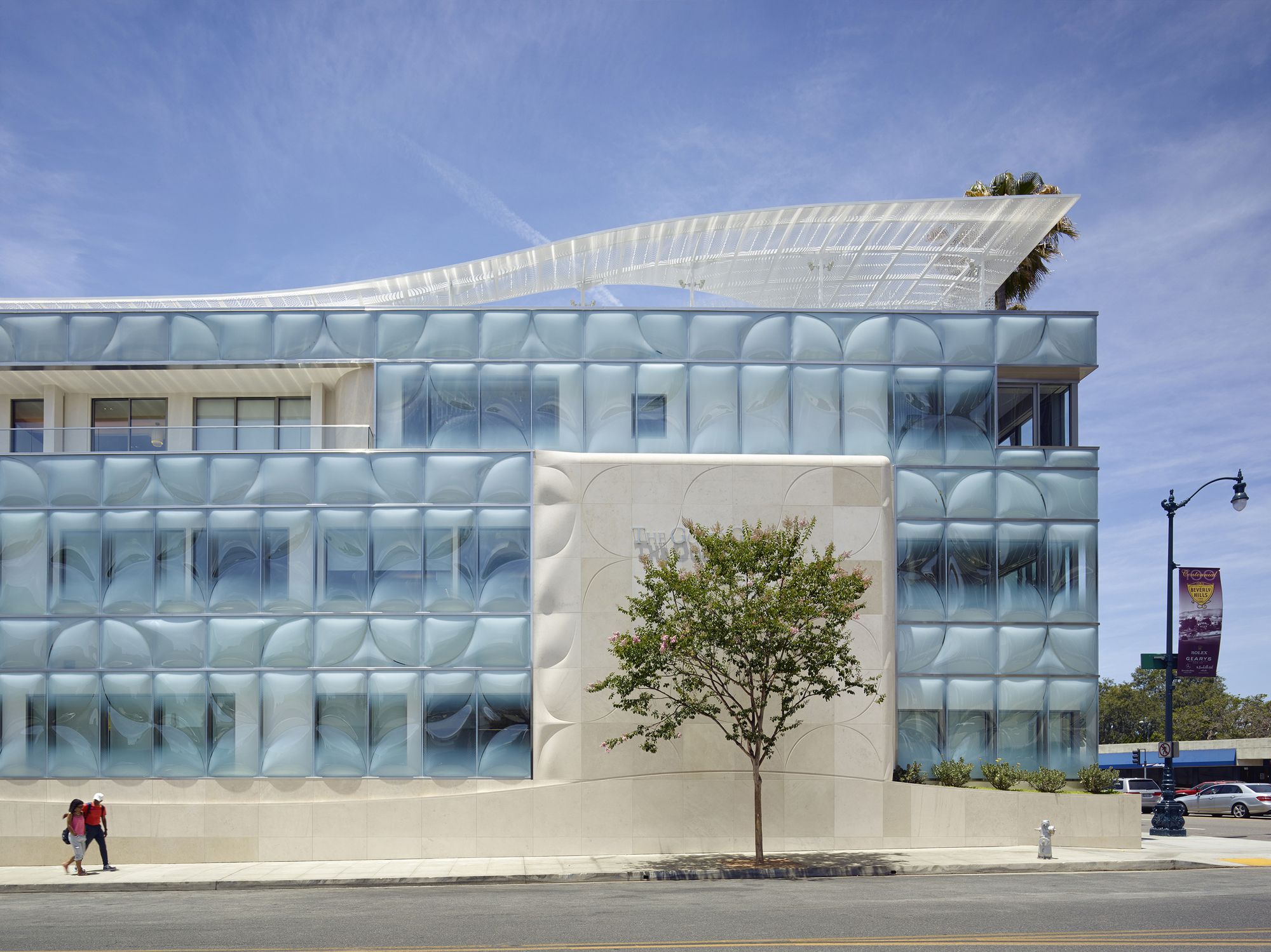
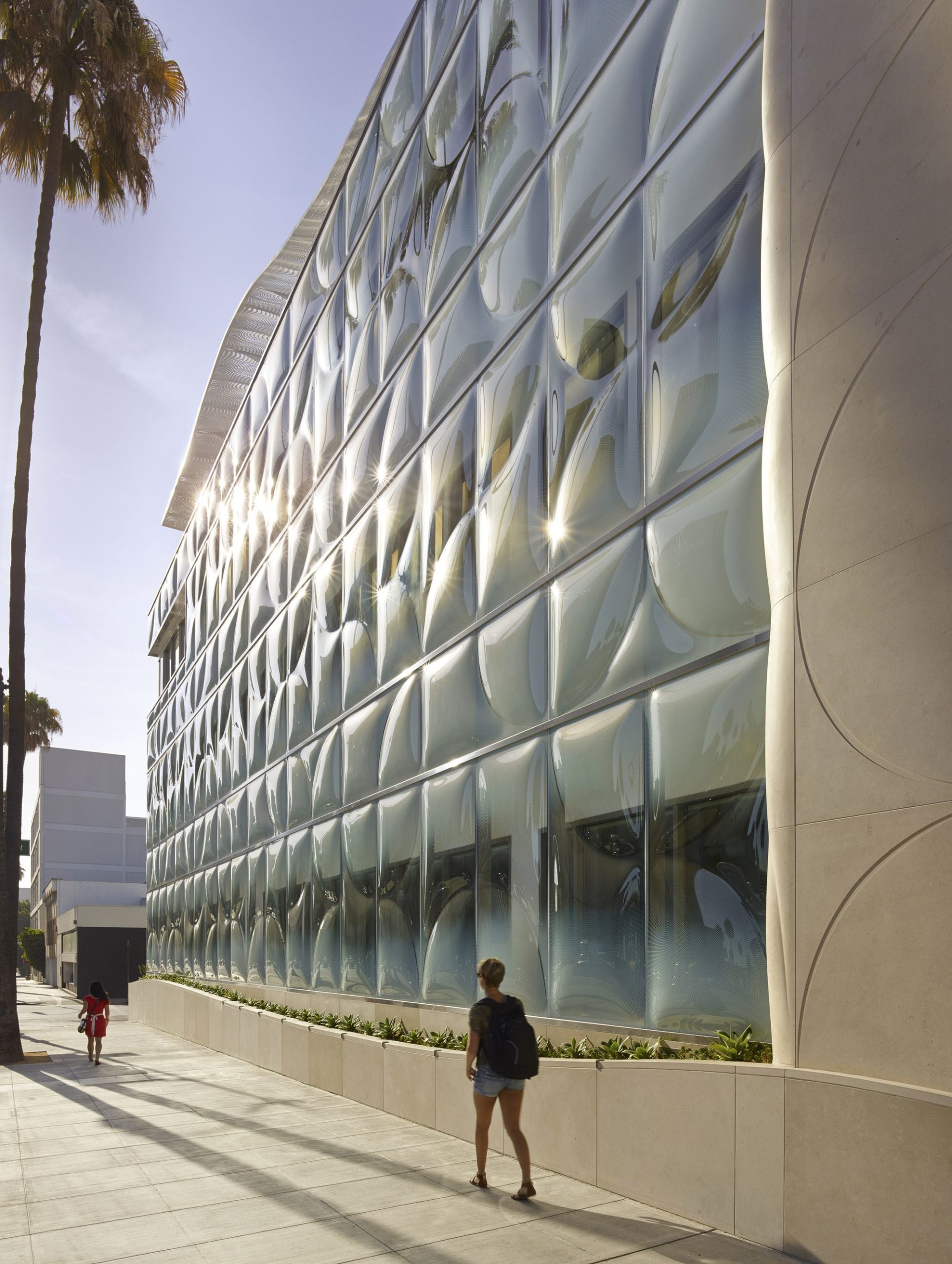
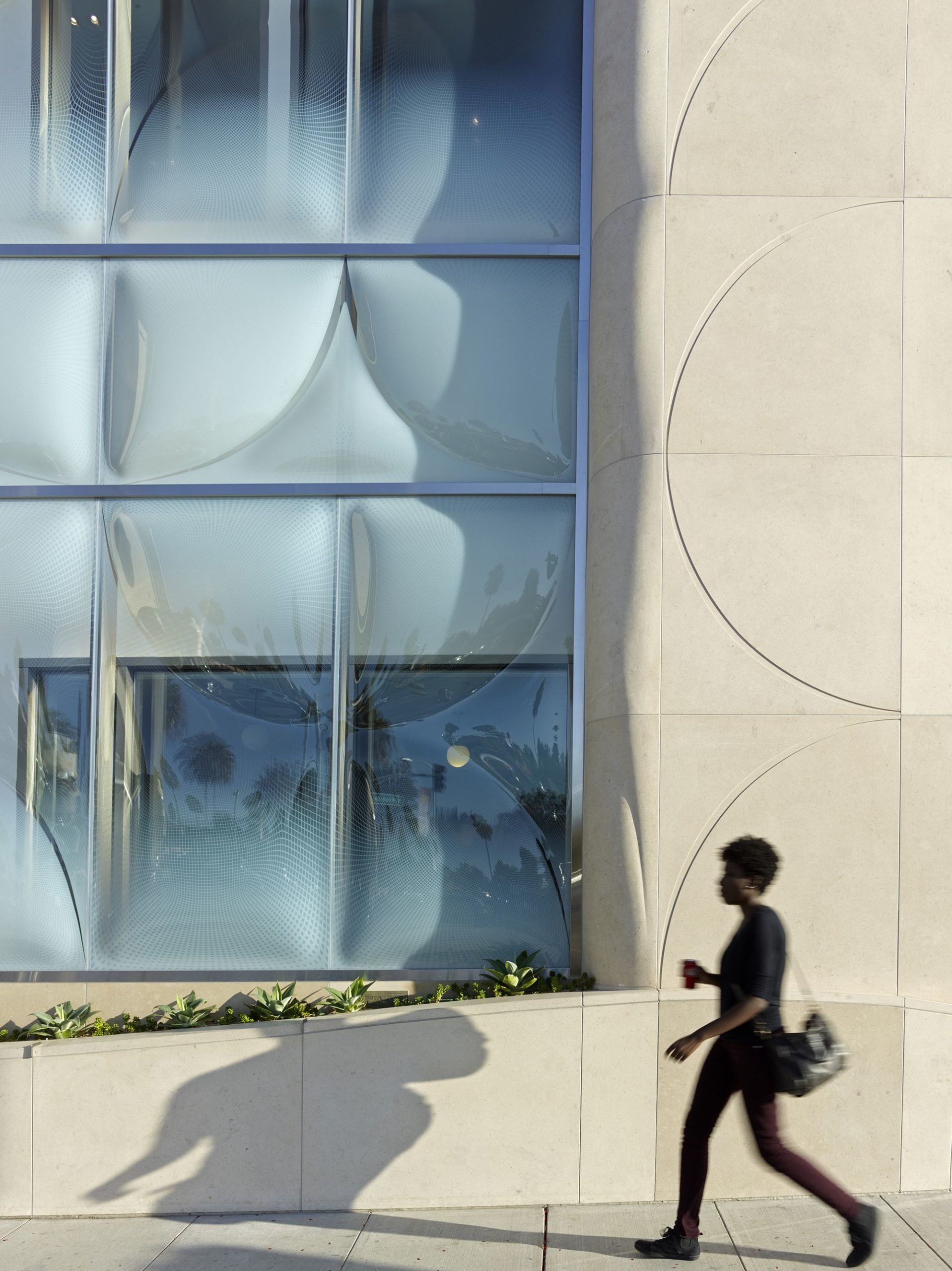
The particular application at the root of this interrogation is the renovation of an existing 1960’s commercial office building at the western gateway to Beverly Hills, CA. The intent is to utilize the existing structure, steel moment frames, shear walls, floor slabs and floor trusses, and make the necessary improvements in order to extend the life of the building another fifty years. The aim of this project is to achieve this by revitalizing the building with a seemingly kinetic facade. The application of a three-dimensional textured pattern that translates across materials and surfaces creates an equally profound effect at both the urban scale and the human scale Three different materials are used as vehicles for the implementation of this pattern: glass, stone, and perforated metal. Slumped glass that is installed as the second layer in a double layer curtain wall takes center stage in the re-skinning of this facade. The unique aspect of this application is its particular use of multiple layers of variable patterns that operate within the modular system of a standard curtain wall.
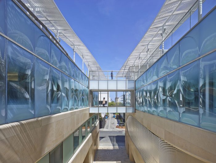
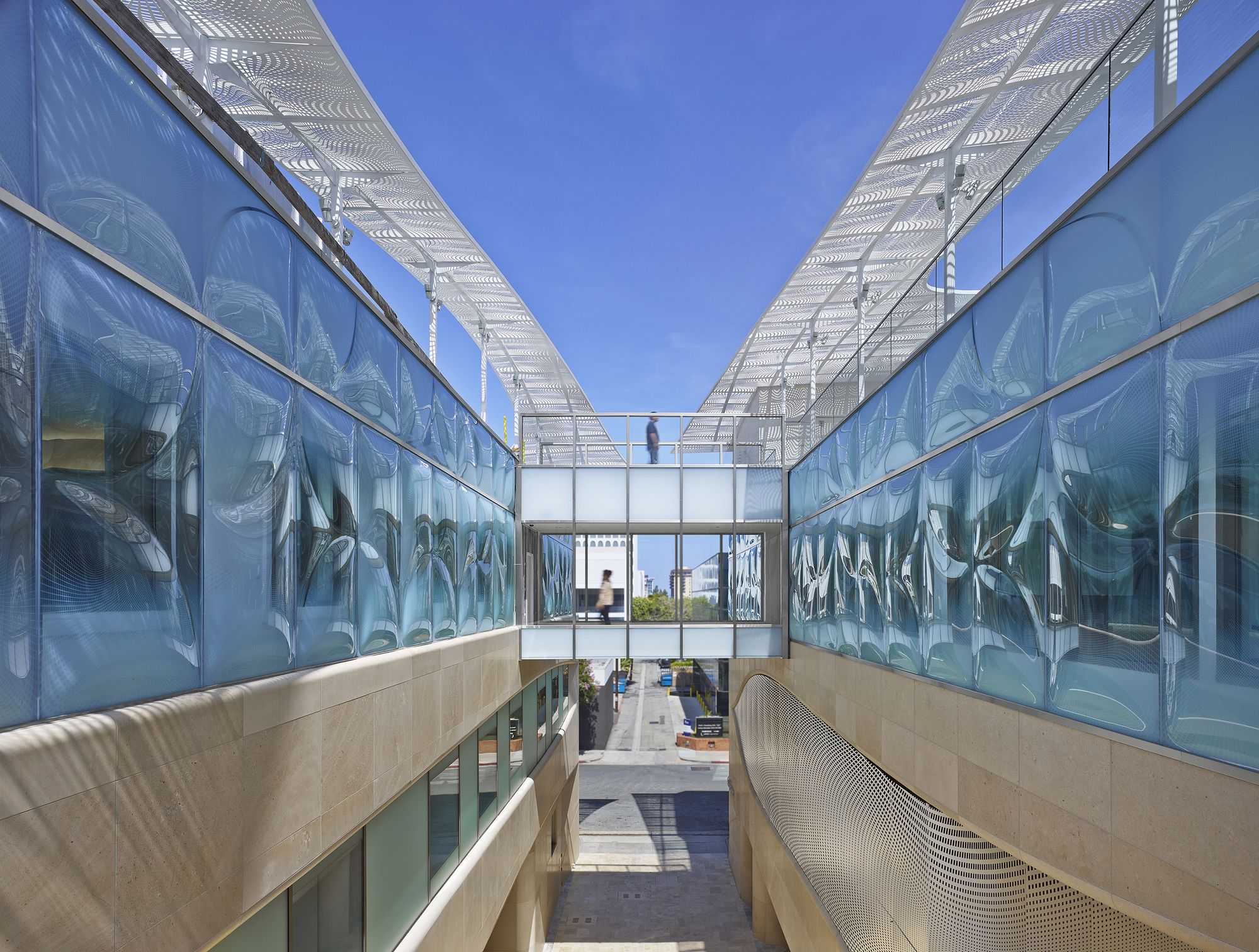
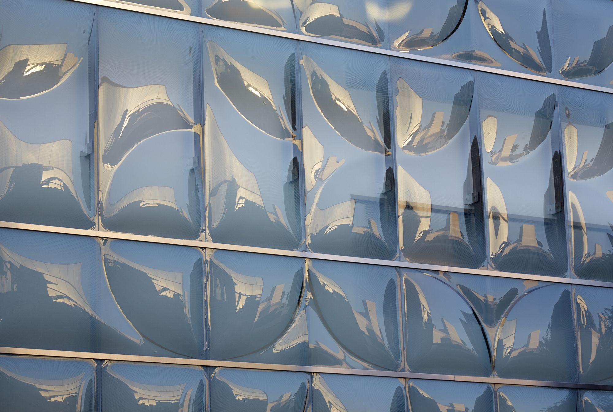
The necessity for the glass to have this capacity [of variable patterns] stems from the existing structural assemblies that signal the need for the architectural mitigation of opaque and transparent conditions. Opaque conditions refer to solid areas such as vertical shafts, shear walls, floor plates and trusses. Transparent conditions refer to areas where views [inward or outward] or daylighting are desired. With the patterned slumped glass both of these conditions are addressed through a custom-printed interlayer that is laminated between two glass panels. The patterned interlayer smooths the transition between clear panel and opaque spandrel panel. This is one layer of the patterning. The second is that the glass is also slumped over one of three custom molds that correlate with the interlayer pattern. These patterned panels are propagated across the curtain grid to create a large scale random mosaic.
This three dimensional slump pattern in conjunction with the opacity mask interlayer pattern works in tandem to produce a seamless and elegant effect that also performs better than regular glass, both structurally, thermally, and acoustically. Though the typical and predominant application of glass in a curtain wall system has been used to celebrate its ability to dematerialize a facade, diffuse visual barriers, and/or completely dissolve perceptible edges and boundaries, the patterned slumped glass facade is one of the first applications in which glass is used to do the exact opposite.
We are using the same technology that has been developed to proliferate thinness and transparency to produce form, volume, thickness, and pattern while simultaneously taking advantage of the affordability of standard curtain wall technology. Solid conditions, such as existing shear walls, make it necessary for the pattern to translate to another material, stone. At their intersection the stone is carved three dimensionally into similar shapes as the slumped glass, blurring the line of the material transition. When the stone flattens into a thinset cladding, the pattern is abstracted into a reveal condition.
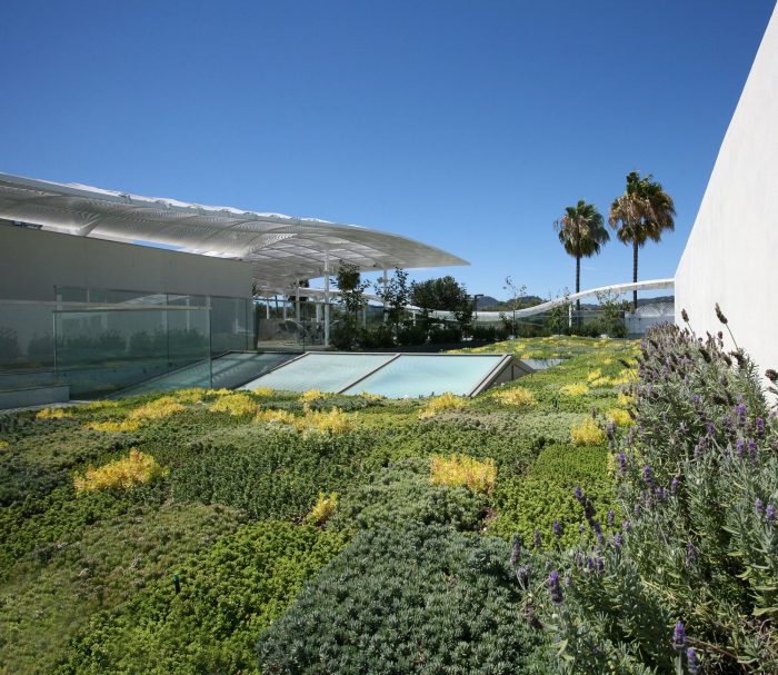
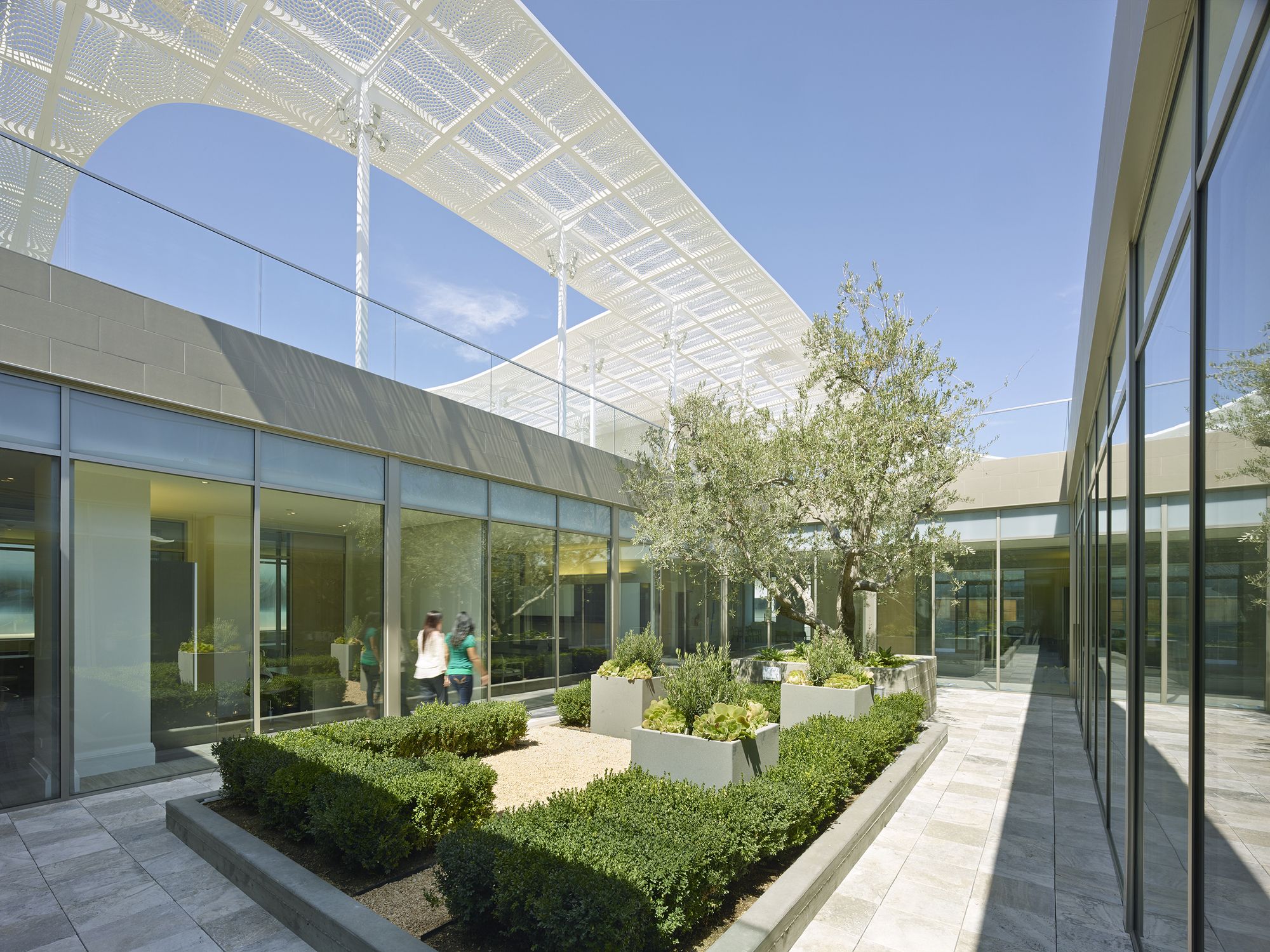
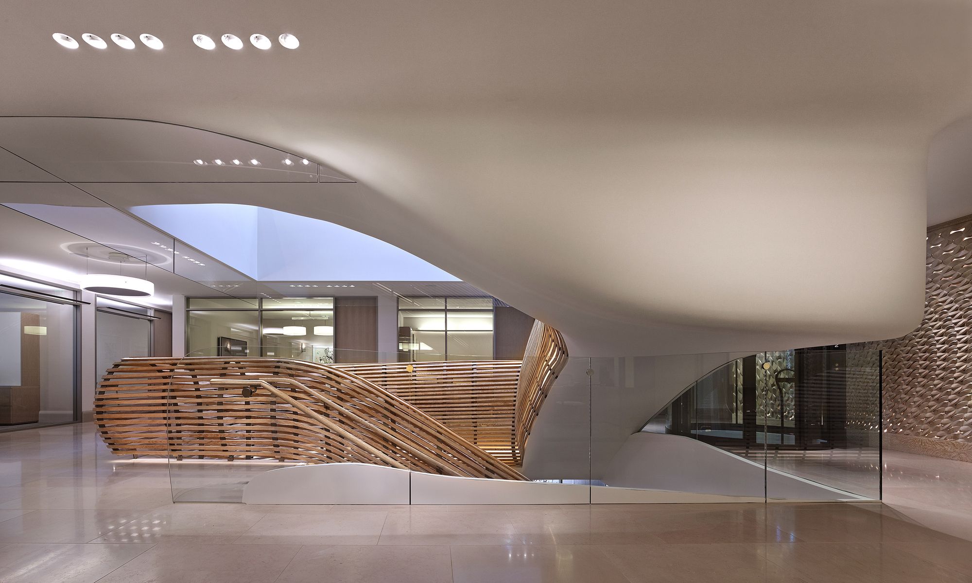
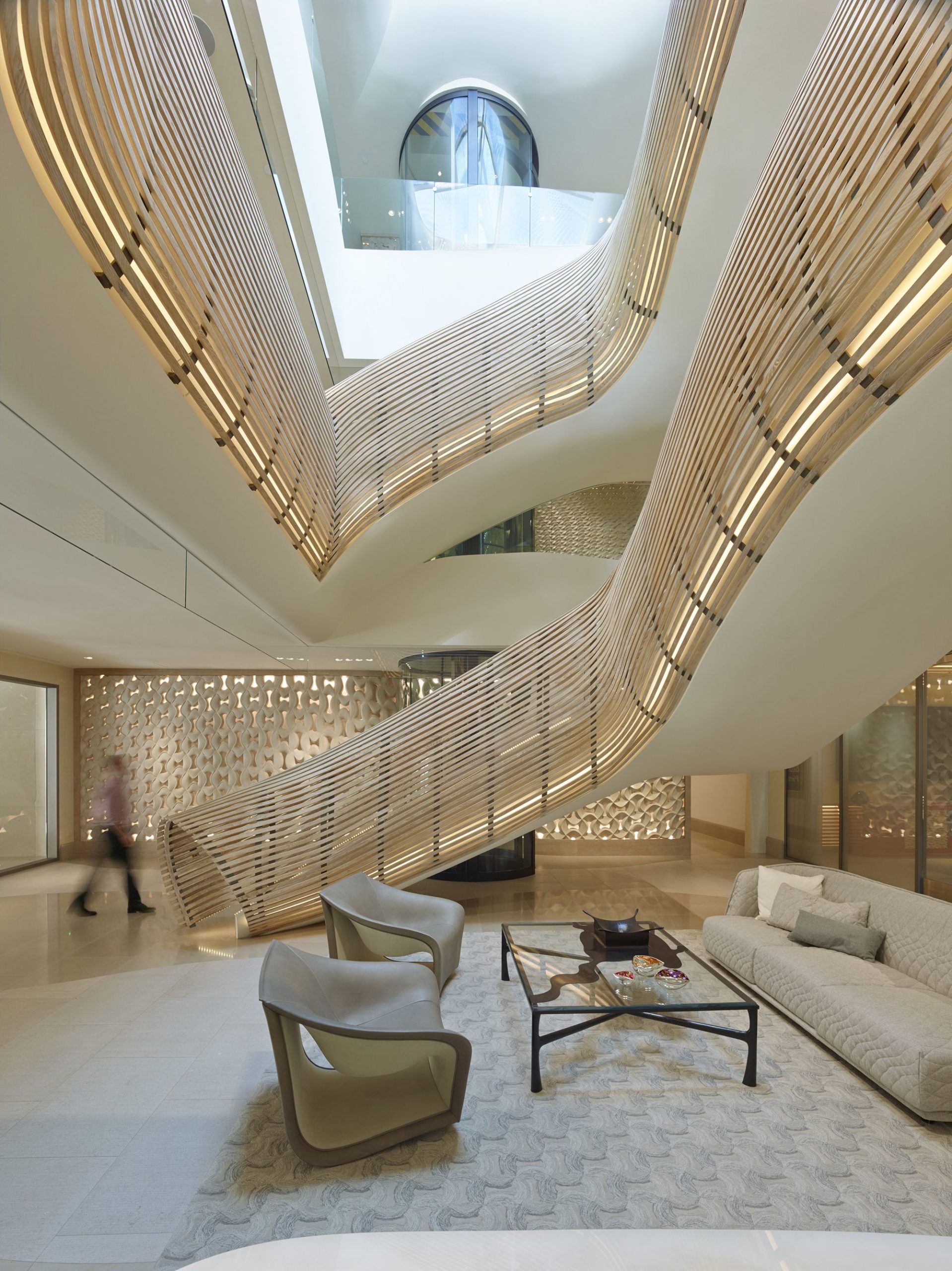
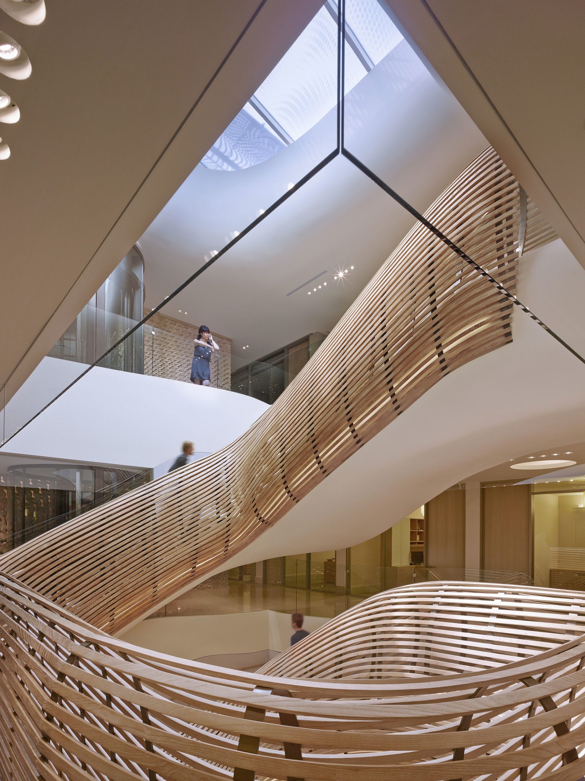
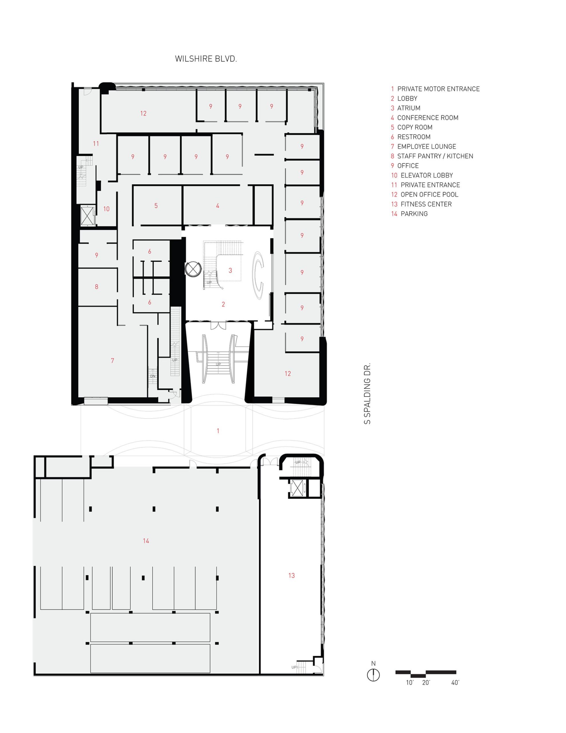
The third material shapes the roof line / profile of the facade. The light “spiderweb-like” laminate interlayer of the slumped glass is abstracted and expanded upon to create custom perforated metal panels for the roof canopy. This application gives the façade unified undulating shape while also providing a finer grained texture that dapples ground with a varying array of shadows. This seamless transition of pattern across materials creates a unique, seemingly kinetic building that contributes to its surrounding urban fabric and the casual onlooker alike. Beyond the formal and conceptual aspects of the glass façade system and general layout strategy are the performative qualities of both. The double layer façade system, made from custom slumped glass, helps to regulate indoor air quality in a seasonal fashion by mechanically venting hot air up and out in the summer and heating and circulating the cooler air in the winter. Opening up the atrium space mirrors this chimney effect from the façade by utilizing an operable skylight to release or retain heat depending on the conditions. Furthermore, the customized pattern interlayer sandwiched within the glass panels selectively filters views, privacy, and light based on specific site conditions and client needs.
Project Info:
Architects: Belzberg Architects
Status: Completed 2014
Project Type: Commercial
Size: 135,000 sf
Location: Beverly Hills, CA
Principal: Hagy Belzberg
Project Manager: Cory Taylor
Project Team: Kris Leese, Ashley Coon, Elizabeth Lorenz, Micah Belzberg
Courtesy of Belzberg Architects
Photography by © Bruce Damonte
Photography by © Bruce Damonte
Photography by © Bruce Damonte
Photography by © Benny Chan/Fotoworks
Photography by © Bruce Damonte
Photography by © Bruce Damonte
Photography by © Benny Chan/Fotoworks
Photography by © Bruce Damonte
Photography by © Benny Chan/Fotoworks
Ground Floor Plan


