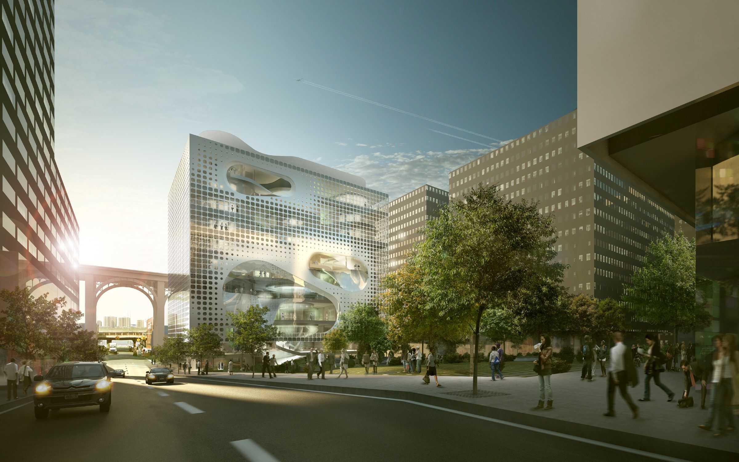
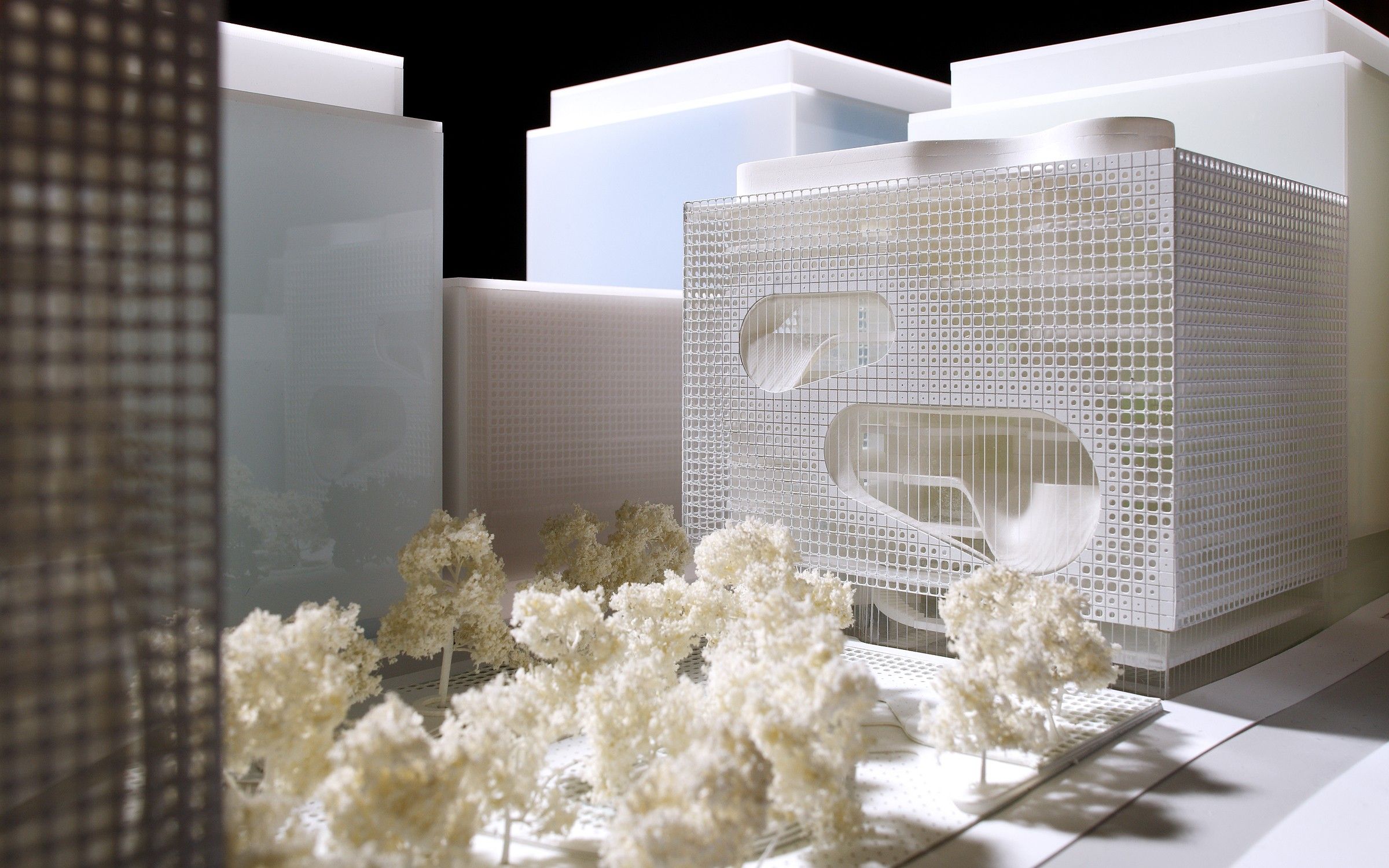
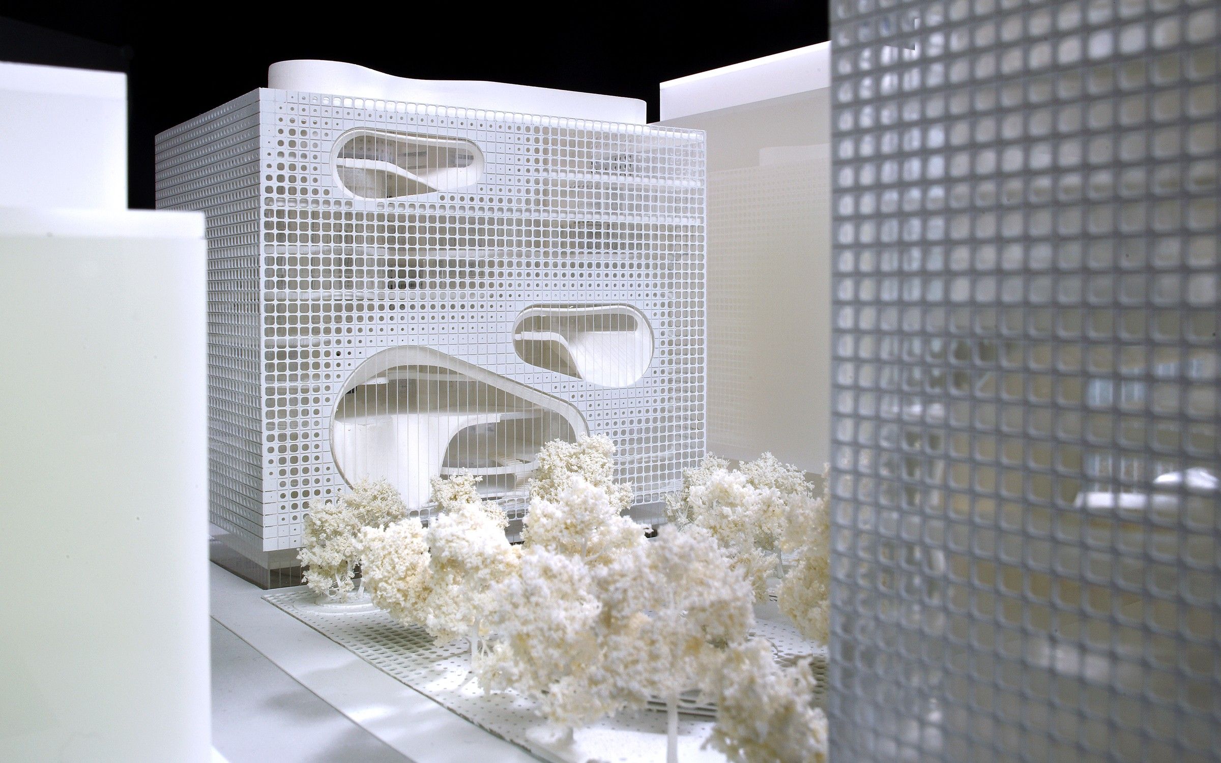
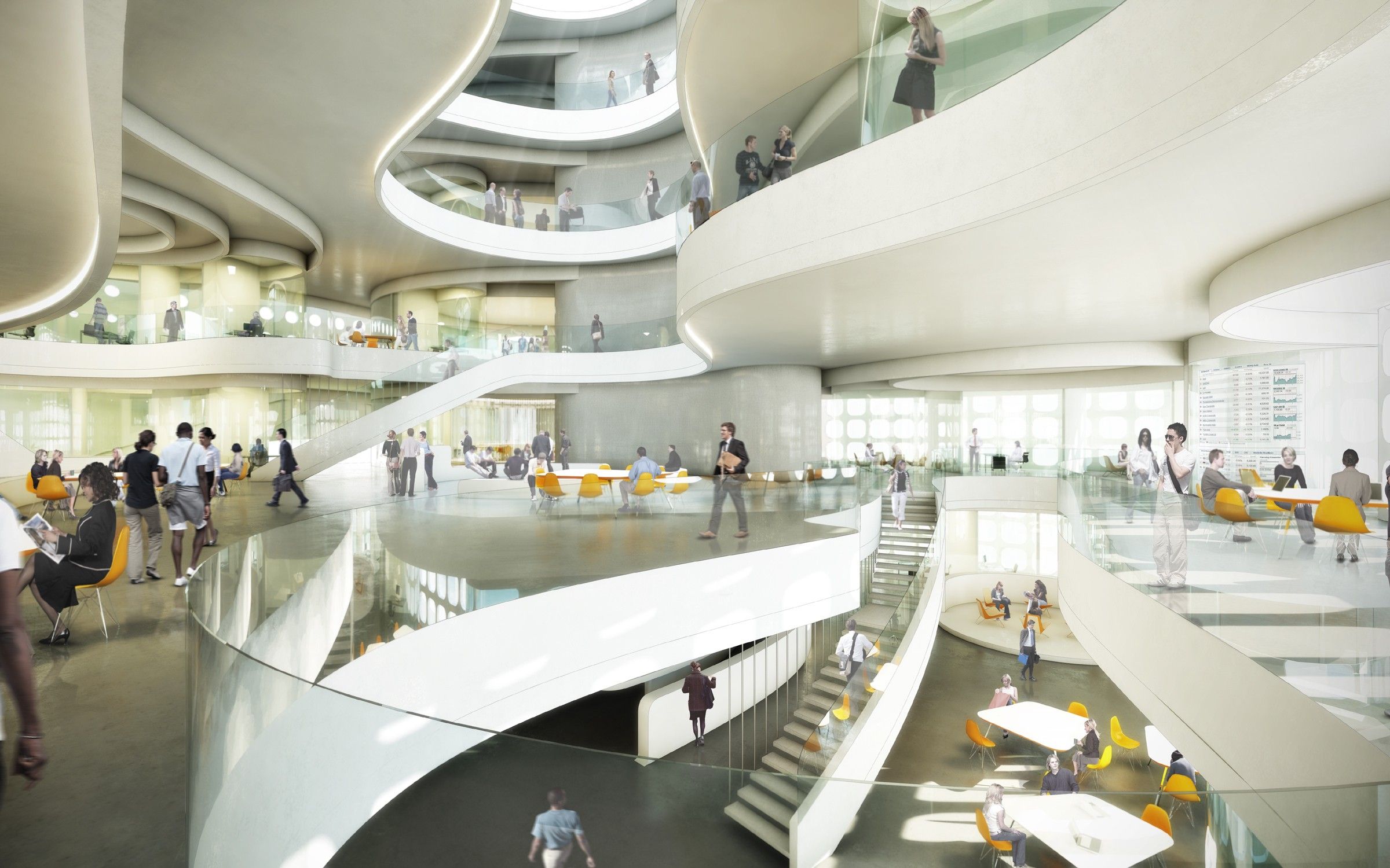
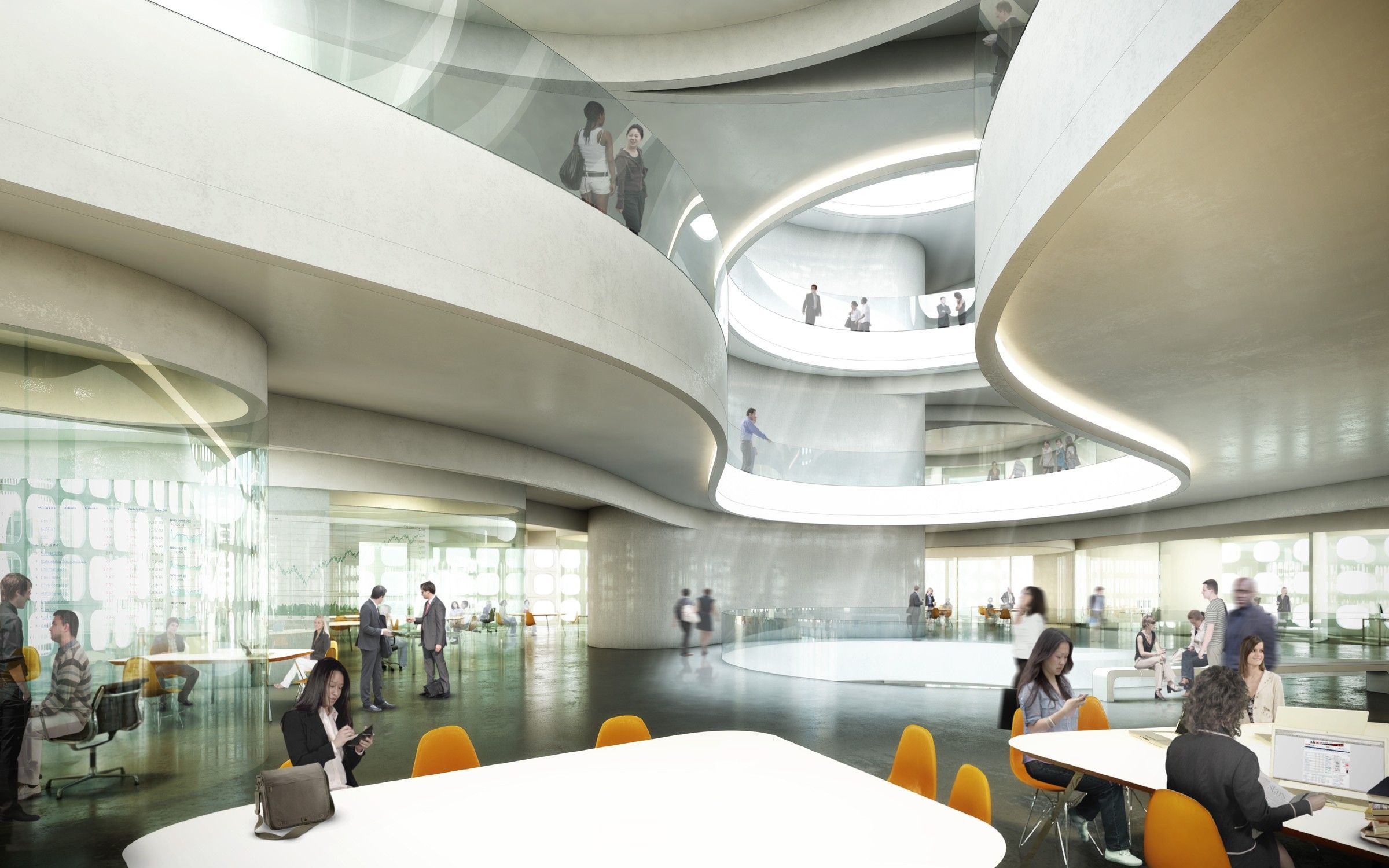
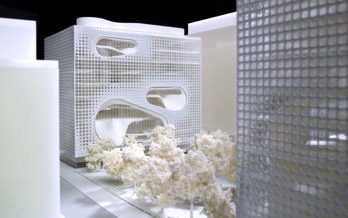
The new Graduate School of Business at Columbia University is a school which strives to offer a new era in education. The architects, UNStudio, state that it ‘offers an opportunity to embrace innovation in the pedagogy of business education. The building is designed to use the creative enterprise of the school to facilitate cross-disciplinary interaction between the professional world, the campus, and the community at large.This seems to me to be a very good idea. My question is ‘how is it different?’ Do we now have schools with no creativity nor community? Well… I believe the answer is a partial ‘yes’- I can think of more than a few. But how do you design for creativity?
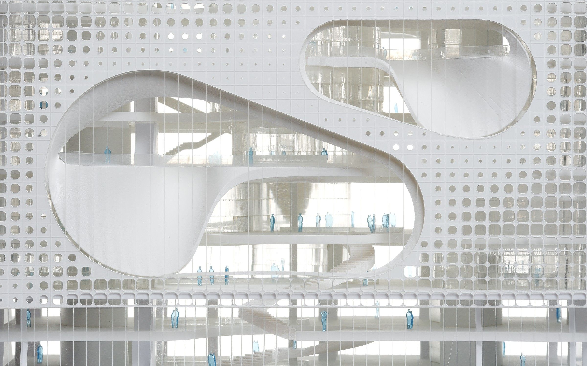
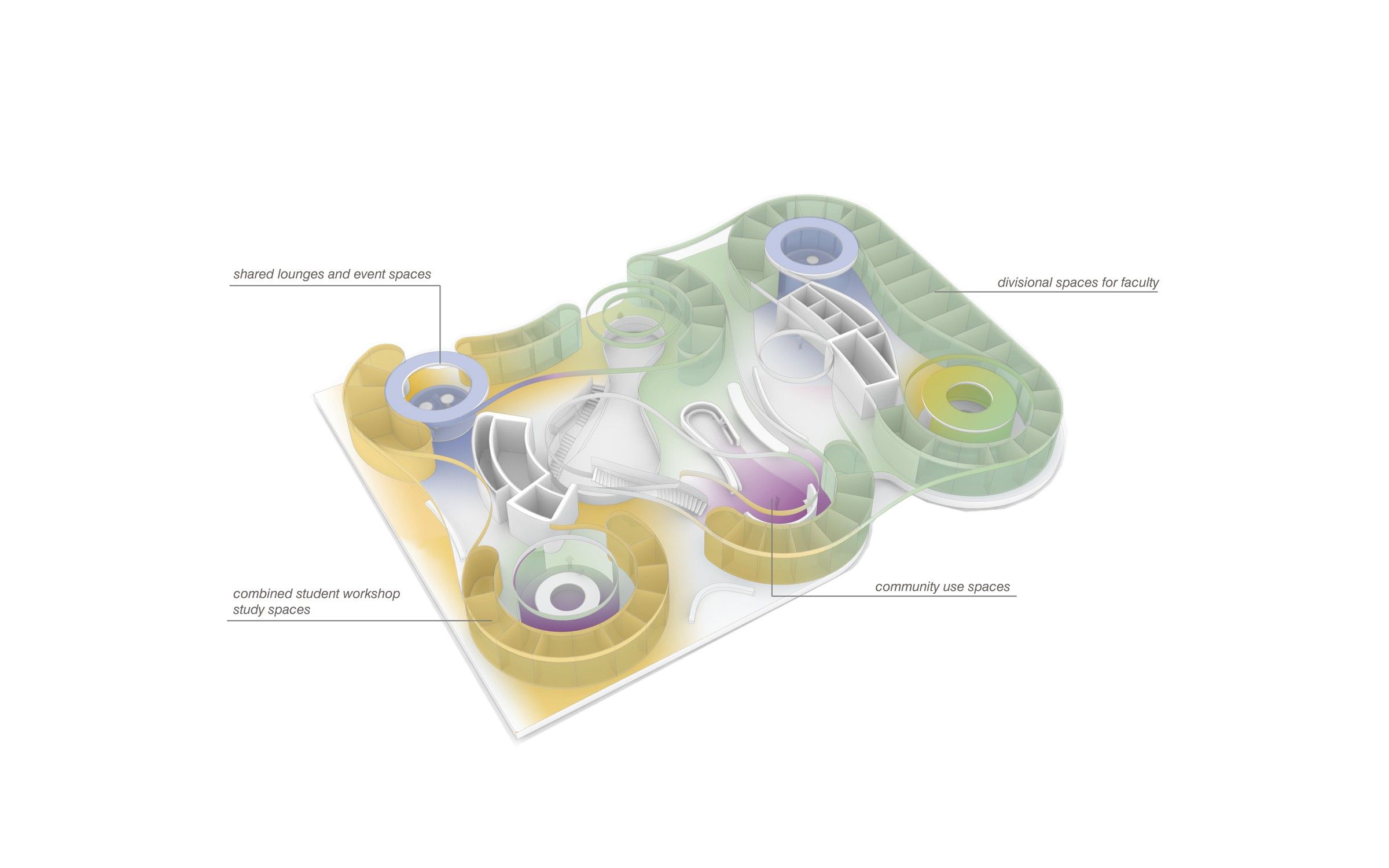
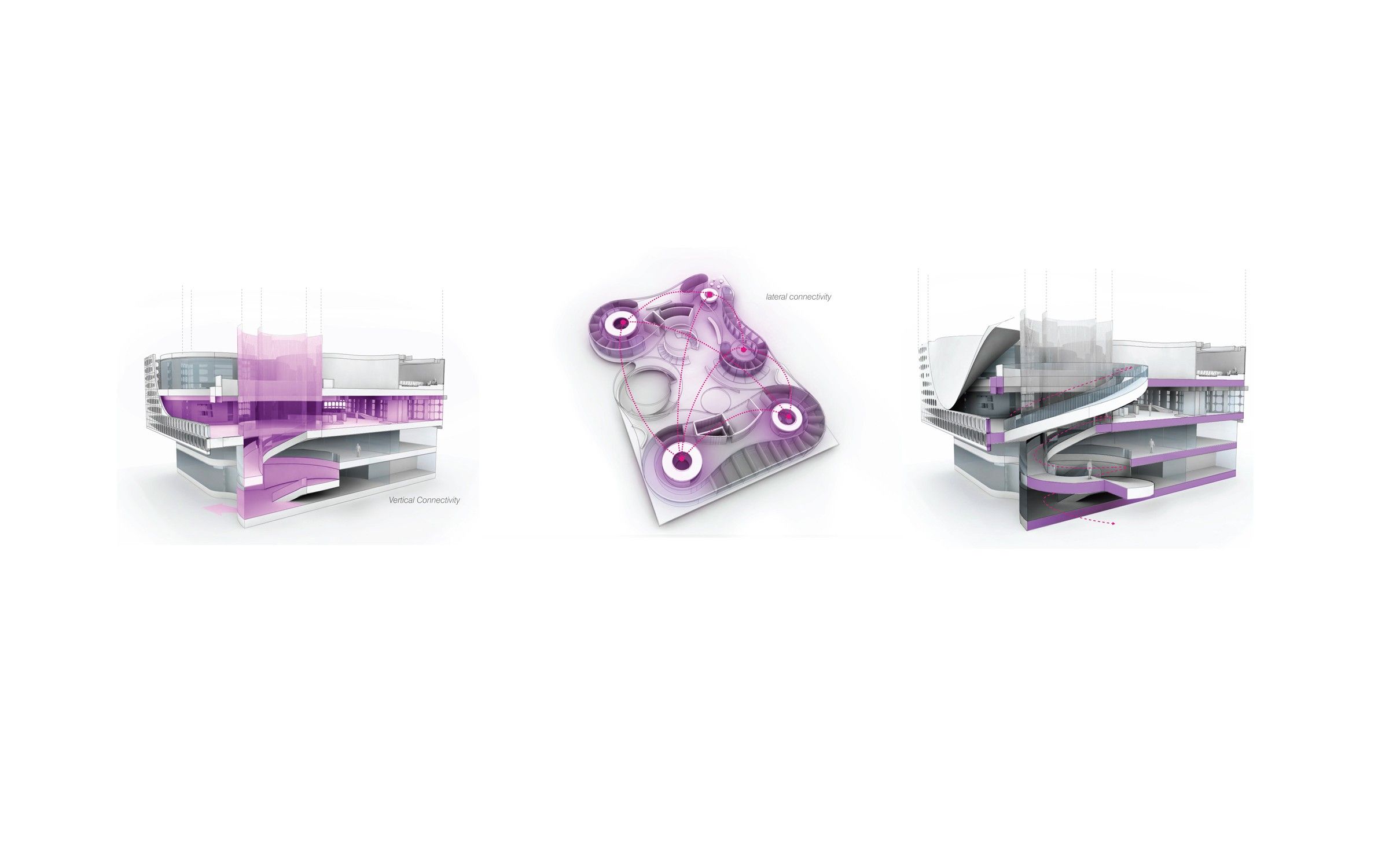
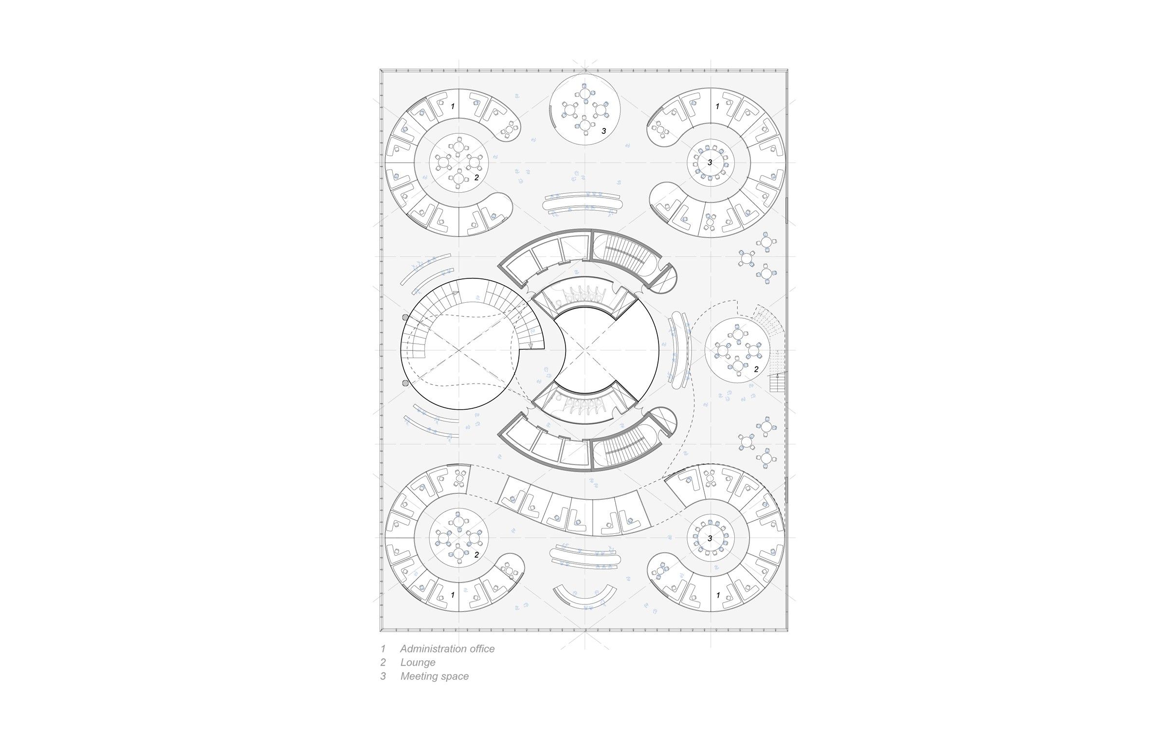
Here, it seems UNStudios has some good ideas. They designed a building which anticipates the need for change in the future and is sufficiently versatile to meet these needs when they arise. It is planned that this versatility will seep from the building, into the ways in which the occupants use and occupy the school. There are blurred lines between faculty and students, encouraging interaction and collaborations to take place. This is achieved through a grouping of work-study spaces for students and office spaces for professors in both plan and section. These groupings are coupled with vertical connections throughout the school in the form of voids and internal staircases. These vertical reaches create ‘room for thought’ and work together with the circulatory system to bring about opportunities for professional and friendly interactions to take place. This circulatory system is based on an idea which I believe my high school could have greatly benefited from. ‘(The) corridors are considered not in terms of size, but for their capacity to contain and distribute large concentrations of people, whilst simultaneously accommodating surges in traffic and lingering individuals.’ Now I will say that this does seem to me a clever way of saying ‘our corridors are big‘ but I might be wrong. The building does seem to lack traditional corridors. Instead, programmatic elements are inserted in plan and section in such a way that they create corridors which shift in size and character- perhaps a jutting wall providing cover for an intimate conversation- to create a system of getting around that is dynamic and enough to encourage students to learn rather than sleep.
Credits:
UNStudio: Ben van Berkel and Caroline Bos with Wouter de Jonge, Christian Veddeler, Imola Berczi and Jan Schellhoff, Elena Scripelliti, Joerg Petri, Jordan Trachtenberg, Seok Hun Kim, Nanang Santoso, Hans Peter Nuenning, Erwin Horstmannshof
Advisors:
Executive Architect: Handel Architects LLP
Engineering Services: Structural, MEP
Sustainability, Curtain Wall: Buro Happold
Consultant Services. IT, Acoustical, Audiovisual, Security: Shen Milsom & Wilke, Inc
Lighting Designer: Renfro Design
Way Finding & Signage: Mijksenaar-Arup
Vertical Transportation: Van Deussen
Expediting and Code Consulting: JAM Consultants Inc.
Estimating Consultant: Stuart – Lynn Company
Roofing and Waterproofing Consulting: Israel Berger Associates LLC
Visualisations: rendertaxi
