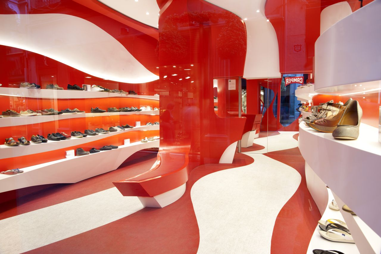
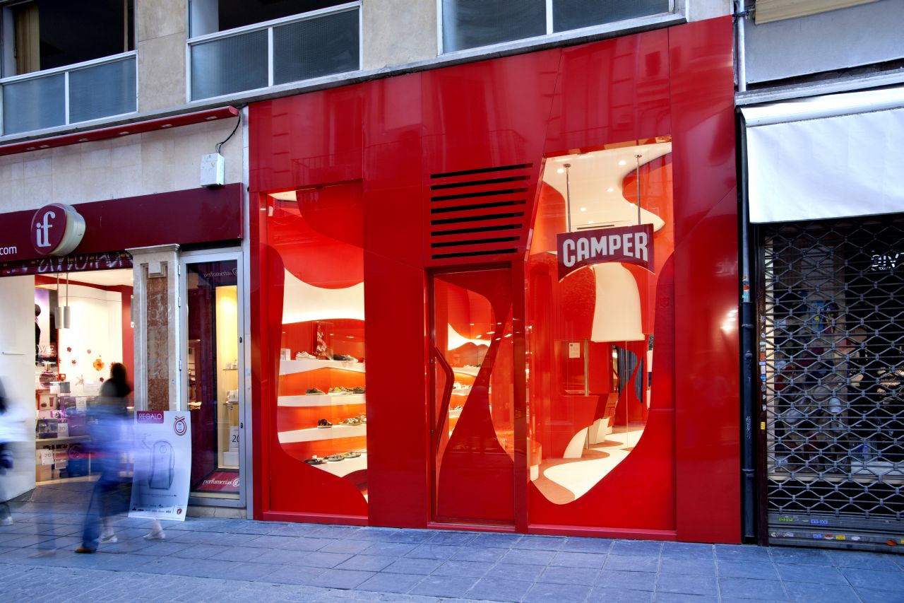
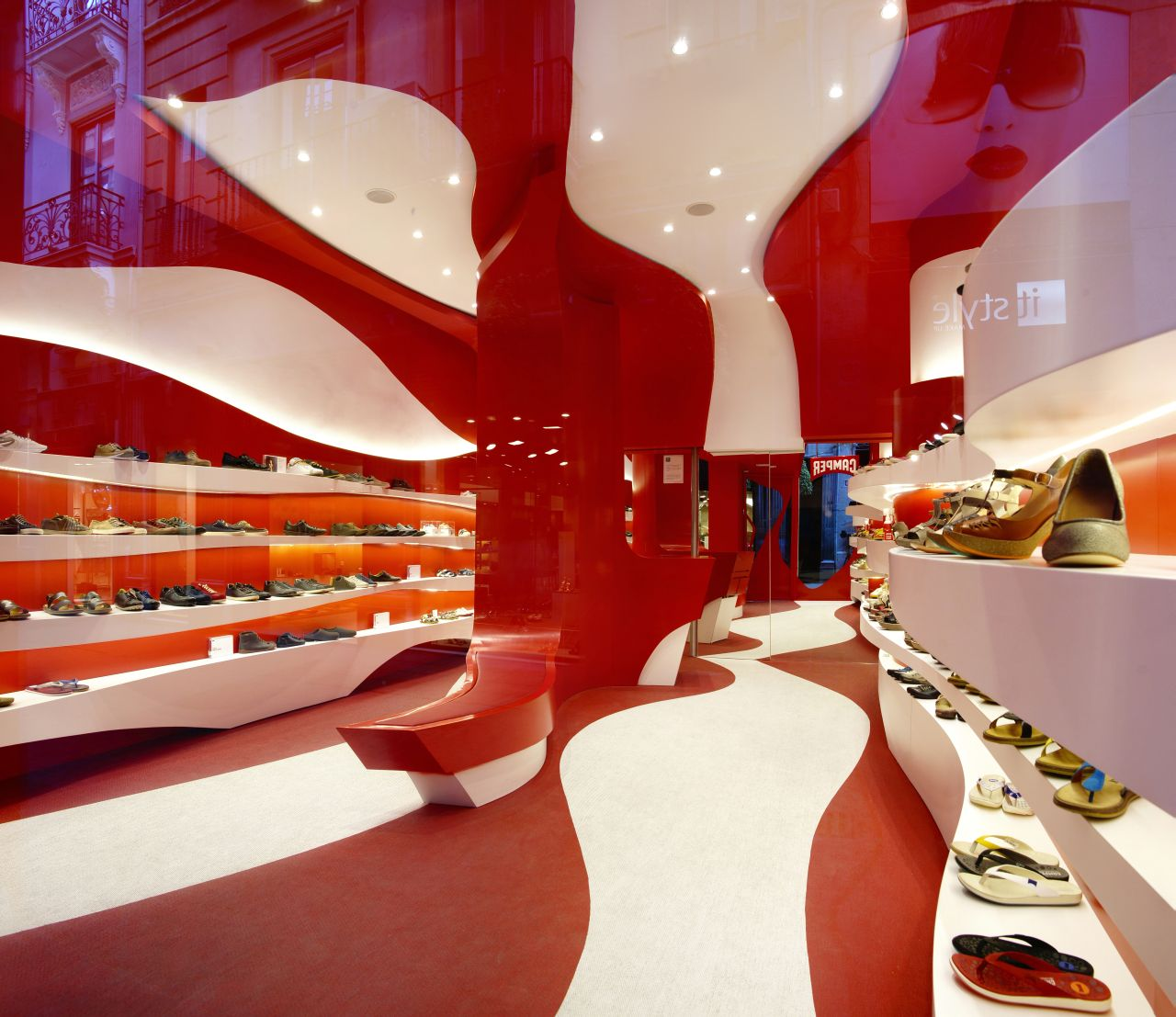
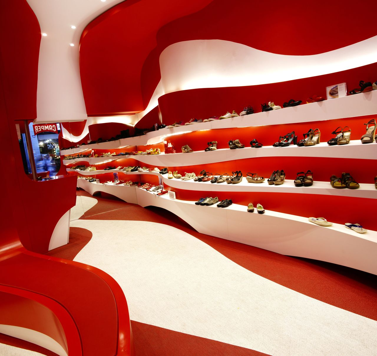
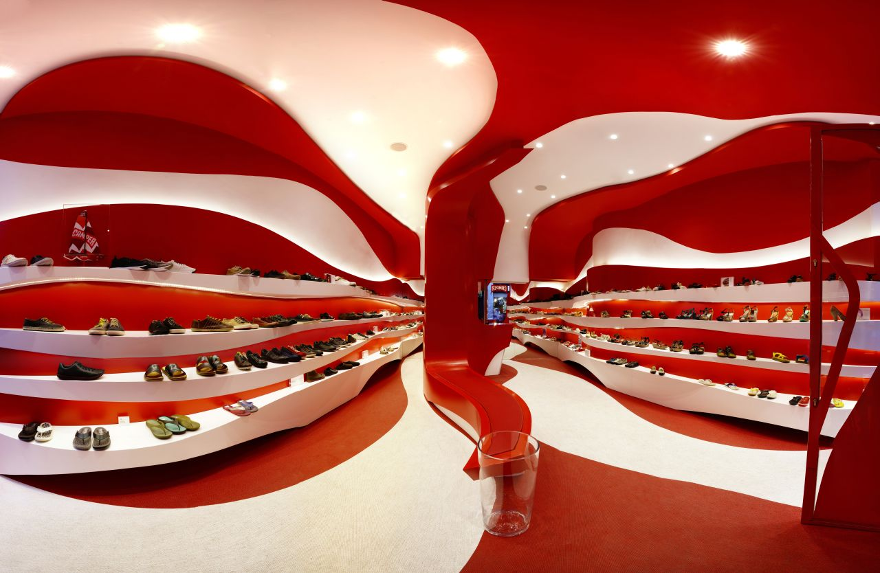
Spanish based firm A-cero have recently unveiled the images of their latest projects, Granada Store, for the footwear brand Camper’s first store in Granada, Spain. The store is designed to attract pedestrians in one of the busiest areas of Spain, with radical, shinning, bold colors. below is the description from A-cero
Project Description fromA-cero:
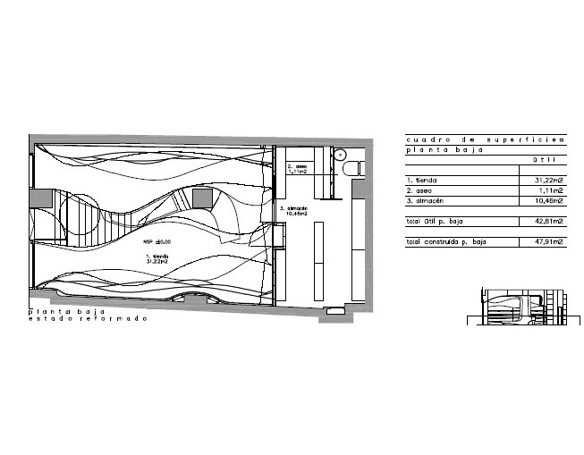
On Mesones street, one of the best known, commercial and important streets of Granada, Spain, there is a little store of 50 m2 that has been renovated by A-cero. The customer is the Spanish leading brand Camper, devoted to the exhibition and sale of trendy shoes. It will be its first store in Granada.
The first important point is the use of the space, as a wide and useful place is needed.
A-cero was selected for this work because of its actual, fresh and dynamic design, the keys for Joaquín Torres and Rafael Llamazares projects.
Each store that Camper opens has his own style and represents an event, depending, among other things, on the designer chosen for the project. Camper always looks for a new style and concept for their stores, making a different and special place.
Other collaborators chosen by Camper have been Olé Armengol, Fernando Amat, Óscar Mariné, Javier Mariscal, Carlos Rolando, Jordi Nogués, Martí Guixé, Shiro Miura and, more recently, in the project Toðer, Jaime Hayón, Alfredo Häberli, Konstantin Grcic, Campana brothers, Memphis group, Bouroullec brothers, Benedetta Tagliabue, Tokujin Yoshioka, Doshi & Levien, Juli Capella and Tomás Alonso.
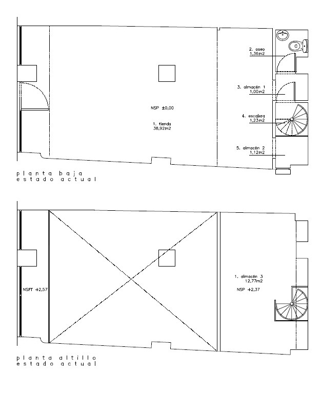
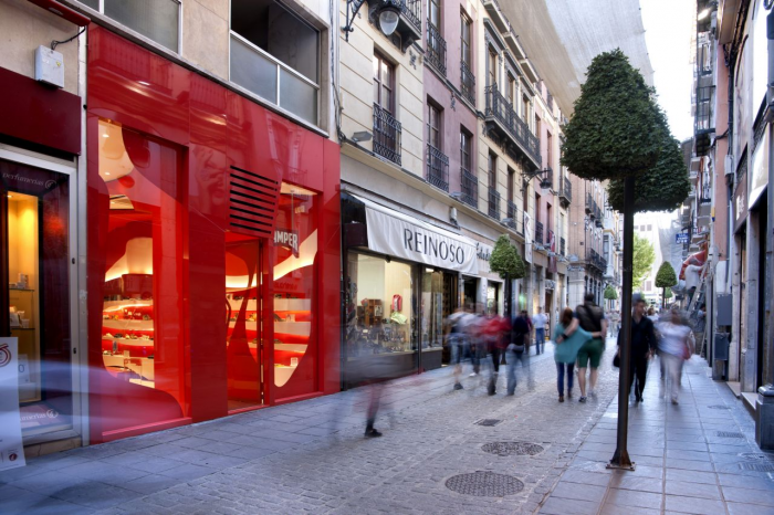
The location of the store is really good being placed in the most famous and commercial street of Granada. The store, with 48 m2, used to be a clothing shop partially abandoned.
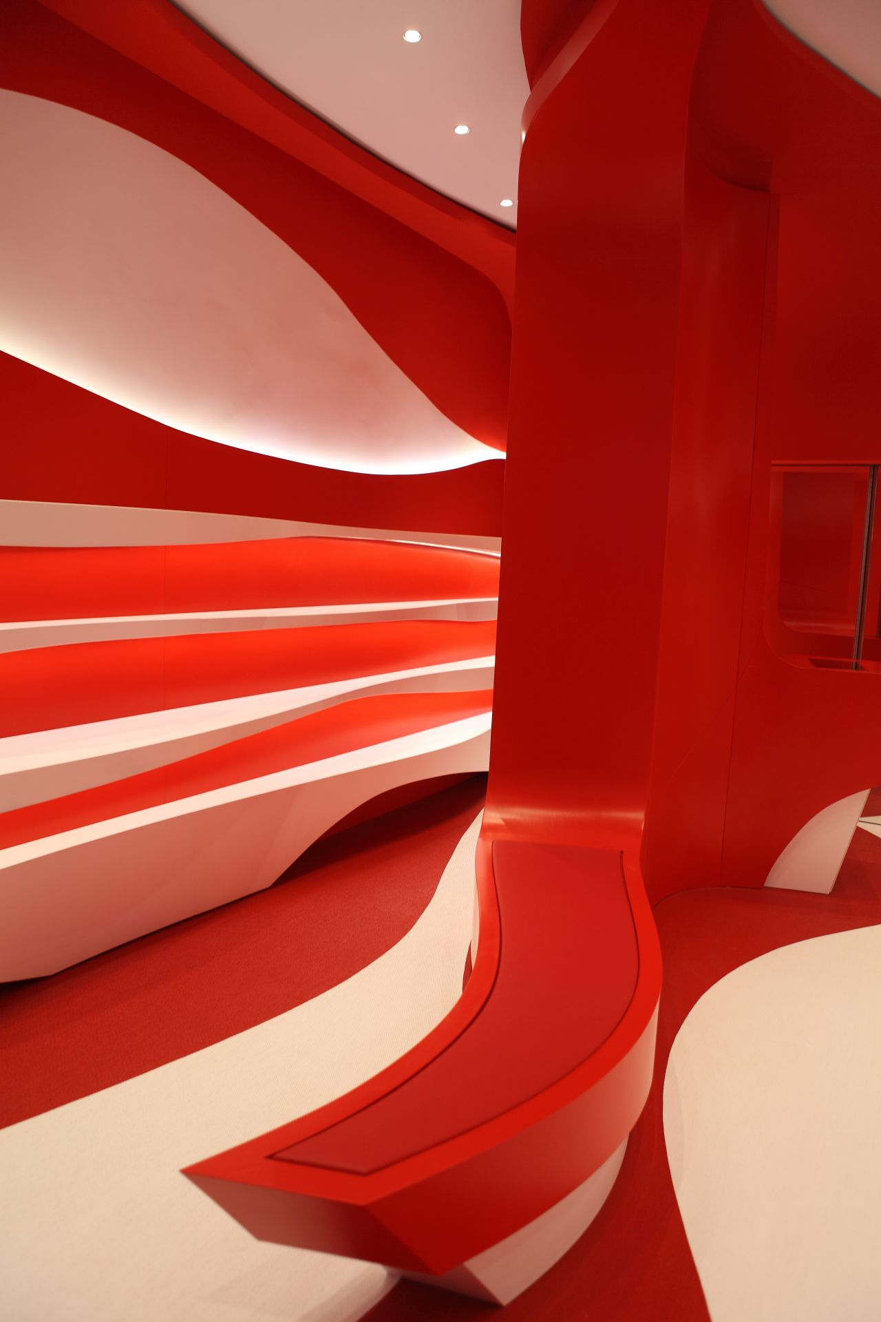
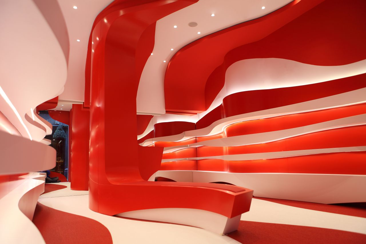
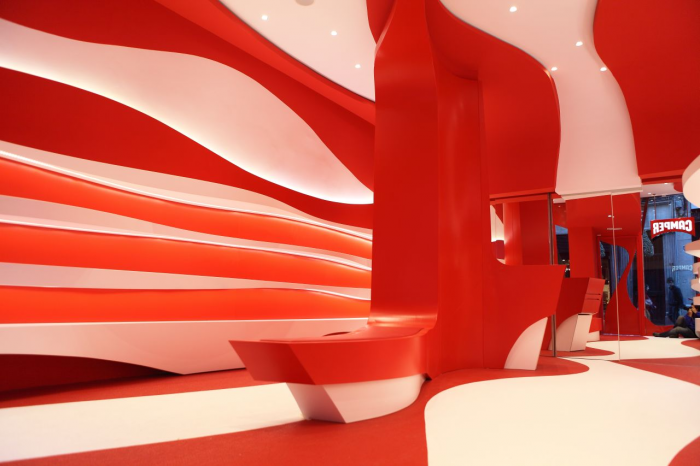
Two colors: white and red, typical of the A-cero interior design projects and Camper.
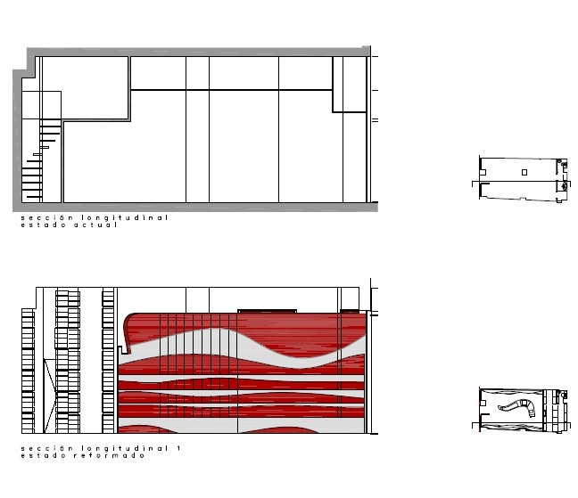
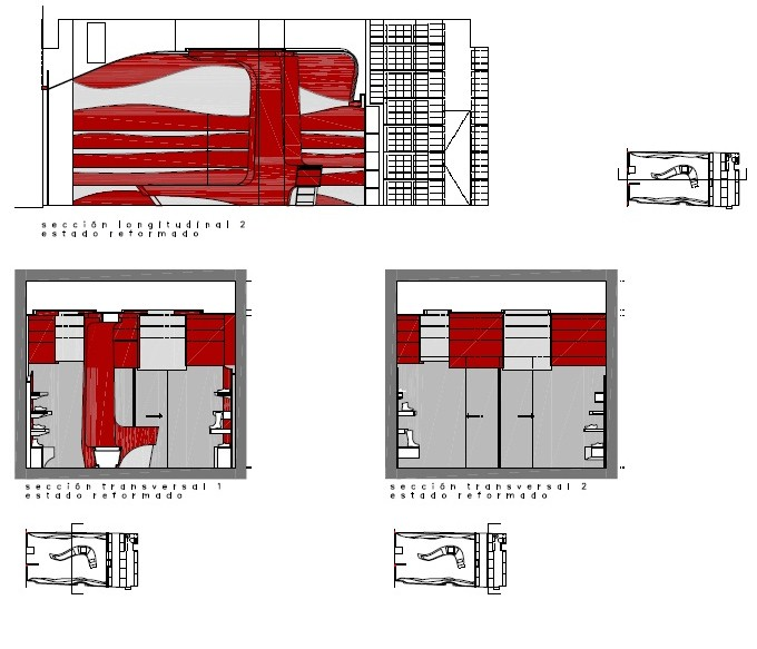
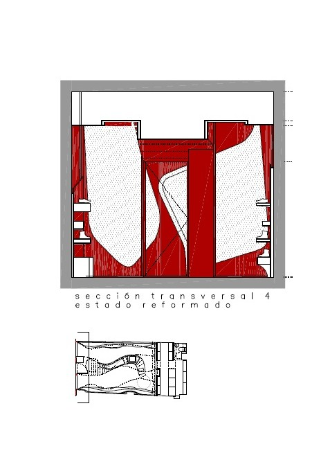
The space is open and projected with organic elements like the expositors, made of lacquered wood with white shelves and red face, having an indirect lighting by leds. Also, following the floor shapes, there is a red and white bolon.
Adding more sculptural values to the complex, in the middle part there is another module curve used as a breach change. To achieve more depth at the rear wall there is a mirror. There is still a space for a warehouse at the back.
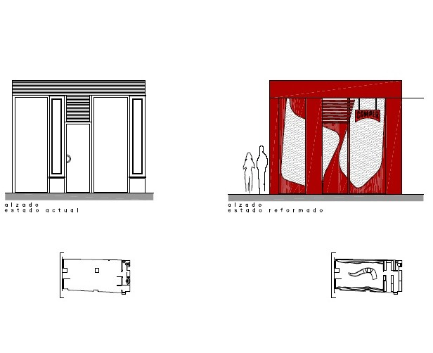
The front is made of composite panel with red aluminum and the showcase has been made of glass and red vinyl following the style of the store.
The final result is an interesting fusion between the corporative resources and designs of Camper and A-cero. A special place that improves the market of the area and also to feel the universe of Camper and A-cero.
