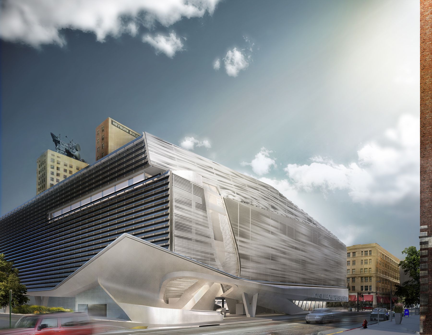
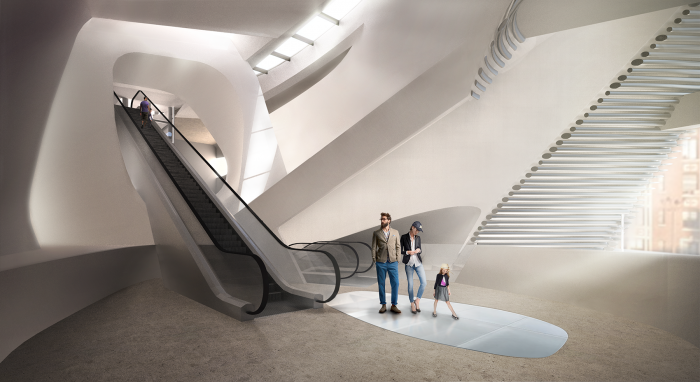
An International Ideas Competition asked for the design of a Children Museum accompanied by a park and high-tech incubator office in the urban area of Louisville, USA. PLUS-SUM studio has come up with a design solution to meet with the requirements of the brief.
Before starting the design, the team focused on the child psychology to better understand the elements required in a Children Museum. According to architects,
“Children are naturally curious, seeking opportunities to playfully explore while wondering about the magical possibilities of the world around them. Wonder and the process of discovery are fundamental to the mission of a children’s museum and our design strategy. We seek to engage the human minds potential via an innovative architectural expression that activates the senses, ignites imagination, and heightens anticipation of new discoveries revealed as you move through space. One oscillates between interior and exterior mental, physical, and conceptual limits.”
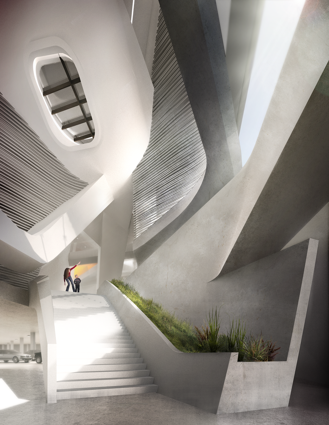
The biggest problem was that in order to access the Museum from the park, one had to go through an urban thoroughfare which was very dangerous for the users that usually consists of school children and families. To rectify this major problem, the designers integrated a civic idea developed by Fredrick Law Olmstead, a revered figure in the history of Louisville. Olmstead separated vehicular and pedestrian access which is used in the campus connection between garage and high-tech incubator office. This was achieved via pocket park from which an under-street entry path was developed for safe access.
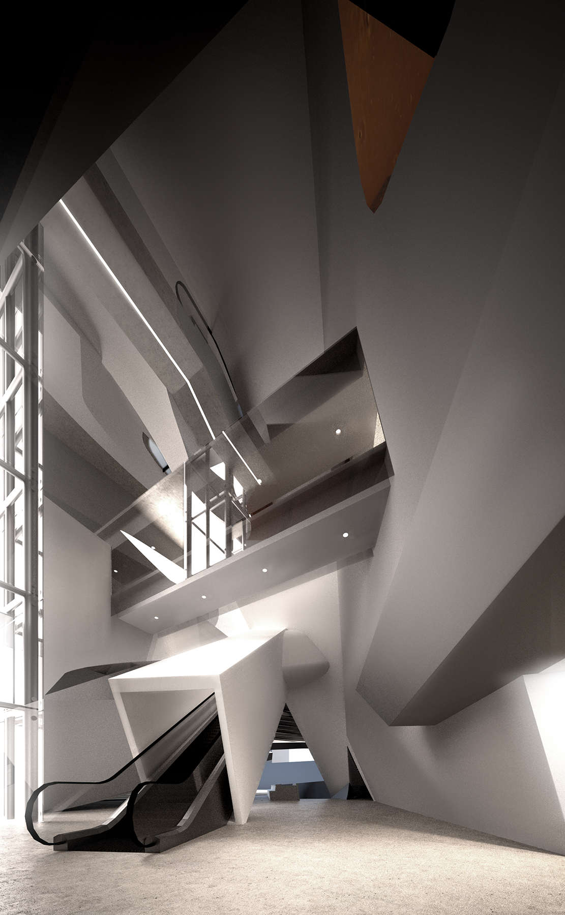
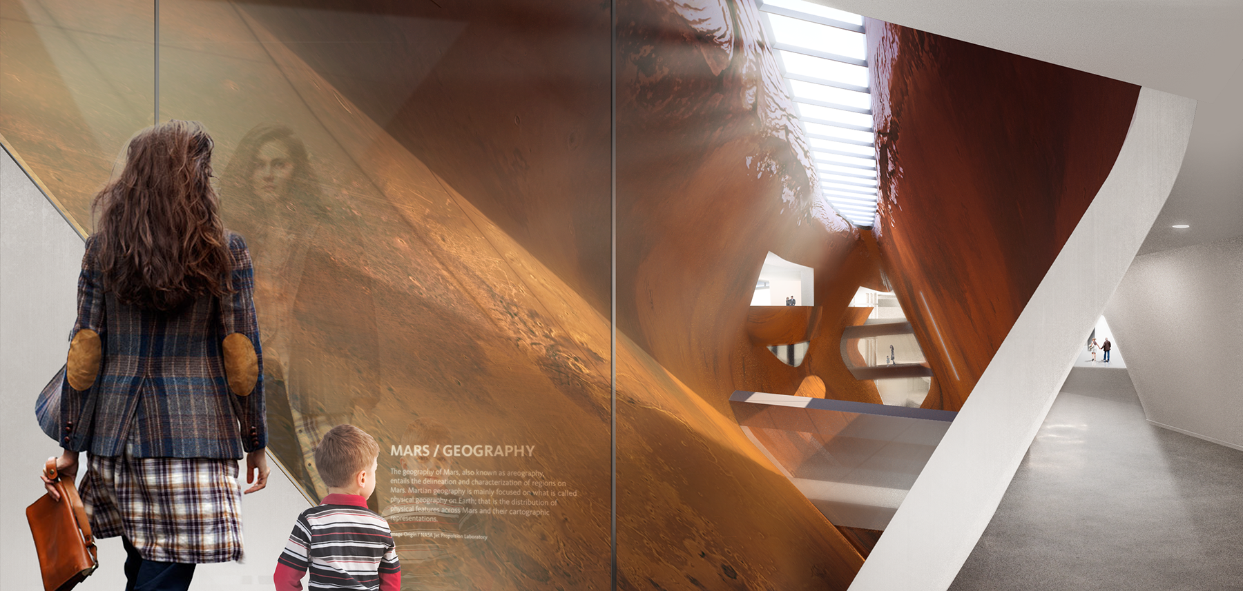
This pocket park and under-street path could also act as an extension of the museum thus merging with the campus conceptually as well as physically. The path leads to main museum entrance that connects underground parking to the street level lobby. From here onwards is a series of spaces and escalators which increase the anticipation of what is coming next.
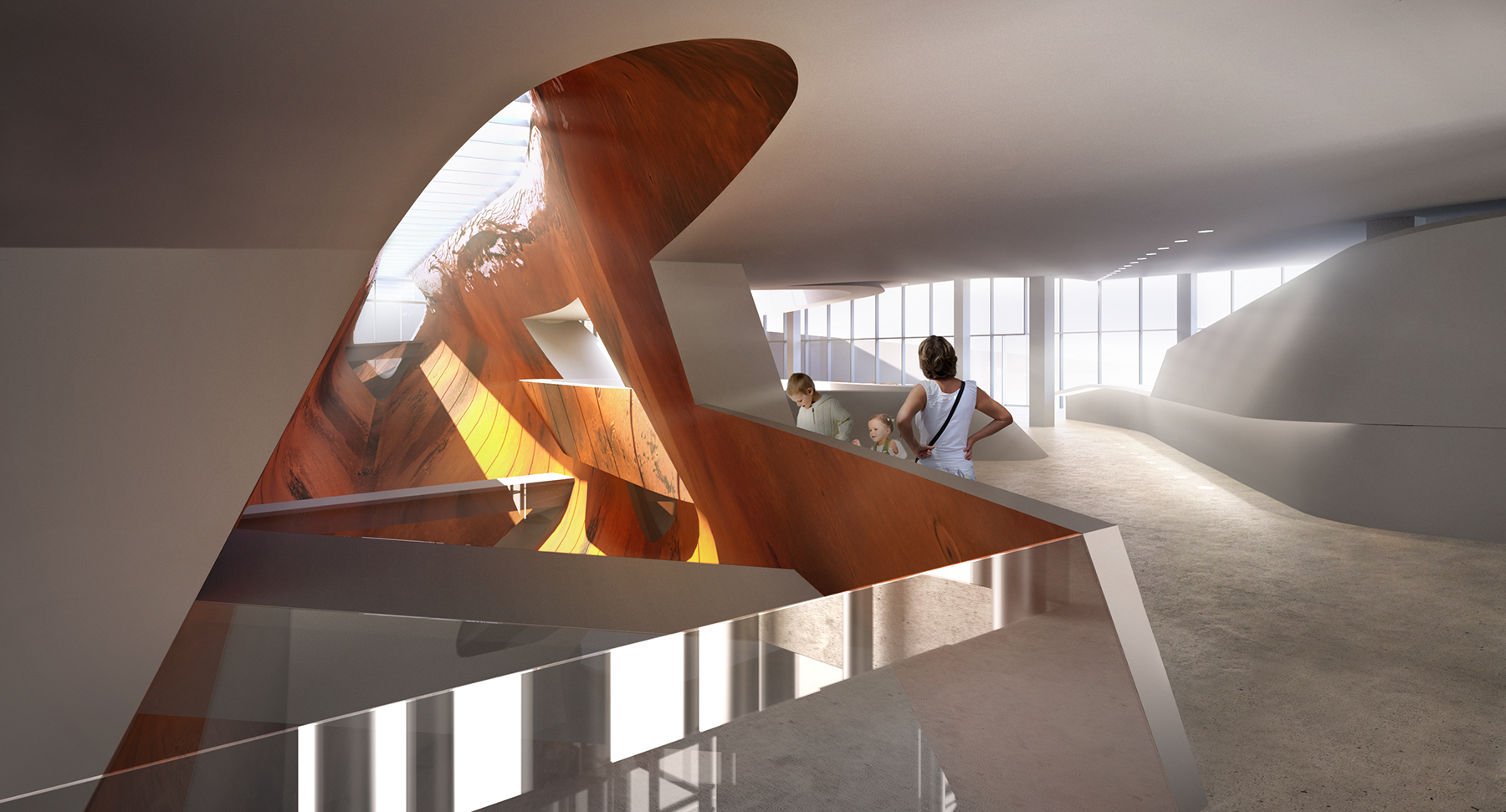
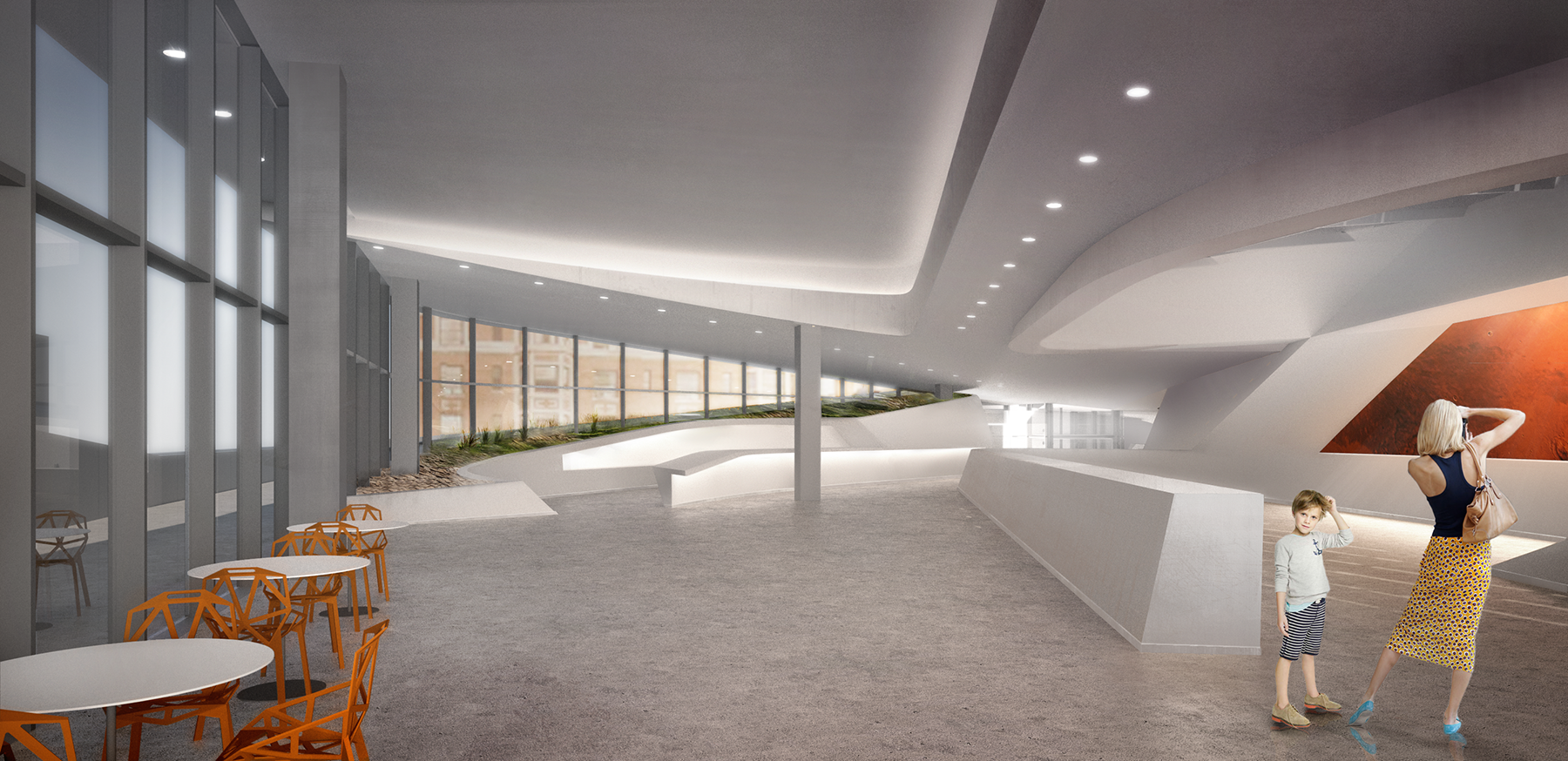
The main gallery consists of gentle slopes where internal circulation is provided such that major spaces connect internal exhibits to semi-external/ public spaces. At the street level, the auditorium, museum store and temporary museum gallery is arranged such that it could be easily segregated outside of typical hours of operation. This allows for lobby and deck to be used as a place where fundraisers and parties could be held without affecting the exhibits in the museum.
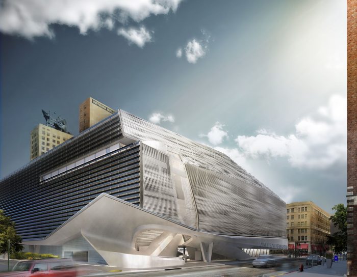
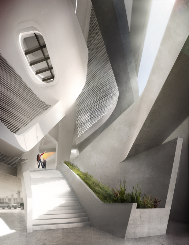
The design ensures that it does not just remain a venue for the exhibition but rather becomes a part of it. The plants and water body in the park becomes natural exhibits while being passively cooling the site. Also the connection between atrium and under-street pathway creates a pressure such that cool air comes in during summers while in winters the upper atrium collects heat thus tempering the space. A large solar array on the south façade and roof is also installed. All these features transform a simple building into a sustainable building worthy of accreditation.
By: Vaibhav Sharma
