Herma Parking Building
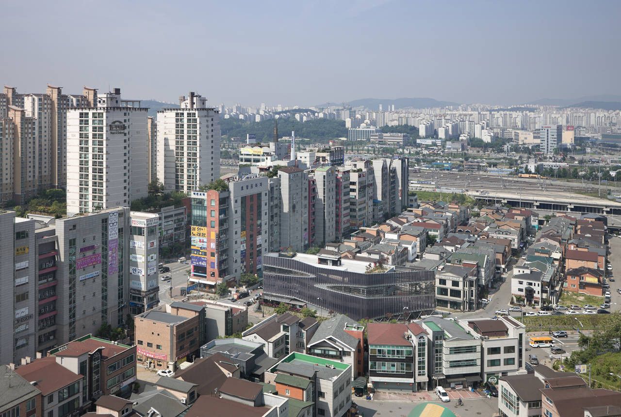
Parking lot either frankly reveals itself to be a parking lot without any consideration for design or surroundings, or disguises like a commercial facility. However, both cases are not welcomed in a city and ruin the city landscape. Development districts of New Downtown in Korea that are fully filled with gigantic real estate goods only emphasize the legal maximum floor area ratio. The city identity is represented by the wall-covering signs not the presence of space nor void. The massive box lumps clutter the city with the logic of capitalism that is composed of investment, lease, and presale, rather than the respective regional characteristics. This project intended to change the urban landscape through a proposition of a certain symbolically designed icon on a dry city.
In Korea for the development of a new town, developers parcel out the land in lots according to the usage such as a business area and a residence area, based on the Building codes. The parking lot zone also gets placed in major sites following the business and residential area zoning program. A plot for a parking lot can be planned with the cheaper land prices and eased regulations than a business area. However, it has a restriction that the commercial facility-to-parking facility ratio has to be 2 to 8. After all, deriving the land cost and construction cost with a very 20% commercial area is the poor reality of Parking lot construction in Korea. This substandard business value causes the parking buildings to be built without any design concerns for lower construction prices. Furthermore, a vicious circle of gradually deteriorating surrounding urban environment continues because of the box-shaped boring parking buildings. The Herma parking building was started from a fundamental consideration of current parking lots in Korea.
– Maximizing the potential commercial uses of the land
– Maximization of the lawful commercial area, the possibility of using a front terrace
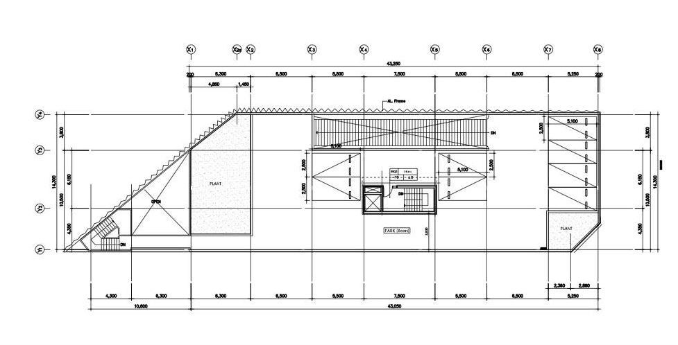
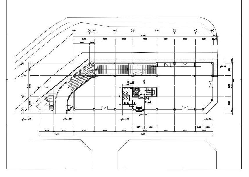
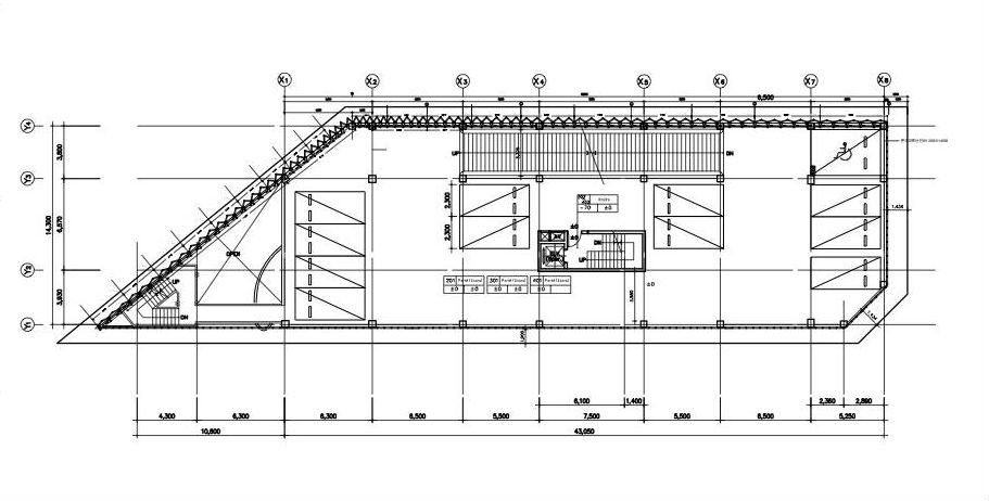
– Composition of the parking ramp and the traffic line
– Increasing the architectural value through front-skin design in order to overcome a realistic limitation of a typical parking building, a new design that can increase the value of commercial facilities, including maximizing the commercial area of the 1st floor and changing the front landscaping area into the terrace, as needed. By investing in a design that gives emphasis on commercial facilities rather than parking space, the value of the building and the land itself can rise. In other words, through an art gallery-like parking building the owner could get the attractive and high rental condition of the commercial building. Owing to the limit of a business program called ‘parking lot’ the construction cost also had lots of business limitations compared with other general buildings. For the economical construction, the main structure was decided with the reinforced concrete having been economical from the construction viewpoint at that time, while for reducing the earthwork the basement was minimized and constructed with the method of open-cut. Like this, the concrete volume is composed of the most economical form to fill the land. It is the volume to enable the maximum parking number of cars in the floor area ratio by enabling the maximum commercial area within the construction cost at a proper level. The mass filled like this was established based on the exhaustive economy.
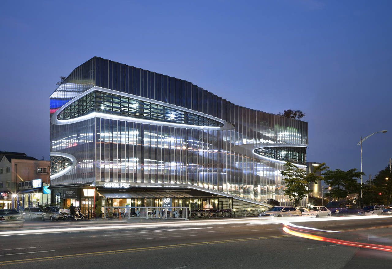
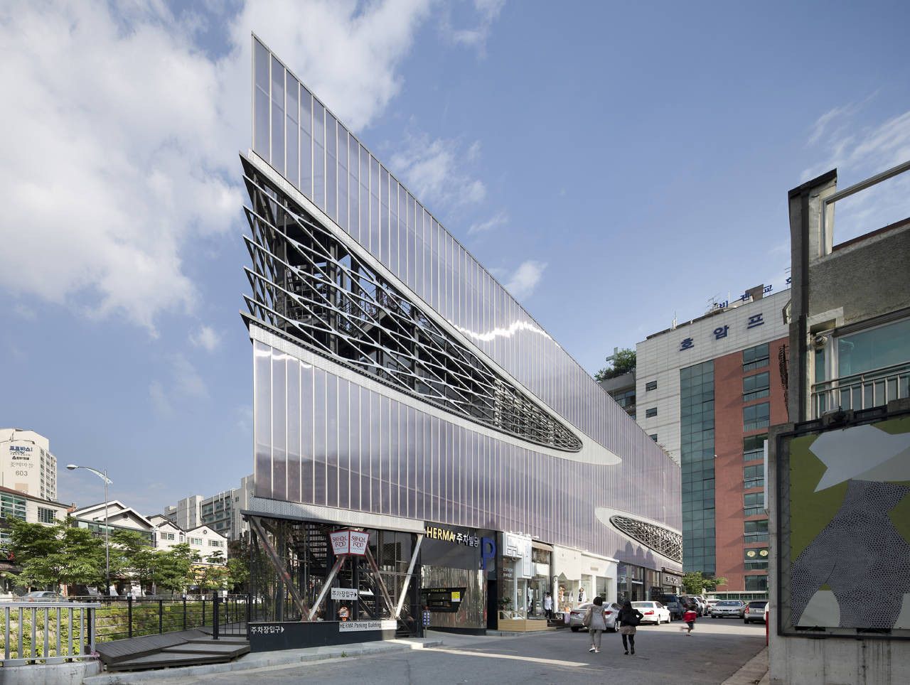
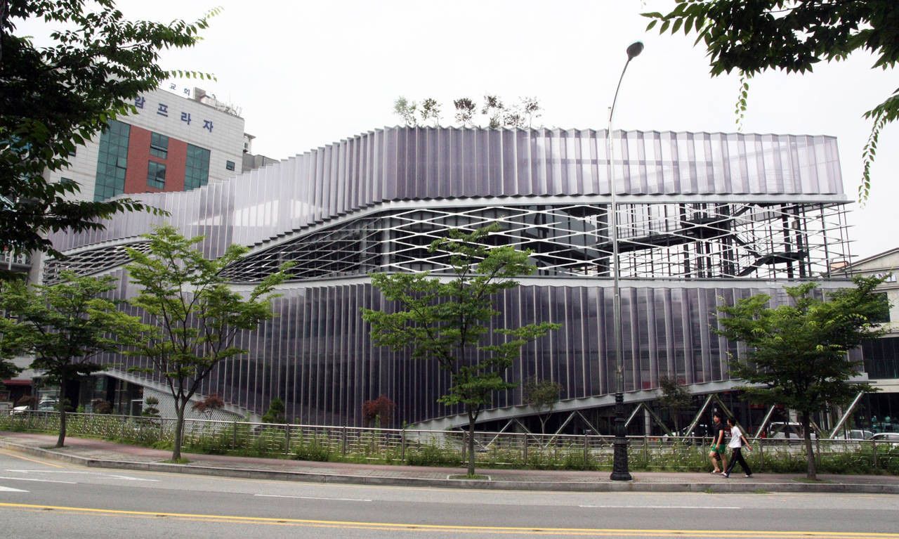
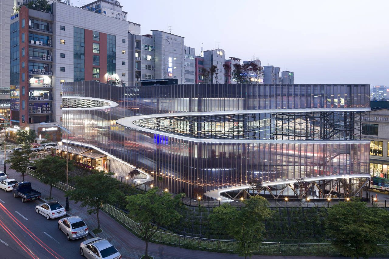
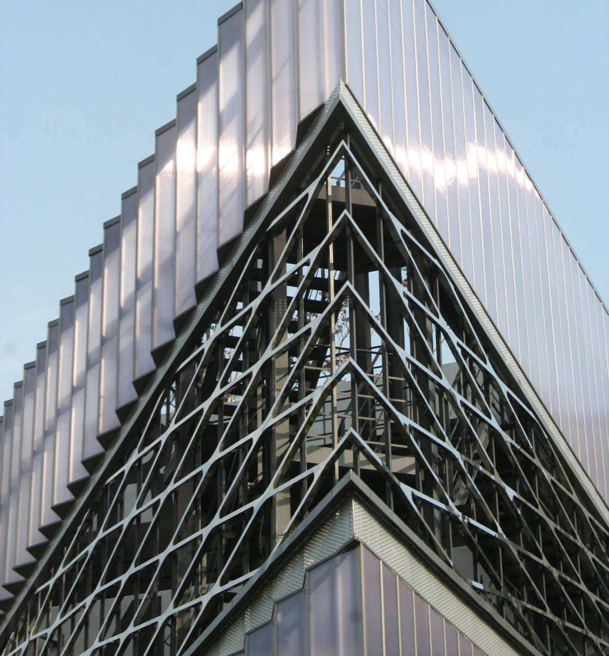
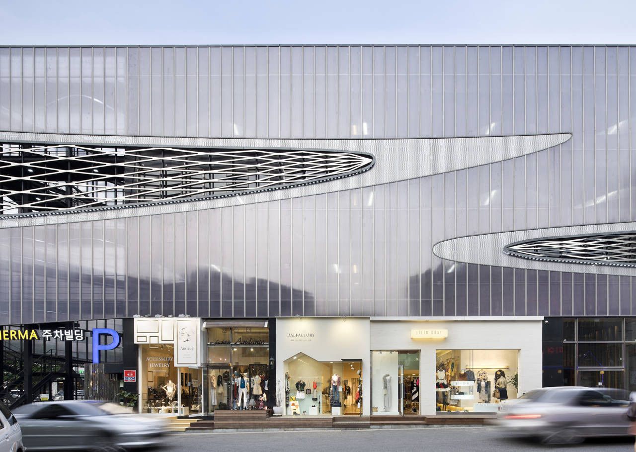
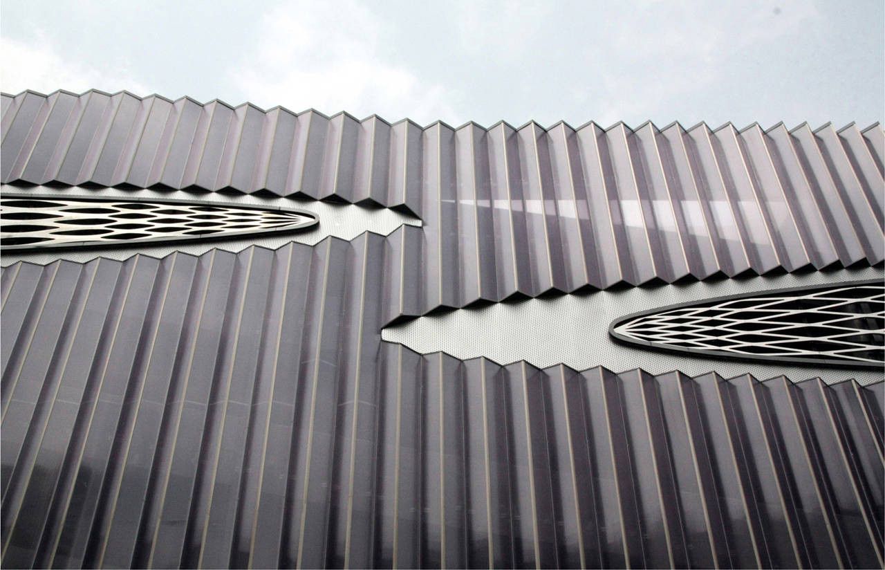
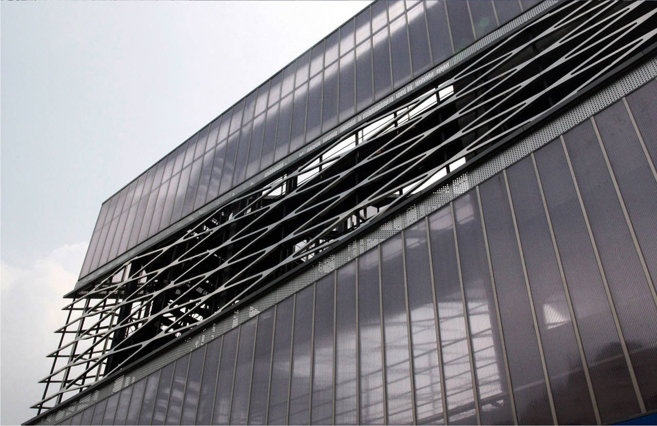
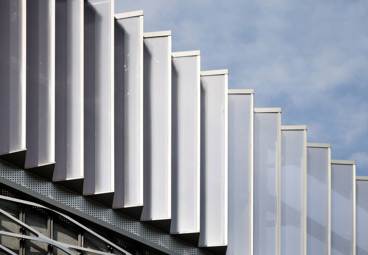
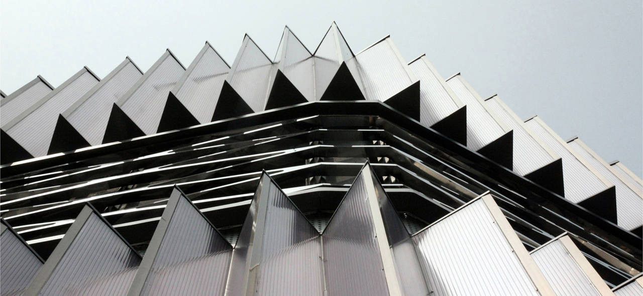
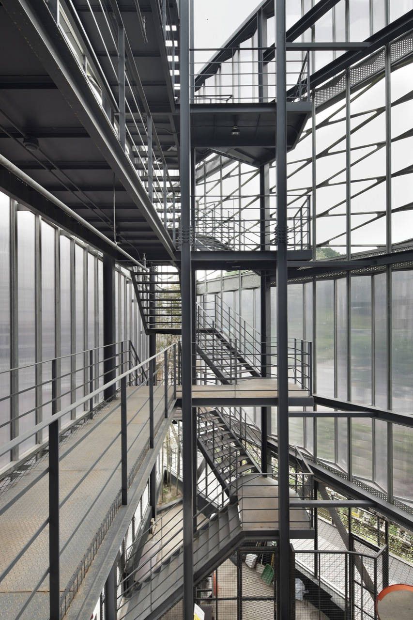
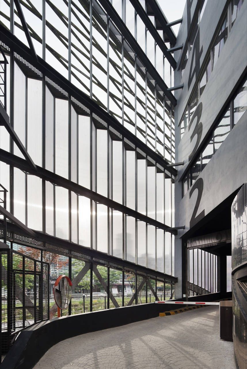
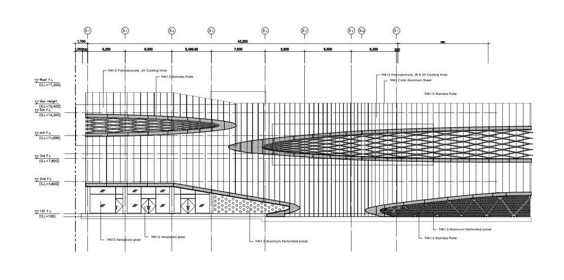
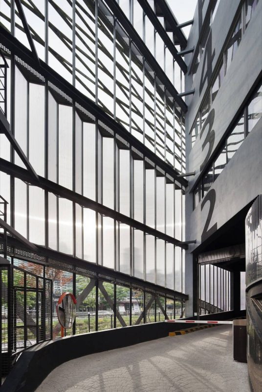
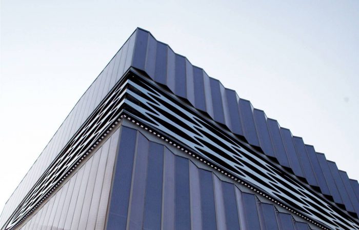
 The north-western pattern of the opening part, composed of violet polycarbonate skin and polished stainless steel, refracts the light. The front part facing the river is a triangular unit, which is composed of 10 different angles from 60 degrees up to 150 degrees and reflects the scenes of light and city with the total units of more than 80. Contrarily the back surface of the commercial area was finished with a flat surface. While the elevation plane toward the river was intended to express the speed of the city by wrinkled image, the flat surface located in the western side directly projects the image toward Bojeong-dong café alley.
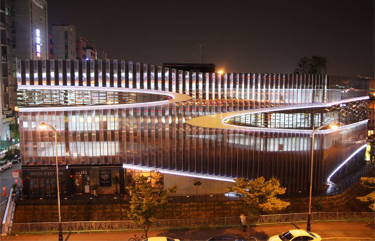
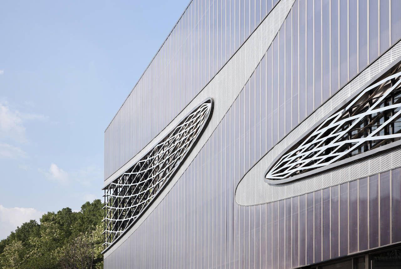
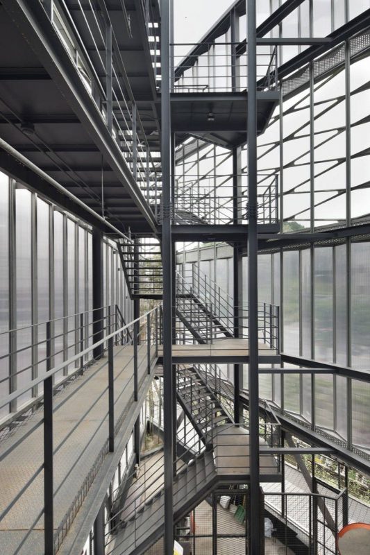
 The polycarbonate used in this project has 5 layers. The external part was coated with a violet color and the internal part with white color. Additionally, the external part was made with IR Coating and Coating surface treatment, which exerted such a feeling as the reflective surface of glass or metal depending on the angle of light. In the morning with the sun rising, it receives direct ray whose color of outer cover minutely appears to be white, and at noon indirect one whose color purely violet. In the afternoon with the sun setting, it reflects the evening glow and turns to be golden, while in the evening it reflects the internal lighting and external neon sign and directs unusual scenes. The skin color sensitively changes with the external light condition. The south-eastern pattern of the opening part is composed of polished stainless steel.
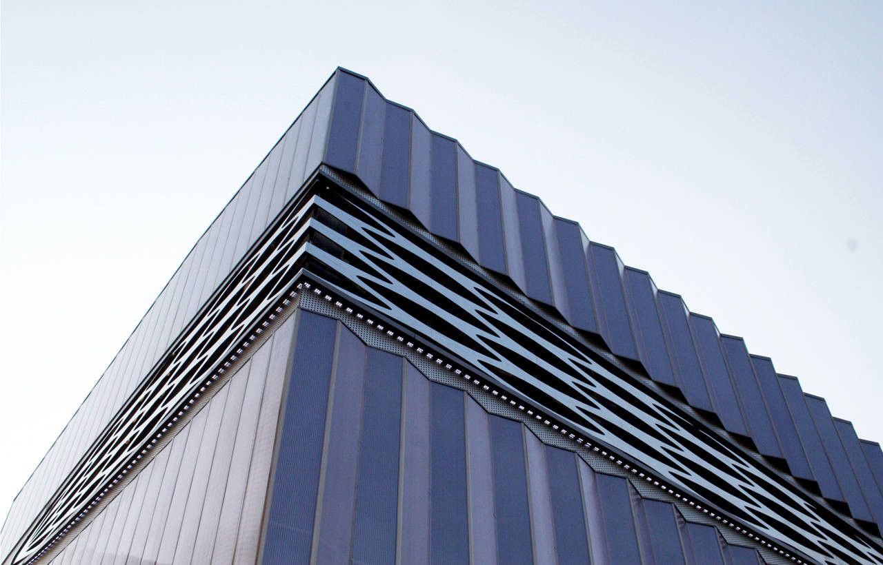
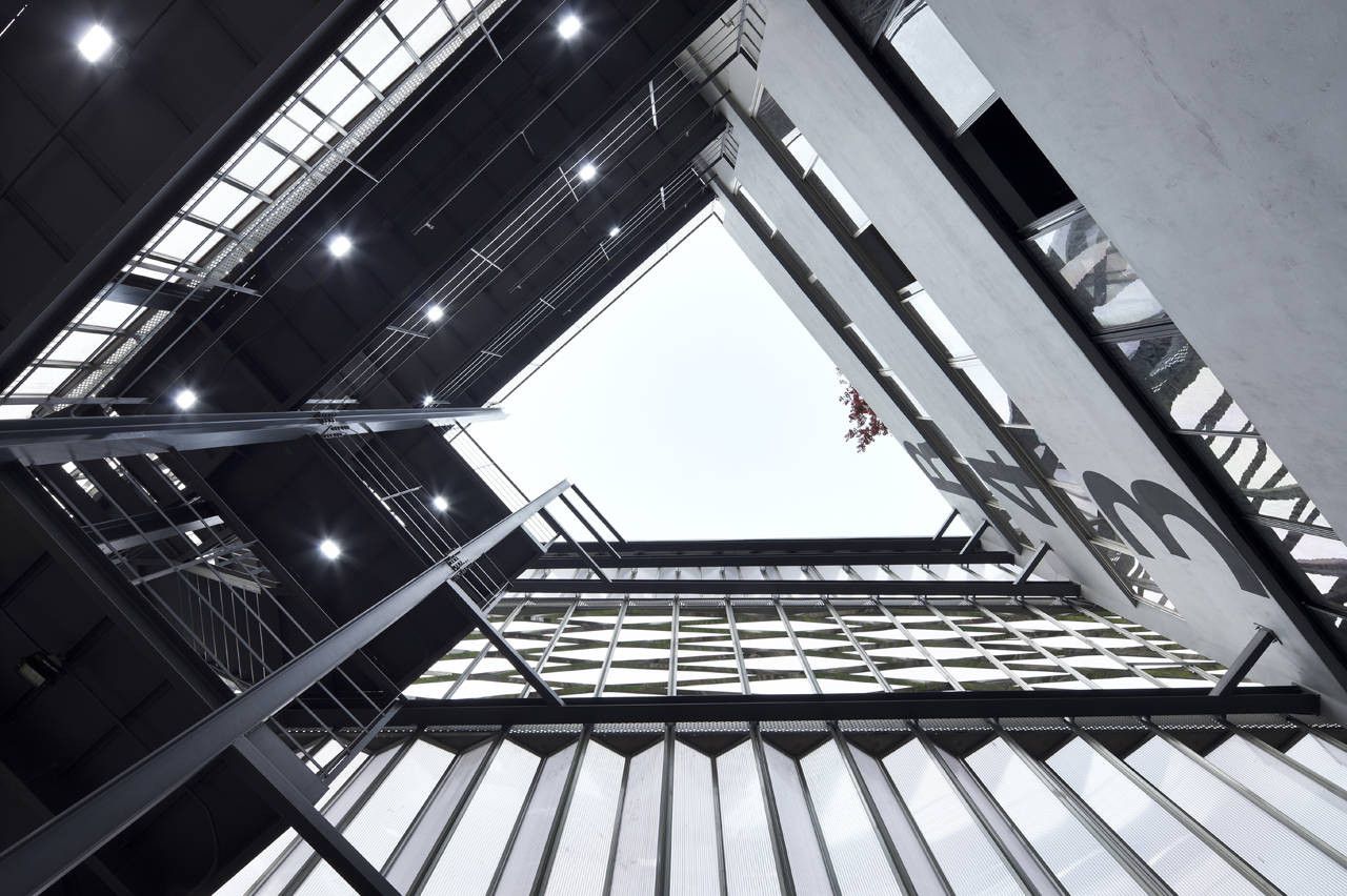
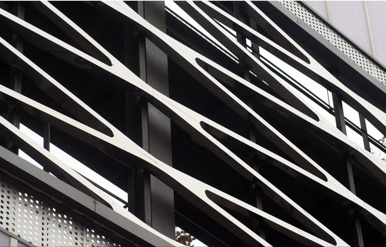
 Another characteristic of land is the point that the four surfaces are independently opened without facing different buildings. According to such characteristics of land, the composition of the elevation plane was designed to direct various images at each vanishing point. The opening part composed of a stainless pattern consists of respectively different forms and patterns at each vanishing point, whose design of automobile grill was applied inspired by the characteristics of this building’s being a facility for cars. As such an opening part is differently open on each floor and elevation plane the natural ventilation is available, and it properly projects inside, due to being cut off from the external part it was designed so as not to recognize from outside the fact that this building is a parking lot.
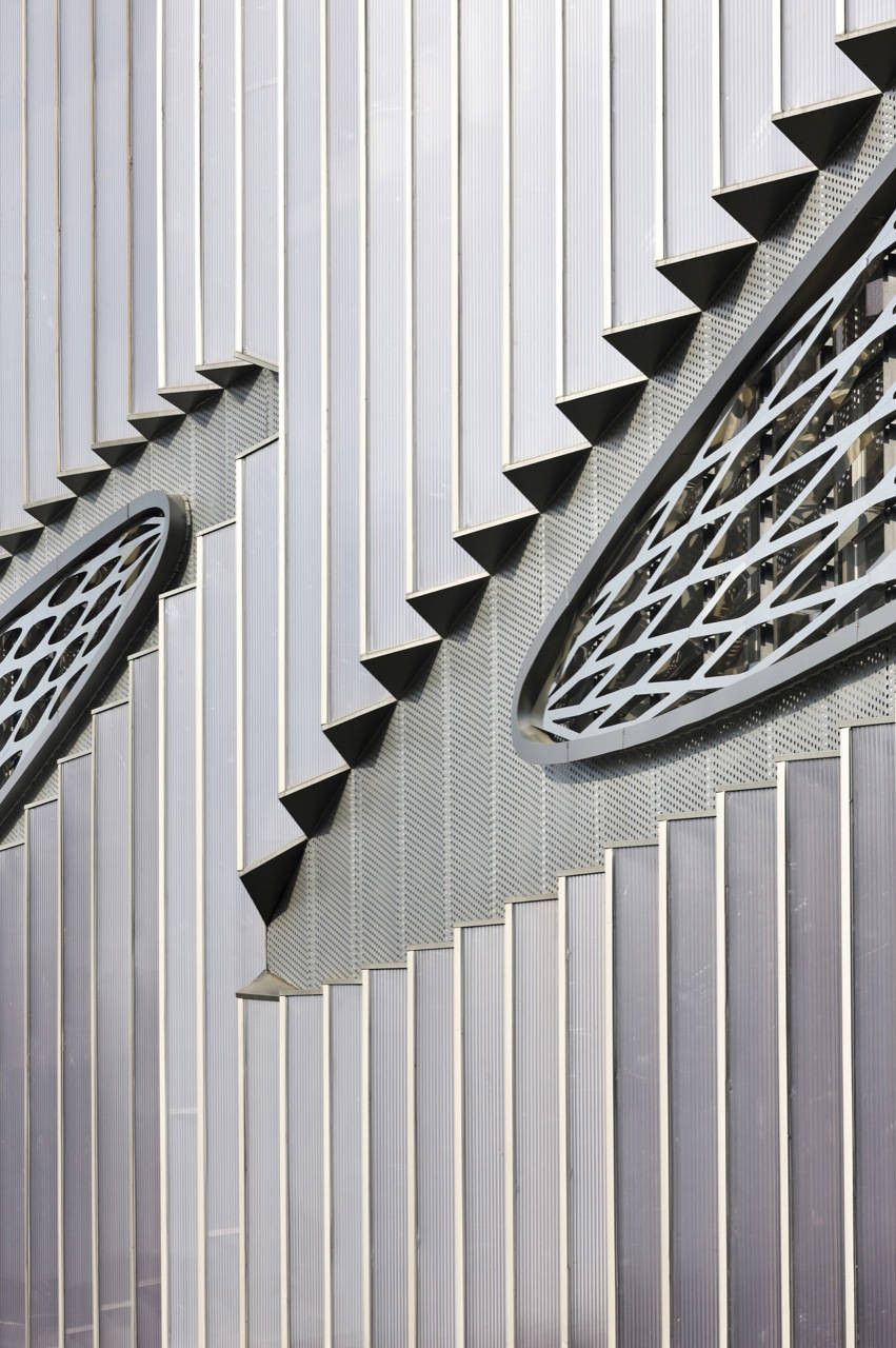
 Various grill patterns from different cars. It was applied to the pattern design of the opening part of the external cover. The elevation surface composed of a triangular panel facing toward the river. It reflects the urban light and speed through triangle wrinkles. The planar figure for ordering 635 polycarbonate panels and more than 930 different Stainless piece patterns.
The characteristics of exterior design exist in the panel with respectively different sizes individually combined above all. As known from the pattern of elevation plane with various expressions the polycarbonate panels used for 635 units of outer covers are all different in their sizes. Each panel differs in size with the spacing of a few centimeters, which was cut and carried in the factory one by one. The maximum length of the panel is 12 meters long, due to the maximum specification of the container box when imported. Each opening part is less than 12 meters wide, which divides the polycarbonate panel and creates respectively different elevation plane factors. It is combined with respectively different sizes of the panel and stainless steel patterns. The stainless louvers were manufactured in the maximum size in the factory and welded on the zinc-galvanized pipes. At the same time as these 935 types of the respectively different diamond-like patterns were cut with CNC with the loss rate minimized and welded into the units again at the site. That is, the elevation pattern changed suited to the spacing change of structural frame, through this process of rationalization the unity of design, manufacture of pattern, and reduction of construction period could be made. When the filled volume was based on the weight of properties, the outer cover was designed under the subject of being light. Considering the construction cost the types of material were limited to 2~3 ones, especially the external clad structural frame was manufactured with easily available zinc-galvanized angle pipes, the polycarbonate, the main external clad material could be imported at a low price through negotiations with material businesses. The pattern of opening part different at each vanishing point is variously open on each floor for the natural ventilation. That is if the polycarbonate skin mutually projects the external and internal images, the opening part composed of a stainless pattern externally and directly creates the image of the building. The characteristics of the parking lot program not needing any insulation material enabled the elevation pattern to be more freely composed.
 Project Info
Architects: JOHO Architecture
Location: Yongin-Si, South Korea
Year: 2010
Type: Parking
Photographs: Sun Namgoong, Jeonghoon Lee
