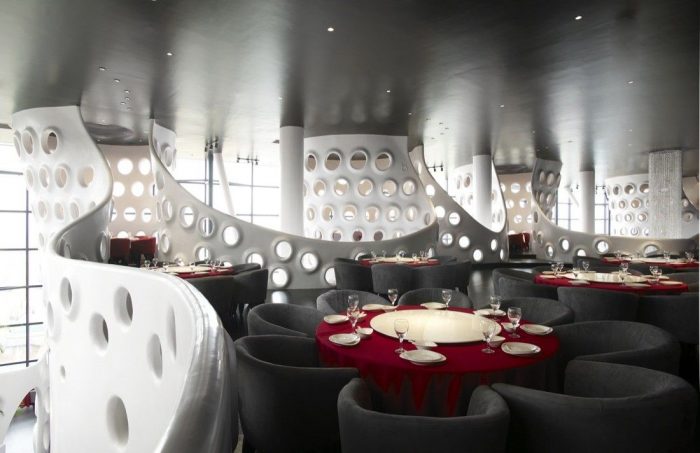
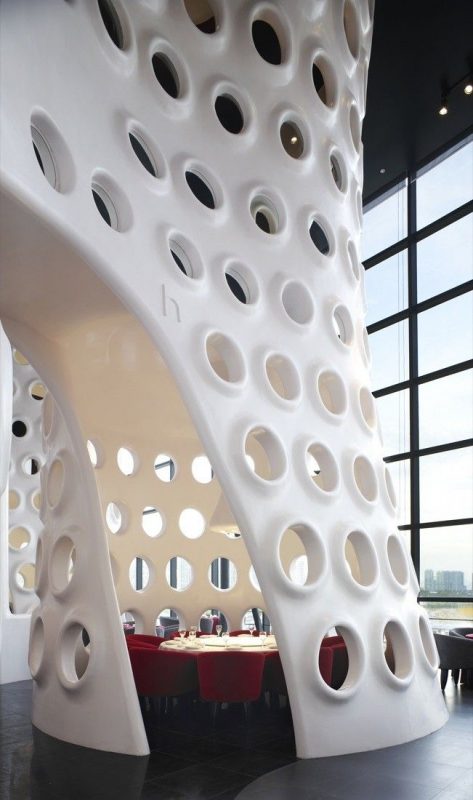
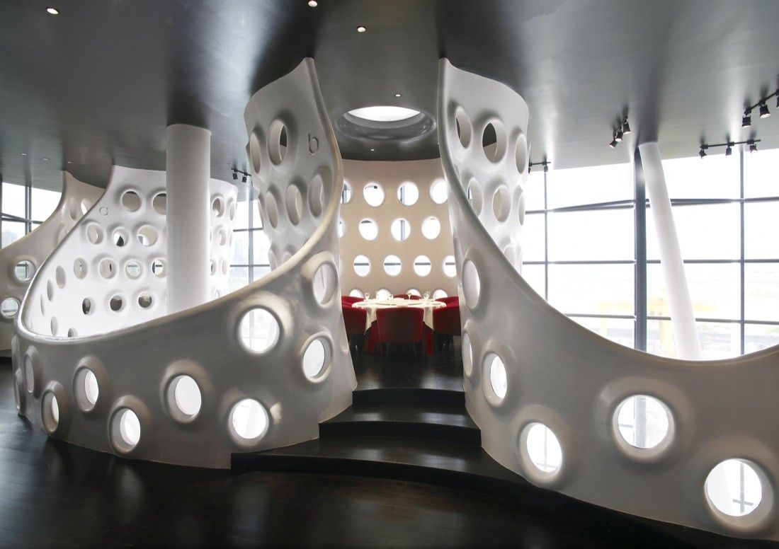
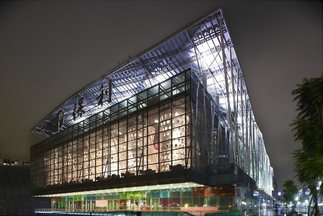
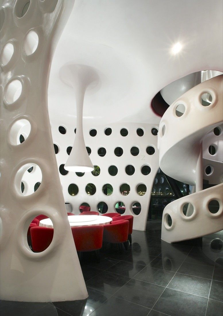
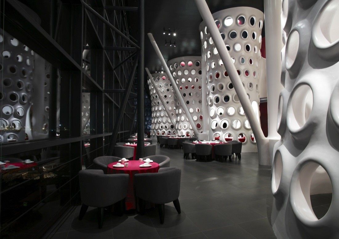
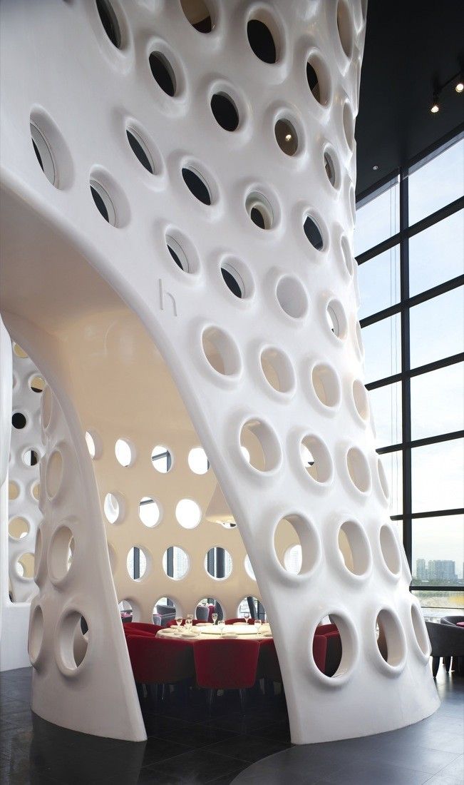
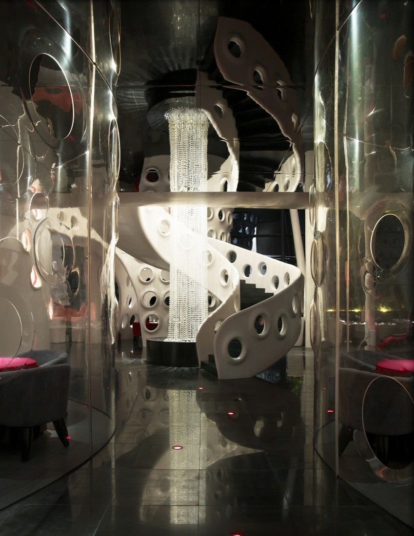
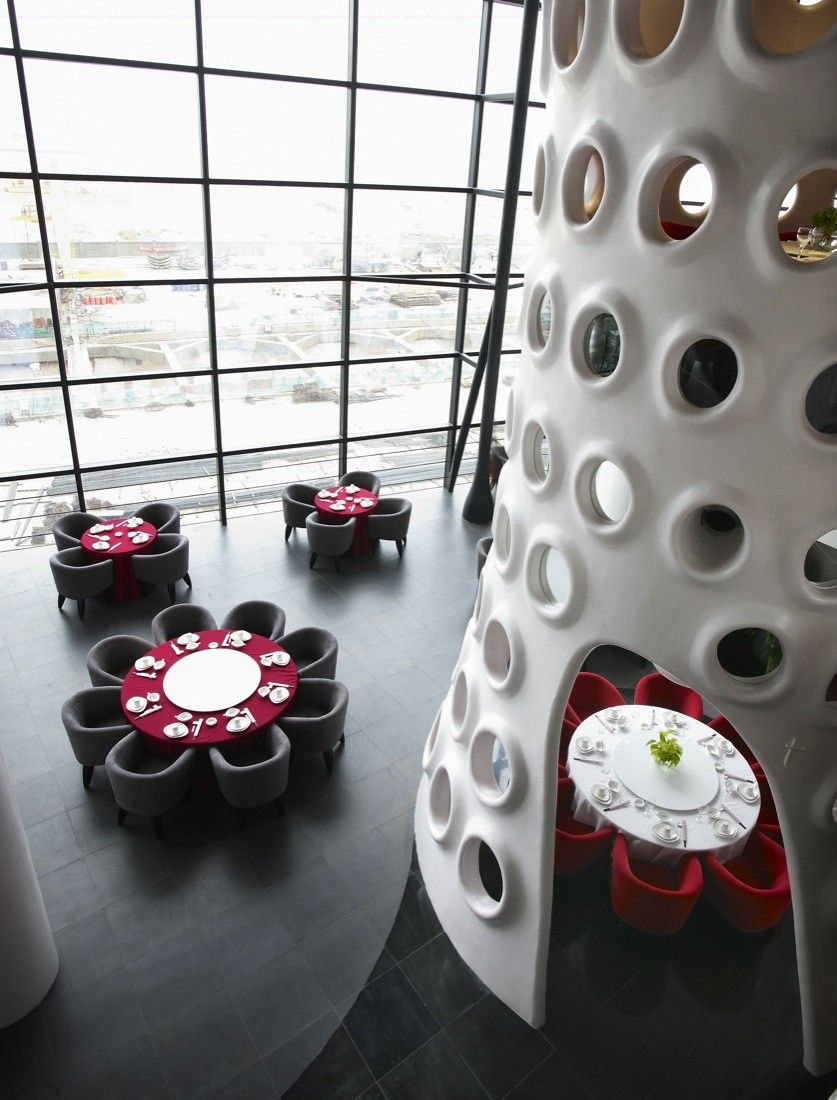
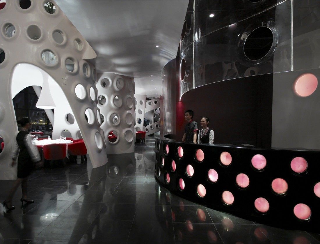
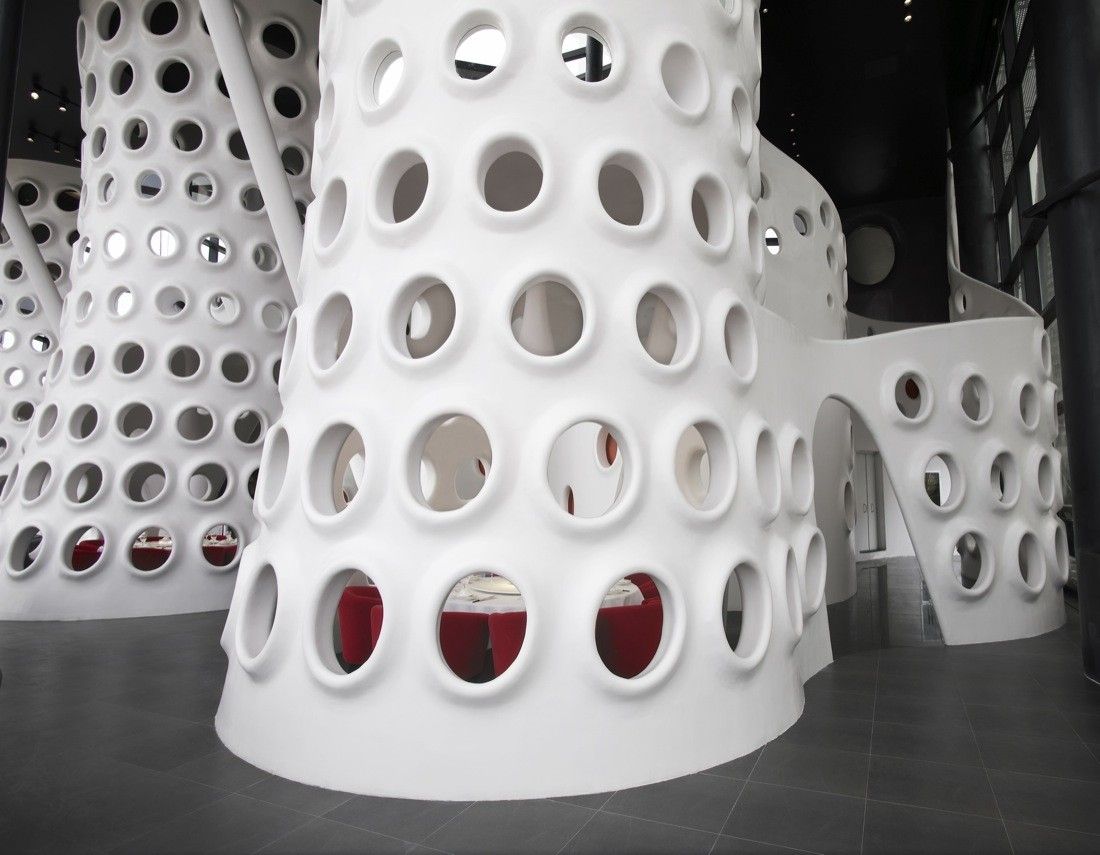
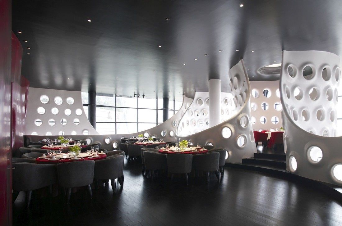
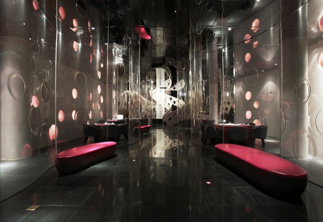
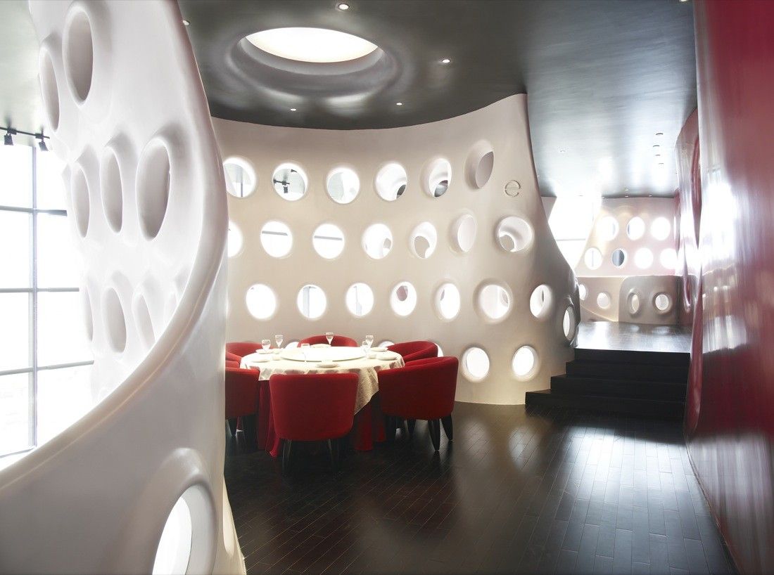
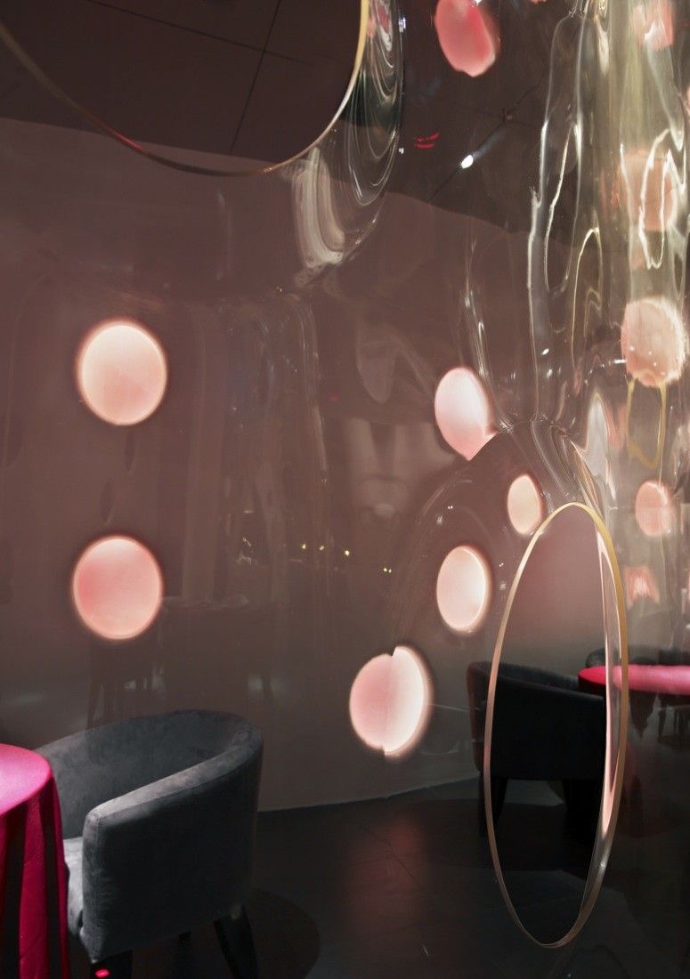
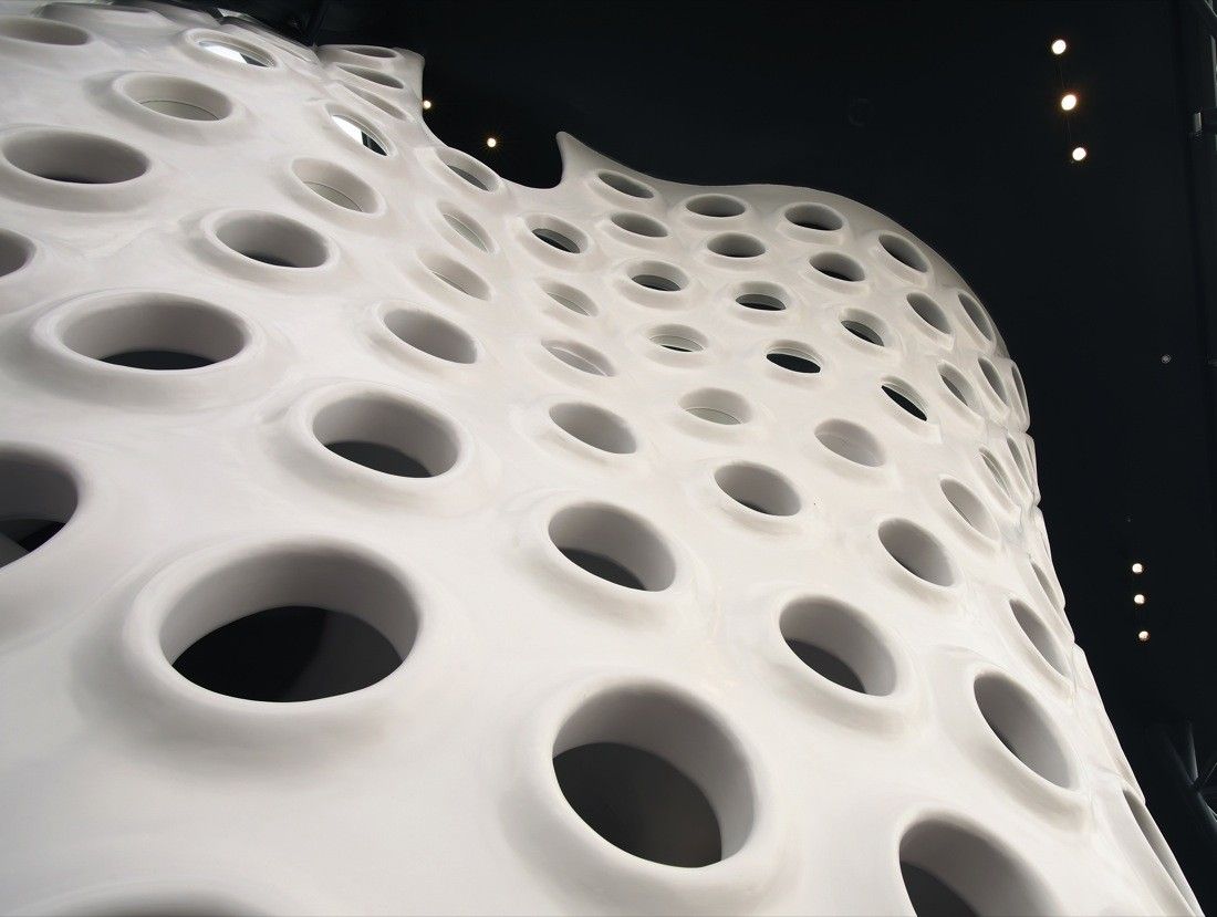
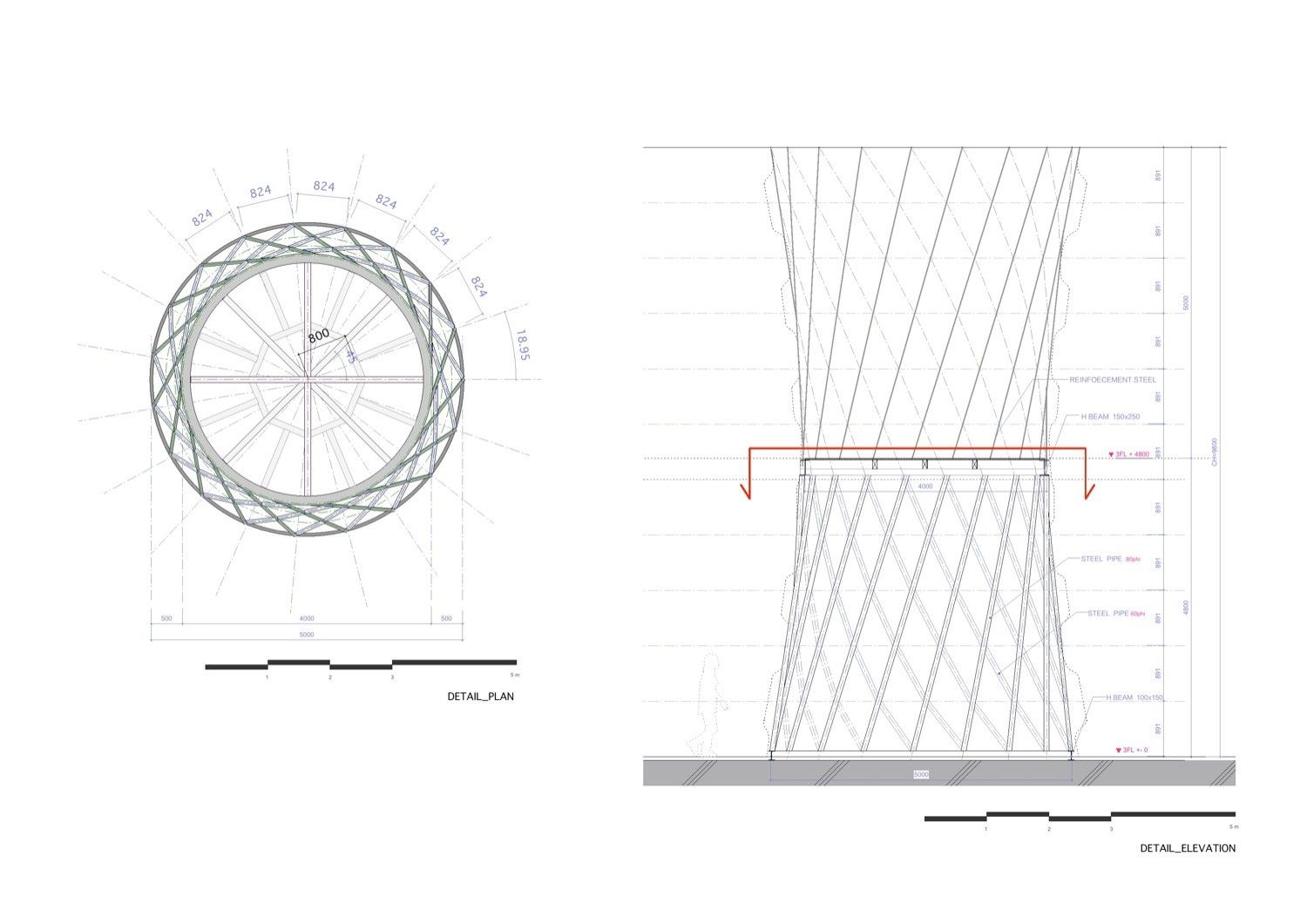
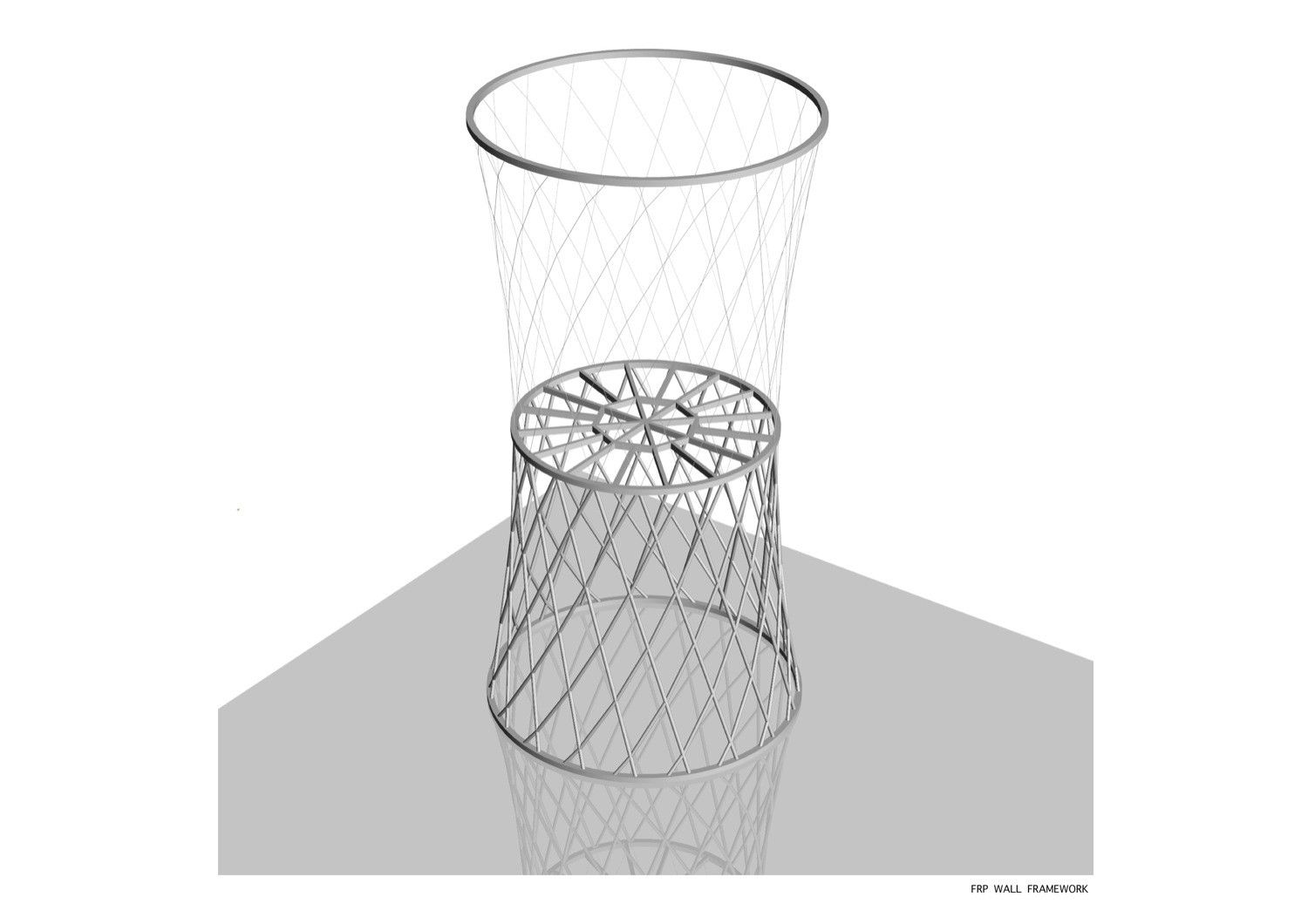
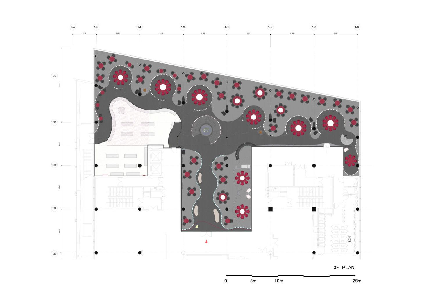
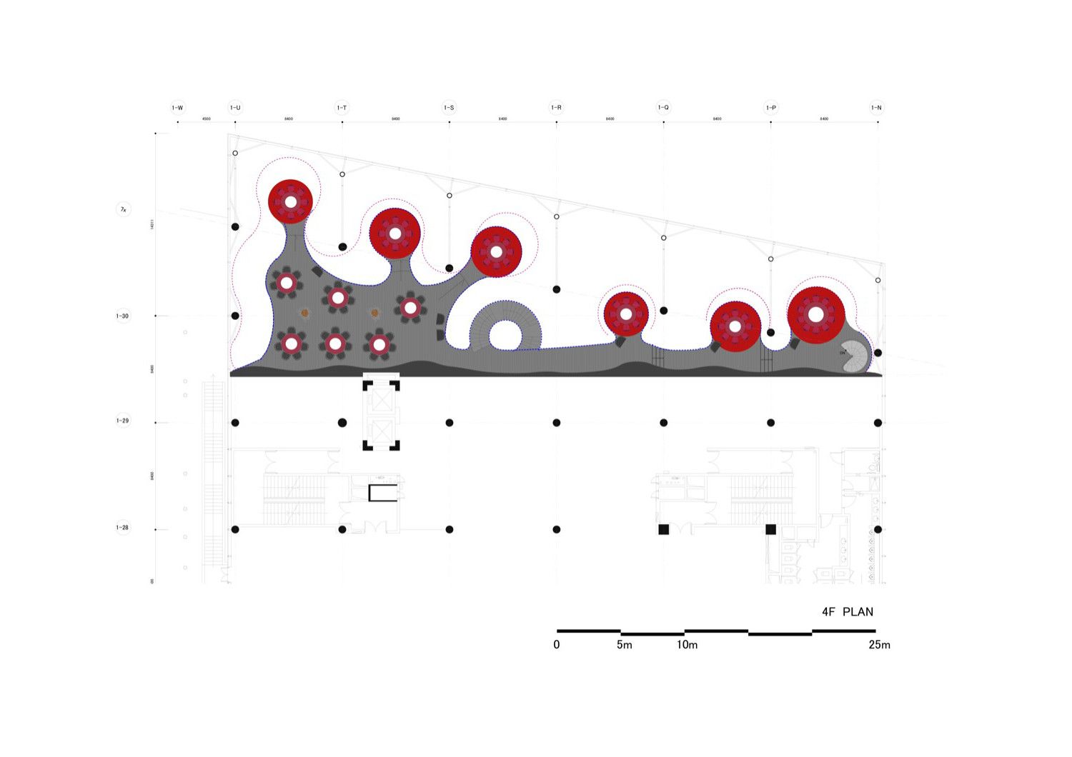
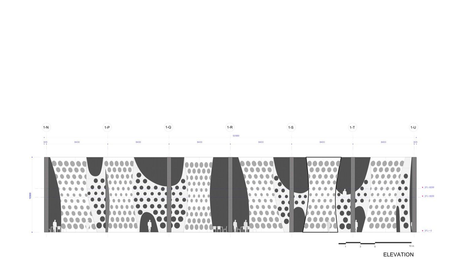
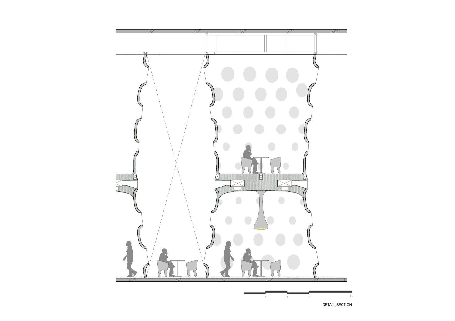
This restaurant design by SAKO Architects is located in Shenzhen China, taking its influence from the idea of the honeycomb. Its influence can be heavily seen in the way the interior is designed, with the numerous amounts of hole that can be seen throughout the space, representing the hexagonal shape found within honeycombs. Internally the space is divided by the use of partitioning walls sometimes cylindrical in shape. This creates a division in the space, influencing the way individuals’ movement throughout the space. Areas within these zones are assigned red chairs to make a clear distinction between areas excluded from these with black chairs.
This creates a hierarchical presence between the users due to this separation. The space is not completely separate as within the walls there are openings created to give some transparency between the two sections.
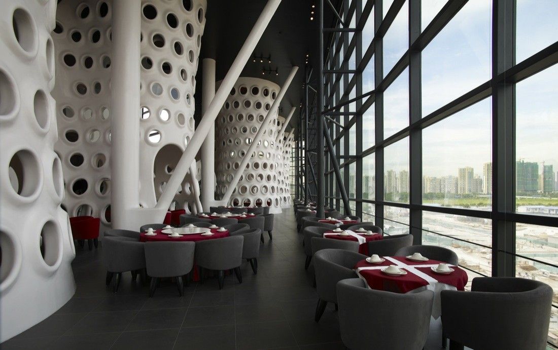
The façade predominately uses a curtain wall system; with the side facing the direct solar gain using solar shading that is created by the roof protruding further forward. The left side also glazed, but as this is away from the direct solar gain, it illuminates the internal space using cooler more diffuse light allowing for a more subtle casting of soft shadows to be formed.

Courtesy of SAKO Architects


