Horizon Media, the largest privately held media company in the country, needed a drastic change to their office space due to immense growth. Situated on 9 different floors of inherited space, in 3 different buildings in midtown up to 10 blocks apart.
a+i‘s work with horizon began with an intensive programming phase, concurrent with the real estate search, which concluded with the determination that moving downtown was both the right real estate and cultural move for the company. An old printing building, 75 Varick street has 360 views, light, high ceilings, and beautiful existing concrete structure that could not be found in midtown. The company’s growing new media focus required the company to present an innovative face to both clients and prospective talent alike.
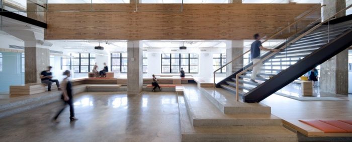
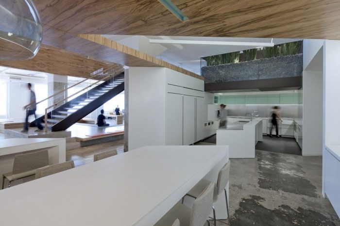
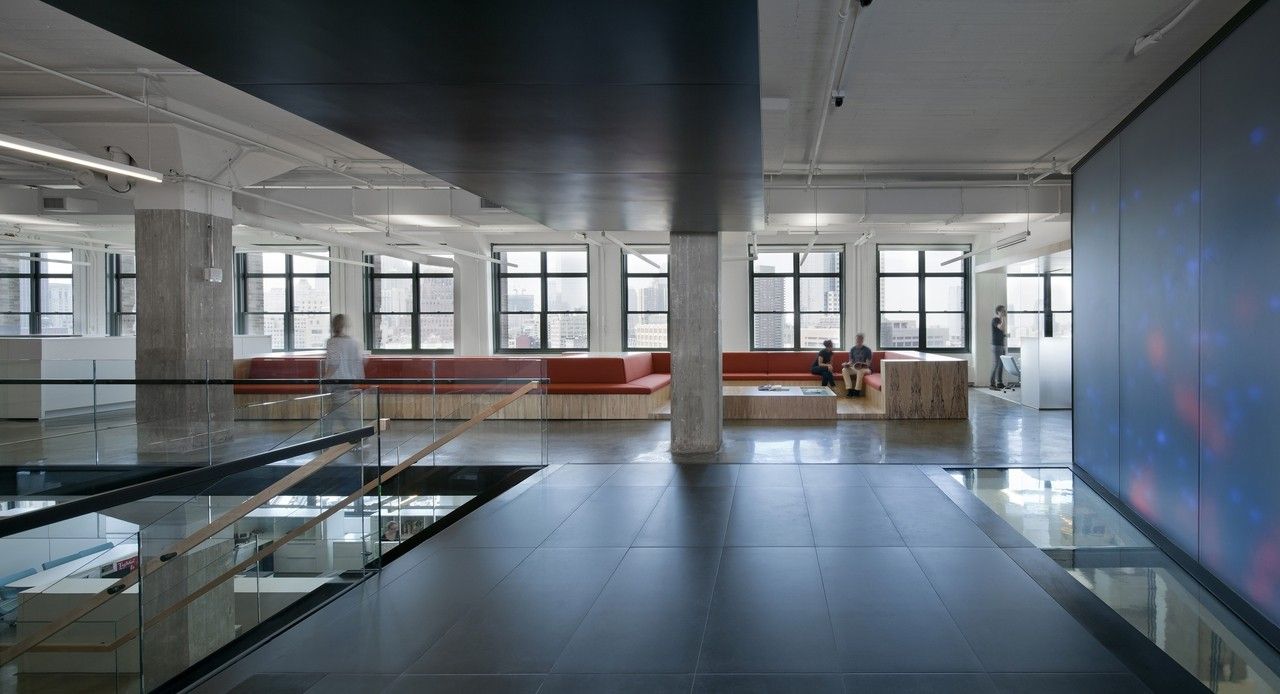
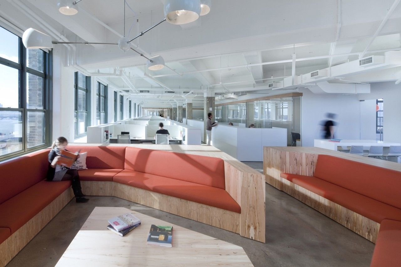
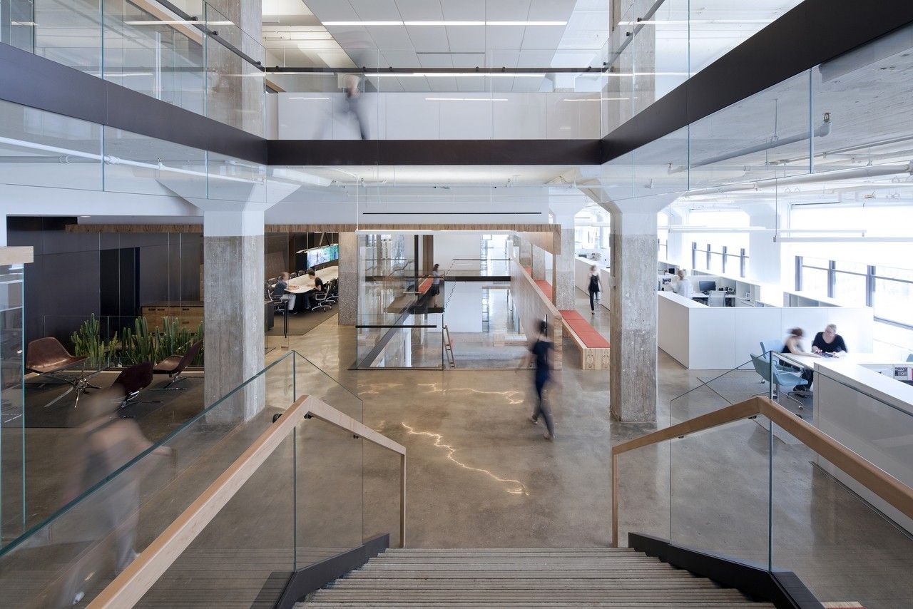
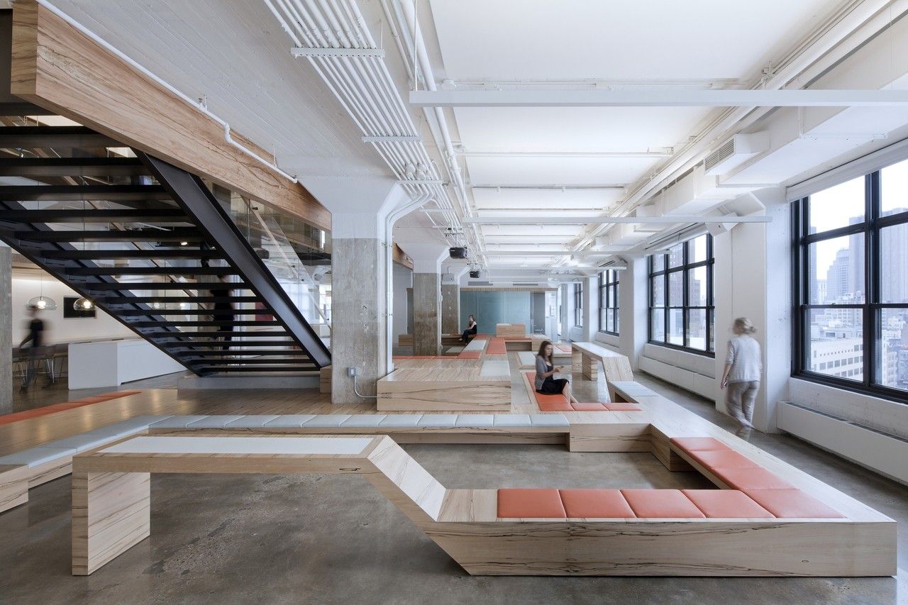
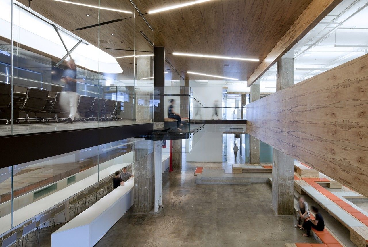
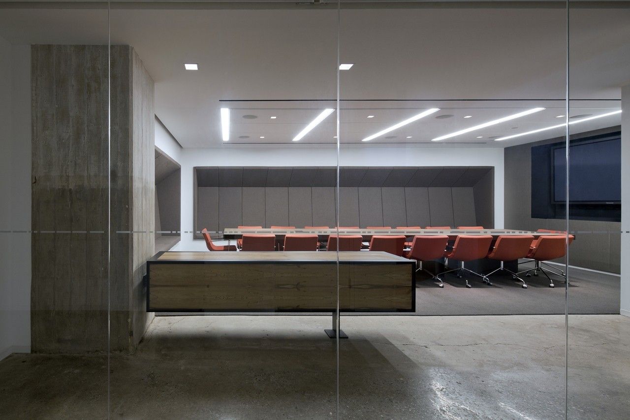
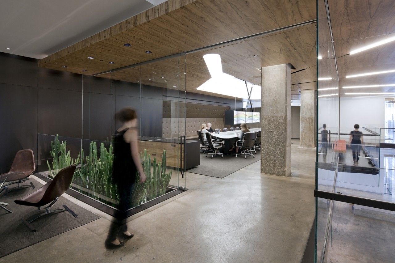
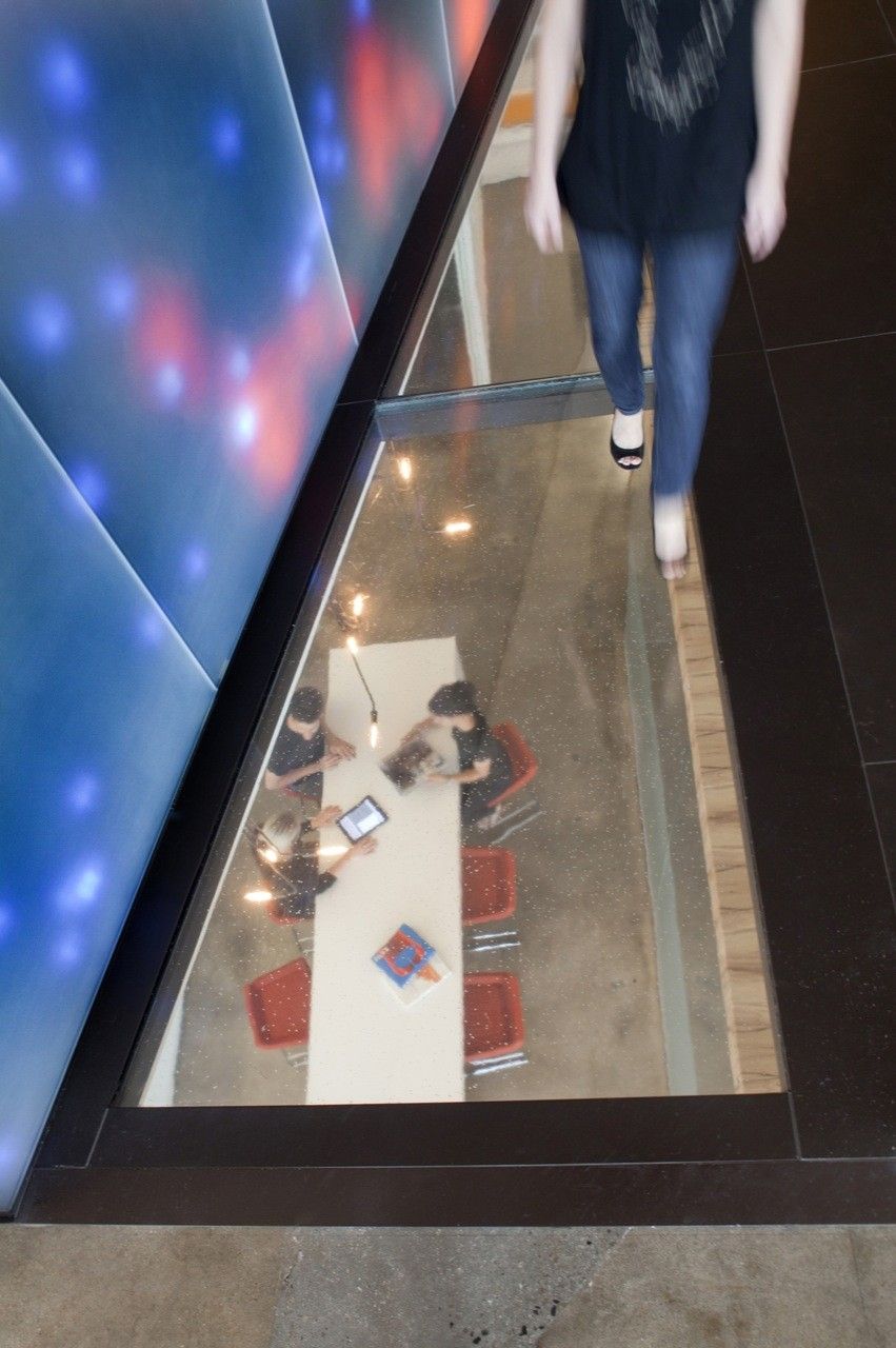
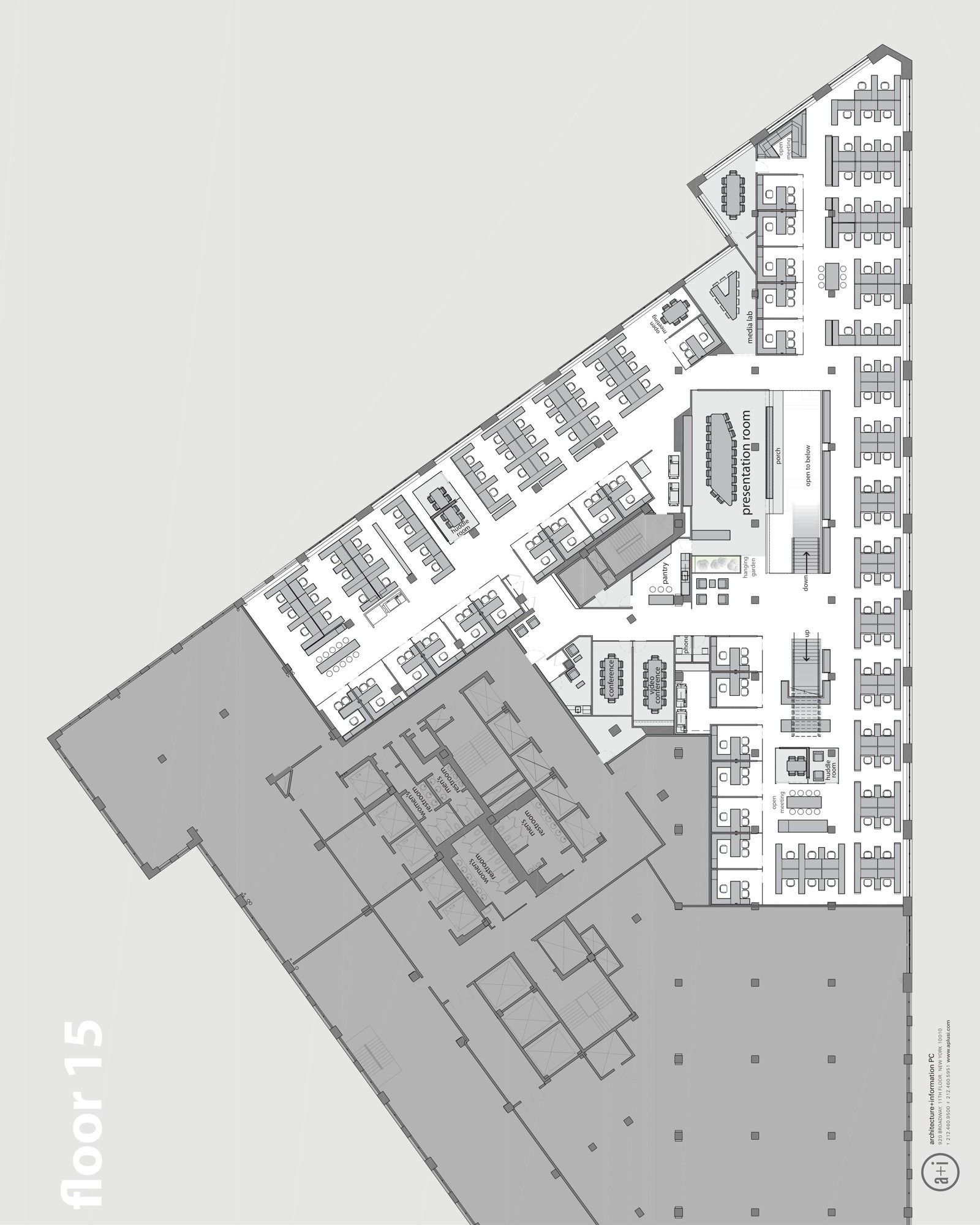
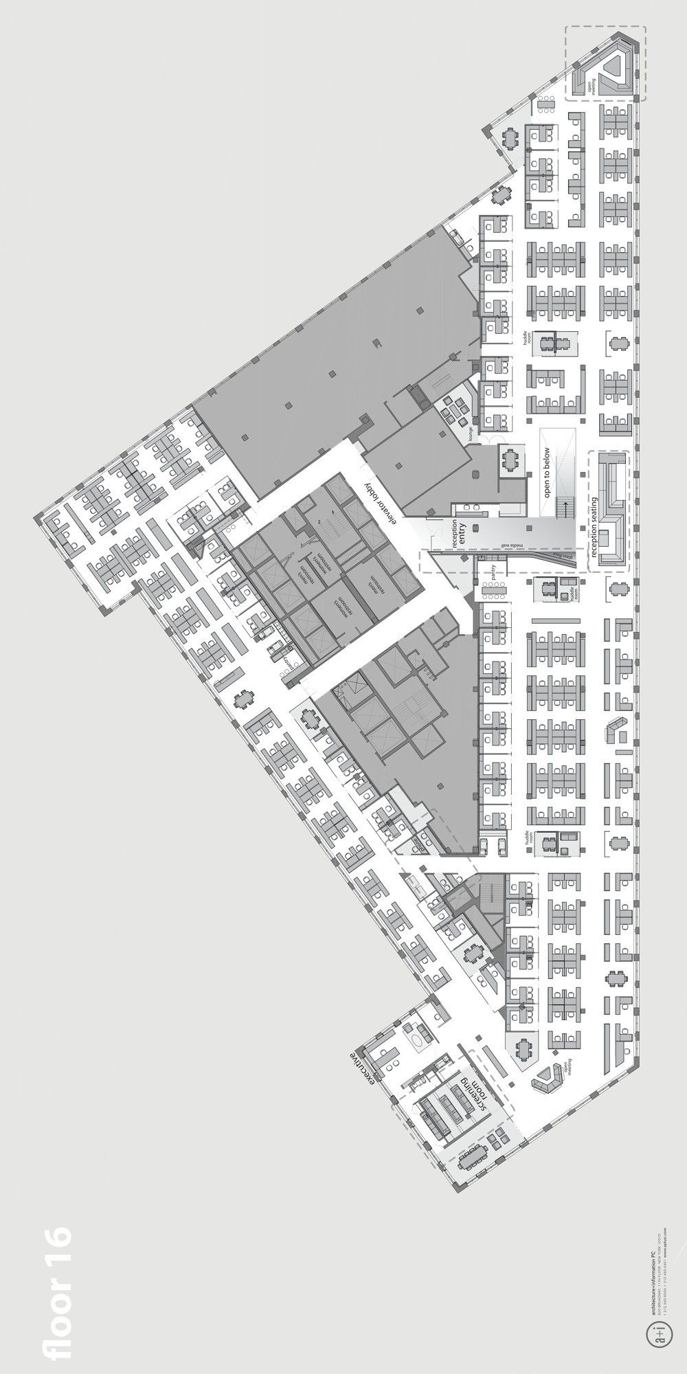
Opening the 3 floors with an internal open stair was the most important move in literally connecting the company. Because both flights of stairs are configured in a straight run, from the 16th reception one can see all the way to the 14th-floor social space, so visitors and employees get an immediate sense of the working environment of the company, not just the usual reception and boardroom. To democratize the space and to encourage employee circulation through areas outside of their department, important functions are located throughout the 3 floors. Reception and executive suite are on the 16th floor, the glass presentation room on the 15th floor is visible to all from the stair, and the main pantry, terraced seating area, and secondary presentation room are on the 14th floor. The entire staff can gather in the “dunes” seating area and around the stair for pep talks or presentations, a function that had previously required horizon to rent out hotel conference facilities.
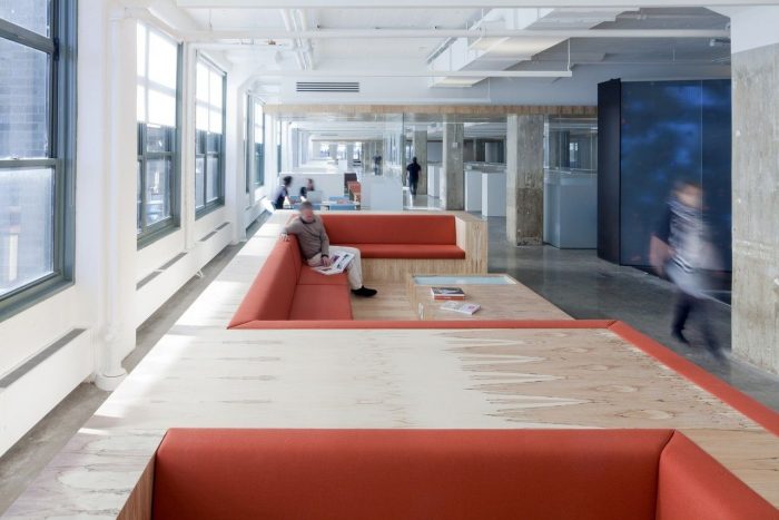
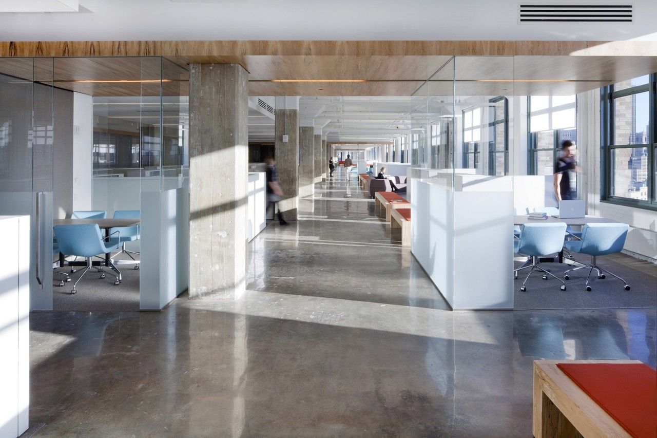
Also of key cultural importance was transitioning horizon media from an environment of almost 50% offices and high workstation partitions to a 20/80 office to workstation ratio with glass office fronts and low partitions. Offices are situated on the core with workstations at the perimeter, allowing light into the core of the building. To ease the transition for those leaving offices, varied functional amenities were supplied in close proximity to all: “huddle rooms” for quick meetings or focused calls, phone booths for private conversations, open lounge areas of various sizes, counters for standing meetings, as well as the usual large enclosed conference rooms for presentations and video conferencing.
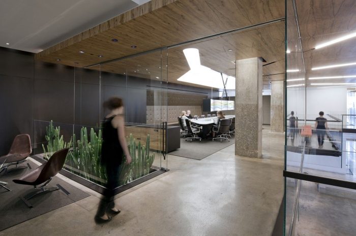
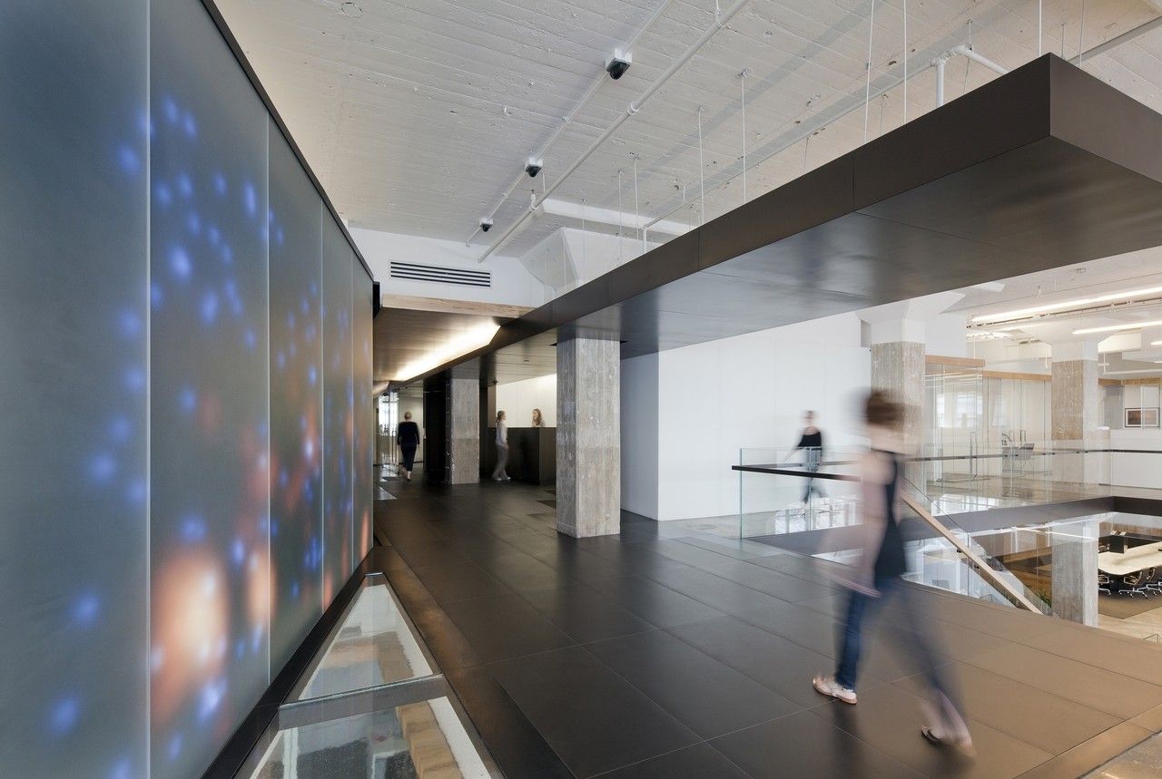
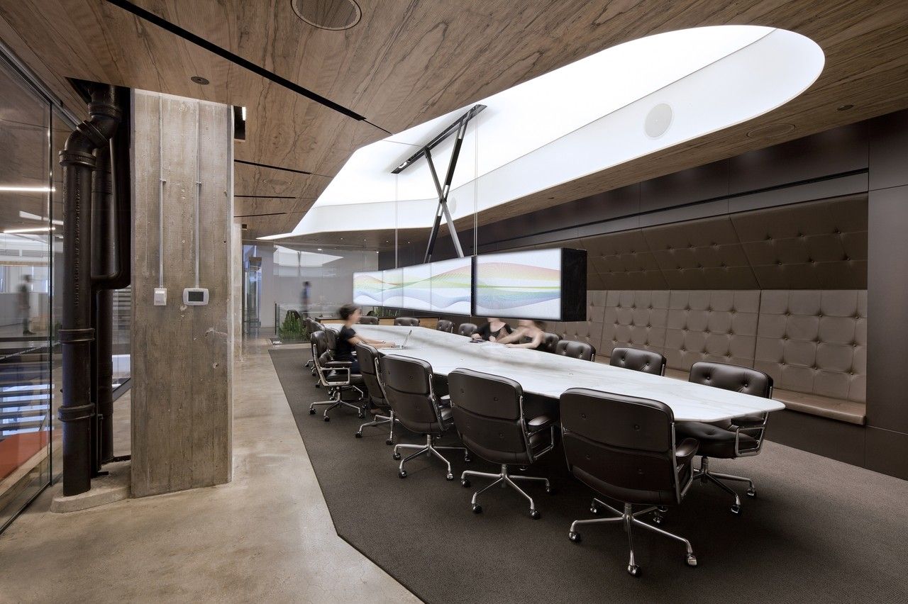
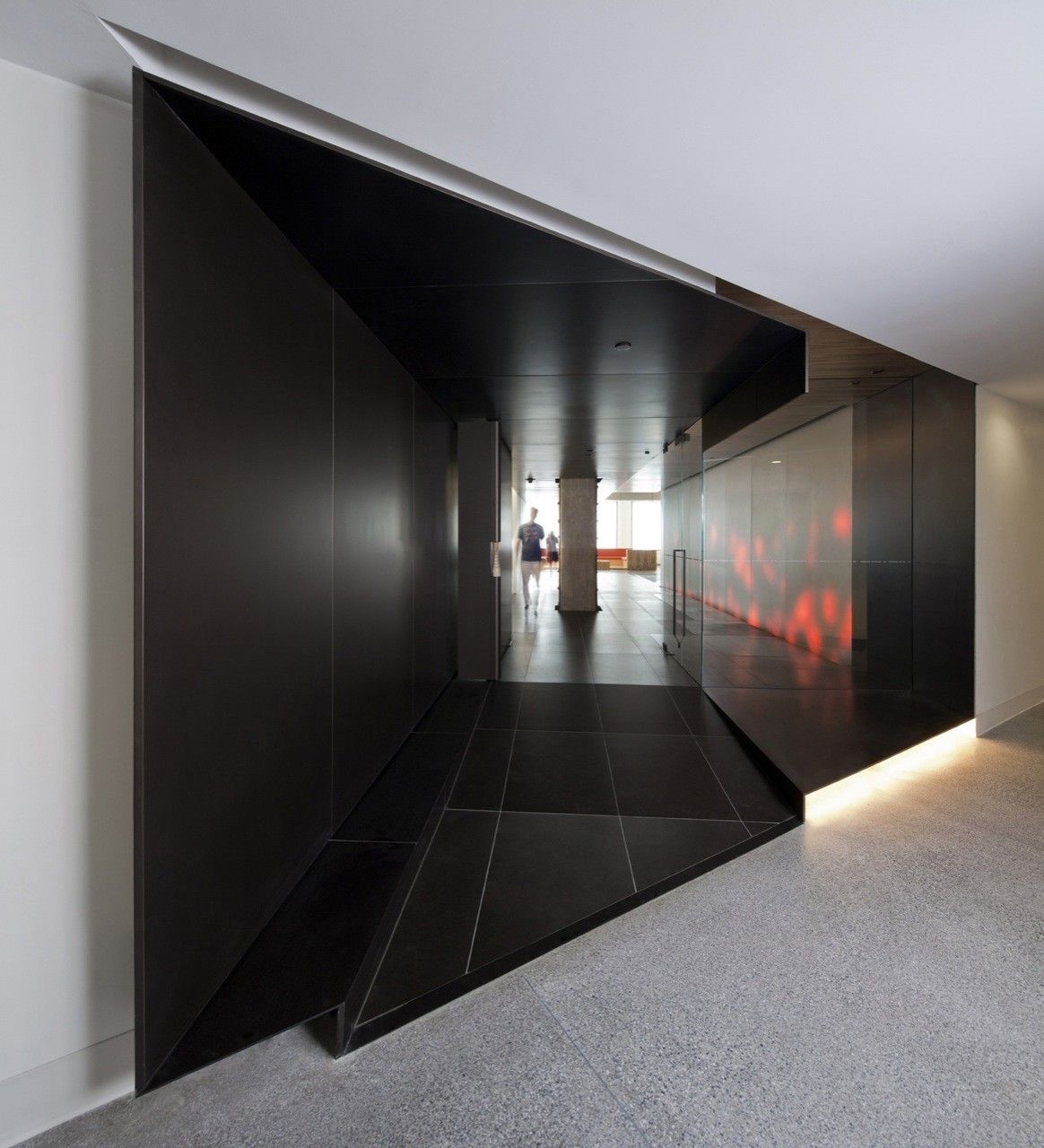
Technology plays an important role in the space. A retractable 10-monitor screen above the main presentation room table allows the presenter to sit face-to-face with his or her audience while presenting, and gauge reactions immediately. A 50′ long “media wall” flanking the reception passage senses and exhibits physical and digital activity within Horizon, as well as tracking the stock market, internet traffic, and other metrics. The executive screening room seats 20 people and can be used for a variety of functions.
Materially, a+i took advantage of the inherent qualities of the space and built on those resulting in a neutral palette with bright color accents in furnishings and millwork. The polished concrete floor provides a refined yet industrial finish. Steel finishes take cues from the existing steel column reinforcements visible at reception and other areas of the space. Spalted maple veneer, sourced from Vermont from felled trees, brings the warmth of wood with the delicate scale of the black lacy lines of the spalting. The largely white furniture and paint palette are bright, clean, and light. Solid surfaces of workstations front main circulation paths, minimizing visual clutter.
Project Info:
Architects: a + i architecture
Location: New York, NY, USA
Project Team: Dag Folger – Principle, Bradley Zizmor – Principle, Sommer Schauer – Senior Associate, Anastasia Amelchakova – Project Manager, Amy Mielke – Designer, Phil Ward – Designer
Client: Horizon Media
Area: 115000.0 ft2
Project Year: 2011
Photographs: Magda Biernat
Project Name: Horizon Media Office
photography by © Magda Biernat
photography by © Magda Biernat
photography by © Magda Biernat
photography by © Magda Biernat
photography by © Magda Biernat
photography by © Magda Biernat
photography by © Magda Biernat
photography by © Magda Biernat
photography by © Magda Biernat
photography by © Magda Biernat
photography by © Magda Biernat
photography by © Magda Biernat
photography by © Magda Biernat
photography by © Magda Biernat
photography by © Magda Biernat
Floor Plan
Floor Plan


