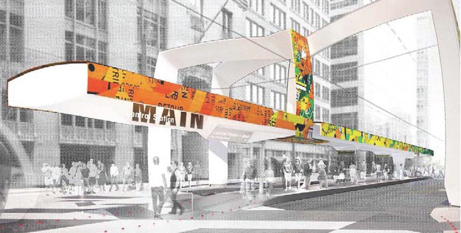
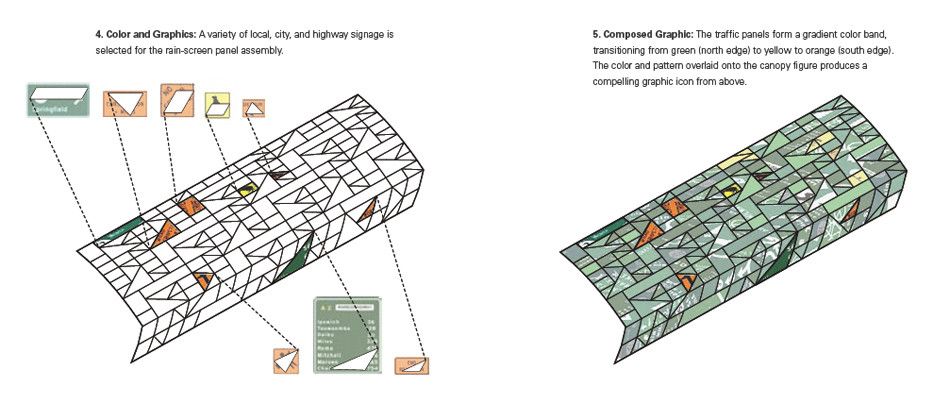
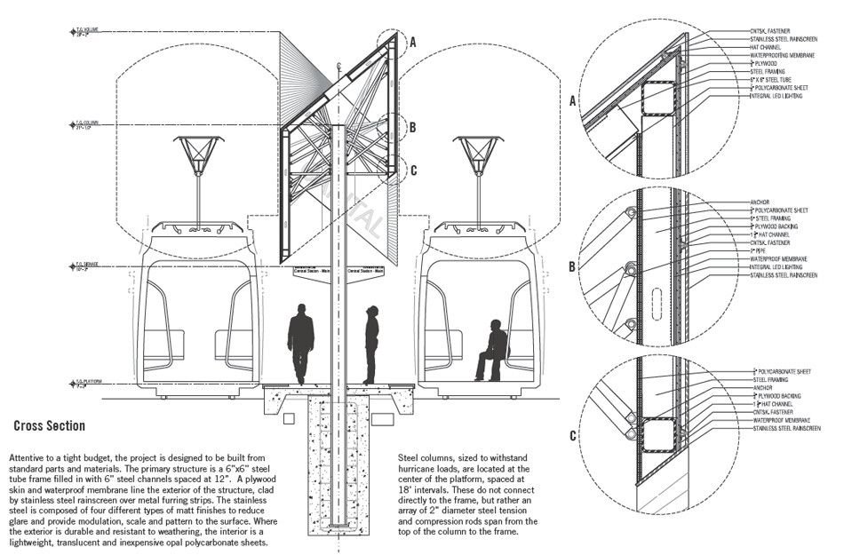
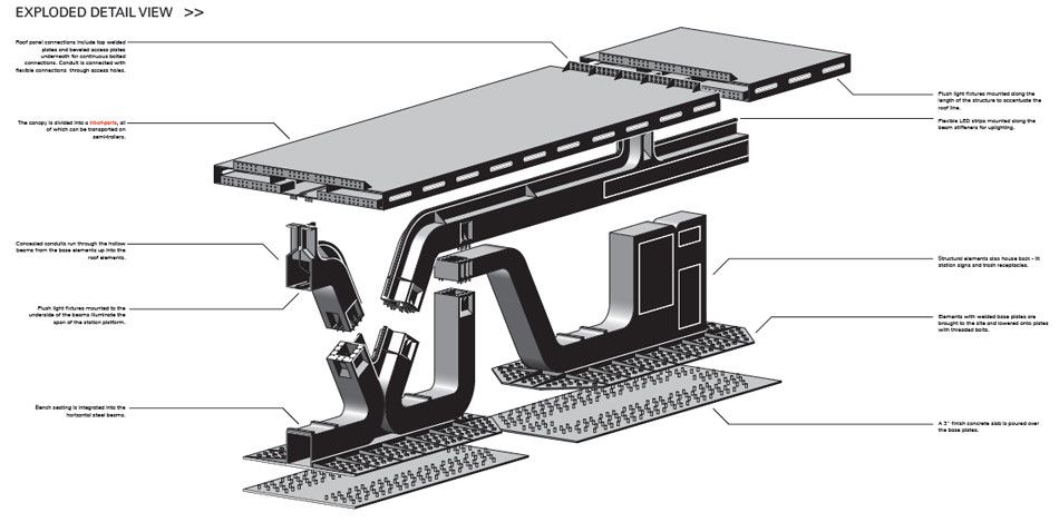
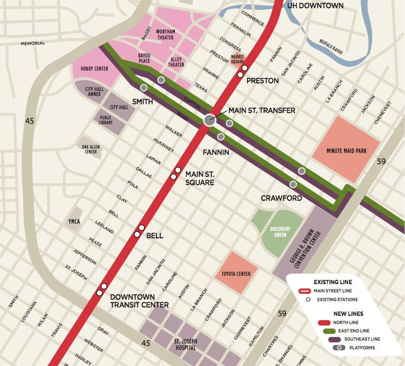
Five different architecture firms, proposed their ideas for the Houston Central Station Design.
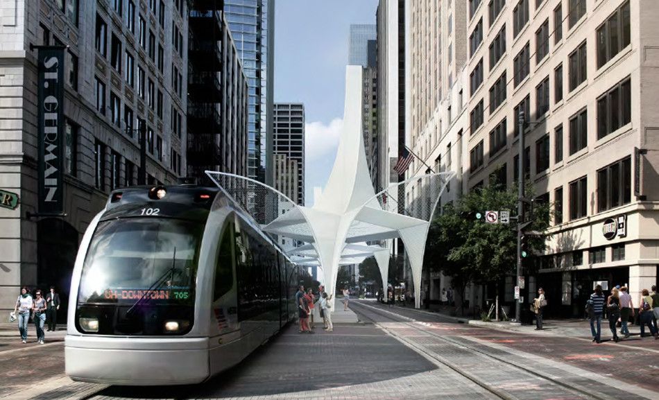
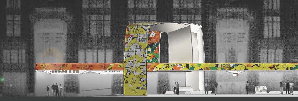
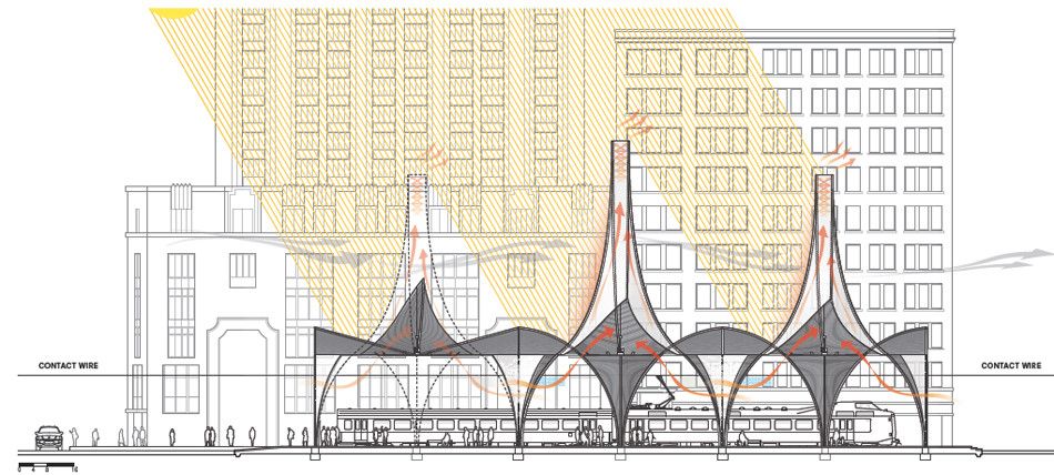
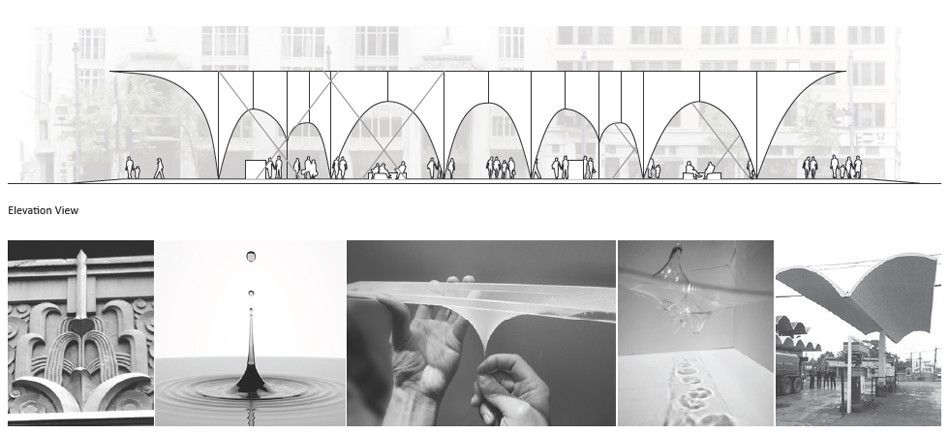
Shop Architects proposal; make use of the surrounding wind and natural lighting conditions with the use of chimneys. The chimneys use the surrounding wind to aid cooling underneath the structure through vents located in-between the columns, especially in warm weather. The chimneys also prevent the harsh summer ray due to there height offering for extra cooling and shading. The curvature of the columns and the chimneys allows rainwater to not settle on the roof and divert it away from the platforms.
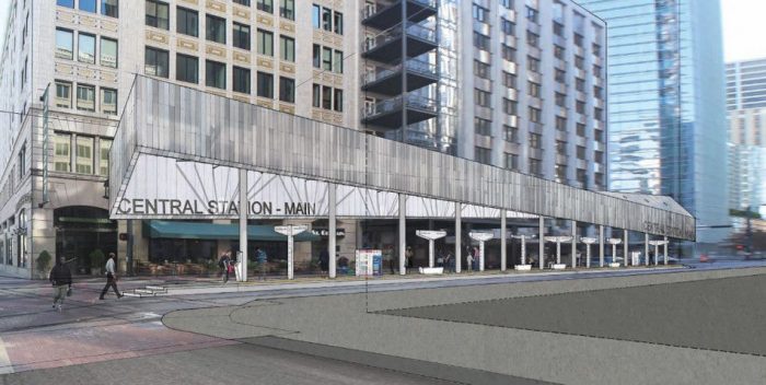
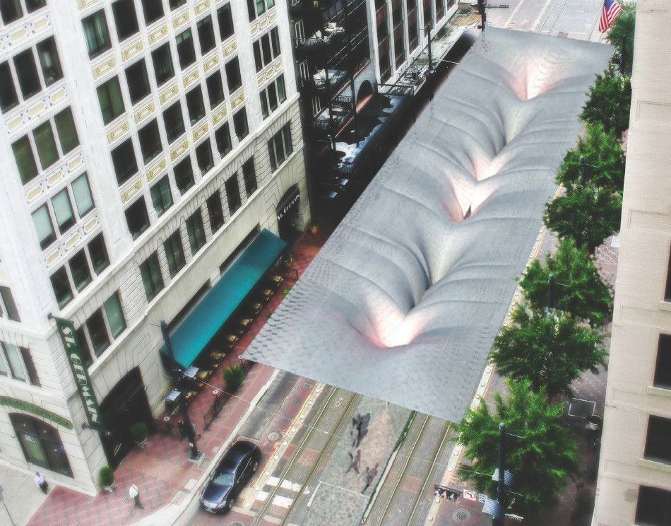
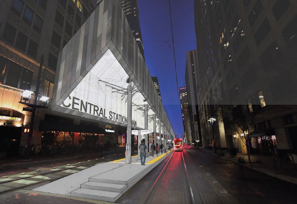
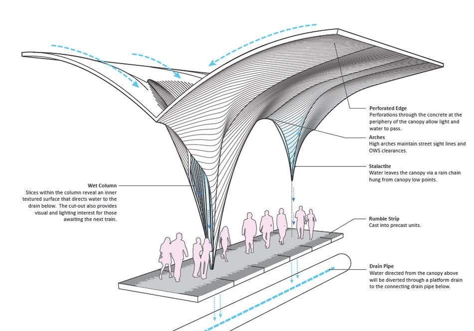
Snøhetta uses several design features to aid there deign environmentally and physically. The structure uses a series of central columns in aiding the support of the structure and its cantilevered wings. The wings are perforated to reduce its weight making it lighter and allowing light and water to pass through. The central region of the space takes the space of a funnel; the advantage for this is that it helps funnel the rainwater away from the platform to the underground drainage system.
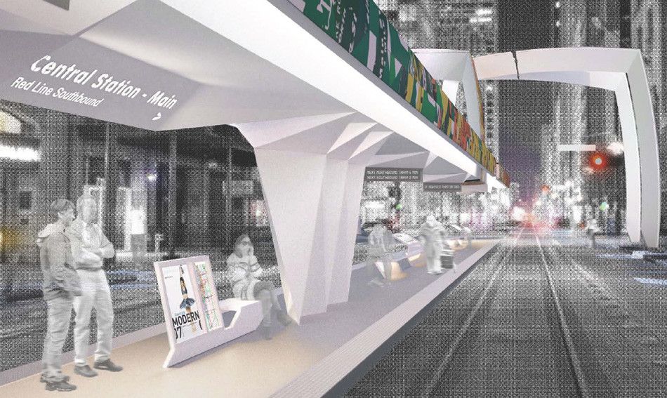
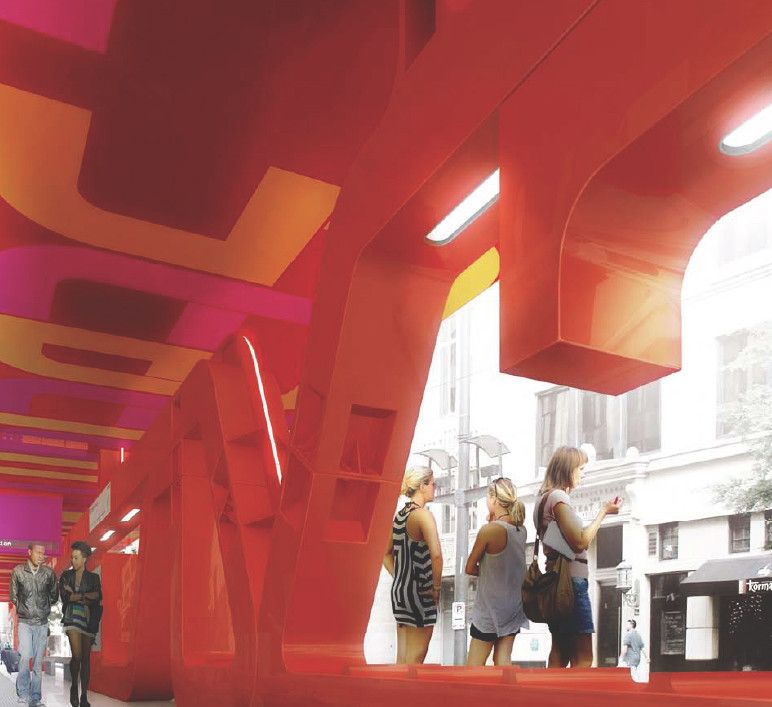
Neil M. Denari went for the approach of using something rigid and quite block like. The use of bold letter in this case serves three purposes. The first is something structural supporting the structure, the second is to make a statement to those in the immediate area and third a potential seating area.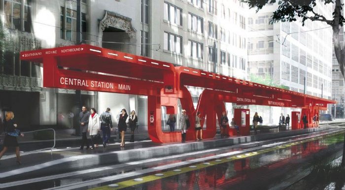
 Interloop’s approach is really to minimize the number of central columns needed. To do this they used five columns, four located within the central area of the structure at either side supporting the structure from above. Finally the last column is located at one of the ends of the platform to prevent any turning motion.
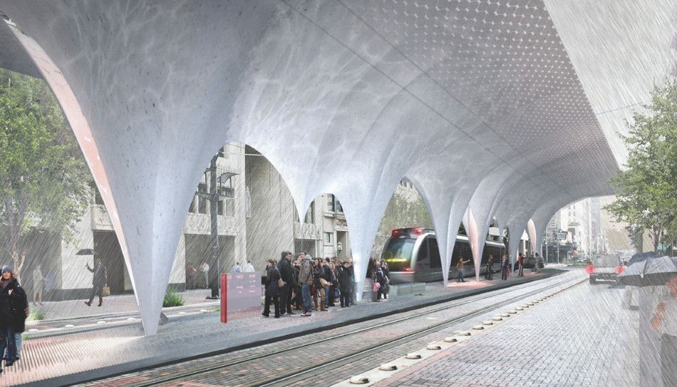
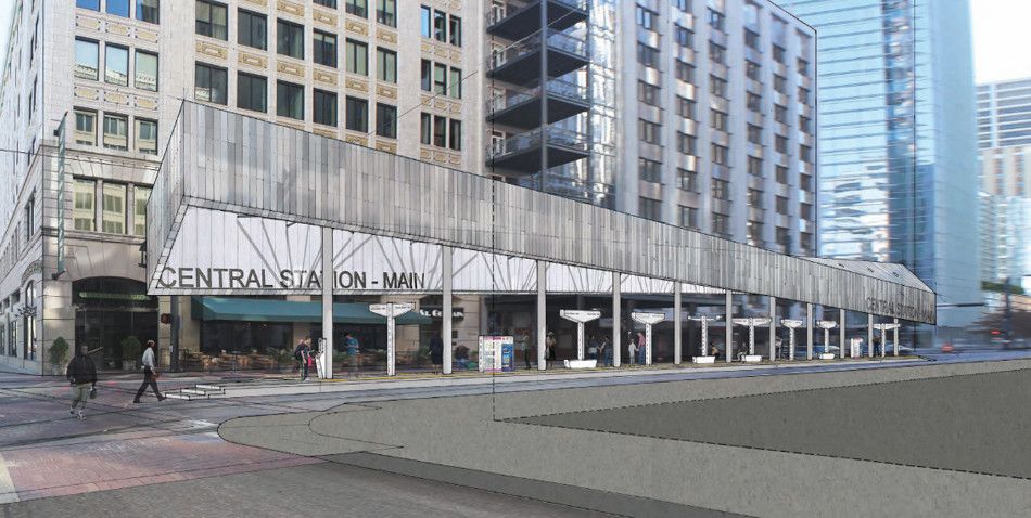
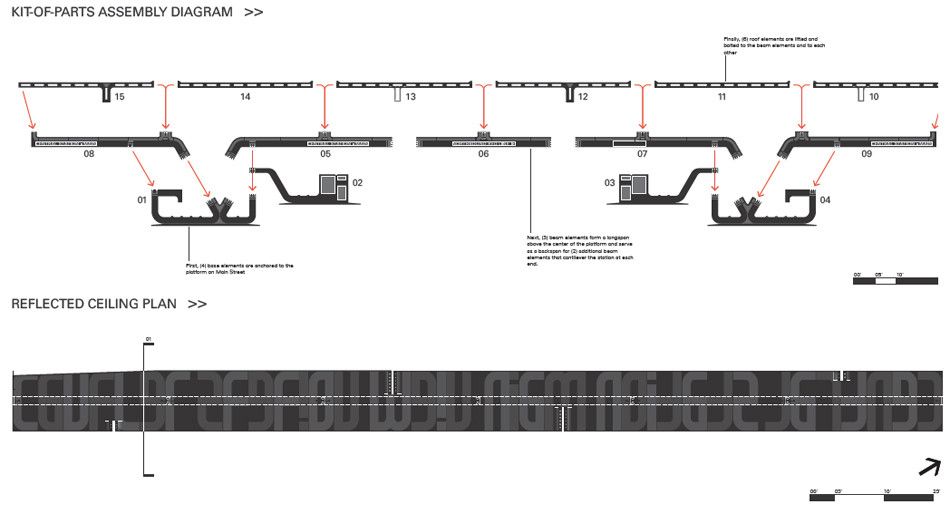
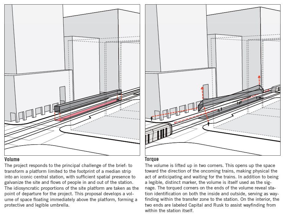
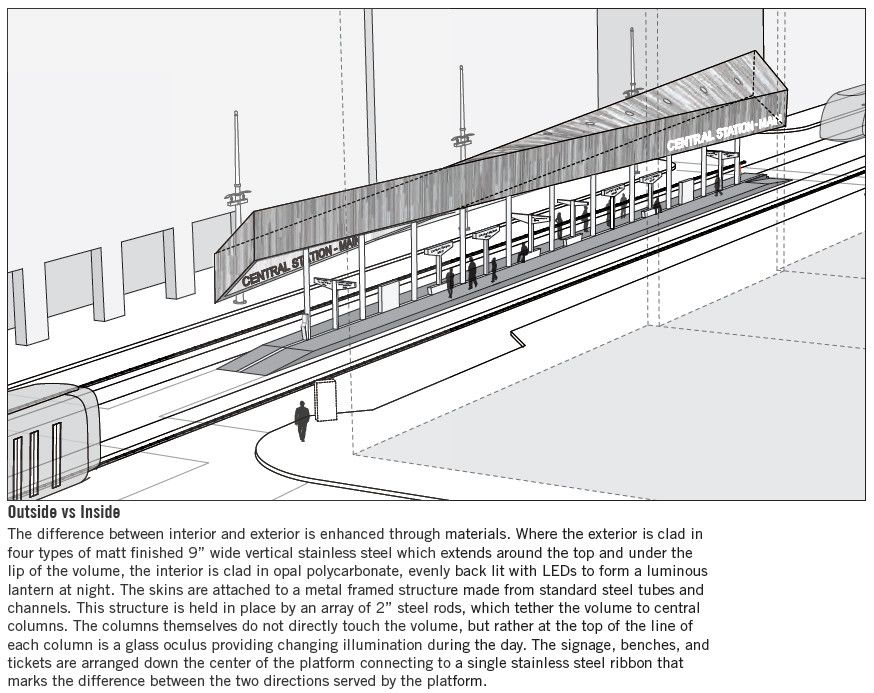
 Lewis Tsurumaki Lewis uses several columns to support the roof structure. The roof takes the rectangular shape, which was altered by skewing the opposite ends of the roof. This modifies the simple rectangular shape into something more interesting.
By Shanaire Blythe
Diagram
Detail
Detail
Detail
Diagram
Diagram
Plan
Section
Section
3D


