ING Group Headquarters Meyer & Van Schooten Architecten
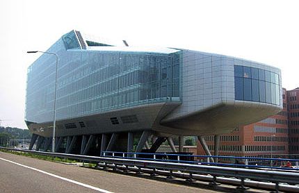
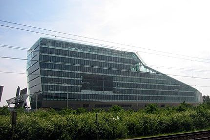
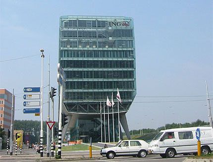
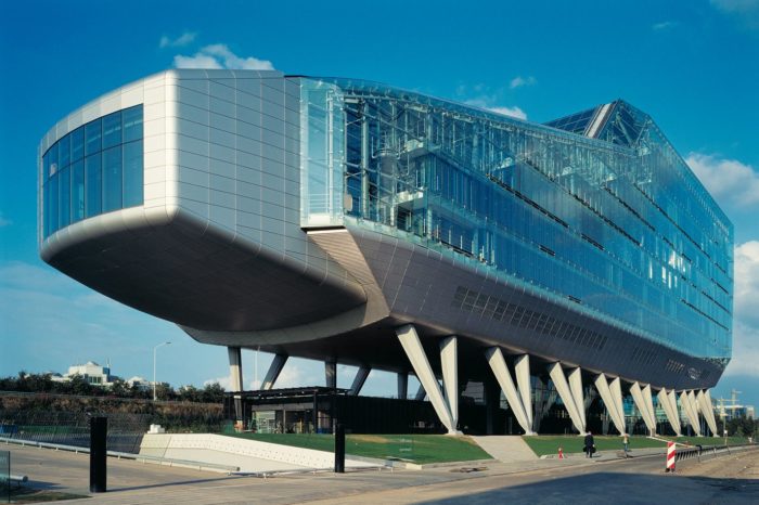
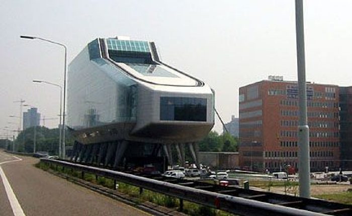
The ING Group headquarters is located in Amsterdam and was constructed to symbolize the banking and insurance conglomerate as a dynamic, fast-moving, international network. It occupied a long, narrow site adjacent to the motorway ring around Amsterdam and is at the junction of two areas consisting of the cosmopolitan high-rise of Zuidas and the green zone of De Nieuwe Meer. Because of this location the building is kept low on the green side of the site with a cantilevered auditorium and rises upwards on the urban side.
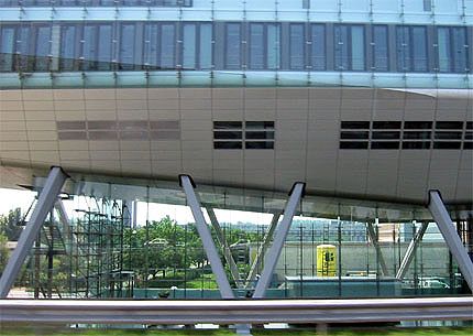
One of the more dominant architectural aspects of this project occurs at ground level. The building rests on stilts measuring 9 to 12.5 meters in height. This action was strategically performed so that travelers on the motorway still have a glimpse of the area behind the building and this way none of the offices have their views blocked by the motorway embankment as well. This architectural decision is further emphasized by having the entrance zone ensconced between the stilts.
Transparency, innovation, eco-friendliness and openness were the main starting points for the design. As far as sustainability is concerned, the building has an innovative interior environment control system. The double-skin façade allows natural ventilation while an advanced air treatment system and the use of an aquifer under the building and a mechanical pumping system provide cold and warm thermal storage.
By alternating open and sheltered spaced within the building, the interior is richly varied. Successive storeys intermingle and offer recurrent glimpses from one to another. The restaurant, large conference room and the auditorium contain panoramic views out towards the city. Atriums, loggias, and gardens, both internal and external, are then distributed through the building at various levels. It is difficult to determine just from pictures, however I get the sense that this building is rather large and massive, a bit contradictory to the apparent narrow site in which it sits upon though it definitely captures the idea of innovation as well as highlighting the dynamic quality of the business in which it was designed for.

