Innocean Headquarters Europe
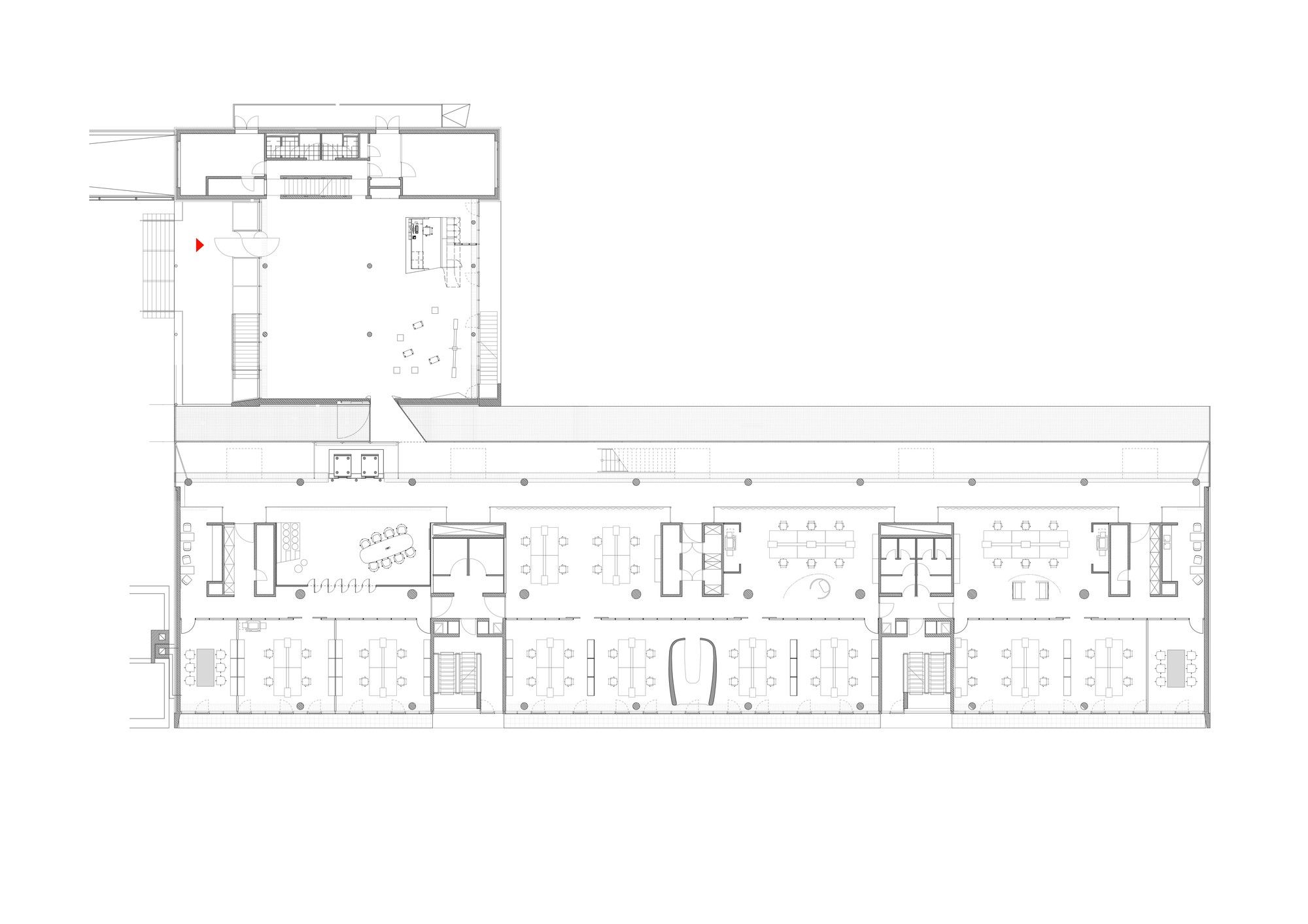
Formely based in Korea, the internationally operating advertising firm Innocean, has moved its headquarters in the business and financial centre of Germany, Frankfurt am Main. The Stuttgart-based architecture studio ‘Ippolito Fleitz Group’ was in charge over this project which was completed in 2013.
Innocean is a young and creative company, and for this it has received just what it fits this character. Ippolito Fleitz Group has created flexible spaces, full with dynamism and movement, without thinking solely about how the work space is formed, but also other activities around this.
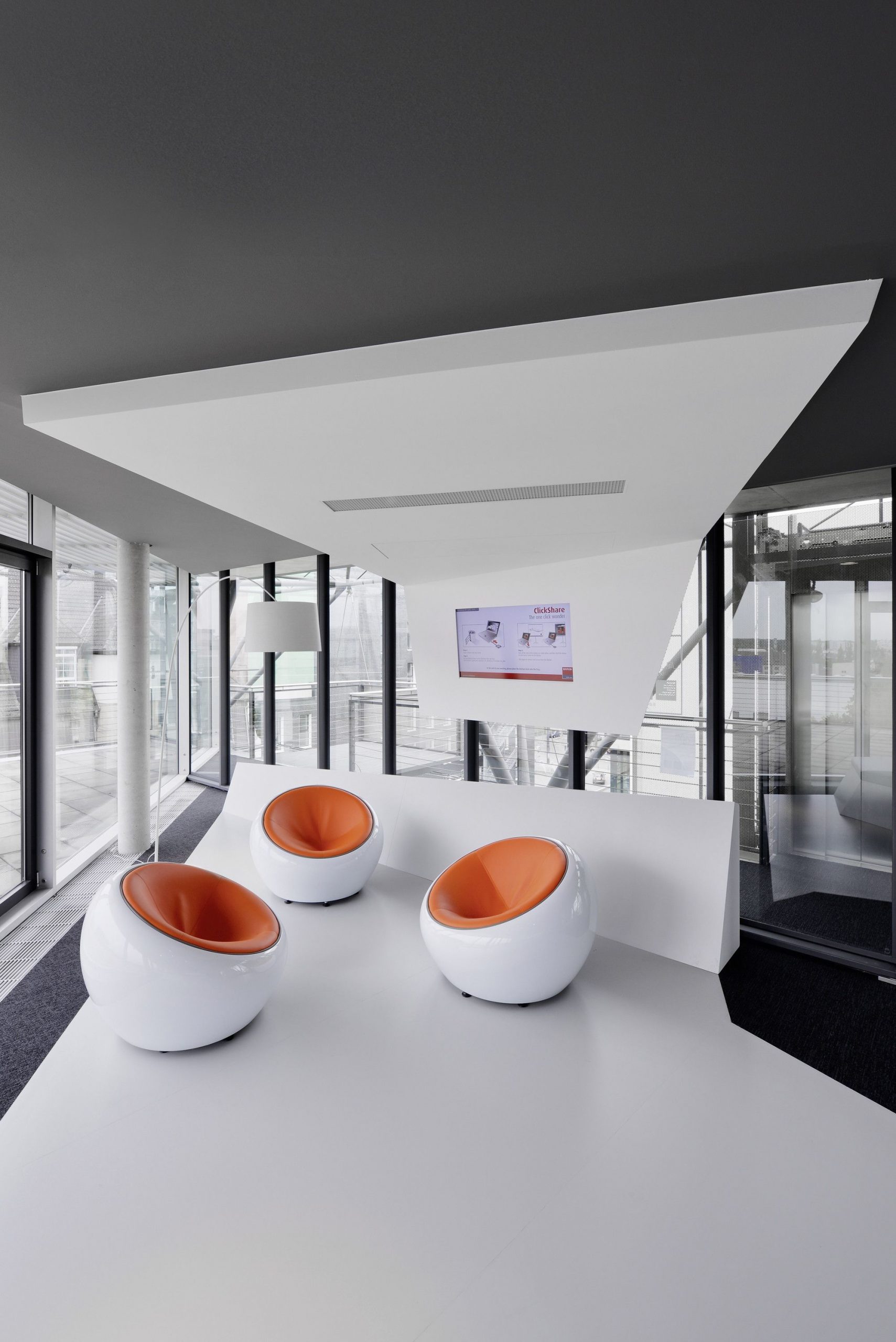
Employee library, spaces of rest and informal collaboration, and views over the city of Frankfurt through an employee gym, are some of the characteristics of how the blend between activities and functions has been achieved.
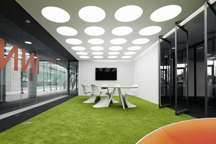
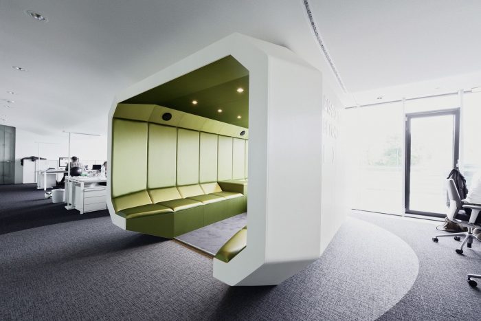
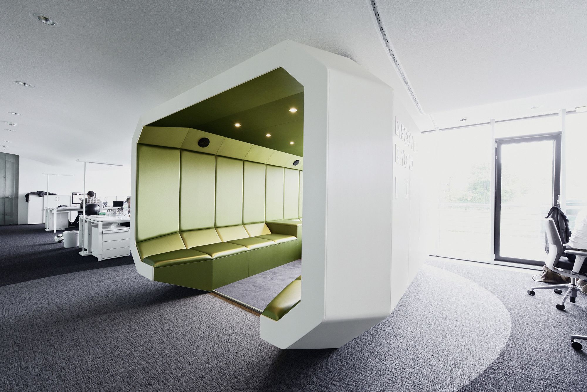
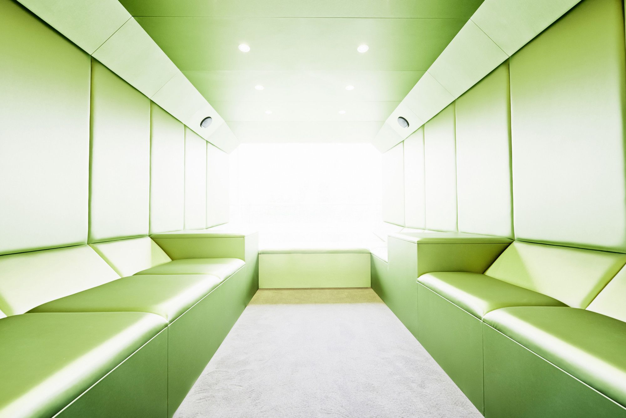
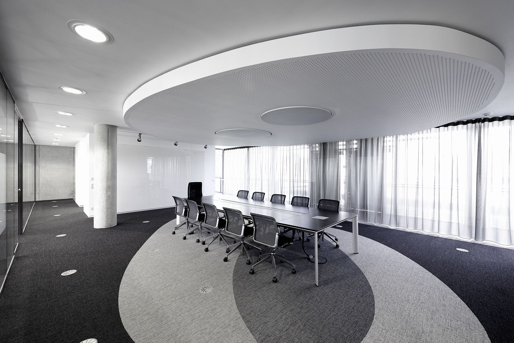
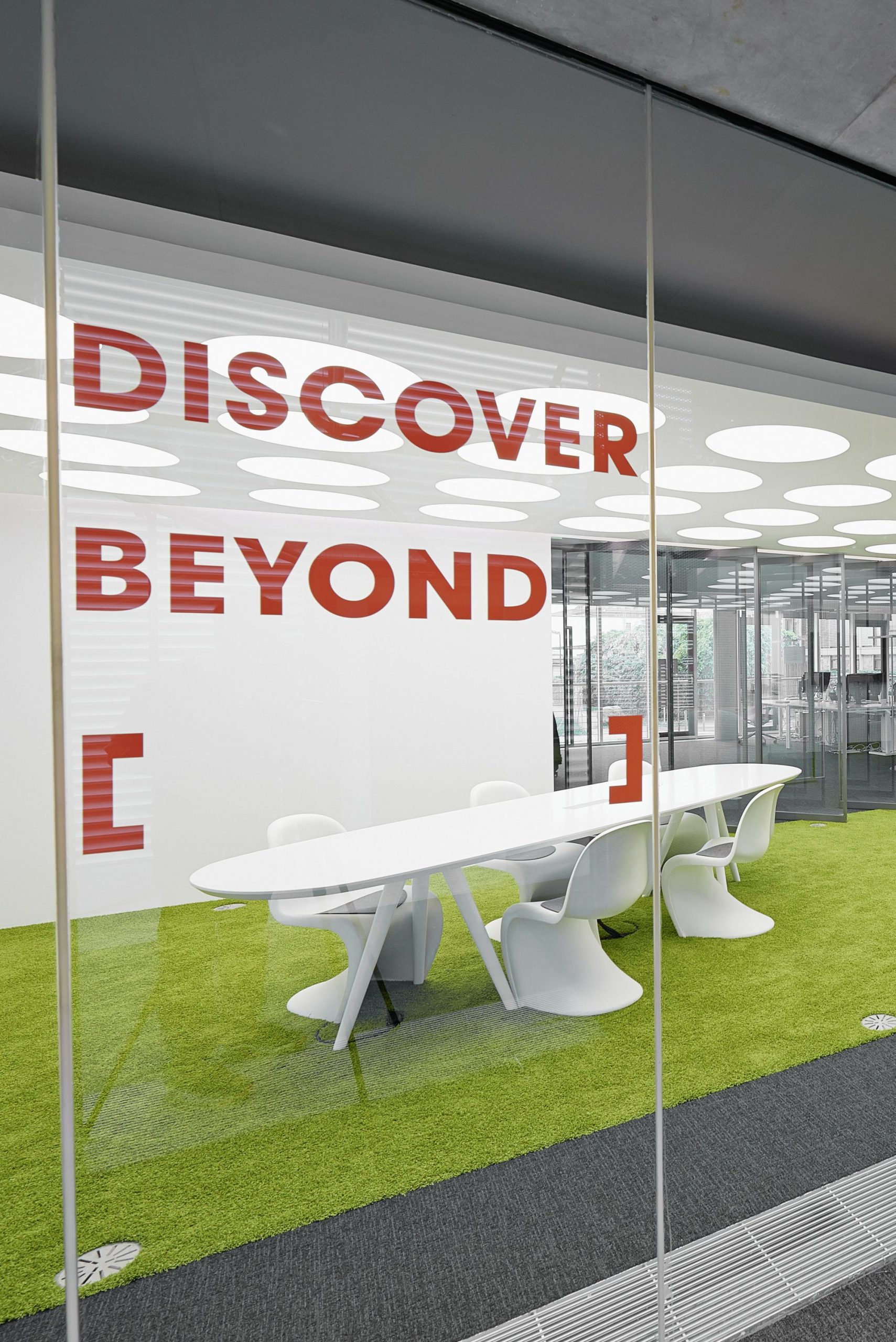
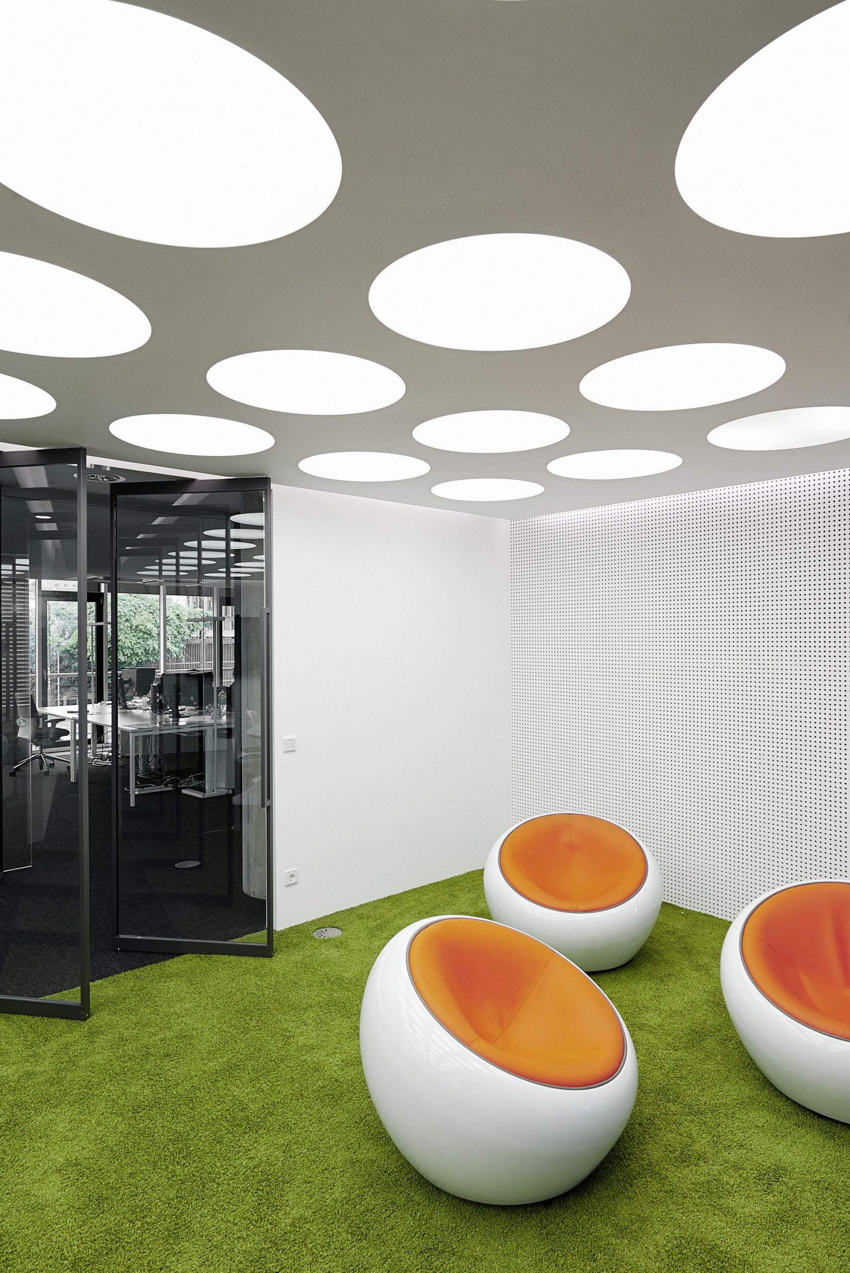
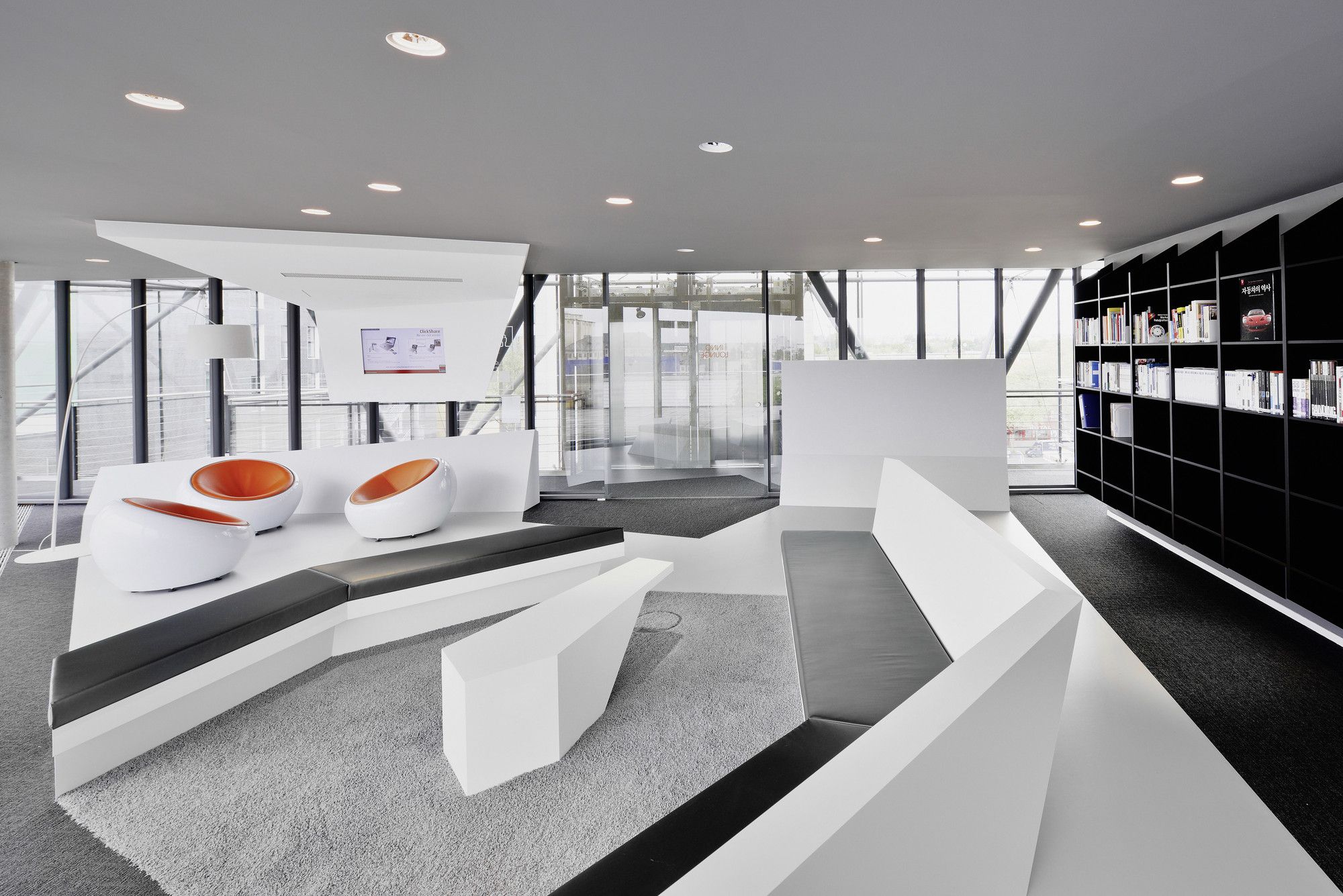
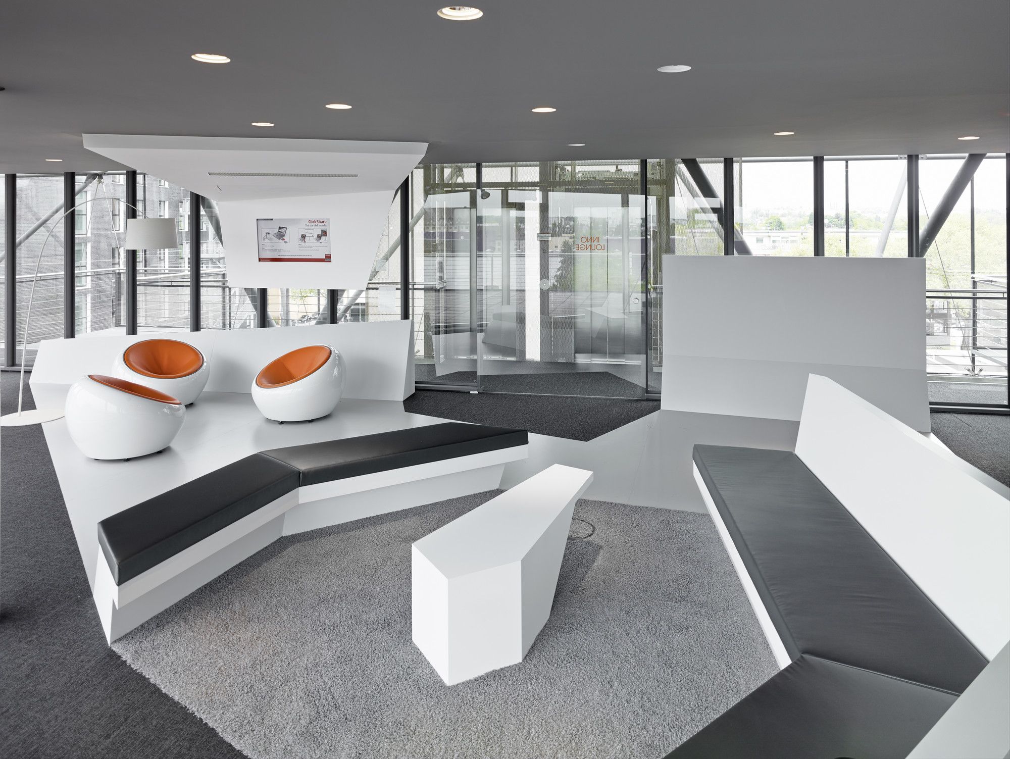
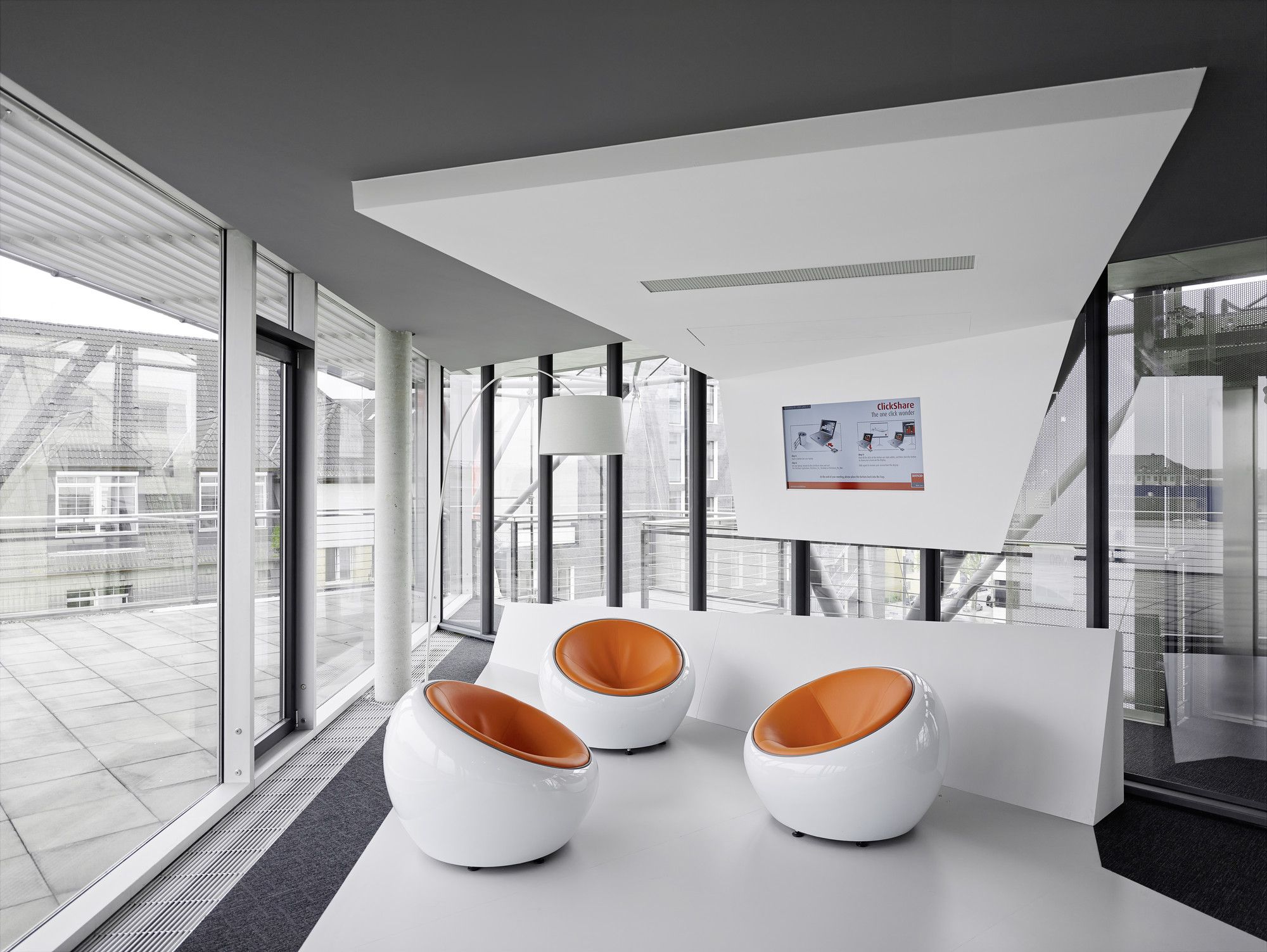
The advertising company sets out its standards in front of the eyes of the people, without having to look at any long manuals. Polygonal spatial elements that take the form of furniture are decorating each room, giving it unique function, look and feel. Furthermore, the use of different colour schemes across the spaces, according to the function, creates a specific atmosphere and sets an anticipation mood for the user before even entering it.
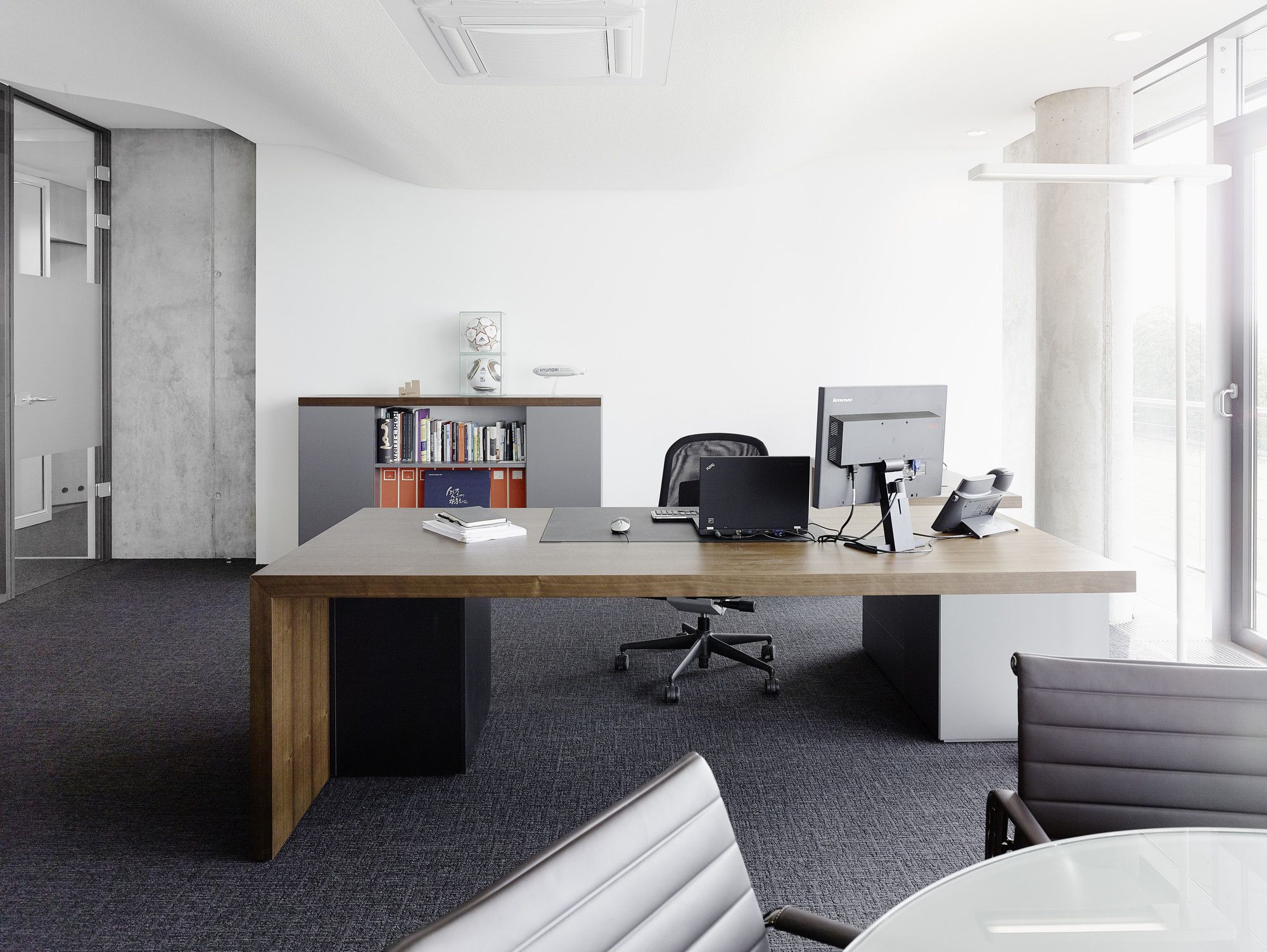
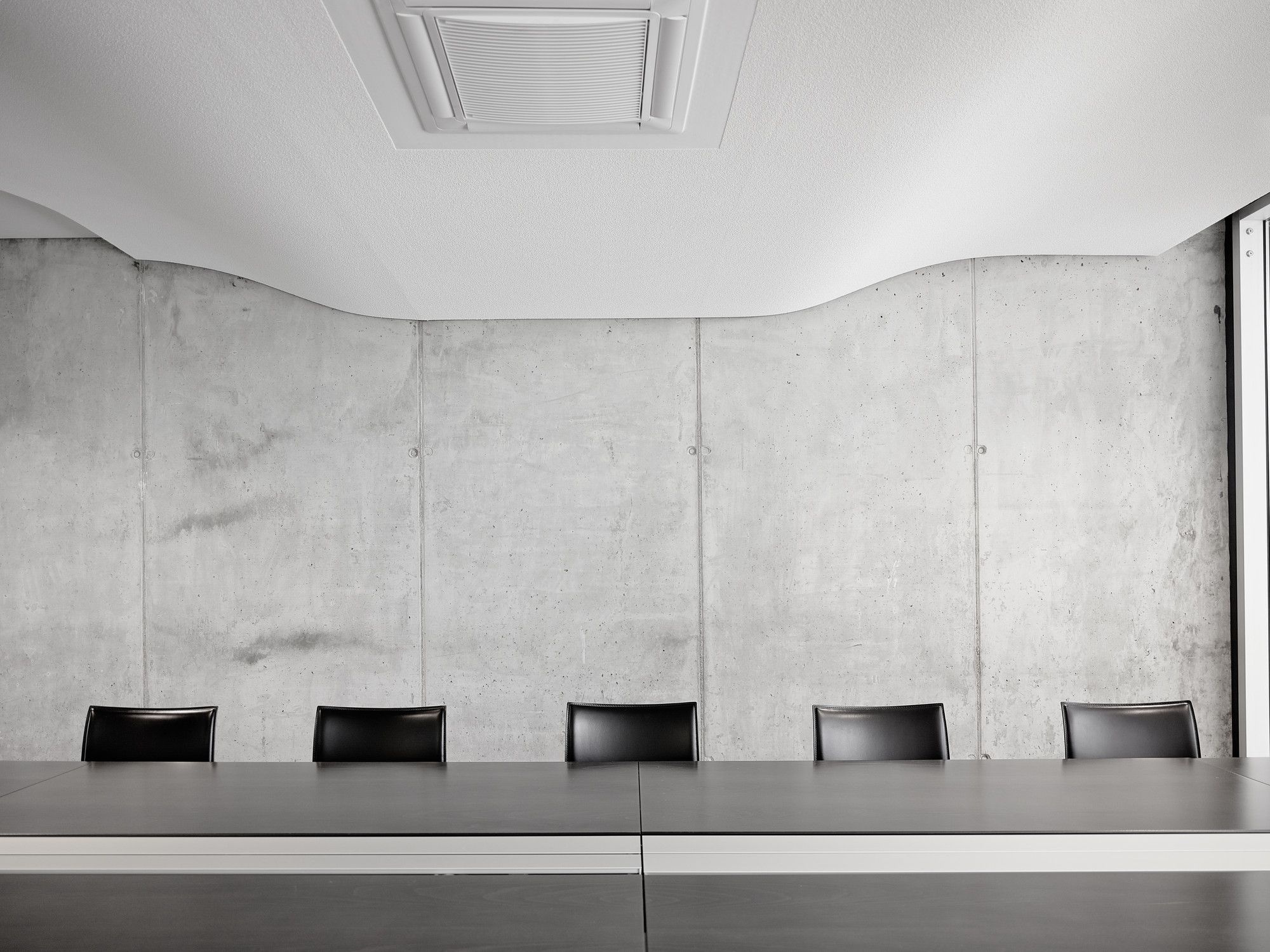
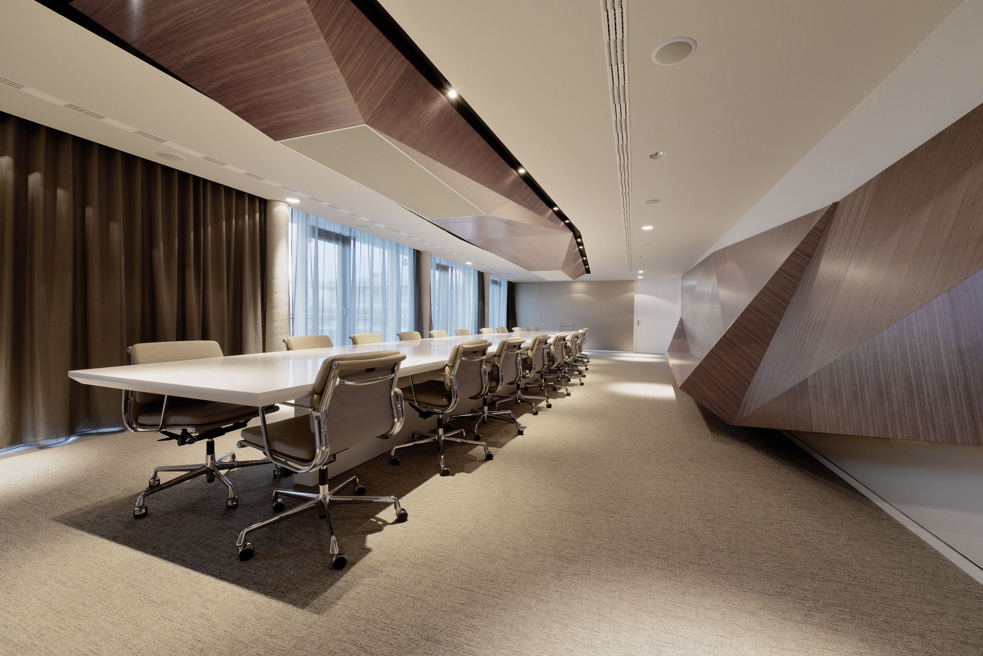
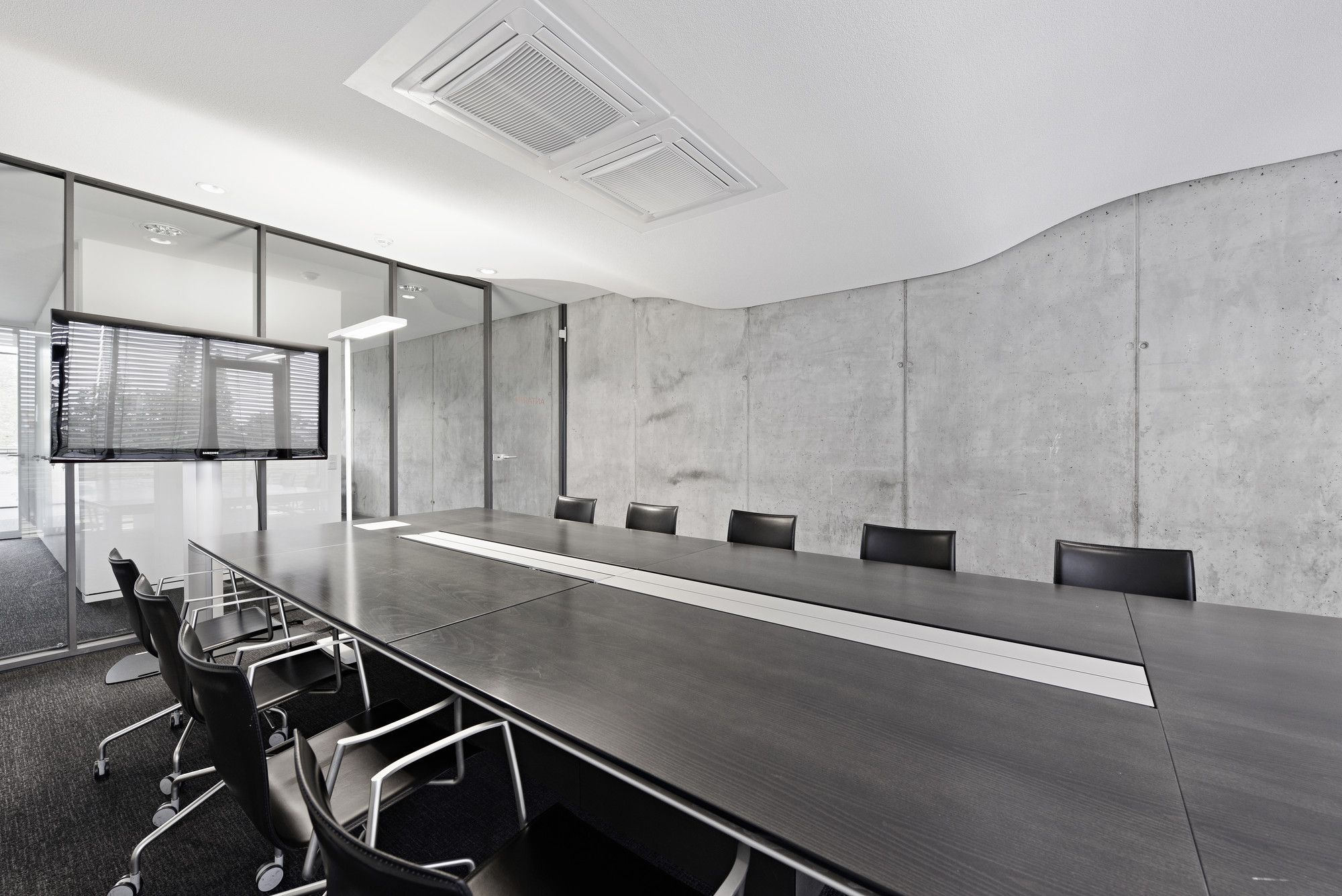
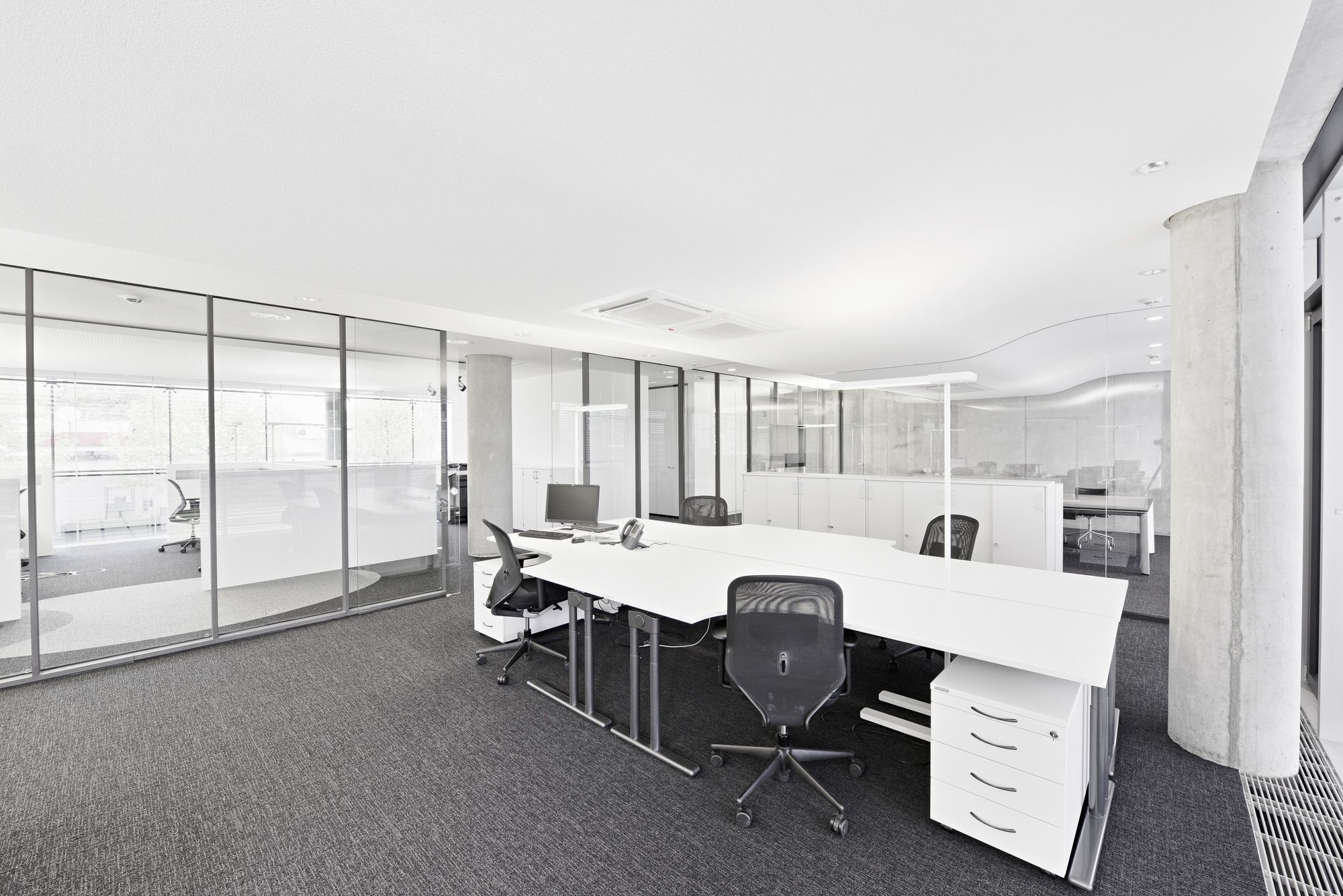
From rough to smooth textures, lit and darker spaces, exposed and non-exposes structural elements, and black to green create these diverse in character spaces, which make you feel like you are going into a completely different world. These elements guide you through the open work zones where privacy is flexible according to the purpose of the time.
Ippolito Fleitz Group prove that materiality is really important in the creation of interior spaces, and through this example, they teach us that it has to be an extremely considerate and careful decision process.
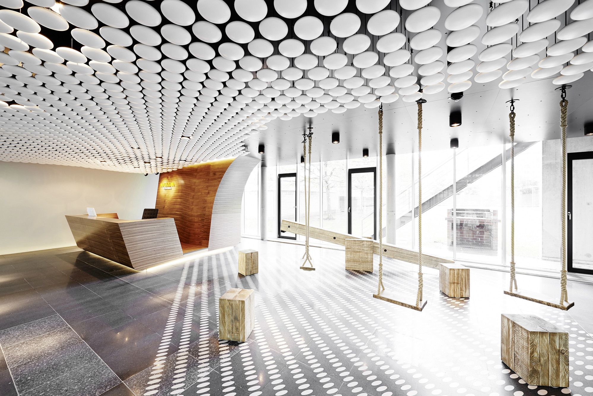
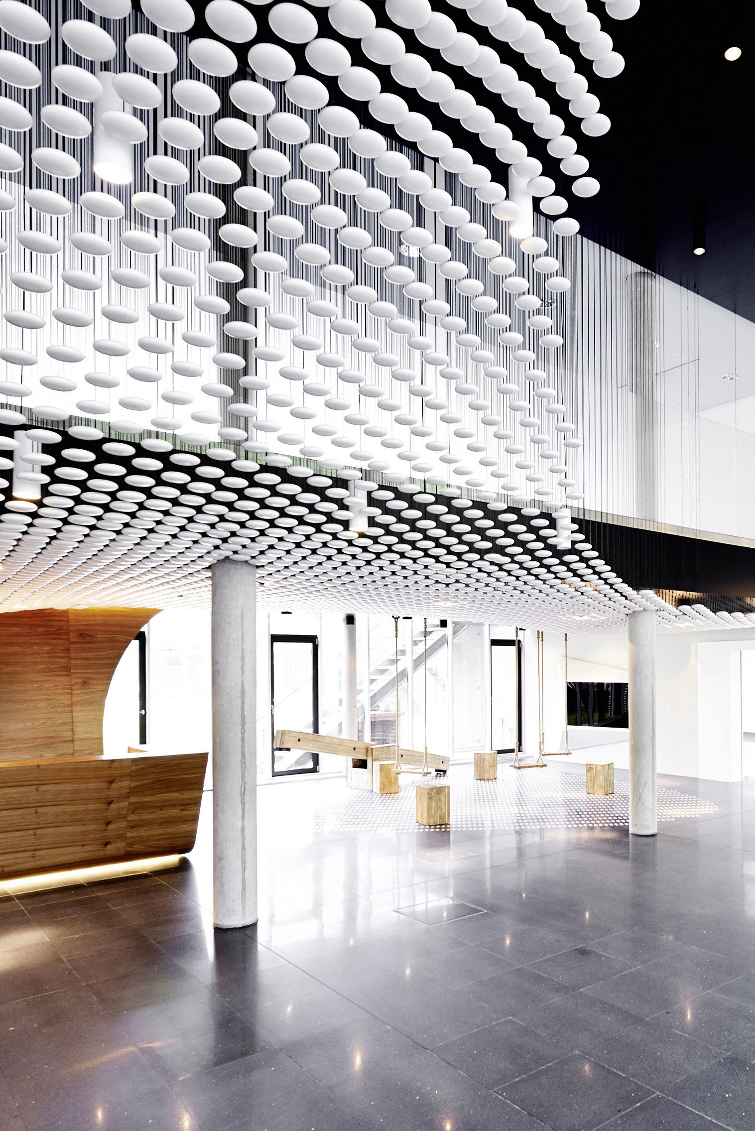
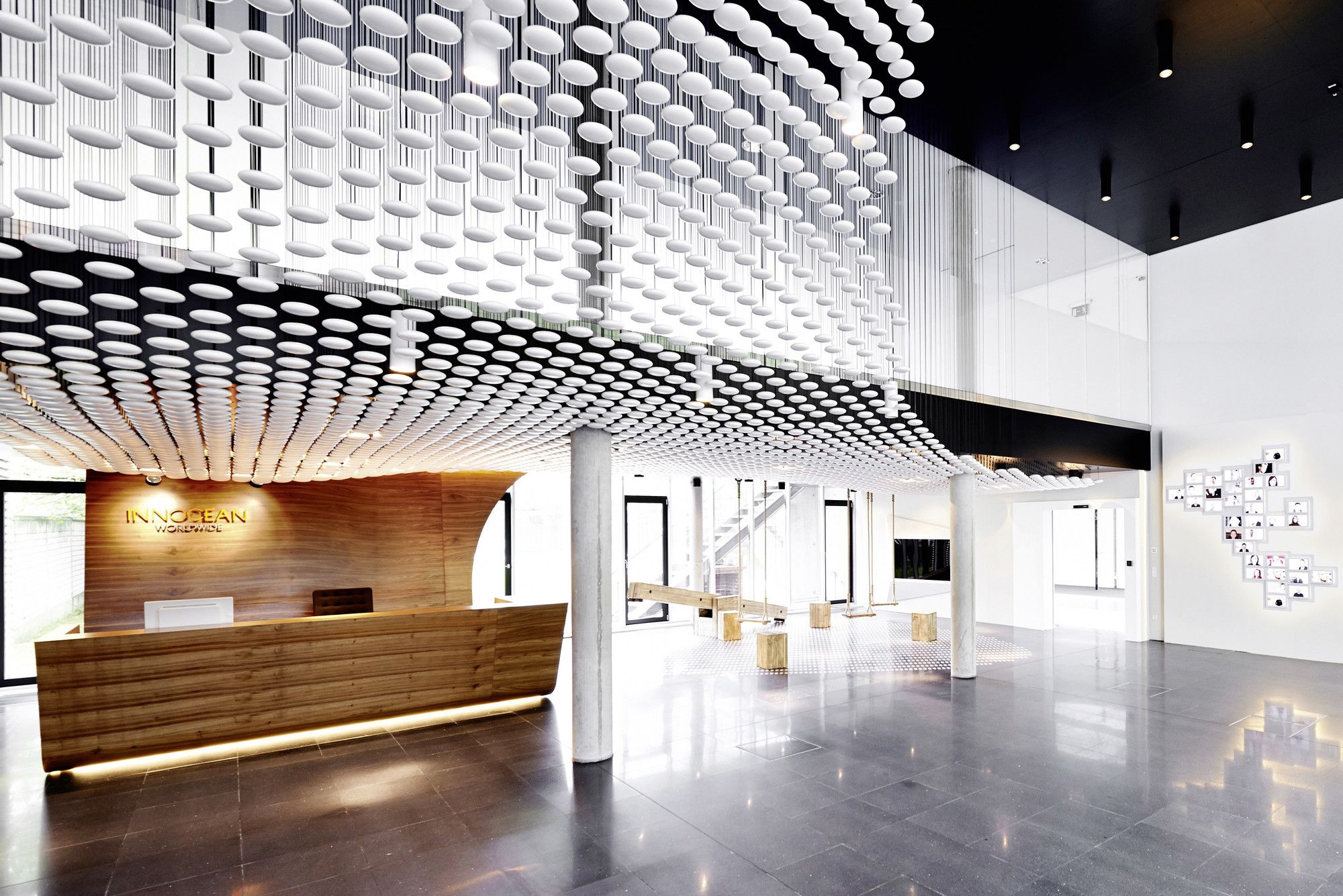
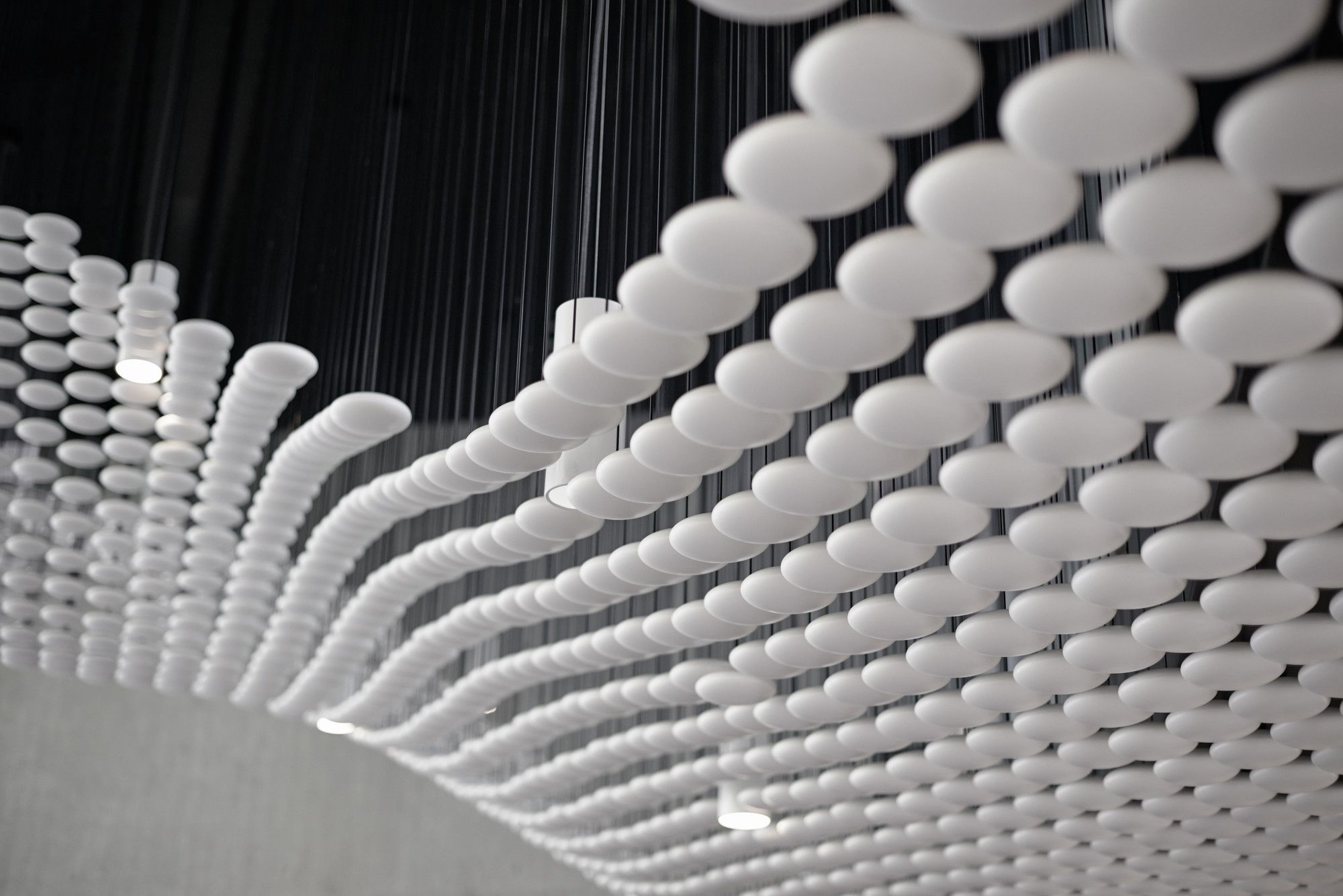
The entrance of the offices, make the visitors feel overwhelmed due to the well lit, wide and double-height space. This reception space, features a ceiling installation which consists of numerous circular disks that give a sense of movement and liveliness to the space.
Wood swing chairs and the captivating play of light, support the young and friendly ideology of the advertising company, welcoming new ideas and concepts.


