Finding ways to make cramped quarters feel more spacious is a common design challenge. While tiny living presents some design difficulties, it also has several advantages. However, before starting a significant makeover or even a minor revamp, avoiding a few basic interior design mistakes can make a tiny residence appear more cramped.
The Most Common Interior Design Mistakes
There are an astounding amount of interior design mistakes that are pretty simple to make, from picking the wrong furniture to underestimating scales. To help you avoid making these common blunders, we’ve enlisted the help of the finest interior designers and experts to share their best advice for avoiding these common pitfalls.
1) Poor Lighting
Because it’s one of the most common interior design mistakes, we’ve placed it upfront because we don’t want you to stop reading it before reading our helpful advice on lighting. Over and over, we observe that illumination is neglected. Lighting is one of the most noticeable improvements you can make to your house and should be prioritized accordingly. While good lighting can completely change the feel of a place, inadequate illumination can have the opposite effect.
How to fix it?
The key is to layer your lighting, which means using many different types of lights, each serving another function, to produce a pleasing overall effect.
Also Read: The 10 Common Mistakes Architecture Students Make
2) Excessive Home Furnishings
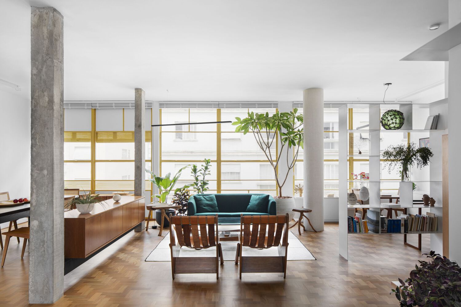
One of the most prevalent approaches to make a tiny room feels even smaller is to stuff too much furniture into it. However, just because your space can feel cramped because of too many assets does not mean you should eliminate them. Consider how you’ll use and navigate your sitting room’s limited space, for instance. Space planning’s ultimate objective is to maximize usefulness. This means interior designers and artists should not follow the latest trends or impose irrelevant or unnecessary features on a space.
How to fix it?
Suppose you’re dealing with a smaller living room layout. In that case, we suggest laying out a big carpet as a focal point for the plan and then developing from there, choosing varieties from the rug and enhancing the room accordingly.
Also Read: 7 Mesmerizing Sofa Ideas for Small Living Rooms Worth Embracing.
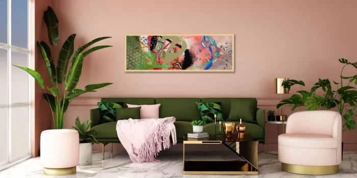
3) Placing Artwork at an Unsuitable Height
The search for the ideal work of art to adorn your walls is only half complete. When Artwork is displayed at an inappropriate height or in a unique location, it immediately draws the attention of art experts. It’s unwise to be overprotective of the spot where your Artwork is displayed. The fact that you paid for an expensive piece of art doesn’t change the fact that it looks great above a shelf in the entryway with a lamp and some books surrounding it.
How to fix it?
Put Artwork in a covert, offbeat spot. It would be best to aim for a height roughly at or below the level of the viewer’s eyes.
4) Avoiding Thorough Lighting Tests of Paint Colors
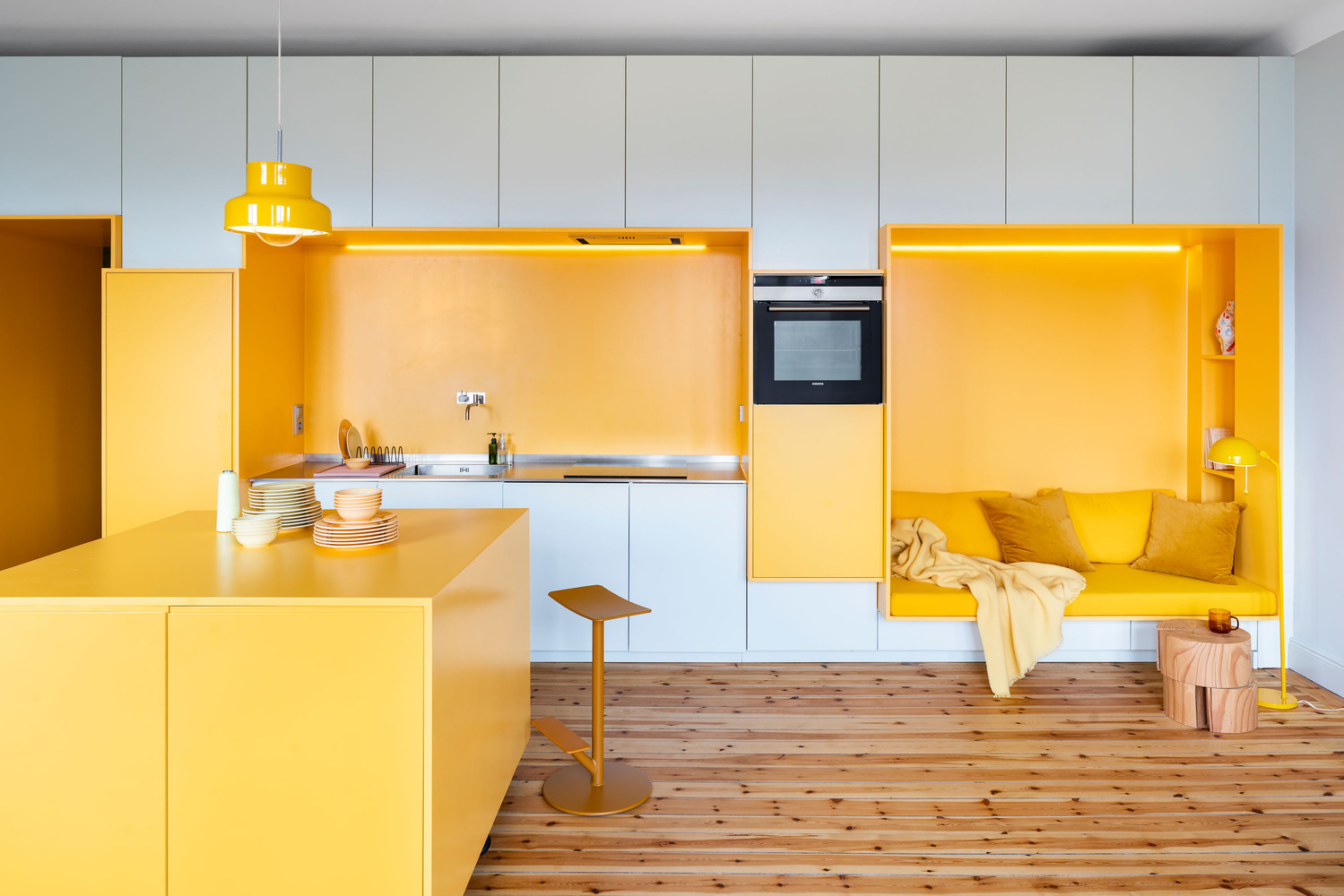
Each room’s paint color also alters the overall feel of the design depending on the time of day and the amount of light entering the space. Avoiding a pricey repaint requires careful planning before settling on the best living room or bedroom paint hue.
How to fix it?
You should select a few representative paint swatches, paint some white index cards, and then stick them to the surfaces you plan to paint. Ensure you check out those hues during the day and at night, in sunlight and artificial light, to ensure your satisfaction. You’ll be amazed how many colors change appearance dramatically at various times of the day.
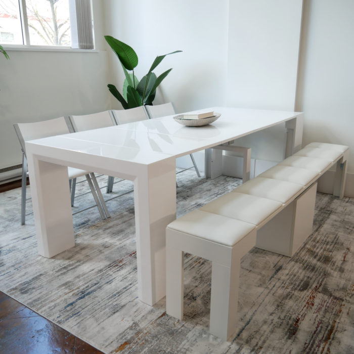
5) Investing in a Massive Dining Table
When planning the perfect house, it can be tempting to center your choices on the life you want rather than on practical considerations. Hosting lavish parties with long dining tables and other indulgences may be appealing, but the truth is often very different. When working with limited square footage, adaptability is of the essence.
How to fix it?
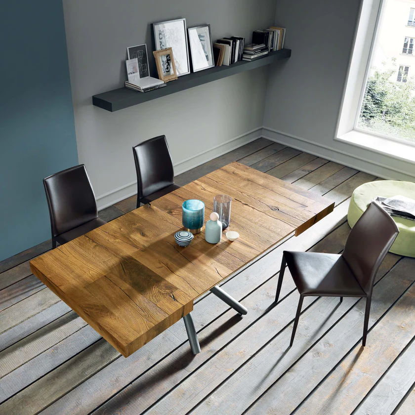
Select a round table that can easily seat additional people. Get a round table with a 36 to 42 inches diameter, ideally one that can be lengthened with leaves. For everyday use, it seats two, but when the company comes, it can accommodate up to six.
Also Read: 19 Glamorous Modern Dining Room Design Ideas That Will Astound Your Beloved Ones.
6) Placement of Furniture Perpendicular to the Wall
Interior designers say homeowners frequently make this easy design mistake when planning a space. People are fascinated with forcing their furnishings right up against the walls. But you know what? It doesn’t reduce clutter or make more room.
How to fix it?
Use accent grouping, or “conversational furniture placement,” to better organize your space. To create cozier, more functional seating, move the components closer together and away from the walls.
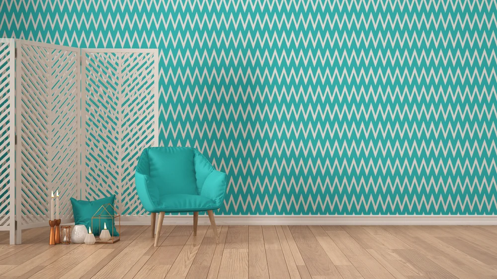
7) Miscaculating Wallpaper
How to fix it?
8) Not Heeding the Advice “Less is More.”
The adage “less is more” wasn’t coined without cause. Don’t make your house renovation more complicated than it needs to be by cramming unnecessary furniture into the space. It would be best to prioritize your needs first, followed by your wants. This facilitates prioritization and minimizes chaos. A clean house is a reflection of a clear head.
9) Mistakenly falling for the allure of matched pairs
Naturally, we want our home to appear put-together and tasteful. People often fall into the trap of purchasing all matching furniture sets because they fear the room won’t appear cohesive when the design is complete.
Having a table and seats that all go together is fine. However, there are times when a few contrasting chairs or a couch of the same design but a different fabric would help break up the monotony of such sets. Doing so can make your house feel more like yours and less like a showroom for mass-produced furnishings.
10) Faulty Curtain Measurement
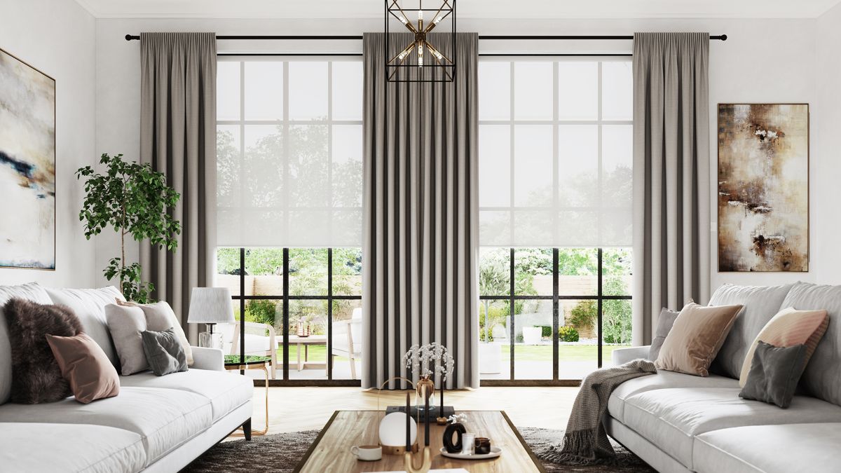
Choosing the wrong window coverings can be a pricey mistake because no one-size-fits-all cheap option meets every window’s requirements. Bespoke is often the only possible layout solution. One of the most frequent interior design mistakes is having too short curtains.
How to fix it?
While curtain style is a matter of personal taste, they should always be long enough to reach the floor with some additional puddle material. This serves the functional purpose of retaining heat during the colder months and makes the space appear more opulent.
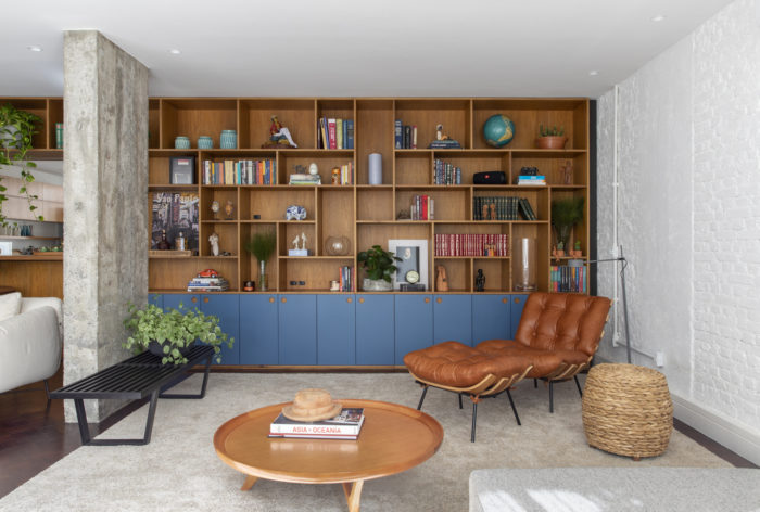
11) Miscalculation of Storage Requirements
The best-designed and most aesthetically pleasing spaces often share a feature: clever stowage solutions. As a result, you’ll ruin your room’s design and functionality by failing to account for storage from the start. The proper storage can bring peace back to a chaotic space, make a place for displays, and still look stylish. Many people view storage as a dirty term, but it can be helpful and aesthetically pleasing when done correctly.
How to fix it?
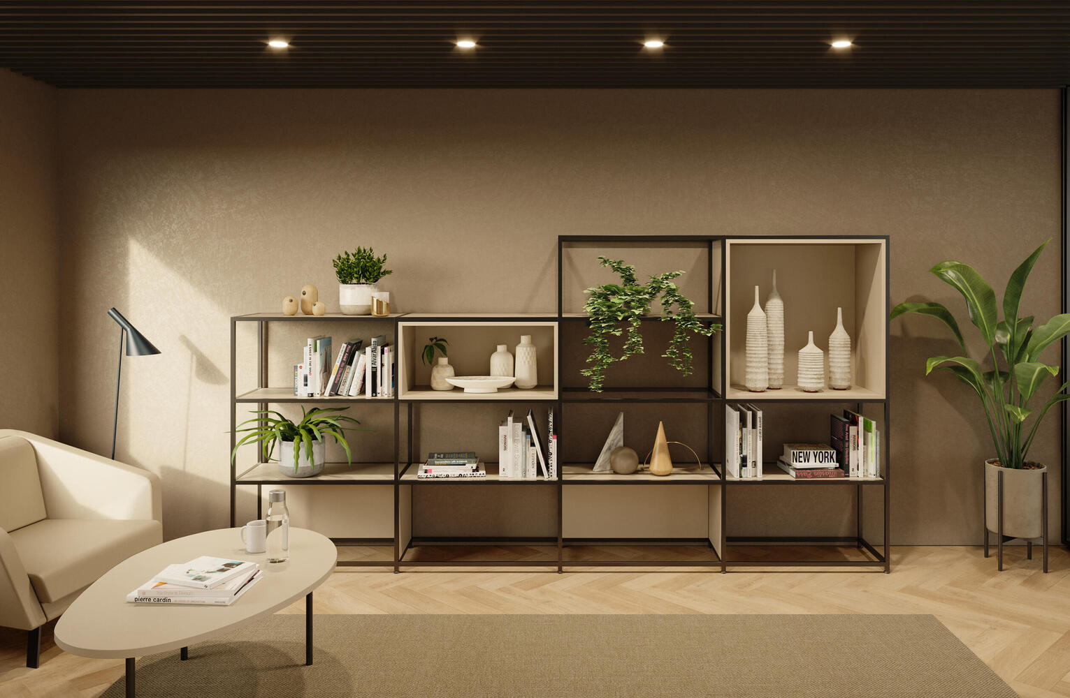
Take advantage of any secluded spots the area may have. Turn squished nooks into exciting features. If you need to store books, you don’t have to buy a bookcase — use a bar cart, the top of your fireplace, or the window ledge. It’s all about having creative storage options rather than ordinary choices.
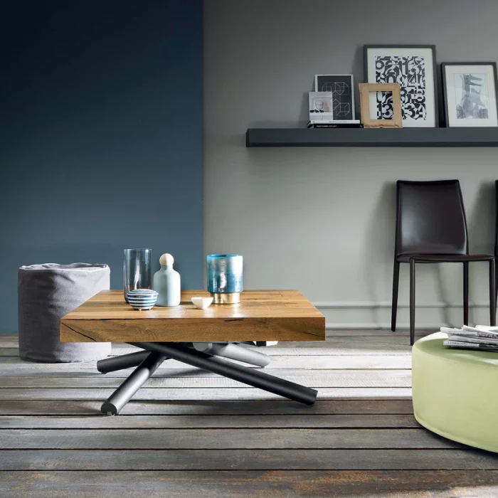
12) Neglecting to Purchase Multi-Purpose Furniture
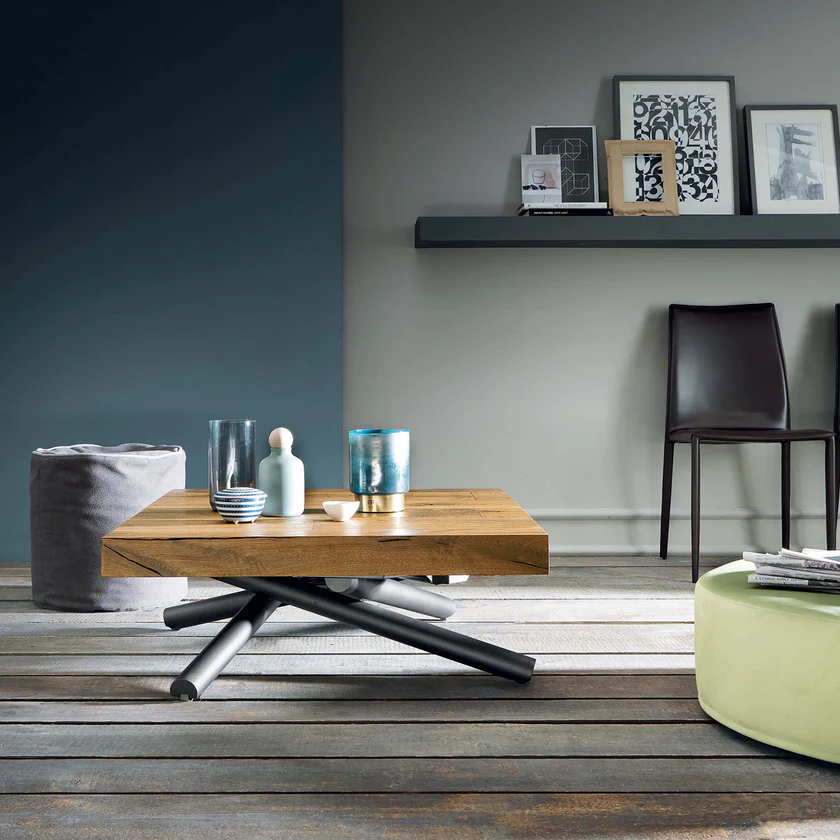
We’ve already discussed how important it is to prioritize storage when planning a tiny room’s layout, but the same principle should be applied to the furniture we select. It would be best if you tried to find multi-purpose furniture for smaller houses and rooms. Famous pieces of furniture include storage ottomans and couch beds.
Furniture that serves multiple purposes is ideal for small living areas. Consider the purpose of the room you’re in. It’s important to remember that a living room may be used for various purposes, including hosting guests, hosting a home workplace, and hosting a playroom.
Interior Design Mistakes: In a Nutshell
Many people make egregious errors in interior design without even realizing it. Some examples of bad design choices are stuffing too much furniture into a room, painting it a dark color that makes it look even smaller, and failing to provide adequate illumination.
But if you eliminate the clutter, paint the walls white or a light natural color, and carefully place mirrors and lamps, you can make your home feel much more extensive and brighter. After all, a designer’s job is to create spaces that work well for the people using them and reflect their unique personalities through layout and color choices.
