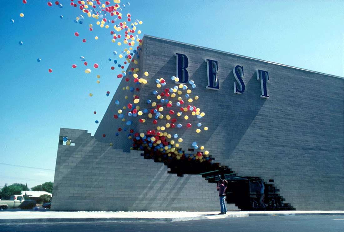
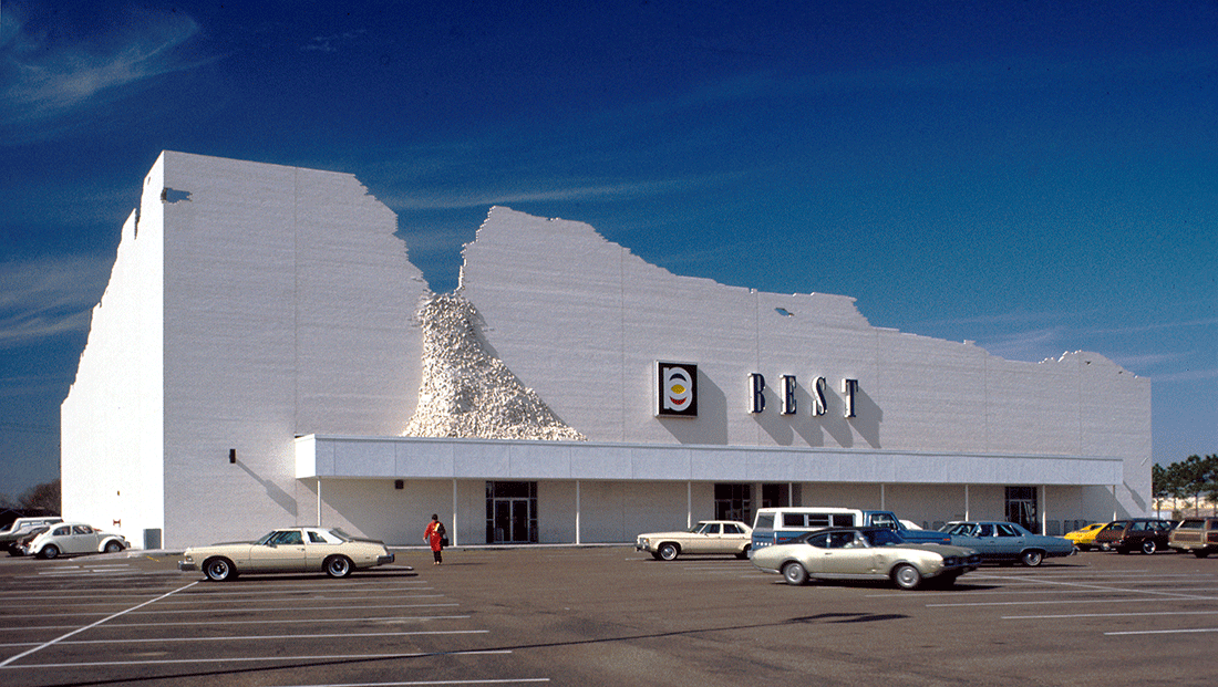
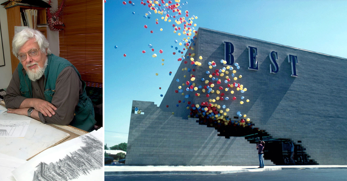
BEST Notch Building. SITE was commissioned to design a series of nine ‘big box’ shopping centers for the BEST Products Company in 1972. Since these retail structures are ubiquitous in the public domain, people’s reflex acceptance of their archetypal imagery was used in each case to invert and change the meaning. Instead of approaching the BEST buildings as conventionally ‘designed’ architecture, they were treated as a ‘subject matter for art’ and a source of visual commentary on the American commercial strip. Mechanized façade section in the process of opening the entrance to the building. BEST Products Company, Inc. Miami, FL. SITE. 1979
James Wines is best known for his innovative buildings, public spaces, parks, interiors and product designs. He founded SITE, an architecture and environmental arts studio in New York City in 1970, and immediately broke into the architecture scene with his controversial BEST Products buildings. With a background in sculpture, he viewed architecture as something to be examined and challenged. The BEST buildings questioned the typology of the big-box retail store while experimenting with the user’s expectations in such a setting. Wines continues to create architecture that eschews the comfort of conventions, and as a result, his work has reshaped how buildings are perceived and how architecture is itself defined.
Much has changed since SITE was first founded, yet the studio’s work continues to be relevant. In 2000 Wines wrote Green Architecture, a book that posed the question “What makes a building ‘green’?” The studio cites a growing concern with ecology and the environment, believing that future projects should go beyond early modern influences and find ways to respond more effectively to the current age of information and ecology. Concurrently, the studio advocates an approach to design which blurs the boundaries between conventionally separate territories such as art, architecture, landscape architecture and urban planning.
We speak with James Wines about his early work and how it led him to use architecture as raw material, whether the city as a project is still relevant, the state of architecture today, and how the pandemic will affect the future of design.
You began working as a sculptor prior to founding SITE, when you began working on more public projects such as buildings, parks and environmental artworks. As a young person, who or what had an influence on your artistic development?
I always drew, painted and made sculptures, ever since I was 4 or 5 years old. It was an instinct, I guess. By the time I got to be a teenager I became more serious. In high school, I was the guy who always created the posters for whatever events were happening. When I arrived in college, I went to study Sculpture with Ivan Meštrović – a famous Yugoslav sculptor and architect – at Syracuse University. I also studied Art History as a dual-major. Meštrović was known for his major public monuments, most of which were located in Yugoslavia; but, he had some profound political conflicts with the Tito dictatorship, so he had to leave the country. Through Meštrović, I became interested in the conflicts inherent in politics, the notion of art as a conduit for historic commemoration and social commentary in the public domain, plus the entire interaction between art and architecture. Being in that studio, the atmosphere definitely had an influence on my aesthetic and psychological development. Also, while in college, I had a very good friend, Aldo Tambellini, who later on became the video art pioneer of the world. While we were still students at Syracuse University . . . and not that we were pillars of religious faith or anything (laughter) . . . but we got jobs with local Catholic churches doing sculptures and paintings for their buildings. Then, as part of this biblical phase, the editor at ‘Liturgical Arts Society’ (a religious foundation located at Notre Dame University) saw some of my work and asked if I would do drawings for their publication. Between religious works for churches and illustrations for the Liturgical Arts Society, I made a living to pay my way through school. During this same period, I was also very interested in architecture; so, I hung around a lot with the architecture students. There was always that fascination with buildings and something about working in the public domain that I liked. Then I moved to Italy, where I lived for almost ten years. In that atmosphere I was exposed to the pinnacle of what public thinking was all about. The aspect of Italy that impressed me the most was the level of communication through facades and open spaces. I like to say “I could talk to buildings and they could talk to me.” There was just this incredible dialogue between the public domain and the people inhabiting it. I became intrigued with the existence of messages delivered in the streets and the infinite possibilities for communication embedded in the built environment. When I returned from Rome to New York in the late 1960s, the great Austrian architect, Frederick Kiesler, took an interest in my sculpture. At that time my work was shifting from organic form to more architectonic imagery, constructed in steel and concrete. Kiesler became a genuine mentor for me and, finally, one day he simply suggested that it was probably time to drop all those continuing influences from Russian Constructivism and abstract art. He convinced me that my pedestal art career was pretty old fashioned and exhausted by pioneer predecessors; so, I should just get into architecture more seriously. Sadly, Kiesler passed away in 1965 and never witnessed my period of transformation and the beginning of SITE; but, in fact, his observations and advice changed my life.
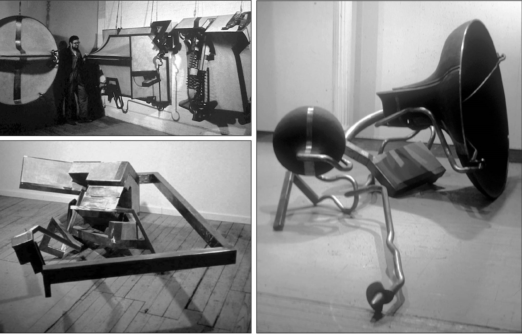
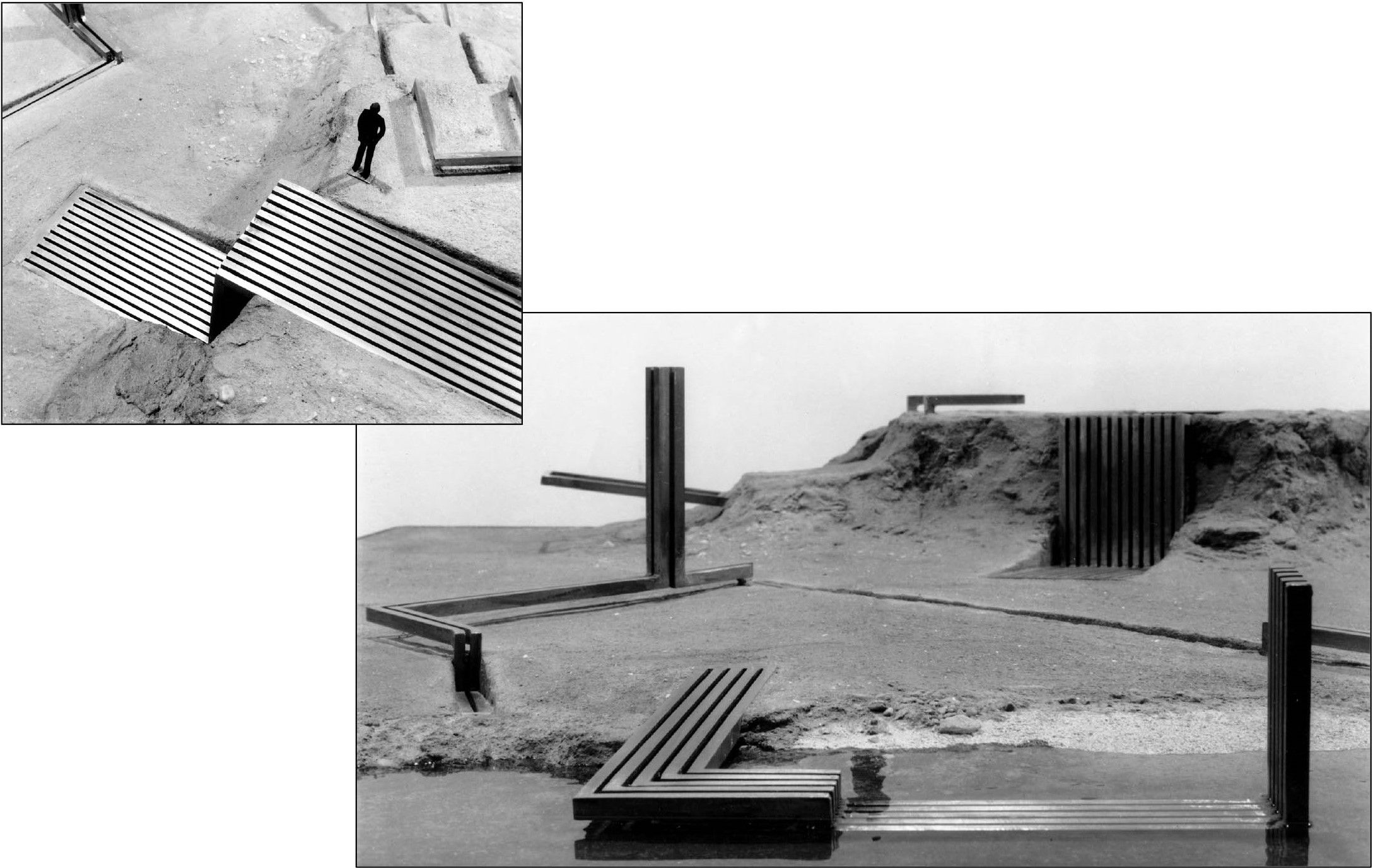
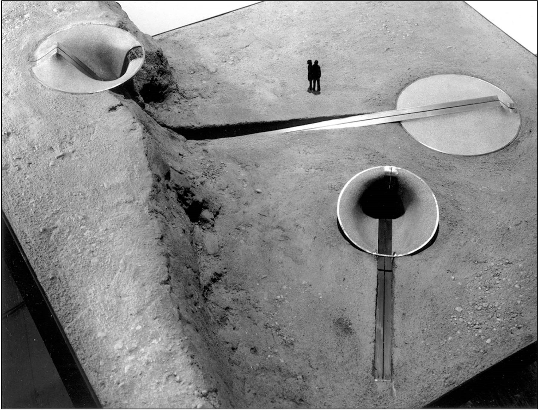
Early sculpture. This selection of early sculptures – constructed as a weave of steel and concrete – reflect the artist’s interest in the relationships between sculpture, industrial artifacts and building technology. After 1967 he produced a series of ‘Landsite’ models, which broke away from the gallery-oriented conventions of exhibited objects and began exploring the use of landscape surfaces as an integral part of sculpture. Through their engagement with regional topography, these works predicted the environmental art movement of the 1970’s and initiated ideas that would ultimately become the motivation for many of SITE’s integrative buildings and public spaces in the 1980’s. Middle: Landsite Model IV. Below: Landsite Model V. Concrete and steel. James Wines. 1963-69.
The concept of architecture has evolved quite rapidly in recent years, particularly since the early Modern Movement which defined architecture as a functional, rational object that was void of ornamentation. Its subsequent movements, including Postmodernism, to today’s tendencies toward Ecological and Environmental design, even “digital” approaches such as Parametric and research-based Computational Design, all operate within their own definition of what separates architecture from mere building. In your view, what constitutes architecture?
Well, to start with, I’m not even a registered architect. I am an environmental artist who happened to have walked into this profession through the back door. In fact, for years the architectural scene resented my presence, though now I think they’ve gotten used to it. Architecture, for me, is the ultimate public art. As a building and space designer, I feel I have a responsibility to communicate some kind of potent messages in the streets, whatever these are. The objective is to connect with people. For me, there is an inherent outreach element in this challenge. At the same time, I believe the visual content has to respond to the surrounding context . . . meaning, social or psychological forces, as well as physical and ecological elements. There should be an absorption of information from the surroundings that can somehow be incorporated into architecture. Essentially, it is the ultimate mission of public art.
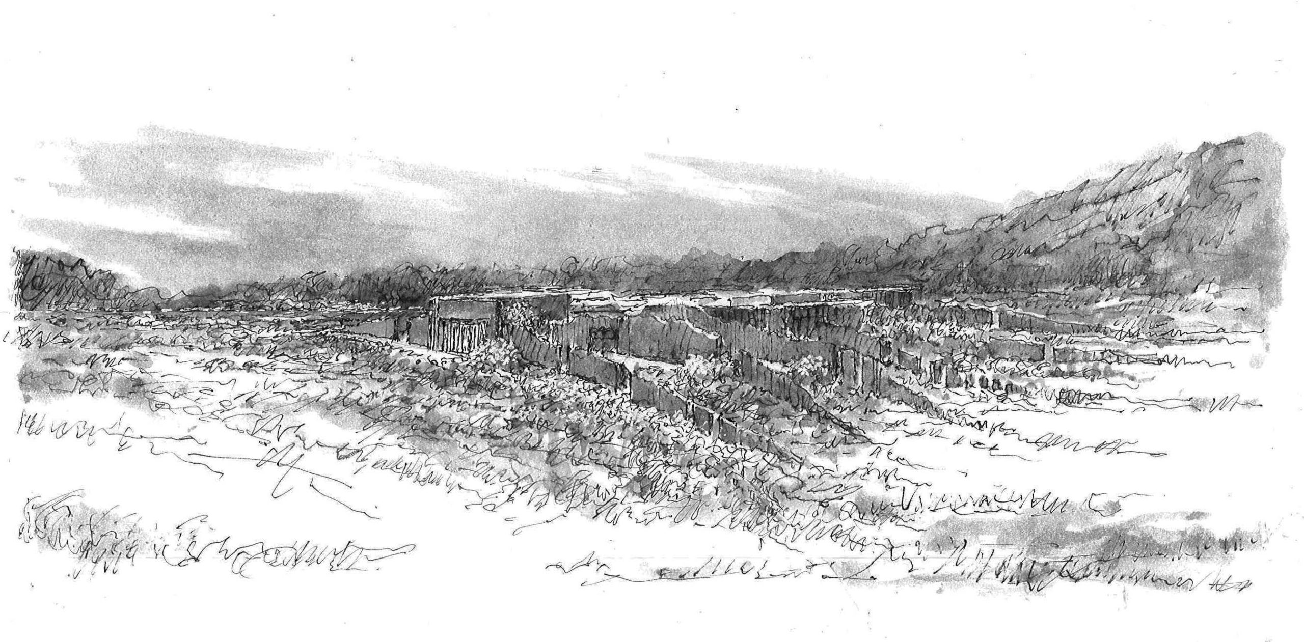
Towles House. The concept for Towles House is based on a response to the desert community of Temecula, California. the house is not treated as an object sitting in the environment; instead it is interpreted more inclusively as the environment. To achieve this objective, the entire dwelling is composed of a series of low, parallel and laterally oriented stucco and stone walls, incorporating fragmented profiles of the topography found in Riverside County. Schematic Design Phase sketch. Riverside County, CA. SITE. 2020.
Drawing by hand has always been a key part of the design process for you. There often exists a dualism in the process wherein the drawing itself communicates ideas about its subject, while the act of drawing becomes an instrument for exploring the content …
It doesn’t always function that way in my personal creative process, because the computer gives you more of an opportunity to make sculptural form, rather than explore the widest range of idea sources. Digital renderings tend to look like 1950’s sculpture to me. It seems that most of the buildings, which have been totally generated by computer and without the benefit of hand drawing for shaping the concepts and sources that drive them, retain that slick tech look. CAD and BIM processes appear to suck the human sensibility out of both the origin of an idea and its final resolution. Somehow, I can’t really describe it. We’ve been doing some work in Korea and Japan. In fact, we actually finished a store for Virgil Abloh this week . . . all produced digitally. I supervised as much as I could with on screen production, but this is especially tough for me. It seems there is a bit of a disconnect between the human being and the whole digital process. I have always been very hands-on and always showed up at the construction site for every project. I still believe that this on-site and in-process control had a lot to do with the communicative value of my work, so it didn’t end up looking like a totally high-tech extrusion of some kind. This could simply be a generational thing for those of us who came to computers late in life. It’s a very tedious task to try to organize my conceptual processes and have them bounce back to me in a digital format. By the time a project gets into its technical definition stages, CAD obviously make a lot of sense, due to the need for accuracy; but, during the conceptual process I find it a real deficit. I sketch profusely for reasons of speed and the idea search process. There is a wonderful comment by Picasso where he says “I draw like other people bite their nails.” If I’m conceptualizing a project, I have to be drawing simultaneously. I sketch all over the page sometimes, which I consider to be the most personally satisfying activity, because I can see my own ideas evolving. I really believe there is an infinite trial and error in that process; and it’s so direct, when expressed mind to hand. It often takes my colleagues at least a half an hour to just get their computers set up. In that time, I can have several pages covered! This quick search process is of great value, as a benefit of the fact that, simultaneously, I’m dealing with evolutionary ideas, plus points of view and answering the question, what do I want to say here. I have a scholar friend named Jamie Cooper who is writing a book on the Laurentian Library by Michelangelo. During his research phase, he had the opportunity of seeing all the original drawings for the project. He reported to me that it was staggering how many trial-and-error gestures Michelangelo went through to come up with the final conclusion. Based in this great example, if we had students working on a project and complaining about the time it’s taking, we would say to them “if Michelangelo had to do trial-and-error, you can do trial-and-error!” (Laughter) Having the controllable dexterity and speed of research inherent in hand drawing is important to me – but it has to evolve unconsciously. It’s like a musician playing an instrument. A talented person creating with sound doesn’t calculate the process itself, it’s just happening through instinct and experience. When dealing with a client, I often engage in illustrative drawing, which provides mutual ownership of idea development, right from the outset. I prefer to uncover the mood and purpose of an unrealized project. I try to express the basis of the whole sensibility controlling the objective and what it is supposed to accomplish. Just last week we had a client meeting about a house SITE is designing in California. We were going over some computer renderings with him and he didn’t seem to agree with anything. These design features, as rendered by computer, were “too cold” and “too intrusive” for him. During this meeting, I reminded him of all the hand drawings I had done, when he hadn’t expressed those concerns; so, I pulled up a few personal sketches to calm him down. The concept for this house is centered around the site area, which is incredibly rocky, with low vegetation and undulating topographical surfaces. Our plan is to build the house as a response to the contours that are already there. Bearing walls and the entire configuration of the building are intended to blend in with the landscape. So, hand drawing best describes these intentions . . . much more than antiseptic photo-accuracy, based on a mechanical tool.
Your work tends to respond to the environment that it’s in, while simultaneously proposing unexpected and even fantastical architectures …
In a way … I would say my thinking is purposely reductive. This is something I call an ‘economy of means’. It comes into play when I try to edit an idea into some kind of essence. The 1970s and 80s BEST buildings were the first examples of this intention. In that case we were interested in what I call ‘psychology of situation’ . . . in other words, simply taking into account people’s gut reaction to big-box stores and prescriptive functional factors they never thought about. I like junk world culture as a subject matter, because it is totally devoid of any particular expression or art value. I always say, I like to put art where you least expect to find it, because the whole aesthetic experience has more impact that way. Since I was a part of the Environmental Art generation, we were always escaping from the confines and restrictions of the art gallery. Everything liberating in the late 1960s and early 70s was about getting out of that precious environment, where the audience is preconditioned to accept whatever is under a spotlight as art. The early BEST buildings were art made out of the junk world. There was the highway, the parking lot, the big-box itself; all approached with humor, irony and social/architectural criticism, invested with environmental and commercial world commentary. The purpose was making fun of those buildings. The idea was to find something that public art could achieve, which was part of the process of construction in the first place; but, without having to do something sculpturally or formalistically exotic. For example, at the time of the BEST buildings, Target stores were going Po-Mo, so their commercial strip-world facilities were becoming more aggressively designed. They were full of historical references and elaborate architectural shape-making. This commitment also cost a lot of money, with limited visual memorability; but, the BEST Buildings had much more impact because they were so simple and direct. Primarily, they dealt with the people’s lack of expectation for encountering anything unusual on a typical commercial strip. Over the years, people have often asked me how I persuaded the BEST Company to sponsor those buildings . . . especially when they were often a form of self-criticism. In fact, these buildings were a send-up of whole big-box industry. The clients – Sydney and Frances Lewis – were art collectors, so they understood the commentary level perfectly. If you look at an Elvis Presley or Liberace concert, these musicians are constantly engaged in self-critique and making fun of themselves. It added so much wit and irony to their performances. Self-deprecation is appreciated by an audience. Presley and Liberace knew they were great performers; so, there was no reason to ram this message down people’s throats. That extra level of modesty and humor made a lot of difference. And it worked for the BEST Company too. I think people liked participating in a dialogue with a building. I would say the biggest compliment I ever got from BEST customers was “You know, I never thought about a building before.” I would say that these big-box structures related to conceptual or environmental art, where the image is taking either a perverse point of view, or making some contextual commentary. It was absorbing information from the habitual strip surroundings and not just letting a building sit there like a sculptural object on a pedestal.
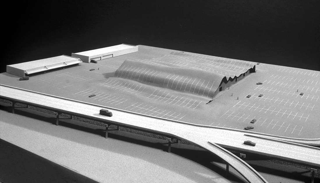
BEST Parking Lot Building. Overview of the project model showing a fusion of the asphalt parking lot with the retail building.
BEST Products Company, Inc. Houston, TX and Los Angeles, CA. SITE. 1976.
BEST Indeterminate Façade. Main façade view from parking lot. BEST Products Company, Inc. Houston, TX. SITE. 1975.
You have described the Best Products showrooms, in particular the Indeterminate Façade, as using “architecture as raw material.”1 What prompted you to see architecture in such a way?
Exactly. It was architecture used as a subject matter for art . . . and associated with the construction process as well. I always loved watching architecture being built or taken down, so why not arrest a building between construction and demolition? This is mental, more than physical. I went to MoMA a couple of weeks ago and was trying to explain what conceptual art was to a group of young people. I was in the midst of an entire floor of ‘conceptual art.’ Sadly, the examples were mostly derivative and mediocre versions, which made it super difficult to provide a convincing explanation to an uninitiated group. Finally, we arrived in the classic collection and we could talk about some of the pioneering works. I encouraged to my group to look at Duchamp and his capacity for transforming the whole art experience and investing it with new meanings (as opposed to re-affirming institutional classifications). For example, Duchamp always said he didn’t want to be “retinal.” This meant he preferred to not be visual in traditional ways. He wanted to practice art within expanded definitions. When he started integrating his ‘Readymades’ into conventional showcase situations, it changed the spectators’ whole viewpoint – not only of art, but also the conditions of its time-worn notions of display. When he put a bicycle wheel in a “normal” sculpture exhibition, next to a Henry Moore, an observer had to ask “what is a conventionally volumetric bronze sculpture supposed to represent?” Duchamp was asking gallery visitors to question “what is art?” He was encouraging people to re-think the entire ambience, as well as what was in it. I remember going to a Duchamp exhibition some years ago in Philadelphia with a scholar friend of mine who took her mother along. This elderly woman was hating everything and her habitual response was “this isn’t art!”. Finally, she arrived in front of a small landscape painting, depicted in all brownish colors . . . the last piece in the show. She looks at it and exclaimed, “This is by Duchamp? Now I can understand him. That’s art.” Then she read the title card: “Landscape Done with Hershey Bars.” She left the gallery mumbling angrily. (Laughter) She’d been tricked. So, in summary, I think using architecture as the subject matter for an art experience has a lot to do with changing a building’s contextual readability and the range of idea sources it can tap into and communicate. You should be able to look at a structure and say, “Yeah, it seems to be pretty nearly normal; but, why is it so different?” The next level of response should be trying to figure it out. For me, the definition and purpose of art have a lot to do with ‘what it makes you think about.’
You’ve cited context as something which heavily influences your work. At the time of the BEST stores, the context was the typology of the big-box store; after that, your concept of context seems to have changed or expanded …2
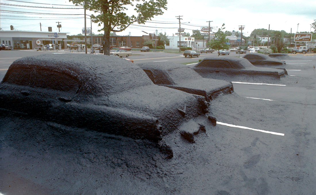
Well, everything depends on the project. Let’s take the Ghost Parking Lot, for instance. If that wasn’t a comment on transportation technology, there never was one. Petroleum is usually consumed by cars; but, in this case, a petroleum product was consuming the cars. SITE’s projects were not all controversial and they were not all based on critical commentary, but our ideas consistently had something to do with the context – be it the shape of the surroundings or the attitude towards the situation, or what people expected to find in certain circumstances. I think, because SITE started with a great deal of controversy, people expect us to be controversial forever. I think there is a mistake in such assumptions. I can remember being part of a symposium some years ago, which included Roy Lichtenstein, Frank Stella and Claes Oldenburg – it was all people whose careers started with great controversy. For example, I recall when I was still in college, there was an article in the New York Times critiquing the first Lichtenstein show. It was titled “Is this the worst artist in the world?” Who wouldn’t go see that show? I immediately visited that exhibition and it blew my mind, it was incredible. During this symposium period, Frank Stella was doing his pinstripe paintings and I remember him saying “why don’t the critics start with what you’re trying to do, rather than criticize what you’re not doing? If they would just look at what I’m trying to do, understand that, then move forward from there.” Oldenburg was also very astute in his response to this topic of controversy. He very well may have had the best remarks of the evening. For example, Noguchi, a very conventional and formalistic sculptor, was attacking Oldenburg from the audience, saying “What you’re doing is not sculpture.” Oldenburg asked “Well why isn’t it sculpture?” Noguchi responded, “Well, because it’s not firm, it’s not hard, it’s not monumental” and so forth. To which Oldenburg responded “In my work, I like to take risks.” Noguchi starts yelling back “What risk? I don’t see any risk.” Oldenburg replied “My risk is that you won’t understand it.” And that’s the bottom line. Noguchi had no clue what a big, soft sculpture was supposed to mean. He had never thought about sculpture as an inversion of situation, as malleable materials and as a transformational aesthetic adventure. He never thought about the sensibility needed to innovate with scale references and commonplace subject matter. In the case of Jasper Johns, I remember him going through a very quiet period in his subject matter. He wasn’t painting targets or the American flag anymore, which, in the 1960s, were very controversial. What’s unfortunate about creating early works that become iconic is the number of memory-based restrictions, imposed by public recognition, that follow. The artist has to live under the shadow of them forever. In Johns’ case, he was always the guy who painted the American flag. From my own past work, I have always been the perpetrator of crumbling buildings. It’s a plague in a way, because media forces, knee-jerk critical summation and popular opinion don’t want to deal with the fact that you have other ideas. Vito Acconci was a great friend of mine and I recall that he used to always complain about this categorization. He’d say “I hate doing the same thing twice!” We both tried to resist style-based repetition or media insistence on familiar images. Obviously, every artist creates successive works that relate to something done before. The ultimate test of innovation is finding a totally different way of interpreting conceptual premises. Some artists just repeat the same thing endlessly, becoming more identified with style than substance. Look at the architecture situation today, when too many designers follow the predominant stylistic persuasions of the day. The assumption is that their work won’t sell unless it maintains a catalogue of familiar mannerisms. But, style is not art.
Ghost Parking Lot. Contrary to the prevalent use of “object art” as a decorative accessory to buildings and public spaces, this fusion of typically mobile artifacts with their environment takes advantage of people’s subliminal connections with the rituals of shopping center merchandising and the fetishism of American car culture. Also, unlike public art conceived from a private art perspective, this project cannot be removed or exhibited apart from its context without a total loss of meaning. Section of the project facing Hamden’s main boulevard. National Shopping Centers parking lot. Hamden, CT. SITE. 1977
You once wrote that “throughout history the successful edifices, at their most intense level of communication, have been the product of psychological, social, cosmic and metaphysical influences (…) the pragmatic aspects of architecture were seen as merely a vehicle for transmitting more interesting ideas.”3 Could you expand on how you see architecture as a narrative device?
When SITE began in the late 1960s, there was an entire generation of environmental artists in SoHo and most of them were colleagues and friends. Some were involved in works that were not considered art or architecture, from the standpoint of conventional expectations. De-architecture was a defensive book in a way, since the architecture world was indifferent to hybrid activity and the art scene (especially the galleries) preferred to continue the merchandising of art as precious objects. At the same time, a number of architects were cribbing ideas and imitating aspects of what the environmental artists were doing. My mission in writing this book was to try to provide a new perspective on the integrative aspects of art and architecture – plus advocate the territories (performance and earth works) that were not being fully credited. A lot of this activity was also undefinable. Still, as one of the conclusions in De-architecture, I emphasized the point that I believed architecture and environmental art should communicate public ideas, because it’s out there in the ‘real world.’ I also felt it should maintain a certain level of ambiguity to intensify public dialogue…
As a child growing up in the Richmond area, I remember my mother telling me of a building where the surrounding forest crept in and around it, engulfing the building itself.4 The building was inhabited by other tenants at the time and therefore not in its original state. But, after I heard the description, architecture took on a kind of mythical nature. Even in its absence, the architecture was telling a story …
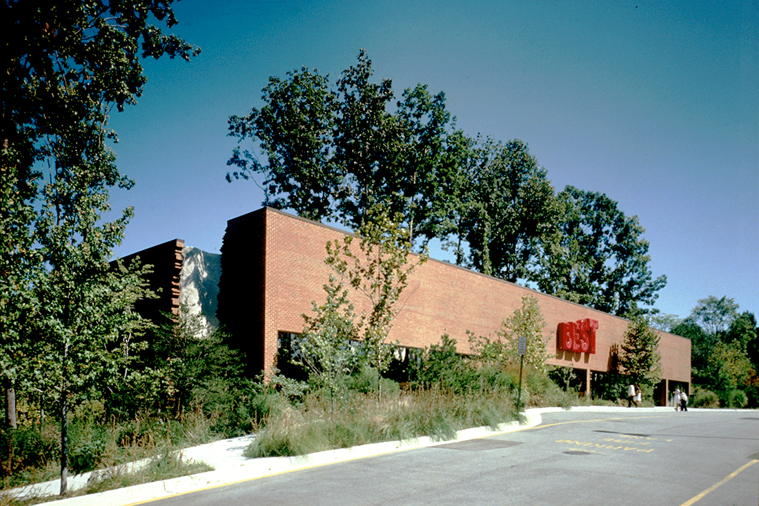
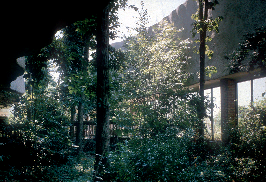
When the BEST Forest Building was purchased by the West End Presbyterian Church in 1998, I thought “Now this is a cognizant clergy, they understand.” They hired an architect, at probably great expense, to surgically take out every single artistic element they possibly could. They paved over beautiful land cover foliage, cut down trees and removed the terrarium garden. Anything that even looked like it might suspiciously be viewed as “art”, they destroyed. About the only thing they couldn’t do is eliminate the split area at the center of the building that accommodated trees. Our landscape architect for this project was obsessed with preserving the rich land cover. In order to construct foundations for this building and not destroy the roots of all those trees was a real feat of ingenuity. She devised a method of digging deep and training the roots of the oak trees downward, so they would grow under the foundation. She also went to great extremes to protect the existing landscape, which had always been shaded by trees and had grown very slowly over many years. Her mission was to protect shaded areas and allow them to remain undisturbed. Unexplainably, the first thing the church did was pave over all that luscious ground cover. So, go figure. On top of that, it was the most popular BEST building, when originally constructed. The Forest Building, the Ghost Parking Lot and Highway 86 were probably the three most popular projects in SITE’s legacy. I remember, in Richmond, people used to bring their lunches to this BEST store and sit in the garden for hours. Its destruction was really a tragedy and the rationales for doing this are hard to grasp. Why would a church organization choose to eliminate art, reject nature and take a totally anti-ecological position in today’s world of global warming?
BEST Forest Building. Above: Cutaway façade section, allowing the existing forest to penetrate the building as an ‘inside-outside’ experience. Below: Existing forest incorporated as an intrinsic part of the building. BEST Products Company, Inc. Richmond, VA. SITE. 1980.
Even when it was altered from its original form, it lived on in the collective memory through the telling of stories, and more recently through the sharing of photographs …
True. Funnily enough, two scholars – one in Czechoslovakia and one in Scotland – have been going there to research the Forest Building and write about it. But, I say, “What’s there to write about? There’s nothing there!” I guess they’ve been studying this particular example because it’s the only one left in the BEST series of nine stores.
The number of media outlets for consuming architecture-related content has increased in recent years, even with apps like Instagram actually influencing how architects design buildings in some cases; yet, you have spoken before, in De-architecture for instance, of a “crisis of communication” in architecture and a corresponding “gulf between the profession and the public.”5 I am curious of this can still be felt, is it still perceptible today?
I would say, in my generation, there have been lots of rip-offs, as you certainly know. I don’t know how many buildings I’ve seen with cut-off corner entryways, tilted walls, fragmented profiles, integrations with nature, waterwalls and so on . . . it’s sort of endless. Obviously, some architects have grown to appreciate the shapes and objectives of these gestures. The principle seems to be, if a floating wall looks good from an aesthetic viewpoint, somebody else is going to use it. It doesn’t’ have to be associated with conceptual ideas or alternative meanings. Also, a lot of what’s being done today is based on the ease of design with computers. Given the ‘gee-whiz technology’ conveniences, architects now can digitally define any shape to get an instantly appealing sculptural look. Just by checking the Internet or Pinterest, designers can access an endless catalogue of wiggly contours. At least, from my perspective, there’s no art there. From the client angle, developers currently tend to be satisfied if their building has an exotic shape . . . so “it’s different.” Usually, this attitude applies to a high-rise structure, so that means you can only see the sculptural configurations from a half a mile away. When you get up close it’s still the same ground floor grab-bag of potted trees, plunked-down art works and acres of concrete paving. What you experience is what you expect; so, in the end, nothing about the physical totality changes your mind about anything. You don’t have an interaction with ideas or people, nor a satisfying psychological and environmental experience. Since visual appreciation can only be achieved at a great distance, to me this is sort of ‘fly-over architecture.’
It seems like a resurrection of early Modernist and Formalist ideas as well, mostly celebrating the purity of the object. There are however some interesting things happening in academia with computational design and material research – with students using robots to 3D print lattice structures and all sorts of things of this nature – but it hasn’t really broken out of the realm of research …
No, it hasn’t. And what continues to proliferate is pedestal art. Finding alternatives to this endless tradition of hermetic objects sitting on bases was one of the main topics of conversation when talking with artists like Alice Aycock, Mary Miss and Bob Smithson. We viewed frames and pedestals with great disdain. Why does an aesthetic endeavor always have to be sitting under a spotlight to be deemed art? Even among painters and sculptors of the 1960s, there were many that broke this mold. Rauschenberg, whom I admire tremendously, was a master at that. He would create a work that had all of the characteristics of a painting, but, then, he would include three dimensional elements that wandered off the wall and into the room. This was an incredible idea. When I saw one of his ‘combines’ for the first time, it blew my mind. Yes, the conventional format of ‘color on canvas’ was still there, but interpreted as much more than a painting. I was just out of college during critic Clement Greenberg’s generation and I recall his imperious attitude in support of Abstract Expressionism. I remember him stating that “Figurative art is dead and no progressive, self-respecting artist would ever paint the figure again.” But, then, based on typical art world rebellion, Greenberg’s pronouncements were followed by Pop Art . . . certainly one of the most figurative movements in history. (Laughter). In terms of crediting art’s defiant spirit, Andy Warhol was right: “Art is what you can get away with.” Such liberties in Architecture are tougher to achieve. Still, at SITE, we have enjoyed a good deal of ‘getting away with it’ over the past fifty years. Our adventure has been a liberation from doing the same old thing the same old way.
Running concurrently with these ideas of art and context you have been speaking about architecture and ecology for some time now, as well as “green architecture” and what that could mean, even writing that “whereas Le Corbusier referred to the house as a “machine for living in” (…) there is a new generation of architects who regard the earth itself as the ultimate ‘machine’ (…) the earth as a living organism.”6 The primitive hut is here dissolved into, or seen as a part of its environment, rather than an object simply placed there.
My point, in that particular book, was to call attention to the fact that too many so-called “green” buildings showed no aesthetic evidence of being green. Most examples looked like traditional Formalist structures, expressing very few ecological or conservationist intentions. But now, more urgently than ever, I try to question everything through an environmentally-conscious lens. I think excesses in the waste of resources, materials and money, identified with previous generations, will go. The whole idea that you have to erect giant skyscrapers out of aluminum, titanium and acres of glass, will be re-evaluated, in favor of the search for alternatives that don’t distribute obscene amounts of toxic waste during their production process. So, I have had to admit that none of us, myself included, are contributing that much to sustainability. Architecture consumes almost two-thirds of the world’s resources. When you think about it, the need for heat, air-conditioning, building with noxious materials and cutting down forests, continue to inflict an overwhelming amount of damage. The entire situation poses staggeringly big questions . . . fundamentally, how is humanity going to stop perpetuating its own customary choices of habitat? I hope your generation is super conscious of the existing damage and tries in every way to find alternative solutions. We’re seeing increasingly obscene levels of environmental destruction. I used to refer to some of SITE’s early projects as ‘nature’s revenge.’ The Forest Building, as one example, was conceived from that point of view. Conservation and the re-cycling of nature was the major objective; but, at the same time there was a certain amount of irony and humor intended. But, now seen in retrospect, many of the materials and processes used for construction had no green qualities to recommend them. To me, this reevaluation period we live in is somewhat like last year’s television comedians who stopped imitating Donald Trump, because the topic just wasn’t funny anymore. In similar ways, the environmental conditions now are so serious it’s become impossible to inject humor into the subject.
I think the question too for my generation, and you talked about this in Green Architecture, is not only how to reconcile man and nature but how to do so without losing the art of building.
That’s one of the main reasons I wrote the book. At the time of publication in 2000, the crisis didn’t seem as apocalyptic as it does now. There was some promise in the air that humanity would resolve the problems and we didn’t believe it would get so much worse. As things stand today, there are a lot of architectural firms that are going to have engage in real soul-searching. In no sense of the word are some of the buildings being constructed now – especially tall buildings, which are the most aggressive of all – going to save the world. I’m also very conscious now of the conflicts that exist. For instance, we have burgeoning populations in some parts of the world; so, how do you build smaller buildings for more people? With public space, which has always been my main interest, how do you design for populations who are going to continue social distancing for obvious reasons, and those who want to cluster together more than ever? How do you design spaces that accommodate both situations? I think these big conundrums that have to be addressed, and there should be more focused dialogue about these issues. There’s lots of tentative solutions being offered by professionals, but they’re usually band-aid remedies. I always get the feeling that architects aren’t exploring bigger ideas, nor becoming involved with genuinely different ways of thinking. As an artist, I’m qualified to be worried, but I’m not qualified to make the kind of technical and scientific suggestions that are needed. Architects are going to have to look at the bigger picture and offer some truly revolutionary proposals. I’m aware of buildings opening now – some of them in New York, unfortunately – that are the epitome of anti-ecological thinking. They seem to always have a LEED certification as endorsement, but it’s just a piece of paper, listing tech-based temporality, compared to what is really needed for long-term sustainability and respect for ecological principles.
Not that long ago the big problem was urbanization. However, while the world as a whole is becoming increasingly urbanized,7 research shows that the population growth in America’s suburbs has accelerated more rapidly than in urban centers in recent years;8 it’s growth being supported by the proliferation of goods and services available online, which has accelerated since the onset of COVID-19.9 Is the archetypal city, with its density of various building typologies as well as culture, still relevant in a post-pandemic world?
As usual, a reality check is needed to address this subject. Already, there are many thousands of square feet of empty space that people do not want to return to. I’ve worked in the Middle East, where entire skyscrapers exist that are empty. Many were built fifteen or twenty years ago. One time, when I was in Saudi Arabia, I asked some planning officials “What are you going to do with all of these empty buildings?” They replied that these structures were seen as preparation for future shifts in the basis of Saudi economy. “When the oil runs out, we’ll have real estate options.” My response was, “Yes, but when the oil runs out, what is going to sustain all of those buildings that totally depend on fossil fuels” …
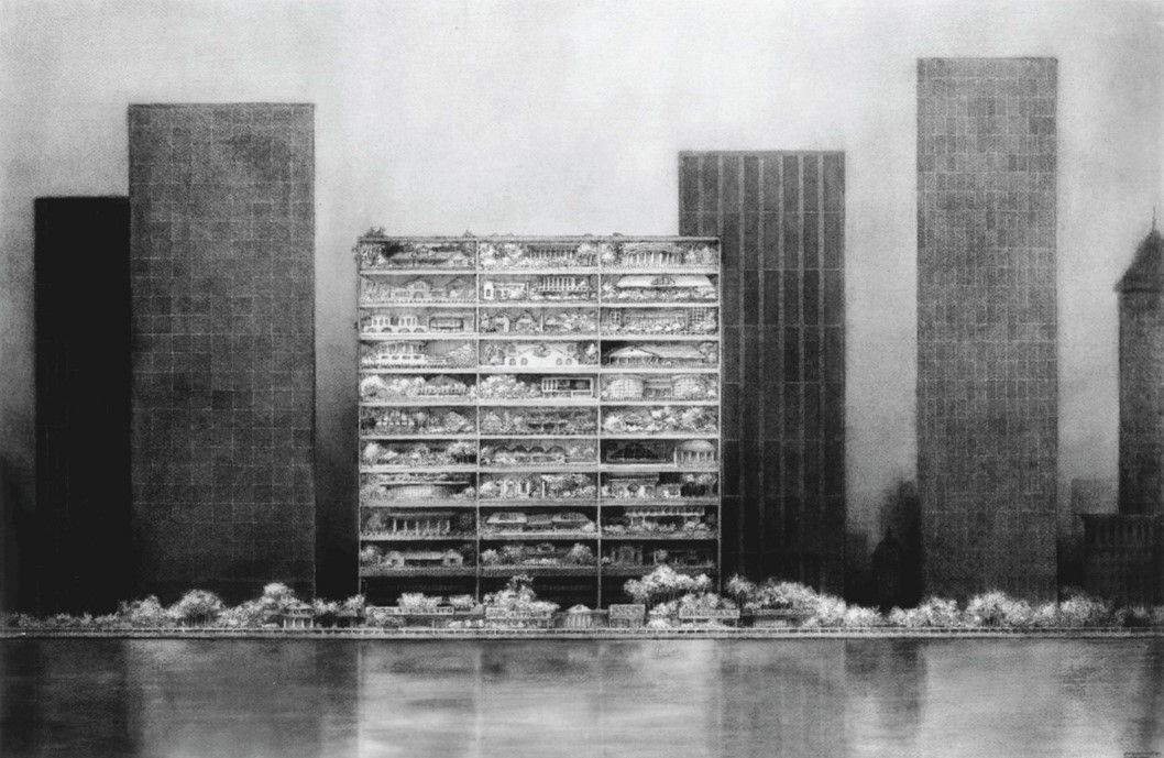
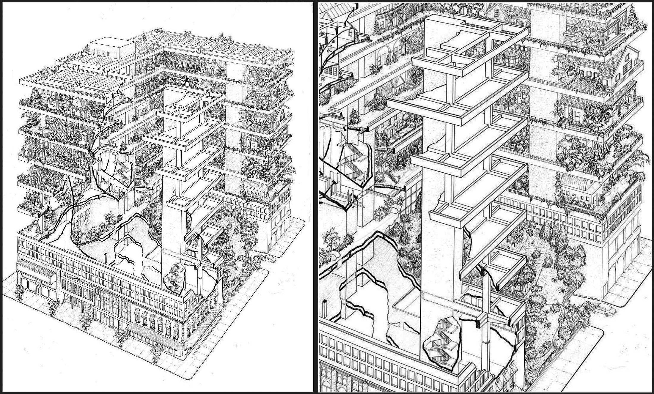
Highrise of Homes. Multi-story condominium for various urban locations in the USA. The building is a steel and concrete matrix supporting a vertical community of private homes, clustered into village-like communities on each floor. One of the objectives is to offer a ‘choice, chance and change’ alternative to conventional housing blocks in the cityscape – replacing this imposed anonymity with an anti-formalist collage of indeterminacy, idiosyncrasy and cultural diversity created by the residents themselves. Above: For location in a major American city. Ink, wash and charcoal. Below: Cutaway axonometric showing courtyard gardens and multiple floor levels. Pen and ink on mylar. SITE. 1981. Collection: Museum of Modern Art, NYC.
It makes me think of your Highrise of Homes project, which proposed a kind of urban village where suburban forms were merged with the rigidity and verticality of the skyscraper.10 Though it was not built, the drawing alone conveys an alternative architectural response to the problems of urbanization, where standardization and repetition give way to personalization and differentiation. Perhaps the answer to some of these deserted buildings is to punch out the walls and fill the empty floors with smaller individual buildings and green energy generators …
When the HoH was first designed in 1981, it couldn’t have been built without wealthy investors. Then, SITE developed a version for New Jersey, by re-cycling a multi-story department store and utilizing its existing structure as an infill matrix for inserting private homes. This opportunity opened a much more environmentally friendly option for the main concept. In the past, we had used recycled materials for all of the WilliWear showrooms and some of the BEST buildings. Then, SITE completed the Rossini Foundation Sculpture Garden Pavilion in 2009. It was all built out of materials found within a 10 kilometer radius. I was also part of a 1999 team of artists and architects who proposed condominium and commercial projects for an island in the Baltimore Harbor, where the Alcoa aluminum factory had previously operated for many years. During the site analysis, we found out that the toxic waste from aluminum production had infiltrated the land more deeply than earlier soil analysis had revealed. The community planning commission had to build an underwater concrete barrier totally encircling the island, so it wouldn’t leak pollutants into the harbor. Since then, the community has had to construct even deeper containment walls to prevent further contamination of both land and water. The whole island was finally condemned as uninhabitable because of Alcoa’s original negligence. Since I wrote Green Architecture I’ve been invited to be a part of all sorts of teams where I witnessed scientists and experts debating these problems with a real sense of desperation. In another SITE project for North Wales, we had the challenge of dealing with a decommissioned nuclear plant, shut down about ten years earlier. As part of some pretty alarming research, we learned that it takes 25,000 years for nuclear waste to reach its half-life pollutant level . . . meaning it was still apocalyptically dangerous. That time slot is longer than civilization has been around. To this day, nuclear waste still has to be contained in some way. The main solution is burial in some form of concrete encasement. But, realistically, what kind of manufactured container can offer guaranteed safety for 25,000 years? Some future civilization will have to deal with our generation’s nuclear waste. We don’t hear media discussion about the issue now, because the containment systems seem secure for the foreseeable future. In the overall environmental picture these days, I think the coronavirus did alarm people to how vulnerable they are to ‘nature’s revenge’ – because, in the final analysis, viruses are environmental aberrations. The most frightening aspect of witnessing disasters is the fact that Earth has been through five mass extinctions, each with their own origins and causes, but none of them have been perpetrated by a single living species. Given all evidence from science, there were also very few species (with the oft-credited exception of sharks and cockroaches) capable of surviving universal extinctions. Humanity’s omni-present experiment will be: are we capable? The willingness to sacrifice many of those luxuries we take for granted will be of paramount importance. The big question for our species is who will be willing to give up what, plus how readily and how permanently? For example, I live in a new apartment in an old building, where the walls are thick and the windows are small; so, we hardly ever turn on the air-conditioning. The difference between these living circumstances and the all glass and steel buildings across the street is radical. These structures probably have thermal glass, but on a hot day over 90°, with sun blasting in the windows, it already takes an excessive amount of energy to maintain comfort. The conundrum remains, which residents in such buildings are willing to surrender all that daylight and turn off their thermostats? Your generation, and those yet to come, really have your work cut out for you! (Laughter). Worst of all, my generation has left a very bad example to follow.
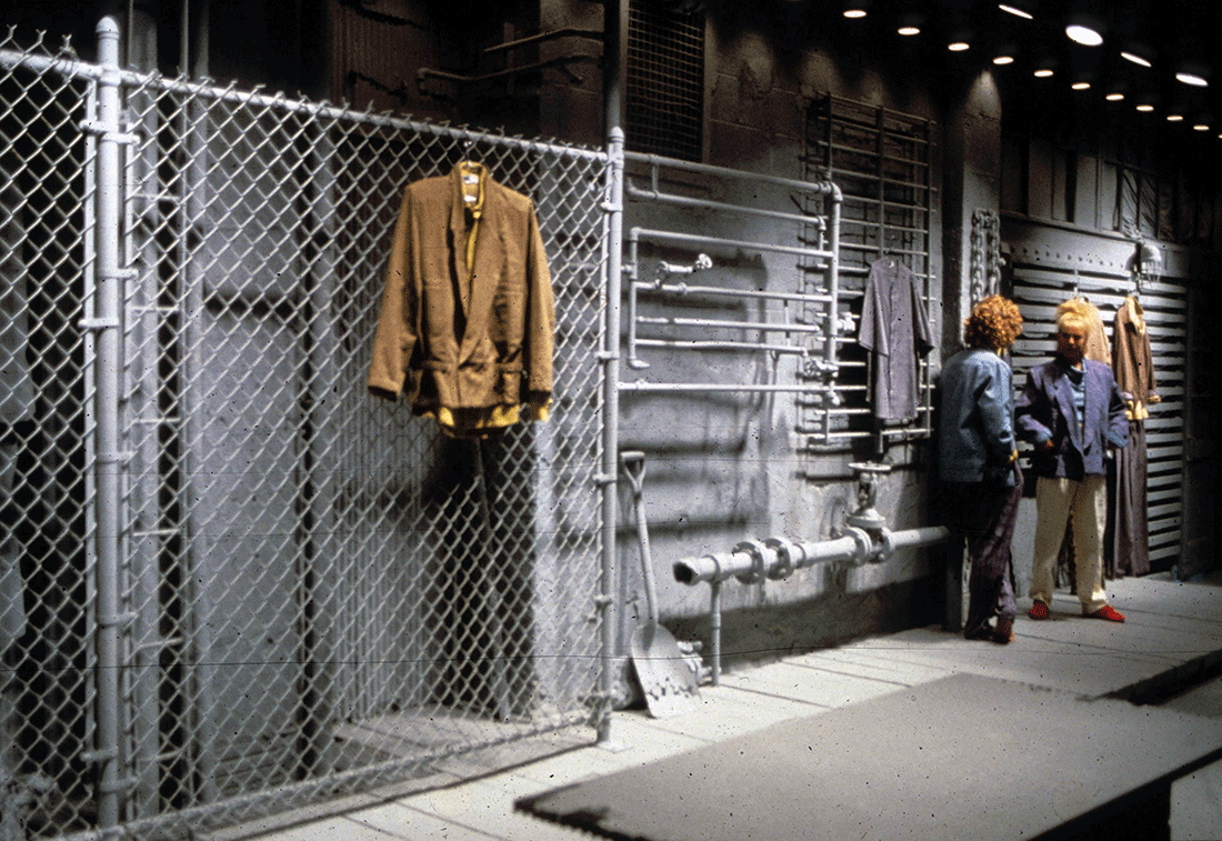
Williwear Men’s Showroom. In response to fashion designer Willi Smith’s preference for a ‘rough urban feeling,’ this garment district showroom is conceived as a collage of waterfront fragments, unified in monochrome gray to provide a neutral background for the client’s colorful variety of attire. The entire space is composed of objects and materials found on the streets; including corrugated siding, chain link fences, fire hydrants, drain pipes, man hole covers, release valves, and construction rubble. Williwear Ltd.. New York, NY. SITE. 1984.
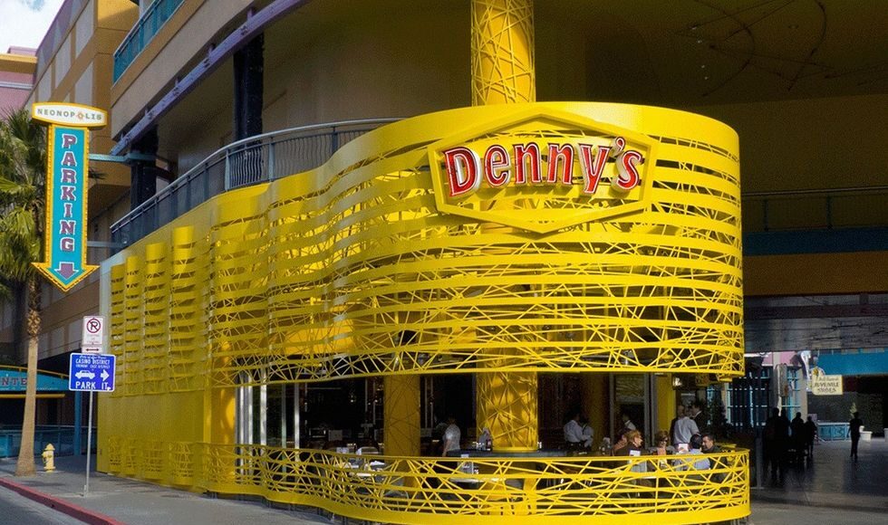
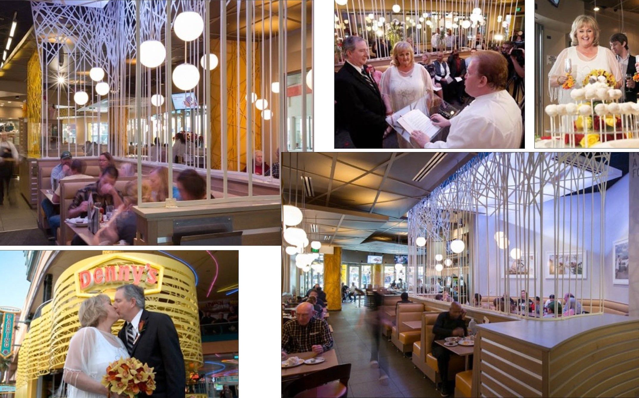
I wanted to talk about another aspect of your work, where you experiment with the program, which is often deemed sacrosanct by architects. I am especially thinking of your design for a diner in Las Vegas which includes a chapel. The company’s website describes the mashup perfectly: “TOGETHER LIKE BACON AND EGGS. Denny’s on Fremont Street is the perfect place to get married or renew your vows. Allow us to put the ‘Mmmm…’ in matrimony.”11
It is a relief to get off our doomsday discussion. This special Denny’s restaurant was mainly a commentary on that particular kind of diner typology. From the perspective of environmental initiatives, I feel guilty that we made it out of aluminum. It was a small building, so I don’t feel overwhelmingly guilty, but I still feel uncomfortable enough. The building is constructed with a filigree of aluminum, as opposed to solid volumes of metal, but I don’t think I would favor aluminum again for a new project. From a conceptual perspective, it’s a building within a building and I loved that idea. It also has a wedding chapel in the dining area, which was a fun feature and has provided unique nuptial experiences for many customers. Lots of people have been married there, so, it’s been a real success. I don’t know why people want to get hitched at Denny’s (laughter) but, given the restaurant’s nostalgic legacy in diner history, I guess it’s sacred to some people. Strangely, however, to this day humor in architecture is controversial. In the beginning days, that was considered one of the most disturbing aspects of SITE’s work by the design scene. There was a general opinion that architecture is no place for humor. Needless-to-say, I find that viewpoint both absurd and as evidence of an overly uptight professional reaction. In the world of literature, can you imagine Oscar Wilde without humor? Why can’t a building have humor?
Denny’s Neonopolis Network. Above: Façade on Fremont Street with network ribbons surrounding the patio. Below: Interior wedding chapel and marriage ceremonies. Denny’s Corporation. Flagship restaurant. Las Vegas, NV. SITE. 2013.
My partner Susan and I were recently married, and she remarked that “It would be great if there was a Denny’s in the chapel!” (Laughter). Regarding humor and architecture, I recall visiting the main Cooper Union building some years back, where John Hejduk had renovated the interior. On one of the upper floors, he included a small slit window so you could peek in on what was going on in board meetings and that sort of thing, it was quite funny …
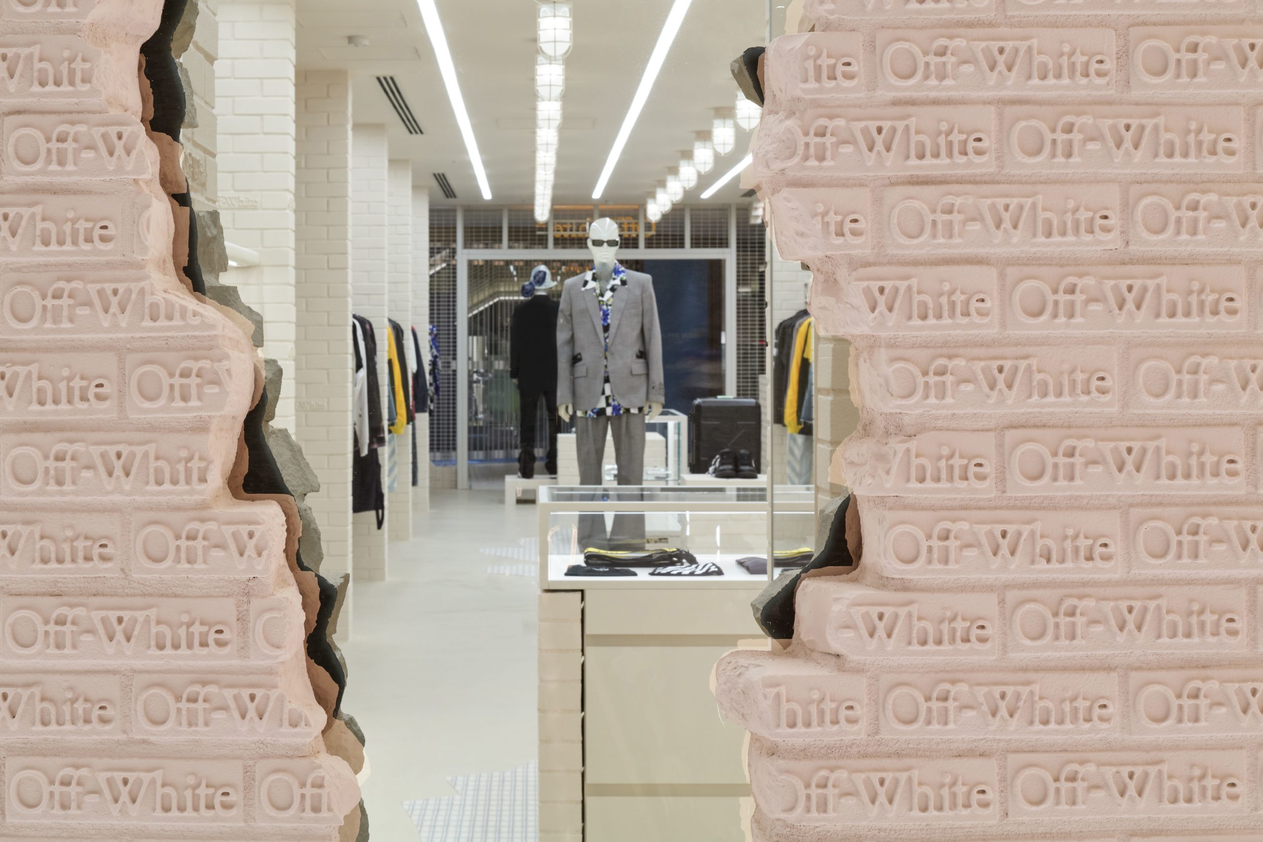
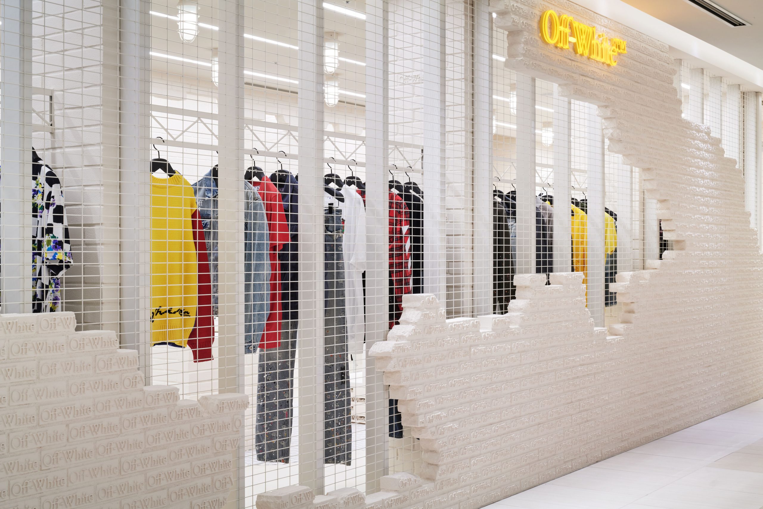
John and I were friends, even though we were at totally opposite conceptual poles in architecture. Still, he invited me for lectures there, even though he was probably gritting his teeth at times. (Laughter). Another thing about that 1970s and 80s generation, was the fact that many contentious design world people targeted corporate architecture. As a sort of defensive wall, smaller firms and studios were quite friendly with each other. We would argue with each other and poke fun at certain colleagues’ work; but it was done with respect and good humor. I miss that kind of discourse today. It often seems the only thing that merits credit or gets talked about now is the mega-building industry. I admire some of the expanded services and technological advances; but I most respect innovations that are really looking at people inclusion and streetscape interaction in innovative ways. I was just sent some pictures of SITE’s new showroom for Off-White fashions in Tokyo; but, these images had no people in the space; so I asked for more photos that included customer presence. I associate such ‘absence of inhabitants’ presentations with Architectural Record. This magazine always seems to photograph architecture from the viewpoint of ‘God forbid that people or vegetation might obscure some detail of the building.’ It is always that same ‘edifice on a pedestal’ sensibility. I prefer the opposite. For me, people presence is as much a basic ingredient for creativity as building materials themselves. I also see people as part of the subject matter.
Is there anything that we haven’t discussed that you feel will impact the art and architecture of the future?
My father was an engineer and an amateur physicist. His influence on me growing up led to an interest in physics and in learning about the universe. The main challenge scientists are continuing to discover concerning the galaxies and endless space reveals that most of what we observe is beyond the mind’s limitation of reason. Humans see everything in terms of ‘cause and effect, beginning and end.’ We think of the earth and the universe as having a precise moment for the ‘big bang.’ OK, but what happened before the beginning and will there be a day of final termination? It’s an impossible concept. Stephen Hawking spent his whole life trying to find a ‘theory of the infinite.’ Einstein basically circumnavigated the limitations of the mind with his theory of relativity, because it was a concept that most people couldn’t wrap their brains around. As he discovered, science could test it, his colleagues could see the implications for physics and future generations could benefit from the subsequent expansiveness of his big idea. But, in fact, Einstein’s theory was beyond reason. The ultimate game plan now will be to look beyond the known universe itself, because out there is a point of total blackness, where nothing exists. The ultimate question becomes, what is nothing? I (cautiously) believe, through that kind of theoretical thinking, humanity can return to its own environment with a newfound reconciliation between our limited existence here and an ability to at least embrace the idea of ‘the infinite.’ Look at black holes. This phenomenon is also an inconceivable concept. Where do stars go after being sucked into a black hole? Then, of course, we always wonder what happens ‘after that.’ I think what will probably be derived from all this inquiry and speculation is some kind of conversion of discoveries into useful technologies. We know that humanity must find a way to go beyond the energy systems we rely on now, which are invasive, destructive and inefficient. With its usual aggressive shortsightedness, industry makes almost everything out of petroleum-related materials, while at the same time, the world is burning up fossil fuel in its excessive need for transportation. Look to past civilizations. In Italy, for instance, you find many of the greatest architectural achievements. Yes, these communities worked by hand, and, yes, they relied on abusive labor policies, which we abhor now . . . but they were doing it without destroying the earth. Today, the only way people build their habitat is to try to disregard, out-maneuver, or deny the needs of nature. One of the continuing problems is that alternative energies can’t completely replace fossil fuels in terms of power requirements. Sustaining a 747 passenger route takes unbelievable amounts of energy. At the same time, the earth is flooded with solar energy, which is nearly 100% efficient, while burning fossil fuels is about 20% efficient. So, it’s a balance between the needs that we have created for ourselves – especially those we assume we cannot live without – and the ultimate mission of sustainability.
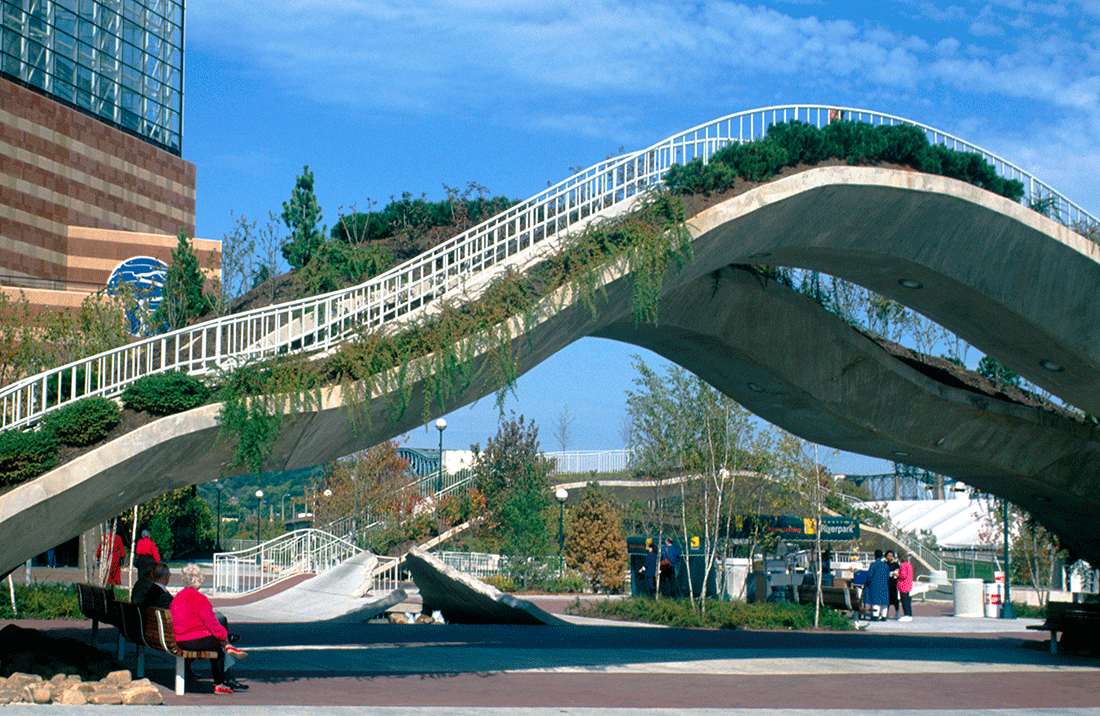
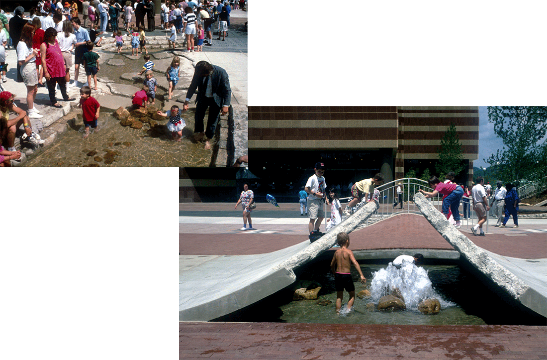
Ross’s Landing Park and Plaza. Above: Vegetated entry arch with performance space in the background.
Below: Shallow river running through the central plaza, plus a fountain created by rolling back the paving surface. Chattanooga, TN. SITE. 1992.
What’s next for James Wines / SITE?
A lot of SITE projects went on hold as a result of the pandemic. Fortunately, all of the 2020 planned exhibitions have opened however, including the Willi Smith: Street Couture show SITE designed for Cooper Hewitt,12 the Retail Apocalypse exhibition in Zurich, and SITE’s 50th anniversary retrospective at the Tchoban Foundation. We’re currently designing stores for Virgil Abloh, as I’ve already mentioned. If things return to some degree of normal again, I most enjoy working on public spaces. The parks, plazas, and exposition spaces we’ve done in the past have been successful and – especially after COVID-19 – I think people will prefer, more than ever, to be outdoors. I like creating what I call ‘trigger elements.’ These are special visual ingredients, subtly orchestrated as part of an environment and based on site-specific references that help activate the participants’ experience. For example, when we built the Ross’s Landing Park in Chattanooga we broke up the sidewalk and allowed for a small river to flow through the length of the site, making it traversable at the same time. This project became particularly appreciated by children, who used the cracked-up paving as a stimulant to invent their own games. This kind of approach is often very simple to execute, without being vastly expensive and consuming huge amounts of energy to construct and operate. I look forward to getting into more projects like this, but I guess the next few months will tell.
Off-White Ginza ‘Decon Depot’. The Off-White Ginza store is totally composed of off-the-shelf building materials as an in-process construction site. Off White & Virgil Abloh. Tokyo, Japan. SITE. 1984.
You touched on this already, but as things return to normal do you think the pandemic will affect how you design for public use?
If I had a specific project in the studio, related to these circumstances, I would focus on that challenge. Sadly, the medical world says these viruses are not done with us yet. The most perverse and unpredictable force of all is nature itself, and the way it generates an indeterminate future. It offers you these incredibly tempting and exhilarating morsels – like beautiful waterfronts, forests and mountains – then injects them with unexpected threats of fatality. Other animals have natural enemies to deal with, but our worst adversaries are invisible viruses and germs . . . plus humanity’s most threatening predator of all, our own species. So, working with those conflicts in mind and trying to conceive of spaces for more people and less people, simultaneously, is a hard one to figure out. How will the public gather together, while keeping apart? I’ve been fascinated by going to restaurants during the pandemic, where you are somewhat in public, while still being somewhat in isolation. So far public space has been about ‘piling up’ people. We always figured that the more people were congested, the more successful the project. But, now, what if the reverse is true? Don’t worry, I’m still thinking. I’m not in the ground and not assigned to the geriatric ward yet! (Laughter)
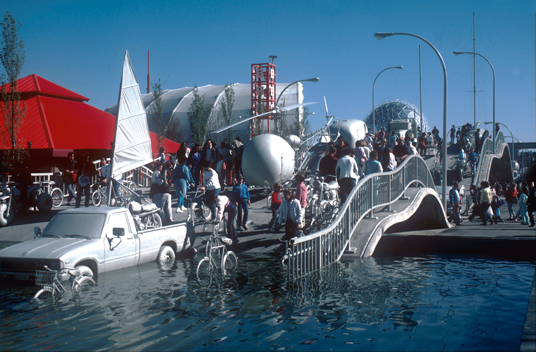
Highway 86. Winning competition entry for public space at the 1986 Canadian World Exposition, celebrating the history of 20th Century air, land and sea transportation. The structure is a seven hundred foot long undulating ribbon of concrete and steel for the purpose of exhibiting all means of mobility as part of a participatory sculptural event. Monochrome vehicles entering the main fountain area. History of 20th Century Transportation Processional Plaza,1986 Canadian World Exposition. Vancouver, Canada. SITE. 1986.
This interview is the latest in a series for Arch2o which delves into the work and philosophy of architects who are actively (re)defining not only architecture proper, but what it means to be an architect today and, perhaps, in the future.SITE’s work, spanning 50 years, is currently on view a the Tchoban Foundation Museum for Architectural Drawing in Berlin.
All images courtesy of James Wines and SITE. For more information on SITE’s work visit www.siteenvirodesign.com/
Interview by Zack Saunders
END NOTES:
1) Wines, James. De-architecture. Rizzoli International Publications, Inc., 1987. p. 145.
2) Wines, James. James Wines and SITE: Retrospective 1970–2020. November 2020 – July 2021. Tchoban Foundation Museum for Architectural Drawing, Berlin. Introduction to the exhibition can be found here.
3) Wines, James. De-architecture. Rizzoli International Publications, Inc., 1987. p.33.
4) Richmond, VA was the location of two SITE-designed BEST Products buildings including the Peeling Showroom of 1971 and the Forest Building of 1980.
5) “Until architects are able to see the product of their efforts as a collection and transmission of contextual information, an embodiment of discourse, and a distillation of psychological insight, the gulf between the profession and the public will remain.” De-architecture. 2000. p.53
6) Wines, James. Green Architecture. Taschen, 2000. p. 9.
7) Urbanization. United Nations, Population Division, 2021. www.un.org/development/desa/pd/themes/urbanization.
8) Fry, Richard. Prior to COVID-19, Urban Core Counties in the U.S. Were Gaining Vitality on Key Measures. Pew Research Center, 29 July 2020. www.pewresearch.org/social-trends/2020/07/29/prior-to-covid-19-urban-core-counties-in-the-u-s-were-gaining-vitality-on-key-measures/.
9) E-commerce in the time of COVID-19. OECD Policy Responses to Coronavirus (COVID-19), 7 October 2020. www.oecd.org/coronavirus/policy-responses/e-commerce-in-the-time-of-covid-19-3a2b78e8/.
10) SITE”s website describes the project as a “Housing proposal where the final identity of the building becomes a collective result of residents’ personalized choices of dwellings and gardens.” Original drawings for the Highrise of Homes are part of the MoMA’s permanent collection and can be viewed on a rotating basis, or online at www.moma.org/collection/.
11) Vegas Weddings. Denny’s, 2021. www.dennys.com/vegasweddings/.
courtesy of James Wines and SITE
courtesy of James Wines and SITE
courtesy of James Wines and SITE
courtesy of James Wines and SITE
courtesy of James Wines and SITE
courtesy of James Wines and SITE
courtesy of James Wines and SITE
courtesy of James Wines and SITE
courtesy of James Wines and SITE
courtesy of James Wines and SITE
courtesy of James Wines and SITE
courtesy of James Wines and SITE
courtesy of James Wines and SITE
courtesy of James Wines and SITE
courtesy of James Wines and SITE
courtesy of James Wines and SITE
courtesy of James Wines and SITE
courtesy of James Wines and SITE
courtesy of James Wines and SITE
courtesy of James Wines and SITE
courtesy of James Wines and SITE


