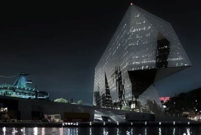
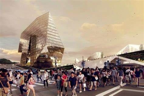
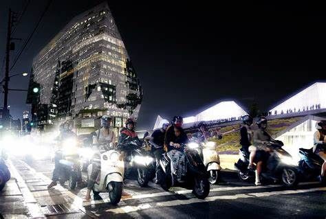
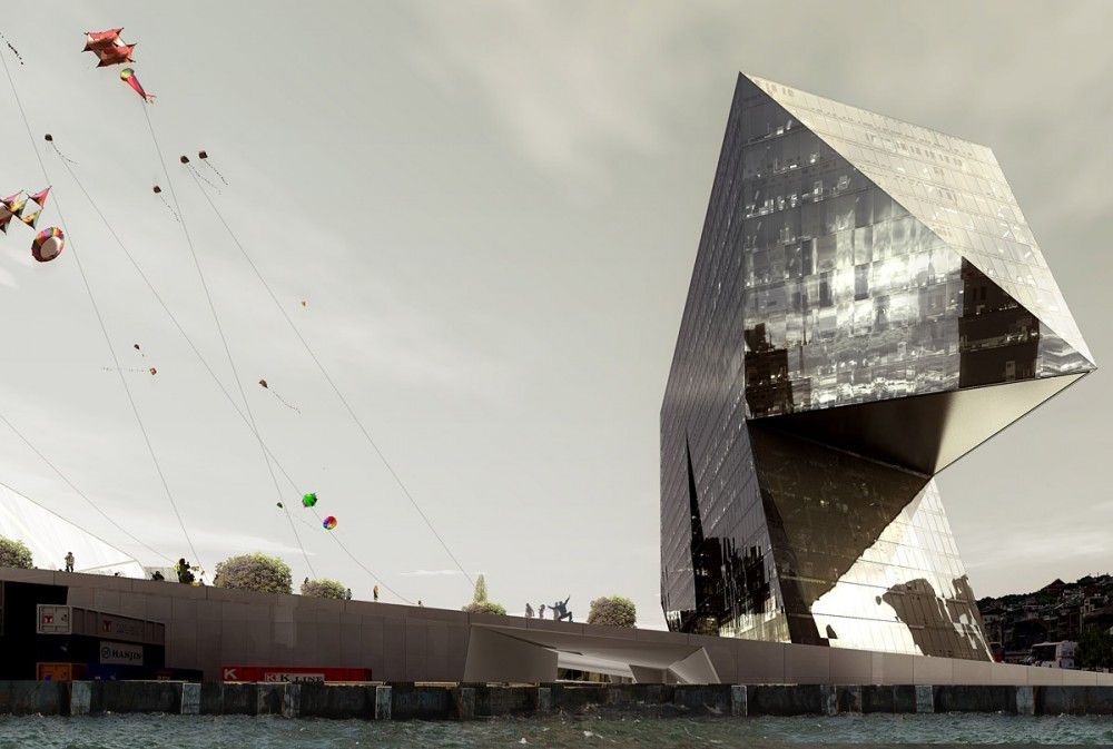
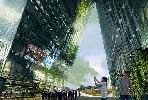
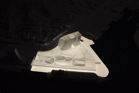
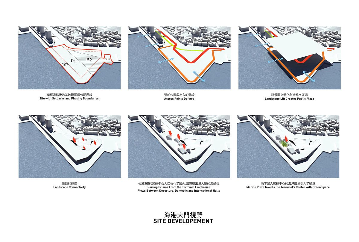
PAR (Platform for Architecture + Research) + Sériès et Sériès unveiled their second stage entry of Keelung Harbor Competition, a competition of designing a landmark that combines maximum artistry with maximum efficiency. The site is located at the very end of Keelung’s harbormaster plan, where the mountain meets the sea. Keelung is a gateway that through its history, climate, and the customs of its inhabitants, is predestined to make use of its exterior space. For this reason, we decided instead of planning the building as an independent object within an open space, we would propose buildings that will generate and structure this open space. The design frames the harbor and the water beyond with an asymmetrical tower defining the northern perimeter of the facility, connected to the terminal by plazas at the ground and concourse levels. The project form, together with the lighting, aims to provide a dramatic entry experience to Taiwan from both the sea and the city of Keelung. The design of the Keelung Harbor Terminal interposes the link between public space and waterfront amenities by providing continuous open space at the water’s edge. Terminal Halls emerge like prisms through the building’s green roof generating a condition that is both building and landscape. In this way, new urban developments and public spaces can grow without displacing natural recreational land. By maintaining this continuity of the network, the waterfront and the port terminal development will be within easy reach of many residents in the central city.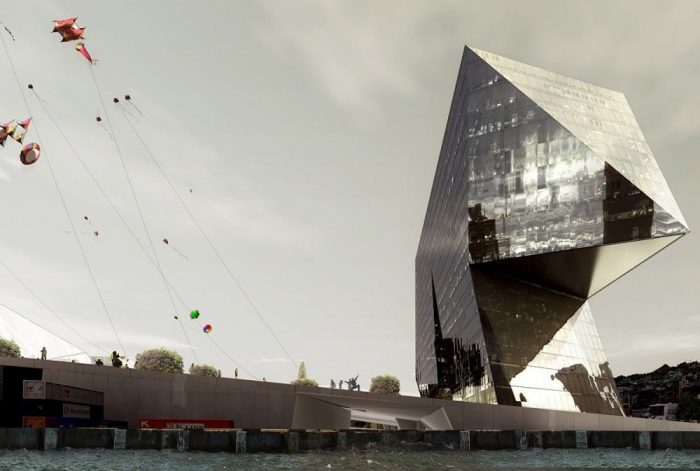
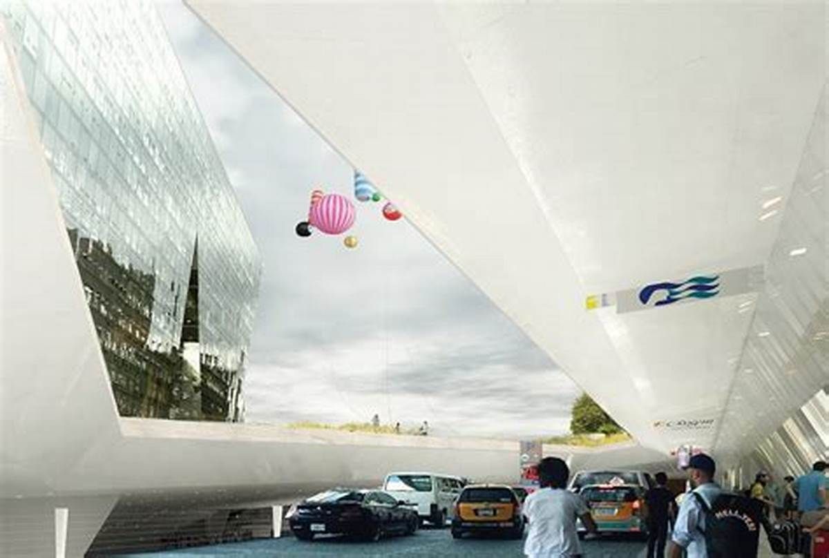
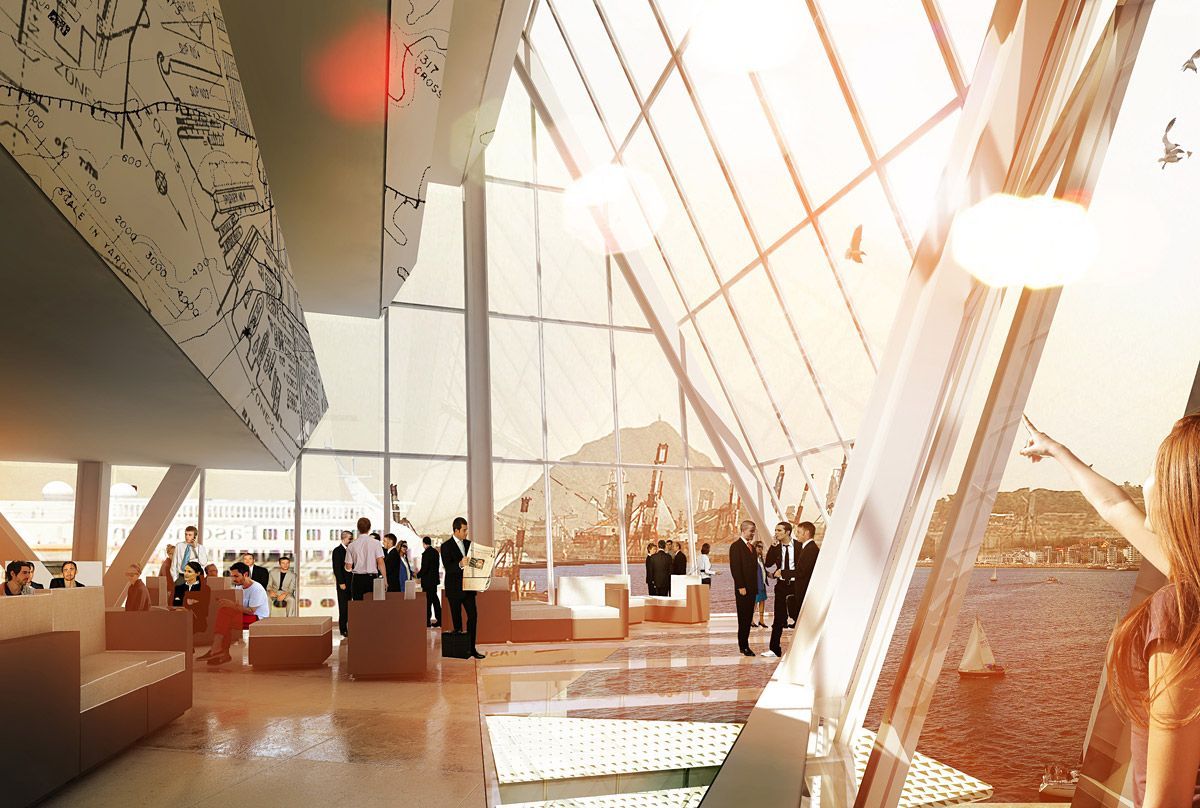
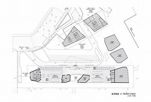
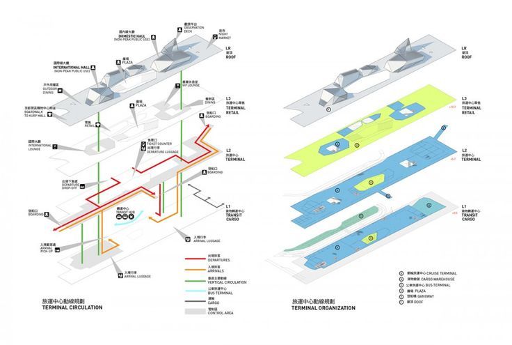
 The structure of the buildings rubs against each other like continental shelves making it possible for the complex of public, transit, and industrial activities to coexist. This is one architectural element: a permeable, open architecture of maximum efficiency encompassing the tower, terminal, and cargo storage. Parallel to the harbor, transit is organized by one large band. Split arrival and departure bands organize traffic to and from the ships with maximum efficiency; while the separate tower and cargo access ensure utilitarian viability. Its chosen theme, A Mixing Chamber, reflects Taiwan’s contemporary ambition: its different cultures – the users of the terminal – embarking on a unified future. A collection of prisms crown the terminal’s Departure, Domestic and International Halls with luminous, vaulted spaces. Cutting diagonally through the terminal platform, multiple relations between the concourse level and other levels of the building are established, while always permitting new angles of vision and a changing play of light. Derived from the interstitial space between the Domestic and International Halls, a second architectural element, the Marine Plaza projects inward bringing the outside in.
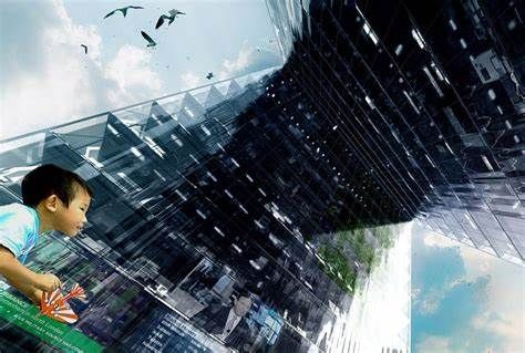
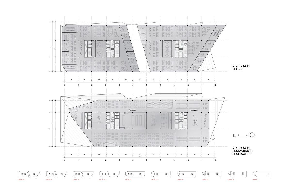
 The interiors of the terminal and the roof mezzanine are designed as hybrid spaces, not only blurring the boundaries between exterior and interior but also easily adapt to the variable program. Existing public, pedestrian flows along the western edge are enhanced, rather than interrupted by creating a continuous elevated public plaza adjacent to the concourse with independent circulation. Cruise functions, meanwhile, are located on all 3 levels yet kept distinct to maintain secure areas for departing and arriving passengers. Overall, an experience of directed yet functionally separated flows lends an aura of energy to the terminal building. A third architectural element, the Harbor Tower, is a clearly identifiable landmark. Its portal becomes a framing device for the city while providing passage for the plaza. Given its location and placement, the figure of the tower takes a geometrical stand in relation to the mountains and transit network. Oriented to true north with the widest elevation on the Land-Sea Axis, the tower is literally the hinge between harbor and city. Tilting five degrees eastward, the building’s broadest facades dematerialize into reflections of water or sky. A global gateway, the tower represents Taiwan’s culture.