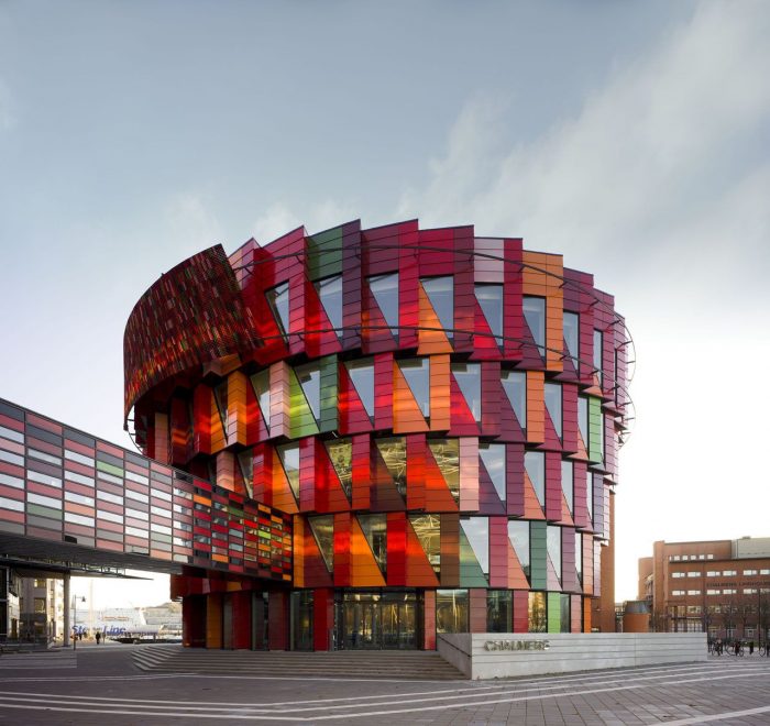
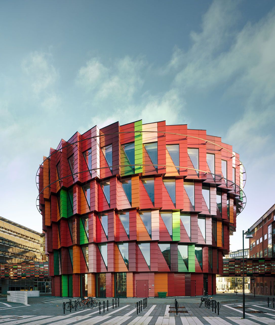
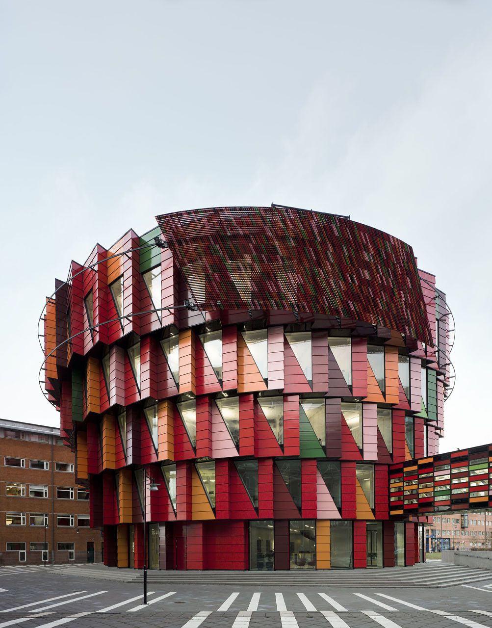
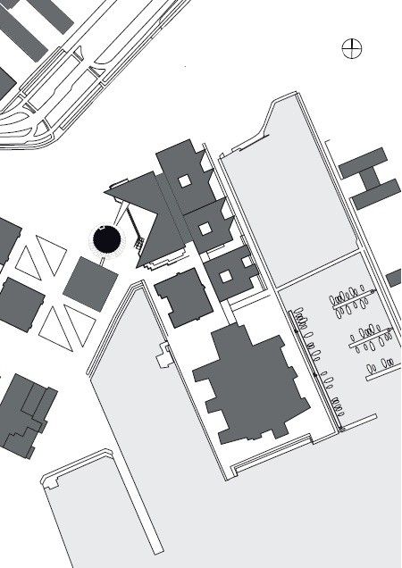
Swedish firm Wingardhs Arkitektkontor’s refreshingly contrasting building, a lively bucket – which catches an abundance of sunlight – among dull reflective cubes that loom over the public squares, is located in the Lindholmen science park on Hisingen Island. The science park which is the working place of 21 000 employees and future employable students and is also home to the University that Gert Wingardh (the man behind the firm) graduated from. ICT, Media and Transportation students studying on the campuses on the science park are rewarded by this building, a hub, providing the community of like-minded professionals with the opportunity to meet and socialize.
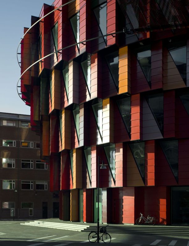
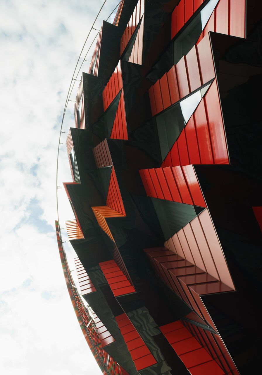
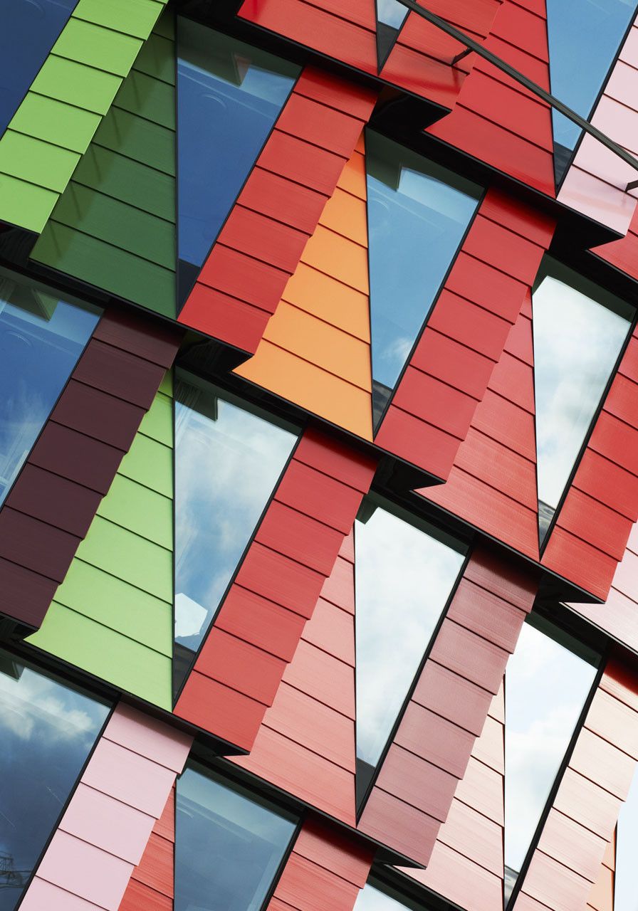
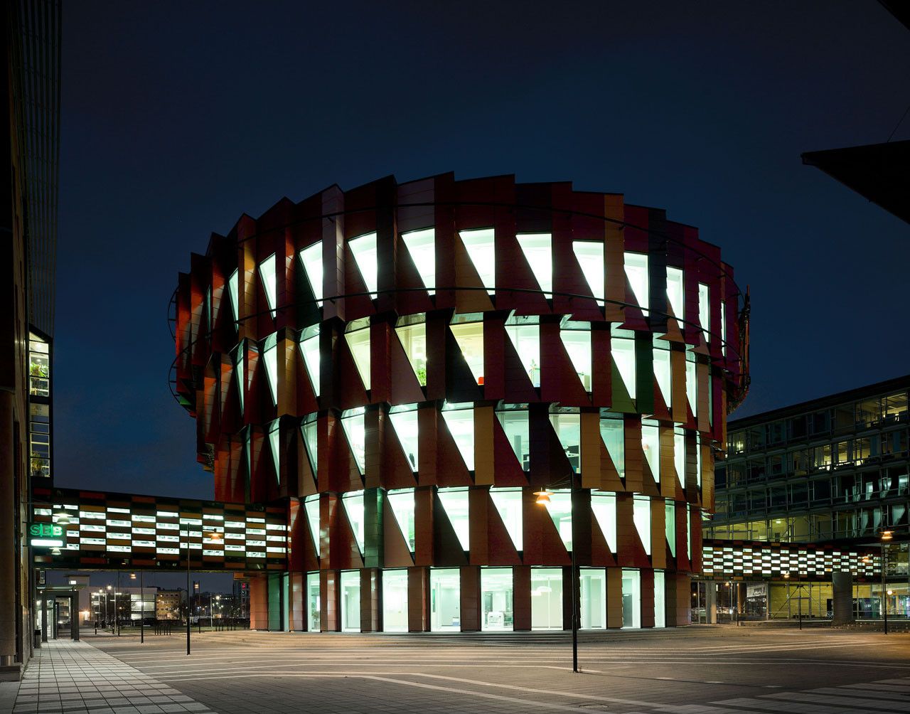
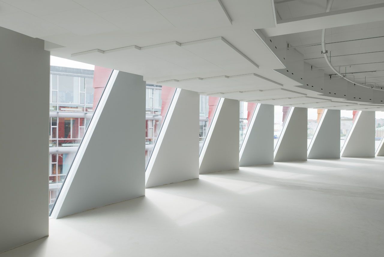
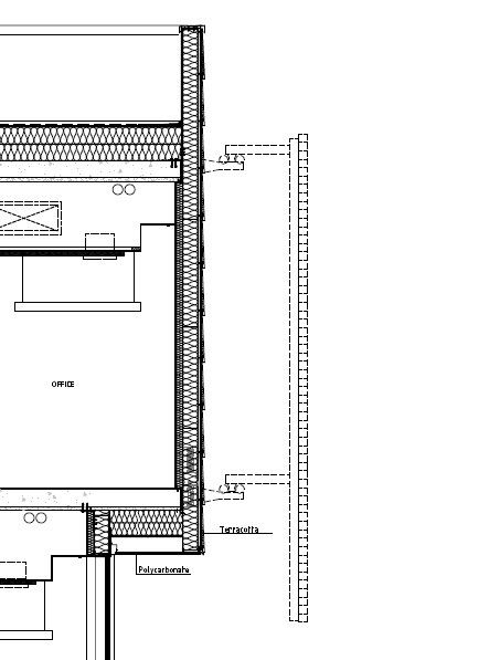
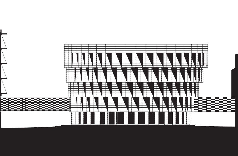
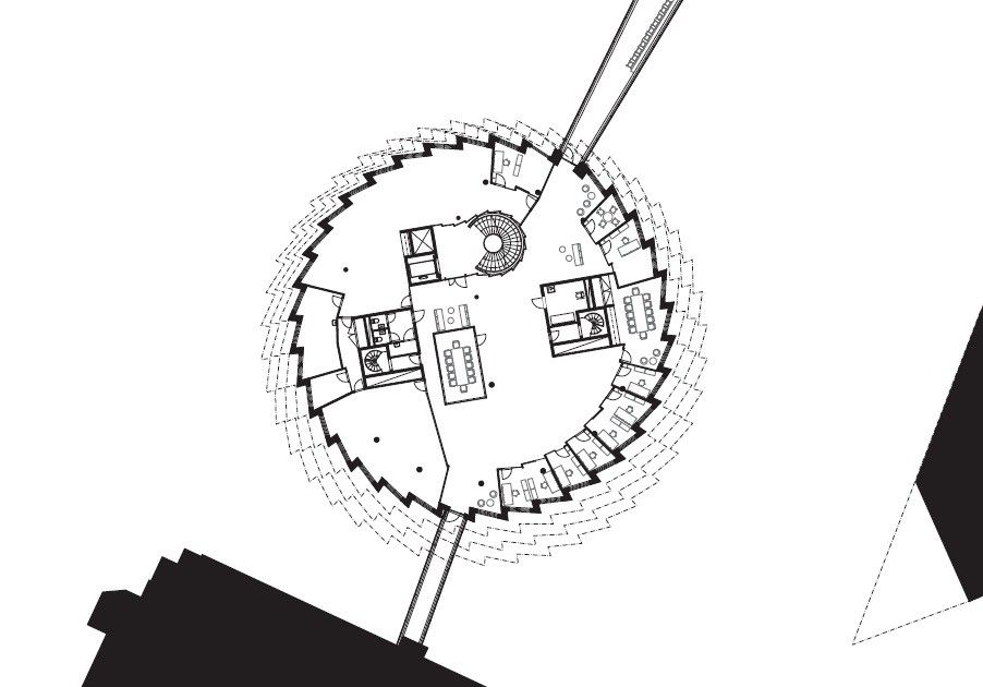
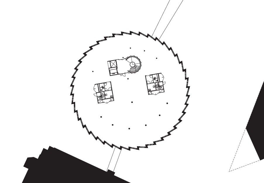
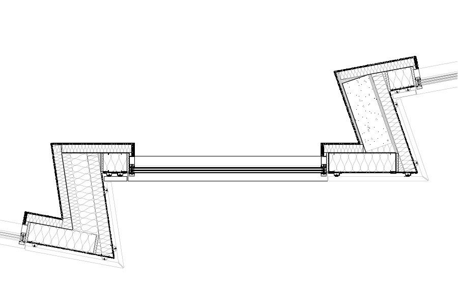
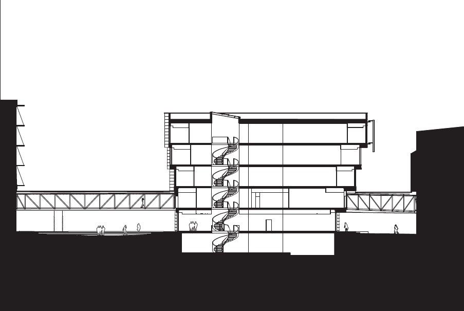
Its primary circulation (spiral stairs) coil around the central light providing atrium. The building’s envelope is a sharp burst of red ceramic tiles framing triangular windows right up to the fifth and final floor of the building. Its shape allows for passive heat gain and cooling through optimizing day lighting, which also minimizes the need for artificial lighting, ultimately lowering its ecological footprint.
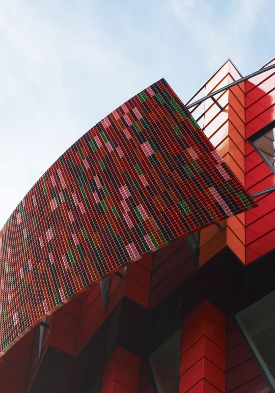
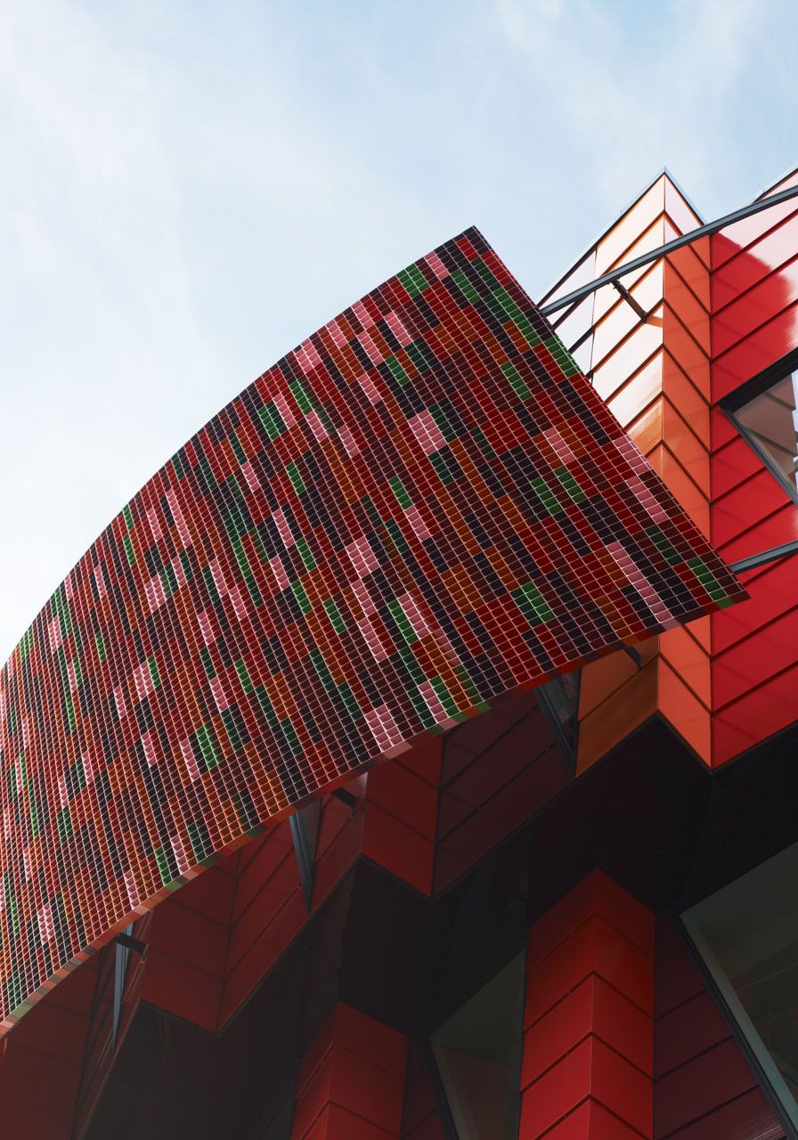
A mobile photo-voltaic screen moves with the sun in order to shade the top floor of the building and is powered by the solar panels of the roof. The aesthetic of the building (apart from colour) is solely secondary as it is a result of the economically conscious and sustainable decisions made in the form of openings and cooling strategies used.
I find the circular form appropriate for a building of its nature,it is innovative and unique, it stands out from the norms of its European and modern context, catapulting ahead in the race to the future of sustainable design. This form provides for the graceful execution of its most spectacular feature, the mobile screen, allowing the building come alive.
The building is spatially economic due to the facade surface area / building area ratio being ideal to assist in controlling the internal temperature, in a sustainable way. The temperature stays between 22 and 26 degrees Celsius, blocking out the excessive wind, a comfortable temperature for the open plan and private offices in the four floors above ground.
The building is connected to its context through two pedestrian walkways on its first level, reaching into the Jupiter Building, which I don’t find ideal because the space created underneath those walkways become dark and even non-places. This negative threshold created will act as a border between the two sides and it’ll either guide people into the building or away from it. That outside spill out space may be made smaller directly in front of the building as a result of this division.
The building provides for a social need withing the business park, a more relaxed but still professional platform for younger professionals to interact with and acquire mentors within their own field of work. Contextually, the initial contrast is a shock, but its colour, mechanism, systems shape and facade style compliment it’s old fashioned programme and basic requirements of it being a physical for in which human activity can be sustained and even encouraged. The building’s height is minimized because the appearance is already a sharp contrast to its environment, a monumental structure would be overpowering.
The Cog, (“Kuggen” translated to English) has been welcomed by the students of the surrounding campuses and the employees that inhabit the offices within. This building provides vibrant office space for the growing professional population of the science park.
By: Thelma Ndebele
- Architects: Wingårdh Arkitektkontor
- Location: Lindholmsplatsen, Göteborg, Sweden
- Architect In Charge: Gert Wingårdh and Jonas Edblad
- Contractor: PEAB
- Client: Chalmersfastigheter AB
- Area: 5350.0 sqm
- Project Year: 2011
photography by© Lindman
photography by© Lindman
photography by© Lindman

photography by© Tord-Rikard Soderstrom
photography by© Tord-Rikard Soderstrom

photography by© Tord-Rikard Soderstrom
photography by© Tord-Rikard Soderstrom
photography by© Tord-Rikard Soderstrom
photography by© Lindman
Courtesy of Wingårdh Arkitektkontor
Courtesy of Wingårdh Arkitektkontor
Courtesy of Wingårdh Arkitektkontor

Courtesy of Wingårdh Arkitektkontor
Courtesy of Wingårdh Arkitektkontor
Courtesy of Wingårdh Arkitektkontor
Courtesy of Wingårdh Arkitektkontor
Courtesy of Wingårdh Arkitektkontor
Thelma Ndebele is an editor at Arch2O and a part-time lecturer at the University of Johannesburg. With a background in architecture and critical spatial research, Thelma’s academic work explores the intersections of urbanism, cultural identity, and public space. Their editorial contributions reflect a commitment to unpacking the socio-political dimensions of architecture, especially within African urban contexts. Through both teaching and writing, Thelma engages with emerging discourse on inclusive design, making them a thoughtful and vital voice in Arch2O’s academic and editorial landscape.


