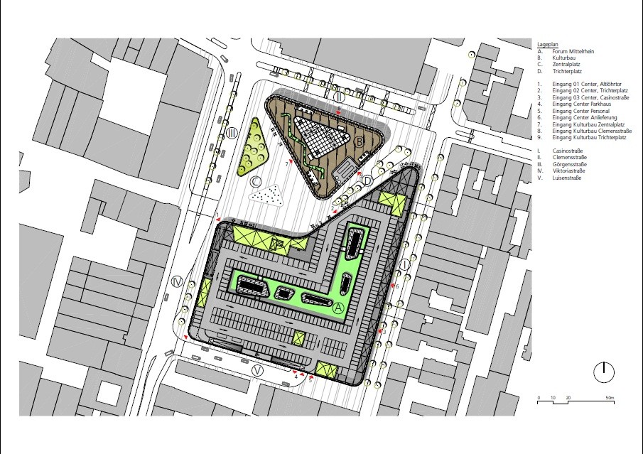
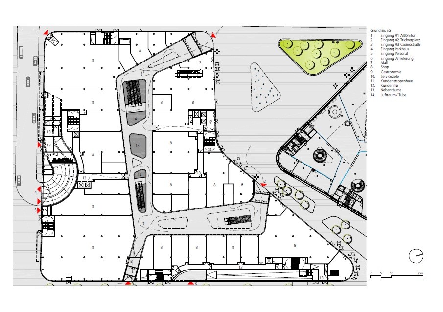
The project started as a competition for the redevelopment of the “Zentralplatz”, the main square in Koblenz. The program included approximately 20,000 m² of retail space ( the mall ) , more space for cultural and tourism purposes and an urban square of 6.000 m².
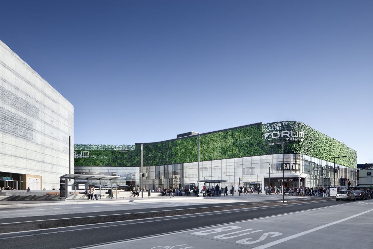
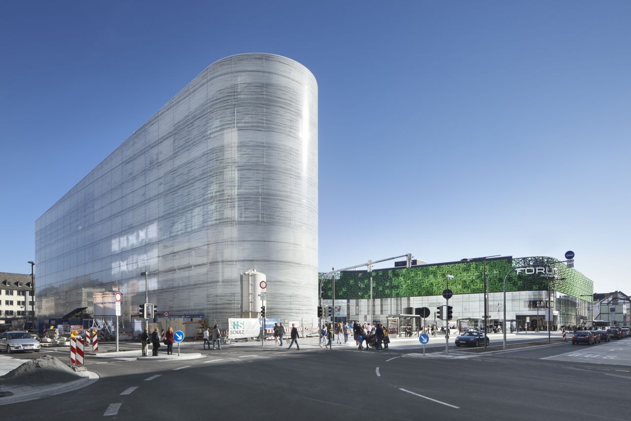
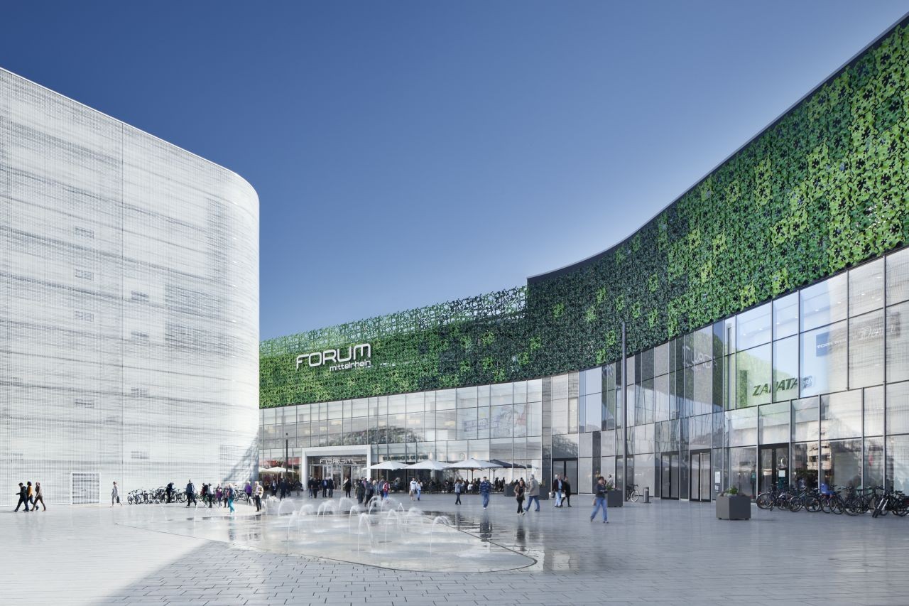
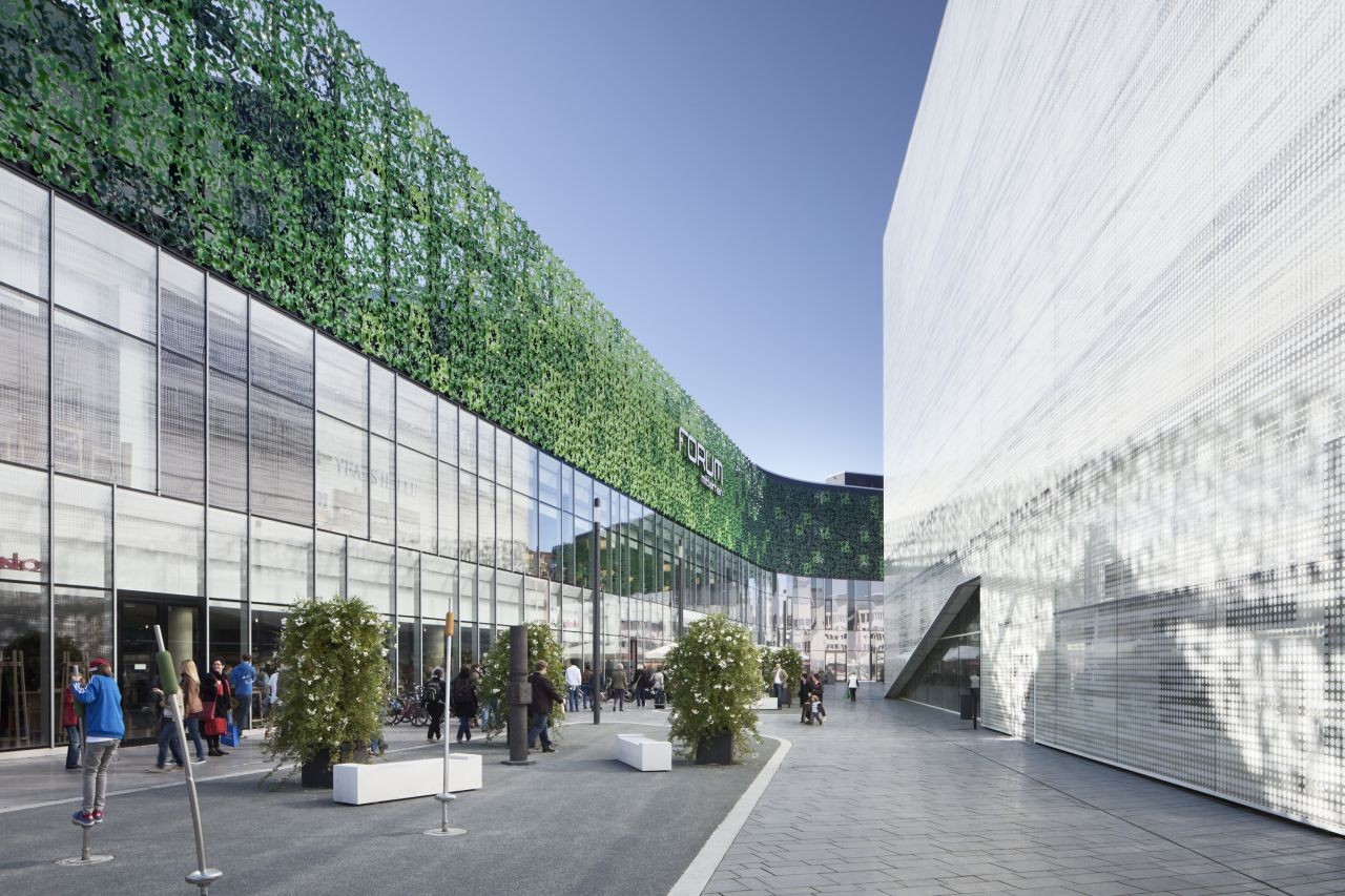
The complete program is split into two volumes, with the Zentralplatz in between. The separation of functions allows for two autonomous and highly functional buildings, which can develop long-term and independently. The two buildings and the square create an urban ensemble. Because of the precise positioning of the buildings and their outline, the pedestrian flows, which make the central square a public setting, are organized in an effective and logical way. The two buildings are complemented and strengthened in their urban and architectural implementation by each other’s background.
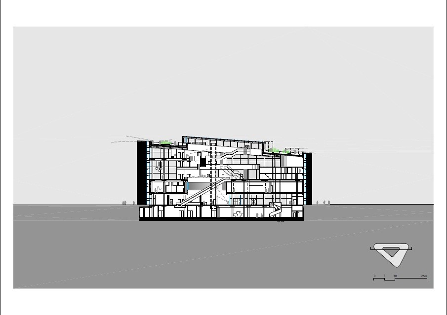
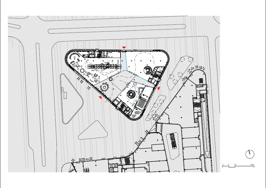
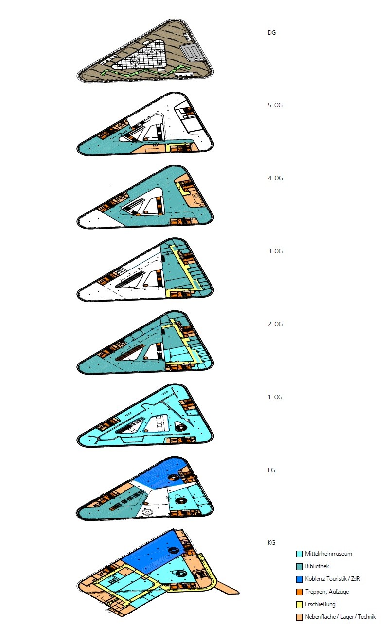
The Kulturbau houses the public library, the Mittelrhein Museum and the tourist information of Koblenz. The combination of these different cultural institutions offers the chance to exploit the synergies between the various institutions.
The cultural building stands solitary in the new central square. Its outline is created naturally by the positioning in the “flow” of routes. On the open square, the three functions each have their own access and develop from there in vertical layers. The no less than 30 meters high space inside connects the institutions, creates a light and airy atmosphere and offers good orientation. The building has splendid accessibility; the central lobby has entrances from all sides and is therefore a natural part of the urban fabric.
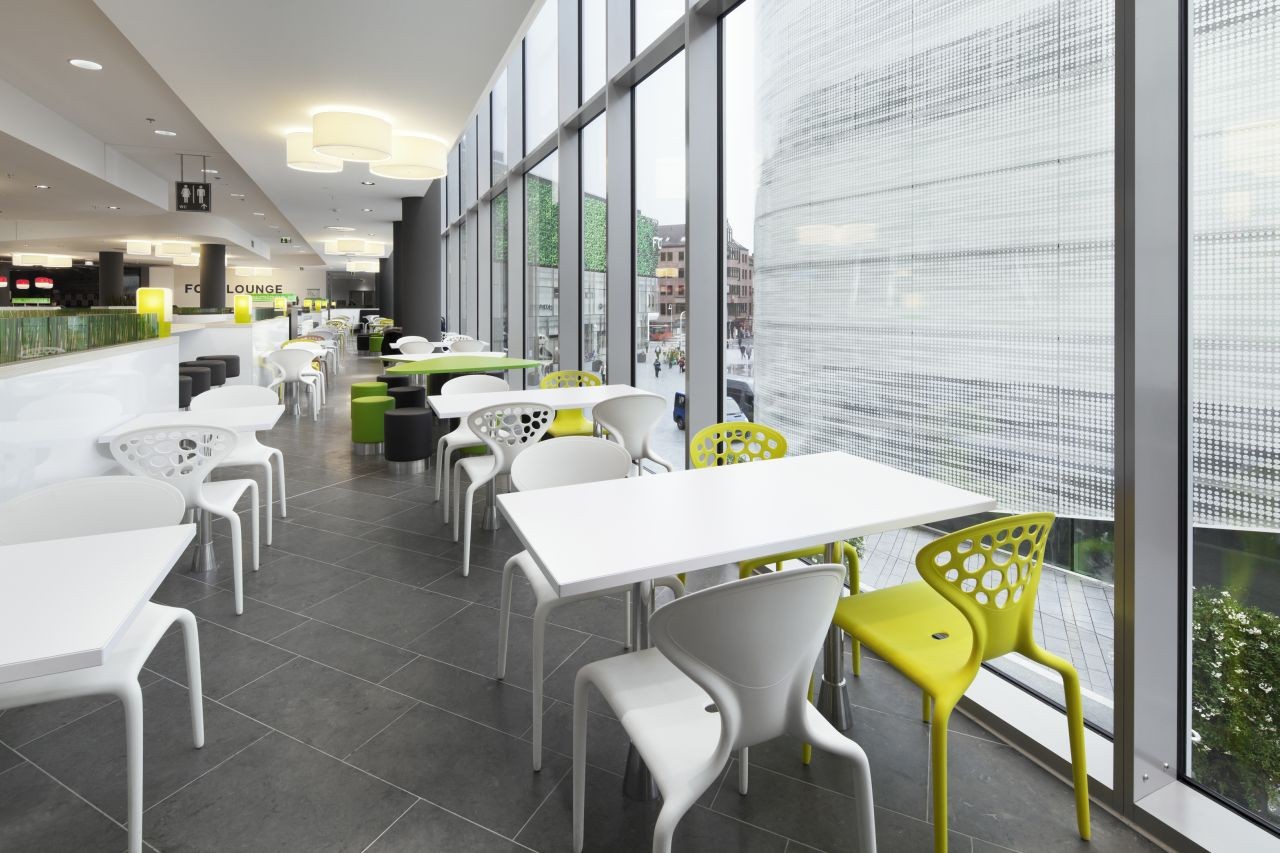
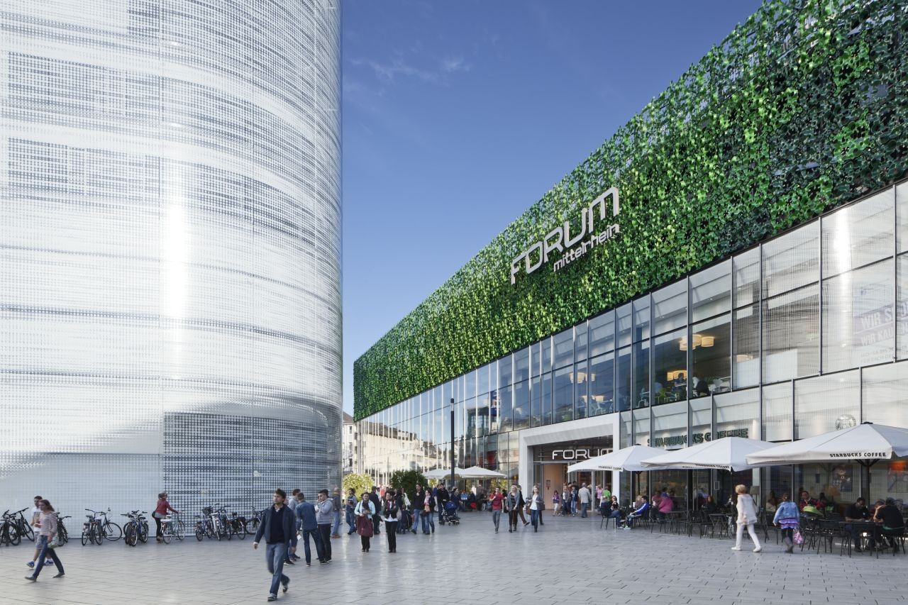
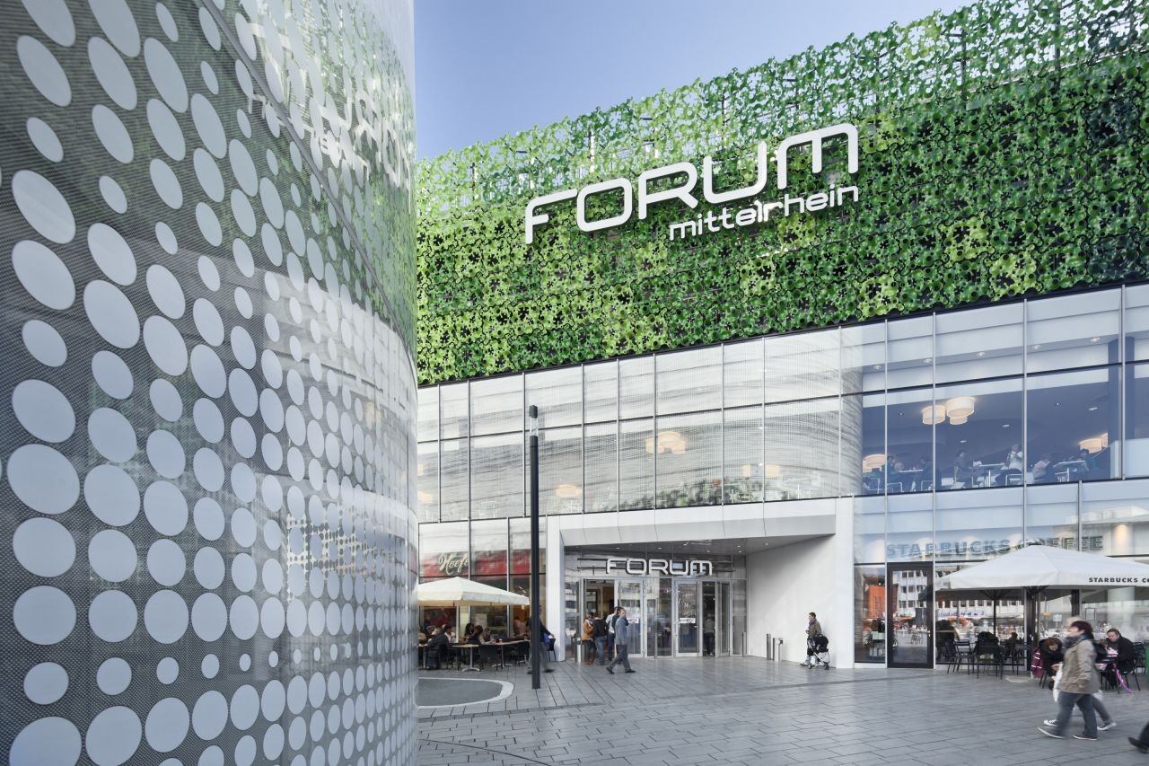
The volume has an double façade with a Structural-Glazing construction of white silk-screened glass, which embraces the building like a second skin. The motif of the print provides a filtered view from inside to outside and allows a vague view when looking from the outside in. At the different entrances, the outer façade has a spacious cut and therefore offers a direct view of the lobby and entrance areas.
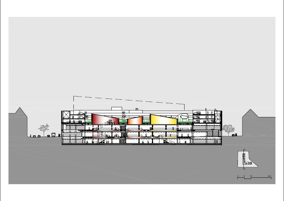
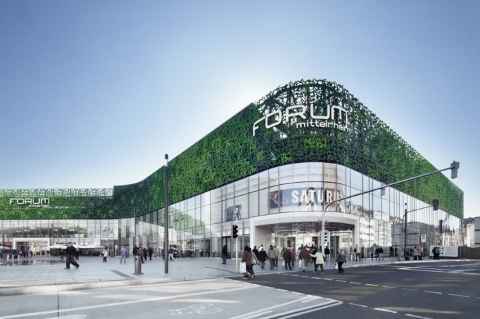
The mall Forum Mittelrhein presents itself as a flat, horizontal layered structure. Due to this powerful format, the buildings volume is reduced efficiently and a pleasant sense of scale is established.
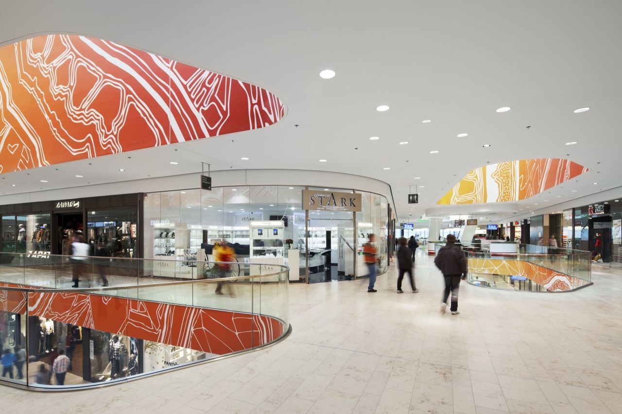
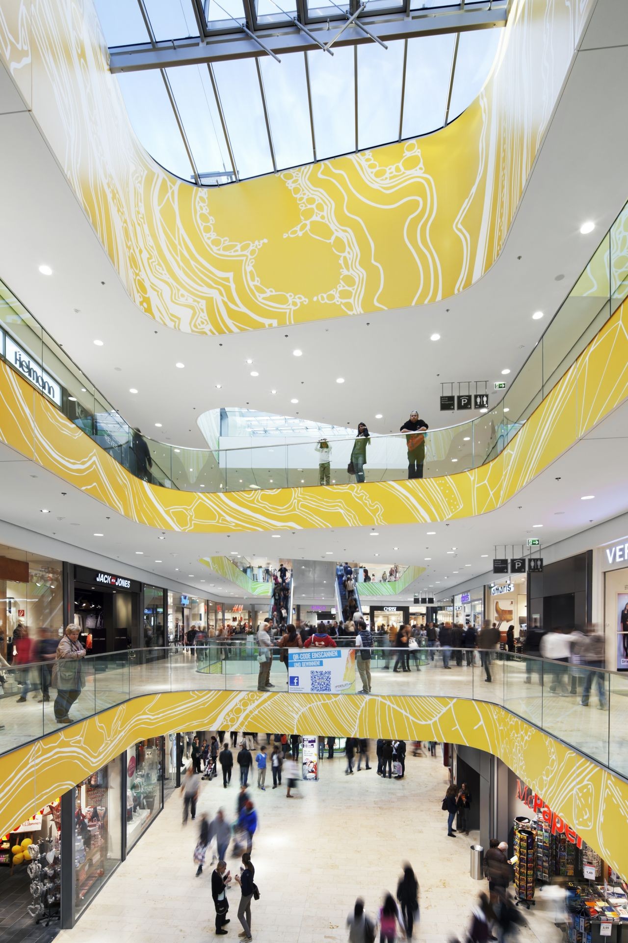
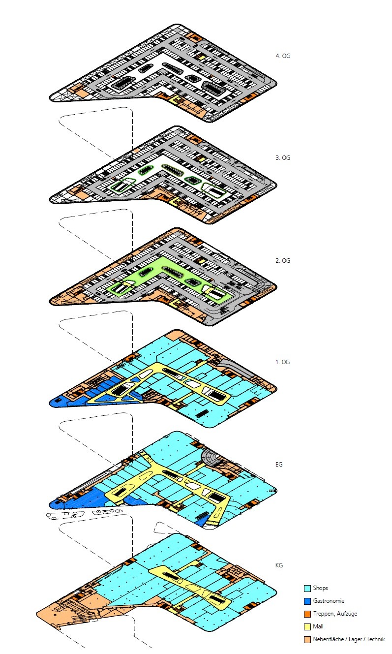
On relevant junctions within the urban fabric, the mall offers spacious entrances and invites visitors to follow the pedestrian flows and to ‘glide’ through the building. The shopping center is characterized by its trapezoidal layout and smooth outlines. The areas intertwined with escalators provide orientation points, divide the building and provide the interior with natural light. This, in combination with the great spaciousness, gives a high-level of amenity and a pleasant ambience for the user. Across the intense colors of the void edges, powerful accentuations are applied that create a vivid image.
The sales floors are located on level -1, 0 and +1. In the basement the loading and unloading area is organized in such a way that supplying both buildings can be easily coordinated and done collectively. On the second to the fourth floor there are technical facilities and a parking lot for about 740 cars, with parking spaces organized around a central landscaped courtyard.
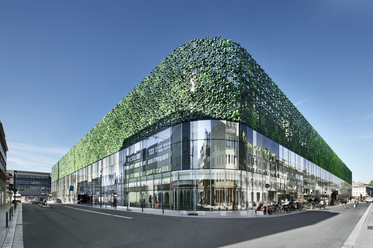
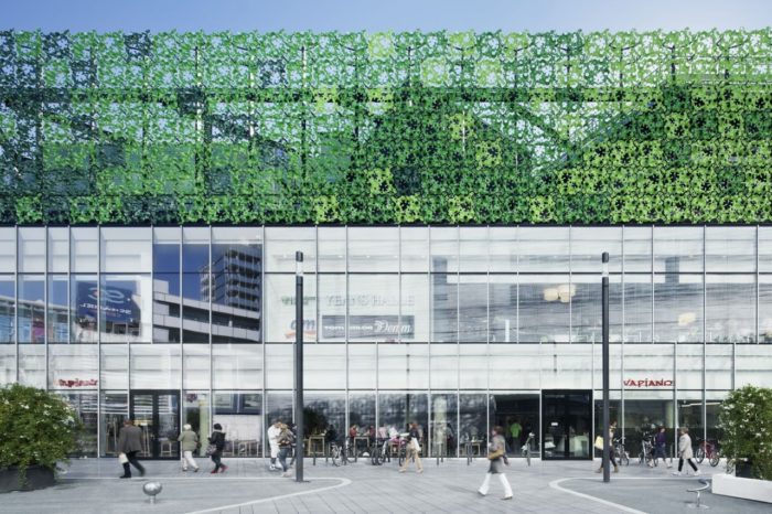
The façade design takes the users into account. The lower two floors with the shops have a glass façade as a strip around the building. The standing glass formats and the expressive shaped click frames of the façade profiles, give a strong vertical orientation.
The top three floors of the building are dominated by an artificial “Weinlaub façade” (wine leaf façade). The initial idea of the competition to make a natural overgrown façade was developed further artistically and abstractly. The basis of the structure is an abstract image of a vine leaf, which is interpreted freely as a 3D-shape. The entire façade is composed out of only one type of element, that is produced in large quantities and high quality in an industrial thermoforming process. Approximately 2,900 identical, three dimensional shaped aluminum elements, painted in three different shades of green, form this distinctive façade.
Project Info:
Architects: Benthem Crouwel Architects
Year : 2013
Photographs: Jens Kirchner
Location: Koblenz, Germany
Gallery:

