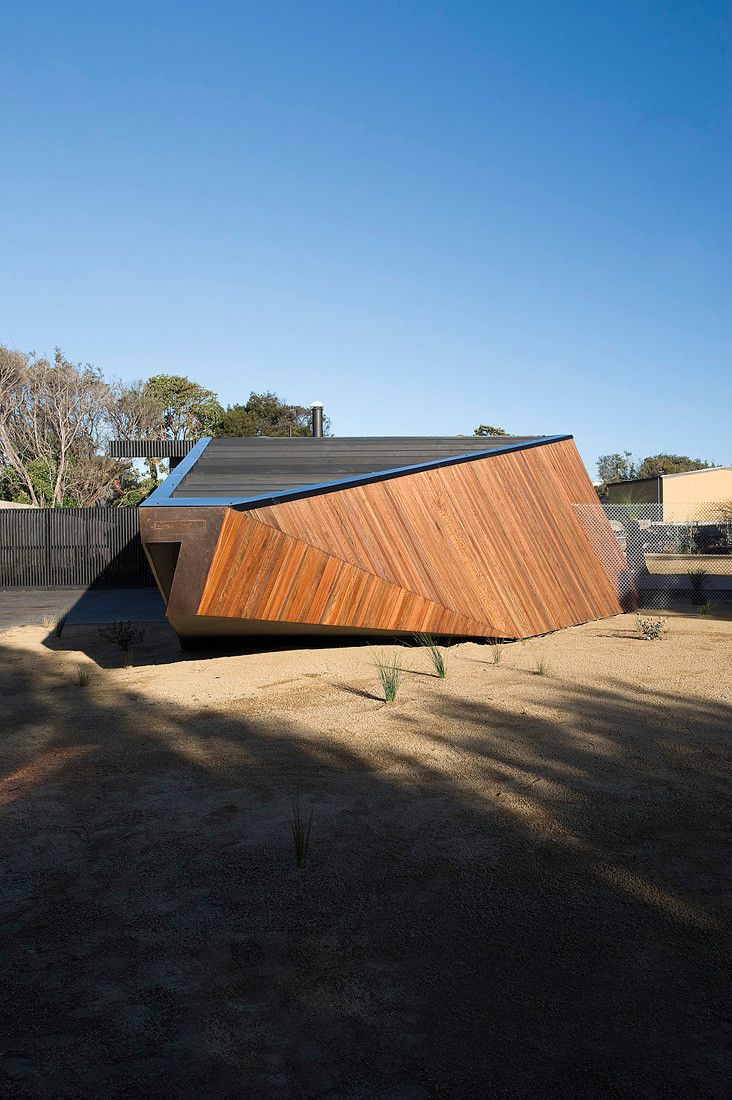
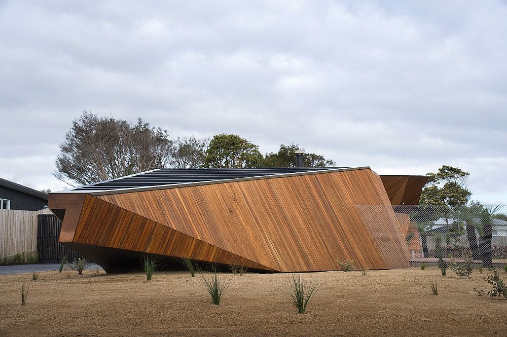
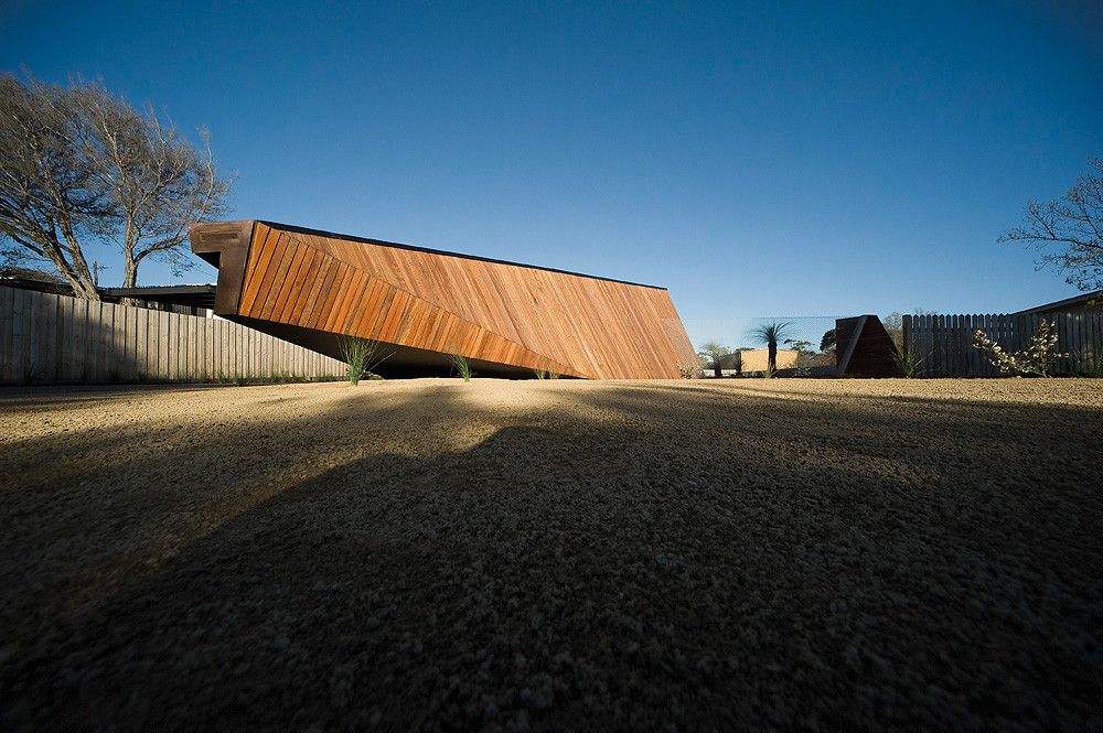
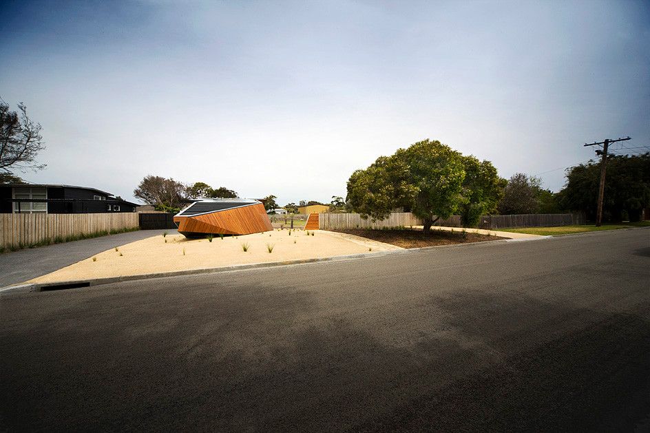
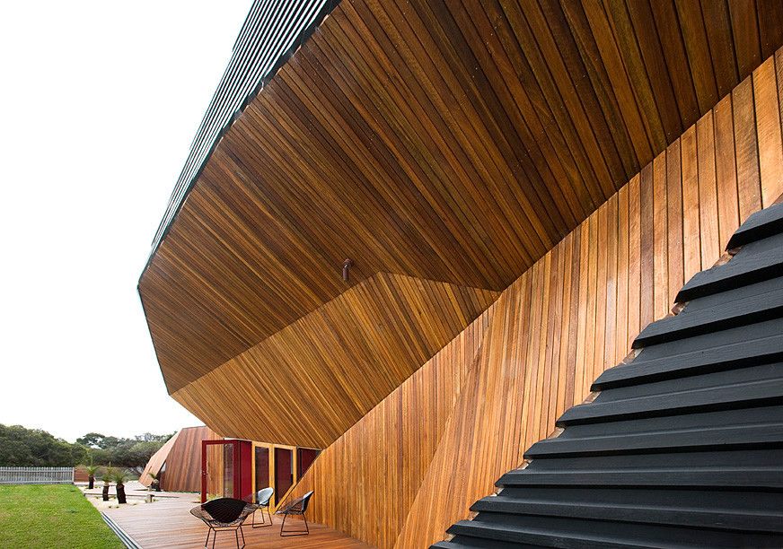
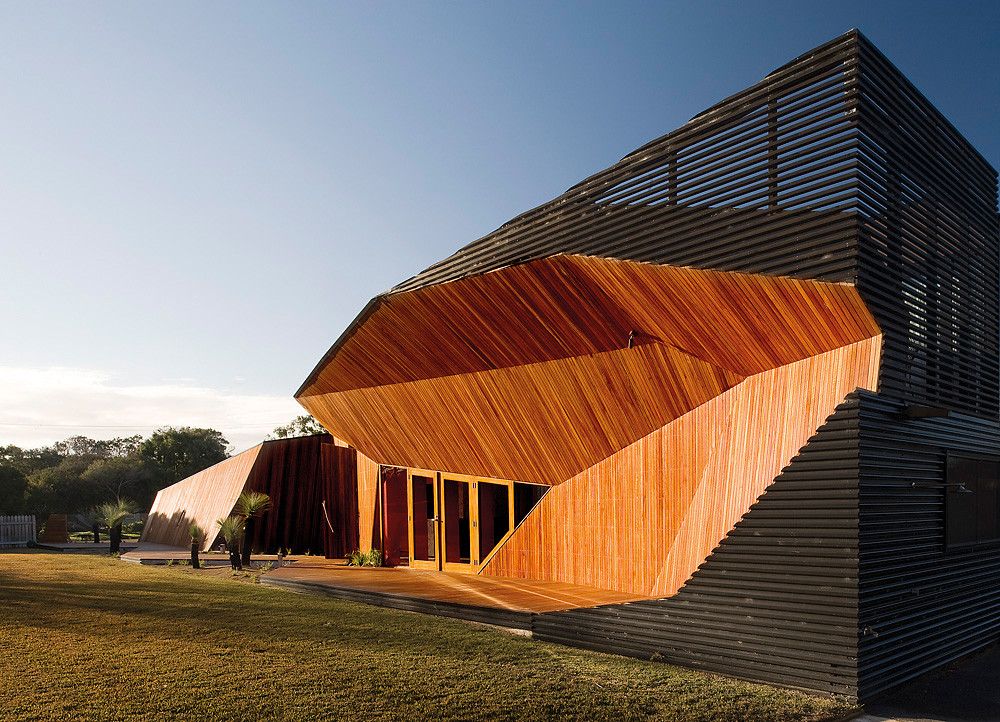
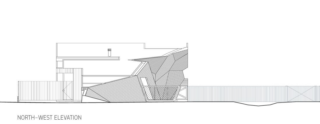
You know, I once heard someone say that they were trying to escape the banality of Australian architecture. I don’t remember what it pertained to, I only remember thinking to myself ‘Banality? Where?’. So to me, this house, the Letterbox House, by the firm McBride Charles Ryan, is just a reinforcement of the excitement and energy I think of when I think of Australian architecture.Built in Blairgowrie, Australia, the Letterbox House is a beach holiday house. Later on, in the architects’ description, you’ll read about how small the facade is. I just want to (p)reiterate this. The house, at 290m², is small (or more accurately, what the house shows you from the street is small) and this is great. It harkens back to Mies Van Der Rohe and the setting back to make way for plaza space. We don’t need the entire plot filled, it’s better to use the best than the most. The fact that much of the site seems left alone, makes the house itself stand out that much more.
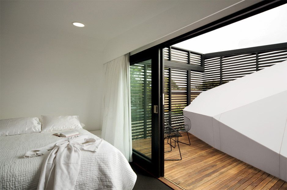
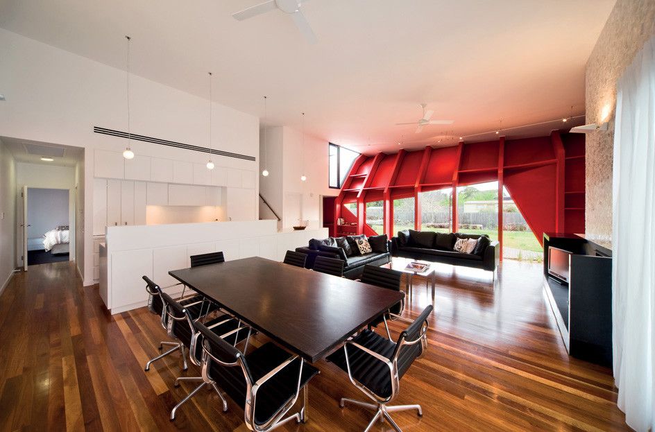
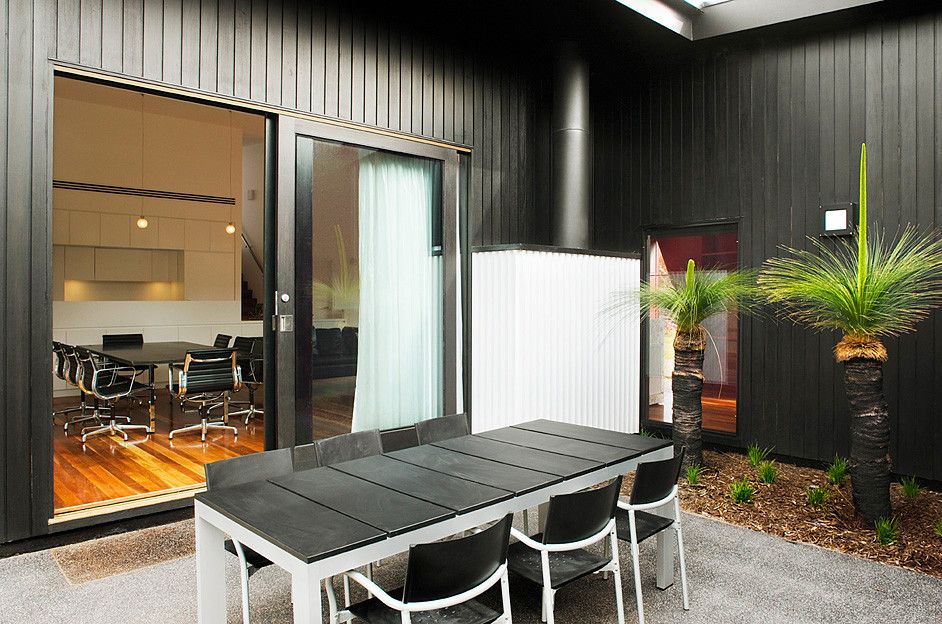
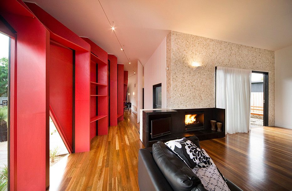
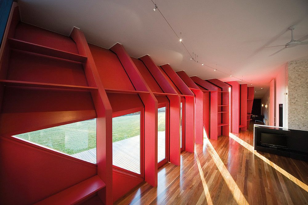
Inside is, in some places, a reverse mirror of what is outside. This feature is yet another easily overlooked detail which makes this house real. ‘Not all the site is used? Ok, this isn’t a cookie-cutter home. The inside speaks to the outside and isn’t just straight-up-and-down drywall? Ok, this really isn’t just a developer’s money pot.’
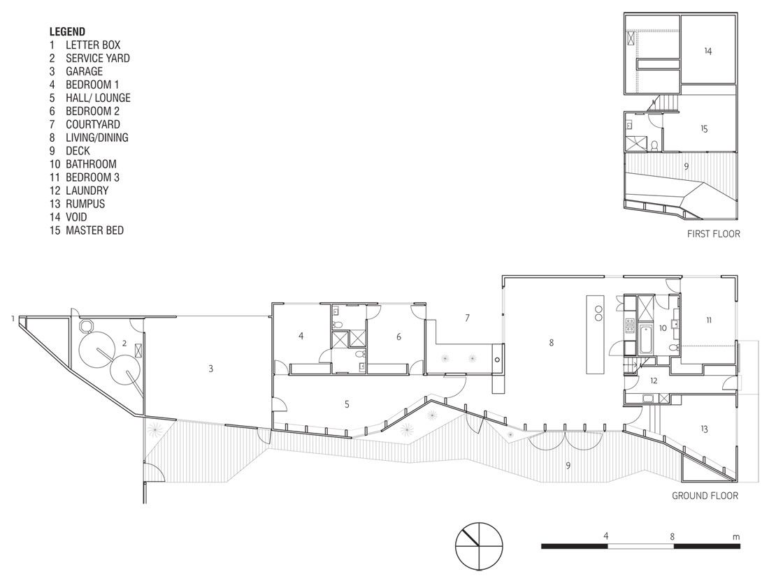
The plan is interesting. I think perhaps it is more interesting to view after viewing the pictures. The pictures walk you through the space in an experience which is both surprising and exciting, and to view the plan afterwards is to solidify realizations which were incited by the pictures. The architects’ description is also helpful, not for details or anything, but for feeling- for the ethos of the building and that which was behind its conception.
So I leave you with the words provided by McBride Charles Ryan:
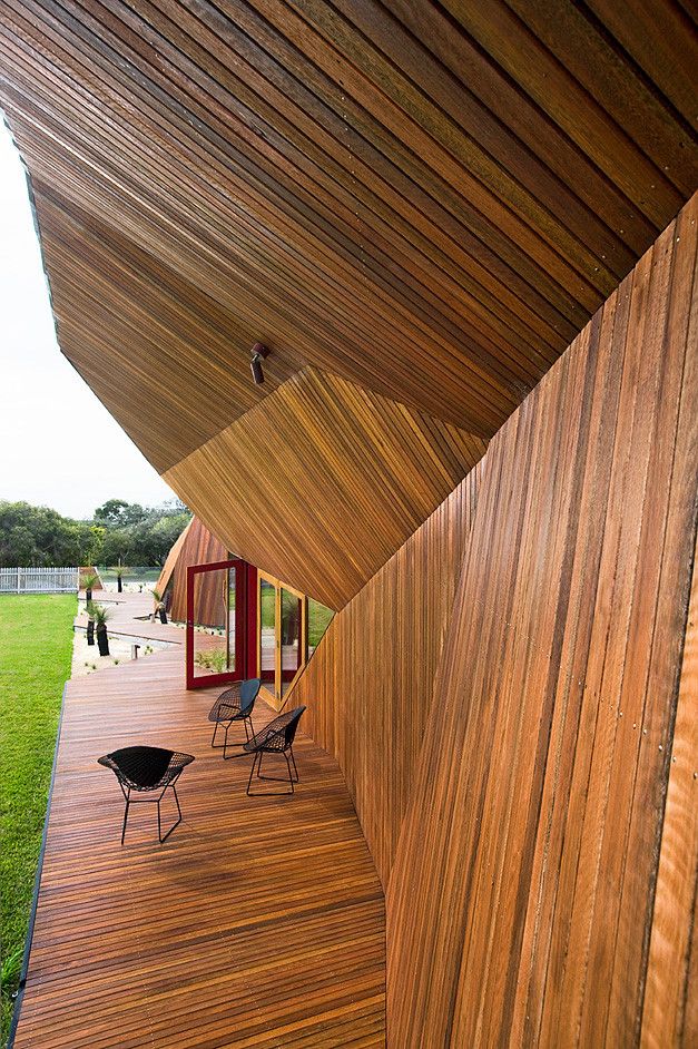
It’s like a half space, half enclosed, half open. Neither in nor out – a new version of the good old Aussie verandah.
Its like a giant multi-sensory organ, the sun, the sky, the breeze and the sound and smell of the sea – When you arrive here of an evening and stand here and see the stars, no matter how still it is, you smell the sea – suck it in, it transforms you, reminds you (of what matters), it’s a kind of tonic.
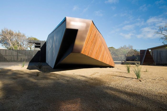
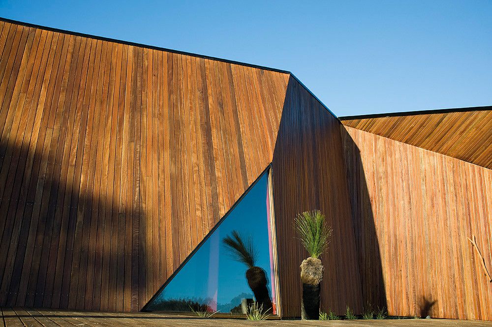
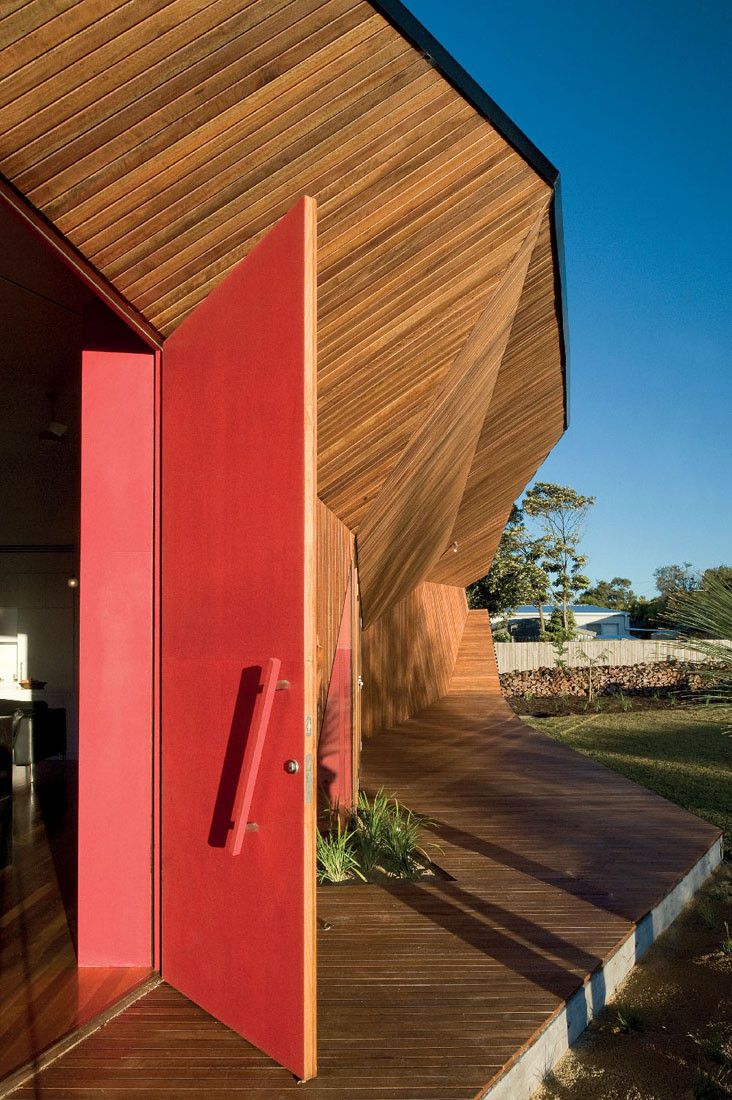
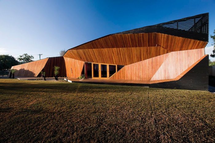
We like the buildings that make you smile (not laugh).It makes people smile, a building with the smallest façade on the peninsula – the building begins as the letterbox and unfurls to become this healthy scaled verandah, to some it is an upturned boat, to others it a wave a cliff. We like it being many things – people stop and ask us, we just say it is what it is to you.
We wanted to show respect – the peninsula needs it, and the scale here was modest beach suburban – we wanted to respect that scale – and yet as you walk along the deck the scale sneaks up on you – before you know it you’re immersed and surrounded by the scale of the house – a bit like life really.
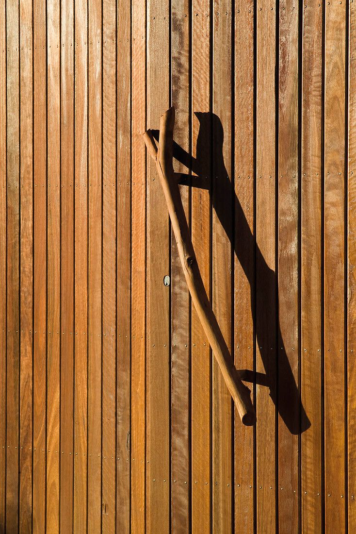
The peninsula is the place where you suspend formality and convention for a while – we wanted the building to do this and to remind you of that – it moves too far from architectural convention towards the other disciplines – that was the intention. It becomes ambiguous – What is it? Where is the front door? You don’t need a ‘front door’ in a holiday house – you just find your way in.

Late on a sunny afternoon, when you are all salty, it is a great place to sit; the afternoon sun gives the wall a golden glow, which is echoed by the golden beer in your hand. You sit and watch the kids do what kids do – the things they forget to do when you are in the city.
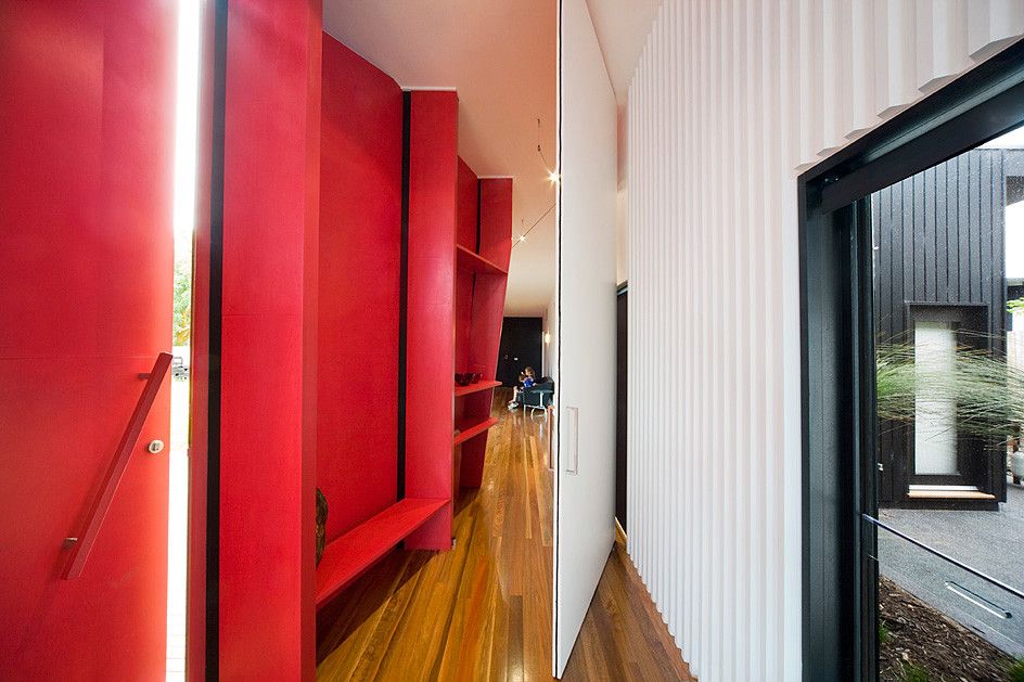
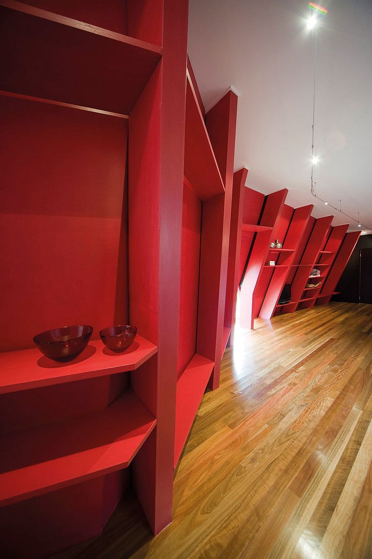
The inside of this golden wall is vivid red; the support structure and the support shelves which in time will become deposits of beach memories, the much leafed book, the photos, the bric-a-brac of beach holidays and markers of the quintessential Australian family life – when that happens maybe that will then become ‘my space’ also.


