The long house by Sunil Patil And Associates, has been evolved out of contextuality – The site, the climate and the surroundings. The long site is a result of amalgamation of two square plots where longer side faces the road. Site is located in bungalow society in the outskirts of Pune with beautiful sugarcane farm on the east side. The north side of the plot peeps in to a large neighbour’s garden. The concept evolves from here to take the advantage of the garden and create our garden as continuation of it thus creating large foreground for the bungalow.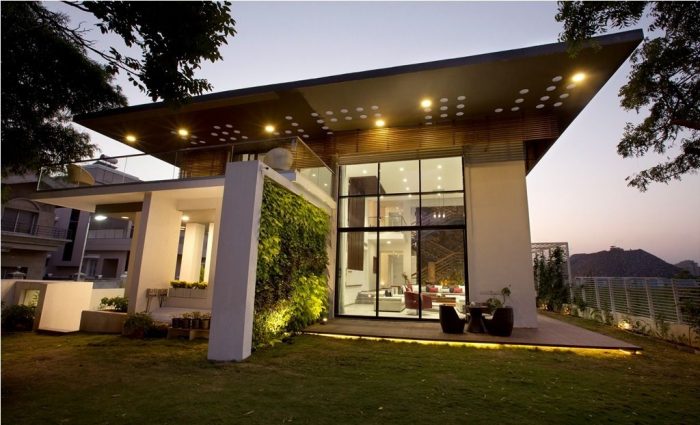
The Spaces of Long House:
The project brief consists of 4 bedrooms apart from Living, dining, kitchen, family, puja and home theatre. The brief is augmented further by the service areas like servants’ rooms, parking, store and utility…etc which makes the project challenging to maintain the cosy look of the bungalow.
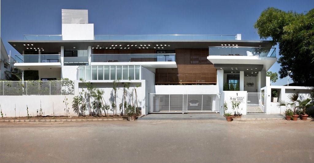
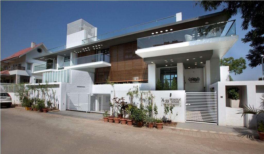
The planning of the long house is done in such a way that the spaces are split on different levels from lower ground to the first floor. The form follows the site and hence the length of the plot has been reflected in the built mass making it a long mass . This long effect is further enhanced by creating a horizontal slab, making the house look dwarf and cozy.
There is a stern simplicity in the planning and aesthetics of the house. The interior décor of the house is very subtle and enhances the spaces. The spaces seamlessly flow into each other achieving the complete transparency and attains grandeur. The Simple colour pallet both in exterior and interior supports the austerity of the house.
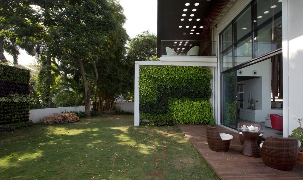
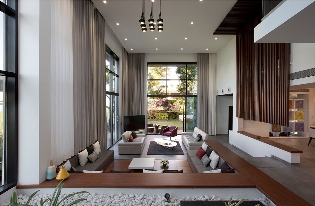
The initial theme of the garden is further enhanced by vertical gardens, created as inherent part of the house. The vertical gardens induce the soothing effect visually and physiologically to the space. The house opens out in to the the garden to the north side and the sugarcane farm to the east. The double heighted living and courtyard spaces facilitate the beautiful view of these green spaces. Living, dining, family and common areas are visually connected to each other . The transparency in the staircase is a conscious decision to enhance this feel.
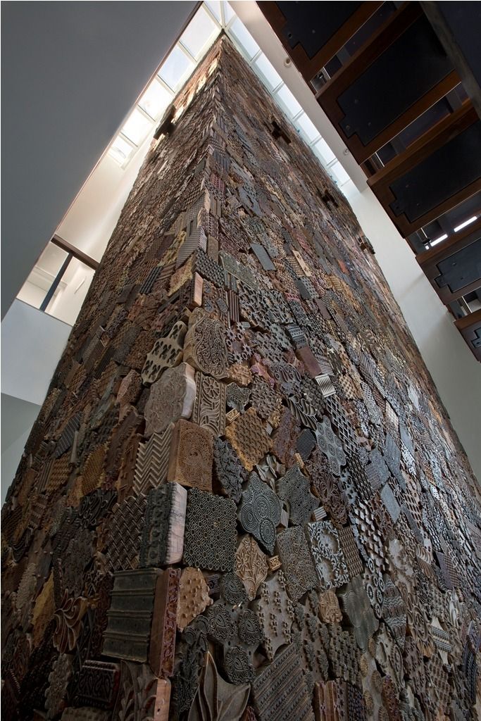
The triple heighted wall behind the staircase is cladded with saree printing blocks creating the unique mural . The wall has added a strong character to the space with its bold texture and creates beautiful background for the courtyard and the staircase. The wooden sculpture in the courtyard complements the saree blocks wall. The skylight on top of this wall filters the light through creating a dramatic effect with the play of shadows as the sun moves throughout the day. Metal railing of the staircase further heightens the eclectic character.
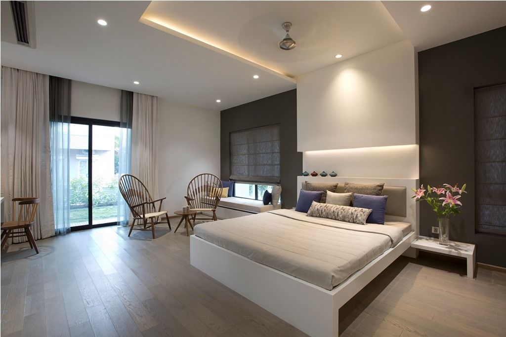
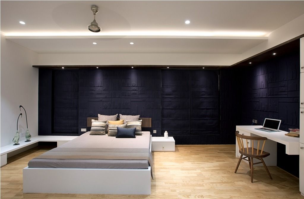
The bedrooms are placed beyond the common areas – opening out into the gardens. Each bedroom is designed with a unique theme. All the walk-in wardrobes and toilets are designed in such a way that the space flows into each other. Skylights in toilets pour in the natural light.
The puja room is designed as the continuous space flowing from ground floor to first floor. The art work on the wall symbolises the shower of flowers from the sky as it starts from the skylight and runs through this double height. The family in the central part of the house is designed in such a way that it can be converted into a guest bedroom. Convertible sofa and sliding partition make the space flexible.
Furniture is designed as continuation of the theme of austerity in architecture. Rustic grey tile forms a base for these simplistic forms. In-built seating and benches created around the courtyards and common areas create informal feel. Double height curtains in simple white and grey linen add to the warmth.
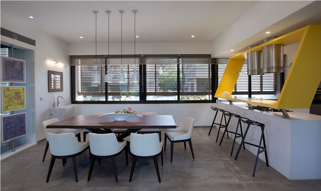
The vertical wooden louvers which run from home theatre to the living – create partition between the spaces yet connecting them visually and maintain the space flow. Kitchen and dining again form the continuous space still separated by the bold element – yellow breakfast table. The bold colour is balanced with grey and white kitchen. The long window running through the dinning and kitchen allows connection with the outdoor.
Paintings in the entrance lobby is a unique concept where partition is formed using 9+9 pivoted paintings. The infinite combinations of these 9+9 painting create very dynamic space in both the spaces – entrance lobby and the dining.
The horizontal slab is designed with circular openings which create very dynamic effect through the day. The reflecting light and shadows both become attractive elements and same has been enhanced at night with the help of artificial fittings. The wooden louvers on the south facade filter the light and solar radiation and also avail the privacy in kitchen and dining area. The large overhang created by the roof and balconies protect the main façade from the heat and help in keeping the house cool. All the areas of the house are well lit and cross ventilated. The top terrace is treated with reflective tiles. Overall The long house archives the grand feel even with its starkness yet allows warmth to the users.
 Project Info :
Architect : Sunil Patil And Associates
FSI : – 0.72
Cost : 2 Cr 73 Lac
Site Area : 6940 sq.ft
Client : Sunil Desadla
Project Location : Pune
Built Up Area : 7720 Sq Ft.
Photographs : Subhash Patil
Construction Area : 748.78 Sq m
Completion Date : December 2016
Civil Contractors : Atul Constructions
Commencement Date : December 2012
HVAC Consultant : Air-Tech Engineering
Interior Designer : Sunil Patil & Associates
Landscape Designers : Sunil Patil & Associates
Mep Consultant : Siddhivinayak Mep Consultant
Structural Consultants : Technocracy Consultant
Project Team : Ar. Sunil Patil, Ar. Anuja Pandit, Er. Sanjay Patil


