LOT 1 Cafe
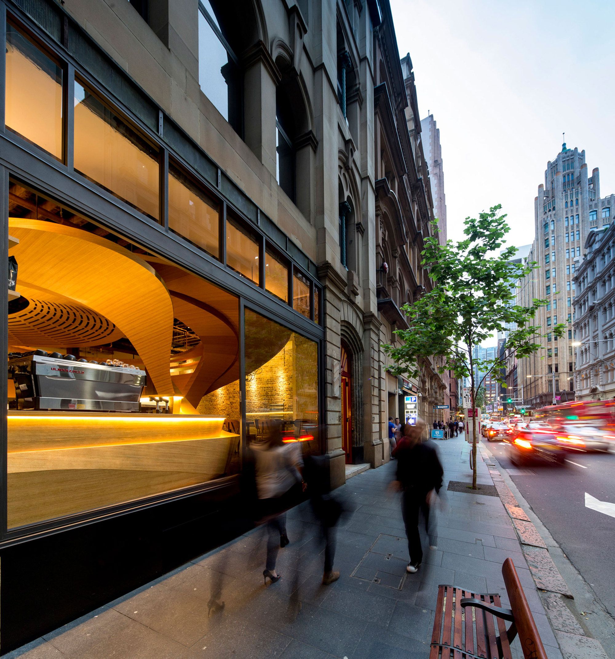
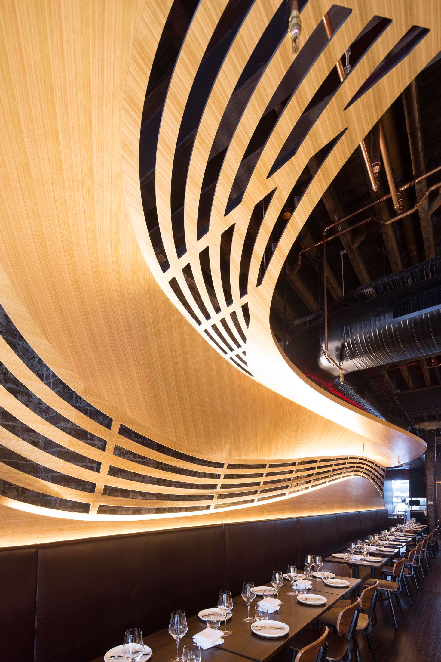
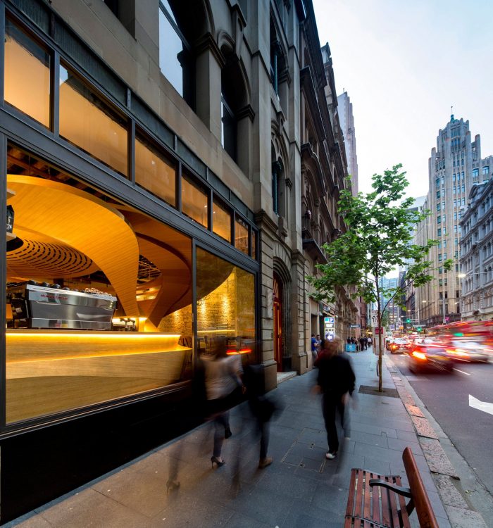
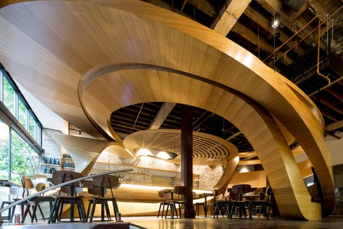
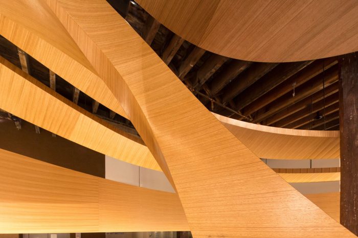
A beautiful part of the experience of drinking a Café Latte is its refreshing aroma, and the other is the pattern of intertwining swirls within it. We see these swirls translated architecturally in the LOT 1 café , bar and restaurant designed by Enter Projects. Located in Sydney, Australia , this cafe stands out with its literal architecture and interior design. “Being in the coffee industry for 3 generations, the client enthusiastically embraced the design concepts, using patterns that delicately lace the infamous ‘Café latte’ as the primary design inspiration.” Says the architect.
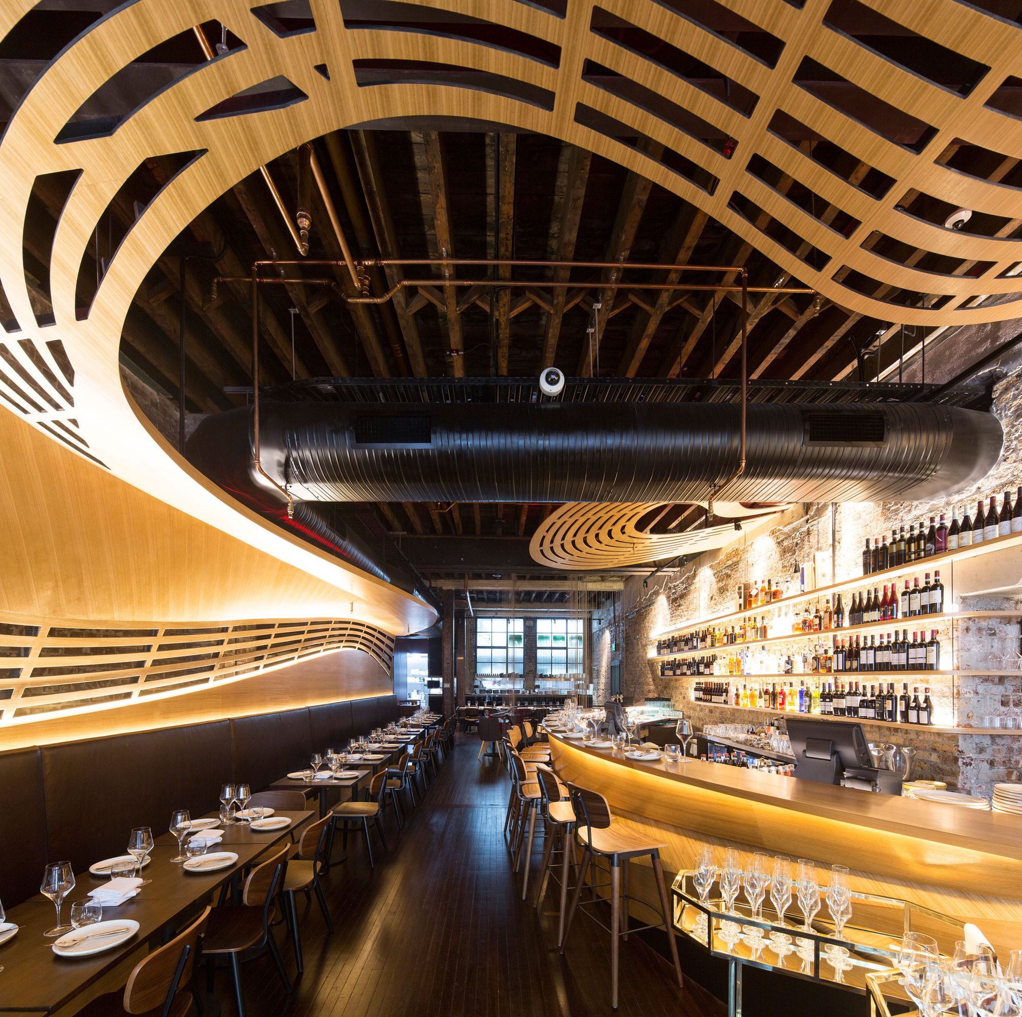
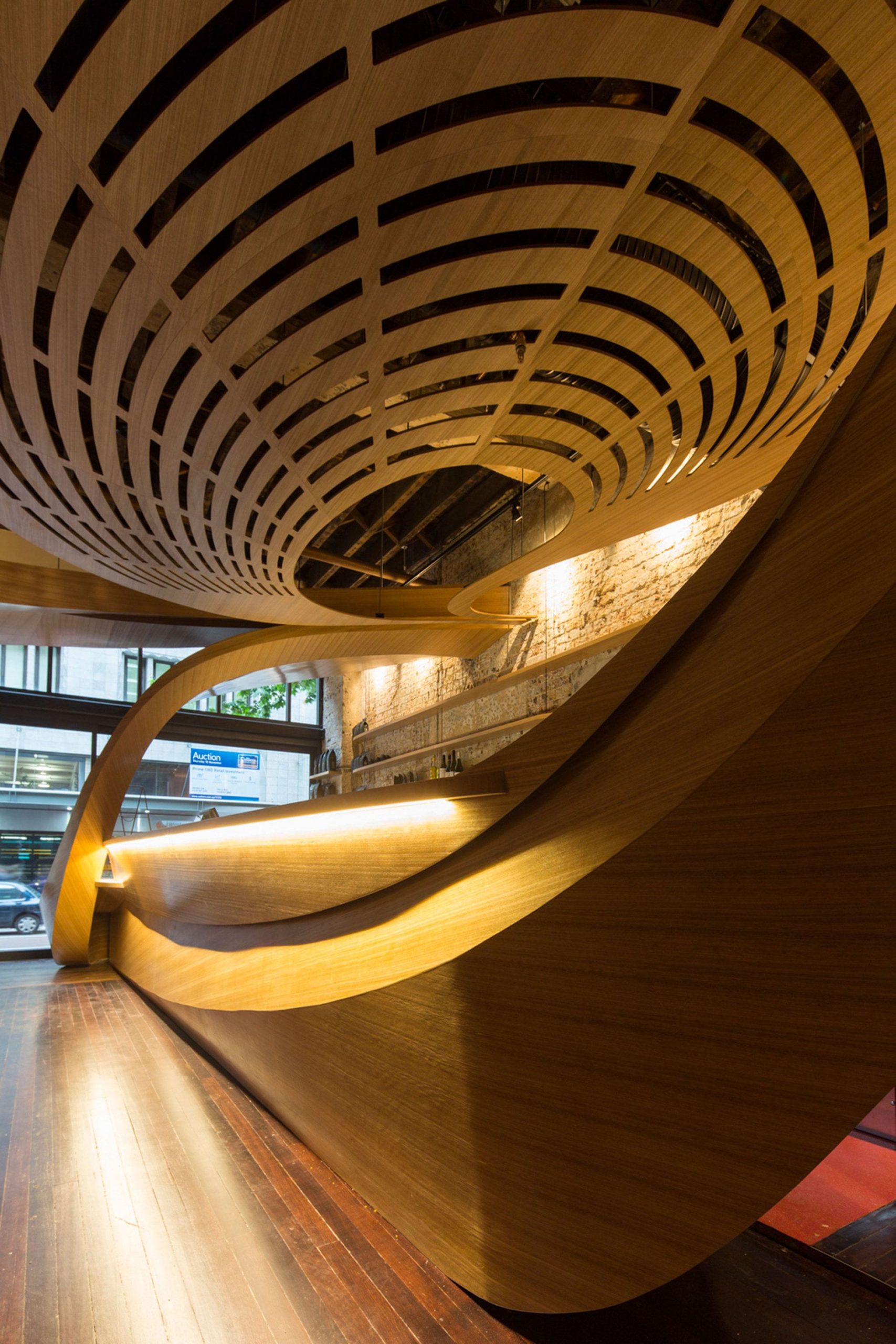
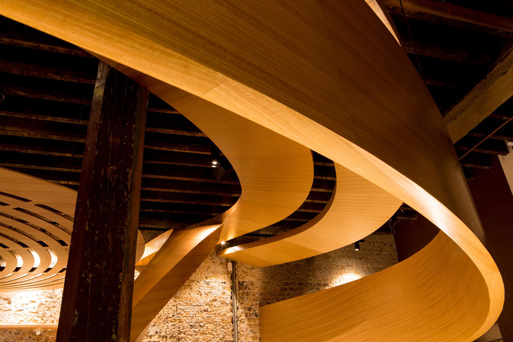
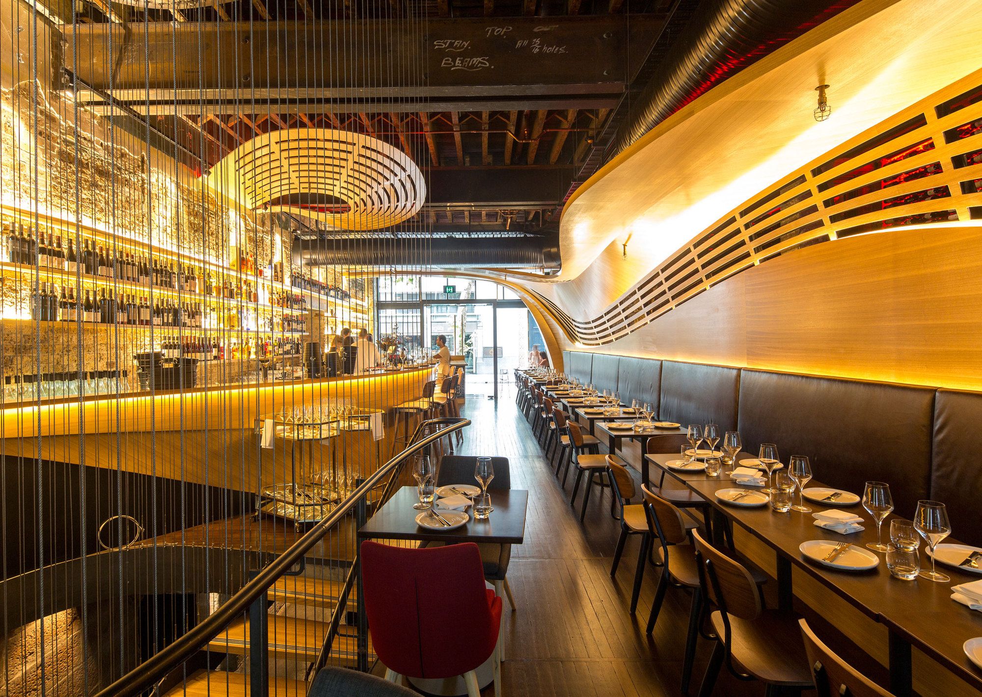
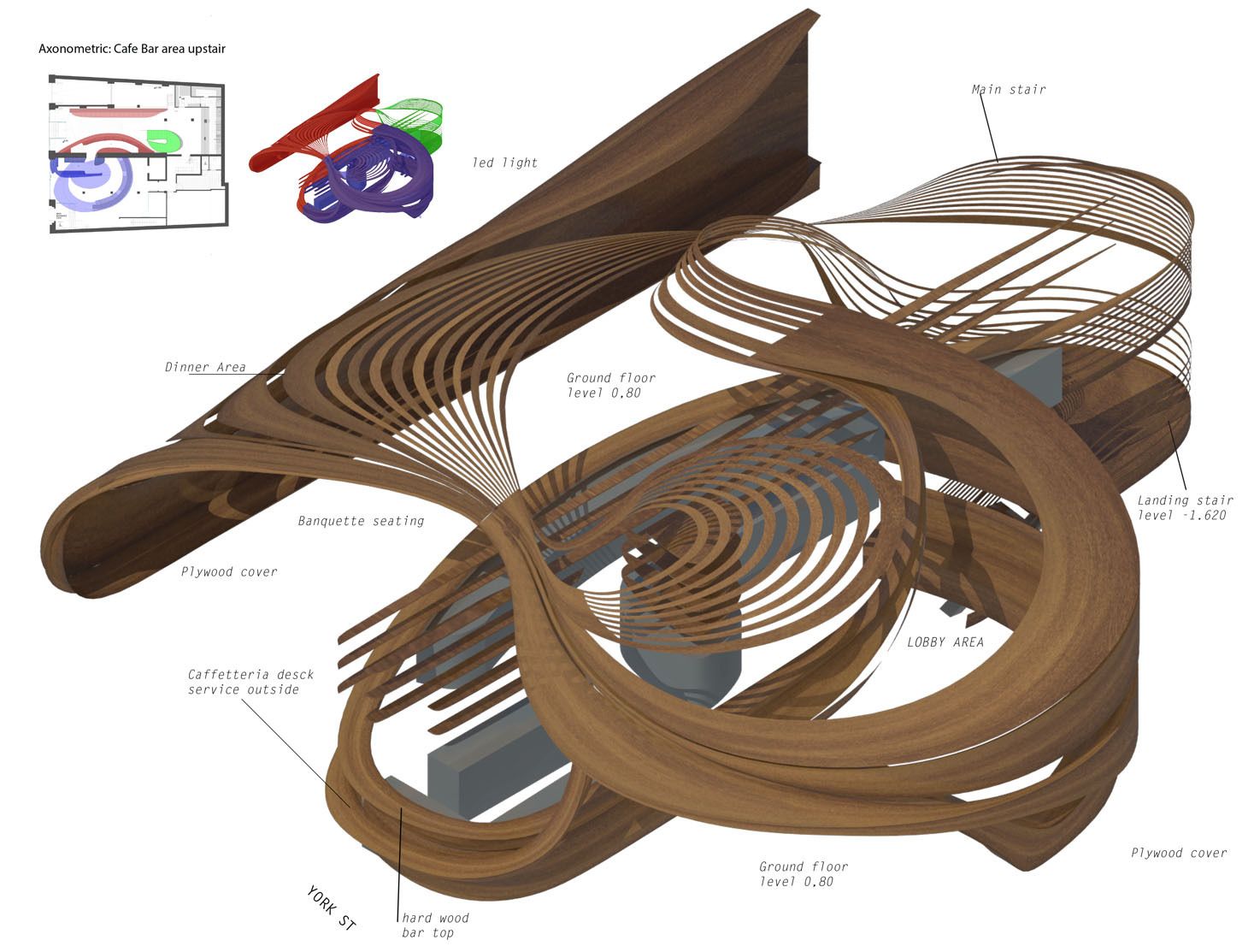
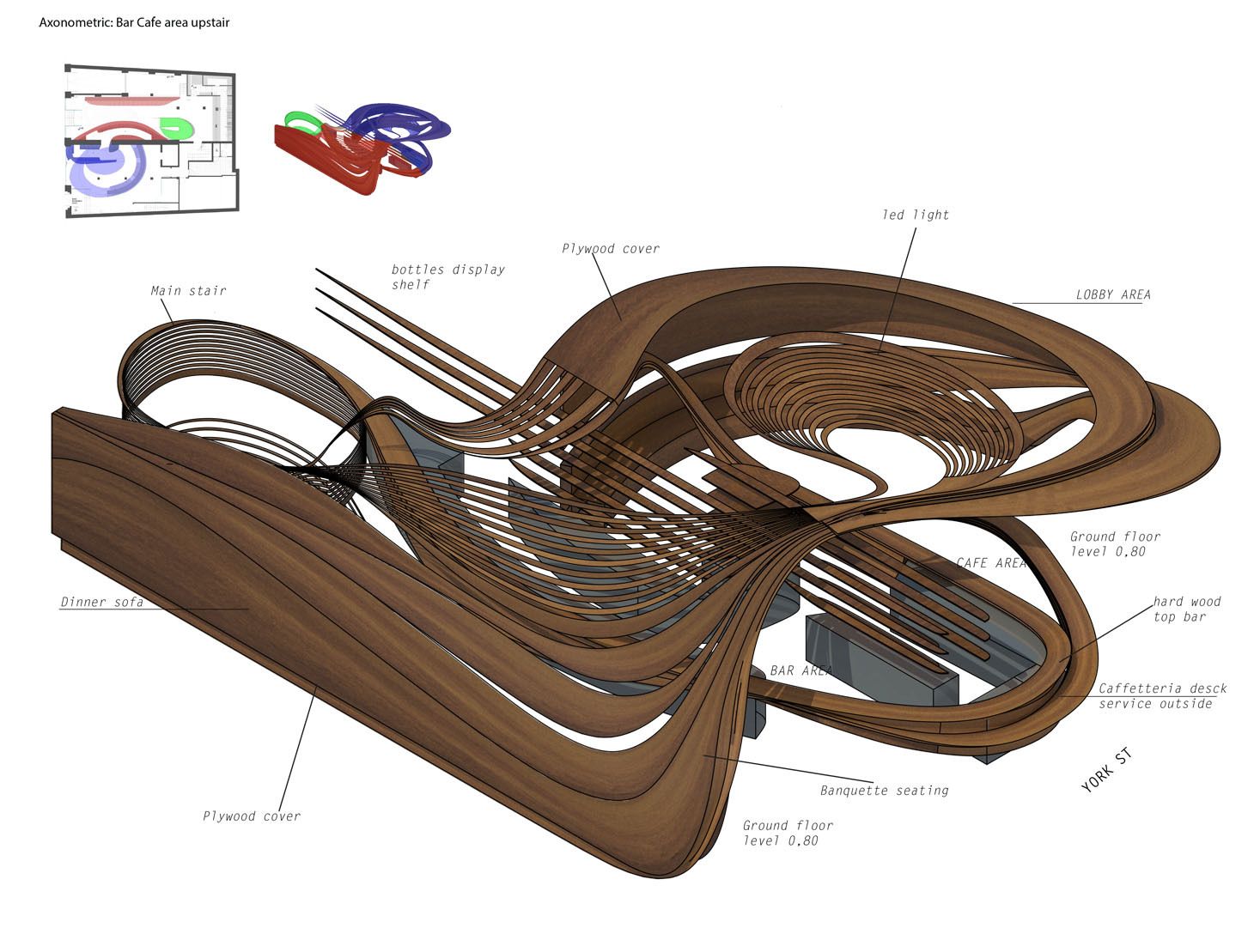
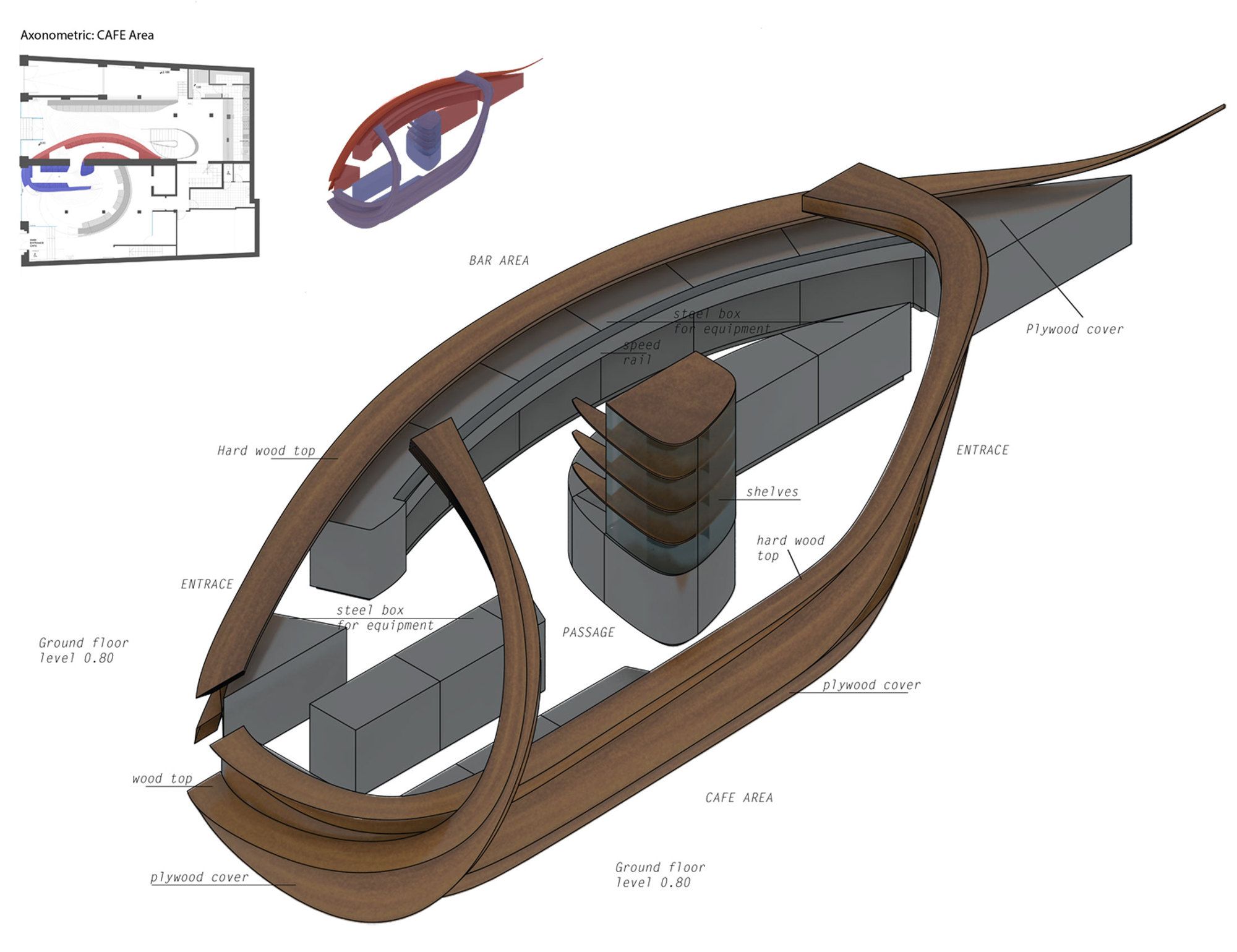
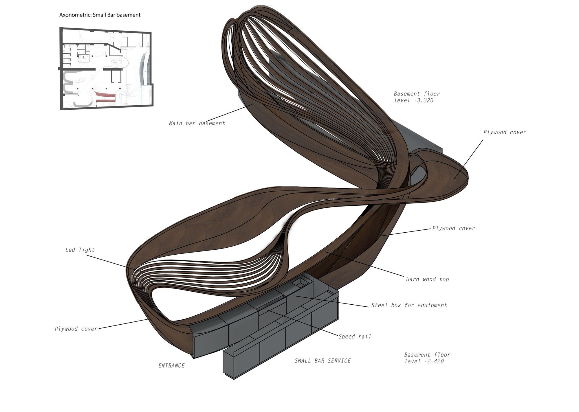
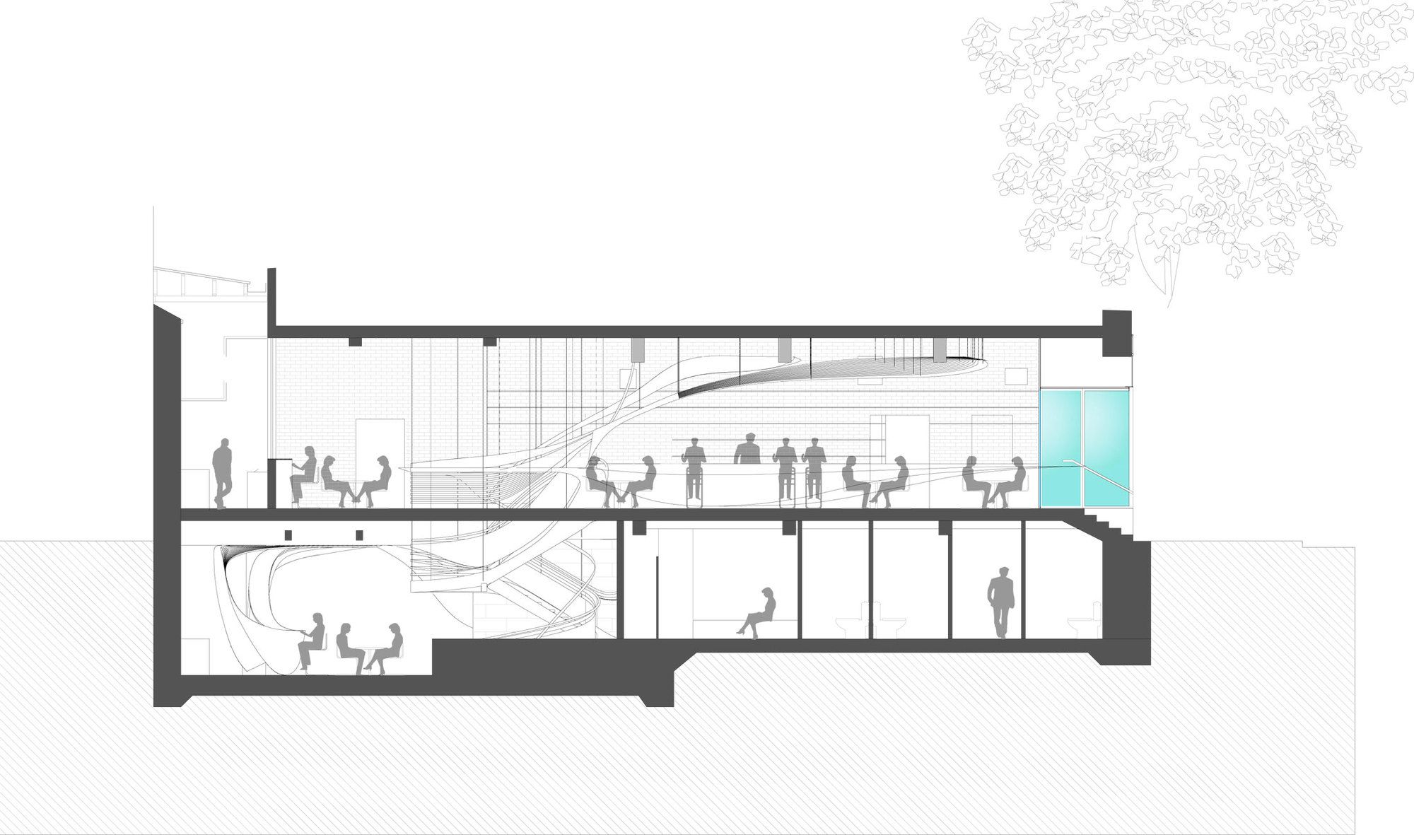
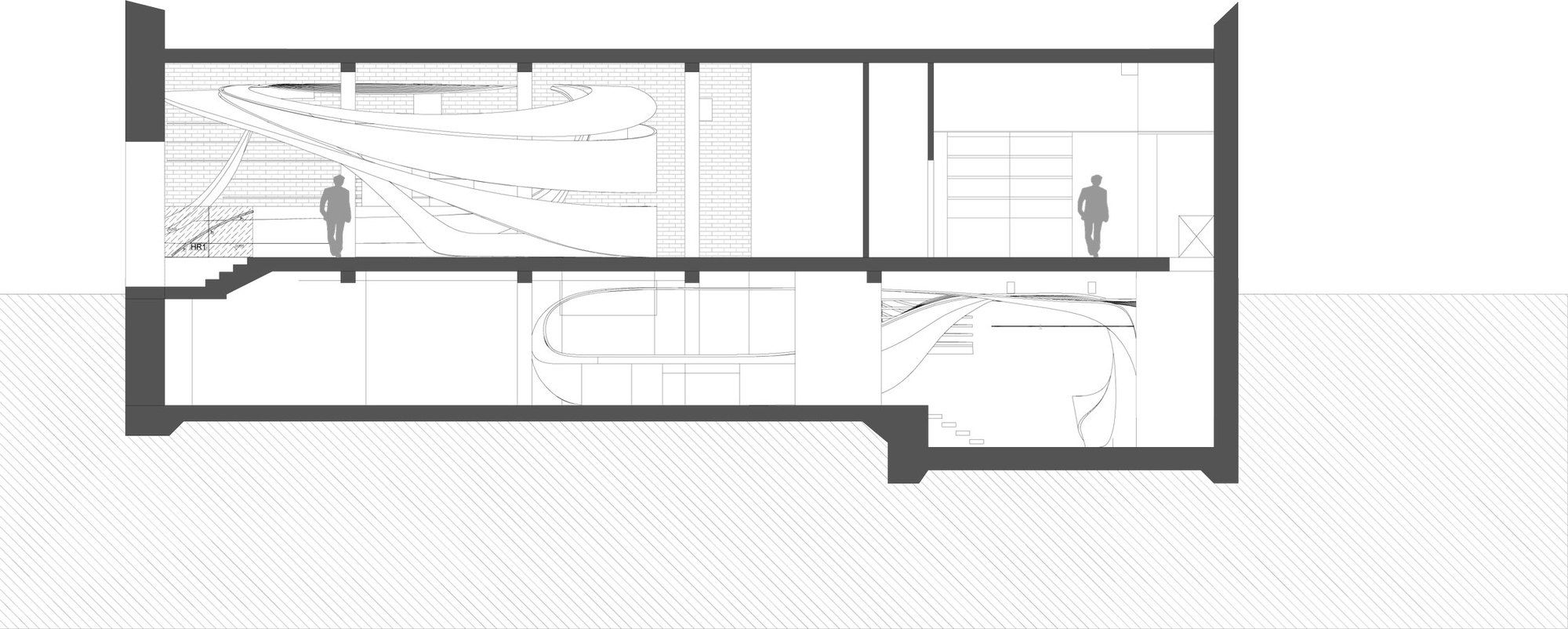
The ‘swirls’ flow throughout LOT 1, functionally connecting and visually embracing all its parts. Digitally fabricated native Australian timber has been used to create this design that goes from the walls to the ceiling and counters as well.
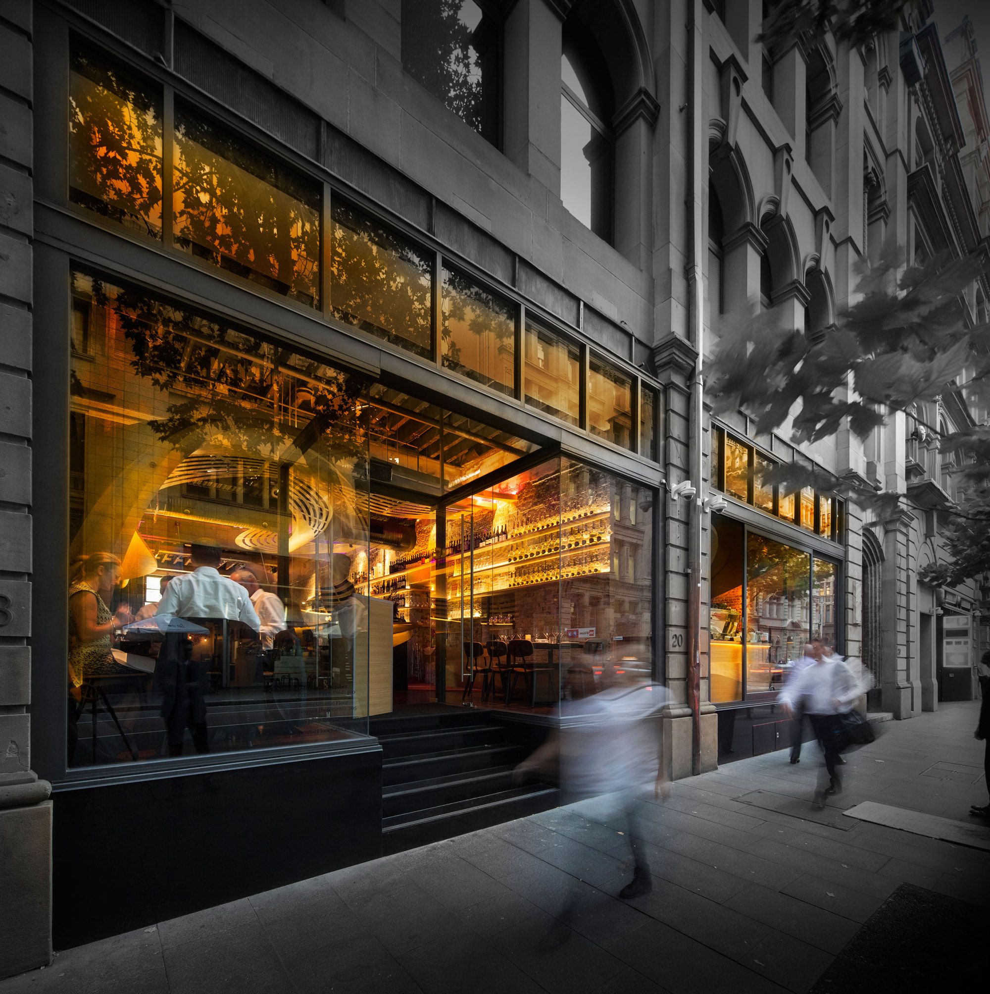
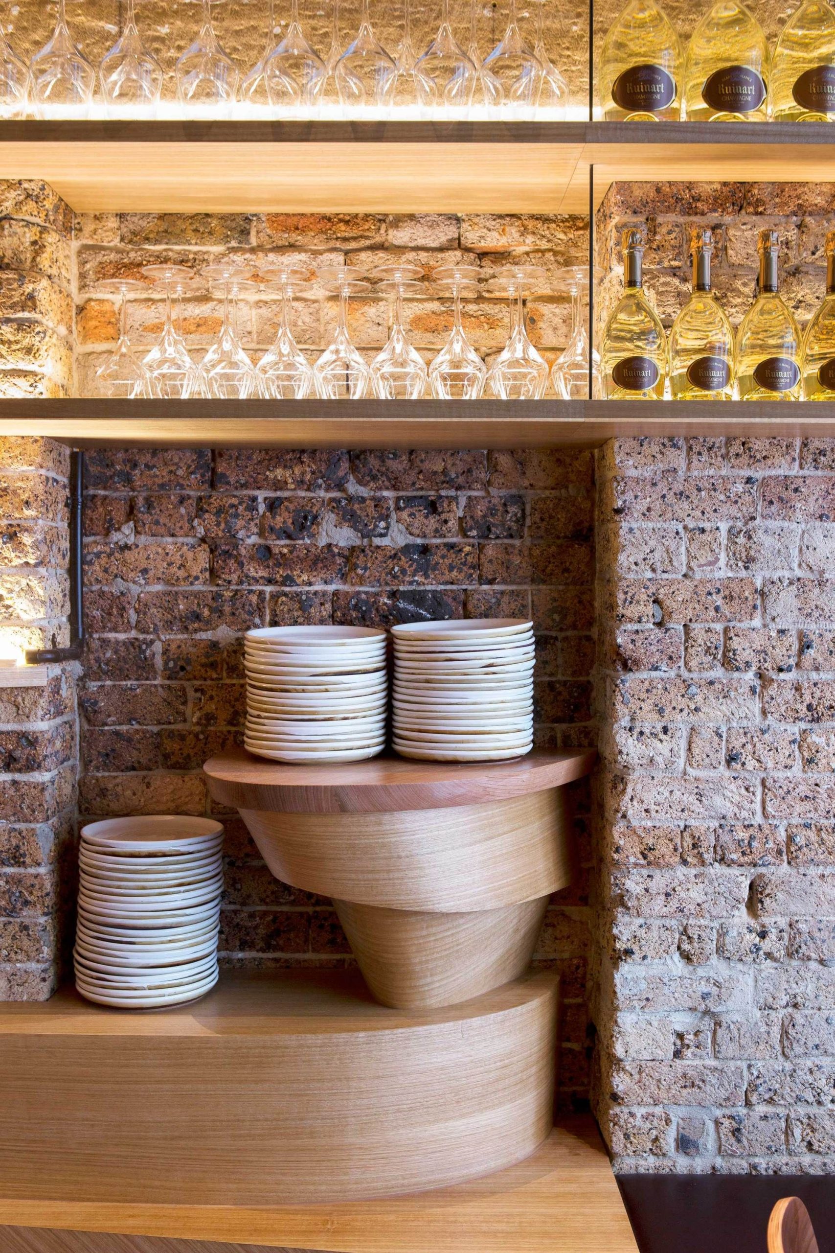
Before being this café, the location was a retail store and much before that a storage facility. The entire structure has been stripped back to its original identity, baring bricks, sandstone walls, old steel work and wooden columns. Visible through the minimal yet classy interiors are all these characteristics. “The existing features are intelligently juxtaposed by the continuity of the new form and the smooth Australian hardwood veneers are further layered by an adaptable lighting scheme.”
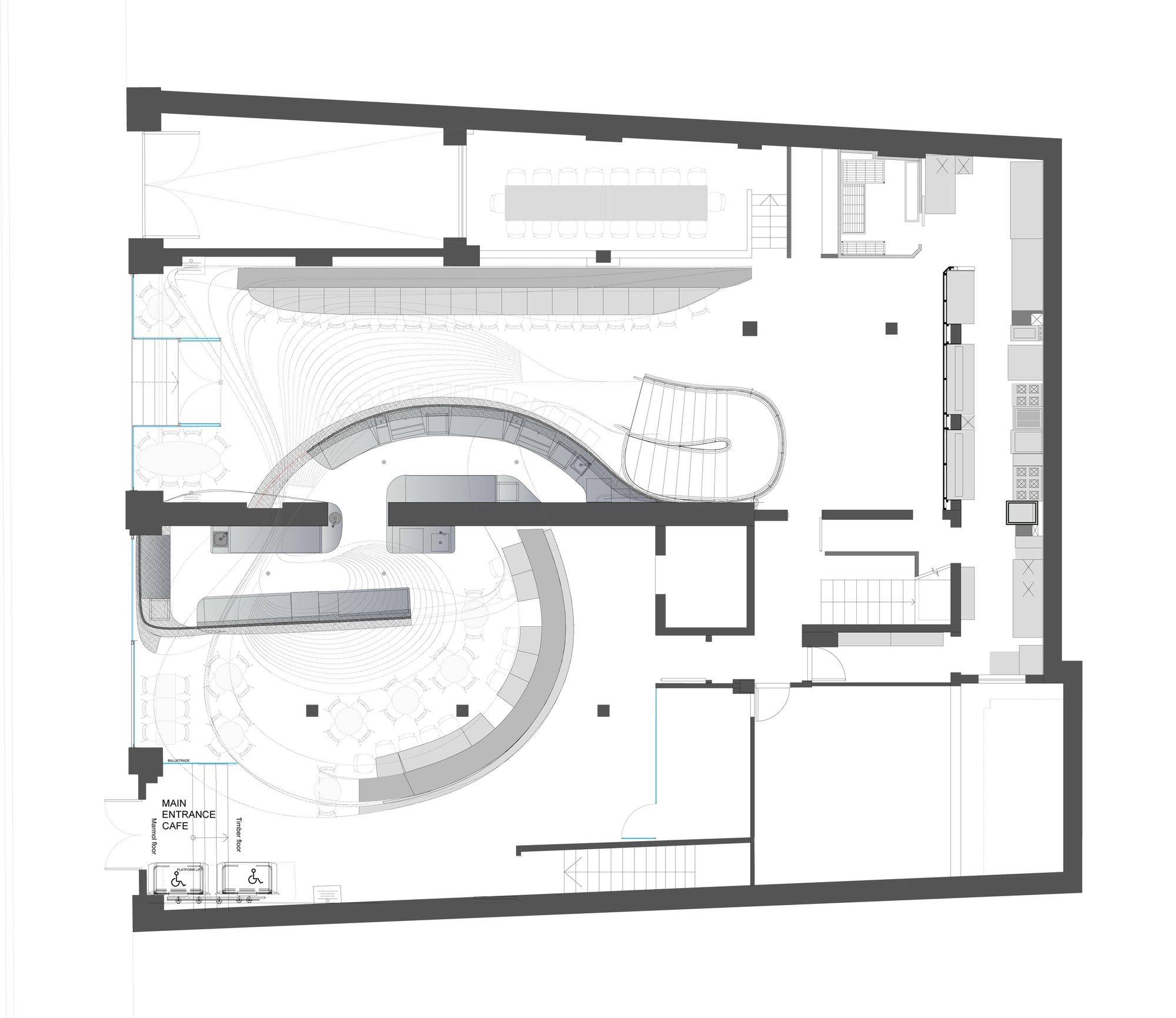
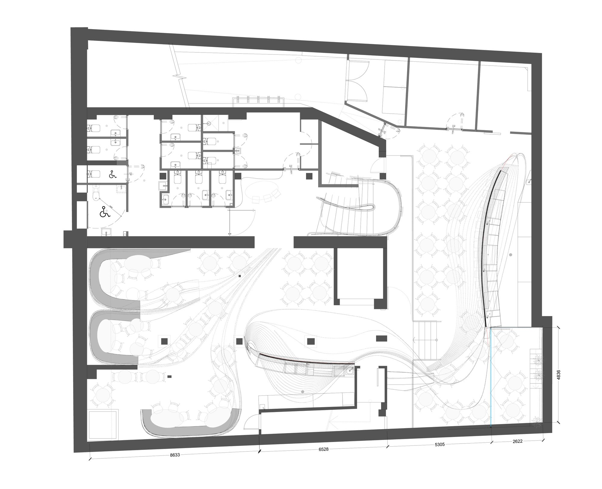
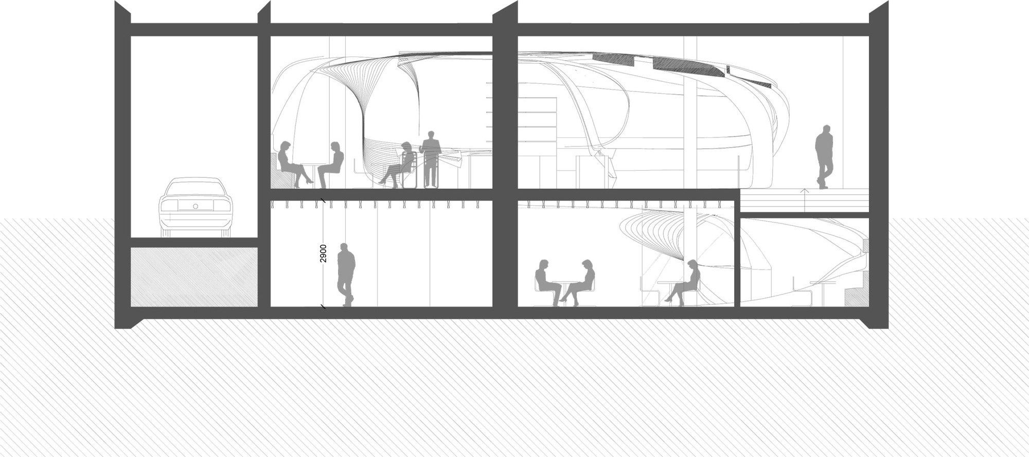
“Careful spatial planning has maximised foot traffic within the interlinking coffee shop and restaurant.” The café is followed by private lounges and dinner boots downstairs and alfresco dining in the basement mezzanine. “Dynamic geometries interlace the many spaces with 3 dimensional curves ensuring that the project cannot be comprehended from one single vantage point,” explains the architect.
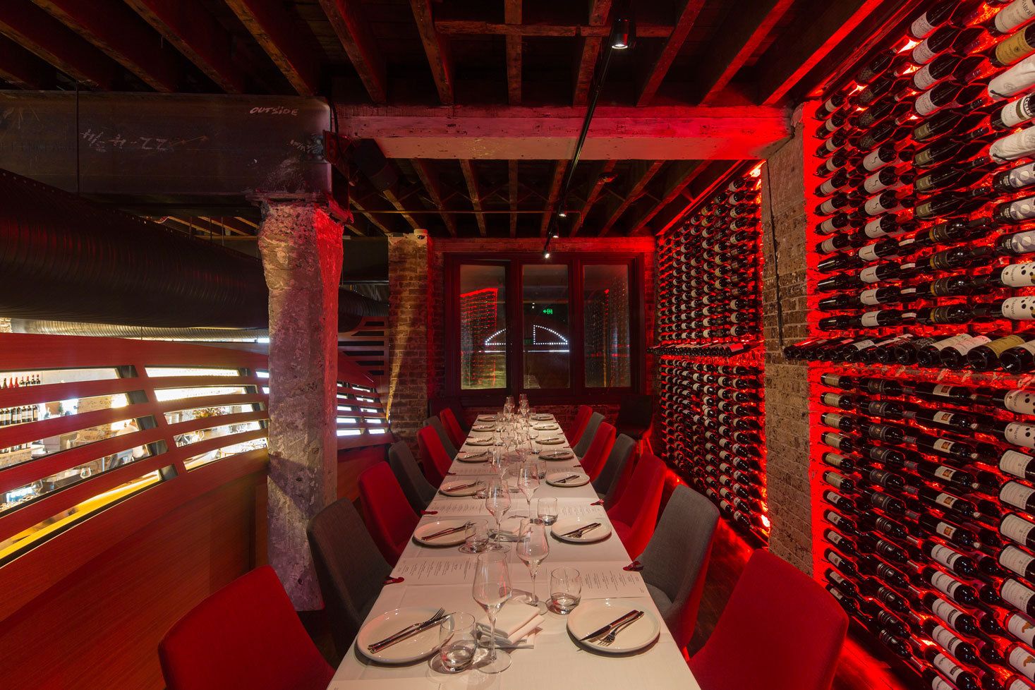
The dining setting is as creative as the café but different in design, imbued with a romantic yet rustic style. The red colour and the wine bottles against the raw look of the walls and beams seem to set the mood of the space.
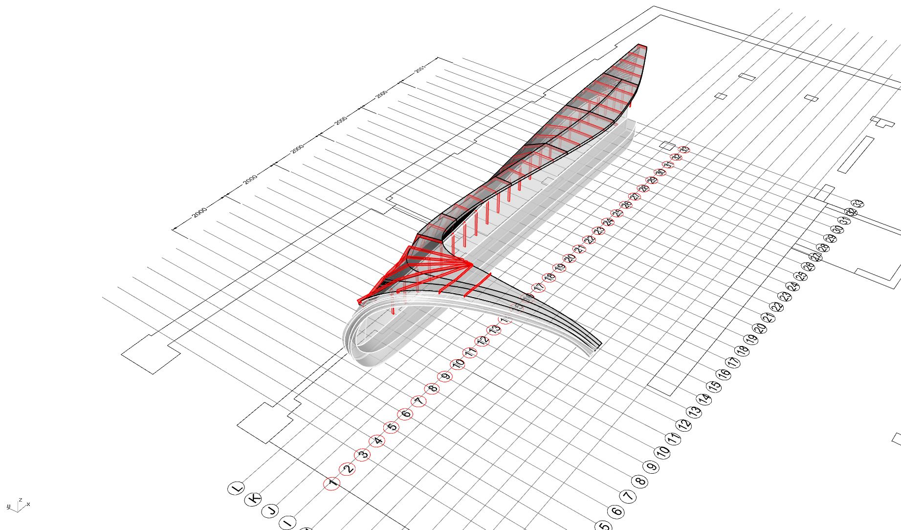
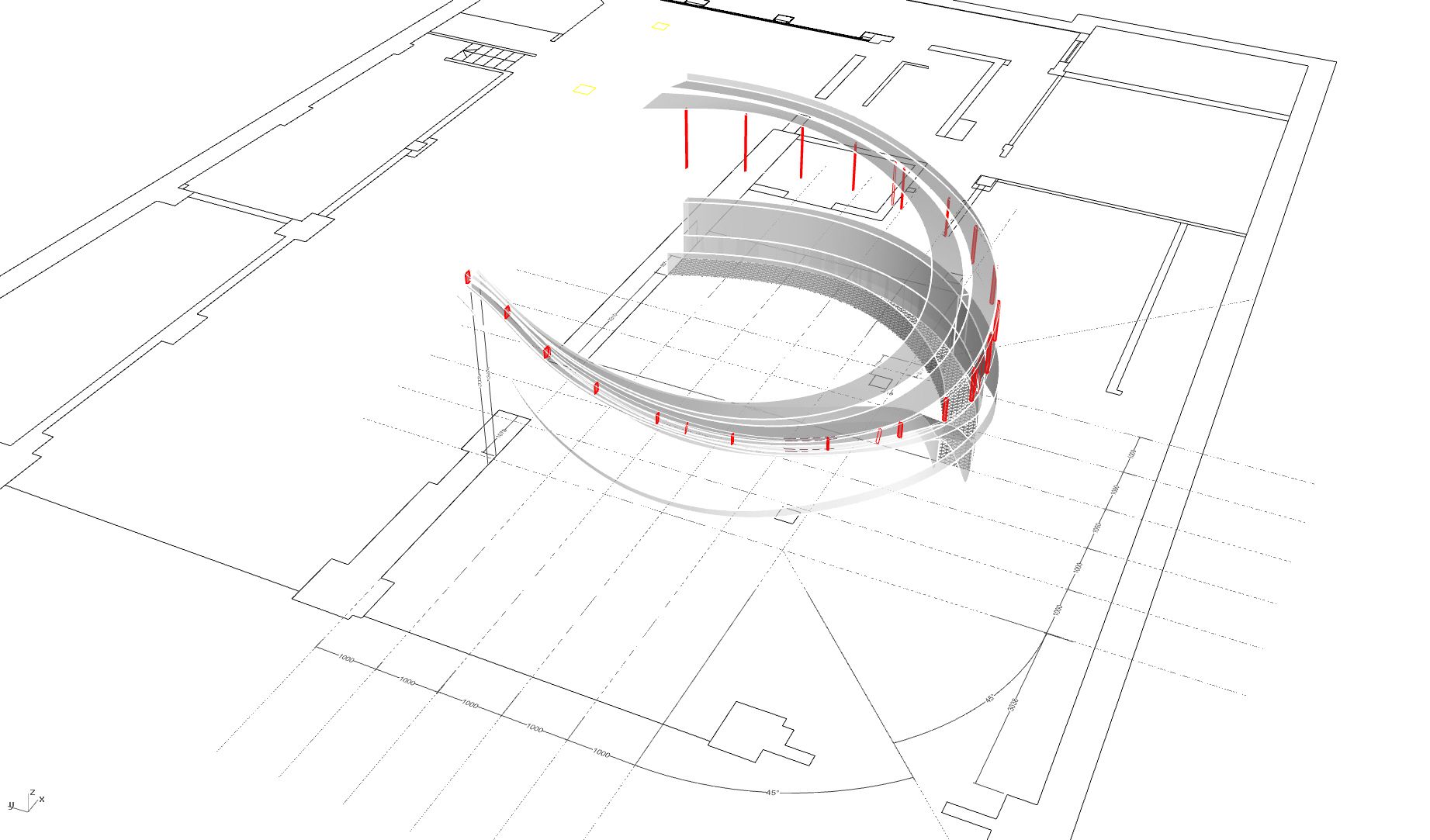
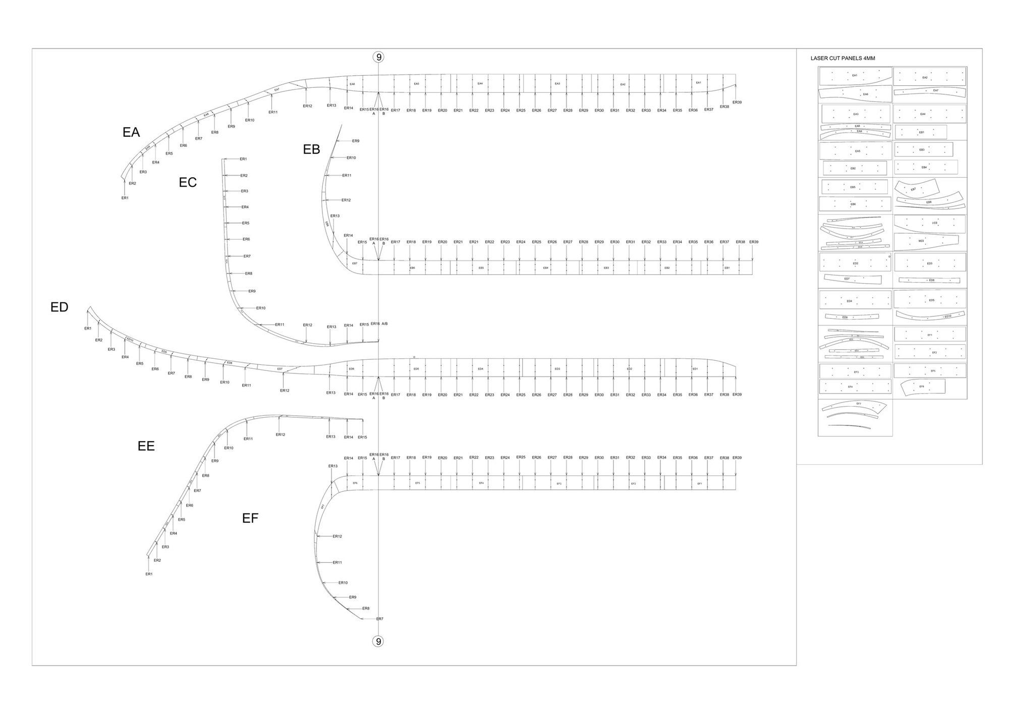
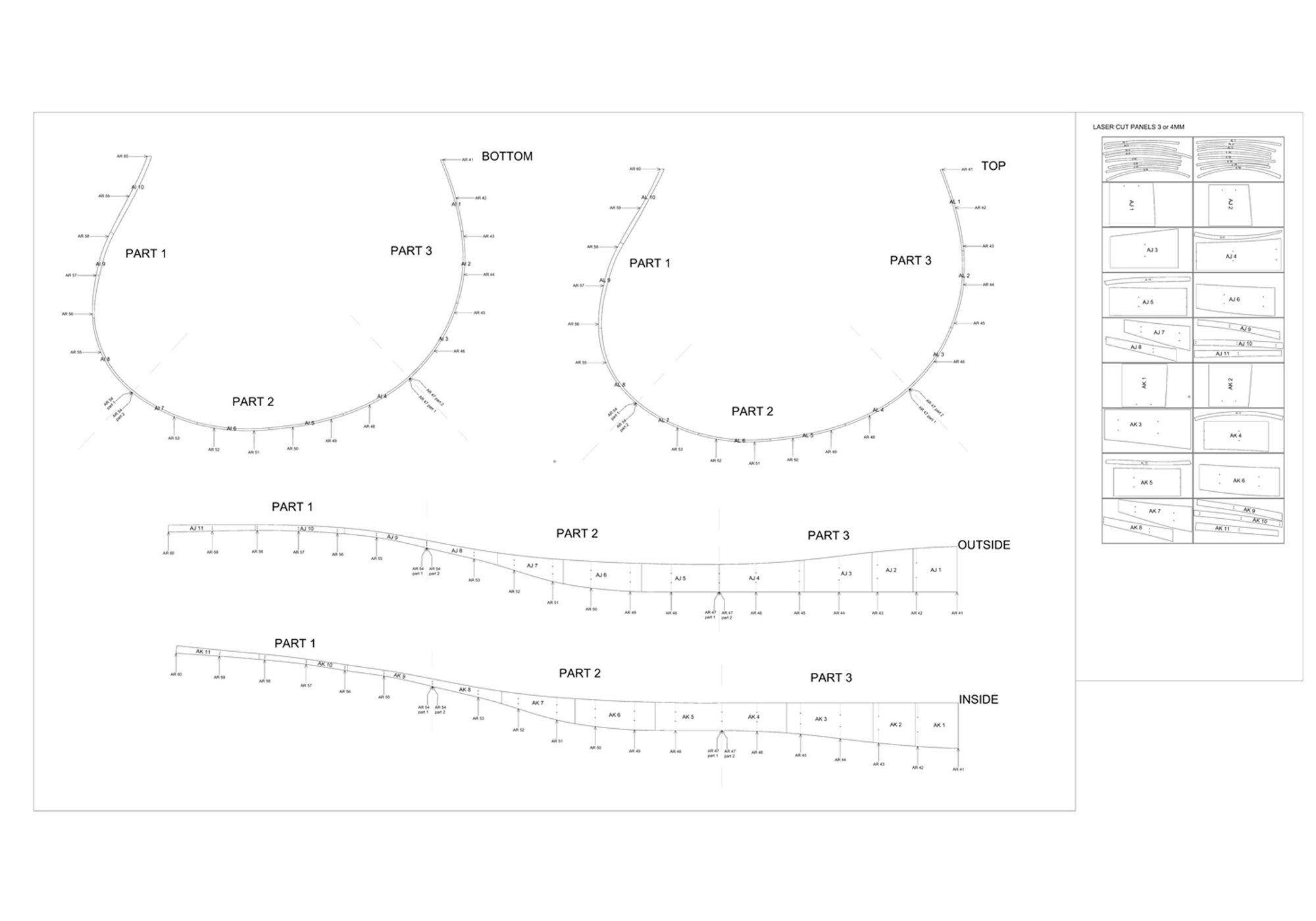
What is absolutely shocking is that no construction drawings were used for this project! “From conception, to early renderings and 3D models, through to laser cutting and CNC, only 3D models were used without construction drawings or conventional plans and sections. The result embodies conceptual swirls that motion a dialogue between the building, the brand and the user.”
“The design solution is an example of excellence in Interiors given the unusual marriage of awe-inspiring aesthetics and full functionality within one given space: using non-orthogonal geometry, it delivers a form that remains responsive to its function and surroundings. Rigorous space planning was required both front and back of house alongside a well-defined but subtle colour palette which created a comfortable and atmospheric environment. The gymnastics of the geometry were required to perform multiple functions including service, seating, privacy and lighting.”
Do you know about more such beautiful projects that in these modern times have been made without construction drawings? Tell us about them in the comments!
Project Information :
Architect : Enter Projects
Location : 20 York St, Sydney NSW 2000, Australia
Project Year: 2016
Total Area : 945 sqm
By: Sahiba Gulati
