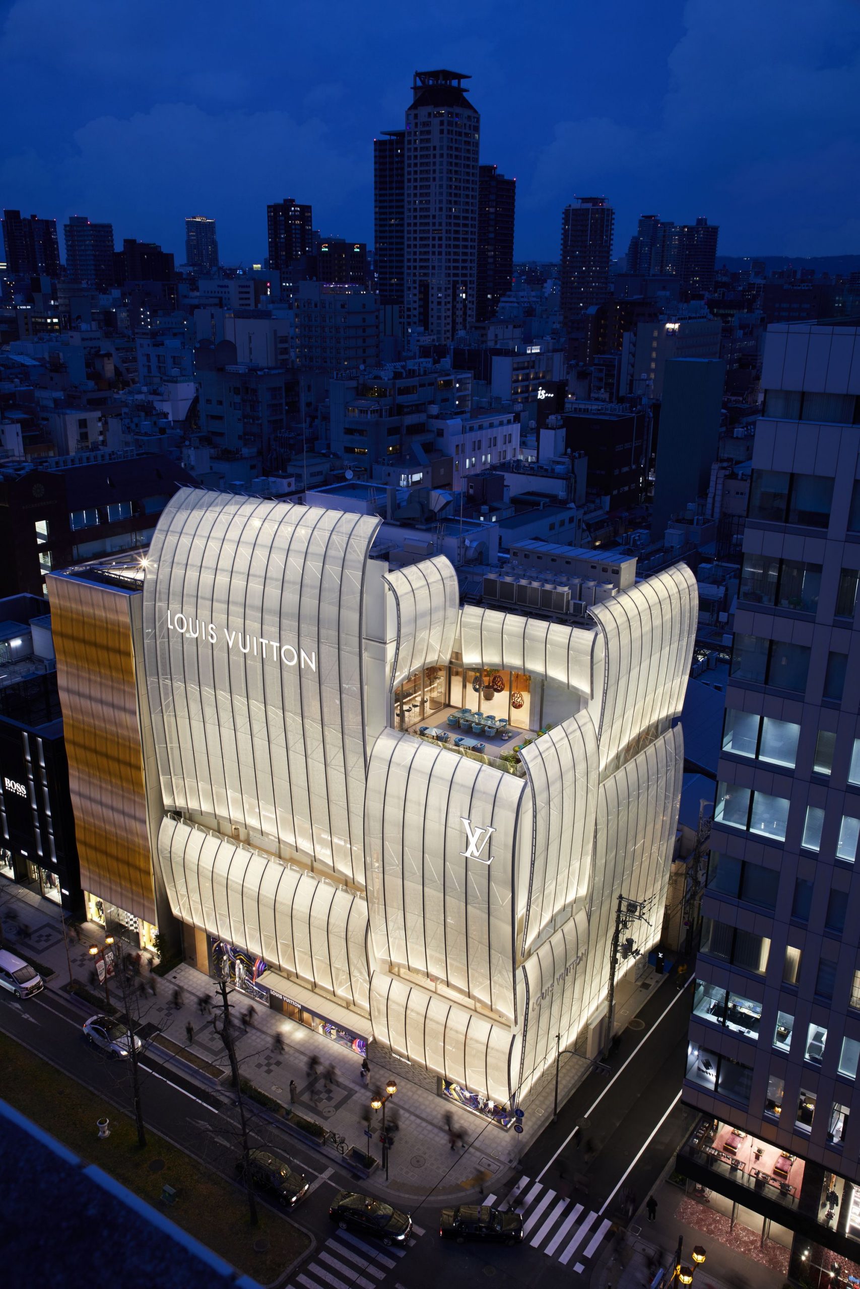
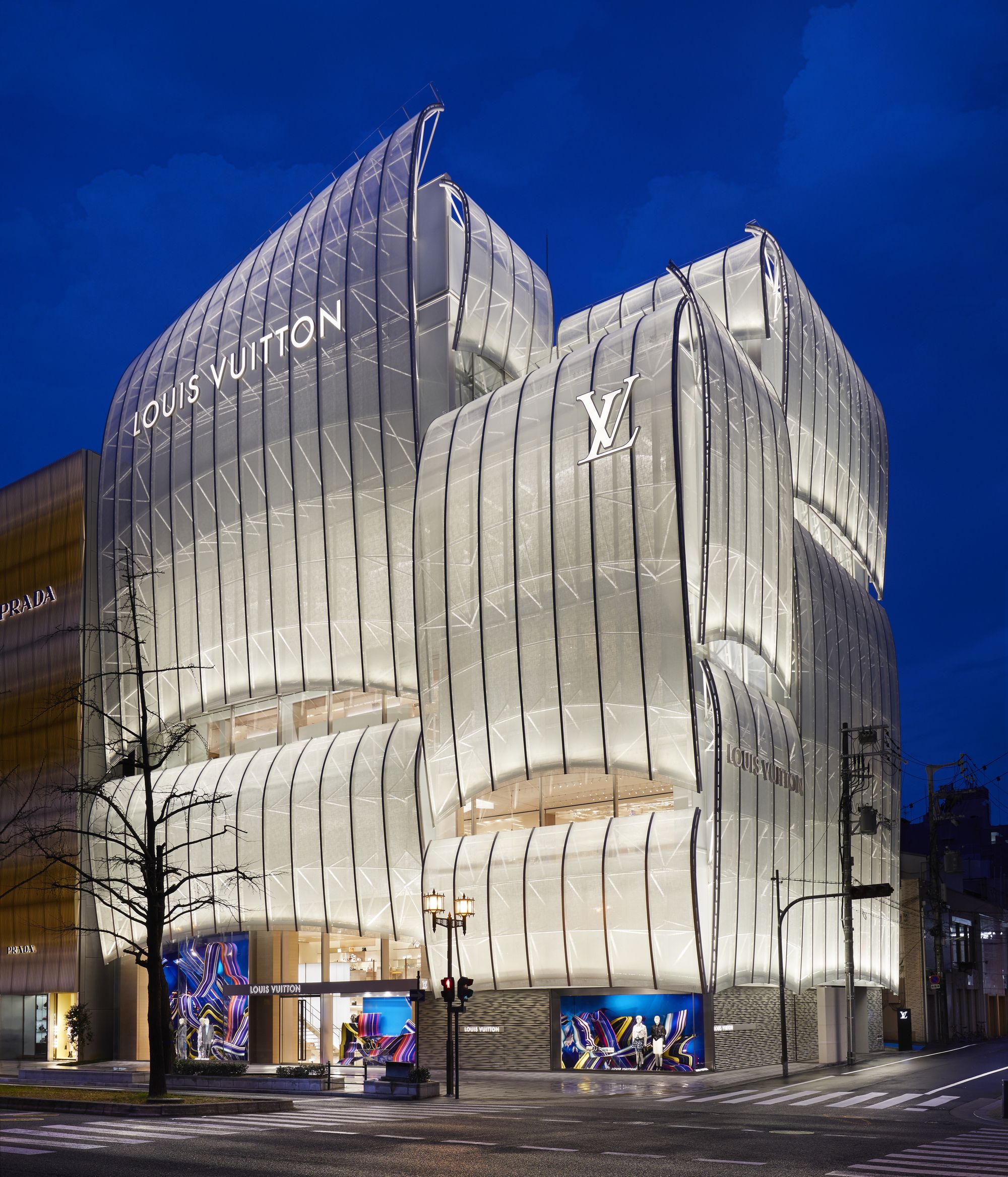
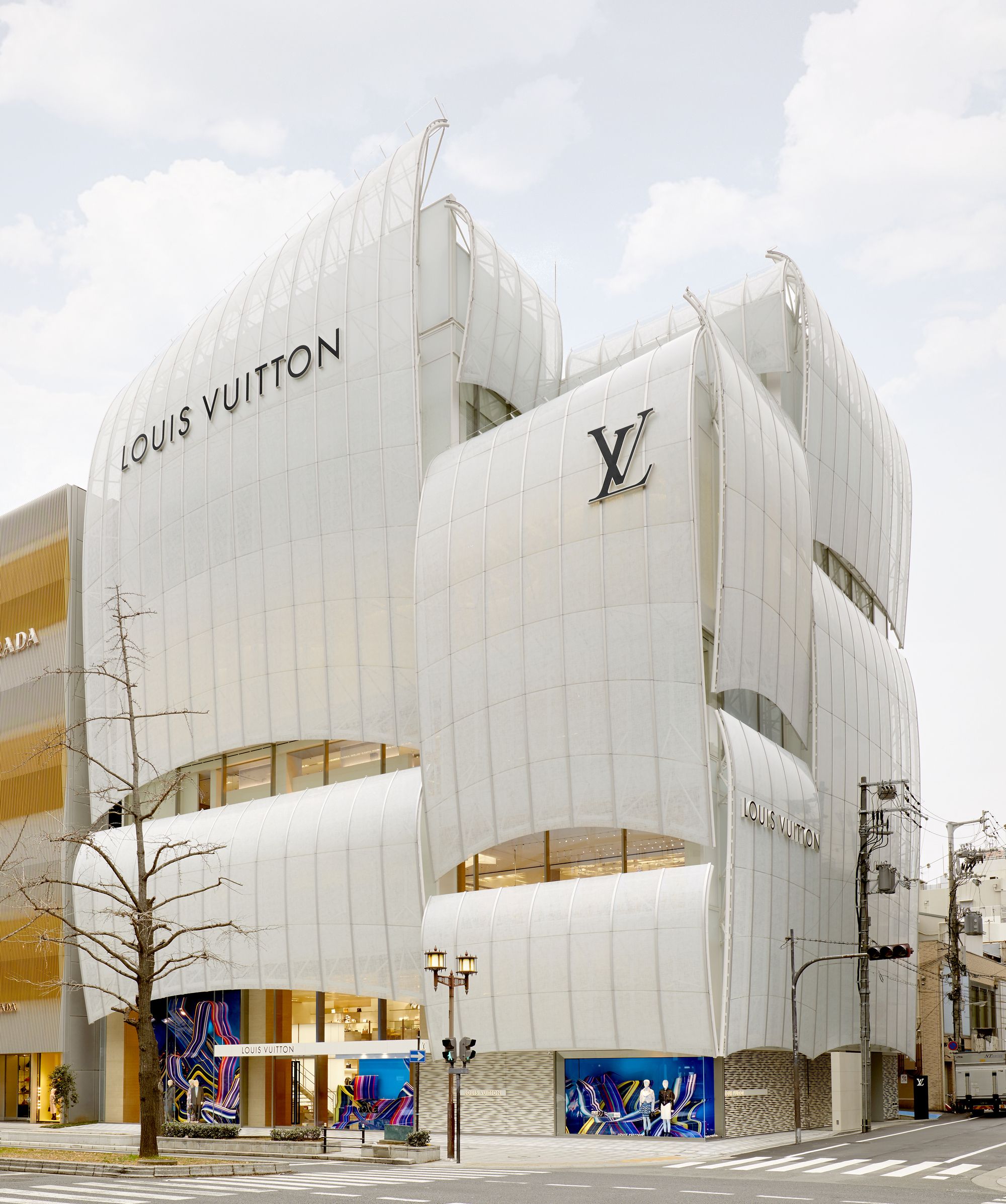
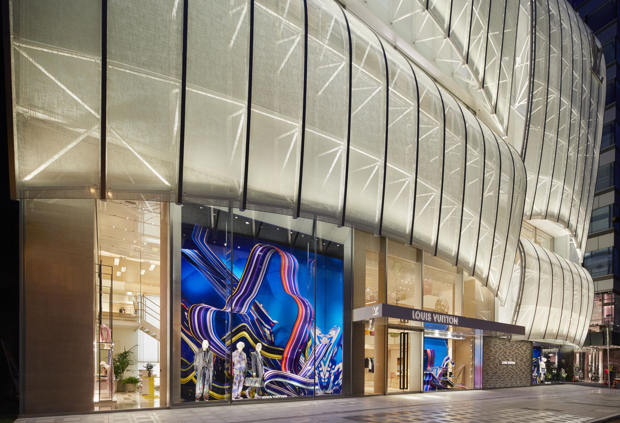
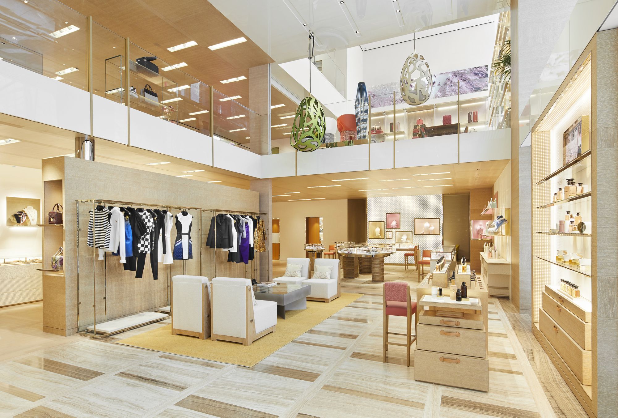
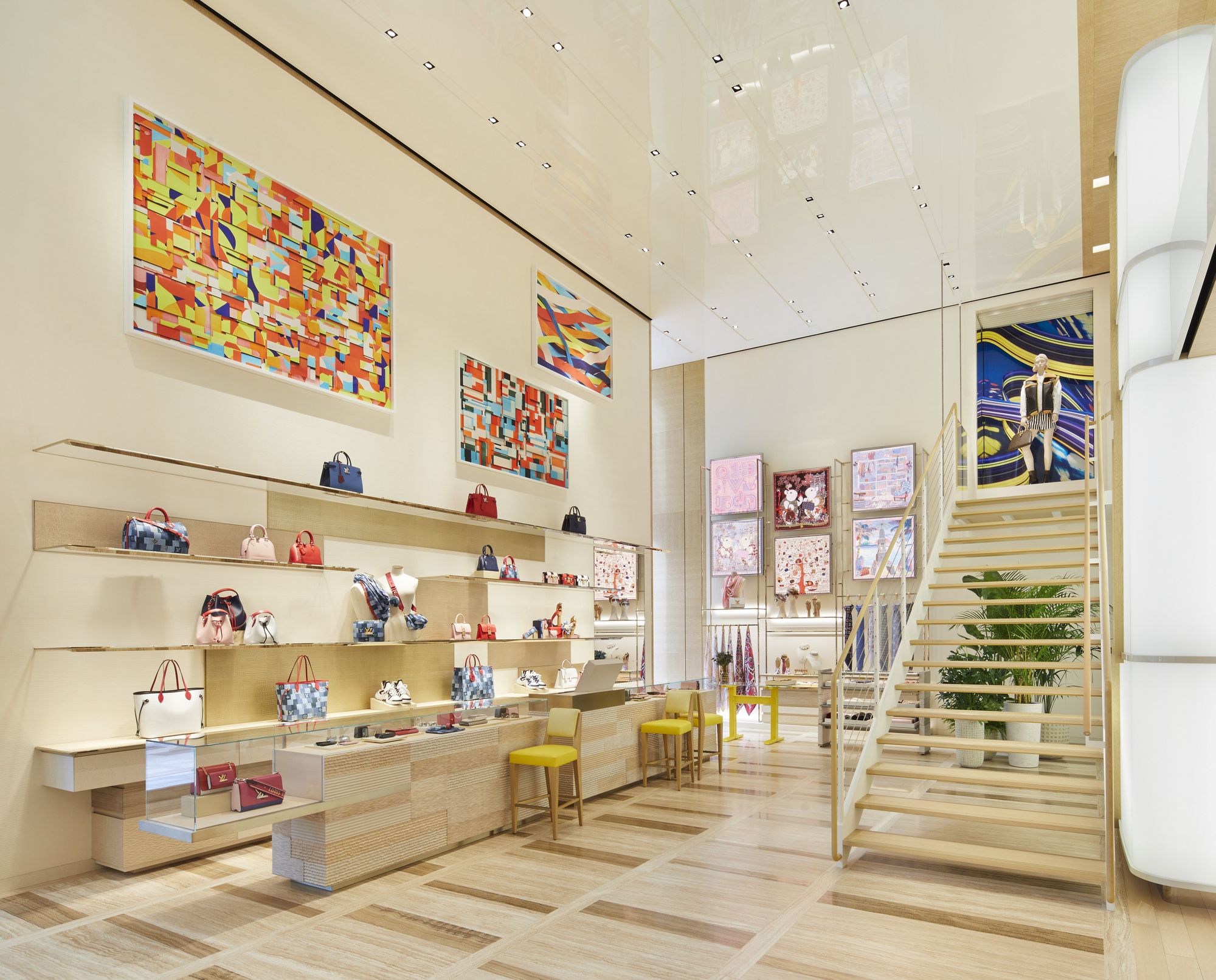
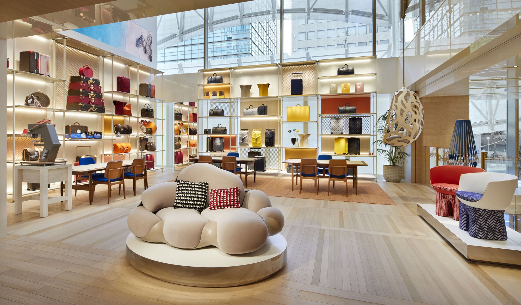
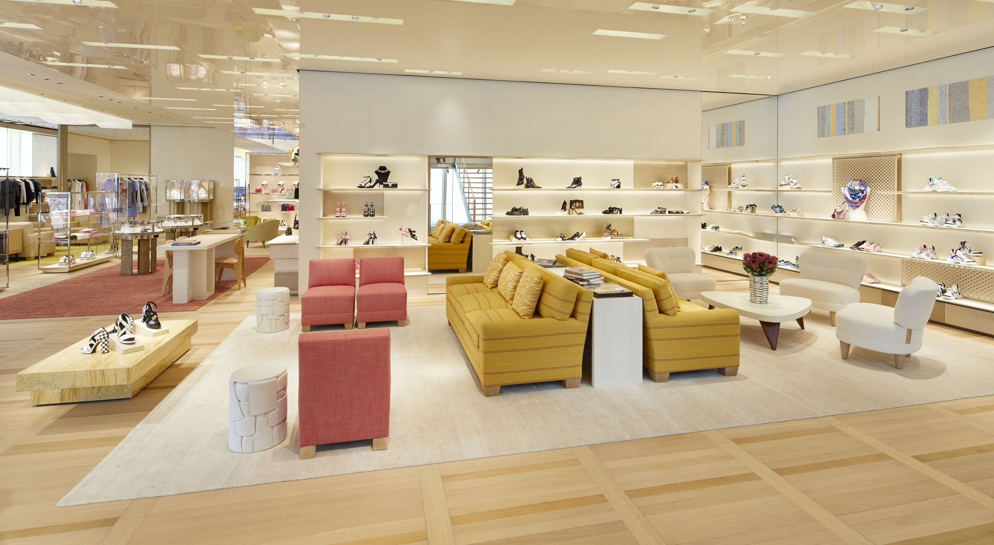
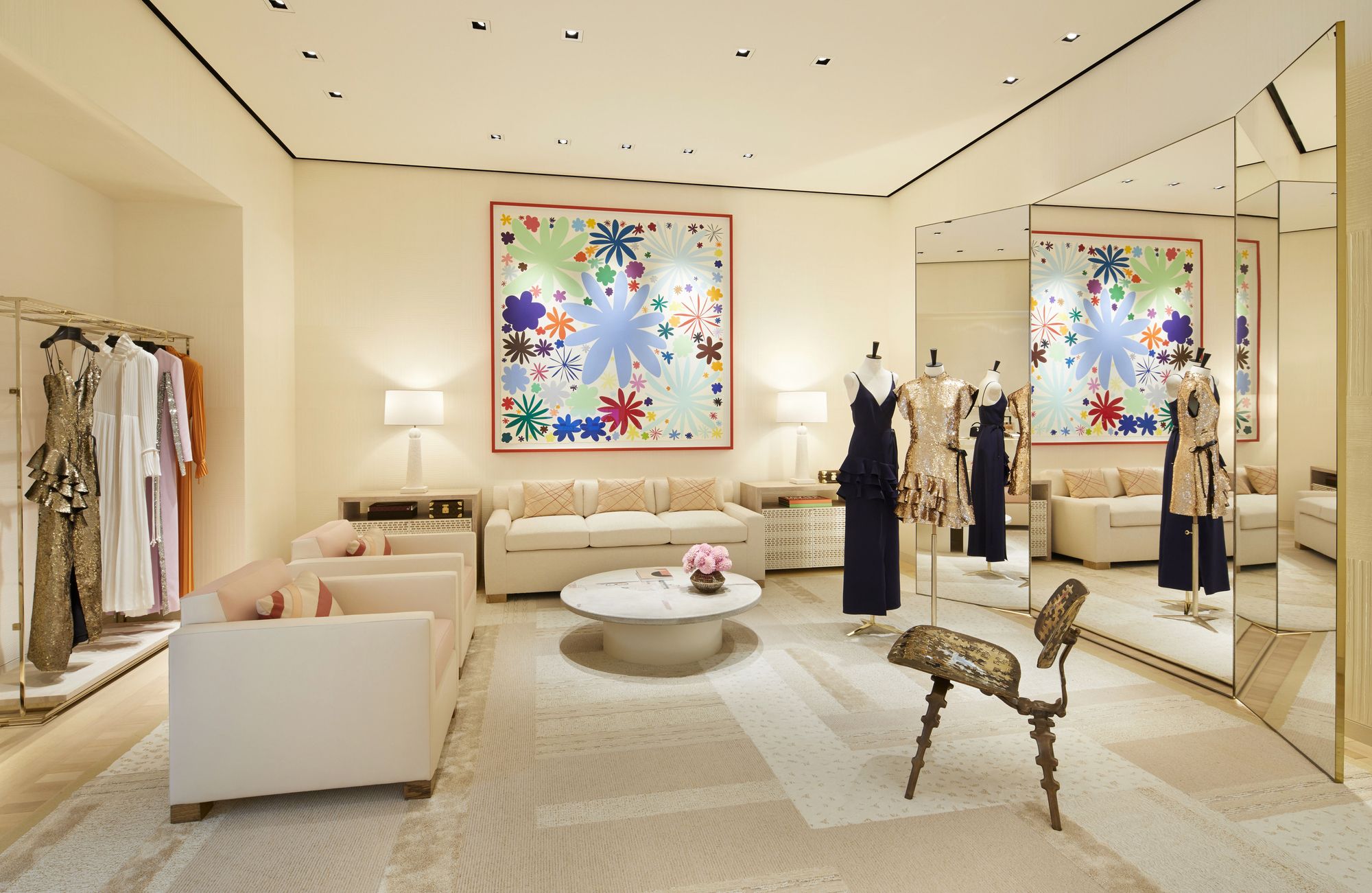
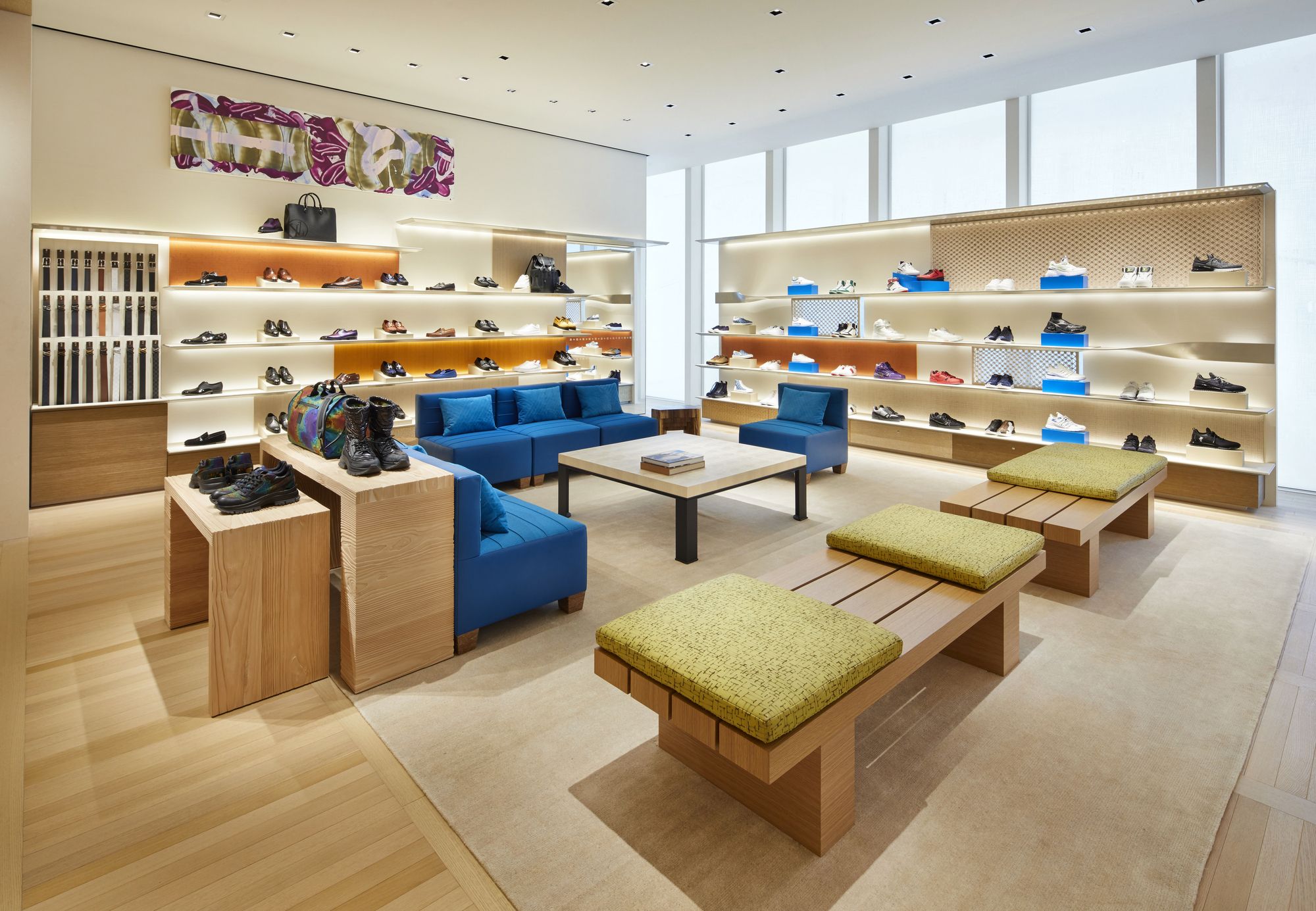
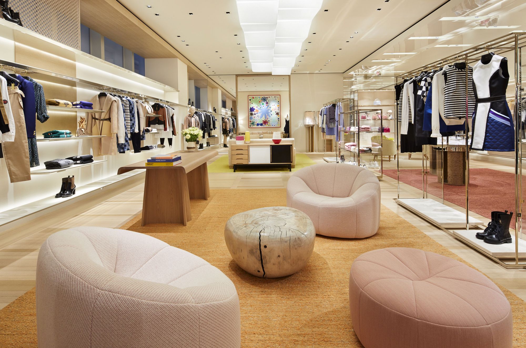
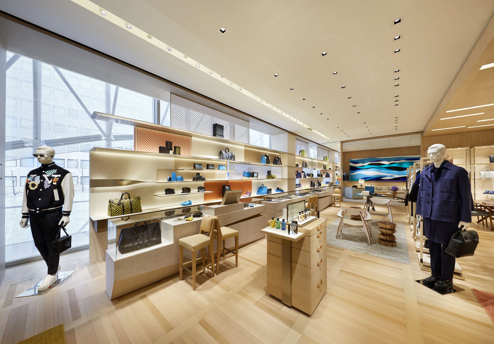
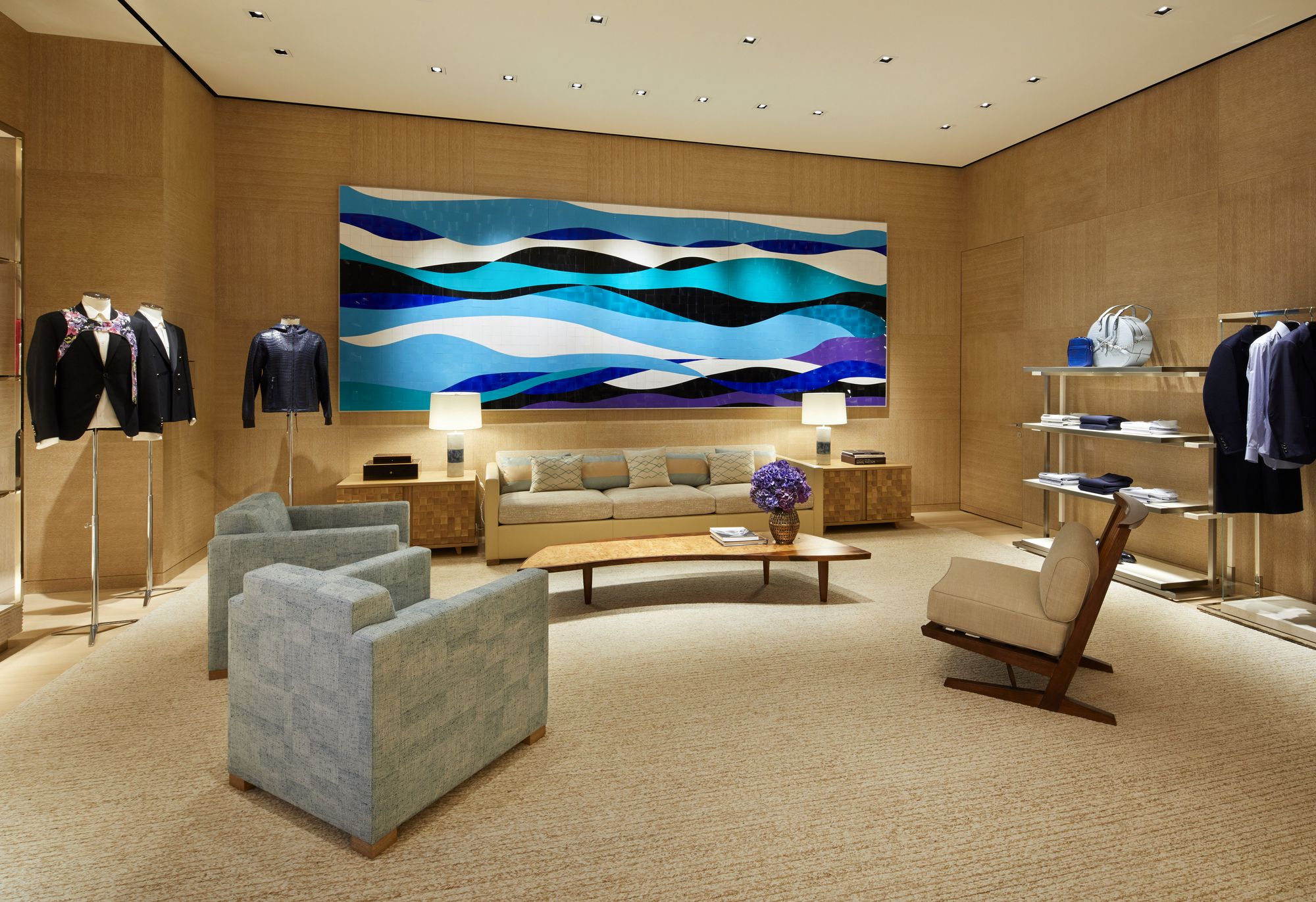
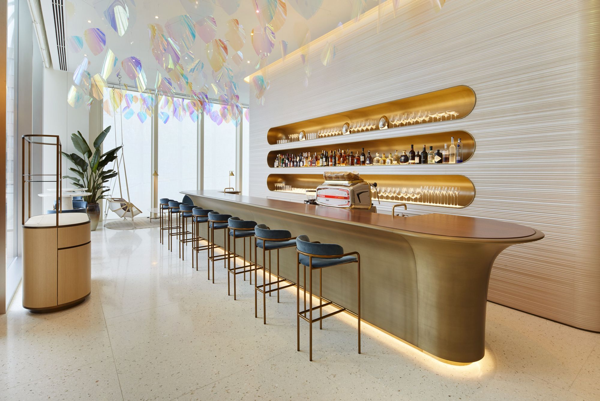
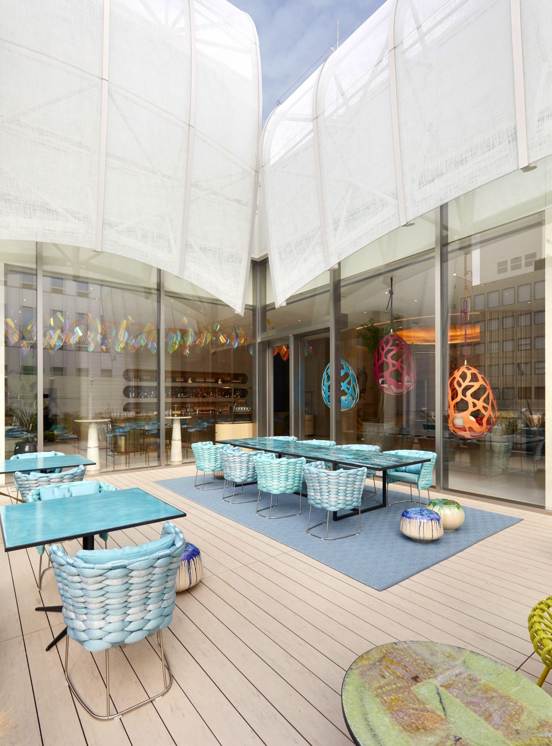
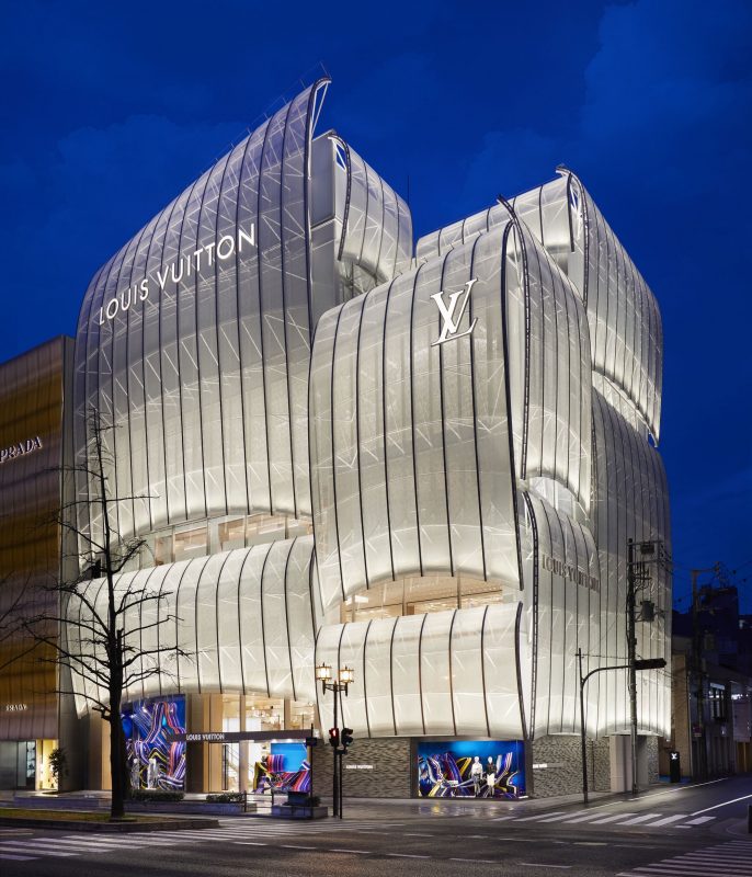
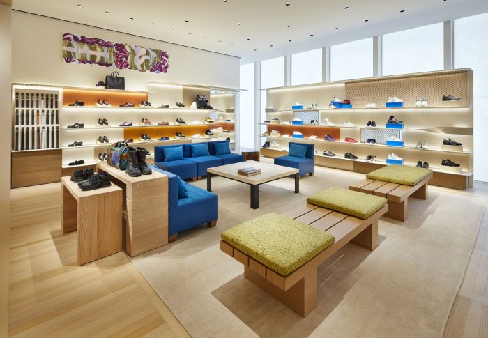
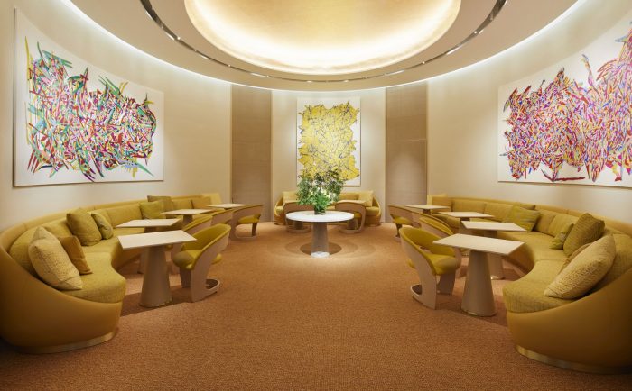
The Louis Vuitton Flagship Store for Japan is designed by UNStudio. A ten-story landmark building, this flagship store contains retail, café, spa, bookstore, event and exhibition space, with the design intention of blending classical and modern qualities that make up the essence of the Louis Vuitton company, its products, its history, and its future.
Being a staple store and identifier for the brand, it was important that the design reflect the classical values honored by Louis Vuitton while still retaining a value of inventiveness. Thus the leaf shape was developed which can be seen as a connection to the famous Louis Vuitton monogram. The lead is found in the floor plan, in the section and in the elevation, as well as applied to the construction in response to location-specific constructional demands. The lead shape openings in the façade give the building a strong identity and allows for discreetness with respect to visibility from the outside.
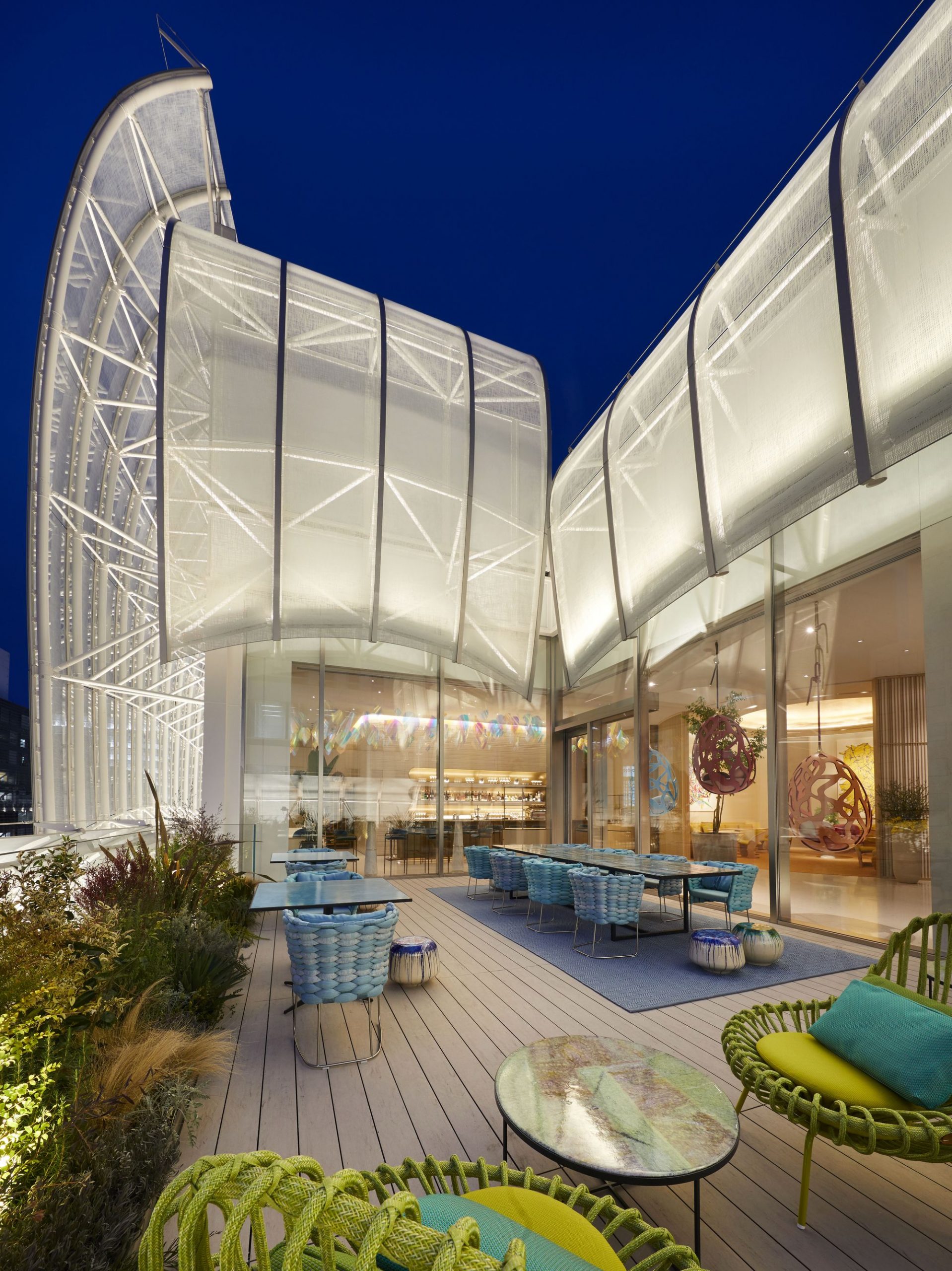
Structurally the building follows that of a grand house containing three levels. Each main level spans a varying number of split-level floors and has its own atmosphere and purpose. Continuing with the “leaf” concept, each floor is in principle divided into four leaves set in a spiral pattern with a height difference between each leaf of 2.70 meters. Terrace zones, which offer a mix of functions in a garden setting, mark the different vertical sections of the house, with the sense of intimacy growing towards the top of the building.
The way the architect thought about the movement up through the building with multiple paths depending upon the method of which one travels between floors, either elevator, escalator, or stair, is an interesting investigation and shows promise. In my opinion the leaf pattern is a bit cliché or juvenile to be representative of such a well-established and high end brand, but none the less it is highly identifiable and recognizable, which, in regards to design and architecture, is what a flagship store ultimately calls for.
Courtesy of Peter Marino
