Mandala Pop-up Digital Art Museum
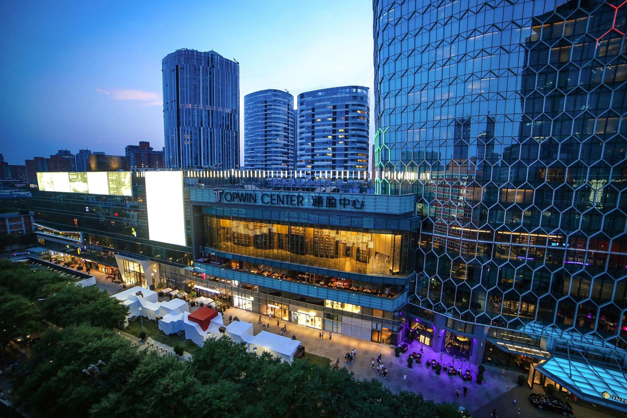
Mandalas Pop-up Digital Art Museum is an inner garden, as well as a utopian city drifting in metropolises. This temporary building, though exhibited in the most bustling urban center of Beijing, provides a completely inward and isolated space.
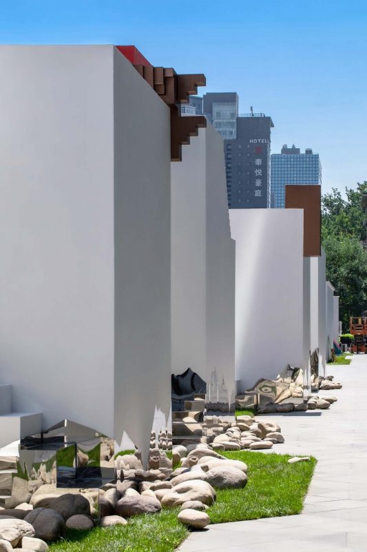
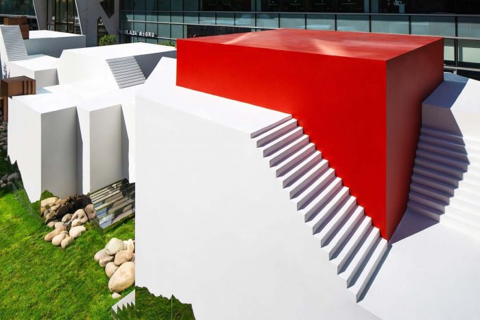
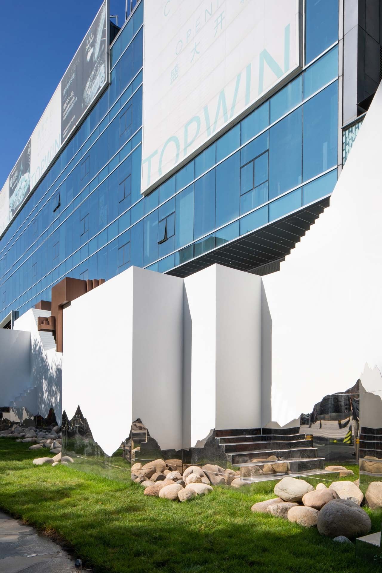
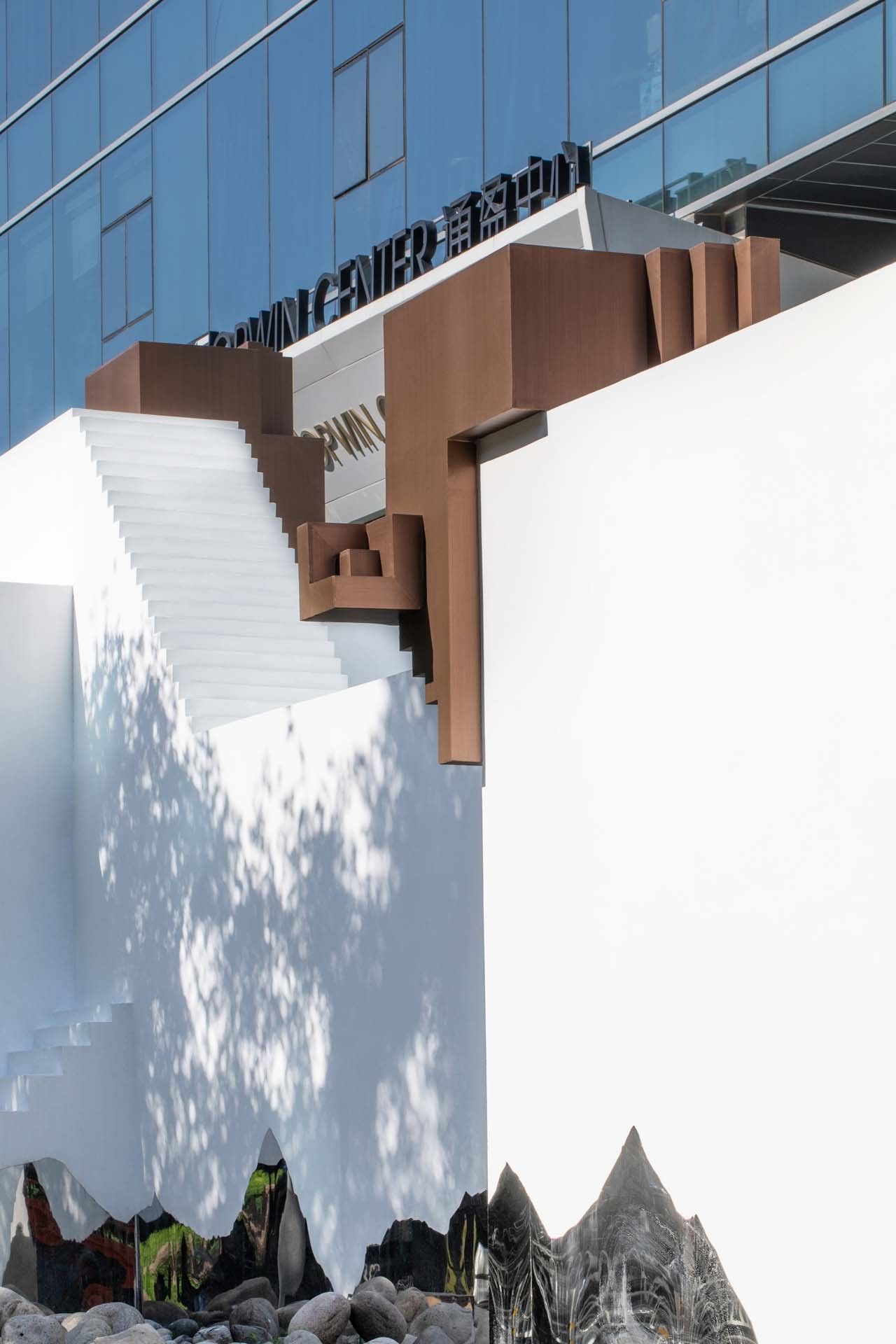
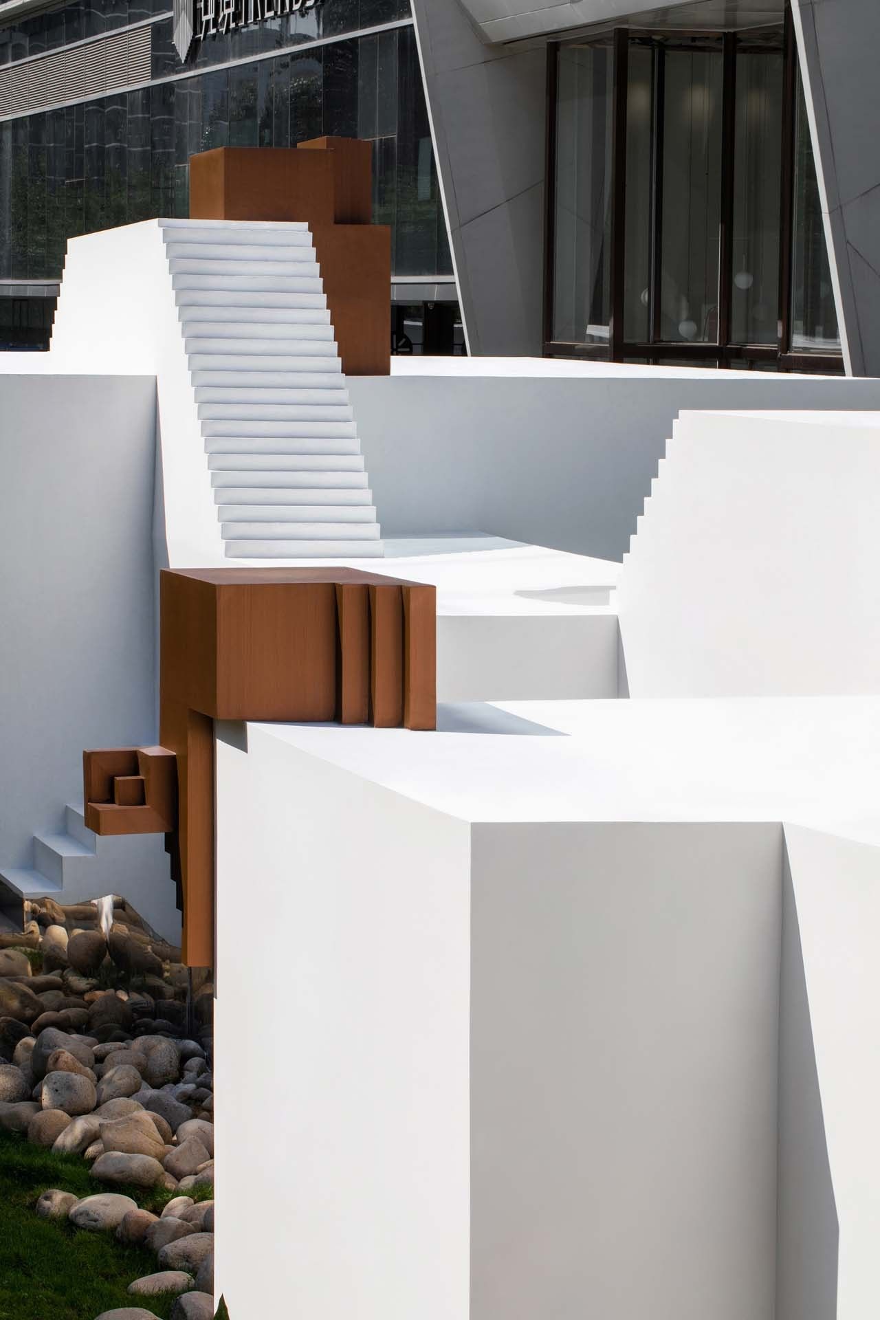
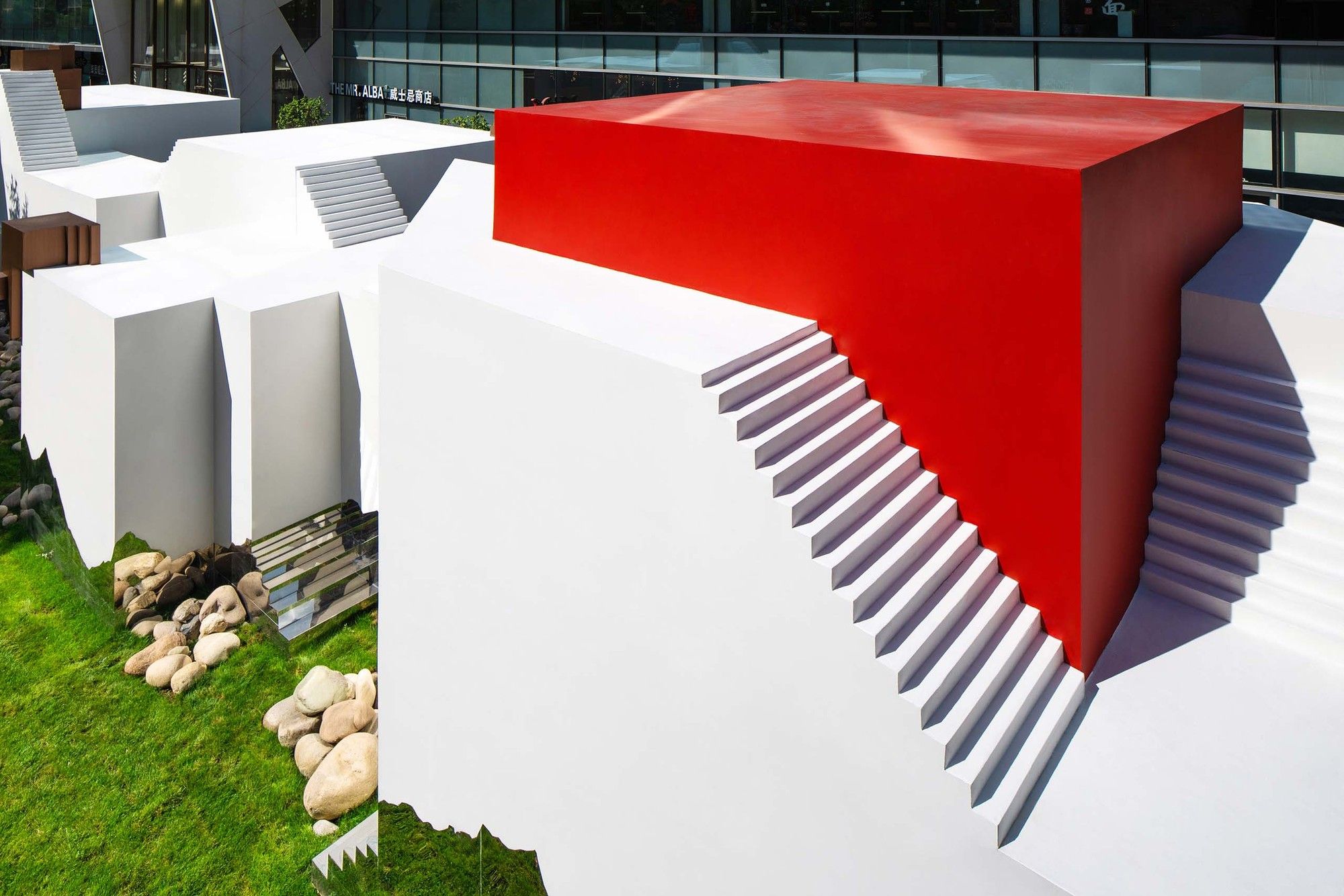
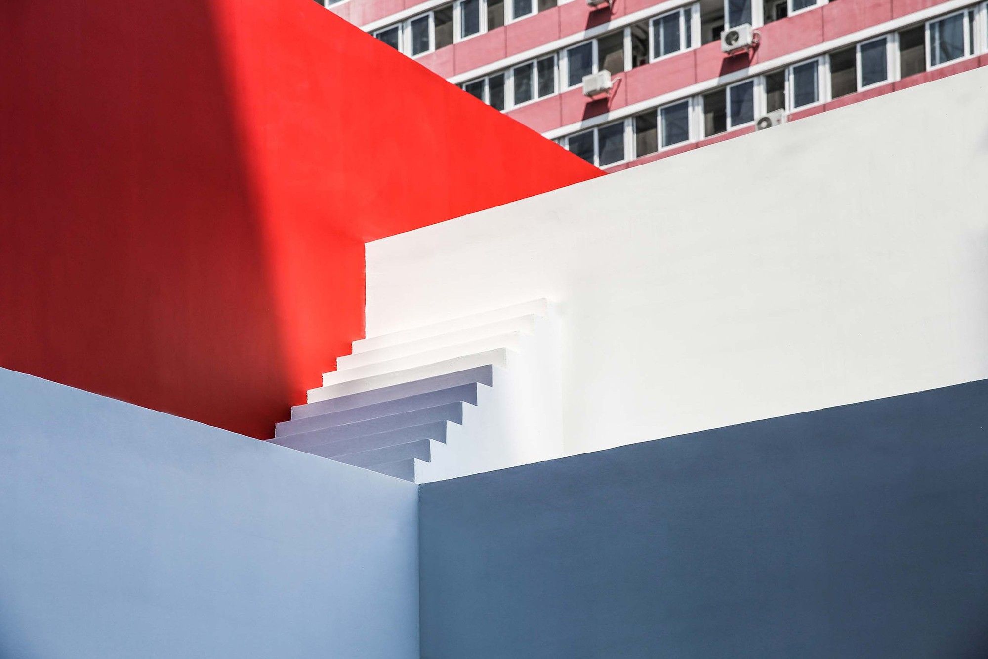
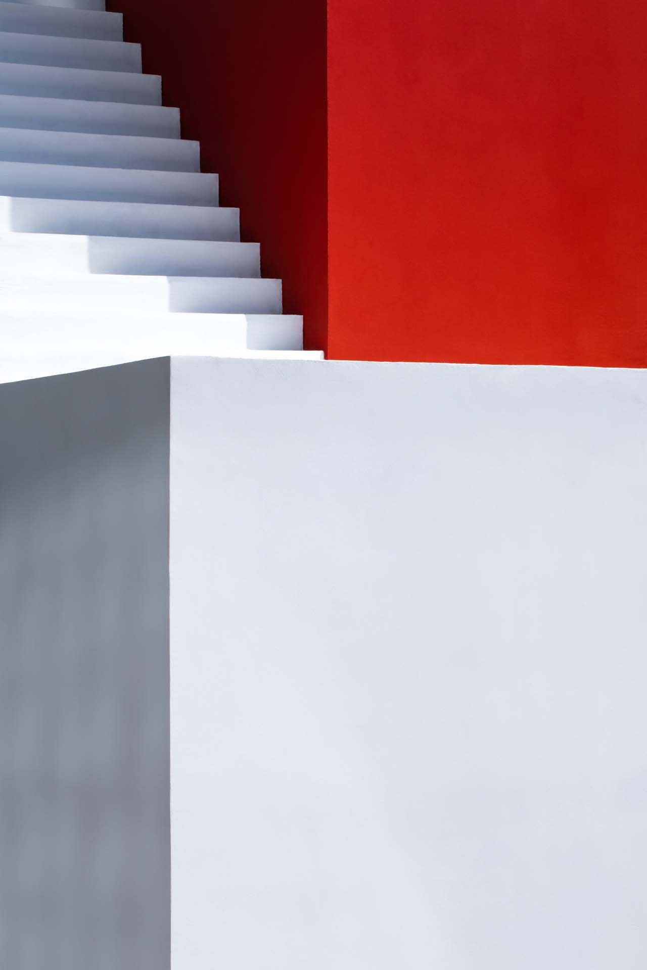
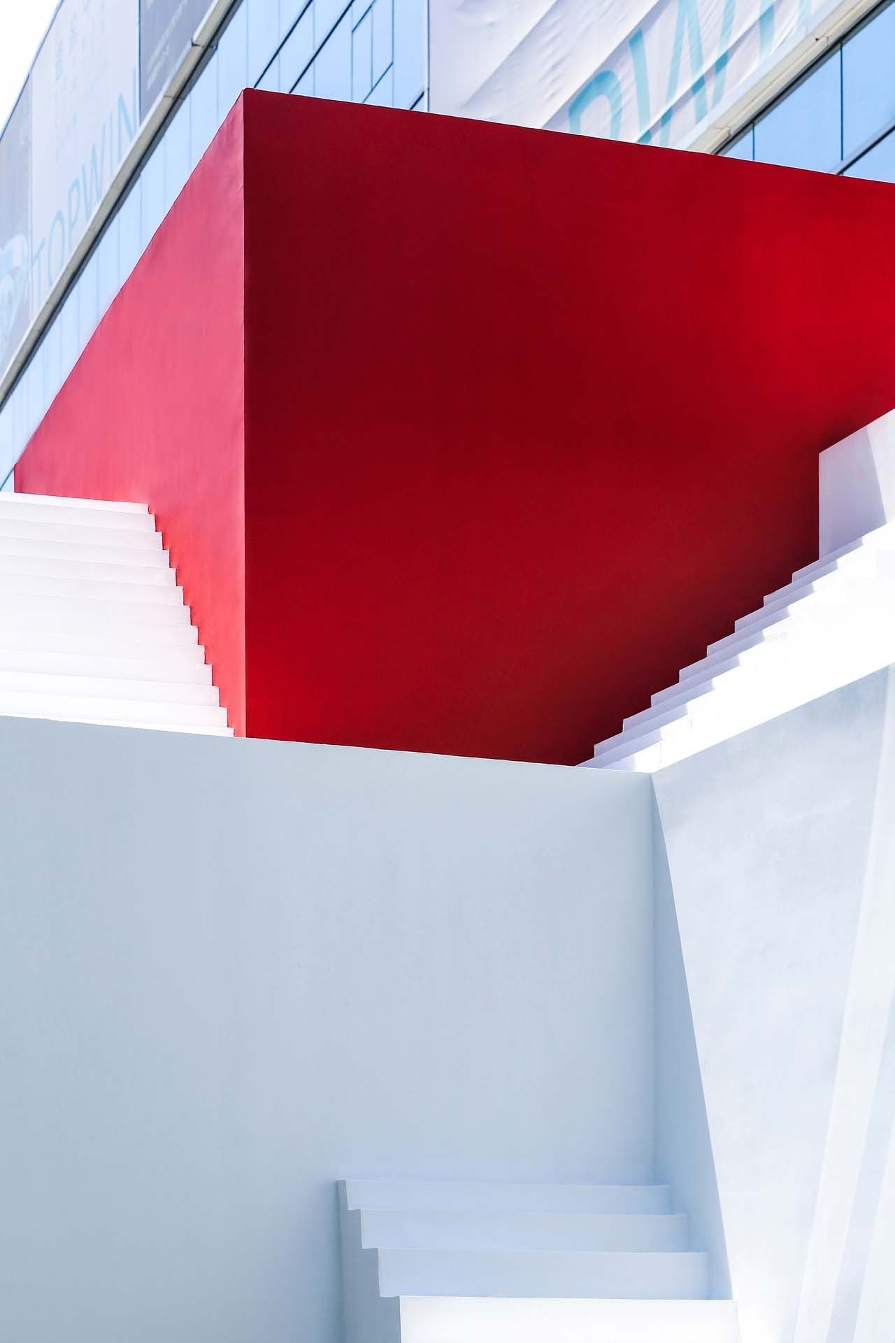
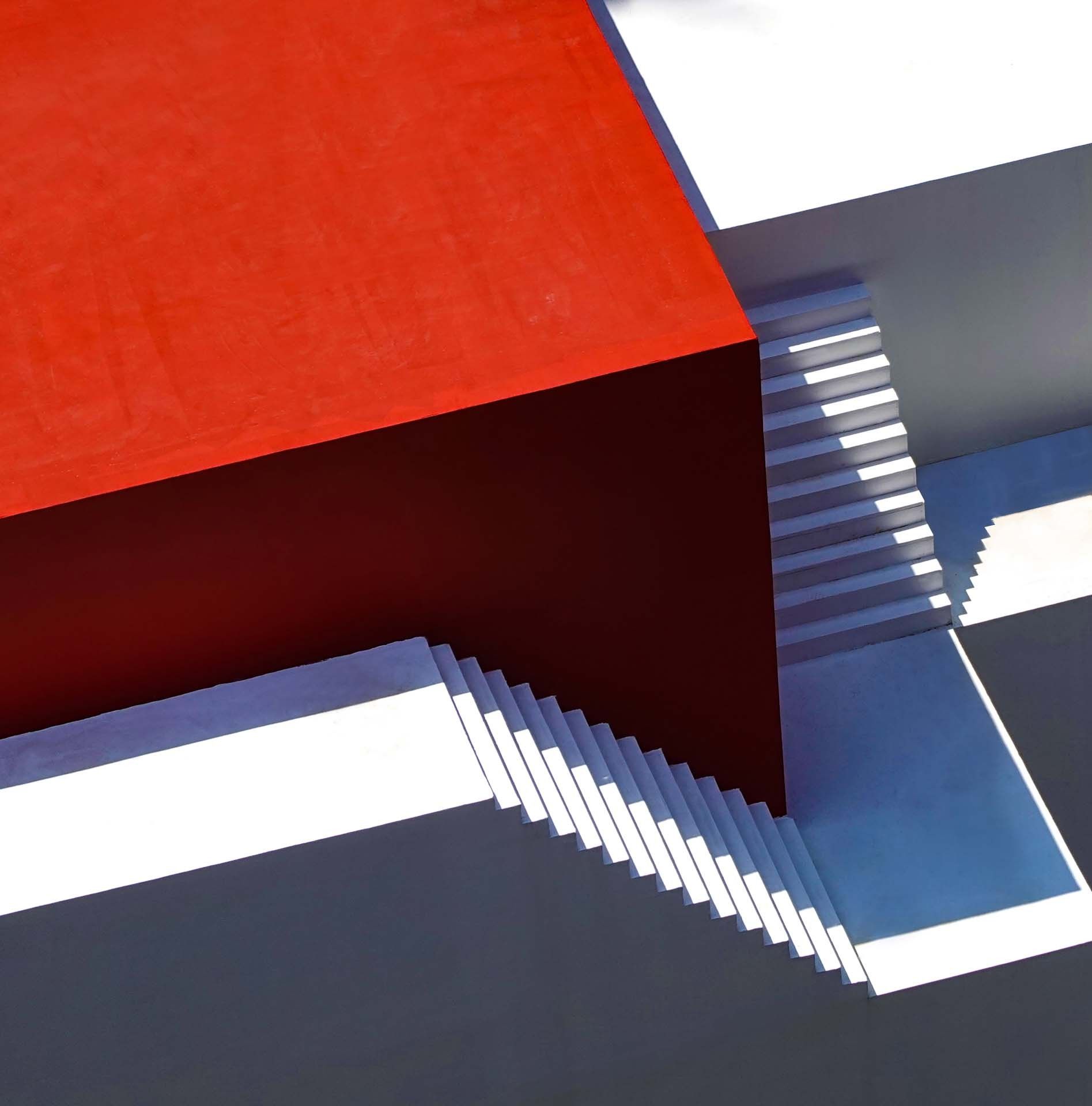
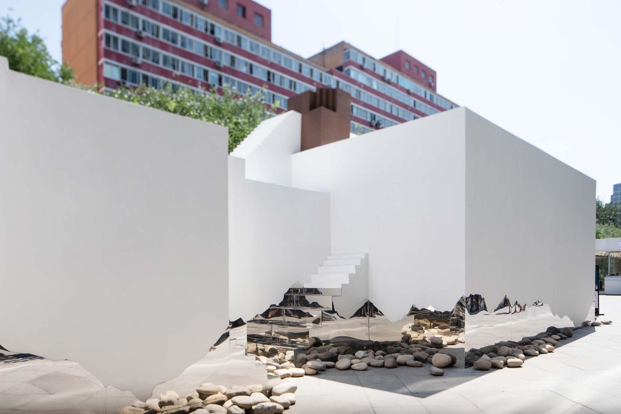
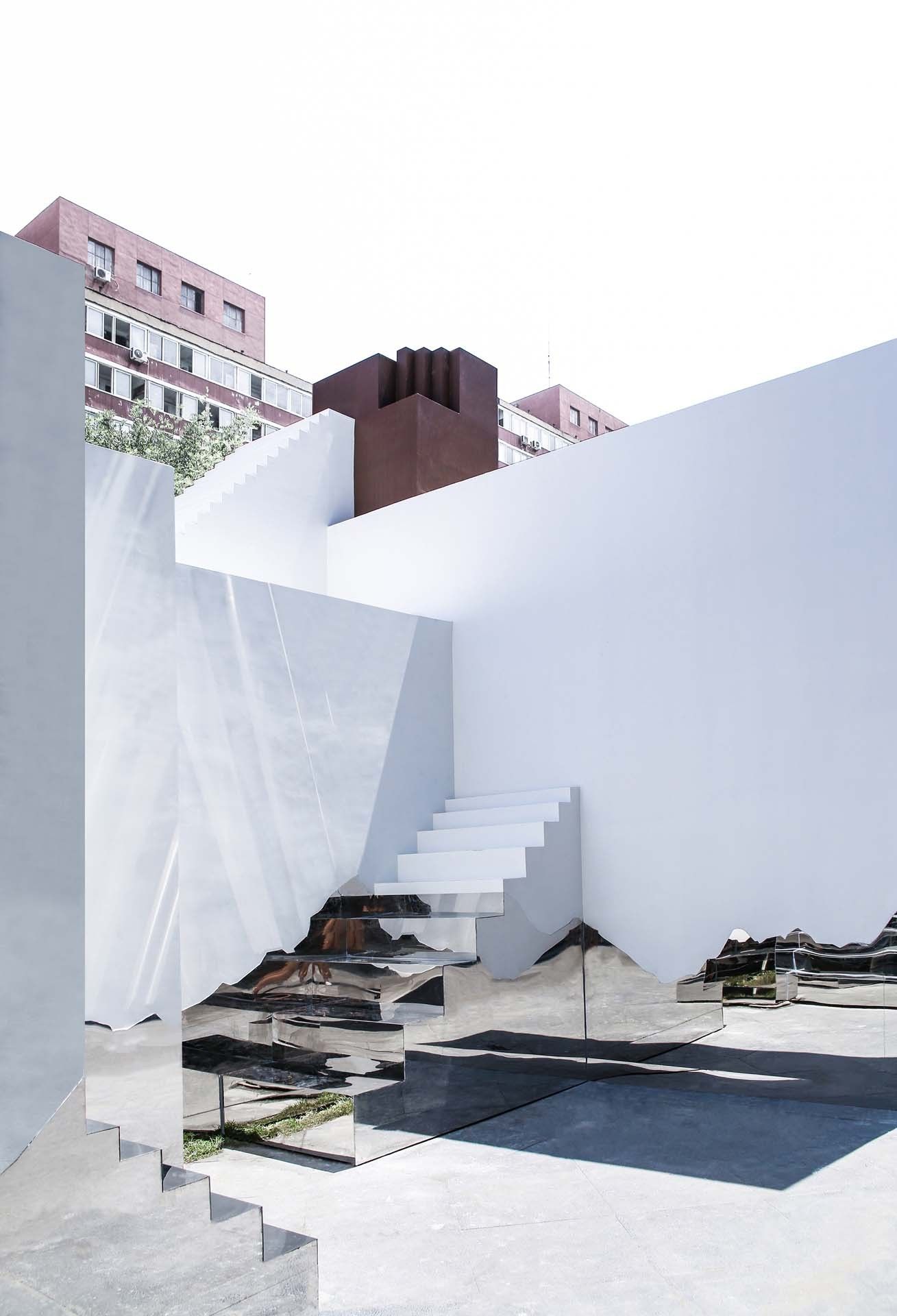
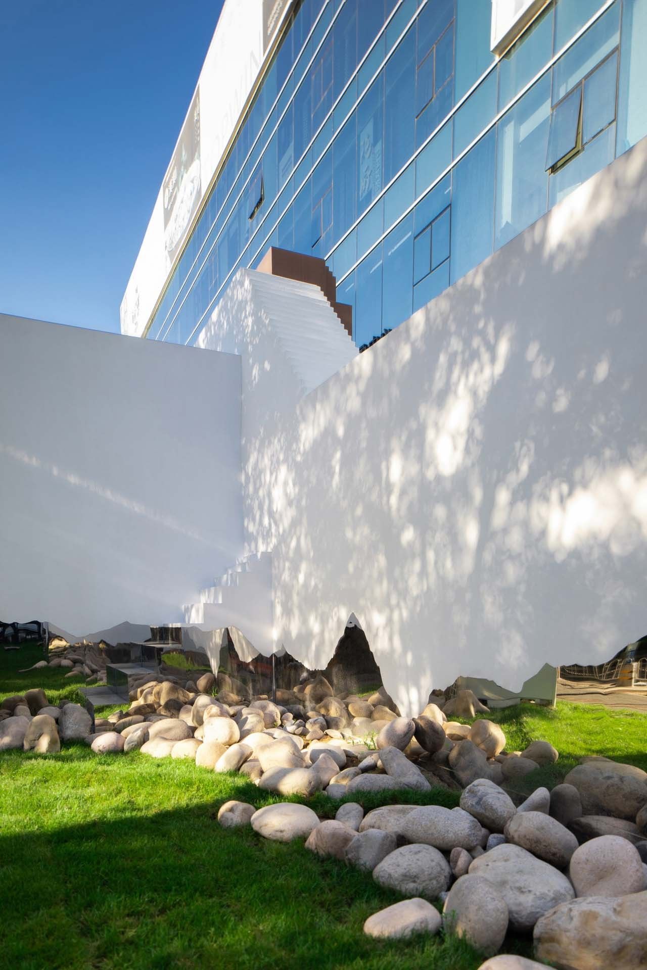
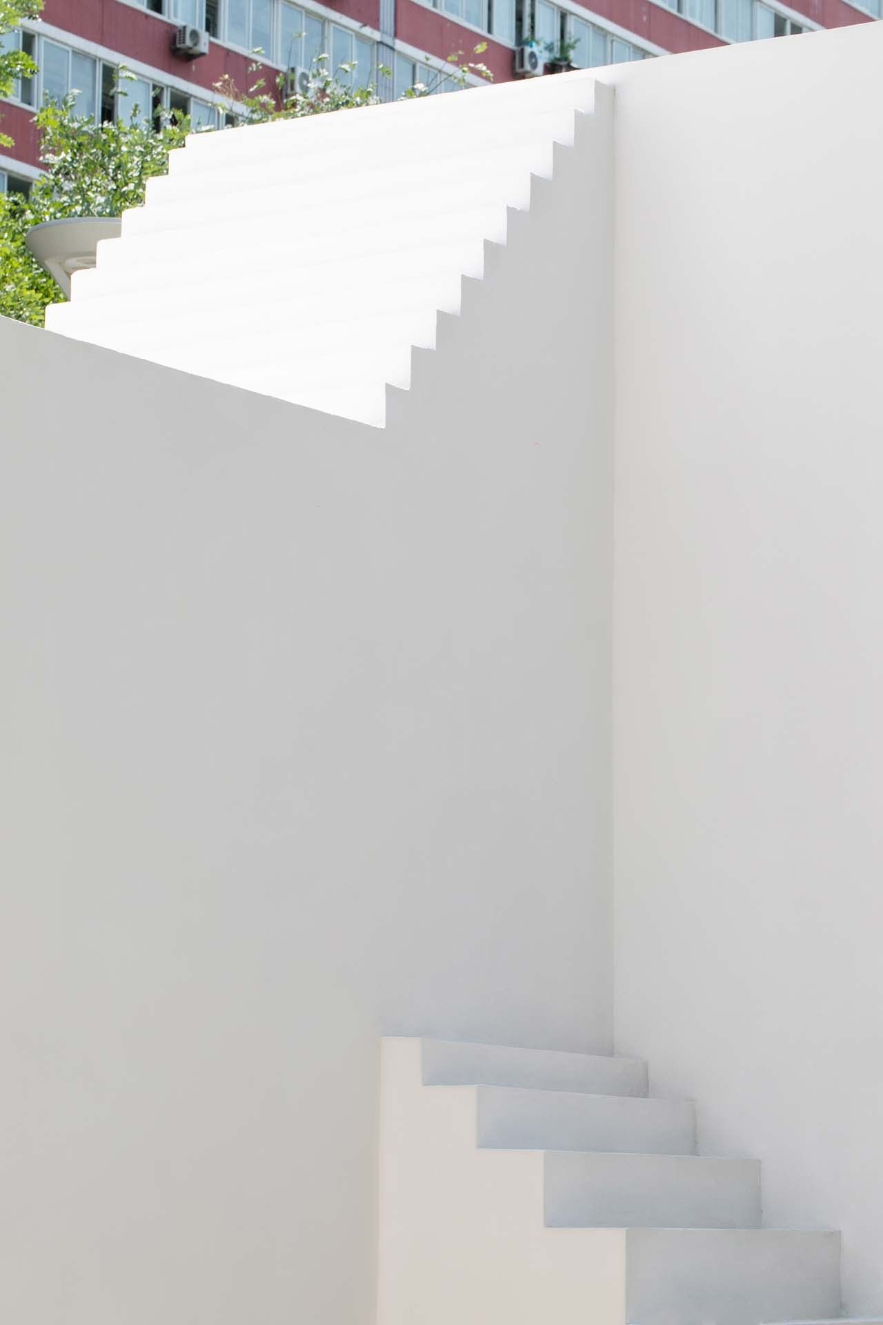
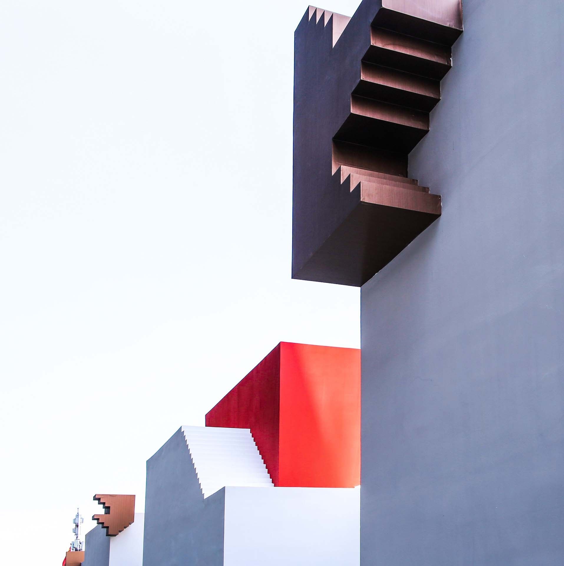
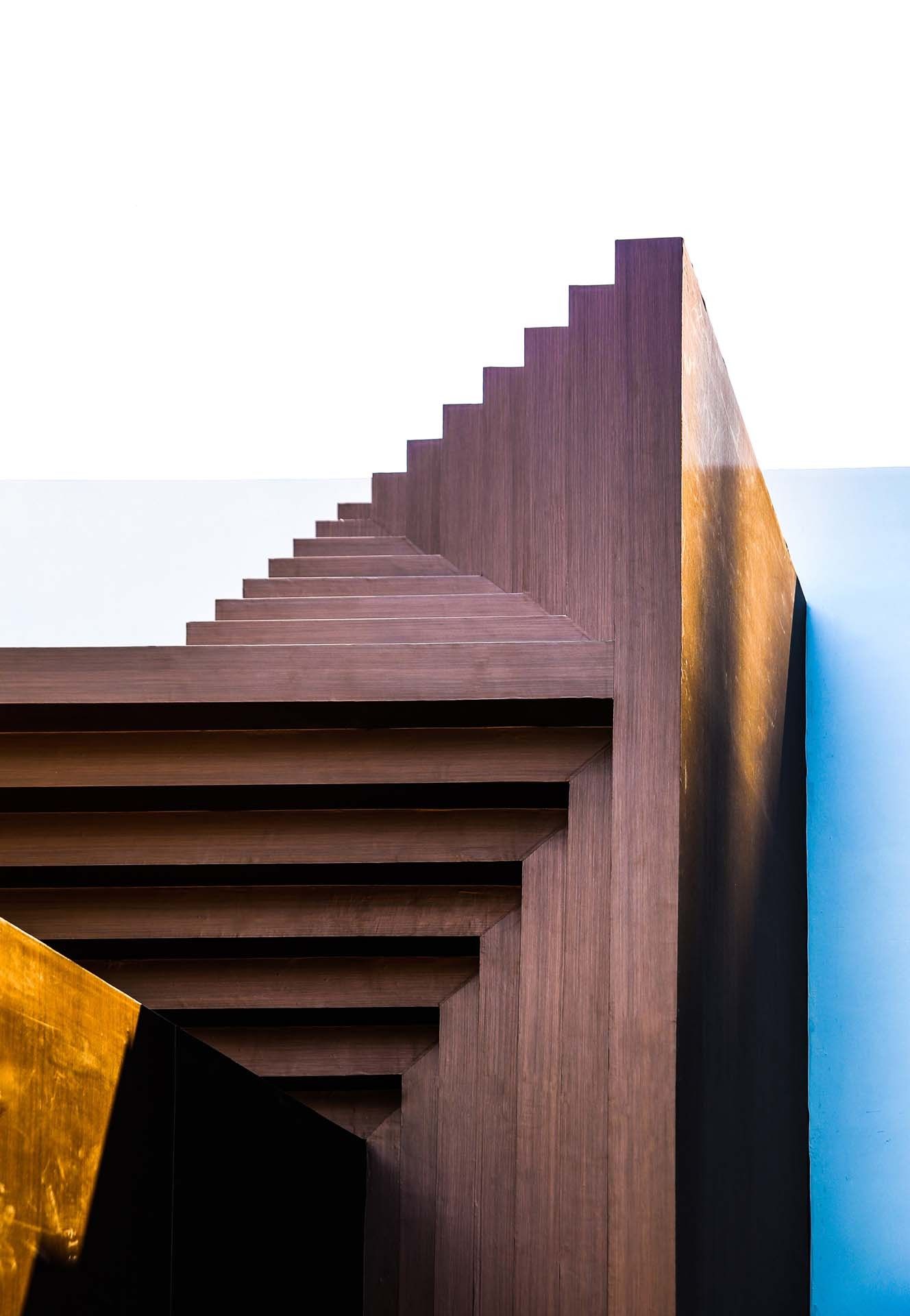
Its external layout is arranged like a labyrinth. The staggered steps surprise visitors with a perspective illusion, motivating their physical interaction with the building. Mingling with façade lines that resemble the skylines of Namcha Barwa, the unadorned stones isolate the building from the full-blown metropolitan atmosphere, as if it were from outer space.
Immersing Art and Architecture. As a temporary building for a digital art exhibition, Mandalas Pop-up Digital Art Museum responds gracefully to the exhibition inside. It is designed for this specific theme – Himalaya culture & art, in order to bring immersing experience, create new relationships between people and space. It is the most important difference between Mandalas Pop-up Digital Art Museum and other traditional museums.
On the two sides facing the shops and the street, the architect made different efforts. For one thing, he ensured enough space for the shops to open as usual. For another, he strived for rich space expressions in a cramped place through very small actions.
As internal multi-media art exhibitions have strict controls on illumination, the architect completely removed outward windows and designed a double-nested space at the entrance, making it impossible for people to see the building’s inner secrets from outside. In the total darkness of its interior space, visitors rely only on the changing lights and shades.
Without windows on the façade, the scale of the building seems to be difficult to judge. When facing it, visitors lack an important yardstick to measure its heights and number of stories. This indicates that the Mandalas Pop-up Digital Art Museum can exist in a form between that of a sculpture and a building, which has also given the architect motivation for further exploration.
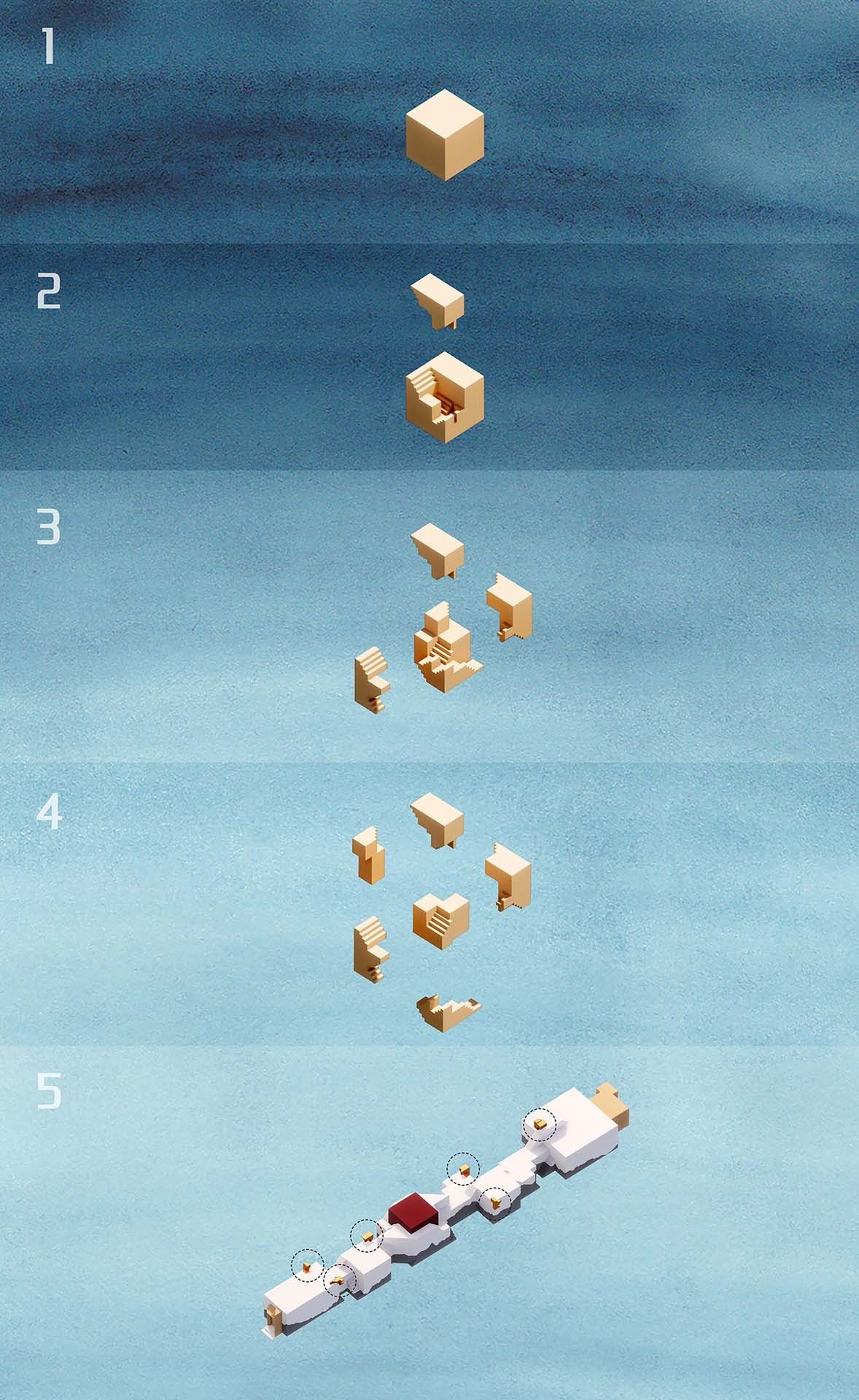
Mandala Blocks. All the blocks that make up the Mandalas Pop-up Digital Art Museum can be split and reorganized into a “dKyil-‘khor” (an inner palace or Buddha realm in Chinese Buddhism, translated as “mandala” in English). This echoes an interpretation of the Mandala Sandpainting: when a sand mandala is completed, a “dKyil-‘khor” is also established in space and time.
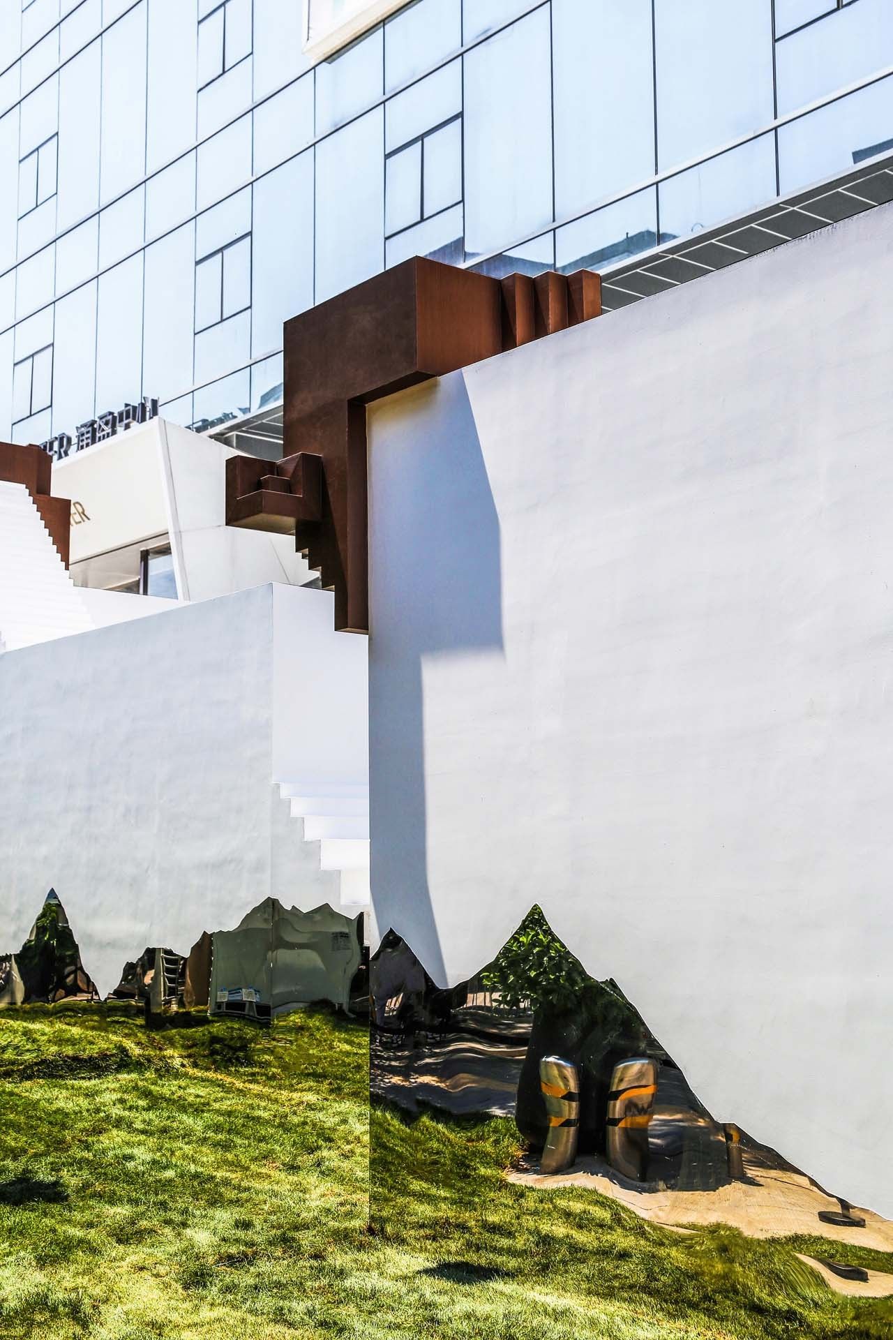
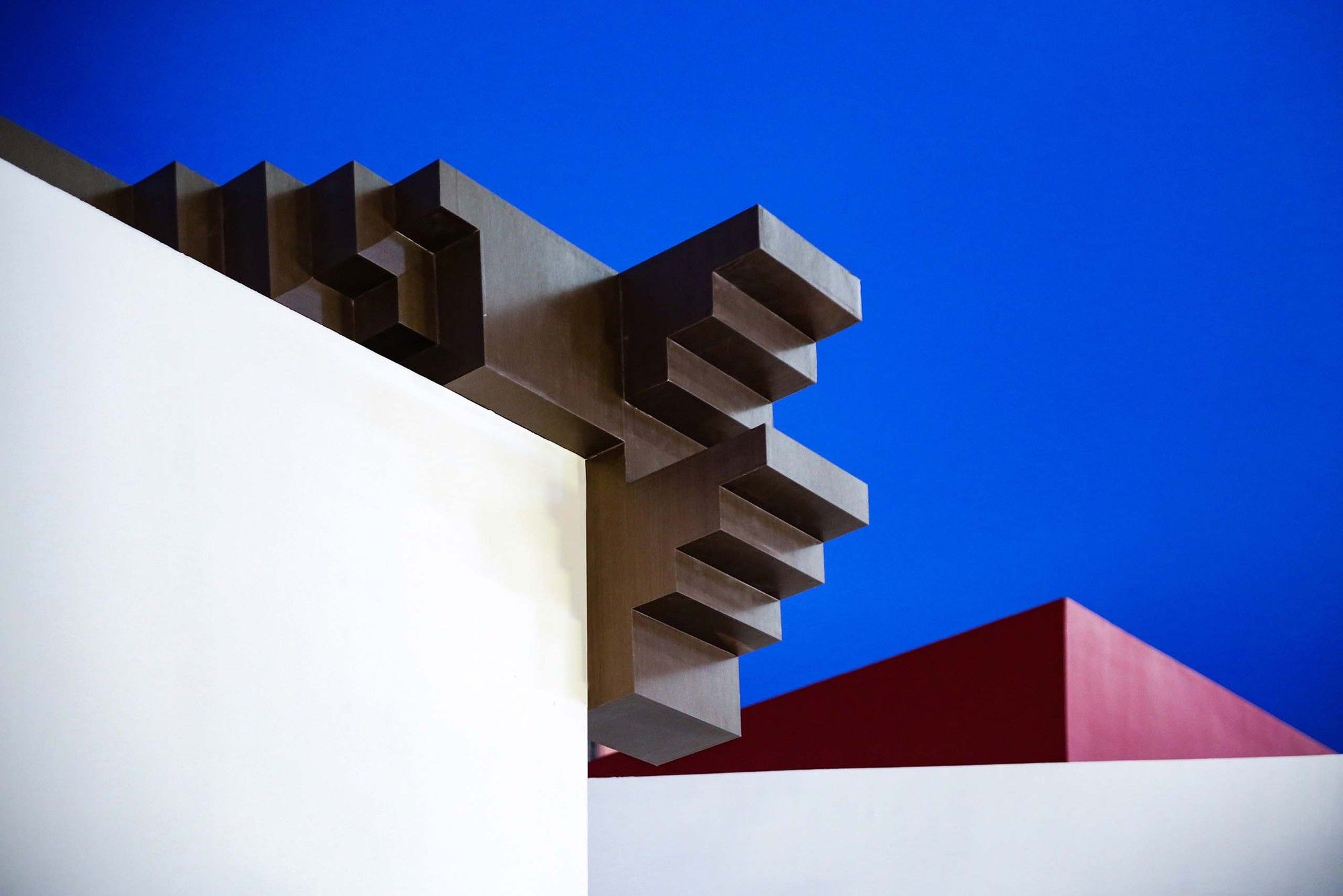
Like a set of blocks that can be reorganized in many ways, the building’s six golden corner blocks can be nested into a complete cube with structures similar to mortise and tenon joints.
Some steps on the external layout are deliberately adjusted to different heights for people to lean back, sit, or climb. Though they cease to provide a reference point of the building’s scale, they make it more interesting and create a sharp contrast to the serious and dull urban space.
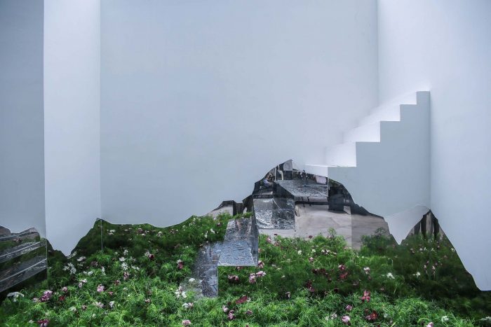
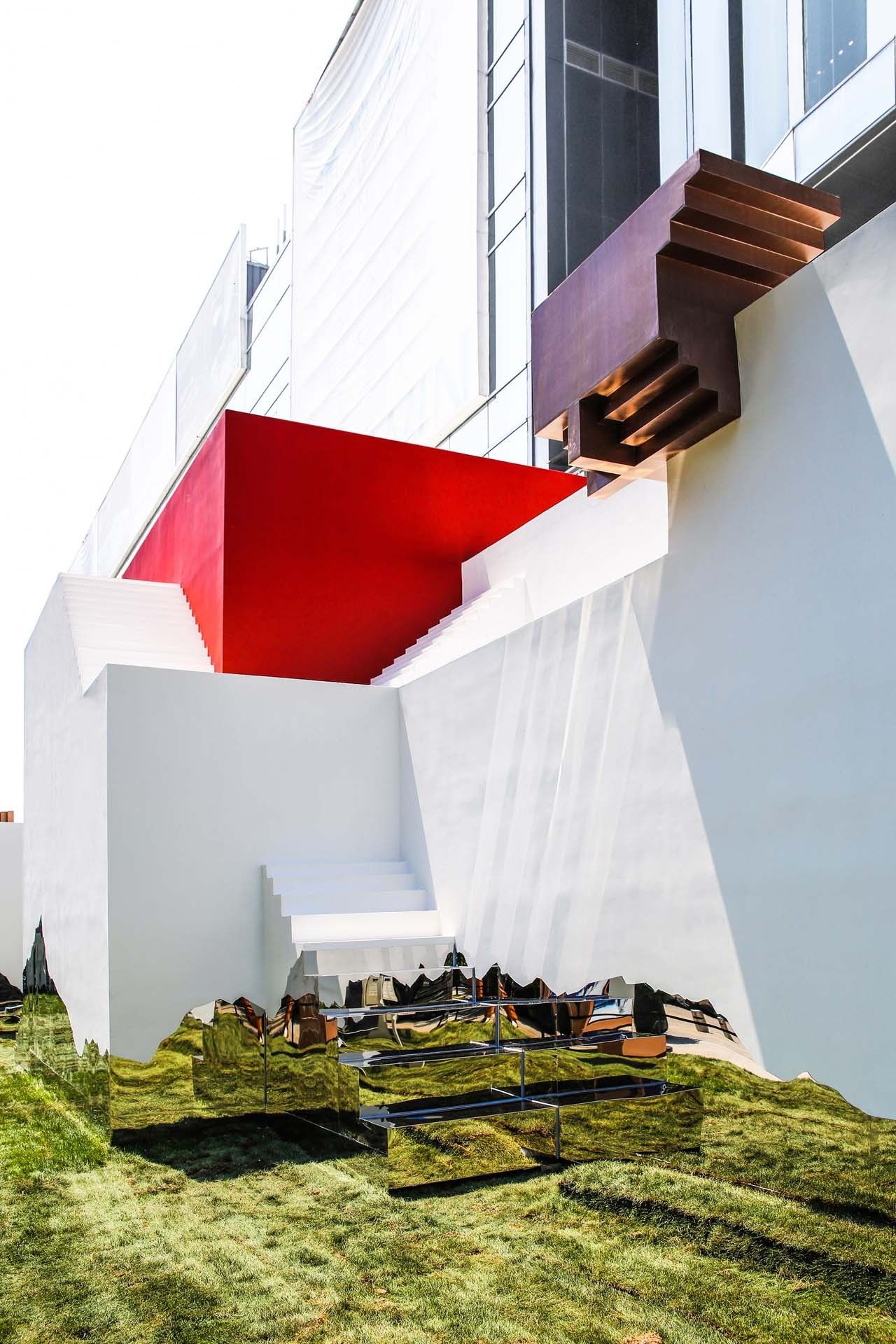
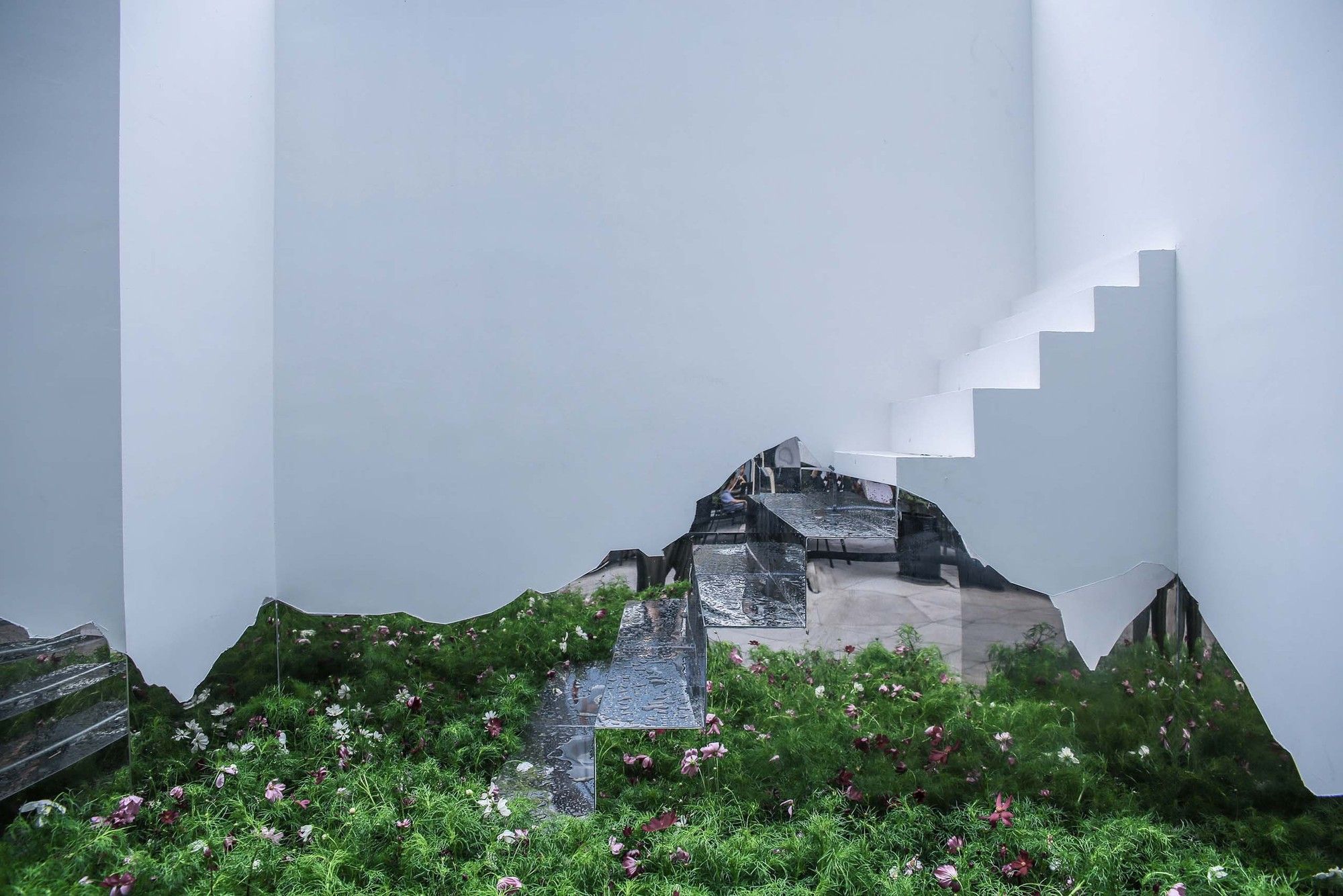
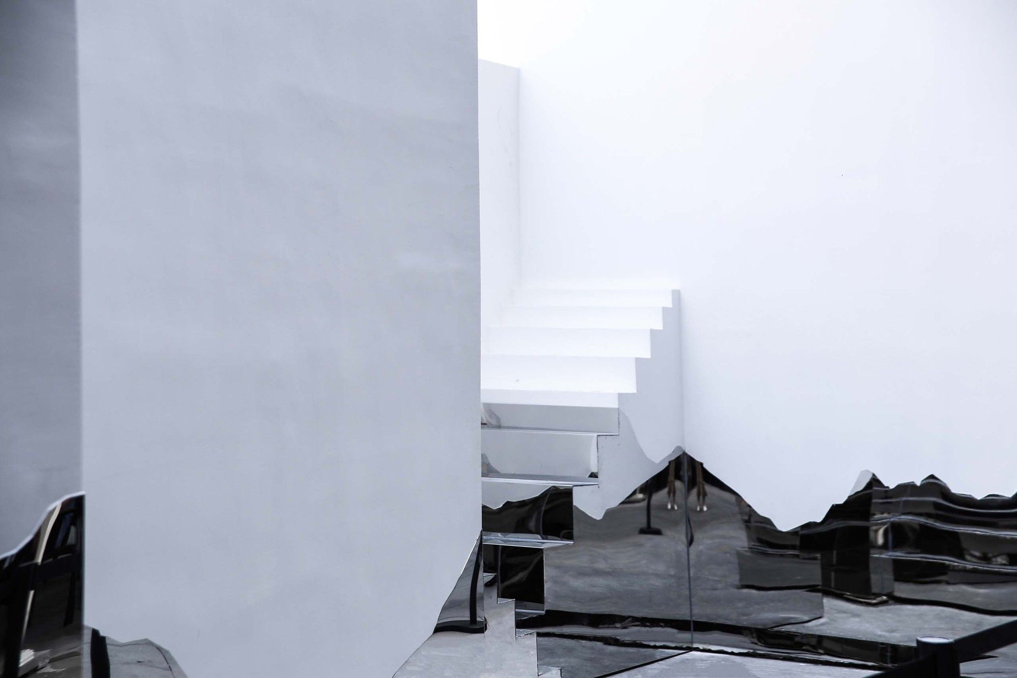
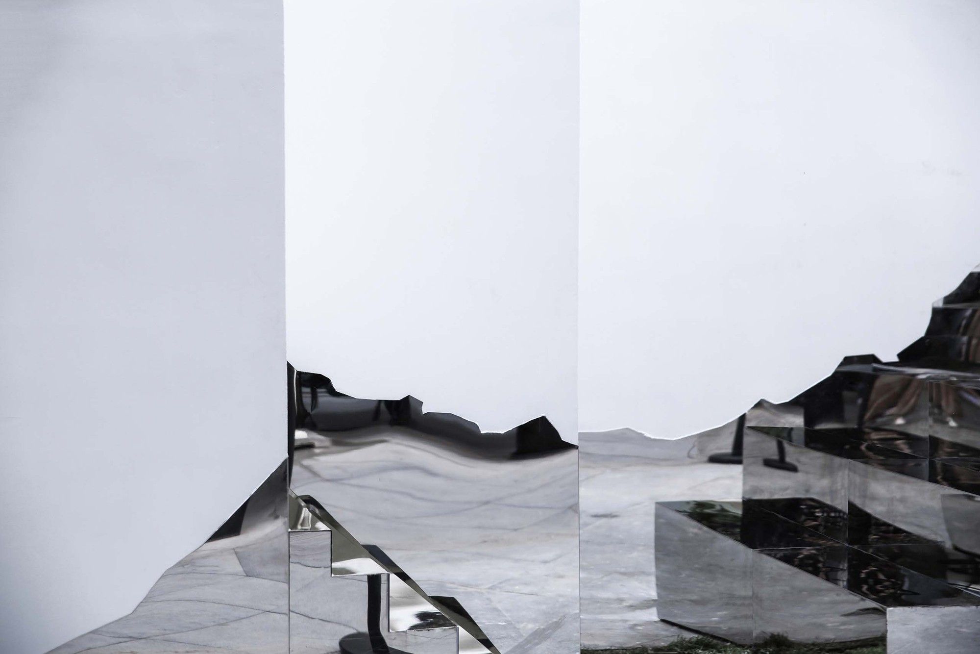
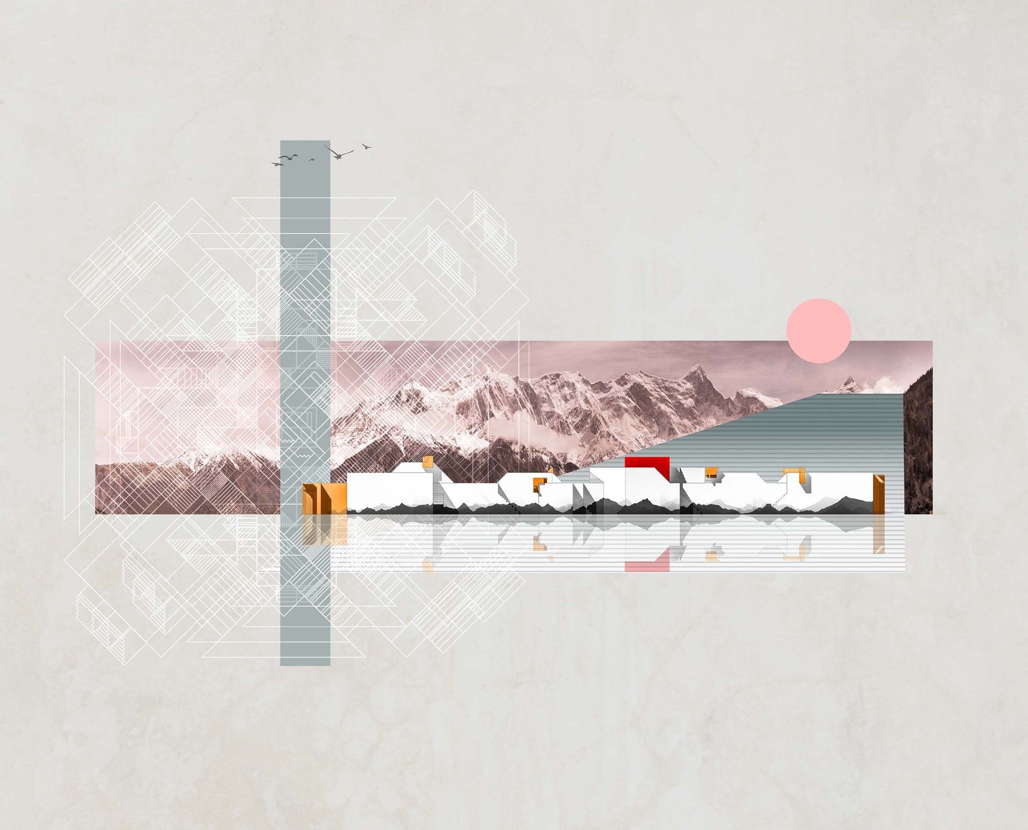
Graphical Façade. In contrast to the emphasis on a building’s solidness, the architect tries to give more graphical features to the building’s surface materials. The winding lines on its façade are in fact taken from the skylines of Namcha Barwa.
According to the most accurate description of Namcha Barwa, the mountain pierces into the blue sky like long spears, with thick white snow and dark rocks that overwhelm human eyes. Located in the deep end of the mysterious Himalayas, it hides among the clouds all year round but is still connected with the world we are living in, sharing the same destiny.
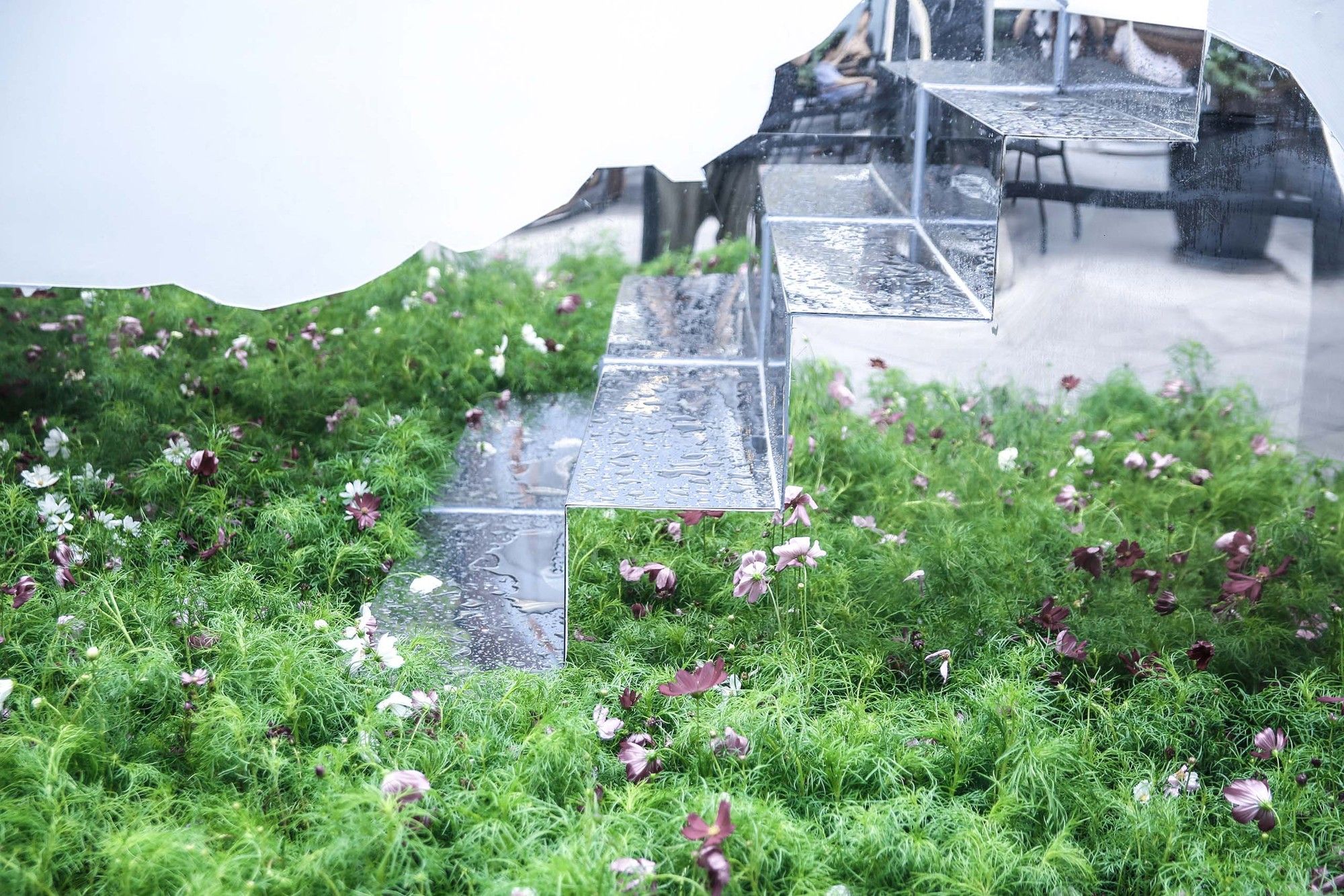
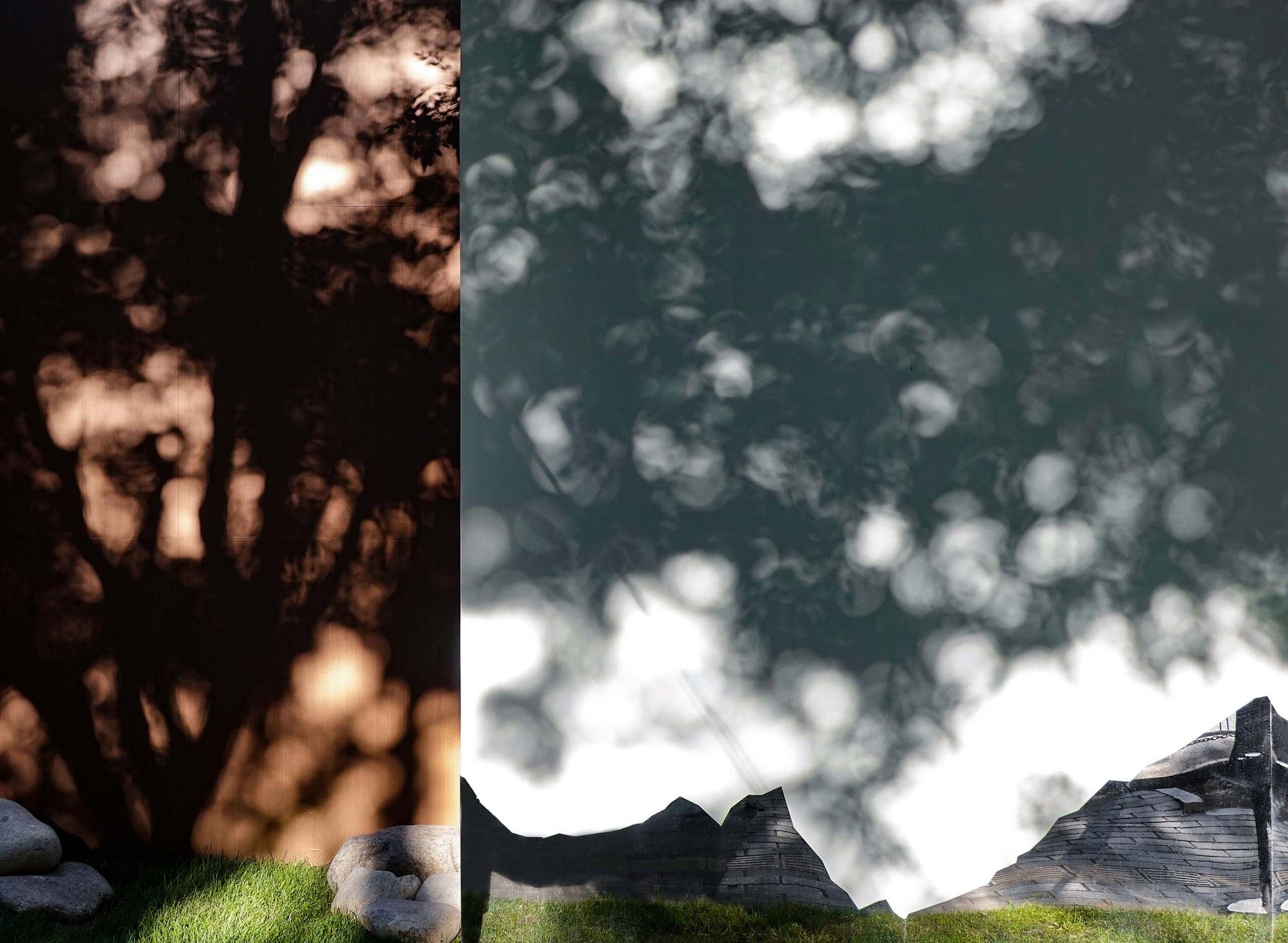
Through the Mandalas Pop-up Digital Art Museum, Namcha Barwa falls into the bustling urban center, reflecting the noisy and earthly scenes of the human world. It also brings mysterious silver sparkles to the Mandalas Pop-up Digital Art Museum, becoming the most romantic feature on this sparsely adorned building.
Flying Stones and Galsang Flowers. With reflections on mirror metals, exposed rough mountain stones and Galsang flowers from the Qinghai-Tibet Plateau stretch far into the building. As the foundation for the drifting Mandalas Pop-up Digital Art Museum, the scattered stones return to where they belong.
Project info :
Architects: One Take Architects
Area: 240.0 m²
Year: 2019
Photographs :Nan Xueqian
Manufacturers: Nippon Paint, Signify, Toli
Architect In Charge: Hao Li
Collaborators: SAMAS
Photography by © Nan Xueqian
Photography by © Wang Shilu
Photography by © Wang Shilu
Photography by © Wang Shilu
Photography by © Nan Xueqian
Photography by © Wang Shilu
Photography by © Wang Shilu
Photography by © Nan Xueqian
Photography by © Wang Shilu
Photography by © Nan Xueqian
Photography by © Nan Xueqian
Photography by © Nan Xueqian
Photography by © Wang Shilu
Photography by © Nan Xueqian
Photography by © Wang Shilu
Photography by © Wang Shilu
Photography by © Nan Xueqian
Photography by © Wang Shilu
Photography by © Nan Xueqian
Photography by © Nan Xueqian
Photography by © Nan Xueqian
Photography by © Nan Xueqian
Photography by © Nan Xueqian
Photography by © Nan Xueqian
Photography by © Nan Xueqian
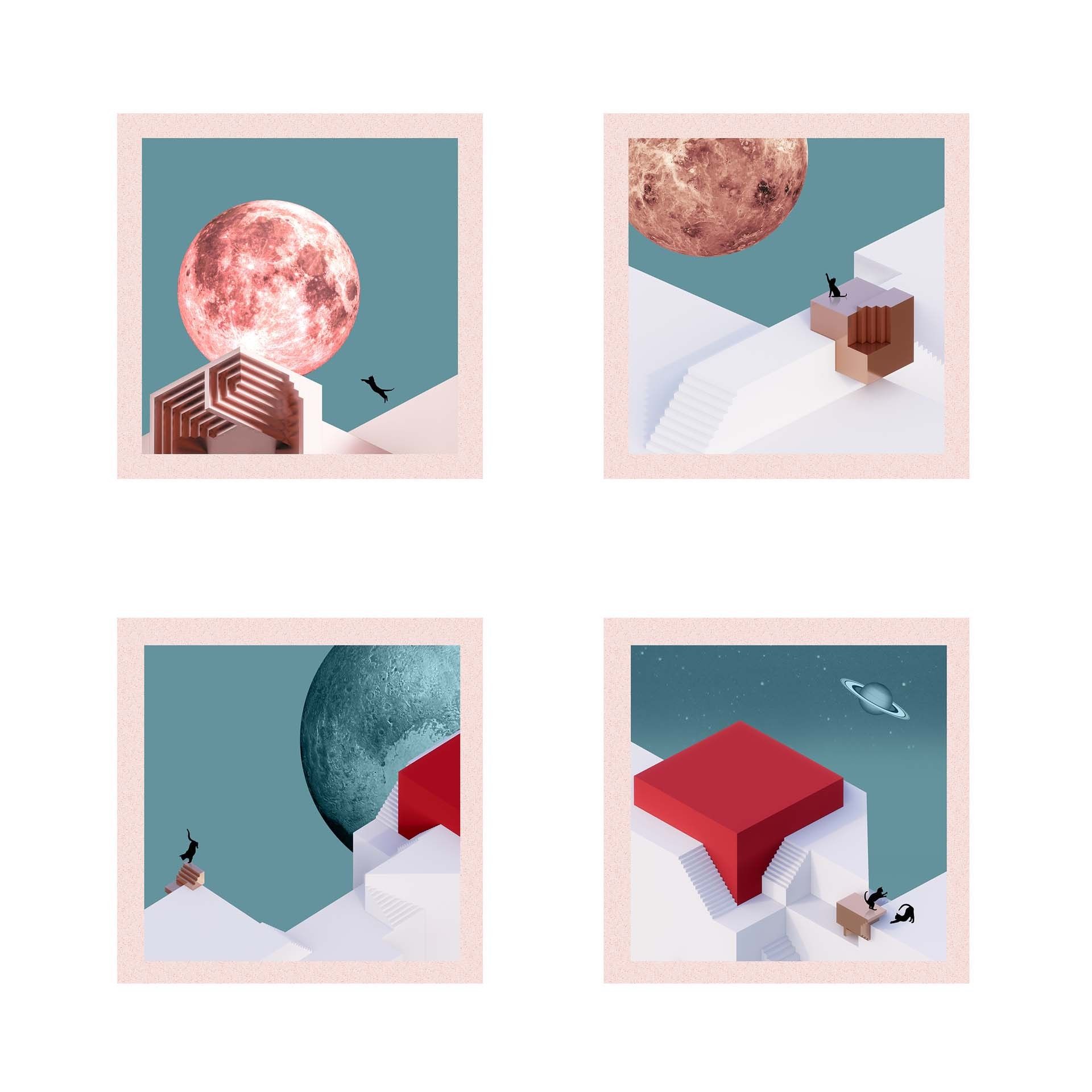
analysis diagram
analysis diagram
analysis diagram
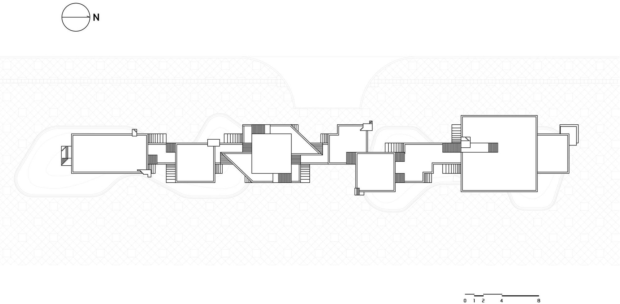
site plan


