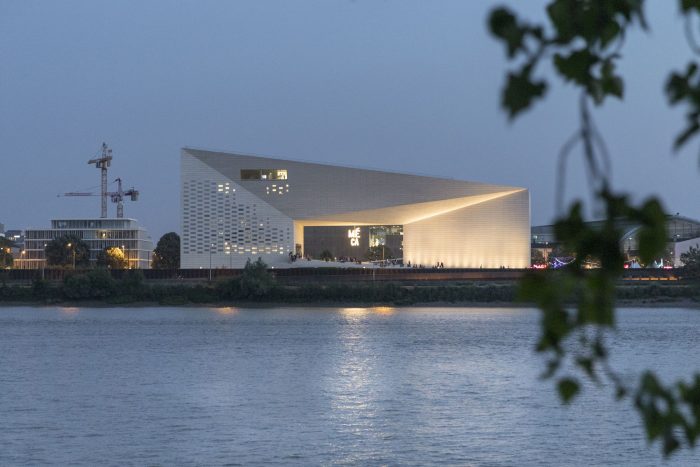
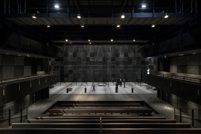
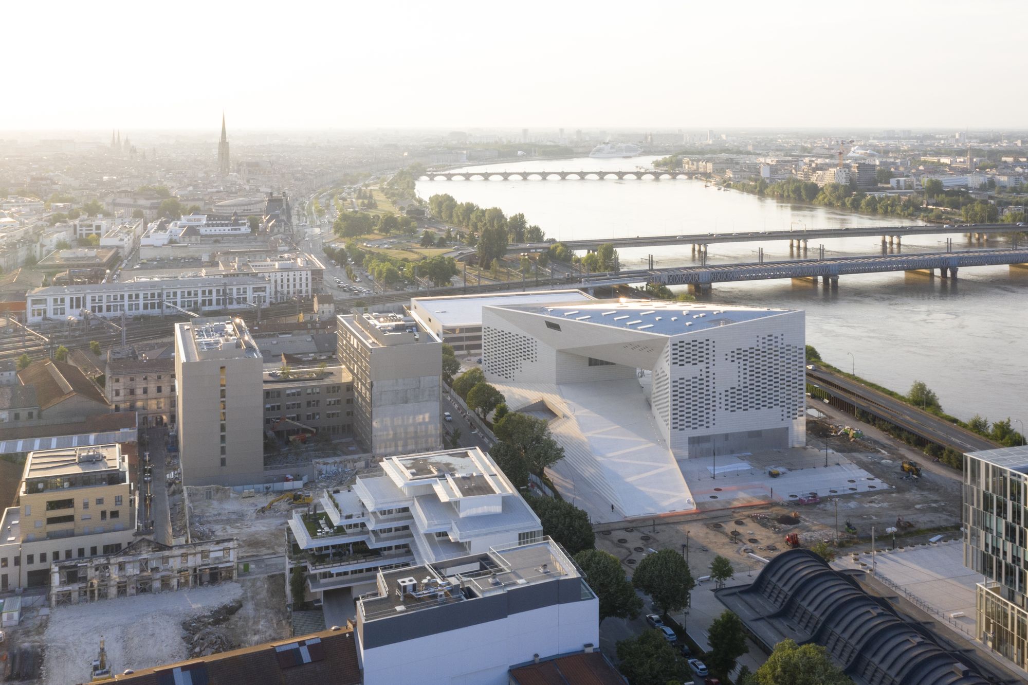
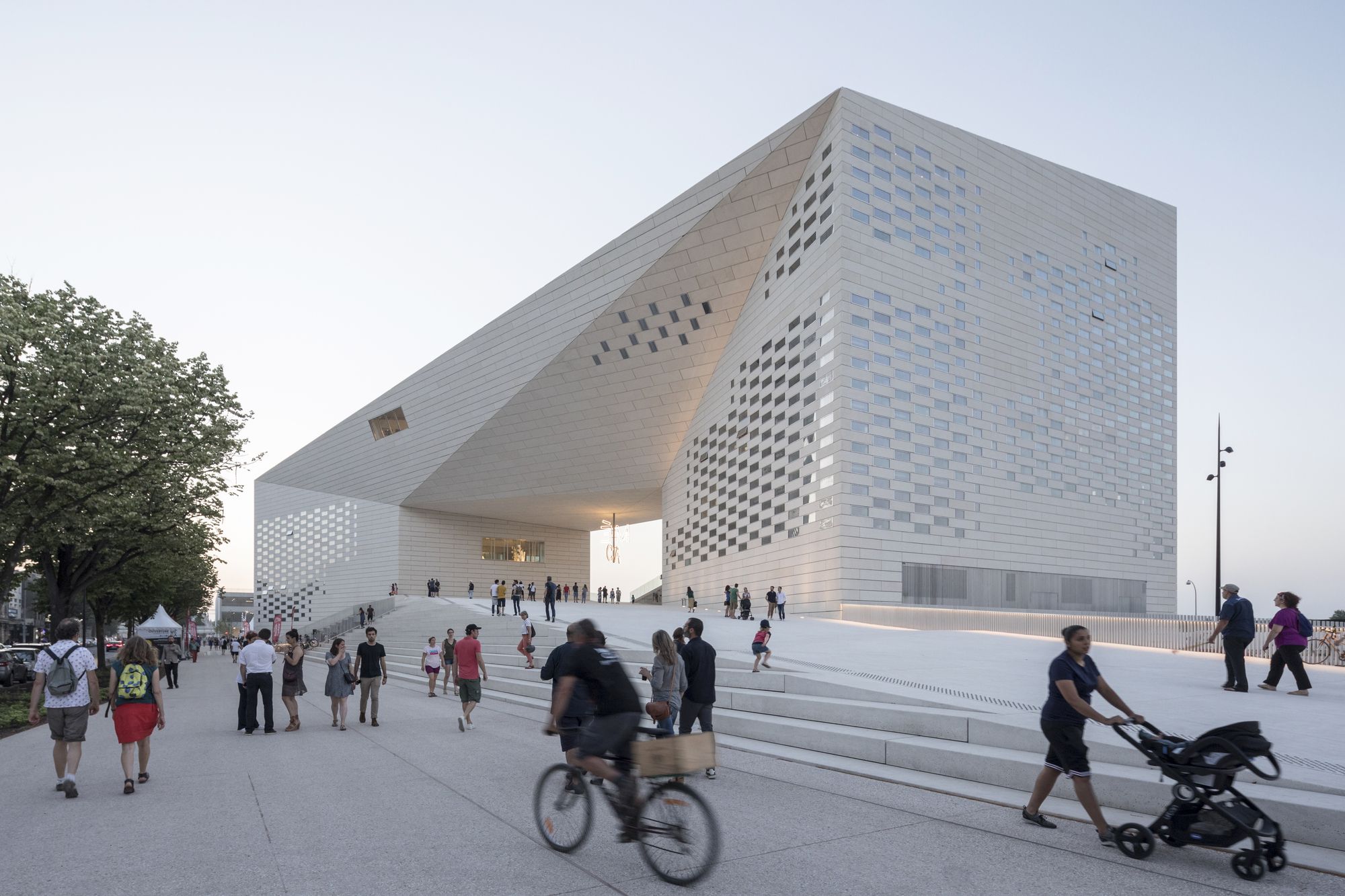
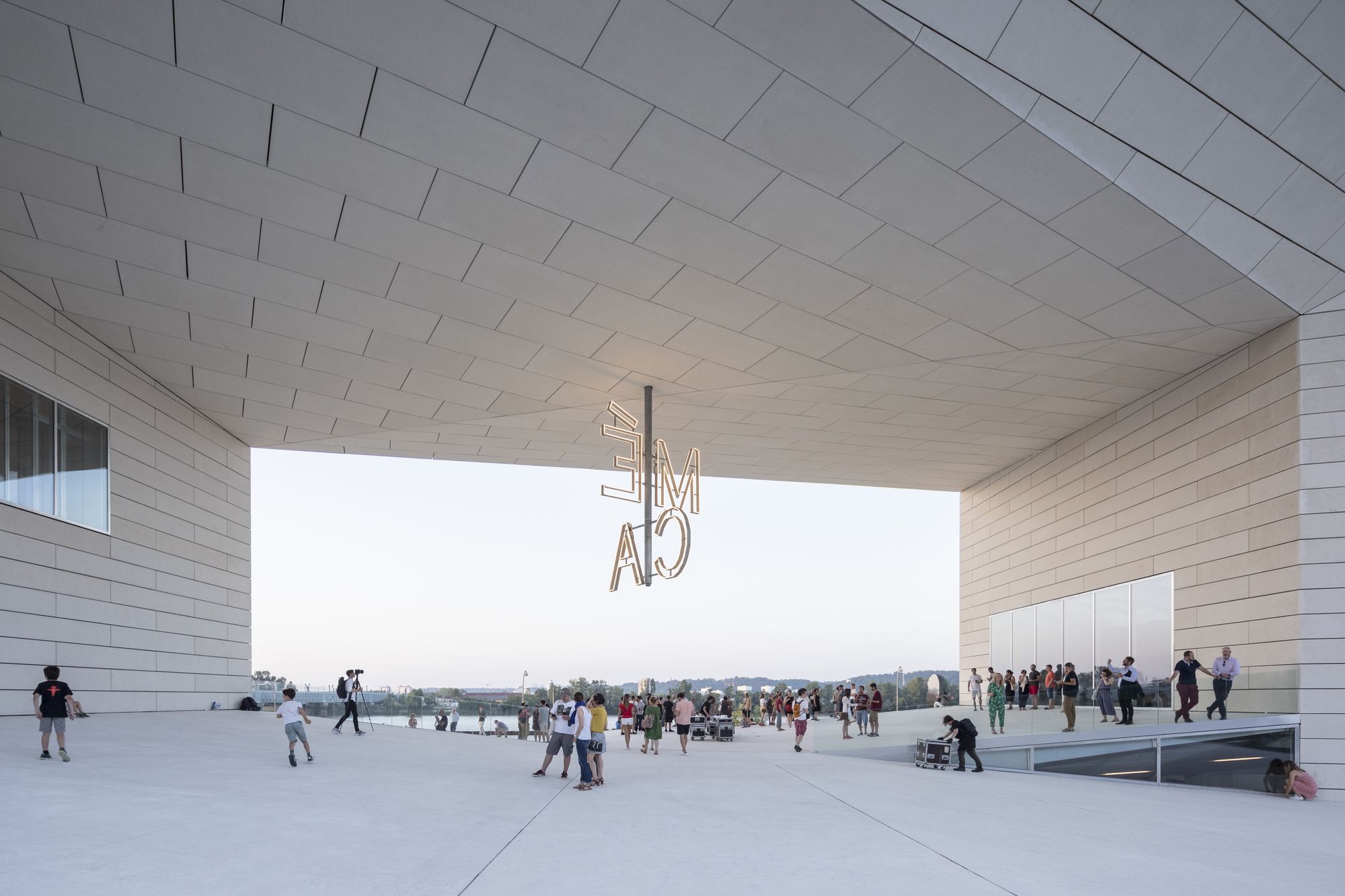
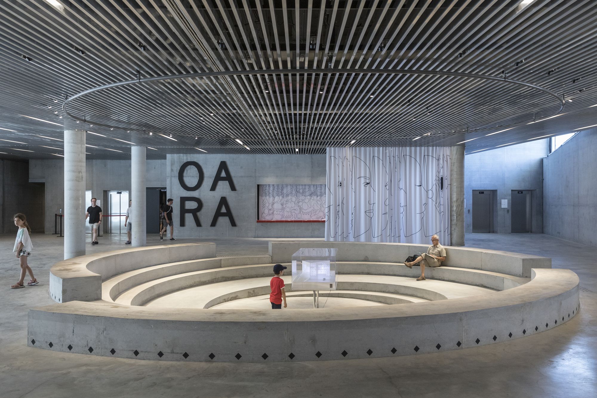
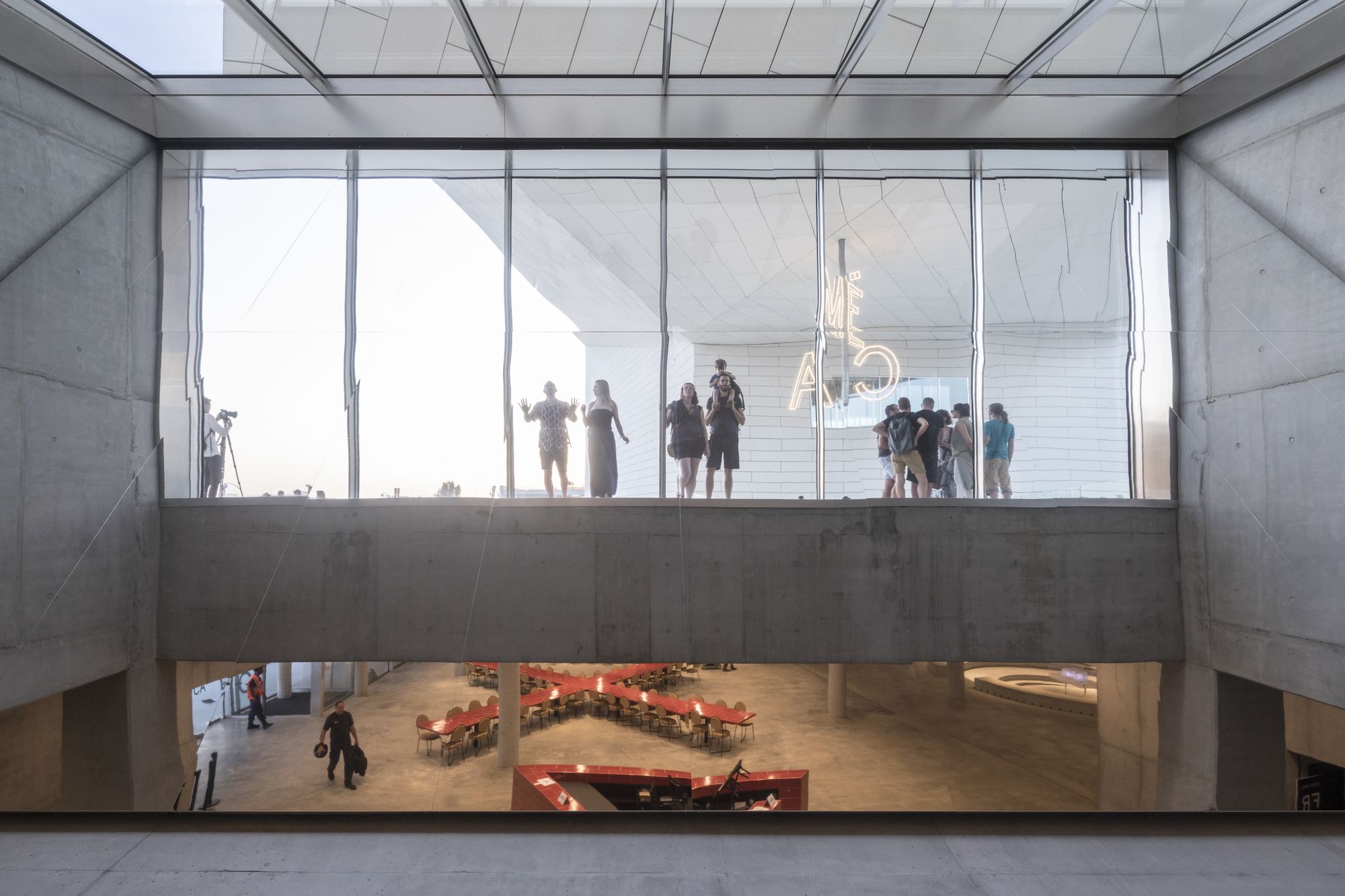
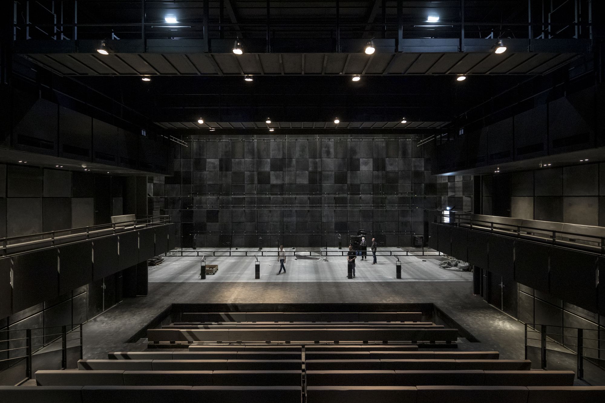
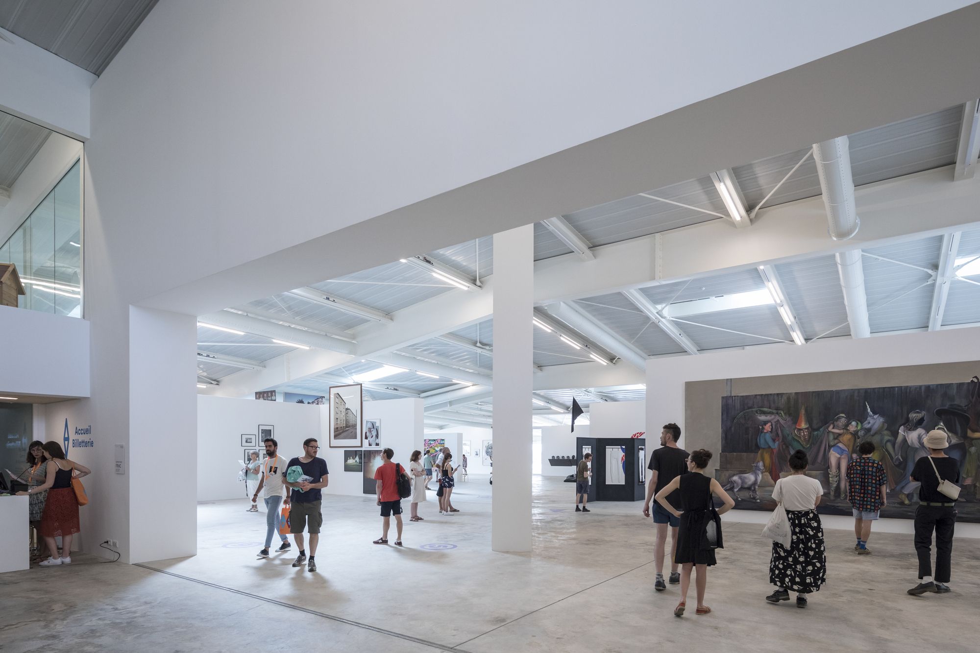
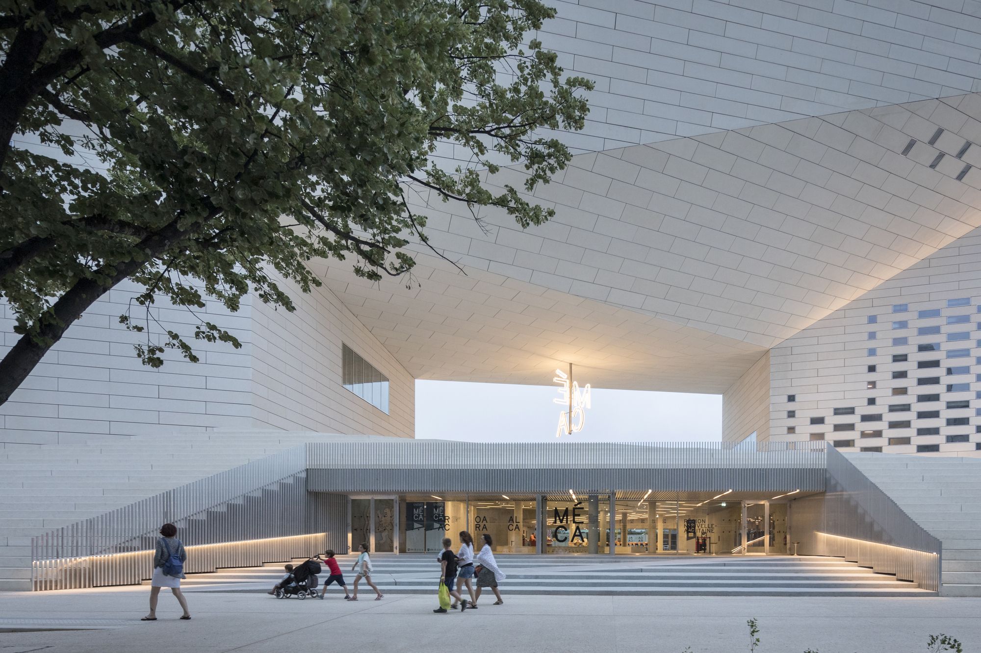
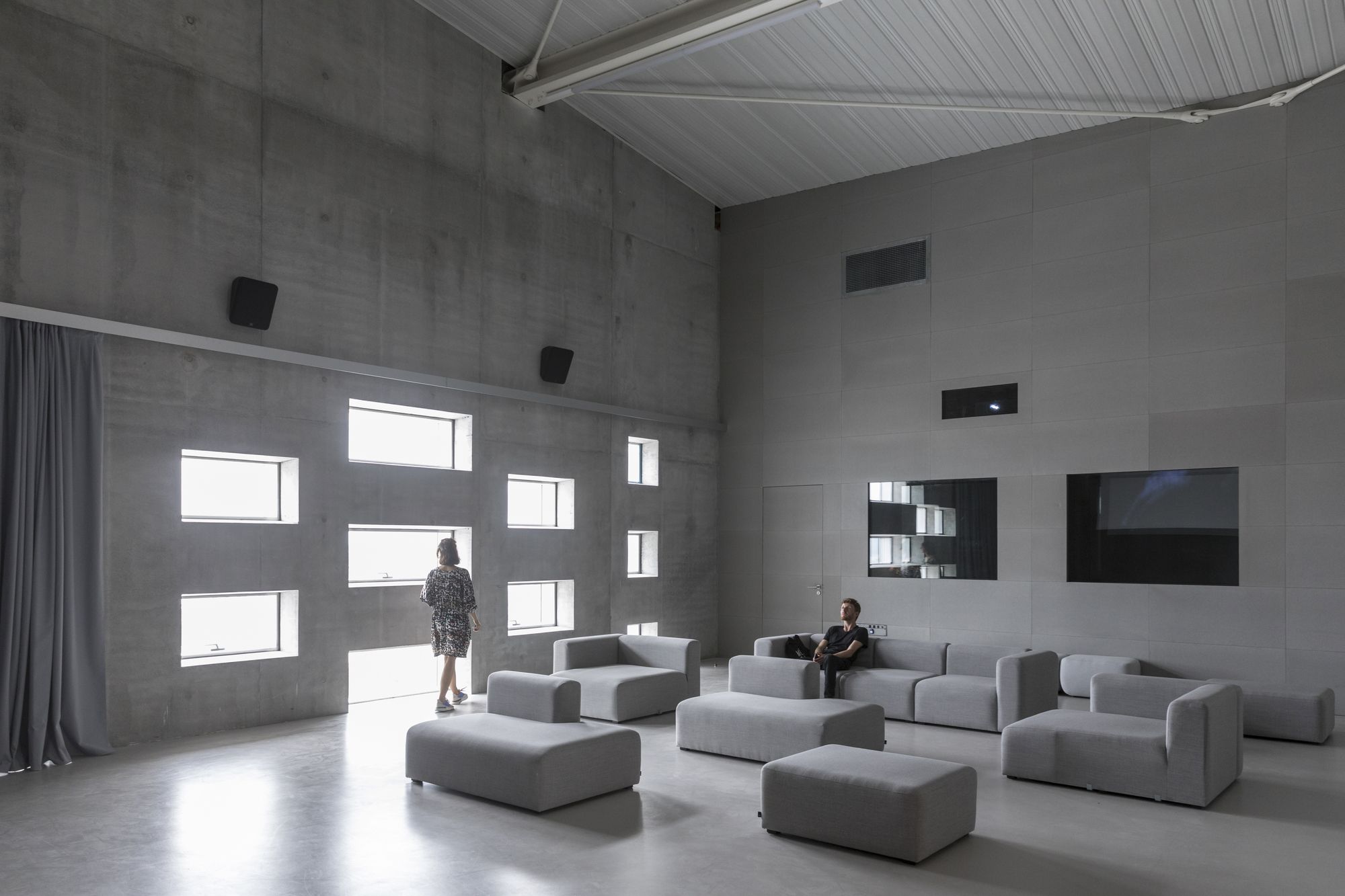
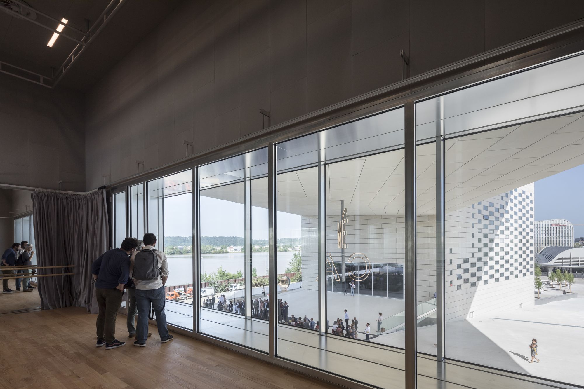
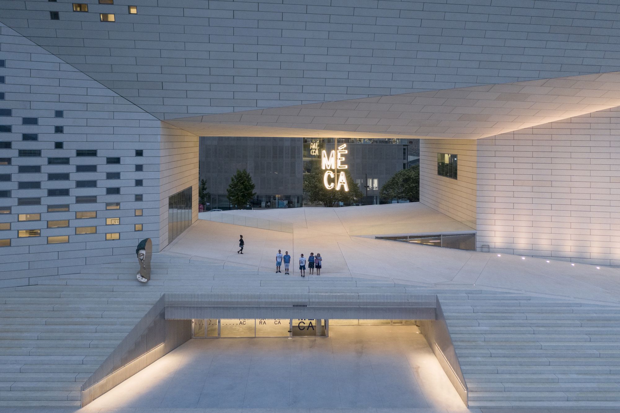
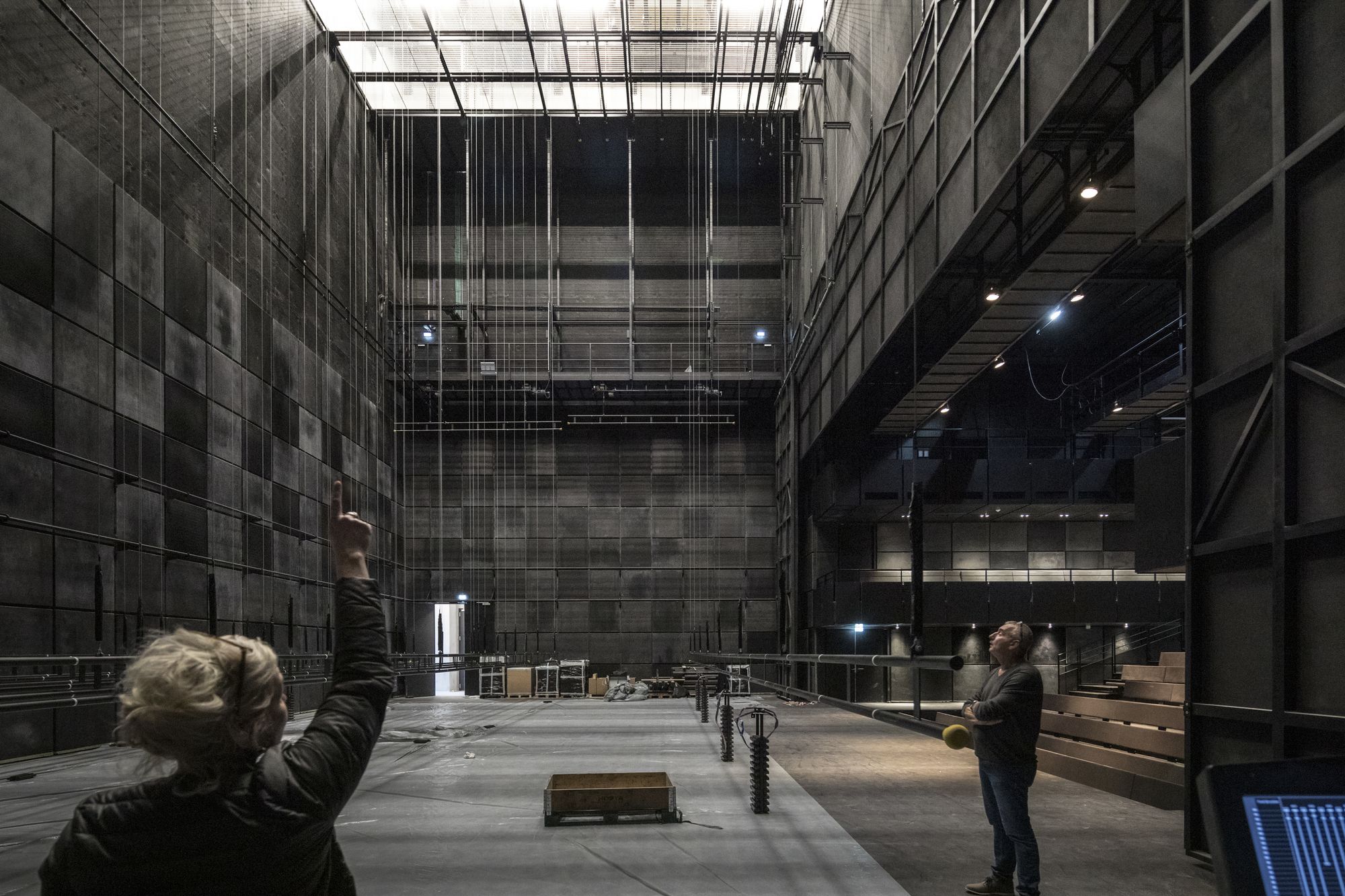
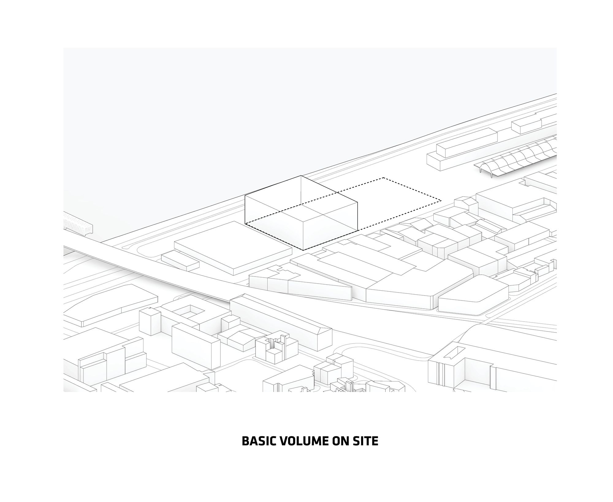
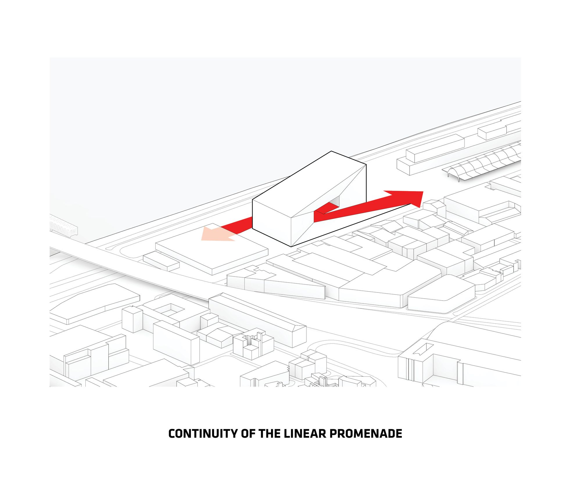
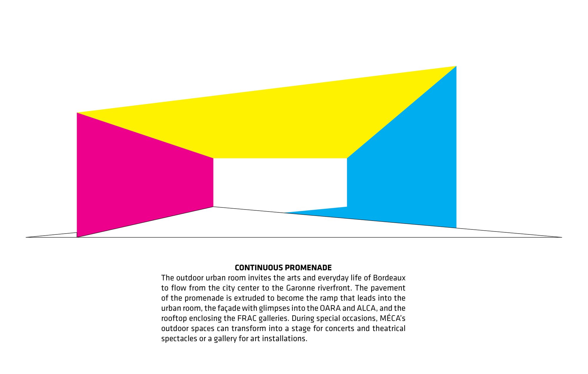
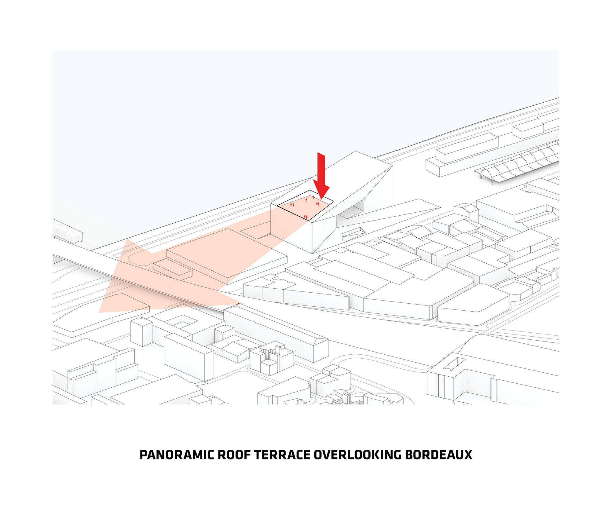
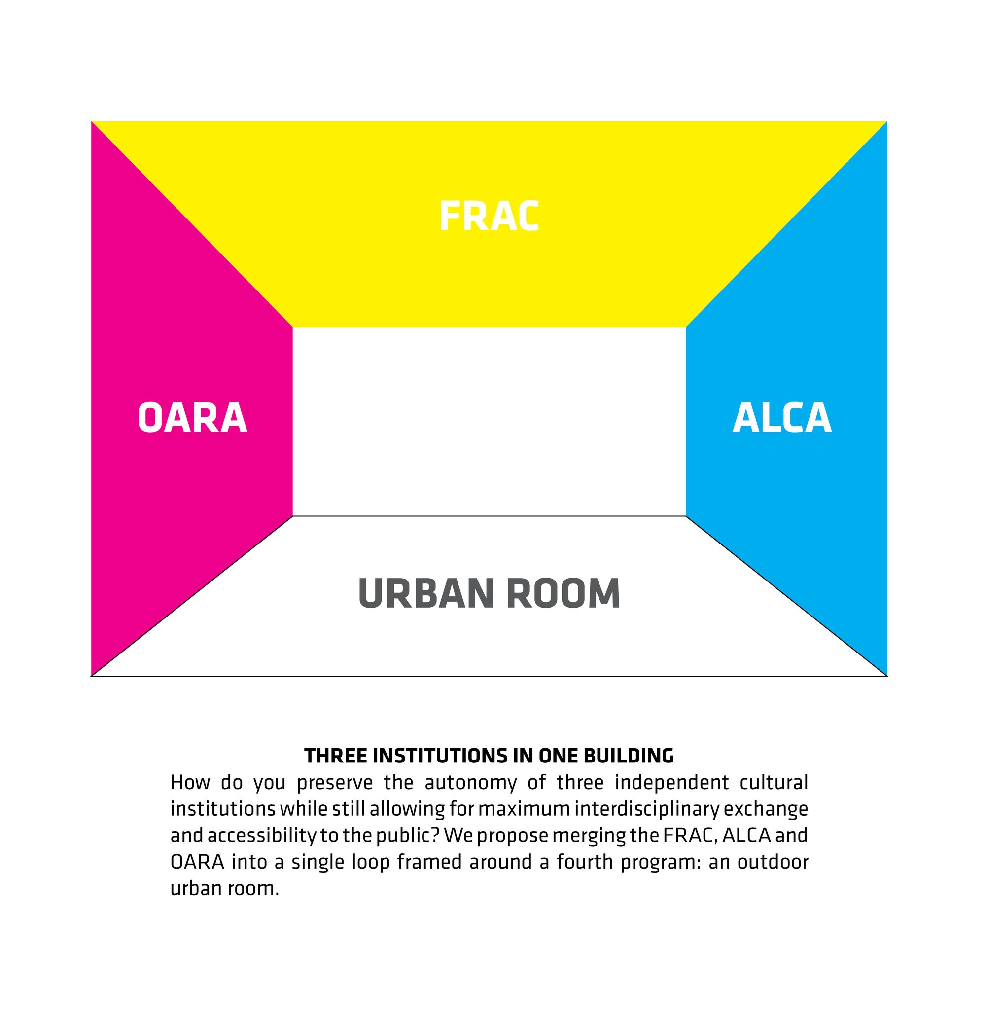
Maison de l’Économie Créative et de la Culture en Aquitaine, or MÉCA for short, is a hybrid building proposal by BIG + FREAKS for a new cultural center in Bordeaux, France. This collaborative team effort merges three regional cultural institutions for the visual and performing arts – FRAC, the ECLA, and the OARA – into a single building. Conceived as a single loop of public space, the pavement of the promenade rises to form the roof of the main lobbies, ascends vertically along the stage tower, bridges across the promenade, and then returns vertically to the ground.
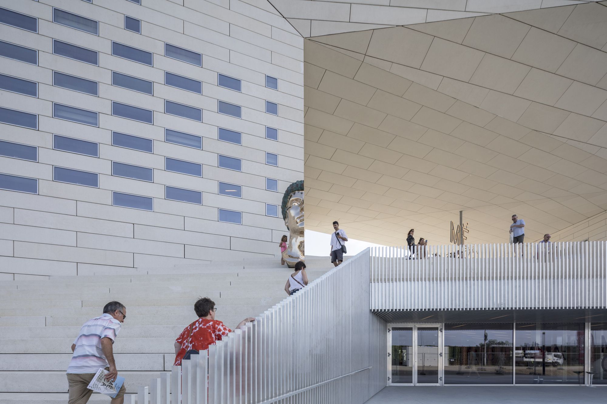
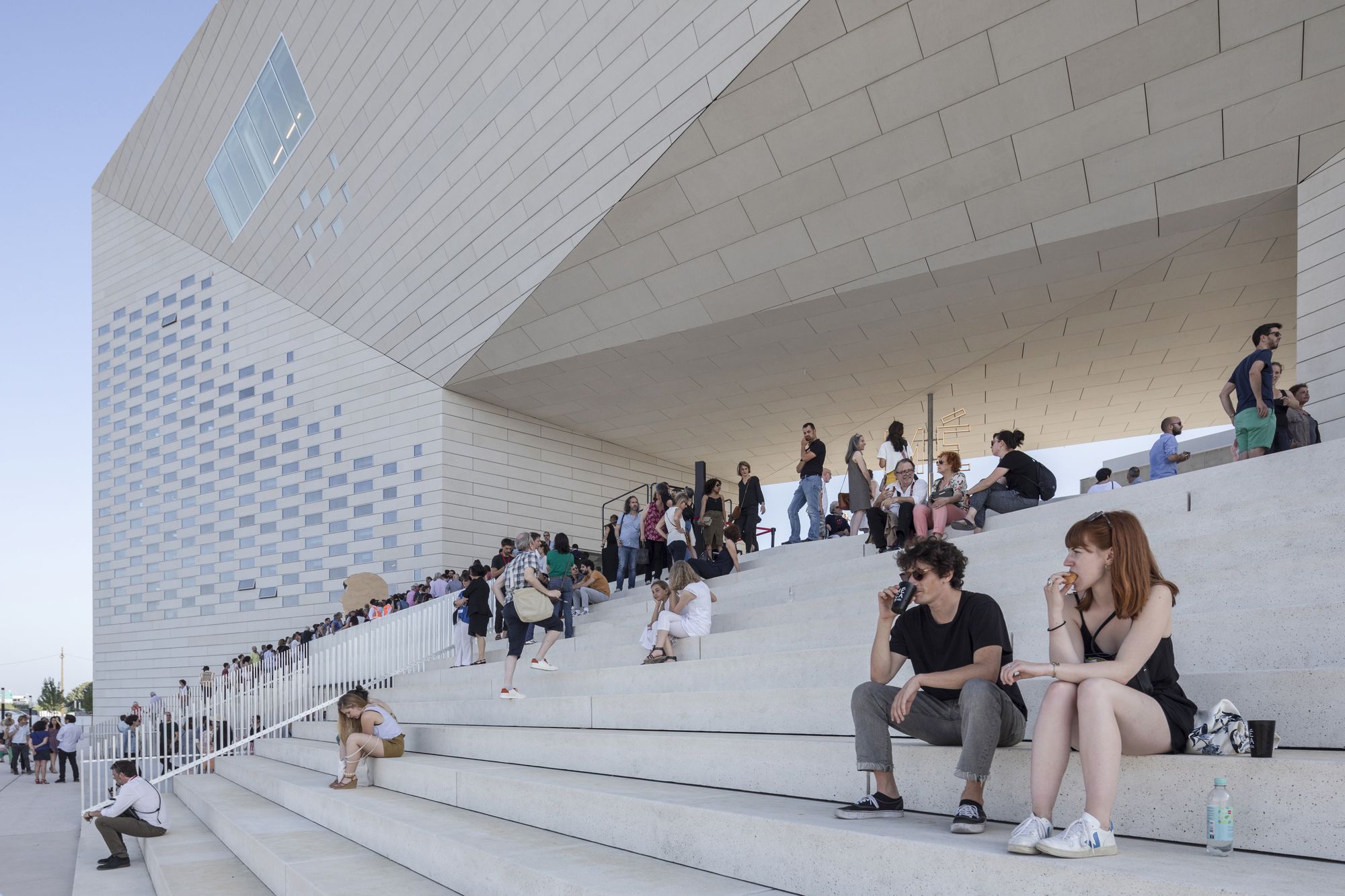
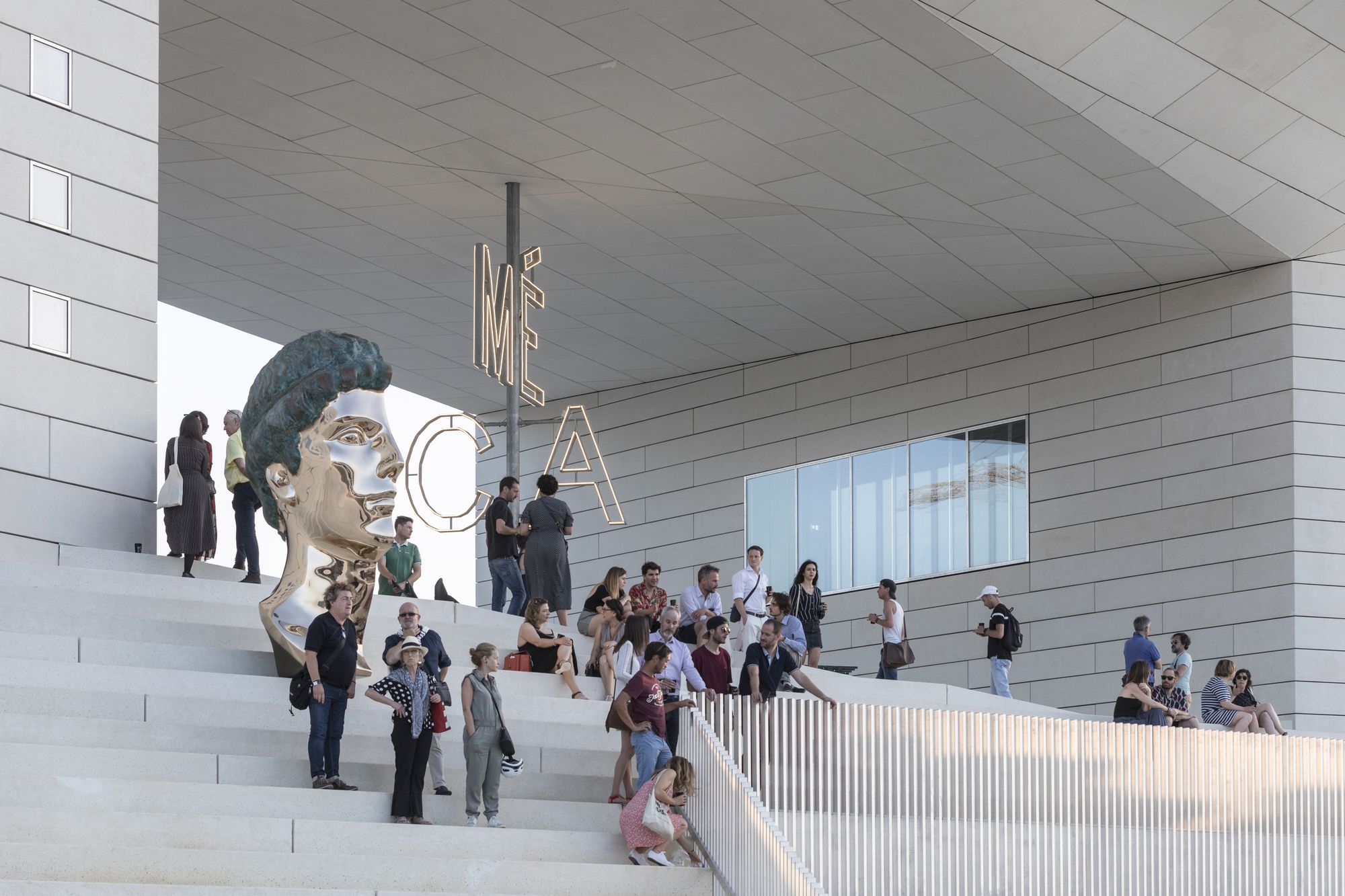
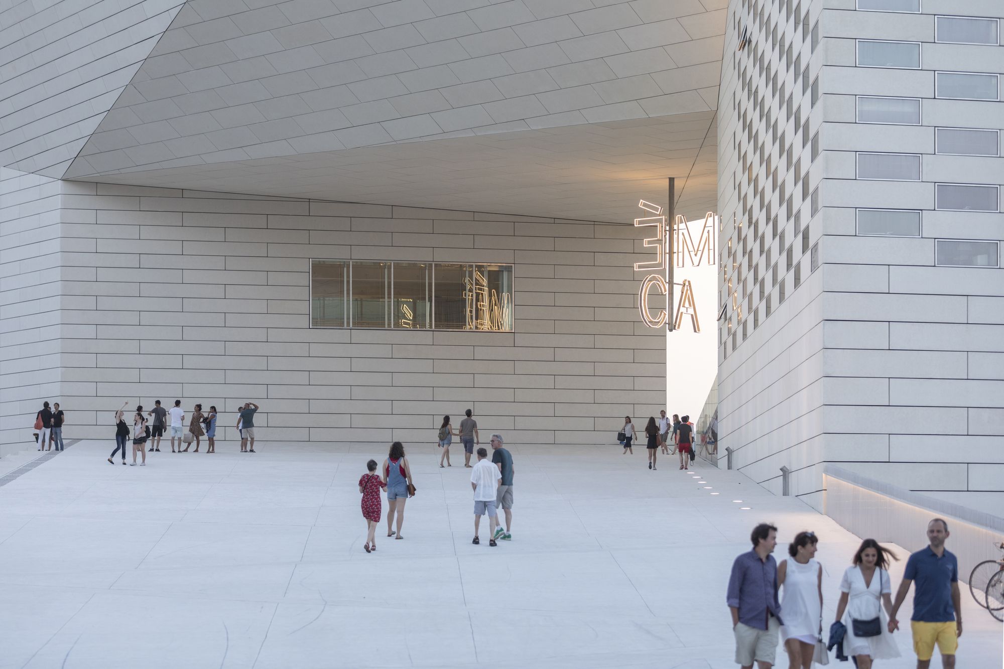
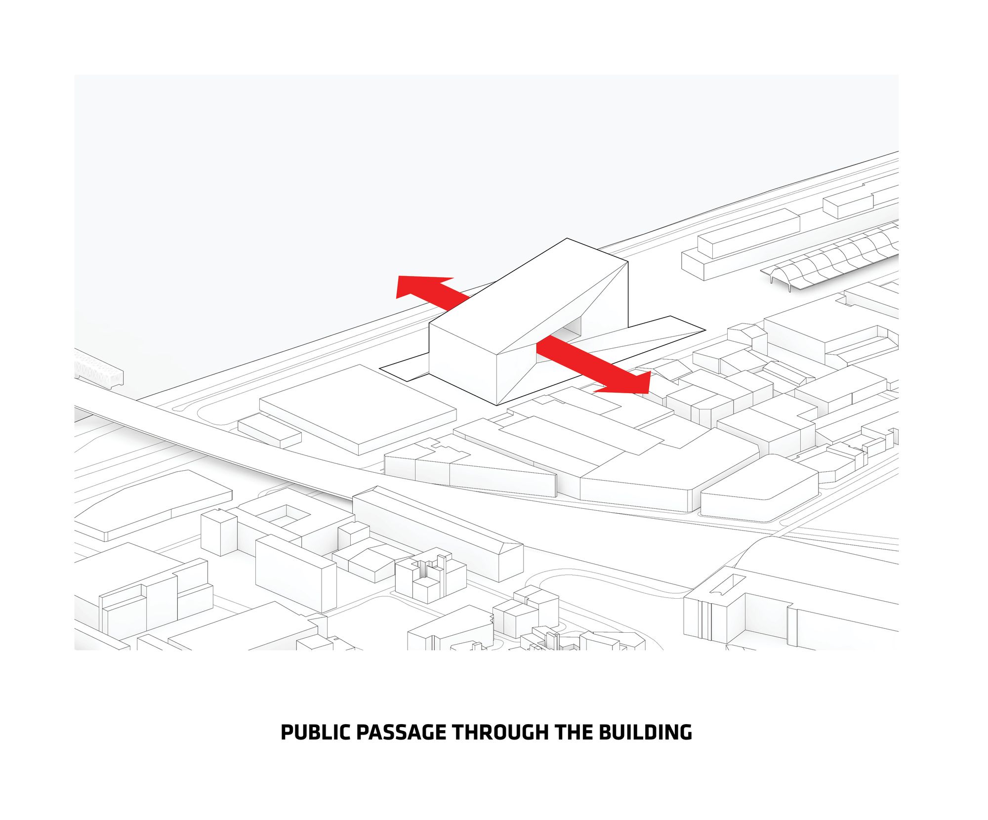
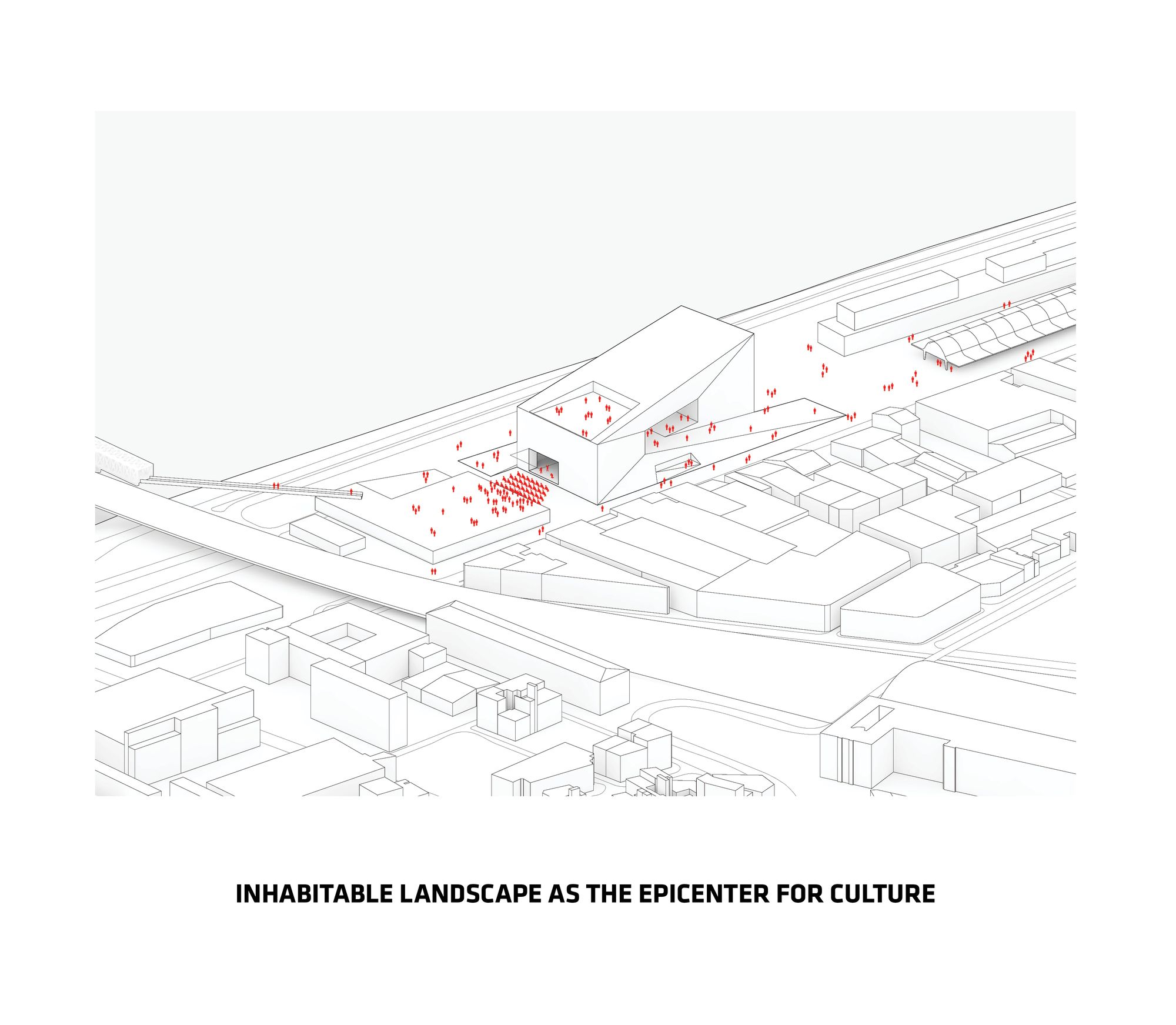
 This gesture was strategically designed, not only to effectively separate each of the agencies occupying the structure, but also to introduce a new public space for the city. The promenade acts as an urban room, allowing for the everyday life of Bordeaux to flow through so that life is brought into the building. The multiple ramps and stairs of the building create makes the center publically accessible and welcoming on the inside as well as the outside. The exterior and surrounding area of the MÉCA was designed so that it can be transformed into a stage for outdoor concerts, theatrical spectacles or even art installations, allowing the agencies to expand further into the city rather than having to stay compacted in the structure.
 Careful consideration was placed on the materiality of the structure as another way to connect it back into the city. It was ultimately decided that the center would be cladded in limestone, which constitutes the majority of Bordeaux’s architecture, so that the building appeared to be carved from the same material as the city itself. This emphasizes the impression that the building is a single entity, as though carved from a single block of stone, where the promenade, façade, stair and tarrace, roof and ceiling act as one.
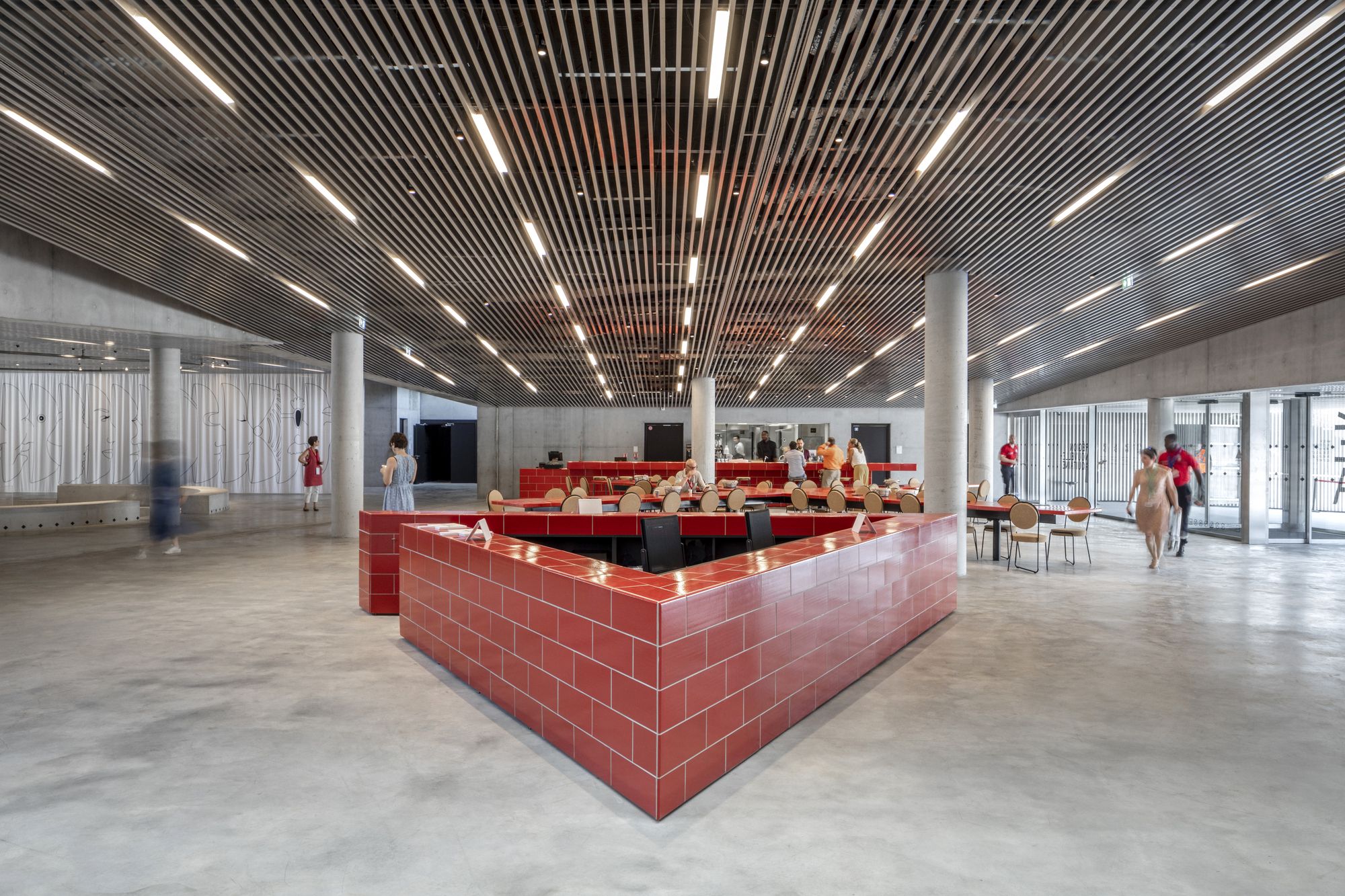
For the most part, this piece of architecture does everything one would expect for a cultural center. The arrangement of interior spaces is interesting, the circular gesture and loop concept are appropriate knowing that the building needed to integrate three different agencies and their needs, but in my opinion there’s nothing really new and exciting about this proposal. The idea’s appear to be very logically driven, thinking about what’s best for the site, what’s best for the client, what’s best for the public, that the fun and excitement has been drained from what could have been a great excuse to do something amazing. Even though I’m slightly disappointed with this building, I do appriciate the strong culmination of effort, design, class and culture, adorned with public interest that was put into this proposal and I look forward to seeing what BIG and FREAKS freearchitects will produce next.



Courtesy of BIG + FREAKS


