Mélange Store
The interior project for Mélange Store in the cosmopolitan city of Kuwait by Ahmad Fakhra and Massive Order has raised the bar of retail stores all around the city tenfold. The spatial experience and functional aspects seamlessly blend together in the highly detailed project.
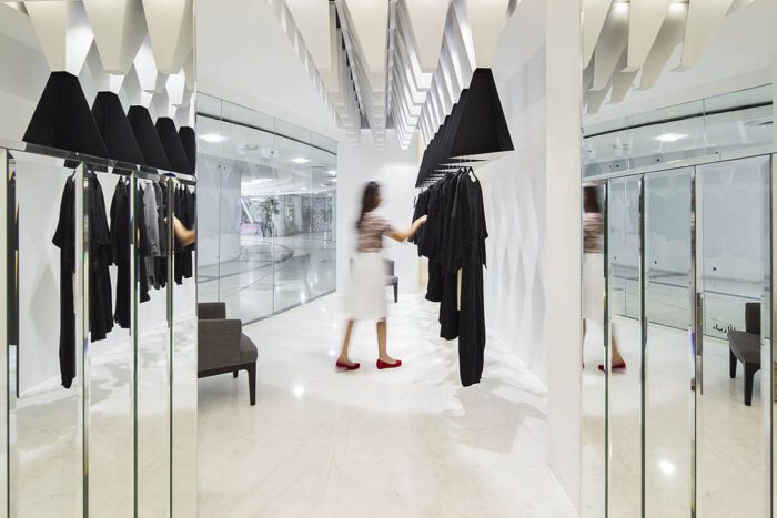
As the area is surrounded by the big names of the fashion industry, the other stores need to stand out to succeed. The color scheme is a simple black/white choice. As the customers enters the store, they are welcomed by mirror walls and elements. The designated area is an L shape which has one side narrower than the other that forced the designers to think outside the box. One side is called the “Display Corridor” which is full of mirrors and the primary objective of that side was to solve the most basic requirement of how to display the merchandise in the most aspirational way and keeping the style in play as well. The whole idea was to make the store feel less clustered as well as at the same being more polished, when viewed from outside.
The mirror partitions were used to create the effect of now-you-see-it-now-you-don’t in an elegant way and created the sense of precise symmetry where it actually didn’t exist. Structural Columns at the front didn’t form a perfect square, so the fourth corner was faked with a display fixture. This idea was then replicated so that the cash counters were not in the viewing range of the customers and kept the security in check. On the narrow side, upside down pyramids were dropped from the ceiling that actually depict a 3-D effect looking like stalactites, which in fact were made out of steel, with one side coated black and the other white. The sculptures look like they are hovering over the customers as they view and touch the clothes. All the movements are simply choreographed so that the customer is directly easily to anywhere in the store. The narrow space was used as a double coax, one making continuous eye-catching window display and the other functioning as a merchandise area.
The whole concept on designing this store was to morph the vantage point of the customer as they walk through, to make them think and understand the reason of making such kind of spaces. Creating dimensionality was the sole purpose of Ahmad Fakhra, which in the end would mean more success and with luck, more sales.
Architects: Ahmad Fakhra, Massive Order
Location: Kuwait City, Kuwait
Design Team: Muhannad Al-Baqshi, Hamad Al-Khaleefi
Photographs: Nelson Garrido
By: Muhammad Umair Siddiqui


