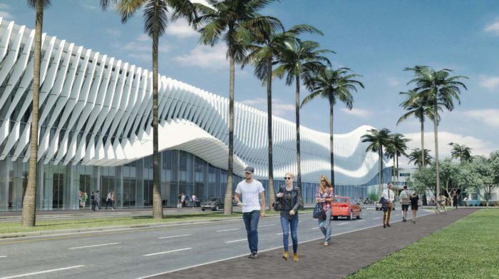
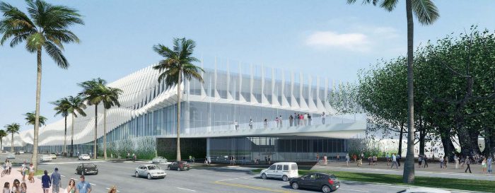
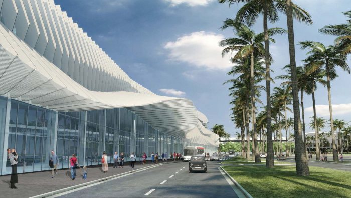
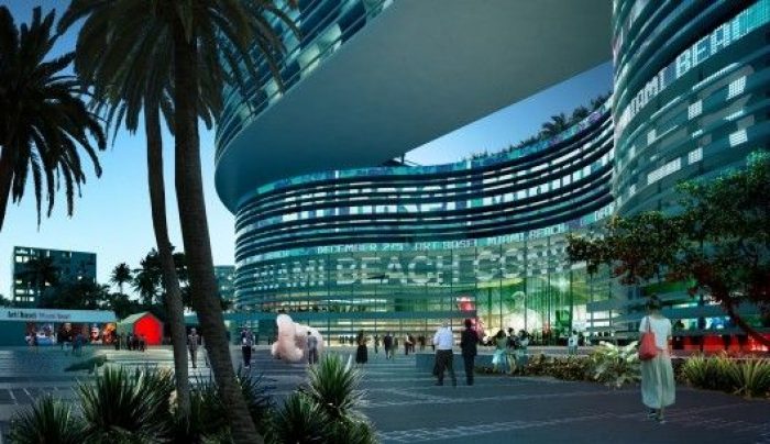
We have devised a strategy that combines urban planning and landscape design to create a neighborhood characterized by human scale, pedestrian connections, shaded spaces with public oriented programs lining the streets and squares. A neighborhood that, depending on the season, the weekday, or even the time of day can be perceived as a lively downtown neighborhood or an inviting public park.
-Bjarke Ingels, Creative Director BIG
BIG is a firm which defies prediction of style. Their approach is consistently one of situational awareness and considered response. Yes, there are motifs of monumentality and lines that are somehow optimistic, which run through many of their works. But outside of these details, each BIG project is inherently its own. This, a proposal made in cooperation by BIG, West 8, Fentress, JPA and the developers Portman CMC, is the 52-acre Miami Beach Convention Center redesign and refit which presents all the feels of old Miami in continuity while being undeniably contemporary. The massive complex, essentially a box scheme with corners lifted up to create soaring canopies, is progressive without being flamboyant. Connectivity throughout and between different functions contained within the prompt creates a unified scheme which makes the maximum use of the plot without being overly expansive. Below, a further description by the architects goes into further detail.
The square creates a series of intuitive connections across the site – a diagonal that connects the Soundscape to the Botanical Gardens and Holocaust Memorial. A north-south connection joins the Collins Canal to Lincoln Road and naturally channels the flow of convention visitors to the liveliness of Lincoln Road. A green network of public spaces that stitches together all of the adjacent neighborhoods – formerly separated by the convention center – into a complete and coherent community – for both visitors and residents. All public programs – old and new come together on the square. All great cities have a great square – this will be Miami Beach Square.
By popular demand we have found a way to preserve and enhance the architecture and programming of the Jackie Gleason Theatre. By making it all public at the street level – opening up lobbies, restaurants and cafes on all sides – we make the Gleason a lively centerpiece in this new neighborhood. Towards the Square we propose to extend the fly tower with a performing arts center with various spaces for rehearsal and offering a visual connection to the public. Adjacent to the Jackie Gleason Theater sits the new Latin American Cultural Museum consisting of a base of public programs opening up on the square. The building form creates a covered shaded event space on the square blurring the transition between inside and outside.
Today the Miami Beach City Hall is almost like a left over wedged between random neighbors surrounded by traffic. Our proposal places it rightly in the middle of the town square with amble space for public expression and at the heart of communal life. The Miami Beach City Hall and Botanical Ballroom book end the Square making it a natural extension of the civic activities of city hall. To the north the botanical ballroom opens up allowing for beautiful views of the botanical gardens and the memorial. The Ballroom has an entrance to the south and to the north allowing for seamless connectivity to the convention center – under the shade and shelter of the canopies.
Rather than being the hermetic mono programmatic box that the Miami Beach Convention Center is today – a single program at the size of an urban block- we propose to consider the Convention Center an actual urban block complete with different programs – grown together to form a continuous architecture. A gradual transition from public to private – and from cultural to civic – conference to residential turns a stroll around the block into an experience of continuous variation. Along the entire west adjacent to the various gardens and the new square – the main entrances to the convention Center and Conference Center occupies the ground. The hotel lobby spans the entire south elevation in continuation of the Convention Center lobby. The Hotel façade as pulled back forming a cascade of terraces for the south facing hotel rooms – decreasing the perceived height seen from the Gleason.
The Roof of the Convention Center is framed by a green roof drawing the outline of the urban block – framing the hotel gardens and the roof parking interspersed with shade giving landscapes. As a reoccurring annual event we propose to sponsor an art foundation that will deliver a roof art piece to cover the remaining roof surface turning it into a giant ever changing canvas seen from the air as well as the roof terrace of the hotel. An ever changing giant canvas that will annually challenge contemporary artists with an architectural scale canvas – seen from the roofs and penthouses of adjacent buildings, from airplanes and google earth.


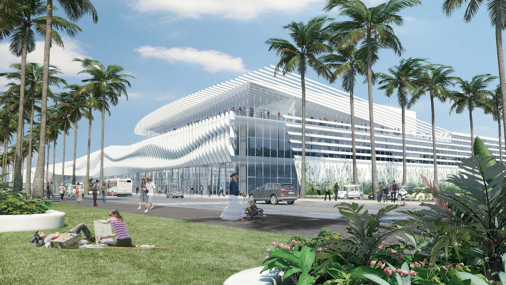

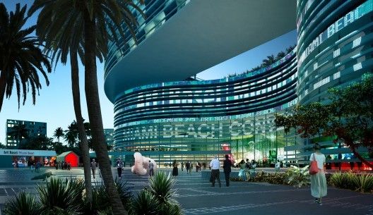
Courtesy of BIG


